

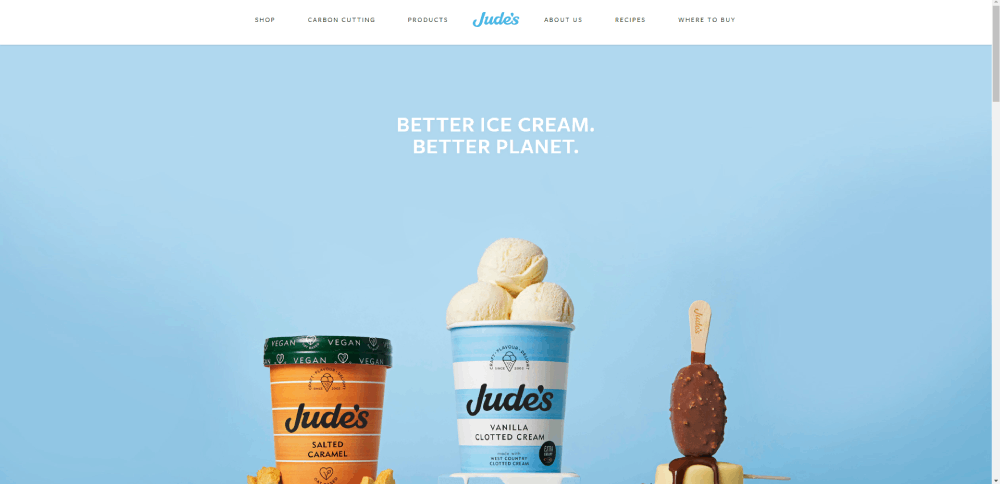
Cool Ice Cream Website Design Examples to Inspire You
January 5, 2026
Top Wellness Website Design Examples To Check Out
January 5, 202690% of donors research a charity online before giving a single dollar. If your nonprofit website looks outdated or makes giving difficult, those visitors leave.
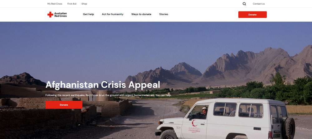
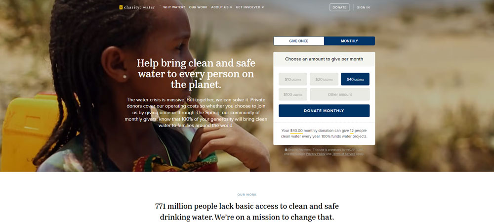
The best charity website design examples prove that strong visuals, clear donation flows, and authentic storytelling convert casual visitors into committed supporters. Organizations like charity: water, Red Cross, and WWF have figured this out.
This guide breaks down real nonprofit websites that get it right. You will see what makes their donation pages, navigation structures, volunteer portals, and impact storytelling work, and how to apply those same patterns to your own site.
What Is Charity Website Design
Charity website design is the process of building a nonprofit's online presence to convert visitors into donors, volunteers, and long-term supporters through strategic layouts, clear donation flows, and mission-driven storytelling.
It sits at the intersection of fundraising, branding, and user experience. Every page has to earn trust fast because people researching charities online decide within seconds whether an organization is credible.
90% of donors look up organizations online before giving. That stat alone tells you why a well-built charity site matters more than most nonprofits realize.
Unlike a standard business website, a charity site has to do double duty. It needs to educate visitors about a cause while making the donation process as frictionless as possible.
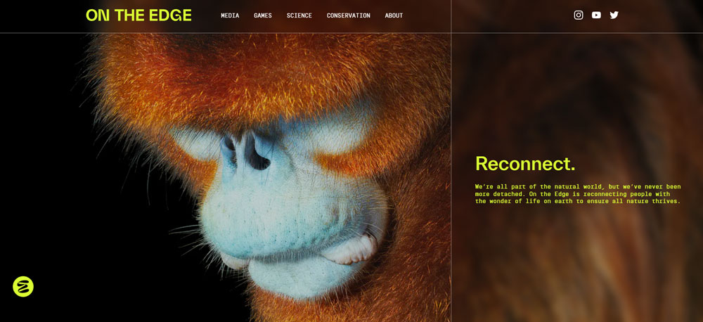
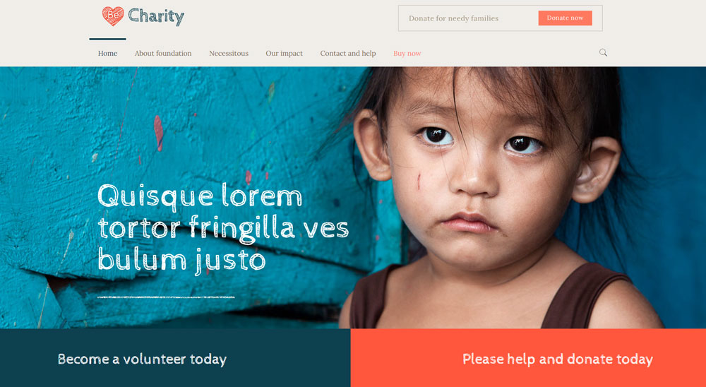
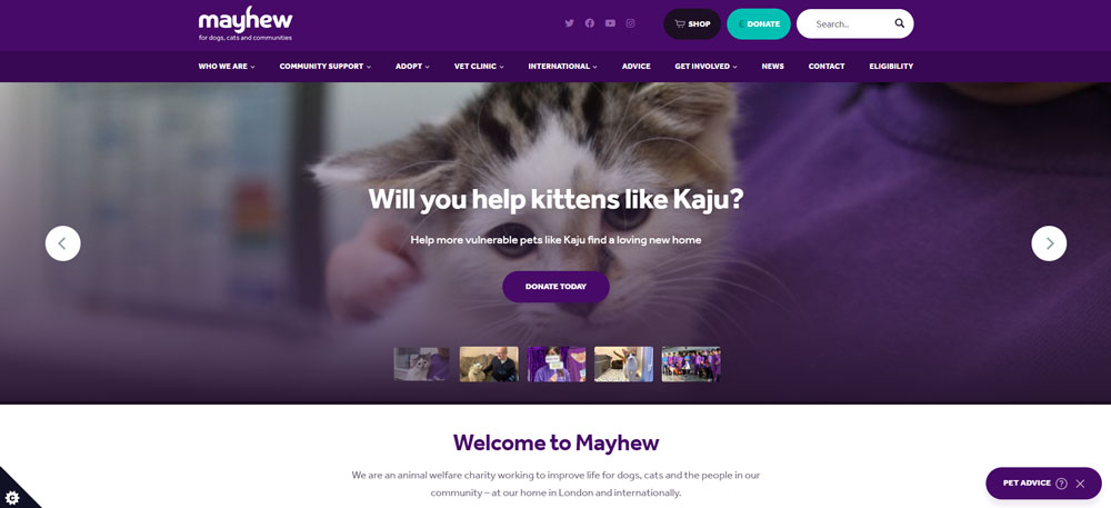
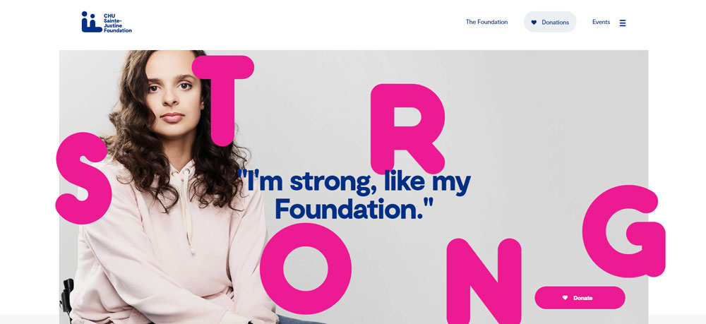
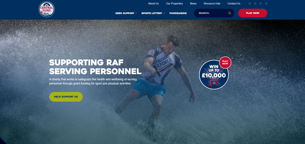
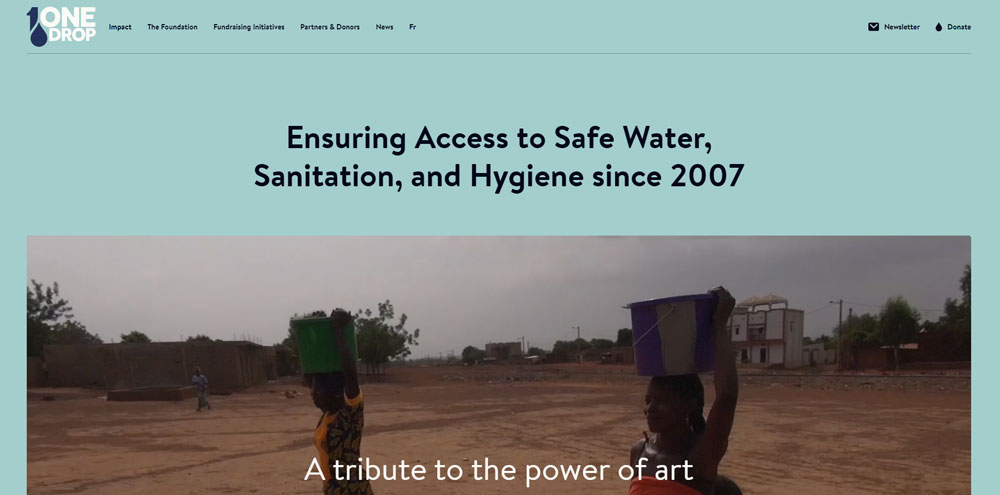
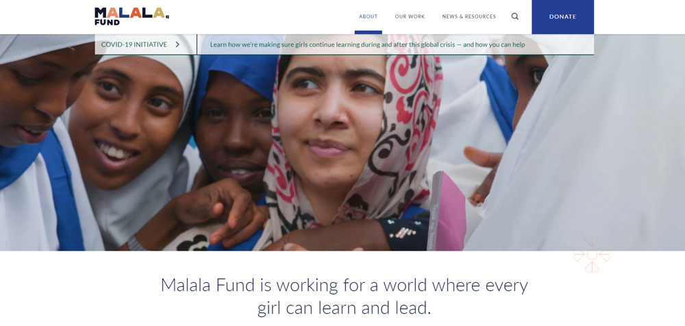
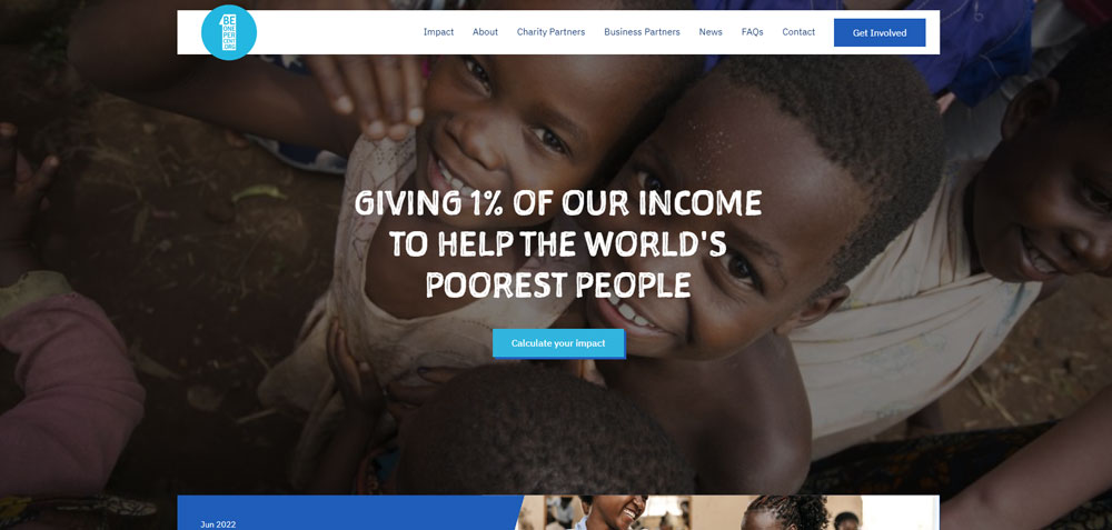
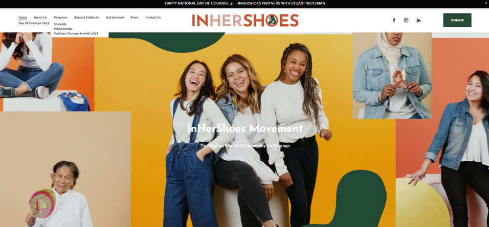
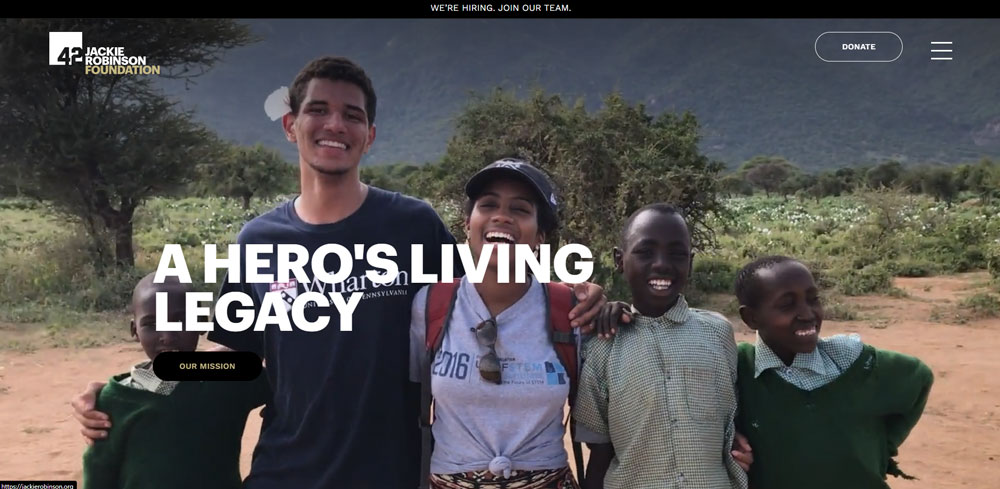
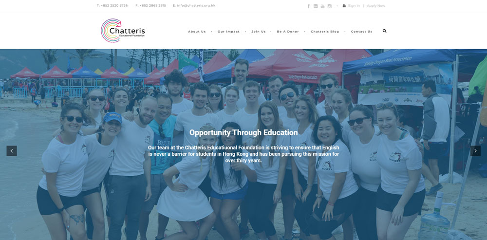
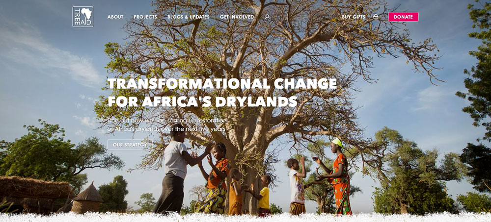
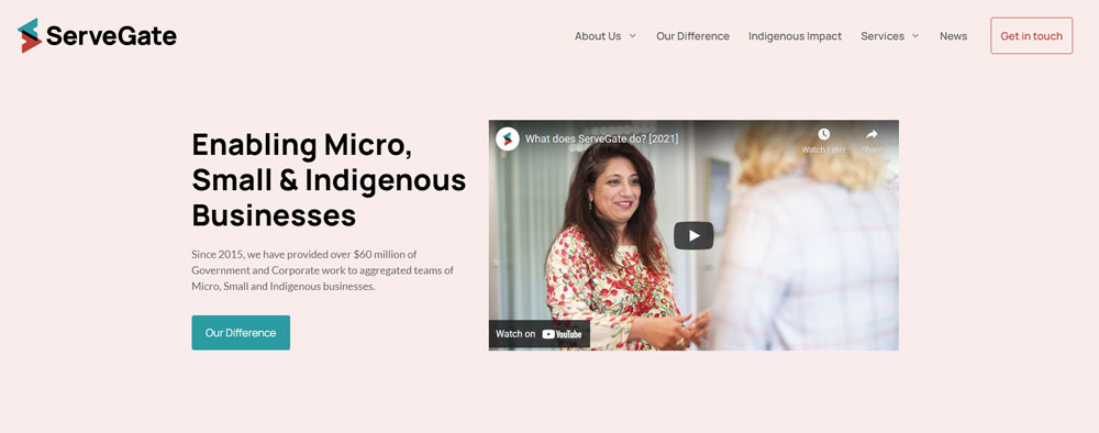
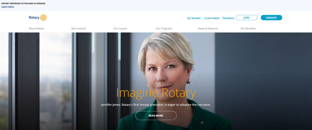
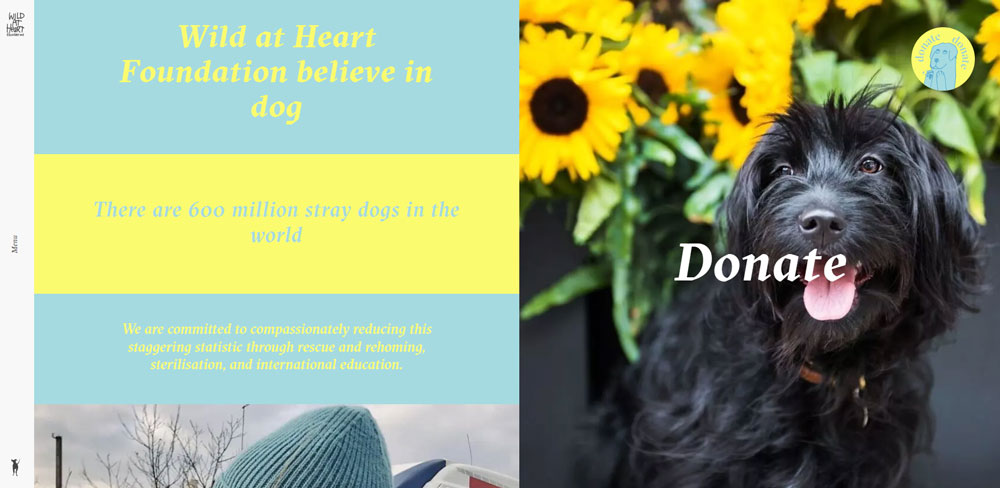
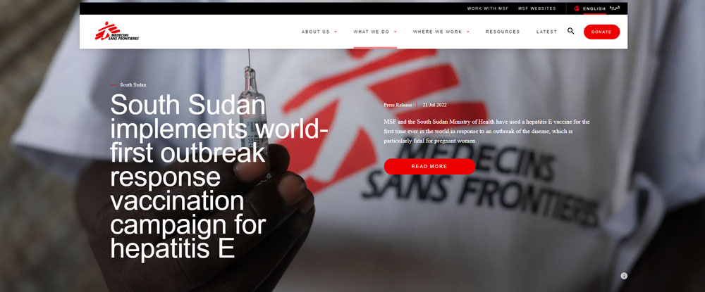
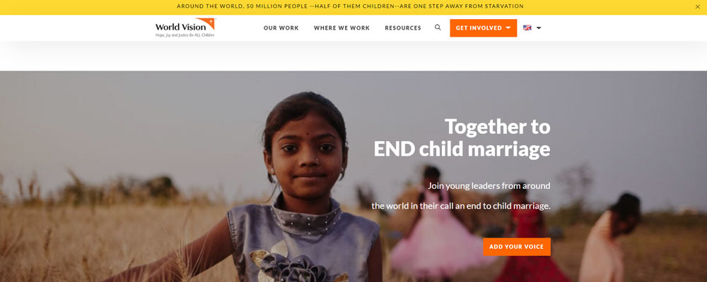
Charity Website Design Examples
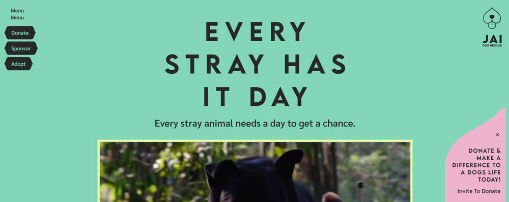
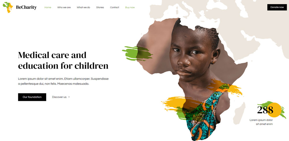
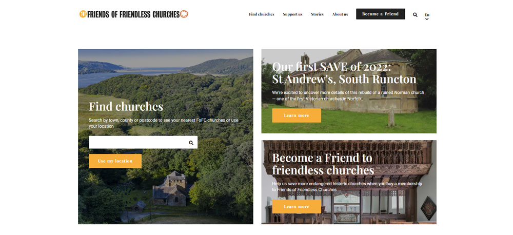
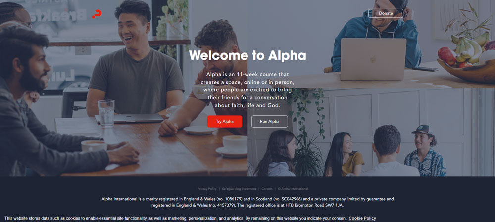
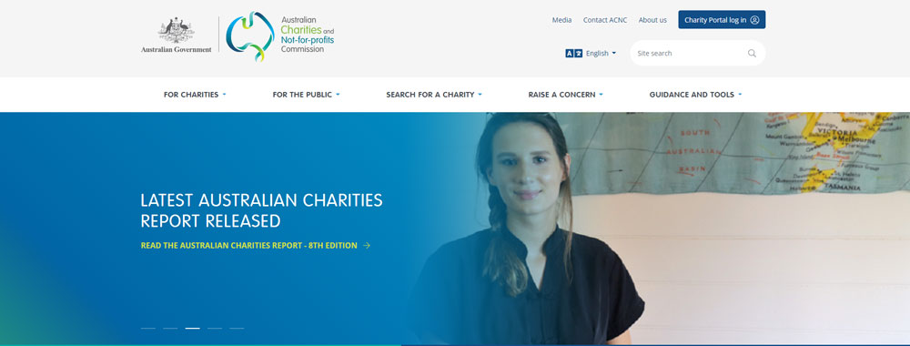
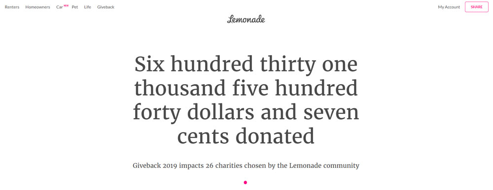
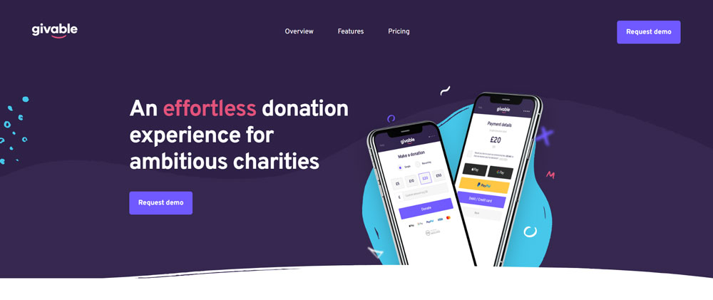
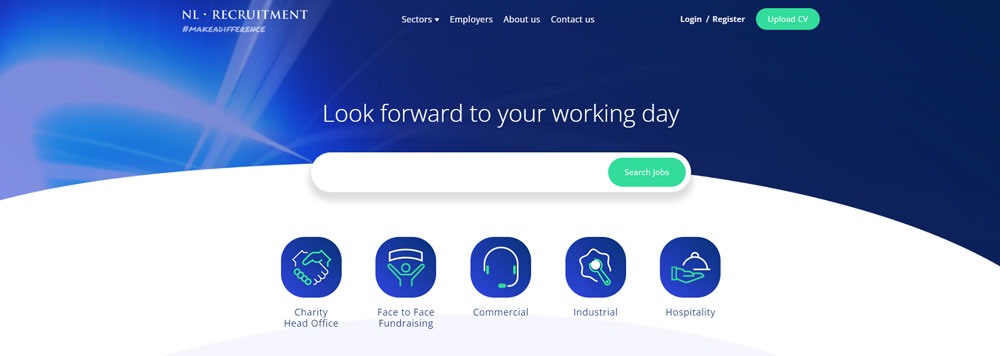
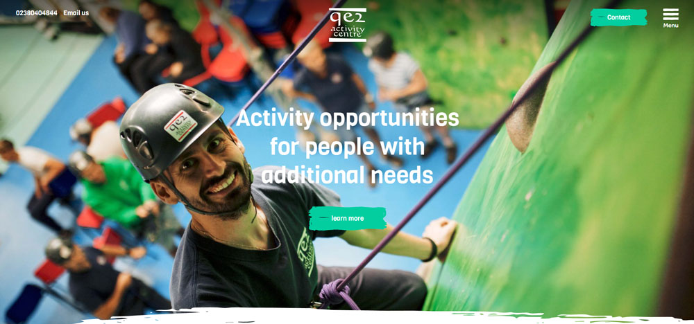
Jai Dog Rescue


How to Evaluate Charity Website Design Quality
Not every nonprofit site that looks polished actually performs well. You need specific criteria to separate good charity website design from sites that just happen to have nice colors.
The evaluation has to go beyond aesthetics. Load time, mobile experience, accessibility compliance, and donation flow all matter as much as the visual identity.
What Design Criteria Separate Good Charity Websites from Great Ones
Eight factors consistently define the best nonprofit websites:
- Navigation structure - clean website navigation that separates donor paths from volunteer paths and information seekers
- Donation flow - fewer than 3 clicks from homepage to completed gift, with recurring donation options
- Mobile responsiveness - over half of nonprofit traffic comes from phones; responsive design is non-negotiable
- Accessibility - WCAG compliance including proper color contrast, semantic HTML, and screen reader support makes the site usable for accessible website standards
- Visual identity - consistent color scheme, typography, and brand elements across every page
- Page speed - slow sites kill donations; Google Analytics data shows bounce rates spike after 3 seconds
- Transparency features - visible trust badges, financial disclosures, and third-party verification seals
- Calls to action - clear, specific, and emotionally driven CTAs placed at multiple scroll points
Sites that hit all eight tend to convert visitors at significantly higher rates. Miss two or three, and you start bleeding potential donors. This is one area where bad design can literally cost lives depending on the cause.
How Charity Website Design Affects Donation Conversion Rates
63% of nonprofit donors prefer giving online with a credit or debit card. Only 4% prefer cash. The site itself is the fundraising tool now, not a brochure for one.
What Donation Form Design Patterns Increase Online Giving
Fewer fields, preset giving amounts, and one-page checkout forms consistently outperform multi-step processes. Platforms like Funraise, Donorbox, and GiveWP handle this well out of the box.
Recurring donation options should appear as the default, not an afterthought. The best donation forms also show a brief impact statement next to each amount.
How Does Page Speed Affect Donor Behavior on Nonprofit Sites
Nonprofit websites average around a 60% bounce rate. Slow load times push that number higher. Every extra second of load time after the 3-second mark loses potential donors.
Compress images, use lazy loading, and avoid heavy scripts that are not strictly needed. Google Analytics can flag which pages are bleeding traffic due to speed issues.
Why Do Trust Badges and Financial Transparency Improve Conversions
Charity Navigator ratings, GuideStar Platinum seals, and Better Business Bureau accreditation placed near the donation form reduce hesitation. Donors want proof before they give.
Publishing annual reports and financial breakdowns on the site itself, not just linking to a PDF nobody reads, builds the kind of credibility that turns one-time gifts into recurring support.
How to Design a Volunteer Portal on a Charity Website
Volunteer signups are the second most common conversion goal after donations. Most nonprofit sites treat them as an afterthought, which is a mistake.
What Features Should a Volunteer Registration Page Include
A short registration form, clear descriptions of available roles, time commitment expectations, and location-based filtering. Overcomplicated signups drive people away before they finish.
How Do Skill-Based Filtering and Scheduling Tools Improve Engagement
Letting volunteers filter opportunities by skill set, availability, and location increases completion rates significantly. Built-in scheduling tools that sync with Google Calendar or Outlook reduce no-shows.
Progress tracking and impact metrics shown to volunteers after they participate encourage repeat engagement. It is the same logic behind donor retention, just applied to time instead of money.
How Accessibility Standards Apply to Charity Website Design
Charities serve broad audiences, including people with disabilities. An inaccessible site contradicts the mission of most nonprofit organizations.
What WCAG Guidelines Are Most Relevant to Nonprofit Websites
WCAG 2.1 Level AA is the standard most nonprofits should target. Focus on text alternatives for images, keyboard navigation, sufficient color contrast ratios, and clearly labeled form fields.
How Does Color Contrast and Semantic HTML Affect Charity Site Usability
Low contrast text fails visitors with low vision. Semantic HTML (proper heading hierarchy, landmark regions, ARIA labels) allows screen readers to parse page structure correctly.
Applying solid color theory is not just about aesthetics here. It directly affects whether people with visual impairments can read your content and complete a donation.
What CMS Platforms Do Charities Use for Website Design
The CMS choice shapes everything from design flexibility to long-term maintenance costs. Most nonprofits land on WordPress, but it is not the only option worth considering.
How Does WordPress Serve Nonprofit Website Needs
WordPress powers a large share of nonprofit websites because of its plugin ecosystem. GiveWP, Charitable, and Seamless Donations handle fundraising. Paid themes and page builders like Elementor give smaller teams design control without developers.
The tradeoff is maintenance. WordPress sites need regular updates, security patches, and hosting management that some small charities are not equipped to handle.
When Is Squarespace a Good Fit for Small Charity Websites
Squarespace works well for small nonprofits that need a professional website without a development team. Templates are clean, hosting is included, and the learning curve is low.
The limitation is customization. Once your fundraising needs outgrow the built-in tools, you hit a ceiling fast.
What Are the Differences Between Custom-Built and Template-Based Charity Sites
Custom builds from agencies like Kanopi Studios give full control over design, integrations, and donor management systems like Salesforce Nonprofit Cloud. Expect to spend $15,000 to $100,000+ depending on scope.
Charity website templates cost a fraction of that and launch faster. For organizations under $500K in annual revenue, templates paired with a good donation plugin usually get the job done.
How Mobile-First Design Applies to Charity Websites
Over half of nonprofit website traffic now comes from mobile devices. Designing for desktop first and then shrinking it down is backwards at this point.
What Percentage of Nonprofit Website Traffic Comes from Mobile Devices
Recent data from the Nonprofit Tech for Good report shows mobile accounts for more than 50% of visits across most charity sites. A significant share of online donations also happens on phones.
How Should Charity Donation Forms Adapt to Smaller Screens
Large tap targets for giving amounts, single-column layouts, and autofill-friendly fields. The donate button needs to be visible without scrolling on any screen size.
Apple Pay and Google Pay integrations cut the process to a single tap. If your donation form still requires typing a full credit card number on mobile, you are losing gifts.
How to Use Impact Storytelling in Charity Website Design
Numbers tell donors what happened. Stories tell them why it matters. The best charity website design examples combine both without letting either dominate.
What Role Do Photo Galleries and Video Play in Nonprofit Websites
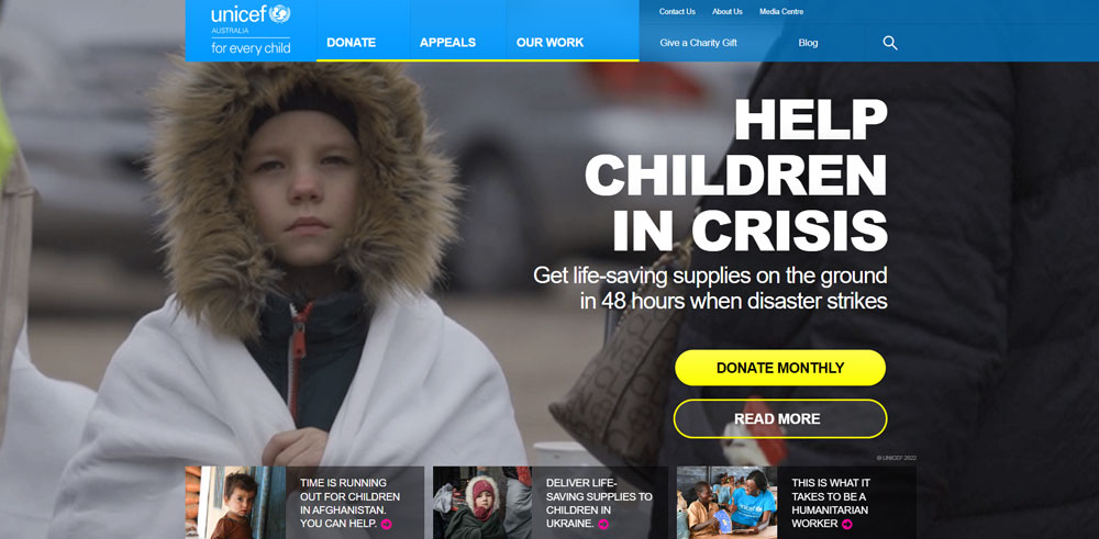
Authentic photography from the field outperforms polished stock images. Video testimonials from beneficiaries build emotional connections that text alone cannot create.
Embedding video on landing pages increases time on page and donation likelihood. Just make sure the files are optimized so they do not tank your load speed.
How Do Data Visualizations Show Charity Impact to Donors
Interactive maps showing project locations, progress bars tracking campaign goals, and infographics summarizing annual impact all give donors concrete proof their money is working.
UNICEF and Doctors Without Borders both use data visualization dashboards on their sites. It turns abstract numbers into something a visitor can actually understand in seconds, which is the whole point of good UI design on a nonprofit site.
FAQ on Charity Website Design
What makes a good charity website design?
A good charity website design combines clear navigation, a visible donation button, authentic photography, fast load times, and mobile responsiveness. Trust signals like Charity Navigator badges and transparent financial reporting build donor confidence and increase online giving conversions.
What are the best charity website design examples?
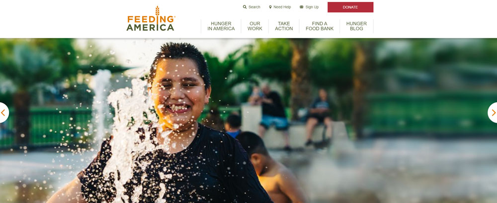
charity: water, Red Cross, WWF, WaterAid, Feeding America, Battersea, Malala Fund, and PEN America rank among the best. Each nonprofit website excels at donation flow, visual storytelling, and mission clarity across desktop and mobile devices.
How much does it cost to build a charity website?
Template-based charity sites using WordPress or Squarespace cost $500 to $5,000. Custom builds from agencies like Kanopi Studios range from $15,000 to $100,000+. Budget depends on donation platform integrations, CMS choice, and design complexity.
What CMS platform is best for nonprofit websites?
WordPress is the most popular CMS for nonprofits because of plugins like GiveWP and Donorbox. Squarespace works for smaller charities needing quick setup. Drupal suits large organizations with complex content and donor management requirements.
How should a charity donation page be designed?
Use preset giving amounts, a single-page form layout, and recurring donation options shown by default. Include impact context next to each amount. Platforms like Stripe, Funraise, and PayPal Giving Fund reduce friction and speed up checkout.
Why is mobile design important for charity websites?
Over 50% of nonprofit website traffic comes from mobile devices. A significant portion of online donations also happens on phones. Donation forms need large tap targets, single-column layouts, and Apple Pay or Google Pay integration.
What accessibility standards should charity websites follow?
WCAG 2.1 Level AA is the target standard. Focus on proper color contrast, semantic HTML, keyboard navigation, and labeled form fields. Accessible design makes sure people with disabilities can browse content and complete donations without barriers.
How does visual storytelling improve charity websites?
Authentic photography and video testimonials from beneficiaries create emotional connections that static text cannot. Organizations like WaterAid and UNICEF use hero videos and impact data together to increase donor engagement and time spent on page.
What trust signals should a nonprofit website display?
Charity Navigator ratings, GuideStar seals, Better Business Bureau accreditation, and published annual reports. Place these near the donation form, not hidden on an About page. Third-party verification directly reduces donor hesitation at the point of giving.
How often should a charity redesign its website?
Most nonprofits redesign every 2 to 3 years. The Nonprofit Tech for Good report shows 68% of charities have redesigned within the past three years. Regular updates to content, speed optimization, and donation tools matter more than full visual overhauls.
Conclusion
The charity website design examples covered here share a common thread. They prioritize the donor experience over flashy visuals, and they back up their missions with transparent data and accessible design.
Whether you build on WordPress with GiveWP or invest in a custom platform with Salesforce Nonprofit Cloud integration, the fundamentals stay the same. Clear donation forms, WCAG-compliant accessibility, fast page speed, and authentic impact storytelling.
Start with your donation flow and work outward. Get the giving experience right on mobile first, add trust badges from Charity Navigator or GuideStar near the form, and use real photography instead of stock images.
Your nonprofit website is your primary fundraising tool now. Treat it like one.


