


How to Embed Google Reviews on Your Website
February 28, 2026
WordPress Briefly Unavailable for Scheduled Maintenance (Solved)
March 2, 2026Your cosmetics website has about three seconds to convince someone to stay. That's not a lot of time.
The beauty e-commerce market is projected to hit $677 billion in revenue by 2025, and competition for that attention is brutal. A weak site loses customers to brands that got the design right.
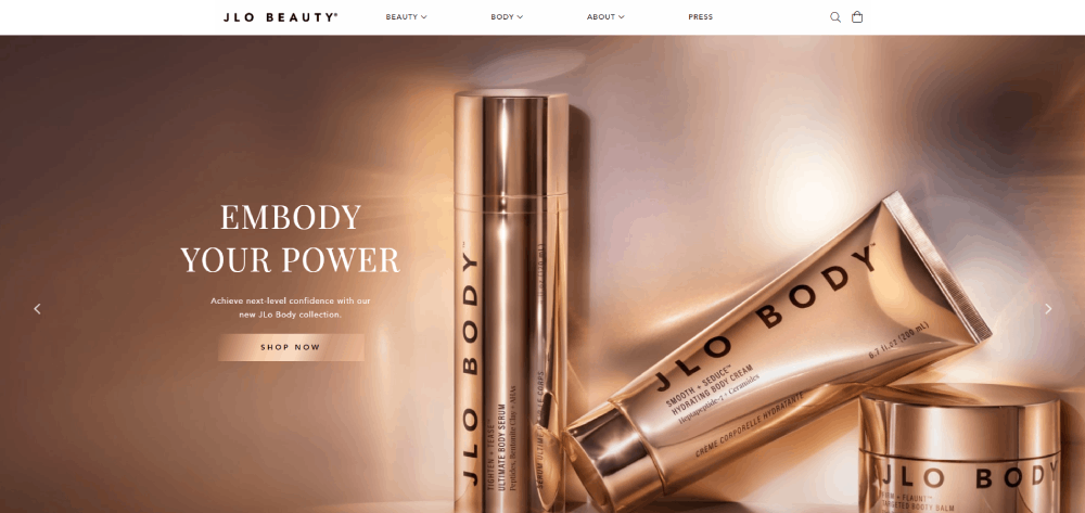
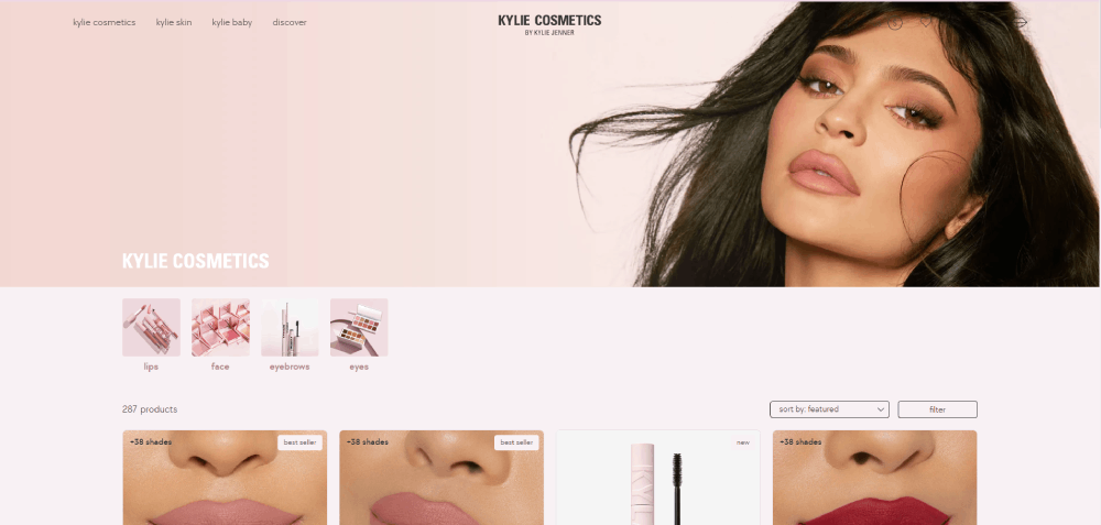
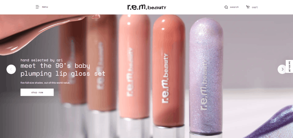
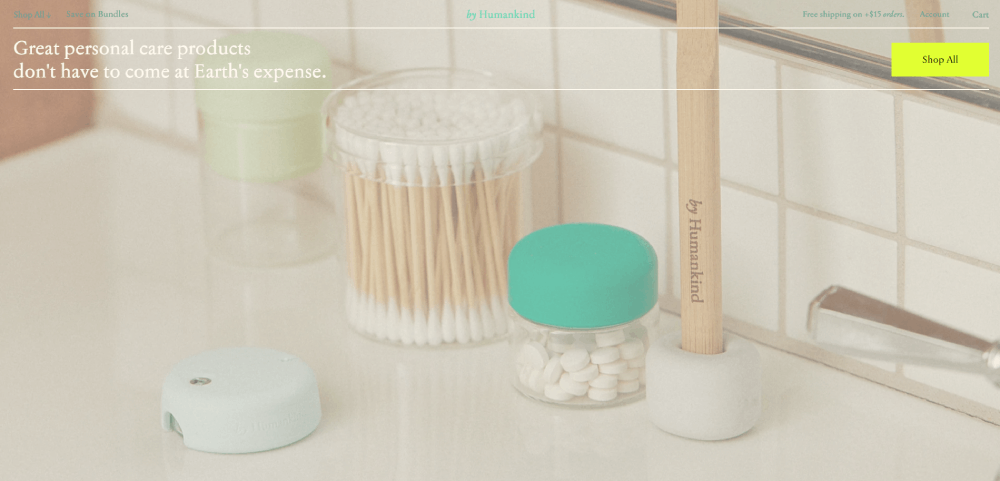
These cosmetics website design examples cover the full spectrum, from luxury brands like La Mer and Charlotte Tilbury to indie DTC brands like Glossier and Fenty Beauty, skincare-focused sites, mobile design patterns, and the platforms behind it all.
By the end, you'll know exactly what separates a beauty site that converts from one that doesn't.
What Is Cosmetics Website Design
Cosmetics website design is the set of visual, structural, and UX decisions built specifically for beauty and personal care brands selling online.
It's different from generic e-commerce design. A clothing site needs to show fit. A tech site needs to explain specs. A cosmetics site has to make someone feel something about a product they can't touch, smell, or test on their skin.
That's the core challenge. And it shapes every decision from layout to typography to checkout flow.
What separates cosmetics web design from standard e-commerce
Sensory suggestion is the whole game. Since shoppers can't physically test a lipstick shade or smell a serum, the design has to compensate. High-resolution imagery, color accuracy, lifestyle photography, and shade swatches all do work that product specs alone can't.
The core components that make or break a cosmetics site:
- Color palette (must match the brand's emotional register, not just look good on screen)
- Typography that signals either clinical precision or editorial warmth
- Product photography style, from flat lay to editorial to skin-close texture shots
- Navigation structure, because beauty brands often have hundreds of SKUs across categories
- Conversion flow, from product discovery through checkout
Most cosmetics brands build on Shopify Plus or Magento. Smaller indie brands often use Webflow or WooCommerce. The platform choice affects what's possible at the design level, especially around shade selectors, quiz tools, and personalization.
Why the beauty category has its own design rules
The global beauty and personal care market is projected to hit $677 billion in revenue by 2025, according to Statista. Online sales are expected to account for 38.4% of that.
That volume means competition is brutal. A well-designed cosmetics site isn't a nice-to-have. It's the primary differentiator for brands that don't have a physical retail footprint.
Beauty and personal care sites also convert at a higher rate than most e-commerce categories. Oberlo data puts the sector's average conversion rate at 4.55%, above the overall e-commerce average of 3%. Good cosmetics website design is part of why.
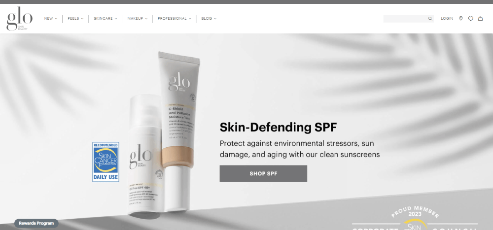
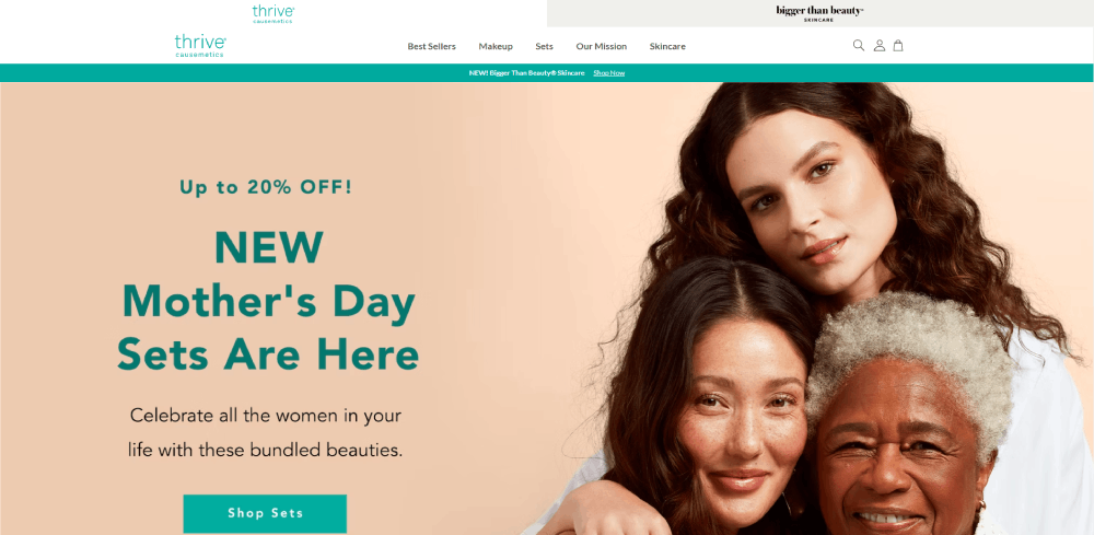
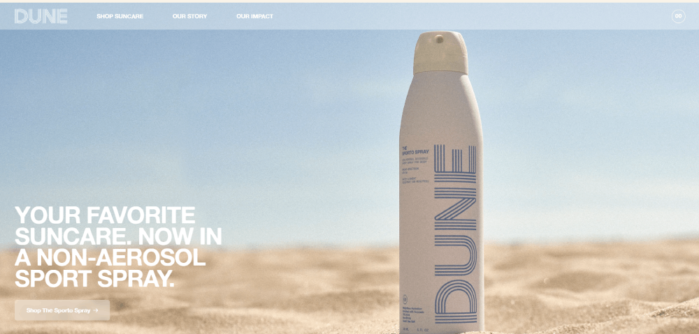
Cosmetics Website Design Examples
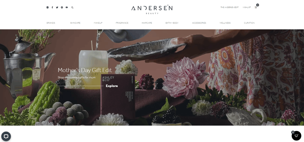
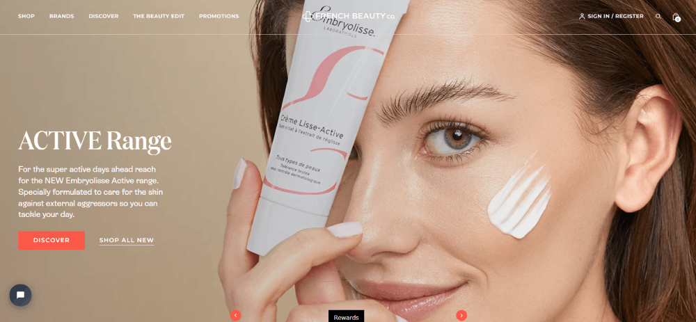
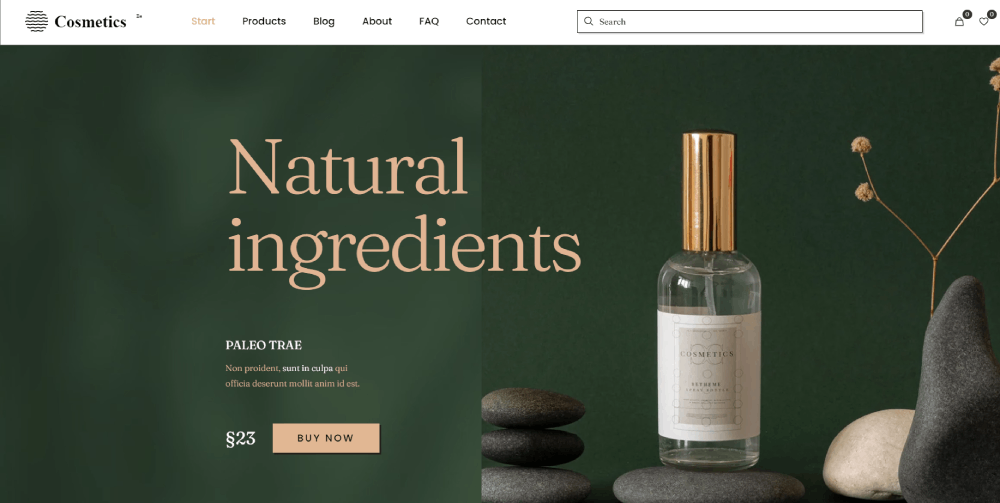
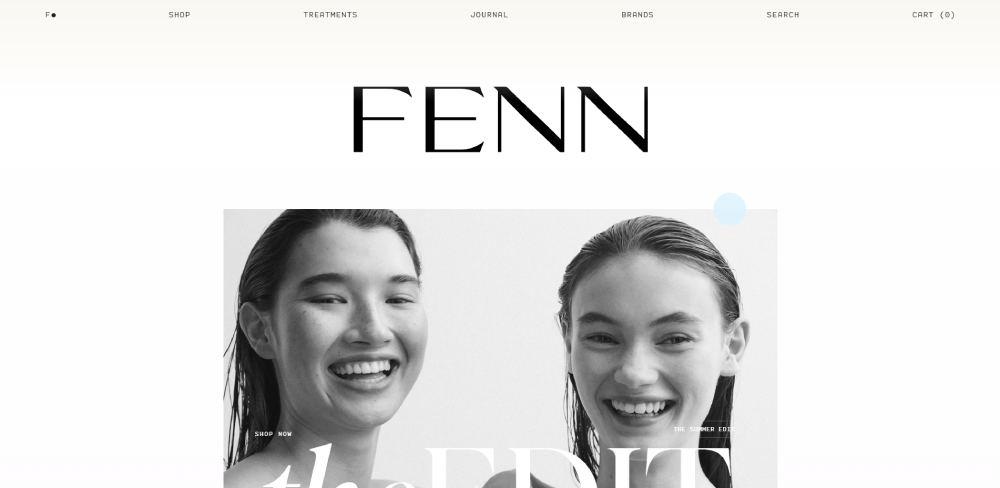
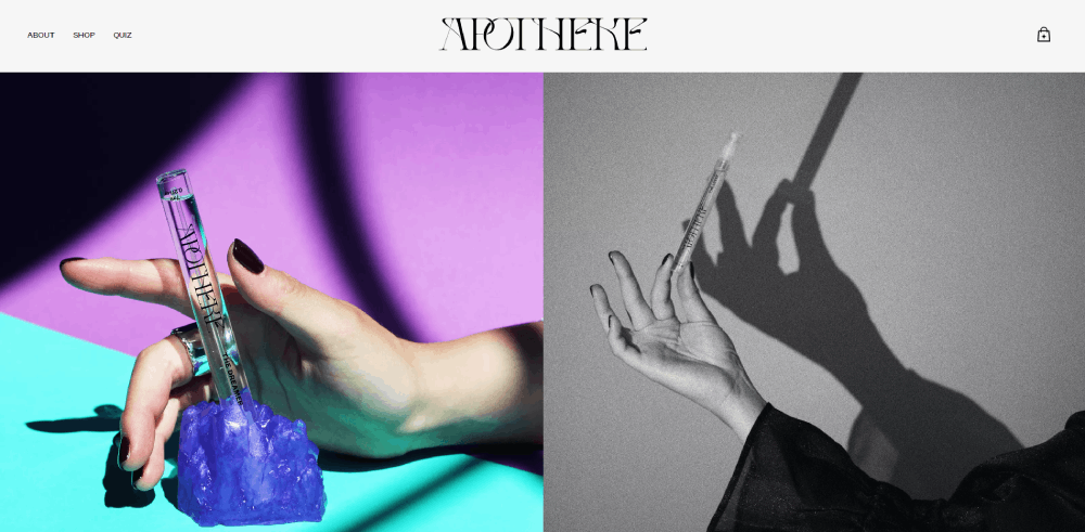
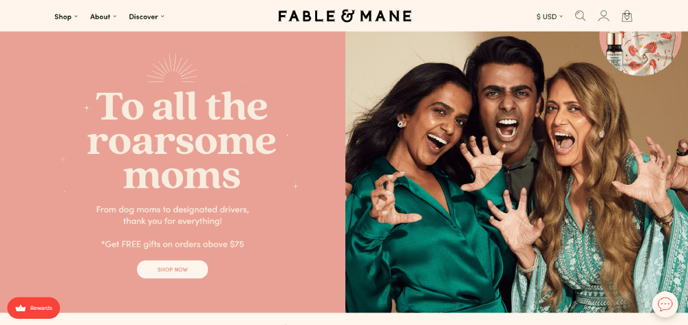
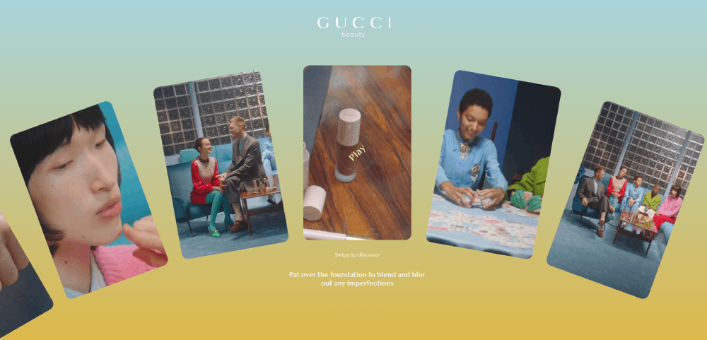
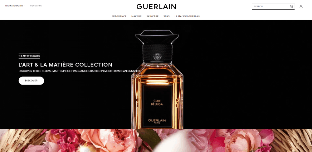
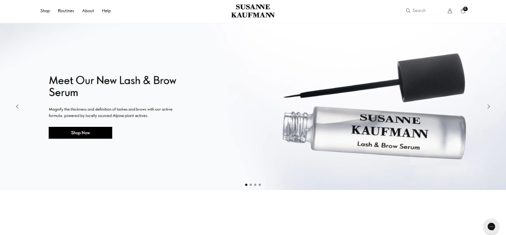
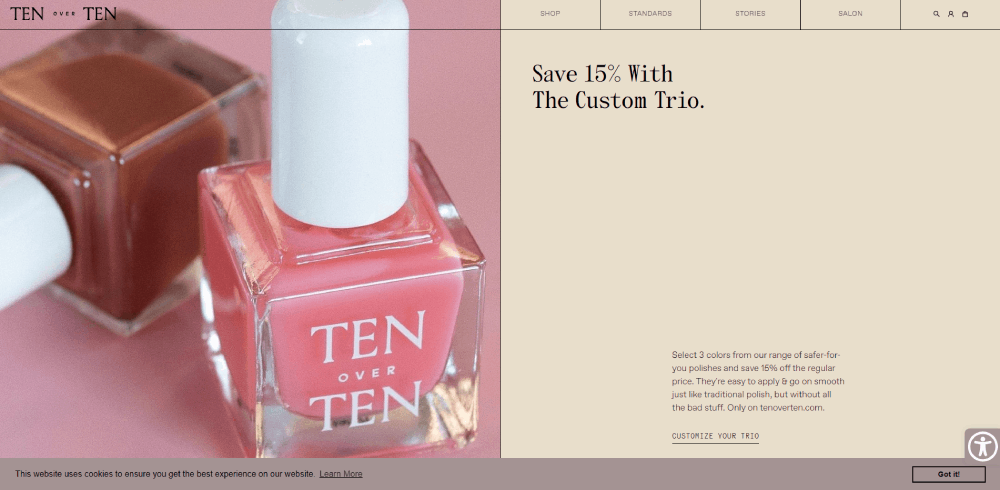
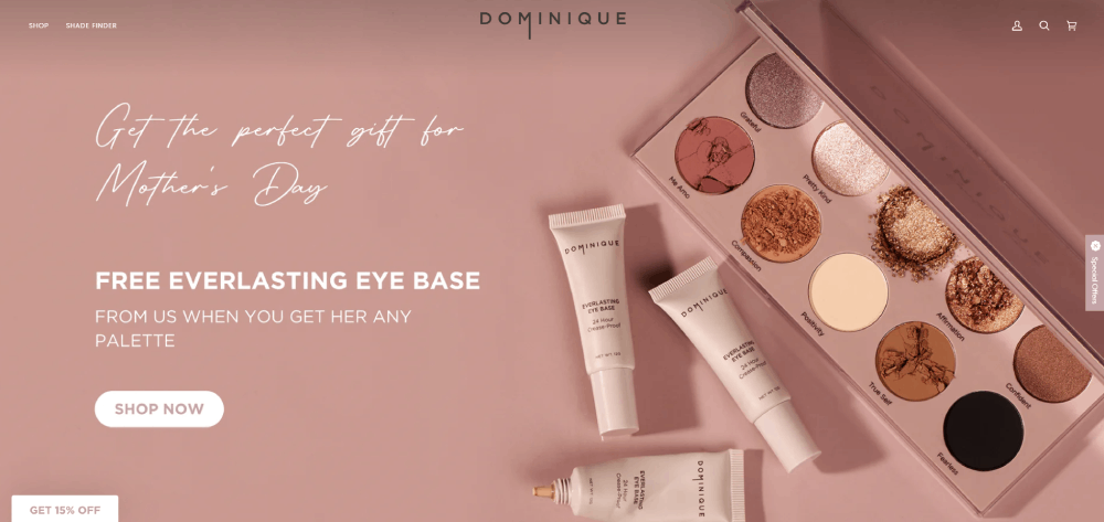
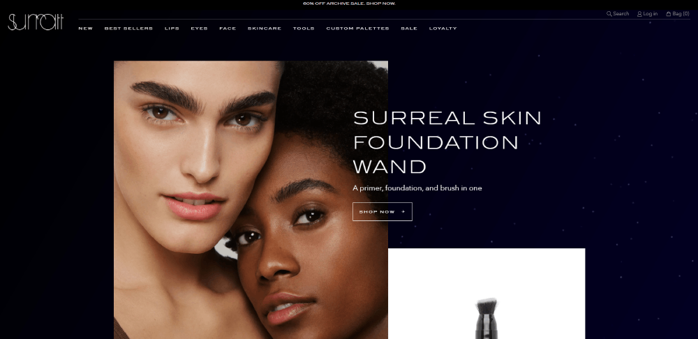
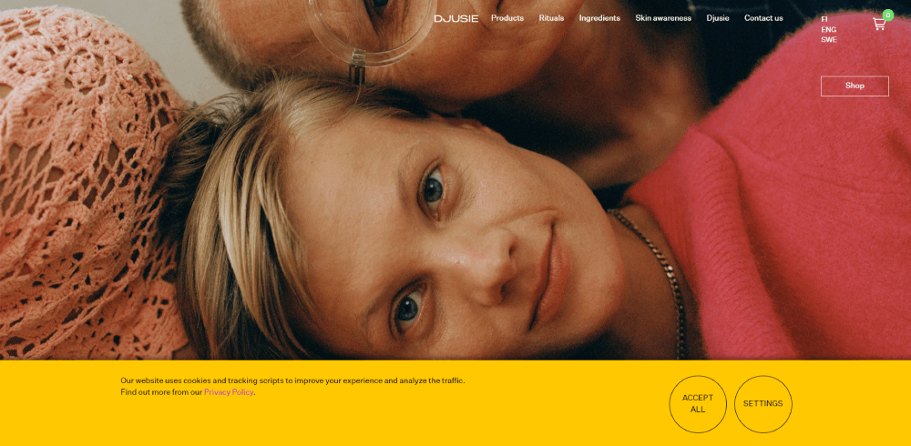
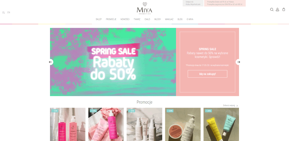
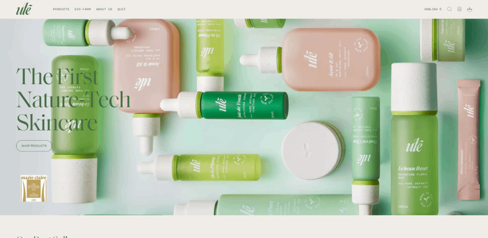
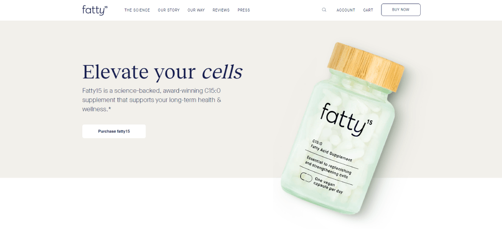
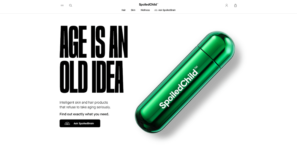
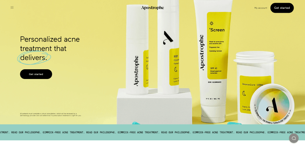
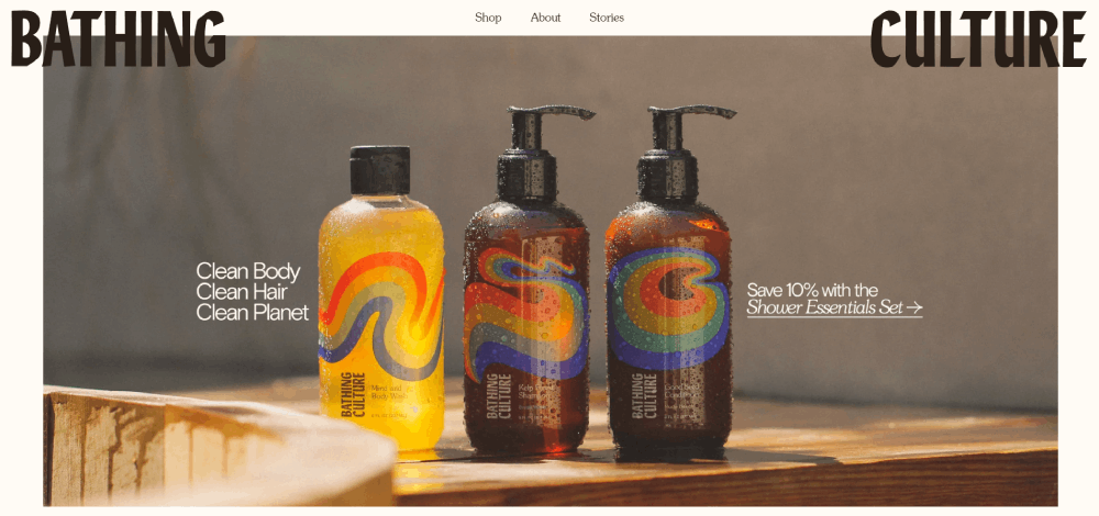
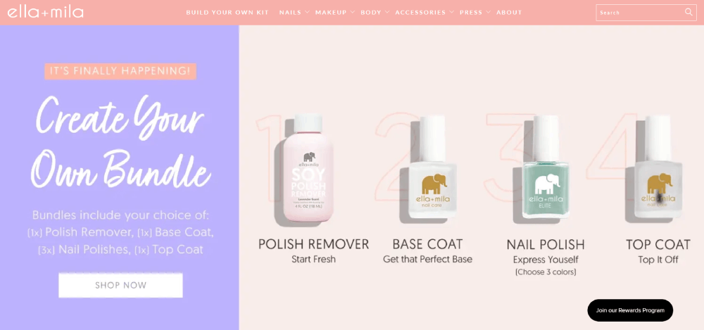
Andersen Beauty


What Makes a Cosmetics Website Design Effective
There's a gap between cosmetics sites that look good and ones that actually perform. The best ones do both, but they get to "perform" first.
Salesforce Research data shows the global cosmetics e-commerce conversion rate peaked at 3.3% in Q4 2023 before settling at 2.3% in Q3 2024. That swing is largely design and UX-driven.
Speed and visual quality, not a tradeoff
Beauty brands often load pages with large imagery, video backgrounds, and animation. That's a real risk. A one-second delay in mobile load time can reduce conversions by 7%, and 53% of users leave if a mobile page takes more than three seconds.
The brands that solve this use:
- Next-gen image formats (WebP, AVIF) for product photos
- Lazy loading on below-the-fold content
- CDN delivery for video assets
- Compressed, optimized shade swatch thumbnails
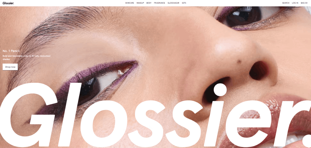
Glossier is a good example. Their site is image-heavy but loads fast because they've optimized every asset aggressively. The visual quality doesn't suffer.
Trust signals that actually do something
Reviews with shade-specific filtering convert better than generic star ratings. Shoppers buying foundation or concealer need to know how a product looks on their skin tone, not an average.
| Trust Signal | What It Does | Best Placement |
| Photo reviews | Shows real skin results and texture | Product page, below the fold |
| Shade-specific ratings | Reduces return anxiety for color matching | Shade selector area / Buy box |
| Ingredient transparency | Builds clean beauty credibility | Product description or dedicated "Ingredients" tab |
| Certifications / badges | Answers "is this safe?" fast | Header, footer, or product page (Cruelty-Free, Vegan) |
Products with 11 to 30 reviews show approximately 68% higher conversion rates than those with none, according to PowerReviews data.
Mobile-first isn't optional for beauty brands
82% of all health and beauty retail website traffic comes from mobile devices, per Digital Silk's 2024 analysis. That number is higher than nearly every other e-commerce vertical.
What that means practically:
- Shade selectors need to work cleanly on touchscreens (most don't, by default)
- Checkout needs to be three taps or fewer on mobile
- Product images must load fast without sacrificing the visual detail shoppers depend on
- Navigation menus need to be thumb-friendly, not just responsive
Mobile-friendly websites see 40% higher conversion rates than non-optimized ones, according to Hostinger's 2024 web design statistics report. For beauty brands with this traffic profile, that's not a marginal improvement.
Mobile Design Patterns in Cosmetics Websites
82% of all health and beauty retail website traffic comes from mobile devices, according to Digital Silk's 2024 analysis. The mobile experience isn't a secondary consideration for cosmetics brands. It's the primary one.
Most cosmetics sites still get this wrong.
What the best mobile cosmetics sites actually do
Shade selectors on small screens are where most beauty sites fail. Tap targets too small, swatches that don't zoom properly, color names that get cut off. Fixing this alone can meaningfully improve mobile conversion.
Patterns from the best-performing mobile beauty sites:
- Sticky add-to-cart bars that stay visible during scroll
- Swipe-based product galleries instead of click-through
- One-thumb navigation, with key actions in the bottom half of the screen
- Checkout in three taps or fewer, with Apple Pay and Google Pay as primary options
11% of beauty shoppers abandon at checkout due to limited payment options, per Ringly.io's 2024 beauty ecommerce analysis.
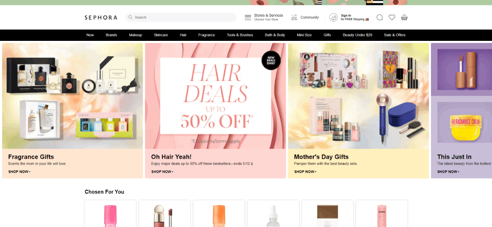
Sephora's mobile product page
Sephora's mobile product page is a good benchmark. Shade swatches load fast, expand on tap, and display the shade name clearly. Reviews include a filter for skin tone and skin type. The add-to-cart button is large and sticky.
Their Virtual Artist AR try-on tool is accessible directly from the product page on mobile. Customers who used it were 3x more likely to complete a purchase than those who didn't, according to DigitalDefynd's 2026 case study on Sephora's AI strategy.
Load speed as a design constraint
Mobile cart abandonment reached 84.8% in 2025, well above the 74.3% rate on desktop, according to Quantumrun. Screen friction and slow load are the two biggest drivers.
This makes page speed a design constraint, not a development afterthought. Image weight, animation load, and third-party script count all need to be part of the design conversation from day one. Not after launch.
The principles behind mobile first design apply here directly. Design for the phone. Let desktop be the enhancement.
Design Features That Drive Conversions on Cosmetics Sites
Some cosmetics UX features move the needle. Others just look impressive in a Figma file. The distinction matters.
Virtual try-on and AR integrations
Beauty brands using AR in the customer journey see conversion rates up to 90% higher than those who don't, according to Free Yourself's 2025 virtual try-on statistics report.
Sephora's Virtual Artist boosted conversions by 112%. L'Oréal's ModiFace integration produced a 72% conversion increase across its brand portfolio, according to Single Grain's AR case study analysis.
The two most-used integrations for cosmetics sites:
- Perfect Corp (YouCam): powers virtual try-on for lip, eye, and foundation products; app users spend 2.7x more per transaction
- ModiFace: L'Oréal's proprietary AR tech, licensed to third-party brands
Quiz-based navigation and shade finders
Product recommendation quizzes bump conversion rates from 2% to 5%, according to RevenueHunt research cited by Slider Revolution's 2024 beauty website roundup.
Well-designed quiz flows do three things at once: qualify the shopper, reduce choice overload, and increase average order value through curated recommendations.
Brands that build these well (Charlotte Tilbury, Fenty Beauty, Paula's Choice) treat the quiz as a core navigation tool, not a popup distraction.
Review display that builds confidence
Standard star ratings don't do enough work on a cosmetics product page. The review format itself is a design decision.
High-converting review layouts for beauty sites include:
- Photo reviews, sorted by skin tone or shade
- Attribute summaries (coverage, longevity, finish) as quick-scan labels
- Verified purchase badges
- Filter by skin type or concern
Platforms like Yotpo and Okendo handle this well out of the box. Both integrate cleanly with Shopify Plus and allow shade-specific filtering.
Loyalty and subscription built into the layout
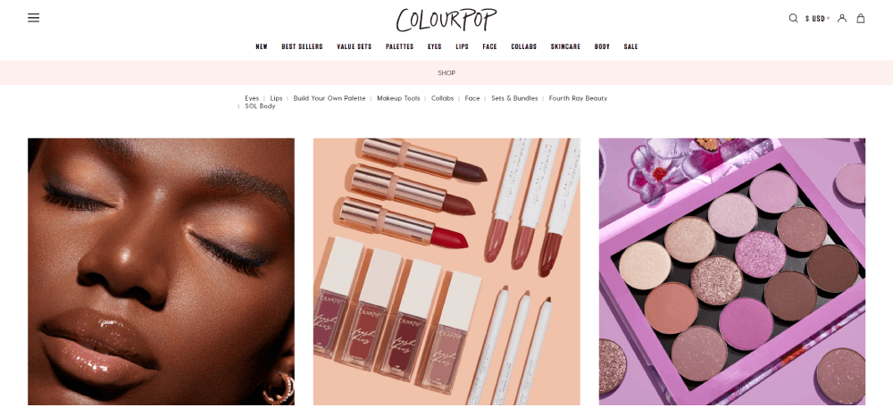
Subscription and loyalty program visibility within the product page layout (not buried in the footer) consistently lifts repeat purchase rates. Brands like ColourPop show loyalty point earning per product on the product page itself.
Tools like Klaviyo and Nosto handle the personalization layer. The design just needs to make the program visible at the moment of decision, not after checkout.
Tools and Platforms Used to Build Cosmetics Websites
The platform a beauty brand builds on affects what's possible at the design level. Shade selectors, AR integration, routine builders, and loyalty programs all behave differently depending on the technical foundation underneath.
Shopify Plus: the default for mid-to-large DTC brands
In 2024, 8,338 enterprise businesses ran their e-commerce sites on Shopify Plus, compared to 1,462 on Magento Enterprise, according to BuiltWith data cited by DataFeedWatch.
Shopify Plus is the most common choice for DTC beauty brands because:
- Launch time is fast, no server management required
- App ecosystem covers most beauty-specific needs (shade finders, subscriptions, loyalty)
- Native Shopify Payments reduces checkout friction
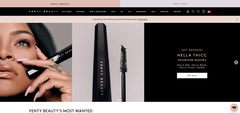
Glossier, Fenty Beauty, and Milk Makeup all run on Shopify Plus. The cosmetics website templates built for Shopify tend to reflect these brands' design patterns.
Magento / Adobe Commerce: for complex catalog management
Magento's open-source architecture gives beauty brands with large, complex product catalogs (multi-store, multi-language, wholesale tiers) more control than Shopify allows.
The tradeoff: Adobe Commerce's enterprise license starts at approximately $22,000 per year, plus development costs for customization. Maintenance requires a dedicated technical team.
It's the right call for brands with complex inventory structures or B2B components. It's overkill for most DTC beauty startups.
Design tools and third-party integrations
| Tool / Platform | Purpose | Best For |
| Figma | UI/UX prototyping | Pre-build design work, design systems |
| Webflow | No-code frontend builds | High-design indie brands, landing pages |
| Yotpo | Reviews and loyalty | Shopify Plus brands, high-trust social proof |
| Nosto | On-site personalization | Mid-to-large beauty retailers with deep catalogs |
| Klaviyo | Email and SMS flows | DTC beauty brands scaling retention |
| Perfect Corp | AR virtual try-on | Makeup, hair color, and foundation brands |
The web design tools used for prototyping and the e-commerce platform used for production are two separate decisions. Getting both right matters.
Headless commerce for brands that need custom front-ends
Some larger beauty brands, especially those running high-volume campaigns with custom interactive experiences, go headless. This decouples the frontend (built in React or similar) from the Shopify or Magento backend.
It gives designers near-total control over animation, layout, and performance. It also adds significant development complexity. Worth it for brands like Charlotte Tilbury, whose 3D virtual store experience wouldn't be achievable within standard Shopify theme constraints.
If you want to see how platform decisions shape the final design output across other site categories, the roundup of websites with good UI covers a wide range of industries worth referencing.
FAQ on Cosmetics Website Design
What makes a good cosmetics website design?
Fast load times, high-quality product photography, and a clear navigation structure. Trust signals like photo reviews and ingredient transparency matter too. The best beauty sites balance visual richness with a checkout flow that doesn't get in the way.
Which platform do most cosmetics brands use?
Shopify Plus is the most common choice for DTC beauty brands. Glossier, Fenty Beauty, and Milk Makeup all run on it. Larger brands with complex catalogs sometimes use Adobe Commerce (Magento) instead.
How important is mobile design for beauty websites?
Critical. 82% of health and beauty retail traffic comes from mobile devices. Shade selectors, fast-loading imagery, and a simplified checkout are the three areas where most cosmetics sites either win or lose on mobile.
What color palettes work best for cosmetics websites?
It depends on positioning. Luxury brands like La Mer use dark backgrounds and minimal color. Clean beauty brands like ILIA Beauty lean on muted earth tones. High-volume brands like NYX Cosmetics use bright, high-energy palettes.
Do virtual try-on features actually improve conversions?
Yes. Beauty brands using AR see conversion rates up to 90% higher than those without it. Sephora's Virtual Artist tool made customers 3x more likely to complete a purchase. The data on this is consistent across multiple case studies.
What typography works best for beauty brand websites?
Luxury brands typically use serif display fonts to signal heritage and authority. DTC and clean beauty brands lean on refined sans-serifs with generous spacing. The key is consistency across every page, not just the homepage.
How should a skincare website differ from a makeup site?
Skincare sites sell through education and trust. Ingredient transparency, routine builders, and product comparison tools matter more than lifestyle photography. The Ordinary and Paula's Choice are strong reference points for this approach.
What navigation structure works for high-SKU cosmetics brands?
A mega menu with filtering by concern, shade, or skin type handles large catalogs well. ColourPop and Sephora both use prominent search and layered filtering to keep hundreds of products discoverable without overwhelming shoppers.
How do indie beauty brands approach website design differently?
DTC brands like Glossier prioritize user-generated content, conversational copy, and community-driven layouts over polished editorial imagery. The design feels personal rather than corporate. That's intentional, and it tends to convert well with younger audiences.
What third-party tools are worth integrating into a cosmetics site?
Yotpo for photo reviews, Nosto for personalization, Klaviyo for email flows, and Perfect Corp for AR try-on are the most widely used. Each addresses a specific gap in the default Shopify Plus feature set.
Conclusion
This conclusion is for an article presenting cosmetics website design examples across luxury, DTC, skincare, and maximalist brands.
The pattern is clear: the sites that perform best aren't just visually polished. They make deliberate decisions about mobile UX, product page structure, and conversion features like shade finders and AR try-on tools.
Platform choice matters too. Whether you're building on Shopify Plus, Webflow, or Adobe Commerce, the foundation shapes what's achievable at the design level.
Brands like The Ordinary, Drunk Elephant, and Urban Decay prove there's no single formula. What works is consistency between brand identity and every design decision on the site.
Build for your beauty e-commerce audience first. Everything else follows from that.


