Stunning Marketing Website Design Examples for Inspiration
July 24, 2024
The Best Interactive Websites You Can Play Around With
July 25, 2024Dark website design examples showcase a modern approach to creating visually captivating, user-friendly interfaces. The growing trend for dark-themed websites is not just about aesthetics; it's about enhancing user experience and leveraging the emotional impact of dark color palettes. This article provides a curated list of standout dark web designs, illustrating how Adobe XD, Sketch App, and Figma templates can transform a simple concept into a stunning digital masterpiece.
Understanding the significance of dark mode UI examples and minimalist dark websites is crucial for any web designer looking to create engaging and accessible websites. Highlighting user experience dark theme and visual hierarchy in dark design principles, you'll learn how to implement dark themes effectively. With insights on dark design patterns and mood-driven web design, explore how dark web color palettes contribute to user retention.
By the end of this article, you'll see practical applications of dark design for mobile, typography in dark mode, and dark UX design through real-world dark-themed website examples. We'll dive into navigation in dark UI, branding with dark designs, and more, offering a comprehensive view of what makes these designs so compelling.
Dark Website Design Examples
Dark Dog
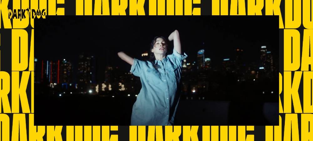
Think energy. Think dynamism. With Dark Dog, it’s not just about quenching thirst; it's a full-on life attitude.
Gitness
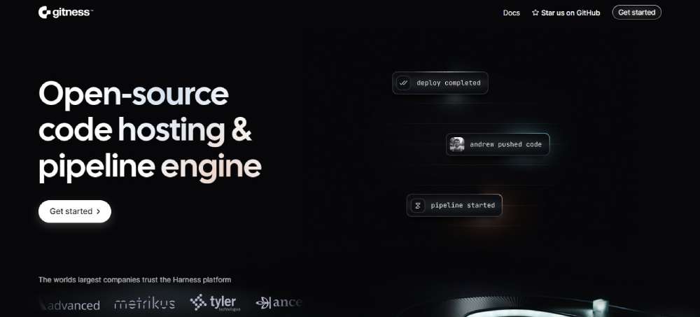
Coding got a makeover! Dive deep with Gitness. Supercharged code reviews and lightning-fast pipelines. Get onboard in a snap!
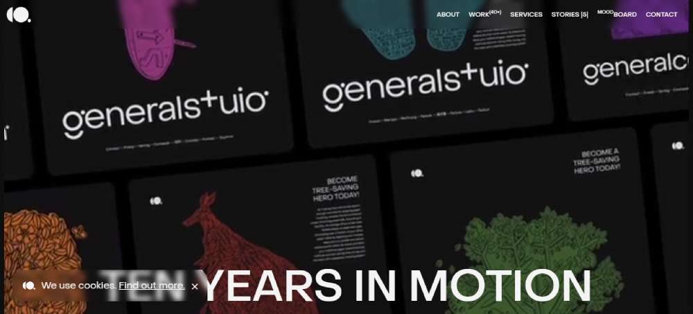
Imotion Factory
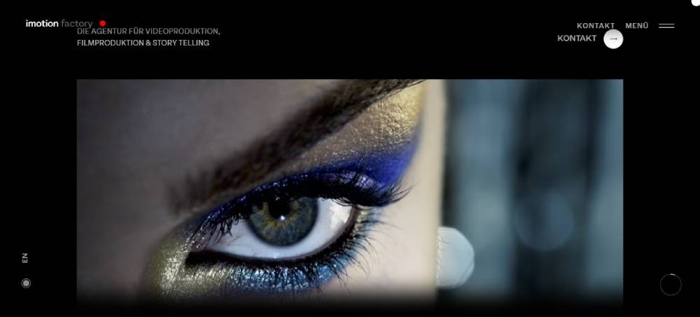
Boom! You land on their page, and it's all about the drama. Giant fonts, melting diagonal stills, and an all-black theme that’s as smooth as butter.
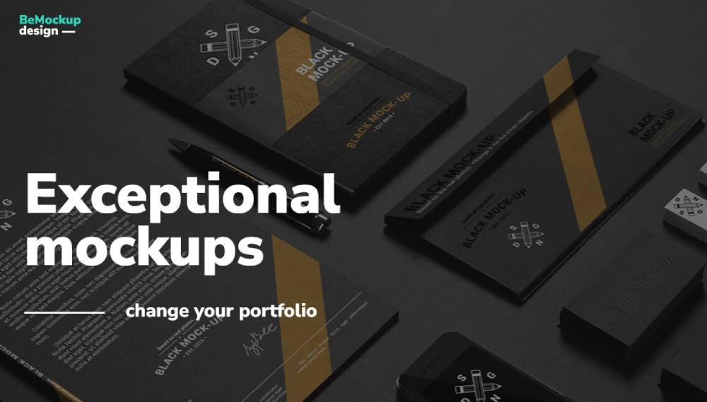
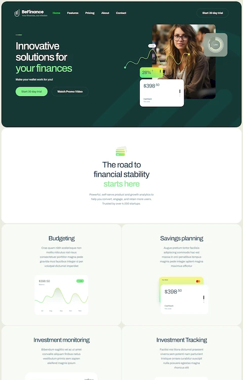
BeMockup
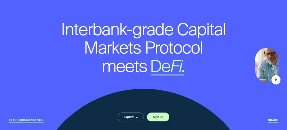
Secured Fi
The future? It’s blockchain. Secured Fi? They’re leading the charge with game-changing, crystal-clear blockchain solutions.
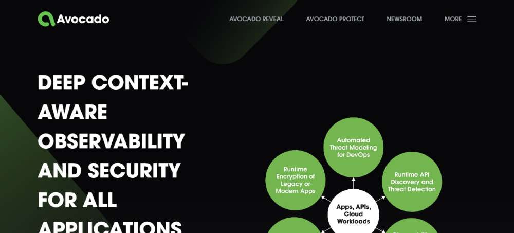
Avocado Systems
Don’t let the fruitiness fool ya. Avocado Systems means business. Their site? Dark, whimsical, and all about app security. Who knew avocados could be this techy?
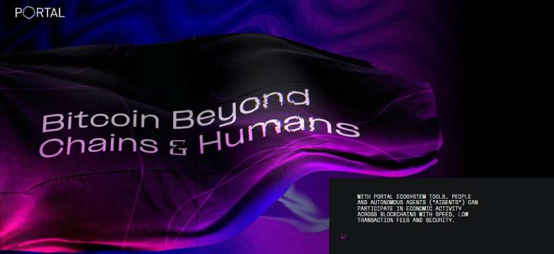
Portal Defi
A world where AI meets blockchain. Portal Ecosystem? It's the place where everyone, even robots, gets in on the action without the pesky fees.
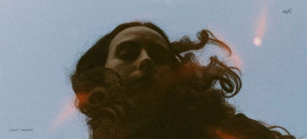
The Moody Doula
Elegance. Simplicity. The Moody Doula site is a dream. Dive into Rachel’s world where she’s guiding peeps through the beautiful journey of birth in the rainy city of Seattle.
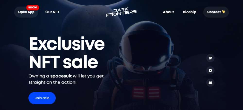
DARK FRONTIERS NFT
Into the artsy side of the web? Dive into this 3D world with a stash of unique NFTs that'll leave you starry-eyed.
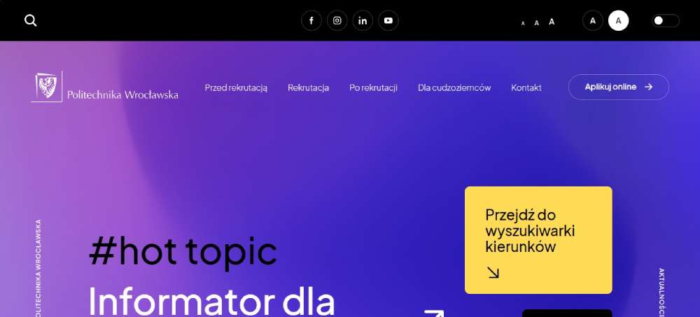
Wroclaw University of Technology - Recruitment
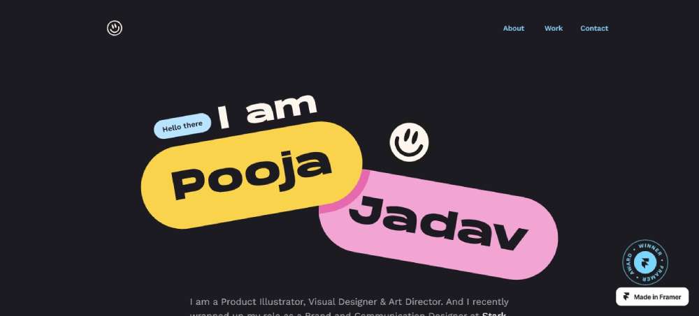
Straight out the gate, we got Pooja. She's the Picasso of brand stories. Dive into her world of Product Illustration, Visual Design, and watch out – she’s been rocking the Brand and Communication scene at Stark too.
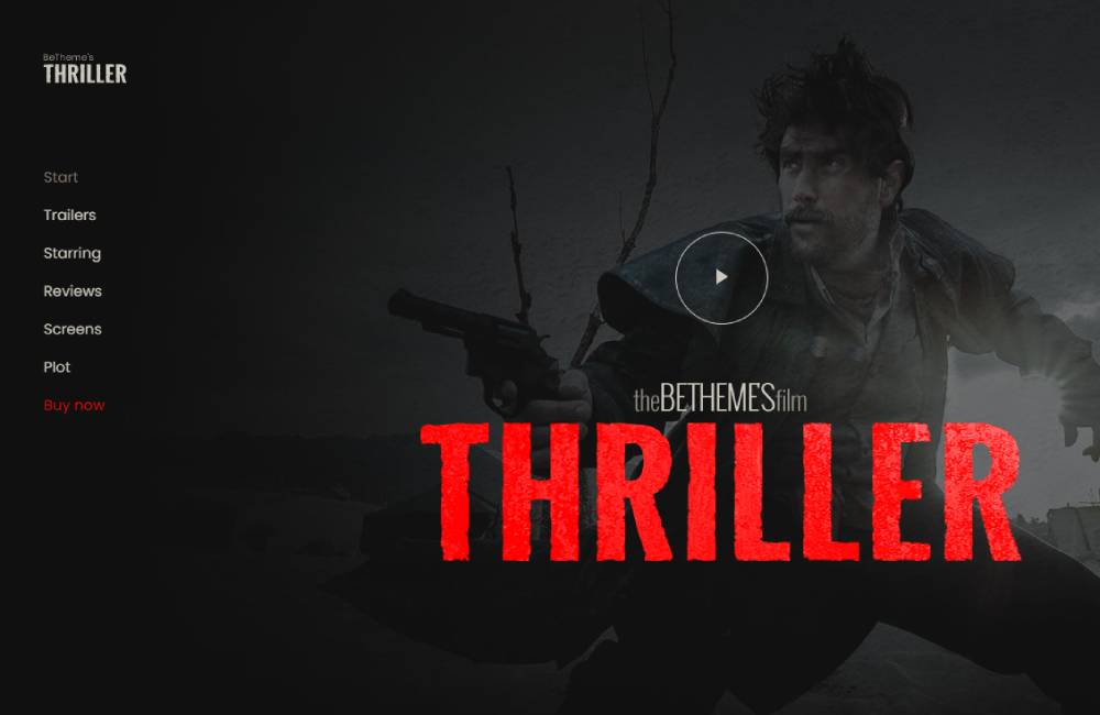
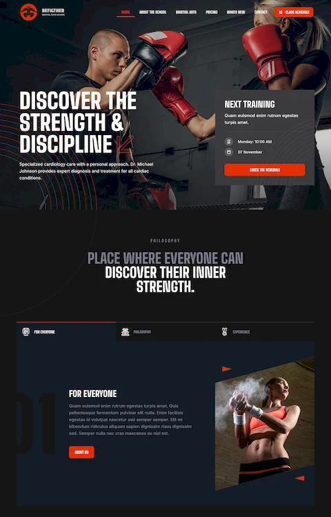
BeThriller
Angelina Swann
Straight out the gate, we got Pooja. She's the Picasso of brand stories. Dive into her world of Product Illustration, Visual Design, and watch out – she’s been rocking the Brand and Communication scene at Stark too.
Angelina Swann
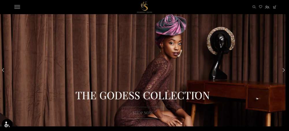
Angelina’s space? Pure luxe. The dark vibes, the pop of white and gold text, the high-fashion shots? All screams "I've got the sauce."
Olliepop Art
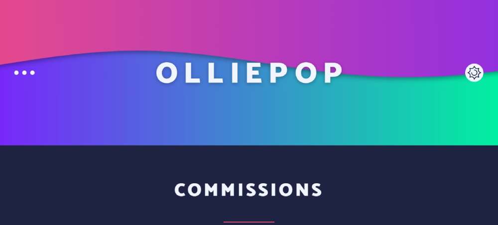
Jump in and BAM – you're greeted by a dark mode playground. Olliepop showcases those fun illustrations with cool fonts and colors that pop against a moodier backdrop.
LVCIDIA
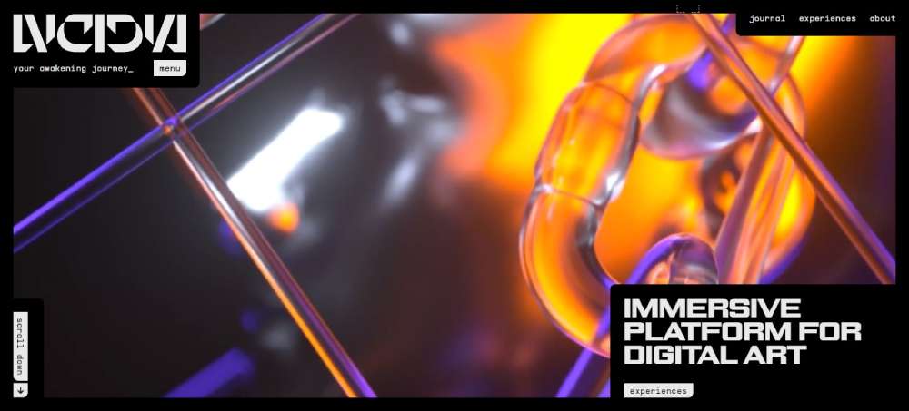
Digital art’s new home. Dive into a world where art goes virtual.
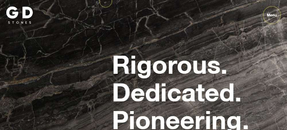
GD Stones
Enter GD Stones and it’s like stepping into a posh, marble-walled room. Bluestone98 took the dark theme and made it rock. Literally. With bold white and yellow text? Pure genius.
BePersonaltrainer3
Mars Rejects
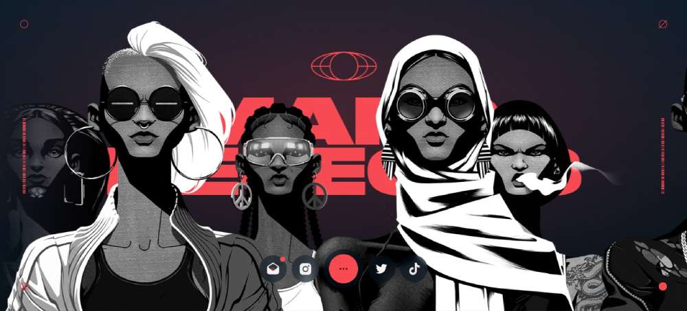
Comics. NFTs. A universe crafted by its peeps. Mars Rejects brings a stellar (pun intended) experience.
General Condition
This site? It’s like a party. First impression is wild creativity, but as you keep scrolling, the black and white content keeps you hooked. They’ve got animations, pics, the works.
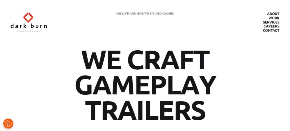
Dark Burn
These guys? Top tier. Crafting trailers for the hottest video games. If you game, you probably saw their magic.
KBI Digital
Monochrome magic. The black and white aesthetic? Spot on. Sliding pics give it that authentic vibe. Trust = earned.
Astro
Wanna build? Astro’s got you. From content sites to dynamic server APIs – it's like a web Swiss army knife.
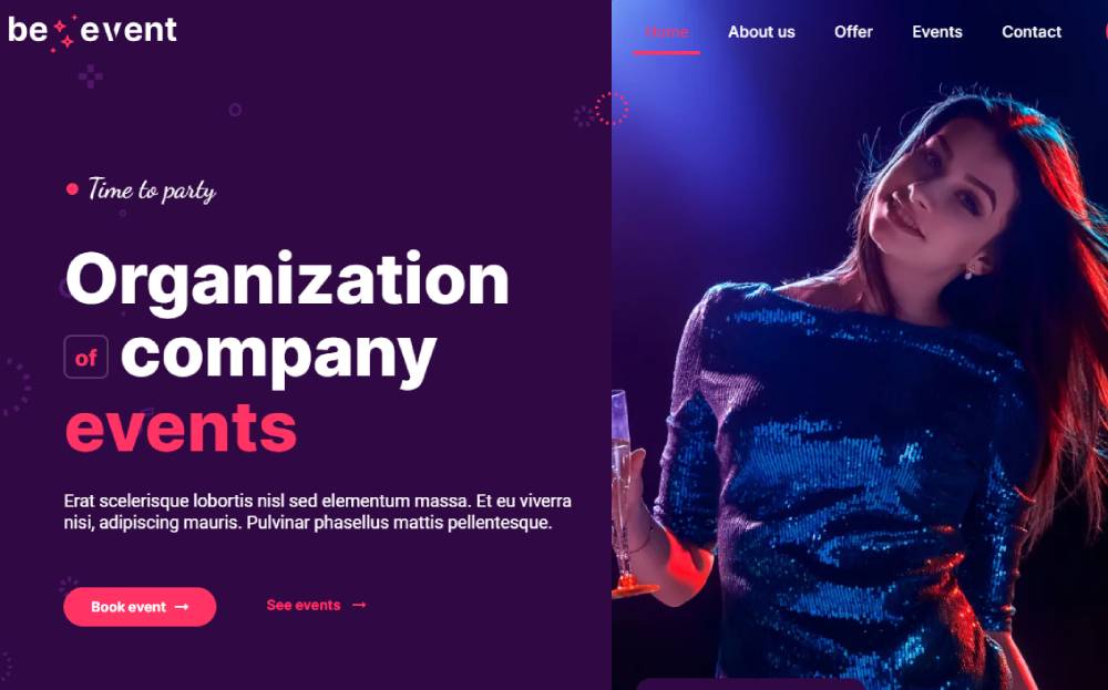
BeEvent
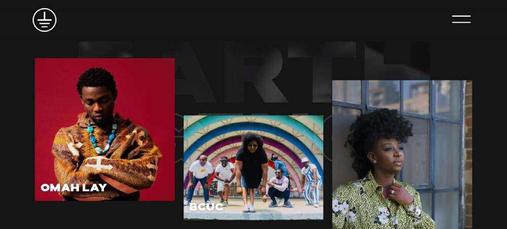
Earth Agency
Music lovers, heads up! Earth Agency is in the house. With a killer roster of artists, they got that modern web face-lift to stay fresh.
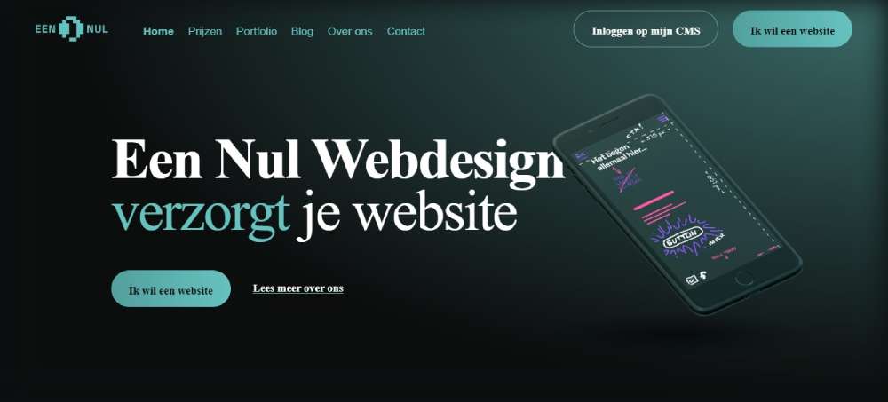
Een Nul
Bold. Dutch. Not-so-basic. Een Nul’s site is a journey with quirky animations and wicked custom illustrations.
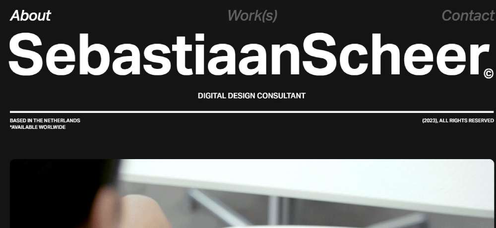
Sebastiaan Scheer
Need a digital design consultant? Meet Sebastiaan. Helping businesses gear up, streamline, and make that jump into the future.
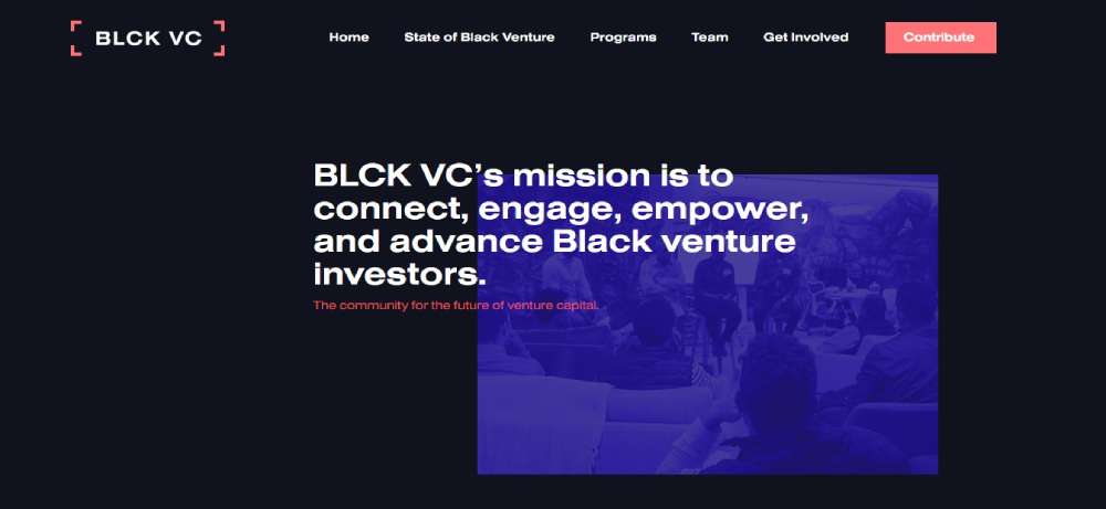
BLCK VC
Bold words. Dark backgrounds. Sliding into different hues with compelling content. It’s all about the emphasis, and they nailed it.
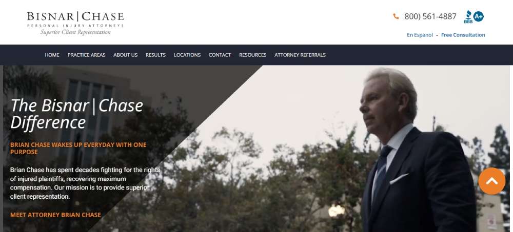
BISNAR CHASE
The OGs of personal injury law in Cali, especially when stuff gets dangerously wonky.
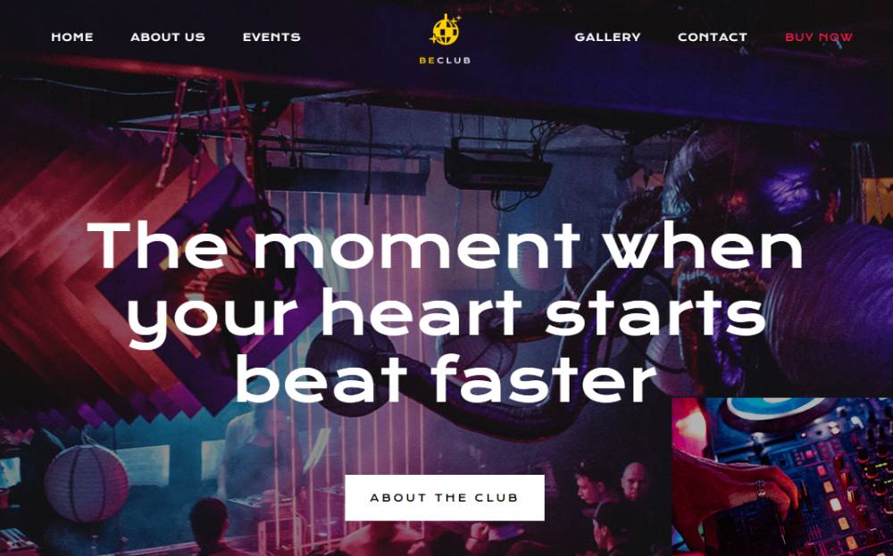
BeClub3
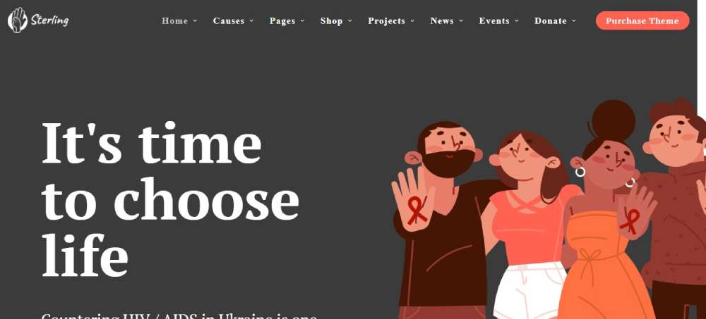
Sterling
Sterling's site? It's like a fashion runway. Flashing pics of folks that just draw you in. And that font? Dang! It's like it's yelling, "Yo, got something cool here!"
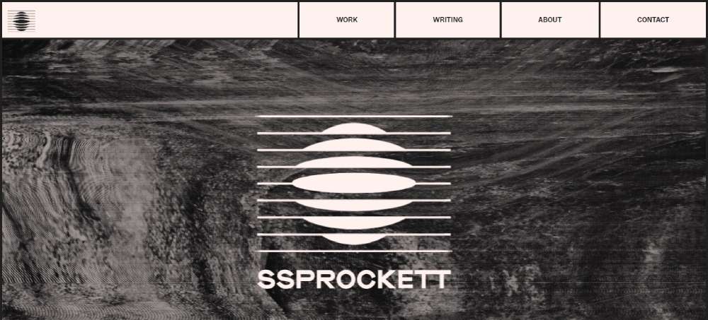
Sprockett
Ever heard of Shawn Sprockett? Well, his digital hangout spot is where ideas and dope designs collide. Teacher by day, designer by... also day? Cool beans.
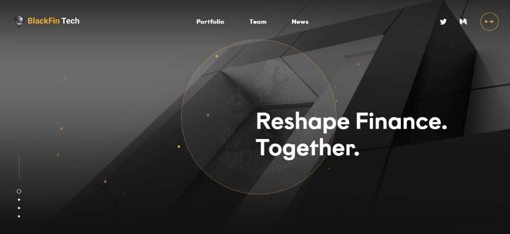
BlackFin Tech
This site is vibing in the dark, but then BAM! Hits you with the warm yellow hues. It's like chilling in a cozy cave with a warm fire. Inviting, right?
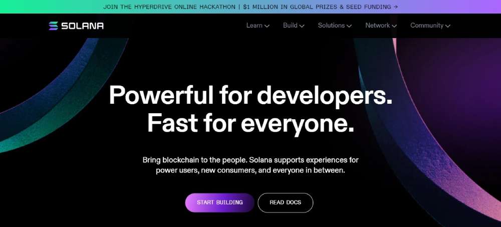
Solana
It’s like the superhero hub of blockchain. Solana's got the tools for the tech nerds, the newbies, and everyone in between.
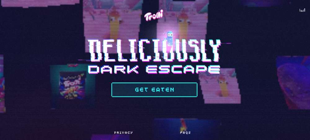
Deliciously Dark Escape
Partnered up with Trolli for this one. Dive deep into glowing pixel art worlds. Oh, and try not to get munched on!
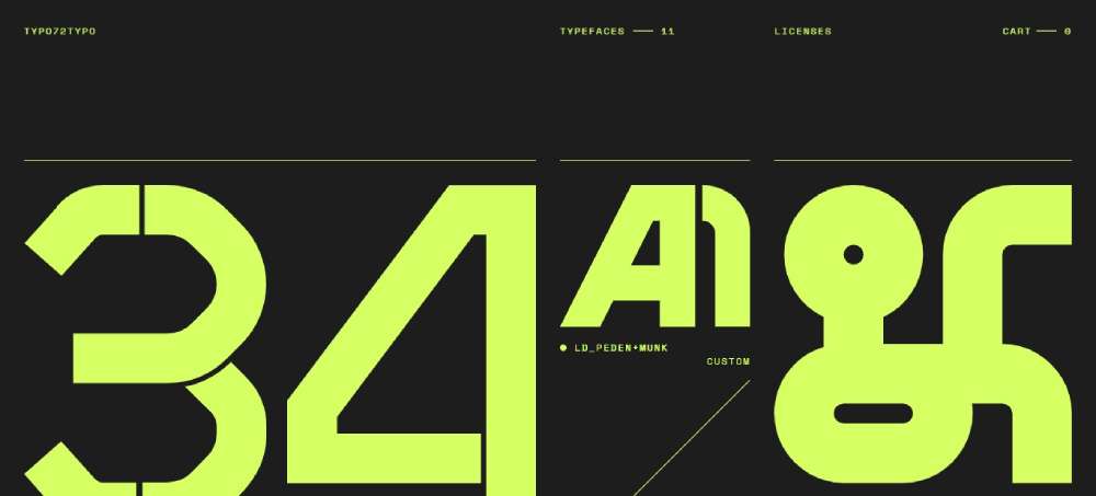
T72T
Some next-level display type magic from T72T, brought to you by the squad at Lundqvist & Dallyn.
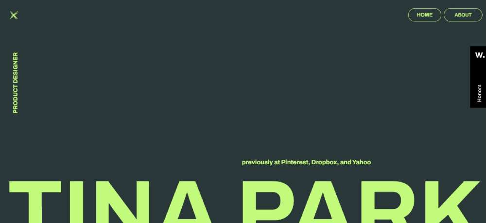
Tina Park
Meet Tina, the boss lady of Product Design. She's done stints at the big leagues like Pinterest and Dropbox. Big rep!
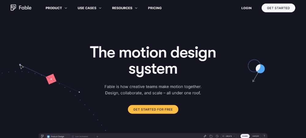
Fable
Motion design's newest playground. It's where creative minds collab and scale things up, all in one space.
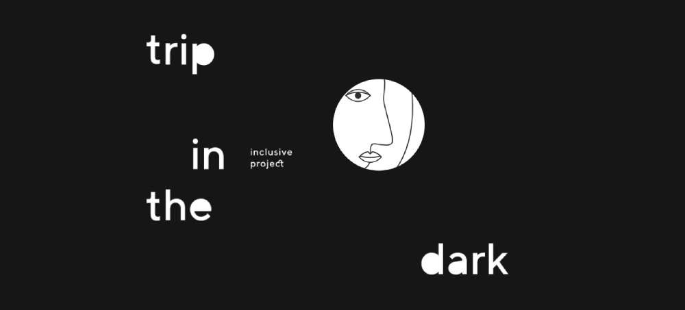
TRIP IN THE DARK
Get lost in the sonic journey with Vladimir, a blind guide. Listen, explore, and craft your own soundscapes.
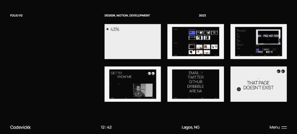
Victor Adeniji
Victor's the man crafting wicked web experiences outta Lagos. Passion drips from his designs. Plus, he's on the Awwwards young jury. Legit!
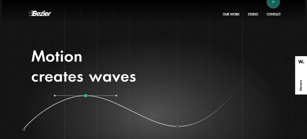
BEZIER ANIMATION STUDIO
These folks? All about that animated magic. Dive into their dark site and get mesmerized by their animated prowess.
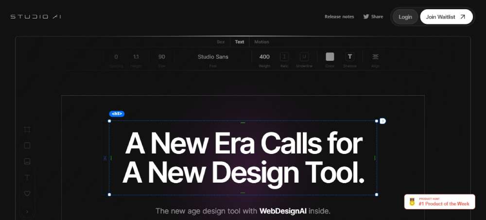
STUDIO AI
AI meets web design. It's like your design buddy that gets you, learns, and whips up live sites. Wild, huh?
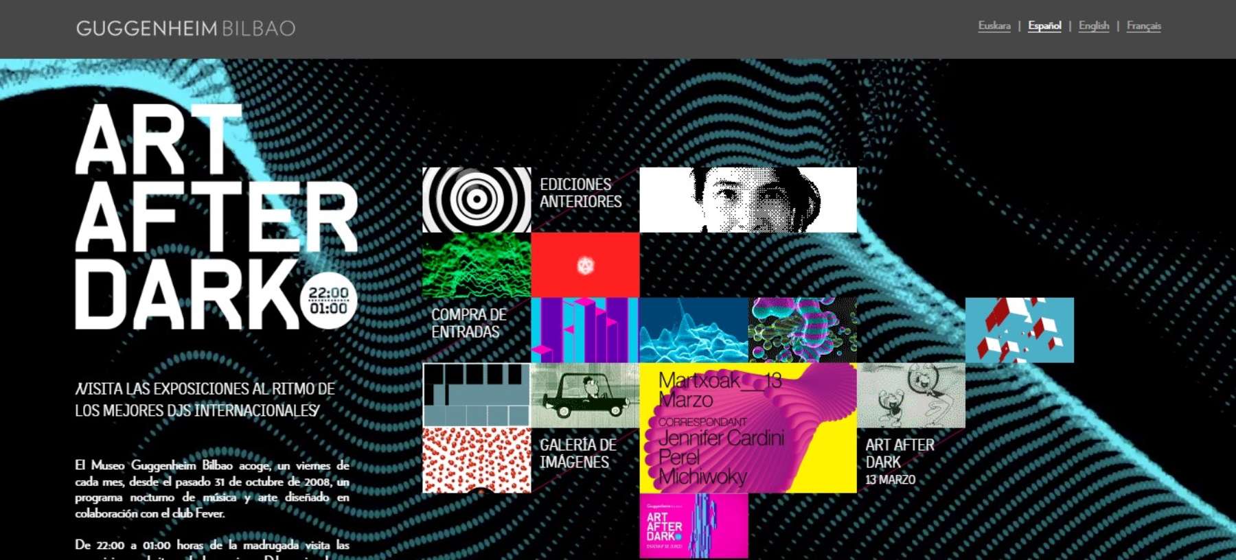
Art After Dark
One Friday each month, the Guggenheim in Bilbao throws a banging art and music bash. And their site? All the deets you need.
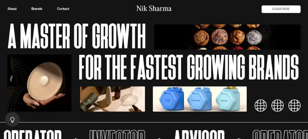
Nik Sharma
Meet Nik - your go-to guru for all things growth and optimization. Guy's got mad marketing skills for those skyrocketing brands.
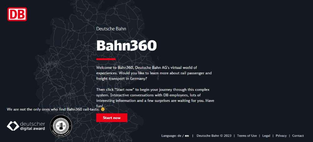
Bahn360
Keen on the railway universe in Germany? Bahn360's your virtual passport. It’s like a real-life metaverse, but with trains!
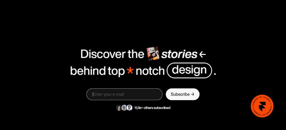
Off-Grid
Ever wonder how epic designs are born? Off-Grid’s your backstage pass to the design world.
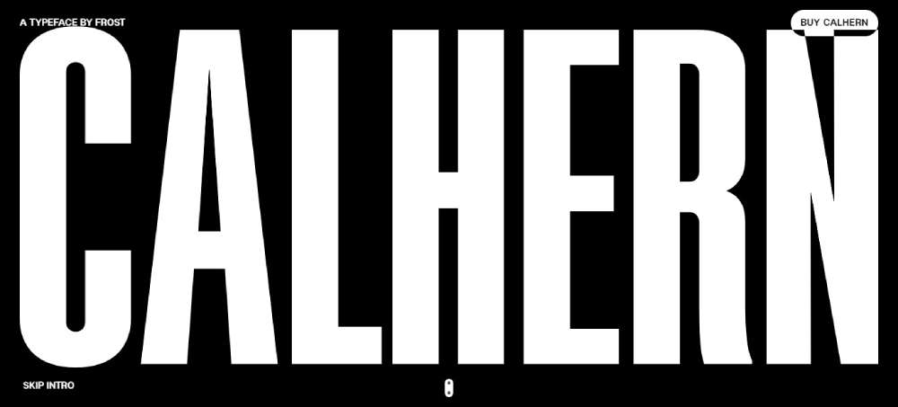
Calhern
Calhern's your typographic chameleon. From movie-like extremes to different vibes, all under one roof at FROST.
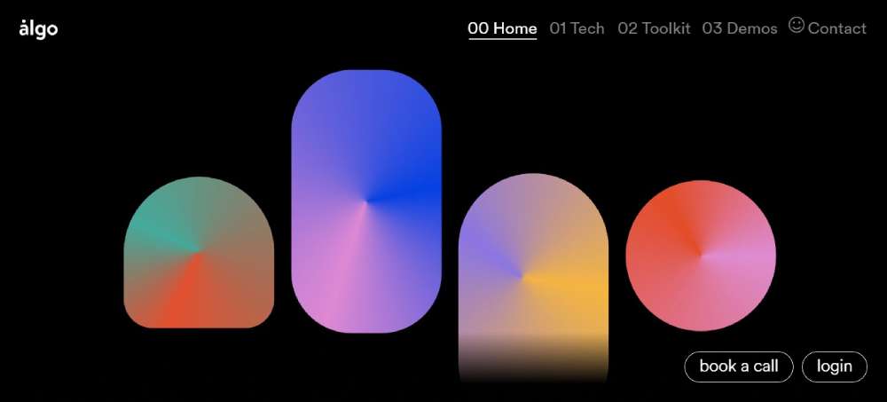
Algo
Algo's doing wizardry with data. Think data transforming into videos - all on auto mode. Super futuristic!
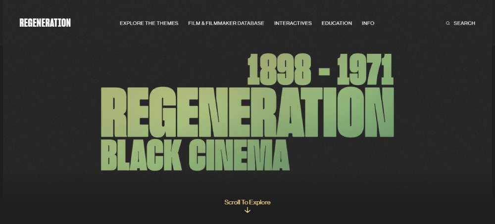
Regeneration: Black Cinema
A time capsule of black cinema from 1898-1971. Dive deep into this Academy of Motion Pictures exhibit.
Hangar Door
Hangar Door's site nails that industrial vibe. A cool steel texture backdrop, matching their door-selling mojo.
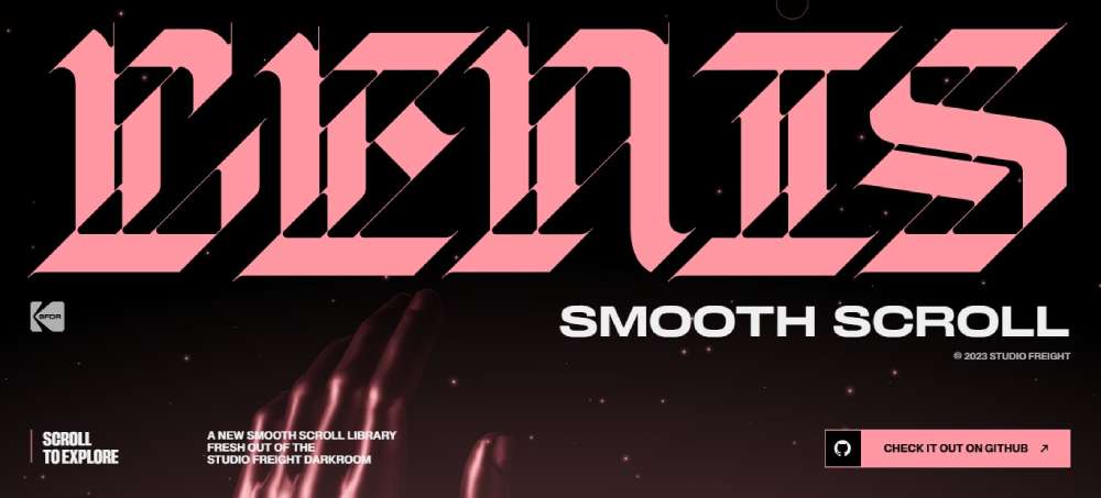
LENIS
Fresh outta Studio Freight's darkroom, LENIS offers a silky-smooth scroll library.
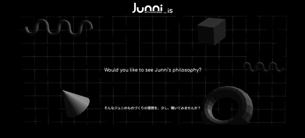
Junni
Discover Junni: Tokyo's production genius. Their site's a treat, with its own Three.js-based magic.
ABL Space Systems
Blast off to ABL’s space. A sleek, dark universe filled with rad design elements and space-age vibes.
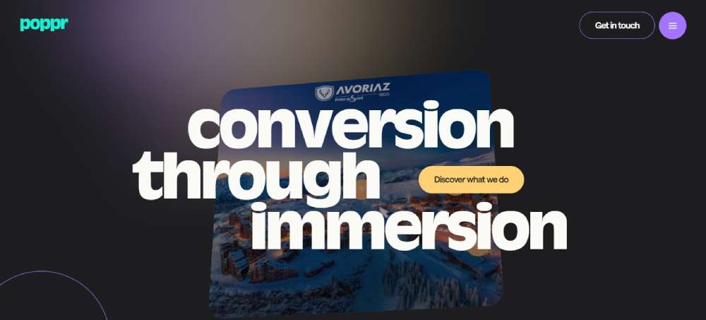
POPPR
POPPR's site? A mix of killer animations with some interactive WebGL magic.
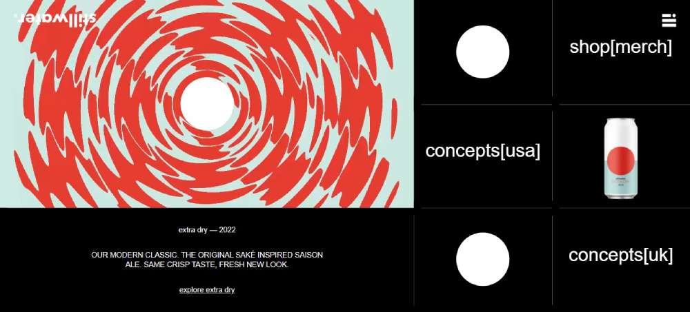
Stillwater
Stillwater rocks that minimalist aesthetic. Their carousel? Totally unique. Dares you to decide your journey.
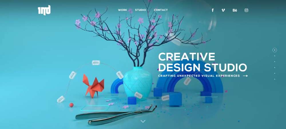
1MD
1MD keeps it clean and mean. No fluff. Just pure, focused dark design magic.
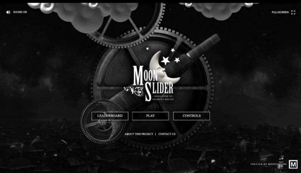
Moonslider
Game time! Moonslider's a nod to 8-bit culture. Brought to life with a dash of Construct3 and Matéo Suslu.
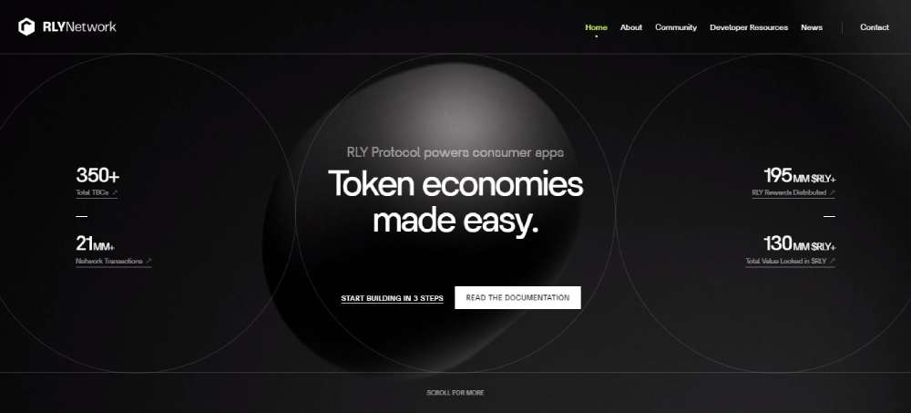
RLY Network
All about tokens? RLY’s got your back. A non-profit building the core RLY Protocol for developers to launch their token dreams.
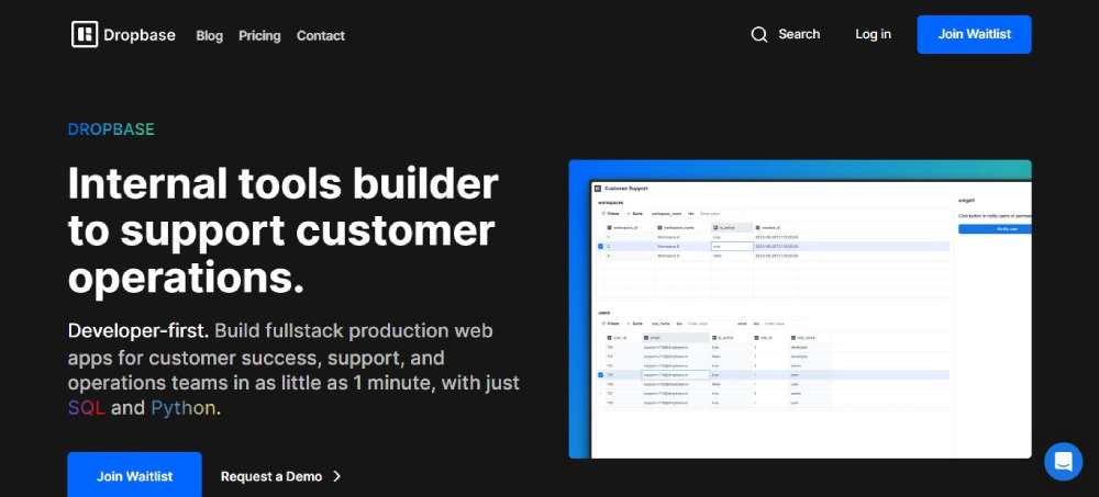
Dropbase
Ever walked into a minimalistic room and thought, "Whoa, this is so stylish!"? That's Dropbase for ya. Clean, dark, and making its product shine without the extra fluff.
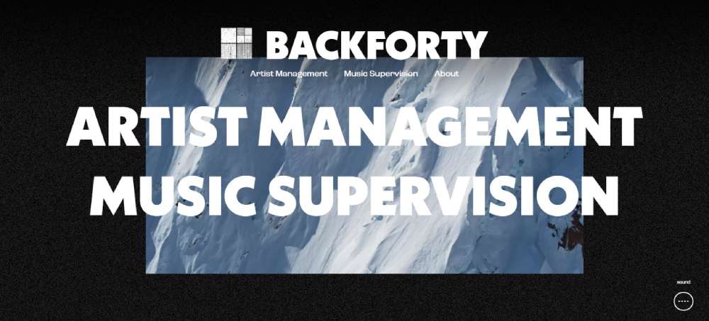
BackForty
These peeps? Music and art enthusiasts. BackForty puts the 'art' in 'artist management.' And the 'cool' in 'music supervision.' Yeah, I just said that.
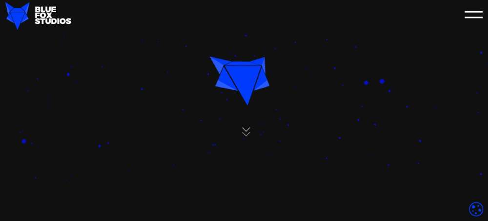
BLUE FOX STUDIOS
If you need your videos to pop, Blue Fox has got your back. Think of them as the backstage magicians - editing, grading, post-sound vibing, the whole shebang.
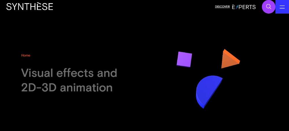
Synthese
Synthese is that effortlessly cool friend. White here, black there, and sometimes, black with a sprinkle of pizzazz. It's all about balance, and they've got it down to an art.
FAQ On Dark Themed Websites
What is dark website design?
Dark website design effectively uses dark color schemes, typically black, grey, and other deep hues, to create an elegant and modern aesthetic. It enhances readability and reduces eye strain by contrasting sharply with lighter text and elements. This design approach is popular for its sophistication and mood-driven impact.
Why choose a dark theme for a website?
A dark theme can create a visually striking and immersive experience. It's great for highlighting vibrant visuals, reducing eye strain in low-light environments, and providing a modern, sleek look. Many websites use dark themes to evoke emotion and enhance user engagement through stylish dark interfaces and high-contrast elements.
Which industries benefit most from dark website designs?
Industries engaging in creative fields like web design agencies, UI/UX design, tech (e.g., WordPress and Webflow), entertainment, and luxury goods can benefit from dark website designs. These industries leverage the sophisticated and modern appeal to present content in visually compelling ways, resonating well with their audience.
Are dark websites good for user experience?
Yes, dark websites can offer a pleasant user experience if designed with care. They should ensure good contrast, clear typography, and intuitive navigation in dark UI. Accessibility considerations, such as readability and visual hierarchy, play a significant role in enhancing ease of use and engagement in dark-themed designs.
How does dark mode affect battery life?
Dark mode can positively affect battery life, especially in devices with OLED screens. Since OLED screens light up individual pixels, using dark backgrounds consumes less power compared to lighter skins. This is a practical advantage for mobile users and contributes to user retention with dark themes.
What are some examples of successful dark website designs?
Successful examples can be found on platforms like Dribbble and Behance, showcasing creative dark web designs. Websites like Awwwards and CSS Design Awards frequently feature award-winning dark-themed websites, serving as inspiration for adopting dark mode UI examples and implementing dark design principles effectively.
What tools can help create dark-themed websites?
Tools like Adobe XD, Sketch App, and Figma are excellent for designing dark-themed websites. They offer templates, UI kits, and extensive customization options ideal for creating stunning dark interfaces. Additionally, Webflow and WordPress themes support dark mode website templates for developers.
How to optimize accessibility in dark website designs?
Accessibility in dark websites can be optimized by ensuring high contrast between text and background, using readable fonts, and providing adequate space between elements. Incorporating structured data and semantic HTML tags also aids screen readers, enhancing the overall accessibility and usability of dark-themed websites.
Are there any downsides to dark website designs?
While visually striking, dark website designs can present challenges like readability issues, requiring careful attention to typography and contrast. Poorly executed dark UX design may lead to eye strain, particularly in bright environments. Overcoming these challenges requires meticulous design and testing to ensure a pleasant user experience.
How can I implement dark mode on my website?
Implementing dark mode involves using CSS to define a dark color scheme and toggling between light and dark modes, often based on user preferences. Tools like Bootstrap Dark Mode and Elementor offer easy integration options, while frameworks like Material Design provide guidelines for creating consistent dark-themed interfaces.
Conclusion
Dark website design examples illustrate the powerful impact and versatility of dark themes in web design. These designs highlight key aspects like user experience dark theme, accessibility, and visually appealing aesthetics.
Implementing a dark theme involves understanding dark design patterns, visual hierarchy in dark design, and the importance of contrast and readability. Websites featured on Dribbble and Behance provide excellent inspiration, showcasing how dark designs can elevate brands and enhance user engagement. Remember to leverage high contrast elements and dark web color palettes to ensure visual consistency.
The takeaway from these dark website design examples is clear: dark themes can create immersive, user-friendly, and stylish digital experiences. By integrating these principles and tools, you can effectively harness the emotional and practical benefits of dark website design, making your projects stand out while ensuring optimal user interaction and satisfaction.
If you enjoyed reading this article about dark themed websites, you should read these as well:

