

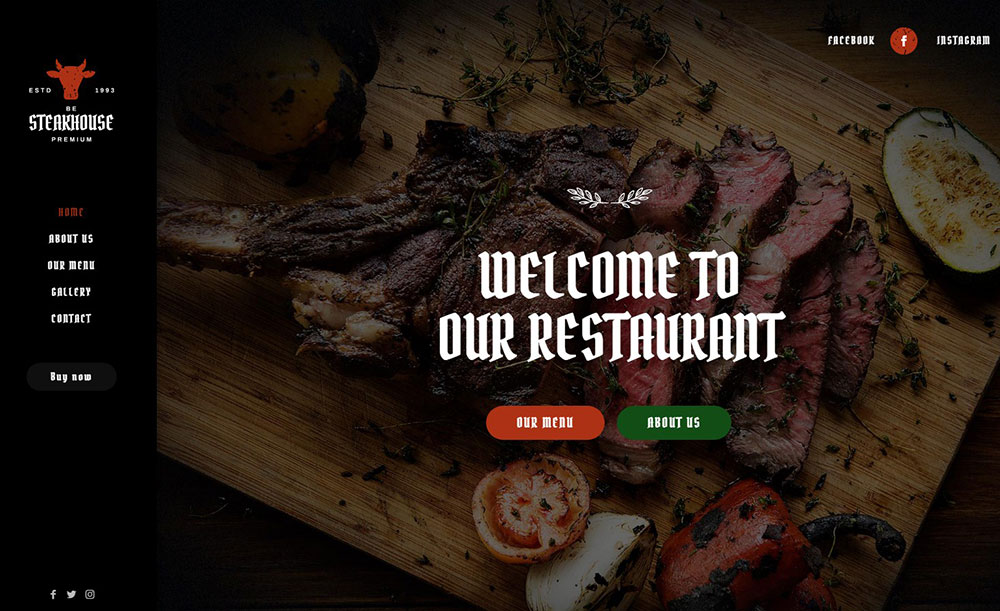
The Best Restaurant WordPress Themes to Choose From
January 9, 2026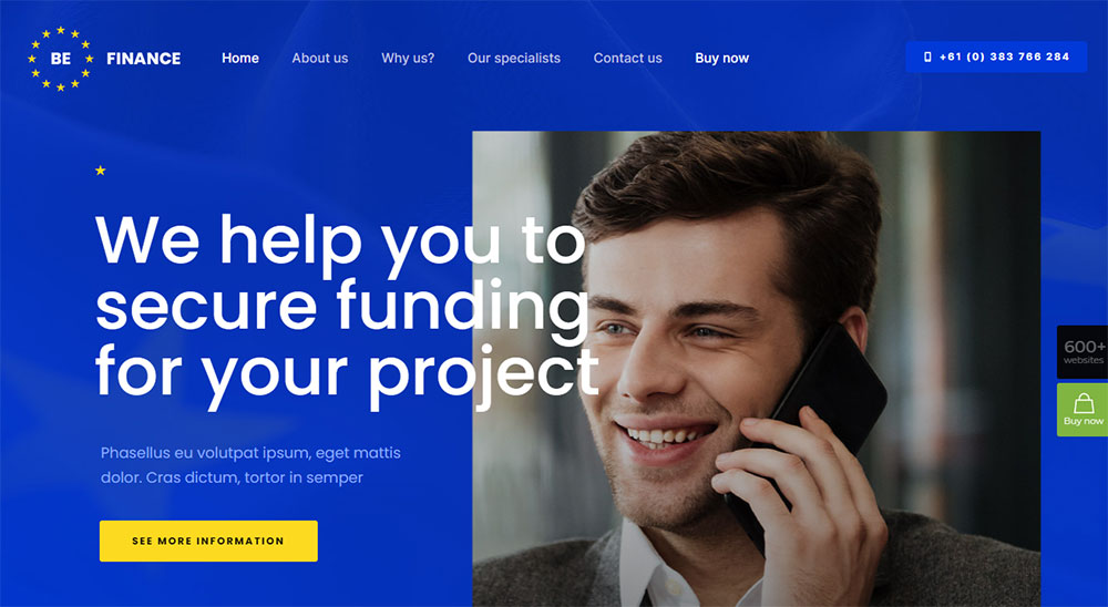
Top Finance WordPress Themes to Use for Your Company
January 10, 2026Your event planning portfolio might be stunning. But if your website looks like it was built in 2016, clients are booking someone else.
The best event planner website design examples share a pattern. Strong visuals, clean navigation, fast load times, and booking systems that actually work. Whether you run a wedding coordination business, a corporate event management company, or a party planning service, your site needs to do more than look good. It needs to convert visitors into inquiries.
This article breaks down real event planner websites, what they get right, and what you can take from their design choices. From homepage layouts and portfolio galleries to color palettes, contact forms, and mobile performance.
What Is Event Planner Website Design
Event planner website design is the process of building a website that represents an event planning business online, showcasing services, past events, and booking capabilities through visual layouts tailored to wedding planners, corporate event coordinators, party organizers, and conference managers.
That 40-word definition covers the basics. But there's more to it than just slapping a gallery on a homepage.
An event coordinator homepage has to do something most service websites don't. It has to sell a feeling. The couple browsing for a wedding planner wants to see the magic before they pick up the phone.
The corporate client looking for a conference manager wants proof of logistics handled cleanly. Different audience, completely different design approach.
These sites separate themselves from general service businesses in a few clear ways:
- Heavy reliance on portfolio galleries with high-resolution event photography
- Booking and inquiry systems built directly into the site (not just a basic contact page)
- Service pages broken down by event type: weddings, galas, corporate retreats, birthday parties, fundraisers
- Social proof pulled from platforms like The Knot, WeddingWire, and Google Reviews
A party planner web design will lean colorful and energetic. A luxury event planner website will go muted, minimal, and heavy on white space.
The visual presentation does most of the talking. If the photography is weak or the layout feels cluttered, potential clients bounce. I've seen it happen on sites that had great services but terrible first impressions. Similar to how wedding planner websites lean on emotional imagery, event planner sites need that same visual pull across all event types.
Your mileage may vary depending on whether you're a solo planner or running a full event production company. But the core principle stays the same: show the work, make it easy to book, get out of the way.
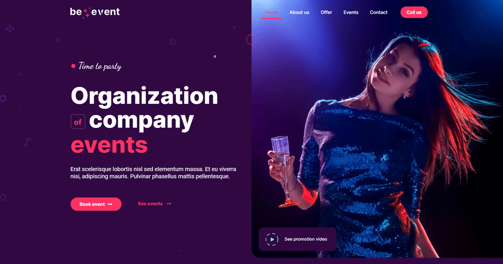
Event Planner Website Design Examples
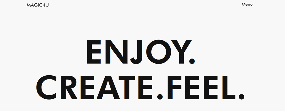
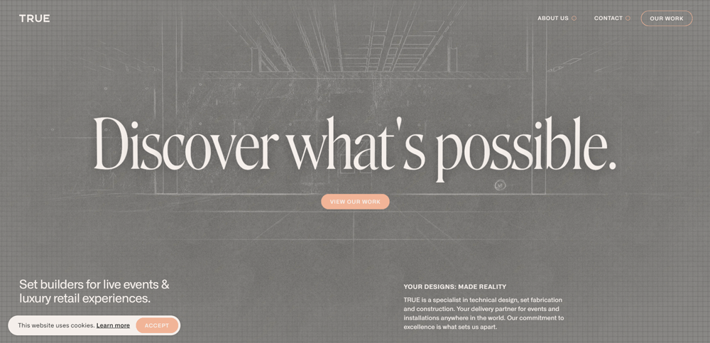
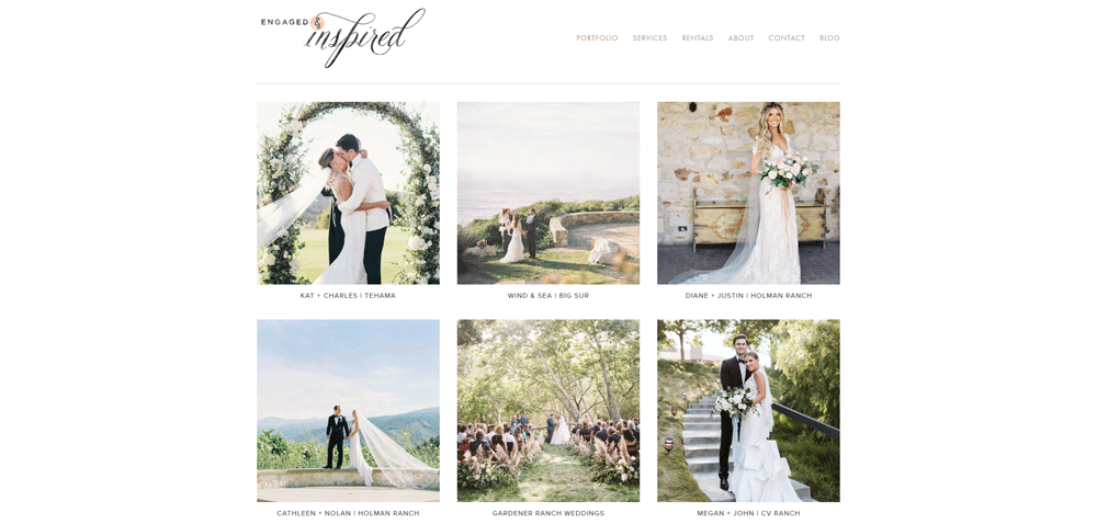
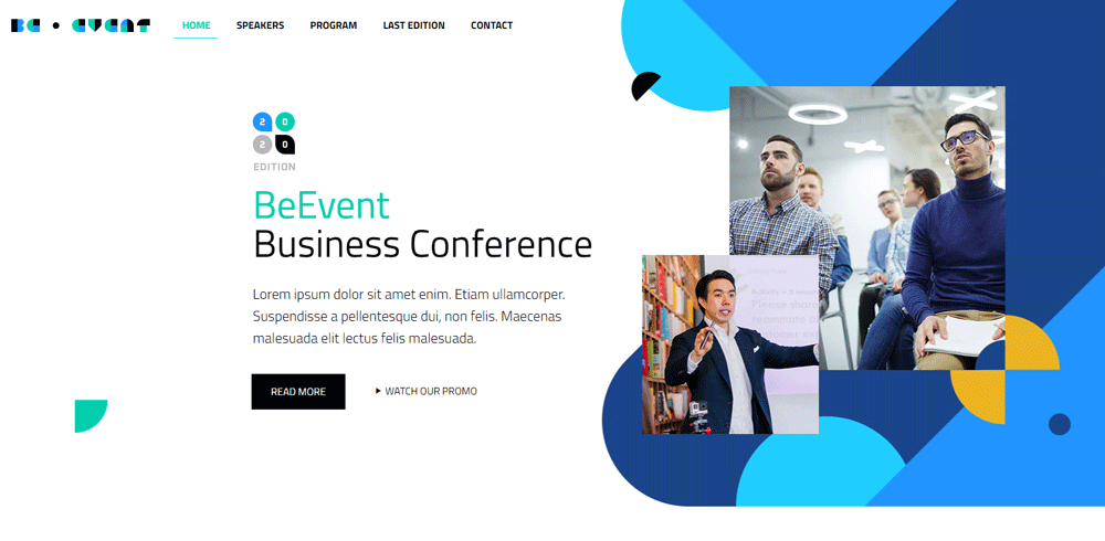
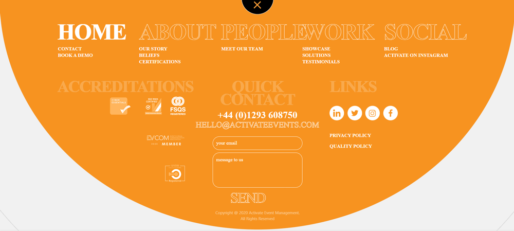
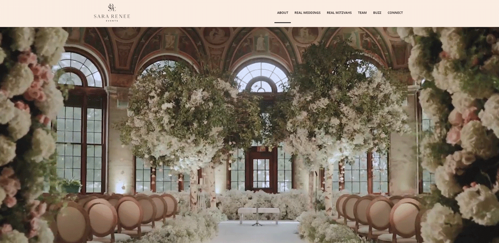
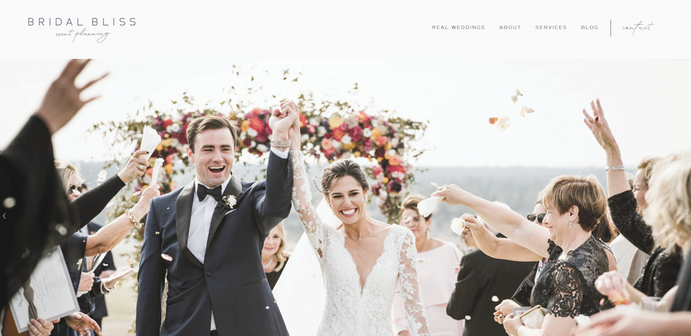
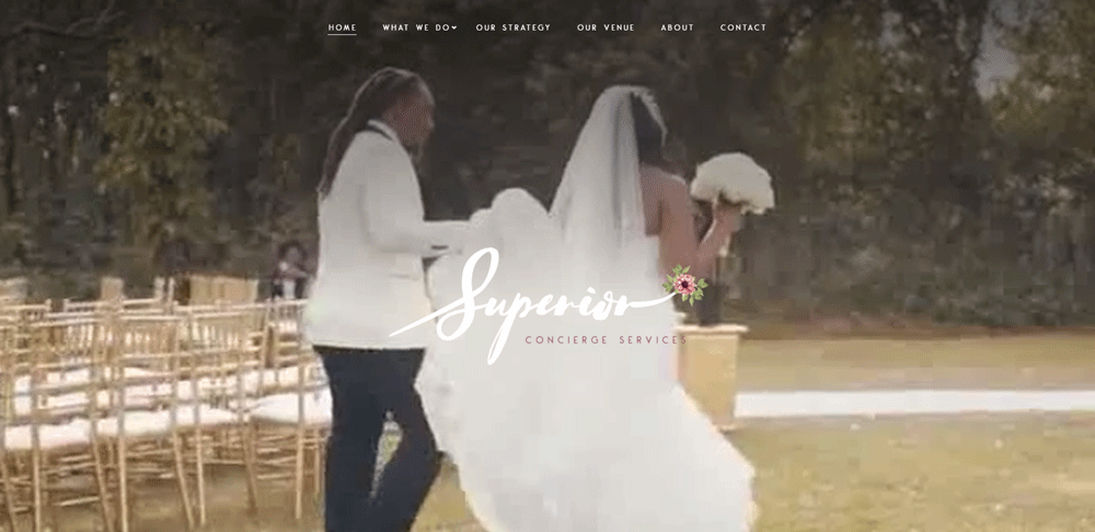
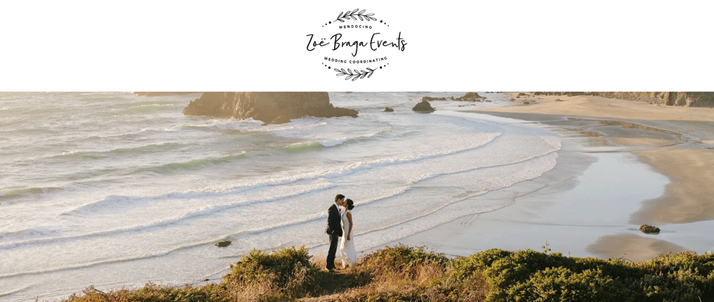
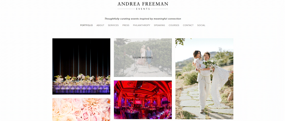
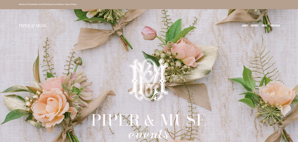
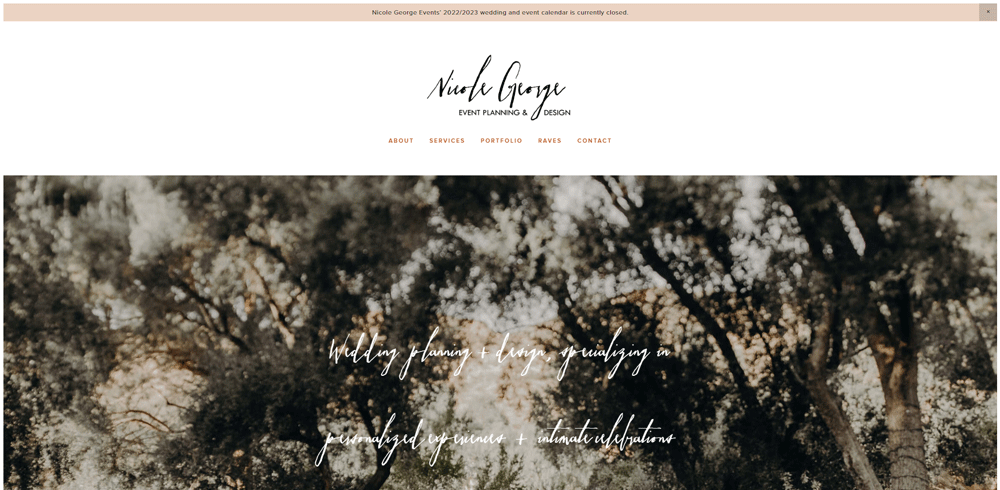
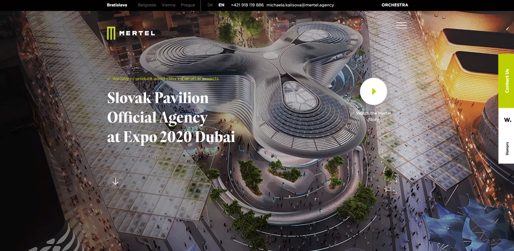
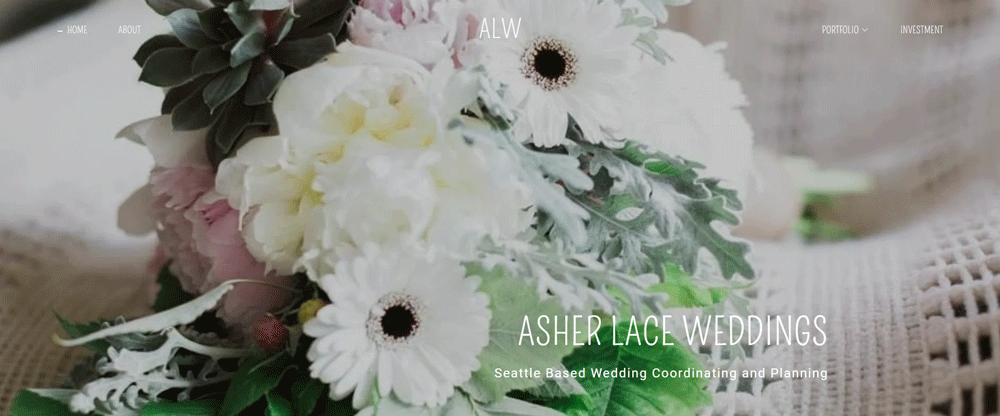
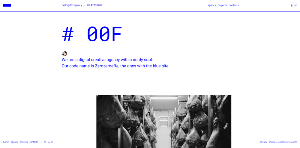
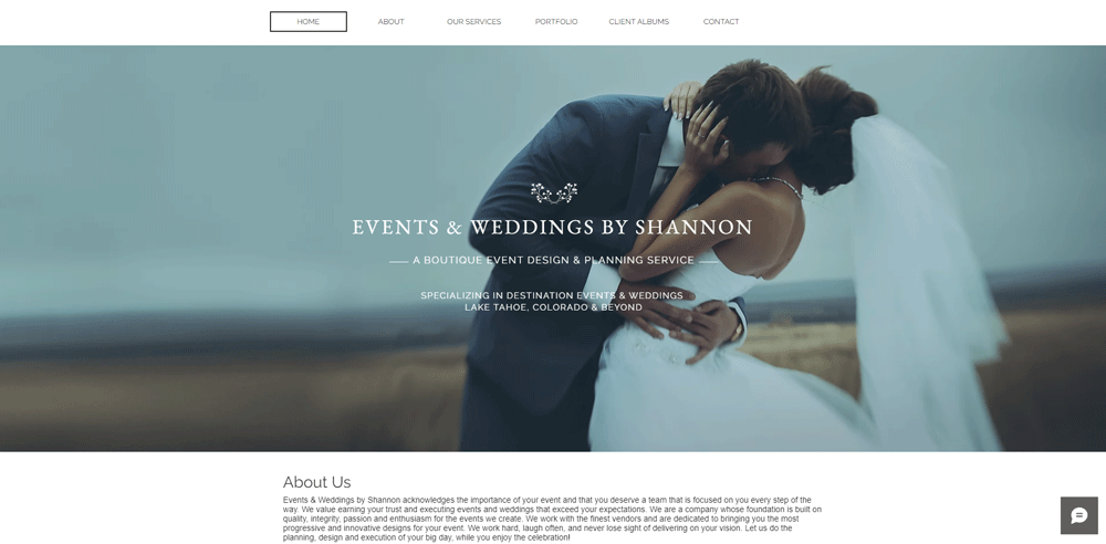
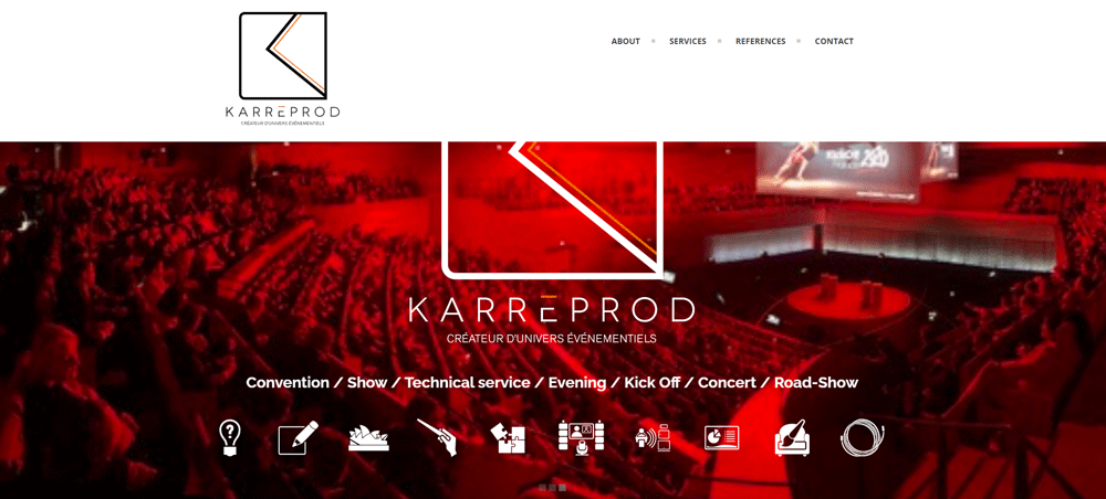
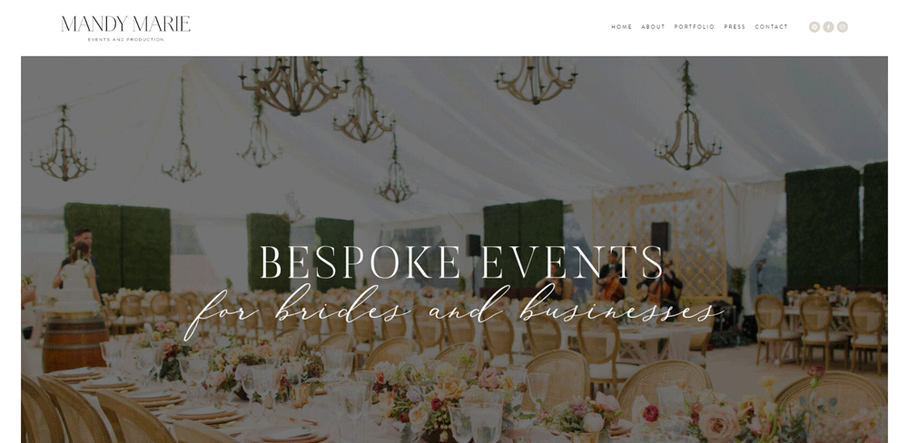
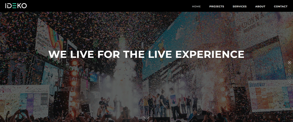
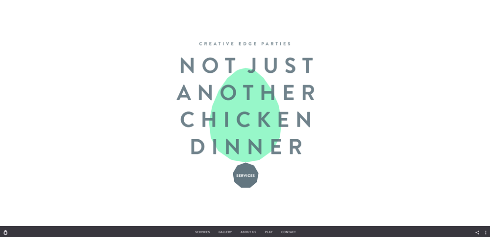
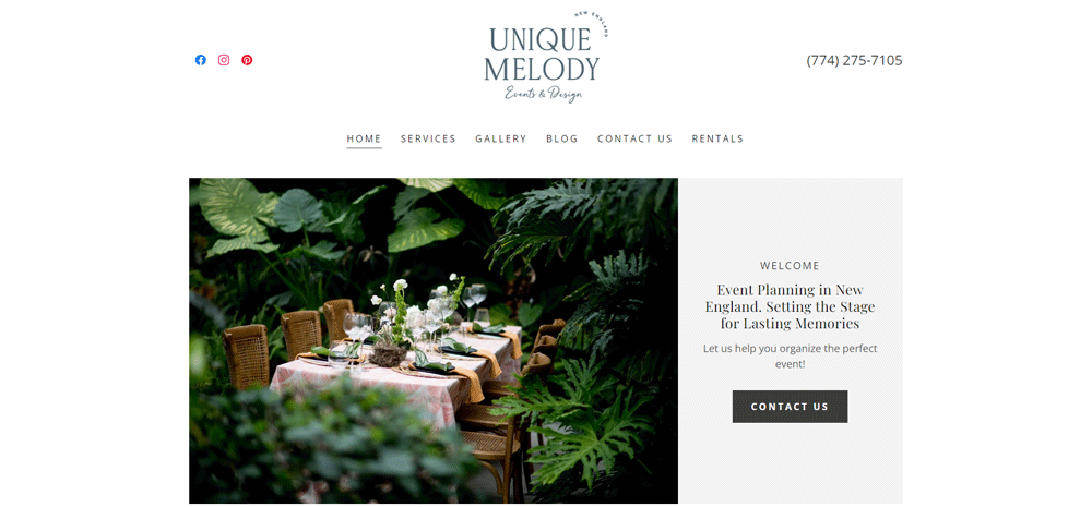
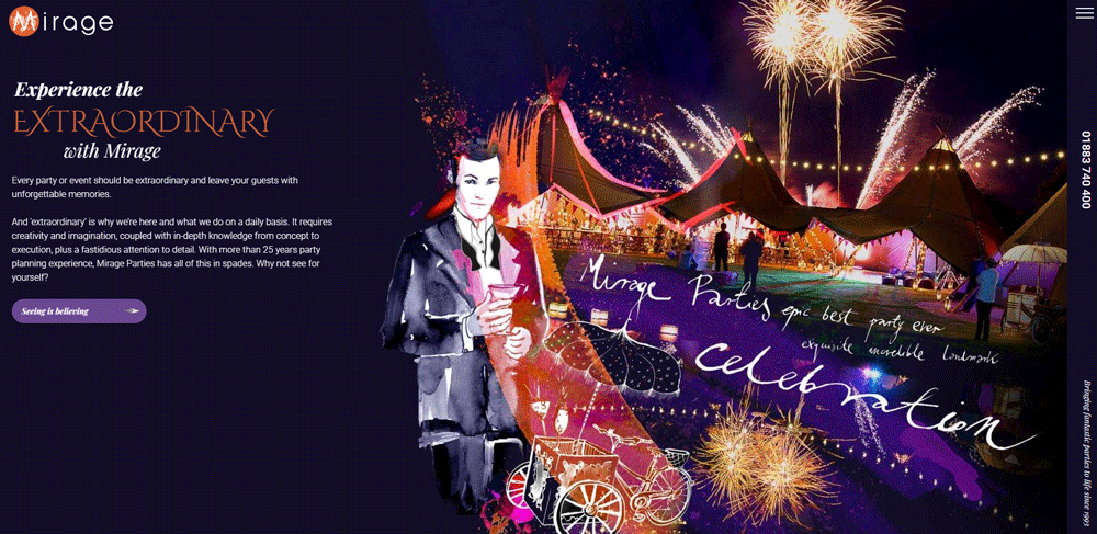
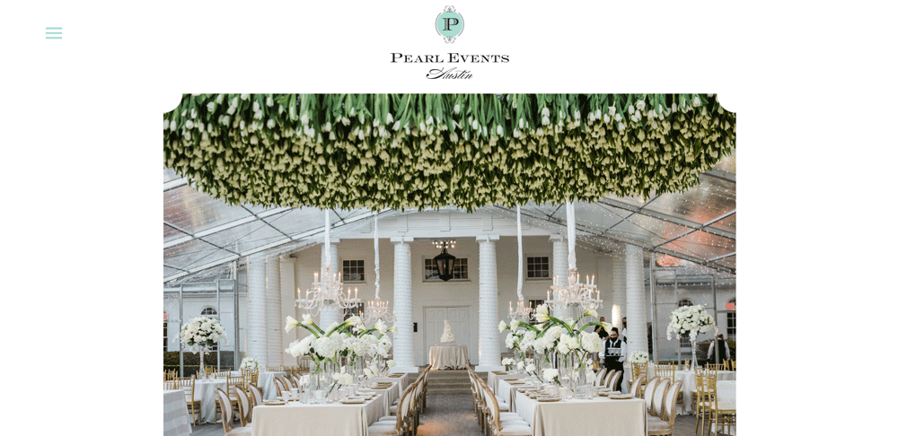
Magic4U


What Makes a Good Event Planner Website
A good event planner website answers one question fast: "Can this person pull off my event?" Everything on the page should point toward that answer.
Here's what actually separates a site that converts from one that just looks pretty.
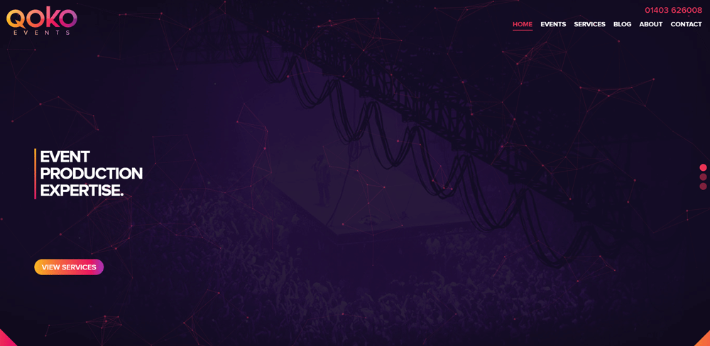
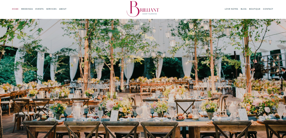
Layout Clarity and Visual Hierarchy
The homepage layout needs a clear path. Hero image or video at the top, services below, portfolio samples, then testimonials. That's the flow most visitors expect, and breaking it without good reason just creates confusion.
Strong website layouts put the most important content above the fold. For event planners, that means a stunning event photo and a way to get in touch.
Portfolio Presentation and Gallery Design
This is the section that closes deals. A grid layout with filtering by event type (corporate, wedding, social) works better than a single endless scroll. Lightbox functionality lets visitors zoom in without leaving the page.
Took me forever to figure out why some event planner portfolio galleries feel sluggish. It's almost always uncompressed images. A gallery-heavy page with no image optimization will tank your Google PageSpeed Insights score.
Mobile Responsiveness and Page Speed
Over 60% of event planning searches happen on mobile devices. If your responsive website doesn't load in under 3 seconds on a phone, you're losing leads before they even see your work.
Touch-friendly galleries, sticky navigation, and properly sized images are baseline requirements. Not extras.
Contact Forms and Booking Functionality
A simple contact form is fine for some businesses. Event planners need more. Multi-step inquiry forms that capture event date, guest count, event type, and budget range give planners the info they need to respond with a real proposal.
Tools like HoneyBook, Dubsado, and Calendly integrate directly into most platforms. Good form design reduces friction and increases completed submissions.
Service Page Structure and Pricing Display
Some planners list everything on a single page. Others break services into separate pages for weddings, corporate events, social gatherings, and destination events.
The second approach performs better for search. Each page targets different queries. Your pricing page can show tiered packages or simply say "contact for a custom quote," but either way, give visitors some frame of reference.
Client Testimonials and Social Proof
Testimonials work hardest when tied to specific event types. A quote from a corporate client means nothing to someone planning a baby shower. Match the review to the service.
A dedicated testimonial page with video reviews, client names, and event photos outperforms a generic quote slider every time.
Color Schemes and Typography
Wedding planners tend to go with soft neutrals, blush tones, and serif fonts. Corporate event companies lean toward navy, charcoal, and clean sans-serif typography.
Party planners and entertainment-focused businesses can push bolder with brights. The color scheme should match the type of events you plan, not just your personal taste.
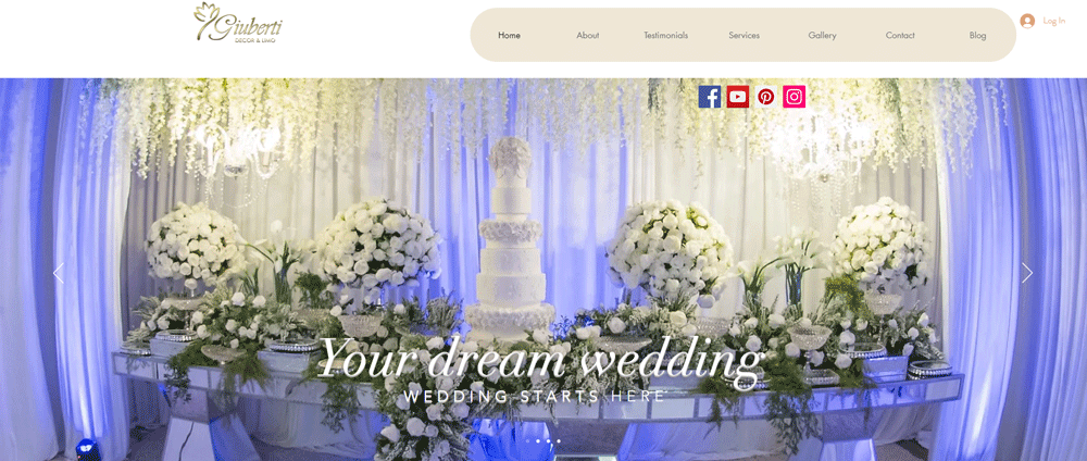
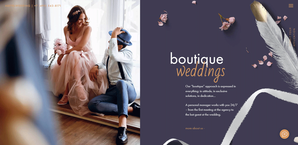
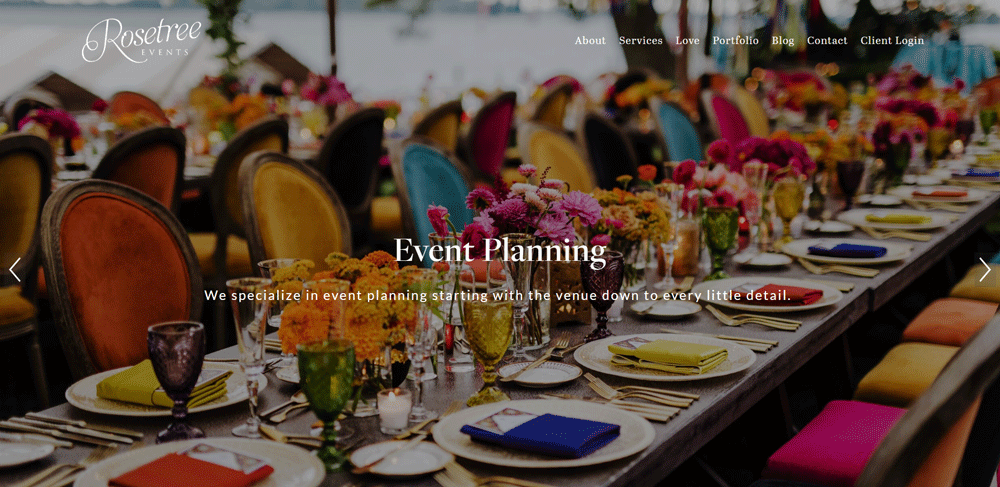
Best Event Planner Website Design Examples
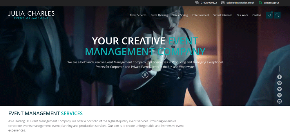
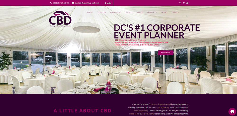
The sites below represent different corners of the event planning industry. Wedding coordination, corporate events, luxury galas, social celebrations. Each one handles design differently based on its target client.
I picked these based on specific criteria:
- Homepage first impression and hero section design
- Portfolio or gallery structure
- Navigation and user flow
- Booking or inquiry system
- Branding consistency (color palette, fonts, imagery)
- Mobile performance
Not every site nails all six. But each one does at least two or three things really well.
Note: I'm looking at these as someone who builds sites, not someone who plans events. The design observations here are about layout, UX, and conversion, not about how good the actual events look.
What you'll notice across all of them is a shared priority: let the event photography carry the weight. The best event planner websites treat their portfolio like a photographer website would. Big images, minimal text interference, and fast load times.
Corporate event websites tend to feel closer to corporate websites in tone. Clean, structured, less emotional. Meanwhile, wedding and social event planners lean into the same visual warmth you'd find on florist websites or catering websites.
The individual breakdowns follow below with specific design details for each site.
How Do Event Planner Websites Display Their Portfolios
The portfolio section is where most visitors spend the longest time. It's the proof. Everything else on the site, the copy, the testimonials, the service descriptions, supports what the portfolio shows.
Grid Layouts vs. Slideshow Galleries vs. Lightbox Presentations
Grid layouts are the most common choice for event planning websites. They let visitors scan multiple events quickly and click into the ones that match their interest.
Slideshows feel dated on most sites now, unless they're used within a single event showcase. Full-page lightbox presentations work well for high-end planners who want each image to land with impact.
The best approach? A filterable grid on the main portfolio page with lightbox zoom on individual images. That gives you both scanning speed and visual punch.
Filtering by Event Type
If you plan weddings, corporate retreats, birthday parties, and fundraisers, your gallery needs filters. Visitors looking for a corporate event coordinator don't want to scroll past 30 wedding photos to find what they need.
Category-based filtering (weddings, corporate, social, nonprofit) is standard. Some planners go deeper with tags like "outdoor events," "destination weddings," or "black-tie galas."
Video Integration for Event Highlights
Event recap videos convert well. A 60-second highlight reel of a past gala or wedding gives visitors a feel for the experience that static photos can't match.
Embed these from YouTube or Vimeo rather than self-hosting. Sites using video backgrounds for their hero sections tend to grab attention faster, but the video file size needs careful management to avoid slow page loads.
Image Loading Speed
Gallery-heavy pages are the biggest performance risk on event planner sites. Lazy loading, WebP format, and proper image compression are non-negotiable.
I've tested event sites where the portfolio page took 8+ seconds to load because every image was a 4MB JPEG. That's a bounce rate disaster. Compress everything, lazy load below-the-fold images, and test with Google PageSpeed Insights before publishing.
What Color Schemes Work Best for Event Planner Websites
Color does more work than most planners realize on their websites. It sets the tone before anyone reads a single word. And the right palette depends entirely on the type of events you handle.
Neutral and Muted Palettes for Luxury and Wedding Planners
Ivory, champagne, soft sage, dusty rose. These are the colors that dominate wedding planner and luxury event websites.
They work because they don't compete with the event photography. A luxury color palette built on warm neutrals lets the portfolio images do the selling while the site itself feels refined and elegant.
Bold and Bright Palettes for Party and Entertainment Planners
If you plan kids' birthdays, festival activations, or themed parties, a muted palette sends the wrong message. Bright corals, electric blues, and warm yellows signal energy and fun.
The trick is keeping it controlled. Bold doesn't mean chaotic. Two or three colorful accent colors against a clean white or light background keeps the energy without making the site hard to read.
Dark Themes for Nightlife and Concert Event Organizers
Nightclub promoters, concert organizers, and late-night event companies lean into dark themed websites. Black or deep charcoal backgrounds with accent lighting in gold, neon, or white create the right atmosphere.
Dark mode web design works well here because it mirrors the actual environment these planners operate in. Just make sure text contrast meets accessibility standards. White or light gray text on dark backgrounds, never medium gray.
How Top Event Planner Sites Use Color
Look at the sites listed in the examples section above. The wedding-focused planners almost always stick to a 2-3 color palette anchored by a neutral base. Corporate event planners use darker, more authoritative tones similar to what you'd see on finance websites.
Understanding color theory<
What Is Event Planner Website Design
Event planner website design is the process of building a website that represents an event planning business online, showcasing services, past events, and booking capabilities through visual layouts tailored to wedding planners, corporate event coordinators, party organizers, and conference managers.
That 40-word definition covers the basics. But there's more to it than just slapping a gallery on a homepage.
An event coordinator homepage has to do something most service websites don't. It has to sell a feeling. The couple browsing for a wedding planner wants to see the magic before they pick up the phone.
The corporate client looking for a conference manager wants proof of logistics handled cleanly. Different audience, completely different design approach.
These sites separate themselves from general service businesses in a few clear ways:
- Heavy reliance on portfolio galleries with high-resolution event photography
- Booking and inquiry systems built directly into the site (not just a basic contact page)
- Service pages broken down by event type: weddings, galas, corporate retreats, birthday parties, fundraisers
- Social proof pulled from platforms like The Knot, WeddingWire, and Google Reviews
A party planner web design will lean colorful and energetic. A luxury event planner website will go muted, minimal, and heavy on white space.
The visual presentation does most of the talking. If the photography is weak or the layout feels cluttered, potential clients bounce. I've seen it happen on sites that had great services but terrible first impressions. Similar to how wedding planner websites lean on emotional imagery, event planner sites need that same visual pull across all event types.
Your mileage may vary depending on whether you're a solo planner or running a full event production company. But the core principle stays the same: show the work, make it easy to book, get out of the way.
What Makes a Good Event Planner Website
A good event planner website answers one question fast: "Can this person pull off my event?" Everything on the page should point toward that answer.
Here's what actually separates a site that converts from one that just looks pretty.
Layout Clarity and Visual Hierarchy
The homepage layout needs a clear path. Hero image or video at the top, services below, portfolio samples, then testimonials. That's the flow most visitors expect, and breaking it without good reason just creates confusion.
Strong website layouts put the most important content above the fold. For event planners, that means a stunning event photo and a way to get in touch.
Portfolio Presentation and Gallery Design
This is the section that closes deals. A grid layout with filtering by event type (corporate, wedding, social) works better than a single endless scroll. Lightbox functionality lets visitors zoom in without leaving the page.
Took me forever to figure out why some event planner portfolio galleries feel sluggish. It's almost always uncompressed images. A gallery-heavy page with no image optimization will tank your Google PageSpeed Insights score.
Mobile Responsiveness and Page Speed
Over 60% of event planning searches happen on mobile devices. If your responsive website doesn't load in under 3 seconds on a phone, you're losing leads before they even see your work.
Touch-friendly galleries, sticky navigation, and properly sized images are baseline requirements. Not extras.
Contact Forms and Booking Functionality
A simple contact form is fine for some businesses. Event planners need more. Multi-step inquiry forms that capture event date, guest count, event type, and budget range give planners the info they need to respond with a real proposal.
Tools like HoneyBook, Dubsado, and Calendly integrate directly into most platforms. Good form design reduces friction and increases completed submissions.
Service Page Structure and Pricing Display
Some planners list everything on a single page. Others break services into separate pages for weddings, corporate events, social gatherings, and destination events.
The second approach performs better for search. Each page targets different queries. Your pricing page can show tiered packages or simply say "contact for a custom quote," but either way, give visitors some frame of reference.
Client Testimonials and Social Proof
Testimonials work hardest when tied to specific event types. A quote from a corporate client means nothing to someone planning a baby shower. Match the review to the service.
A dedicated testimonial page with video reviews, client names, and event photos outperforms a generic quote slider every time.
Color Schemes and Typography
Wedding planners tend to go with soft neutrals, blush tones, and serif fonts. Corporate event companies lean toward navy, charcoal, and clean sans-serif typography.
Party planners and entertainment-focused businesses can push bolder with brights. The color scheme should match the type of events you plan, not just your personal taste.
How Do Event Planner Websites Display Their Portfolios
The portfolio section is where most visitors spend the longest time. It's the proof. Everything else on the site, the copy, the testimonials, the service descriptions, supports what the portfolio shows.
Grid Layouts vs. Slideshow Galleries vs. Lightbox Presentations
Grid layouts are the most common choice for event planning websites. They let visitors scan multiple events quickly and click into the ones that match their interest.
Slideshows feel dated on most sites now, unless they're used within a single event showcase. Full-page lightbox presentations work well for high-end planners who want each image to land with impact.
The best approach? A filterable grid on the main portfolio page with lightbox zoom on individual images. That gives you both scanning speed and visual punch.
Filtering by Event Type
If you plan weddings, corporate retreats, birthday parties, and fundraisers, your gallery needs filters. Visitors looking for a corporate event coordinator don't want to scroll past 30 wedding photos to find what they need.
Category-based filtering (weddings, corporate, social, nonprofit) is standard. Some planners go deeper with tags like "outdoor events," "destination weddings," or "black-tie galas."
Video Integration for Event Highlights
Event recap videos convert well. A 60-second highlight reel of a past gala or wedding gives visitors a feel for the experience that static photos can't match.
Embed these from YouTube or Vimeo rather than self-hosting. Sites using video backgrounds for their hero sections tend to grab attention faster, but the video file size needs careful management to avoid slow page loads.
Image Loading Speed
Gallery-heavy pages are the biggest performance risk on event planner sites. Lazy loading, WebP format, and proper image compression are non-negotiable.
I've tested event sites where the portfolio page took 8+ seconds to load because every image was a 4MB JPEG. That's a bounce rate disaster. Compress everything, lazy load below-the-fold images, and test with Google PageSpeed Insights before publishing.
What Color Schemes Work Best for Event Planner Websites
Color does more work than most planners realize on their websites. It sets the tone before anyone reads a single word. And the right palette depends entirely on the type of events you handle.
Neutral and Muted Palettes for Luxury and Wedding Planners
Ivory, champagne, soft sage, dusty rose. These are the colors that dominate wedding planner and luxury event websites.
They work because they don't compete with the event photography. A luxury color palette built on warm neutrals lets the portfolio images do the selling while the site itself feels refined and elegant.
Bold and Bright Palettes for Party and Entertainment Planners
If you plan kids' birthdays, festival activations, or themed parties, a muted palette sends the wrong message. Bright corals, electric blues, and warm yellows signal energy and fun.
The trick is keeping it controlled. Bold doesn't mean chaotic. Two or three colorful accent colors against a clean white or light background keeps the energy without making the site hard to read.
Dark Themes for Nightlife and Concert Event Organizers
Nightclub promoters, concert organizers, and late-night event companies lean into dark themed websites. Black or deep charcoal backgrounds with accent lighting in gold, neon, or white create the right atmosphere.
Dark mode web design works well here because it mirrors the actual environment these planners operate in. Just make sure text contrast meets accessibility standards. White or light gray text on dark backgrounds, never medium gray.
How Top Event Planner Sites Use Color
Look at the sites listed in the examples section above. The wedding-focused planners almost always stick to a 2-3 color palette anchored by a neutral base. Corporate event planners use darker, more authoritative tones similar to what you'd see on finance websites.
Understanding color theory helps here. Complementary colors create visual contrast for CTAs. Analogous palettes keep things cohesive and calm. The palette you choose should align with the emotional experience your clients expect from their events.
FAQ on Event Planner Website Design
What should an event planner website include?
A strong event planner website includes a portfolio gallery, service pages broken down by event type, client testimonials, a booking or inquiry form, an about page with planner credentials, and clear call to action buttons on every page.
What is the best platform to build an event planning website?
WordPress with Elementor offers the most flexibility. Squarespace works well for visual-first planners who want quick setup. Showit is popular among wedding planners. Wix suits smaller budgets. Each platform handles event planner portfolio galleries differently.
How much does an event planner website cost to build?
Template-based sites on Squarespace or Wix run $200-$500 annually. Custom WordPress builds range from $2,000 to $10,000+ depending on features like online booking systems, gallery complexity, and integration with tools like HoneyBook or Dubsado.
What colors work best for event planner websites?
Wedding planners perform well with soft neutrals and muted tones. Corporate event sites lean toward navy and charcoal. Party planners use brighter palettes. The color choice should match your event niche, not personal preference.
How do I display my event portfolio on my website?
Use a filterable grid layout organized by event type. Include lightbox functionality for image zoom. Add short descriptions with event details like venue, guest count, and services provided. Compress all images for fast page loading.
Do event planner websites need a blog?
Yes. A blog targeting event planning tips, venue guides, and seasonal trends helps with local search visibility. It also builds trust with potential clients. Posts linking to your service pages improve your site's internal website navigation structure.
What makes an event planner website convert visitors into clients?
Fast load speed, a visible phone number, strong event photography above the fold, and a multi-step inquiry form that captures event date, type, and budget. Social proof from Google Reviews or WeddingWire listings also increases conversion rates.
Should event planner websites include pricing?
At minimum, show starting rates or package tiers. Full transparency isn't required, but giving visitors a price range reduces unqualified inquiries. "Starting at $3,000" works better than "contact for pricing" for most event planning businesses.
How important is mobile design for event planner websites?
Over 60% of event-related searches happen on phones. A mobile first design approach with touch-friendly galleries, sticky navigation, and fast-loading images is baseline. Not optional. Google ranks mobile performance as a core signal.
Can I use AI-generated content on my event planner website?
Google's guidelines focus on content quality, not how it was produced. AI-assisted content is acceptable if it demonstrates first-hand expertise, provides accurate event planning information, and genuinely helps visitors. Always review and add personal experience to any generated text.
Conclusion
The event planner website design examples above share a common thread. They prioritize the visitor's experience over everything else. Clean layouts, fast-loading galleries, and clear paths to booking.
Your site doesn't need to look like a Behance showcase. It needs to work. That means responsive design tested on actual phones, image compression handled before upload, and inquiry forms that capture the right details without friction.
Pick a platform that fits your skill level. WordPress gives you control. Squarespace gives you speed. Showit sits somewhere in between.
Study what the top event management websites do with their service pages, website menus, and event photography galleries. Then build something that reflects your specific planning style, whether that's corporate conferences, destination weddings, or social celebrations.
The best event planner site is the one that gets clients to reach out. Everything else is decoration.


