The best parallax scrolling website templates you can use
August 7, 2025
Farming and Agriculture Website Design Examples
August 11, 2025Your painting skills mean nothing if homeowners never find you online.
Most house painters website design examples you'll find look outdated, load slowly, or bury contact information three clicks deep. That's a problem when 85% of customers check a contractor's website before calling.
This guide breaks down what actually works for painting contractor websites. You'll see real examples, learn which features convert visitors into estimate requests, and understand how to display your portfolio effectively.
Whether you're building a new site or redesigning an existing one, these patterns will help you compete with larger painting companies in your service area.
What is a House Painters Website
A house painters website is a digital platform where residential and commercial painting contractors showcase their services, display completed projects, and capture leads from homeowners.
It functions as a 24/7 sales representative for your painting business.
The best painting company websites combine portfolio galleries, service descriptions, customer testimonials, and easy quote request options into one cohesive experience.
Think of it as your storefront on the web. Potential clients check your work, read reviews, and decide whether to call you or your competitor.
House Painters Website Design Examples
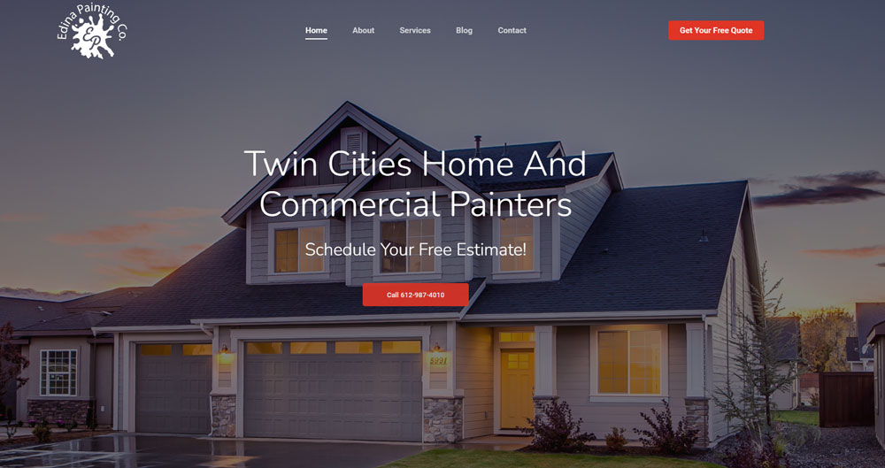
Edina Painting Co.
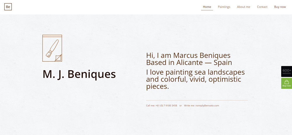
Painter
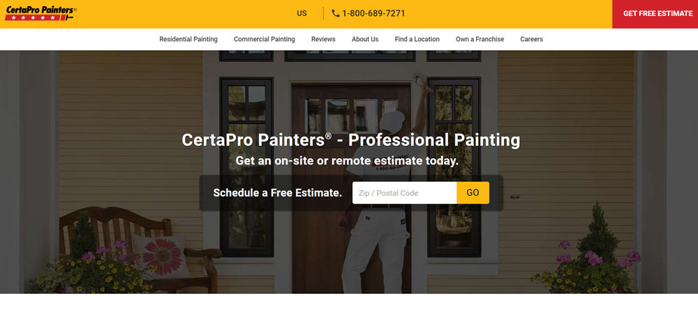
CertaPro Painters
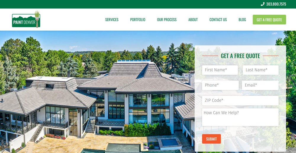
Paint Denver
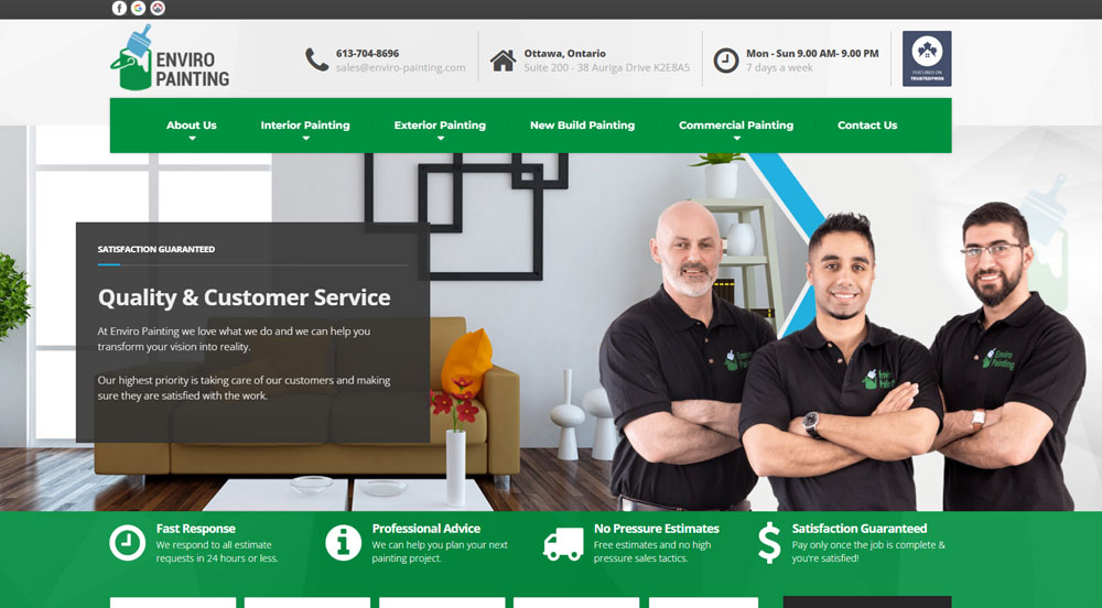
Enviro Painting
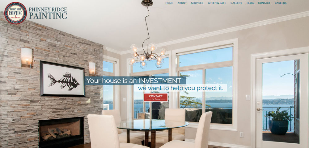
Phinney Ridge Painting
Base Coat Marketing
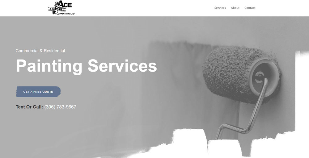
Ace Painting
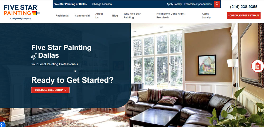
Five Star Painting
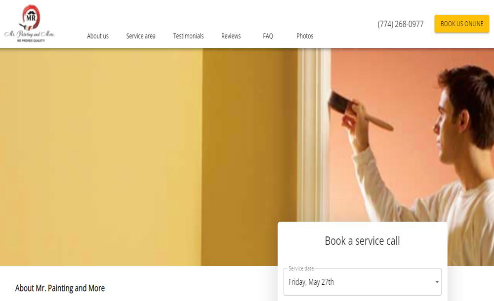
MR Painting
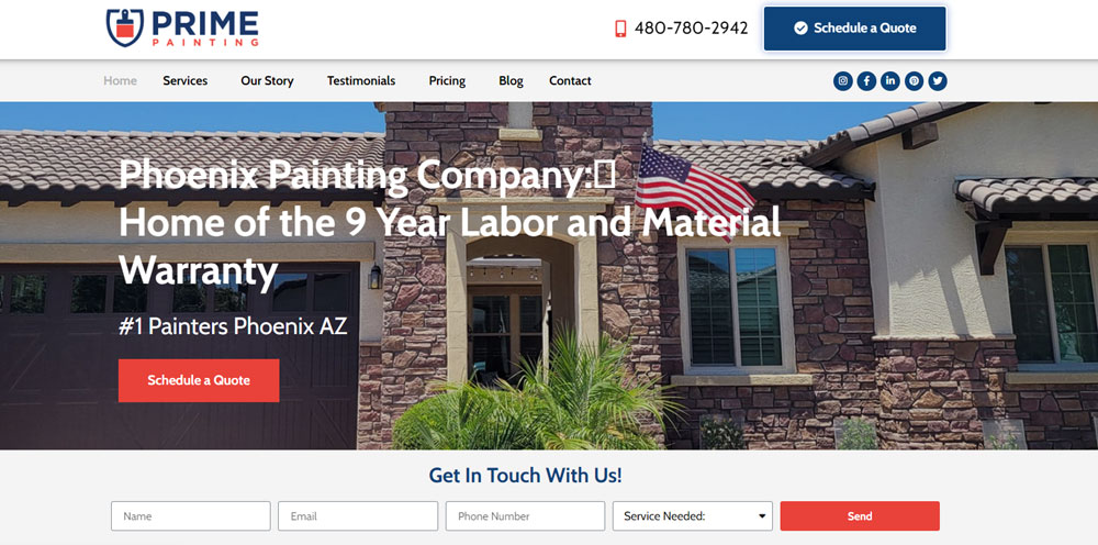
Prime Painting & Construction
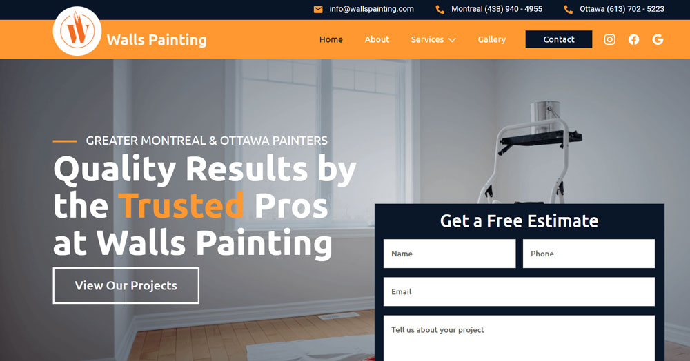
Walls Painting
Arizona Painting Company
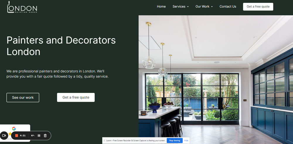
London Painting Group
Durapro Painting
Dallas Paints
Balatoni Festo
Paintworks
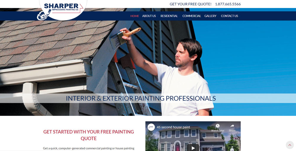
Sharper Impressions Painting
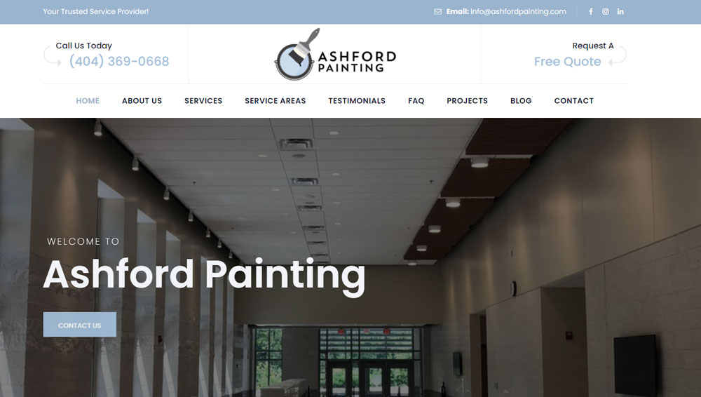
Ashford Painting
Nolan Painting
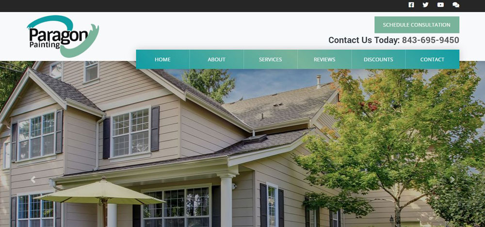
Paragon Painting
ASAD
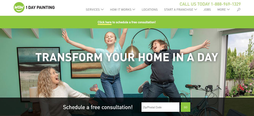
Wow1Day Painting
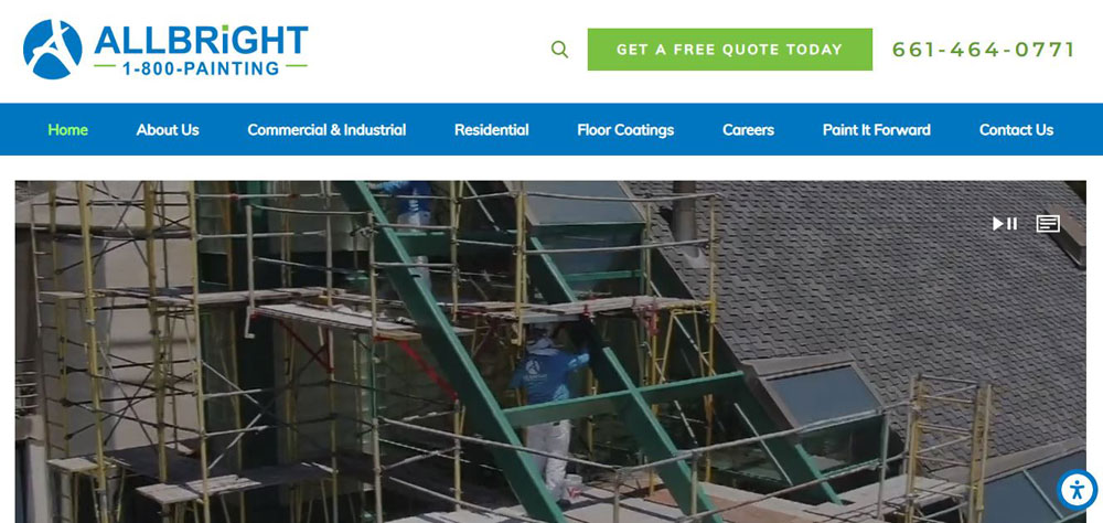
All Bright Painting
Ignas
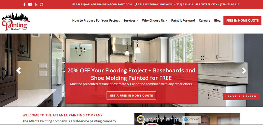
Atlanta Painting Company
Why Does Website Design Matter for Painting Contractors
Homeowners judge your painting skills by your website within seconds. A sloppy site signals sloppy brushwork.
Your website design directly impacts whether visitors request a free painting estimate or bounce to the next contractor on Google.
Local house painters compete against dozens of other companies in every service area. Your site needs to stand out visually while loading fast on mobile devices.
Professional painting contractors who invest in quality web design consistently outperform competitors relying on basic directory listings or outdated sites.
Similar to how construction websites build credibility through project showcases, painting sites must prove expertise visually.
What Makes a House Painter Website Convert Visitors into Leads
Conversion happens when trust meets convenience. Visitors need confidence in your work and a friction-free path to contact you.
The highest-converting painting websites combine social proof, clear service information, and multiple contact options above the fold.
Trust Signals on Painting Contractor Websites
Display your painting insurance coverage, licenses, and certifications prominently. BBB accreditation and PDCA membership badges belong in your header or footer.
Customer reviews from Google Business Profile, Yelp, and HomeAdvisor should appear on every major page. A dedicated testimonial page consolidates your strongest endorsements.
License and Insurance Badges
Place state contractor license numbers in the footer. Show proof of liability coverage and workers comp.
Industry Certifications Display
EPA Lead-Safe Certification matters for older homes. Sherwin-Williams or Benjamin Moore preferred painter status adds credibility.
Review Platform Integration
Embed live review widgets from Angi, Thumbtack, or Houzz. Fresh reviews signal active business.
Contact Forms and Quote Request Placement
Your quote request form should appear on every page, either in the sidebar or as a sticky element. Good form design keeps fields minimal: name, phone, email, project type.
Click-to-call buttons need prominent placement for mobile users. Most painting leads come from smartphones.
Sticky Quote Request Bars
Fixed headers with "Get Free Estimate" buttons follow users as they scroll. Reduces friction, increases submissions.
Multi-Step Form Advantages
Break longer forms into steps: contact info first, project details second. Higher completion rates than single long forms.
How Should a House Painting Website Display Services
Each painting service deserves its own dedicated page. This helps with local search rankings and gives visitors specific information about their needs.
Avoid cramming all services onto one page. Search engines reward depth over breadth.
Interior Painting Service Pages
Cover room-specific services: bedroom painting, kitchen cabinet refinishing, ceiling painting, trim and molding work. Include typical project timelines and preparation steps.
Room-by-Room Breakdown
Living rooms, bedrooms, bathrooms, kitchens each have unique challenges. Address paint types, prep work, and drying times for each space.
Specialty Interior Services
Wallpaper removal, texture coating, accent walls, color consultation. These upsells deserve dedicated sections.
Exterior Painting Service Pages
Exterior house painting involves weather considerations, surface prep, and material-specific techniques. Detail your process for wood siding, stucco, brick, and vinyl.
Surface-Specific Approaches
Wood needs priming; stucco requires elastomeric coatings; aluminum siding demands special prep. Show you understand the differences.
Weather and Timing Information
Explain optimal painting seasons in your region. Address how your crew handles humidity, temperature, and rain delays.
Commercial Painting Service Pages
Commercial painting services target property managers, business owners, and facility directors. Different audience, different messaging.
Industry-Specific Content
Office buildings, retail spaces, restaurants, warehouses. Each has distinct coating requirements and scheduling constraints.
Compliance and Safety Details
OSHA compliance, low-VOC options for occupied spaces, after-hours scheduling. Commercial clients prioritize these factors.
What Portfolio Features Work Best for Painting Company Websites
Your portfolio sells your services better than any sales copy. Homeowners want visual proof of quality work in homes similar to theirs.
Organize projects by type, location, or style for easy browsing.
Before and After Photo Galleries
Side-by-side comparisons demonstrate transformation dramatically. Shoot from identical angles with consistent lighting for maximum impact.
Image compression keeps pages loading fast without sacrificing visual quality.
Interactive Slider Tools
Drag-to-compare sliders let visitors reveal transformations themselves. More engaging than static split images.
Project Category Filters
Let users filter by interior/exterior, residential/commercial, or specific rooms. Helps them find relevant examples quickly.
Project Case Studies with Details
Go beyond photos. Include square footage, paint color selections, challenges overcome, and completion timelines for standout projects.
Problem-Solution Narratives
Describe initial condition, your approach, and final results. Peeling paint fixed, water damage addressed, color consultation provided.
Client Testimonials per Project
Pair each case study with the homeowner's review. Specific praise tied to visible results builds powerful trust.
How Do Top House Painter Websites Handle Mobile Responsiveness
Over 70% of painting leads come from smartphones. Your site must work flawlessly on small screens.
Mobile responsive design automatically adjusts layouts, images, and navigation for any device size.
Test your site on iPhone and Android devices regularly. What looks perfect on desktop often breaks on mobile.
Building with a mobile first design approach ensures phone users get the best experience, not an afterthought.
Touch-Friendly Navigation Elements
Buttons need minimum 44x44 pixel tap targets. Menus should collapse into hamburger icons with thumb-reachable placement.
Click-to-Call Button Placement
Sticky phone buttons at screen bottom let users call instantly. This single feature can double your mobile conversion rate.
Image Optimization for Speed
Compress portfolio images for mobile delivery. Use WebP format and lazy loading to prevent slow page loads on cellular connections.
What Color Schemes Perform Best for Painting Contractor Websites
Ironic but true: many painting websites use terrible colors. Your color scheme should demonstrate the visual taste you bring to client homes.
Understanding basic color theory helps you pick palettes that build trust and look professional.
Industry-Appropriate Palettes
Blues and greens signal reliability and calm. Whites with accent colors showcase cleanliness. Avoid neon or clashing combinations.
Brand Color Integration
Match your website to vehicle wraps, uniforms, and business cards. Consistent brand identity across touchpoints builds recognition.
Contrast for Readability
Dark text on light backgrounds for body copy. High contrast buttons for calls-to-action. Skip trendy low-contrast designs that hurt conversions.
What Page Speed Benchmarks Do Successful Painting Websites Meet
Google PageSpeed Insights scores above 90 on mobile. GTmetrix fully loaded time under 3 seconds.
Every second of delay costs conversions. Homeowners searching for painters won't wait for slow sites.
Core Web Vitals Targets
Largest Contentful Paint under 2.5 seconds. First Input Delay under 100 milliseconds. Cumulative Layout Shift below 0.1.
Image Compression Standards
Portfolio images under 200KB each. Use next-gen formats like WebP. Implement lazy loading for below-fold images.
Hosting Requirements
Quality managed WordPress hosting or equivalent. CDN for static assets. Avoid cheap shared hosting that slows sites during traffic spikes.
How Do Painting Contractors Display Customer Reviews on Their Websites
Third-party review widgets from Google Business Profile, Yelp, and Angi add authenticity. Screenshots or manually added quotes work too.
Customer testimonials convert better when they include specific details about the project completed.
Review Widget Integration
Embed live feeds that update automatically. Display star ratings and review counts prominently. Link to full profiles for verification.
Video Testimonial Features
Short clips of happy homeowners outperform text reviews. Film in front of completed work for visual proof. Keep videos under 60 seconds.
Review Response Display
Show how you respond to feedback, positive and negative. Demonstrates professionalism and customer care approach.
What Local Service Area Features Should a House Painter Website Include
Local painting companies need geographic specificity. Generic "we serve the area" messaging loses to competitors targeting specific neighborhoods.
Service Area Maps and Location Pages
Interactive maps showing coverage zones help visitors confirm availability. Embed Google Maps with service radius highlighted.
City-Specific Landing Pages
Create dedicated pages for each city served. Include local landmarks, neighborhood references, and area-specific testimonials.
Zip Code Lookup Tools
Let visitors enter their zip to confirm service availability instantly. Captures contact info while providing immediate value.
Neighborhood-Specific Landing Pages
Target suburbs and neighborhoods by name. "House Painters in [Neighborhood]" pages rank for hyper-local searches.
Local Content Elements
Reference local architecture styles, common home ages, and regional weather challenges. Shows genuine area expertise.
Community Involvement Mentions
Sponsor local teams? Donate to area charities? Mention these connections. Builds trust with community-minded homeowners.
How Should Painting Contractors Structure Their About Page
Your About page humanizes the business. Homeowners invite painters into their homes; they want to know who's coming.
Owner and Team Introductions
Photos and brief bios of key team members. Include years of experience, specialties, and certifications held.
Company History and Values
When founded, why started, what drives quality standards. Keep it genuine; skip corporate buzzword soup.
Credentials and Memberships
PDCA membership, EPA Lead-Safe Certification, state licenses. Licensed painting contractor status belongs here with verification details.
What Pricing Information Belongs on a House Painter Website
Full pricing rarely works; too many variables in painting projects. But complete silence on cost frustrates visitors.
Price Range Indicators
Provide ballpark ranges: "Interior rooms typically $300-$800 depending on size and prep work." Sets expectations without locking commitments.
Pricing Factor Explanations
Explain what affects cost: square footage, surface condition, paint quality selected, ceiling height, trim complexity. Educates while justifying quotes.
Free Estimate Emphasis
No pricing page replaces personalized quotes. Drive visitors toward free estimate requests as the path to accurate numbers.
How Do Professional Painting Websites Handle Online Booking
Estimate scheduling beats instant booking for painting services. Projects need assessment before commitment.
Tools like Calendly integrate easily with most professional websites for appointment scheduling.
Estimate Appointment Scheduling
Let homeowners pick consultation times online. Reduces phone tag and fills your calendar efficiently.
Calendar Integration Options
Sync with Google Calendar or Outlook automatically. Send confirmation emails and reminder texts through the booking system.
Quote Follow-Up Automation
Mailchimp or similar tools nurture leads after estimates. Automated sequences keep your company top-of-mind during decision periods.
FAQ on House Painters Website Design
How much does a house painter website cost?
Basic sites on Wix or Squarespace run $150-$500 yearly. Custom WordPress sites cost $2,000-$10,000 upfront.
Factor in hosting, domain registration, and ongoing maintenance. Professional painting contractor websites typically require $3,000-$5,000 for quality results.
What platform works best for painting company websites?
WordPress with Elementor or Divi Builder offers the most flexibility. Squarespace works for simpler sites.
Avoid free website builders; they look unprofessional and limit functionality. Your platform choice affects page load speed and customization options.
How many pages does a painting contractor website need?
Minimum five pages: Home, Services, Gallery, About, Contact. Larger companies need dedicated pages for each service type and location.
Add service area pages for local searches. Quality matters more than quantity.
What photos should I include on my painting website?
Before and after project shots are mandatory. Include team photos, equipment, and action shots of crews working.
High-resolution images from completed residential painting services build trust faster than stock photography ever will.
How do I get more leads from my painting website?
Add quote request forms on every page. Include click-to-call buttons for mobile users. Display Google Business Profile reviews prominently.
Strong call to action buttons with clear language like "Get Free Estimate" increase conversions significantly.
Should painting contractors use website templates?
Templates accelerate launch time and reduce costs. Choose industry-specific themes designed for service businesses.
Customize colors, fonts, and images to match your brand. Responsive website templates ensure mobile compatibility from the start.
How important is mobile responsiveness for painter websites?
Critical. Over 70% of local service searches happen on smartphones. Google prioritizes mobile friendly sites in search rankings.
Test your site on multiple devices. Broken mobile layouts cost you leads daily.
What information belongs on a house painter homepage?
Services overview, service area, phone number, and quote request form above the fold. Add testimonials, trust badges, and portfolio previews below.
Your homepage should answer "what, where, and how to contact" within seconds.
How do I add customer reviews to my painting website?
Embed widgets from Yelp, Google, or HomeAdvisor that update automatically. Screenshot reviews work too.
Video testimonials from satisfied customers outperform text. Display customer reviews on homepage and dedicated review pages.
How often should I update my painting company website?
Add new portfolio projects monthly. Update service pages quarterly. Check contact forms and phone numbers weekly for functionality.
Fresh content signals activity to search engines. Outdated sites with old copyright dates hurt credibility.
Conclusion
These house painters website design examples prove that effective sites share common patterns. Mobile responsiveness, clear service pages, and visible contact options drive results.
Your website represents your painting business around the clock. Homeowners searching Google for local house painters will judge your professionalism in seconds.
Focus on what matters: fast load times through proper image compression, trust signals like BBB badges and customer testimonials, and a frictionless path to your quote request form.
Skip the flashy animations. Prioritize a user friendly website that works on every device.
Start with the fundamentals covered here. Test your site on mobile. Add fresh portfolio images monthly. Watch your painting estimate requests increase.
Your next customer is searching right now.

