The Best Hair Salon Website Design Examples for You to See
July 4, 2025
Makeup Artist Website Design Examples to Check Out
July 7, 2025Parents spend 15 seconds deciding if your preschool website deserves their attention.
Most early childhood education centers lose prospective families before they even find the enrollment button.
The problem? Generic templates, cluttered layouts, and designs that look nothing like a place where kids learn and play.
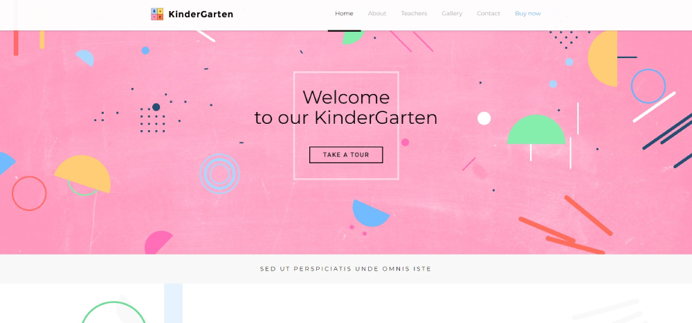
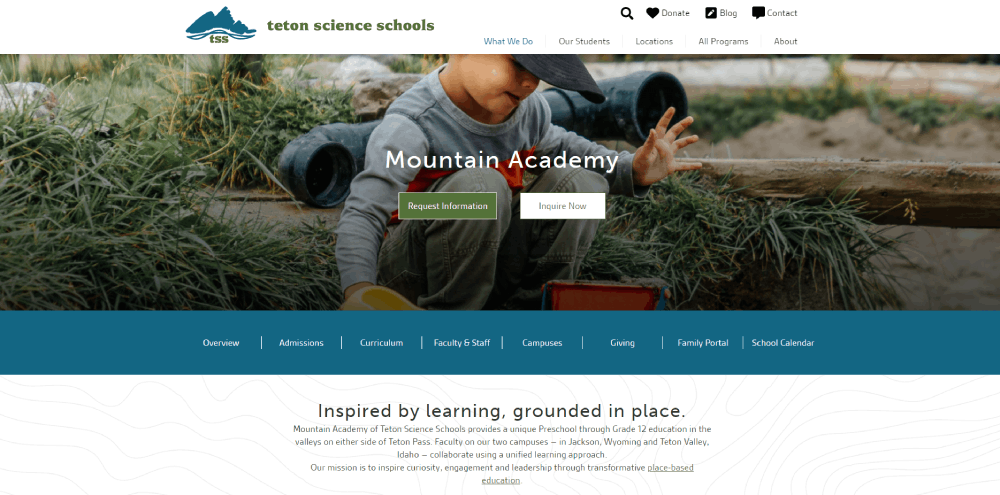
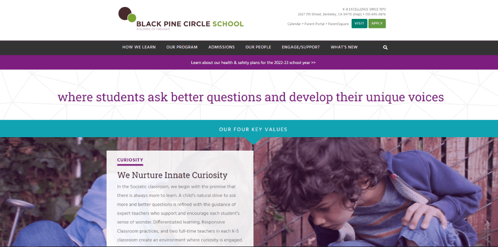
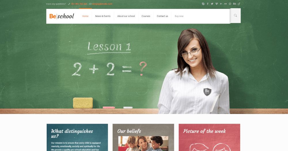
These kindergarten website design examples show what actually works: child-friendly visuals, clear navigation, fast load times, and enrollment flows that convert browsers into scheduled tours.
You'll see real nursery school sites using WordPress, Squarespace, and Wix.
Each example breaks down specific design choices for color schemes, typography, mobile responsiveness, and parent portal integration.
Copy what fits your brand. Skip what doesn't.
What is Kindergarten Website Design
Kindergarten website design is the practice of building web interfaces for early childhood education centers serving children ages 3-6 and their parents.
These sites blend playful visual elements with practical tools for enrollment, parent communication, and daily activity updates.
The target audience is dual: busy parents researching preschool options and administrators managing inquiries.
A successful nursery school online presence balances child-friendly aesthetics with clear calls to action for tour scheduling and registration.
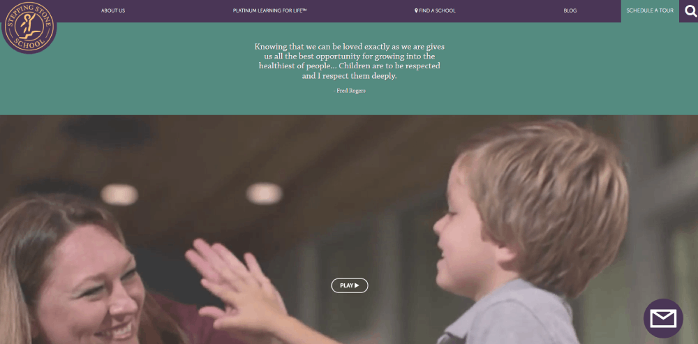
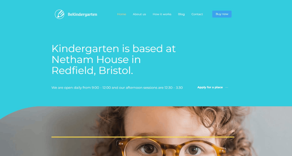
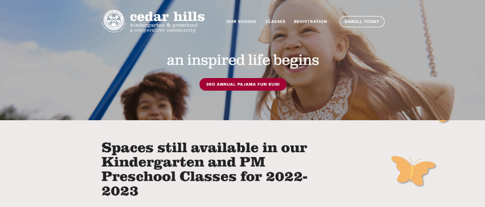
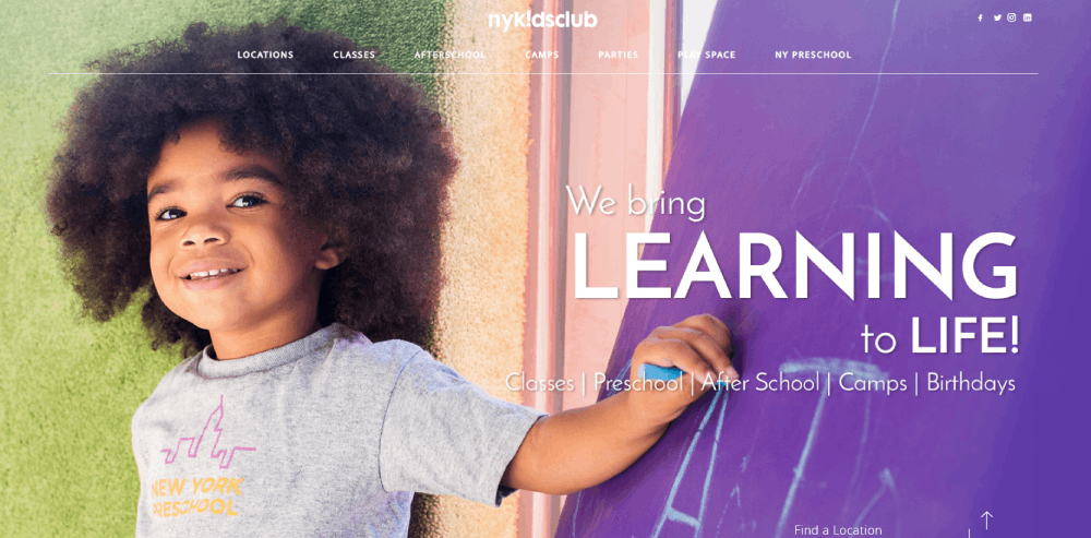
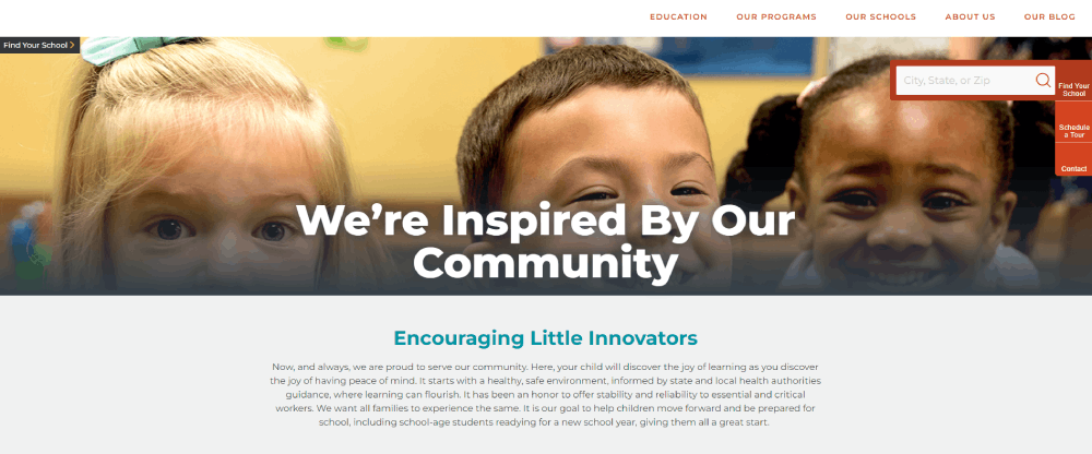
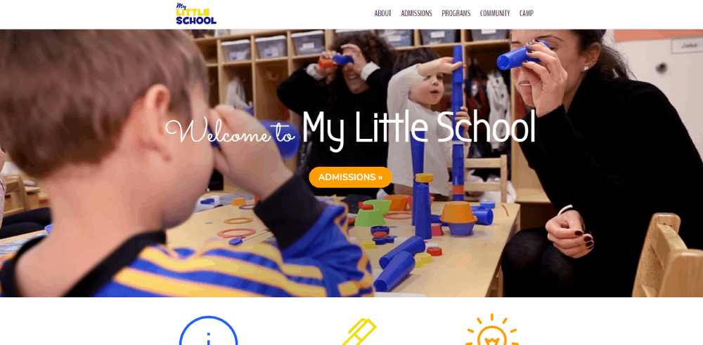
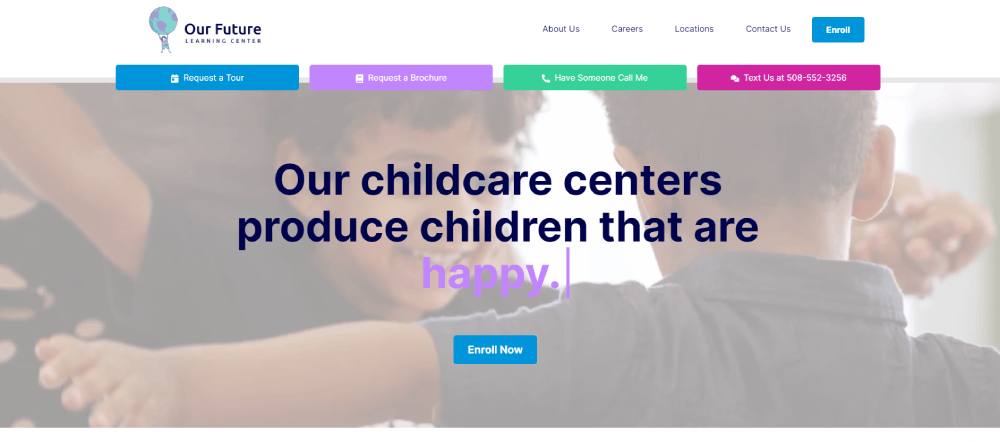
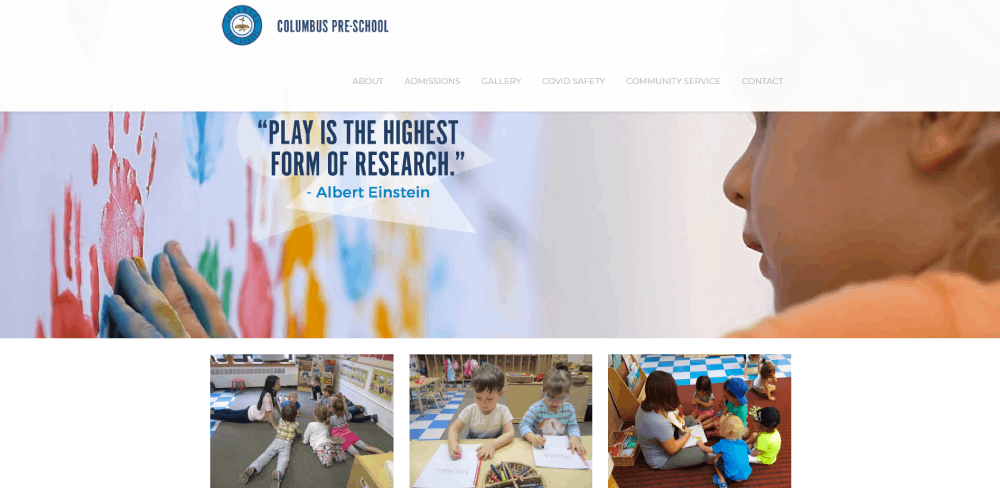
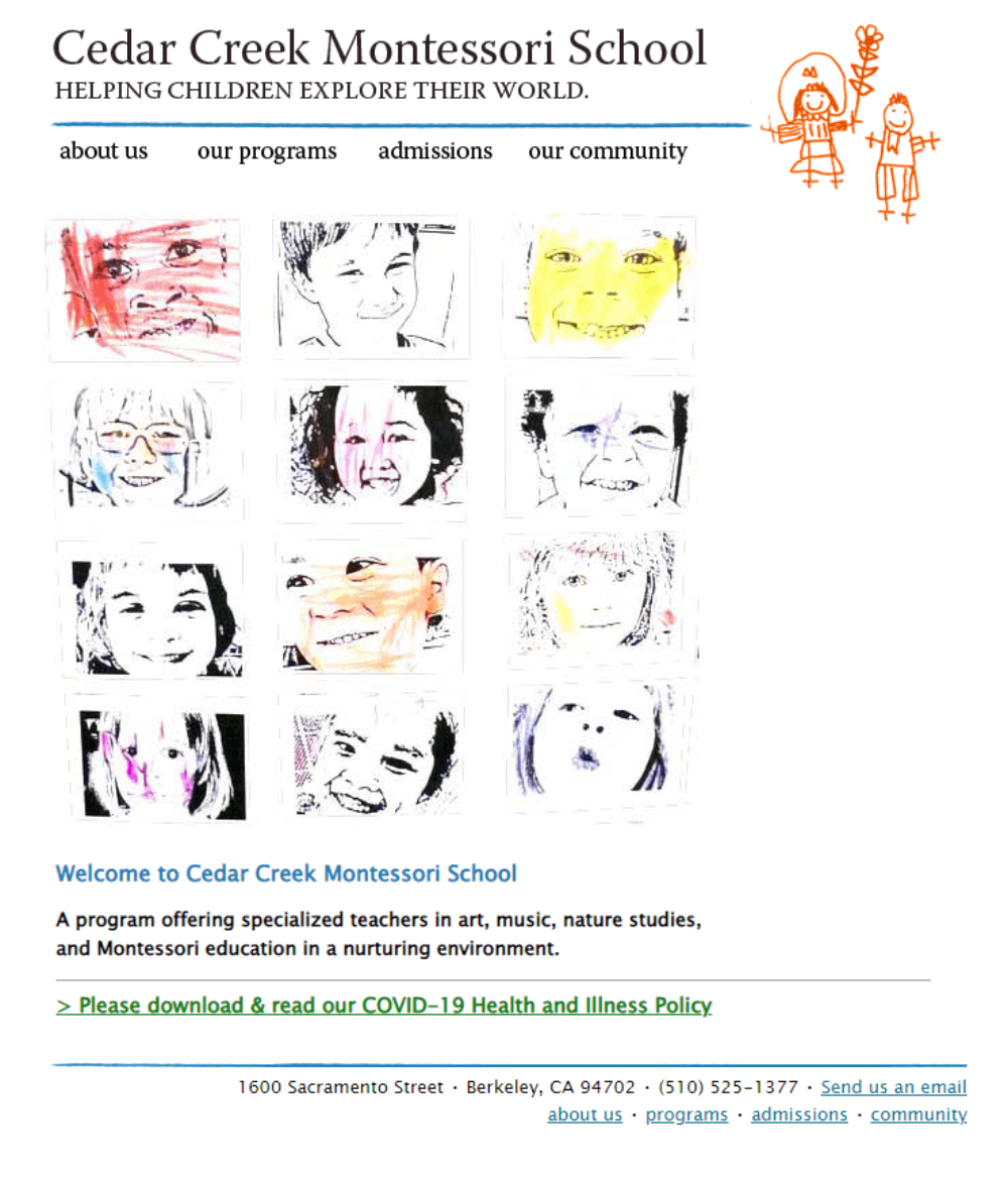
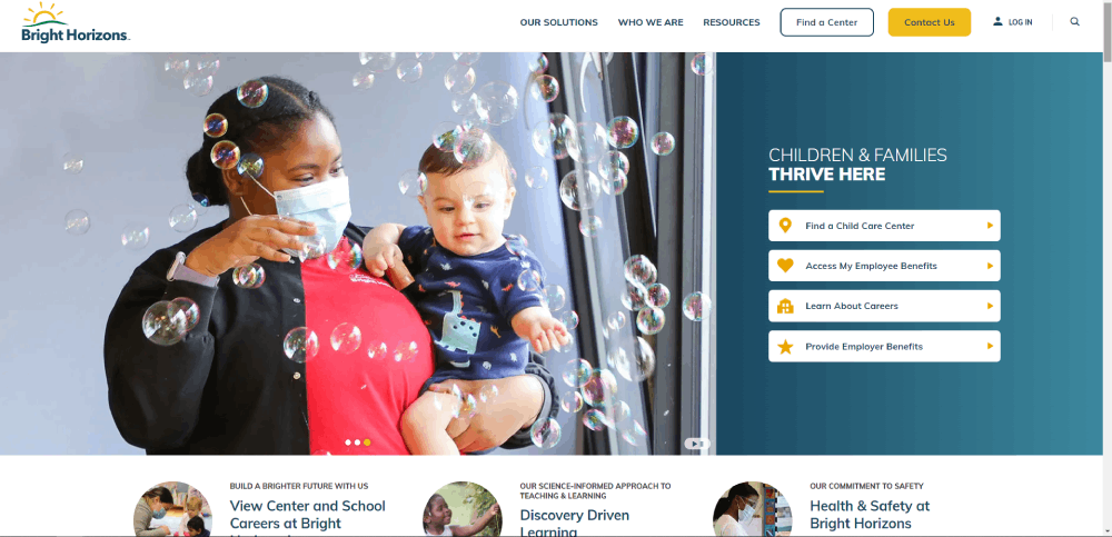
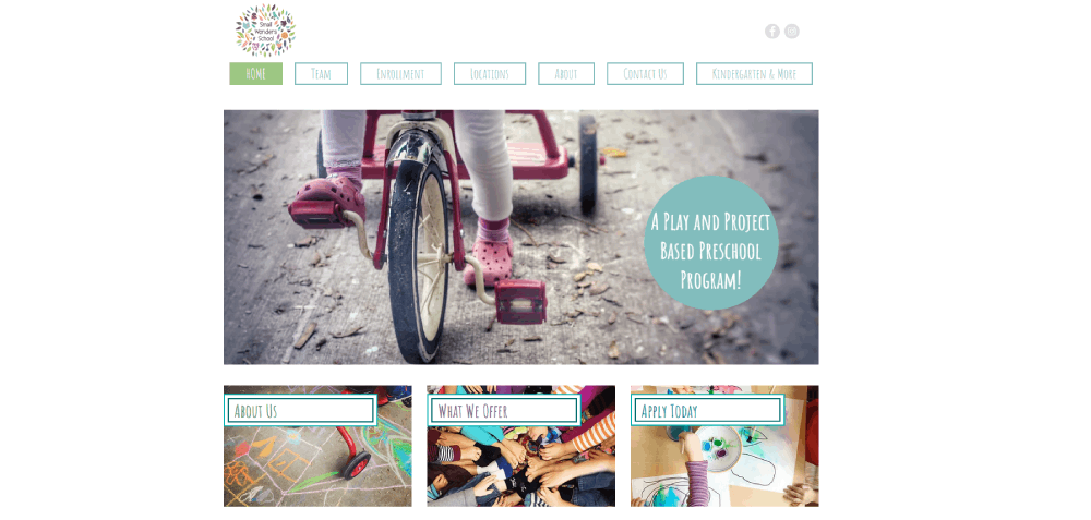
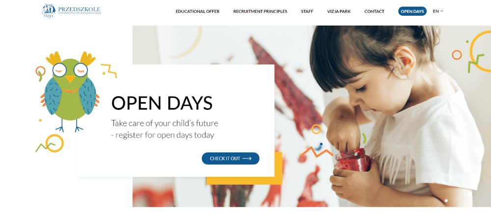
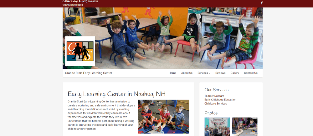
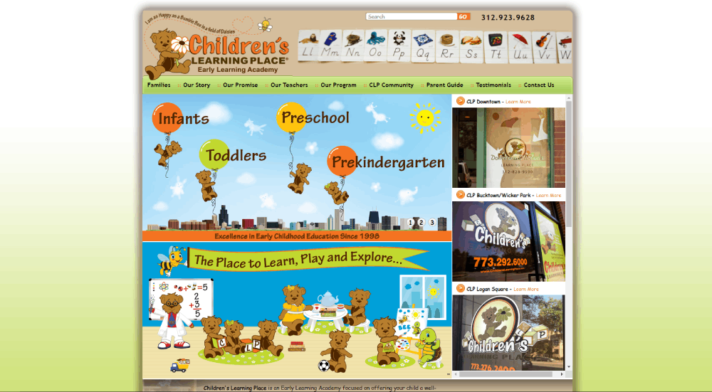
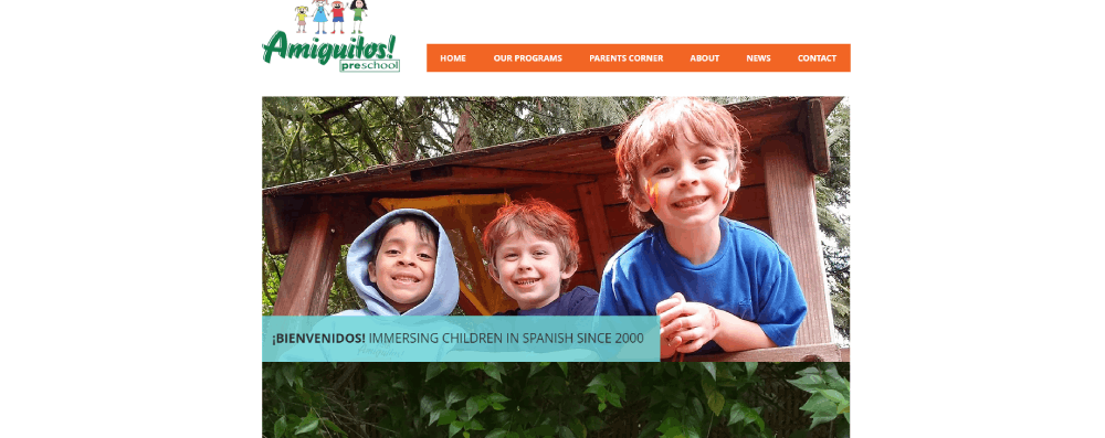
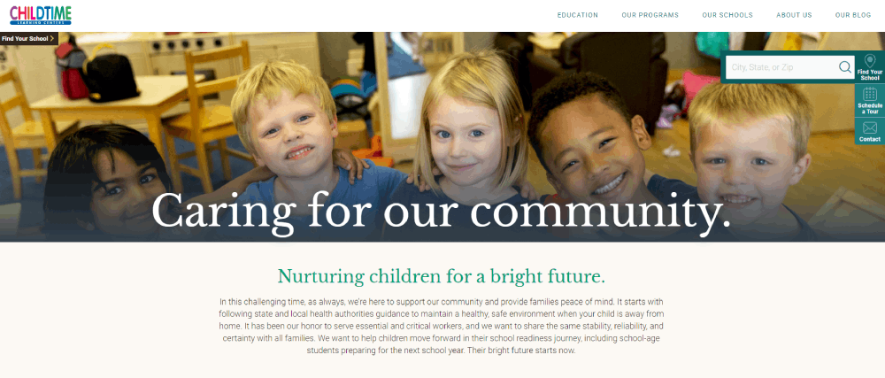
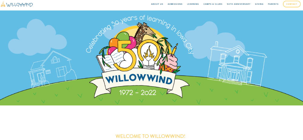
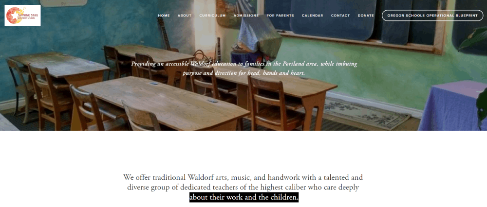
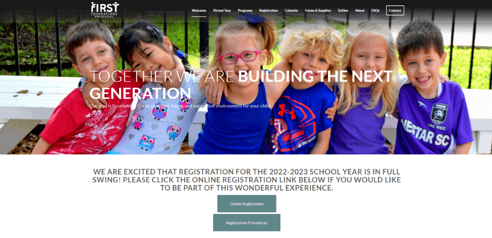
Kindergarten Website Design Examples
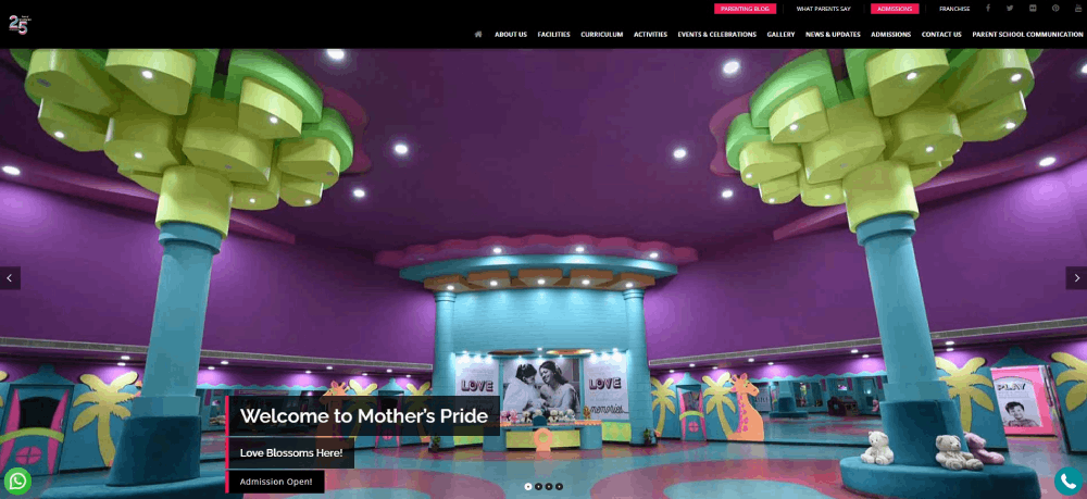
Mother’s Pride
How Kindergarten Websites Differ from Standard School Sites
What makes kindergarten web design unique?
Larger touch targets for mobile browsing, brighter color palettes, simplified navigation structures.
Standard school websites focus on academics; kindergarten sites prioritize enrollment CTAs, photo galleries, and safety credentials.
What visual elements define kindergarten website aesthetics?
Rounded corners, hand-drawn illustrations, primary colors (yellow, blue, red, green), cartoon mascots.
Sans-serif fonts with high x-heights like Nunito or Quicksand improve readability on mobile devices.
Sites using custom illustrations stand out from template-heavy competitors.
Common Design Patterns in Kindergarten Websites
What navigation structures work for kindergarten sites?
Sticky headers with 5-7 menu items max perform best.
Parent portal links belong in the top right corner; enrollment buttons need high contrast colors.
Check these website navigation examples for reference patterns.
What color combinations appear most frequently?
Primary color schemes dominate: sunny yellows (#FFD93D), sky blues (#6BCB77), soft greens (#4D96FF).
Pastel variations work for Montessori and Waldorf programs targeting a calmer aesthetic.
Avoid dark themes entirely; they conflict with the child-friendly brand positioning.
What typography choices do kindergarten websites prefer?
Google Fonts favorites: Fredoka One for headings, Quicksand for body text, Comic Neue for playful accents.
Minimum 16px body text; 44px minimum for mobile touch targets on buttons.
Sites with strong typography convert better on enrollment pages.
Technical Requirements for Kindergarten Website Builders
What CMS platforms suit kindergarten websites?
WordPress with Elementor handles 60% of childcare center homepages.
Squarespace and Wix offer simpler setups for non-technical staff; both include built-in SSL.
Custom solutions make sense only for multi-location daycare chains needing parent portal integration.
What page speed benchmarks matter for kindergarten sites?
Target these Core Web Vitals scores:
- LCP (Largest Contentful Paint): under 2.5 seconds
- FID (First Input Delay): under 100ms
- CLS (Cumulative Layout Shift): under 0.1
Compress classroom photo galleries using WebP format; lazy load images below the fold.
What security features protect kindergarten websites?
SSL certificates are non-negotiable for any site collecting parent data.
COPPA compliance matters if you display children's photos or collect information from kids under 13.
Spam protection on contact forms prevents bot submissions flooding your inbox.
Two-factor authentication on parent portal logins adds another security layer.
Design Elements to Include on Kindergarten Websites
What homepage sections perform best?
The hero section needs a welcoming image of children engaged in activities, not stock photos.
Place your enrollment CTA button within the first viewport; use contrasting colors like orange or green.
Include these sections in order:
- Hero with tagline and primary CTA
- Program overview (3-4 cards max)
- Photo gallery preview
- Parent testimonials
- Staff highlights
- Contact block with embedded Google Maps
What interior pages do kindergarten websites need?
Core pages for any early childhood education website:
- About Us (mission, history, accreditation badges from NAEYC)
- Programs/Curriculum (Montessori Method, Reggio Emilia Approach, or traditional)
- Enrollment/Admissions with online registration
- Gallery organized by classroom or activity type
- Staff Directory with teacher bios and credentials
- Parent Portal login
- Tuition and Fees (transparent pricing builds trust)
- Calendar/Events
- Contact with multiple methods
What footer information matters for kindergarten sites?
Address, phone (click-to-call), email, operating hours in a scannable format.
Add licensing numbers, privacy policy link, and social icons for Facebook, Instagram, Pinterest.
The website footer is where parents look for quick contact details after scrolling.
Mobile Design Considerations for Kindergarten Websites
How should kindergarten sites display on smartphones?
Over 70% of parents research childcare options on mobile devices first.
Responsive design requirements:
- Touch targets minimum 44x44 pixels
- Click-to-call buttons prominent in header
- Collapsible hamburger menus with clear icons
- Swipeable photo galleries
- Font sizes minimum 16px to prevent zoom
Test on both iOS and Android; forms should auto-fill parent contact information.
A user friendly website reduces bounce rates and increases tour bookings.
Enrollment Flow Design for Kindergarten Websites
What form fields capture prospective parent information?
Keep inquiry forms short; 5-7 fields maximum for first contact.
Required fields:
- Parent name
- Email address
- Phone number
- Child's age or birthdate
- Preferred start date
Optional: how they found you (Google, referral, drive-by), preferred program, siblings already enrolled.
Multi-step forms with progress indicators convert better than single long pages.
What confirmation elements reassure parents after form submission?
Redirect to a thank you page with clear next steps, not just a popup message.
Send automated email confirmation within seconds using Mailchimp or Constant Contact integration.
Include expected response timeline (24-48 hours), tour scheduling link, and downloadable info packet.
Add the director's photo and direct phone number to build immediate trust with prospective families.
Parents comparing daycare websites will remember the one that responded fastest and felt most personal.
FAQ on Kindergarten Website Design
What makes a good kindergarten website design?
A good kindergarten website combines playful visuals, mobile responsiveness, fast load times under 3 seconds, and clear enrollment pathways. Parents need to find contact information, program details, and tour scheduling within two clicks from the homepage.
What colors work best for preschool websites?
Primary colors like yellow, blue, red, and green perform best for early childhood education websites. Pastel variations suit Montessori and Waldorf programs. Avoid dark themes entirely since they conflict with child-friendly brand positioning and parent expectations.
Which CMS platform should I use for a kindergarten website?
WordPress with Elementor handles most childcare center sites effectively. Squarespace and Wix offer simpler setups for non-technical staff. Both include built-in SSL certificates and mobile-responsive templates designed for educational institutions.
How many pages does a kindergarten website need?
Core pages include: About Us, Programs/Curriculum, Enrollment, Gallery, Staff Directory, Parent Portal, Tuition, Calendar, and Contact. That's 9 pages minimum. Add a blog for classroom activity updates if you have capacity to maintain it.
What fonts are best for kindergarten websites?
Google Fonts like Fredoka One, Quicksand, Nunito, and Comic Neue work well for preschool sites. Use playful fonts for headings and clean sans-serif options for body text. Minimum 16px size ensures readability on mobile devices.
How do I make my kindergarten website mobile-friendly?
Use responsive design with touch targets minimum 44x44 pixels. Add click-to-call buttons in headers, collapsible menus, and swipeable photo galleries. Test on iOS and Android before launching to catch display issues.
What should be on a kindergarten website homepage?
Include a hero image with children, enrollment CTA button, program overview cards, photo gallery preview, parent testimonials, staff highlights, and contact block with Google Maps embed. Keep the most important actions above the fold.
How do I add a parent portal to my preschool website?
WordPress plugins like MemberPress or LearnDash add secure login areas. Squarespace and Wix offer member pages with password protection. Integrate with childcare management software like Brightwheel or HiMama for attendance and billing features.
What security features do kindergarten websites need?
SSL certificates are mandatory for any site collecting parent data. COPPA compliance applies if displaying children's photos. Add spam protection on contact forms, two-factor authentication on parent portals, and regular security updates on your CMS.
How much does a kindergarten website cost to build?
DIY options using Wix or Squarespace run $150-300 annually. WordPress with premium theme and hosting costs $300-600 yearly. Custom designs from web design agencies range from $2,000-10,000 depending on features and complexity.
Conclusion
These kindergarten website design examples prove that effective preschool sites balance playful aesthetics with practical functionality.
Parents want classroom photo galleries, transparent tuition information pages, and online enrollment systems that work on their phones.
Start with a reliable school website builder like WordPress or Squarespace.
Pick a child-friendly color palette with primary hues. Add a teacher staff directory with real photos and credentials.
Track visitor behavior using Google Analytics to see where parents drop off.
Test your enrollment forms on mobile devices before going live.
The best early learning center homepages convert curious browsers into scheduled tours within 48 hours.
Your site should do the same.


