

How to embed a Google form in WordPress
March 17, 2026
Top IT Company Website Design Examples
March 17, 2026Color is the first thing a visitor feels, and it takes just 50 milliseconds to form that impression.
Websites with a calm color palette use low-saturation hues, restrained contrast, and soft neutrals to reduce visual noise and build trust before a single word is read.
The effect is measurable. Calm palettes lower cognitive load, extend session duration, and signal credibility across wellness, SaaS, luxury e-commerce, and editorial design alike.
This article covers what technically defines a calm palette, which industries use it most, how it affects user behavior and conversion, and which real-world tools and examples you can use to build one.
What Is a Calm Color Palette in Web Design?
A calm color palette is a controlled set of low-saturation, low-contrast hues that reduce visual noise and cognitive load for the user. It is not a random collection of soft colors. It is a deliberate system built around restraint, where every hue, value, and contrast ratio works together to lower visual tension without losing functional clarity.
The distinction matters. Calm is not the same as dull. A dull palette loses contrast entirely and makes content hard to read. A calm palette keeps enough contrast for hierarchy and legibility while removing the visual aggression that comes from fully saturated or clashing hues.
People make a subconscious judgment about a website within 50 milliseconds, and 94% of those first impressions are based on design, not content (Forbes, 2024). A calm palette shapes that judgment before a single word is read.
How Calm Palettes Differ from Related Styles
These 4 terms get mixed up constantly, and they are not interchangeable:
- Calm: Low saturation, controlled contrast, intentional hierarchy across 2-3 hues
- Minimalist: Focused on removing elements, not necessarily on hue restraint
- Pastel: High lightness, often still saturated, can feel playful rather than calm
- Monochromatic: Single hue at varying values, which can produce calm results but is a structural choice, not a mood-based one
A minimalist website and a website with a calm palette often overlap, but they start from different decisions. Minimalism reduces quantity. Calm palettes manage quality of visual stimulation.
Role in User Experience
Restrained palettes reduce cognitive load and guide user actions more effectively than high-stimulation color systems (Nielsen Norman Group). When every element competes for attention, users reach decision paralysis. E-commerce sites using high-contrast brutalist palettes show 22% lower add-to-cart rates compared to more restrained approaches (Roberto Moreno Celta, Medium, 2025).
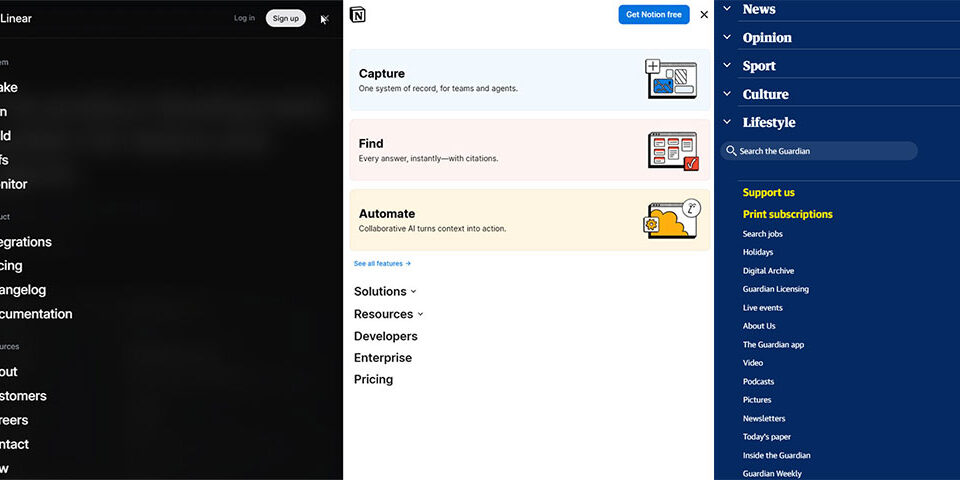
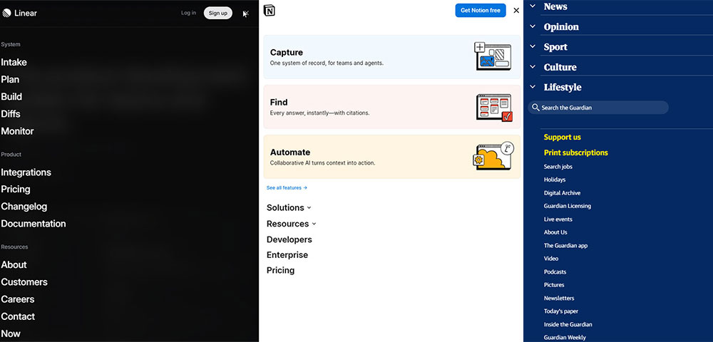
Calm palettes slow eye movement, extend reading sessions, and build a perception of credibility. Notion, for example, uses near-neutral tones across its entire interface specifically to reduce cognitive load during long work sessions.
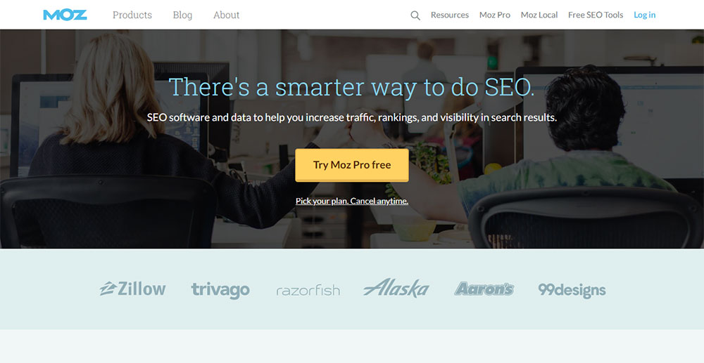
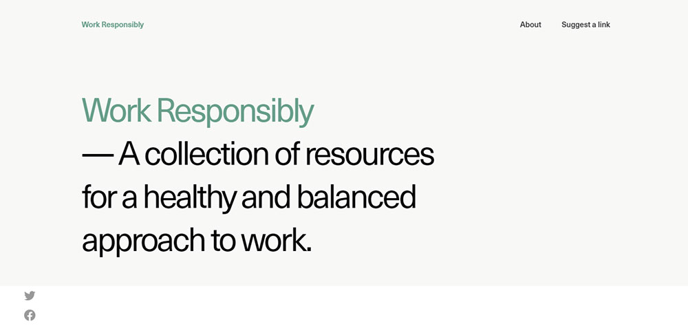
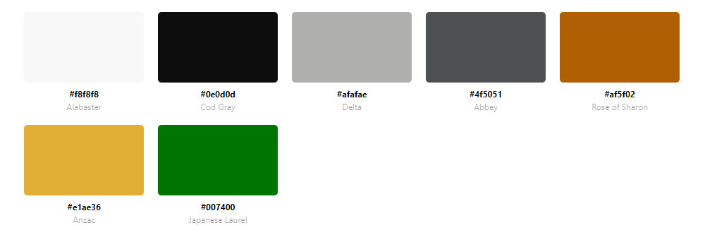
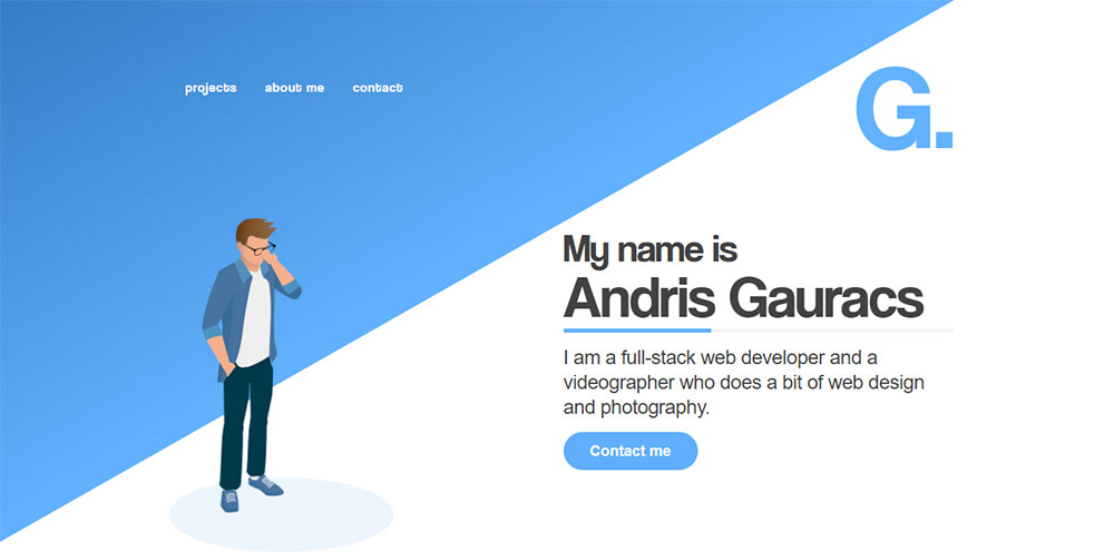
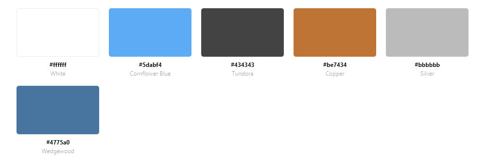
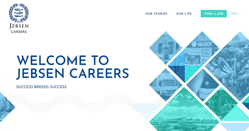
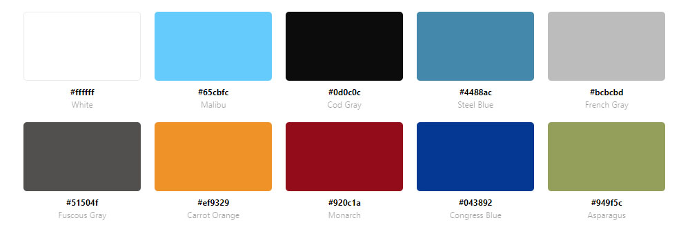
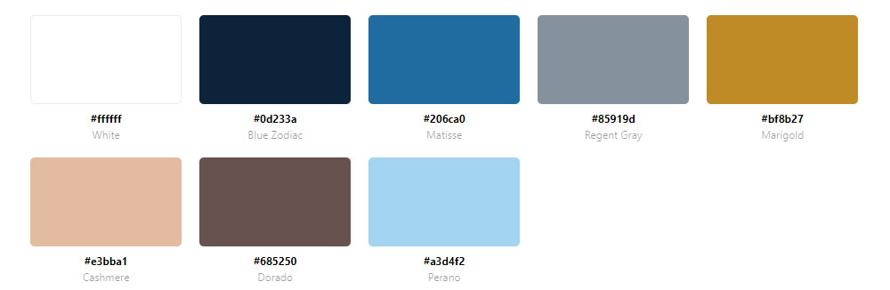
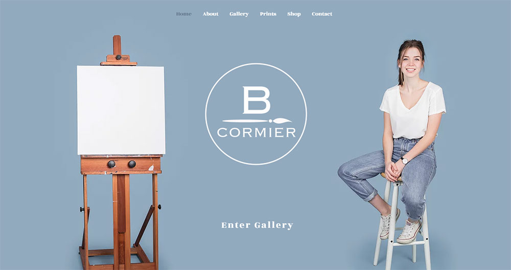
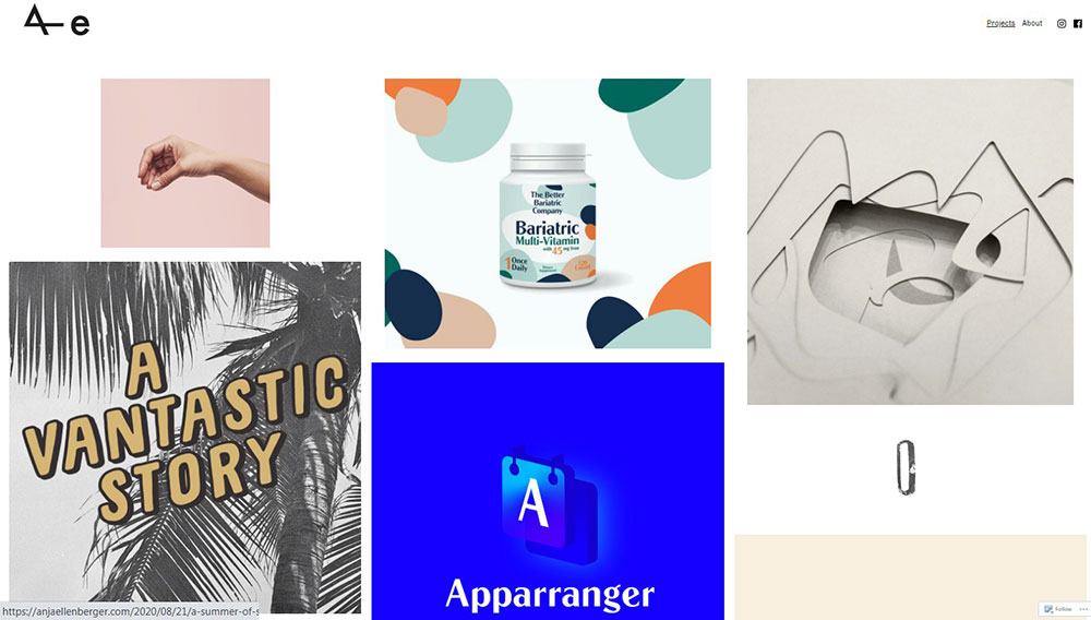
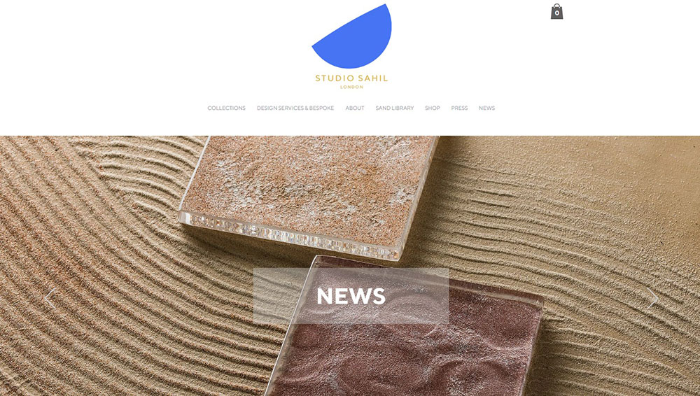
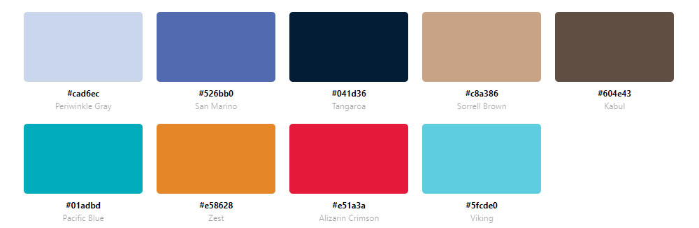
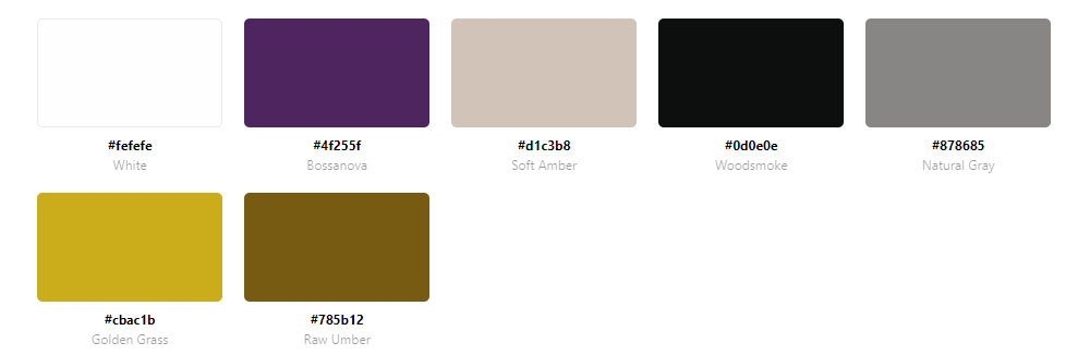
Websites With A Calm Color Palette
Moz


What Color Properties Define a Calm Palette?
The technical foundation of a calm palette comes down to 3 color attributes: saturation, lightness, and contrast ratio. Get these wrong and the palette will not read as calm regardless of which hues are chosen.
Saturation and Lightness Ranges That Read as Calm
In HSL color values, calm palettes typically keep saturation below 30% for background and primary surface colors. Accent colors can go higher, but rarely above 55-60% saturation without breaking the overall tone.
Lightness range: Calm backgrounds avoid pure white (#ffffff) and pure black (#000000). Soft off-whites like #f5f5f0 and near-blacks like #1a1a1a read as calmer because they reduce the harshness of maximum contrast.
A 2025 study published in the journal Behavioral Sciences (Kyoto Institute of Technology) confirmed that low-saturation backgrounds measurably reduce anger responses compared to high-saturation equivalents, across multiple hue families including blue-green and yellow-green.
Hue Families Most Associated with Calm Web Design
Not every low-saturation color reads as calm. Hue temperature matters.
| Hue Family | Calm Association | Common Use |
|---|---|---|
| Desaturated blue | Trust, focus, professionalism | SaaS, finance, healthcare |
| Muted sage green | Nature, balance, low stimulation | Wellness, lifestyle, editorial |
| Warm gray / greige | Neutrality, softness, luxury | E-commerce, fashion, interiors |
| Dusty earth tones | Grounding, warmth, organic quality | Skincare, food, sustainability brands |
| Cool off-white | Clarity, openness, calm efficiency | Productivity tools, portfolios |
A 2010 study in the Journal of Environmental Psychology found that blue environments lower heart rate and breathing rate, directly promoting physiological relaxation. This is why desaturated blue remains the most consistently calm-perceived hue across digital interfaces.
Color can increase brand recognition by up to 80% (University of Loyola, Maryland). Calm palettes leverage this by making that recognition feel consistent and low-pressure rather than loud.
What Industries Use Calm Color Palettes Most?
Calm palettes are not universal. They cluster in specific industries where the audience's emotional state, trust requirements, or usage context makes visual restraint a functional advantage.
Mental Health, Wellness, and Healthcare
This is the clearest use case. Therapy platforms, meditation apps, and wellness brands need to signal safety and reduce user anxiety at first glance. A high-stimulation palette actively works against that goal.
Blue tones specifically are linked to trust and professionalism, making them a preferred choice for corporate and healthcare websites where credibility is the primary conversion driver (New Target, 2024). The best therapist websites almost universally use muted blues, soft greens, and warm neutrals for exactly this reason.
Spa websites and yoga websites follow the same logic. The palette is part of the promise before the user reads a word.
Productivity Tools, SaaS, and Finance
Focus-driven interfaces need calm backgrounds. Users of project management tools, note-taking apps, and financial dashboards spend extended sessions inside these products. A visually aggressive palette creates fatigue.
Finance adds a trust layer. Banks and fintech brands use desaturated blues and cool grays because high saturation reads as flashy, not stable. Mint's use of muted greens and blues directly communicates financial growth and calm, not urgency.
Fintech websites and finance websites both follow this pattern, though fintech sometimes allows slightly higher saturation for a modern, product-forward tone.
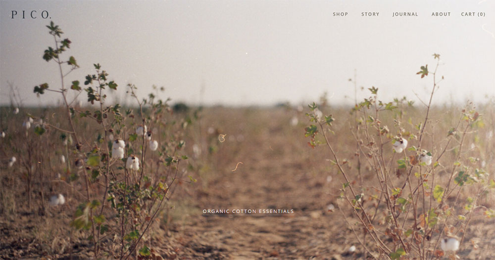
Luxury E-Commerce and Fashion
Calm signals premium. Loud signals budget. This is the simplest explanation for why luxury brands almost uniformly choose restrained palettes.
Warm neutrals, warm whites, and single-hue product photography backgrounds dominate high-end fashion and skincare. The palette removes noise so the product value becomes the visual anchor. This is also a common approach in jewelry websites, where the product needs to hold all the attention.
How Do Calm Color Palettes Affect User Behavior?
Color choice directly affects measurable UX outcomes. These are not subjective preferences. The research is consistent enough to treat calm palette decisions as behavioral design choices, not aesthetic ones.
Trust, Credibility, and First Impressions
Users form opinions about websites in 50 milliseconds (Lindgaard et al., 2006, Behaviour and Information Technology). In that window, visual appeal including color is the primary driver of perceived credibility.
A British study found that 94% of website critiques were about design, not content (CXL, citing Stanford University research). Of those design-related critiques, color scheme and visual hierarchy ranked highest. Calm palettes consistently score higher on credibility assessments than high-stimulation alternatives.
This is especially significant for professional websites where trust is a direct conversion factor.
Cognitive Load, Session Duration, and Decision-Making
Too many colors increase cognitive load and distract users from important actions. A restrained palette improves focus and strengthens visual hierarchy (Design Monks, 2024).
Users interacting with green elements in calm interfaces report a 23% higher satisfaction rate (Hakunamatatata Tech, citing internal UI research). More broadly, e-commerce sites using restrained color approaches show significantly higher add-to-cart completion than brutalist, high-contrast alternatives.
Well-placed design choices including calm color reduce cognitive load and keep users on the page longer (LoopEx Digital, 2026). Cluttered designs with aggressive color schemes see bounce rates approximately 50% higher in 2026 compared to restrained alternatives.
Conversion: Calm Does Not Mean Passive
A common misunderstanding is that calm palettes suppress conversion. They do not, when implemented correctly.
The key is a single high-contrast accent color for CTAs against a calm base. The calm palette makes the accent stand out harder, not less. This is exactly how Notion, Aesop, and Calm handle conversion elements. The call to action button on a calm-palette site does not need to shout because the surrounding environment is already quiet.
A contrasting CTA color increased click-through rates by 35% on average in 2023 (Nielsen Norman Group). On calm-palette sites, this contrast is built into the system rather than achieved by making everything louder.
What Is the Role of White Space in a Calm Color Palette?
White space is not the absence of design. It is a color element. In a calm palette, the space between elements contributes directly to the low-stimulation quality of the interface. Remove it and the palette loses its effect, even if the hues remain unchanged.
White Space as a Functional Color Component
Visual weight reduction: Generous padding and margin reduce the perceived density of content, which lowers user stress during reading or task completion.
Hue perception: Colors look different depending on what surrounds them. A muted sage green surrounded by tight, dense content looks completely different from the same sage green given room to breathe. Calm palettes require space to register as calm.
Hierarchy support: White space creates separation between sections, which allows the limited hue range of a calm palette to still signal visual priority without introducing new colors.
Less complex websites are preferred over more complex ones across multiple credibility studies (PMC, citing Michailidou et al.). Density kills calm even when the palette is correct.
When Tight Layouts Break Calm Palettes
I have seen this happen repeatedly: a designer builds a technically correct calm palette with the right saturation levels and hue families, then compresses the layout to fit more content above the fold. The calm reads as tension instead.
Calm-design SaaS products consistently use generous spacing ratios. Notion's default document view uses padding that would feel excessive in other contexts. That generosity is a deliberate decision, not leftover real estate.
The hero section is where this is most visible. Calm-palette sites give the hero room. Busy palettes and dense hero layouts correlate consistently with higher bounce rates, not lower ones.
How Is Typography Chosen to Match a Calm Color Palette?
Typography and color are not independent decisions in calm-palette design. The wrong type color, weight, or contrast breaks the calm effect even when the palette itself is technically sound.
Text Color in Calm Palette Systems
Pure black (#000000) on a soft off-white background is too harsh for a calm palette. The contrast is technically accessible but visually aggressive. Calm-palette sites use soft blacks in the range of #1a1a1a to #2d2d2d, which reduce maximum contrast while staying well above WCAG AA requirements.
Typography in calm interfaces typically avoids bold, heavy weights for body content. Notion, Bear app, and Dropbox Paper all use regular or medium weights with generous line height to maintain the calm, readable quality of the text layer.
Typeface Choices and Visual Tension
High-contrast serif typefaces with strong thick-thin stroke variation introduce visual tension. This can be intentional in editorial design, but in calm palettes, lower-contrast typefaces with more uniform stroke widths integrate better.
Sans-serif typefaces with humanist or geometric proportions read as calm in most contexts. Examples from well-known calm-palette products: Inter (Notion, Linear), Neue Haas Grotesk (Aesop), and GT America (several wellness brands).
Typefaces convey personality and signal identity even before reading begins (Shaikh et al., 2007, cited in ResearchGate typography review, 2024). In calm-palette design, the typeface choice either reinforces the low-stimulation quality of the palette or fights it. Choosing a display typeface with high personality in a calm-palette context requires care. It works best as a headline accent, not as a system-wide choice.
This is also worth noting for websites with strong typographic systems: calm and expressive typography are not mutually exclusive, but the relationship between type weight, type color, and background hue needs to be checked carefully at every combination in the system.
What Accent Colors Work with a Calm Base Palette?
One accent. That is the rule for calm-palette systems that still need to convert.
The calm base palette does the heavy lifting of reducing visual tension. The accent color's job is singular: mark where to click. Blue buttons came out on top in 31% of 2,588 CTA color A/B tests, making it the most consistently successful choice across industries (Amra and Elma, 2026). On calm-palette sites, this result makes particular sense because desaturated backgrounds amplify the contrast of any single accent.
Accent Hue Selection for Calm Palettes
Dusty rose: works against warm greige and off-white bases, widely used in wellness and beauty.
Sage green: pairs cleanly with warm neutrals and cool off-whites, common in sustainability and lifestyle brands.
Muted terracotta: strong against light gray and stone bases, signals warmth without aggression.
Soft cobalt: the most versatile option, reads as trust-building against almost any calm neutral base.
Strategic color choices increase CTA clicks by up to 34% (HubSpot), but this number assumes the accent color contrasts with the surrounding palette. On a calm base, even a moderately saturated accent achieves high visual contrast without needing to be loud.
Saturation Ceiling for Accent Colors
Calm palettes typically keep accent colors below 60% saturation. Higher than that and the accent starts competing with the base rather than sitting above it.
The 60-30-10 rule applies directly here: 60% neutral background, 30% secondary palette tones, and 10% accent reserved exclusively for CTAs and key interaction points (ColorUXLab). Reducing clutter around a single CTA color increased Open Mile's conversion rate by 232% (VWO). The principle is the same regardless of palette style.
Linear and Notion both use this approach. The accent color appears on interactive elements only and nowhere else in the interface. When you see it, you know what it means.
If you are working on SaaS landing pages specifically, single-accent systems consistently outperform multi-accent ones because they eliminate the visual ambiguity about where the primary action is.
How Do Dark Mode Calm Palettes Differ from Light Mode?
Dark mode is no longer a niche preference. As of 2024, nearly 82% of smartphone users use dark mode (Earthweb), and dark mode-first design is now specified in 30% of new web design projects, up from 8% in 2021 (Awwwards, via Colorlib). Calm palette principles still apply in dark contexts, but the technical decisions change significantly.
Background Values and Surface Layering
Pure black (#000000) is too extreme for a calm dark palette. It creates harsh contrast and causes visual issues on OLED screens (Algoworks, 2024).
Calm dark bases use deep, desaturated near-blacks instead:
- #121212 (Material Design recommendation)
- #16161a (used by products like Obsidian)
- #1c1c1e (Apple's system dark background)
- #0f172a (slate-tinted dark, common in SaaS dashboards)
Surface layering replaces color contrast for creating depth. 3-4 slightly lighter near-black tones stack to signal hierarchy, where cards sit above backgrounds and modals sit above cards. No additional hue is needed.
These are well-demonstrated in dark mode web design examples from products like Linear, Craft, and the Obsidian interface.
Desaturation Rules for Dark Contexts
Colors behave differently on dark backgrounds. Saturated hues create optical vibration against dark surfaces, causing eye strain and failing accessibility checks (Material Design guidelines).
Google's Material Design system recommends reducing saturation by approximately 20 percentage points when moving a color from light mode to dark mode use. A calm blue that reads at 40% saturation in light mode needs to sit closer to 20% in dark mode to maintain the same calm visual weight.
Key dark-mode calm rule: If your background saturation is below 15% and your value is below 15%, the background reads as calm regardless of its base hue (Colorhero, 2025).
This also applies to text. Pure white (#ffffff) on dark backgrounds causes the halation effect for users with astigmatism. Off-white at around 88% opacity or #fafaf9 resolves this without reducing accessibility compliance (Wix Studio, 2024).
Examples: Calm Dark Palettes in Practice
Linear uses deep desaturated purples and cool grays rather than neutral black. The result reads as focused and premium rather than harsh.
Craft uses warm dark surfaces (#1c1c1e range) that borrow from Apple's system palette. The warmth prevents the cold, clinical quality common in developer-focused dark interfaces.
For comparison, dark themed websites that push toward pure black with high-saturation neons read as high-energy, not calm. The palette category is different entirely.
What Tools Generate Calm Color Palettes?
AI color palette tools saw over 400% growth in usage from 2024 to 2025, with Coolors processing over 50 million palettes in 2024 alone (Colorlib). The tools are genuinely useful for exploration. The problem is that none of them automatically outputs a calm palette without some deliberate setup on the designer's side.
Coolors
Best for: fast iteration with manual saturation control.
Coolors introduced AI-powered generation in 2024, allowing keyword and mood-based inputs. For calm palettes, the most reliable approach is locking a desaturated anchor color (a soft blue or warm gray) and generating complements from there.
It also has a built-in contrast checker and color blindness simulator, which are both necessary for ensuring calm palette choices stay accessible. Exports work directly to Figma and Adobe plugins.
Huemint
Huemint generates colors based on context rather than a flat swatch strip. It knows which colors will be used as backgrounds, which as text, and which as accents, and generates accordingly.
Took me a while to understand how much better this is than standard generators for calm palettes specifically. Because it accounts for contrast relationships between roles, it naturally produces lower-saturation backgrounds without the designer needing to manually pull saturation down after generation.
Realtime Colors and Additional Tools
| Tool | Primary Use | Best For Calm Palettes When |
|---|---|---|
| Realtime Colors | Live UI preview of palette | Checking calm effect in actual layout context |
| Adobe Color | Harmony rules and image extraction | Using "muted" harmony rules or photo extraction |
| Khroma | AI palette learning from preferences | Training the model on calm reference palettes |
| Stark | Accessibility and WCAG checking | Verifying calm low-contrast choices still pass AA |
Realtime Colors is the one I reach for when I am uncertain whether a palette reads as calm in practice. Swatches lie. A beige and sage green combination that looks serene as five color blocks can feel completely different when applied to a navigation bar, a hero section, and a form field simultaneously.
These tools are also well-covered alongside broader web design tools resources if you want to compare them against prototyping or design system tools.
What Mistakes Break a Calm Color Palette?
Most calm palette failures are not about wrong hue choices. They are about execution errors that introduce visual tension after the palette has been defined correctly.
Too Many Hues and Pure White Backgrounds
Calm palettes work on 2-3 hues maximum. Beyond that, the visual system starts to feel competitive rather than restrained.
Pure white backgrounds (#ffffff) are one of the most common errors. The maximum contrast against text elements reads as clinical and harsh. Soft off-whites like #f5f5f0 or #fafaf8 preserve brightness while removing the visual edge.
Colors increase website comprehension by 73% and readership by 40% (Colorcom, via Higo Creative). Both of those effects depend on palette coherence. A calm palette with an accidental pure-white background introduces a visual jolt that undermines the effect.
Accessibility Failures and Accent Overuse
Calm palettes create a specific risk: low-contrast choices can drift below WCAG AA requirements (4.5:1 for normal text). 81% of websites fail basic contrast checks (Colorlib). Calm palettes are disproportionately represented in that failure group because designers reduce contrast in pursuit of softness and overshoot.
The fix is simple. Check every text-background combination with a contrast checker before finalising. A calm palette can pass WCAG AA while still looking soft, as long as the saturation reduction is targeted at backgrounds rather than text contrast ratios.
Accent overuse is the other common failure. Once the accent color appears on more than interactive elements, it loses its signal value and the palette starts to read as neither calm nor clear. This is especially common on color theory implementations where designers apply the accent to decorative elements, icons, and borders in addition to CTAs.
Mixing Warm and Cool Neutrals
This is the one that is hardest to spot until a design is fully assembled. Warm grays (those with slight yellow or red undertones) and cool grays (with blue or green undertones) visually fight each other even at low saturation.
Pick one temperature for your neutral system and commit to it. Warm neutrals pair with warm anchors (sage, terracotta, dusty rose). Cool neutrals pair with cool anchors (desaturated blue, muted slate, soft teal). Crossing these temperature families creates a subtle but persistent visual discomfort that undermines calm.
Checking your final color scheme against real UI layouts (not just swatch strips) before committing is the most reliable way to catch this mistake before it goes live.
How Do Calm Palettes Perform in E-Commerce Contexts?
E-commerce creates the sharpest tension in calm palette design. The palette needs to reduce friction and build trust, while conversion mechanics still depend on urgency cues, visible CTAs, and product focus.
Luxury and Premium E-Commerce
Calm signals premium. Most luxury e-commerce brands converge on 2-3 core colors supported by neutrals (Hook Agency, 2026). Fewer colors, tighter control, and consistent application across every page signal confidence before price is even shown.
Aesop's e-commerce site is the clearest example. Warm earthy neutrals, minimal product photography, no high-saturation accent competing with the products. The palette communicates considered, expensive positioning the moment the page loads.
This approach also works for jewelry website templates and high-end fashion. The product becomes the most visually complex element on the page, which is exactly the effect premium brands need. Browse any luxury color palette reference collection and the pattern repeats consistently: restrained base, single accent, generous negative space.
Category Pages Versus Product Detail Pages
Category pages: calm palette with more breathing room, products as visual anchors.
Product detail pages: slightly tighter layout, single strong CTA accent, product imagery against a neutral or white-adjacent background.
The calm palette constraint matters more on category pages, where multiple products compete for attention. A high-stimulation background on a category grid creates visual chaos as each product thumbnail fights the surrounding palette.
On product detail pages, you have more flexibility to introduce one accent element because the page has a single conversion goal. Reviews near CTAs increase conversions by 34%, and security badges increase conversions by up to 42% (LoopEx Digital, 2026). Both of these elements integrate cleanly into calm palettes because they are small, text-forward components that do not require additional hue complexity.
When Calm Palettes Suppress Urgency
The real risk is flash sales, clearance events, and time-limited offers. These depend on psychological urgency cues that a calm palette actively works against.
The practical solution: use the calm palette as a permanent site system and introduce a temporary high-contrast promotional overlay for sale events. Lululemon does this with seasonal campaigns, where the base site stays restrained but promotional periods introduce bolder accent use without redesigning the core palette.
This also applies to e-commerce landing page design for specific campaigns. A promotional landing page can break from the main site's calm palette while still referencing it through typography and layout.
For product landing pages outside of sale contexts, calm palettes consistently outperform high-stimulation alternatives because the product, not the palette, should command attention.
FAQ on Websites With A Calm Color Palette
What makes a color palette feel calm on a website?
Low saturation, soft lightness values, and a limited hue range of 2-3 colors. Calm palettes avoid pure white and pure black. They use muted neutrals, desaturated blues, warm grays, and sage greens to reduce visual tension without losing functional contrast.
Which colors are most commonly used in calm web design?
Desaturated blues, warm off-whites, muted sage greens, dusty earth tones, and cool grays. These hue families consistently score lowest on visual stimulation measures. Blue specifically lowers heart rate and promotes relaxation, making it the most widely used calm base hue.
Do calm color palettes hurt conversion rates?
No, when paired with a single high-contrast accent color for CTAs. The calm base makes the accent stand out harder. Reducing visual clutter around one CTA color increased conversions by 232% in one VWO-tracked test.
What industries use calm palettes most?
Mental health platforms, wellness brands, SaaS productivity tools, luxury e-commerce, and editorial sites. These sectors share a common need: users spend extended time on the interface, and visual fatigue directly reduces engagement and trust.
Is a calm palette the same as a minimalist palette?
Not exactly. Minimalism reduces the number of elements. A calm palette controls the quality of visual stimulation through hue, saturation, and contrast choices. A site can be calm without being minimal, and minimal without being calm.
What HSL saturation values define a calm palette?
Background and surface colors typically sit below 30% saturation. Accent colors can reach up to 55-60% saturation before breaking the calm tone. Pure white (#ffffff) and pure black (#000000) are avoided in favor of soft off-whites and near-blacks.
How does white space relate to a calm color palette?
White space is a functional color element in calm design. Generous padding reduces perceived content density and lowers user stress. A technically correct calm palette applied to a tight, dense layout will still read as visually tense rather than calm.
Can dark mode websites use calm palettes?
Yes. Calm dark palettes use deep desaturated near-blacks like #121212 or #16161a instead of pure black. Surface layering with 3-4 slightly lighter tones creates hierarchy. Accent color saturation should drop by approximately 20 percentage points compared to light mode use.
What tools help build calm color palettes?
Coolors for fast iteration with locked anchors, Huemint for context-aware generation across UI roles, Realtime Colors for live layout preview, and Stark for WCAG accessibility verification. Use Realtime Colors before finalizing, since swatches behave differently in full layouts.
What are the most common mistakes that break a calm palette?
Using more than 3 hues, using pure white backgrounds, mixing warm and cool neutrals inconsistently, overusing the accent color beyond interactive elements, and letting contrast ratios fall below WCAG AA requirements in pursuit of softness.
Conclusion
This conclusion is for an article presenting websites with a calm color palette as a deliberate design system, not an aesthetic trend.
Low saturation, controlled contrast, and restrained hue ranges reduce cognitive load, build perceived credibility, and keep users engaged longer across wellness platforms, productivity tools, and luxury e-commerce alike.
The core principle stays consistent regardless of industry: fewer well-chosen hues outperform crowded palettes every time.
Pair a soft neutral base with a single accent color, apply generous white space, and verify every text combination against WCAG AA standards.
Done right, a muted color scheme does not suppress conversions. It focuses them.
Use the tools, examples, and saturation guidelines covered here to build a serene web design that earns trust before a visitor reads a single word.


