

Awesome Websites with an Orange Color Palette (48 Examples)
November 19, 2025
Inspiring Examples of Educational Website Templates
November 24, 2025Red stops people mid-scroll. No other color commands attention quite like it.
Netflix, Target, YouTube, Coca-Cola. The biggest brands on the planet built their digital presence around this single bold hue.
But red is tricky. Get it wrong and your site feels aggressive, cheap, or exhausting to look at.
This collection of examples of red websites shows exactly how top brands and designers use red effectively across different industries.
You'll see eCommerce sites, corporate pages, portfolios, restaurants, and tech companies. Each one handles red differently.
Some go all in with full red backgrounds. Others use strategic accents that guide the eye without overwhelming it.
Study these patterns. Then apply what works to your own projects.
What is a Red Website
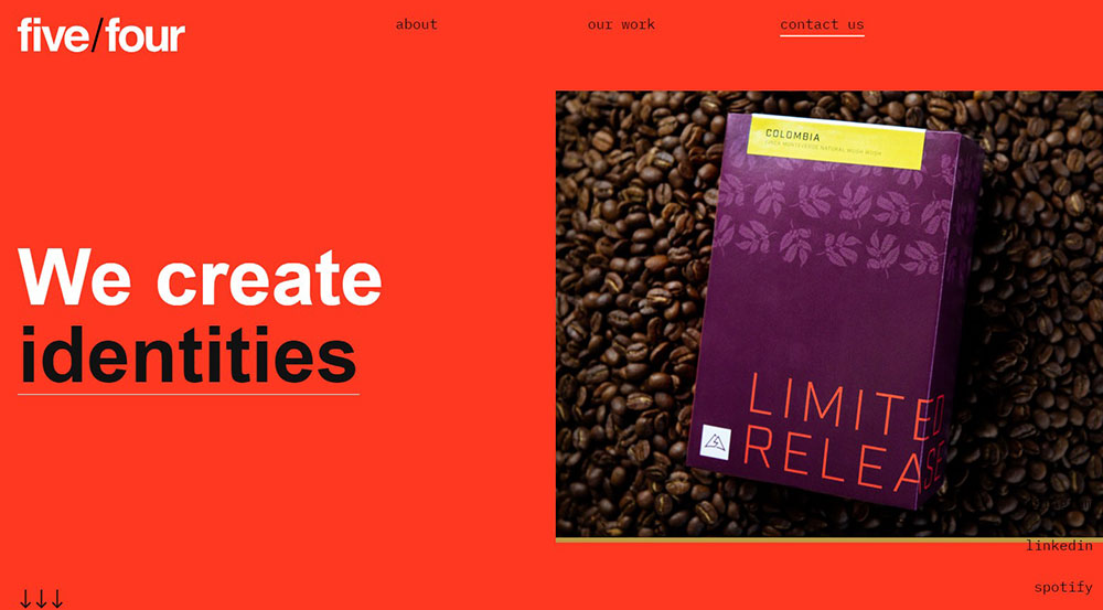
A red website is any site that uses red as its primary or dominant color in the overall color scheme. This includes backgrounds, headers, navigation bars, buttons, and accent elements.
Red sits on the warm end of the color spectrum. It grabs attention faster than any other hue. Brands like Netflix, Target, YouTube, and Coca-Cola built their entire visual identity around this color.
The hex values range from deep crimson (#DC143C) to bright scarlet (#FF2400) to softer coral tones. Some sites go full red. Others use it strategically for call to action buttons and key UI elements.
Both approaches work when executed properly.
Why Red Works in Web Design
Color Psychology Behind Red Websites

Red triggers immediate emotional responses: excitement, passion, urgency, power.
Studies show it increases heart rate and stimulates appetite, which explains why KFC, Heinz, and countless food websites rely on it heavily.
It also signals danger and importance, making visitors pay attention to critical information.
How Red Affects User Behavior on Websites
Red buttons consistently outperform other colors in A/B testing for conversions.
The color creates visual hierarchy instantly. Your eye goes to red elements first.
But there's a catch: too much red causes fatigue and can feel aggressive. Balance matters.
Pairing red with white space and neutral tones keeps the design inviting rather than overwhelming.
Best Red Website Examples
These sites demonstrate how different industries approach red in their web design.
Some go bold with full red backgrounds. Others use strategic accents.
Red eCommerce Website Examples
Target
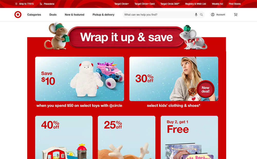
The retail giant's site uses red sparingly but effectively.
White dominates, red highlights: logo, sale badges, cart icons, promotional banners.
Clean layout with the signature bullseye red pulling attention to shopping actions.
H&M
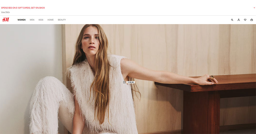
Red appears in the logo and key promotional sections.
The clothing website balances product photography with bold red accents for sales and new arrivals.
Minimalist approach lets the red moments hit harder.
Red Corporate Website Examples
Canon

Deep red runs through the entire brand experience.
Navigation bar, footer, buttons, product category highlights. Consistent and professional.
Works because Canon pairs it with generous white space and high-quality imagery.
Santander
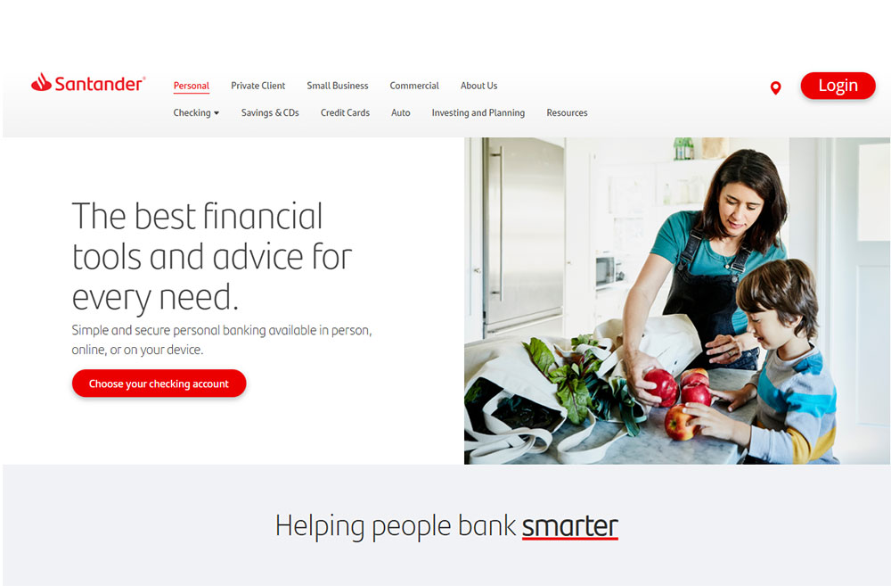
The bank website wraps its identity in signature red.
Headers, icons, interactive elements. Red everywhere, yet never chaotic.
Proves that even finance websites can embrace bold color choices.
Red Portfolio Website Examples
Creative Agency Sites
Design studios love red for its boldness.
Many agency websites use full-screen red backgrounds with white typography.
High contrast, impossible to ignore. Perfect for showcasing creative work.
Photographer Portfolios
Red creates drama for photographer websites displaying bold visual work.
The color adds intensity without competing with the images when used as accent or overlay.
Red Restaurant and Food Website Examples
KFC
Red and white dominate the Colonel's digital presence.
Hero images of crispy chicken against red backgrounds. Buttons in red. Icons in red.
The color amplifies hunger cues and brand recognition simultaneously.
Heinz
Ketchup red, obviously. The entire site feels like the iconic bottle label expanded.
Product shots pop against red sections. Navigation stays clean with white and black balance.
Brand consistency taken to its logical extreme.
Red Tech and Startup Website Examples
Netflix
Black background, red logo, red buttons. That's it.
The streaming giant proves restraint works. Red appears only where action happens.
Sign up buttons, play icons, notification badges. Strategic placement drives engagement.
Adobe
Red threads through the entire Adobe ecosystem.
Each product gets the signature red treatment in icons, headers, and UI elements across their software website.
Proves red works for serious technology websites, not just consumer brands.
Oracle
Enterprise tech with bold red accents.
The site uses red for navigation highlights, buttons, and section dividers.
Professional without being boring, which is tricky for B2B websites.
Red Color Combinations That Work for Websites
Red rarely works alone. The supporting colors determine whether a site feels elegant or chaotic.
Red and White Websites
The classic pairing. Clean, high-contrast, instantly readable.
Target, YouTube, Pinterest, CNN all use this combo. White provides breathing room; red delivers punch.
Perfect for brands wanting bold energy without visual clutter. Check how minimalist websites handle this balance.
Red and Black Websites
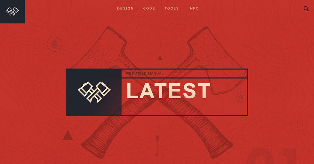
Dramatic, edgy, premium. Netflix built an empire on this palette.
Dark themed websites with red accents feel cinematic and powerful.
Works brilliantly for entertainment websites, gaming websites, and luxury brands.
Red with Neutral Colors
Gray, beige, cream soften red's intensity.
This approach suits corporate websites needing professionalism with personality.
The neutrals handle body content; red highlights what matters most.
Red Gradient Websites
Red-to-orange gradients feel warm and energetic. Red-to-pink reads softer, more playful.
Mastercard uses the red-orange gradient across their entire brand. Modern, dynamic, memorable.
Modern website designs increasingly favor gradients over flat colors.
How to Use Red in Your Website Design
Red as Primary Background Color

Full red backgrounds demand confidence. Few brands pull it off.
Keep text white or very light. Limit content density. Add generous padding around elements.
Great for landing pages, hero sections, and promotional campaigns.
Red as Accent Color

The safer choice. Most successful red websites actually use red sparingly.
Apply to:
- Navigation highlights and hover states
- Icons and small UI elements
- Links and interactive components
- Section dividers and borders
- Badge and notification indicators
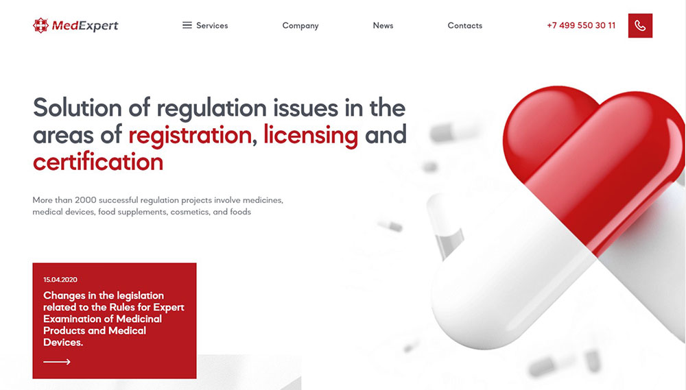
This approach works across all industries, from healthcare websites to retail websites.
Red for Call-to-Action Buttons
Red CTAs convert. Multiple studies confirm higher click-through rates versus blue or green.
The urgency factor kicks in. Red says "act now" without spelling it out.
Pair with action words: Buy, Subscribe, Download, Start, Join.
Common Mistakes When Designing Red Websites
Red punishes poor execution harder than any other color.
- Too much saturation - fully saturated red (#FF0000) strains eyes; slightly muted tones work better
- Red text on dark backgrounds - terrible readability; save red for elements, not body copy
- Ignoring accessibility - red-green colorblindness affects 8% of men; always test contrast ratios
- No visual relief - walls of red exhaust visitors; break it up with white space and imagery
- Wrong industry fit - red screams energy, not calm; avoid for spa websites or mental health websites
Study sites with good UX to understand how they balance bold colors with usability.
Avoid becoming an example of bad design.
Red Website Design Best Practices
Follow these guidelines for red that works.
- Test multiple shades - brick red, cherry, crimson, scarlet all create different moods
- Maintain contrast ratios - WCAG requires 4.5:1 minimum for text; check with accessibility tools
- Use red purposefully - every red element should guide attention somewhere specific
- Balance with neutrals - 60% neutral, 30% secondary, 10% red works as a starting ratio
- Consider cultural context - red means luck in China, danger in Western contexts, mourning in South Africa
Study your header design and website navigation carefully. These high-visibility areas set the tone.
Look at websites with good UI for inspiration on implementing red thoughtfully.
Consistent application across all web design elements separates amateur attempts from professional website design.
FAQ on Examples Of Red Websites
What brands have red websites?
Netflix, YouTube, Target, Coca-Cola, KFC, Heinz, Canon, Adobe, Pinterest, and CNN all use red prominently. These brands leverage red for brand recognition, urgency, and emotional impact across their digital presence.
Why do companies choose red for their website design?
Red triggers strong emotional responses: excitement, passion, urgency. It increases heart rate and grabs attention faster than other colors. Red also boosts conversion rates on buttons and promotional elements.
What colors pair best with red on websites?
White creates clean contrast. Black adds drama and sophistication. Gray and beige soften intensity for corporate sites. Orange gradients feel warm and modern. Avoid pairing red with green due to accessibility concerns.
Is red a good color for eCommerce websites?
Yes. Red drives action and creates urgency around sales and promotions. Target, H&M, and Uniqlo use red effectively. Works best for call-to-action buttons, sale badges, and promotional banners rather than full backgrounds.
How much red should I use on my website?
Start with the 60-30-10 rule: 60% neutral colors, 30% secondary color, 10% red. Too much red overwhelms visitors. Strategic placement on buttons, headers, and key elements delivers impact without visual fatigue.
Does red affect website conversion rates?
Multiple A/B tests confirm red buttons outperform blue and green alternatives. The color creates psychological urgency. However, context matters. Test red against your specific audience before committing to major design changes.
What industries should avoid red websites?
Wellness, meditation, and mental health brands typically avoid red. It conflicts with calm, peaceful messaging. Eco-friendly brands often skip red too. Always consider your brand values and target audience expectations first.
Can red websites be professional and corporate?
Absolutely. Santander, HSBC, Oracle, and Canon prove red works for corporate sites. The key is balance: pair red with generous white space, clean typography, and professional imagery. Restraint makes it sophisticated.
What hex codes work best for red website design?
Avoid pure red (#FF0000), which strains eyes. Try crimson (#DC143C), firebrick (#B22222), or Indian red (#CD5C5C) for softer tones. Netflix uses #E50914. Test shades against your background colors for optimal contrast.
How do I make a red website accessible?
Maintain WCAG contrast ratios of 4.5:1 minimum for text. Never use red text on dark backgrounds. Remember 8% of men have red-green colorblindness. Add secondary indicators like icons or underlines alongside color cues.
Conclusion
These examples of red websites prove one thing: red works when you respect its power.
From Mastercard's warm gradients to ESPN's bold sports branding, each site handles red differently based on industry and audience.
The common thread? Restraint and purpose.
Red demands balance. Pair it with neutrals. Give it breathing room. Use it to guide attention, not overwhelm it.
Your CTA buttons, hero sections, and brand accents are where red delivers the strongest impact.
Full red backgrounds work too, but only with confident execution and high-contrast typography.
Test different shades. Check your accessibility. Study how Virgin, Red Bull, and Marvel approach their vibrant color palettes.
Then build something bold.


