


Stunning Examples of SaaS Website Templates
November 19, 2025
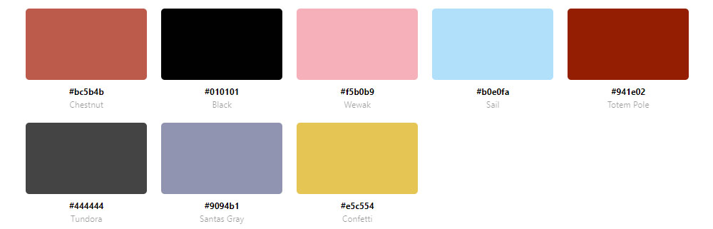
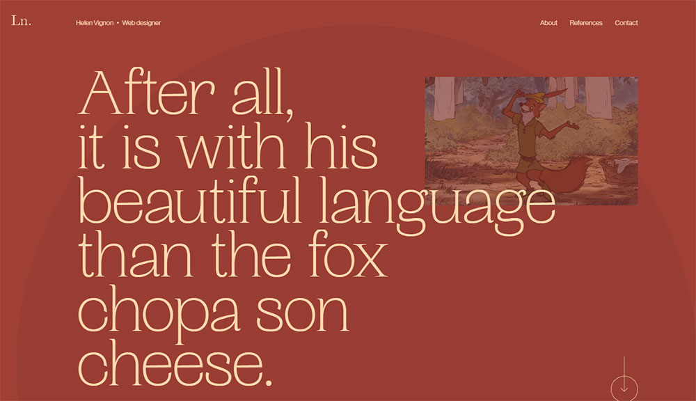
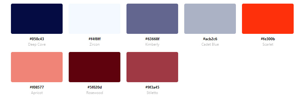
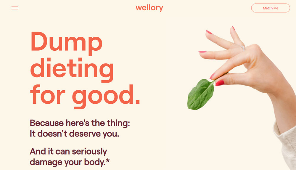
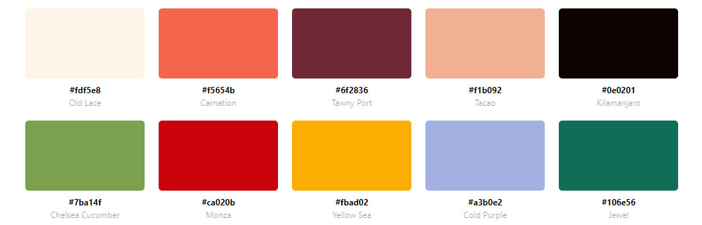
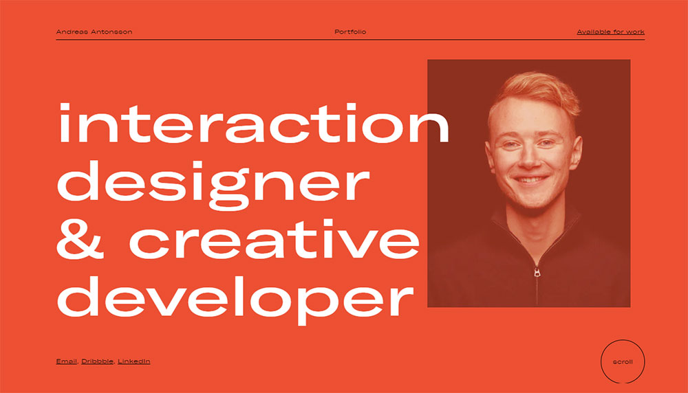
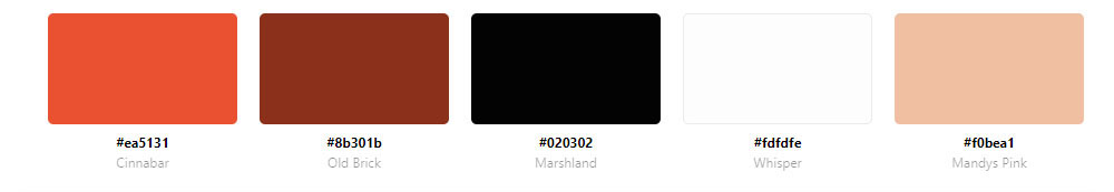
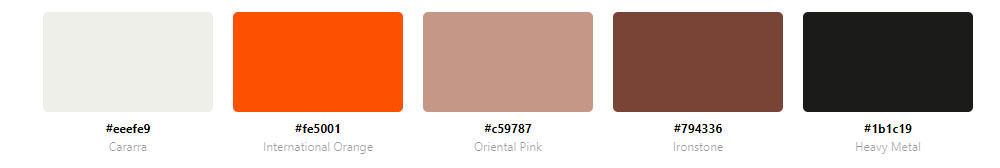
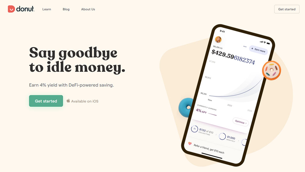
Modern red websites with awesome color schemes
November 21, 2025Orange grabs attention. It converts clicks. And some of the world's biggest brands built their entire visual identity around it.
Looking at examples of websites with an orange color palette reveals why Amazon, Nickelodeon, SoundCloud, and Firefox all chose this warm, energetic hue.
Orange sits in a sweet spot between red's urgency and yellow's optimism. It communicates creativity, affordability, and enthusiasm without overwhelming visitors.
This guide breaks down real website examples using orange effectively. You'll learn which hex codes they use, how they balance orange with secondary colors, and which industries benefit most from this vibrant palette.
Whether you're designing a SaaS platform, food brand, or entertainment site, these examples show exactly how to make orange work.
What is an Orange Color Palette in Web Design
An orange color palette uses orange as the dominant or accent color across a website's visual design.
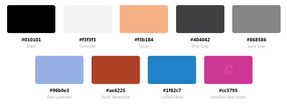
Orange sits between red and yellow on the color spectrum. Pure orange carries the hex code #FFA500, but web designers work with dozens of variations.
Burnt orange (#CC5500), tangerine (#FF9966), coral (#FF7F50), and amber (#FFBF00) all fall under this warm color family.
Designers apply orange in multiple ways: background colors, call to action buttons, icon accents, typography highlights, and gradient overlays.
The color creates visual warmth. It draws attention to conversion elements without the aggressive energy of pure red.
Brands like Amazon, Fanta, Nickelodeon, and SoundCloud built global recognition through orange-dominant palettes. Firefox, Etsy, and HubSpot followed the same approach.
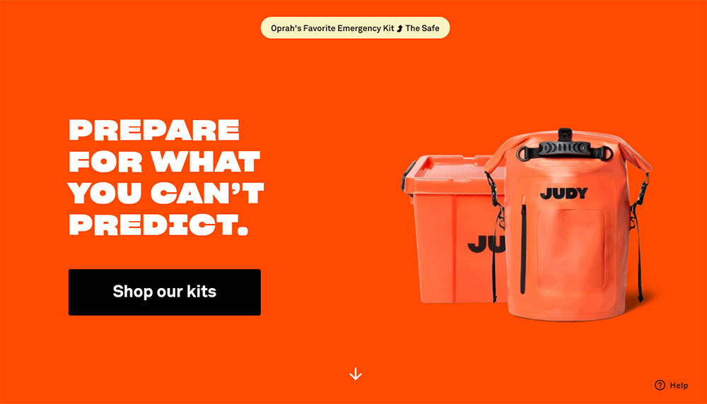
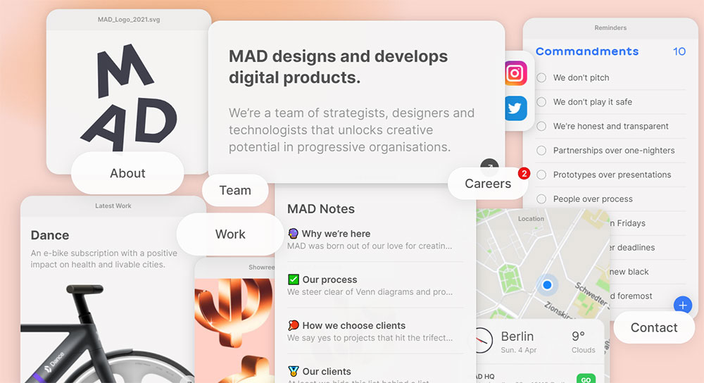
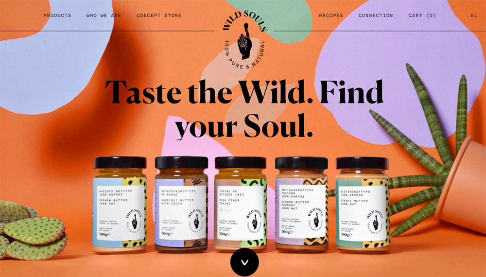
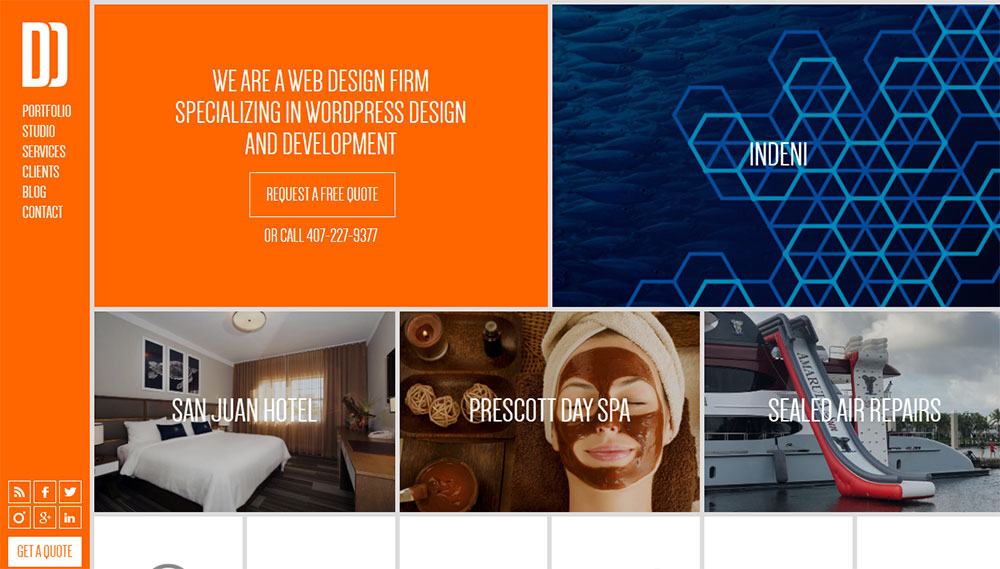
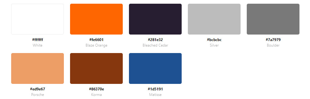
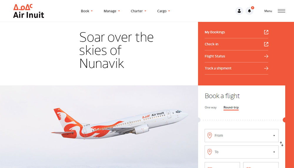
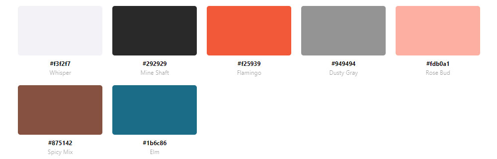
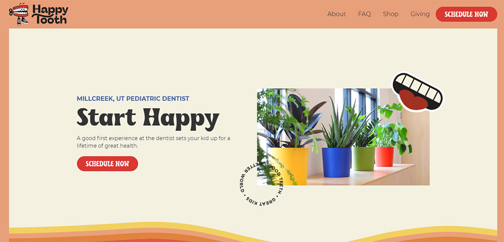
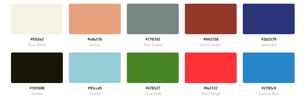
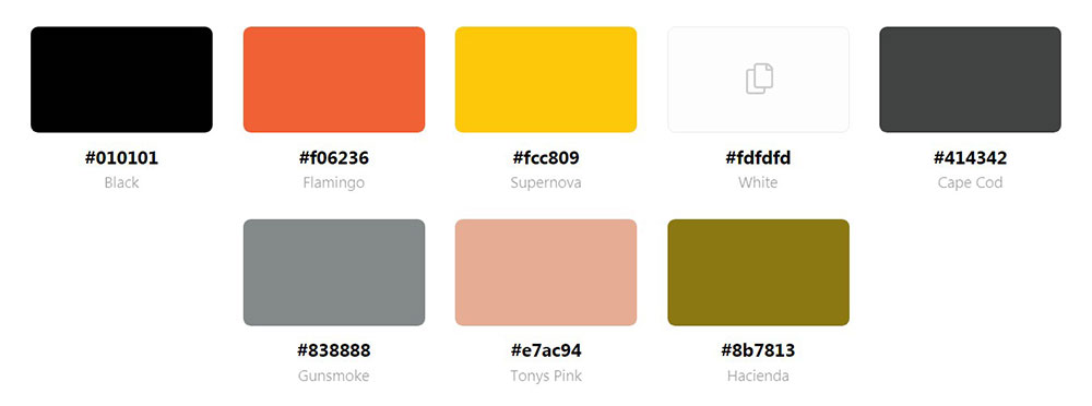
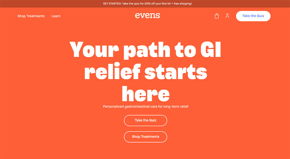
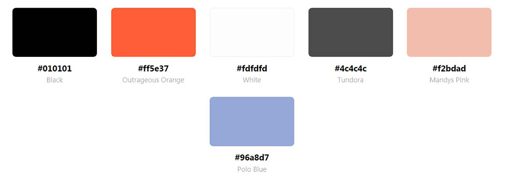
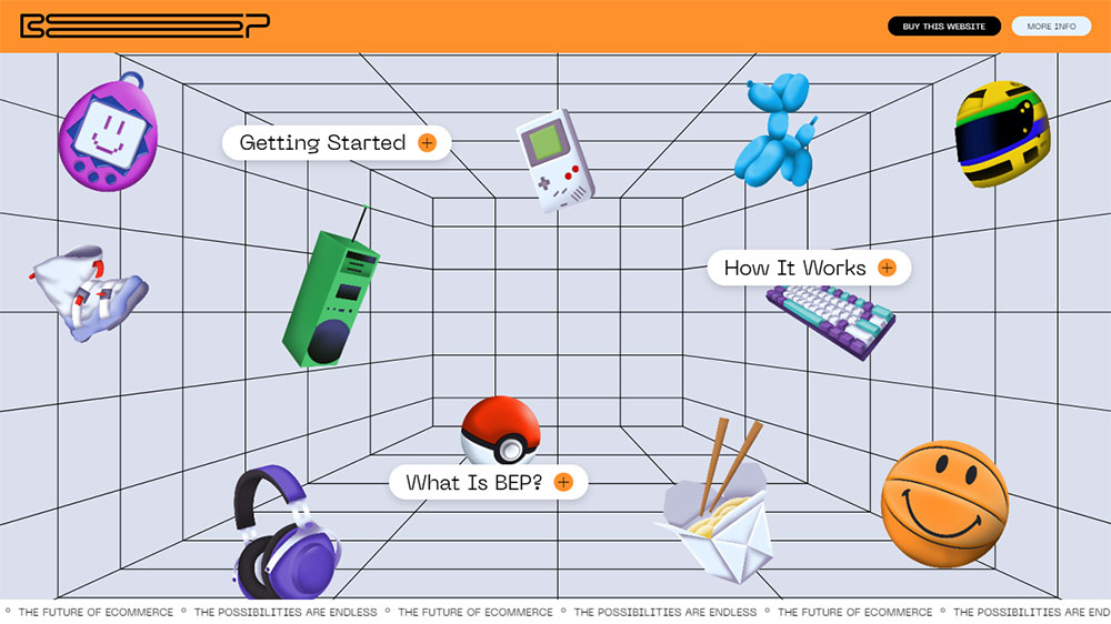
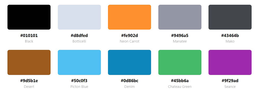
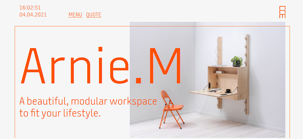
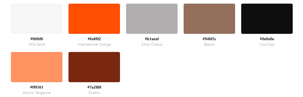
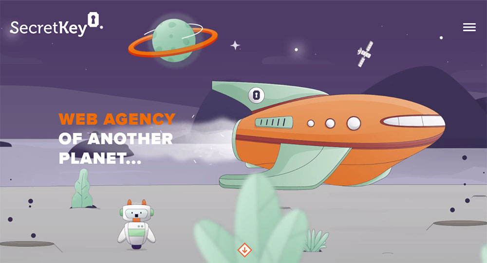
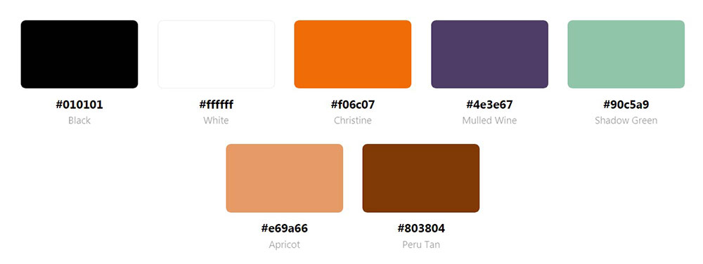
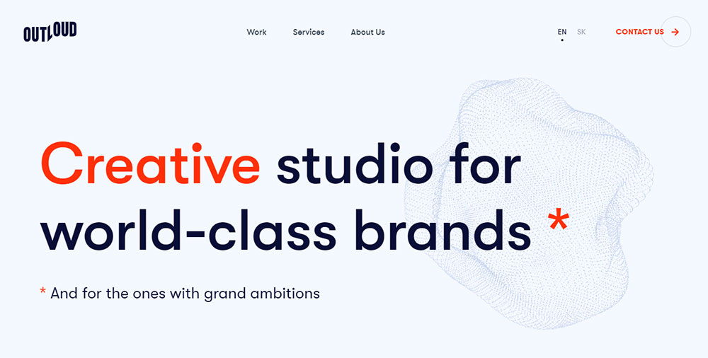
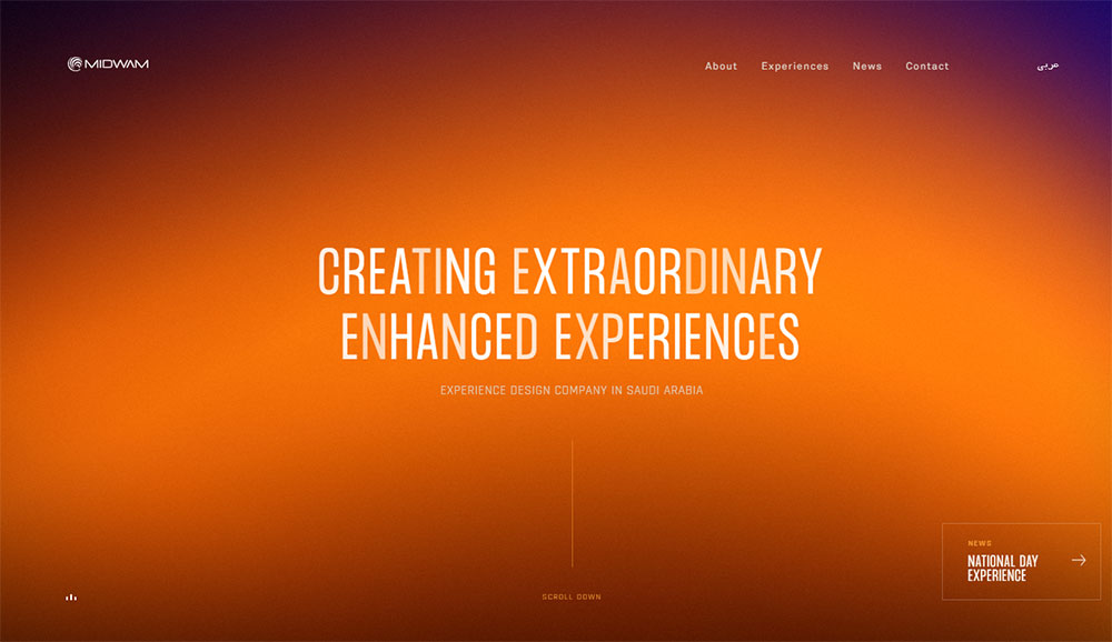
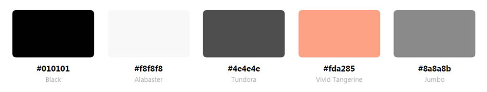
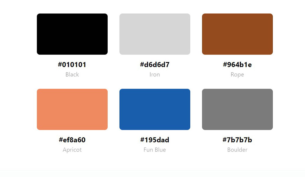
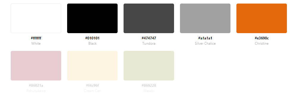
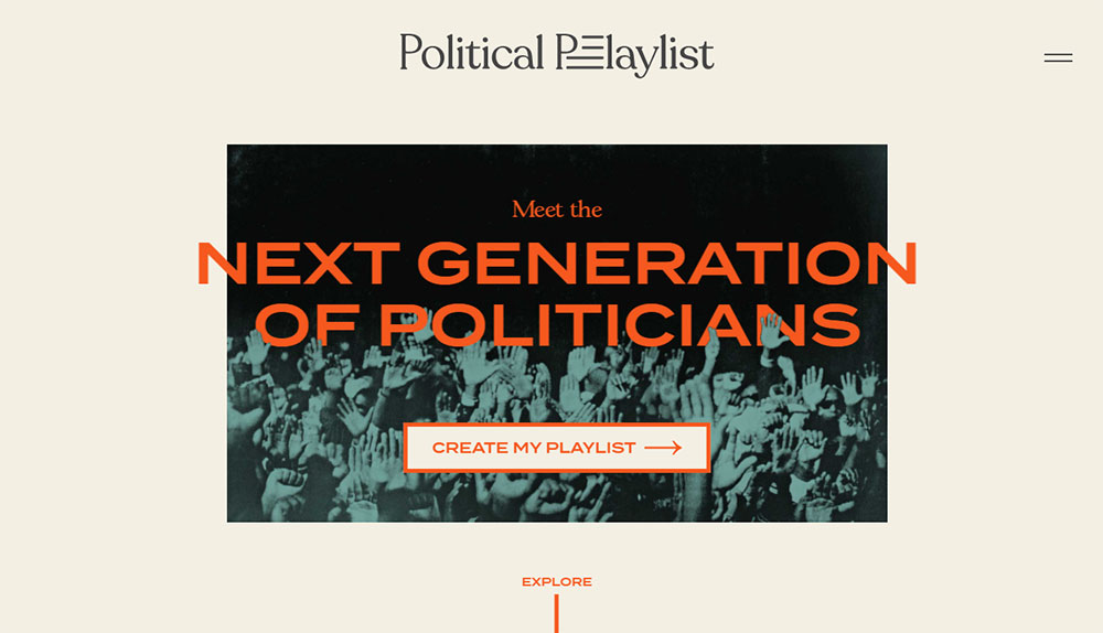
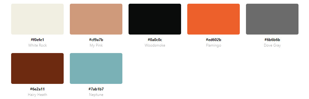
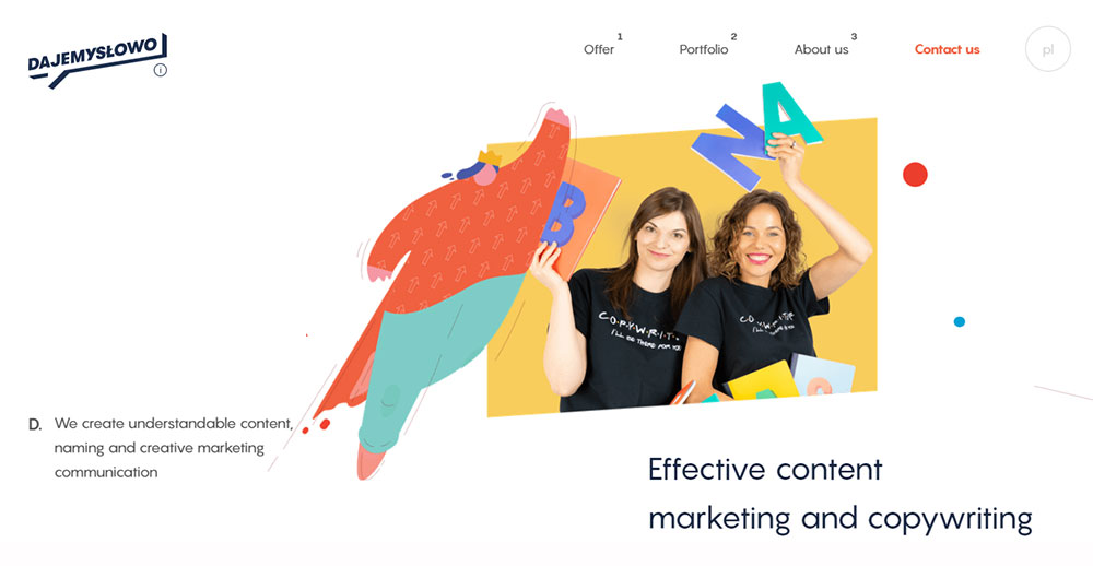
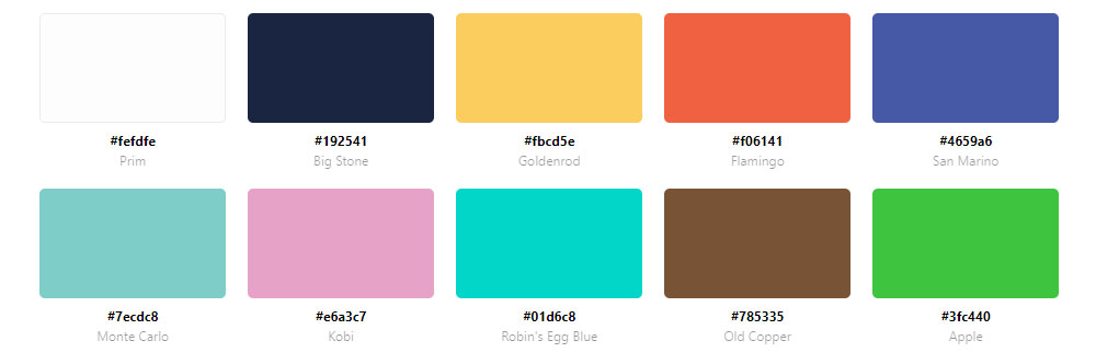
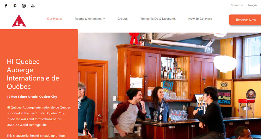
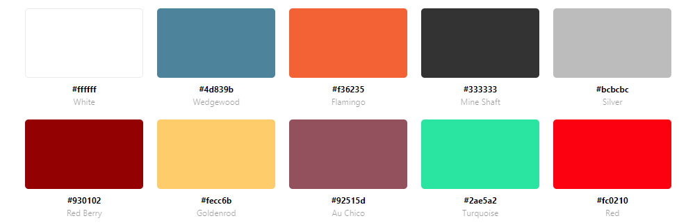
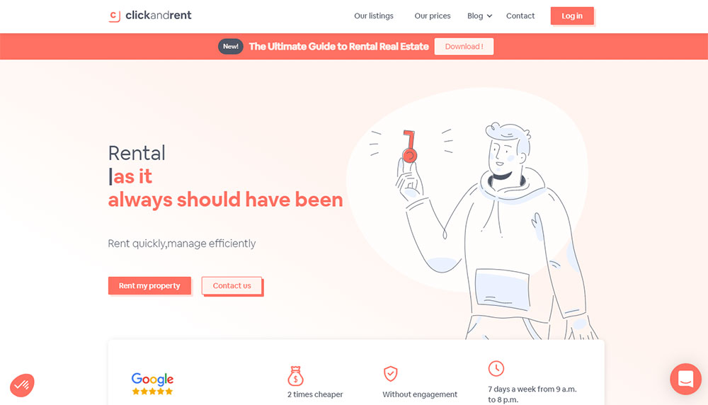
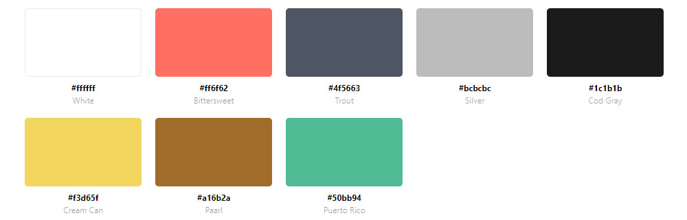
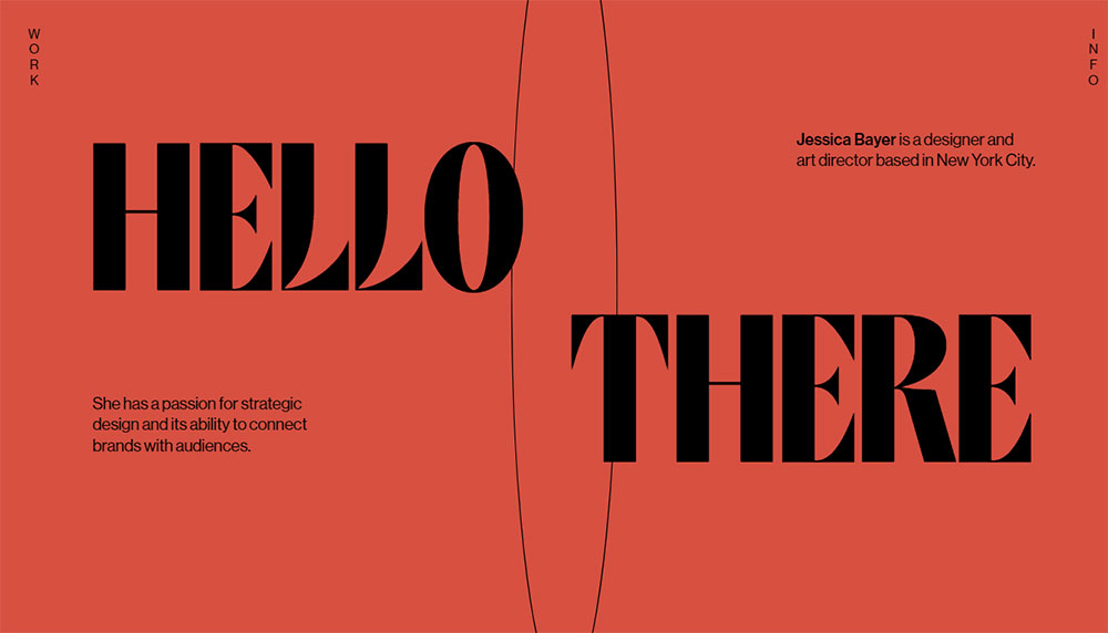
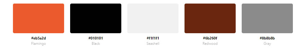
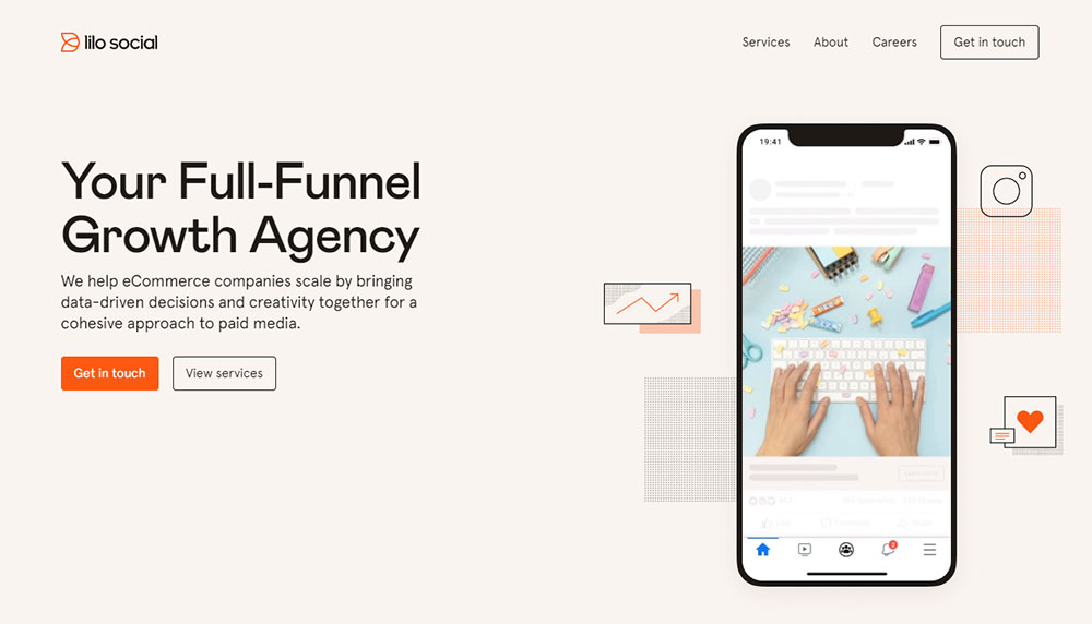
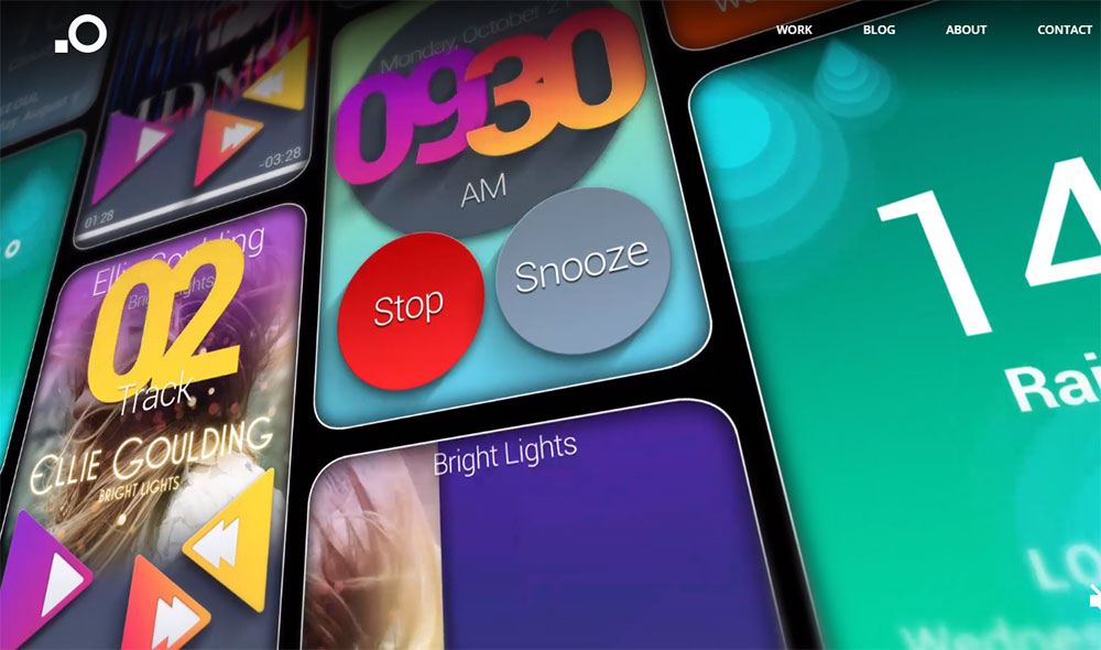
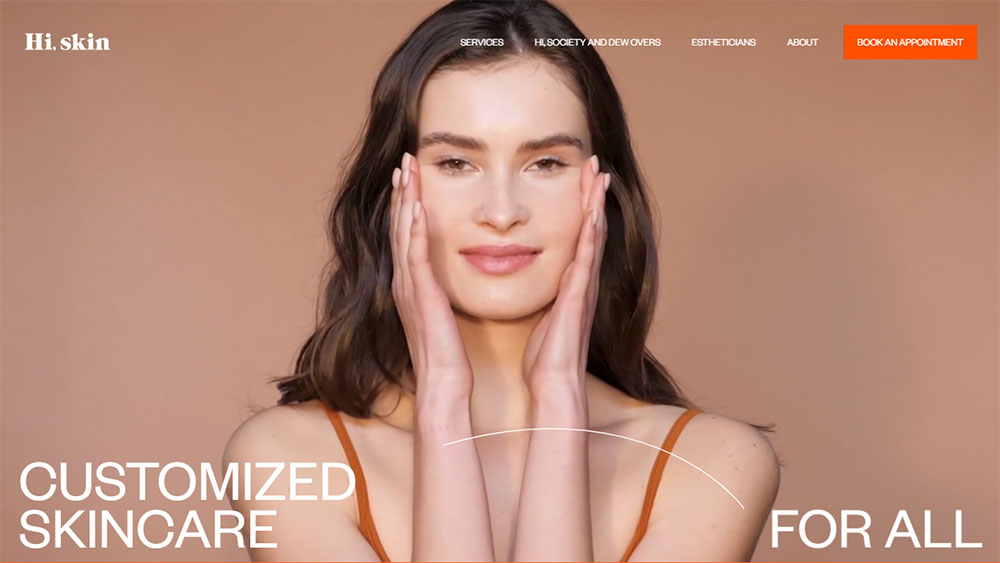
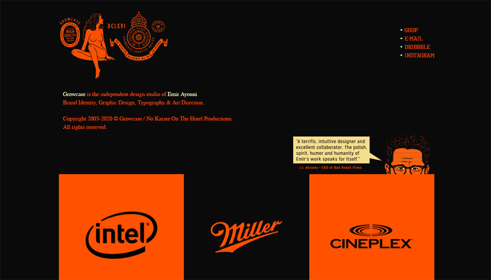
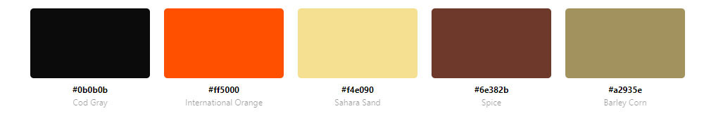
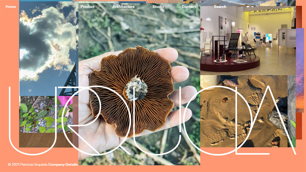
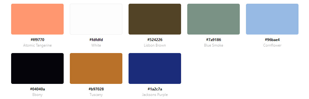
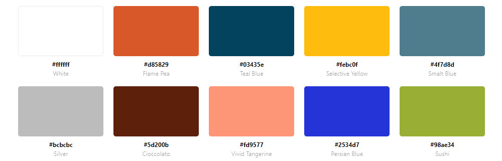
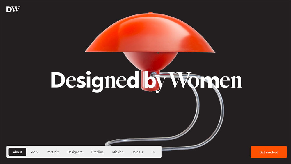
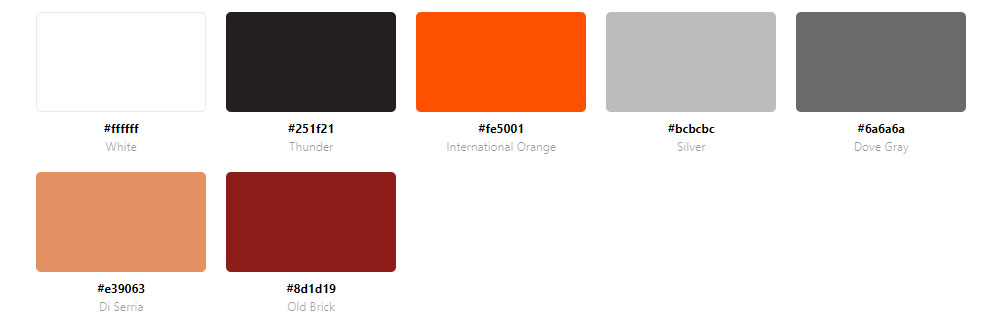
Examples of Websites Using Orange in Their Color Scheme
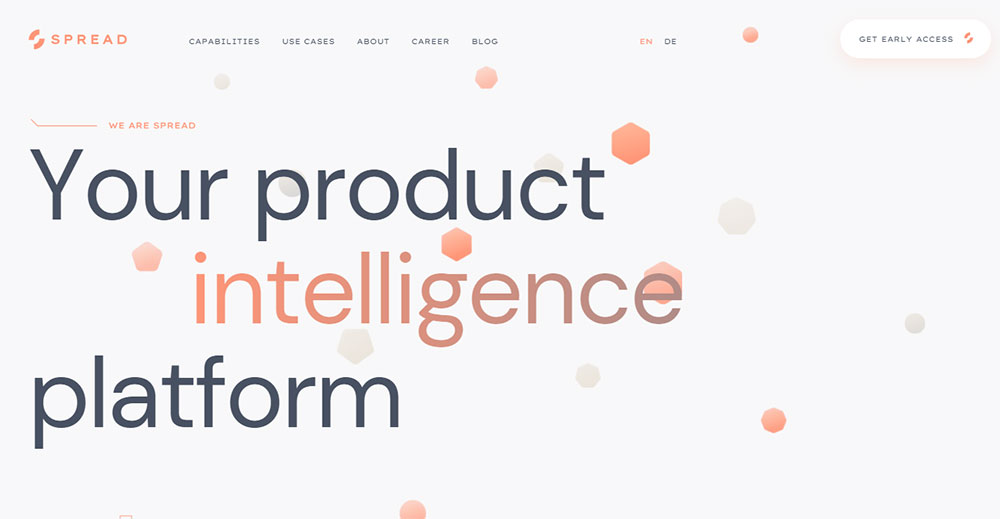
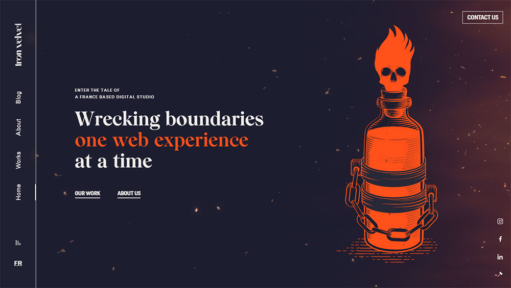
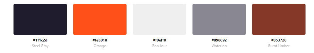
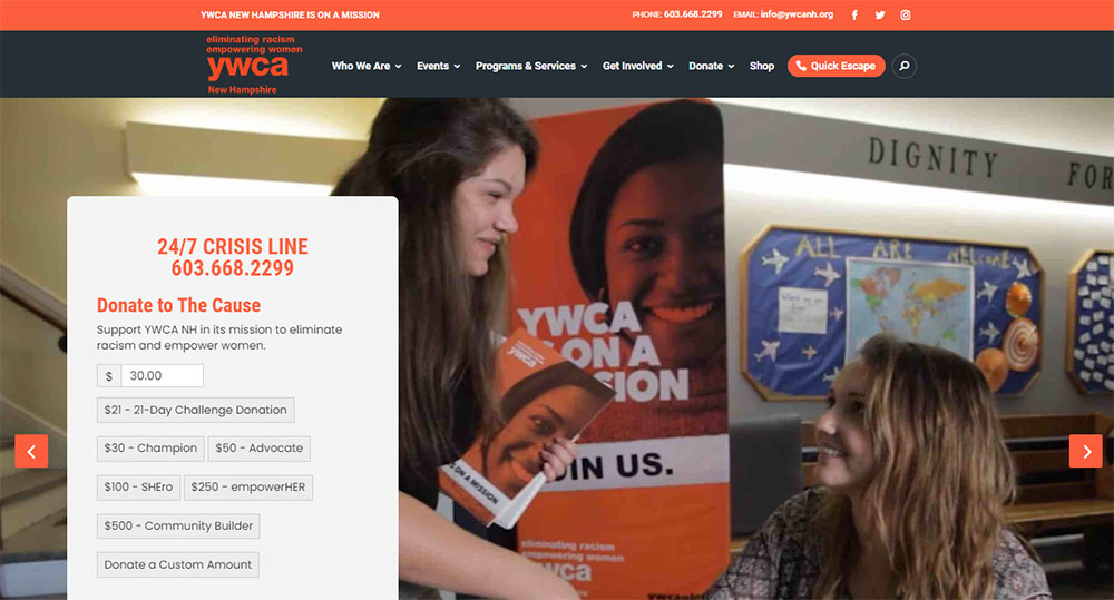
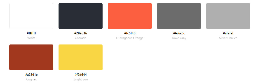
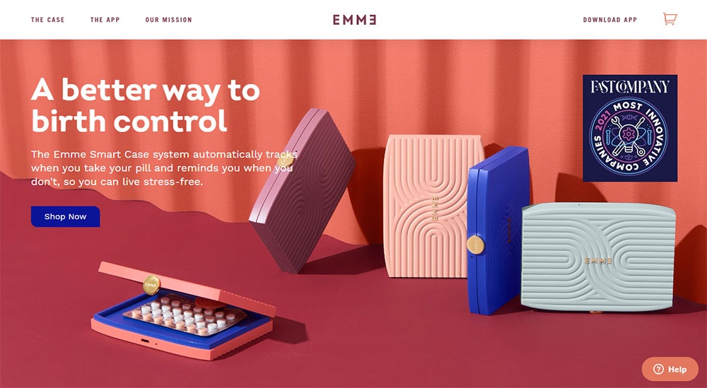
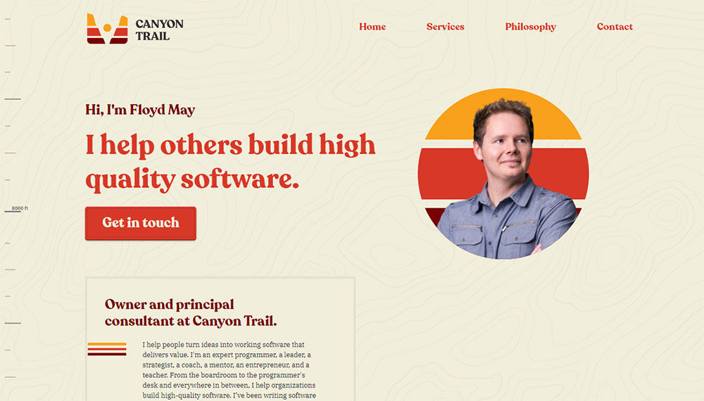
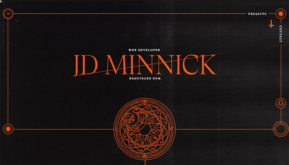
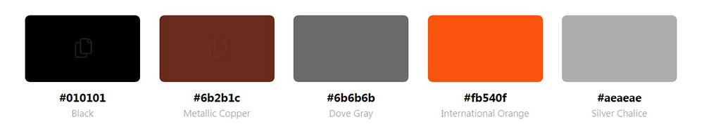
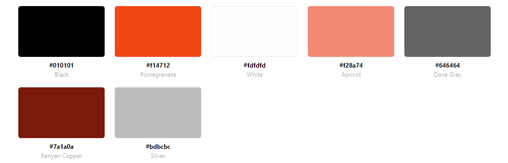
MAD


Why Websites Use Orange as a Primary Color
Color Psychology of Orange
Orange signals enthusiasm, creativity, and affordability. It triggers feelings of warmth and optimism without overwhelming visitors.
Unlike red, which can feel urgent or alarming, orange maintains energy while staying approachable. This makes it effective for brands targeting younger demographics.
Conversion Rate Connection
Orange buttons convert. Multiple A/B tests have shown orange CTAs outperforming other colors in specific contexts.
The color stands out against most backgrounds without creating visual tension. It catches the eye naturally.
Home Depot, ING Bank, and Mastercard all use orange strategically in their conversion paths.
Brand Associations
Orange communicates creativity, youth, confidence, and value. Budget airlines, tech startups, and entertainment brands gravitate toward it.
The color works particularly well for entertainment websites, fitness websites, food brands, and technology websites.
Dunkin, JBL, Crunchyroll, and Penguin Random House all leverage orange's energetic associations.
Industries Where Orange Performs Well
Food and beverage brands use orange to stimulate appetite. The color mimics citrus fruits, autumn harvests, and warm meals.
Tech companies choose orange to appear innovative yet accessible. SaaS websites and software websites often feature orange accent colors.
Gaming websites and sports websites pair orange with black for high-energy aesthetics.
Retail websites use orange to highlight sales, discounts, and limited-time offers.
How to Evaluate Orange Color Palette Effectiveness
Color Harmony with Secondary Colors
Effective orange palettes include complementary or analogous secondary colors. Blue provides the strongest contrast as orange's direct complement.
Gray, white, and black serve as neutral foundations. Warm palettes add yellow and red tones for cohesion.
Readability and Contrast Ratios
Orange text on light backgrounds often fails WCAG accessibility standards. Smart designers use orange for accents, not body text.
Dark orange (#E65C00) on white backgrounds typically passes AA contrast requirements. Always verify with contrast checking tools.
Building accessible websites requires careful attention to these ratios.
Consistent Application Across UI Elements
Strong orange palettes maintain consistency. The same orange appears in buttons, links, icons, and hover states.
Inconsistent orange usage creates visual chaos. Pick two or three orange variations maximum.
This principle applies to websites with good UI across all color schemes.
Brand Alignment
Orange works for energetic, youthful, creative brands. It clashes with luxury positioning or serious professional services.
A luxury color palette typically avoids bright orange. Bank websites and lawyer websites rarely feature orange prominently.
Match your color choice to your brand personality. Orange says "friendly and fun," not "exclusive and refined."
Orange Color Combinations That Work
Orange and White
Clean, fresh, modern. White backgrounds let orange elements pop without competition.
This combination works well for minimalistic websites and clean websites focused on clarity.
Orange and Black
Bold, energetic, high-contrast. Perfect for esports websites, gaming sites, and automotive websites.
Harley-Davidson uses this combination to communicate power and rebellion.
Orange and Blue
Complementary colors create maximum visual interest. This pairing feels both professional and creative.
Firefox built its entire brand identity around this combination. Many digital marketing agency websites follow suit.
Orange and Gray
Sophisticated without losing warmth. Gray tones down orange's intensity while maintaining energy.
Corporate websites and B2B websites often use this pairing.
Orange Gradients
Sunset gradients blend orange with pink, red, or yellow. These work for creative websites and animated websites.
Gradients add depth and visual interest to hero sections and background elements.
Common Orange Color Palette Mistakes to Avoid
Oversaturation
Too much bright orange causes eye strain. Visitors leave quickly when overwhelmed by vibrant color.
Balance orange with neutral colors. Use it strategically, not everywhere.
This represents bad design that drives users away.
Poor Text Contrast
Orange body text on white backgrounds fails accessibility tests. Light orange on light backgrounds becomes unreadable.
Reserve orange for headings, buttons, and accents. Keep body text in dark gray or black.
Clashing with Photography
Orange palettes fight with cool-toned photography. Blue-tinted images create jarring visual conflicts.
Select warm-toned images or adjust photo color temperatures to match your palette.
Inconsistent Orange Tones
Mixing coral, tangerine, and rust randomly looks unprofessional. Pick one primary orange and one accent variation.
Document your exact hex codes. Apply them consistently across every page and element.
Following web design principles prevents these common errors.
Tools for Creating Orange Color Palettes
Adobe Color
Adobe Color generates harmonious orange palettes using color theory rules. Input any orange hex code and get complementary, analogous, or triadic combinations instantly.
The tool integrates with Creative Cloud apps. Extract palettes directly from uploaded images.
Coolors
Coolors generates random palettes with one spacebar press. Lock your orange, then cycle through matching colors.
Export palettes as CSS, SCSS, or image files. The free version handles most needs.
Paletton
Paletton visualizes how colors interact across different UI elements. Preview your orange palette on simulated buttons, text, and backgrounds.
The adjacency diagram shows color relationships clearly.
Canva Color Palette Generator
Canva extracts palettes from uploaded images. Found a website with perfect orange tones? Screenshot it, upload it, grab the exact hex codes.
Works within web design tools you already use.
Colormind
Colormind uses machine learning to generate palettes. It learns from photographs, movies, and popular art.
The AI suggests colors that work together naturally, not just mathematically.
Browser Extensions
ColorZilla and Eye Dropper extract colors from any website. Hover over an orange element, click, copy the hex code.
Essential web designer skills include knowing these tools.
Orange Palette Variations by Industry
Food and Beverage
Bright, saturated oranges stimulate appetite. Citrus tones (#FF8C00, #FFA500) work for recipe websites, bakery websites, and pizza websites.
Pair with food photography featuring warm lighting.
Fitness and Sports
High-energy orange (#FF4500) communicates intensity. Gym websites, personal trainer websites, and cycling websites use orange to motivate.
Black backgrounds amplify the energetic effect.
Technology and SaaS
Coral and peach oranges (#FF6B6B, #FFB347) feel modern without being aggressive. Startup landing pages and SaaS landing pages favor these softer variations.
Orange gradients add visual interest to modern landing pages.
Entertainment and Media
Vibrant, playful oranges (#FF5722) capture attention. Musician websites, DJ websites, and record label websites embrace bold applications.
E-commerce and Retail
Orange highlights deals, sales, and urgency. Clothing websites and jewelry websites use orange for promotional elements.
Keep product photography neutral; let orange draw eyes to CTAs.
Implementing Orange Palettes Effectively
Start with Brand Strategy
Define your brand personality first. Orange suits friendly, energetic, creative, and value-focused brands.
Review your website checklist before committing to any color direction.
Choose Your Orange Variation
- Bright orange (#FF6600): Energy, youth, urgency
- Burnt orange (#CC5500): Warmth, autumn, sophistication
- Coral (#FF7F50): Modern, approachable, feminine
- Amber (#FFBF00): Premium, warm, golden
- Rust (#B7410E): Earthy, vintage, natural
Build Supporting Colors
Select 2-3 supporting colors using color theory principles.
Test combinations against your target color scheme preferences.
Apply Consistently
Document exact hex codes for primary orange, secondary orange, and accent colors. Apply across all web design elements.
Consistency builds recognition. Random orange variations destroy cohesion.
Test Accessibility
Run contrast checks on every text-background combination. Orange body text rarely passes WCAG AA standards.
Building user friendly websites requires accessibility compliance.
Review on Multiple Devices
Orange renders differently across screens. Test on mobile, tablet, and desktop.
Ensure responsive websites maintain color consistency across breakpoints.
FAQ on Websites With An Orange Color Palette
What brands use orange in their website design?
Amazon, Nickelodeon, SoundCloud, Firefox, Etsy, HubSpot, Home Depot, Fanta, ING Bank, and Dunkin all feature orange color palettes. These brands span e-commerce, entertainment, technology, finance, and food industries.
What hex code is best for orange websites?
Pure orange uses #FFA500. Popular variations include tangerine (#FF9966), coral (#FF7F50), burnt orange (#CC5500), and amber (#FFBF00). Choose based on your brand personality and target audience.
Which industries work best with orange color schemes?
Food and beverage, fitness, technology, entertainment, and e-commerce industries benefit most from orange. The color stimulates appetite, conveys energy, and highlights call to action buttons effectively.
Does orange improve website conversion rates?
Orange CTAs often outperform other colors in A/B tests. The color stands out against most backgrounds without feeling aggressive. Amazon and HubSpot use orange strategically in their conversion paths.
What colors pair well with orange on websites?
Blue provides complementary contrast. White creates clean, modern aesthetics. Black adds energy and boldness. Gray offers sophistication. These combinations appear across successful colorful websites globally.
Is orange accessible for web design?
Orange text often fails WCAG accessibility standards on light backgrounds. Use orange for accents, buttons, and icons rather than body text. Always verify contrast ratios with checking tools.
How do I create an orange color palette?
Use Adobe Color, Coolors, or Paletton to generate harmonious palettes. Input your primary orange hex code and select complementary, analogous, or triadic color relationships automatically.
Can orange work for professional or corporate websites?
Yes. ING Bank and Mastercard prove orange works professionally. Pair orange with gray, white, and clean typography to maintain credibility while adding warmth and approachability.
What is the psychology behind orange in web design?
Orange signals enthusiasm, creativity, affordability, and warmth. It triggers optimism without red's urgency. Brands targeting younger demographics or value-conscious consumers frequently choose orange palettes.
How much orange should I use on my website?
Use orange strategically, not everywhere. Apply it to CTAs, accents, icons, and key UI elements. Too much saturated orange causes eye strain. Balance with neutral colors and white space.
Conclusion
These examples of websites with an orange color palette prove one thing: orange works when applied strategically.
From Hermès' luxury positioning to Crunchyroll's vibrant entertainment branding, the same color family serves wildly different purposes.
The key lies in choosing the right variation. Burnt orange, coral, tangerine, and rust each communicate distinct brand personalities.
Pair your orange with complementary colors using tools like Paletton or Colormind. Test contrast ratios for accessibility. Apply consistently across your header, footer, and UI elements.
Whether you're building product landing pages or a full B2C website, orange adds warmth and drives action.
Start with one primary hex code. Build from there. Let these real-world examples guide your palette decisions.


