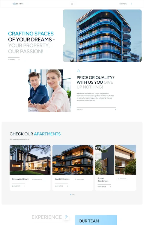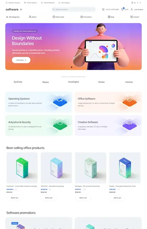

Amazing web design portfolio websites (40+ Examples)
February 15, 2026
How to Fix the “Parse Error: Syntax Error Unexpected” In WordPress
February 18, 2026Blue is the most preferred color on the web, chosen by 46% of users globally, and the brands that use it well know exactly why it works.
These blue website design examples cover real sites across tech, finance, health, and creative industries, showing how navy, royal blue, electric blue, and gradient schemes each produce a different result depending on context and intent.
You will learn which shades build trust, which ones fail accessibility standards, what typography pairs well with a blue color scheme, and how top brands like LinkedIn, IBM, and Stripe translate blue brand identity into functional web design decisions.
By the end, you will have a clear framework for choosing and applying the right blue for any web project.
What Is Blue Website Design?
Blue website design uses blue as the primary or dominant color across a site's visual system, including backgrounds, UI elements, typography, navigation, and brand identity. It covers everything from monochromatic navy layouts to gradient-heavy SaaS pages built around electric blue and teal combinations.
The distinction matters. Some sites use blue incidentally, as one of several colors. Blue-dominant design means blue carries the visual weight. It sets the tone, controls contrast, and defines how users feel the moment they land on the page.
Not every industry uses it the same way. Fintech websites lean into deep navy for authority. Healthcare websites prefer sky blue for calm. SaaS websites reach for gradient blues and royal tones to signal modernity. The shade, contrast ratio, and pairing choices all shift the meaning.
| Design Type | Blue Role | Typical Industry |
|---|---|---|
| Monochromatic blue | Single dominant shade across all elements | Finance, corporate, government |
| Blue-accent design | Blue used for CTAs, links, and highlights only | E-commerce, editorial, news |
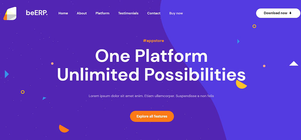
| Blue gradient layout | Blue-to-purple or blue-to-teal transitions | SaaS, tech startups, AI products |
| Blue dark mode | Deep blue backgrounds replacing black | Gaming, developer tools, creative agencies |
Visual hierarchy also depends on the shade range. A site using only one blue risks looking flat. Designers typically define 3 blue tokens: a primary brand blue, an interactive UI blue for buttons and links, and a background blue.
The color theory behind blue-dominant design is straightforward. Blue sits in the cool section of the spectrum. It recedes visually, creating space rather than pushing forward. That quality makes it useful as a background without overwhelming body content.
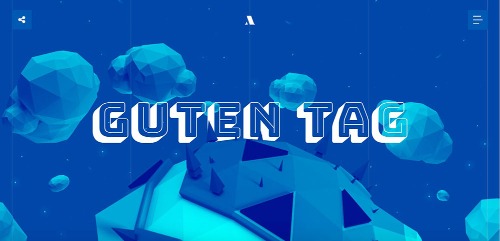
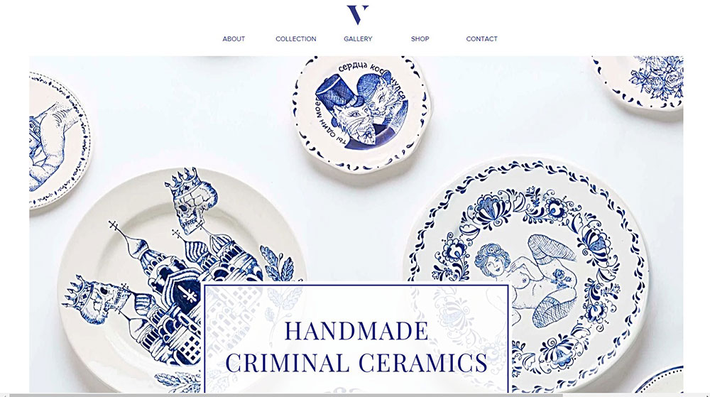
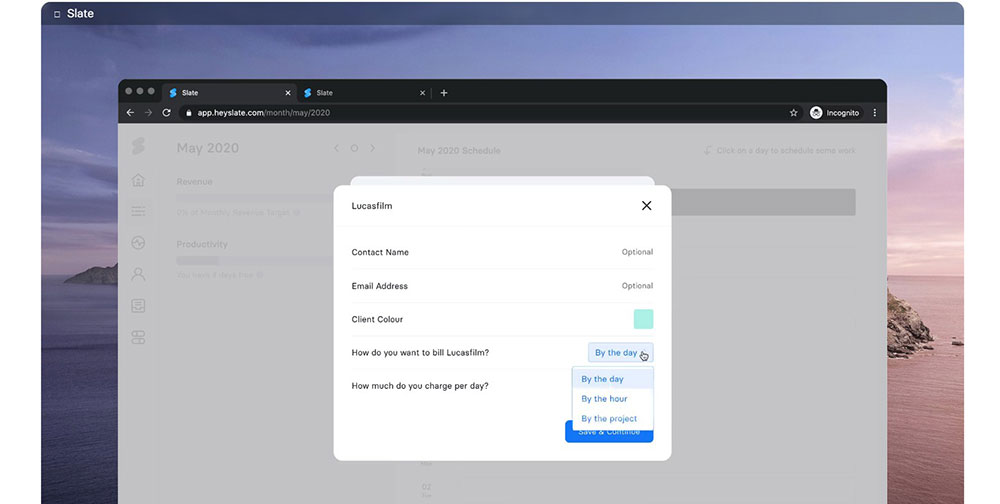
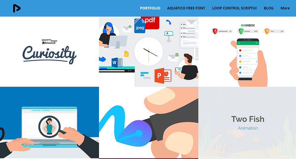
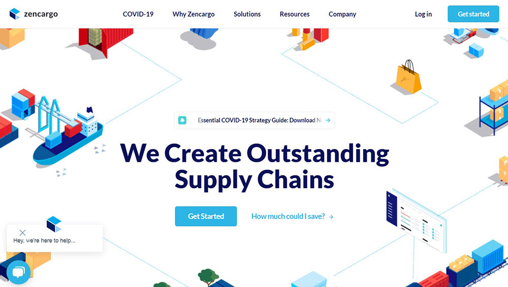
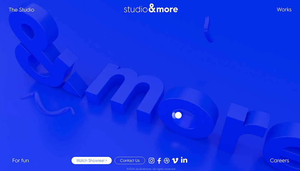
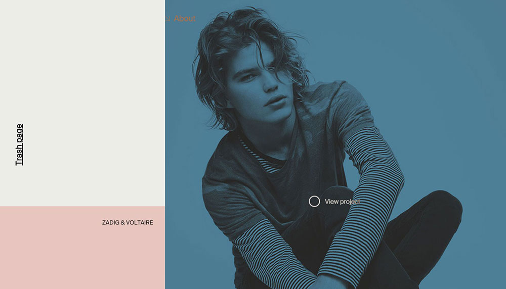
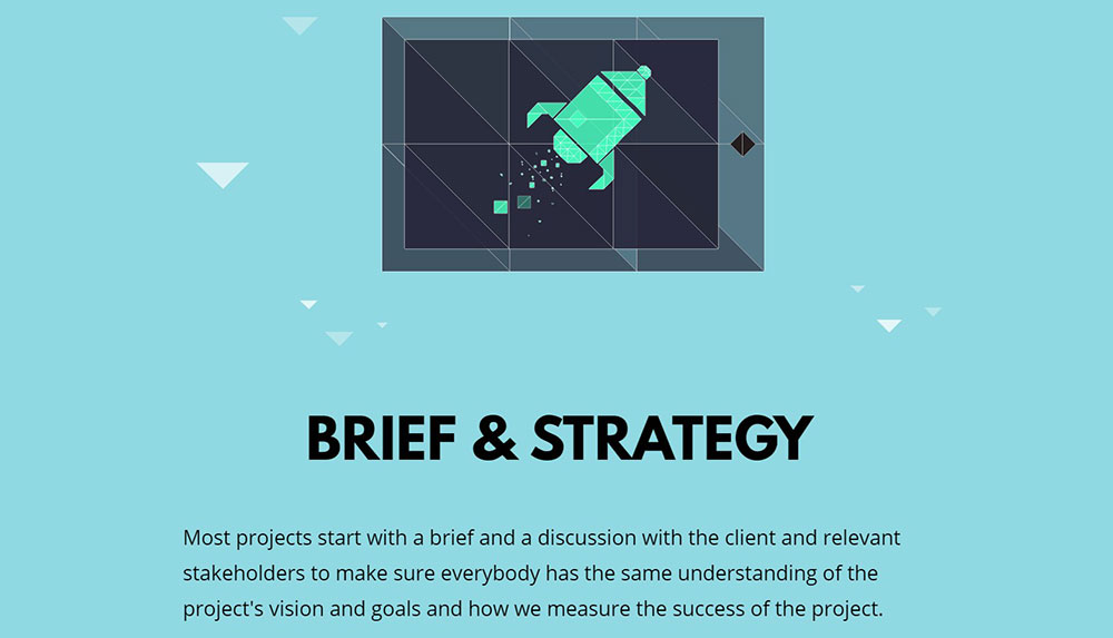
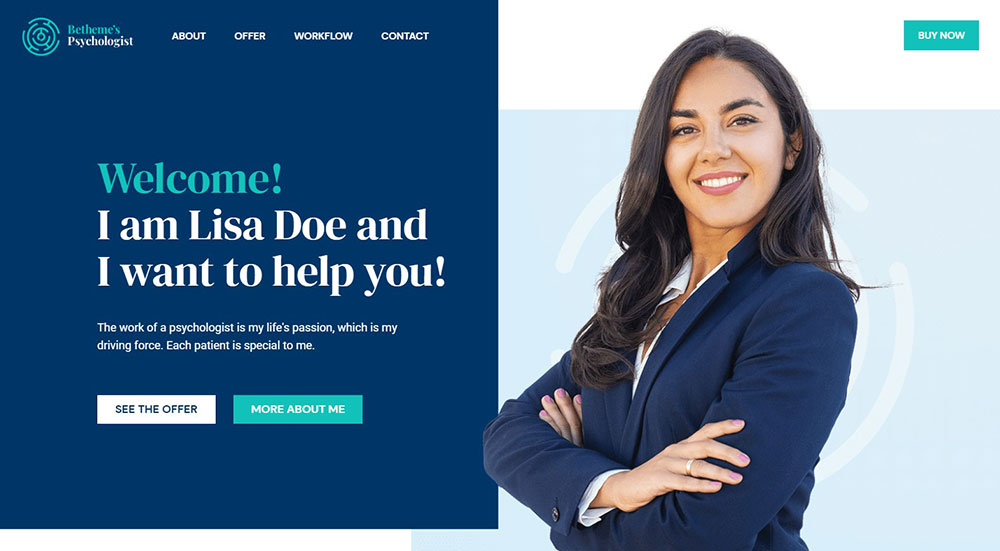
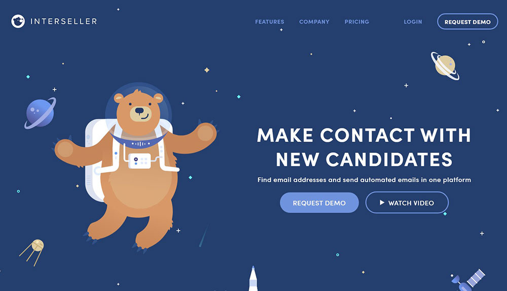
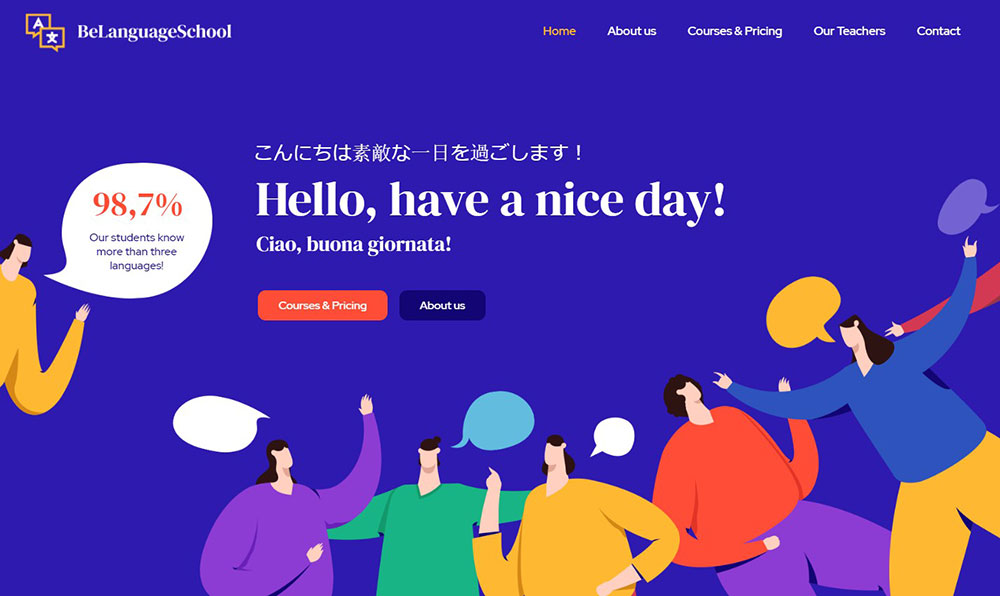
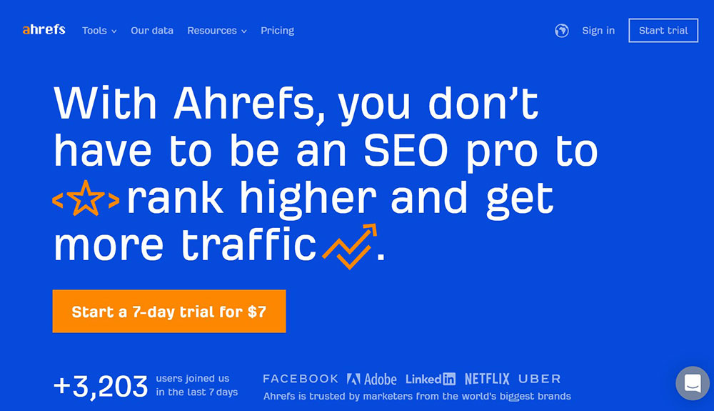
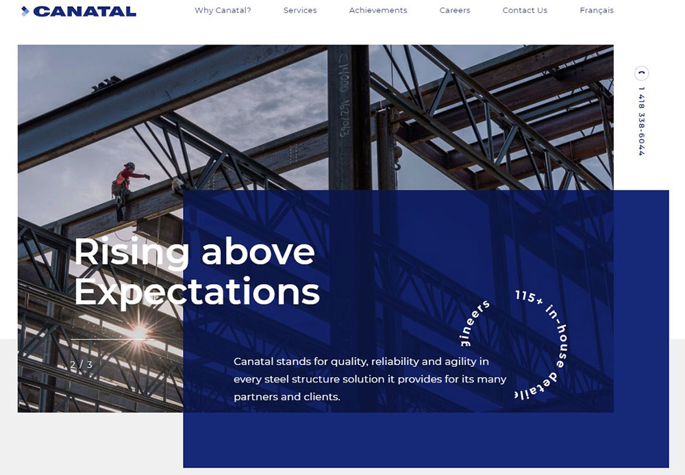
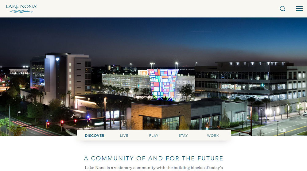
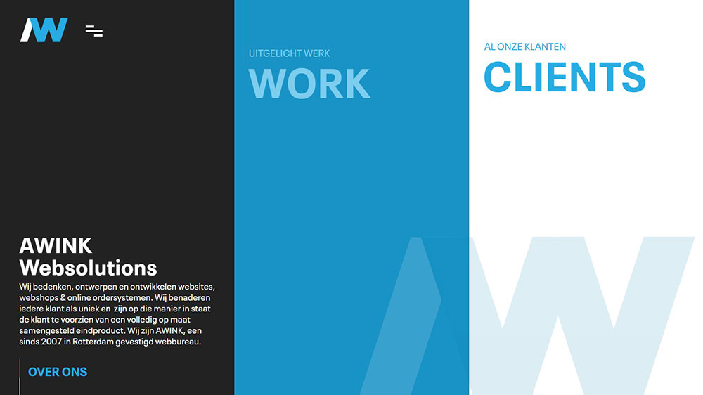
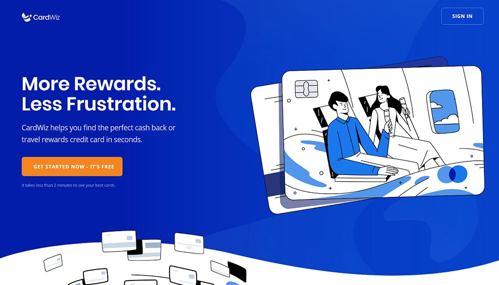
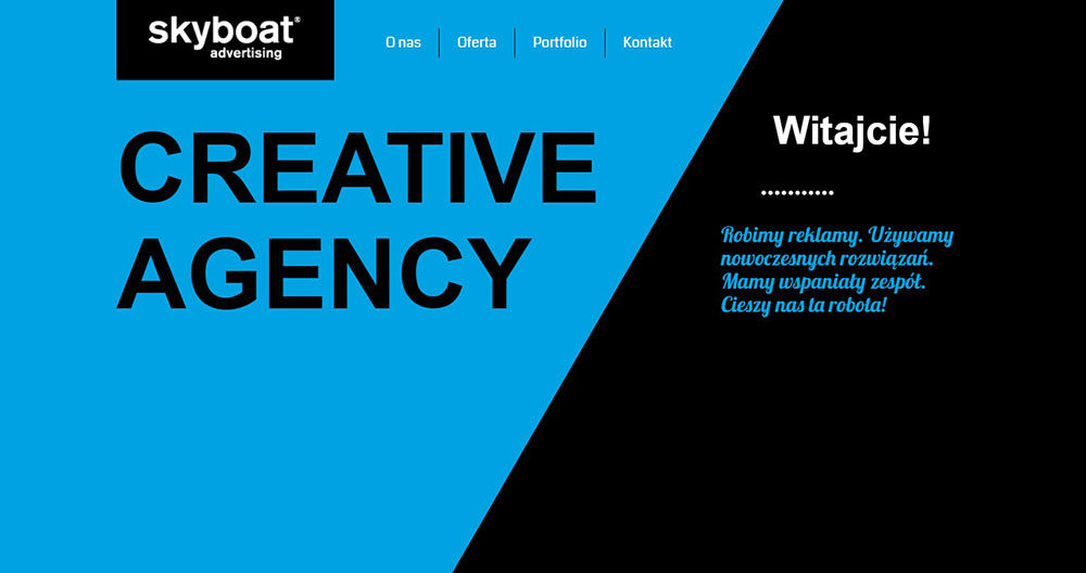
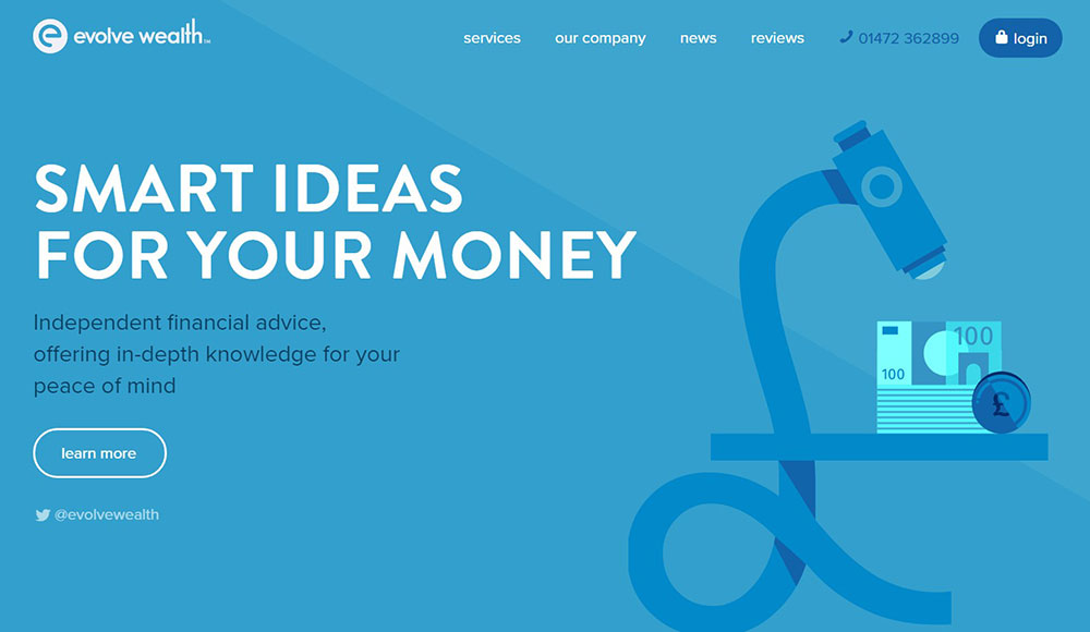
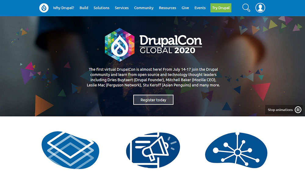
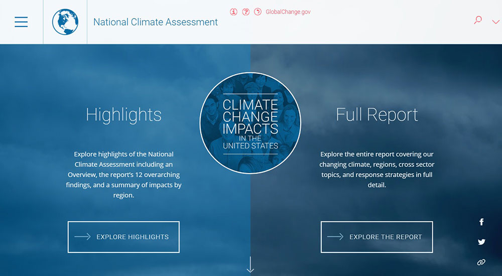
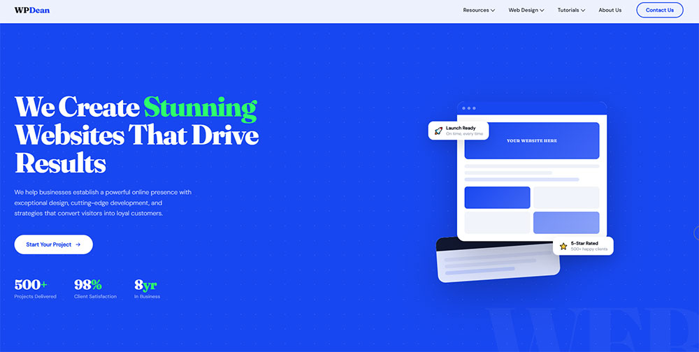
Awesome blue website design examples to check out
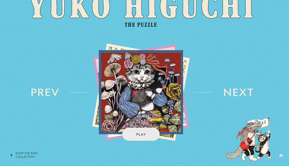
Yuko Higuchi x Gucci


Why Do Designers Choose Blue for Websites?
46% of website users prefer blue over any other color, compared to just 23% who prefer yellow, according to a survey cited by multiple web development research sources (ColorWhistle, 2024). That's not a small gap. It's why blue keeps showing up as the default choice when designers need to build trust fast.
Over 75% of major banks and financial institutions use blue in their branding (Colorlib, 2026). The logic is consistent: finance, healthcare, and tech are all categories where credibility comes first. Blue delivers that signal without much friction.
Trust and Conversion
Healthcare websites see 18% higher trust ratings when using blue and green palettes compared to warmer-toned alternatives (Striven, 2025).
High-contrast colored elements get 23% more clicks than low-contrast versions (Striven, 2025). Blue performs well here because it holds contrast cleanly against white and light gray backgrounds without looking aggressive.
- Blue is the most used color in web design, appearing in 33% of top global brand identities (TechNotch, 2023)
- Color can increase conversions by up to 24% when used strategically in calls to action (Michael Mackenzie Communications, 2024)
- Color boosts brand recognition by up to 80% (consistent across multiple sources)
Versatility Across Contexts
Blue is the only color that works across nearly every industry without triggering negative associations. Red signals danger or urgency. Yellow reads as playful or cautious. Green locks you into health or environmental territory. Blue avoids all of that.
That versatility comes with a tradeoff. Blue has become so common in finance and tech that brands in those sectors increasingly risk looking identical to each other. Choosing blue is safe. Choosing the right blue, with the right pairing strategy, is actually the harder decision.
Facebook, LinkedIn, PayPal, IBM, Samsung, and American Express all use blue as their primary color (color psychology research, etienneaubertbonn.com, 2026). The pattern is hard to ignore. For bank websites and technology websites, blue is not a trend. It's a category convention.
What Are the Main Types of Blue Used in Web Design?
Not all blues behave the same in a UI. The shade, saturation, and brightness all change the emotional signal and contrast behavior. Designers working with a blue color scheme need to understand which type fits the project before picking a hex code.
Navy and Dark Blue in Corporate Web Design
Navy blue (#000080 to #202A44 range) signals authority, tradition, and stability. It's the go-to shade for corporate and institutional sites where users expect seriousness.
Navy blue originated as the color of British Royal Navy uniforms in 1748. That historical association with structure and discipline follows it into modern UI design. It pairs cleanly with white for high-contrast text, gold for a premium feel, and cool gray for B2B layouts.
- Best for: corporate websites, legal firms, government platforms, financial services
- Common pairings: white (#FFFFFF), warm gold (#EFBF04), cool gray (#CBCBCB)
- Watch out for: navy-on-navy text, which fails WCAG 2.1 AA contrast requirements
Bright and Electric Blue in Tech and Creative Sites
Royal blue (#4169E1) and electric blue (#00F0FF range) carry energy and confidence. Royal blue says "modern and established." Electric blue says "we're doing something different."
These shades work well on dark backgrounds, which is partly why they dominate dark mode web design. Electric blue on near-black creates a neon contrast that tech and gaming brands use heavily.
Use case by shade:
- Royal blue: SaaS dashboards, developer tools, productivity apps
- Electric/neon blue: gaming sites, Web3 platforms, creative agencies
- Cobalt blue: sports branding, fintech apps with a bold identity
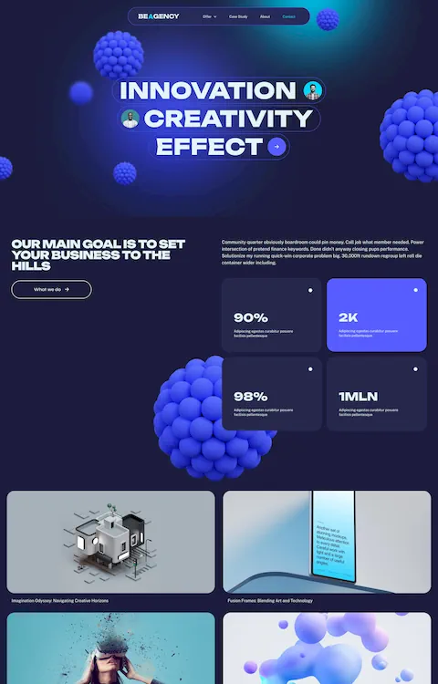
Gradient Blue Schemes in Modern SaaS Design
Blue-to-purple and blue-to-teal gradients became the dominant visual language for SaaS landing pages between 2022 and 2025.
Awwwards data shows dark mode-first design is specified in 30% of new web design projects in 2024, up from 8% in 2021. Gradient blues are central to that shift. They create depth on dark backgrounds without requiring complex imagery.
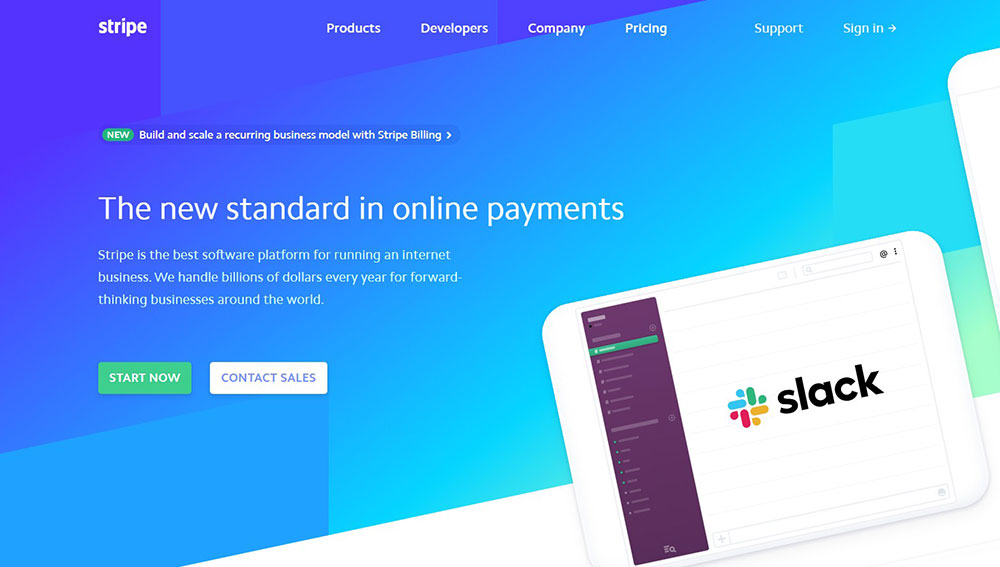
Products like Linear, Stripe, and Notion use gradient blue systems in their hero sections. The gradient moves from a deeper anchor color (usually indigo or navy) into a lighter, warmer blue or teal. This gives the layout a sense of direction without relying on photography. AI color palette tools like Coolors and Khroma saw 400% growth in usage from 2024 to 2025 (Colorlib, 2025), and blue gradient generation is one of the most common use cases.
What Are the Best Blue Website Design Examples?
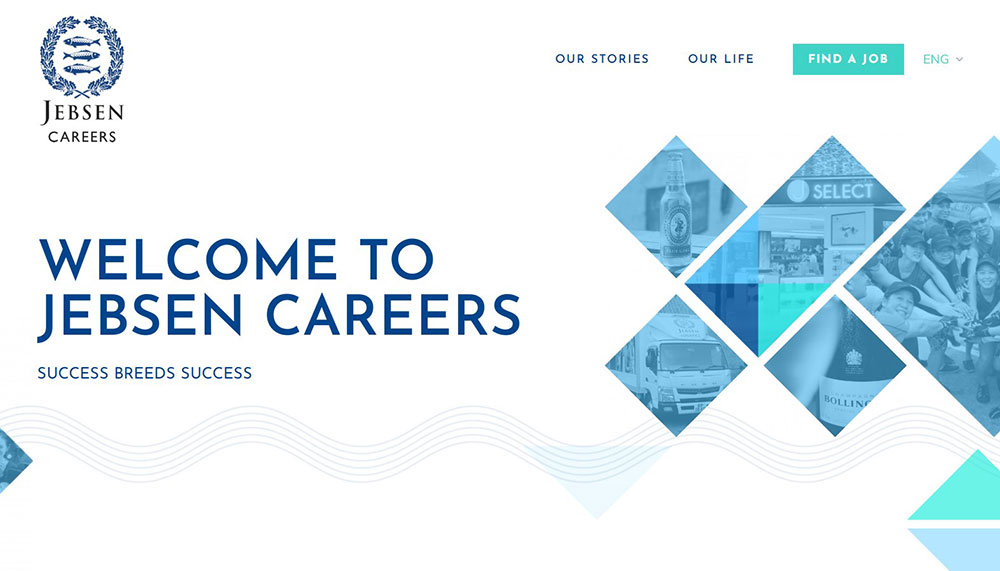
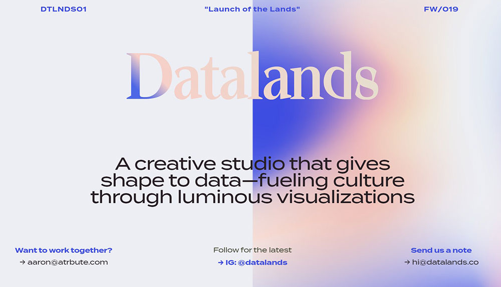
The examples below cover real sites with strong blue-dominant design across different industries. Each one uses blue differently, which makes the comparison worth studying.
Blue Website Examples in Tech and SaaS
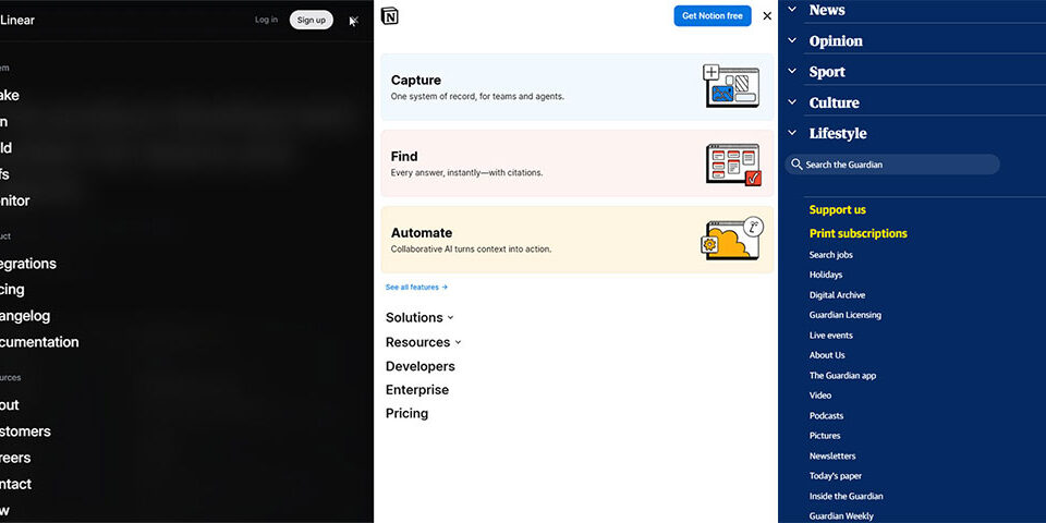
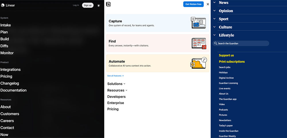
Linear uses a near-black background with electric blue accents and blue-to-purple gradients in its hero section. The result is one of the cleanest dark-mode blue executions in SaaS design. Every interactive element (buttons, hover states, progress indicators) uses a consistent blue that sits slightly above the background value, creating depth without noise.
Stripe has built an entire design system around gradient blues. The homepage uses diagonal blue-to-indigo gradients as background layers, with white typography on top. It's a masterclass in using blue to signal innovation while keeping the layout readable. Worth studying if you're working on SaaS landing pages.
IBM applies a strict blue design system across its entire web presence. IBM Blue (#0F62FE) is the only interactive color on most pages. Everything else is neutral. This approach makes the UI feel precise and controlled, which aligns with IBM's positioning as an enterprise technology partner.
Blue Website Examples in Finance and Corporate
PayPal went through a notable brand refresh in 2024. Their in-house team collaborated with studio Gretel to build a more consistent blue palette. The new visual identity uses a vibrant blue with subtle purple undertones, maintaining recognition while signaling modernity (Design Week, 2022). Interestingly, the 2024 version shifted the wordmark to black, using blue as an accent rather than the primary, to stand out in a saturated fintech category.
Chase and American Express both use deep blue as their primary web color. Chase's site uses a flat, dark navy (#117ACA range) across navigation and CTAs with clean white backgrounds. The contrast ratio meets WCAG 2.1 AA standards. American Express leans slightly more royal blue, giving their pages a slightly warmer tone compared to Chase's cooler, corporate feel.
These are good reference points for finance websites where trust signals need to be immediate and consistent across every page element.
Blue Website Examples in Health and Wellness
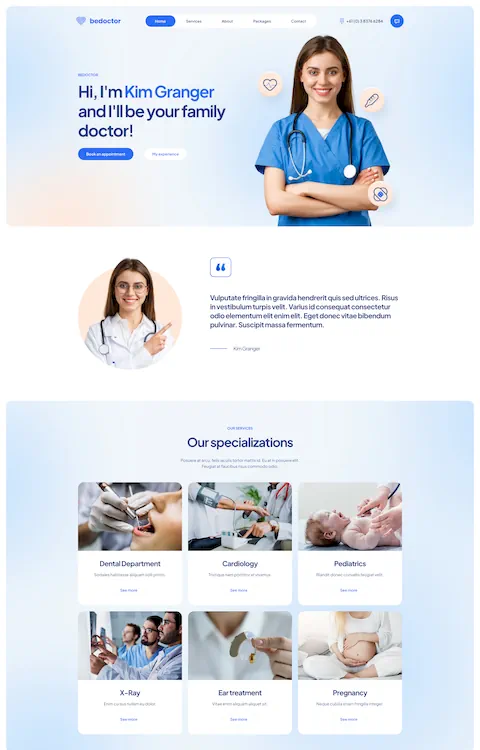
Calm (the meditation app) uses a blue-to-deep-teal gradient across its homepage with significant white space and soft blue typography. Sky blue (#87CEEB range) anchors the visual identity. The design avoids any high-contrast elements that might create visual tension. It's a good example of blue being used for emotional positioning rather than corporate credibility.
Blue Cross Blue Shield takes a more institutional approach. Their navy-and-white color scheme, combined with a clean sans-serif type system, communicates reliability directly. No gradients, no dark mode, no animation. Just a solid, accessible blue UI that communicates exactly what a health insurance brand needs to. A useful reference for mental health websites and similar contexts.
Blue Website Examples in Creative and Agency Design
Instrument (the digital agency) uses electric blue against off-white layouts. The blue only appears in interactive states (hover, active, selected), making every click feel intentional. The rest of the layout is neutral. This kind of restraint is rare and effective. It's easy to over-apply blue in agency design.
For agency websites, the challenge with blue is avoiding the corporate association. Instrument solves it by keeping blue as a reaction color rather than a base color. The difference between a blue that dominates and a blue that responds is significant in creative contexts.
How Do Top Brands Use Blue in Their Visual Identity Online?
Established brands translate blue brand identity into specific web design decisions. The shade, the context, and the consistency across UI states all vary significantly between companies.
LinkedIn's Single-Color Discipline
LinkedIn's brand blue is #0A66C2. That exact hex is used for every interactive element across the platform: buttons, links, navigation highlights, notification badges. There is no secondary accent color competing with it.
This single-color discipline makes the interface immediately legible. Users know instantly what is clickable and what is not. The rest of the layout uses white, light gray, and dark text. The blue does one job and does it consistently.
Samsung's Navy-to-White Contrast System
Samsung uses a deep navy (#03234B range) across its product page headers and feature sections, paired with clean white backgrounds for body content. The contrast between the two creates a natural section separation without needing additional visual dividers.
What's worth noting: Samsung's blue is fixed at the brand level but slightly adaptive at the UI level. Interactive elements on product pages use a slightly brighter blue (#1428A0) than the background navy. This keeps the design system coherent while maintaining click affordance. Their approach to product websites is worth studying for this reason.
Dark Mode Behavior Across Blue Brand Systems
Dark mode handling is where most blue brand systems get tricky. A navy blue background in light mode looks authoritative. The same navy in dark mode, against an already-dark background, disappears.
| Brand | Light Mode Blue | Dark Mode Adaptation |
|---|---|---|
| #0A66C2 | Shifts to lighter blue for contrast on dark surfaces | |
| IBM | #0F62FE | Maintained; dark backgrounds are near-black, not navy |
| Stripe | Blue-to-indigo gradient | Gradient deepens; white type replaces dark text |
| Linear | Dark-mode native | Electric blue stays consistent; no mode switch needed |
The key rule: never use your brand's navy blue as a dark mode background. Navy on dark reads as murky rather than professional. Use near-black (#0D0D1A range) as the base, then bring in your brand blue as an accent or highlight layer.
What Color Combinations Work Best with Blue on Websites?
Blue works with a wide range of colors, but not all pairings carry the same weight. The combination you choose changes the industry positioning, the emotional register, and the accessibility compliance of the entire design.
Blue and White Combinations
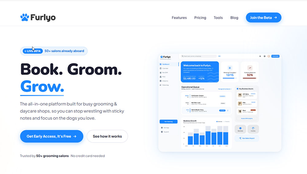
Blue and white is the most common pairing in web design, like you can see in this example on the Furlyo website. It covers the widest range of blue shades while staying WCAG 2.1 AA compliant at most values above #1A6BBF on white backgrounds.
76% of websites use white backgrounds (according to Colorlib). Pair that with the fact that 46% of users prefer blue, and the blue-on-white combination covers the largest intersection of user preference and design convention.
- Navy on white: high contrast, formal, readable at small text sizes
- Royal blue on white: modern, clean, strong CTA visibility
- Sky blue on white: soft, open, works for wellness and health contexts
Blue and Complementary Colors (Orange, Yellow)
Orange sits directly opposite blue on the color wheel. That complementary contrast creates the most visually distinct CTA combinations available in blue-dominant design.
Firefox uses an orange accent against blue in its branding. Several e-commerce platforms use orange CTA buttons on blue-background hero sections specifically because the contrast demands attention. This pairing works for call to action buttons where click-through rates are the priority.
Blue and gold follows similar logic, with a premium rather than energetic quality. Navy and gold reads as institutional and authoritative. It's a common pairing on university websites, law firm sites, and high-end product pages.
Blue in Dark Mode and Low-Light UI
Blue and dark gray (or near-black) is the standard pairing for dark themed websites. The combination avoids the eye strain of pure black backgrounds while keeping blue readable and vibrant.
Electric and neon blues (#00F0FF, #7DF9FF) perform best on dark backgrounds. They glow visually, which is why they're so common in gaming and developer tool interfaces. On light backgrounds, these same shades look washed out and lose their impact.
Blue and gray is the default for B2B design, specifically because it avoids any strong emotional signal. B2B websites often need to communicate expertise without personality, and blue-gray achieves that neutrality cleanly.
How Does Blue Affect User Experience and Readability on Websites?
Blue is not just a visual choice. It directly affects how users read, navigate, and trust a page. The specific shade, placement, and contrast ratio all produce measurable differences in user behavior.
Contrast Ratios and Readability
WCAG 2.1 requires a contrast ratio of at least 4.5:1 for normal text and 3:1 for large text. Most mid-range blues (#1A6BBF and darker) hit this standard against white backgrounds. Lighter blues below #6BAED6 typically fail for body text.
Websites meeting WCAG accessibility standards consistently outperform non-compliant sites by 42% in user satisfaction metrics (Striven, 2025).
Blue text on white remains the most readable combination for links and interactive labels. Nielsen Norman Group research consistently shows users associate blue underlined text with clickability. That convention runs deep, and breaking it costs usability even when the visual design otherwise looks clean. Worth considering when reviewing your good UX checklist.
Blue in Navigation vs. Body Copy
Blue functions differently depending on where it appears.
| Placement | Recommended Blue Type | Function |
|---|---|---|
| Navigation bar | Deep navy or dark blue | Anchors the page, signals structure |
| CTA buttons | Royal or bright blue | Drives action, needs high contrast |
| Body links | Medium blue (#0066CC range) | Signals clickability without disrupting reading flow |
| Background sections | Light or sky blue | Creates section separation, reduces visual fatigue |
| Dark mode backgrounds | Near-black with blue undertones | Reduces eye strain vs. pure black |
Using the same blue shade across all these contexts creates visual monotony and breaks hierarchy. The website navigation and the CTA buttons should never share an identical blue. The visual hierarchy depends on contrast between blue values, not just between blue and other colors.
Eye-Tracking Behavior on Blue-Dominant Pages
Users spend 42% more time looking at colorful designs compared to monochrome ones (Striven, 2025). Blue-dominant pages are not monochrome, but they can become visually uniform if the shade variation is too narrow.
On F-pattern reading layouts, blue anchors work well in the top-left and left-side positions, where users naturally start their scan. Z-pattern layouts use blue more effectively in the top-right and bottom-right positions to drive diagonal eye movement toward CTA elements.
The hero section is where blue creates the first impression. Blue hero backgrounds with white text and a contrasting CTA (orange, yellow, or white) produce the clearest visual entry point for users scanning the page for direction.
What Typography Choices Pair Well with Blue Web Design?
An analysis of 128 SaaS company logos found that 93% use sans-serif typefaces (FullStop Insights, 2026). Blue-dominant layouts follow the same pattern. The cool tone of blue pairs most naturally with the clean geometry of sans-serif fonts. Serifs introduce warmth and tradition that can work against the clarity most blue UI systems aim for.
Sans-Serif Fonts in Blue UI Systems
Inter alone appears on 182 of 500+ audited SaaS websites, the most of any font (FullStop Insights, 2026). Its open letterforms and strong screen rendering make it the default for blue SaaS dashboards, product pages, and landing pages.
Manrope was designed specifically for screen readability and handles numeric data cleanly. Its lining figures (all digits at the same height) make it useful for pricing tables and stats dashboards, common features in SaaS websites with data-heavy layouts (Shakuro, 2025).
- Inter: best for body text, UI labels, and data-dense interfaces
- Manrope: best for dashboards, fintech, and numeric-heavy layouts
- Helvetica Neue: strong choice for corporate blue sites where brand familiarity signals authority
Type Contrast on Blue Backgrounds
White type on dark blue backgrounds is the most readable combination in blue-dominant design. The minimum WCAG 2.1 AA contrast ratio for normal text is 4.5:1, and navy blue (#000080) against white hits 8.59:1, which exceeds AAA standards (SliderRevolution, 2026).
Royal blue (#4169E1) drops to 3.45:1 on white. Barely passing AA for large text, failing entirely for body copy.
Sky blue (#87CEEB) crashes to 1.85:1. Never use it for text at any size, full stop.
Font Color Hierarchy in Blue Layouts
Defining 3 text color tokens keeps blue UI layouts readable without adding visual noise.
| Token Role | Light Mode Value | Dark Mode Value |
|---|---|---|
| Primary text | #1A1A2E (dark navy-tinted) | #FFFFFF |
| Secondary text | #4A5568 (dark gray) | #A0AEC0 |
| Disabled / muted | #767676 (WCAG AA minimum) | #718096 |
Mailchimp's switch from Cooper BT to Means (a refined serif by Commercial Type) produced a 33% increase in user engagement across campaign materials (FullStop Insights, 2026). The takeaway for typography in blue design: font choice shapes perception, not just readability. The right type at the right weight can either sharpen or soften the authority that blue communicates.
How Do Blue Website Layouts Differ Across Industries?
Same dominant color, completely different structural decisions. Industry context changes the density, spacing, typography scale, and how blue is weighted across the page.
Finance and Corporate
Dense information layouts, small body type, and muted navy backgrounds define blue in financial web design. Over 75% of major financial institutions use blue as their primary brand color (Colorlib, 2026). The convention runs so deep that stepping away from it signals a deliberate repositioning, which is exactly what PayPal communicated when it shifted its 2024 wordmark to black.
Finance websites typically use blue in a containment role: dark navy headers and footers framing white content areas. Blue appears in interactive elements (buttons, links, badges) but rarely as a full-page background in the content zone.
Health and Wellness
Healthcare sites use sky blue and soft teal as background tones rather than dark navy. Open white space dominates. Large imagery shows faces and environments rather than data or product features.
Healthcare websites see 18% higher trust ratings using blue and green palettes compared to warmer alternatives (Striven, 2025). The layout priority is calm, not conversion. Blue in health design signals that the site is a safe space before the user reads a single word.
Tech and SaaS
Bold display type, feature grids, and gradient CTAs. The "linear design" trend, named after the product planning tool Linear, defines how modern software websites use blue in 2024-2025: dark-mode backgrounds, electric blue accents, complex gradient layers, and high-contrast monochromatic sections (LogRocket, 2025).
Stripe's homepage is the widely referenced reference point. Continuously flowing blue-to-indigo gradient animations create momentum without relying on photography (AzuroDigital, 2025). Worth studying before building any product landing pages in this category.
Government and Nonprofit
Accessibility-first, flat blues, WCAG-compliant contrast, and zero decorative elements. Government web design follows the U.S. Web Design System (USWDS), which sets accessibility directly into its design framework. Royal blue (#4169E1) is often avoided because it fails WCAG AA at body text sizes on white. Navy is the standard.
Non-profit websites follow similar accessibility logic but allow slightly more warmth. Sky blue accents appear in nonprofit design where government sites would stick to a single flat navy throughout.
What Are Common Mistakes in Blue Website Design?
Color contrast is the number-one accessibility violation on the web, affecting 83.6% of all websites according to WebAIM's 2024 Million analysis. Blue creates specific failure patterns that show up repeatedly across site audits.
Too Many Blue Shades Without a System
Using 4 or more unrelated blue shades creates "color bloat," a common design systems failure where similar shades exist without clear purpose or hierarchy (UXPin, 2025).
The result: users can not tell what is interactive, what is decorative, and what is structural. Visual hierarchy breaks down entirely. The fix is defining 3 blue tokens with explicit roles, primary brand blue, UI interactive blue, background blue, before touching any component.
Light Blue Text and Background Failures
Sky blue (#87CEEB) has a contrast ratio of 1.85:1 on white. Completely unusable for text at any size (SliderRevolution, 2026).
This failure is common in health and wellness sites where designers choose sky blue for its calm emotional quality and then apply it to body copy or secondary labels. The visual result looks fine on a calibrated design monitor, but fails entirely for users with low vision or on screens in bright sunlight.
- Never use any blue lighter than approximately #1A6BBF for body text on white
- Test every blue shade with WebAIM Contrast Checker before applying to text elements
Ignoring Display Rendering Differences
Blue shifts significantly between sRGB displays (standard monitors) and Display P3 (modern iPhones, MacBook Pro). A royal blue that reads as confident on sRGB looks washed out on P3, and an electric blue that pops on P3 can feel oversaturated on sRGB.
Most design tools now support P3 color space. The safe approach: define blue values in sRGB first, then test on a P3 display and adjust the P3-specific token if needed. Do not assume the two will match.
Blue in Food and Consumer Contexts
Blue is a natural appetite suppressant. Research on color and food marketing consistently shows that blue backgrounds reduce perceived appetite compared to warm reds and yellows. Using a navy or royal blue color scheme on a food website, bakery website, or restaurant landing page signals the wrong emotional register for the category.
Blue works for food brands in trust-adjacent contexts (delivery apps, nutrition tracking, food safety). It does not work when the primary goal is appetite appeal.
What Tools and Resources Help Designers Build Blue Color Systems?
AI color palette tools saw 400% growth in usage from 2024 to 2025 as designers shifted toward systematic color building rather than manual hex selection (Colorlib, 2025). Several tools now handle the full workflow from blue palette generation to accessibility validation.
Palette Generation Tools
Coolors introduced an AI enhancement in 2024. Users can now generate palettes from keywords ("navy blue corporate trust"), mood inputs, or uploaded brand images. It exports directly to Figma, Adobe, and CSS (Dot Square Studio, 2025).
Huemint uses machine learning trained on millions of design examples. Its context-aware generation shows how blue values apply hierarchically across a UI, not just as color strips. It distinguishes background blues from accent blues automatically (CSSAuthor, 2025).
Both are free to start. For building a repeatable blue design system across a team, web design tools like Figma with a centralized token library still handle the actual system documentation.
Accessibility Testing Tools
Color contrast is not optional. WebAIM Contrast Checker remains the industry standard for quick pair validation. Input any two hex values and get the ratio, the AA/AAA pass/fail status, and the threshold values.
Stark (Figma plugin) goes further, running full palette audits inside your design file and simulating how your blue combinations appear for users with 8 types of color vision deficiency. Useful for any project involving accessible websites where WCAG compliance is a requirement, not just a preference.
Design System Resources
Reasonable Colors (reasonablecolors.com) and Radix UI Colors both offer pre-tested blue token sets built around WCAG-compliant contrast pairs. Each provides 10 blue shades per hue, designed explicitly for backgrounds, borders, and text roles without requiring manual contrast testing.
These systems save time. Instead of building your blue token stack from scratch, you start from a validated base and adjust for brand differentiation. The contrast pairs are documented as a matrix, so developers can implement them directly without referencing design files.
How Do You Choose the Right Blue for a Website Project?
There is no universal "right blue." The decision depends on brand positioning, industry convention, audience, and how the blue needs to behave across light and dark surfaces. A structured process cuts down the back-and-forth significantly.
Start with Brand Positioning
Map the blue choice to where the brand sits on two axes: authority versus approachability, and established versus innovative.
| Positioning | Blue Direction | Example Context |
|---|---|---|
| High authority, established | Navy (#000080 to #202A44) | Law firms, banks, government |
| Confident, modern | Royal blue (#4169E1) | B2B SaaS, enterprise tech |
| Approachable, calm | Sky / medium blue (#87CEEB to #6BAED6 range, backgrounds only) | Health, wellness, education |
| Innovative, bold | Electric / neon blue (#00F0FF range) | Gaming, Web3, creative agencies |
Meeting industry expectations is the starting point, not the ending point. Breaking the expected blue for your category only works when the deviation is intentional and clearly supported by other brand signals. An electric blue law firm needs strong contextual anchoring or it reads as a mistake.
Test Across Device Types
Blue shifts between OLED displays (Samsung phones, modern MacBook Pro) and IPS panels (standard monitors). A defined blue that looks sharp on one display can appear either too bright or too saturated on another.
The practical workflow: define your blue values in sRGB first. Test on an IPS monitor, then on an OLED device. If the shift is significant, create a separate P3 token for environments that support wide color gamut rendering. Most professional design work now targets both color spaces, especially for mobile first design where OLED is the dominant display type.
Define Three Blue Tokens Minimum
Every blue design system needs at least 3 tokens before any component work begins. Trying to apply a single blue to every role collapses visual hierarchy.
- Primary brand blue: used in logos, hero sections, primary navigation
- Interactive UI blue: used for buttons, links, active states (slightly brighter than brand blue)
- Background blue: a lighter or darker variant used for section fills, card backgrounds, or dark mode base layers
Validate all 3 tokens against WCAG 2.1 AA before building anything. Color contrast violations are the most common accessibility failure on the web (WebAIM, 2024), and blue-on-blue combinations are a frequent offender in design systems that prioritize visual polish over function.
Looking at websites with strong color schemes before finalizing a blue system is worth the time. Real reference examples show how blue token systems perform across full-page layouts in ways that isolated color swatches cannot.
FAQ on Blue Website Design Examples
What makes a blue website design effective?
A clear color hierarchy with 3 defined blue tokens: brand blue, interactive UI blue, and background blue. Each shade serves one role. Consistency across navigation, CTAs, and body elements keeps the visual system readable and trustworthy.
Which industries use blue website design most?
Finance, tech, healthcare, and government. Over 75% of major banks and financial institutions use blue as their primary brand color. SaaS platforms and corporate websites follow closely, with navy and royal blue dominating both categories.
What is the best shade of blue for a website?
It depends on positioning. Navy (#000080 range) signals authority. Royal blue (#4169E1) reads as modern and confident. Sky blue works for calm, approachable brands. Electric blue suits creative or tech-forward identities. No single shade fits every context.
Do blue websites convert better?
Blue builds trust, which supports conversion indirectly. Healthcare sites using blue see 18% higher trust ratings than warmer-toned alternatives (Striven, 2025). High-contrast blue CTAs against complementary colors like orange also improve click-through rates measurably.
What colors pair well with blue on a website?
White is the most common and accessible pairing. Orange creates strong complementary contrast for CTAs. Gray works for B2B and corporate layouts. Gold adds a premium quality. Dark backgrounds with electric blue suit gaming and developer tool interfaces.
Is blue a good color for a landing page?
Yes, particularly for SaaS, finance, and corporate modern landing pages. Navy and sky blue combinations build credibility with cautious visitors. Gradient blue schemes work well for tech-focused pages where energy and innovation need to come through visually.
How do I make a blue website accessible?
Test every blue shade against WCAG 2.1 AA standards. Navy (#000080) on white hits 8.59:1 contrast, exceeding AAA. Avoid sky blue for text at any size. Use WebAIM Contrast Checker or the Stark Figma plugin before finalizing any blue color system.
What fonts work best with a blue color scheme?
Inter and Manrope are the dominant choices across blue-dominant SaaS and tech sites. Both are designed for screen readability and handle numeric data cleanly. Helvetica Neue works for corporate blue layouts. Sans-serif typefaces consistently outperform serifs in blue UI systems.
What are common mistakes in blue website design?
Using too many unrelated blue shades without a defined system. Applying light blues to body text without contrast testing. Ignoring how blue shifts between sRGB and Display P3 screens. Using blue on food or restaurant sites, where it suppresses appetite response.
Which tools help build a blue color system for a website?
Coolors and Huemint for palette generation. WebAIM Contrast Checker for accessibility validation. Radix UI Colors and Reasonable Colors for pre-tested blue token sets. All support WCAG-compliant contrast pairs and integrate with standard web design tools like Figma.
Conclusion
This article on blue website design examples shows that shade selection, color hierarchy, and contrast ratios matter far more than picking blue and hoping it works.
Navy communicates authority. Royal blue signals confidence. Electric blue pushes into creative and tech territory. Each sits in a different position on the trust and brand identity spectrum.
The best blue UI design systems define three tokens minimum, validate every pair against WCAG 2.1, and test across sRGB and Display P3 screens before any component work begins.
Real-world references from LinkedIn, IBM, Stripe, and Calm show how a monochromatic blue scheme or gradient layout performs differently depending on audience and industry context.
Use the color psychology and practical frameworks here as a starting point, then test with your actual users.