


Unique WordPress Themes That You Must Check Out
May 22, 2025
Clean and Powerful Examples of Minimalist Landing Pages
May 25, 2025In today's digital marketplace, the difference between thriving and merely surviving often comes down to your ability to capture qualified leads. Effective lead generation isn't just desirable, it's essential.
Converting visitors into prospects requires more than just traffic; it demands strategically designed landing pages that speak directly to your target audience's needs. The best examples showcase a perfect balance of compelling call-to-action buttons and streamlined form design.
What separates high-converting landing pages from those that underperform? Often it's attention to user-friendly website principles and psychology-driven hero section design. The most successful lead capture pages leverage:
- Strategic placement of customer testimonials
- Value proposition messaging above the fold
- Mobile-optimized layouts that load quickly
- A/B tested elements that maximize conversion rates
This guide explores proven landing page templates that generate marketing-qualified leads across industries, from SaaS landing pages to event landing pages. You'll discover practical insights to build landing pages that not only attract prospects but convert them into your sales funnel.
Web Design Elements Analysis
HubSpot
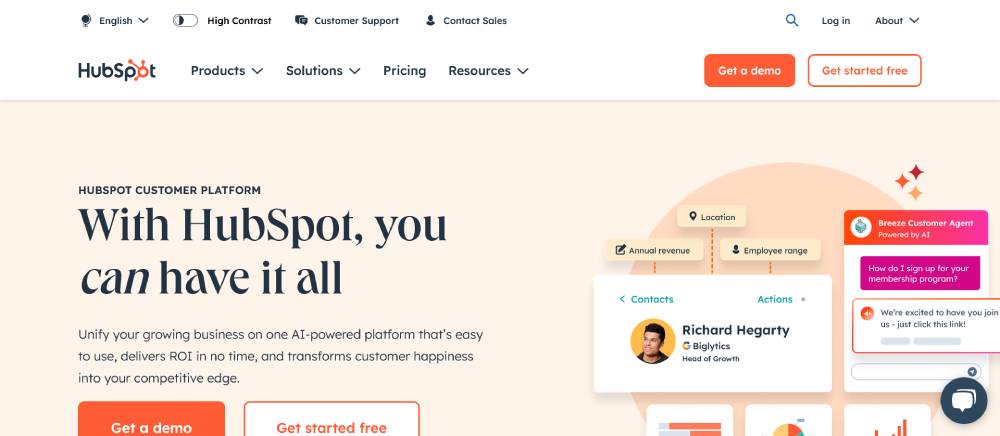
Clean layout with strong color contrast. The hero section balances text and visuals effectively. Orange call-to-action buttons stand out against white space. Navigation remains accessible yet unobtrusive. Mobile design keeps key elements visible without cluttering the screen.
ClickUp
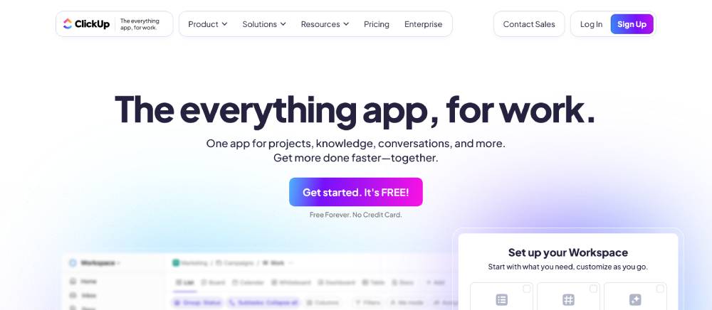
Bold purple branding with subtle animations. The landing page uses micro-interactions that feel both playful and professional. Sticky header keeps action buttons visible while scrolling. Card layouts organize information cleanly. Custom illustrations add personality to technical content.
Salesforce
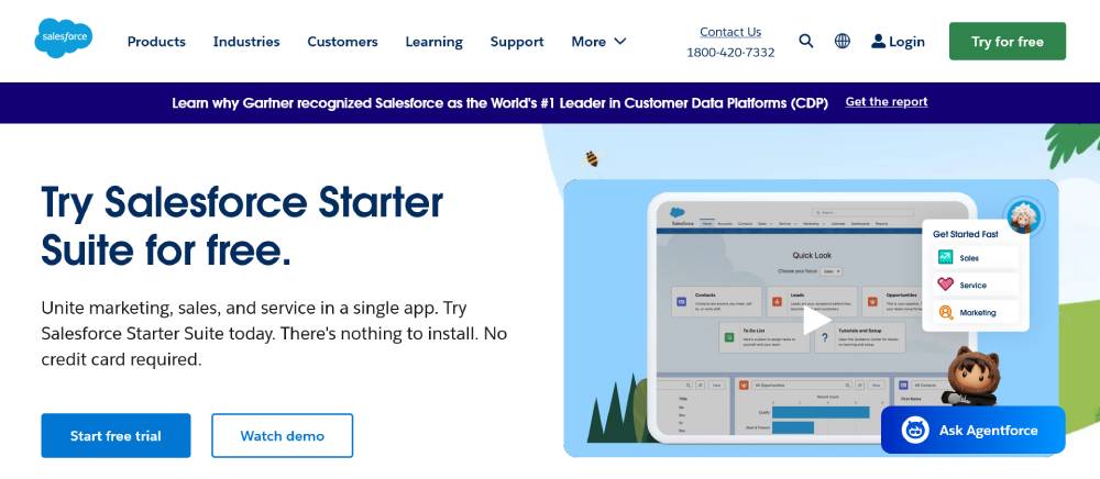
Corporate blue dominates with strategic white space. The homepage uses a modular grid system. CTAs feature subtle hover effects. Video elements add movement without distraction. Navigation organizes their extensive offerings logically.
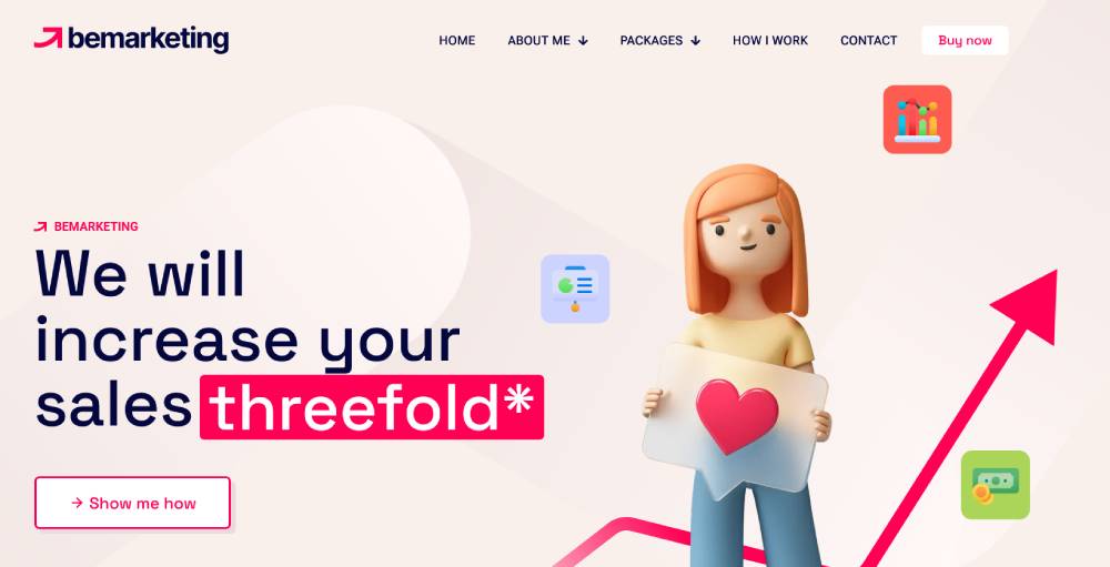
Be Marketing 2
Unbounce
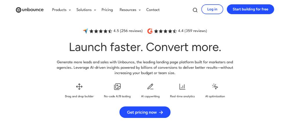
Conversion-focused design with clear visual hierarchy. A/B testing elements built into the page structure. Green accents highlight key action points. Their layout showcases sample templates directly on the homepage. Form fields keep input requirements minimal to reduce friction.
Mailchimp
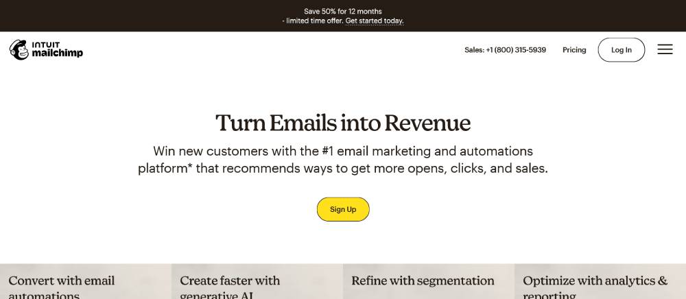
Playful illustrations with distinctive yellow branding. Typography mixes serif and sans-serif thoughtfully. The homepage flows in a story-like sequence. Interface elements have rounded corners creating a friendly feel. Mobile version stacks content without losing visual identity.
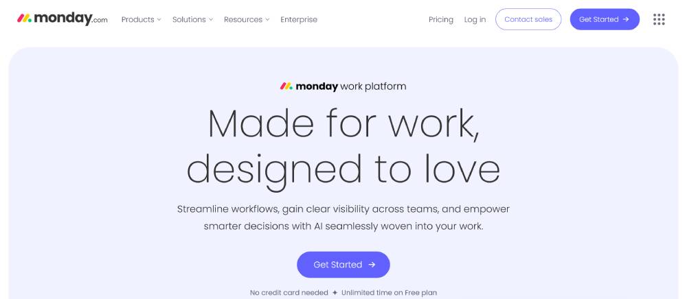
Monday.com
Vibrant multi-color palette across sections. Animated product screenshots show the platform in action. Fixed navigation with prominent sign-up button. Card-based design with subtle shadow effects. Testimonials appear as you scroll at key decision points.
ConvertKit
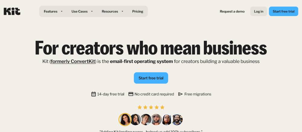
Minimalist aesthetic with plenty of negative space. Typography focuses on readability with limited font variations. Muted color scheme feels professional yet approachable. The homepage prioritizes social proof elements. Mobile menu collapses cleanly without hiding key functions.
FreshBooks
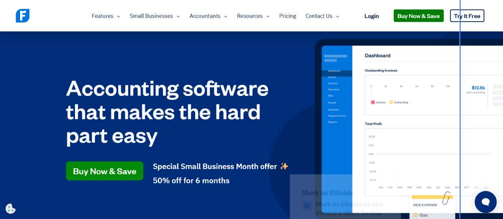
Structured layout with consistent blue accents. Dashboard previews take center stage on the homepage. Navigation groups features by user need rather than product category. Form fields include helpful inline instructions. Responsive design adjusts gracefully across breakpoints.
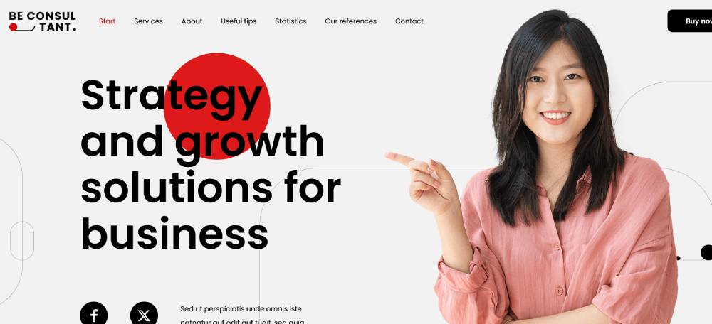
Be Consultant 2
Intercom
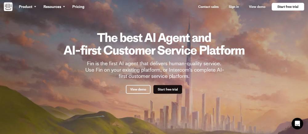
Gradient color effects create visual interest. Chat widget demonstration appears right on the homepage. Clean typography with generous line spacing. Interactive elements show the product in context. Scrolling triggers subtle animations that highlight features.
ActiveCampaign
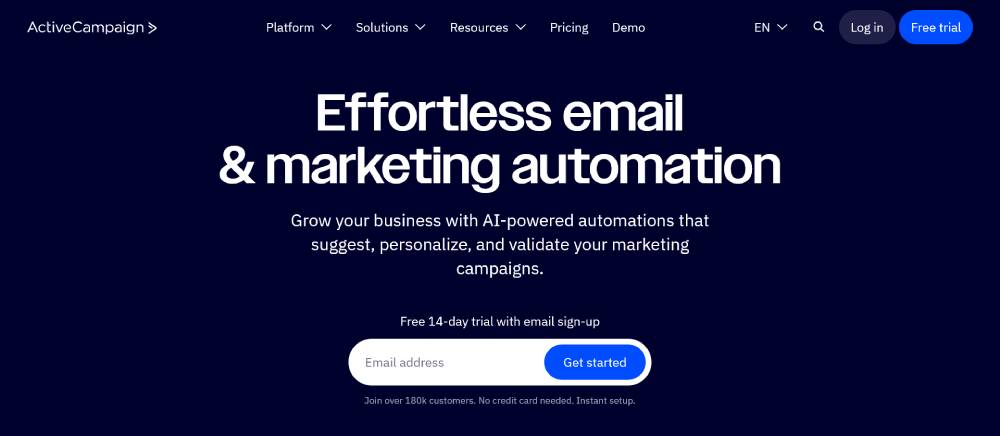
Data visualization elements throughout the design. Deep blue color scheme creates trust and stability. Section dividers use subtle wave patterns. The homepage balances text and screenshots effectively. Navigation includes targeted industry solutions.
Calendly
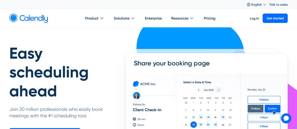
Simple, focused design with minimal distractions. The homepage leads with a working demo. Color blocking separates functional areas clearly. Typography uses a single font family with weight variations. Mobile view prioritizes booking functionality.
Zapier
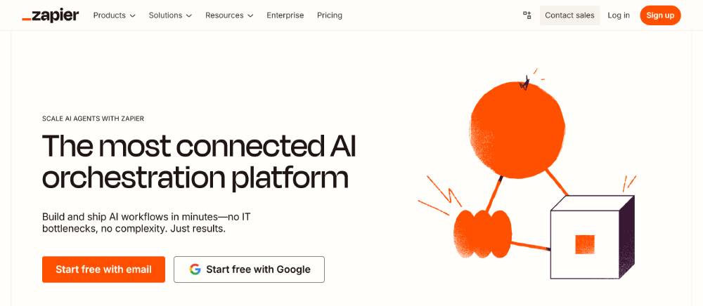
Icon-rich interface showing connection possibilities. Orange accents guide attention to action points. The homepage showcases integration partners prominently. Card layout presents complex workflow concepts simply. Search functionality appears above the fold.
Grammarly
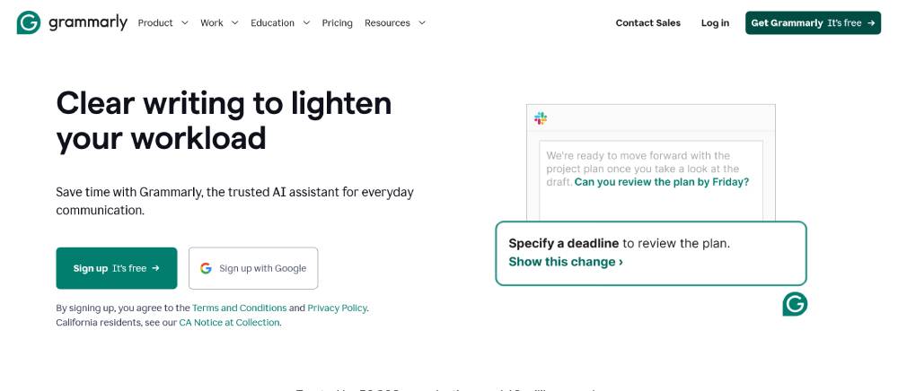
Clean interface with focused attention on text correction. Green brand color signals correctness and improvement. Animated demonstrations show the product working. Before/after examples make benefits immediately clear. Sign-up form appears at multiple scroll depths
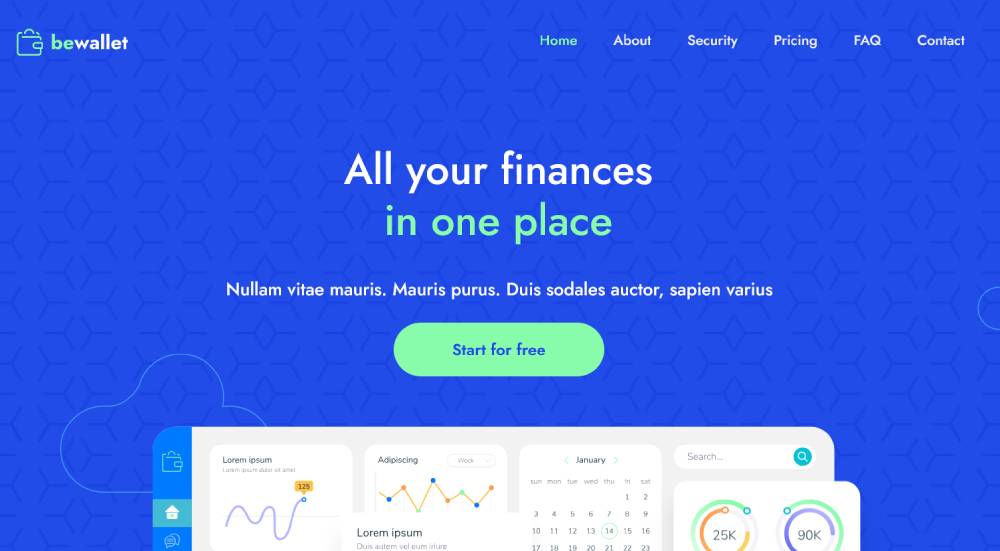
Be Wallet 2
Kajabi
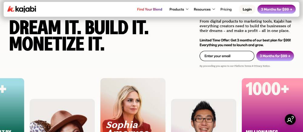
Rich purple branding throughout interface elements. Homepage showcases customer success stories prominently. Feature blocks use consistent iconography style. Dashboard previews show actual platform functionality. Mobile design maintains visual hierarchy effectively.
FAQ on Lead Generation Landing Pages
What elements must a high-converting lead generation landing page include?
Every effective lead generation page needs a compelling headline, clear value proposition, trust signals like customer testimonials, and a simple lead form. The form optimization tactics should focus on collecting only essential information. Visual hierarchy matters too, use white space strategically to guide visitors toward your CTA.
How many form fields should my lead generation landing page contain?
Less is more. Research shows conversion rates drop significantly with each additional field. For initial lead capture, limit fields to 3-5 essential ones (typically name, email, and perhaps company or phone). Typeform conversions increase by up to 120% when forms are shortened. Consider multi-step forms for complex offers.
What makes a call-to-action button effective on lead generation pages?
Effective CTAs use action-oriented, benefit-focused language in first person ("Get My Free Trial" vs "Get Free Trial"). Button design should incorporate contrast with your color scheme, adequate size, and positioning below persuasive content. A/B testing shows personalized CTAs convert 202% better than generic ones.
How do I optimize lead generation landing pages for mobile users?
Mobile optimization is non-negotiable with responsive websites being standard. Ensure touch-friendly button sizes (minimum 44×44 pixels), simplified form fields with appropriate input types, compressed images for faster loading, and vertical layouts that eliminate horizontal scrolling. Consider implementing mobile-first design principles.
Should I include navigation menus on my lead generation landing page?
No. Removing navigation menus can increase conversions by up to 100%. Focus on landing page psychology by eliminating distractions and exit points. If you must include navigation, consider using a simplified version or implementing it only after form submission.
How can I use social proof effectively on lead generation pages?
Strategic placement of social proof near your CTA can boost conversions by 15%. Include specific, results-focused testimonial page elements showcasing real customers with photos, company names, and measurable outcomes. Case study snippets, trust badges, and usage statistics also work well as conversion catalysts.
What's the ideal landing page length for lead generation?
It depends on your offer complexity. Lower-commitment offers (newsletter signup) succeed with shorter pages, while high-commitment offers (demo request) require longer pages addressing more objections. HubSpot data shows product landing pages with 500+ words convert better than shorter versions when explaining complex solutions.
How do I create compelling headlines for lead generation landing pages?
The best headlines address specific pain points or desires, include numbers when possible (e.g., "5X Your Leads"), and contain your unique value proposition. Keep headlines under 10 words for maximum impact. Avoid generic phrases and focus on benefit-oriented language that connects with your buyer persona.
What types of lead magnets convert best on landing pages?
High-converting lead magnets solve specific problems for your target audience. Top performers include toolkits/templates (70% conversion rate), checklists (52%), free trials (25%), and industry reports (25%). ClickFunnels data shows interactive lead magnets like quizzes and assessments often outperform static downloads by generating more qualified leads.
How do I measure lead generation landing page success?
Track more than just conversion rates. Analyze quality metrics like cost per lead, lead-to-customer rate, and ROI. Use Google Analytics and lead generation metrics like bounce rate, time on page, and form abandonment rates. Set up conversion tracking and implement heat mapping tools like Hotjar to understand visitor behavior.
Conclusion
Studying examples lead generation landing pages reveals patterns that separate high-performers from the rest. Conversion-focused pages aren't just visually appealing, they're strategically engineered with web design principles that drive prospect actions. Marketers who implement these tactics consistently outperform competitors in lead acquisition costs.
The digital lead generation landscape continues evolving, with interactive landing elements showing particular promise. Success demands ongoing optimization:
- Regular split testing of headlines, imagery, and form layouts
- Integration with marketing automation platforms like Mailchimp and HubSpot
- Implementation of exit-intent technology to recapture abandoning visitors
- Continuous analysis of heat maps to identify user behavior patterns
Remember that landing page conversion rates vary significantly by industry, what works for B2B software differs from fitness landing pages. The journey doesn't end with form submission. Your thank you page design plays a critical role in nurturing new leads into qualified prospects ready for your sales team.
If you enjoyed reading this article about lead generation landing pages, you should read these as well:


