
How To Reorder Pages In WordPress Easily
October 10, 2024
Inspiring HR Website Design Examples
October 16, 2024Creating a standout mobile app website is crucial in today's digital environment. As developers and designers focus on responsive design and user-friendly interfaces, examples of mobile app website design are becoming the blueprint for success.
Talented creatives are blending a mix of adaptive design and intuitive layouts to ensure seamless navigation and scalable performance. In this guide, we'll explore a range of modern design principles that prioritize user experience and share innovative prototypes that have been excelling in the industry.
You'll also uncover how strategic content optimization and UI patterns contribute to a highly engaging digital presence. By the end of this article, you will grasp the essence of crafting visually appealing and efficient mobile app websites and understand the necessary approach to staying relevant in the fast-paced world of digital product design.
Get ready to dive into interactive examples and practical insights that highlight simplicity and functionality at their core.
The thing is, you’ll require a focus point for your app’s marketing, a place that will allow your app’s audience to increase by hyping it up. This is why all apps require effective landing pages with a good design.
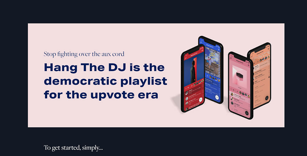
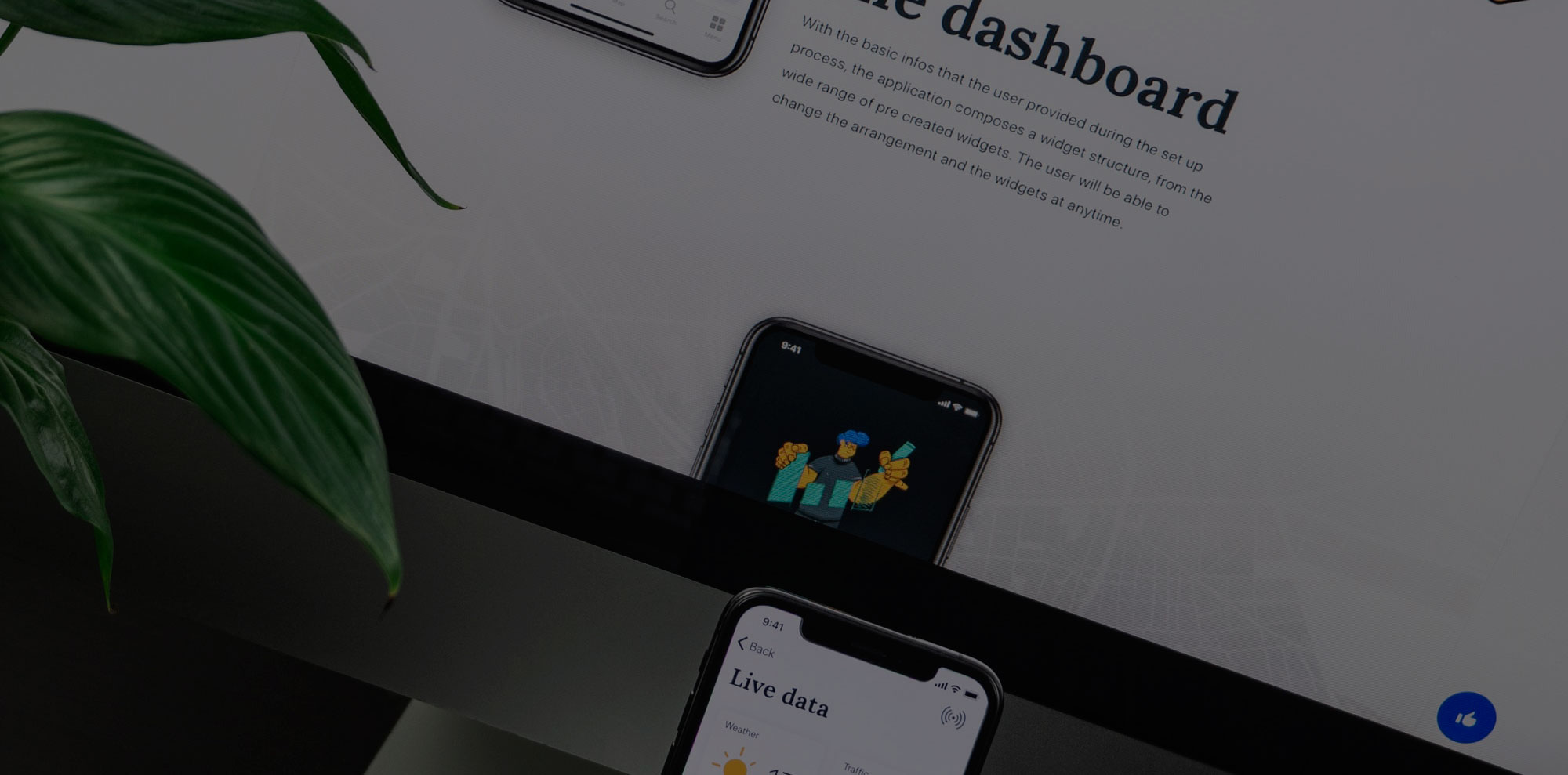
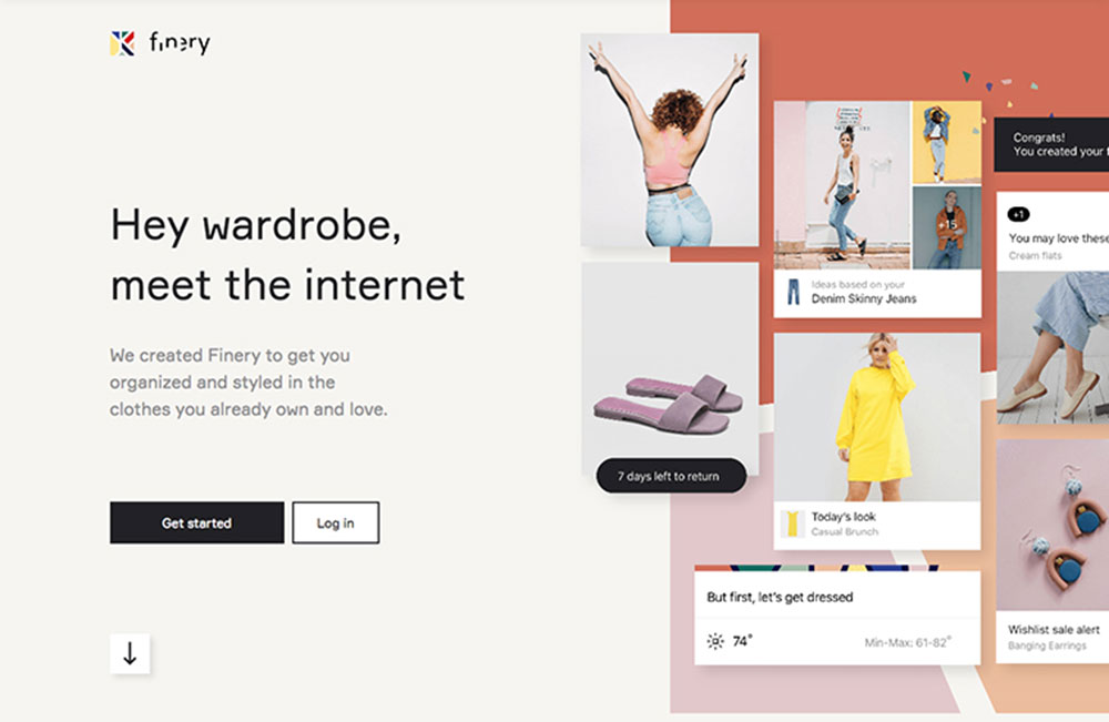
The most successful formula is to have your product placed right in the middle and have it surrounded by a clean UI design and beautiful color schemes. Full-screen images, videos, vibrant colors, and other memorable and catchy features make things even more enticing. Mobile app websites are a fantastic source of inspiration when they’re designed properly.
To achieve this level of design excellence, partnering with professional mobile app development services can help bring your vision to life.
Take a look at the following concepts and try to utilize them when creating the layout for your app website.
Components of a Compelling App Landing Page
What does the template for the landing page of app websites normally consist of? If you look at the examples listed in this article and even take a look at your favorite apps’ landing pages, you’ll discover these basic elements:
The Headline
The headline is the first thing seen by visitors. It needs to showcase your app’s value. Basically, it needs to convince the visitor that your app is exactly what they need. At the very least it needs to intrigue visitors enough to remain on your page.
A good way for earning visitors and turning them into customers is with excellent customer support. Companies can achieve this by integrating a cloud phone, having a live chatbot on their website, using email, and other means of professional communication.
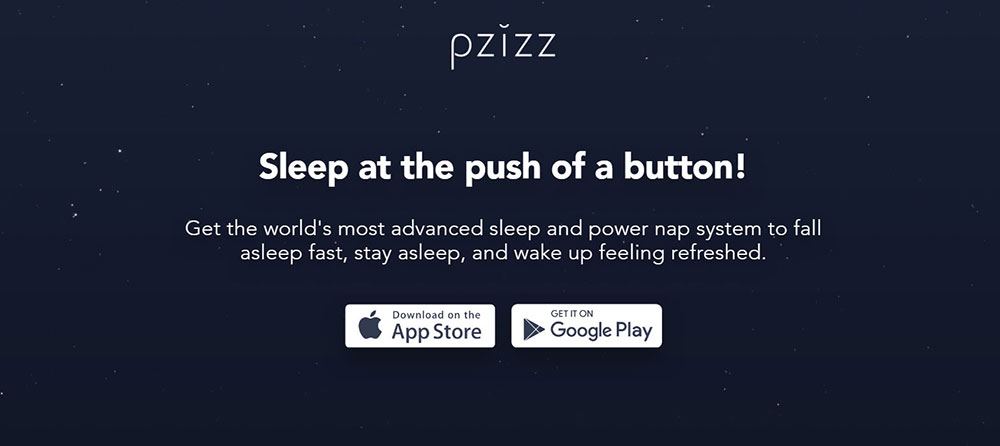
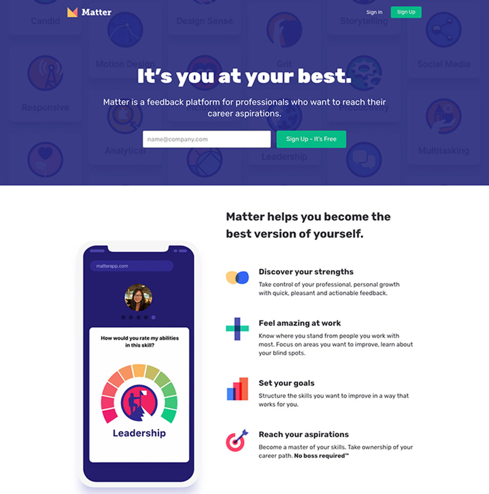
Take a look at how the sleeping app how Pzizz communicates their app’s entire value with simply one headline, and their call-to-action buttons right below it. a sleeping app, explains the entire value of their app with the headline. Roy Hibbert’s social proof adds celebrity influence and is a nice touch.
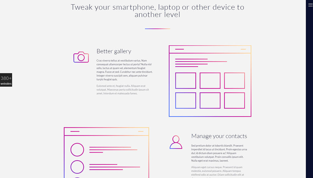
As soon as users land on a page, large, oversized images will catch their attention. These images also help convey the brand’s unique selling point (USP) to users, allowing them to form an opinion straight away.
Product-first hero images will show off either the mobile app itself or one of its features. These aren’t full-screen images, but they’re borderless and feature a clear background.
Custom mobile apps benefit from such images as they provide a snapshot of the app's interface, functionality, and value proposition, enticing users to explore further.
They either float to a certain point on the page or they’ll be fixed in position. Their backgrounds are usually white, and they’ll be accompanied with contrasted, almost-black header text.
Attractive Media for Hero Images
Your visitors have to be made aware right away of the fact that this is an application website if you want the majority of your website or landing page to even make sense. They’ll also find out straight away if it’s usable since they’ll know if it’s an app for Android, iOS, iPad, or Tablet.
Since visitors only care about your app, the best way to demonstrate its purpose to them is through screenshots. Screenshots fit into any layout style, so this isn’t a limiting factor.
Your visuals’ main goal isn’t to create beautiful app landing pages, but to build up the story told through the body copy. Your product and its benefits should be showcased through your visuals.
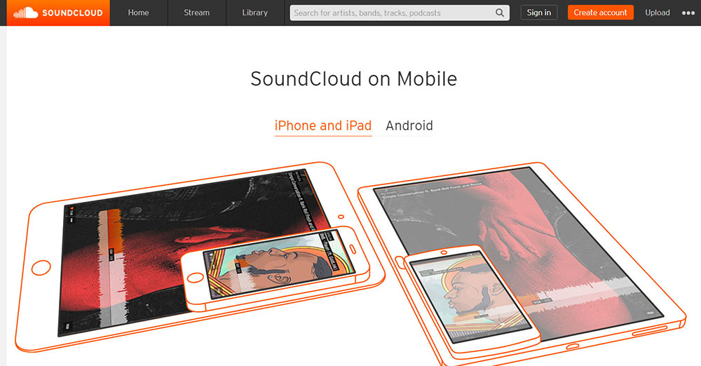
The Soundcloud’s mobile app landing page is a fantastic example of attractive media as it demonstrates how easy it is to search for new music through the use of animated GIFs to show how easy it is to scroll to find new music.
Basically, negative space — more commonly known as white space — is the area of the layout that gets left empty. It can usually be found around the objects placed in the layout, as well as inside and between them. It gives all of the objects on the page or screen room to breathe.
Don’t forget that you don’t need to use just white space for negative space in web design — all colors, textures, patterns, and background images are at your disposal.
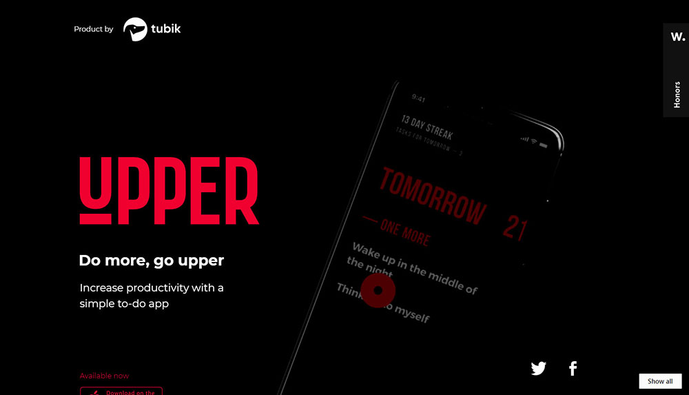
Check out the website for Upper app: they use black negative space, which contrasts beautifully with the interface’s core elements. Only one straight line is used for the entire screen. However, the layout looks organized and is easy to read due to the lack of distractions and because the elements have room to breathe. It also utilizes a minimalistic style, making it aesthetically pleasing.

Your benefits get placed in the main body copy. Provide as much copy as is necessary to answer your visitor’s unspoken questions and leave them feeling satisfied with the decision to visit your landing page in the first place.
Your copy’s length depends on the kind of app and industry you’re a part of. Less copy (and more pictures) is required to get someone to buy an endless runner game than it is to buy a dieting and healthy lifestyle app.
- Describe the most relevant information first
- Briefly describe key functionalities
- Use bullet points to mention key features
- Use familiar words

When choosing color themes for app websites, go for those that complement your organization. The color palette selected for your app web page should either be in sync with or match your organization’s color.
This gives the website the look and feeling of it being an extension of your application. If your website features too many colors, colors that are heavy, textures, and an abundance of composition tricks, that might hinder the UX.
App Store Badge
Once you’re done with building your app, this might seem like a no-nonsense technique. Badges are easily identified as download links to the app marketplace.
Both iOS and Android users are given the option of viewing apps straight from their browser, or when viewed on a smartphone, this will redirect.
If there are no prominent call-to-actions featured on app websites, no amount of convincing will enable users to download that app. This CTA must draw attention and trigger a certain action. Adding it to several different places on your app website is a good idea.
Your app landing page exists in order to gear visitors towards the call-to-action, which should consist of clicking a download button that leads them to the app store. Either that, or it should consist of them filling out a contact form and then getting the app directly.
This main objective should be supported by all the components on the web page.
Some kind of social proof is also necessary as it demonstrates to visitors that your app is trustworthy. These can consist of the best quotes from reviews by blogs or newspapers, as well as some of the best quotes from user reviews.
Most apps tend to shed the spotlight on glowing user reviews or testimonials that come from big-name users. If their app has received any awards or recognition, those will be displayed. They might also just boast about how many users they have or how many downloads they’ve generated. All these statistics show the immense popularity of online marketplace apps, which has led to the rise in demand for bespoke marketplace app development.
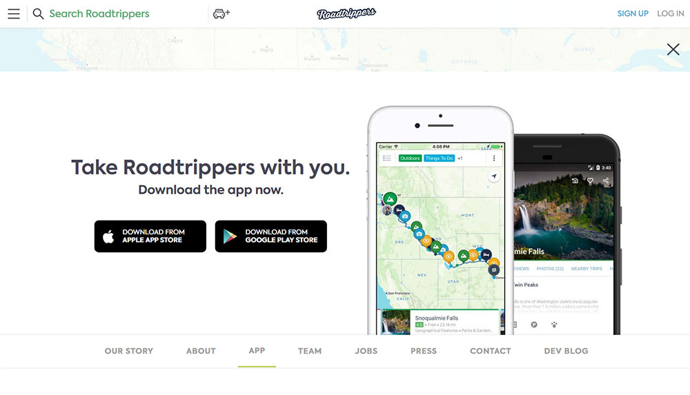
Check out how at how the map and travel app Roadtrippers tells a story about finding hidden gems on road trips through user reviews and body copy.
Mobile-Friendly Design
When designing your mobile app’s landing page, make sure that your tap targets (the areas on the page that users interact with) don’t overlap and are large enough in size.
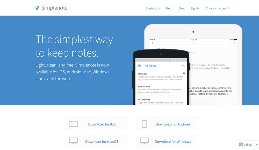
Take a look at the landing page for mobile app Simplenote. First of all, you’re given an overview of the app’s functions, immediately followed by download links for every OS. Look at how large those links are. That’s because the goal is to make them easily clickable on mobile devices.
What kind of article doesn’t feature some eye candy? The techniques listed in this article are accompanied by a list of some of the best mobile app development websites:
What makes this landing page so great: Beautiful pictures, effects, and animations, Numerous auto-play videos demonstrating the app in action, Sections that are simple and structured make this page easily digestible and several clear call-to-action.
Things that could be improved: A much simpler copy would be better - technical words such as “bespoke” might confuse numerous visitors.
Path
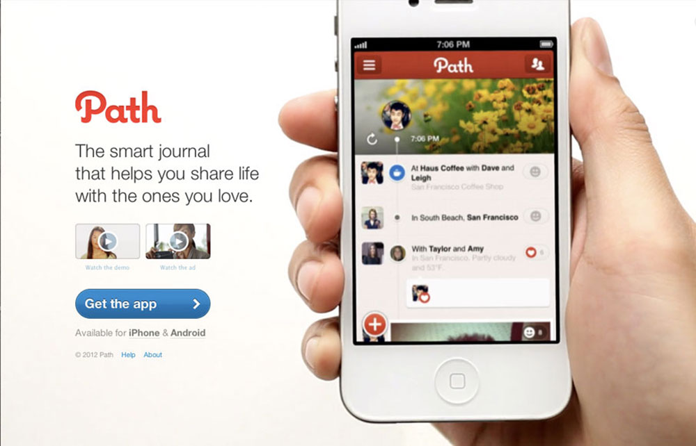
Our favorite thing about the Path website (besides them integrating an actual video of the app in use and their responsive website) is that they provide some instructions: the app can either be downloaded through your browser, or you’ll receive a download link via text message. Badges for the Google Play and App Store are also included, just to be on the safe side.
Pacemaker
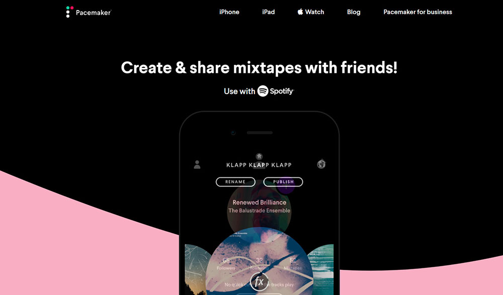
What makes this landing page so great: Users are enticed thanks to beautiful branding and vivid colors, the app’s functionality is showcased through fantastically-executed product videos, a short page will lead to towards the various product offerings, and there’s also an awards section to display the product’s credibility.
Things that could be improved: The call-to-action should be placed above the fold so that there’s no need to scroll, showcase some example mixes to entice prospective users, mention that it’s a FREE app!
FAQ on designing websites for mobile apps
What makes a good mobile app website design?
A good design starts with user interface inspiration and a mobile-first approach. It uses intuitive navigation, scalable visuals, and clear content optimization. Focusing on the user journey, it ensures seamless access across all devices. Consistent branding and high performance highlight engaging app experiences that attract users and keep them interacting.
How do I make my mobile app website responsive?
Creating a responsive design involves using flexible grids, layouts, and media queries. Emphasize cross-device design to ensure functionality is seamless on any screen size. Tools like Bootstrap can help. Remember, smooth navigation and readability are key factors to consider for mobile touchpoints in today’s digital interface development.
Why is user experience crucial for mobile app sites?
User experience is the backbone of any successful design because it impacts user engagement. Good experiences employ user-centric layouts, intuitive navigation systems, and interface adaptability. It’s about presenting information in a distraction-free way to ensure that users find and do what they need easily.
What are the emerging trends in app website design?
Modern designs focus on simplicity, bold typography, and high-quality visuals. Flat design trends and material design concepts continue to lead the way. Interactive prototypes, micro-interactions, and minimalist approaches are shaping experiences into user-friendly journeys aiming for clarity and functionality in every component.
How can I improve my site's performance?
Improving performance involves reducing load times, optimizing images, and enabling browser caching. Use Google Analytics to track user activity and identify bottlenecks. Regular audits can ensure page speed remains competitive, ultimately benefiting overall mobile user persona satisfaction through fast and responsive site access.
How do I incorporate SEO into my design?
SEO integration starts with keywords in your titles and meta descriptions. Ensure your content strategy aligns with user search intent. Use structured data and alt tags for images. Internal linking helps create a coherent site structure. Regular updates of sitemaps ensure your site remains at peak indexing efficiency.
What tools can help in designing mobile app websites?
Many tools boost efficiency and creativity in design, such as Sketch for prototyping, Figma for collaboration, and Adobe XD for all-in-one capabilities. For wireframes, try Balsamiq. These tools support comprehensive digital product design and can simplify the path from concept to interactive high-fidelity prototypes.
How do I make my design user-friendly?
Focus on creating an intuitive flow with a simple layout and clear calls to action. Consistency in UI elements and logical navigation paths are vital. Accessibility features like readable fonts and contrast ratios must be in place. Ensure content is engaging but not overwhelming, prioritizing user-friendly design.
How often should I update my mobile app website design?
Regular updates are crucial. Keep up with trends and interface usability standards. At least once a year, evaluate your design’s alignment with user expectations and industry advancements. However, smaller tweaks may be needed quarterly to test new ideas or functionalities, enhancing the user's continuous exploration of the site.
What is the role of color schemes in app design?
A thoughtful color scheme establishes brand consistency and enhances visual appeal. It guides the user's eye through the site, impacting their emotional response. Choose palettes that reflect your app's purpose, using colors to form a digital design language that’s easy on the eyes and memorable.
Conclusion
Bringing everything together, showcasing examples of mobile app website design reveals a significant mix of creativity and practicality. These examples highlight key benefits of focusing on user-friendly layouts and effective navigation.
With digital trends constantly shifting, it’s crucial to stay updated. Prioritize adaptive layouts to keep users engaged and your app competitive.
Design is more than looks; it's about function. Keep the user journey smooth by maintaining consistent UI patterns. Consider performance in every choice, from interactive elements to color schemes. Your site should do more than attract; it should engage with purpose.
By applying these insights, your website not only stands out but also delivers on expectations. In essence, let the design speak volumes without a word, ensuring every click adds value and enhances the user's experience. This is the key to making a memorable, effective digital presence.
If you enjoyed reading this article about mobile app websites, you should read these as well:

