The Best Fitness Website Design Examples
January 7, 2026
The Best Church Website Design Examples
January 8, 2026Your website has about three seconds to convince a homeowner to call you instead of the next carpet cleaner on the list.
Most carpet cleaning website design examples fail this test. Cluttered layouts, missing phone numbers, zero trust signals.
The result? Visitors bounce to competitors with better online booking systems and clearer service presentation.
This guide breaks down what actually works for residential cleaning services and commercial floor care companies.
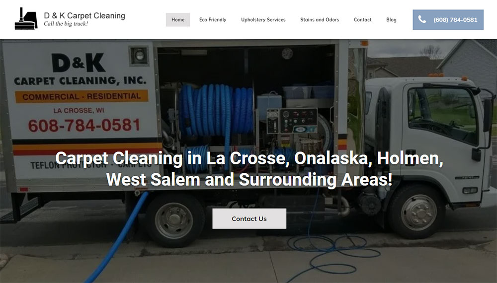
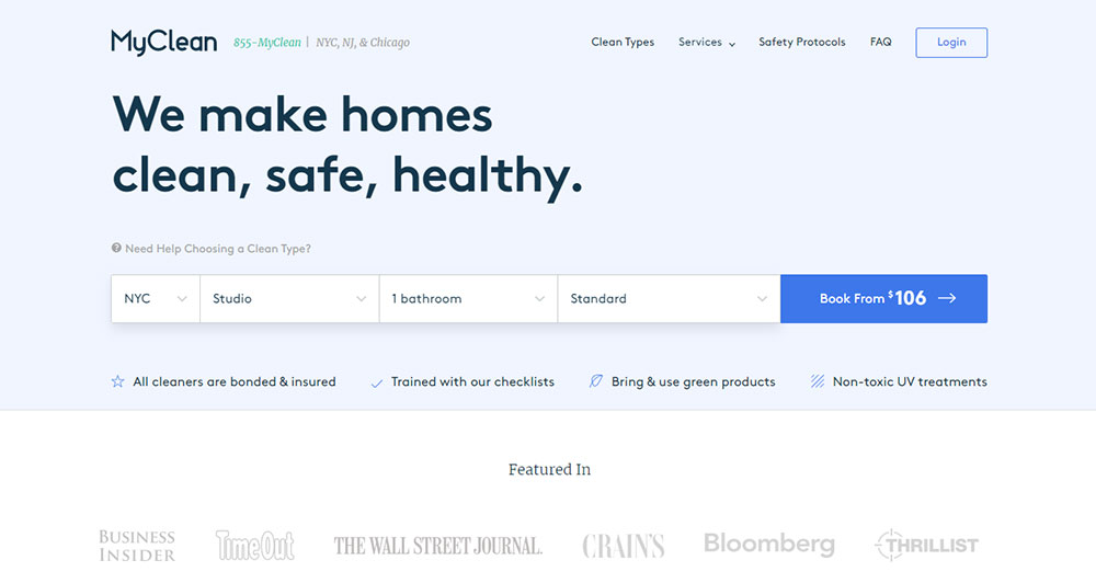
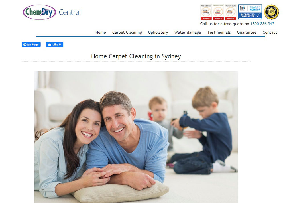
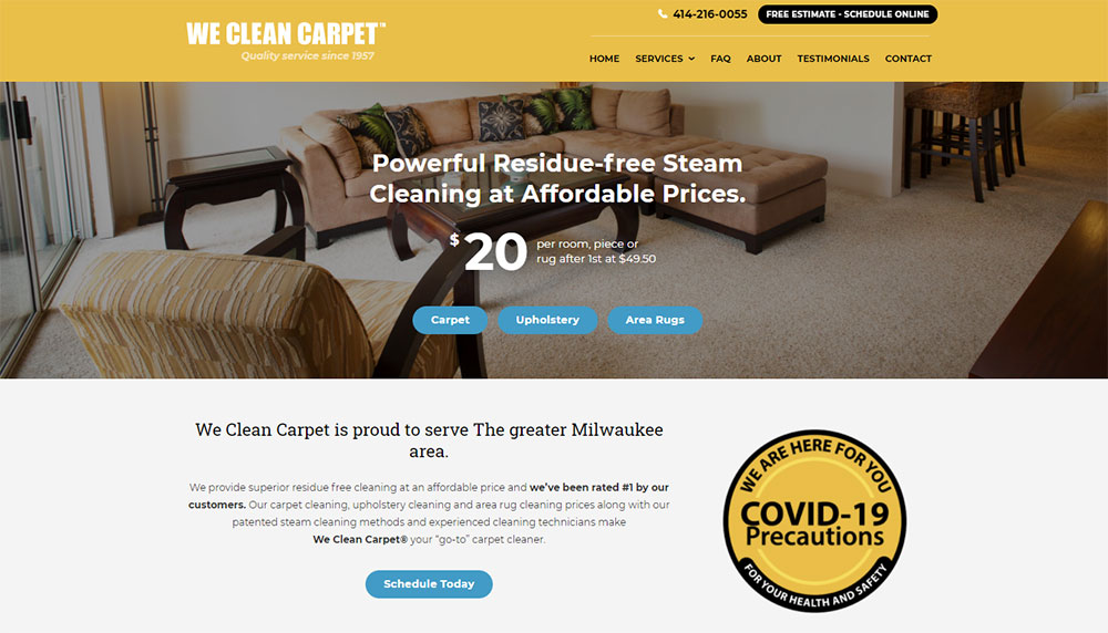
You'll see real websites from brands like Stanley Steemer, Chem-Dry, and Zerorez. Each example shows specific conversion elements: quote request forms, before after galleries, IICRC certification placement, and mobile-friendly layouts that turn browsers into booked appointments.
What is Carpet Cleaning Website Design
Carpet cleaning website design is the process of building a digital presence for residential and commercial floor care businesses.
These sites focus on service presentation, local visibility, and converting visitors into booked appointments.
A professional carpet cleaner needs more than a basic template.
The site must communicate trust, showcase steam cleaning equipment capabilities, and make scheduling effortless.
Most carpet cleaning companies serve specific zip codes or cities, so the design must highlight service area coverage prominently.
Think of it like plumber websites or house cleaning websites.
Same local focus. Same need for immediate contact options. Same trust-building requirements.
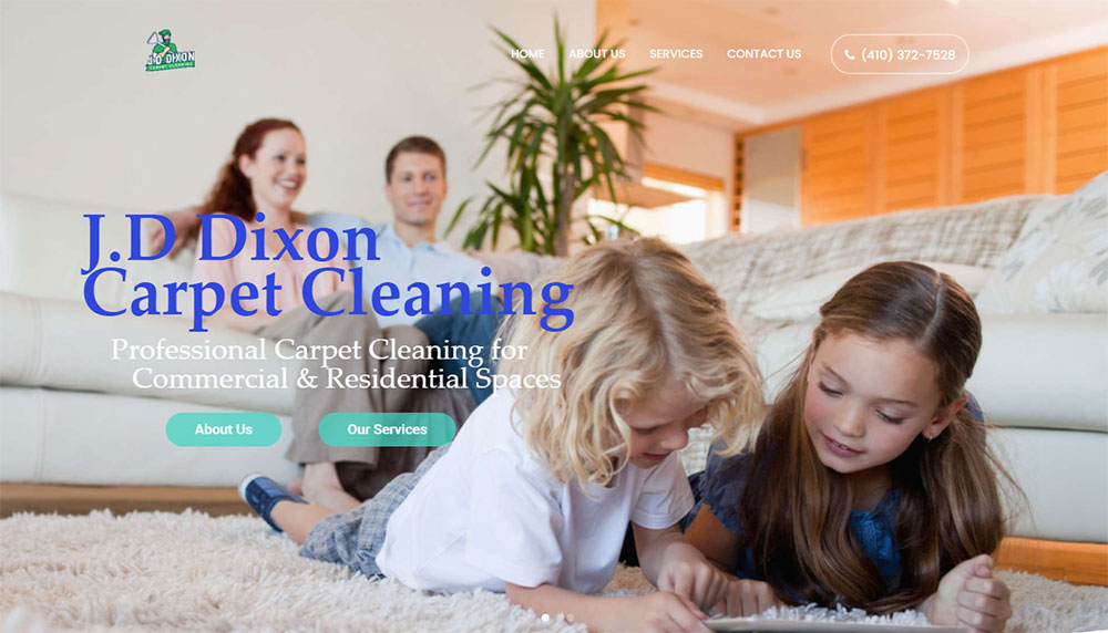
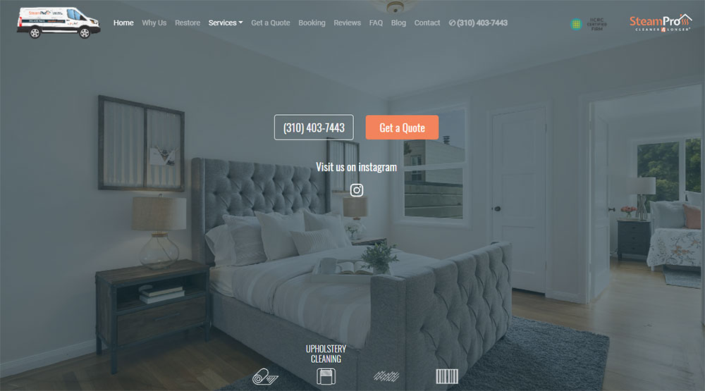
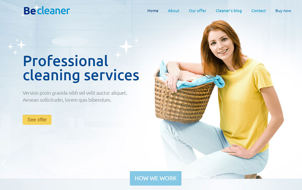
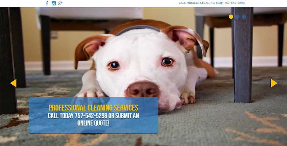
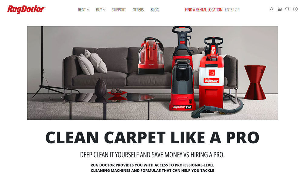
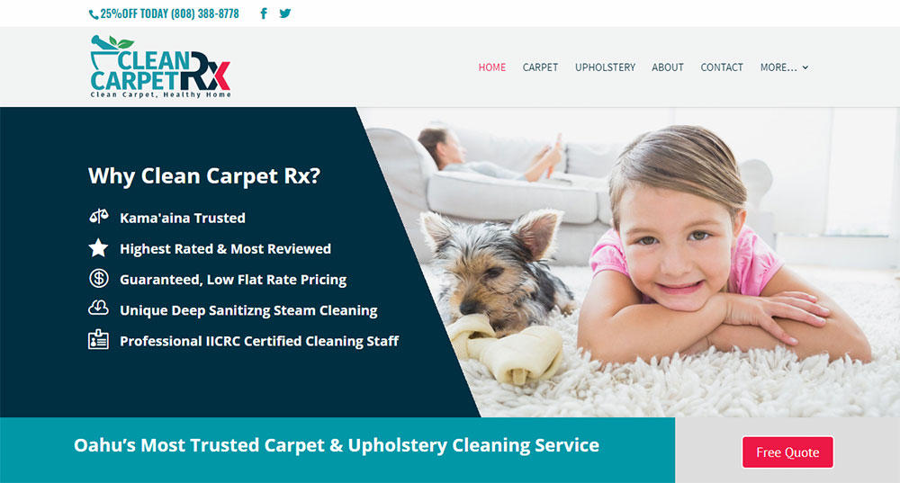
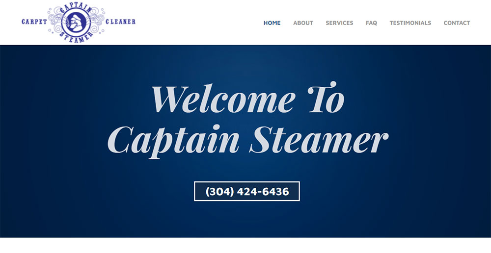
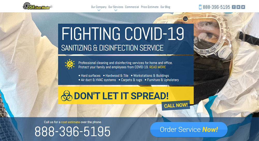
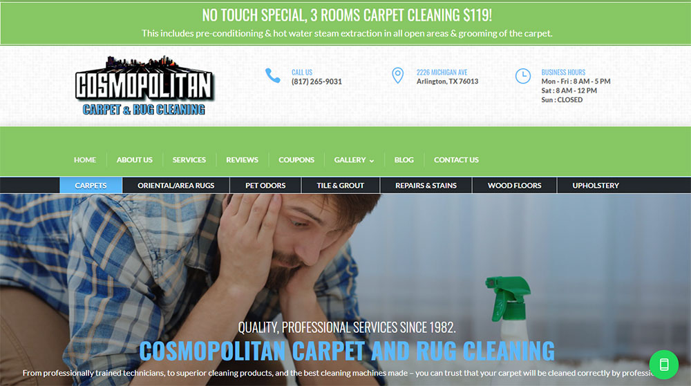
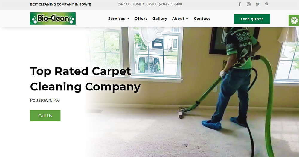
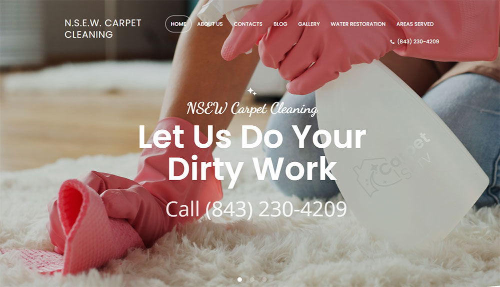
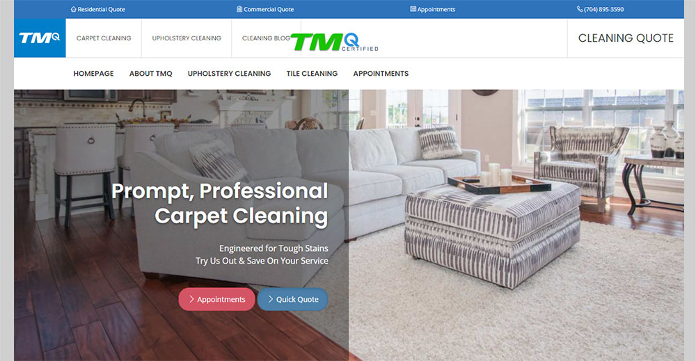
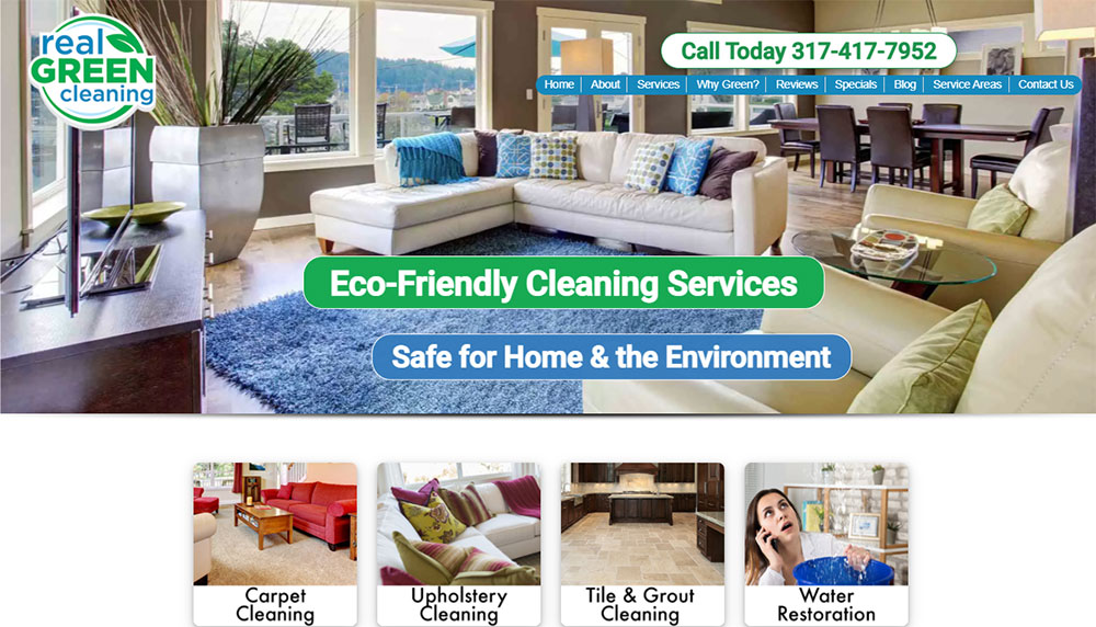
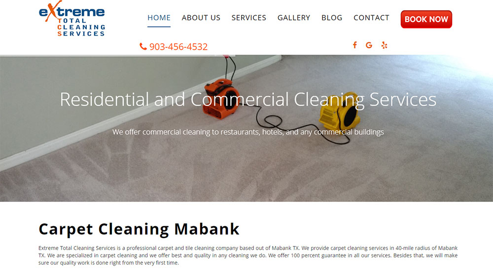
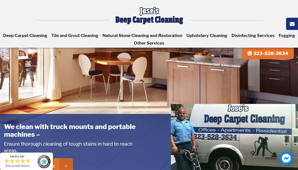
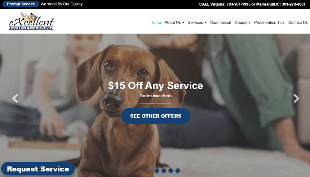
Carpet Cleaning Website Design Examples
SteamPro, Inc.
How Do Carpet Cleaning Websites Convert Visitors Into Customers?
Conversion happens when visitors find what they need fast.
For carpet cleaning services, that means clear pricing, visible phone numbers, and simple booking paths.
Quote Request Forms
Every high-converting site includes a free estimate request form above the fold.
Keep fields minimal: name, phone, zip code, service type.
Trust Signals
IICRC certification badges, BBB accreditation, and Google reviews build credibility instantly.
Licensed bonded insured statements remove hesitation.
Click-to-Call Buttons
Mobile users want to tap and talk.
Sticky call to action buttons in the header keep the phone number accessible during scroll.
Before After Galleries
Nothing sells stain removal like visual proof.
Slider comparisons showing pet odor treatment results or deep cleaning outcomes close deals.
Service Area Maps
Embedded Google Maps with coverage zones answer the "do you serve my area" question immediately.
What Visual Elements Work Best for Carpet Cleaning Website Layouts?
Clean design wins for cleaning companies. Ironic but true.
Color Psychology
Blues signal cleanliness and trust.
Greens suggest eco-friendly solutions.
White backgrounds reinforce the "fresh and clean" message your services promise.
Check out proven color scheme examples for inspiration.
Hero Section Images
The hero section needs a high-quality image of technicians at work or sparkling clean carpet results.
Skip generic stock photos. They kill credibility.
White Space Usage
Cluttered layouts feel chaotic.
Strategic white space makes information scannable and keeps focus on conversion elements.
Mobile-First Approach
Over 60% of local service searches happen on phones.
Responsive websites with thumb-friendly navigation convert better than desktop-first designs squeezed onto small screens.
What Homepage Sections Should Carpet Cleaning Websites Include?
Homepage structure follows a conversion-focused hierarchy.
Above the Fold Requirements
- Company name and logo
- Primary phone number (click-to-call enabled)
- One-line value proposition
- Quote request form or booking button
- Service area statement
Service List Presentation
Organize by category: residential cleaning services, commercial floor care, specialty services like upholstery restoration or tile grout cleaning.
Icon-based cards work well here.
Social Proof Section
Customer testimonials with names and locations.
Google review widget showing live ratings.
Study effective testimonial page layouts for placement ideas.
About Section
Years in business, team photos, truck mounted systems shown.
This builds the "who" behind the service.
Footer Essentials
Full contact information, service area list, hours of operation, and links to privacy policy.
Secondary navigation for less-visited pages like same day service policies or area rug specialist certifications.
How Do Carpet Cleaning Websites Display Service Offerings?
Service presentation affects booking rates directly.
Visitors scan, they don't read. Structure matters.
Service Cards vs Lists
Icon-based cards with short descriptions outperform plain text lists; each card should link to a dedicated service page with pricing page details.
Residential vs Commercial Separation
Split audiences early.
Residential cleaning services and commercial floor care have different needs, budgets, and decision timelines.
Specialty Services Placement
Area rug specialists, tile grout cleaning, and upholstery restoration get secondary positioning below core carpet services.
Package Bundles
Combine deep cleaning methods with fiber protection treatments.
Bundle pricing increases average ticket value.
What Booking Features Do Carpet Cleaning Websites Need?
Friction kills conversions.
Every extra click loses potential customers.
Online Scheduling Tools
Calendly, Acuity Scheduling, or integrated solutions like ServiceTitan and Jobber connect directly to technician calendars.
Real-time availability removes back-and-forth phone calls.
Quote Request Forms
Good form design keeps fields under seven.
Name, phone, email, address, service type, preferred date.
Phone Call Tracking
Dynamic number insertion through CallRail or similar tools tracks which pages generate calls.
Chat Widgets
Live chat or chatbots answer quick questions without requiring a form submission; reduces bounce on visitors who just want pricing ballparks.
How Should Carpet Cleaning Websites Show Before and After Results?
Visual proof beats written claims every time.
Gallery Layouts
Grid-based photo galleries organized by service type: pet stain removal, water extraction services, commercial jobs.
Study how photographer websites handle image-heavy layouts.
Slider Comparisons
Interactive before-after sliders let visitors drag to reveal the transformation.
More engaging than static side-by-side images.
Video Testimonials
Customer videos showing actual results build trust faster than stock photography.
Even smartphone-quality footage works.
Case Study Pages
Detailed writeups for difficult jobs: severe pet odor treatment, flood restoration, high-traffic commercial spaces.
What Trust Signals Increase Carpet Cleaning Website Conversions?
Trust removes hesitation.
Hesitation kills bookings.
Certification Badges
- IICRC certification (industry standard)
- Carpet and Rug Institute seal of approval
- Green Seal Certification for eco-friendly solutions
- BBB accreditation with rating displayed
Review Integration
Embed live Google reviews, Yelp ratings, or Trustpilot scores.
Third-party validation carries more weight than self-reported testimonials.
Guarantee Statements
Satisfaction guarantee badges with clear terms reduce perceived risk.
"Not happy? We'll re-clean for free."
Business Credentials
Years in business, number of homes served, licensed bonded insured statements, team photos with names.
How Do Mobile Users Experience Carpet Cleaning Websites?
Most local service searches start on phones.
Desktop-first thinking fails here.
Click-to-Call Placement
Sticky headers with tap-to-dial buttons.
Phone number visible without scrolling.
Thumb-Friendly Navigation
Bottom navigation bars beat hamburger menus for user friendly website experiences on mobile.
Important actions within thumb reach.
Form Simplification
Reduce form fields on mobile.
Auto-detect location instead of manual address entry; use dropdown selectors over text inputs.
Image Compression
Before-after galleries need WebP format and lazy loading.
Heavy images destroy mobile page speed.
What Color Schemes Work for Carpet Cleaning Website Design?
Colors communicate before words do.
Blue Palettes
Trust, cleanliness, professionalism.
Blue websites dominate the cleaning industry for good reason.
Green Palettes
Eco-friendly positioning, freshness, health-conscious messaging.
A green color palette works well for companies emphasizing non-toxic cleaning methods.
White and Neutral Backgrounds
Reinforces the "clean" message visually.
Creates contrast for CTAs and important information.
Accent Colors for CTAs
Orange or red buttons pop against blue and green schemes.
Understanding color theory helps buttons stand out without clashing.
How Do Carpet Cleaning Websites Handle Local Service Areas?
Local visibility drives bookings.
Generic national content loses to location-specific pages.
City and Zip Code Pages
Dedicated landing pages for each served location improve local search rankings.
"Carpet Cleaning in [City Name]" as H1.
Google Maps Integration
Embedded maps showing service radius.
Google Business Profile link with reviews visible.
Location-Specific Content
Mention local landmarks, neighborhoods, or regional concerns like humidity-related mold in coastal areas.
Multi-Location Setups
Franchise models need location selectors.
Each branch gets unique contact info, service area map, and team photos; similar to how real estate landing pages handle multiple agents.
What Technical Requirements Affect Carpet Cleaning Website Performance?
Speed and security affect both rankings and conversions.
Core Web Vitals Targets
- LCP under 2.5 seconds
- FID under 100 milliseconds
- CLS under 0.1
Google Search Console flags issues; fix them.
Hosting Recommendations
Managed WordPress hosting from WP Engine, Kinsta, or SiteGround.
Shared hosting struggles with image-heavy gallery pages.
Image Optimization
WebP format, compression below 100KB per image, responsive srcset for different screen sizes.
Security Basics
SSL certificates required for any site with forms.
HTTPS builds trust and satisfies browser warnings.
Schema Markup
LocalBusiness schema with service area, hours, and aggregate rating.
Helps Google understand what the business does and where it operates.
Use a website checklist to verify all technical elements before launch.
FAQ on Carpet Cleaning Website Design
What makes a good carpet cleaning website?
A good carpet cleaning website loads fast, displays a visible phone number, and includes a quote request form above the fold.
Trust signals like IICRC certification badges and customer testimonials build credibility. Mobile responsiveness is mandatory.
How much does a carpet cleaning website cost?
Basic WordPress sites run $500 to $2,000. Custom designs with online booking systems cost $3,000 to $10,000.
Monthly maintenance, hosting, and Wix or Squarespace subscriptions add $20 to $100 ongoing.
What pages should a carpet cleaning website have?
Essential pages include: homepage, services (residential cleaning services, commercial floor care), about us, service areas, before after gallery, and contact.
Add dedicated pages for specialty services like upholstery restoration or tile grout cleaning.
How do I get more leads from my carpet cleaning website?
Add click-to-call buttons, simplify your booking form, and display Google reviews prominently.
Create city-specific landing pages for local search visibility. Speed up page load times to reduce bounce rates.
Should I use WordPress for my carpet cleaning website?
WordPress offers flexibility and integrates with scheduling tools like Jobber and ServiceTitan.
Wix and Squarespace work for simpler sites. WordPress requires more maintenance but scales better for multi-location businesses.
What images work best on carpet cleaning websites?
Before after photos showing stain removal results outperform stock imagery.
Include team photos, truck mounted systems, and steam cleaning equipment shots. Compress all images to WebP format for faster loading.
How important is mobile design for carpet cleaners?
Critical. Over 60% of local service searches happen on smartphones.
Mobile users need sticky call buttons, simplified forms, and thumb-friendly navigation. Poor mobile experience sends customers to competitors immediately.
What booking software works for carpet cleaning businesses?
Housecall Pro, Jobber, and ServiceTitan are industry standards.
Calendly and Acuity Scheduling work for basic appointment booking. Choose software that syncs with technician calendars and sends automated confirmations.
How do I show my service areas on my website?
Embed Google Maps with your coverage zone highlighted.
Create dedicated pages for each city or zip code you serve. Link your Google Business Profile and list specific neighborhoods in your footer.
What certifications should I display on my carpet cleaning website?
Display IICRC certification, BBB accreditation, and Carpet and Rug Institute seals.
Green Seal Certification appeals to eco-conscious customers. Add licensed bonded insured badges and any manufacturer certifications for specific equipment.
Conclusion
These carpet cleaning website design examples share common traits: fast load times, clear service area coverage, and frictionless booking paths.
The difference between a site that generates leads and one that collects dust comes down to trust badge integration and user experience flow.
Start with the basics. Add Schema Markup for local search visibility. Track performance through Google Analytics and Google Search Console.
Display your satisfaction guarantee prominently. Make free estimates easy to request.
Your website competes with listings on Angi, HomeAdvisor, and Thumbtack.
It needs to work harder. Build a conversion focused homepage with click-to-call functionality, customer testimonials from real jobs, and proof of your deep cleaning methods.
Professional carpet cleaners who invest in proper web design win more local jobs. Period.

