Farming and Agriculture Website Design Examples
August 11, 2025
Examples of Responsive Website Templates That Work
August 14, 2025Your website is working against you. Or it's not working at all.
Most electrical contractors lose potential customers before anyone answers the phone. The site loads slowly, looks outdated, or buries contact information three clicks deep.
Electrician website design examples show what actually converts visitors into booked jobs. Real sites. Real results.
This guide breaks down 15 high-performing electrical contractor websites. You'll see what makes their homepage layouts, service pages, and trust signals effective.
Whether you're building from scratch with WordPress or Wix, or redesigning an existing site, these examples give you a clear blueprint for generating leads.
What is Electrician Website Design
Electrician website design is the process of creating a digital presence for electrical contractors, service companies, and licensed electricians that converts visitors into booked jobs.
It combines visual branding, service information, trust signals, and lead capture tools into a single platform.
The goal is simple: make it easy for homeowners and businesses to find, trust, and contact an electrical service provider.
A well-built electrician website displays licensing credentials, service areas, customer reviews, and emergency contact options in a clear layout that works on any device.
Electrician Website Design Examples
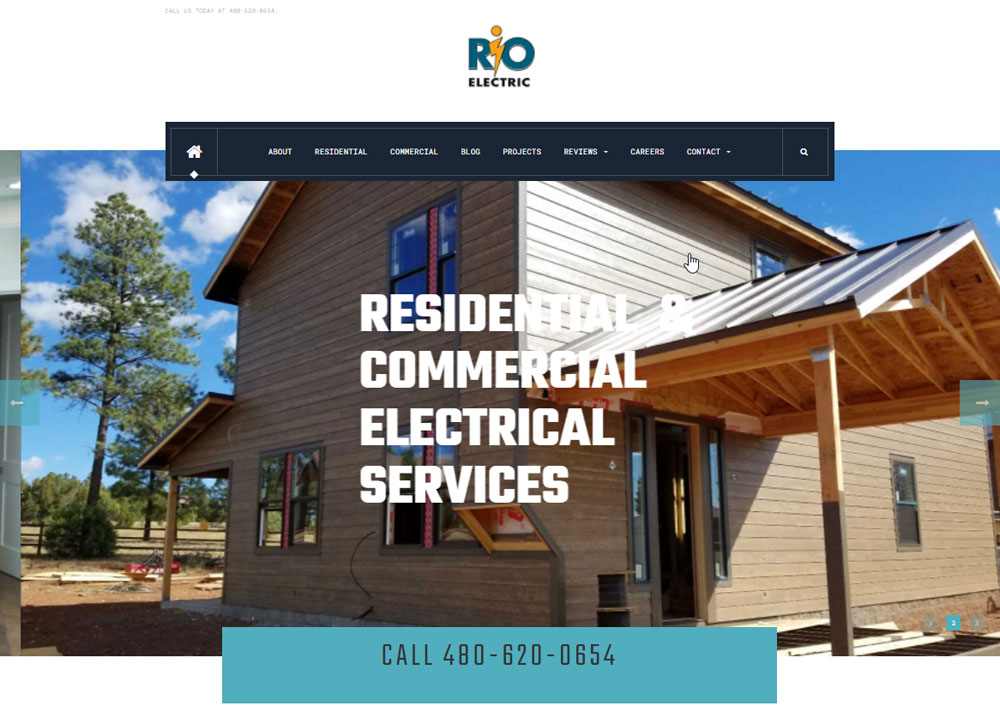
Rio Electric
A & P Electrical Services
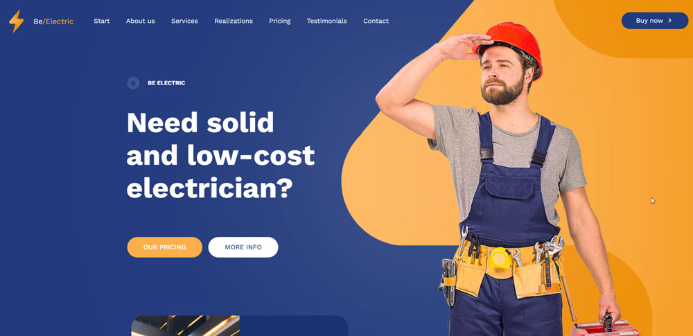
Be Electric
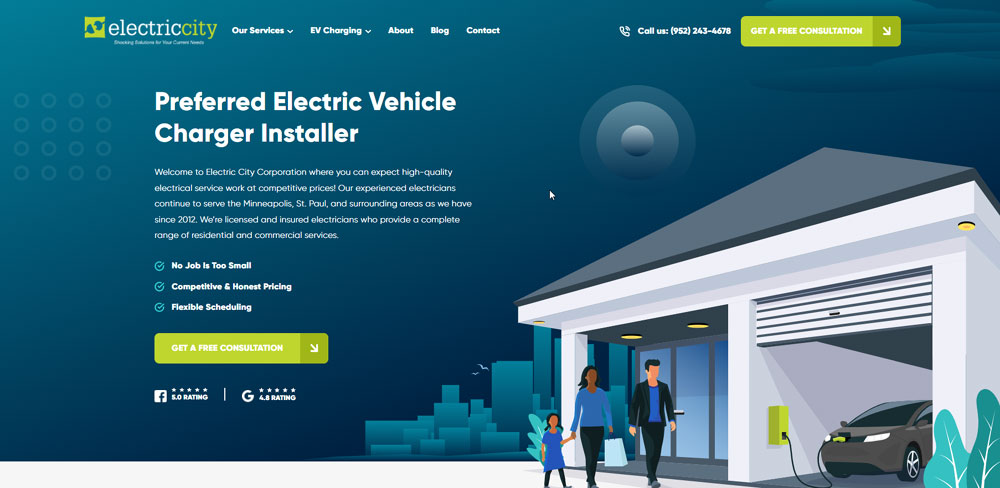
Electric City
Be Electric 2
Weifield Group
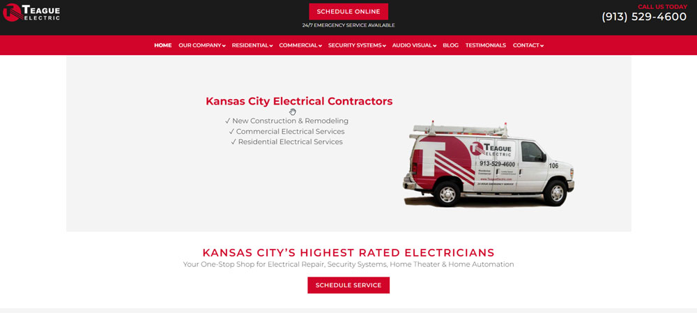
Teague Electric
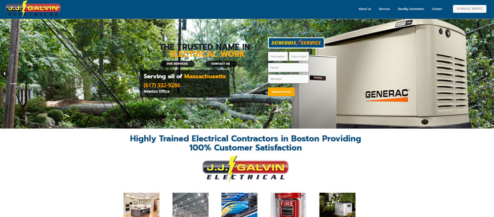
J.J. Galvin Electrical
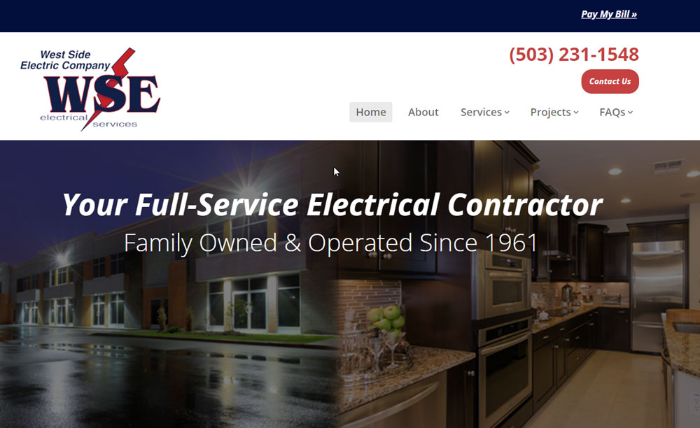
West Side Electric Company
Electrical Safety First
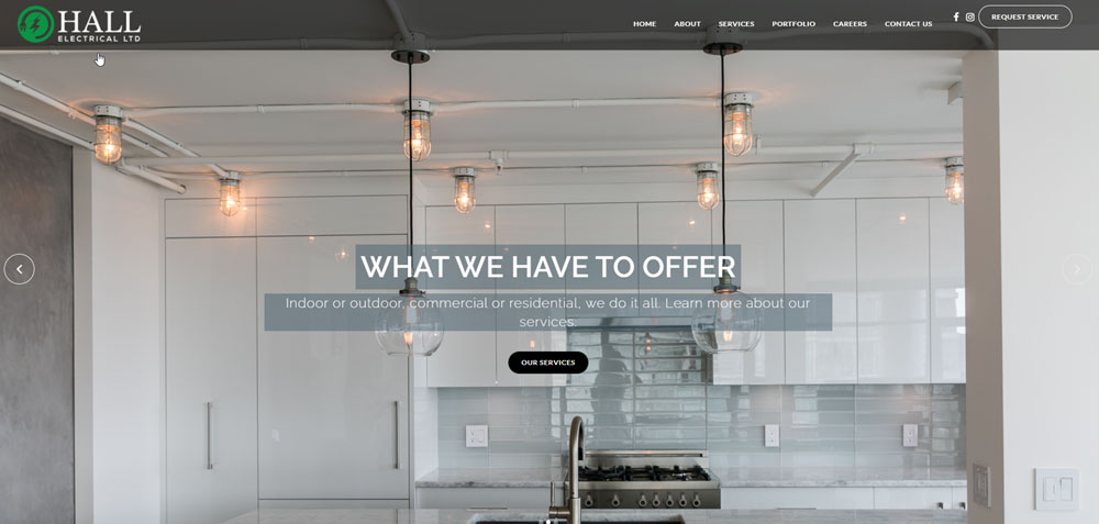
Hall Electrical
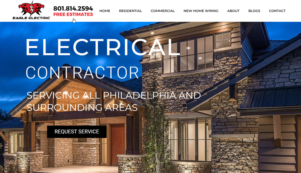
Eagle Electric
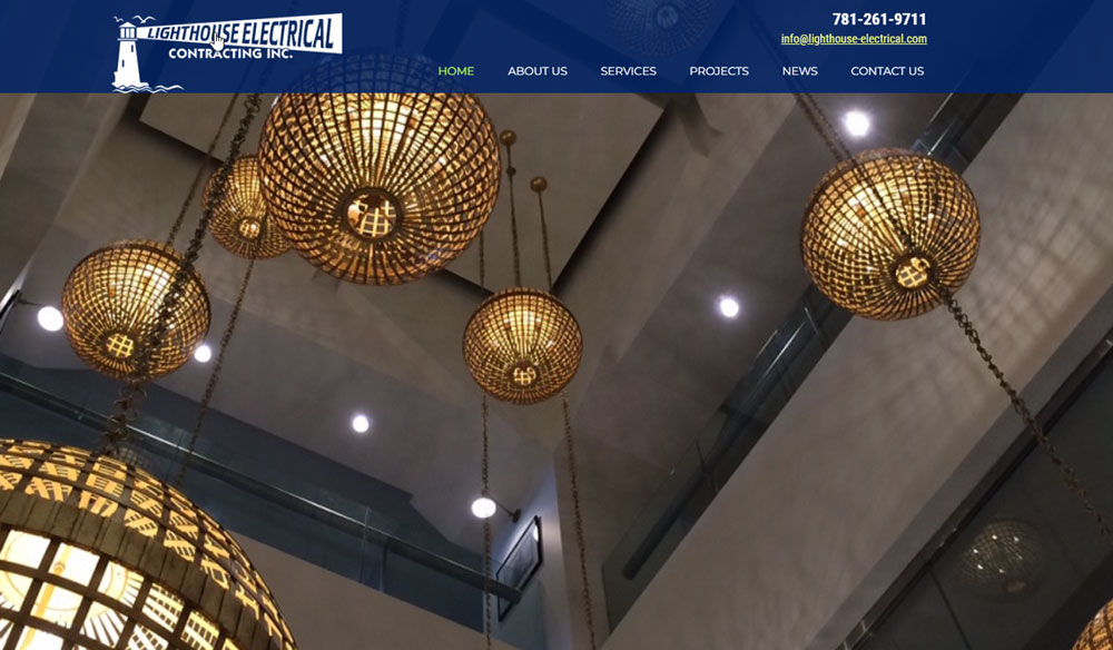
Lighthouse Electrical Company
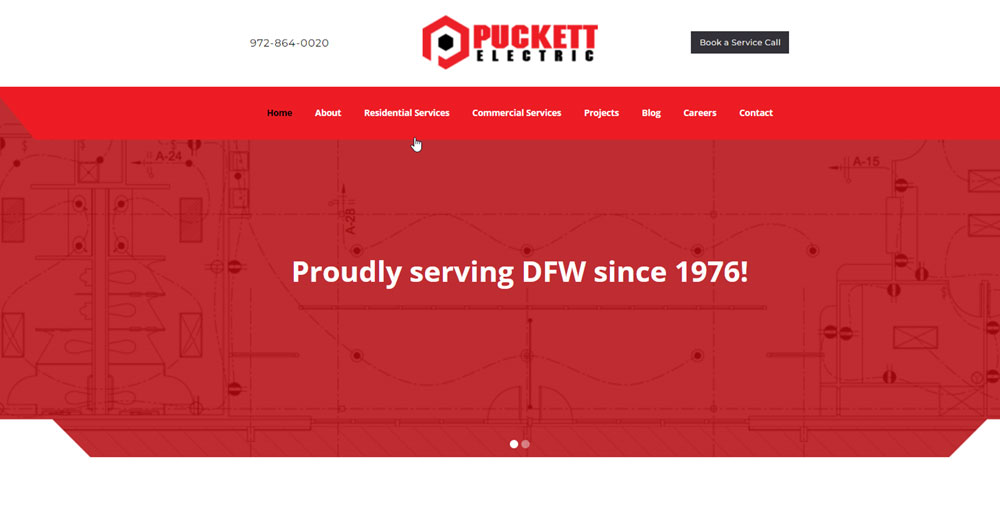
Puckett Electric
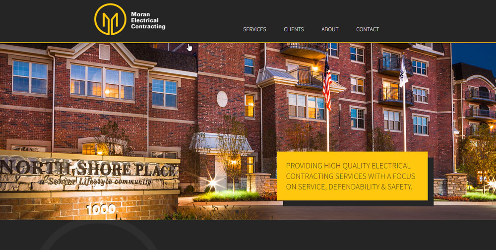
Moran Electrical Contracting
Platinum Electricians
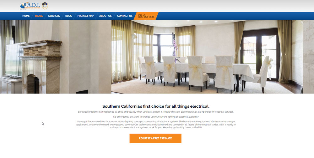
A.D.I. Electrical Services
Stay Wired Electrical
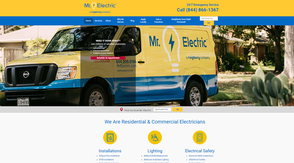
Mr Electric
Withrow Electric
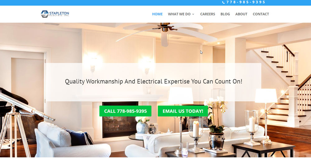
Stapleton Electric Inc.
Mister Sparky
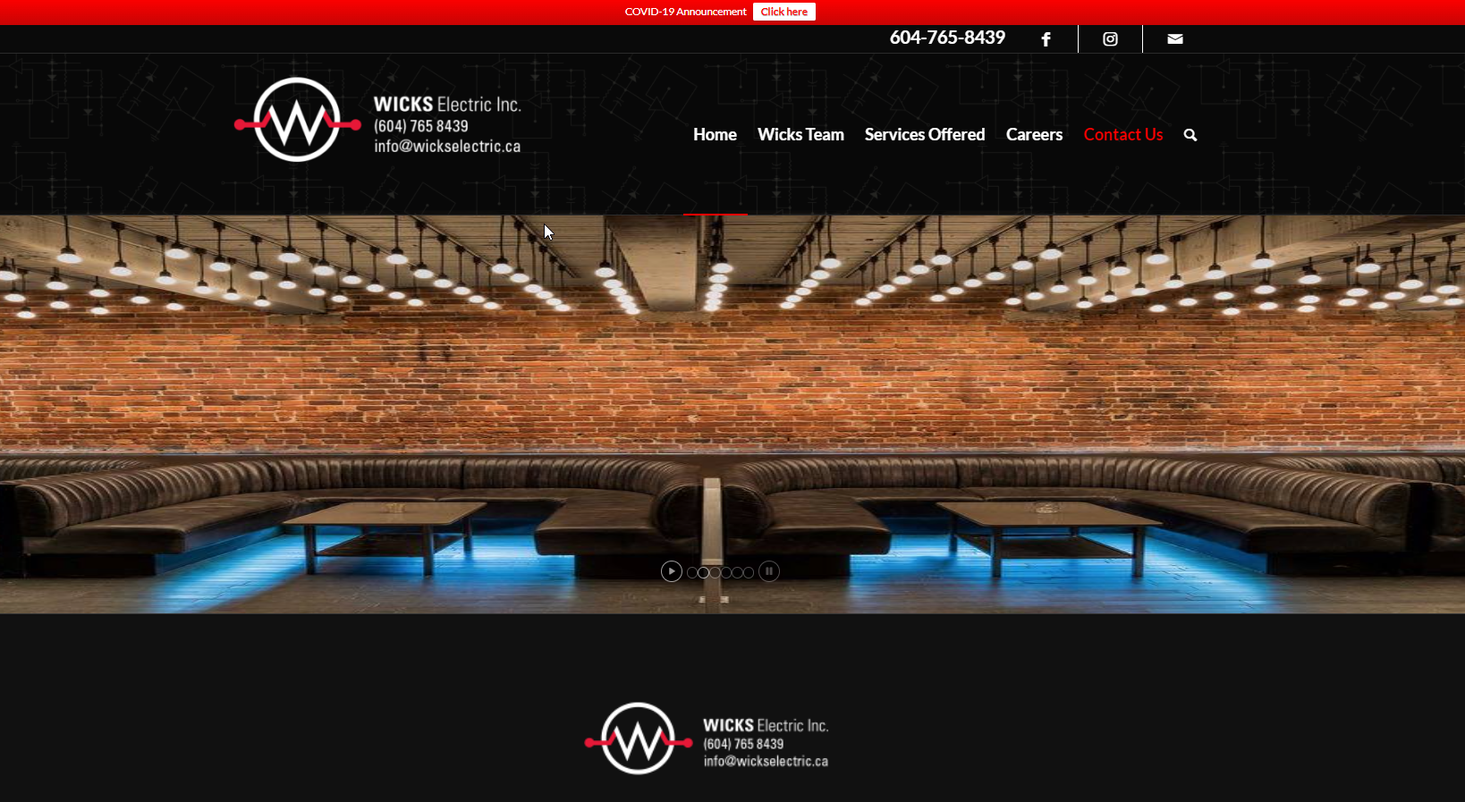
Wicks Electric
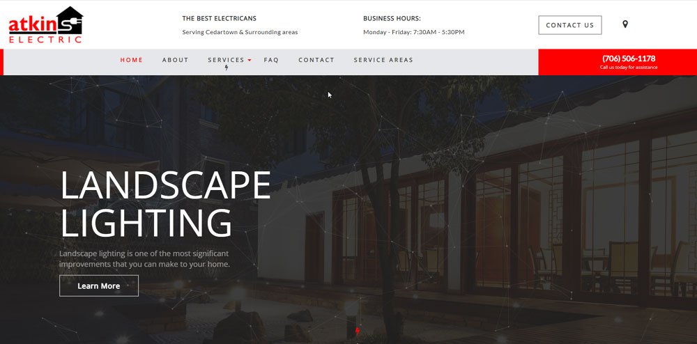
Atkins Electric
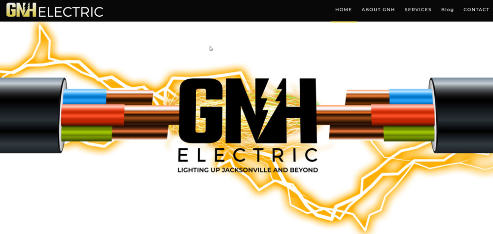
GNH Electric
Hardt Electric Inc.
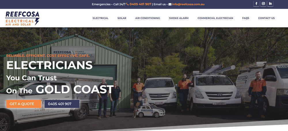
Reefcosa Electrical
Lemberg
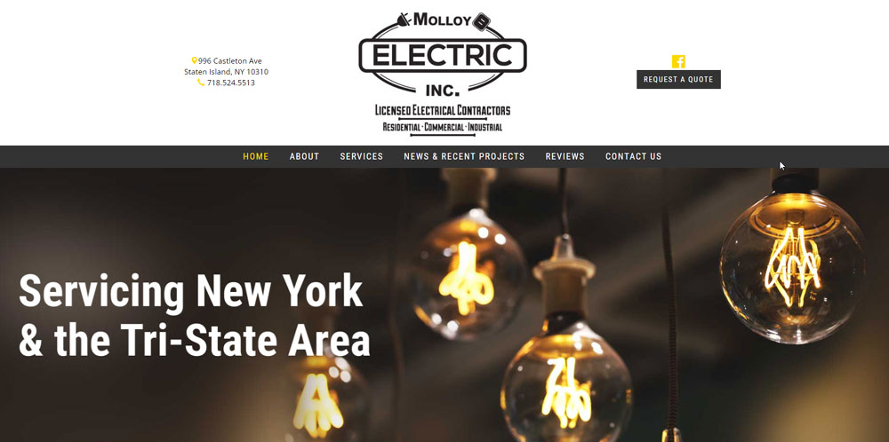
Molloy Electric
What are the Core Elements of an Electrician Website
Every high-performing electrical contractor website shares specific components that drive conversions and build credibility with potential customers.
Homepage Layout Components
The homepage answers four questions immediately: who you are, what services you offer, where you work, and how to reach you.
Place your phone number and call to action buttons above the fold where visitors see them without scrolling.
Include your Master Electrician License number, insurance verification, and any NECA credentials in visible positions.
Service Page Structure
Create dedicated pages for each service type: residential wiring, commercial electrical, panel upgrades, EV charger installation, generator installation, and emergency repairs.
Each page needs specific details about what the work involves, not generic descriptions copied from competitors.
Add before-and-after project photos with brief descriptions of the scope and location.
Contact and Quote Request Features
Your contact form design directly affects lead generation rates.
For many electrical contractors, the website works best when it integrates with electrical contractor software, automatically syncing quote requests, bookings, and customer details into the same system used for scheduling jobs, sending estimates, and tracking reviews. This prevents leads from slipping through the cracks and streamlines the entire service workflow.
Keep fields minimal: name, phone, email, service needed, brief description.
Add click-to-call functionality for mobile users and display response time expectations prominently.
How Does Mobile Responsiveness Affect Electrician Websites
Over 60% of electrical service searches happen on smartphones, often during emergencies when someone needs help fast.
A responsive website adapts automatically to any screen size, keeping buttons tappable and text readable without pinching or zooming.
Mobile first design means building for phones initially, then scaling up to desktop layouts.
Google prioritizes mobile-friendly sites in local search results, so a site that breaks on phones loses visibility in "electrician near me" queries.
Test every page on actual devices. Tap targets need at least 44 pixels of space. Forms should be easy to complete with thumbs.
What Makes a Hero Section Effective for Electrical Contractors
The hero section is the first visual element visitors see, and it determines whether they stay or leave within seconds.
Effective hero sections for electricians include:
- A clear headline stating what you do and where you serve
- Professional imagery of your team, trucks, or completed work
- Visible phone number with click-to-call on mobile
- Primary CTA button like "Get Free Quote" or "Schedule Service"
- Trust badges showing licensing, insurance, and ratings
Skip generic stock photos of light bulbs. Use real images of your crew and service vehicles instead.
The headline should include your city or service area for local search optimization.
Which Color Schemes Work for Electrician Website Design
Color choices affect trust perception and brand recognition instantly.
A strong color scheme for electrical contractors typically uses blue (trust, reliability), orange or yellow (energy, visibility), or green (safety, eco-friendly services).
Most successful electrician sites use:
- Blue and white for clean, professional appearance
- Orange accents for CTAs and emergency service highlights
- Dark backgrounds with high-contrast text for industrial appeal
- Yellow highlights connecting to electrical/safety themes
Keep your palette to 2-3 colors maximum. Match them to your existing logo and truck wraps for brand consistency.
CTA buttons need contrast against the background. Orange buttons on blue backgrounds convert well for service businesses.
What Service Information Should Electrician Websites Display
Specific service pages outperform generic "Services" pages in both search rankings and conversions.
Residential Electrical Service Pages
Cover whole house rewiring, panel upgrades, outlet installation, ceiling fan mounting, and lighting design. Include typical project timelines and permit requirements for your service area.
Commercial Electrical Service Pages
Address office buildouts, retail lighting, data cabling, parking lot lighting, and code compliance inspections. Mention experience with specific building types: restaurants, warehouses, medical offices.
Emergency Service Information
Display 24-hour availability, average response times, and after-hours phone numbers. List common emergencies handled: power outages, burning smells, sparking outlets, tripped breakers.
How Do Electrician Websites Display Service Areas
Service area pages improve local search optimization and help customers confirm coverage.
Three effective approaches:
- Interactive maps with clickable service zones
- City/neighborhood lists organized by county or region
- Dedicated landing pages for each major city served
Location pages should include the city name in the H1, mention nearby landmarks, and list specific services available in that area.
Link service area pages from your Google Business Profile for consistency.
What Trust Signals Convert Visitors on Electrician Websites
Electrical work involves safety concerns and significant cost. Trust signals reduce hesitation.
High-impact trust elements:
- Licensing credentials: Master Electrician License, Journeyman certifications
- Insurance verification: liability and workers' compensation proof
- Industry affiliations: NECA membership, ESFI partnerships
- Review platforms: Google ratings, Yelp, HomeAdvisor, Angi, Thumbtack scores
- Guarantees: satisfaction promises, warranty information
- BBB accreditation: Better Business Bureau rating display
Place credentials near the header or footer so they appear on every page.
A dedicated testimonial page with customer reviews adds depth beyond homepage snippets.
How Do Project Portfolios Improve Electrician Website Conversions
Before-and-after photos prove capability better than any written claim.
Effective portfolio elements include:
- Project type and scope description
- Location (city/neighborhood, not exact address)
- Challenges solved during the project
- High-quality images of completed work
Organize by category: residential, commercial, industrial, EV charger installation, generator installation, surge protection systems.
Add new projects quarterly to keep content fresh for returning visitors and search engines.
What Call-to-Action Buttons Work for Electrical Contractor Websites
Button text affects click rates significantly. Generic "Submit" underperforms specific action phrases.
Top-performing CTA text for electricians:
- "Get Free Quote"
- "Schedule Service"
- "Call Now"
- "Request Emergency Help"
- "Book Online"
Use contrasting colors that stand out against your background. Orange on blue, white on dark backgrounds, or your brand accent color works well.
Place primary CTAs above the fold, after service descriptions, and in the footer.
How Do Contact Forms Affect Lead Generation for Electricians
Every additional form field reduces completion rates by roughly 10%.
Optimal fields for electrical service requests:
- Name
- Phone number
- Service type (dropdown)
- Brief description (optional)
Skip address collection initially; get it during follow-up. Add a checkbox for emergency requests that triggers immediate notification.
Display expected response time: "We respond within 2 hours during business hours."
What Website Builders Do Electricians Use
Platform choice depends on budget, technical comfort, and feature requirements.
WordPress: Maximum flexibility with themes and plugins. Requires more maintenance but offers complete control over design and SEO.
Wix: Drag-and-drop simplicity with built-in hosting. Good for DIY builds; limited advanced customization.
Squarespace: Clean templates with strong visual design. Works well for electricians prioritizing aesthetics.
Jobber: Industry-specific with built-in scheduling, invoicing, and quote features. Integrates with Google Business Profile automatically.
ServiceTitan: Enterprise solution for larger electrical companies needing CRM, dispatching, and marketing tools integrated with their website.
How Does Page Speed Affect Electrician Website Performance
A one-second delay in load time reduces conversions by 7%. Emergency searches have even less patience.
Speed optimization priorities:
- Compress images below 200KB without visible quality loss
- Use lazy loading for below-fold content
- Choose hosting with servers near your service area
- Minimize plugins and external scripts
- Enable browser caching
Test with Google PageSpeed Insights and GTmetrix. Aim for under 3 seconds on mobile connections.
Fast sites rank better in local search results and keep impatient visitors from bouncing to competitors.
FAQ on Electrician Website Design
How much does an electrician website cost to build?
DIY platforms like Wix or Squarespace cost $15-50 monthly. Custom WordPress sites range from $2,000-10,000 depending on features. Industry-specific builders like Jobber or ServiceTitan include websites in their subscription packages starting around $50 monthly.
What pages should every electrician website have?
Homepage, Services, About, Contact, and Service Areas are the minimum. Add dedicated pages for residential electrical, commercial electrical, and emergency services. A website footer with contact details should appear on every page.
How do I make my electrical contractor website rank on Google?
Claim your Google Business Profile and keep NAP (name, address, phone) consistent everywhere. Create location-specific service pages targeting "electrician in [city]" searches. Collect Google reviews regularly and ensure mobile responsive design for all pages.
Should electricians use stock photos or real images?
Real photos outperform stock images for trust and conversions. Show your actual team, service vehicles, and completed projects. Customers want to see who's coming to their home. Generic light bulb photos signal a low-effort website.
What colors work best for electrician websites?
Blue conveys trust and reliability. Orange and yellow connect to electrical themes and create urgency for CTAs. Many successful sites use dark backgrounds with high-contrast text. Match colors to your existing logo and truck wraps for brand consistency.
How important is mobile optimization for electricians?
Critical. Over 60% of "electrician near me" searches happen on phones, often during emergencies. Sites that don't load properly on mobile lose leads immediately. Google also ranks mobile-friendly sites higher in local search results.
What website builder is best for electrical contractors?
WordPress offers maximum flexibility for SEO and customization. Wix and Squarespace work for simple DIY builds. Jobber and ServiceTitan provide industry-specific features like scheduling and invoicing integrated with your business website.
How do I display licensing credentials on my website?
Place your Master Electrician License number in the header or footer for site-wide visibility. Create trust badge graphics showing insurance, bonding, and NECA membership. Add your BBB rating and link to verification pages.
What makes a good electrician website homepage?
Clear headline stating services and location, visible phone number, prominent quote request button, and trust signals above the fold. Include service categories, customer reviews, and service area information. Fast load time under 3 seconds on mobile.
How often should I update my electrician website?
Add new project photos quarterly. Update service information when offerings change. Refresh customer testimonials monthly. Check contact forms weekly to confirm they're working. Review Google Analytics data to identify underperforming pages needing improvement.
Conclusion
These electrician website design examples prove that effective sites share common patterns. Clear service information, visible licensing credentials, and fast load times convert browsers into booked jobs.
Your electrical contractor website needs to work harder than a business card. It should capture leads through quote request forms, build trust with customer reviews, and rank in local search results.
Start with the basics. A clean website with strong website navigation beats a flashy site that confuses visitors.
Connect your site to Google Business Profile. Display your Master Electrician License prominently. Make the phone number clickable on mobile.
The best electrical service websites keep it simple. They answer customer questions fast and make booking effortless.

