


Clean Accountant Website Design Examples
October 7, 2025
Top Soccer Website Design Examples To Inspire You
October 10, 2025Your mortgage website has about 3 seconds to convince a borrower to stay.
Most lender sites fail that test.
The best mortgage website design examples from companies like Rocket Mortgage, Better.com, and LoanDepot prove that loan calculators, rate displays, and pre-approval forms can convert visitors into applicants when designed properly.
This guide breaks down what actually works in mortgage lender web design.
You'll see real examples from top lending institutions, learn which homepage elements drive conversions, and understand how trust signals like NMLS badges and Consumer Financial Protection Bureau compliance shape effective layouts.
Whether you're building a site for a mortgage broker or refinancing your digital presence, these patterns will show you exactly what borrowers expect.
What is Mortgage Website Design
Mortgage website design is the visual and functional planning of websites that serve home loan applicants, mortgage brokers, and lending institutions.
It covers layout decisions for loan calculators, pre-approval forms, rate comparison tools, and educational content about the home financing process.
Companies like Rocket Mortgage, LoanDepot, and Better.com have set industry standards for what borrowers expect from a lender's online presence.
The primary focus: user experience, lead generation, and trust building through clean interface design.
Unlike bank websites that handle dozens of financial products, mortgage sites concentrate entirely on home loans.
This single-purpose focus allows for streamlined navigation and faster conversion paths.
Mortgage Website Design Examples
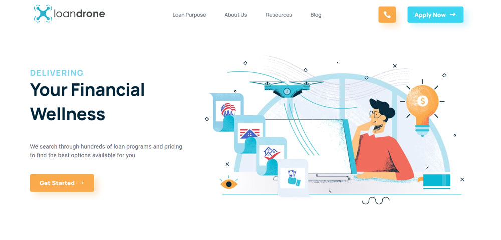
Loandrone
Be Loans

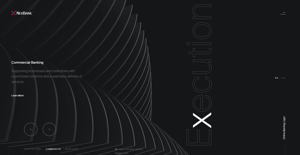
NexBank
Be Loans 2

Quicken Loans

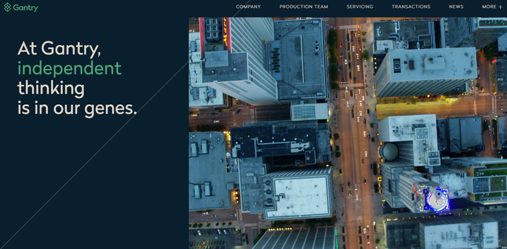
Gantry
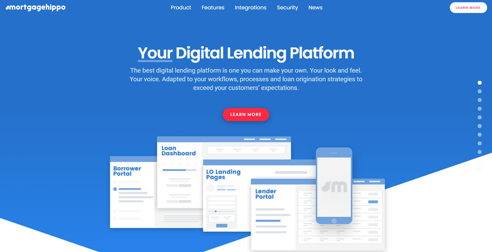
Mortgage Hippo
Be Loans 3

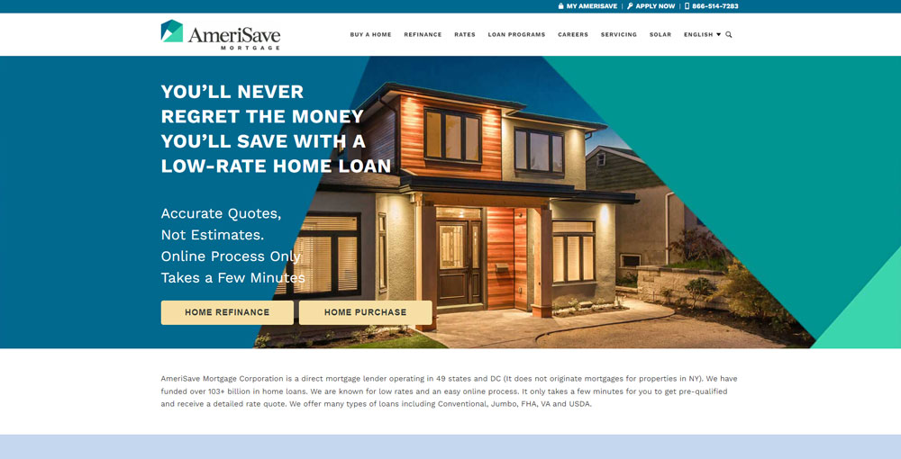
AmeriSave Mortgage
BrightPath Mortgage

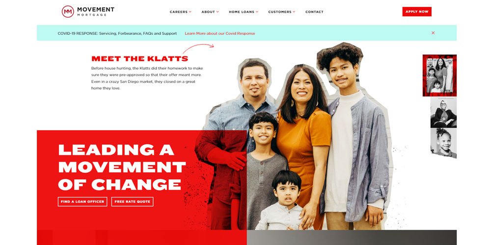
Movement Mortgage
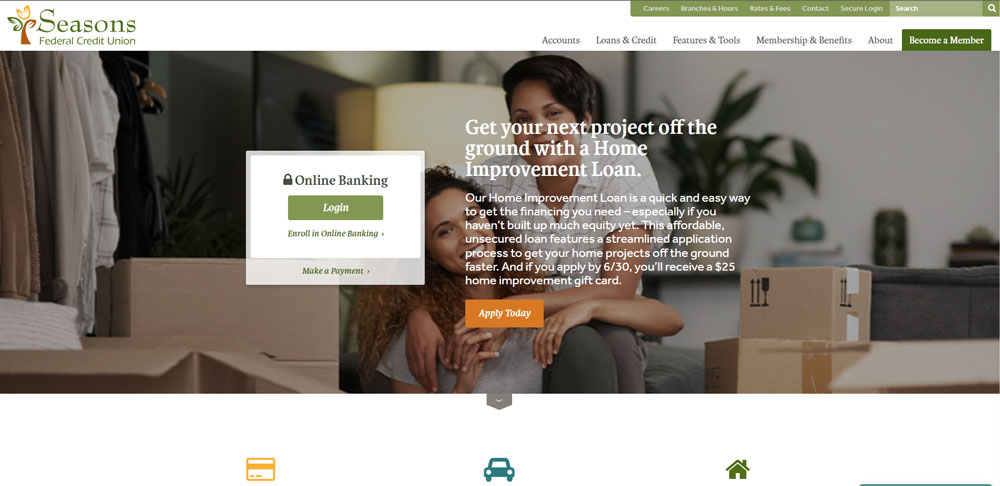
Seasons Federal Credit Union
Be Loans 4

Beeline

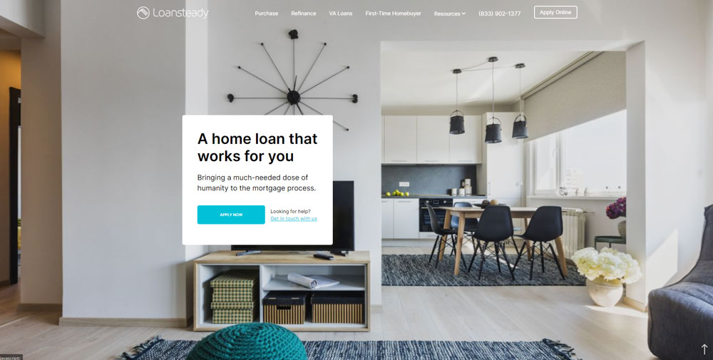
Loansteady
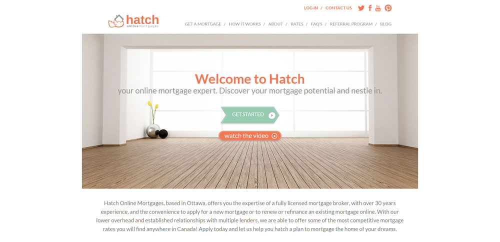
Hatch Online Mortgages
Be Estate 3
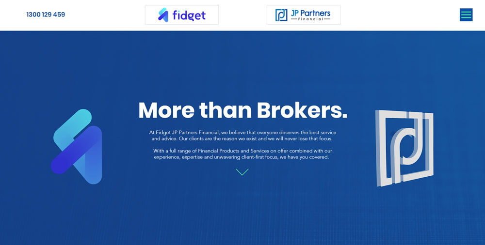
Fidget
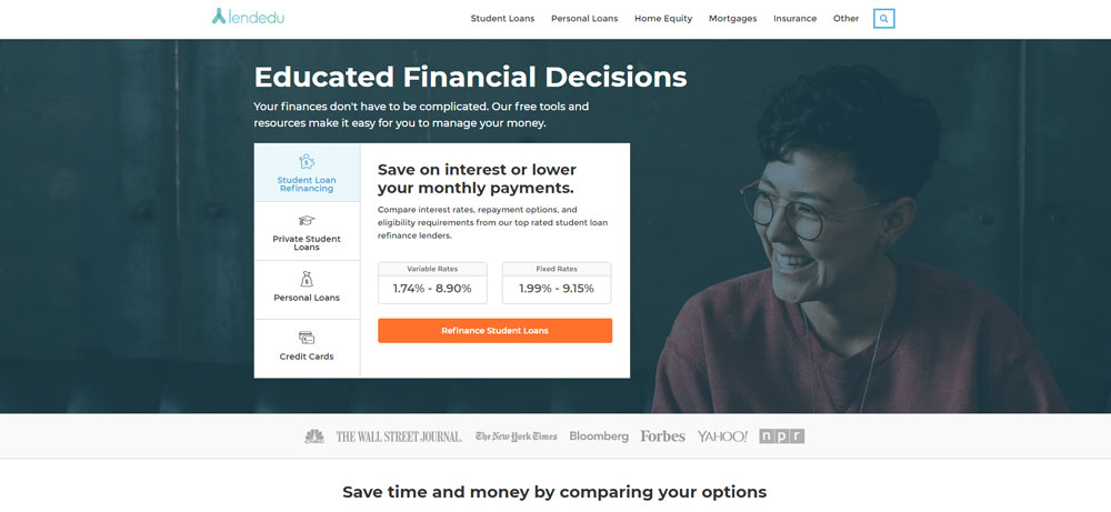
Lendedu
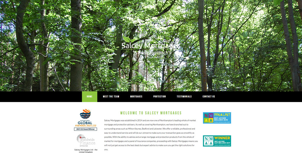
Salcey Mortgages
Be Estate 2
Star Financial

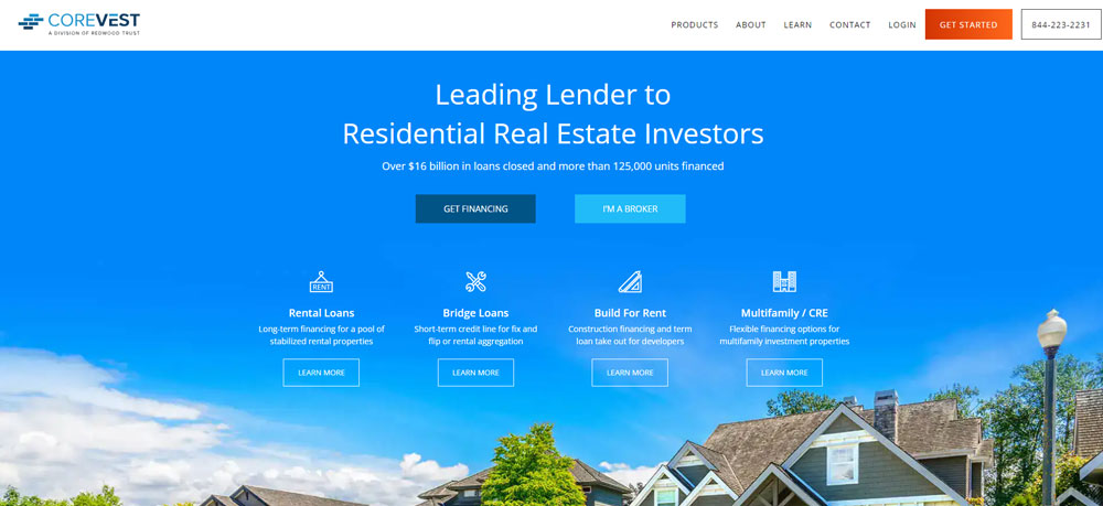
CoreVest Finance
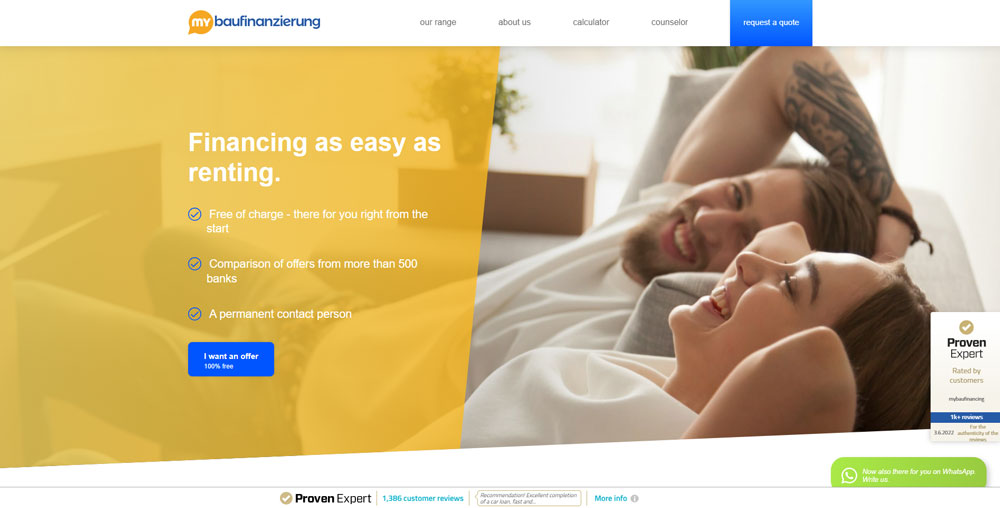
my baufinanzierung
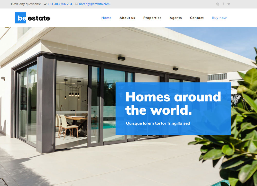
Be Estate

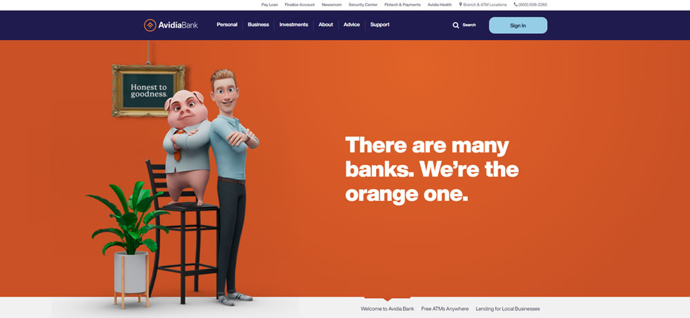
Avidia Bank Home Loans and Mortgages Massachusetts Home Lender
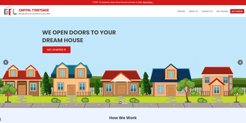
Capital Mortgage
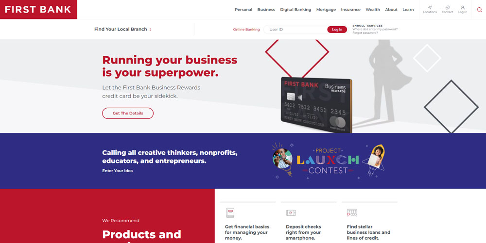
Local First Bank
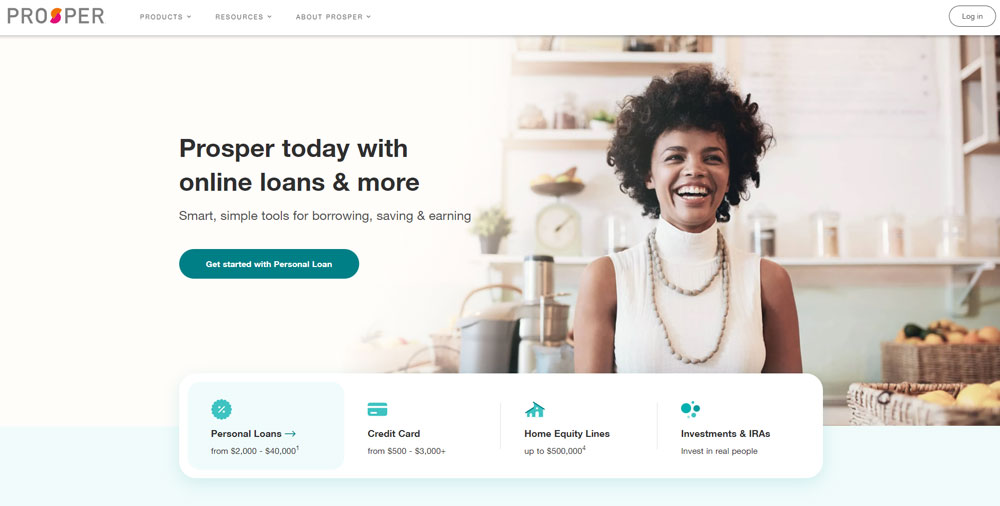
Prosper
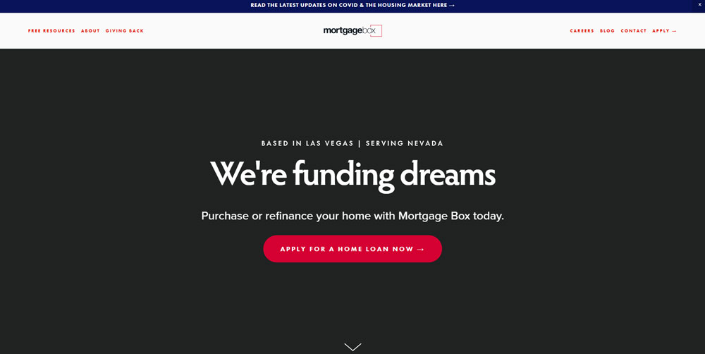
Mortgage Box
NZMS

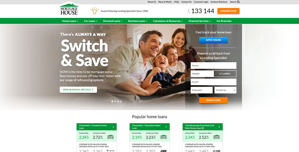
Mortgage House
Yachting Financial Solutions

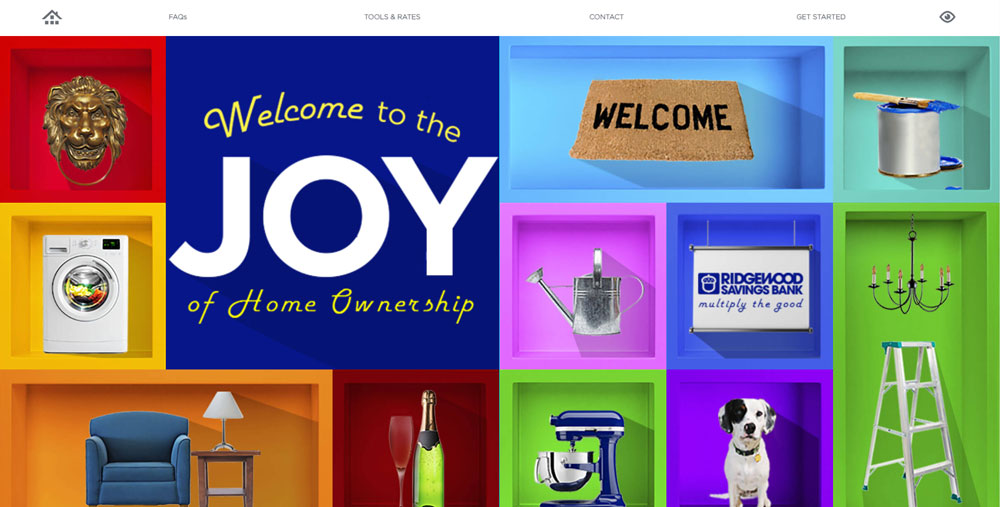
Joy of Home Ownership
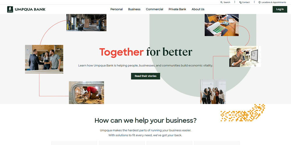
Umpqua Bank
New American Funding

How Mortgage Websites Differ from Standard Financial Sites
Standard finance websites spread attention across checking accounts, credit cards, investments, and insurance.
Mortgage lender sites dedicate every pixel to one goal: getting visitors to apply for a home loan.
The differences show up in specific ways:
- Calculator prominence - loan calculators sit above the fold, not buried in submenus
- Rate displays - current interest rates update daily and appear on nearly every page
- Compliance elements - NMLS licensing numbers, RESPA disclosures, and Truth in Lending statements take prominent positions
- Form design - pre-qualification forms ask for debt-to-income ratios and credit score ranges upfront
Fannie Mae and Freddie Mac guidelines influence how lenders present loan products.
FHA, VA, and USDA loan information requires specific disclosure language that shapes page layouts.
The Consumer Financial Protection Bureau sets rules that directly impact how mortgage sites display rates and fees.
What Homepage Elements Work for Mortgage Lenders
The mortgage lender landing page needs to answer one question instantly: what's the current rate?
Top performers display today's rates within the first viewport, paired with a simple "Get Started" or "Check Your Rate" button.
Essential homepage components:
- Rate ticker or prominent rate display updated via API
- Loan calculator with monthly payment estimates
- Clear paths for purchase vs. refinance visitors
- Trust badges including NMLS number and Equal Housing logo
- Call to action buttons in contrasting colors
Wells Fargo Home Mortgage and Chase Home Lending use segmented navigation separating first-time buyers from refinance seekers.
This approach reduces bounce rates by immediately addressing visitor intent.
How to Structure a Mortgage Calculator Page
Calculator pages drive the highest engagement on mortgage sites.
Placement matters: above-fold positioning with minimal distractions converts best.
Input fields that perform well:
- Home price (slider + manual entry)
- Down payment (percentage and dollar amount toggle)
- Loan term (15, 20, 30-year options)
- Interest rate (pre-filled with current rates)
- Property tax estimate by ZIP code
Results should display amortization schedule breakdowns showing principal, interest, taxes, and insurance separately.
Ellie Mae and Encompass LOS integrations allow real-time rate pulls from pricing engines.
What Trust Signals Mortgage Websites Need
Borrowers hand over Social Security numbers, income documentation, and bank statements.
Trust isn't optional in this industry.
NMLS Licensing Numbers and Placement
The Nationwide Multistate Licensing System requires visible display; footer placement works, but header positioning signals transparency.
Security and Association Badges
SSL indicators, BBB accreditation, and Mortgage Bankers Association membership logos reduce abandonment on application pages.
HUD-approved counselor badges matter for FHA loan pages.
Team and Company Pages
Loan officer photos with NMLS individual IDs build personal connections.
Company history pages showing years in business and loans funded establish credibility; this approach mirrors what works on realtor websites where personal trust drives conversions.
How Lead Capture Forms Perform on Mortgage Sites
The pre-approval form design directly impacts conversion rates.
Shorter forms (5-7 fields) generate more leads; longer forms produce higher-quality applicants.
High-converting field combinations:
- Loan purpose (purchase/refinance)
- Property value or purchase price
- Estimated credit score range
- Contact information
- Best time to call
Progressive forms that reveal additional questions after initial submission reduce friction.
Blend mortgage platform powers many of the smoothest digital application experiences.
What Mobile Design Patterns Work for Mortgage Applications
Over 60% of initial mortgage research happens on smartphones.
Desktop-first designs fail these users.
Mobile requirements for mortgage sites:
- Click-to-call buttons on every page
- Thumb-friendly form fields and buttons
- Collapsible rate tables that expand on tap
- Document upload via camera integration
- Sticky navigation with "Apply Now" always visible
LoanDepot and Quicken Loans score above 90 on mobile usability tests.
Their mobile first design approach treats phone users as the primary audience.
How Rate Tables Should Display on Mortgage Websites
Rate presentation directly influences lender selection.
Confusing tables send borrowers to competitors.
Effective rate table elements:
- APR alongside interest rate (required by Truth in Lending)
- Points and origination fees clearly labeled
- Monthly payment estimates per $100,000 borrowed
- Last updated timestamp
- Loan type filters (conventional, FHA, VA, jumbo)
Optimal Blue pricing engine integration keeps displayed rates within minutes of market changes.
NerdWallet and Bankrate set consumer expectations for rate comparison layouts.
What Color Schemes Mortgage Websites Use
Blues dominate mortgage website palettes.
The color signals trust, stability, and professionalism; blue websites convert better in financial services than any other palette.
Common combinations:
- Navy blue + white + gold accents (traditional lenders)
- Light blue + green (eco-friendly or first-time buyer focus)
- Dark blue + orange CTAs (high contrast for conversions)
Green works well for money-related messaging and approval indicators.
Understanding color theory helps lenders choose palettes that match their brand positioning.
How Navigation Structures Organize Mortgage Products
Mortgage sites need clear paths for different borrower types.
Proper website navigation reduces confusion and speeds conversions.
Standard navigation categories:
- Purchase loans — conventional, FHA, VA, USDA, jumbo
- Refinance options — rate-and-term, cash-out, streamline
- Home equity products — HELOC, home equity loans
- Resources — calculators, guides, glossary
- About — company info, loan officer directory, reviews
Mega menus work for lenders with extensive product lines.
Mega menu designs let visitors see all options without multiple clicks.
What Content Types Appear on High-Performing Mortgage Sites
Top mortgage websites blend transactional and educational content.
Content categories that drive organic traffic and conversions:
- First-time homebuyer guides
- Mortgage glossary pages
- State-specific loan program information
- Rate trend analysis and market updates
- Closing cost breakdowns by loan type
- Down payment assistance program directories
Caliber Home Loans and Bank of America Mortgage maintain extensive resource libraries.
This content serves informational search queries while building topical authority.
How Contact Pages Convert on Mortgage Websites
Contact pages on mortgage sites need multiple communication options.
Different borrowers prefer different channels.
High-converting contact page elements:
- Phone number with hours of operation
- Live chat integration
- Loan officer locator by ZIP code
- Callback request form
- Branch location map (for lenders with physical offices)
Response time expectations matter: displaying "We respond within 1 hour" increases form submissions.
What Footer Elements Mortgage Sites Include
Mortgage website footers carry heavy compliance weight.
Required elements:
- NMLS company ID and state licenses
- Equal Housing Lender logo
- Privacy policy and terms of use links
- Consumer Financial Protection Bureau disclosures
- State-specific licensing information
The website footer also provides secondary navigation, social links, and contact redundancy.
Department of Housing and Urban Development guidelines influence disclosure placement.
How Fast Mortgage Websites Load
Speed benchmarks from top-performing mortgage lenders:
- Better.com: 1.8 second average load time
- Rocket Mortgage: 2.1 seconds
- LoanDepot: 2.4 seconds
- Industry average: 3.5+ seconds
Slow sites lose applicants.
Each second of delay increases bounce rate by 7% in financial services.
Image optimization, CDN usage, and minimal third-party scripts keep mortgage sites fast.
ICE Mortgage Technology (formerly Ellie Mae) integrations can slow pages if not properly implemented.
Key Points
- Place loan calculators above the fold with real-time rate integration
- Display NMLS numbers and compliance badges prominently
- Design mobile-first with click-to-call and thumb-friendly forms
- Use blue color palettes to signal trust and stability
- Separate navigation paths for purchase and refinance borrowers
- Keep page load times under 2.5 seconds
- Include progressive lead capture forms starting with 5-7 fields
- Build educational content libraries for organic search visibility
FAQ on Mortgage Website Design
What makes a good mortgage website design?
A good mortgage website design features prominent loan calculators, clear rate displays, mobile responsiveness, and visible trust signals like NMLS licensing numbers. Fast load times under 2.5 seconds and streamlined pre-approval forms also drive higher conversion rates.
How much does a mortgage website cost to build?
Custom mortgage lender websites range from $15,000 to $75,000 depending on loan calculator complexity, CRM integrations, and compliance requirements. Template-based solutions start around $3,000 but lack Encompass LOS or Optimal Blue pricing engine connections.
What pages should a mortgage website have?
Essential pages include homepage with rate display, loan product pages for FHA, VA, conventional, and jumbo loans, calculator tools, about page with loan officer bios, contact page, and resource center. Compliance pages for RESPA and Truth in Lending disclosures are required.
How do I generate leads from a mortgage website?
Mortgage lead generation requires short pre-qualification forms, prominent call-to-action buttons, live chat, and click-to-call functionality. Offering instant rate quotes or pre-approval letters in exchange for contact information converts browsers into qualified applicants.
What colors work best for mortgage websites?
Blue dominates mortgage website color schemes because it signals trust and stability. Navy paired with white creates a professional look. Green accents work for approval messaging. Orange or gold call-to-action buttons provide contrast against blue backgrounds.
Should mortgage websites be mobile-friendly?
Absolutely. Over 60% of mortgage research starts on smartphones. Mobile-friendly features include click-to-call buttons, thumb-sized form fields, collapsible rate tables, and camera-enabled document uploads. Sites failing mobile usability lose applicants to competitors like Rocket Mortgage.
What compliance elements do mortgage websites need?
Mortgage sites require NMLS company and individual license numbers, Equal Housing Lender logo, state licensing disclosures, Consumer Financial Protection Bureau notices, and Truth in Lending rate disclaimers. HUD guidelines dictate specific placement for FHA loan content.
How important are loan calculators on mortgage websites?
Loan calculator pages drive the highest engagement on mortgage sites. They should display monthly payments including principal, interest, property tax, and insurance. Above-fold placement with real-time rate integration from Black Knight or Ellie Mae systems performs best.
What mortgage website builders do lenders use?
Lenders use platforms like Blend, ICE Mortgage Technology, and custom WordPress builds with specialized plugins. Enterprise lenders including Wells Fargo Home Mortgage and Bank of America Mortgage develop proprietary systems integrated with their loan origination software.
How can I improve my existing mortgage website?
Start with speed optimization and mobile responsiveness testing. Add prominent rate displays, simplify lead capture forms to 5-7 fields, and ensure NMLS badges appear in headers. Integrate customer testimonials and update educational content for first-time homebuyer queries.
Conclusion
These mortgage website design examples reveal a clear pattern: successful lender sites prioritize function over flash.
Loan calculators belong above the fold. Rate tables need daily updates. NMLS compliance badges build trust instantly.
The mortgage brokers and lending institutions winning online share common traits: fast page speeds, mobile-responsive layouts, and progressive lead capture forms that don't overwhelm first-time homebuyers.
Companies like United Wholesale Mortgage and Zillow Home Loans prove that integrating tools like Blend or ICE Mortgage Technology creates seamless borrower experiences.
Your next step? Audit your current site against these benchmarks.
Check your debt-to-income calculator placement, verify your FHA and VA loan pages meet HUD guidelines, and test your application flow on mobile devices.
The difference between a bounced visitor and a closed loan often comes down to design decisions you can fix today.


