Stylish Tailor Website Design Examples to Inspire
September 7, 2025Veterinarian Website Design Examples That Look Great
September 13, 2025Google processes over one billion health-related searches every day. Your website is often the first interaction patients have with your practice.
The best healthcare website design examples share common traits: clear navigation, fast load times, HIPAA compliance, and trust signals that convert visitors into booked appointments.
Medical websites face unique challenges. Patient data security, accessibility requirements under WCAG 2.1, and regulatory compliance all demand specialized design approaches.
This guide breaks down real examples from Mayo Clinic, Cleveland Clinic, telehealth platforms, and private practices. You'll see what works, what doesn't, and how to apply these patterns to your own healthcare digital presence.
What is Healthcare Website Design
Healthcare website design is the process of building digital interfaces for medical practices, hospitals, clinics, and health technology companies.
It covers layout planning, visual hierarchy, patient portal development, and HIPAA compliance integration.
Medical websites serve a different purpose than standard business sites. They handle sensitive patient data. They need appointment booking systems. They require accessibility compliance under WCAG 2.1 and ADA standards.
A well-built healthcare digital presence includes secure messaging, telehealth platform connections, and EHR integration with systems like Epic Systems or Cerner.
The goal is simple: help patients find information fast, book appointments easily, and trust the provider before they walk through the door.
Healthcare Website Design Examples
Kindbody
Diet Shop
Centura Health
Bedentist
Fifth Avenue Healthcare Service
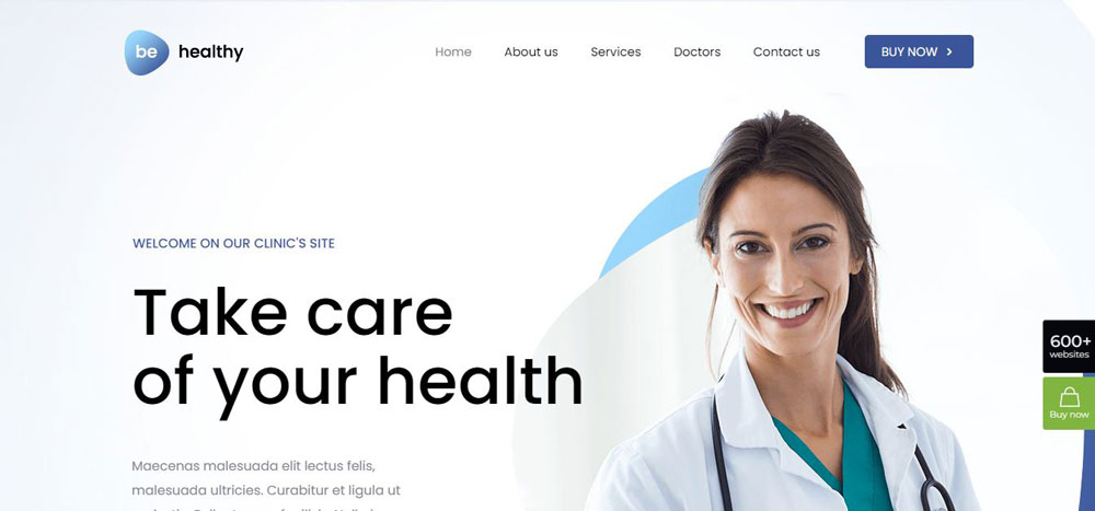
Healthy
Sunshine State Women’s Care
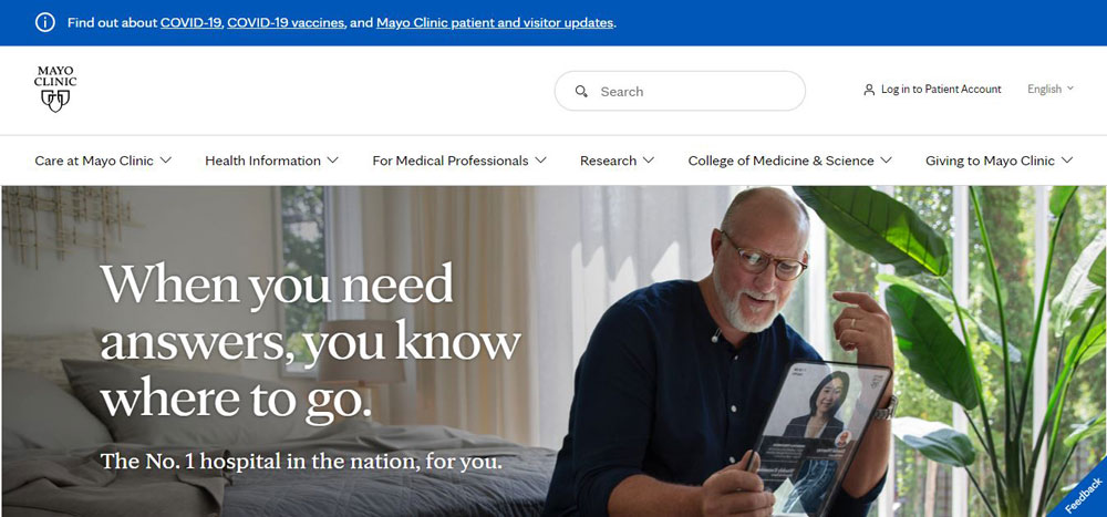
Mayo Clinic
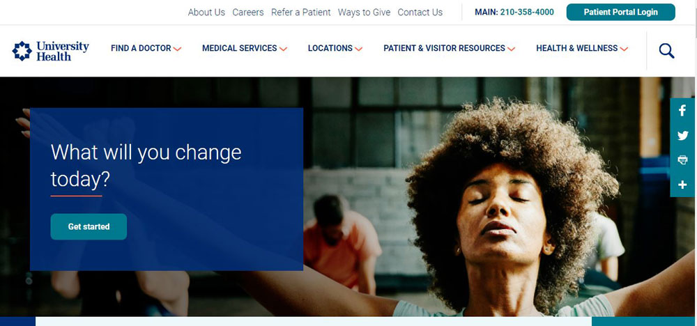
University Health
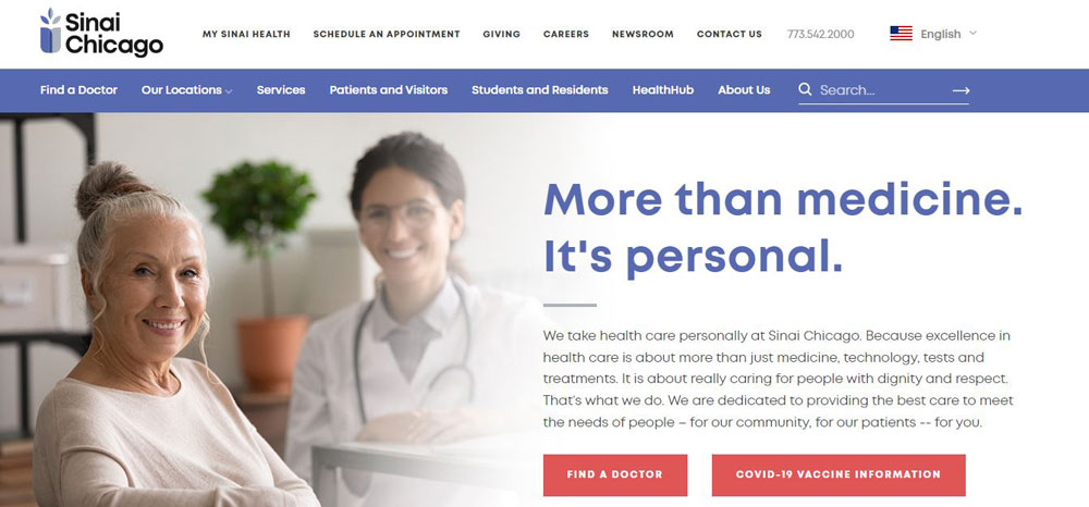
Sinai Chicago
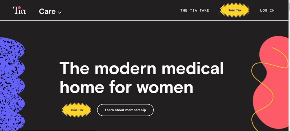
Tia
BetterMe
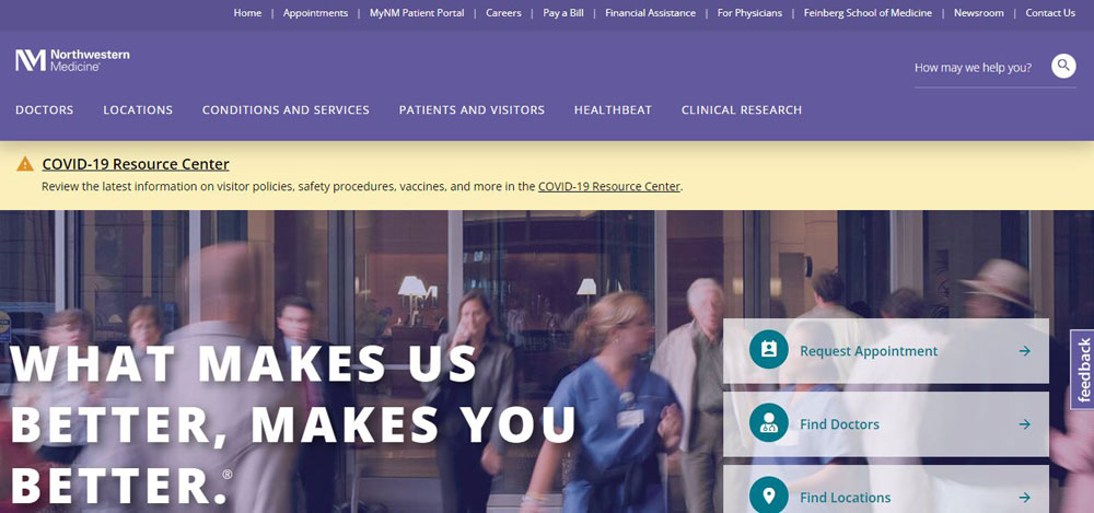
Northwestern Medicine
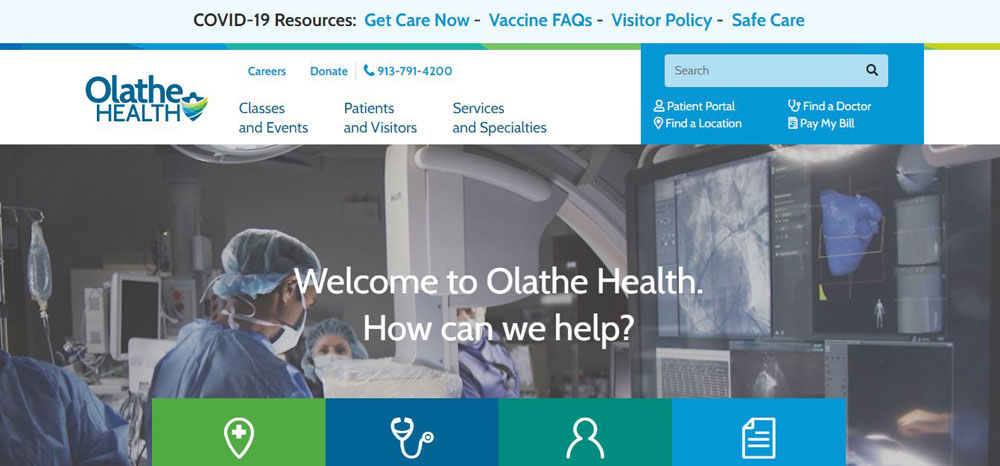
Olathe Health
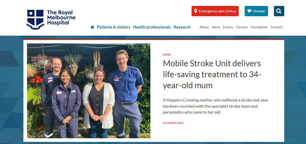
The Royal Melbourne Hospital
Healthx
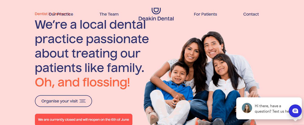
Deakin Dental
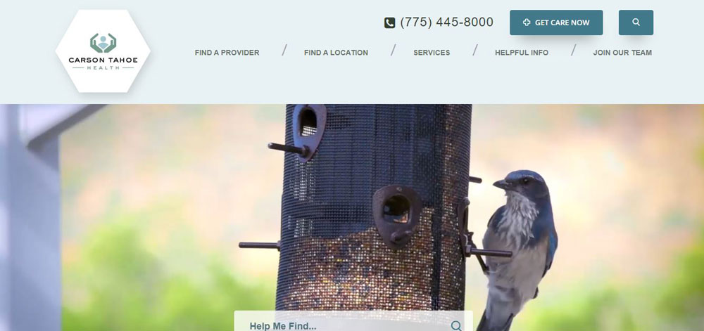
Carson Tahoe
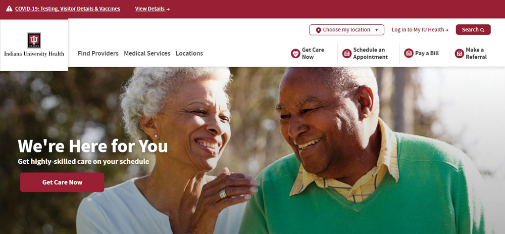
IU Health
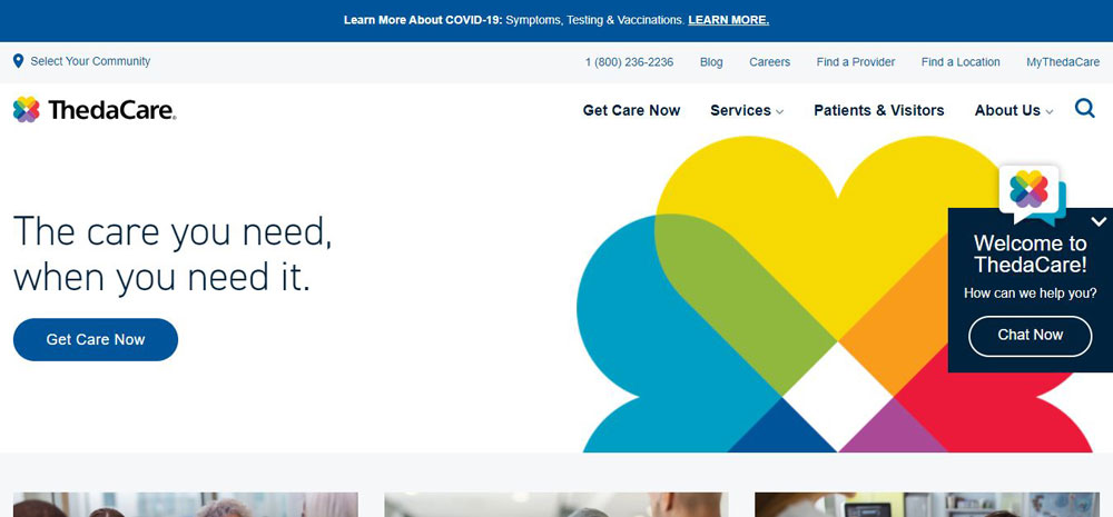
ThedaCare
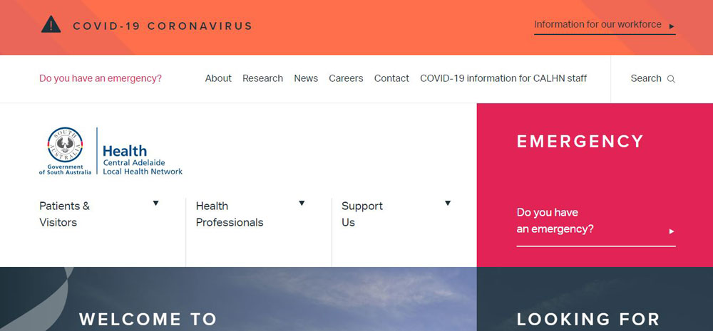
Royal Adelaide
Trevidic
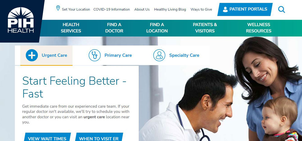
PIH Health
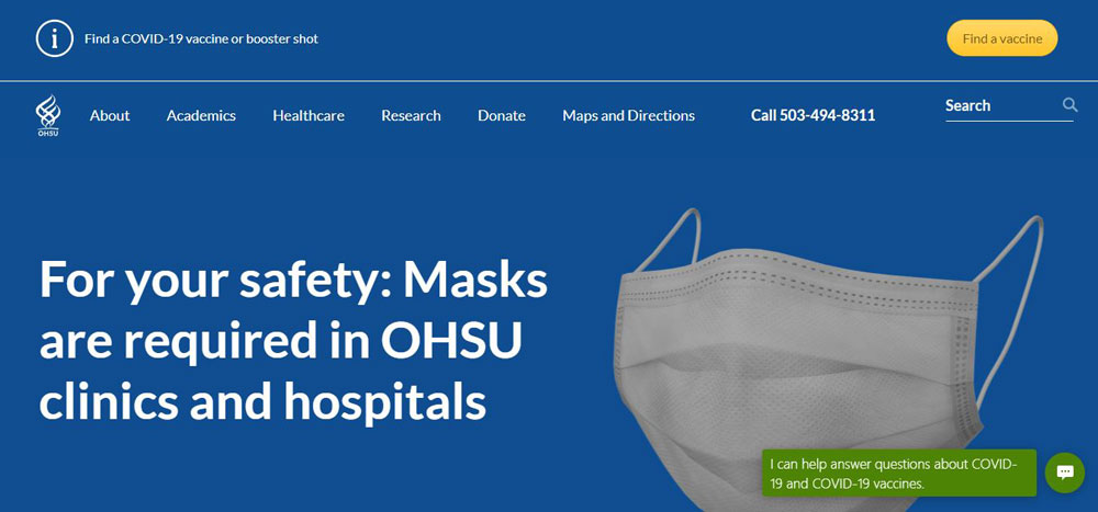
Oregon Health & Science University (OHSU)
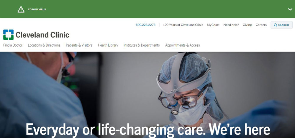
Cleveland Clinic
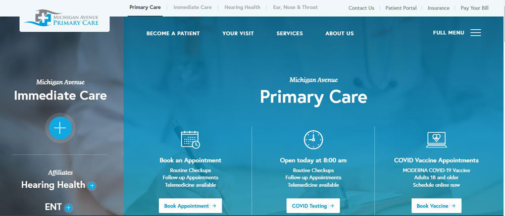
Michigan Avenue
BiomeSense
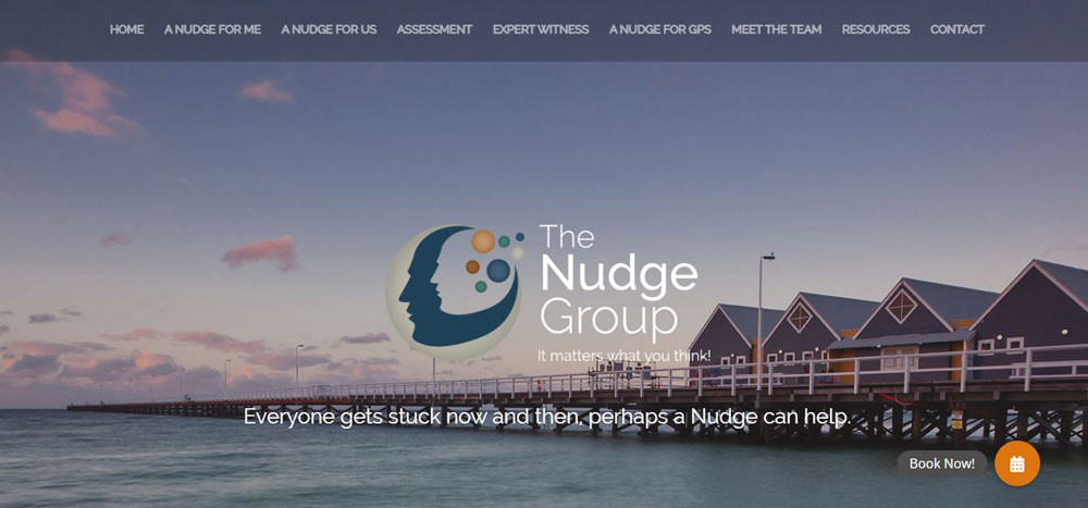
The Nudge Group
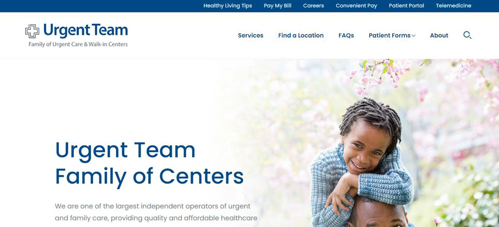
Urgent Team
Huntingdale Dental Clinic
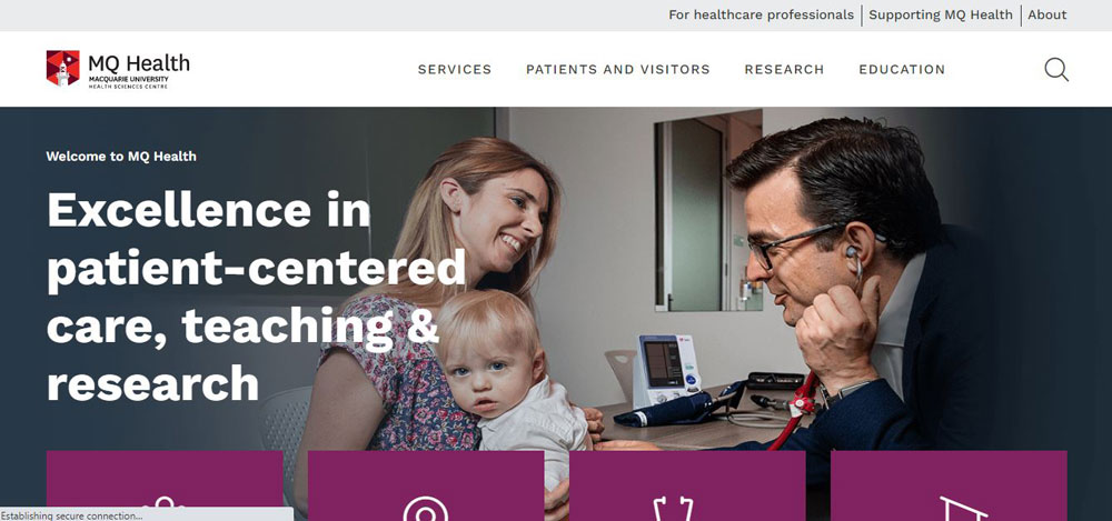
Macquarie University Hospital
Rush Medical
Beaujour
Scanlons Health Services
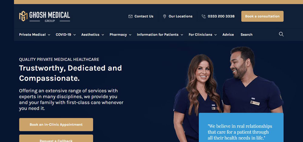
Ghosh Medical Group
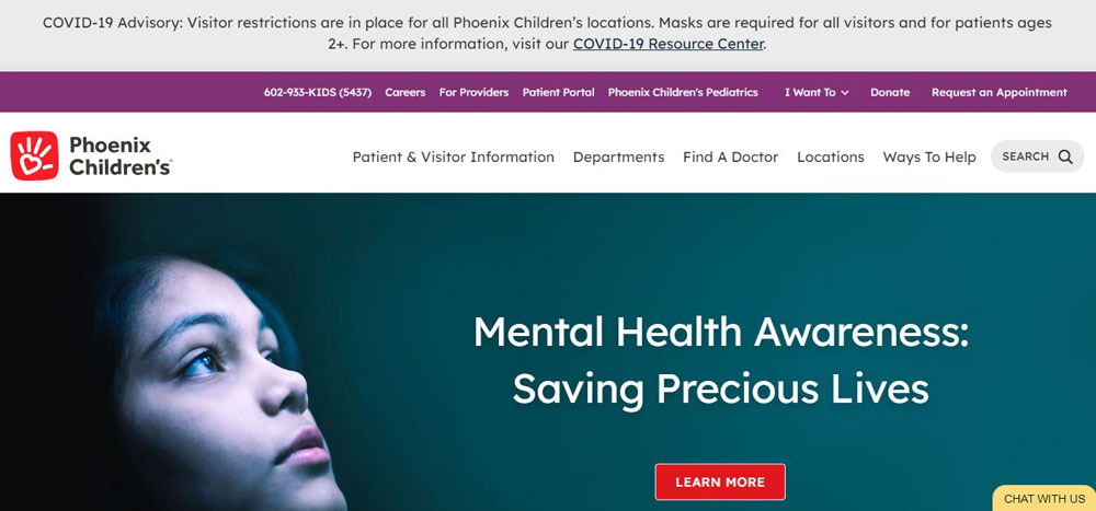
Phoenix Children’s Hospital
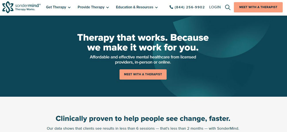
SonderMind
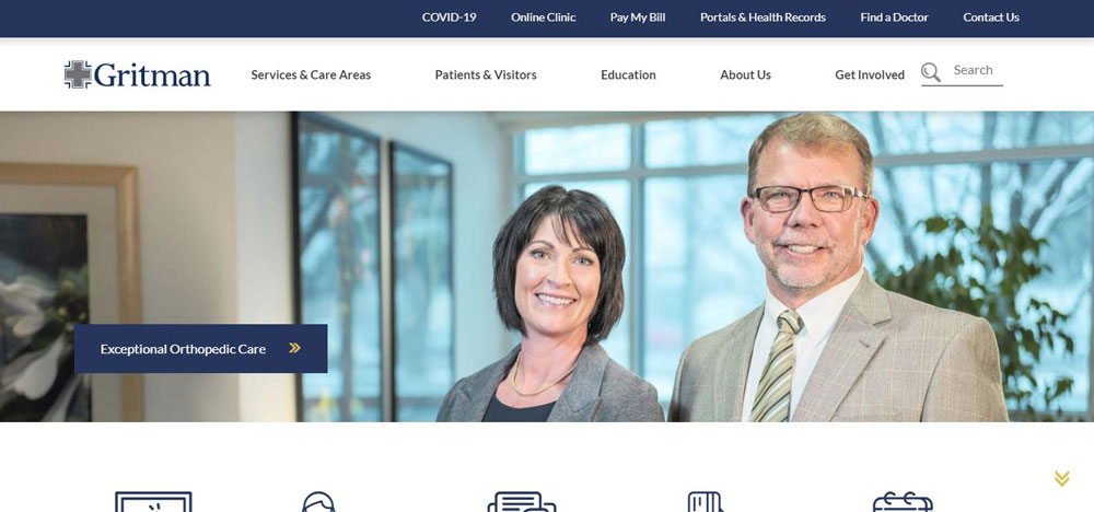
Gritman Medical Center
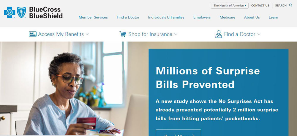
Blue Cross Blue Shield
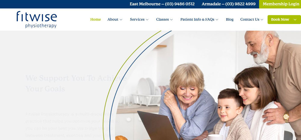
Fitwise Physiotherapy
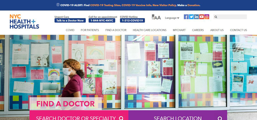
NYC Health + Hospital
Ermi
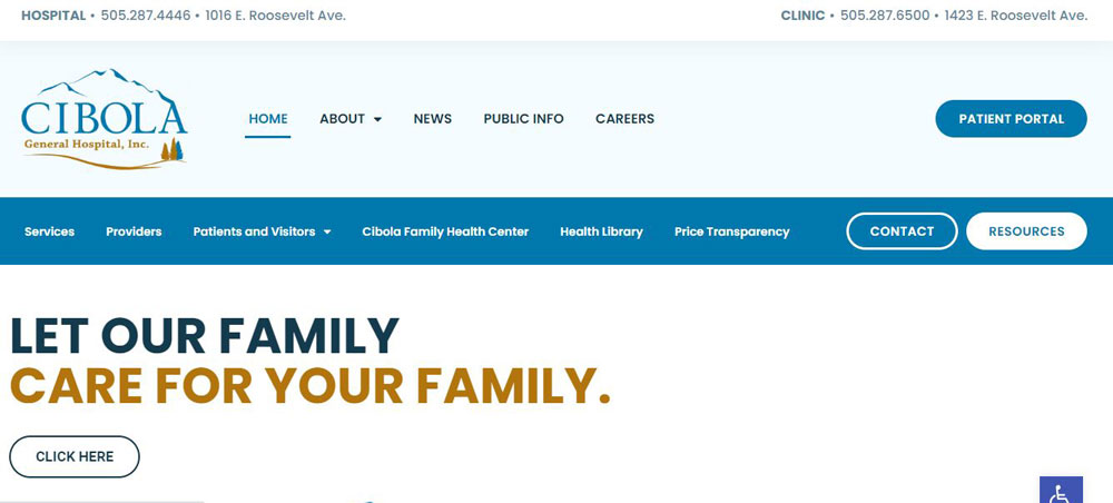
Cibola Hospital
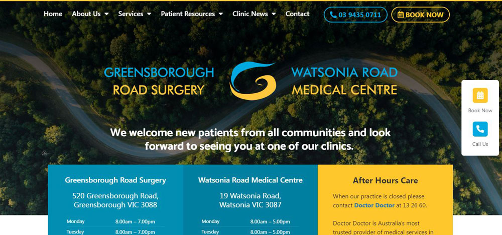
Greensborough Road Surgery
Medtronic
Doctor Steven Park
Gineko
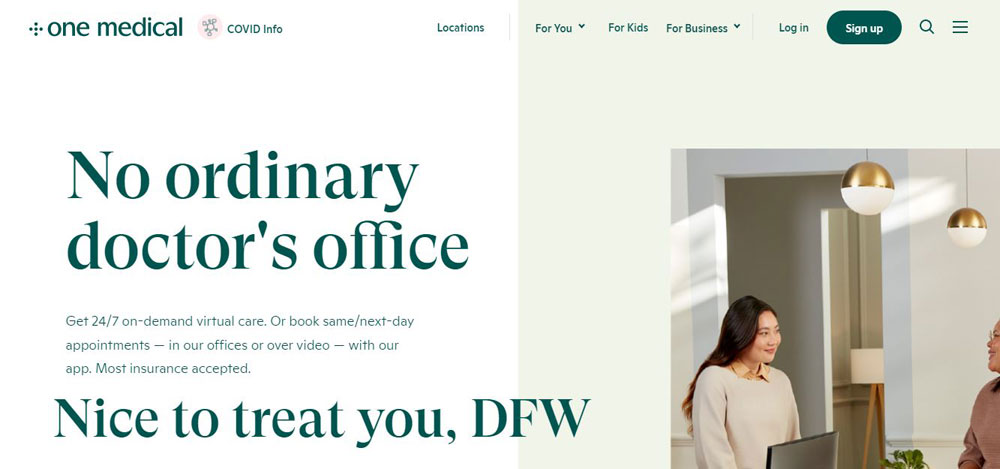
One Medical
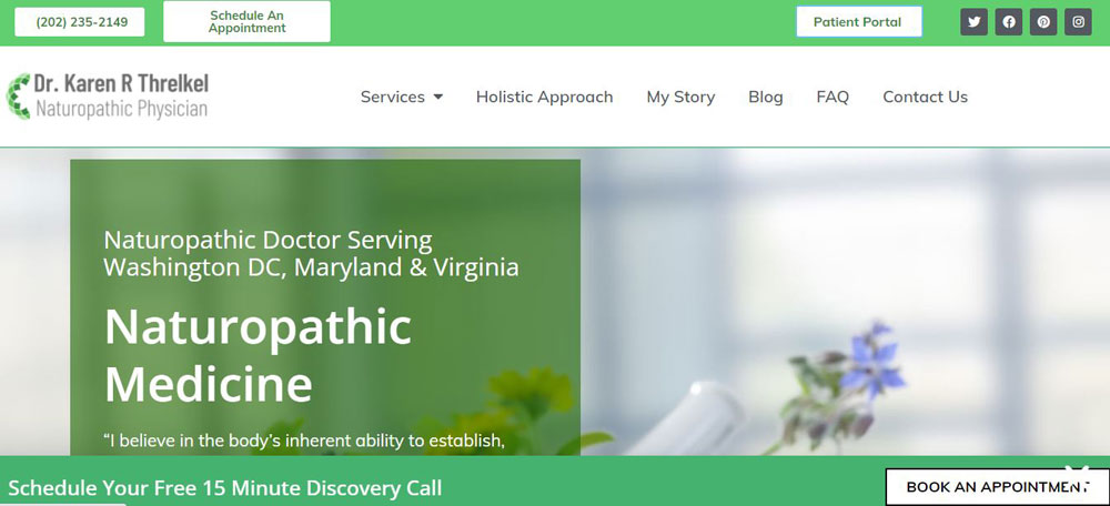
Karen Threlkel, ND
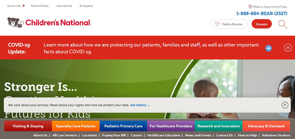
Children's National
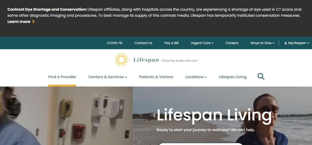
Lifespan
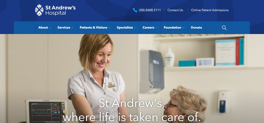
Andrew’s Hospital
Institute of Dermatologists
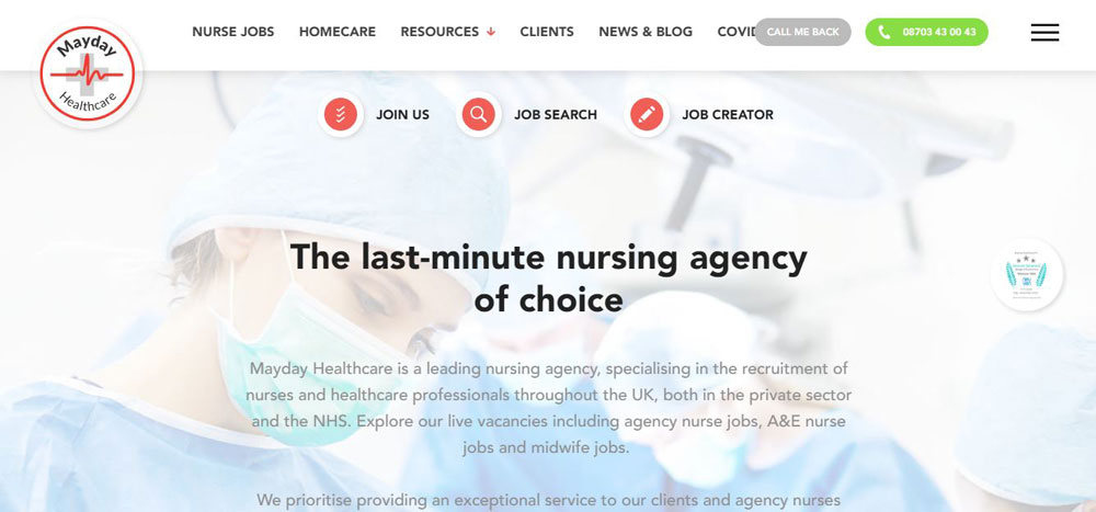
Mayday Healthcare
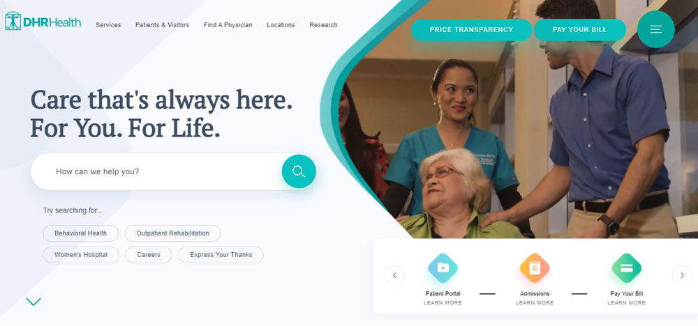
DHR Health
Rest Assured
Barrett Plastic Surgery
Clinica Dental Escariz
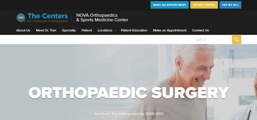
NOVA Orthopaedics
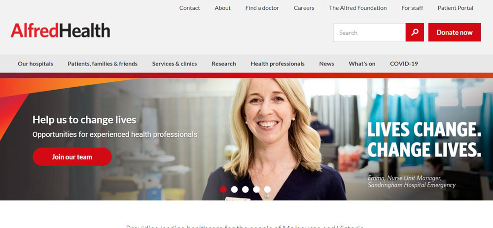
The Alfred
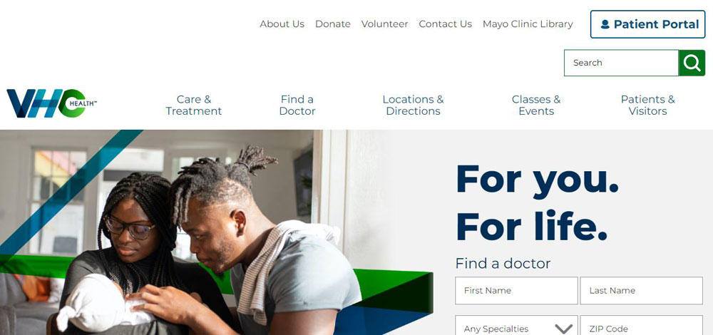
Virginia Hospital Center
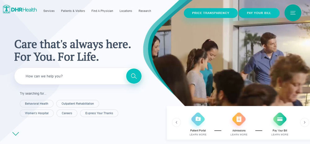
DHR Health
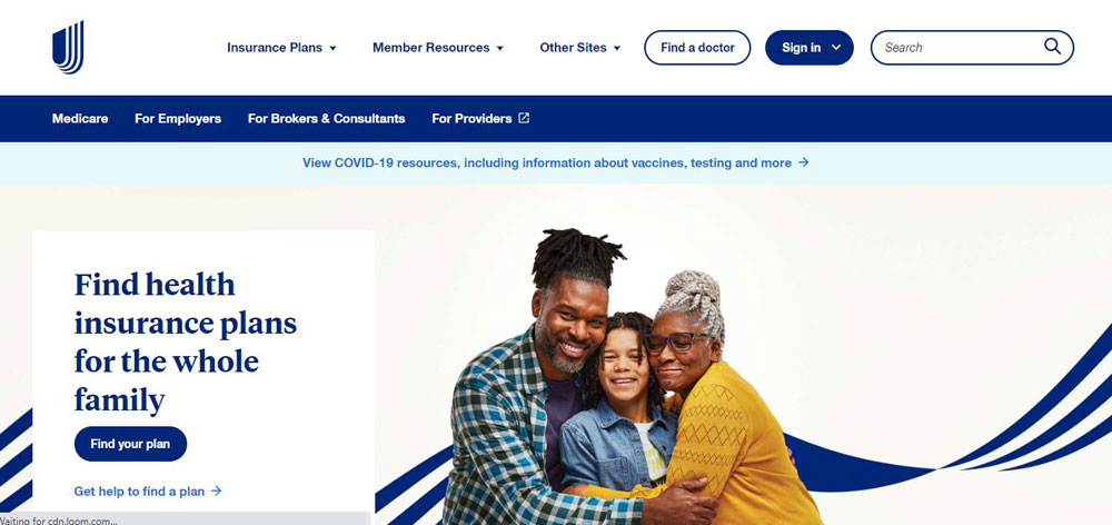
United Healthcare
Health Insider
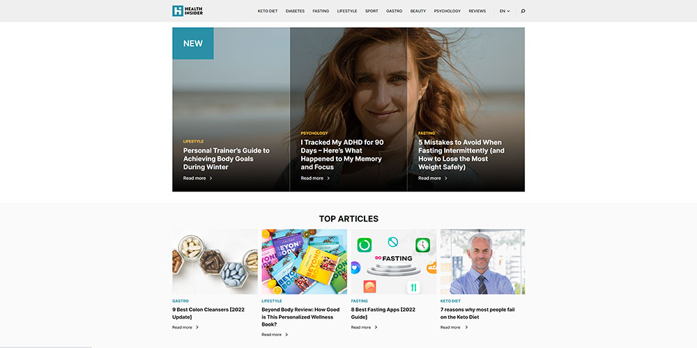
Their medical professionals waste no time sourcing health-based information and ensuring everything is top-notch for their dedicated readers. They are here to answer some questions regarding the emotional and physical aspects of improving your health.
Health Reporter
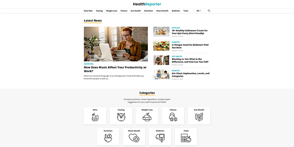
At Health Reporter, they focus on creating only the best and most trustworthy health articles. Their team of medical professionals and writers works hard to educate readers on the most important topics. You can turn to their range of articles covering weight loss, nutrition, general fitness, and more. In the messy online world, it’s essential to focus on reliable facts. That’s why it’s their mission to publish informative and safe content for curious individuals.
How Healthcare Websites Differ from Standard Business Websites
Medical practice websites face challenges that retail websites or marketing websites never encounter.
Patient trust requirements are higher. Regulatory compliance is mandatory. Accessibility standards carry legal weight.
Patient Trust Requirements in Medical Web Design
Patients research providers online before booking. They look for credentials, reviews, and professional affiliations.
Trust signals matter more here than in any other industry. Provider photos, board certifications, hospital affiliations, and Google Business Profile reviews all influence decisions.
A testimonial page with real patient stories builds credibility faster than any marketing copy.
Regulatory Compliance Considerations
HIPAA compliance affects every design decision.
Patient forms need SSL encryption. Third-party trackers require careful vetting. Contact forms must protect personal health information.
Even basic features like chat widgets need HIPAA-compliant alternatives. Standard tools from most SaaS websites won't work here.
Accessibility Standards for Healthcare Platforms
WCAG 2.1 Level AA compliance is the baseline. Many healthcare organizations aim for WCAG 2.2.
Requirements include:
- Alt text for all medical imagery
- Keyboard navigation support
- High-contrast color options
- Screen reader compatibility
- Large click targets for appointment buttons
Rest Assured, a senior care provider, built their entire site around accessible website principles. Large fonts, simple navigation, touch-friendly buttons throughout.
What Makes a Good Healthcare Website Design
The best medical website templates share common traits. Clear navigation. Fast load times. Mobile-first layouts. Secure data handling.
Clear Navigation and Information Architecture
Patients arrive with specific goals: find a doctor, book an appointment, access test results.
Good website navigation examples in healthcare limit top menu items to five or six options. Services, providers, locations, patient portal, contact.
Mayo Clinic uses prominent search functions on every page. Autocomplete suggestions. Alphabetical condition lists. Users find what they need in seconds.
Mobile-First Design Implementation
Over 60% of health searches happen on phones.
Mobile first design isn't optional for healthcare. Touch-friendly buttons, readable fonts without zooming, fast-loading pages on cellular connections.
Appointment booking flows need single-column layouts. Form fields should trigger the right keyboard type. Date pickers must work on small screens.
Fast Load Times and Performance Optimization
Google Core Web Vitals affect rankings. Patients abandon slow sites.
Healthcare sites often struggle here. Large provider directories, image galleries, and embedded appointment systems add weight.
Solutions include lazy loading images, optimizing provider photos, and using CDNs for static assets. Google PageSpeed scores above 90 should be the target.
Secure Patient Data Handling
Every form submission needs encryption. Patient portals require multi-factor authentication.
Good form design in healthcare minimizes data collection. Ask only what's necessary. Store nothing you don't need.
Third-party integrations with Zocdoc, Healthgrades, or EHR systems must meet HIPAA requirements. Regular security audits are mandatory.
Appointment Scheduling Integration
80% of patients prefer online booking.
The scheduling interface should show real-time availability. Filter by provider, service type, or location. Send confirmation emails and SMS reminders automatically.
Brightside Health displays appointment booking prominently on every page. No hunting for contact information. One click to start the scheduling process.
Healthcare Website Design Best Practices
The examples above share common patterns. Apply these to any medical practice website or healthcare platform.
How to Build Patient Trust Through Web Design
Display credentials prominently: board certifications, hospital affiliations, awards. Add provider photos and video introductions. Include verified patient reviews.
Feature trust badges from recognized organizations. Show Google Business Profile ratings. List media mentions and press coverage.
Color Psychology in Medical Website Design
Blue signals trust and professionalism. Green suggests health and growth. White space creates calm.
Avoid aggressive reds or oranges. Calm color palettes reduce patient anxiety. Consistency matters more than creativity here.
How to Structure Navigation for Healthcare Sites
Limit primary navigation to five or six items. Group services logically. Make patient portal access visible on every page.
Use mega menus for large hospital systems with many departments. Smaller practices should keep it simple.
Call-to-Action Placement Strategies
Book appointment buttons belong above the fold. Repeat CTAs after service descriptions. Use contrasting colors for visibility.
Effective call to action buttons in healthcare are specific: "Book Online," "Schedule Consultation," "Start Free Assessment."
How to Display Provider Credentials and Trust Signals
Create individual provider profile pages with education, specialties, certifications, and patient reviews.
Include professional headshots. Add video introductions where possible. Link to published research or media appearances.
Healthcare Website Design Features by Practice Type
Different healthcare organizations need different approaches. Hospital systems versus solo practitioners. Telehealth versus brick-and-mortar.
Hospital Website Design Requirements
Large provider directories with advanced search and filtering. Multiple location pages with maps and hours. Emergency information prominently displayed.
Service line landing pages for each department. Integration with EHR systems like Epic Systems or Cerner. Healthcare landing pages for specific conditions drive organic traffic.
Private Practice Website Design Requirements
Simpler structure. Provider bio, services, location, contact, patient portal.
Focus on local SEO. Google Business Profile integration. Online appointment scheduling. Insurance acceptance list displayed clearly.
Similar principles apply to dentist websites, chiropractic websites, and other specialty practices.
Telehealth Platform Design Requirements
Seamless video consultation integration. Easy account creation. Clear pricing and insurance information upfront.
Mobile-first approach is mandatory. Patients access telehealth from phones more than desktops.
Appointment booking should take under two minutes. Reminder systems via SMS and email reduce missed sessions.
Mental Health Website Design Requirements
Calming visual design. Reduced stimulation. Clear pathways to crisis resources.
Privacy messaging front and center. Confidentiality concerns are higher in mental health than other specialties.
Therapist profiles should feel personal and approachable. Therapist websites benefit from warmer photography and conversational copy.
Common Healthcare Website Design Mistakes
Knowing what works isn't enough. Avoid these errors that plague medical websites.
What Breaks Patient Trust on Healthcare Websites
Stock photos of models instead of real staff. Missing credentials. Outdated content with old dates visible.
Broken appointment booking systems. Slow load times. Non-secure forms collecting health information. These are examples of bad design that drives patients away.
Navigation Errors That Increase Bounce Rates
Too many menu items. Buried contact information. Patient portal hidden in footer.
Missing search functionality on content-heavy sites. No mobile optimization. Confusing service categorization.
Accessibility Issues That Create Legal Risk
Missing alt text on images. Poor color contrast ratios. No keyboard navigation support.
Healthcare websites face lawsuits over ADA compliance failures. WCAG 2.1 Level AA is the minimum standard. Test with screen readers before launch.
How to Choose a Healthcare Website Design Agency
Not every web design agency understands healthcare requirements. HIPAA compliance, accessibility standards, and patient trust factors require specialized knowledge.
What Questions to Ask Before Hiring
- Do you have healthcare clients in your portfolio?
- How do you handle HIPAA compliance for forms and integrations?
- What accessibility standards do you build to?
- Can you integrate with our EHR or practice management system?
- Do you provide ongoing maintenance and security updates?
Portfolio Review Criteria
Look for healthcare-specific experience. Check if example sites are still live and performing well.
Test their previous work on mobile. Review page speed scores. Verify accessibility compliance using automated tools.
Ask for client references. Contact them directly about the agency's communication, timeline adherence, and post-launch support.
FAQ on Healthcare Website Design
What makes a good healthcare website design?
A good healthcare website design combines clear navigation, fast load times, mobile responsiveness, and HIPAA-compliant forms. Trust signals like provider credentials, patient reviews, and professional certifications build credibility. Accessible design following WCAG 2.1 standards is mandatory.
How much does a healthcare website cost?
Healthcare website development ranges from $5,000 for basic practice sites to $150,000+ for large hospital systems. Costs depend on EHR integration, patient portal features, custom appointment scheduling, and HIPAA compliance requirements. Ongoing maintenance adds $200-2,000 monthly.
What features should a medical practice website include?
Medical practice websites need online appointment booking, provider directories with credentials, service descriptions, location pages with maps, patient portal access, contact forms, and insurance information. Mobile optimization and SSL encryption are baseline requirements.
How do I make my healthcare website HIPAA compliant?
HIPAA compliance requires SSL certificates, encrypted form submissions, secure patient portals with multi-factor authentication, and compliant third-party integrations. Avoid standard chat widgets and analytics tools. Use HIPAA-certified alternatives for any feature handling patient data.
What are the best healthcare website platforms?
WordPress with healthcare-specific themes dominates the market. Webflow offers design flexibility with fast performance. Squarespace works for smaller practices. Enterprise systems use custom solutions integrated with Epic Systems or Cerner EHR platforms.
How important is mobile optimization for healthcare websites?
Over 60% of health searches occur on mobile devices. Google's mobile-first indexing prioritizes responsive sites. Appointment booking flows must work flawlessly on phones. Poor mobile experience directly impacts patient acquisition and search rankings.
What colors work best for medical website design?
Blue conveys trust and professionalism. Green suggests health and wellness. White space creates calm. Mayo Clinic and Cleveland Clinic use muted palettes with minimal distraction. Avoid aggressive colors that increase anxiety in patients seeking care.
How do I improve my healthcare website's SEO?
Healthcare SEO requires local optimization, Google Business Profile management, schema markup for medical content, fast page speeds, and authoritative health content. Target condition-specific keywords. Build topical authority through comprehensive service pages and educational resources.
What accessibility standards apply to healthcare websites?
WCAG 2.1 Level AA is the minimum standard. Requirements include alt text for images, keyboard navigation, screen reader compatibility, sufficient color contrast, and large click targets. ADA lawsuits against healthcare organizations are increasing annually.
How often should I update my healthcare website?
Review content quarterly for accuracy. Update provider information immediately when staff changes occur. Refresh design every 3-5 years. Security patches and plugin updates should happen monthly. Outdated medical information damages credibility and search rankings.
Conclusion
The healthcare website design examples covered here prove one thing: patient-centered design wins. Mayo Clinic, athenahealth, Zocdoc, and telehealth platforms like Brightside Health all prioritize user experience over flashy aesthetics.
Your medical practice website needs three things to compete: seamless appointment scheduling, mobile-first layouts, and visible trust signals.
WCAG 2.1 accessibility isn't optional. Neither is HIPAA-compliant form handling.
Start with the basics. Fast page speeds through Google PageSpeed optimization. Clear provider directories with credentials. Patient portal integration that actually works.
Study the sites that rank. WebMD dominates health content. Healthgrades owns provider search. Learn from their information architecture and content strategy.
Your healthcare digital presence is often the first touchpoint. Make it count.

