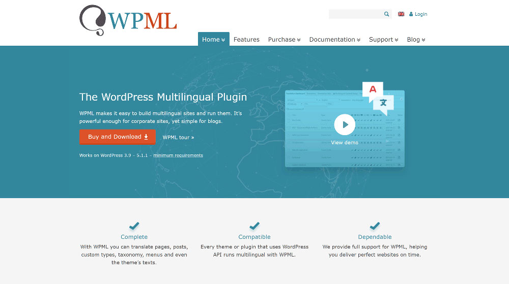
Polylang vs WPML: Which translation plugin should you use?
October 18, 2023
Sombre Funeral Websites With Interesting Web Design
January 4, 2024Gradient website design is legit the new star of the show. We're talking about spicy backgrounds, wicked image overlays, and that rockin' duotone vibe. And man, it doesn't stop there! From popping buttons to dynamic typography – the gradient game is EVERYWHERE.
The big question: Why are these designers all over it? Well, gradients are like that secret sauce. They let you blend colors and mix 'em up with other cool effects, like our buddy, duotone. And what you get is this stellar, vibrant combo that totally pops on screen. It's like giving your web design a splash of unicorn magic.
So, hang tight! I'm about to take you on a trip down the gradient lane with some mind-blowing examples that have hopped on this trend.
Websites Rocking the Gradient Vibes
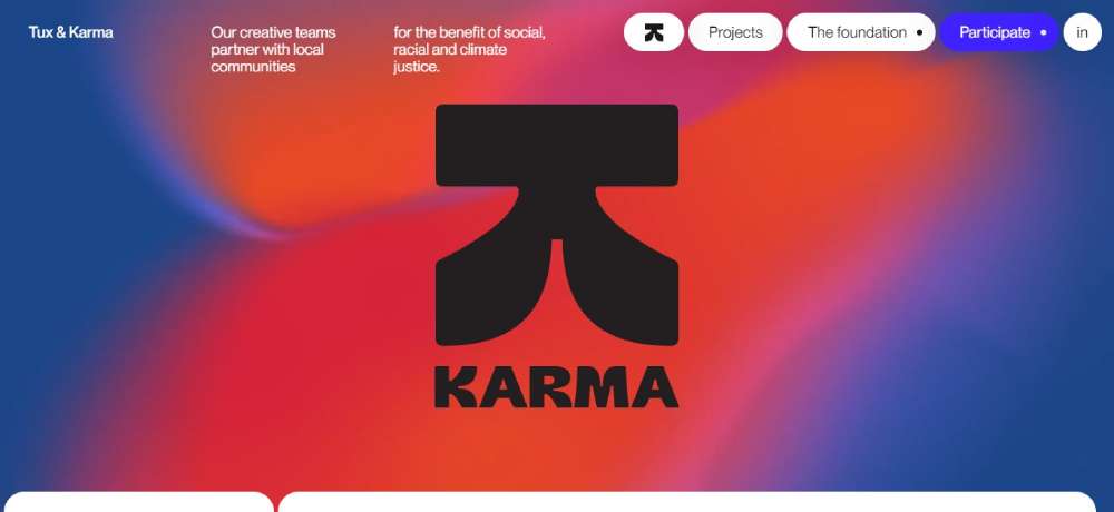
Tux & Karma
Man, these guys are next level. Working hand in hand with local peeps to push for social, racial, and climate justice. Hats off!
Fluz
Heard of 'em? They're the real deal! Collaborate, earn, and get that cashback rolling. Plus, you can share bucks with your pals. Neat, right?
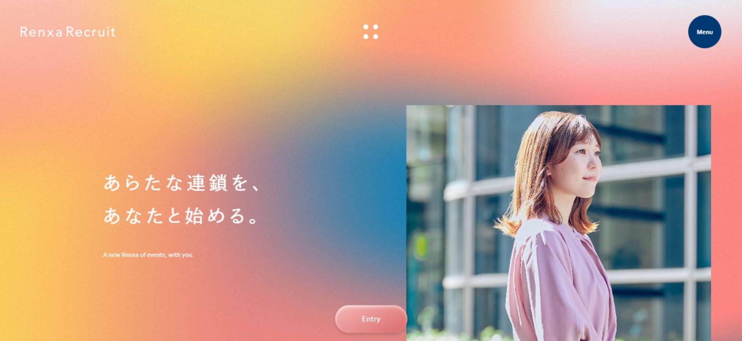
Renxa
Connecting peeps and spreading value – that's Renxa for ya. They're into sales, marketing, and looking for fresh grads to join the tribe.
BeLab
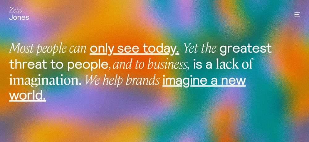
Zeus Jones
Talk about drama! Their site starts all mysterious with a plain black canvas. You've got this message that says “Most people can only see today.” Then bam! Wait a bit and you’re hit with more text and a wild wave of blacks and greys.
OUTSTANDLY
Straight up – they're all about gaming. Providing some sick visuals for the gaming world, and trust me, they live up to their name.
elje Group
You open their site and it's like walking into a party. Bright gradients, dancing blobs, and that BOLD typography that's just screaming, “Look at me!” They've also got this smooth gradient effect when you’re browsing. A true masterpiece!
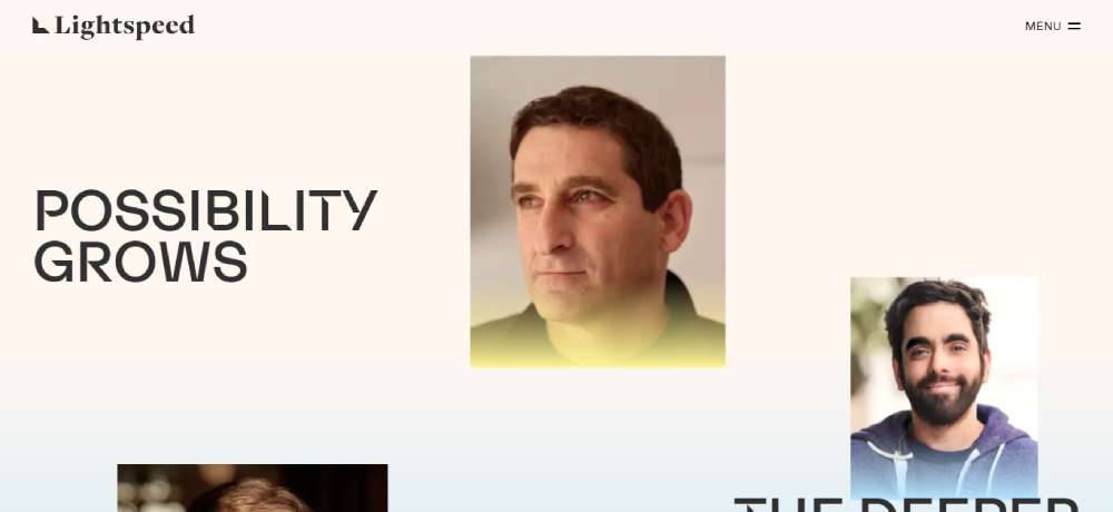
Lightspeed
These folks have been in the game for two decades. Backing up innovative brains and big ideas, from start to... well, forever.
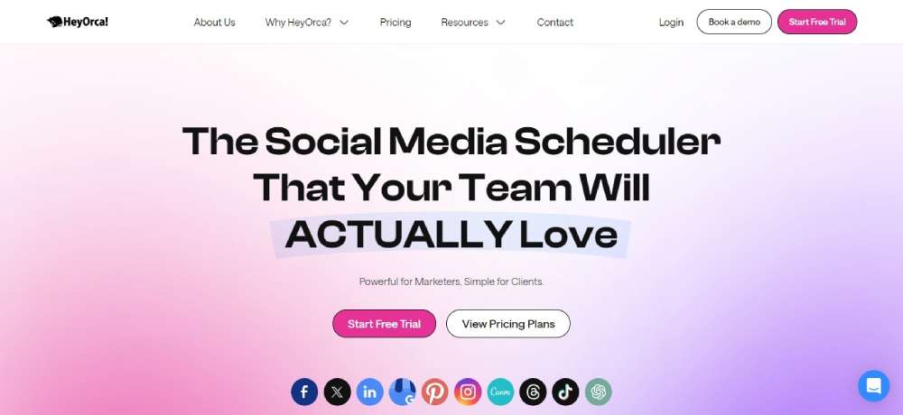
HeyOrca
Last but not least, if you’re into social media scheduling, these are your people. A tool your team is gonna adore. Promise!
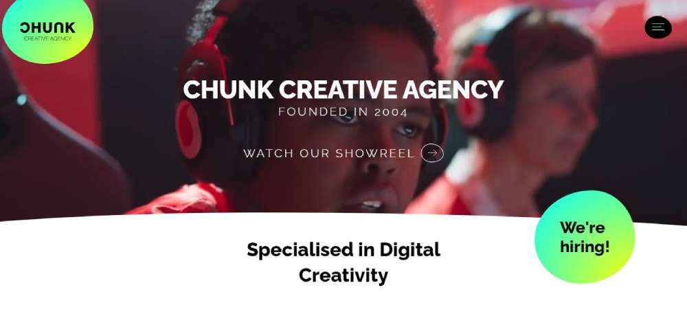
Chunk Creative Agency
Chunk’s game? Brighter than my future! Their design? Straight fire. They've blended bright hues all over the shop. Pair that with some intense black fonts and bam – you're left starstruck.
BeVr
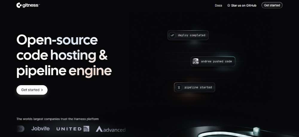
Gitness
Get in, we're boosting Git flows with Gitness. It's all about that buttery smooth code review life and speedy pipelines. Get on this rollercoaster and buckle up!
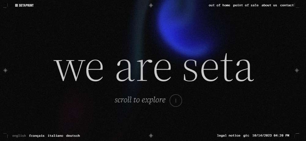
SETAPRINT
Europe's print kingpins right here. Their site? A digital mirror reflecting their edge in the biz.
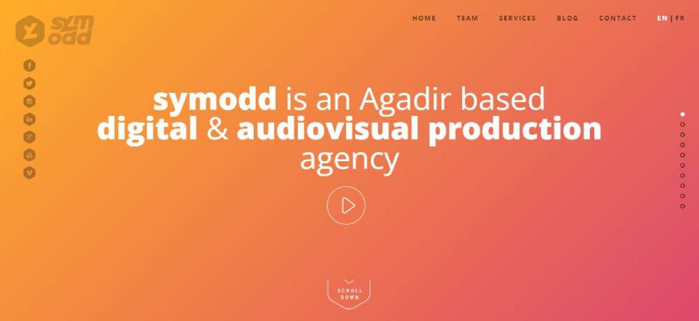
symodd
symodd from Morocco? They're playing 4D chess with their site. Each section? A gradient masterpiece. Pair that with ghostly buttons, wicked white fonts, and snazzy graphics. It's a full-on visual concert!
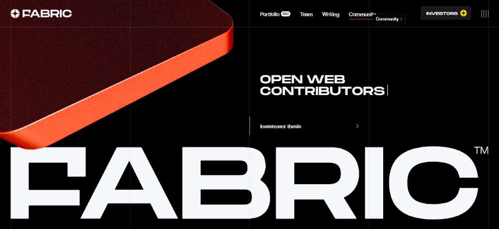
FABRIC
All about those Web 3 legends. They're here, investing in the folks who're shaping tomorrow.
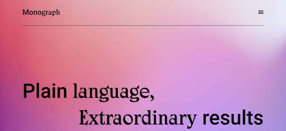
Monograph Communications
Every. Single. Page. It's all gradient galore. Dive into their world and see how they're changing the comms game.
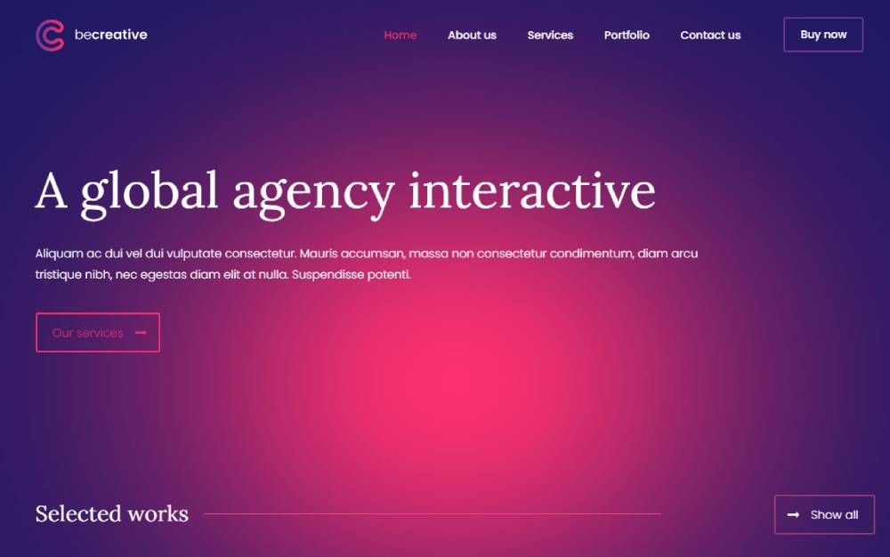
BeCreative3
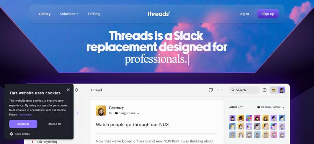
Threads
Threads? More like life-savers for creators. Say bye to endless pings and focus on what you love. Keep that momentum, always!
The Engine
The Engine’s out here breaking molds. Who said gradients are just for backdrops? Check their text highlights and mouse-hover glow-ups. It's a visual treat on a dark, moody canvas.
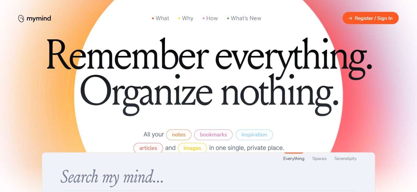
mymind
Your brain's best bud. Stash your golden thoughts, pics, and all things cool. And guess what? No more organizing fuss. AI's got your back!
Astro
Meet the web's Swiss knife. From snappy sites to robust apps, Astro's making magic happen.
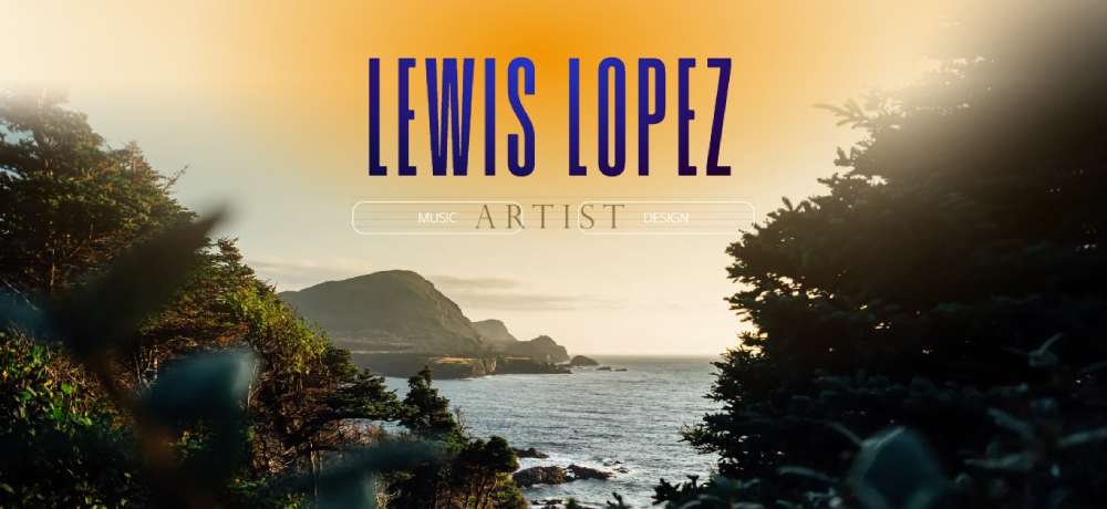
Lewis Lopez
Lewis? He’s remixing gradient overlays. Peep his portfolio and watch colors melt like a dreamy sunset.
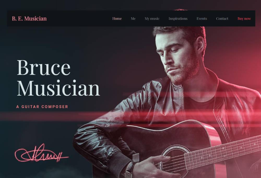
BeMusician
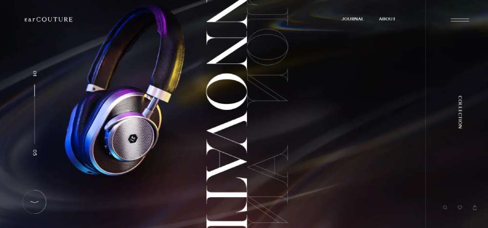
EarCOUTURE
Audio lovers, rejoice! EarCOUTURE's showcasing their gems with gradient-infused slides. Abstract doodles, swirls, and sparkles make it pop.
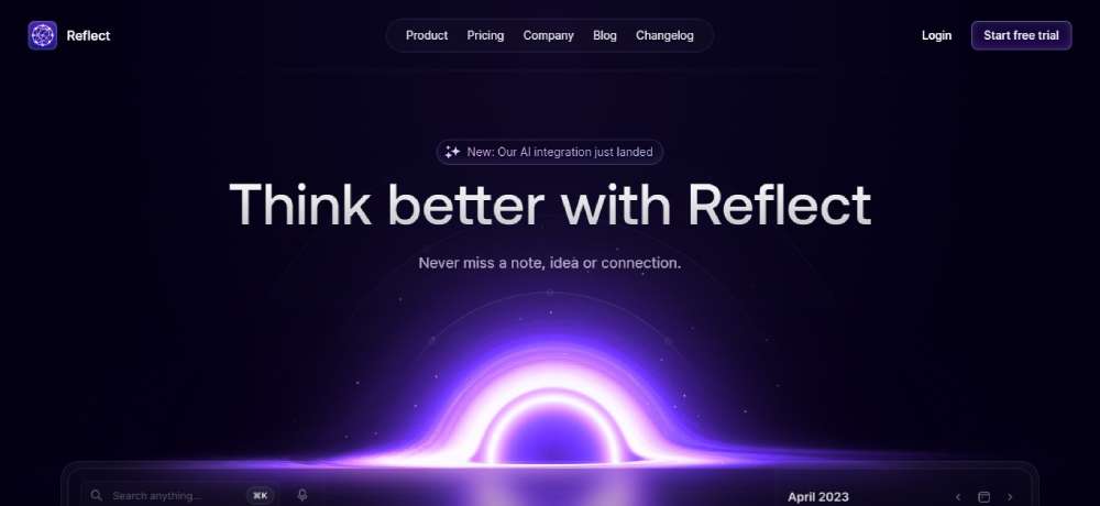
Reflect
Ever wanted a note-taking app that, well, reflects you? These guys went minimalist with a sprinkle of AI charm.
Solana
All about that blockchain hype? Solana’s bringing the heat - from tech gurus to curious newbies, they got everyone covered.
Zoocha
Zoocha's site? Straight-up gradient poetry. The trick? Gradient-coated fonts against a clean backdrop. The result? Your eyes are glued to that text.
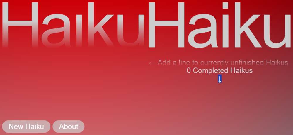
Haiku-Haiku
This site by Ezekiel Aquino? It’s where poetry meets community. A playground for Haiku lovers. Share, write, and complete poetic tales in a split-screen delight.
BeApp2
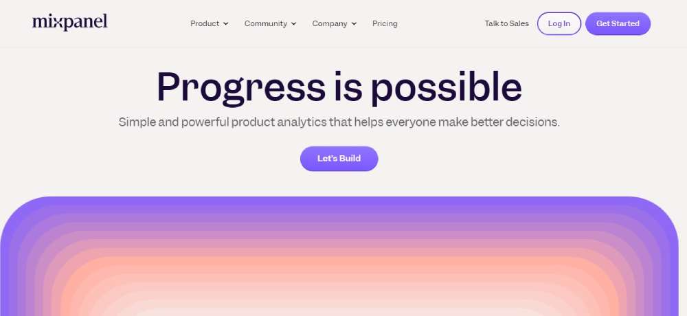
Mixpanel
They believe in progress and got the tools to prove it. Dive into analytics, decode data, and let's build something rad!
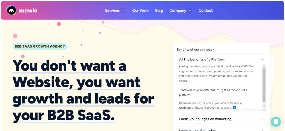
Mawla
Mawla, a mobile app maestro, layers their site with gradient-tinged wonders. Abstract shapes, clickable buttons, and snazzy menu effects.
Luro
Heard of no-code? Luro's all over it. Helping you monitor and track components, it's like the Swiss knife for your product.
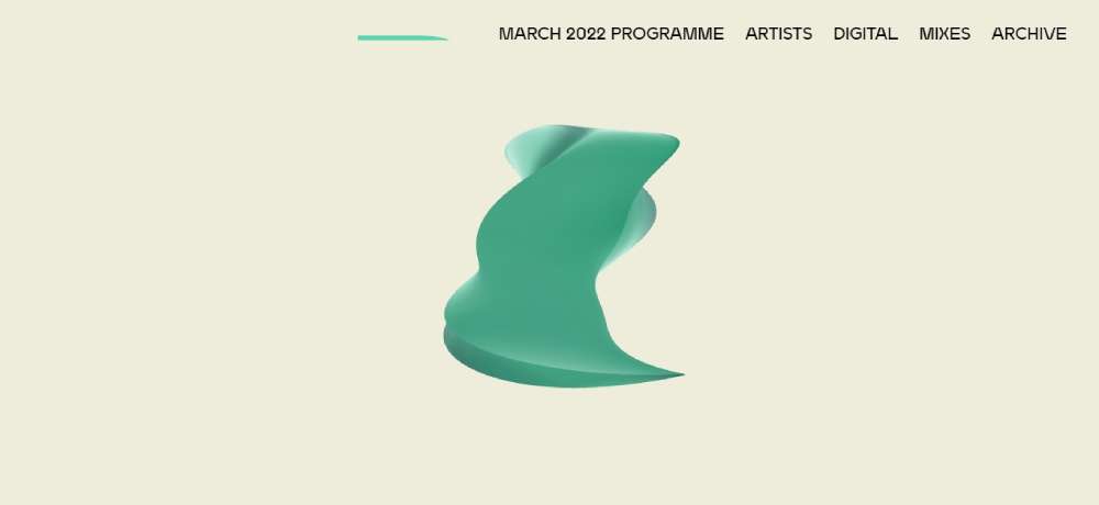
DICE
Berlin's DICE fest? A blend of music and discourse. The gradient? A cosmic mix of blues and purples. Plus, a 3D shape to jazz things up.
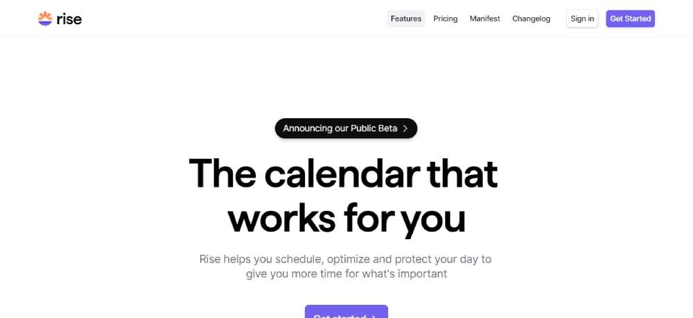
Rise
In the world of calendars, Rise is your loyal butler. Plan, protect, and squeeze out more time for the cool stuff.
Prism Data
Dive into the world of financial insights with Prism Data. Though they love their monochromes, catch that gradient glow sneaking in.
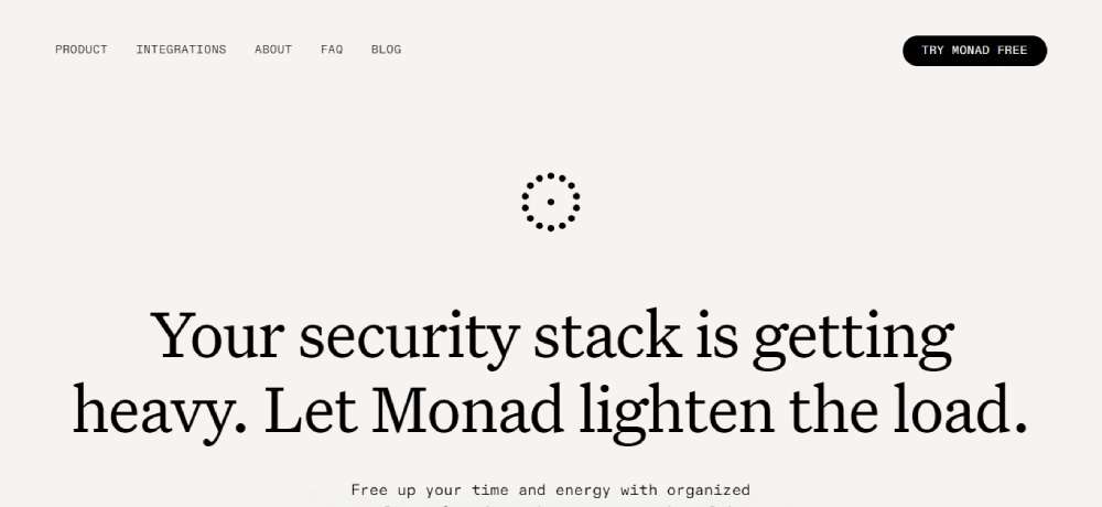
Monad
Security woes weighing you down? Monad's here with a featherlight touch, making the digital realm a bit safer for ya.
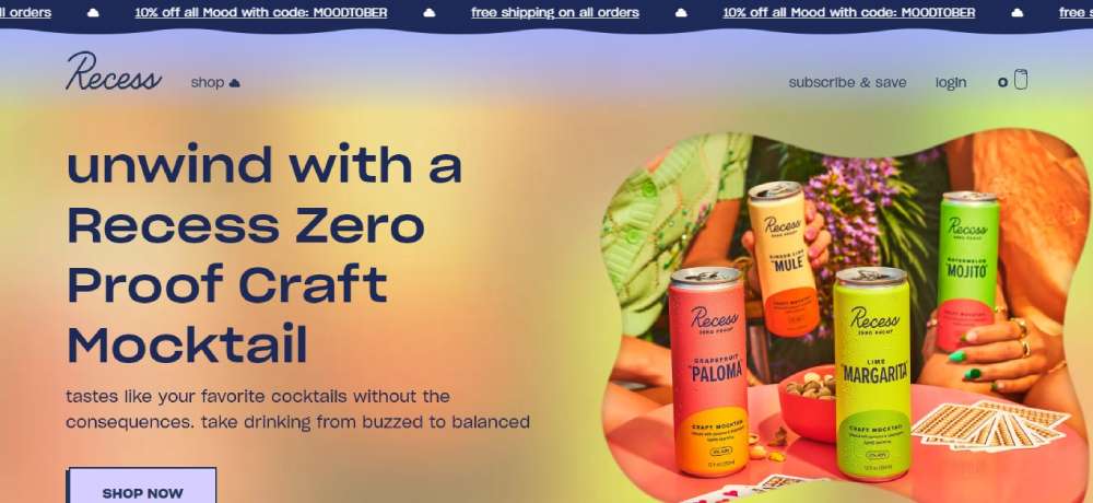
Recess
Recess? More like a visual break. Slide halfway down, and you’ll see the magic. Sky blues turning into candy pinks. And as you scroll? The hue deepens. It's like watching a sunset.
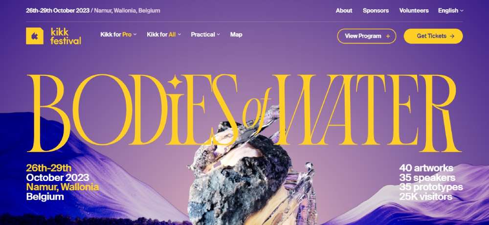
KIKK Festival 2023
Where tech geeks and art nerds collide! A digital fest exploring the love triangle between art, science, and tech.
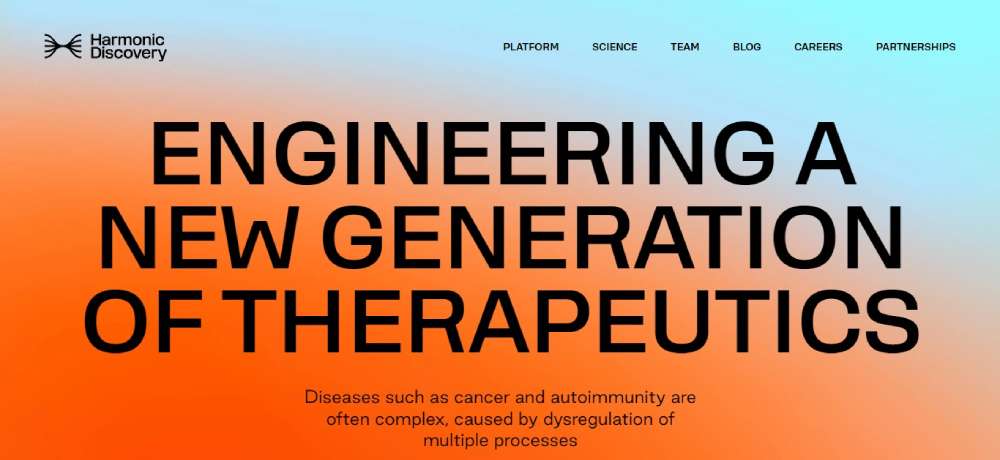
Harmonic Discovery
These folks are the wizards behind next-gen therapeutics. Think tackling the big bads like cancer and autoimmunity.
Cohere
Peep into the future of AI. Cohere's serving up some fine AI language tools - all packed neatly behind one snazzy API.
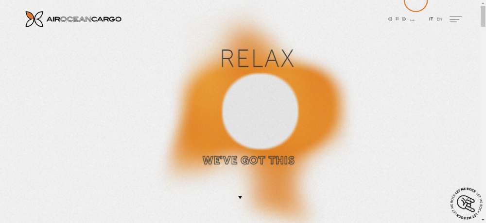
Air Ocean Cargo
Get your groove on! As you tap to the music, watch the gradient sway and shift. Hit pause? The gradient chills into a halo.
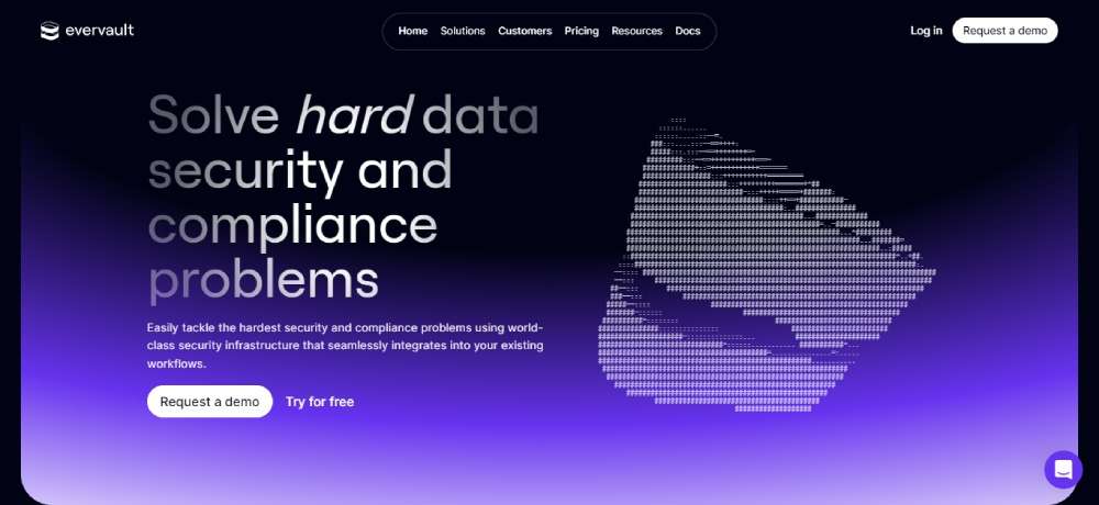
Evervault
For the devs who love secrets! Encrypt, shuffle, and share sensitive info. All without the plaintext peek-a-boo.
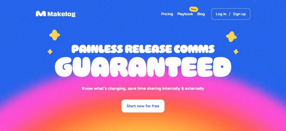
Makelog
Here's the 411 for all the fast-shipping software squads. Keep everyone in the loop straight from your workspace.
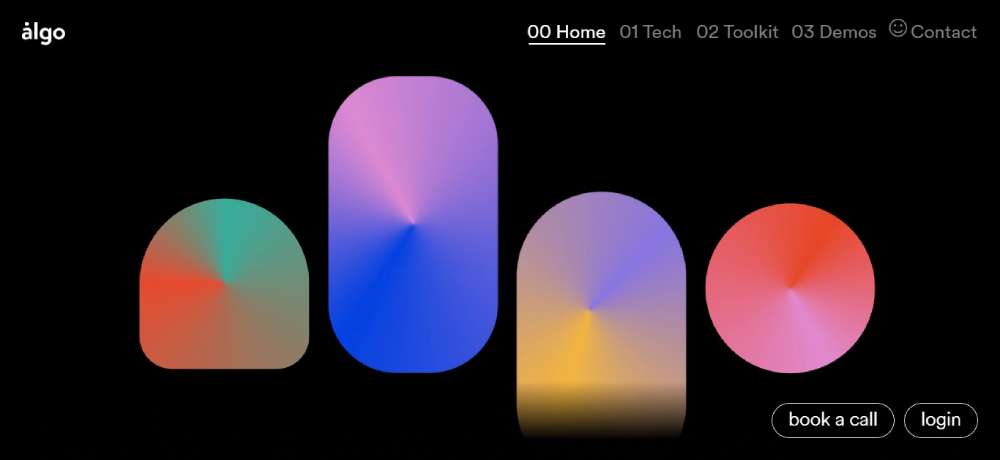
Algo
Algo's spinning data into binge-worthy videos. Yep, they're the data-visualization rockstars.
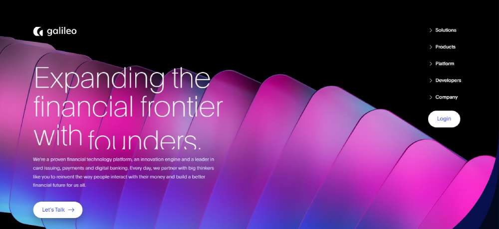
Galileo
Bringing money closer to peeps and painting the fintech future, that's Galileo for you.
Scale AI
Got data? Make it shine with Scale. They're all about powering up AI with prime data.
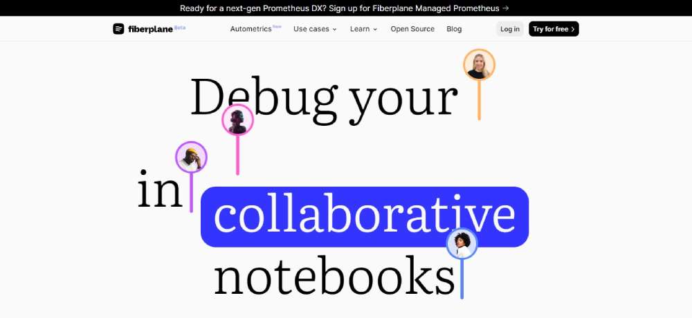
Fiberplane
For the code-cracking engineers! Fiberplane's notebooks are all about simplifying those pesky debugging sessions.
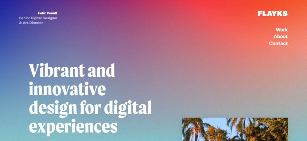
Flasks
Peek into Félix Péault's digital realm. This dude's a design maven from France, weaving art and web together.
FAQ On Gradient Website Design
What's gradient design all about, man?
Ah, dude, gradient design? It's like, when you blend one color into another on a webpage, creating a smooth transition. Instead of a flat design with one solid color, you're introducing depth and dimension. Think sunsets or that rad ombre hair trend.
Are gradients a new trend?
Not really, buddy! Gradients have been around since the early web days, but, ya know, they've made a comeback recently. Thanks to modern design tools and better screen resolutions, they’re lookin' fresher than ever.
Why are designers choosing gradients again?
Okay, so, remember when everything was flat design? It looked cool, but everything started to kinda... look the same. Gradients add a bit of zest, personality, and they can really make certain elements pop. It’s like adding a dash of paprika to your favorite dish.
Does gradient design slow down a website?
Nah, not if done right. The gradients are often implemented through CSS, so it doesn’t necessarily add heavy image files. As long as you're not going overboard with heavy graphic elements, you’re golden.
How do I choose the right colors?
Ah, that’s the art of it! Always consider your brand and audience. But, general tip? Use complementary colors or shades of the same color. Online tools like color wheel sites? Absolute lifesaver.
Can I use gradients for backgrounds and buttons?
For sure! But a word of caution – for backgrounds, it’s subtle gradients that often work best. For buttons, make sure there's enough contrast so the text remains legible. No one wants to squint, right?
Does gradient design work well on mobile devices?
Absolutely. But just remember, screens vary. Always check how it looks on different devices. You don’t want your cool gradient to turn into a weird color mush on someone’s older phone.
How can I blend gradients smoothly?
Smoothness is the key, mate! Tools like Adobe XD or Figma are great. They allow you to manipulate gradient directions and transition points. It’s all about that perfect gradient flow.
Are there any challenges I should be aware of with gradient design?
Yeah, buddy, like everything, there’s always a catch. Watch out for the contrast, especially with text. And always think about accessibility. Some color combos might be hard for certain folks to see.
Any tips for a newbie diving into gradient design?
Oh, totally! Start simple. Play around with two colors and see how they blend. Check out inspirations online – there are tons of designers doing amazing stuff with gradients. And always, always keep the user in mind. If it looks cool but confuses the user, rethink it. Cool? Cool.
Wrapping Up the Gradient Love
Alright, so here's the thing: If you're trying to make a splash in the web ocean, gradient website design is your surfboard. It’s vibrant, it’s catchy, and it’s hella unique. Your site will not only shimmer but will stick in folks' minds, setting you apart from the crowd.
If you enjoyed reading this article about gradient website design, you should read these as well:


