Stunning Examples of Hotel Website Templates
July 21, 2025
Jewelry Website Design Examples That Will Inspire
August 7, 2025Your woodwork deserves better than a template that looks like every other small business site.
The best woodworking website design examples share one thing: they let the craftsmanship speak first. Clean galleries, intuitive navigation, and quote request systems that actually work.
Most carpenter websites fail because they prioritize flashy features over function. Or they bury stunning furniture photography behind slow-loading pages and confusing menus.
This guide breaks down what works. You'll see real portfolio layouts from custom furniture makers, tool retailers, and woodworking educators.
We'll cover homepage structures, gallery design patterns, typography choices, and the technical details that keep image-heavy sites running fast.
What is Woodworking Website Design
Woodworking website design is the process of building an online presence for carpenters, furniture makers, cabinet shops, and timber craft businesses.
These sites showcase custom woodwork galleries, display project portfolios, and convert visitors into quote requests.
A well-built craftsman website template does more than look good. It communicates expertise through visual storytelling and makes the buying process simple for potential clients.
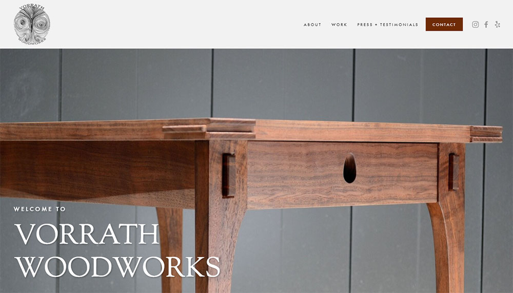
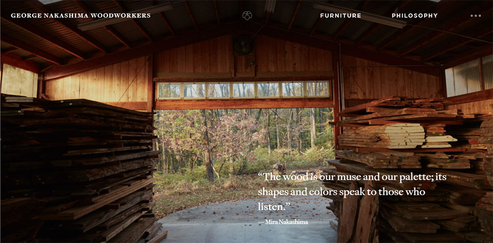
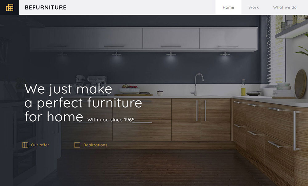
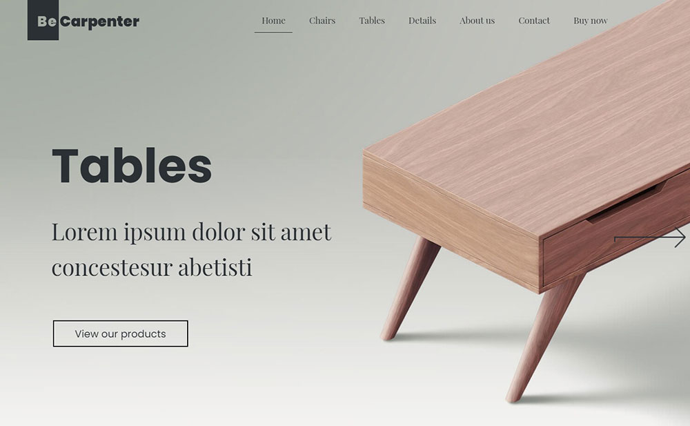
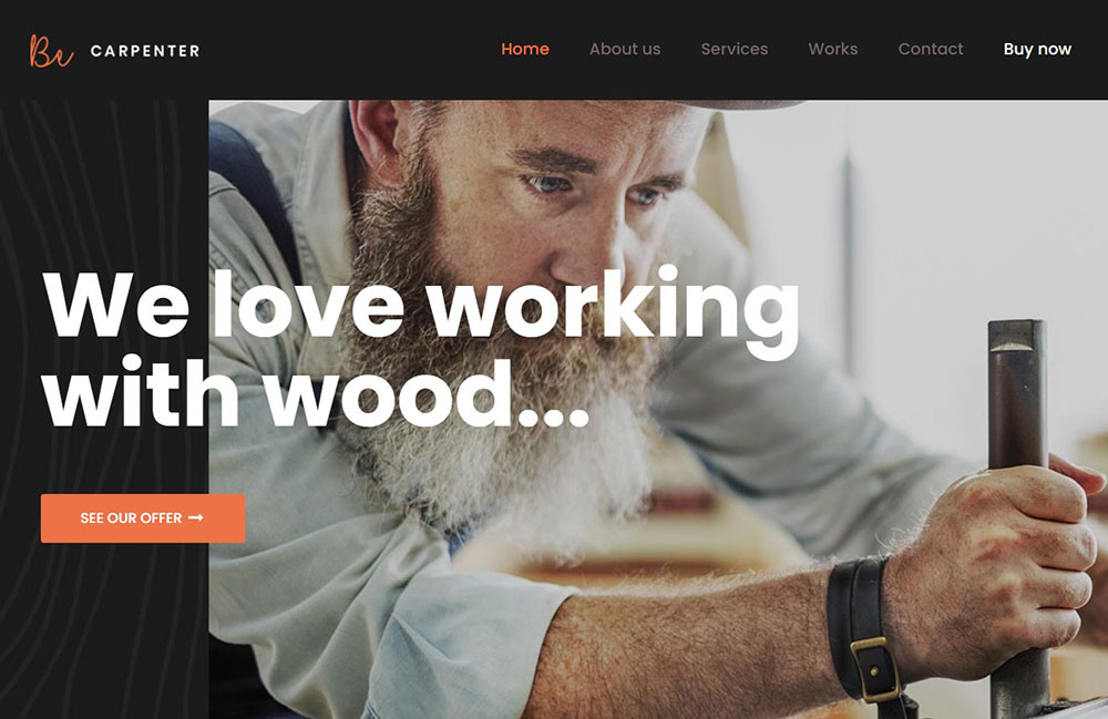
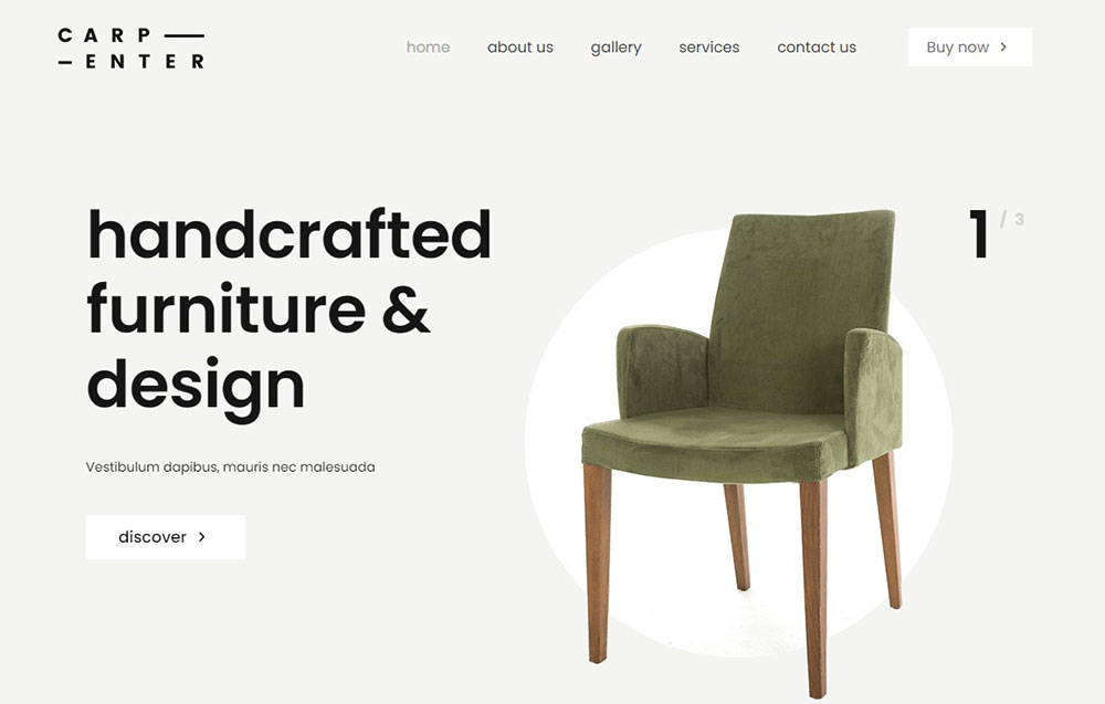
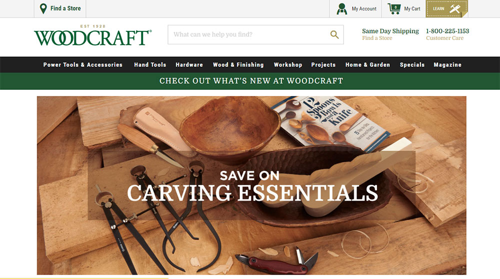
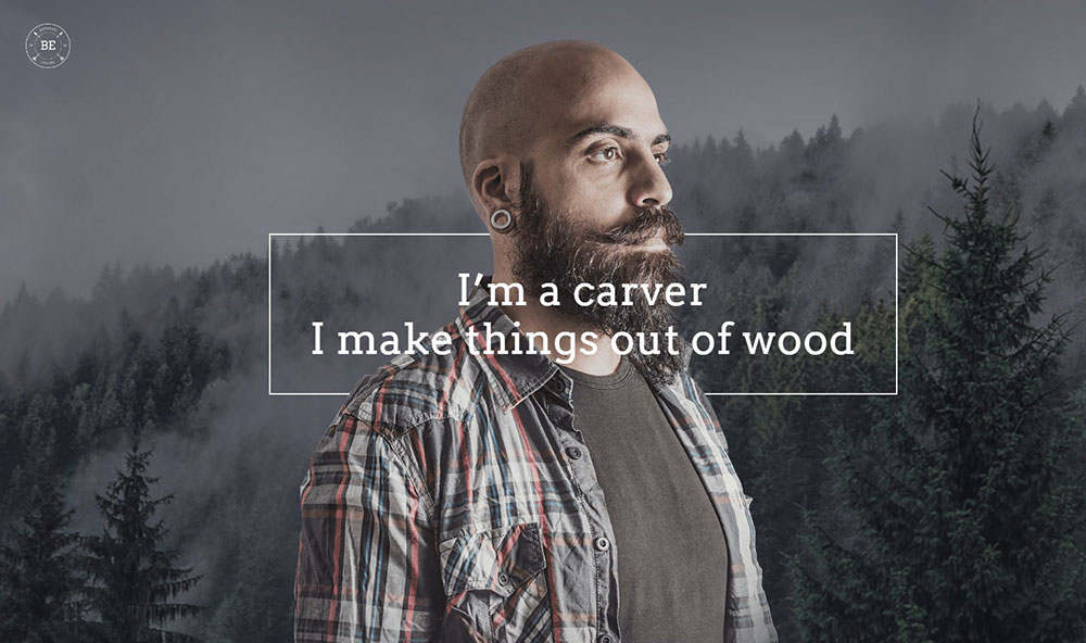
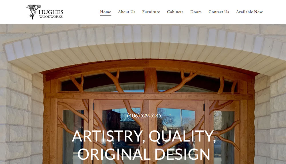
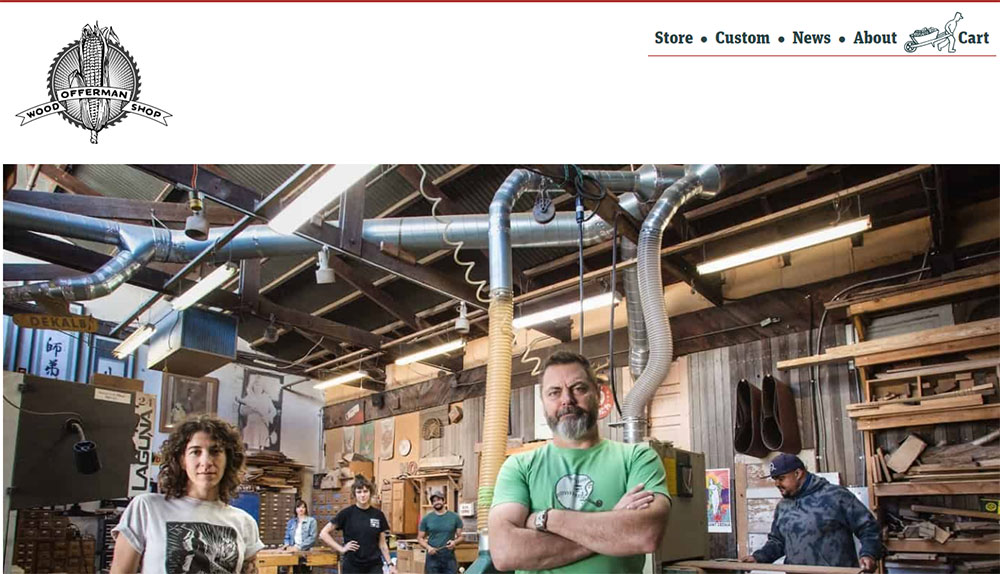
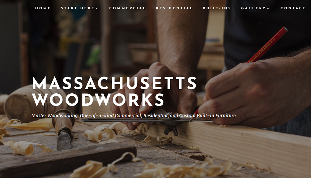
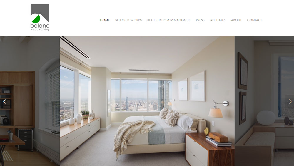
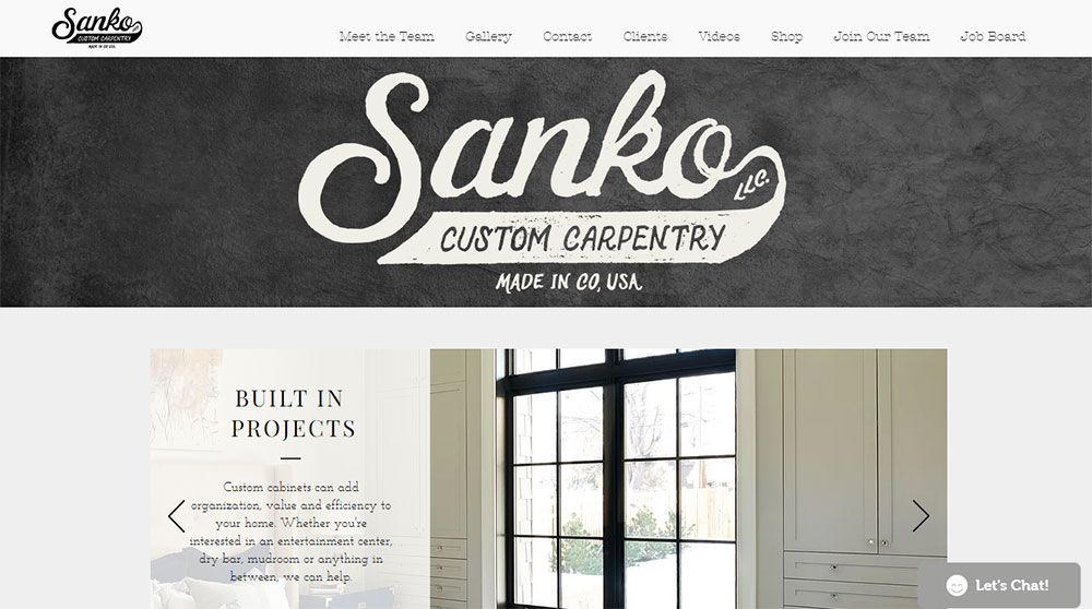
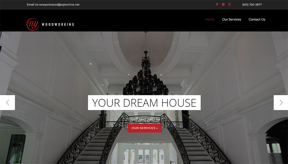
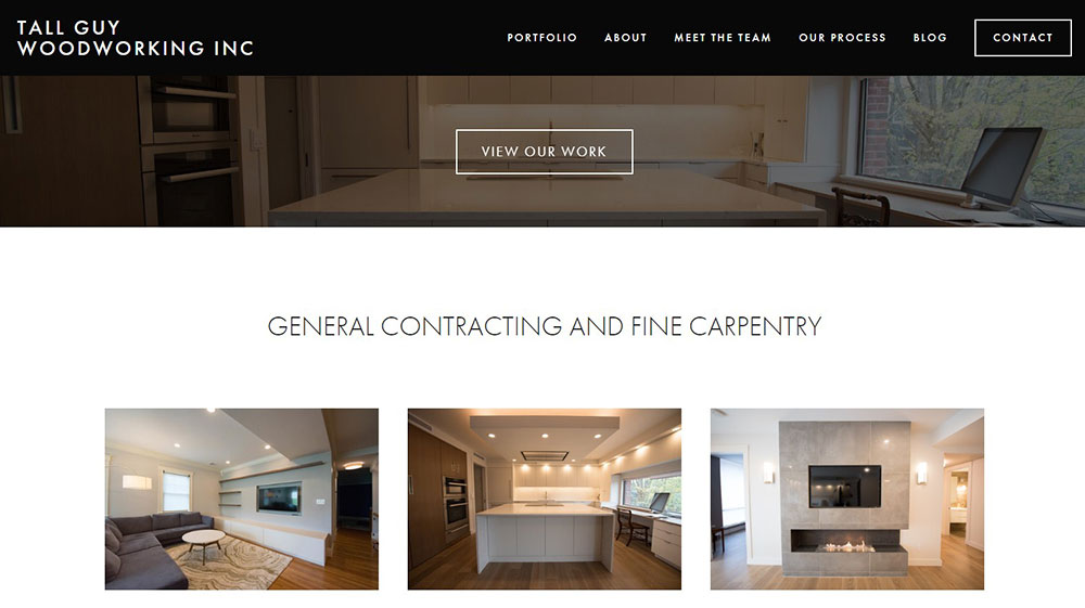
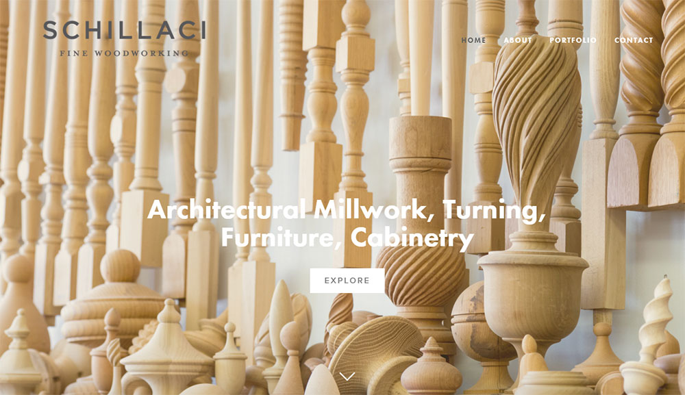
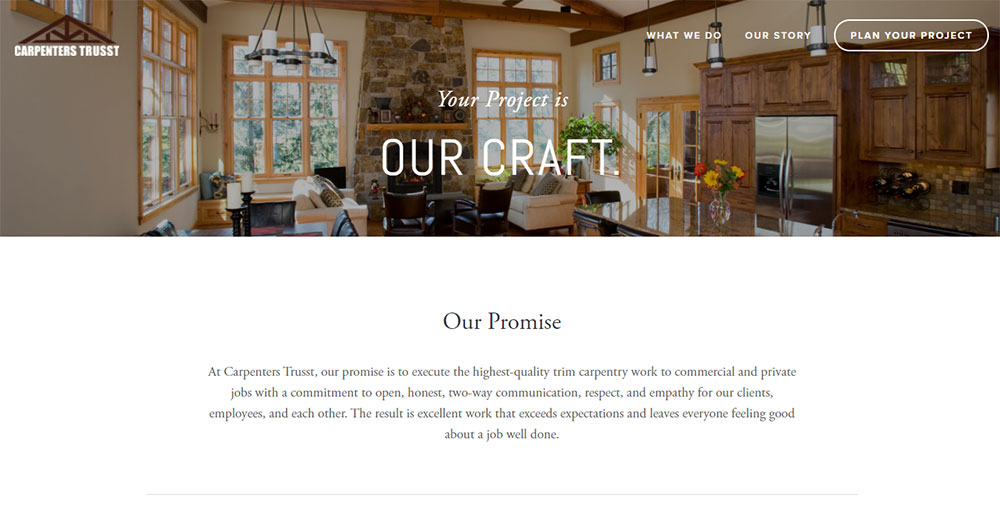
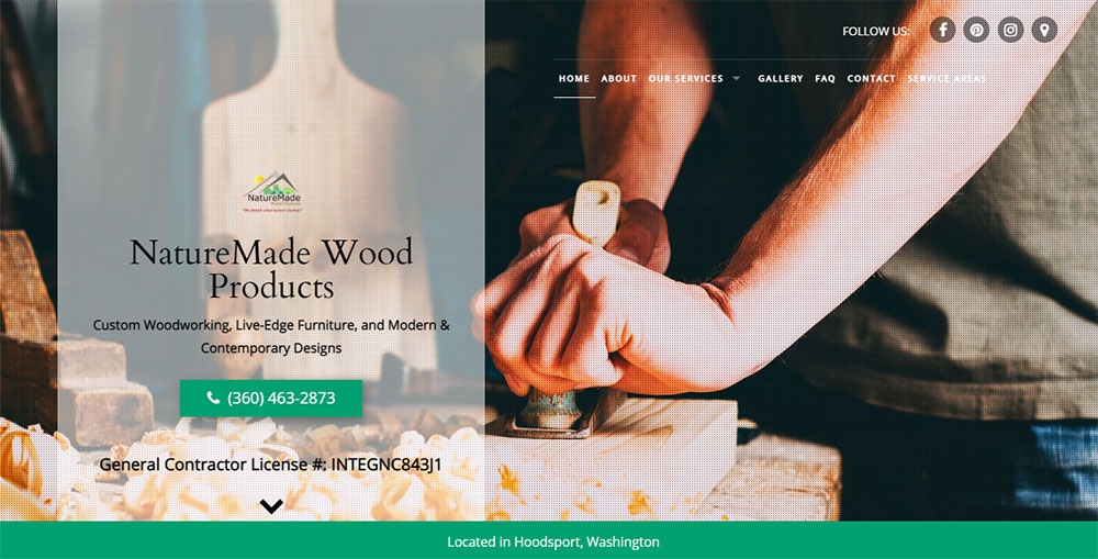
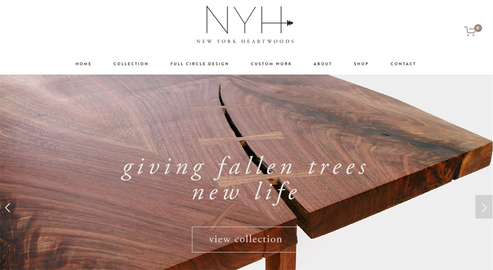
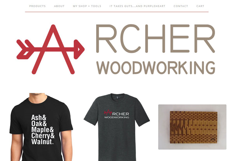
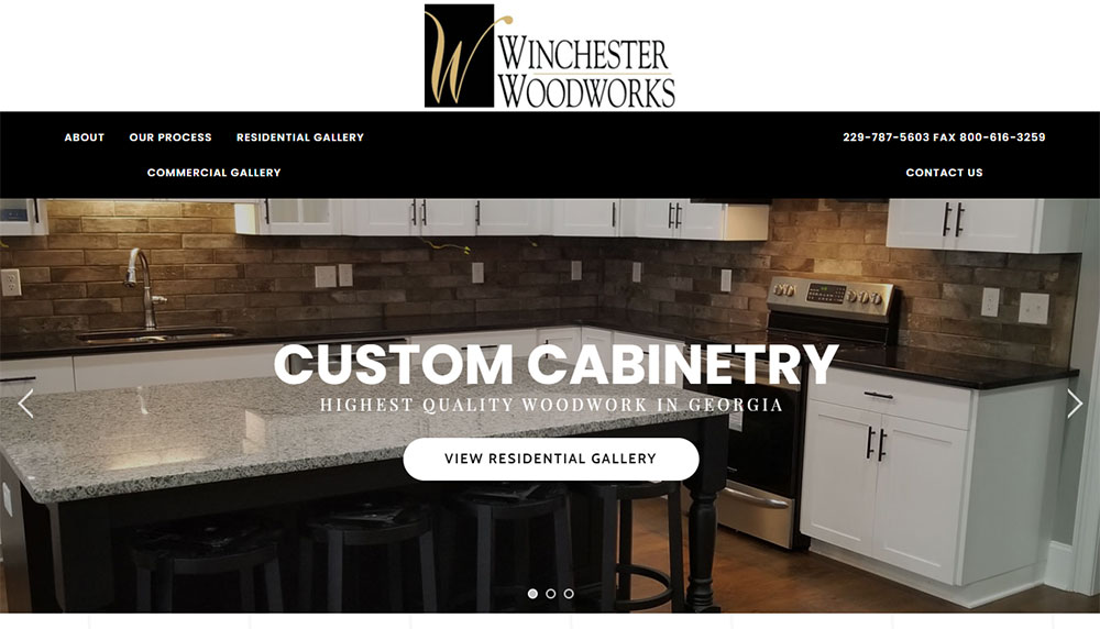
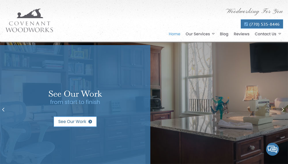
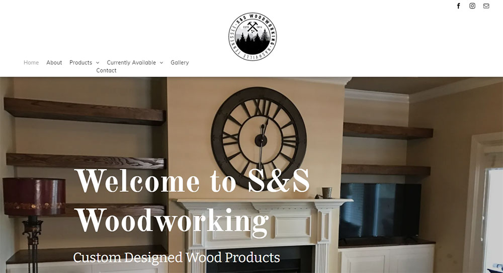
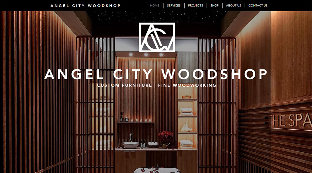
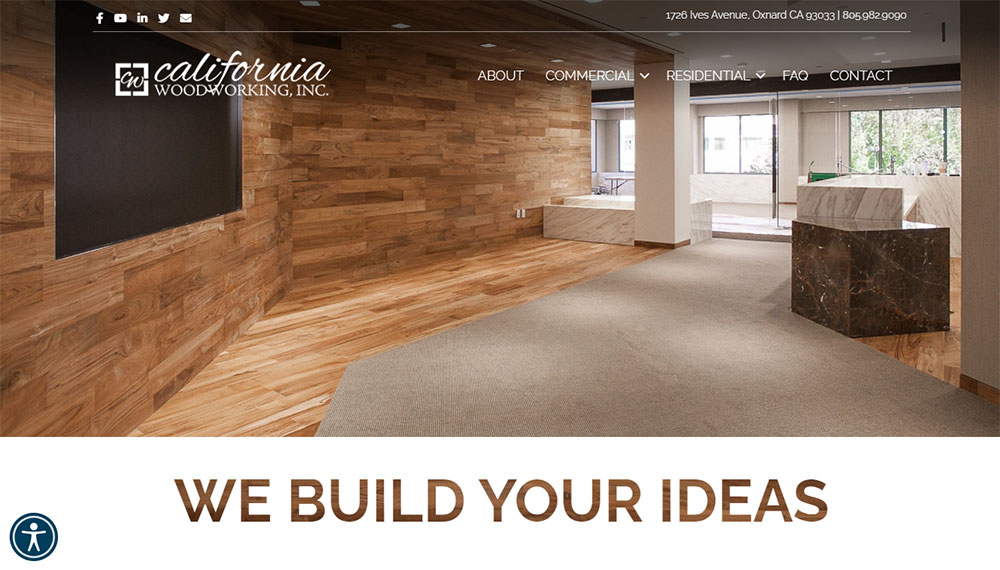
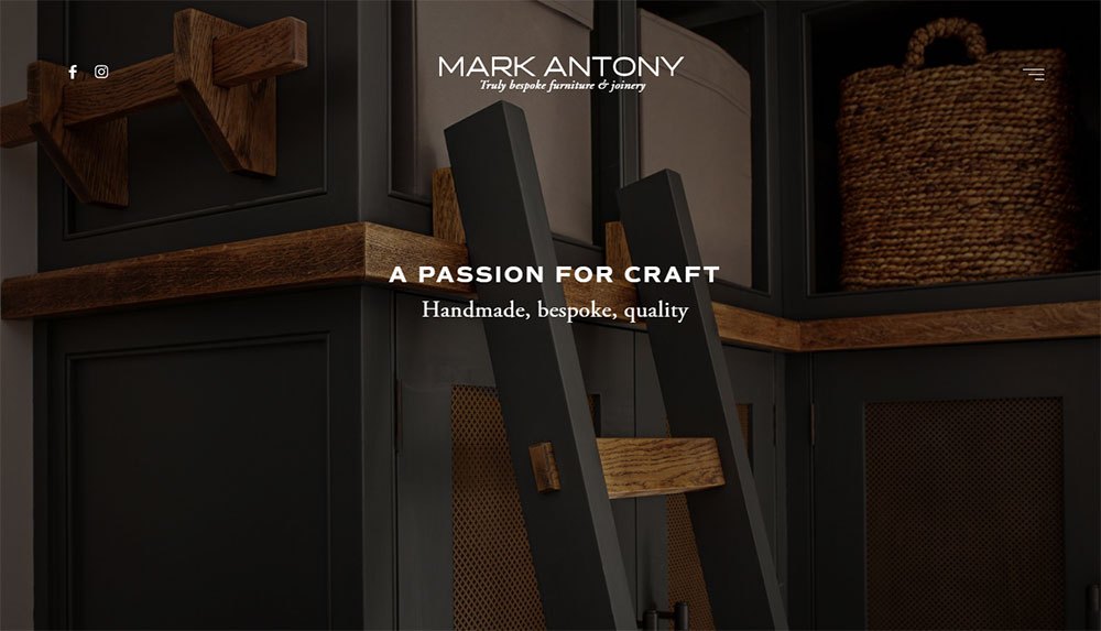
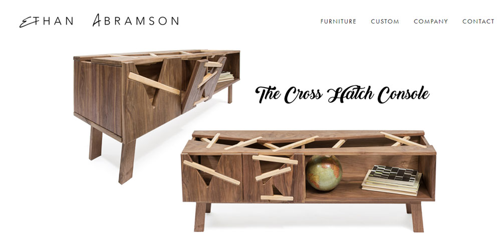
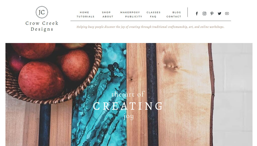
Woodworking Website Design Examples
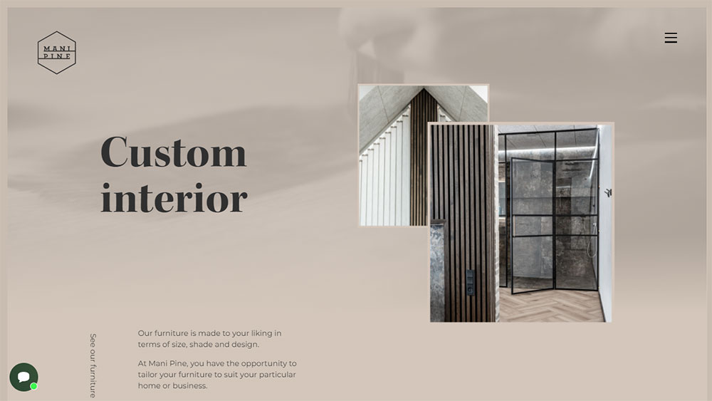
Mani Pine
How Woodworking Websites Differ from General Business Sites
Visual Style Requirements
Wood shop branding demands high-resolution imagery. Every grain pattern, joint detail, and finish needs to be visible.
Most carpenter website templates fail here because they compress images too aggressively.
Content Display Needs
Image-heavy site design is the baseline. You need lightbox gallery features, before and after sliders, and zoom functionality that actually works on mobile.
Process documentation pages showing raw lumber to finished piece build trust faster than testimonials alone.
User Journey Considerations
Someone looking for a custom dining table has different needs than someone buying woodworking tools online.
Your website navigation should separate these paths clearly. Commission inquiries go one direction; product purchases go another.
Types of Woodworking Websites by Business Model
Custom Furniture Maker Websites
Portfolio Display Methods
Grid layouts work for volume. Masonry image display works better for varied piece sizes.
The best furniture websites let the work speak first, details second.
Quote Request Systems
File upload for custom projects is non-negotiable. Clients want to share inspiration images, room dimensions, and existing furniture photos.
Keep form design simple: name, email, project type, budget range, upload field.
Woodworking Tool Retailer Sites
Product Category Organization
Organize by tool type first (hand planes, chisels, saws), then by brand (Lie-Nielsen, Festool, DeWalt).
Woodcraft ecommerce sites that bury navigation lose sales to Amazon.
Comparison Feature Implementation
Side-by-side specs matter when someone chooses between a $50 chisel and a $200 one.
Include steel type, handle material, country of origin, and warranty information in comparison tables.
Woodworking Tutorial and Course Platforms
Video Integration Approaches
Embed from Vimeo or self-host. YouTube works but pulls viewers away with suggested videos.
Paul Sellers built his entire platform on clean video presentation without distractions.
Membership Area Design
Tiered access works best. Free content hooks interest; premium tutorials drive membership website signups.
Woodworkers Guild of America uses this model effectively.
Woodworking Blog and Resource Sites
Project Gallery Layouts
Category filtering by project type (tables, chairs, cabinets) and skill level (beginner, intermediate, advanced) helps readers find relevant content.
Fine Woodworking Magazine does this well on their digital platform.
Material Guide Presentation
Wood species guides need good photography showing grain patterns, color variations, and finished samples.
Include hardness ratings, workability notes, and typical pricing per board foot.
Design Elements That Perform Well on Woodworking Sites
Homepage Layouts for Woodworkers
Hero Section Approaches
Full-bleed workshop photography or a signature piece works best for the hero section.
Skip stock images entirely. They kill credibility for handmade furniture businesses.
Service Showcase Methods
Three to four service categories maximum on the homepage. Custom builds, restoration, commercial projects, classes.
Each gets an image, a two-line description, and a call to action button.
Project Gallery Design Patterns
Grid vs. Masonry Layouts
Uniform grid for consistent piece sizes (cutting boards, small boxes). Masonry for mixed work (furniture plus small items).
Lazy loading images prevents slow page speeds on gallery-heavy pages.
Image Zoom and Lightbox Features
Joinery details sell custom work. Dovetails, mortise and tenon joints, hand-cut details need to be inspectable.
A basic lightbox is fine. Fancy animations just slow things down.
Before and After Displays
Restoration businesses live on these. Interactive sliders beat side-by-side static images for engagement.
Show the damaged original, the stripped piece mid-process, and the finished restoration.
Navigation Structures
Menu Organization by Service Type
Primary nav: Portfolio, Services, About, Contact. Secondary nav handles blog, FAQ, process pages.
Check these website navigation examples for craftsman-appropriate structures.
Menu Organization by Wood Type
Works for specialty shops. Walnut collection, oak pieces, reclaimed wood galleries each get dedicated sections.
This approach suits makers who work primarily with specific species.
Menu Organization by Room
Kitchen, dining room, bedroom, office. Residential furniture makers find this intuitive for clients.
Add a custom/commission category for one-off requests.
Contact and Quote Request Pages
Form Field Requirements
Essential fields: name, email, project description, timeline, budget range.
Optional but useful: inspiration image upload, preferred wood species, room dimensions.
File Upload for Custom Projects
Accept JPG, PNG, and PDF. Set a reasonable file size limit (10MB per file works).
Multiple file uploads help clients share Pinterest boards and reference photos.
Typography Choices
Serif vs. Sans-Serif for Craft Businesses
Serif fonts suggest tradition and craftsmanship. Sans-serif reads as modern and clean.
Many successful websites with good typography in this space mix both: serif for headings, sans-serif for body text.
Readability on Project Descriptions
px minimum for body copy. Line height around 1.5 to 1.6 for comfortable reading.
Dark text on light backgrounds. Save the dramatic reversed type for headings only.
Color Palettes
Earth Tone Applications
Browns, tans, forest greens, and warm grays complement wood photography naturally.
A strong color scheme stays in the background. The woodwork is the star.
High Contrast for Product Photography
White or light gray backgrounds make finished pieces pop in product shots.
Dark backgrounds work for dramatic hero images but complicate consistent gallery presentation.
Technical Considerations for Woodworking Websites
Image Optimization for Large Project Photos
Raw camera files from a Canon or Sony often exceed 20MB. Compress to WebP format at 80% quality for web delivery.
Keep original high-resolution versions for print requests; serve optimized versions on the site.
Tools like ShortPixel or Imagify handle batch compression through WordPress automatically.
Page Speed with Gallery-Heavy Content
Lazy loading is mandatory for any portfolio gallery with more than 12 images.
Content delivery networks (CDNs) like Cloudflare distribute image files across global servers, cutting load times for international visitors.
Test with Google PageSpeed Insights. Aim for 70+ on mobile, 85+ on desktop.
Schema Markup for Local Woodworking Businesses
LocalBusiness schema helps Google Business Profile listings connect to your website.
Add Product schema for items you sell directly; use Service schema for custom commissions.
Review schema displays star ratings in search results, which increases click-through rates.
Mobile Gallery Performance
Touch-friendly navigation matters more than fancy animations on phones.
Swipe gestures for gallery browsing feel natural. Pinch-to-zoom on detail shots is expected.
Test on actual devices, not just browser emulators. A responsive website that works in Chrome DevTools can still fail on a real iPhone.
Common Mistakes in Woodworking Website Design
Poor Image Quality
Blurry photos kill sales faster than anything else. Phone cameras work fine if you have good lighting and a steady hand.
Hire a photographer for your hero images and signature pieces. DIY the rest.
Inconsistent backgrounds across gallery images look amateur. Pick white, gray, or workshop setting and stick with it.
Missing Process Documentation
Clients want to see how furniture gets made. Rough lumber selection, joinery work, finishing stages.
This content builds trust and justifies premium pricing for bespoke furniture commissions.
A simple blog post showing a dining table build from start to finish outperforms generic service descriptions.
Unclear Service Categories
Mixing custom furniture, restoration, and woodworking classes on a single page confuses visitors.
Separate service pages let you target different search queries and customer needs.
Each service type deserves dedicated portfolio examples, pricing guidance, and its own contact form path.
Hidden Contact Information
Contact links belong in the main navigation and footer. Not buried three clicks deep.
Phone numbers should be tap-to-call on mobile. Email addresses should open the default mail client.
Add your shop location with an embedded Google Map if you accept workshop visits or local pickups.
Platform Options for Building Woodworking Websites
WordPress with Gallery Plugins
Most flexible option for craftsman portfolio sites. Elementor or Divi handle visual building without code.
WooCommerce adds ecommerce if you sell finished pieces or woodworking plans directly.
Hosting costs run $10-30/month depending on traffic and image storage needs.
Squarespace for Visual-First Portfolios
Templates designed for photographers and artists translate well to woodworking portfolios.
Built-in gallery features, simple commerce tools, and reliable hosting in one package.
Less customizable than WordPress but faster to launch for non-technical makers.
Shopify for Product-Focused Businesses
Best choice if you sell more than you commission. Cutting boards, small boxes, turned items.
Inventory management, shipping calculations, and payment processing work out of the box.
Custom furniture makers find Shopify limiting for quote-based sales workflows.
Webflow for Design Control
Full visual control without touching code. Popular with design-conscious furniture makers.
Learning curve is steeper than Squarespace. Results look more polished than template-based sites.
CMS features handle blog posts and project galleries effectively.
Photography Tips for Woodworking Portfolios
Lighting Setup Basics
Natural window light works for small pieces. Position near a large north-facing window for soft, even illumination.
Larger furniture needs two to three continuous lights. LED panels from brands like Godox cost under $200 for a basic kit.
Background Choices
Seamless paper rolls in white or gray create clean website background images for product shots.
Workshop environment shots add authenticity but require tidying up the space first.
Detail Shot Requirements
Joinery close-ups sell custom work. Dovetails, through-tenons, hand-cut details deserve their own images.
Macro lens or extension tubes capture wood grain texture that standard lenses miss.
Consistency Across Projects
Same lighting angle, same background, same crop ratio across all portfolio images.
This consistency makes gallery pages look cohesive rather than thrown together.
Content Strategy for Woodworking Sites
Project Case Studies
Document the client brief, design decisions, material selection, build process, and final delivery.
These long-form posts rank for specific queries like "custom walnut dining table" and demonstrate expertise.
Material Guides
Wood species comparisons, finish options, care instructions. Practical content that serves existing and potential clients.
Fine Woodworking and American Woodworker have set reader expectations for this type of resource content.
Workshop Updates
Behind-the-scenes content performs well on Instagram and Pinterest. Repurpose for blog posts.
New tool acquisitions, shop improvements, and technique experiments keep the site fresh without requiring finished project content.
FAQ Pages
Common questions about lead times, pricing factors, wood movement, and finish durability.
These pages capture long-tail search traffic and reduce repetitive email inquiries.
Integrating Social Proof
Client Testimonials
Place quotes near related portfolio pieces, not just on a dedicated testimonial page.
Photos of clients with their finished furniture add authenticity that text alone lacks.
Publication Features
Logos from Houzz, local magazines, or woodworking publications build credibility above the fold.
"As seen in" sections work best near the homepage hero or about page.
Social Media Feeds
Embedded Instagram feeds show current work without manual updates. Keep to 6-9 recent posts maximum.
Too many social widgets slow page load and distract from primary conversion goals.
Review Platform Links
Google reviews, Houzz badges, and Etsy shop ratings all serve as external validation.
Link to these profiles rather than embedding full widgets to maintain page speed.
FAQ on Woodworking Website Design
What platform works best for woodworking websites?
WordPress with Elementor or Divi offers the most flexibility for craftsman portfolio sites. Squarespace works well for visual-first portfolios. Shopify suits makers who sell products directly. Your choice depends on whether you prioritize custom commissions or retail sales.
How many images should a woodworking portfolio include?
Start with 15-20 of your best pieces. Quality beats quantity. Include 3-5 images per project showing different angles, joinery details, and scale context. Update quarterly as you complete new work.
Do I need professional photography for my woodworking site?
For hero images and signature pieces, yes. Professional shots of your best work justify the investment. For regular portfolio updates, good natural lighting and a consistent background produce acceptable results with a phone camera.
What pages does every woodworking website need?
Homepage, portfolio gallery, services, about, and contact are the minimum. Add a pricing page if you offer standard items. Include a blog for process documentation and workshop updates to support search visibility.
How do I display before and after restoration work?
Interactive sliders let visitors drag between original and restored states. Place these prominently on service pages for furniture restoration portfolio sections. Static side-by-side comparisons work as a fallback but generate less engagement.
Should I include prices on my custom furniture website?
Starting ranges help qualify leads without committing to fixed quotes. Display "dining tables from $3,000" rather than exact figures. This filters serious inquiries while acknowledging that custom woodwork pricing depends on size, species, and complexity.
What makes a woodworking website mobile-friendly?
Touch-friendly gallery navigation, tap-to-call phone numbers, and readable text without zooming. Test on actual devices, not just browser tools. Over 60% of Houzz and Pinterest traffic comes from mobile users researching furniture.
How do I get quote requests through my website?
Clear calls to action on every page pointing to a simple contact form. Include file upload for inspiration images. Respond within 24 hours. Most professional websites lose leads through slow response times, not poor design.
What colors work best for woodworking website design?
Earth tones, warm grays, and muted greens complement wood photography without competing. Keep backgrounds neutral so the furniture stands out. Avoid bright colors that distract from your craftsmanship.
How often should I update my woodworking portfolio?
Add new projects within two weeks of completion while details are fresh. Remove older work that no longer represents your skill level. Quarterly reviews keep galleries current and give search engines fresh content to index.
Conclusion
These woodworking website design examples prove one thing: your online presence should match the quality of your craftsmanship.
Whether you build custom tables or run a cabinet shop, the same principles apply. Clean project showcase sections, mobile responsive design, and fast-loading galleries.
Start with the basics. A solid WordPress or Webflow foundation, optimized product photography display, and clear service page layouts.
Skip the flashy animations. Focus on what converts: visible contact information, simple quote request forms, and portfolio work that sells itself.
Your handmade furniture gallery does the heavy lifting. The website just needs to stay out of its way.
Build something that works as well as the pieces in your shop.

