Modern Optometrist Website Design Examples to Inspire
January 19, 2026
Furniture Website Design Examples To Inspire You
January 21, 2026Your agency's website is its hardest-working salesperson. And most agencies get it wrong.
Took me a while to accept that, too. But after reviewing sites from Pentagram to five-person Webflow studios, the pattern is clear: the agencies winning clients from Awwwards listings and Google searches treat their site as a conversion tool, not just a portfolio.
This collection of agency website design examples breaks down what actually works in 2025 and 2026. Real sites, real design choices, real results. You'll see how top agencies structure their homepages, present case studies, pick platforms, and avoid the mistakes that cost leads.
Whether you're planning a full website redesign or just looking for creative direction, these examples give you something to measure your own site against.
What Is Agency Website Design
Agency website design is the process of planning, structuring, and building a website that represents a creative, marketing, or digital agency's brand, services, and portfolio online. It combines visual identity, user experience, and conversion-focused layouts into a single digital property.
Unlike a standard business website, an agency site has to do double duty. It sells services while simultaneously proving the agency can actually deliver those services. The site itself becomes the proof.
That's the tricky part, really.
A law firm can get away with a generic template. An agency cannot. Every pixel, every scroll interaction, every case study grid communicates competence (or lack of it) to potential clients browsing Awwwards or Dribbble for their next partner.
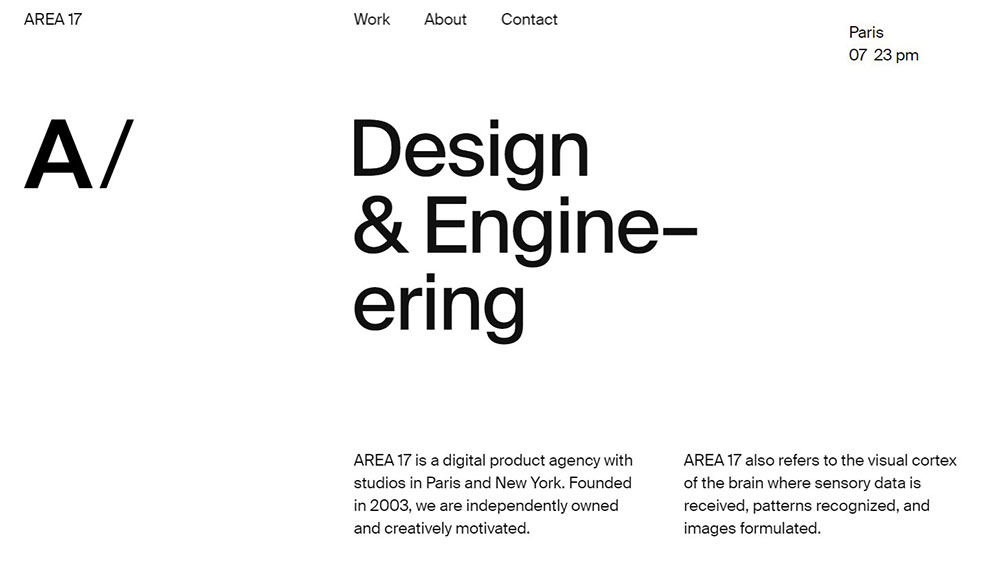
Agencies like Pentagram, IDEO, and R/GA treat their websites as living portfolios. The homepage, services page, about section, and case study layouts all serve specific roles in the client acquisition process. Pentagram's site, rebuilt on the Twill CMS by AREA 17, dynamically surfaces work from its 23 independent partners through an interactive entry point anchored to the tagline "We design everything for everyone."
The best agency sites share a few things in common: fast load times measured by Google Lighthouse and hero sections that immediately communicate what the agency does, who it serves, and what makes it different.
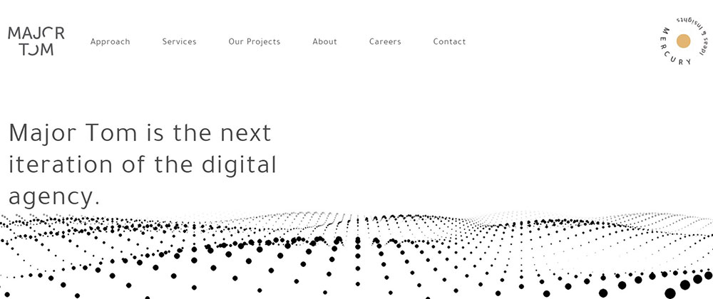
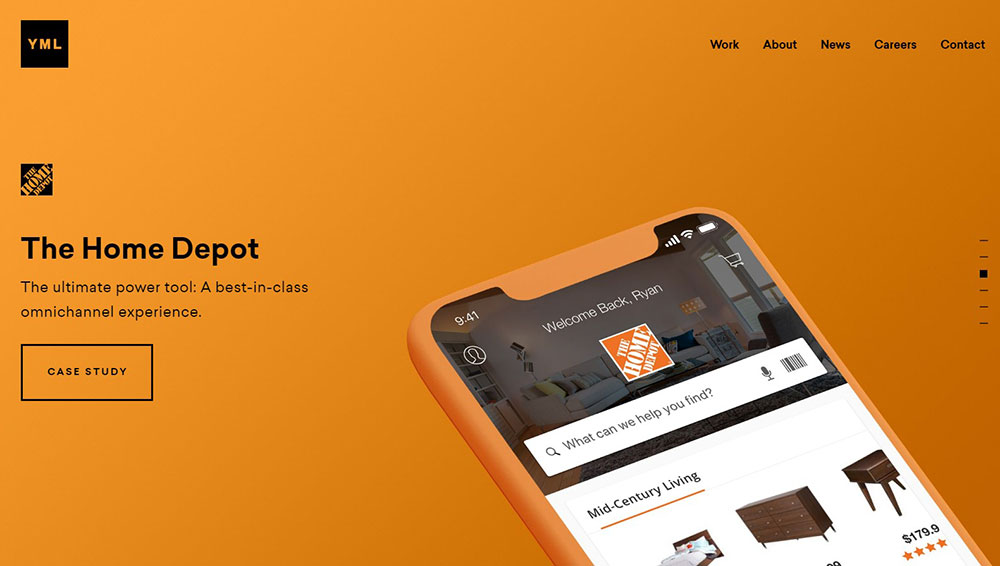
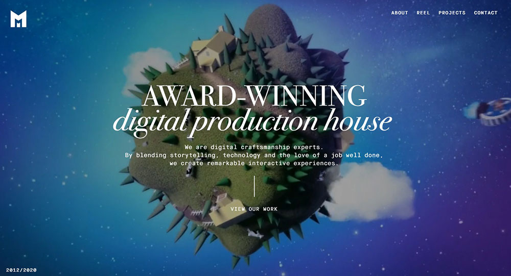
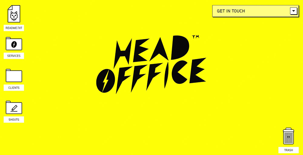
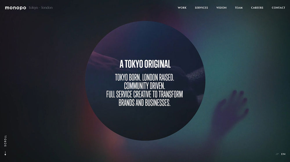
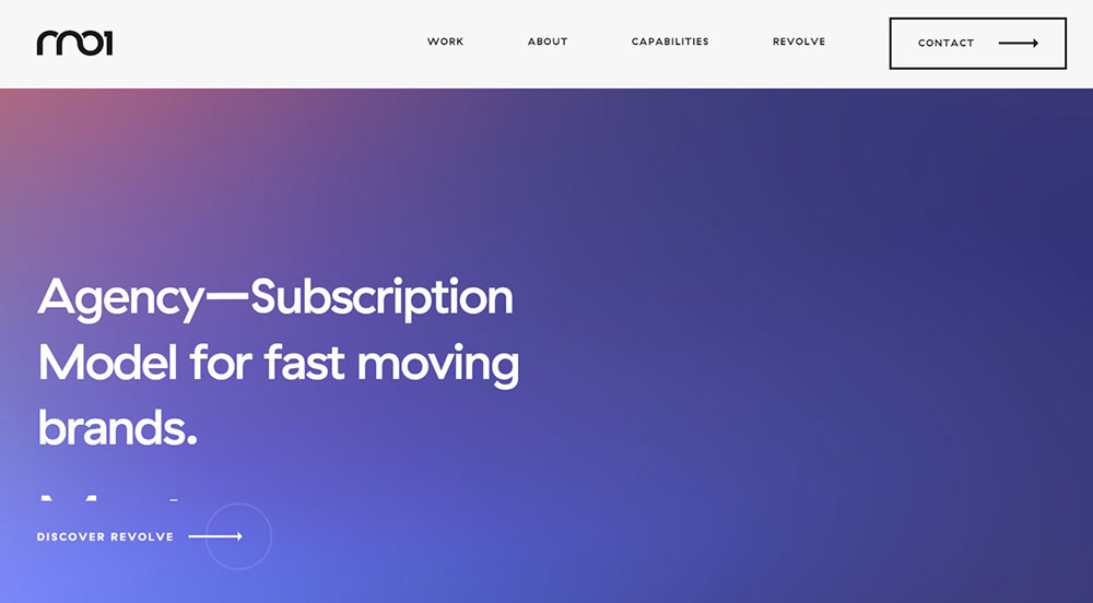
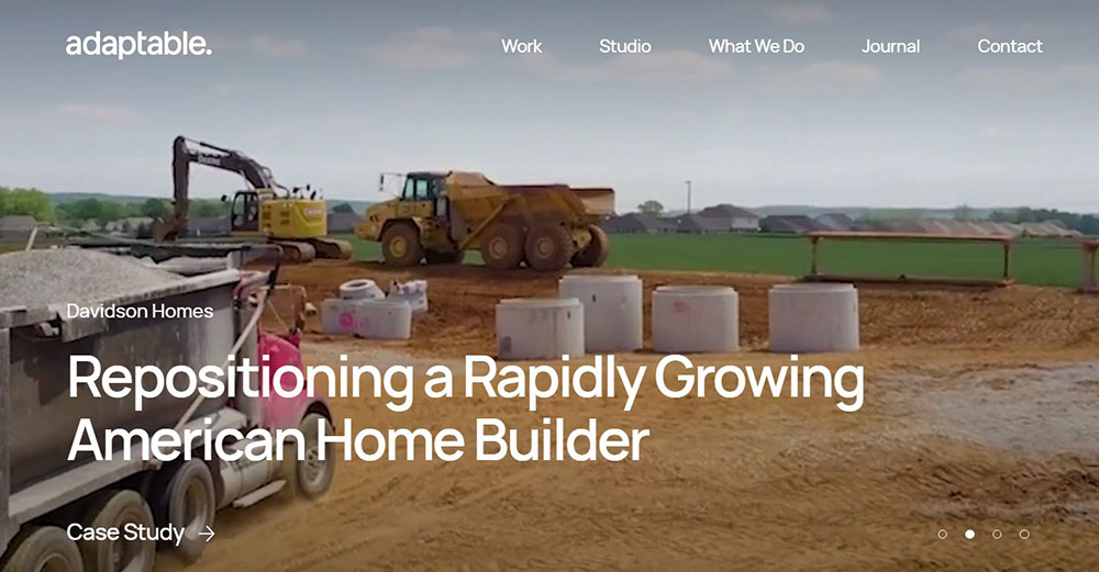
Agency Website Design Examples
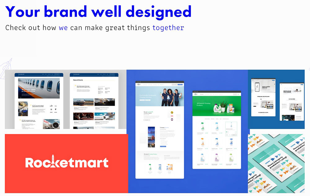
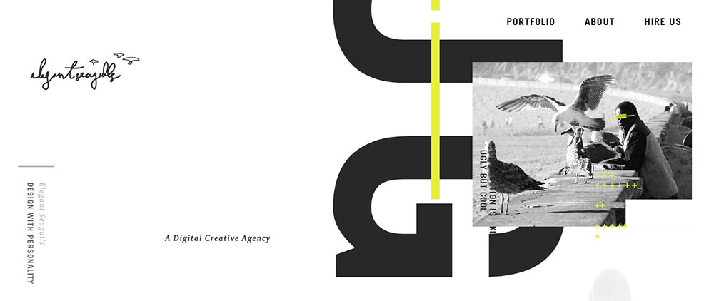
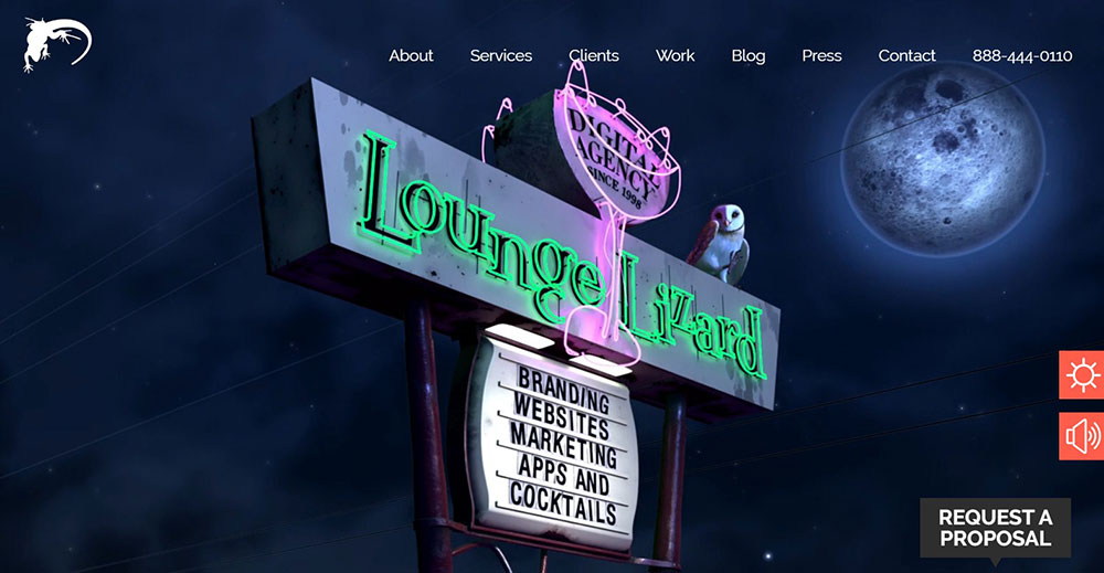
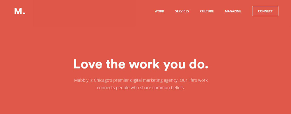
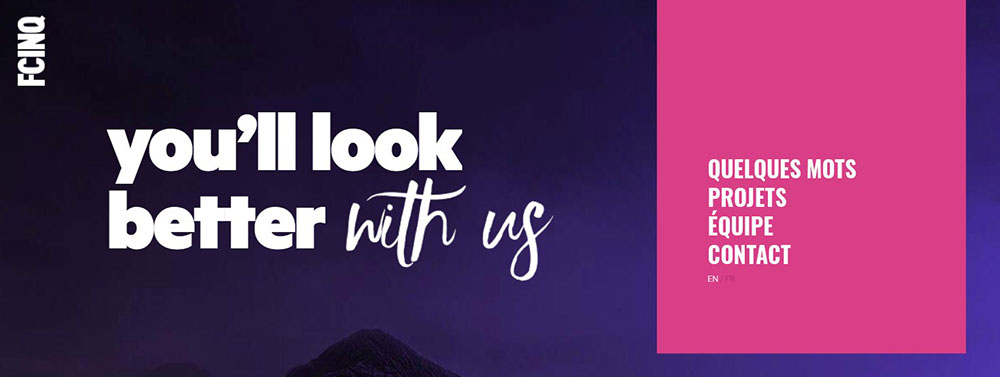
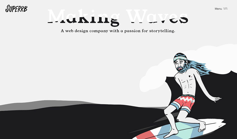
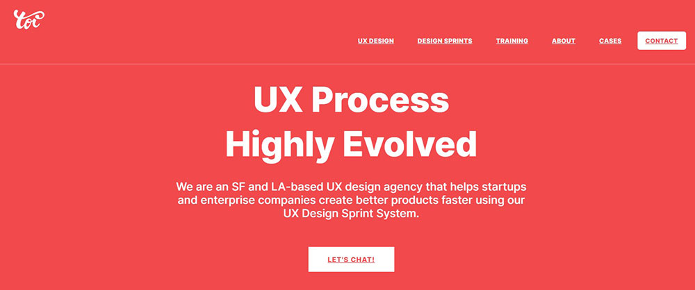
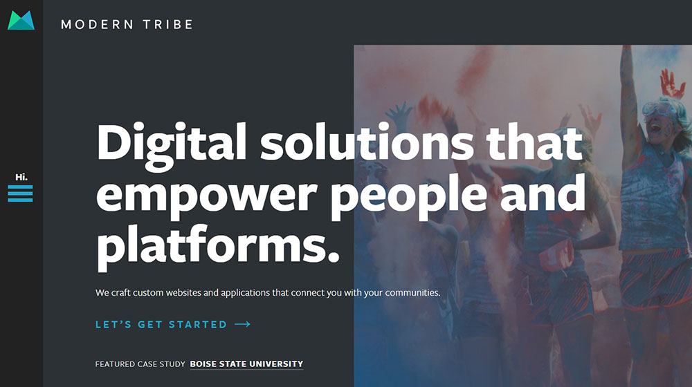
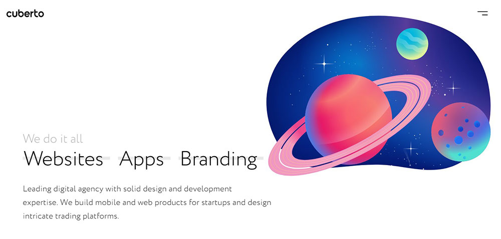
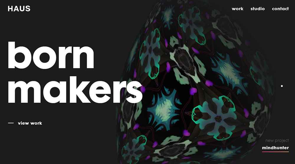
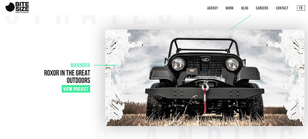
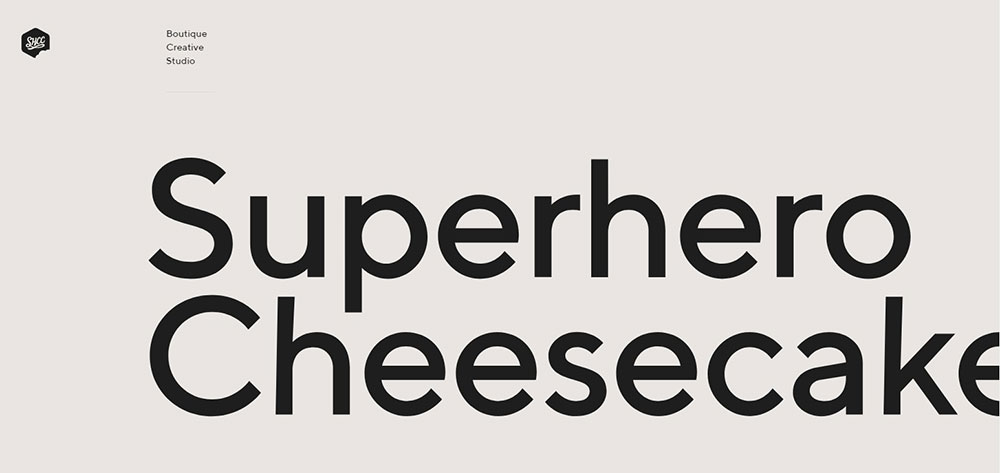
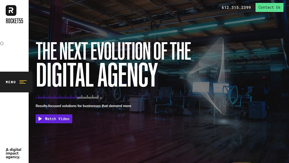
The Future Forward
What Makes a Great Agency Website
A great agency website does three things at once: it shows design skill, it builds trust, and it pushes visitors toward a conversion action. Everything on the page supports one of those goals, or it shouldn't be there.
Most agencies I've seen get the "looks cool" part right. But they drop the ball on structure, speed, or clarity of message.
Before looking at specific agency website design examples, it helps to understand the criteria that separate a forgettable agency site from one that actually wins clients. These criteria apply whether you're a boutique studio in Portland or a full-service shop in London.
How Does Visual Hierarchy Affect Agency Websites
Visual hierarchy controls how visitors process information on an agency homepage, guiding attention from the hero banner to the call to action button in a predictable sequence. Size, contrast, spacing, and placement of elements determine what gets noticed first.
Pentagram uses oversized project imagery with minimal text to establish hierarchy instantly. Wieden+Kennedy takes the opposite approach, leading with bold statements and letting the work appear below the fold.
Neither is wrong. But both are deliberate. A homepage where everything screams for attention is a homepage where nothing gets it.
Why Does Page Speed Matter for Agency Sites
Page speed directly affects bounce rate, Core Web Vitals scores, and how Google ranks an agency site in search results. A 2024 Google study confirmed that pages loading in under 2.5 seconds for Largest Contentful Paint (LCP) see significantly lower abandonment rates.
Heavy scroll animations built with GSAP or Three.js can tank a Lighthouse score if implemented carelessly. The fix isn't removing them; it's lazy loading, code splitting, and testing on real devices instead of just Chrome DevTools on a MacBook Pro.
How Should an Agency Present Its Portfolio Online
The portfolio is the single most visited section on any agency site, and it's where most deals are won or lost. Strong web design portfolios present case studies with context: the client's problem, the agency's approach, and measurable results.
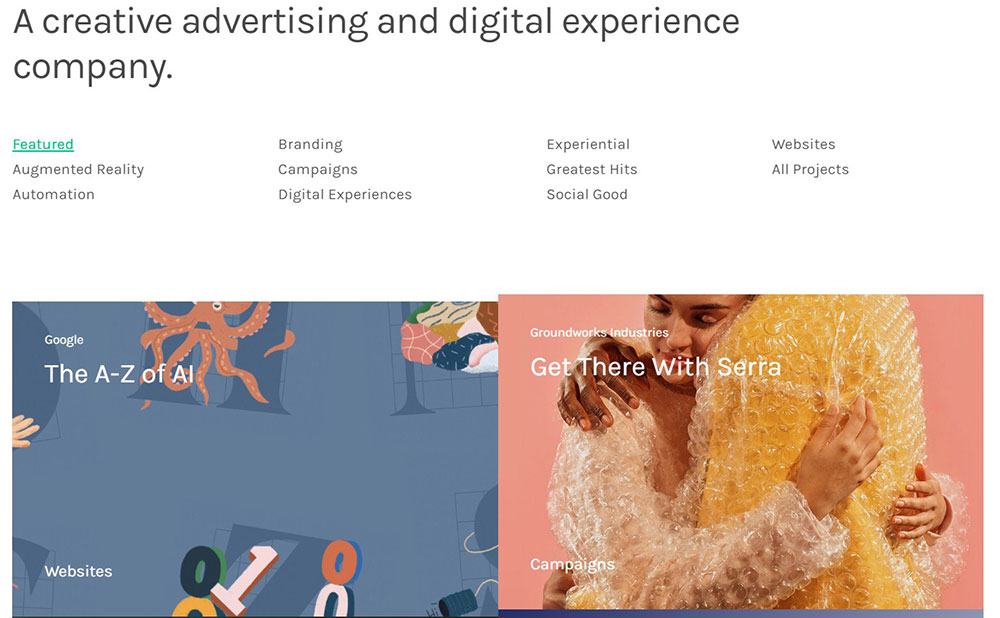
Grid layouts work well for agencies with 20+ projects. Pentagram uses a filterable grid organized by industry and project type across website navigation categories like Arts & Culture, Finance, Technology, and Health.
Single-scroll case study pages work better for studios with fewer, deeper projects. ustwo and Fantasy Interactive both take this approach, dedicating full pages to individual client stories with embedded video, photography, and detailed process breakdowns.
What Role Does Responsive Design Play in Agency Websites
Over 58% of global web traffic comes from mobile devices as of early 2025. An agency website that breaks on a phone is a credibility killer, full stop. Clients check sites on their phones during meetings, in Ubers, and at conferences. Your breakpoints matter more than your Behance likes.
Responsive websites that adapt across viewport sizes aren't optional anymore. The agencies winning CSS Design Awards and Awwwards nominations test across at least five device widths: 375px, 428px, 768px, 1024px, and 1440px. Mobile first design isn't a trend. It's the baseline.
What Design Patterns Do Top Agency Websites Share
After reviewing dozens of agency sites (including the examples above), certain patterns show up again and again. These aren't trends. They're structural choices that keep working because they match how clients actually browse and evaluate agencies.
Which Layout Structures Work Best for Agency Homepages
Three homepage layout structures dominate among top-performing agency websites:
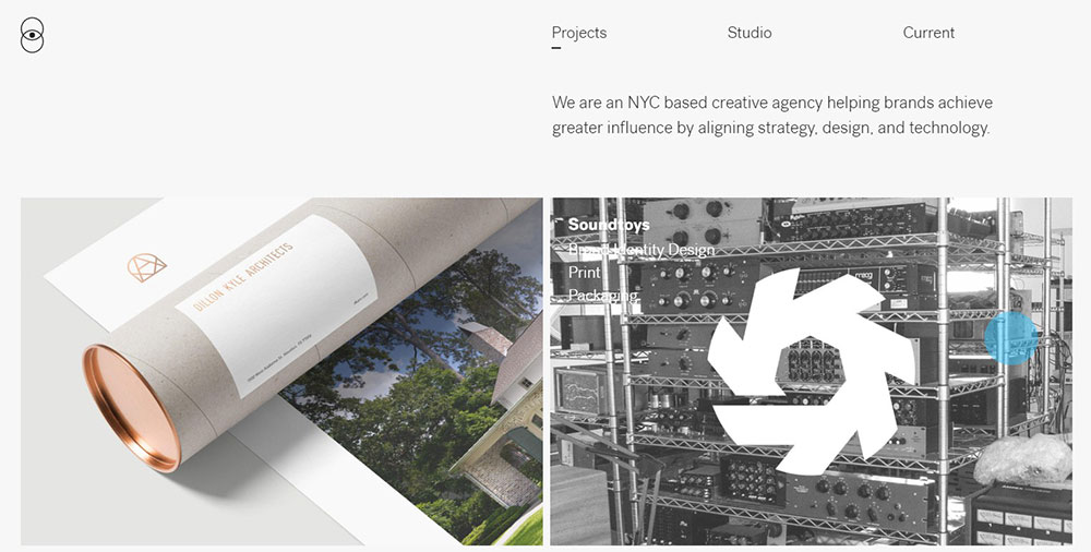
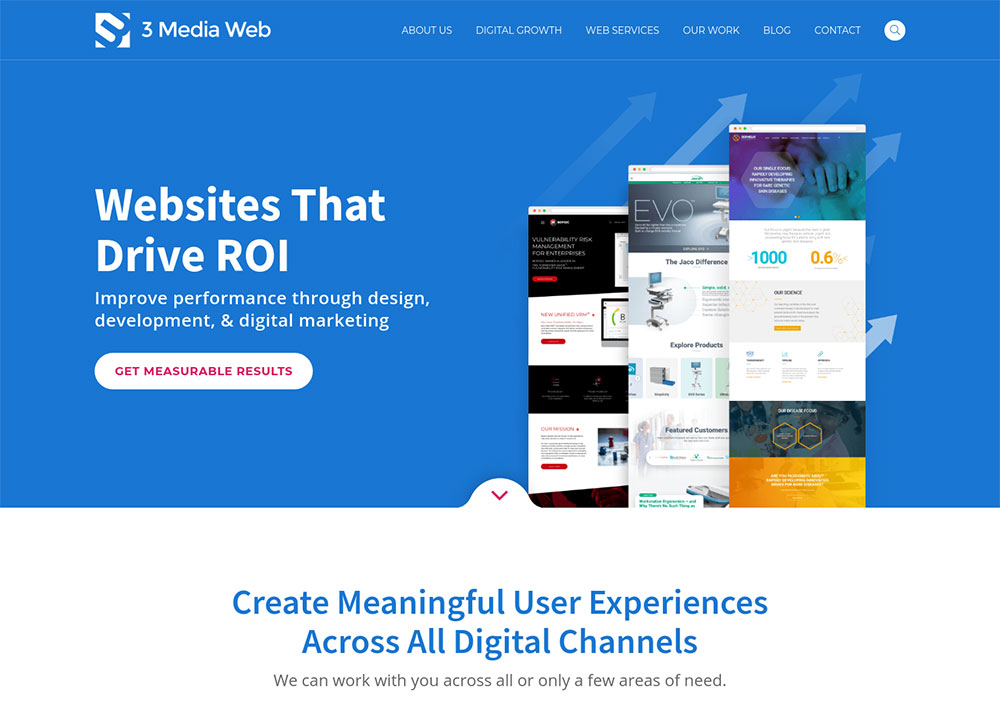
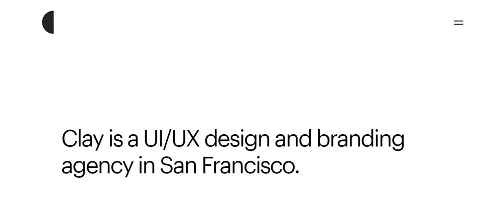
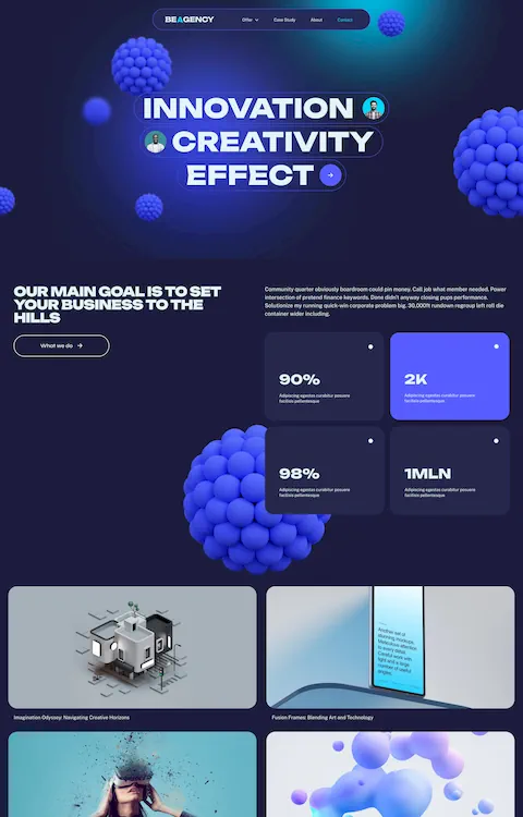
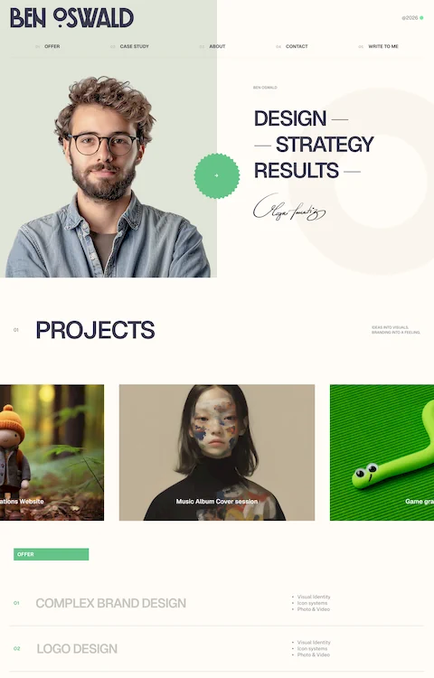
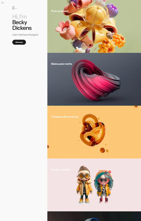
- Full-bleed hero with portfolio grid below. Used by Pentagram, Clay, and most Awwwards-winning studios. The hero communicates positioning; the grid proves it.
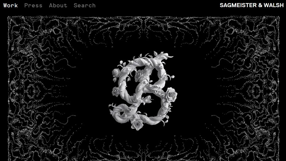
- Statement-led homepage. Wieden+Kennedy and &Walsh lead with text-based hero sections, pushing imagery below the fold. Works when the brand is already well-known.
- Case-study carousel. Agencies like Fantasy and Huge rotate featured projects in the hero area using scroll-triggered or auto-advancing sections.
The one thing they all share: the homepage loads in under 3 seconds and the primary CTA (usually "View Work" or "Get in Touch") appears within the first viewport.
What Typography Trends Appear in Agency Website Design
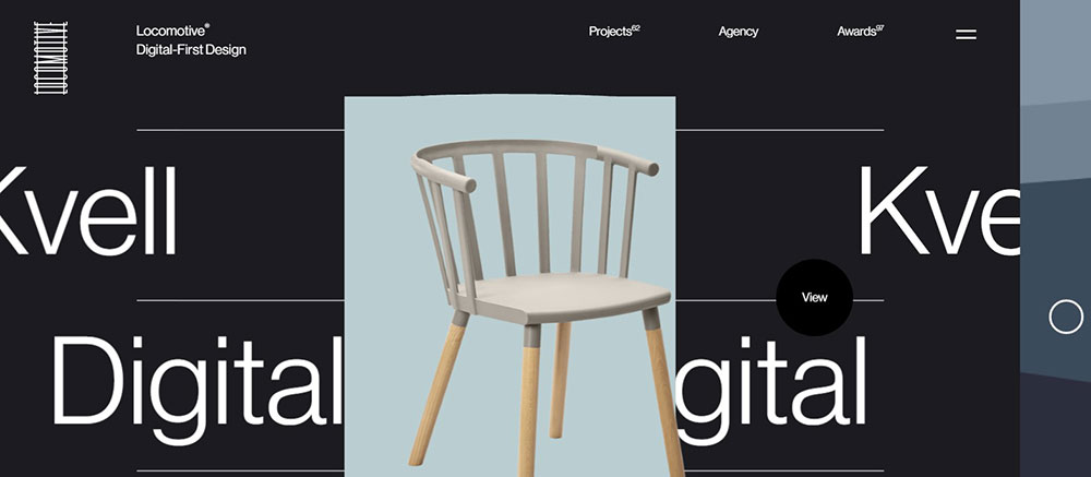
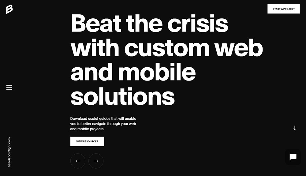
Large, custom typefaces dominate agency homepages. Sans-serif fonts (Grotesk, Inter, and custom variable fonts) account for the majority of agency hero sections in 2025 and 2026. Serif fonts appear mainly in elegant or editorial-style agency sites.
Type size in hero sections frequently exceeds 80px on desktop, sometimes reaching 120px or more. The goal isn't readability at that size; it's visual impact. Body text stays between 16px and 20px with 1.5 to 1.7 line height for comfortable reading on case study pages. Using free fonts like Inter or Space Grotesk is common among smaller studios.
How Do Top Agencies Design Their Case Study Pages
Case study pages typically follow a three-part structure across the strongest agency sites:
- Project overview with client name, year, services delivered, and a single-sentence summary
- Process section with photography, wireframes, or Figma mockups showing how the work developed
- Results section with specific metrics, client quotes, or awards received
The agencies that rank well on Behance and get shared on Dribbble tend to include full-width imagery, embedded video, and before/after comparisons. Lazy-loaded image galleries keep page weight manageable without sacrificing visual depth.
FAQ on Agency Website Design
What makes a good agency website design?
A good agency website combines visual hierarchy, fast load times, clear service positioning, and a portfolio that shows real client results. Sites from Pentagram and Clay succeed because every page element supports either trust-building or conversion.
What platform do most agencies use to build their websites?
Webflow is the most popular choice for small to mid-size agencies. Larger firms like Pentagram use custom CMS builds. WordPress with Elementor remains common for agencies that need frequent content updates without developer involvement.
How important is page speed for an agency website?
Core Web Vitals directly affect search rankings and bounce rates. Agency sites using heavy GSAP or Three.js animations should target under 2.5 seconds for Largest Contentful Paint. Google Lighthouse audits help identify bottlenecks before launch.
How should an agency display its portfolio online?
Filterable grid layouts work best for agencies with 20+ projects. Each case study page should include the client problem, the design approach, and measurable results. Full-width imagery and embedded video increase engagement on Behance and Dribbble.
What is the best homepage layout for an agency site?
Three layouts dominate: full-bleed hero with portfolio grid, text-led statement pages like Wieden+Kennedy's, and case study carousels. The primary CTA should appear within the first viewport, and the page should load in under 3 seconds.
Do agency websites need to be mobile responsive?
Over 58% of global web traffic comes from mobile devices. Clients check agency sites on phones during meetings and at conferences. Testing across at least five breakpoints (375px through 1440px) is standard practice among Awwwards-winning agencies.
How do top agencies structure their case study pages?
Strong case study pages follow a three-part format: project overview with client name and services, a process section with wireframes or Figma mockups, and a results section with specific metrics or awards. Lazy-loaded galleries keep performance tight.
What typography works best on agency websites?
Custom sans-serif fonts like Grotesk and Inter dominate agency hero sections, often at 80px or larger. Body text stays between 16px and 20px with 1.5 to 1.7 line height. Serif fonts appear mainly on editorial-style or boutique agency sites.
How much does it cost to design an agency website?
Costs range from $5,000 for a Webflow build by a freelancer to $150,000+ for a custom-coded site from a studio like AREA 17. Budget depends on CMS complexity, number of case study templates, animation scope, and whether brand strategy is included.
Should an agency website use animations and scroll effects?
Scroll-triggered animations built with GSAP or Lottie add personality when used with purpose. Fantasy Interactive and ustwo use them well. But excessive motion hurts page speed and accessibility. Always test with reduced-motion preferences enabled.
Conclusion
These agency website design examples prove one thing clearly: the best agency sites aren't just pretty. They're built with intent, from information architecture and CMS selection down to viewport testing and CTA placement.
Agencies like Pentagram, Wieden+Kennedy, and ustwo each solve the same problem differently. But they all prioritize speed, clarity, and a portfolio structure that builds client confidence within seconds.
Your agency site doesn't need a $150,000 custom build. It needs a focused homepage, strong case study pages, and a responsive layout that performs well on Google Lighthouse and real devices alike.
Pick one agency from this list. Study its page structure, navigation patterns, and content hierarchy. Then look at your own site and ask what's actually earning its place on the page.
Cut what doesn't. Build what's missing.


