
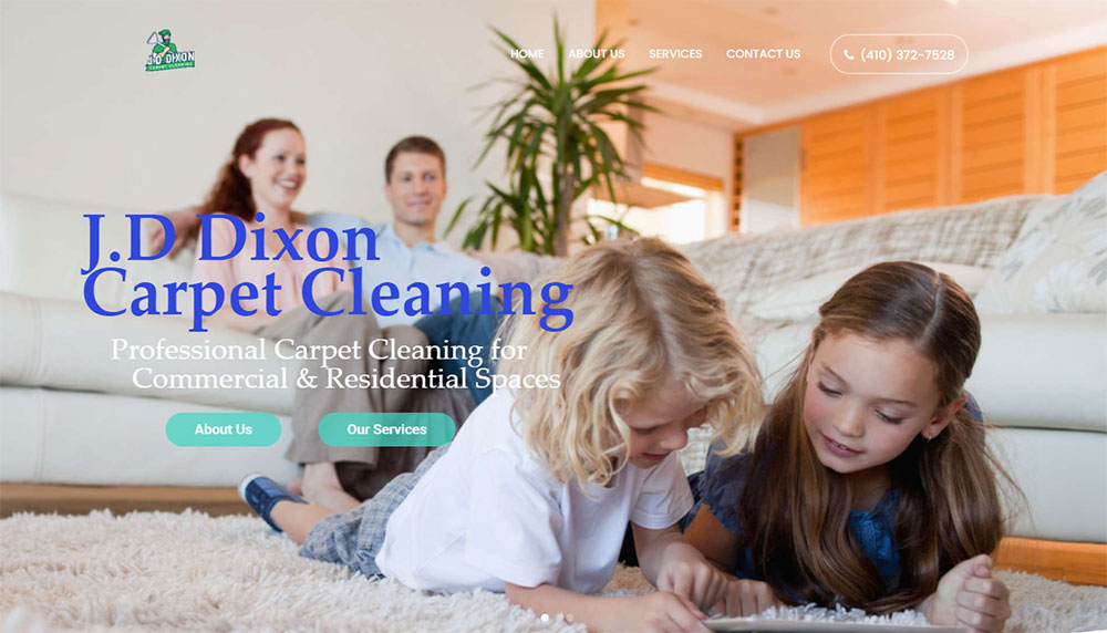
Top Carpet Cleaning Website Design Examples
January 7, 2026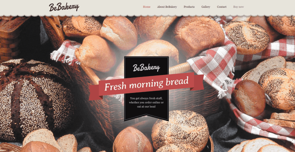
Stunning Bakery Website Design Examples to Inspire You
January 8, 2026Your church website is often the first impression visitors get before stepping through your doors.
A dated layout, missing service times, or broken donation page sends people elsewhere. They have options.
This collection of church website design examples shows what actually works for congregations of all sizes. From mega-churches like Life.Church and Elevation Church to small community congregations using WordPress or Squarespace.
You will see effective homepage layouts, sermon archive organization, online giving integration through platforms like Tithe.ly and Pushpay, and mobile responsive approaches that convert visitors into members.
Real examples. Specific features. Practical patterns you can apply to your own ministry website.
What is Church Website Design
Church website design is the process of creating a digital presence for a religious organization, congregation, or ministry.
It combines visual elements, navigation structure, and functional features that serve both members and first-time visitors.
A church site typically includes service time displays, sermon archives, online giving platforms, and event calendars.
The design approach differs from standard business websites because the primary goal is community connection rather than sales conversion.
Most churches use platforms like WordPress, Squarespace, or specialized builders like Faithlife Sites and Subsplash.
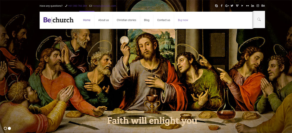
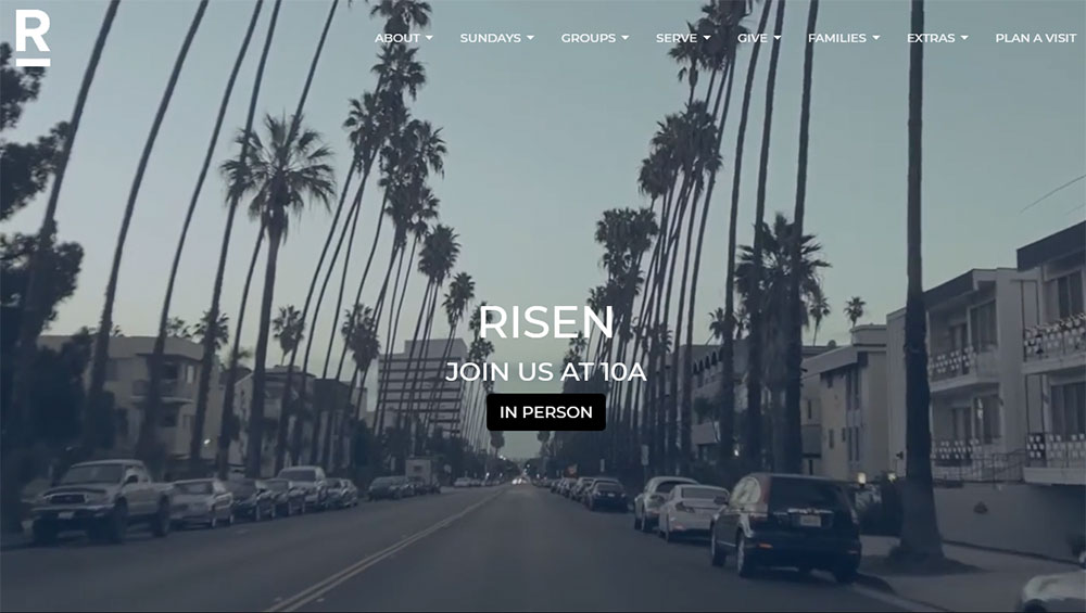
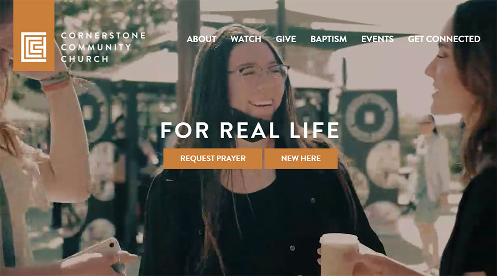
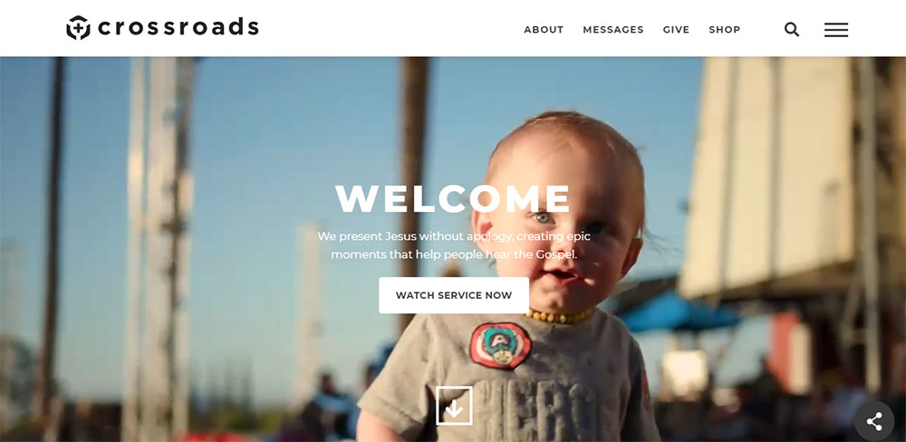
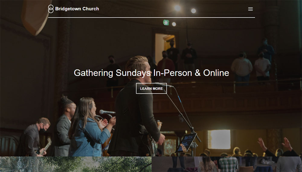
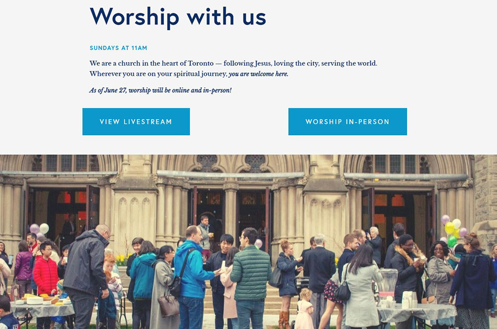
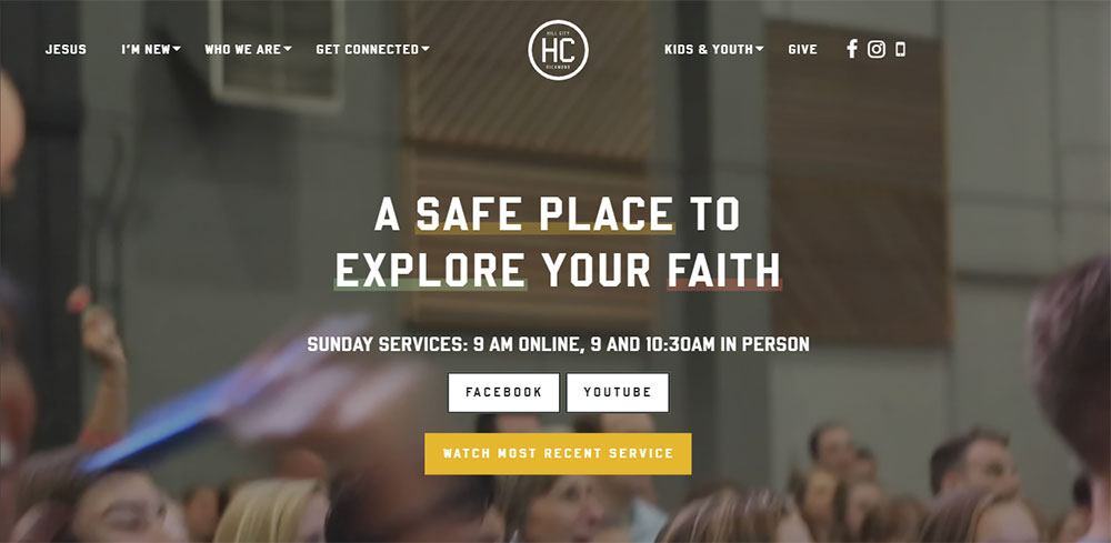
Church Website Design Examples
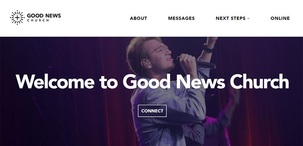
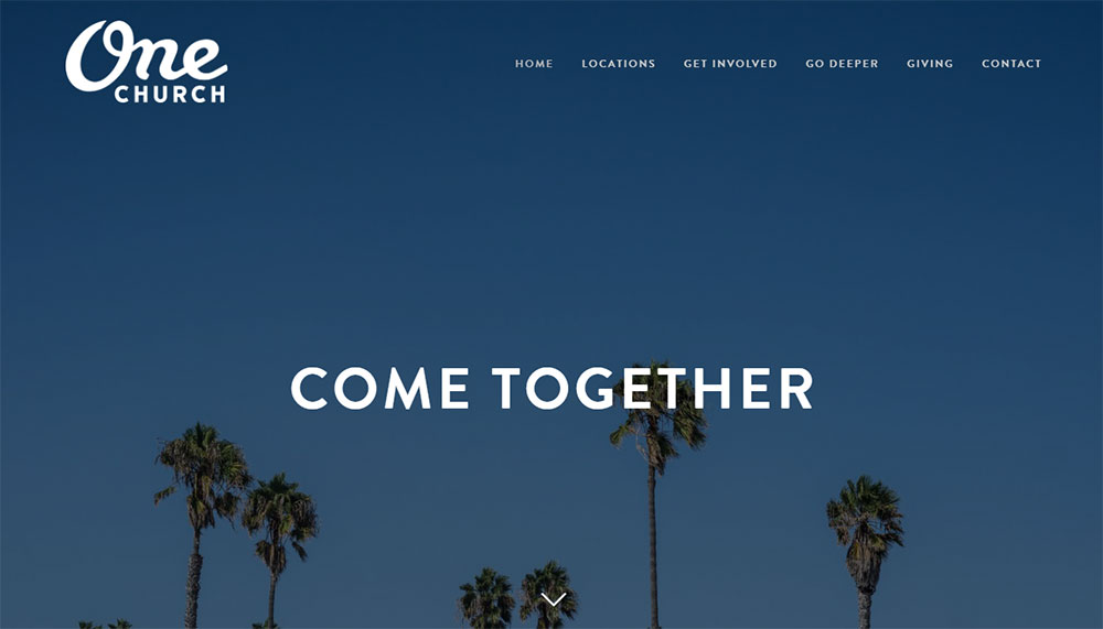
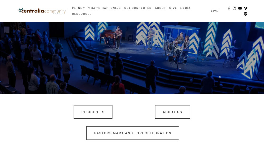
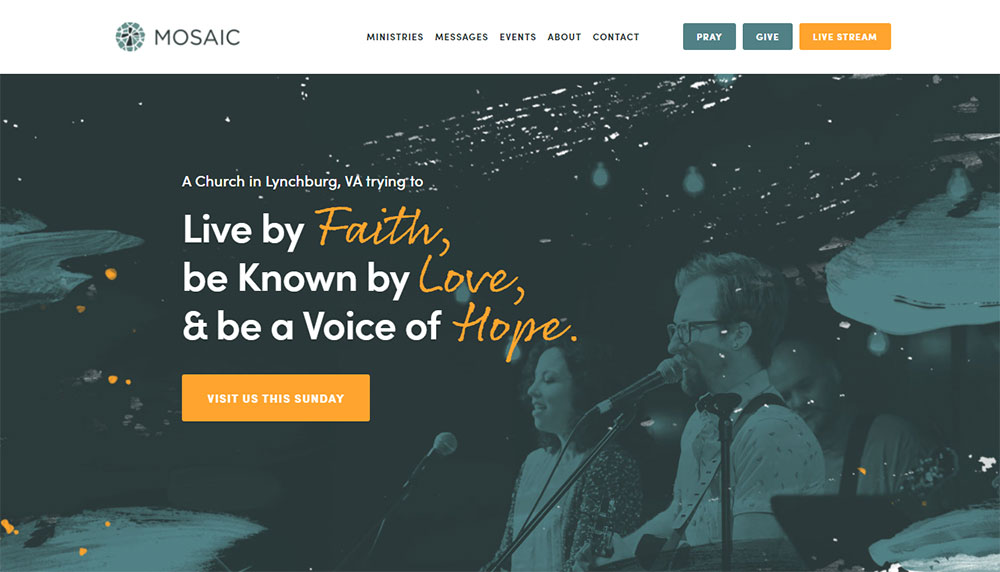
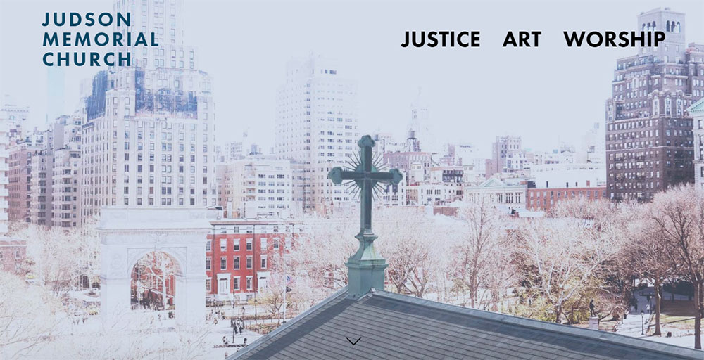
Good News Church

Why Does Church Website Design Matter for Congregations
75% of visitors check a church website before attending in person.
That first digital impression determines whether someone walks through your doors on Sunday morning.
A poorly designed site with outdated information signals a disconnected or inactive community. People move on.
Your website serves multiple audiences simultaneously: long-time members checking event schedules, newcomers researching your beliefs, and donors looking for giving options.
Similar to how non-profit websites build trust through transparency, church sites must communicate authenticity quickly.
Mobile responsiveness matters here more than most categories. People search for churches on their phones, often on Sunday mornings while deciding where to go.
A site that loads slowly or displays poorly on mobile loses visitors before they even see your welcome message.
What Makes a Church Website Effective
Effective church websites share specific qualities that serve visitors and members equally well.
What Core Features Should Every Church Website Include
Service times visible within 3 seconds of landing. Location with embedded Google Maps. Clear pathway to visitor information.
Online giving integration through Tithe.ly, Pushpay, or Planning Center is standard now.
What Design Elements Build Trust with Visitors
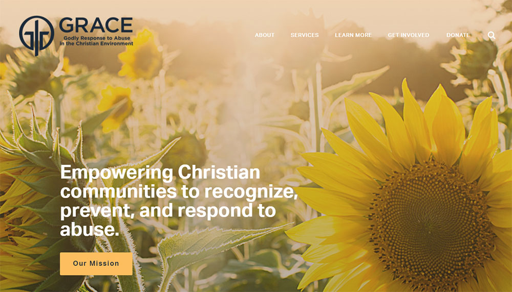
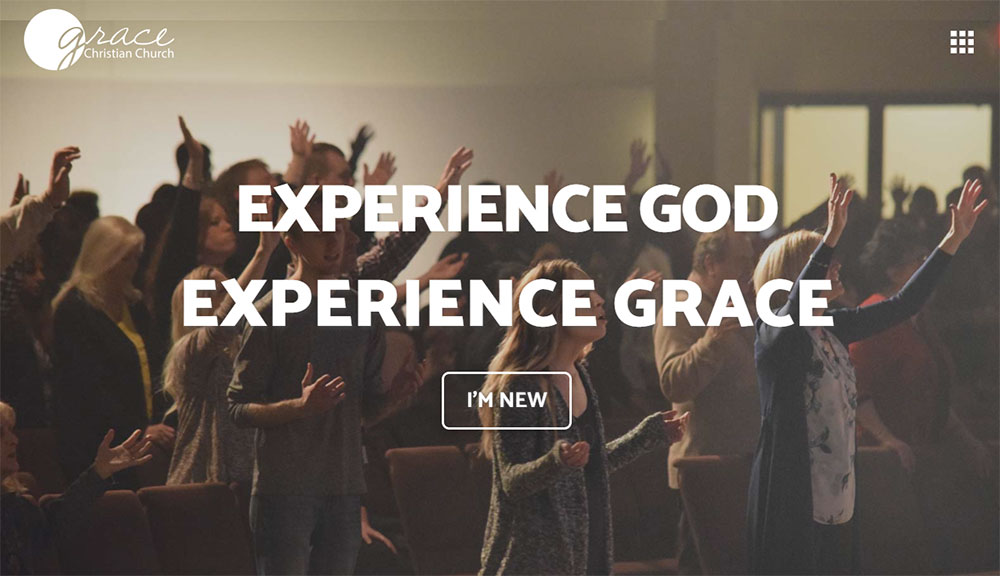
Real photography of your actual congregation, not stock images of smiling strangers.
Pastor and staff bios with genuine photos build credibility faster than mission statements.
A thoughtful color scheme that reflects your community's personality without overwhelming the content.
What Technical Standards Matter Most
- Mobile responsive layout that works on all devices
- Page load time under 3 seconds
- SSL certificate for secure donations
- ADA compliance for accessibility
- Clear website navigation with logical menu structure
Which Church Websites Show Strong Homepage Design
The homepage carries the heaviest burden. It must answer who you are, when you meet, and how to connect.
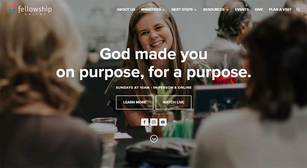
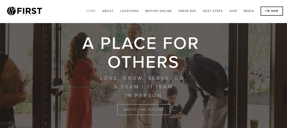
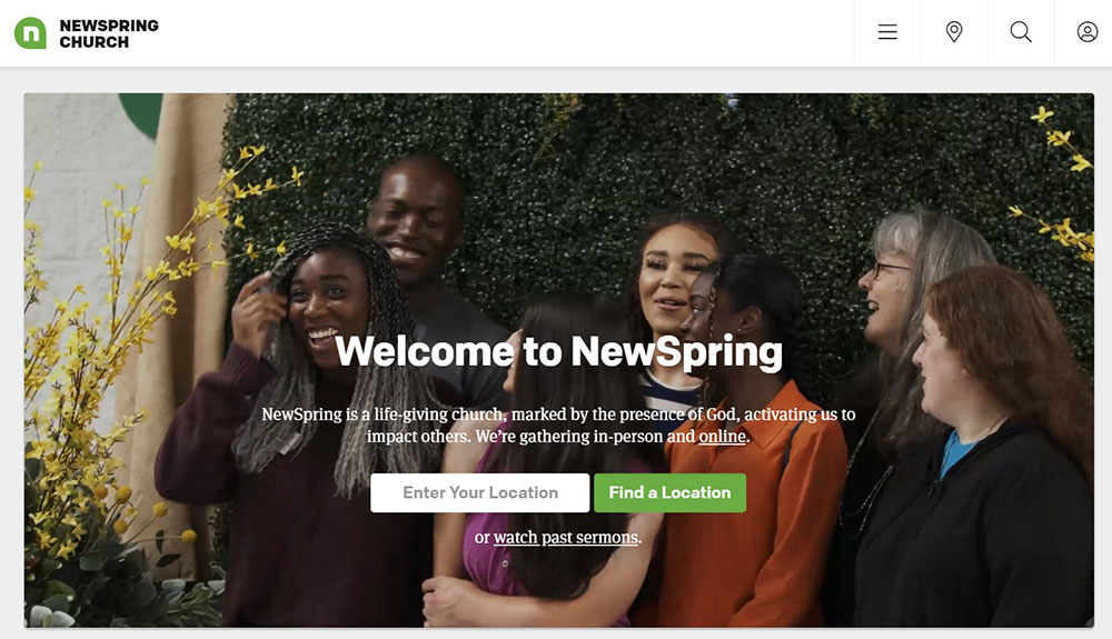
Life.Church Homepage Breakdown
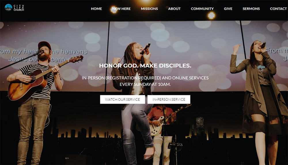
Life.Church uses a full-width video hero section with minimal text overlay. Service times appear immediately below the fold.
The navigation stays simple: Plan a Visit, Watch, Give, Groups. Four options, no confusion.
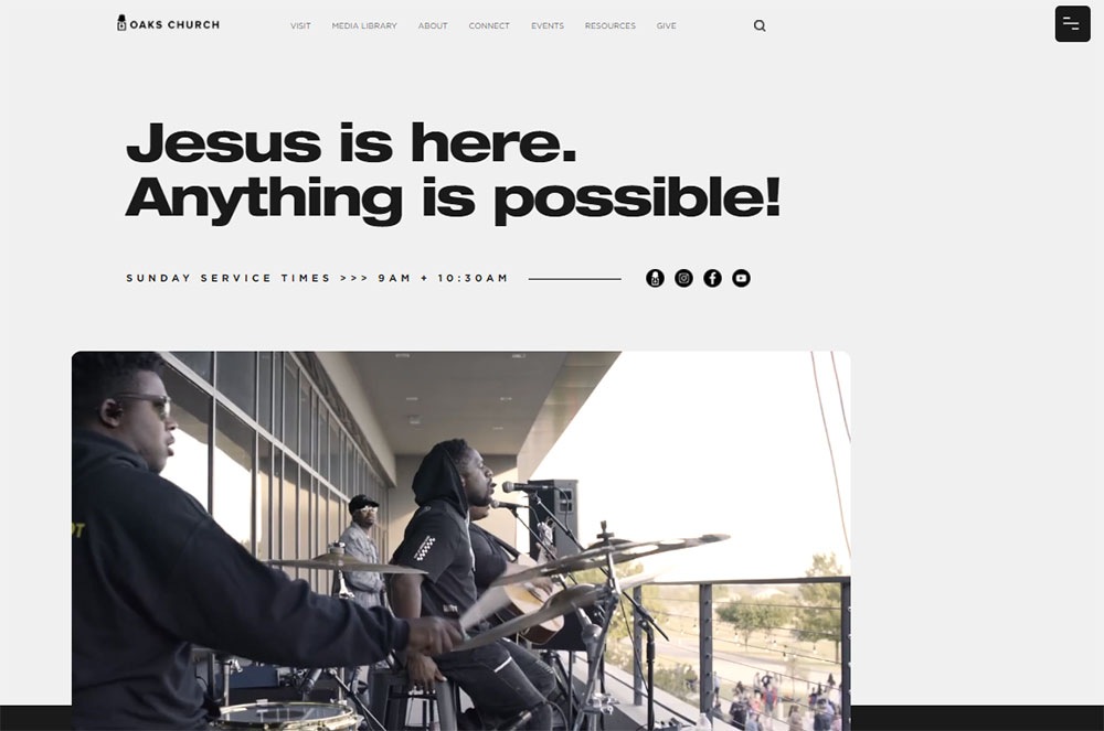
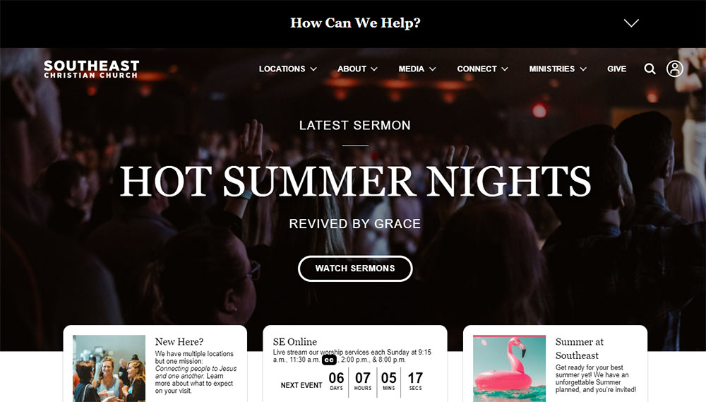
Elevation Church Homepage Approach
Elevation Church leads with their latest sermon prominently featured. The design assumes visitors want content first.
Their homepage uses bold typography and generous white space to prevent visual overwhelm.
Saddleback Church Homepage Structure
Saddleback takes a more traditional approach with clear sections for different audience segments.
Separate pathways for new visitors, members, and those exploring faith. Each group finds their entry point quickly.
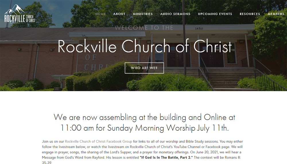
Small Church Homepage Patterns
Smaller congregations often succeed with simpler layouts. A welcoming photo, service times, address, and contact form design that actually works.
No need for mega-church complexity when authenticity serves you better.
Which Church Websites Use Effective Navigation Structure
Navigation makes or breaks the visitor experience. Confused visitors leave.
How Do Mega-Churches Organize Their Menus
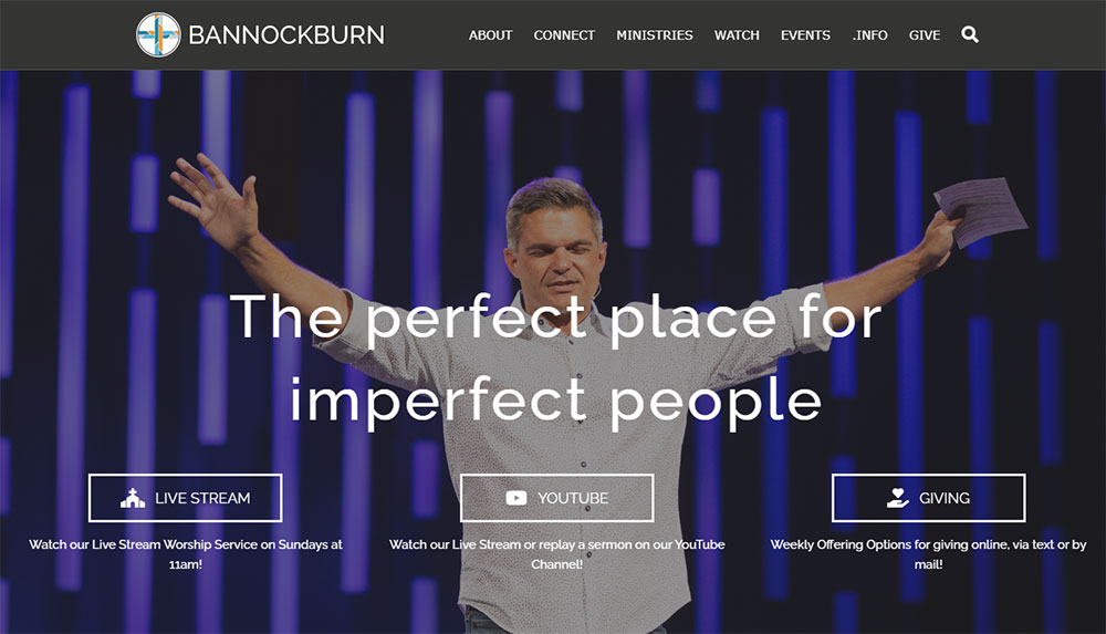
Churches like North Point Community Church and Church of the Highlands use mega menu dropdowns to organize extensive content.
Primary categories typically include: About, Ministries, Sermons, Events, Give, Connect.
What Navigation Works for Smaller Churches
Five to seven main menu items maximum. More than that creates decision paralysis.
Sticky headers help on longer pages, keeping navigation accessible as visitors scroll through sermon archives or ministry descriptions.
How Should Mobile Navigation Differ
Hamburger menus work, but the most critical actions need dedicated buttons.
Watch Live, Give Now, and Plan a Visit deserve permanent spots in your mobile header. These actions drive engagement.
Churches building with mobile first design principles see higher visitor retention and giving completion rates.
Which Church Websites Display Service Information Clearly
Service times should be visible within seconds. No hunting, no clicking through multiple pages.
Above-the-Fold Placement Examples
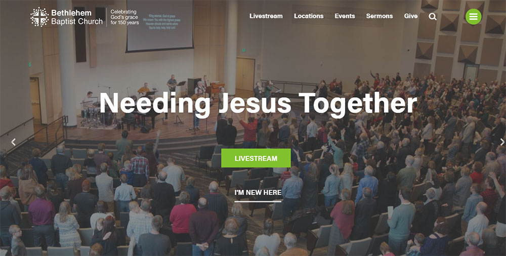
Hillsong Church displays service times directly in their header. Always visible, regardless of which page you land on.
Bethel Church uses a dedicated "Plan Your Visit" button that opens a modal with times, locations, and what to expect.
Multi-Campus Display Solutions
Churches with multiple locations need location-aware displays. Church of the Highlands uses geolocation to suggest the nearest campus first.
Dropdown selectors or interactive maps let visitors choose their preferred location and see relevant service schedules.
What to Expect Sections
First-time visitors want answers: How long is the service? What should I wear? Where do kids go?
Dedicated visitor pages with parking instructions, children's check-in procedures, and worship style descriptions reduce anxiety.
Which Church Websites Have Strong Giving and Donation Pages
Online giving now accounts for the majority of donations at digitally-focused churches.
Tithe.ly Integration Examples
Tithe.ly embeds directly into WordPress and Squarespace sites. Clean interface, multiple payment options, recurring giving setup.
The donate button placement matters. Header placement outperforms footer links significantly.
Pushpay and Planning Center Approaches
Pushpay focuses on mobile-first giving with text-to-give options. Planning Center integrates giving with member management.
Both platforms offer branded giving pages that match your church website design.
Donation Page Best Practices
- Suggested giving amounts reduce decision friction
- Fund designation options (general, missions, building)
- Recurring giving prominently featured
- Security badges visible near payment forms
- Mobile-optimized checkout process
Strong call to action buttons with clear labels like "Give Now" or "Support Our Mission" outperform vague alternatives.
Which Church Websites Showcase Sermon Archives Well
Sermon content drives repeat visits. Members catch up on missed Sundays; visitors preview your teaching style.
Video Player Integration Options
YouTube and Vimeo remain the primary hosting platforms. Both offer free embedding with reliable playback.
Life.Church built their own video platform. Most churches lack those resources, and third-party solutions work fine.
Sermon Organization Systems
Series-based organization helps visitors follow teaching sequences. Filter by speaker, topic, book of the Bible, or date.
Subsplash and Church Community Builder offer built-in sermon management with automatic categorization.
Podcast Feed Integration
Audio-only options expand your reach. Commuters and multitaskers prefer podcast formats.
Automatic RSS feeds push new sermons to Apple Podcasts, Spotify, and Google Podcasts without manual uploads.
Which Church Websites Handle Event Calendars Effectively
Church calendars serve multiple audiences: members tracking small groups, parents finding youth events, newcomers discovering entry points.
Calendar Display Formats
List view works better than grid view for most church sites. Upcoming events in chronological order, filtered by ministry area.
Grid calendars overwhelm when you have dozens of weekly activities across multiple ministries.
Registration System Integration
Planning Center, Church Community Builder, and Faithlife Sites all include event registration.
Capacity limits, waitlists, and automatic confirmation emails reduce administrative burden.
Category Filtering Options
- Youth Ministry events
- Small Groups and Bible Studies
- Worship and Music
- Community Outreach
- Family and Children
Let visitors see only what applies to them. A college student and a senior citizen need different calendar views.
What Design Elements Do Large Church Websites Share
Mega-churches invest heavily in digital presence. Their patterns reveal what works at scale.
Visual Consistency Patterns
Strong brand identity across all pages. Consistent typography, color application, and image treatment create professional cohesion.
Custom photography dominates. Stock images disappear entirely at the enterprise level.
Content Management Approaches
Dedicated web teams update content weekly. Sermon pages go live within hours of Sunday service.
Multi-author workflows with approval processes prevent outdated information from lingering.
Technical Infrastructure
CDN hosting handles traffic spikes during livestream events. Caching layers keep page speeds fast despite media-heavy content.
Custom WordPress builds with Elementor or Divi provide flexibility beyond standard themes.
What Design Elements Do Small Church Websites Share
Budget constraints force simplicity. That simplicity often serves visitors better than complexity.
Template-Based Solutions
Squarespace and Wix templates dominate the small church market. Monthly fees under $20, no developer needed.
Weebly offers drag-and-drop simplicity for volunteer-maintained sites.
Volunteer Maintenance Realities
Content updates happen monthly at best. Design for low-maintenance sustainability.
Evergreen content structure prevents dated appearances when updates slip.
Budget-Friendly Approaches
- Free stock photos from Unsplash
- Google Fonts for typography
- Canva for custom graphics
- Free Tithe.ly giving integration
- YouTube for video hosting
A simple website that stays updated beats an ambitious site that becomes neglected.
How Do Church Websites Approach Mobile Responsiveness
Over 60% of church website traffic comes from mobile devices. Sunday morning searches spike on smartphones.
Responsive Design Essentials
Fluid grids, flexible images, and CSS media queries adapt layouts automatically.
Touch targets need minimum 44px sizing. Tiny buttons frustrate mobile users.
Mobile-Specific Features
Click-to-call phone numbers, tap-to-navigate addresses, and mobile wallet donations reduce friction.
Simplified mobile navigation with prominent action buttons: Watch, Give, Visit.
Testing Across Devices
Chrome DevTools simulates various screen sizes. Real device testing catches issues simulation misses.
Test on older phones too. Not everyone carries the latest iPhone.
What Website Builders Do Churches Use Most
Platform choice depends on budget, technical skill, and feature requirements.
WordPress for Churches
WordPress powers roughly 40% of church websites. Flexibility comes with learning curve and maintenance demands.
Church-specific themes from ThemeForest offer ministry-focused layouts. Plugin ecosystem handles almost any feature need.
Squarespace and Wix Comparison
Squarespace offers cleaner templates with less customization. Wix provides more flexibility with slightly dated aesthetics.
Both include hosting, security, and updates in monthly pricing. No separate maintenance required.
Church-Specific Platforms
- Faithlife Sites: Integrated with Logos Bible Software ecosystem
- Subsplash: Mobile app and website bundle
- Church Community Builder: Website plus member management
- Nucleus: Ministry-focused builder with giving integration
These specialized platforms understand church needs but limit design flexibility compared to general builders.
How Much Does Church Website Design Cost
Costs range from free to $50,000+ depending on approach and complexity.
DIY Template Costs
Squarespace Business plan: $23/month. Wix Unlimited: $16/month. WordPress.com Business: $25/month.
Free options exist through WordPress.com, Wix, and Google Sites with significant limitations.
Professional Design Agency Rates
Custom church website design from agencies runs $3,000 to $15,000 for mid-sized projects.
Mega-church builds with custom features, integrations, and ongoing support can exceed $50,000.
Ongoing Maintenance Expenses
- Domain registration: $12-15/year
- Hosting: $10-50/month
- SSL certificate: Often included, sometimes $50-100/year
- Plugin updates and security: $50-200/month if outsourced
- Content updates: Staff time or contractor fees
Budget for ongoing costs, not just initial build. Websites require continuous attention.
What Accessibility Features Should Church Websites Include
Churches serve everyone, including those with visual, auditory, or motor impairments.
WCAG 2.1 Compliance Basics
Minimum 4.5:1 color contrast ratio for text. Alt text on all images. Keyboard navigation support throughout.
Semantic HTML structure helps screen readers interpret content correctly.
Visual Accessibility Elements
Resizable text without layout breaking. No information conveyed by color alone. Focus indicators visible on interactive elements.
Following accessible website patterns benefits all users, not just those with disabilities.
Audio and Video Accessibility
- Closed captions on all sermon videos
- Transcripts available for audio content
- Audio descriptions for visual-only information
- No auto-playing media with sound
Captioning services like Rev.com or YouTube's auto-captions (with manual correction) make video content accessible.
Testing and Compliance Tools
WAVE browser extension identifies accessibility issues. Google Lighthouse includes accessibility audits.
Screen reader testing with NVDA (free) or VoiceOver (Mac) reveals real user experience.
FAQ on Church Website Design
What makes a good church website design?
A good church website design displays service times immediately, includes clear navigation, offers mobile responsiveness, and integrates online giving.
Real congregation photos, accessible visitor information, and fast page loading complete the foundation for an effective ministry site.
How much does a church website cost?
DIY options using Squarespace or Wix run $15-25 monthly. Custom WordPress builds range from $3,000 to $15,000.
Large church projects with Subsplash or custom development can exceed $50,000 including ongoing maintenance.
Which platform is best for building a church website?
WordPress offers the most flexibility with church-specific themes and plugins. Squarespace provides easier maintenance for smaller congregations.
Church-specific platforms like Faithlife Sites and Subsplash bundle websites with ministry management tools.
What features should every church website include?
Service times, location with map, online giving integration, sermon archives, event calendar, and visitor welcome page.
Contact forms, staff directory, and small group registration enhance member engagement beyond basic functionality.
How do I add online giving to my church website?
Platforms like Tithe.ly, Pushpay, and Planning Center embed directly into most website builders.
WordPress plugins handle integration seamlessly. Squarespace and Wix support donation buttons through third-party payment processors.
Should church websites be mobile responsive?
Yes. Over 60% of church website traffic comes from smartphones. Sunday morning searches happen on mobile devices.
Non-responsive sites lose visitors before they find service times or directions to your location.
What is the best free church website builder?
WordPress.com, Wix, and Google Sites offer free tiers with limitations. Ads may appear, custom domains cost extra.
Free Tithe.ly giving pages work alongside any platform for donation functionality without monthly fees.
How do I display sermon videos effectively?
Host videos on YouTube or Vimeo and embed players on dedicated sermon pages. Organize by series, speaker, or topic.
Add podcast feeds for audio-only listeners who prefer Apple Podcasts or Spotify.
What colors work best for church website design?
Colors should reflect your church brand and community personality. Blues convey trust, greens suggest growth, warm tones feel welcoming.
Maintain sufficient contrast for accessibility. Avoid overwhelming visitors with too many competing colors.
How often should a church website be updated?
Event calendars and sermon pages need weekly updates. Staff changes, service time adjustments, and ministry information require immediate attention.
Design refreshes every 3-5 years keep your digital presence current with visitor expectations.
Conclusion
These church website design examples demonstrate what works across congregations of every size and budget.
The patterns are clear. Visible service times, integrated event calendars, sermon video players, and streamlined donation button placement drive engagement.
Whether you build with Wix, use Church Community Builder, or hire an agency for custom development, the fundamentals remain consistent.
Prioritize your visitor welcome page. Make online giving effortless through Planning Center or similar platforms. Keep your digital church presence updated and mobile-friendly.
Your congregation engagement tools matter less than how you use them.
Start with one improvement this week. Update your service times. Add a pastor bio section. Fix that broken contact form.
Small changes compound into a ministry website that actually serves your community.


