Impressive Animated Websites and Tools to Create Similar Ones
March 23, 2024
Modern website design: How to create a website that looks awesome
March 28, 2024Imagine this: Your website, a canvas just waiting to be transformed into a digital masterpiece. It’s where colors collide, layouts lead, and every pixel plays a pivotal role. In the bustling tapestry of the internet, a well-crafted site is like a beacon in the digital night sky.
Now, let’s paint that picture. Diving into the elements of web design, we’re about to explore the core ingredients that make or break a website’s look, feel, and function.
Think of this as your exclusive map to mastering the visual language that captivates visitors and keeps them clicking.
By the time you reach the end of our digital odyssey, you’ll have unraveled the mystery behind a flawless user interface, decoded the secrets of responsive design, and why a site’s visual hierarchy can be the difference between a one-time visitor and a lifelong customer.
Whether you’re after an aesthetic that enchants or a layout that leads to conversion optimization, the treasure trove of knowledge tucked into this article will equip you with the power to transform any virtual space.
Let’s embark on this journey to ensure that your next web project doesn’t just function, it flourishes.
Purpose and Goal Alignment
When we dive deep into the essentials of a website, we often stumble upon the vital energies that shape its very existence.
It’s not just what meets the eye—those neon buttons or the sleek fades—but the undercurrents, the why behind the website’s very breath and heartbeat. At the core, every website whispers a purpose, hums with goals waiting to burst into fruition.
Defining Website Purpose
Every structure has a foundation. For a website, it’s acknowledging what it’s meant to do. From there, a splendid journey begins.
Understanding Target Audience Needs and Aligning Design with Business Goals step up as the twin pillars supporting each other, bearing the weight of expectations, dreams, and the pragmatism of day-to-day functions.
Understanding Target Audience Needs
Imagine stepping into a room where the walls listen and the air responds to your every need. That’s the kind of environment a website should envelop its visitors in. Thorough research illuminates the user’s desires, pains, and digital footprints.
This knowledge is the compass that guides the navigation structure, ensuring that typography and all elements of web design cater to their taste.
It’s about walking in their shoes, discerning their heartbeat, maybe through clear call-to-action buttons or content hierarchy that sings relevance.
Aligning Design with Business Goals
Now, let’s play with the puzzle pieces of a company’s aspirations, arranging them until they fit the jigsaw of elements of web design.
These pieces are immutable truths, the brand identity that weaves through each pixel and code line.
Imagine color schemes that are not mere spectrums but evoke emotions, branding that arrives at your doorstep with familiarity and warmth. It’s about embedding conversion points elegantly, not like stones that trip, but as stepping-stones that guide.
Setting Measurable Objectives
Objectives are stars guiding ships through the digital night. Setting them involves dangling the carrots of measurement—Conversion Rate Optimization (CRO) is one, Enhancing Brand Awareness is another, each with its own flavor, its unique crunch.
Conversion Rate Optimization (CRO)
Performance indicators in the world of web are often numbers, percentages that twirl on dashboards. But it’s more than graphs—it’s about the visitor’s dance, choreographed by the elements of web design.
From speed optimization reducing wait times to interactive calls to action that prompt immediate responses—it’s an intricate ballet. Every micro-interaction, every hint of typography, every slice of imagery and multimedia is a performer on stage, aiming for the crescendo of a sale, a subscription, a lead.
Enhancing Brand Awareness
Caressing the tendrils of recognition, planting the seeds of remembrance—this is the art of brand awareness.
It’s akin to strolling through the website as though a gallery, with each navigation structure leading you through exhibitions of user interface design and graphics. Responsive layouts whisper the brand’s essence into the user’s consciousness.
These elements of web design merge, blend, and coalesce into an expression of intent—a firm handshake, a steady gaze into the digital future.
Each objective, each target in this kaleidoscope of responsive design, mobile optimization, and more, pulses with the purpose of aligning the thrum of the website’s heart with the rhythm of business success.
Usability and User Experience
Capturing the essence of a website goes beyond the mere visuals, it’s the feeling of empowerment and ease that users breathe in as they navigate. It’s this seamless flow, this intuitive dance between visitor and digital landscape, that truly shapes the soul of a site.
Navigation Structure
Simplifying Site Navigation – it’s like being the ultimate host at a grand party. Setting up signposts, laying crumb trails, creating a space where getting lost is pleasantly impossible.
Easy, fluid, it’s creating a clear path for even the most directionally challenged visitor. No clutter, no confusion, just a smooth stroll through a digital garden that feels like second nature.
The Impact on User Retention and Engagement – if visitors stick around, revel in the space created just for them, that’s when the magic happens. It’s like igniting a spark that keeps burning, keeps them coming back for more because here, in this crafted corner of the internet, they’ve found their comfy couch, their nook.
They stay, they play, they engage – it’s the silent applause for every well-thought-out user interface design plucked from the elements of web design.
Mobile Optimization
Importance of Responsive Design – in the palms of hands, the world unfolds, one swipe at a time. Sizes vary, from the smallest screens to the largest panels, and here lies the challenge: sculpting a website that gracefully stretches and shrinks, maintaining its poise no matter where it stands.
It’s crucial, it’s the now and the future, it’s molding the user experience to fit within the contours of our handheld realities.
Mobile-First Approach in Modern Web Design – begin where the pulse is strongest. The mobile wave isn’t cresting; it’s rolling, strong and steady, and to ride it is to start at its core.
A mobile-first design whispers of foresight, of understanding the tides. It’s shaping content, site architecture, and user interface elements to slip effortlessly into the stream of daily life, always within thumb’s reach.
Speed Optimization
Effects of Load Times on User Satisfaction – time is the currency of the digital age. Pennies of seconds, the ticking clock, weigh heavy on a visitor’s heart.
Quicken the pace, make pages fly open like birds set free, and watch as satisfaction soars. Greet with speed; it’s the silent music that plays between the clicks, the waits, and the reveals.
Strategies for Efficient Site Performance – juggling web design trends, bold images, and the wisps of animations while keeping a site light on its feet requires a maestro’s touch.
It’s in selecting the right web hosting, in compressing images without a sigh of pixel loss, in the coding standards that make browsers sing.
Swift, smart, it’s trimming the fat so the essence of all elements of web design sprints forward, unencumbered by the drag of digital excess.
This interplay between expressiveness and efficiency, between the welcoming arms of a site and the brisk snap of its performance, molds the journey of every traveler through the terrains of the digital world.
It’s a crafted, conscious celebration of connection, of drawing every dot and line in the portrait of elements of web design to resonate, to serve, to empower.
Aesthetic Elements and Visual Design
In the whirlwind of pixels and palettes, each shade, each curve holds meaning. Picture a canvas where every stroke contributes to a larger narrative—a narrative that echoes the essence of a brand, weaving through the elements of web design with the finesse of a painter lost in their art.
Color Theory and Branding
Psychology of Color in Web Design
Step into a world where colors speak louder than words.
Here, hues aren’t just splashes on a screen; they’re whispers of emotion, tugging at the heartstrings, commanding attention, painting moods.
They’re meticulously chosen, not just for beauty but for their ability to communicate. It’s about picking that perfect blue that calms, that vibrant red that energizes—a palette that speaks the brand’s language.
Consistency with Brand Identity
Colors are loyal companions to a brand’s soul, echoing its spirit across every digital corner. They stand guard, ensuring recognition, breeding familiarity.
When a visitor lands, greeted by that signature shade, they’re cloaked in a comforting blanket of brand identity. It’s the silent nod, the “you’re in the right place,” made not with words, but with consistent, thoughtful color choices woven through the entire tapestry of elements of web design.
Typography and Readability
Choosing the Right Font Types
A different kind of artistry emerges in the realm of letters—a ballet of serifs and sans-serifs, each pirouetting on the stage of readability.
Selecting fonts is a balance of emotion and clarity; a play of personalities. It’s finding that distinct voice that speaks clearly, not just to the eyes, but to the heart, ensuring each word, each sentence lands with grace and purpose.
Ensuring Accessibility and Legibility
Open the doors — let the light of accessibility shine through every line of text. Crafting web content so it can be consumed by all is not an afterthought; it’s a proclamation, a commitment to inclusivity where legibility reigns supreme.
It’s about striking the perfect size, the ideal spacing, ensuring a seamless experience regardless of ability, device, or situation, for each and every one who encounters the elements of web design.
Imagery and Multimedia
Role of High-Quality Visuals
Envision a gallery within the digital landscape. This is a place where imagery doesn’t just exist; it speaks, tells stories, encapsulates moments.
High-quality visuals are the messengers of a brand’s narrative, delivering experiences that words alone cannot.
They’re chosen with a discerning eye, ensuring each photograph, illustration, or video complements the symphony of elements of web design.
Balancing Engagement with Page Load Speed
Yet, in the gallery of the web, the beauty of imagery must harmonize with the melody of speed. It’s a performance, juggling stunning visuals with the swift beat of loading times.
It’s in the technical grace of image optimization, the behind-the-scene tweaks, and compression, that maintains visual eloquence without burdening the lightning feet of page performance. It’s the equilibrium, the perfect blend, ensuring a dance where neither footsteps nor the audience’s breath are ever out of sync.
Interaction and Dynamic Elements
Imagine a world where every click, every scroll tells a story. It’s an adventure laced with the expectation, where the silent conversation between a soul and a screen becomes a journey of discovery.
In this tale of interaction, every movement is a melody, and the elements of web design are the notes that make the music dance.
Engaging Users with Interactive Design
When hands reach out to screens, it’s the unseen waltz of interactivity that beckons. It’s the sparkle of motion that catches the eye, drawing visitors down rabbit holes of engagement.
Memorable moments are born in the subtleties of hover effects, the small surprises that bloom when they’re least expected—a button changing color, a menu unveiling itself like a treasure map. This is where storytelling unfolds without a single word being uttered.
Use of Animations and Micro-interactions
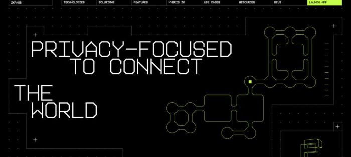
Softly, the visuals pulse, elements glide into view with an effortless grace. Lively animations and playful micro-interactions: they’re the winks, the knowing smiles of a site.
These are the sparks in the realm of elements of web design that transform the mundane into something magnetic, sticky, holding attention like a subtle magnet. It’s about knowing when to animate a graph, when to infuse life into a loading icon, making the wait almost as delightful as the reveal.
Risks of Overuse and User Overwhelm
Yet, flashing lights and dancing graphics are a cacophony when overdone. It’s vital to not let the zest of dynamism drown the melody of simplicity.
Too much sugar spoils the brew, and so does an excessive serving of interactivity. There’s a thin line between enchantment and exhaustion, and the trick is to tiptoe on it gracefully—too many leaps, and the charm plummets into chaos.
Calls to Action (CTAs)
Compel, don’t repel; invite, don’t demand. The digital world’s magic lies in choice, and the most potent of selections hinge on the tactful art of calls to action. It’s the open doorway beckoning, the unforced choice that feels like a natural next step.
Designing Effective CTAs
Craft CTAs like a jeweler sets stones—each one placed with precision, drawing the eye, the cursor, the touch
. It’s integrating the magnetic force of words with the push and pull of colors and shapes. A button, a phrase, sculpted to resonate, to spark action as naturally as sunrise beckons the day.
It’s the punctuation in the paragraph, the climax in the narrative of elements of web design.
Placement and Visibility for Maximum Conversion
Not hidden in shadows, not shrouded in mystery, but dipped in the light of visibility. It’s balancing prominence and subtlety, learning where the eye roams, where the heart follows.
Thoughtful placement isn’t just about being seen—it’s about being discovered at just the right moment when the whisper of need hums loudly enough to beckon a click, a tap, a touch. It’s finding the sweet spot on each page where intention and opportunity intertwine to form the perfect union, the hoped-for “yes.”
Accessibility and Inclusion
Picture this: a space where every visitor, regardless of how they interact or perceive the world, finds a path tailored just for them. It’s a haven constructed with compassion at its core, where the elements of web design elegantly conjoin to embrace each unique individual.
In this realm, we’re all guests of honor, and the digital stage is set to celebrate our collective diversity.
Designing for All Users
Importance of Web Accessibility
Dive into the deep blue of the internet ocean, and there, find a trove that’s reachable by everyone. It’s this concept of web accessibility that guides the hands to chisel doorways instead of walls.
Tapping into web content accessibility guidelines and responsive design principles, it’s carving out a user experience where the keys to navigation fit every hand, sight, and sound. It’s an embrace of inclusivity, where user experience (UX) isn’t just for the few but for the complete spectrum of humanity.
Implementing ARIA and Accessibility Best Practices
Lend an ear to the whispers of best practices; they chatter among themselves, sharing secrets of a web that speaks with clarity to screen readers, that sing sign language with visual cues. Use ARIA—Accessible Rich Internet Applications—to articulate the silent yet significant elements of web design.
It’s like adding subtitles to a silent film, like scripting an audio description for a painting—it’s bringing the digital symphony to those who experience the world differently.
Cultural Sensitivity and Global Reach
Adapting Content for Diverse Audiences
Imagine the globe, spun on the finger, countries blurring into a single, vibrant mosaic. Each piece of this puzzle thrums with history, culture, and voice. Adapting content isn’t just about translation—it’s the delicate art of cultural resonance.
It’s tailoring the elements of web design to speak in tongues that feel like home, that echo the local lingo, that resonate with idioms and gestures known and loved.
Language and Localization Strategies
Think of the web as a marketplace that spans the planet, where each stall brims with the fragrance of the local soil. Language and localization strategies are the maps that guide visitors through this bazaar, signage that whispers “welcome” in a hundred dialects.
Infuse search engine optimization (SEO) with the local zest, sprinkle keywords that charm both the universal and the particular. It’s more than a word here or a currency switch there; it’s the crafting of an experience that honors the locale while cherishing the universal mosaic that is the internet.
FAQ On Elements Of Web Design
What’s the role of color in web design?
Colors aren’t just pretty; they’re communicators. They set the mood, influence emotions, and signal actions, like the bold red of a ‘Buy Now’ button. Choose your palette wisely to match your brand’s voice and improve user engagement.
How important is typography on a website?
Typography is a silent ambassador of your brand. Get it wrong, and it’s a visual hiccup. Get it right, and it guides users with ease, enhances readability, and maintains visual hierarchy on your page.
Can web design affect SEO?
Absolutely. Google adores websites that users love. Think mobile-friendly layouts, quick loading times, and intuitive navigation. Such responsive design isn’t just about looks, it’s about being found.
What does ‘responsive design’ truly mean?
Responsive design is the backbone of a universal web experience. It means your site looks great and works flawlessly, whether it’s on a desktop or a smartphone. It’s essential for reaching a wider audience and crucial for good UX.
Why is user experience (UX) critical in web design?
UX is like a great host at a party. It makes visitors feel welcome, guides them, and ensures they have a good time. Stellar UX leads to happier visitors, and that means more return visits and better conversion rates.
What makes a website’s layout effective?
A solid layout isn’t just about good looks. It’s about order and function. It should lead the eye naturally, prioritize important content, and promote easy navigation. This blend is the secret to a user-friendly interface.
How does website speed impact user engagement?
Speed is a silent killer of interest. Slow load times test patience and often send users straight to your competitors. Quick loading is key for user retention and overall experience.
What are the best practices for mobile web design?
With mobiles everywhere, best practices include a mobile-first approach, touchscreen-friendly navigation, and fast loading elements. It’s about making every smartphone user’s visit a breeze.
How does image optimization enhance web design?
Optimized images hit a sweet spot between quality and loading speed. They boost page performance and user engagement without weighing down the site. It’s visual appeal without the lag.
What’s the significance of white space in web design?
White space isn’t empty space, it’s a powerful design element. It breaks up clutter, highlights important content, and creates balance on a page. Used smartly, white space is a pause that gives viewers a break to understand and appreciate your content.
Conclusion
Let’s reel it back. We’ve navigated the spectrum, from color theories whispering brand stories to typography serenading our eyes through every sentence.
The goal? Crafting an immersive digital landscape where each element, each pixel, carries its weight, marrying form and function in a seamless user interface. It’s about stoking those fires of user engagement, where every navigation menu and call-to-action is a stepping stone in a journey, one that leads to destinations filled with conversions and echo with return visits.
- Incorporating responsive design matters, more than ever before. It’s the digital glue that connects us across a constellation of devices.
- Optimized images and strategic white space? They’re the silent ballerinas — graceful, powerful, and pivotal.
So, what have we learned? Each detail, from hover effects to grid systems, folds into a greater narrative. One where elements of web design harmonize to create experiences, not just web pages. Let’s not just design—let’s inspire.
If you liked this article about Elements of Web Design , you should also check out this one about the best veterinarian websites.
We also have similar articles about doctor websites, retail websites, mortgage websites, landscaping websites, agriculture websites, electrician websites, healthcare websites, and house painters websites.
Yep! We really like websites, especially when we build them with BeTheme and the BeBuilder.

