Examples of Websites with Good UX
January 21, 2025
Examples of Websites with Bad Design
January 27, 2025A call to action button is more than a simple clickable element; it’s the gateway to your website's conversion goals. Your landing page, promotional email, or signup form can make or break your user’s decision-making process, turning mere visitors into loyal customers.
With the right color, text, and placement, CTA buttons can significantly enhance user experience and drive conversions.
In this article, I will showcase various call to action button examples featuring designs, styles, and templates that have proven to be effective.
We’ll explore how user experience principles and conversion rate optimization techniques can be applied to create engaging CTA buttons.
From typography tips to optimal button shapes and colors, let’s cover all aspects of designing powerful CTA buttons that compel action. By the end, you'll be equipped to boost your conversion funnel and improve your click-through rate.
Call To Action Button Examples
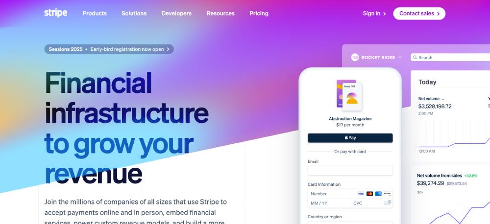
Stripe
Stripe features sleek, easy-to-find call-to-action buttons that drive user conversion. The buttons stand out visually and provide clear, actionable next steps for customers. Their clean design, aligned with conversion optimization principles, makes it easy for users to sign up or learn more.
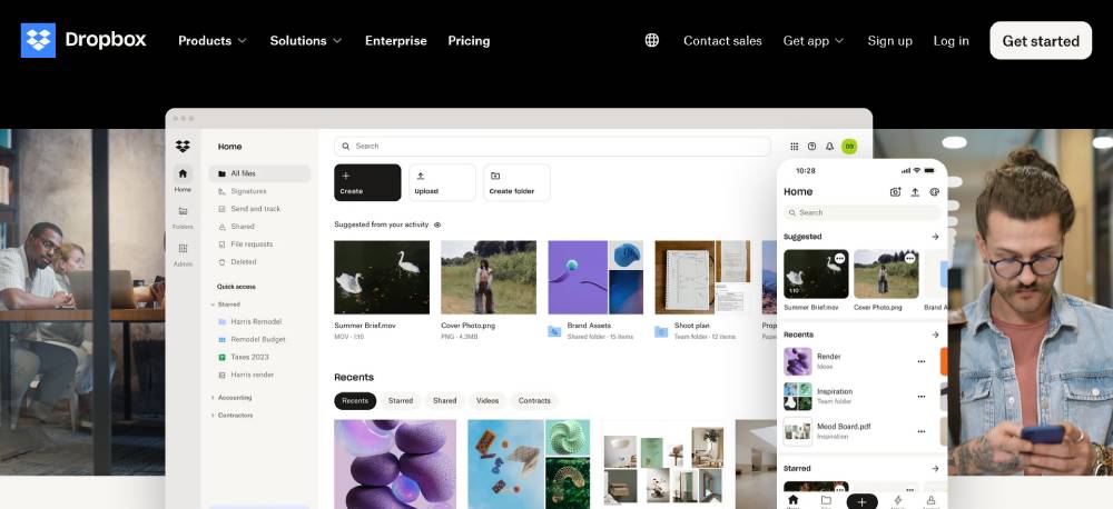
Dropbox
Dropbox employs persuasive design techniques to make their call-to-action buttons prominent and highly visible. The buttons use strong action words, encouraging immediate interaction and promoting an easy sign-up process. Coupled with effective use of whitespace, they drive user conversion effectively.
Slack
Slack’s website integrates compelling call-to-action buttons that facilitate user engagement with minimal friction. The buttons are strategically placed and designed to stand out without disrupting the overall interface. This is a textbook example of leveraging color psychology and button text to boost click-through rates.
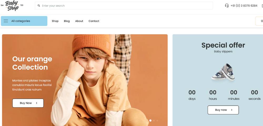
Be BabyShop 2
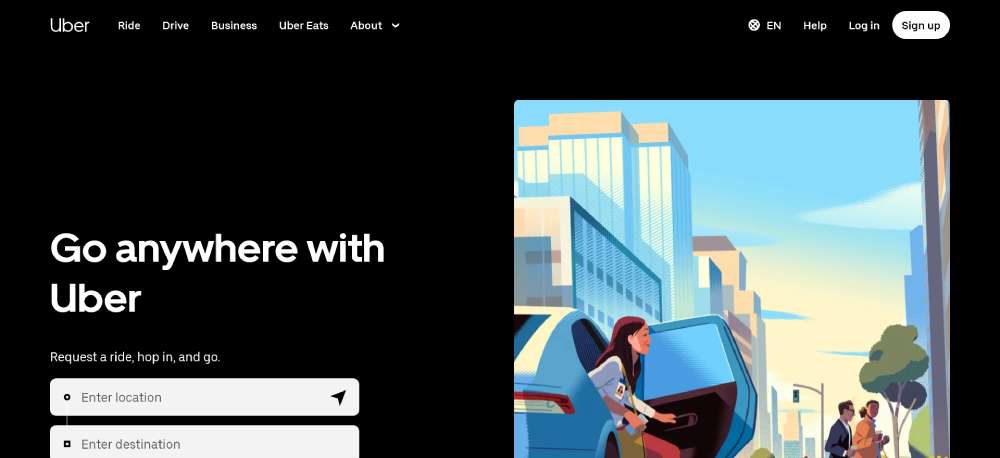
Uber
Uber's site excels at using call-to-action buttons that are methodically tested for the highest conversion rates. The buttons are prominently displayed and entice users to take action immediately, whether it's signing up as a rider or driver. Their placement and design are optimized for both desktop and mobile users.
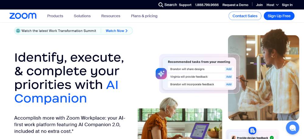
Zoom
Zoom’s call-to-action buttons are designed to meet specific user needs, driving high conversion rates through clear, concise language and strategic placement. These buttons are optimized for quick access and immediate action, making the sign-up and start meeting processes seamless.
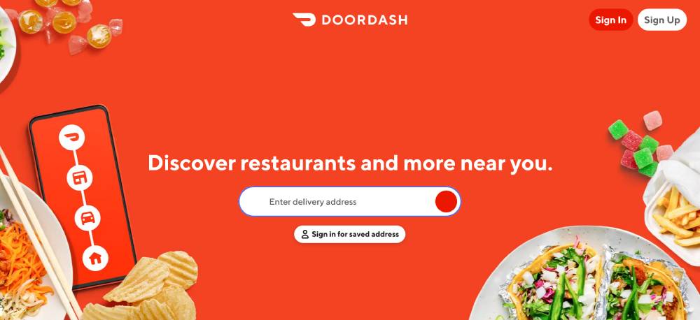
DoorDash
DoorDash’s call-to-action buttons are not just visually appealing but also expertly engineered to optimize the user journey from landing page to purchase. The strategic use of color and text elevates the overall user experience, enhancing engagement and driving sales.
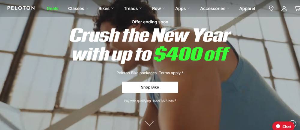
Peloton
Peloton integrates visually striking call-to-action buttons that are crucial for user navigation and conversion. Each button is positioned to guide users effortlessly through product exploration and sign-up, backed by a strong aesthetic that aligns with their brand’s innovation and fitness focus.
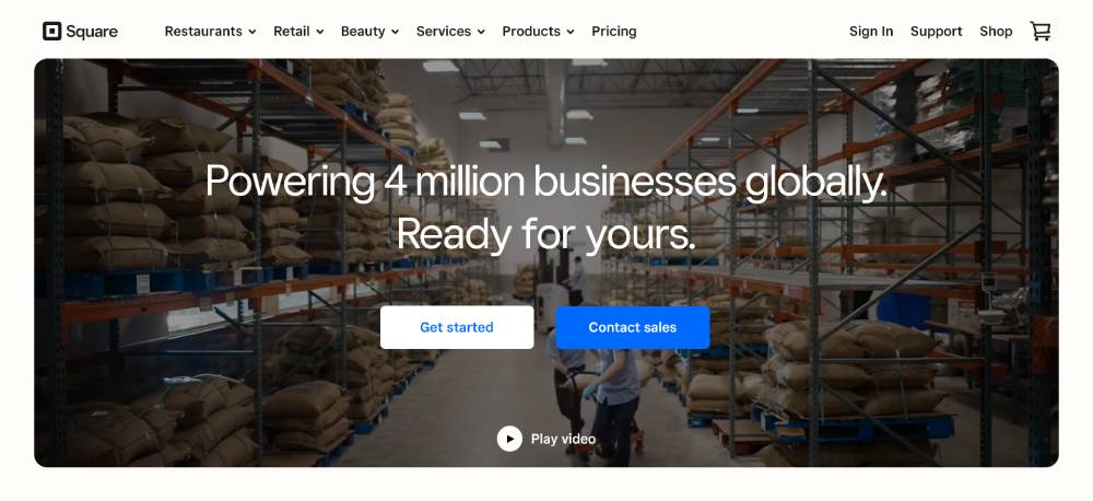
Square
Square uses call-to-action buttons that blend seamlessly with its minimalist design while still capturing user attention. These buttons are thoughtfully placed to lead visitors through product information and purchase processes cleanly and effectively.
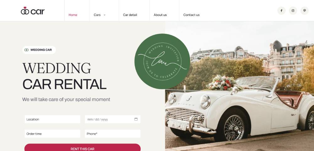
Be Wedding Car
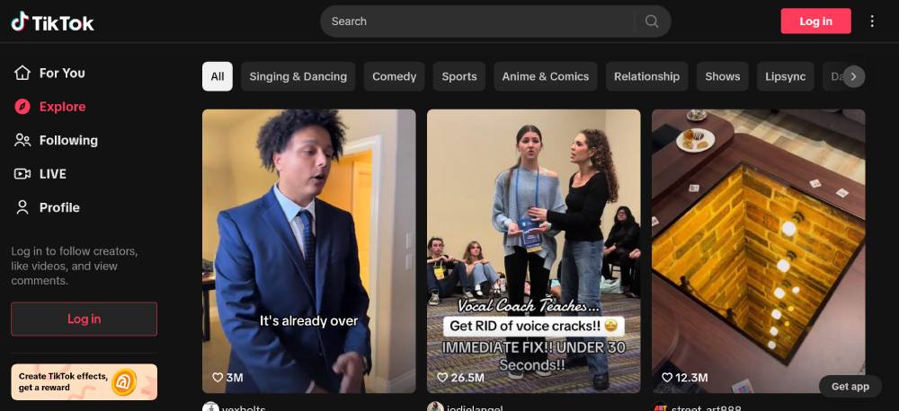
TikTok
TikTok features call-to-action buttons that are strategically integrated into the vibrant visual layout of the site. These buttons use direct language to guide users towards downloading the app, promoting videos, or engaging with content, maximizing click-through rates.
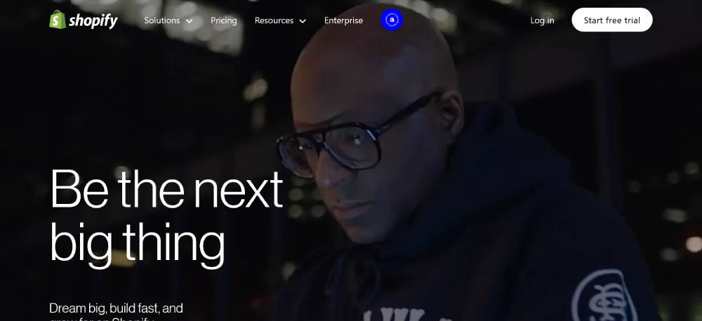
Shopify
Shopify’s site uses compelling call-to-action buttons that encourage immediate interaction, whether starting a free trial or exploring solutions. The buttons stand out with vibrant colors and direct language, facilitating a smooth user experience from discovery to conversion.
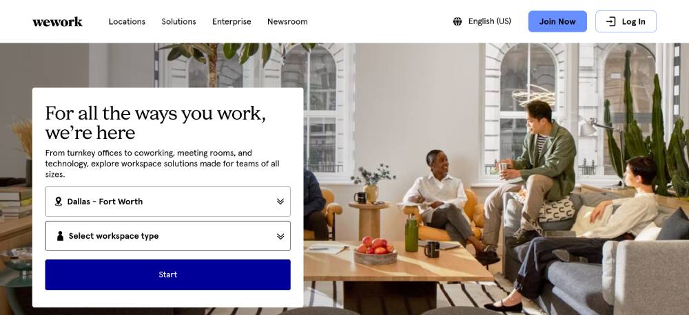
WeWork
WeWork’s call-to-action buttons are designed for maximum engagement, using a blend of strategic placement and appealing design. The buttons guide potential customers through workspace options and tour bookings, enhancing the overall user journey and driving higher conversion rates.
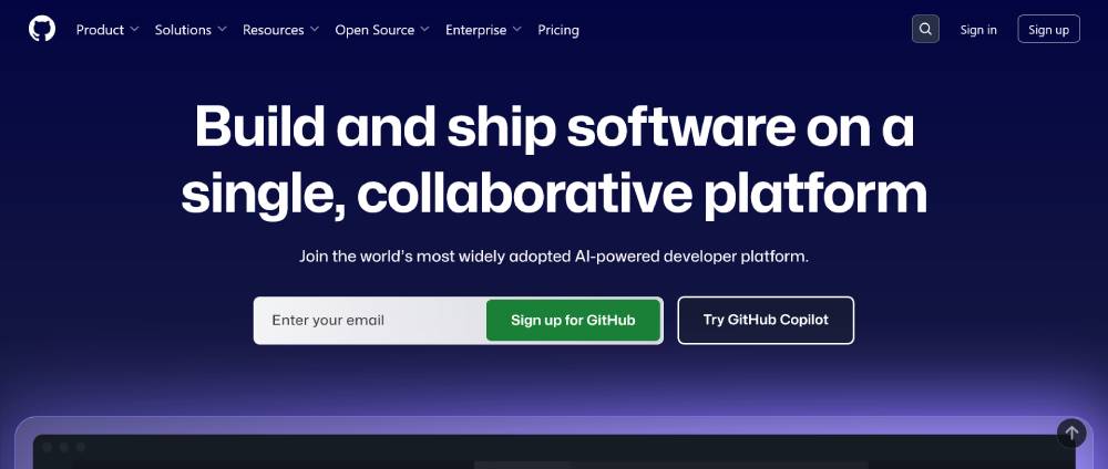
GitHub
GitHub’s call-to-action buttons are optimized for developers, featuring clear, action-driven text and standout design. The buttons are strategically placed within the layout, ensuring ease of use and quick navigation through repositories, sign-ups, and collaborations.
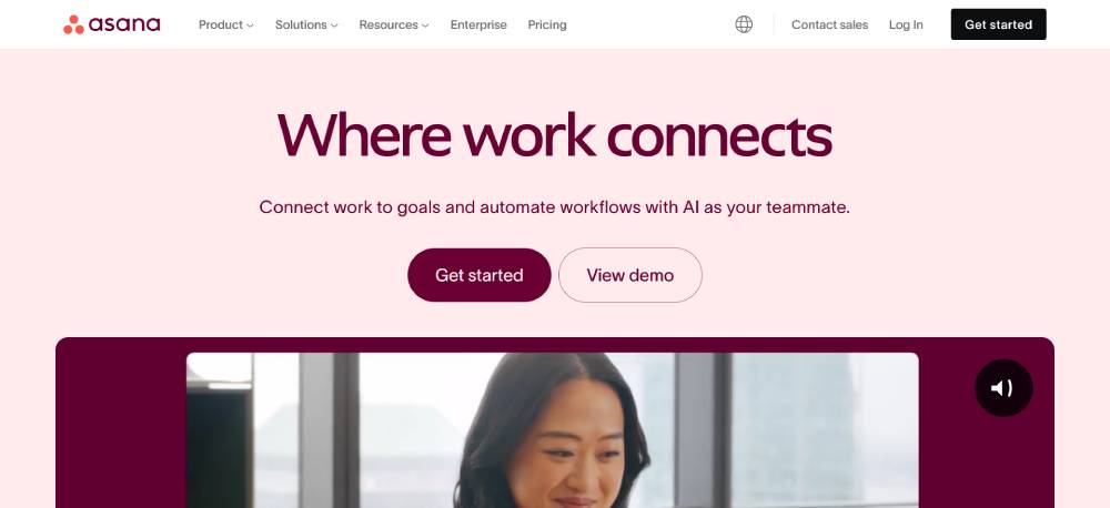
Asana
Asana’s call-to-action buttons employ effective color contrast and clear communication, driving users to take immediate action. These buttons are seamlessly integrated into the layout, promoting high engagement and smooth navigation for project management solutions.
Be Estate 4
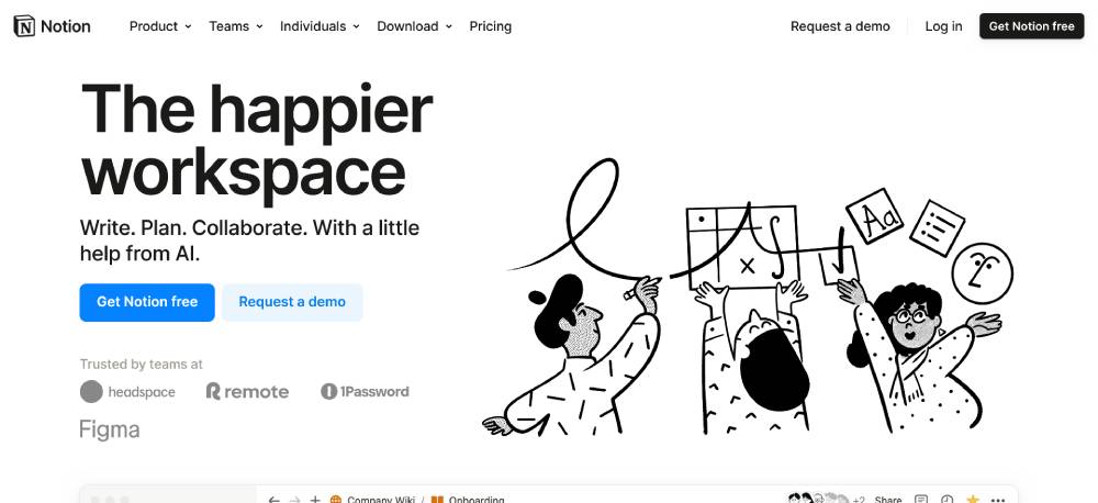
Notion
Notion’s website uses understated yet highly effective call-to-action buttons that promote ease of engagement. The buttons are designed with user-centric language and superior visual hierarchy, making navigation intuitive while enhancing the overall user experience.
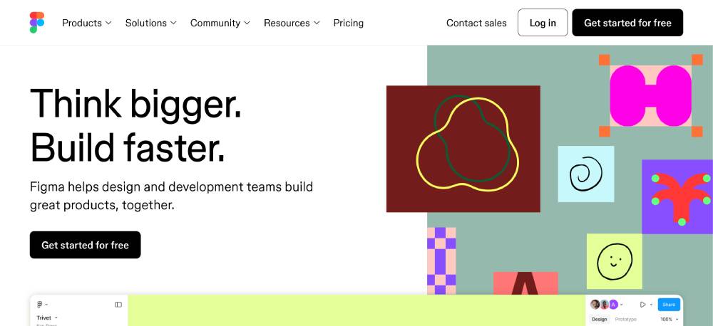
Figma
Figma places its call-to-action buttons in key positions throughout the site, ensuring maximum visibility and user engagement. Each button uses compelling text and vibrant colors, facilitating easy sign-ups and tool exploration, making it an example of great web interactivity.
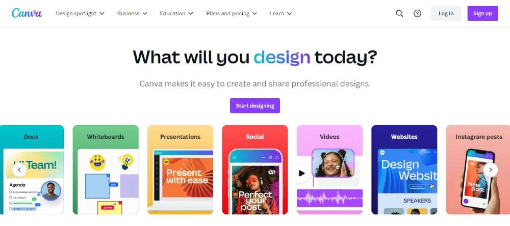
Canva
Canva’s call-to-action buttons stand out due to their high visibility and user-friendly design. These buttons employ straightforward text and strategic placement, guiding users effortlessly through design creation and app engagement, enhancing user experience and conversion.
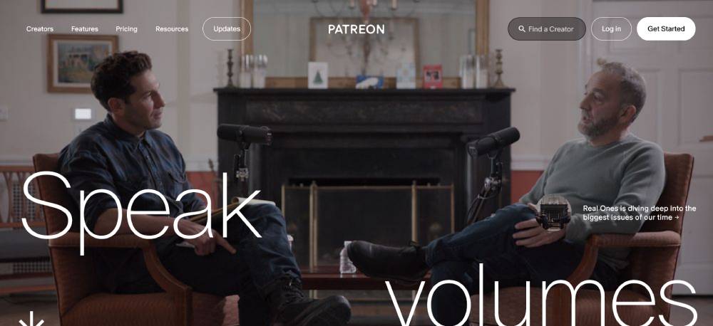
Patreon
Patreon’s call-to-action buttons integrate seamlessly into its layout, promoting easy user interaction with creators. The buttons use persuasive language and eye-catching colors to drive immediate actions, whether it's supporting a creator or learning more about the platform.
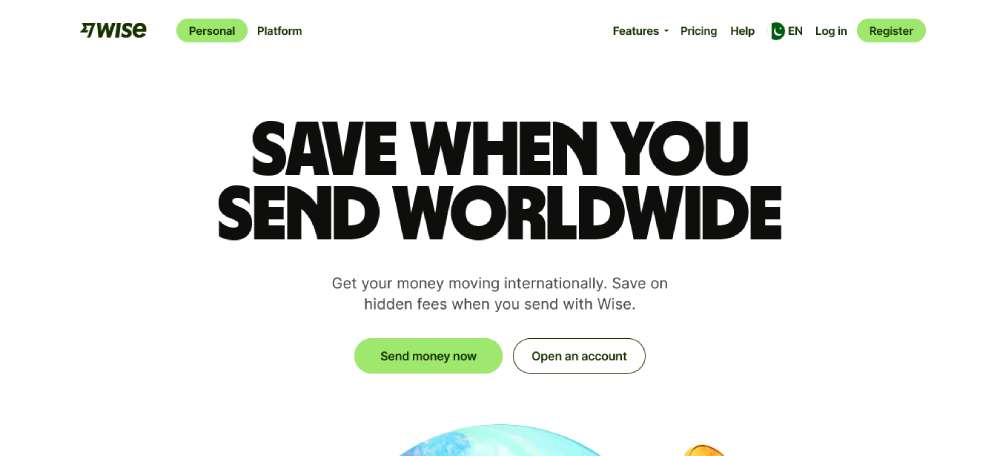
TransferWise (Wise)
Wise incorporates call-to-action buttons that are both functional and aesthetically pleasing. The buttons emphasize quick action, promoting ease of use for international money transfers and maintaining a seamless user experience with effective color and placement.
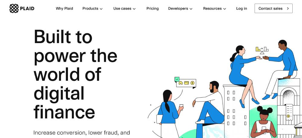
Plaid
Plaid’s call-to-action buttons are designed to foster user engagement through strategic placement and compelling text. The buttons effectively guide users through financial technology solutions, ensuring clear navigation and high interaction rates.
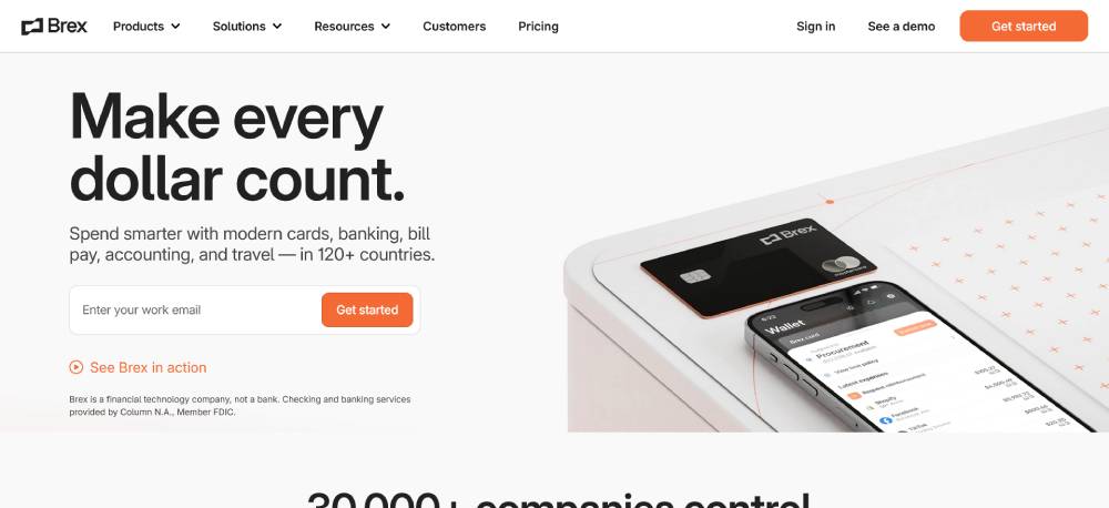
Brex
Brex’s site features high-impact call-to-action buttons that drive immediate user action. These buttons stand out with vibrant colors and clear text, promoting an easy sign-up process and seamless navigation through financial management tools.
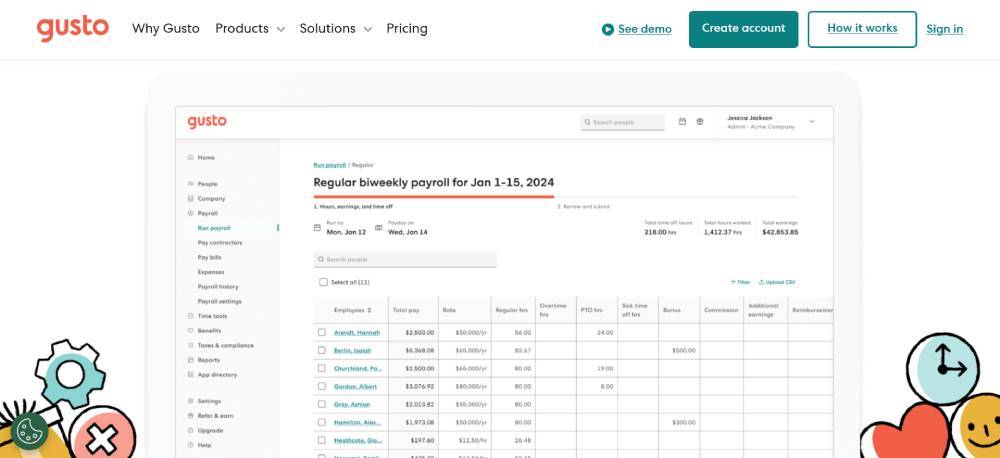
Gusto
Gusto’s call-to-action buttons are tailored for high conversion rates, featuring precise, actionable text and contrasting colors. These buttons are strategically placed to guide users through payroll and HR solutions effortlessly, enhancing user interaction and engagement.
FAQ on Call To Action Buttons
What constitutes an effective call to action button example?
An effective call to action button is clear, concise, and compelling. It uses action-oriented language like "Get Started" or "Sign Up Now."
The design must stand out—bright colors and readable text. Good examples often involve A/B testing through tools like Optimizely to refine their effectiveness.
How does button color influence user behavior?
Color significantly impacts user behavior. Bright colors like orange or green often yield higher conversion rates. However, it depends on your site’s color scheme and audience preference.
Utilizing tools like Crazy Egg can help analyze which colors perform best for your gateway button.
What are the best practices for CTA button placement?
Place it where it grabs attention without disrupting the content flow. Above the fold is popular, but scattered CTAs within long content also work. Test placements using Google Analytics or Hotjar for optimal results and to track click-through rates.
How can I make my CTA buttons more engaging?
Make them visually appealing and interactive. Use shadow effects and animations. Add persuasive text—focus on benefits, not features.
Combine with user experience principles and understand your audience's behavior for maximum engagement through tools like HubSpot.
Are there standard sizes for optimal CTA buttons?
There's no universal size. Ensure it's large enough to tap, especially on mobile. Width typically spans 1/3 to 1/2 of the screen. Use responsive design tools like Sketch for precise adjustments. A/B test sizes to see what works best for your audience.
How important is the wording of a CTA button?
Wording is crucial. Use strong, clear, and urgent language. Avoid generic labels like "Click Here." Test different verbs and phrases with Unbounce or Leadpages to find what resonates. Action words and benefit-oriented text often perform best.
Can images or icons enhance CTA buttons?
Yes, images and icons can increase visibility and comprehension. A small icon can make a button more intuitively understandable. Use relevant visual cues but avoid clutter. Adobe XD can help design buttons with integrated visual elements seamlessly.
How should I integrate CTA buttons into emails?
Embed them naturally within your email content. Ensure they contrast with the background but match your overall branding.
Use persuasive text and clear instructions. Mailchimp can help design and test CTA buttons specifically for email campaigns.
Do different shapes of CTA buttons affect conversions?
Button shape affects user perception and behavior. Rounded corners generally perform better than sharp edges, offering a more approachable feel.
Design tools like Canva allow you to experiment with various shapes and analyze which yield the best conversion rates.
What role does A/B testing play in optimizing CTA buttons?
A/B testing is vital for understanding user preferences and behaviors. It involves comparing two versions of a CTA—different text, color, or placement.
Tools like Optimizely and Crazy Egg provide insights, helping refine and enhance your call to action button effectiveness.
Conclusion
Call to action button examples we've explored offer a roadmap to enhancing user engagement and conversion rates. Effective CTA buttons are clear, concise, and visually compelling. Implement tools like Google Analytics and Hotjar to track performance. Think about button color theory and ensure placement is not only visible but strategic.
By integrating principles from user experience and conversion funnel strategies, you can optimize buttons for higher click-through rates. A/B testing with platforms like Optimizely or Unbounce will refine your approach, optimizing design for different audiences. Adapt and test continuously.
Remember, each element—color, wording, placement—contributes to success. Use tools like Crazy Egg for heatmap analyses and always prioritize. Use compelling action words and make your button shapes intuitive.
By applying these tactics, your CTAs will effectively convert visitors, driving measurable results.
If you enjoyed reading this article on call to action buttons, you should check out this one about accessible websites examples.
We also wrote about a few related subjects like the best looking tourism websites, hotel website design, product landing page, great looking spa websites, cool looking personal trainer websites, top notch musician websites, the most impressive luxury websites and impressive animated websites.

