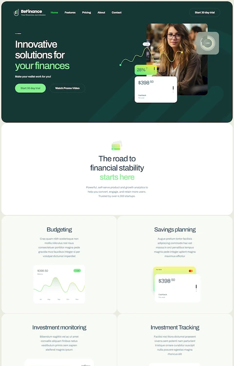
Top Examples of Sports Website Templates
October 19, 2025
Parallax Scrolling Website Design Examples That Wow
October 20, 2025Your cleaning service might be spotless, but your website? That's what potential customers judge first.
A poorly designed site sends visitors straight to your competitors.
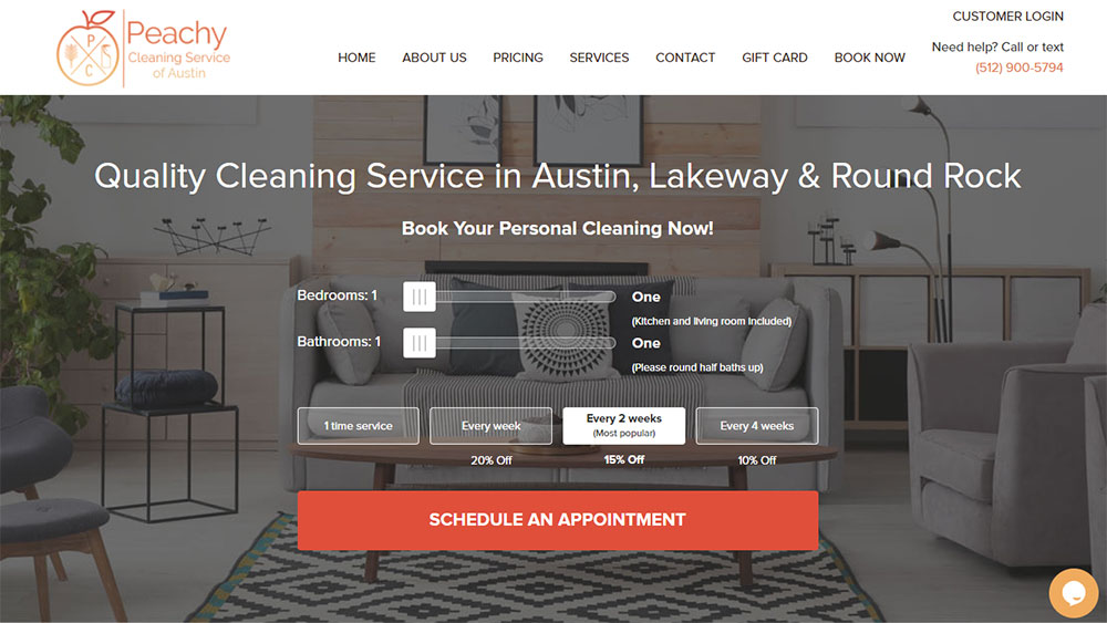
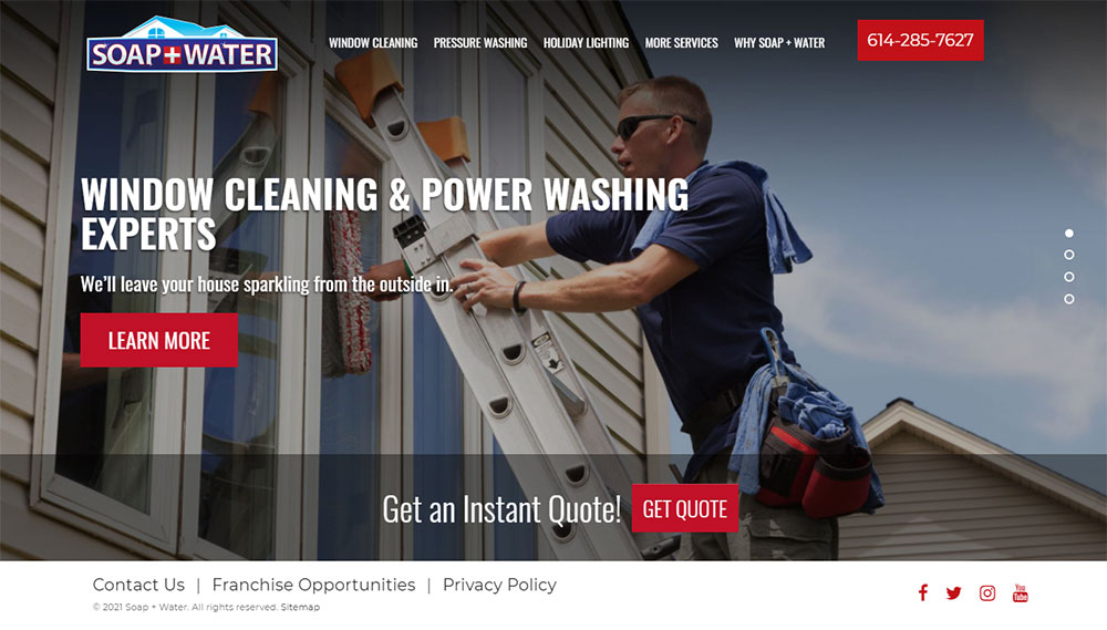
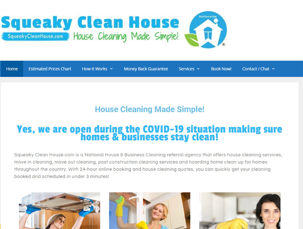
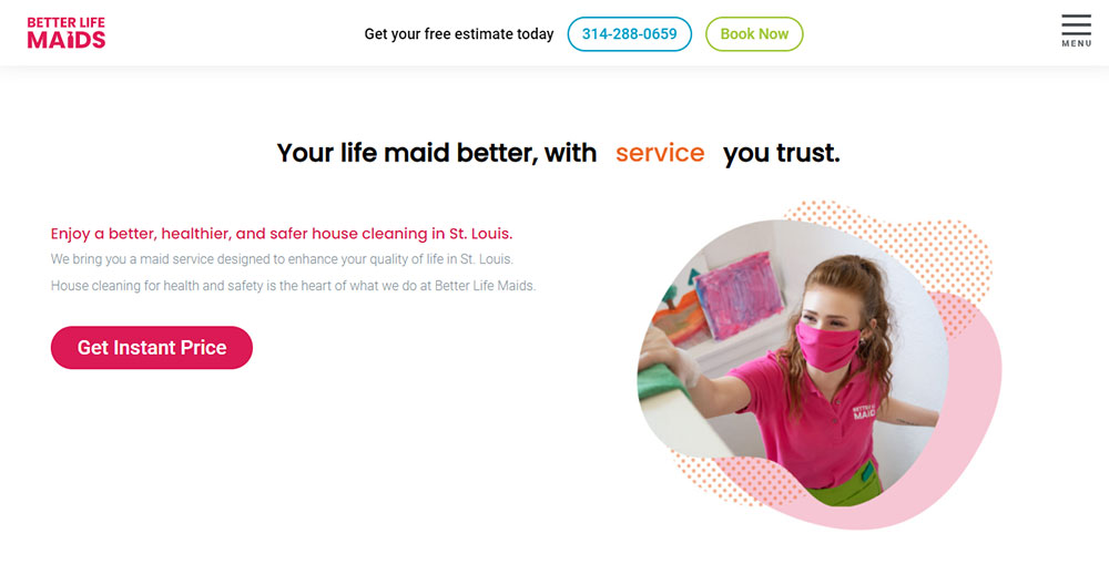
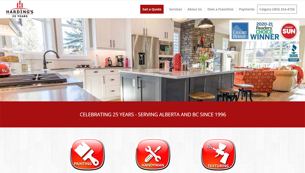
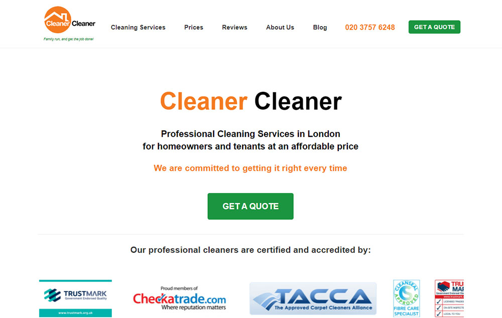
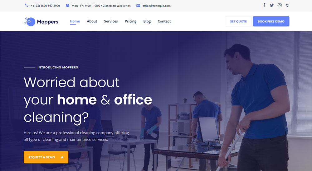
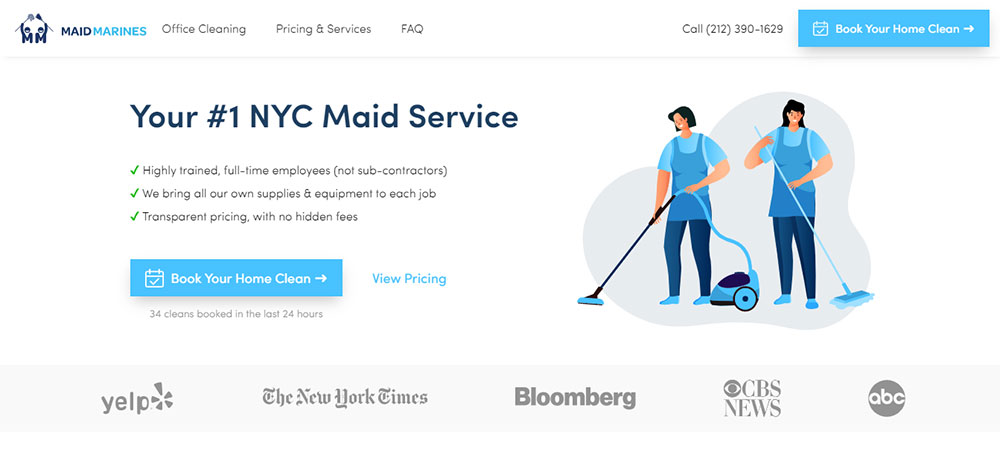
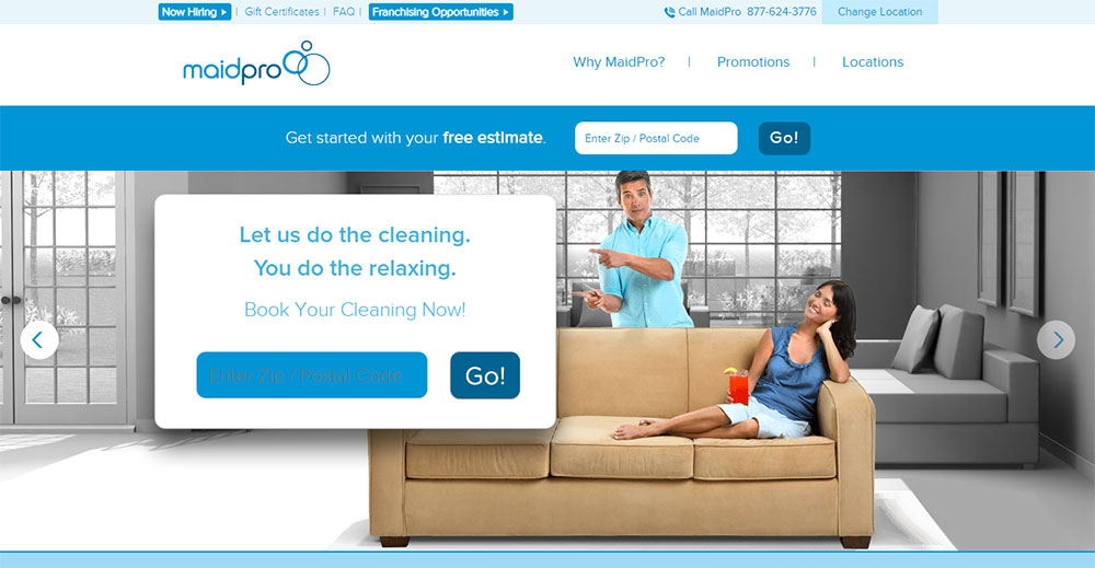
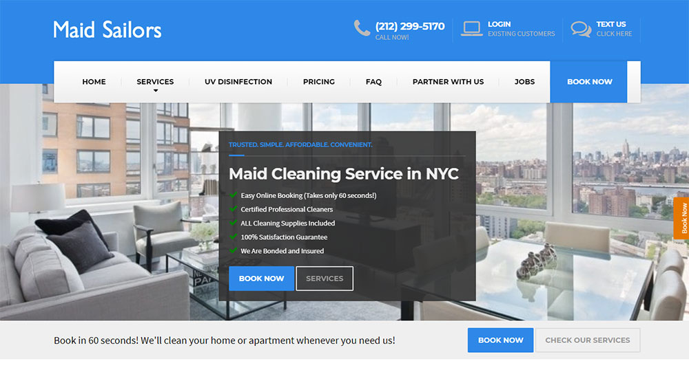
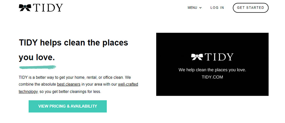
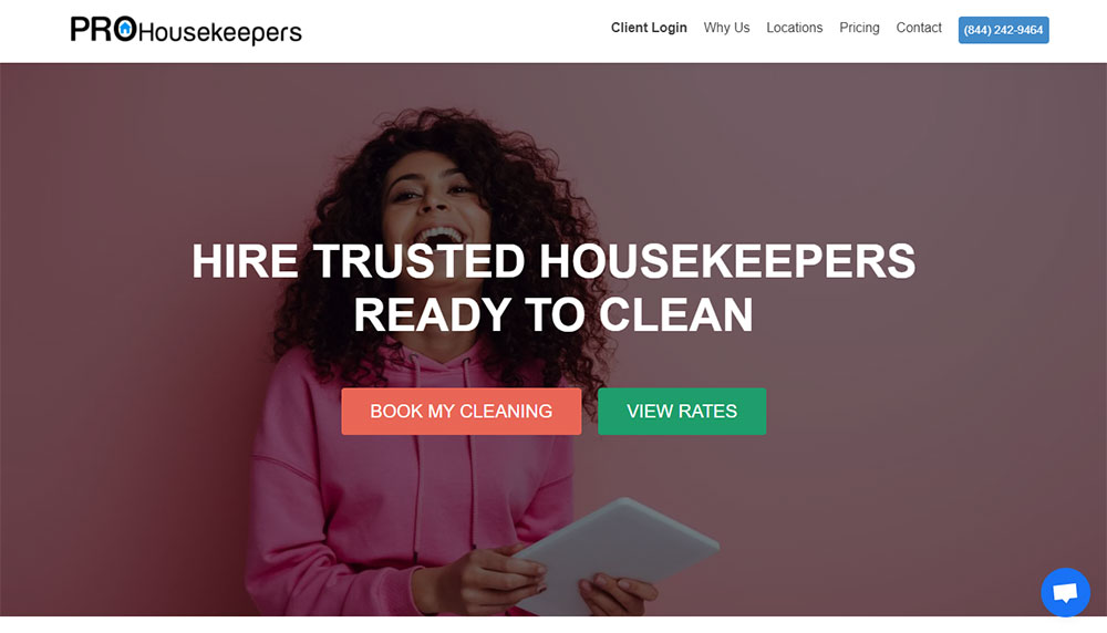
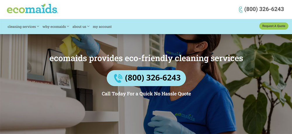
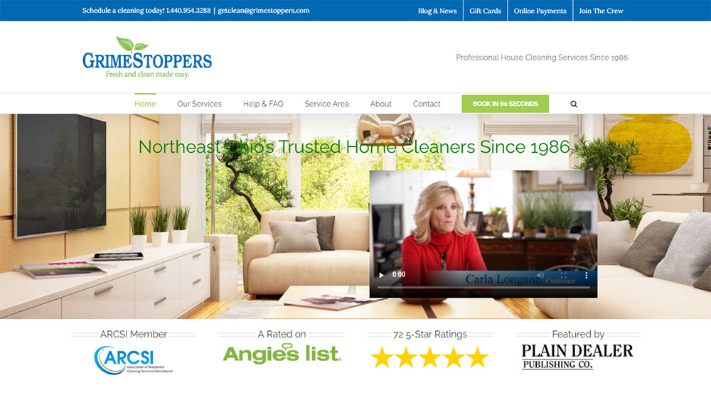
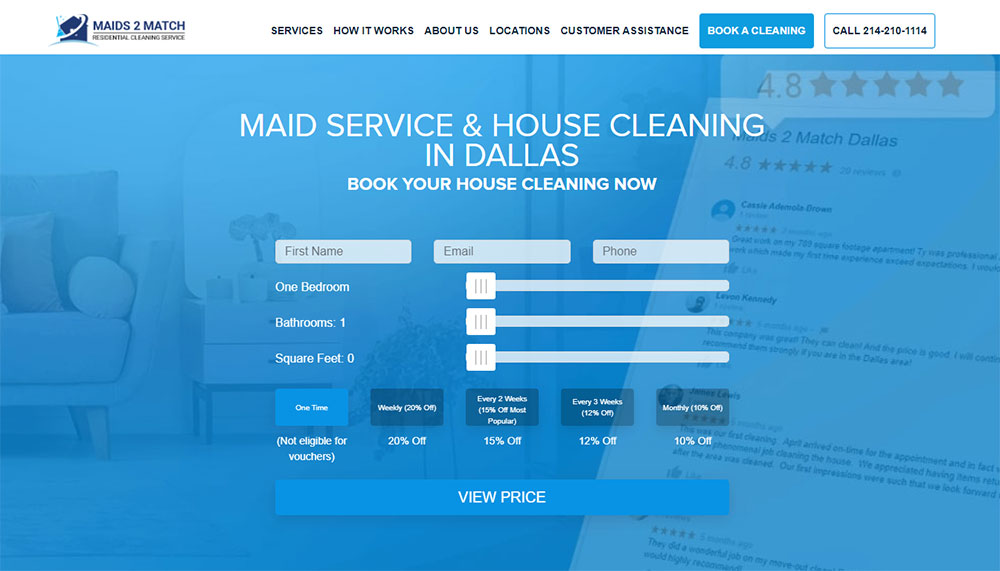
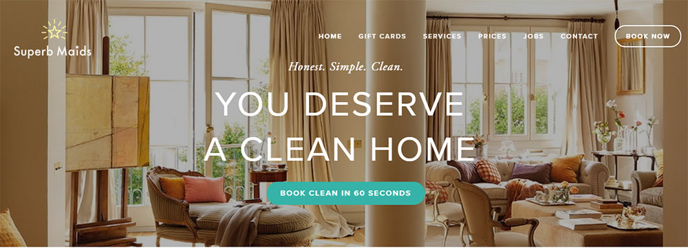
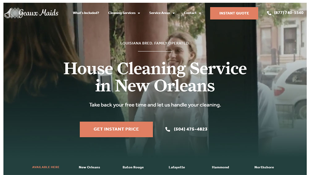
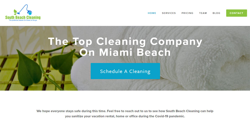
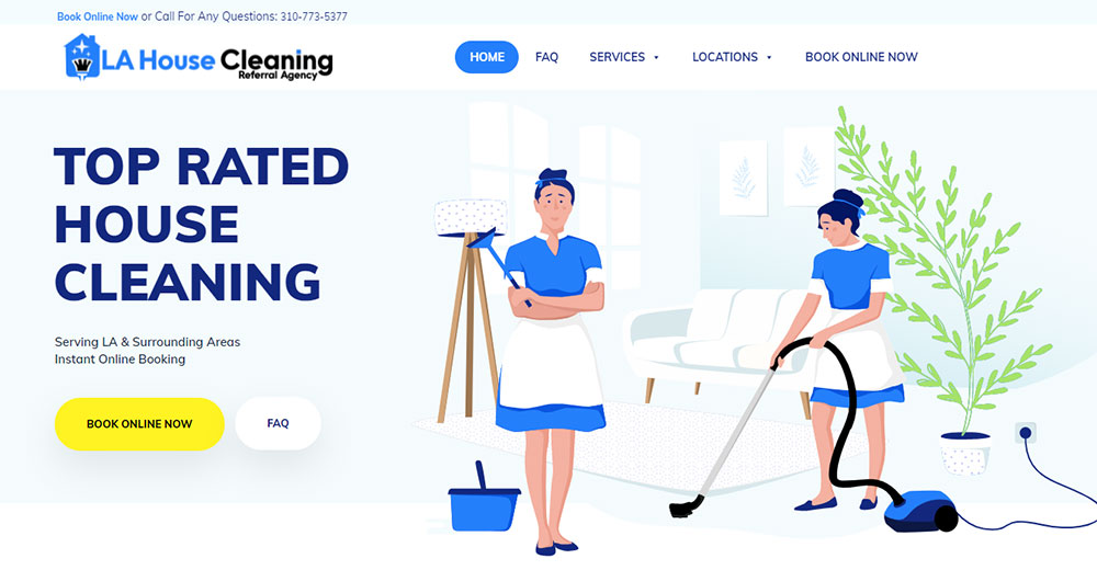
These house cleaning website design examples show exactly what converts browsers into bookings.
You'll see real maid service websites that nail trust signals, booking systems, and mobile responsiveness.
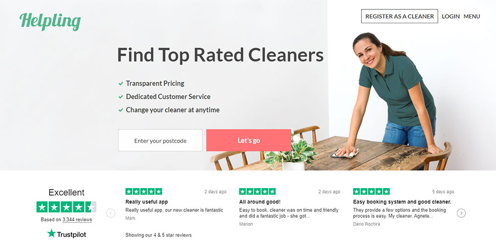
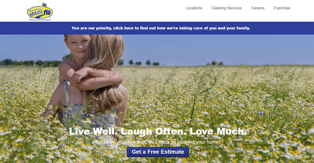
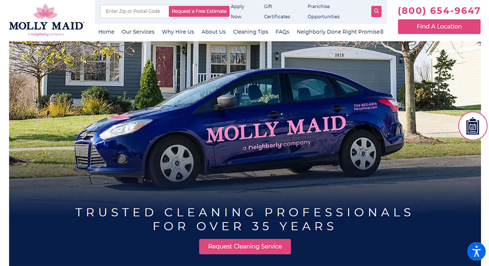
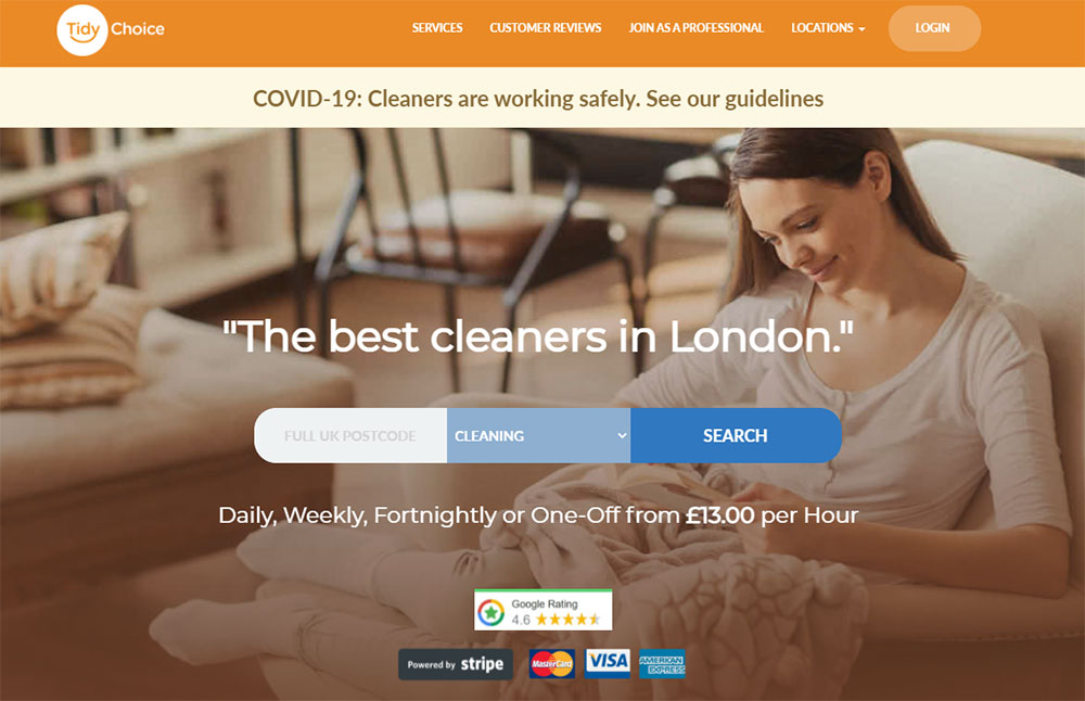
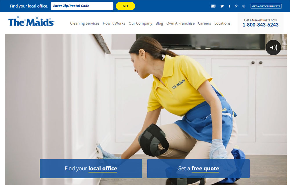
From franchise giants like Molly Maid to local residential cleaning operations using WordPress and Squarespace, each example breaks down what actually works.
We'll cover homepage layouts, service page structures, pricing displays, and the lead generation forms that turn visits into scheduled cleans.
Whether you're building a new cleaning company website or redesigning an existing one, these patterns apply.
What is House Cleaning Website Design
House cleaning website design is the process of creating an online presence for residential and commercial cleaning businesses.
It combines visual elements, booking systems, and trust signals to convert visitors into paying customers.
These sites typically feature service menus, pricing pages, instant quote calculators, and online scheduling software.
The goal? Make it dead simple for homeowners to book a maid service in under 60 seconds.
Unlike generic business websites, cleaning company sites need specific functionality: service area maps, recurring cleaning subscription options, and before-and-after photo galleries.
Platforms like WordPress, Squarespace, and Wix dominate this space.
Many cleaning businesses integrate third-party tools like Housecall Pro, Jobber, or Launch27 for appointment management.
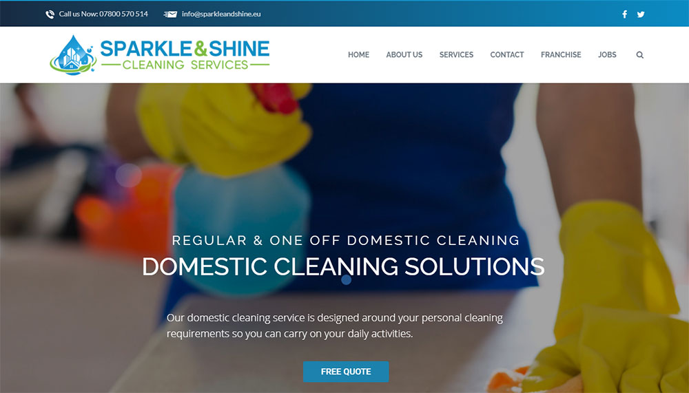
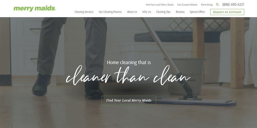
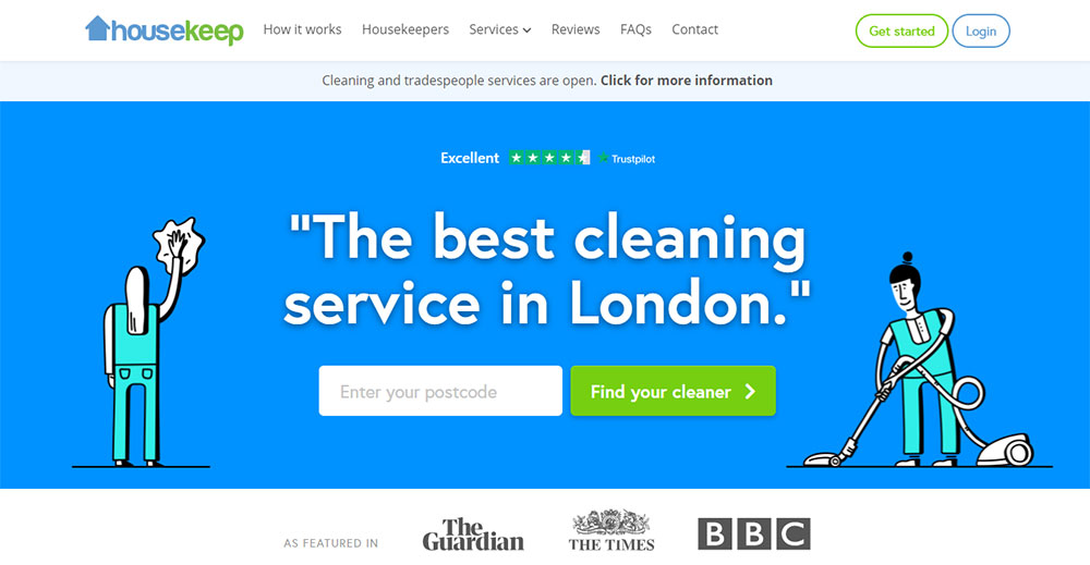
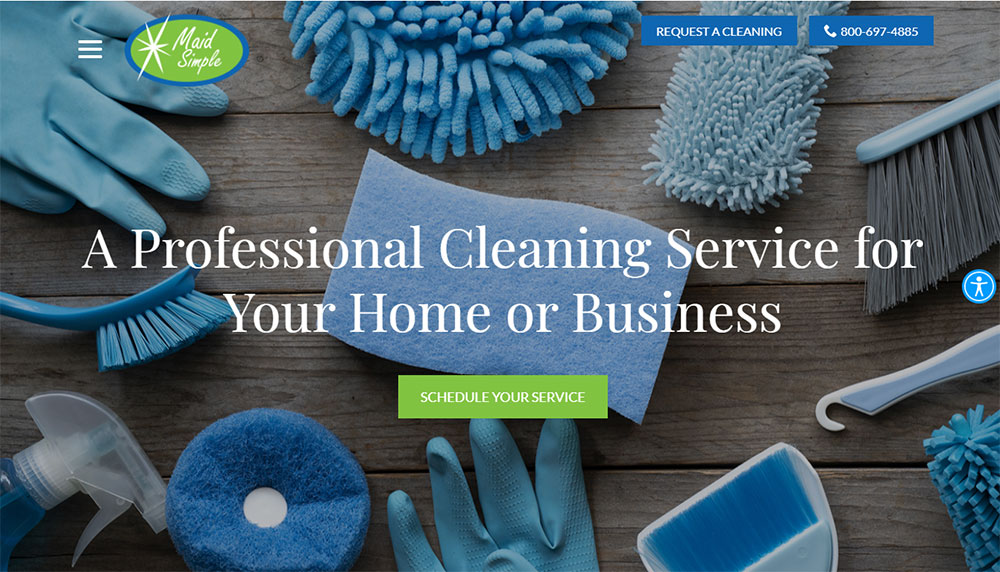
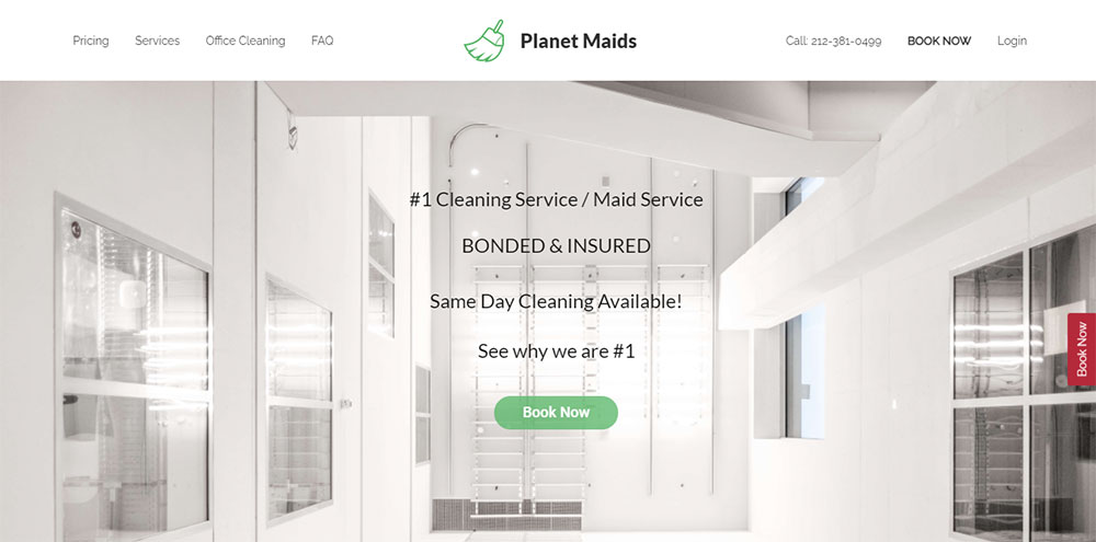
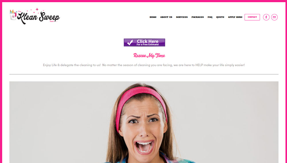
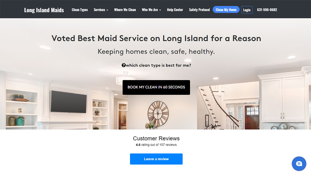
House Cleaning Website Design Examples
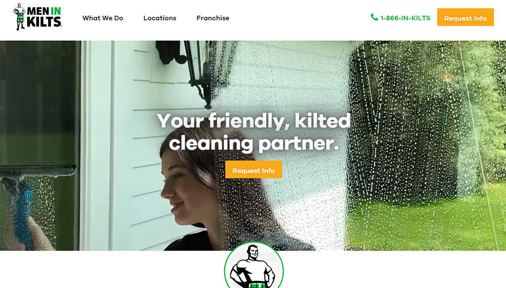
Men In Kilts
What Makes a House Cleaning Website Design Effective
An effective cleaning service website does three things: builds trust fast, shows services clearly, and gets bookings without friction.
Most visitors decide within 3 seconds whether to stay or bounce.
How Does Visual Hierarchy Affect Cleaning Service Conversions
Visual hierarchy guides the eye from headline to call-to-action button in a logical flow.
Poor hierarchy buries the booking form; good hierarchy makes "Get a Quote" impossible to miss.
The hero section carries the heaviest weight, followed by service descriptions and testimonials.
What Role Does Color Psychology Play in Cleaning Business Sites
Blue signals trust and cleanliness; green suggests eco-friendly cleaning products.
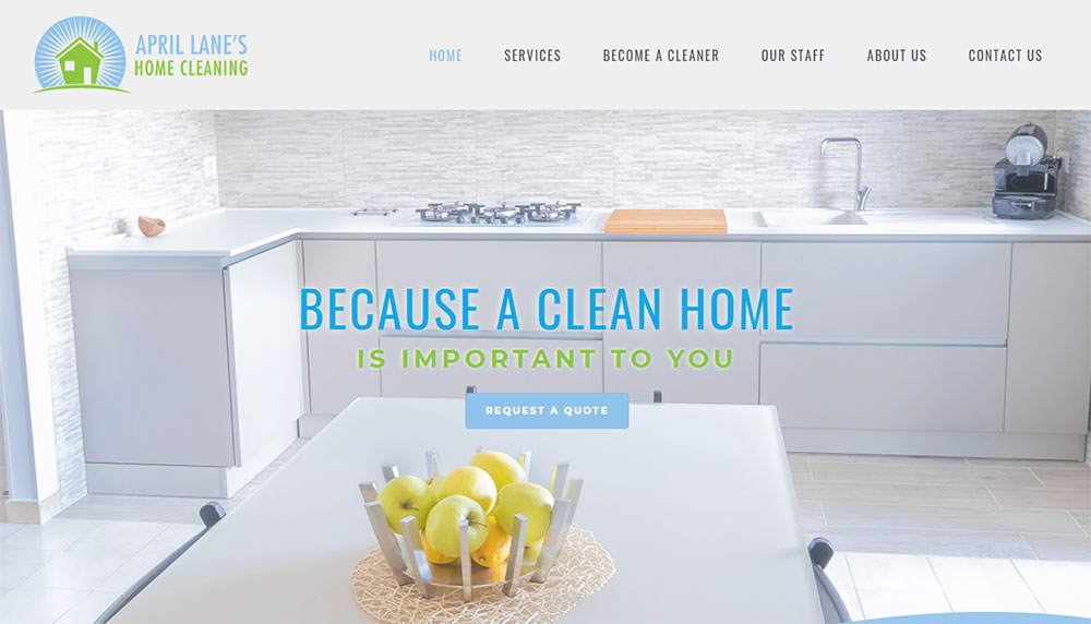
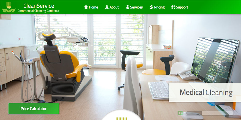
Most successful janitorial company sites stick to a calm color palette with whites, light blues, and soft greens.
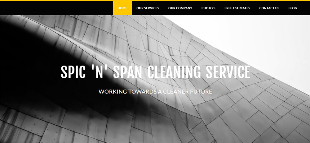
Avoid dark themes for cleaning websites. They contradict the "fresh and clean" message you're selling.
How Do Trust Signals Impact Cleaning Company Websites
Trust signals include:
- Google Reviews and Yelp ratings displayed prominently
- Better Business Bureau badges
- ARCSI or ISSA certifications
- Staff background check guarantees
- Insurance and bonding information
A testimonial page with real customer photos outperforms anonymous quotes every time.
Cleaning services enter people's homes. Trust isn't optional.
House Cleaning Website Design Features by Service Type
Different cleaning niches need different design approaches.
A residential maid service website looks nothing like a commercial janitorial company site.
What Design Elements Work for Residential Cleaning Websites
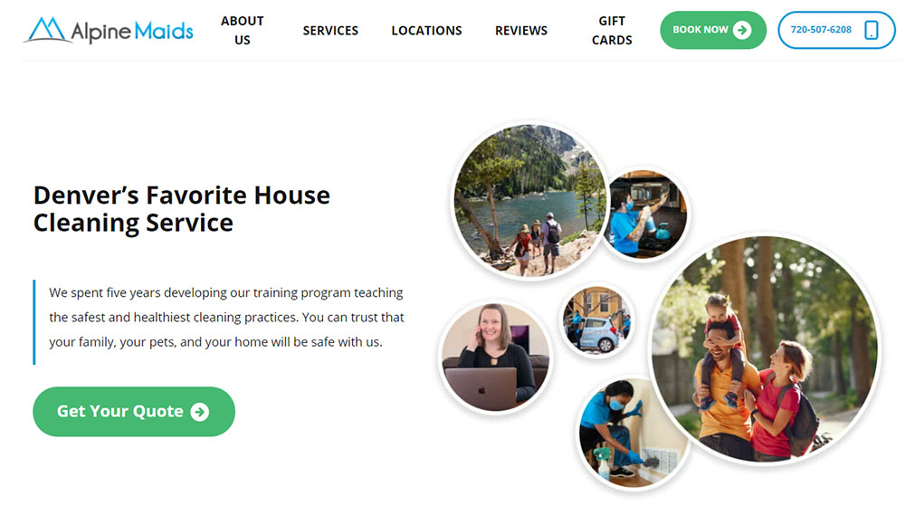
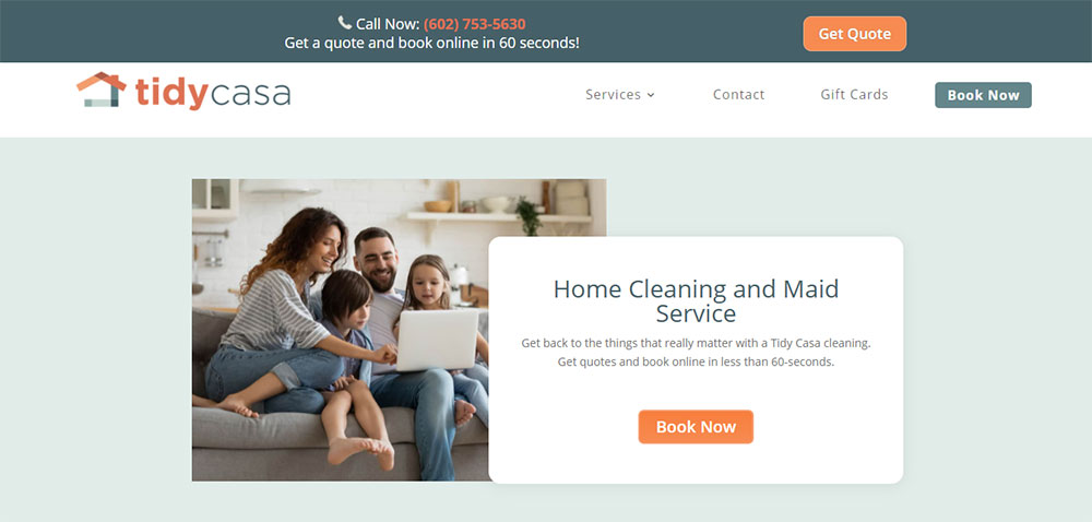
Warm imagery of homes and families; emphasis on trust, reliability, and personal service.
Booking systems should allow selection of specific rooms, add-on services, and recurring schedules.
Price calculators based on bedrooms and bathrooms work well here.
How Should Commercial Cleaning Websites Differ in Design
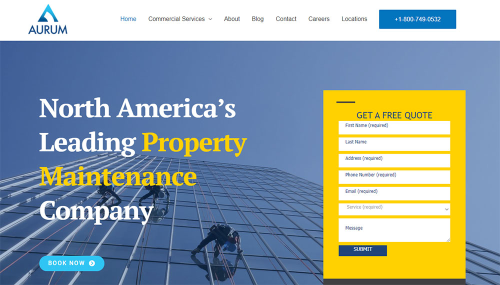
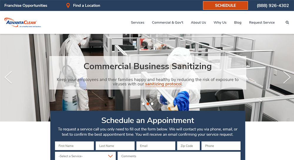
More corporate aesthetic with office environments, uniformed crews, and equipment photography.
Lead generation forms replace instant booking since commercial contracts require custom quotes.
Industry certifications (ISSA, CIMS) and case studies carry more weight than customer testimonials.
These sites share similarities with B2B websites in their approach to lead capture.
What Design Patterns Suit Specialized Cleaning Services
Carpet cleaning: Before-and-after sliders, stain removal galleries, equipment specifications. Similar patterns appear on carpet cleaning websites across the industry.
Window cleaning: Portfolio of completed projects, safety certifications for high-rise work.
Move-out cleaning: Checklist downloads, security deposit guarantee messaging, real estate agent partnership badges.
Eco-friendly cleaning: Green color palettes, ingredient transparency, certification logos from green cleaning organizations.
House Cleaning Website Design Layouts That Convert
Layout determines whether visitors book or bounce.
The best cleaning websites follow proven web design principles while adapting them to service-based conversions.
What Homepage Layouts Perform Best for Cleaning Businesses
Single-column layouts with clear vertical flow outperform complex multi-column designs.
The pattern that works: hero with CTA, trust badges, services overview, testimonials, final CTA.
Hero Section Patterns for Cleaning Websites
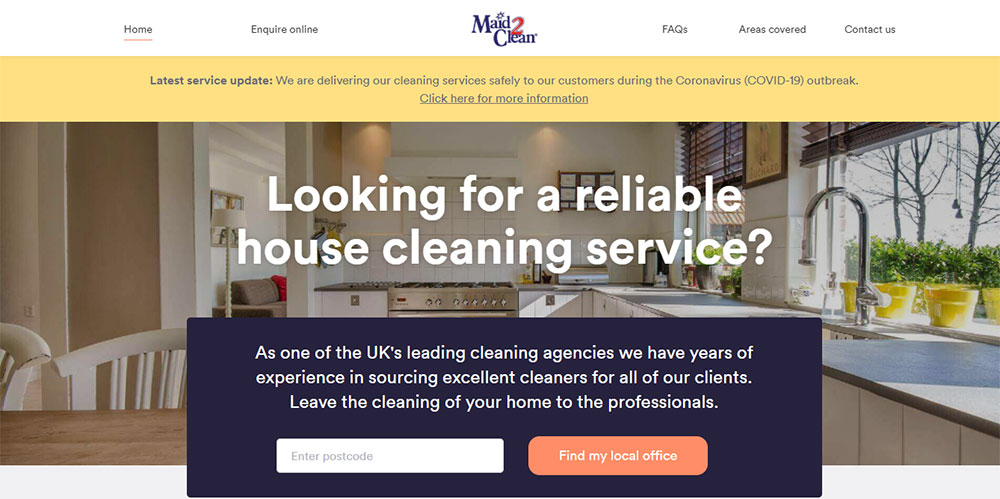
Full-width image of a sparkling clean home or friendly cleaning professional.
Headline focuses on benefit ("Come Home to Clean"), subhead on offer ("Book Your First Clean Today").
Primary CTA button above the fold, always.
Service Section Arrangements
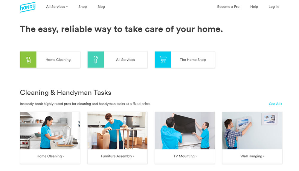
Icon-based grid showing 4-6 core services: standard cleaning, deep cleaning, move-in/out, recurring plans.
Each card links to detailed service pages with full task lists and pricing.
Testimonial Placement Strategies
Customer reviews appear after services but before the final booking CTA.
Star ratings from Google Reviews or Thumbtack add third-party validation.
Video testimonials convert better than text when bandwidth allows.
How Should Service Pages Be Designed for Cleaning Companies
Each service gets its own page optimized for that specific search query.
Structure: service description, what's included checklist, pricing or quote form, FAQ section, related services.
Include cleaning checklists as downloadable PDFs to capture email addresses.
What Contact Page Designs Generate More Cleaning Leads
Multiple contact options: form design for detailed requests, phone for urgent bookings, chat for quick questions.
Service area map shows coverage zones clearly.
Response time expectations ("We reply within 2 hours") reduce anxiety about submitting forms.
House Cleaning Website Design Elements
The right design elements make cleaning websites feel professional and trustworthy.
Get these wrong and visitors assume your cleaning quality matches your sloppy website.
What Typography Choices Work for Cleaning Business Sites
Sans-serif fonts like Open Sans, Lato, or Montserrat read cleanly on all devices.
Pair a bold headline font with a lighter body font for contrast; avoid more than two font families total.
Sites with good typography use 16-18px minimum for body text on mobile.
How Should Cleaning Websites Display Pricing Information
Three options work: flat-rate packages, hourly rates with estimates, or instant quote calculators.
Display starting prices ("From $99") even if final quotes vary by home size.
Price transparency reduces tire-kicker inquiries and attracts serious buyers.
What Photography Styles Suit House Cleaning Websites
Bright, naturally lit images of clean spaces outperform dark or overly staged shots.
Real staff photos build trust faster than stock images of models in aprons.
Before-and-after cleaning galleries prove your results better than any sales copy.
How Do Icons and Graphics Support Cleaning Service Sites
Service icons (spray bottle, mop, vacuum) create visual shorthand for quick scanning.
Consistent icon style matters; mixing flat icons with 3D graphics looks amateur.
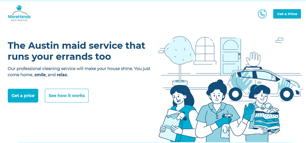
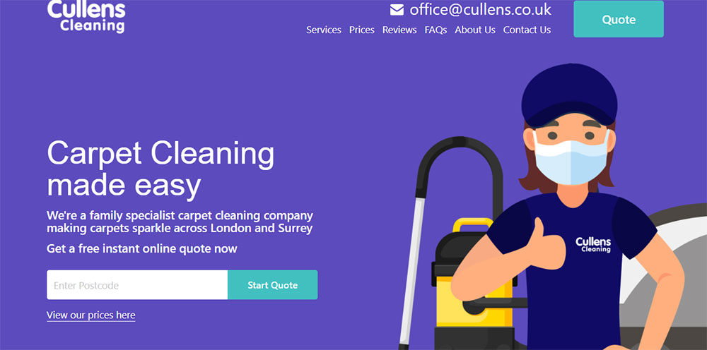
Some cleaning sites effectively use custom illustrations to stand out from competitors.
House Cleaning Website Design for Local Markets
Most cleaning businesses serve specific geographic areas.
Local optimization determines whether you show up when someone searches "house cleaning near me."
How Should Cleaning Websites Display Service Areas
Embed Google Maps with service boundaries clearly marked; list all cities, neighborhoods, and ZIP codes served.
Create individual landing pages for each major service area to capture local search traffic.
What Location-Based Design Features Increase Local Bookings
Key local elements:
- City name in headlines and page titles
- Local phone numbers (not toll-free)
- Google My Business review widget
- Neighborhood-specific testimonials
- Local landmark references in copy
Schema markup for LocalBusiness helps Google understand your service coverage.
HomeAdvisor and Thumbtack badges signal local market presence.
House Cleaning Website Design and User Experience
A user-friendly website removes every obstacle between "I need cleaning" and "Booking confirmed."
Every extra click costs you customers.
What Booking Systems Work Best for Cleaning Websites
Integrated tools like Calendly, Launch27, or Housecall Pro handle scheduling without custom development.
Best booking flows: select service → choose date/time → enter address → pay deposit.
Jobber and Square Appointments work well for smaller operations needing simple scheduling.
How Should Cleaning Websites Handle Quote Requests
Short forms convert better: name, email, phone, service type, home size.
Multi-step forms with progress indicators feel faster than single long forms.
Auto-responders confirming receipt reduce "Did they get my request?" anxiety.
What Mobile Design Considerations Apply to Cleaning Sites
Over 60% of cleaning service searches happen on phones.
Mobile-first design isn't optional anymore.
Critical mobile elements:
- Tap-to-call button always visible
- Thumb-friendly form fields
- Compressed images under 100KB
- No horizontal scrolling ever
- Sticky booking CTA on scroll
Test on actual devices; Google PageSpeed Insights and GTmetrix catch performance issues before customers do.
House Cleaning Website Design Mistakes to Avoid
Took me forever to figure out why some cleaning websites fail despite decent traffic.
Usually it's one of these self-inflicted wounds.
What Design Errors Hurt Cleaning Website Performance
Common conversion killers:
- Buried contact information (footer only)
- No pricing hints anywhere
- Stock photos of obviously fake "cleaners"
- Walls of text nobody reads
- Missing trust signals and certifications
- Cluttered layouts competing for attention
Sites with bad design share these patterns; avoid them entirely.
The worst offenders hide their phone number behind three clicks. Maddening.
How Do Slow Load Times Affect Cleaning Business Sites
Pages loading over 3 seconds lose 53% of mobile visitors.
Uncompressed hero images are the usual culprit; followed by unoptimized sliders and bloated WordPress themes.
Run your site through GTmetrix monthly; fix anything in red.
Hosting matters too. Cheap shared hosting on GoDaddy or Bluehost struggles under traffic spikes when your Google Ads hit.
Responsive websites that load fast on every device win the booking.
Everyone else fights for leftovers.
FAQ on House Cleaning Website Design
What platform works best for cleaning service websites?
WordPress offers the most flexibility with plugins like Jobber and Housecall Pro integration. Squarespace and Wix work well for simpler sites without custom booking needs. Choose based on your technical comfort and required features.
How much does a professional cleaning website cost?
DIY builds on Wix or Squarespace run $150-$500 yearly. Custom WordPress sites cost $2,000-$10,000 depending on booking system complexity. Factor in ongoing hosting, maintenance, and scheduling software subscriptions like Launch27 or Calendly.
What pages should every house cleaning website include?
Homepage, services page, pricing or quote request, about us, service areas, contact page, and testimonials. Add individual pages for each cleaning type: standard, deep cleaning, move-out, and recurring residential cleaning subscriptions.
How do I add online booking to my cleaning website?
Integrate tools like Housecall Pro, Jobber, or Square Appointments directly into your site. Most embed via simple code snippets. WordPress users can install booking plugins that sync with Google Calendar and accept Stripe or PayPal payments.
What colors convert best for cleaning business websites?
Blues and greens signal cleanliness and trust. White backgrounds with accent colors keep layouts fresh. Avoid dark themes since they contradict the "clean" message. Most successful maid service sites use light, airy color schemes.
How important is mobile responsiveness for cleaning sites?
Over 60% of cleaning service searches happen on smartphones. Non-responsive sites lose most potential customers immediately. Google also ranks responsive website templates higher. Mobile-first design directly impacts both traffic and bookings.
Should cleaning websites show pricing upfront?
Yes. Starting prices or price ranges reduce unqualified leads and build trust. Use pricing tables or instant quote calculators based on bedrooms and bathrooms. Transparency converts better than "call for quote" approaches.
What booking system features matter most?
Online scheduling with calendar sync, automated reminders, deposit collection via Stripe, and recurring appointment options. Service area validation prevents bookings outside your coverage zone. Integration with Google Analytics tracks conversion rates.
How do I build trust on a new cleaning website?
Display Google Reviews and Yelp ratings prominently. Add Better Business Bureau badges, insurance certificates, and background check guarantees. Real staff photos outperform stock images. ARCSI or ISSA certifications add professional credibility.
What makes cleaning website photos effective?
Bright, naturally lit images of actual cleaned spaces and real team members. Before-and-after galleries prove results visually. Avoid obvious stock photos of models. Authentic photography builds trust that polished corporate imagery cannot match.
Conclusion
These house cleaning website design examples prove one thing: conversion comes from clarity, not complexity.
The best janitorial company sites share common DNA. Clean layouts, visible booking forms, transparent pricing, and authentic customer reviews.
Whether you build on Webflow or grab a template from Wix, the fundamentals stay constant.
Prioritize mobile responsiveness since that's where most homeowners search for domestic cleaning services.
Integrate scheduling tools like Housecall Pro or Jobber early. Add Google Reviews widgets and Better Business Bureau badges to build instant credibility.
Test your page speed with GTmetrix regularly.
Your cleaning crew delivers spotless results. Now your website can match that standard and turn every visitor into a booked appointment.


