


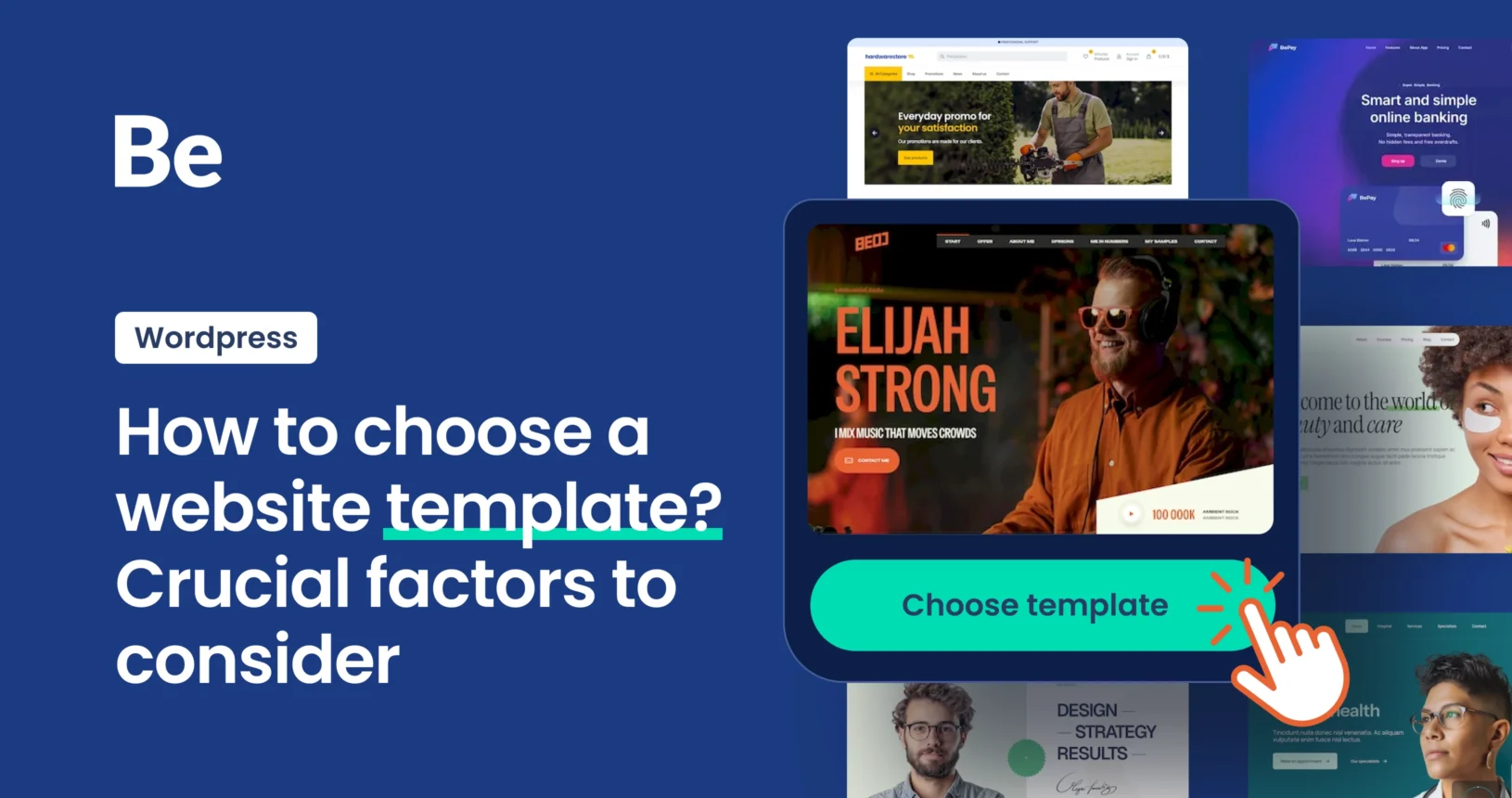
Great Examples of Software Website Templates
November 17, 2025
Stunning Examples of SaaS Website Templates
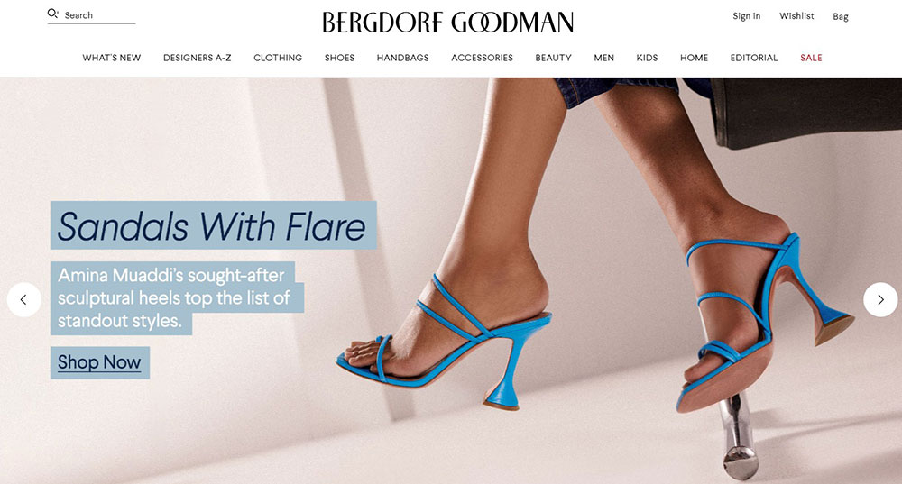
November 19, 2025A Chanel homepage loads. You feel something shift.
That reaction isn't accidental. Brands like Hermès, Rolex, and Cartier invest millions in digital experiences that communicate exclusivity before you read a single word.
These luxury website design examples reveal how high-end brands translate craftsmanship into pixels.
You'll see exactly what separates a premium digital presence from standard e-commerce. Typography choices. Color psychology. The specific animations that signal sophistication.
We've analyzed sites from fashion houses, watchmakers, automotive brands, and hospitality leaders.
Each demonstrates different approaches to elegant user interfaces and refined visual hierarchy. Take what works for your projects.
What is Luxury Website Design
Luxury website design is a specialized approach to creating digital experiences for high-end brands like Chanel, Hermès, and Rolex.
It combines refined visual hierarchy, custom typography, and sophisticated color palettes to communicate exclusivity and craftsmanship.
These sites prioritize elegance over information density.
Every pixel serves a purpose. Nothing feels rushed or cluttered.
Premium brands invest heavily in bespoke web development because their online presence must match the quality of their products.
A Cartier bracelet demands more than a standard e-commerce template.
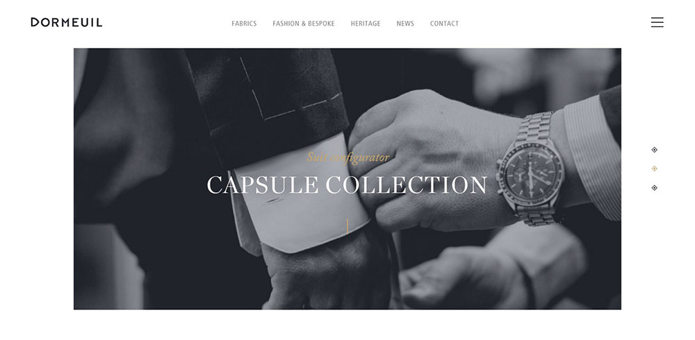
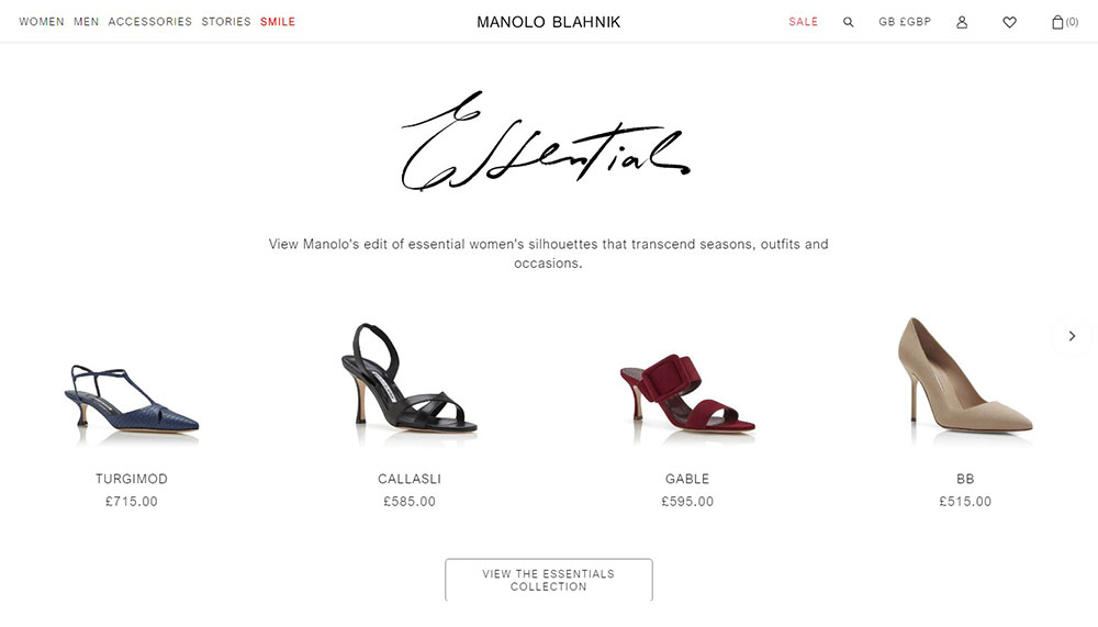
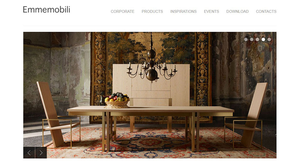
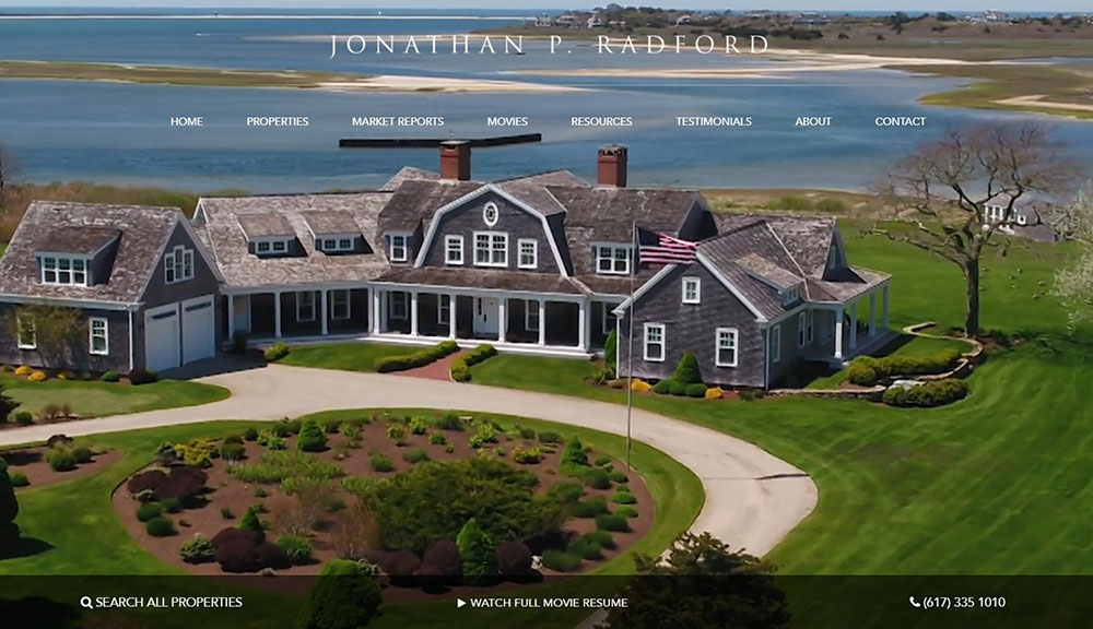
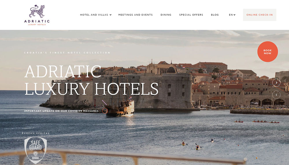
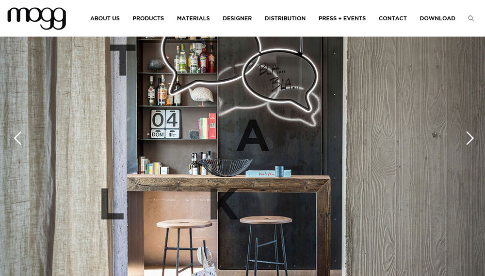
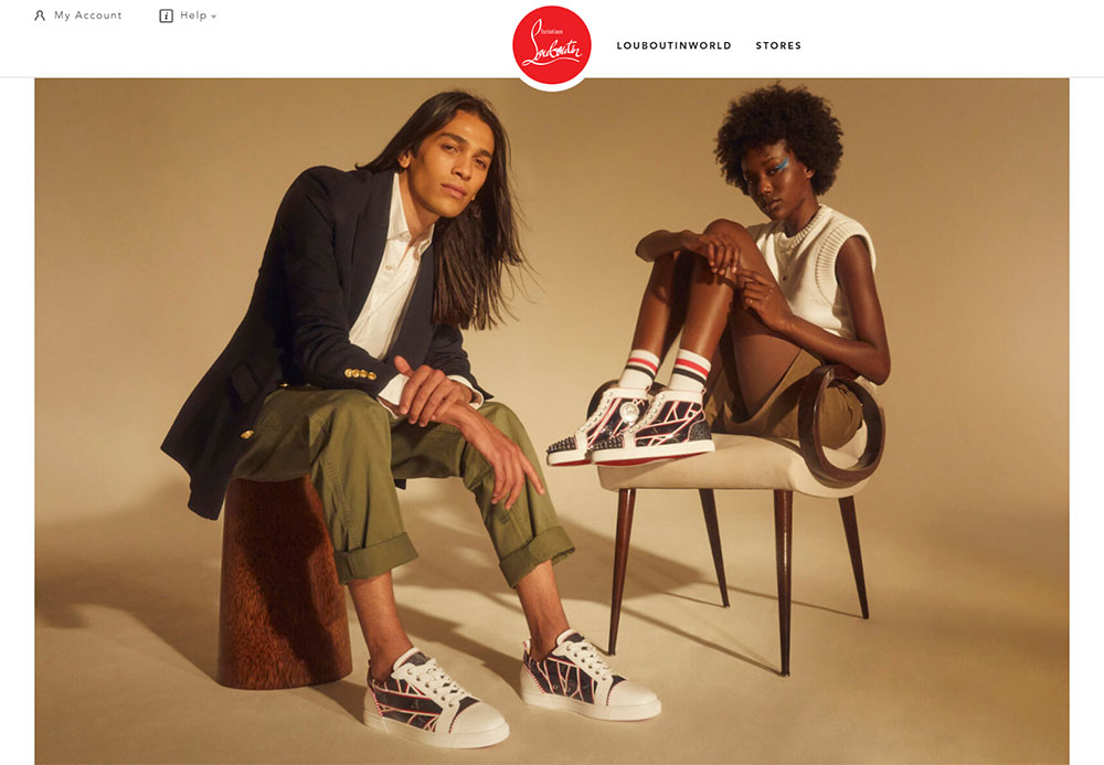
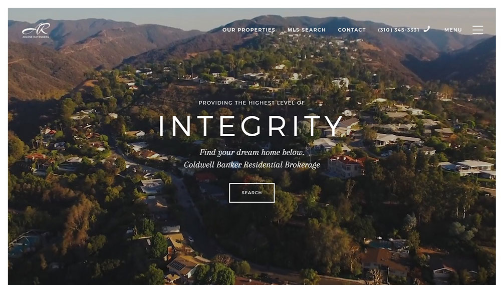
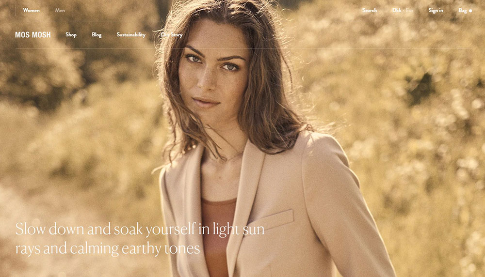
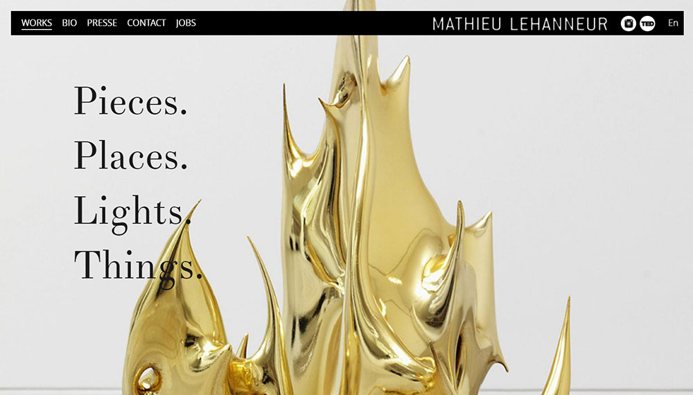
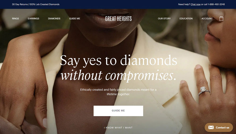
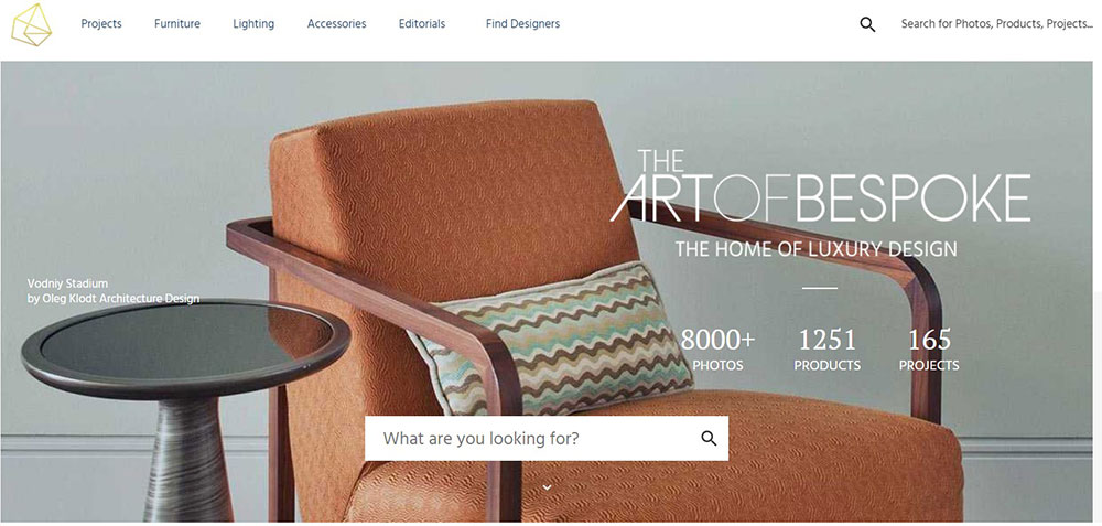
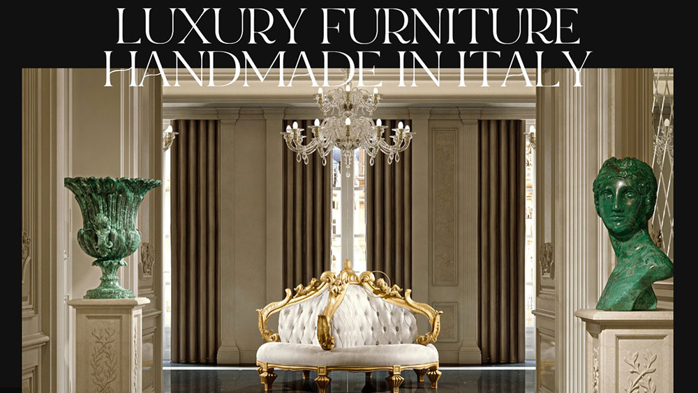
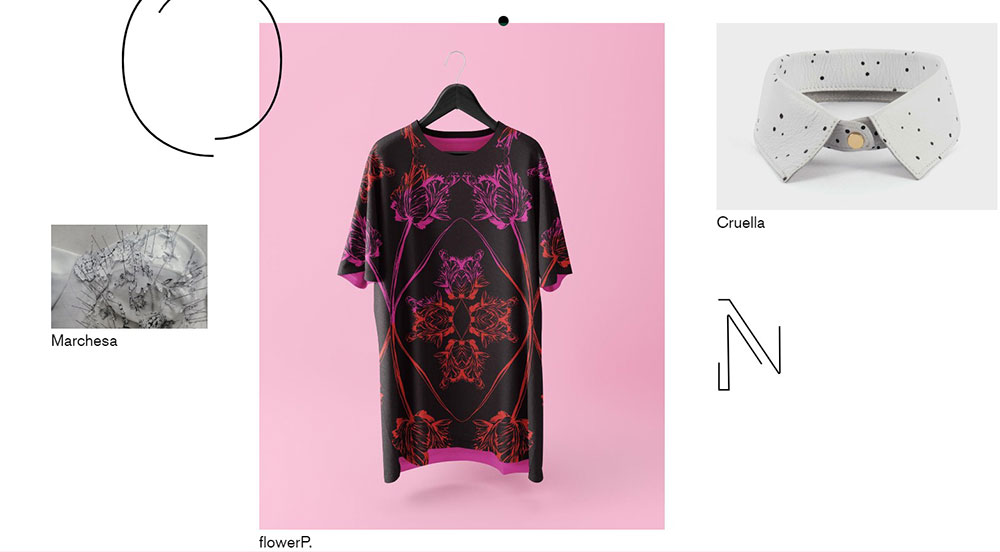
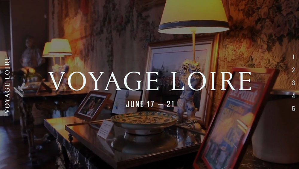
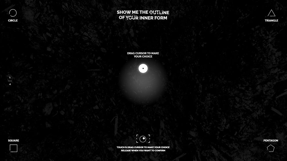
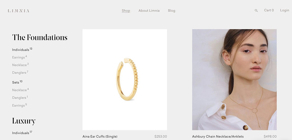
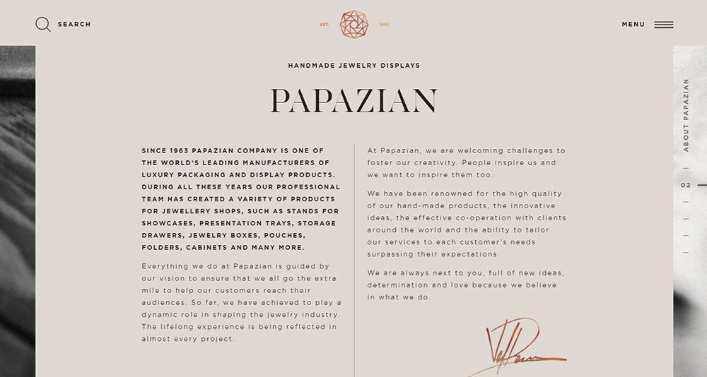
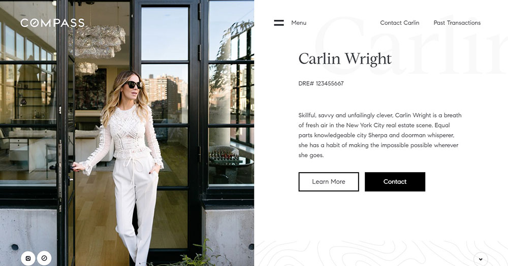
Awesome Luxury Website Design Examples
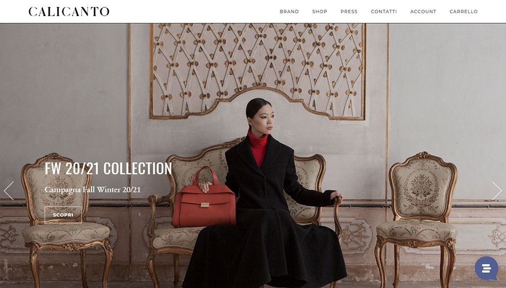
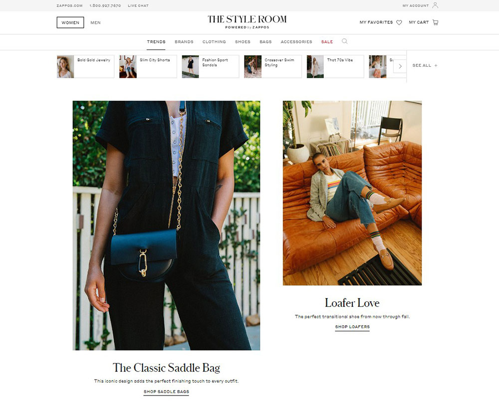
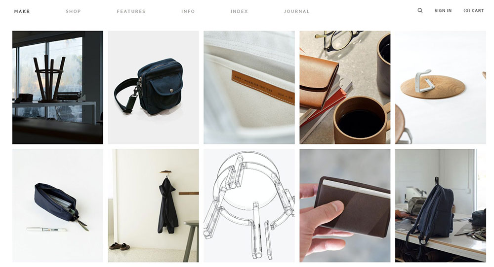
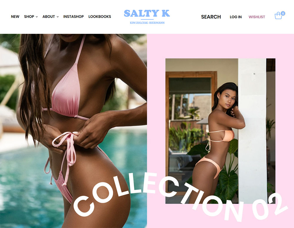
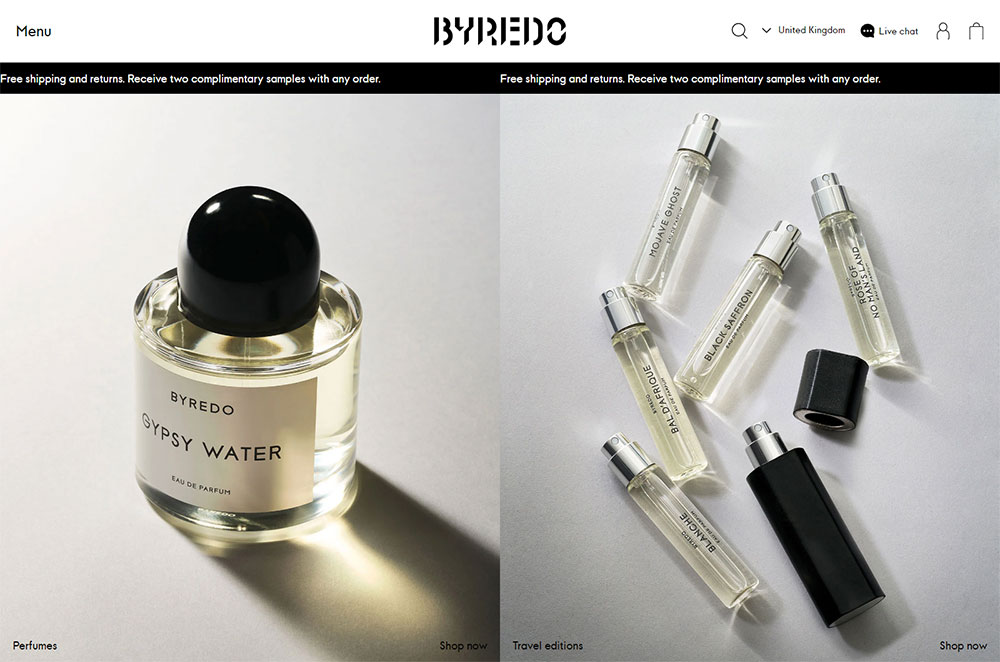
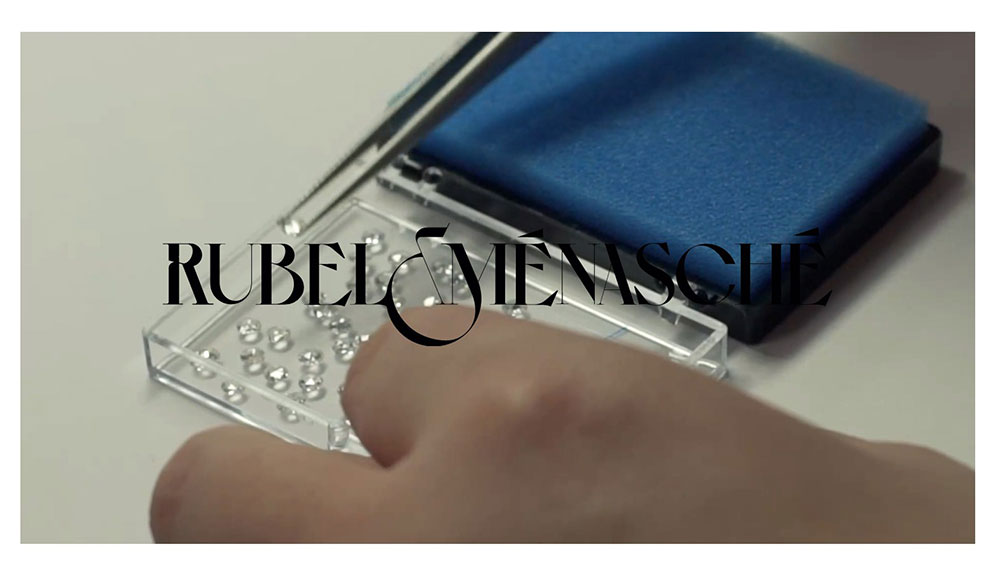
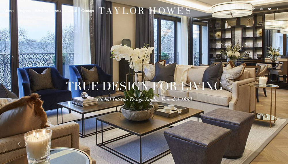
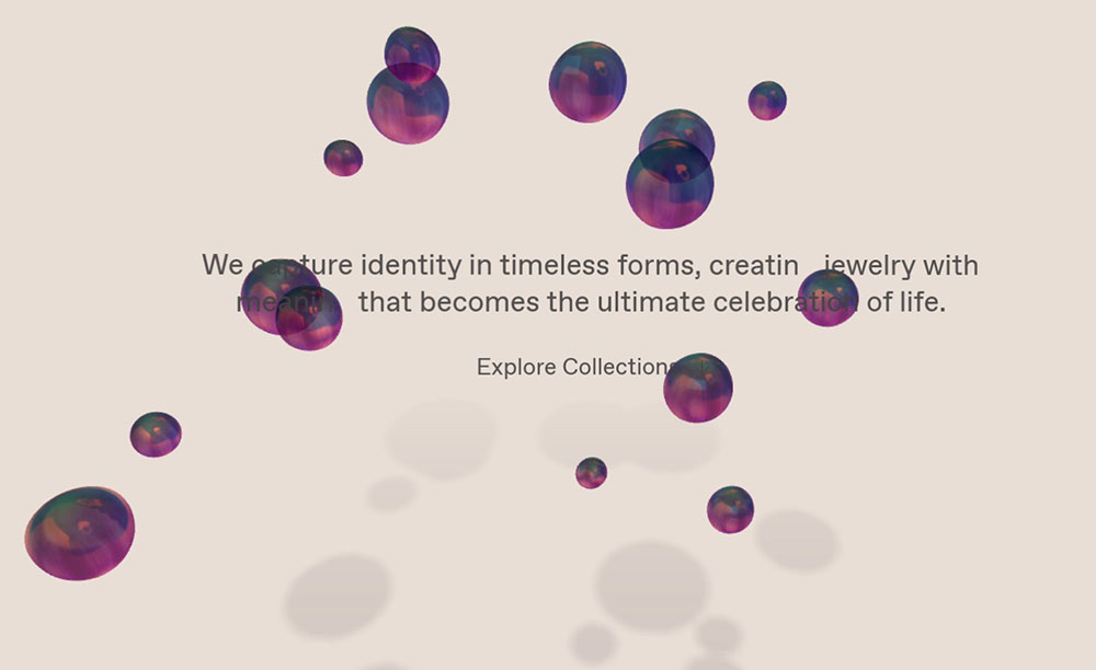
Calicanto Luxury Bags


How Does Luxury Website Design Differ from Standard Web Design
Standard websites focus on conversion speed and information delivery.
Luxury websites prioritize experience and emotion.
The differences show up everywhere:
- White space becomes a design element, not wasted real estate
- Loading animations turn into brand moments
- Product photography replaces stock images entirely
- Custom typefaces like Didot and Bodoni signal sophistication
- Navigation feels curated, almost editorial
High-end brands like Louis Vuitton and Gucci treat their websites as digital flagship stores.
The browsing experience mirrors walking through a boutique on Avenue Montaigne.
Understanding proper white space usage separates premium design from everything else.
What Makes a Website Look Luxurious
Several elements work together to create that unmistakable premium feel.
Visual Hierarchy and Layout
Luxury sites guide the eye deliberately through oversized imagery, generous margins, and asymmetrical compositions.
Nothing competes for attention. One focal point per screen.
Typography Selection
Serif fonts dominate the luxury space.
Bodoni, Didot, and custom brand typefaces appear consistently across Dior, Prada, and Tiffany & Co. websites.
Font weight stays light. Letter spacing runs wide.
Strong typography choices instantly communicate brand positioning.
Color Psychology
Black, white, gold, and deep navy form the core luxury color palette.
Burberry uses its signature beige. Tiffany owns that specific blue.
Color restraint signals confidence. Brands that know their identity don't need visual noise.
Motion and Micro-Interactions
Smooth parallax effects, subtle hover states, and cinematic page transitions define animated websites in the luxury sector.
Animations feel intentional, never decorative.
Photography Standards
High-resolution imagery shot by renowned photographers.
Products float against clean backgrounds or appear in aspirational lifestyle settings.
Compression artifacts are unacceptable. Every image loads crisp at any viewport size.
What Typography Works Best for Luxury Websites
Serif typefaces dominate premium digital design.
Didot, Bodoni, and Garamond appear across Vogue, Bazaar, and countless fashion houses.
Custom typefaces increasingly define brand identity. Burberry, Celine, and Saint Laurent commissioned proprietary fonts.
Weight matters. Thin and light weights signal elegance; bold weights feel commercial.
Letter spacing runs wider than standard settings. Headlines breathe.
Sans-serif fonts work as supporting players. Futura and Helvetica Neue handle body copy and navigation.
Mixing serif headlines with sans-serif body creates visual hierarchy without complexity.
Studying websites with good typography reveals consistent patterns across successful luxury brands.
What Color Palettes Do Luxury Brands Use on Their Websites
Restraint defines luxury color strategy.
Most premium sites limit palettes to two or three colors maximum.
Black and white form the foundation. Chanel, Prada, and Dior build entire experiences on this contrast.
Gold (#D4AF37 and variations) signals prestige across cultures. Rolex, Cartier, and Versace use it as accent.
Navy blue (#1C2541 range) conveys trust and sophistication. Banks and watchmakers prefer it.
Brand signature colors create instant recognition:
- Tiffany Blue (Pantone 1837)
- Hermès Orange (#FF6600 range)
- Burberry Beige (#E9D5A1)
- Louboutin Red (#E50000)
Background colors stay neutral. Products need clean stages to shine.
Reviewing color scheme implementations shows how restraint amplifies impact.
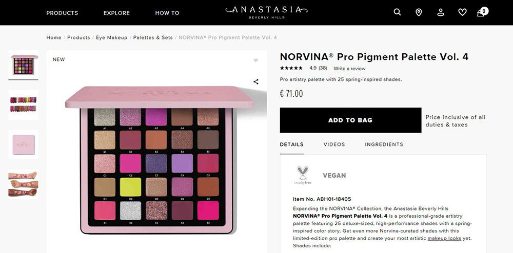
How Do Luxury Websites Handle Product Photography
Image quality separates amateur from professional luxury presentation.
Resolution standards: minimum 2000px on longest edge for zoom functionality.
Background treatments vary by brand strategy:
- Pure white (#FFFFFF) for clean catalog presentation
- Contextual lifestyle shots for aspirational positioning
- Gradient backgrounds for dramatic product emphasis
Lighting creates desire. Jewelry brands like Cartier use specialized macro photography capturing light refraction.
Multiple angles become standard. 360-degree views and detail shots satisfy purchase consideration.
Models appear selectively. Hermès shows bags empty; Louis Vuitton shows them carried.
File optimization maintains quality. WebP format delivers crisp images at smaller sizes.
What Loading Experiences Do Luxury Websites Use
Loading screens become brand moments on premium websites.
Logo animations during load reinforce identity. Chanel's interlocking Cs animate elegantly.
Progress indicators match brand aesthetics. Thin lines, subtle pulses, refined movements.
Skeleton screens preview layout structure before images load. Content appears intentionally.
GSAP animation library powers most sophisticated loading sequences.
Performance expectations: under 3 seconds for first contentful paint, even with heavy imagery.
Lazy loading prioritizes above-fold content. Users see hero imagery immediately.
Preloaders set tone. Rushed loading feels discount. Elegant pacing signals premium positioning.
How Do Luxury Websites Build Trust Through Design
Trust signals differ from mass-market e-commerce approaches.
Craftsmanship storytelling replaces review counts. Heritage timelines, artisan profiles, and making-of content.
Authenticity guarantees appear prominently. Certificates, serial numbers, and provenance documentation.
Security indicators integrate subtly. Trust badges don't dominate checkout experiences.
Physical presence matters. Store locators, appointment booking, and consulting services bridge digital and physical.
Social proof appears editorially. Celebrity features, press mentions, and brand ambassador galleries.
Return policies display confidence. Generous terms signal product quality assurance.
Customer service visibility. Chat, phone, and form design for inquiries show human presence.
What Navigation Patterns Work for Luxury E-commerce
Luxury navigation prioritizes browsing experience over search efficiency.
Mega menu layouts reveal product categories elegantly with supporting imagery.
Category naming uses brand language. "Ready-to-Wear" not "Clothes." "Timepieces" not "Watches."
Hamburger menus appear even on desktop for minimal header aesthetics.
Sticky navigation stays subtle. Thin bars that don't compete with content.
Search functionality hides initially. Expansion reveals refined filtering options.
Breadcrumbs appear minimally styled. Functional but unobtrusive.
Understanding website navigation examples across luxury sectors reveals consistent UX patterns.
How Do Luxury Websites Perform on Mobile Devices
Mobile experiences require equal investment to desktop for responsive websites.
Touch targets size appropriately. 44px minimum for comfortable tapping.
Swipe gestures feel natural. Product galleries, lookbooks, and image carousels respond smoothly.
Typography scales proportionally. Headlines remain impactful on smaller screens.
Checkout simplifies dramatically. Apple Pay, Google Pay, and saved payment methods.
Performance optimization intensifies. Smaller image variants serve mobile connections.
Portrait orientation drives design decisions. Vertical scrolling, stacked layouts, full-width imagery.
Mobile first design thinking ensures luxury experiences translate across all devices.
FAQ on Luxury Website Design
What makes a website look luxurious?
Generous white space, refined typography using serif fonts like Didot or Bodoni, restrained color palettes, and high-resolution product photography.
Premium sites prioritize elegance over information density. Every element serves a purpose.
Which brands have the best luxury website designs?
Chanel, Hermès, Rolex, and Cartier consistently set standards.
Louis Vuitton excels at interactive experiences. Dior masters cinematic presentation. Tiffany & Co. owns color-driven brand identity online.
What colors work best for luxury websites?
Black, white, gold, and navy dominate premium digital design.
Most luxury brands limit palettes to two or three colors. Signature colors like Hermès orange or Tiffany blue create instant recognition.
What typography do luxury brands use on their websites?
Serif typefaces lead the category. Didot, Bodoni, and custom brand fonts appear across fashion and jewelry sites.
Light font weights and wide letter spacing signal sophistication. Sans-serifs handle supporting copy.
How do luxury websites handle loading times?
Premium brands turn loading screens into brand moments with logo animations and elegant progress indicators.
Performance still matters. First contentful paint stays under 3 seconds despite heavy imagery through lazy loading.
What makes luxury e-commerce different from standard online stores?
Luxury e-commerce prioritizes browsing experience over conversion efficiency.
Editorial content integrates with shopping. Product pages feel like magazine spreads. Navigation uses brand language, not generic categories.
How important is mobile design for luxury websites?
Mobile drives over 60% of luxury traffic.
Touch interactions, swipe gestures, and simplified checkout require equal investment to desktop. Typography and imagery must scale without losing impact.
What photography standards do luxury websites follow?
Minimum 2000px resolution for zoom functionality. Professional lighting that captures texture and detail.
Jewelry brands use macro photography. Fashion houses mix clean product shots with aspirational lifestyle imagery.
How do luxury websites build trust with visitors?
Craftsmanship storytelling, heritage timelines, and artisan profiles replace standard trust badges.
Authenticity guarantees, certificate documentation, and visible customer service options bridge digital and physical brand experiences.
Can small brands achieve luxury website aesthetics?
Yes. Restraint costs nothing.
Focus on quality photography, refined typography, generous spacing, and limited color palettes. Tools like Figma and Webflow make premium design accessible without enterprise budgets.
Conclusion
These luxury website design examples share a common thread: intentionality.
Brands like Prada, Gucci, and Bentley prove that premium digital experiences require more than expensive photography. Every interaction, from navigation patterns to checkout flows, must reflect brand values.
The principles scale down. Bespoke web development budgets aren't mandatory.
Prioritize restraint in your color palette. Invest in quality imagery. Choose typography that signals sophistication.
Let negative space do the heavy lifting.
Study how Net-a-Porter blends editorial content with commerce. Notice how Four Seasons sells experiences through destination storytelling.
Apply what fits your brand context. Skip what doesn't.
Premium perception comes from consistent execution of fundamentals, not flashy features.
Be Theme also has a library of more than 500 pre-built websites. They are fully functional, responsive, and customizable, so you’re only one click away from creating a successful web page.
If you enjoyed reading this article on the most impressive luxury websites, you should check out this one about accessible website examples.
We also wrote about a few related subjects like top-notch musician websites, cool-looking personal trainer websites, great-looking spa websites, best corporate websites, the best-looking tourism websites, hotel website design, product landing page, and impressive animated websites.


