


Top Finance WordPress Themes to Use for Your Company
January 10, 2026
Event Website Design Examples To Check Out
January 11, 2026Retail websites either convert browsers into buyers or watch them leave for competitors. The difference comes down to design decisions made before a single product gets listed.
Cart abandonment sits above 70% across the industry. Most of those lost sales trace back to fixable design problems: confusing navigation, slow checkout flows, or mobile layouts that break on smaller screens.
These retail website design examples show what separates stores that sell from stores that struggle. You'll see how brands across different product categories handle navigation, product pages, checkout friction, and mobile commerce.
Each example was evaluated on page speed, conversion flow, mobile responsiveness, and the specific design patterns that reduce abandoned carts. No fluff. Just what works when revenue depends on it.
What Is Retail Website Design
Retail website design is the process of building an online storefront that displays products, guides shoppers through categories, and moves them toward checkout with minimal friction.
It covers everything from the hero section on a homepage to the product listing page layout, the cart interface, and the final purchase screen.
Platforms like Shopify, WooCommerce, Magento, and BigCommerce provide the infrastructure. The design layer on top determines whether people actually buy.
A retail site is not a brochure. It is a sales tool built around product photography, clear pricing, fast page loads, and a checkout flow that doesn't lose people halfway through.
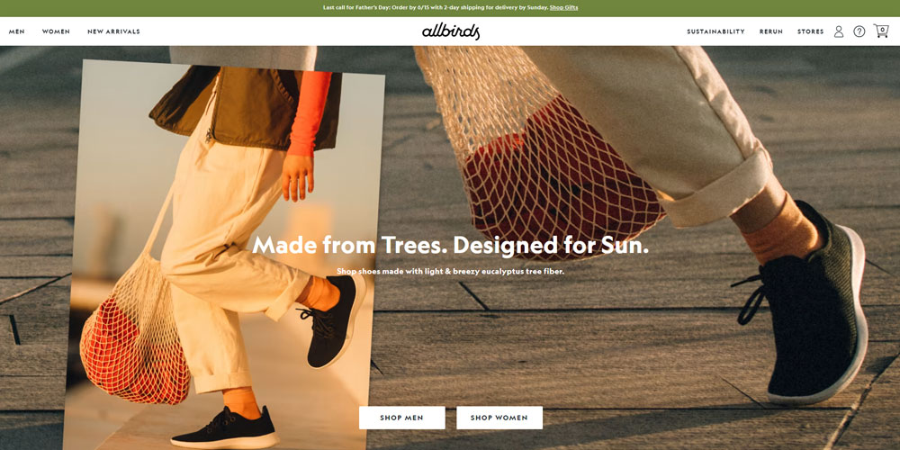
Brands like ASOS, Allbirds, and Glossier treat their websites as full retail experiences. Every pixel serves the transaction.
Retail Website Design Examples
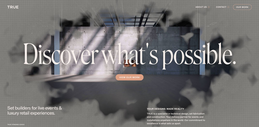
TRUE
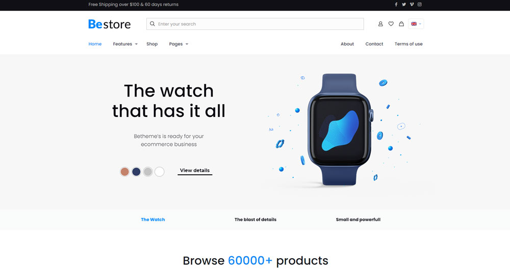
Be Default Store
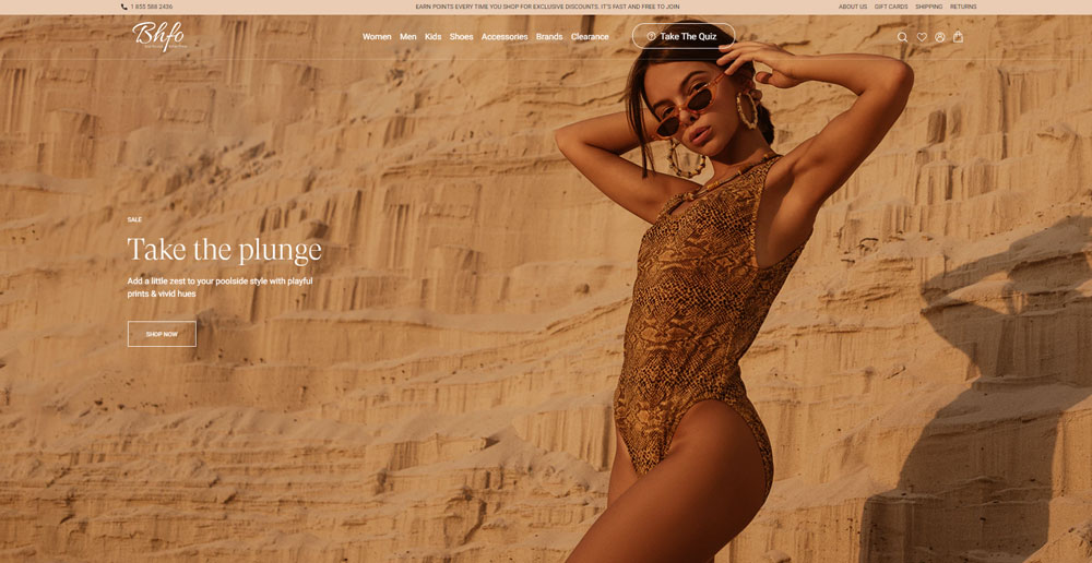
BHFO
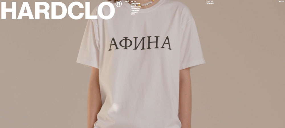
HARDCLO
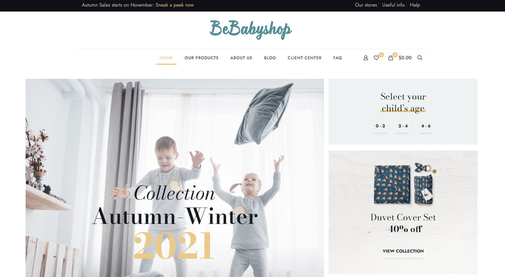
Be Baby Shop
Central Retail Corporation

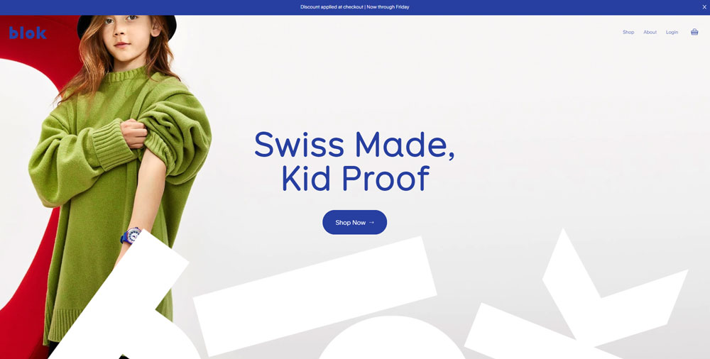
Blok Watches
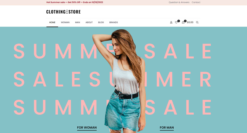
Be Clothing Store
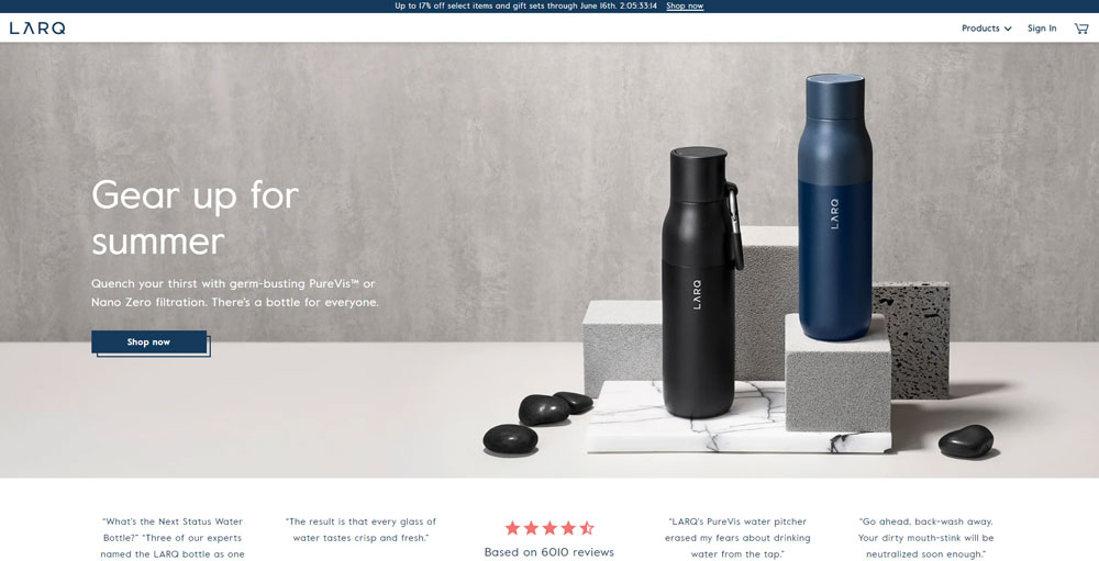
Larq
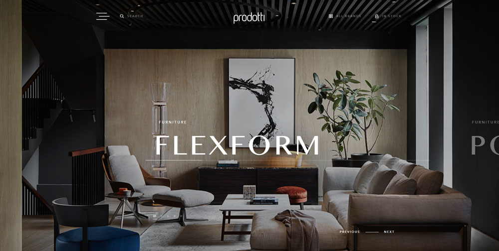
Prodotti Indonesia
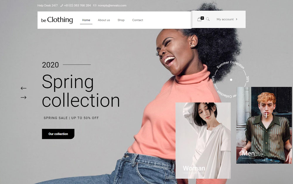
Be Clothing 2
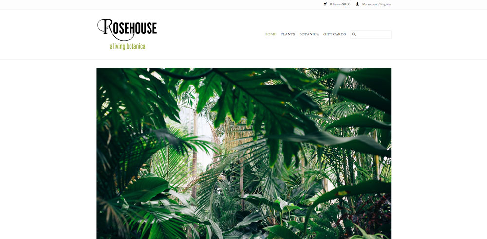
Rosehouse
KITH

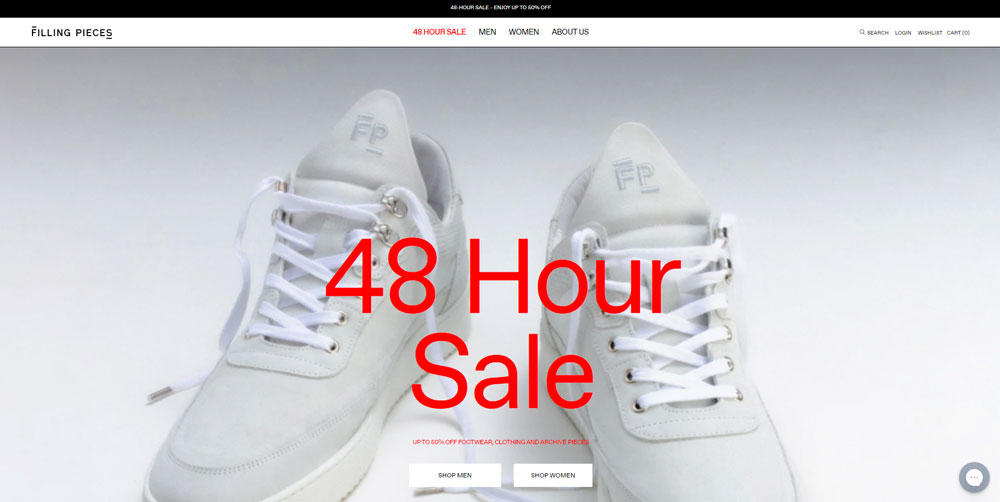
Filling Pieces
Be Store 2
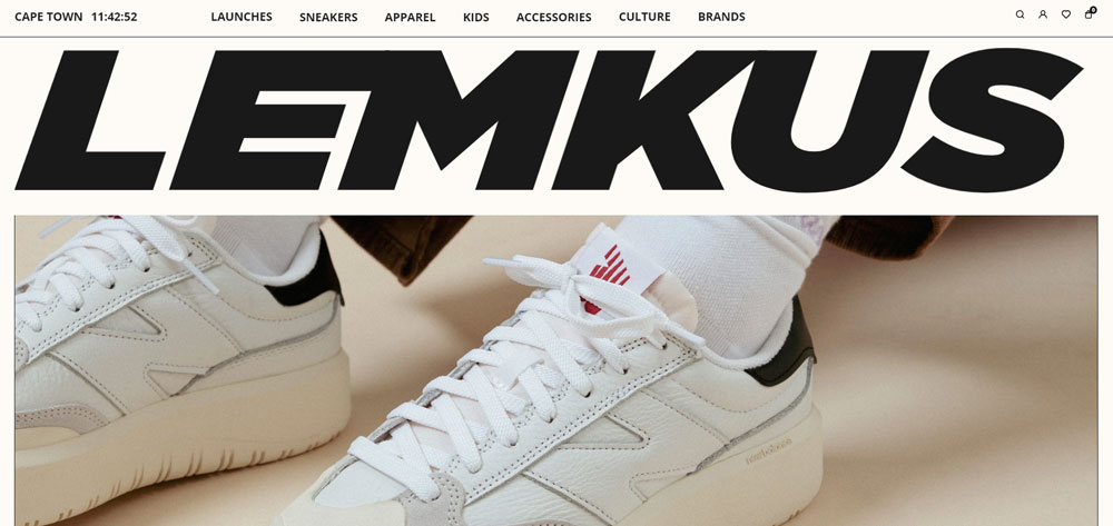
Lemkus
LULA PACE

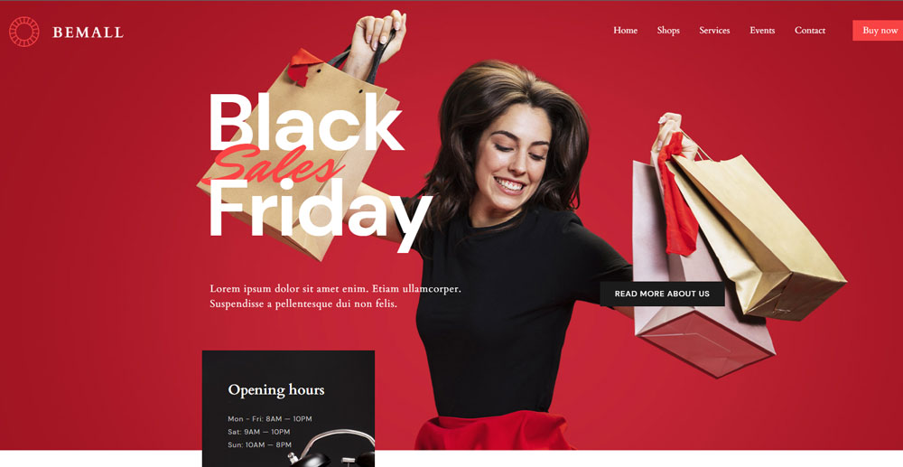
Be Mall
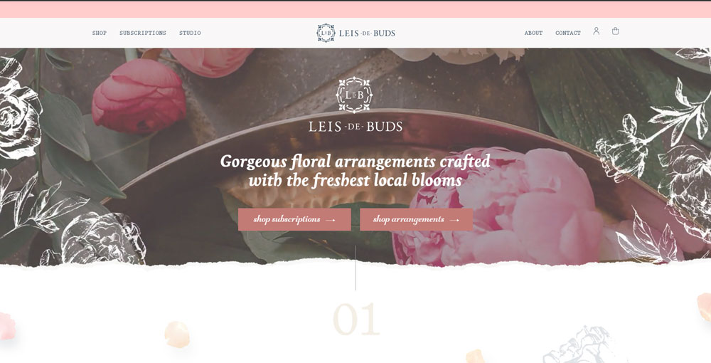
Leis De Buds
Spur Line Supply Co.
Be Store
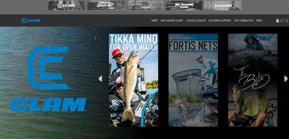
Clam Outdoors
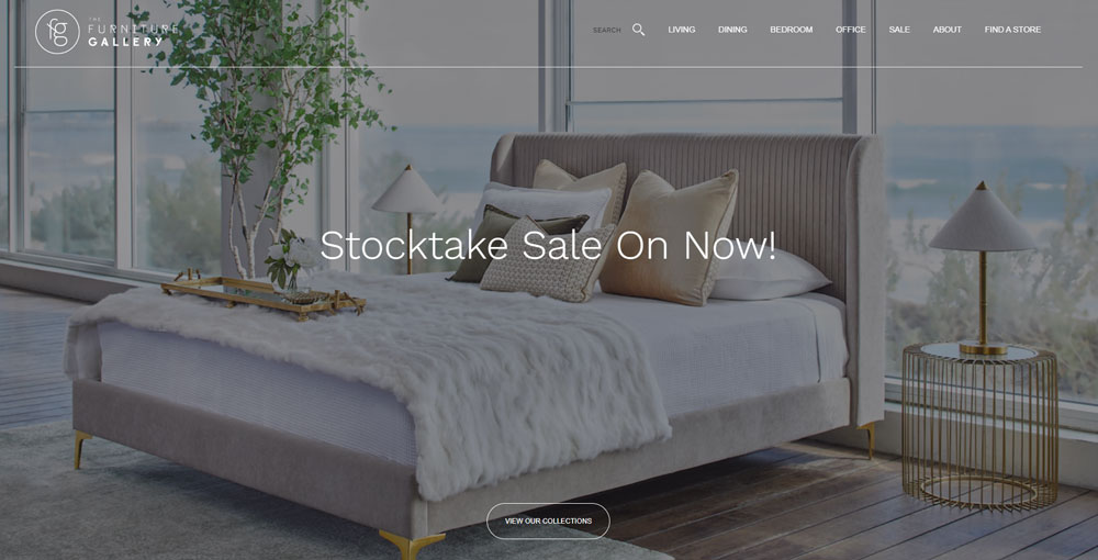
The Furniture Gallery
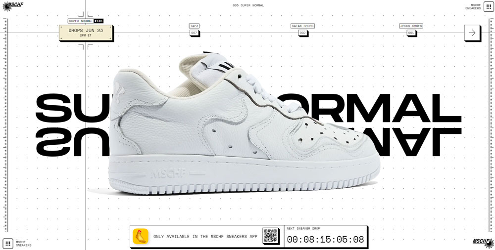
MSCHF Sneakers
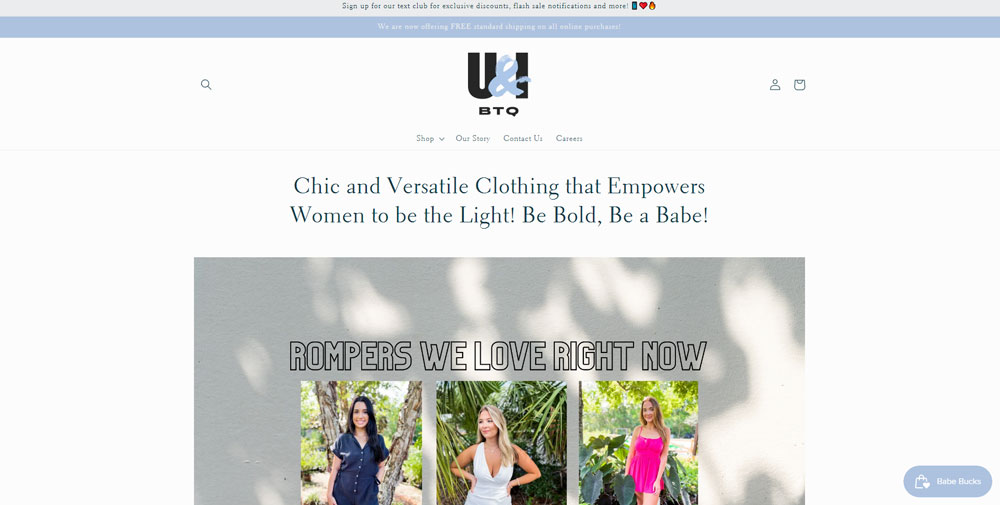
U&I BTQ
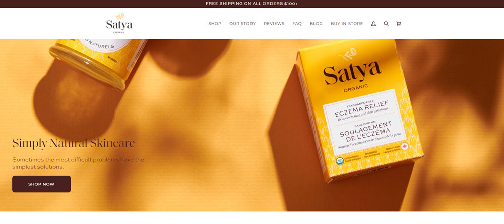
Satya Organic Skincare
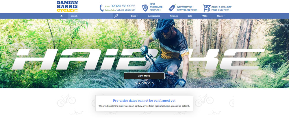
Damian Harris Cycles
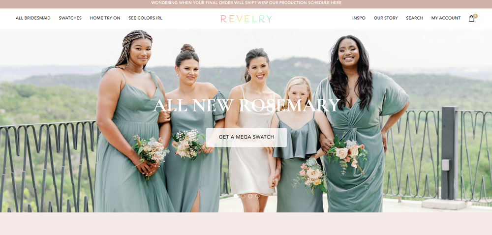
Revelry
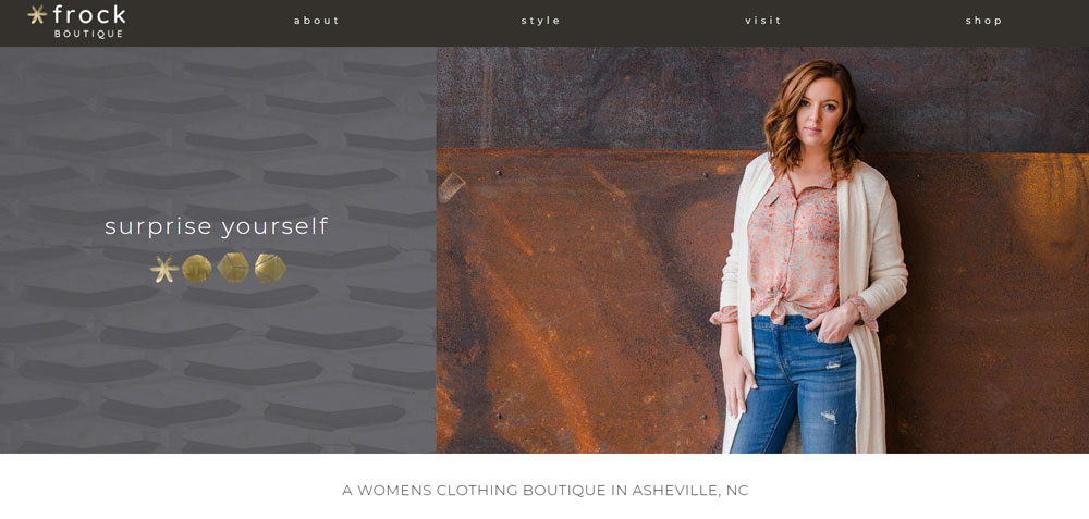
Frock Boutique
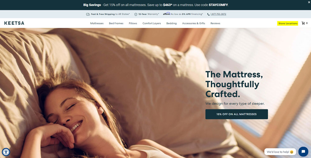
Keetsa
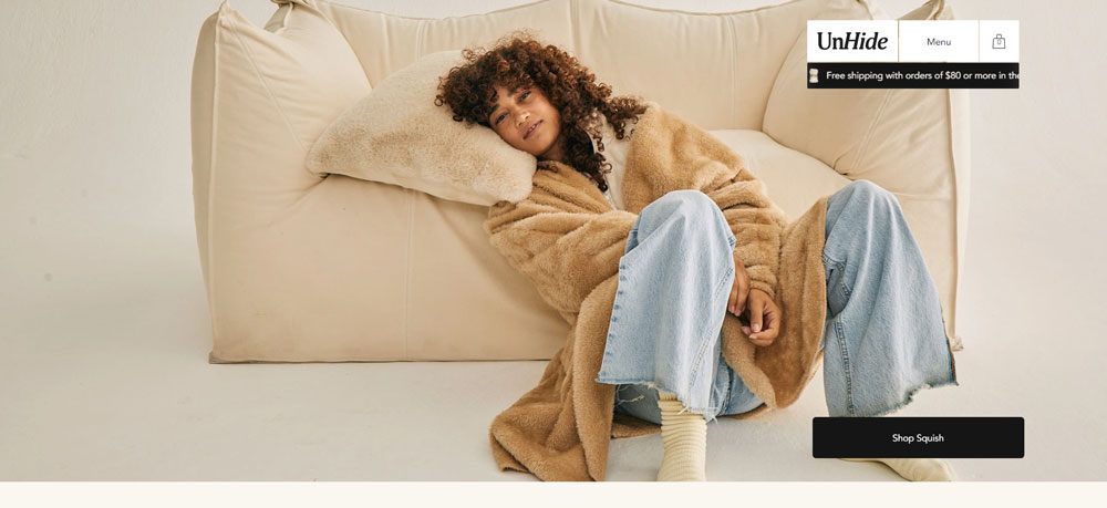
UnHide
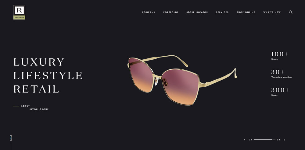
Rivoli Group
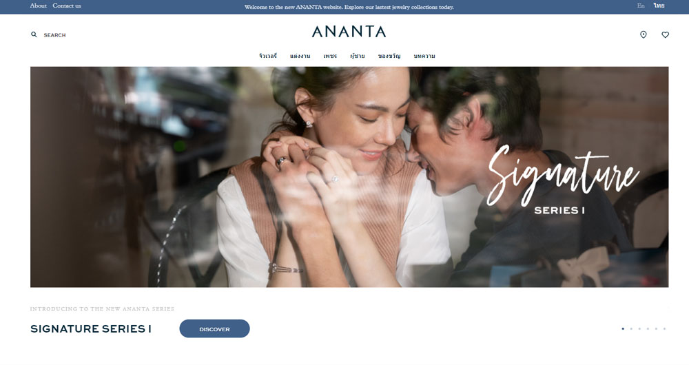
Ananta Fine Jewelry
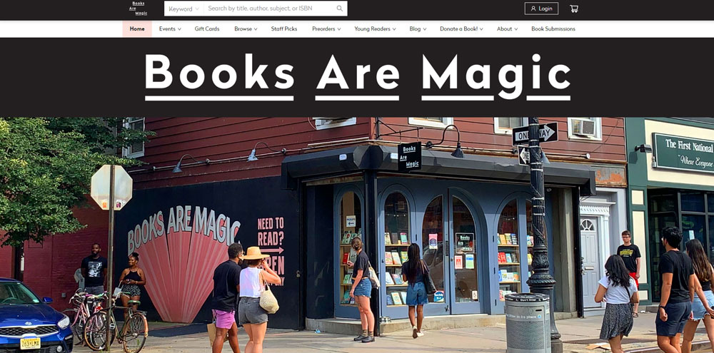
Books Are Magic
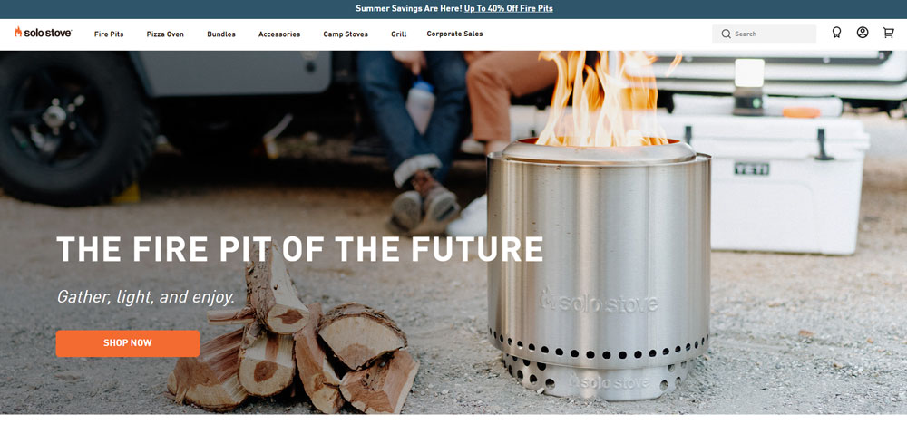
Solo stove
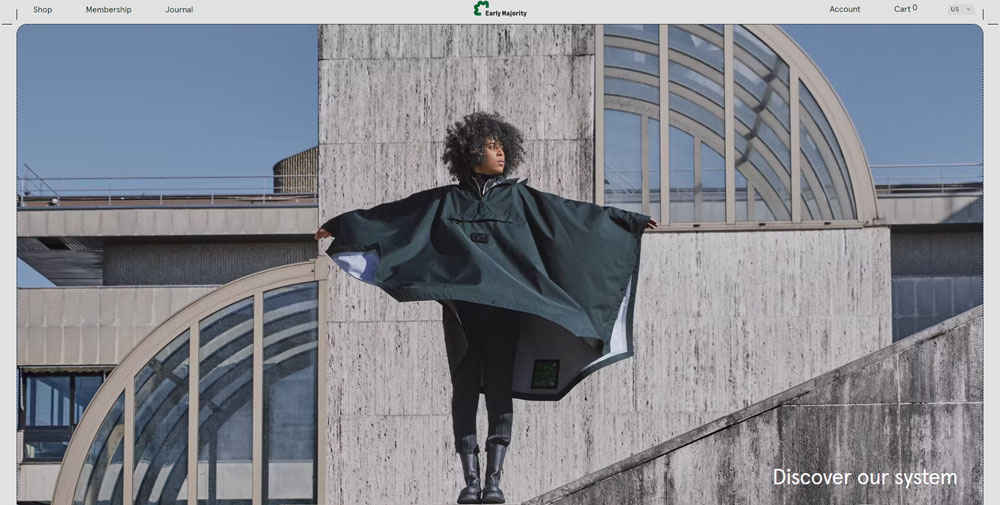
Early Majority
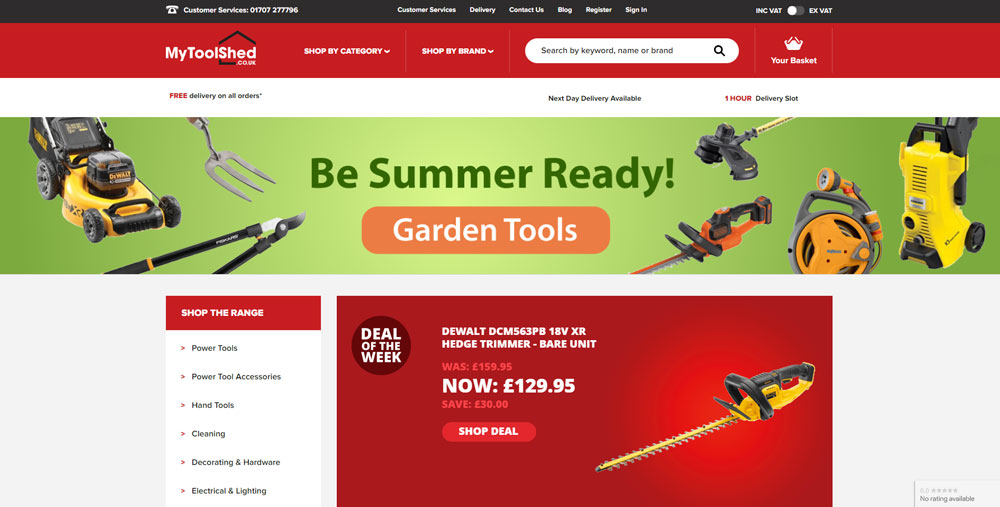
My Tool Shed
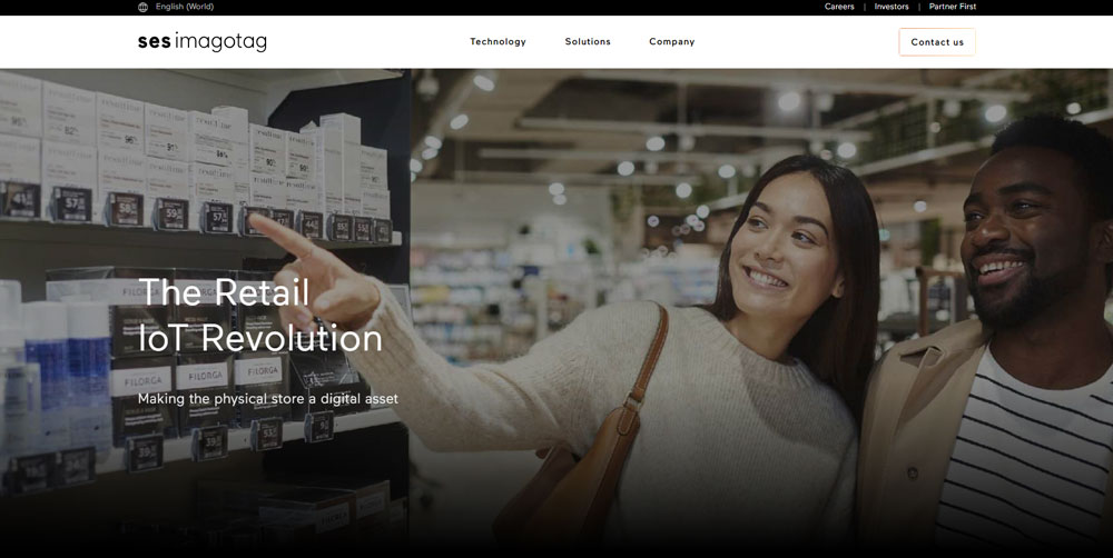
SES-Imagotag
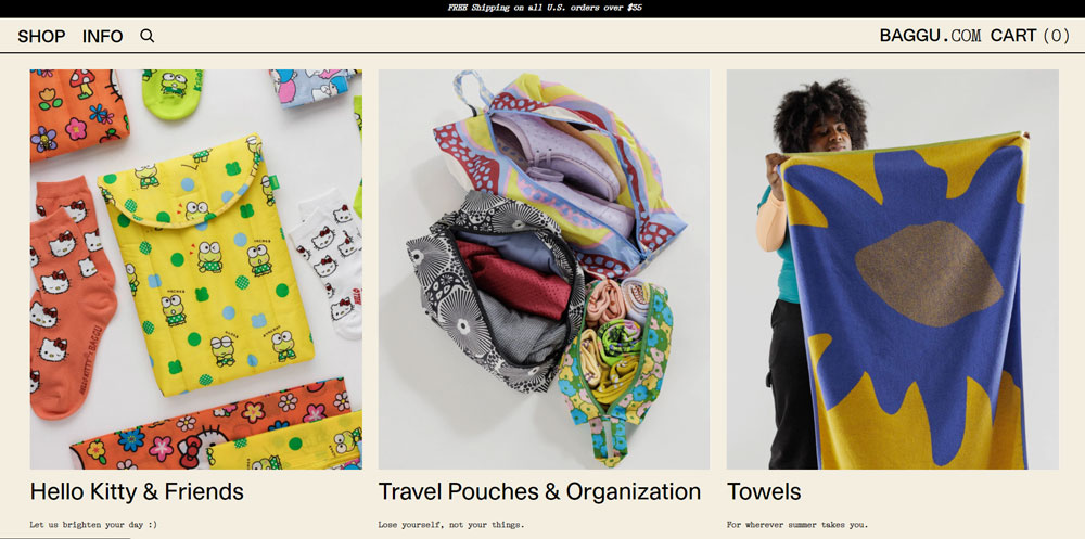
BAGGU
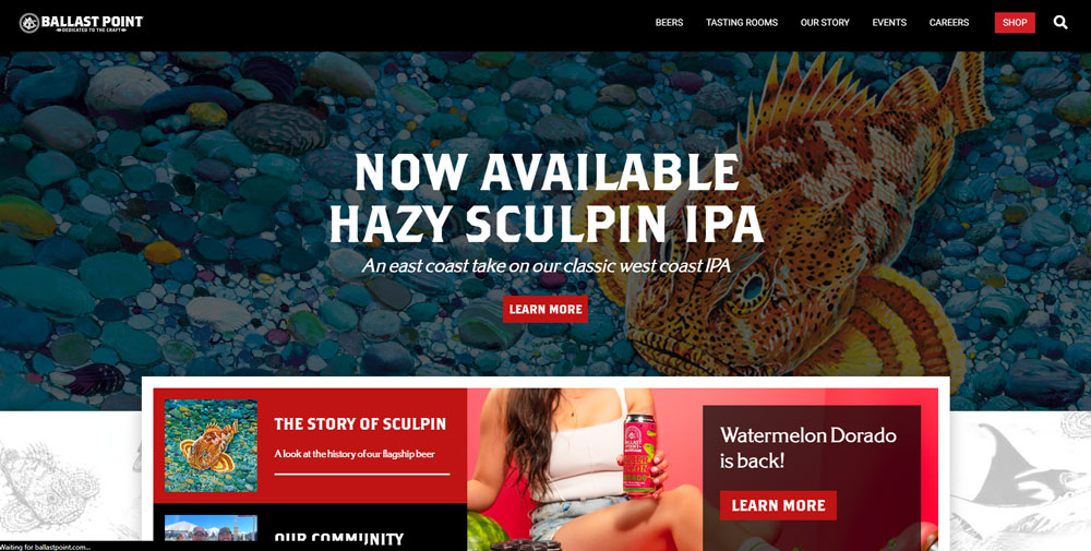
Ballast Point
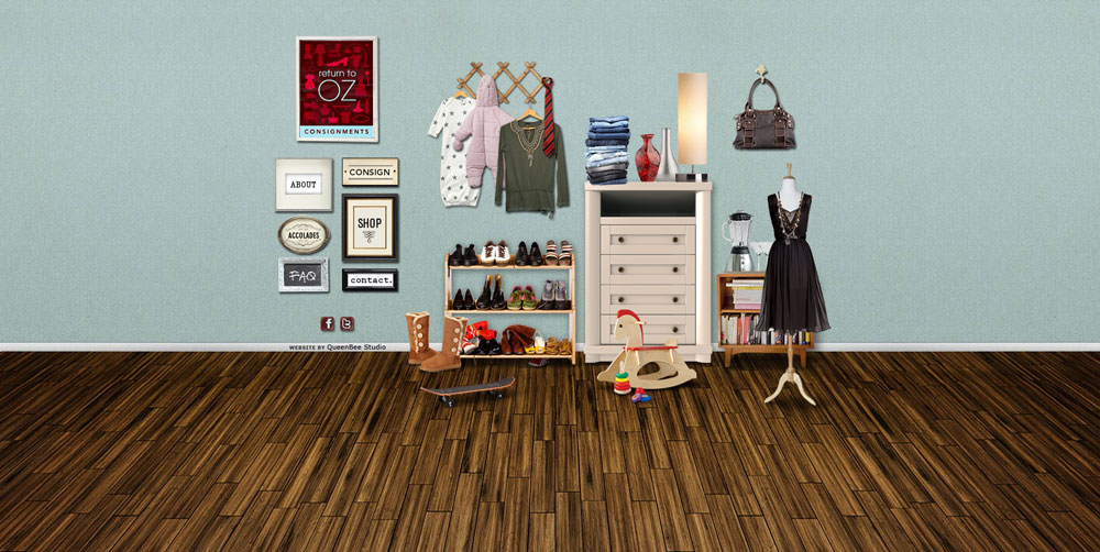
Return to OZ consignments
Take Heart
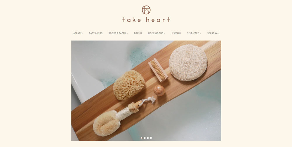
Take Heart from Austin, Texas, wanted to make something new. Besides a great online shopping experience, it has an awesome layout. They use heartwarming images that emphasize shadows and texture.
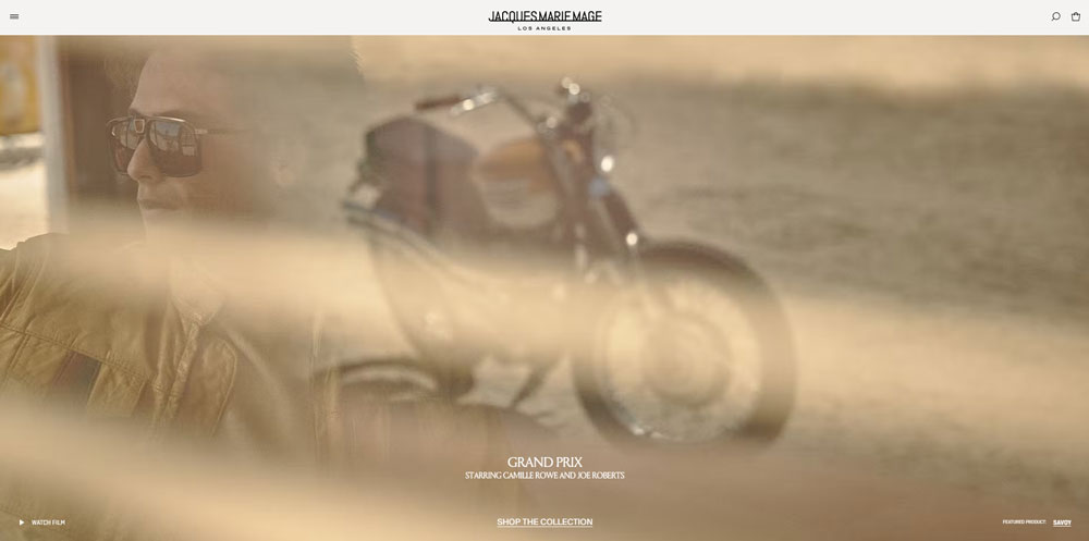
Jacques Marie Mage
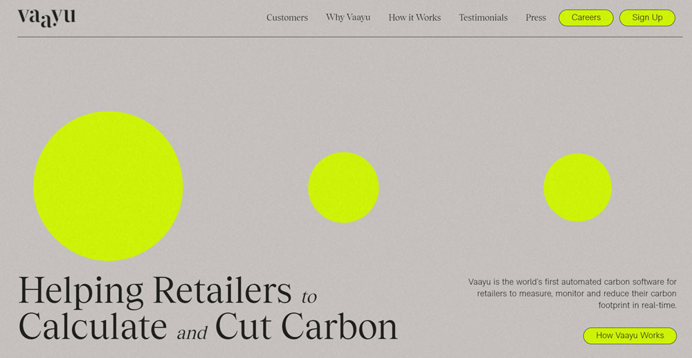
Vaayu
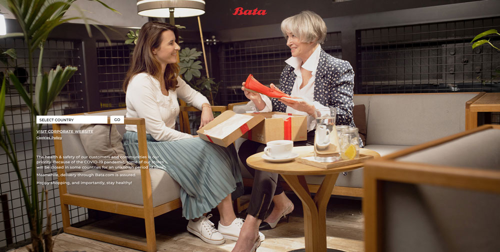
Bata
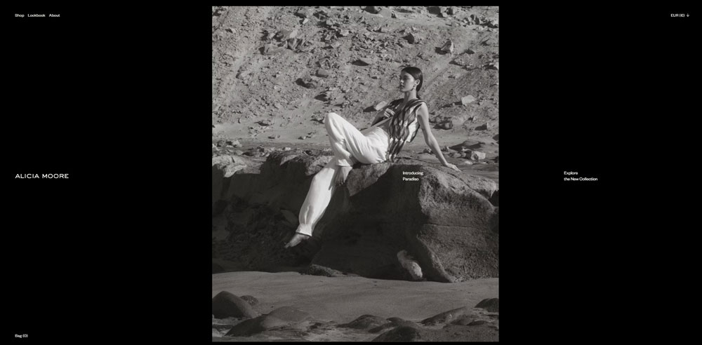
Alicia Moore
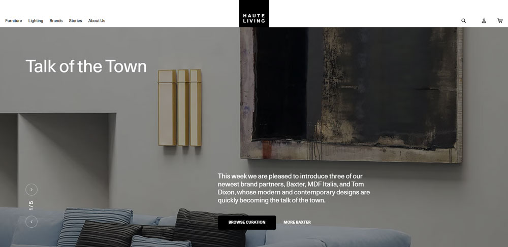
Haute Living
UNITE DIVISION OF ME

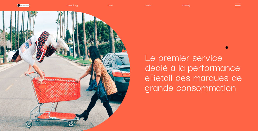
bascule
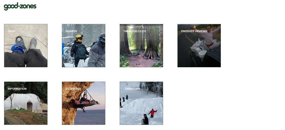
Good Zones
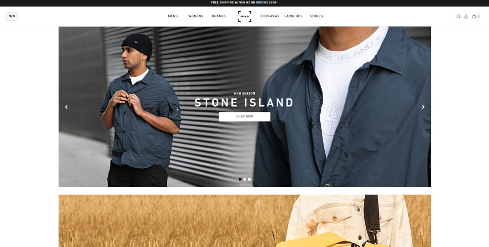
Area 51
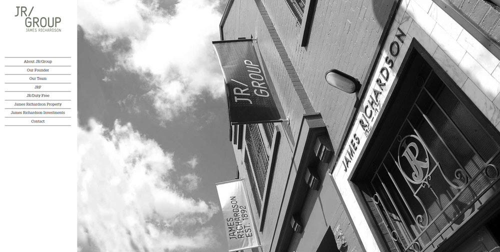
JR/Group
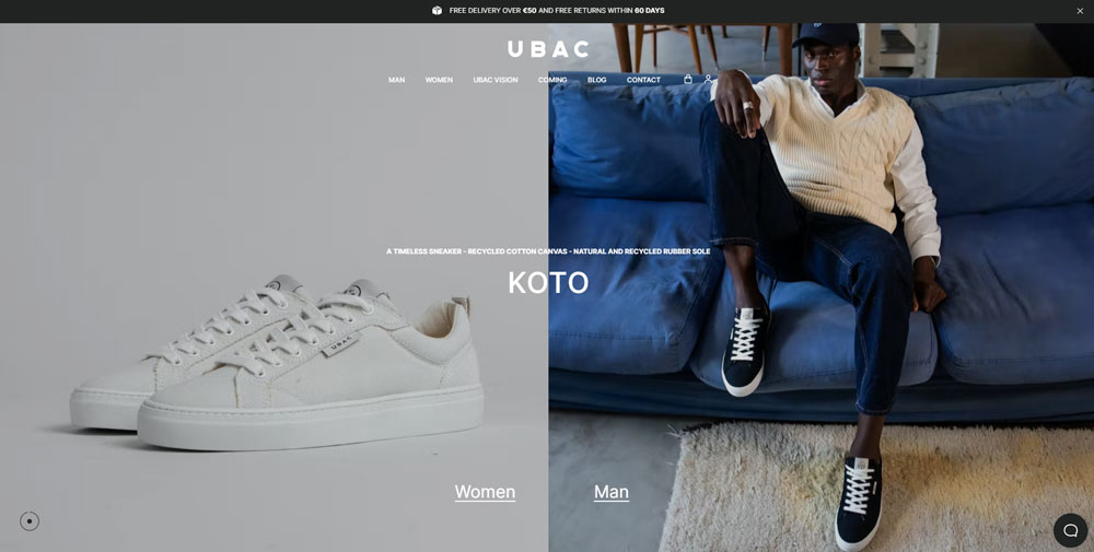
Ubac
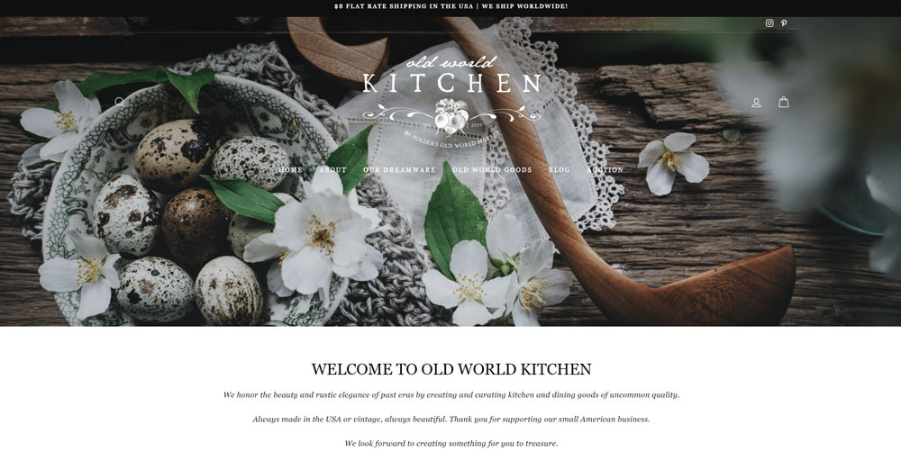
Old World Kitchen
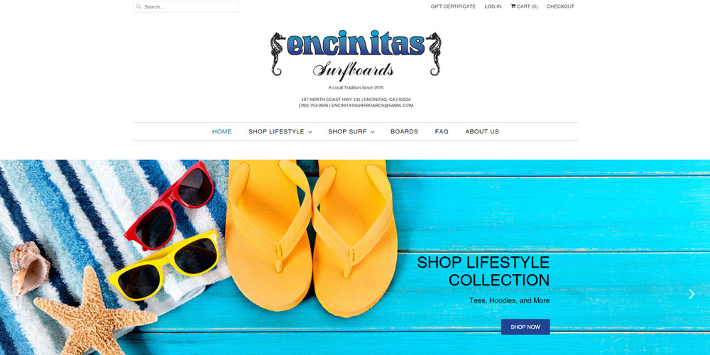
Encinitas Surfboards
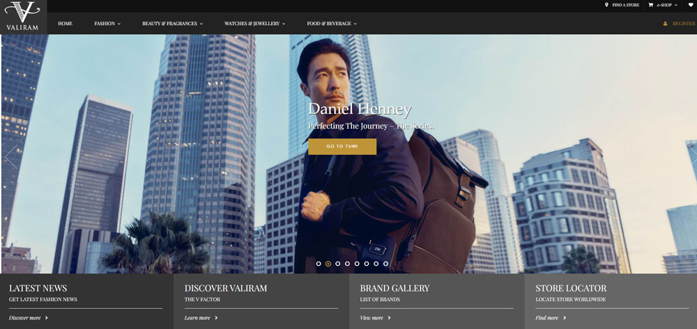
Valiram Group
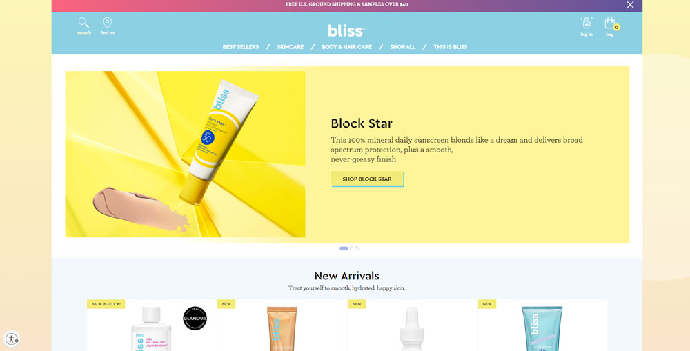
Bliss
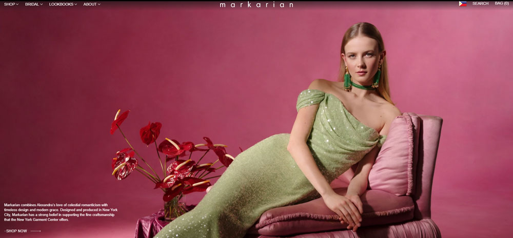
Markarian
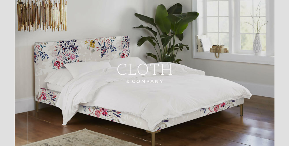
Cloth & Company
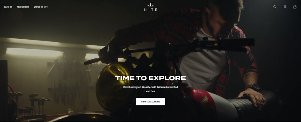
Nite Watches
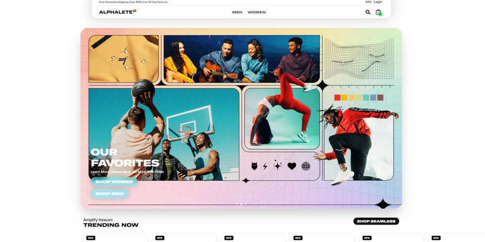
Alphalete Athletics
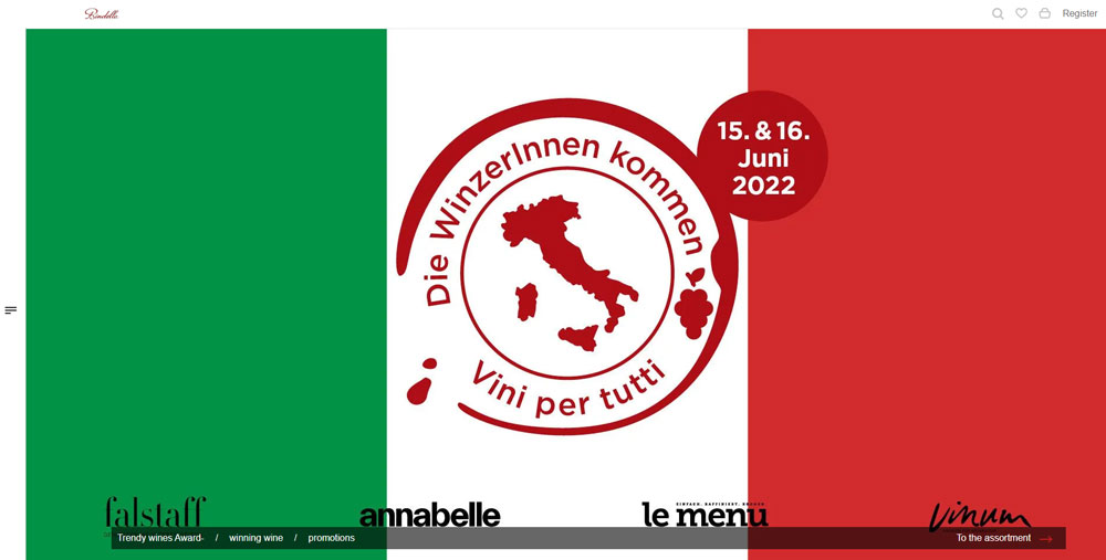
Bindella Wineshop
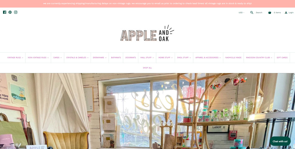
Apple and Oak
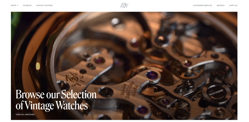
Amsterdam Vintage Watches
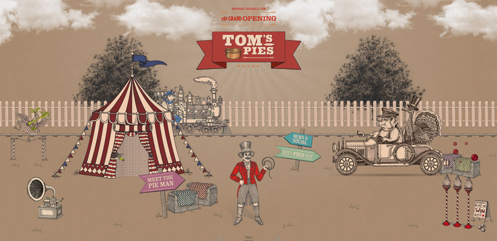
Tom's Pies - Food Portfolio
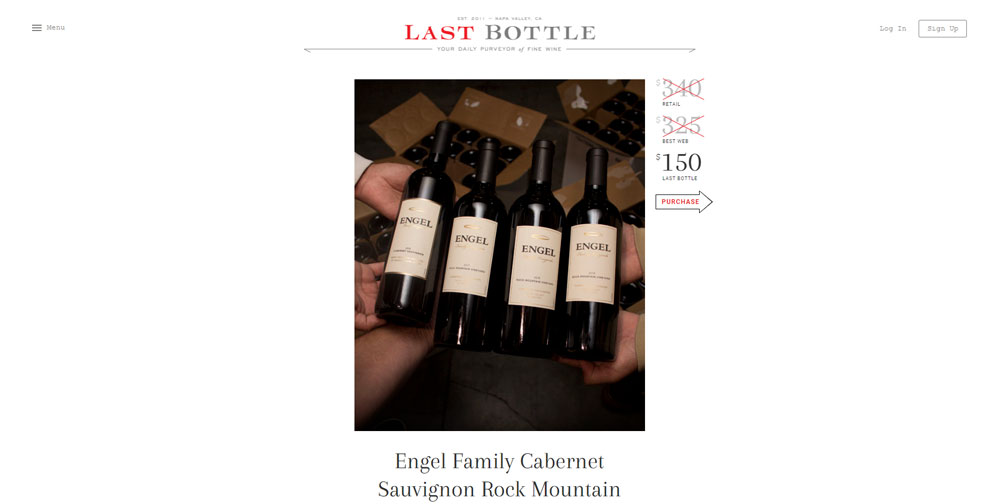
Last Bottle
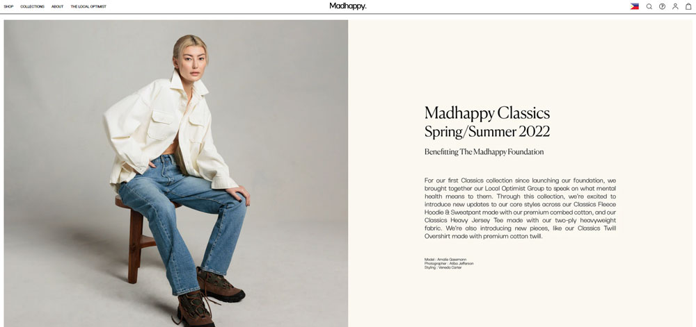
Madhappy
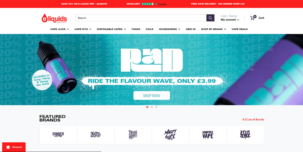
E-Liquids Superstore
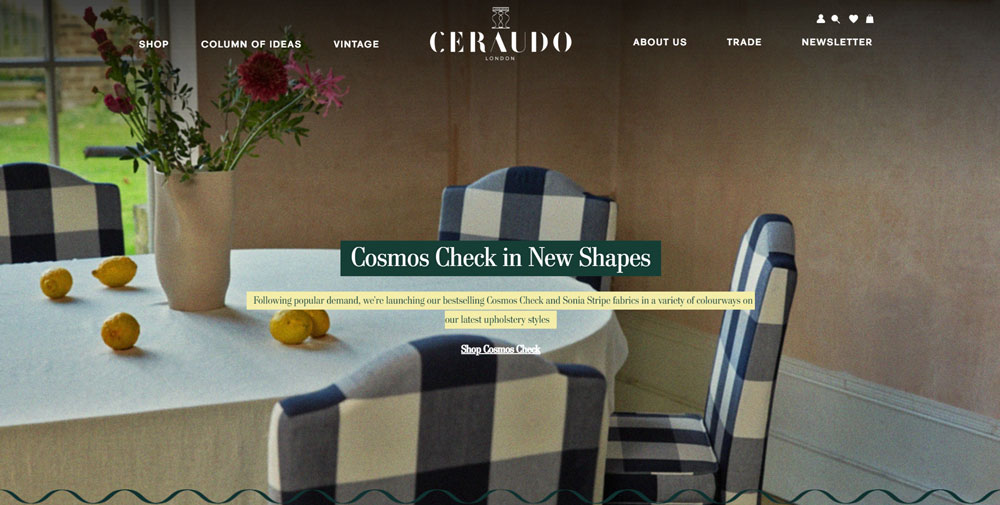
Ceraudo
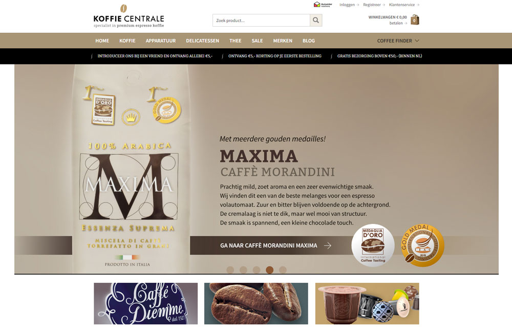
Koffiecentrale
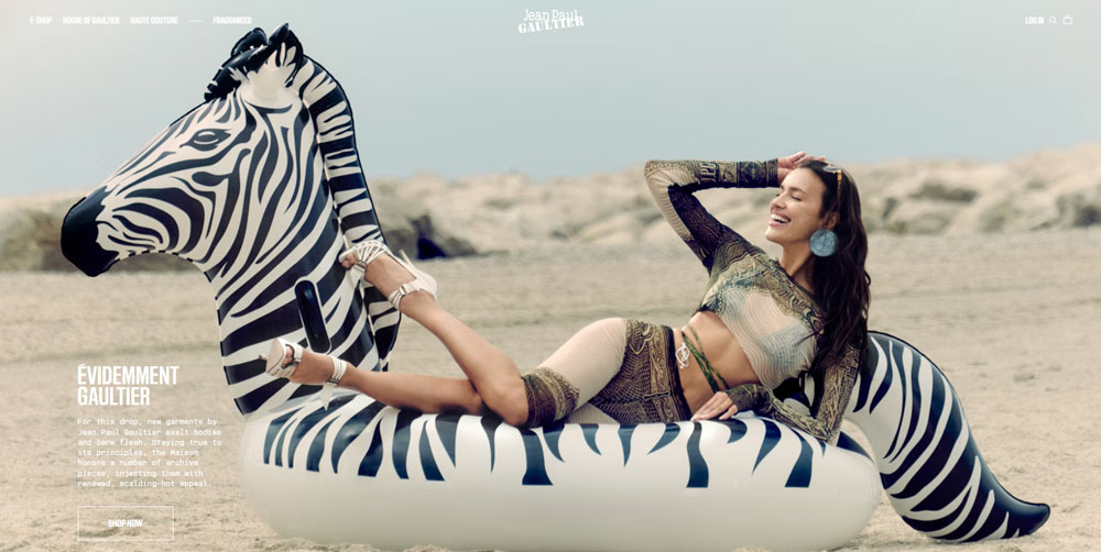
Jean Paul Gaultier
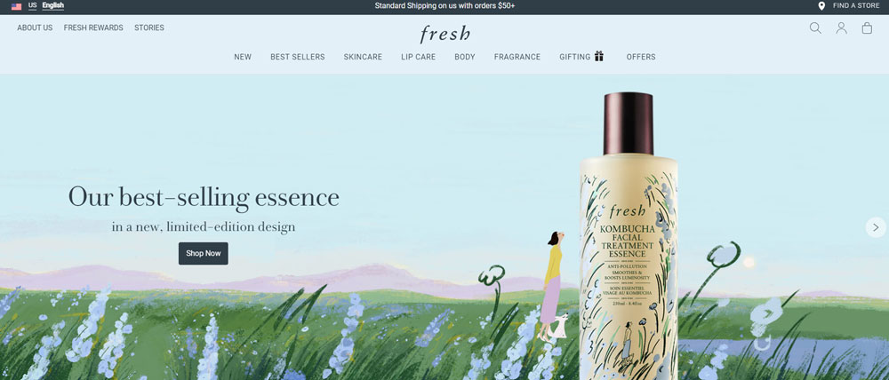
Fresh
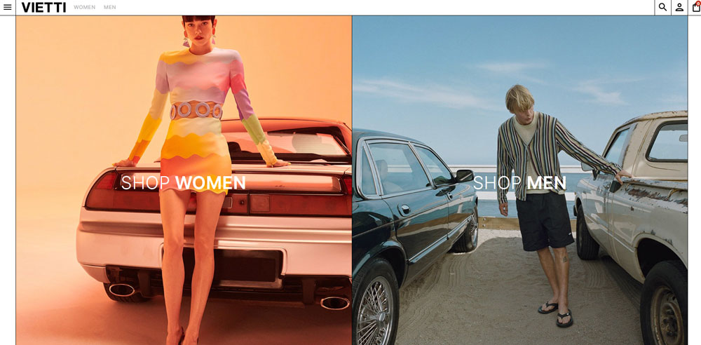
VIETTI
Ulé

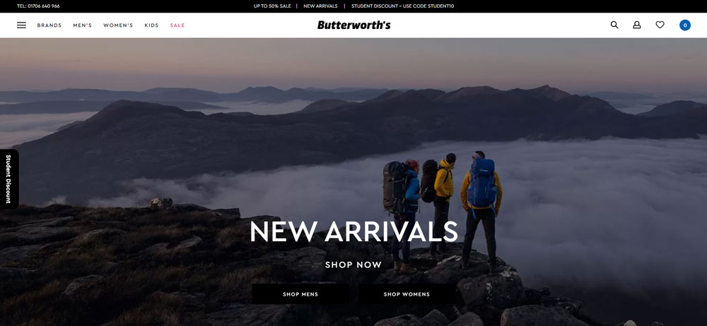
Butterworths
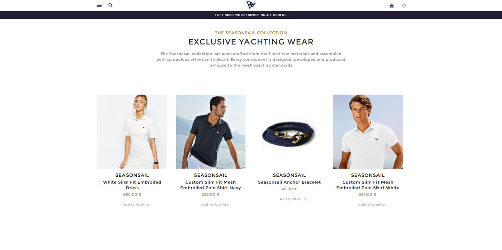
Seasonsail
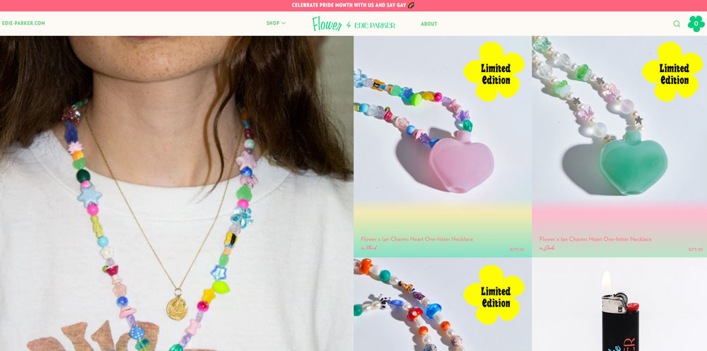
Edie Parker
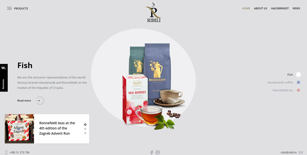
Hausbrandt Caffee Croatia
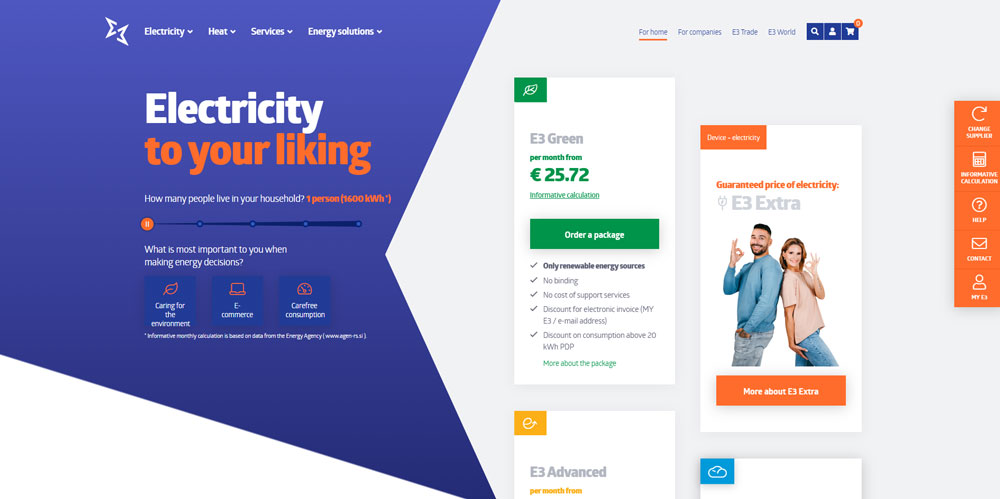
E3
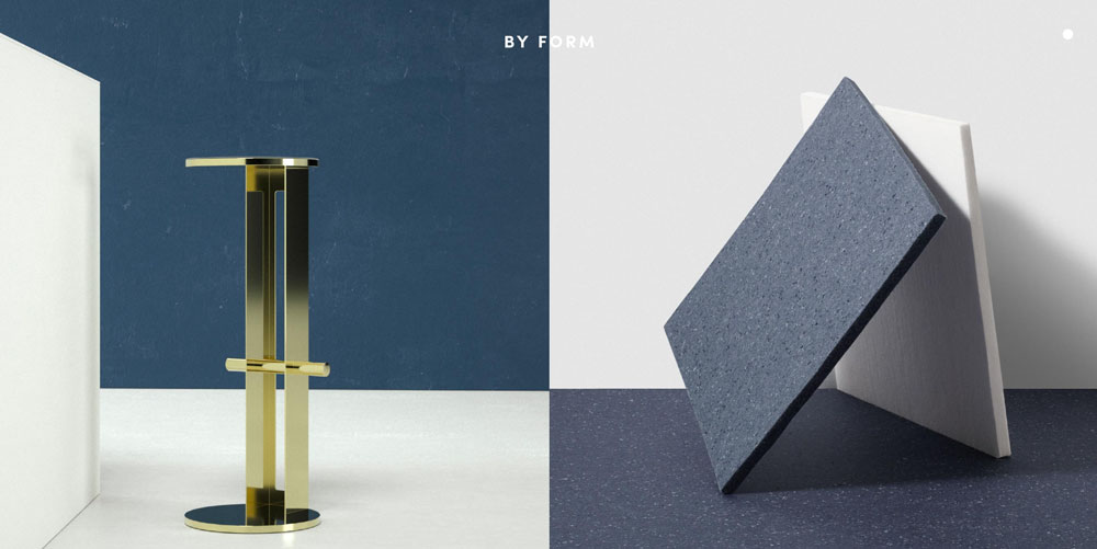
Form
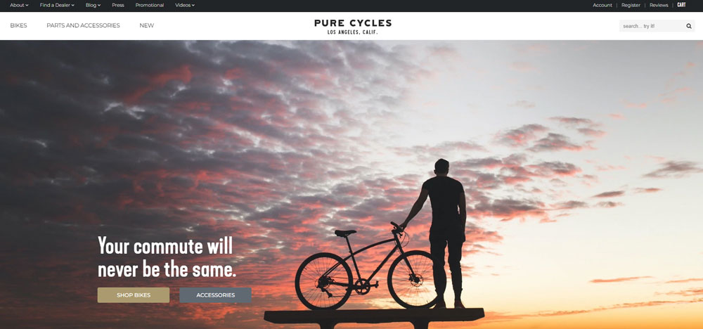
Pure Cycles
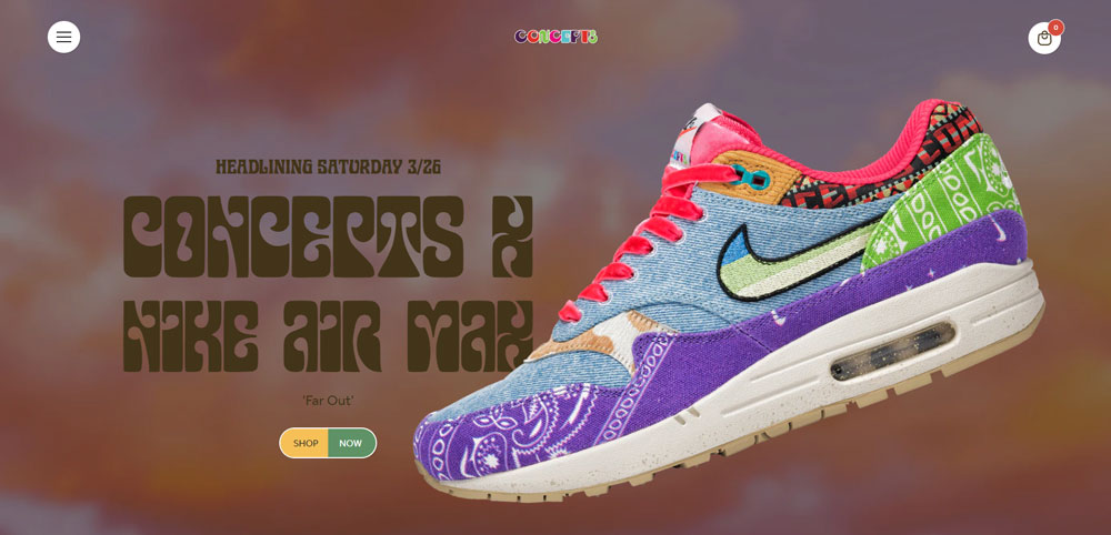
Concepts x Nike Air Max 1
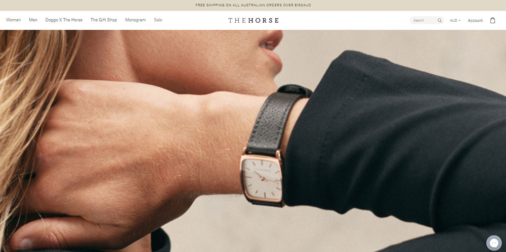
The Horse
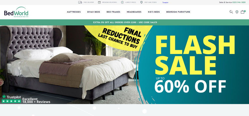
BedWorld
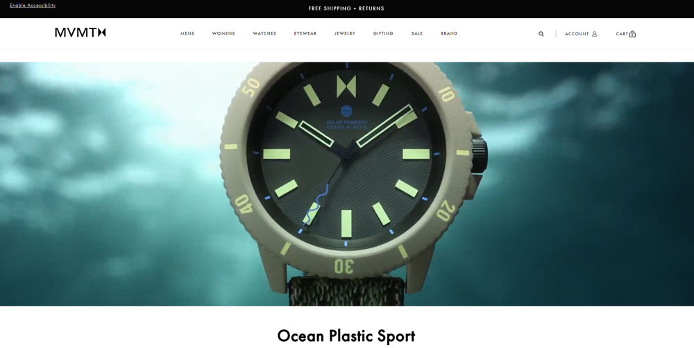
MVMT
A Fresh Take

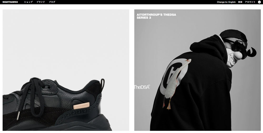
Nighthawks
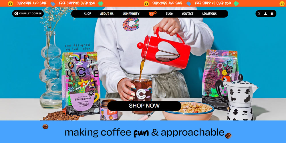
Couplet Coffee
Allbirds
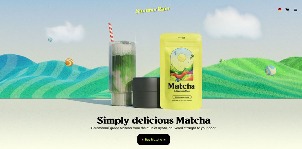
SummerRain
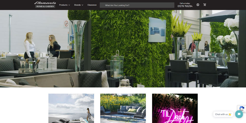
Elements Home & Garden
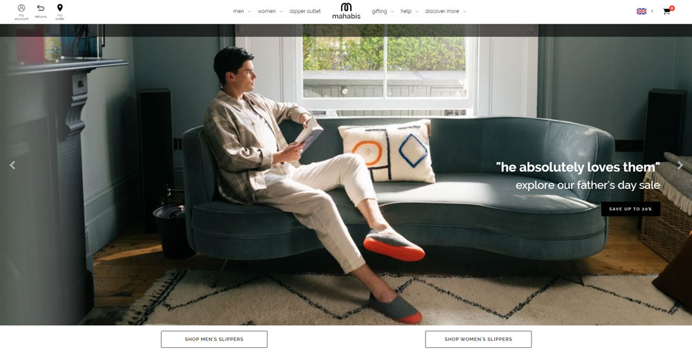
mahabis
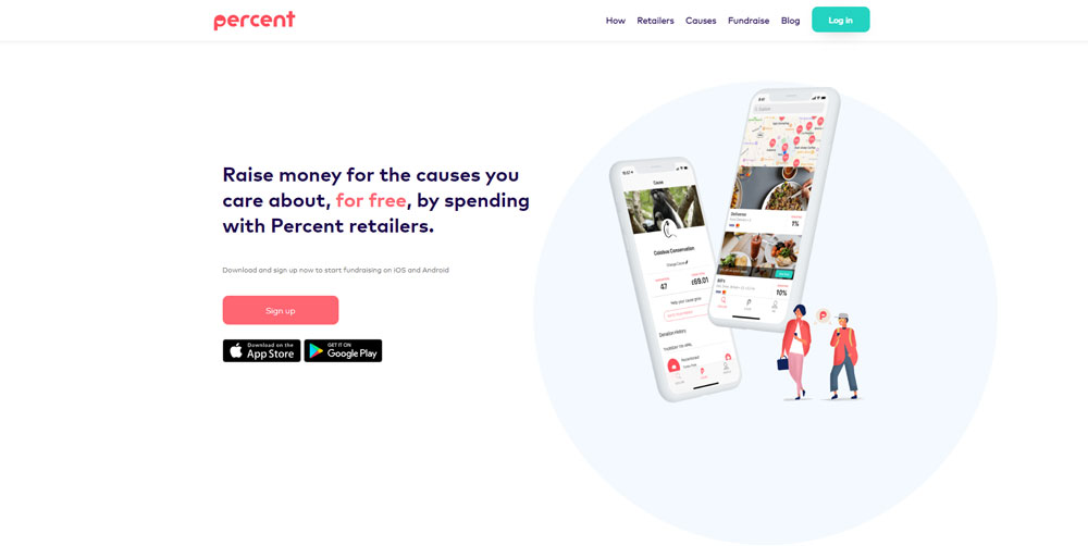
Percent
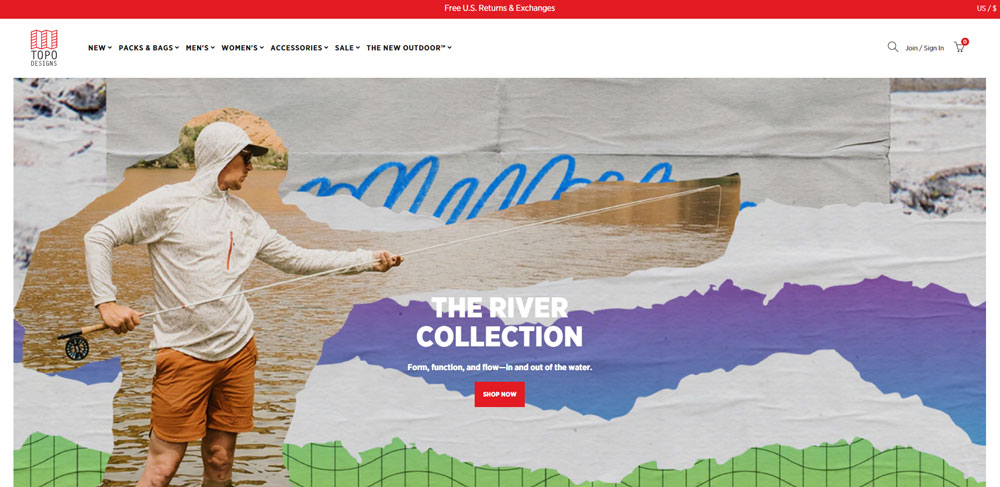
Topo designs
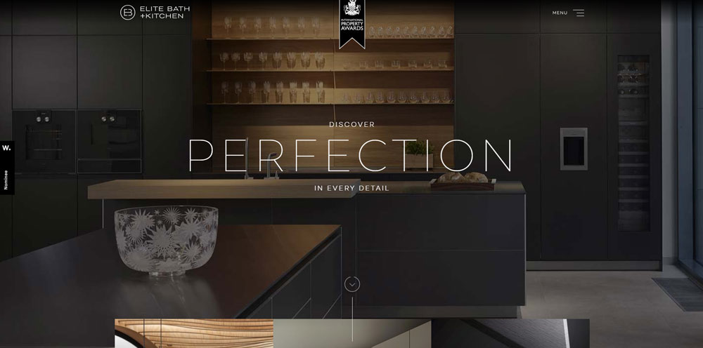
ELITE BATH+KITCHEN
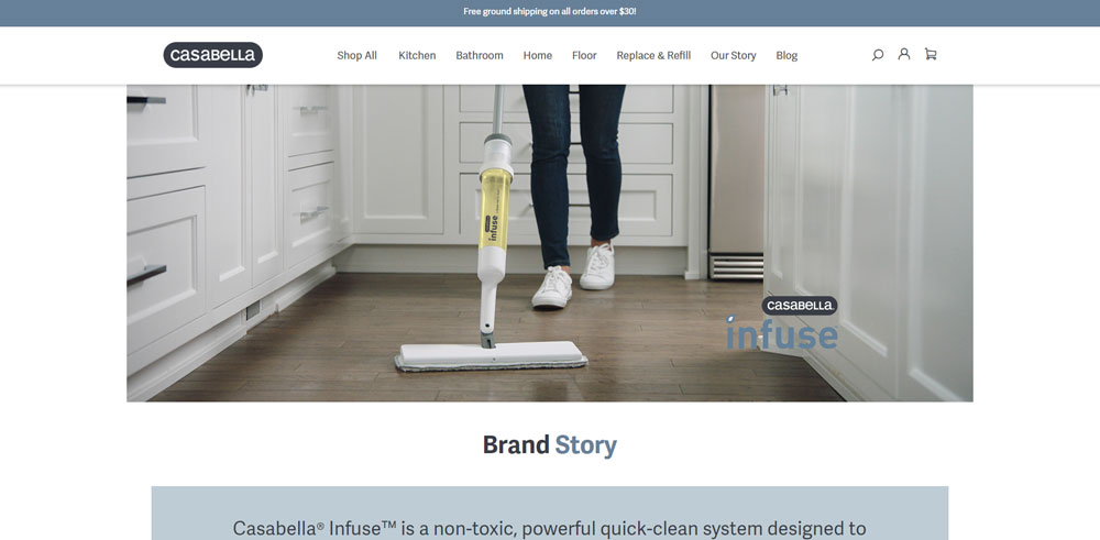
Casabella
Pack4it
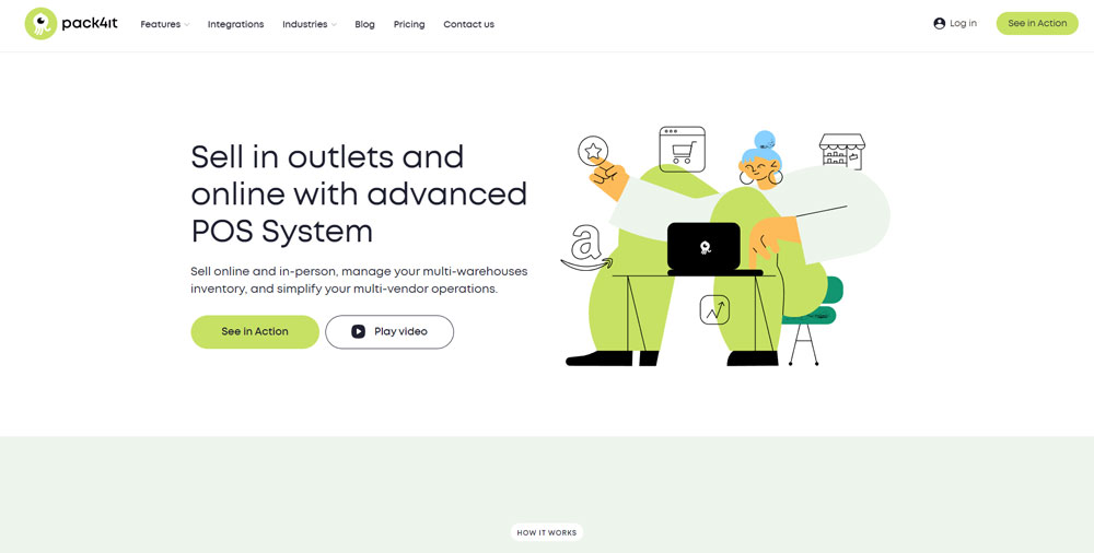
Pack4it offers POS software through its cloud solutions. Their target audiences are wholesalers and retailers. They specialize in the best POS system for customers.
Emphasis Jewellery Brand Site
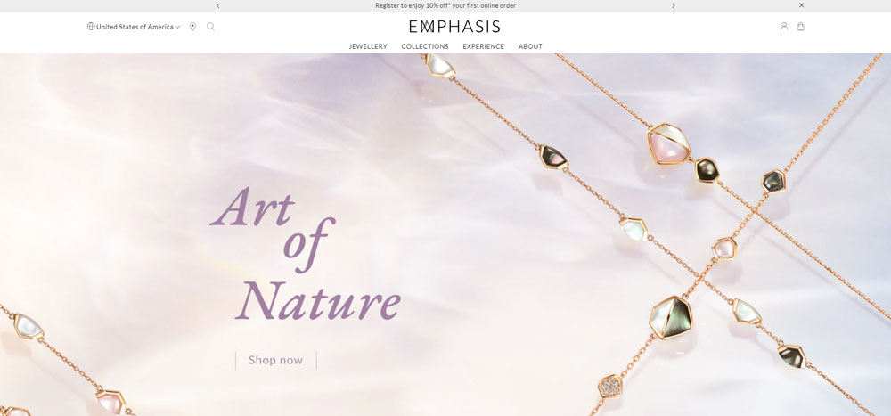
Emphasis, from Hong Kong, has limited edition designer jewelry collections. This luxury store works together with many international jewelry brands.
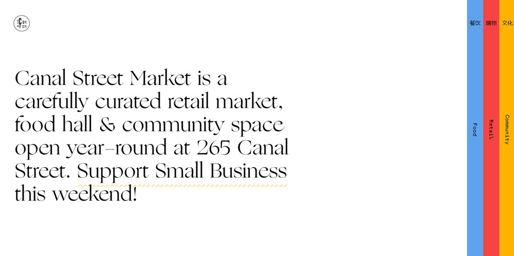
Canal Street Market
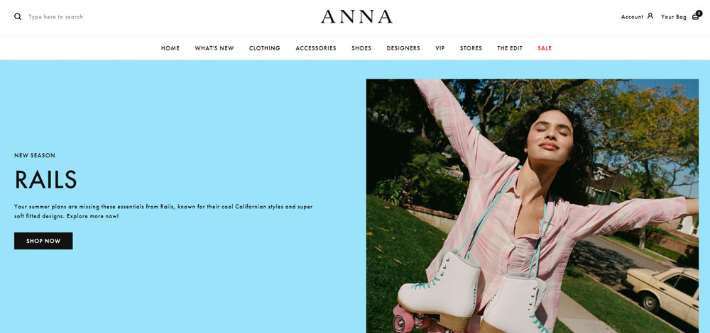
Anna Clothing
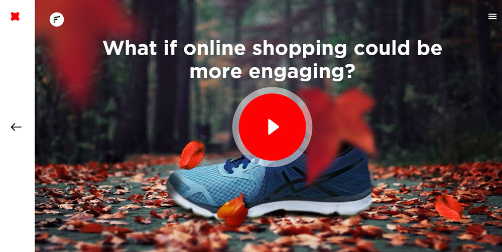
Fantasy Shopping
Why Does Retail Website Design Matter for Online Stores
Baymard Institute research from 2024 found that 70.19% of online shopping carts get abandoned. Most of those drop-offs trace back to design problems: complicated checkout, slow load times, or confusing navigation.
A 2023 study by Nielsen Norman Group showed that users form opinions about a website in 50 milliseconds. That first impression is almost entirely visual.
Design directly affects conversion rates, average order value, and bounce rates. Fixing a single checkout friction point can lift revenue by 10-35%, according to Baymard's checkout usability data from March 2024.
Specific retail design patterns carry their weight here. Sticky add-to-cart buttons, mega menus for large catalogs, quick-view modals on product grids, and a well-structured website navigation all reduce the gap between browsing and buying.
Mobile commerce accounted for 60% of global ecommerce sales in 2024. If your responsive design breaks on a phone screen, you lose the majority of your potential customers before they even see a product.
What Makes a Retail Website Design Effective
Before looking at specific examples, it helps to know what separates a retail site that sells from one that just sits there. These are the criteria used to evaluate the examples in this article:
- Page load speed - measured through Google Lighthouse and Core Web Vitals (Largest Contentful Paint under 2.5 seconds, Cumulative Layout Shift below 0.1)
- Mobile responsiveness - how well the layout adapts across screen sizes, thumb-zone placement, swipe-friendly product galleries
- Navigation structure - category organization, filter systems, search bar with autocomplete, breadcrumb trails
- Product page layout - image quality, zoom functionality, information hierarchy, cross-sell placement
- Checkout flow - number of steps, guest checkout availability, express payment options like Apple Pay and Stripe integration
- Visual hierarchy - use of white space, typography choices, color theory application
- Trust and credibility signals - review placement, security badges, return policy visibility
URL structure, crawlability, and ecommerce SEO fundamentals like canonical tags and structured data also feed into overall site performance - not just rankings, but how easily shoppers find product pages in the first place.
No single factor makes a retail website work. It is the combination that matters. A gorgeous homepage with a broken checkout is worse than an ugly site that converts.
How Do Retail Websites Handle Mobile Design
Every example above generates more than half its traffic from phones. Mobile first design is the baseline, not a feature.
Common mobile patterns across top retail sites:
- Bottom-sheet navigation for filters and sorting (thumb-zone friendly)
- Swipe gestures on product image galleries instead of arrow buttons
- Sticky add-to-cart bars that follow the scroll
- Collapsed product details in accordion sections to reduce scroll depth
- Express checkout buttons (Apple Pay, Google Pay, Shop Pay) above the fold
Statista reported in 2024 that mobile commerce hit $2.2 trillion globally. Brands like Gymshark and ASOS build mobile-first, then adapt upward to desktop. Not the other way around.
The biggest mobile mistakes? Tiny tap targets on filter buttons, image carousels that hijack vertical scrolling, and checkout forms that don't trigger the right keyboard type for phone number or email fields. A solid form design approach fixes most of these.
What Design Patterns Do the Best Retail Websites Share
After looking at 15 examples, some patterns repeat across nearly all of them.
Navigation
Large catalogs use mega menus with visual category thumbnails. Smaller catalogs use simple top bars. Almost all include a persistent search bar with autocomplete. Breadcrumb trails appear on every product and category page. Check these website navigation examples for more patterns.
Homepage Layout
Hero banner or full-width video at the top, followed by a category grid, then featured collections, then social proof. Seasonal promotions rotate in the hero slot. Editorial brands (Zara, Away) break this pattern with lookbook-style scrolling.
Product Listing Pages
Filter sidebar on desktop, bottom-sheet on mobile. Grid layouts with 3-4 columns. Hover states reveal quick-add or secondary images. Infinite scroll is less common than "Load More" buttons now, because pagination helps Google Lighthouse performance scores.
Checkout Flow
Single-page checkout is gaining ground over multi-step. Guest checkout is standard. Express payment buttons appear early. Shipping calculators and return policy callouts show before the payment step. Shopify's one-page checkout update in 2023 pushed a lot of brands in this direction.
How Do Retail Website Designs Handle Trust and Credibility
Trust is not a single badge in the footer. It is built through dozens of small decisions across the entire site.
Baymard Institute's 2024 checkout usability study identified specific trust patterns that reduce cart abandonment:
- Security badge placement near the payment form, not just in the footer
- Return policy visible on the product page and in the cart summary
- Customer reviews with verified purchase tags and specific usage context
- Shipping cost transparency before the checkout step
- Brand contact information (phone, email, chat) accessible from every page
Glossier and Sephora both display user-submitted photos in reviews. Everlane shows factory photos and cost breakdowns. Patagonia links to supply chain reports.
Each approach is different, but they all answer the same question: "Can I trust this store with my money?" A strong testimonial page design helps, but scattering trust signals across the entire shopping flow matters more.
FAQ on Retail Website Design
What makes a retail website design effective?
An effective retail website design combines fast page load speed, clear navigation, strong product photography, and a frictionless checkout flow. Core Web Vitals scores, mobile responsiveness, and trust signals like reviews and return policies all contribute directly to higher conversion rates.
Which platform is best for building a retail website?
Shopify works for most small to mid-size retail stores. WooCommerce suits WordPress users who want flexibility. BigCommerce and Magento handle larger catalogs. For enterprise-level performance, headless setups using React or Next.js with a CMS like Contentful give the most control.
How important is mobile design for retail websites?
Mobile commerce accounts for over 60% of global ecommerce sales. Thumb-zone navigation, swipe-friendly product galleries, sticky add-to-cart bars, and express payment options like Apple Pay are standard on every high-performing retail site today.
What should a retail homepage include?
A retail homepage typically starts with a header and hero banner, followed by category grids, featured product collections, social proof sections, and promotional banners. The layout should guide shoppers toward products within two clicks or fewer.
How do retail websites reduce cart abandonment?
Top retail sites reduce abandonment by offering guest checkout, showing shipping costs early, placing security badges near payment forms, and adding express payment buttons. Baymard Institute data from 2024 shows that fixing checkout usability alone can lift revenue by 10-35%.
What role does product page design play in retail conversions?
Product pages drive the final purchase decision. High-quality image galleries with zoom, clear pricing, visible size guides, and specific customer reviews all reduce hesitation. Cross-sell sections like "Complete the Look" increase average order value without extra traffic.
How do retail websites handle large product catalogs?
Large catalogs use mega menus, layered filtering systems, search autocomplete with image previews, and breadcrumb navigation.
Brands like ASOS and Ikea offer multiple browsing paths (by category, by room, by activity) so shoppers reach products through different entry points.
What typography works best for retail websites?
Clean sans-serif fonts like Inter, Helvetica Neue, or custom brand typefaces dominate retail. Body text needs a WCAG 2.1 AA contrast ratio of 4.5:1 minimum. Pairing a lighter body font with a bolder heading weight creates readable visual hierarchy across product and category pages.
Should retail websites use dark or light color schemes?
It depends on the product category. Dark mode web design works well for fitness, electronics, and luxury brands. Light backgrounds suit beauty, home goods, and children's products. The choice should match brand identity and keep product images as the focal point.
How much does a custom retail website design cost?
A Shopify theme with customization runs $2,000-$10,000. Semi-custom builds on WooCommerce or BigCommerce range from $10,000-$50,000. Fully custom headless commerce builds with a React front end start around $50,000 and scale up depending on catalog size and integrations needed.
Conclusion
These retail website design examples show that high-converting online stores share a few common traits: fast load times, clear product page layouts, and checkout flows that don't lose people halfway through.
The specifics vary by catalog size and product type. A single-product brand like Casper needs guided quizzes. A mega-catalog like ASOS needs layered filtering and search autocomplete.
What stays consistent is the focus on reducing friction. Sticky add-to-cart bars, express payment through Stripe or Apple Pay, guest checkout options, and visible return policies all directly affect conversion rate optimization.
Study the brands that match your scale. Screenshot their product listing pages, navigation patterns, and mobile layouts. Then build from proven patterns instead of guessing.
Good retail design is not about trends. It is about removing every barrier between a shopper and the buy button.


