Examples of Event Landing Pages That Convert Well
May 29, 2025
Top Examples of B2B Landing Pages That Drive Results
June 17, 2025Every click represents potential value. Yet most websites squander this opportunity with generic pages that fail to convert.
Landing pages transform clicks into measurable business outcomes. These specialized conversion tools come in various forms, each designed for specific marketing objectives and customer journey stages.
Understanding the different types of landing pages empowers marketers to select the right format for each campaign goal. From quick lead capture to complex sales processes, the structure directly impacts conversion rates.
This guide explores the essential landing page varieties and their strategic applications:
- Click-through pages that warm prospects toward purchase
- Lead generation forms that capture valuable contact information
- Sales pages using persuasion techniques to close deals
- Thank you pages that extend the conversion path
- Mobile-optimized experiences for on-the-go users
Master these landing page design formats to maximize your conversion rate optimization efforts and transform more visitors into customers, leads, or subscribers.
Click-Through Landing Pages
Click-through landing pages serve as crucial stepping stones in your conversion funnel. Unlike pages that immediately ask for information, these pages focus on convincing visitors to take the next step in your sales process. They bridge the gap between initial interest and final conversion.
Structure and Design Elements
The effectiveness of click-through pages hinges on their structure. A successful implementation requires several key components:
Minimal Form Fields
Keep interaction requirements low. These pages shouldn’t ask for information-they should provide it. The only action required is clicking the call to action button that moves users forward.
Strong Visual Hierarchy
Direct attention where it matters most. Your page should guide the eye through:
- A compelling headline that addresses user needs
- Supporting copy explaining key benefits
- Images or videos demonstrating value
- A prominent CTA that stands out visually
Visual hierarchy creates a natural flow toward conversion. Proper use of white space between elements gives content room to breathe and enhances readability.
Clear Next-Step Guidance
Eliminate confusion about what happens next. Visitors should understand exactly what clicking your button will lead to-whether it’s viewing pricing options, signing up for a demo, or proceeding to checkout. Transparency builds trust.
Best Use Cases
Product landing pages excel when used for specific scenarios:
Product Launches
When introducing something new, click-through pages build anticipation before asking for commitment. They showcase features, highlight benefits, and address potential objections-all before asking users to provide information or make a purchase.
Service Introductions
Services often require explanation before users are ready to convert. These landing pages educate potential clients about your unique approach, methodology, or results. For complex offerings, this education stage is vital.
Lead Warming Sequences
Not all prospects convert immediately. Click-through pages work within multi-step campaigns, gradually building interest through a sequence of increasingly persuasive pages. Each click signals growing commitment before the final conversion request.
Measurement Metrics for Success
Track these key performance indicators:
Click-Through Rates
The percentage of visitors who click your CTA is your most direct success measure. Low rates may indicate messaging misalignment, unclear value propositions, or insufficient urgency.
Time on Page
How long do visitors engage with your content? Extremely short visits suggest disinterest, while excessively long times might indicate confusion. Optimal engagement varies by industry and complexity but should align with your content length.
Bounce Rates vs. Exit Rates
Distinguish between visitors who leave immediately (bounces) and those who exit after engagement. High bounce rates point to traffic quality issues or initial impression problems. Exit rates help identify where users lose interest in your funnel.
Creative landing pages implement these metrics effectively through integration with analytics platforms.
Lead Generation Landing Pages
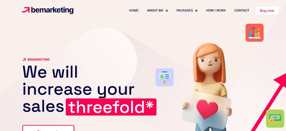
Lead generation pages focus explicitly on capturing user information. They represent the workhorse of digital marketing-converting anonymous visitors into identifiable leads for your sales pipeline.
Form Design Strategies
The form is your conversion centerpiece. Its design directly impacts submission rates.
Field Quantity Optimization
Every field creates friction. Studies consistently show conversion rates drop as field count increases. Consider:
- What information is genuinely necessary now?
- Which fields can wait for later interactions?
- How can you reduce perceived effort?
For initial conversions, consider requesting only name and email. Add phone numbers only when leads are further down the funnel or for high-value offerings.
Progressive Profiling Techniques Instead of gathering all information at once, collect data across multiple interactions. Initial forms request minimal details, while subsequent engagements gather additional information. This approach respects user psychology-small commitments lead to larger ones.
Value Exchange Principles
Forms represent a transaction. Users provide personal information in exchange for perceived value. The higher the form friction, the greater the value you must offer. Match your ask to your offer:
- Basic information for newsletters or simple downloads
- More details for comprehensive guides or valuable tools
- Significant information only for personalized consultations or premium content
Form design best practices emphasize clarity and user experience to maximize conversions.
Industry-Specific Applications
Implementation varies significantly across business types.
B2B vs. B2C Approaches
Business-to-business lead generation typically involves longer forms and more qualification questions. Decision-makers expect thorough processes. Consumer-focused forms prioritize simplicity and instant gratification, with minimal friction.
Service-Based Business Implementations
Professional service firms like consultancies, agencies, and specialized providers use lead generation pages to qualify prospects. These pages often include:
- Problem validation questions
- Budget qualification fields
- Timeline inquiries
- Service-specific questions
On SaaS landing pages, form design balances between gathering necessary information and streamlining the signup process.
E-commerce Lead Capture Variations
Online retailers use specialized approaches:
- Email capture for cart abandonment recovery
- Loyalty program signups
- Product notification requests
- First-purchase discount offers
These implementations feature ultra-simple forms, often just email address collection, to build relationships before purchase.
Testing and Optimization Methods
Continuous improvement drives performance gains.
A/B Testing Critical Elements
Systematically test variables to identify winning combinations:
- Form length and field order
- Button text and design
- Headlines and copy components
- Social proof placement
- Trust indicators and security badges
Let data guide decisions rather than assumptions. Small improvements compound into significant conversion lifts over time.
Form Abandonment Analysis
Identify where users give up on your forms. Field-level tracking reveals problematic questions or validation issues. Common abandonment triggers include:
- Unexpected required fields
- Privacy concerns
- Excessive form length
- Technical difficulties
Address these issues to recapture lost conversions.
Incentive Effectiveness Evaluation
Not all offers perform equally. Test different lead magnets and incentives:
- Guides and ebooks
- Templates and tools
- Webinars and video content
- Assessments and calculators
- Discounts and promotions
Match incentives to your audience’s needs and your sales process.
The most effective modern landing pages implement robust testing methodologies to continuously improve performance.
Both click-through and lead generation landing pages play vital roles in conversion optimization. Understanding their distinct purposes, design requirements, and best practices allows marketers to deploy them effectively within comprehensive campaign strategies.
Sales Pages
Sales pages convert visitors into customers through persuasive content and strategic design. They’re the closers in your marketing funnel.
Long-Form vs. Short-Form Considerations
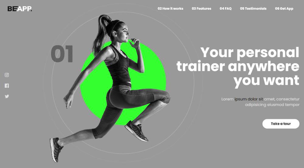
The optimal length depends on several factors:
Product Complexity Factors
Simple products need less explanation. Complex offerings require more detail. Consider:
- Technical specifications that need clarification
- Learning curves that must be addressed
- Problem-solution scenarios that need illustration
SaaS websites often use longer pages to explain their platforms’ capabilities, while simpler products can convert effectively with concise pages.
Price Point Influences
Higher prices demand more justification. The psychological threshold varies by industry, but generally:
- Low-cost items (<$50) can convert with minimal content
- Mid-range offerings ($50-500) require moderate justification
- Premium products ($500+) need extensive validation
As investment increases, so does perceived risk. Your content length should scale accordingly to overcome objections.
Audience Awareness Levels
Eugene Schwartz’s awareness stages determine content needs:
- Problem-aware prospects need education about solutions
- Solution-aware visitors need differentiation between options
- Product-aware users need specific benefits and proof
- Most-aware customers just need the offer and call to action
Match your content depth to your audience’s knowledge level. Cold traffic generally requires more education than warm leads.
Persuasive Elements
Effective sales pages incorporate proven conversion elements:
Social Proof Integration
Third-party validation builds credibility. Include:
- Customer testimonials with specific results
- Case studies demonstrating outcomes
- Review snippets from trusted sources
- Usage statistics and customer counts
- Client logos (with permission)
The testimonial page principles apply directly to sales pages-authentic voices outperform marketing claims.
Risk Reversal Techniques
Remove purchasing barriers through:
- Money-back guarantees with clear terms
- Free trial periods without obligation
- Easy cancellation policies
- Low-risk entry points
- Satisfaction promises
Each policy reduces perceived risk, making conversion more likely. Be specific about terms rather than vague about protections.
Scarcity and Urgency Triggers
Motivate immediate action with:
- Limited-time offers with genuine deadlines
- Limited-quantity availability when authentic
- Early-bird pricing with tangible benefits
- Bonus offers for immediate decision
- Enrollment or purchase windows
Artificial scarcity damages trust. Only use these triggers when genuinely applicable.
Purchase Path Optimization
Streamline the buying process:
Cart Abandonment Prevention
Minimize lost sales by addressing common exit points:
- Unexpected costs (shipping, taxes, fees)
- Account creation requirements
- Complicated checkout processes
- Payment security concerns
- Lack of payment options
Each friction point costs conversions. Test your process regularly to identify and fix abandonment triggers.
Payment Process Streamlining
Simplify the final steps:
- Minimize form fields to the essential
- Offer guest checkout options
- Support multiple payment methods
- Provide clear error messages
- Maintain design consistency
Many sales are lost in the final steps. Your pricing page should transition seamlessly to payment processing.
Post-Purchase Confirmation Design
After conversion, solidify the relationship:
- Clear confirmation messaging
- Next-step instructions
- Access details when applicable
- Support contact information
- Cross-sell opportunities when appropriate
The confirmation page begins the customer relationship. Design it to reduce buyer’s remorse and enhance satisfaction.
Splash Pages and Welcome Gates
Splash pages serve as digital foyers-introducing visitors to your site before they access main content. When implemented thoughtfully, they enhance user experience rather than hinder it.
User Experience Considerations
Balance promotion with usability:
Timing and Trigger Mechanisms
Strategic display parameters include:
- Immediate vs. delayed appearance
- First-visit vs. returning visitor rules
- Scroll depth triggers
- Exit-intent activation
- Time-on-site thresholds
Animated landing pages often use timed animations to create engaging splash experiences without disrupting user flow.
Skip Options and User Control
Respect visitor autonomy with:
- Clearly visible close buttons
- “Skip intro” options
- “Remember me” preferences
- Keyboard navigation support
- Timeout auto-dismissal
Users should never feel trapped by your splash page. Forced engagement creates resentment rather than conversion.
Mobile Responsiveness Requirements
Small screens demand special consideration:
- Touch-friendly close mechanisms
- Simplified content for limited space
- Reduced image sizes for fast loading
- Alternative layouts for different orientations
- Avoidance of disruptive techniques
Mobile visitors have less patience. Google may penalize sites that use intrusive interstitials on mobile devices.
Content Strategy
Maximize splash page effectiveness:
Announcement Effectiveness
Communicate news with impact:
- Clear, concise headlines
- Visual emphasis on key points
- Context for why the news matters
- Action steps related to the announcement
- Expiration dates when applicable
News without relevance gets ignored. Connect announcements to visitor benefits.
Promotion Communication Clarity
Special offers need clear terms:
- Benefit stated upfront
- Qualification requirements if any
- Redemption process explained
- Expiration dates emphasized
- Exclusions noted transparently
Avoid “bait and switch” tactics that promise more than they deliver. Build trust through transparency.
Email Capture Optimization
When collecting addresses:
- Articulate the specific value proposition
- Clarify what subscribers will receive
- Set expectations for frequency
- Respect privacy with clear policies
- Use minimal fields (email only when possible)
User-friendly website principles apply especially to email capture forms-make them simple and valuable.
SEO Implications
Manage search engine considerations:
Bounce Rate Management
Splash pages can impact site metrics:
- Track interactions separately from main content bounces
- Set appropriate analytics goals for splash page actions
- Monitor time-on-site impact after implementation
- Compare conversion paths with and without splash pages
- Adjust based on performance data
Pure bounce metrics can be misleading. Evaluate splash pages by their conversion impact rather than bounce effect alone.
Search Engine Visibility Factors
Balance promotion with indexing:
- Use robots meta tags appropriately
- Consider separate URLs for splash content when appropriate
- Maintain primary content indexability
- Avoid cloaking (showing different content to users vs. search engines)
- Include text alternatives for splash page images
Search engines should understand your site structure and content hierarchy, including how splash pages fit.
Session Duration Impacts
Splash pages affect engagement metrics:
- Monitor whether they increase or decrease overall site time
- Track path differences for users who engage vs. skip
- Evaluate content consumption after splash interaction
- Compare conversion rates between engagement groups
- Set appropriate time triggers based on findings
On event landing pages, splash elements often increase engagement when they provide valuable event information upfront.
When implemented strategically, both sales pages and splash pages enhance the user journey rather than interrupt it. The key lies in designing with user needs as the priority while still meeting business objectives.
Thank You Pages
Thank you pages represent critical yet underutilized conversion opportunities. Far from mere confirmation screens, they serve as strategic touchpoints for relationship building and conversion path extension.
Conversion Continuation Strategies
Keep momentum going after the initial conversion:
Next Action Prompts
Guide users toward additional valuable interactions:
- Related resource downloads
- Product tour registration
- Community membership activation
- Assessment or quiz participation
- Social channel connections
Each suggestion should logically follow the initial conversion action. A whitepaper download might lead to a webinar registration, while a free trial signup could prompt feature exploration.
Cross-Selling Opportunities
Thoughtfully introduce complementary offerings:
- Related products based on initial interest
- Service upgrades with clear value differentiation
- Bundle options with preferential pricing
- Accessory or add-on suggestions
- Limited-time special offers exclusive to new conversions
The product websites approach applies here-showcase additional offerings contextually rather than pushing random products.
Social Sharing Encouragement
Leverage the positive moment:
- Pre-populated share messages highlighting value
- Referral program introduction with incentives
- Easy-click social icons with tracking
- User-generated content submission invitations
- Review or testimonial requests when appropriate
The psychological principle of reciprocity makes thank you pages ideal for sharing requests.
Customer Experience Enhancement
Exceed expectations from the start:
Expectation Setting
Clearly communicate what happens next:
- Delivery timeframes for digital or physical products
- Processing time for applications or registrations
- Contact points for questions or support
- Access instructions for purchased content
- Next steps in multi-stage processes
Transparency builds trust. Specific timelines outperform vague promises.
Resource Access Delivery
Provide immediate value:
- Direct download links for purchased content
- Login credentials or setup instructions
- Getting started guides or quick-win resources
- FAQ collections addressing common questions
- Video tutorials for product utilization
Websites with good UX principles apply especially to delivery mechanisms-make access intuitive and immediate.
Community Introduction Points
Connect users to your broader ecosystem:
- Relevant user groups or forums
- Upcoming events or webinars
- Knowledge base or resource center links
- User spotlights showcasing community benefits
- Social proof highlighting community size and engagement
Communities create stickiness. Early introduction increases long-term retention.
Marketing Integration Points
Maximize data collection and tracking:
Remarketing Pixel Placement
Set up future targeting:
- Conversion-specific audience tagging
- Purchase value tracking for ROAS calculation
- Product or interest category segmentation
- Exclusion lists for completed conversions
- Cross-platform tracking synchronization
Thank you pages confirm specific user actions, making them perfect for precise audience segmentation.
Survey Implementation Options
Gather actionable insights:
- Single-question Net Promoter Score (NPS) surveys
- Source attribution questions (how did you hear about us?)
- Decision factor inquiries (what convinced you to convert?)
- Alternative consideration identification (which competitors did you evaluate?)
- Demographic or firmographic data collection
Keep initial surveys brief. Save comprehensive feedback requests for later relationship stages.
Event Tracking Configuration
Measure conversion path effectiveness:
- Goal completion verification
- Conversion value recording
- Campaign attribution confirmation
- User flow path analysis
- Cross-device conversion reconciliation
Proper configuration ensures accurate ROI calculation across marketing initiatives.
On websites with good UI, thank you pages maintain design consistency while clearly confirming user actions.
Microsites as Extended Landing Pages
Microsites expand the landing page concept into multi-page experiences while maintaining conversion focus. They offer depth without the distractions of full websites.
Multi-Page Structure Benefits
Extended formats provide strategic advantages:
Complex Offer Explanation Capabilities
Break down sophisticated propositions:
- Sequential information presentation
- Concept building across pages
- Multiple feature highlighting
- Comprehensive benefit exploration
- Objection addressing at appropriate stages
For products or services requiring education, microsites provide space for thorough explanation without overwhelming single pages.
Audience Segmentation Possibilities
Tailor experiences to visitor types:
- Industry-specific paths
- Role-based journeys
- Problem-centered navigation
- Experience-level adaptations
- Need-based content organization
On websites with illustrations, visual storytelling helps guide users through these segmented paths.
Content Depth Advantages
Provide comprehensive information:
- In-depth case studies
- Detailed methodologies
- Complete specifications
- Extensive social proof
- Thorough FAQ coverage
Microsites balance focus with thoroughness. They provide depth without the navigation complexity of full websites.
Navigation and User Flow Design
Guide visitors purposefully:
Linear Path Creation
Develop sequential journeys:
- Progressive disclosure of information
- Next/previous navigation controls
- Progress indicators showing completion status
- Logical topic building sequence
- Clear pathway to conversion
Linear flows work best for educational processes or when qualification requires specific information exposure.
Decision Tree Implementation
Enable self-selection:
- Needs-based branching points
- Interactive qualification questions
- Persona-based path options
- Problem-centered navigation choices
- Result-focused selection criteria
Well-designed decision trees improve relevance by letting users self-direct to appropriate content.
Exit Point Management
Minimize undesirable departures:
- Strategic internal linking patterns
- Recovery paths for hesitant visitors
- Exit-intent interventions
- Bookmark/return later options
- Alternative conversion points for partial interest
Every page should have a clear purpose and next step, minimizing “dead end” experiences.
The hero section principles apply throughout microsite design-each page should clearly communicate its purpose and value.
Brand Experience Consistency
Maintain identity while focusing on conversion:
Visual Identity Application
Keep brand presence strong:
- Consistent color scheme implementation
- Typography standardization across pages
- Image style guidelines adherence
- Logo placement and sizing standards
- Component and interface element consistency
Brand recognition builds trust. Visual consistency reinforces legitimacy throughout the experience.
Voice and Tone Continuity
Communicate with personality:
- Messaging archetype adherence
- Vocabulary consistency
- Sentence structure patterns
- Perspective maintenance (first/second/third person)
- Formality level standardization
Inconsistent voice creates cognitive dissonance. Maintain your established tone while tailoring message content.
Campaign Alignment Techniques
Connect to broader marketing:
- Consistent messaging with originating advertisements
- Visual continuity from initial touchpoints
- Terminology matching across channels
- Promise fulfillment from initial claims
- Thematic consistency with overall campaign
The most effective startup landing pages maintain perfect alignment between ad promises and microsite delivery.
Microsites bridge the gap between focused landing pages and comprehensive websites, providing the perfect format for complex offerings requiring education before conversion. When thoughtfully implemented, both thank you pages and microsites significantly enhance conversion pathways.
Coming Soon and Pre-Launch Pages
Pre-launch pages build anticipation and capture interest before your full offering is available. They convert early enthusiasm into measurable assets.
Anticipation Building Tactics
Create excitement and foster emotional investment:
Countdown Timers
Visual urgency generators drive action:
- Dynamic counters showing days/hours/minutes
- Milestone celebrations at key intervals
- Launch date prominence in design
- Time-zone appropriate displays
- Mobile-responsive timer implementations
Counters create psychological commitment. When viewers see time passing, they feel more invested in the outcome.
Preview Content Strategy
Showcase value without revealing everything:
- Product highlight teaser videos
- Feature sneak peeks with limited detail
- Behind-the-scenes development insights
- Founder vision statements
- Problem-solution frameworks
The best websites with video backgrounds often use this approach for pre-launch pages, creating immersive preview experiences.
Early Access Incentives
Reward early interest with exclusive benefits:
- Founder’s circle membership opportunities
- Preview or beta access promises
- Special pricing for early adopters
- Limited edition versions or features
- Priority onboarding or implementation
Scarcity drives action. Limited spots create urgency and perceived value.
Email List Building Focus
Convert interest into owned audience:
Value Proposition Clarity
Communicate benefits explicitly:
- Problem statements that resonate
- Solution previews that intrigue
- Outcome promises that motivate
- Differentiation points that matter
- Timeline expectations that set context
Vague promises generate weak commitment. Specific value drives stronger conversion.
FOMO Trigger Techniques
Leverage fear of missing out:
- Limited spot messaging (when authentic)
- Early adopter exclusive benefits
- Time-sensitive bonuses
- Access-level tiers with diminishing availability
- Social proof showing others’ interest
Fitness landing pages often excel at this, showcasing transformations others have achieved that new visitors might miss.
Referral Program Integration
Multiply reach through sharing incentives:
- Multi-tiered reward structures
- Friend benefit emphasis
- Progress tracking for referrals
- Social sharing shortcuts
- Leaderboard recognition for top referrers
Viral mechanics accelerate list growth exponentially when properly incentivized.
Social Proof Groundwork
Build credibility before launch:
Testimonial Collection Methods
Gather early advocates’ voices:
- Beta tester feedback highlights
- Industry expert preview opinions
- Partner or supplier endorsements
- Previous product user experiences
- Team credential showcases
Even pre-launch pages need validation. Early access feedback provides this essential element.
Expert Endorsement Strategies
Leverage authority figures:
- Industry thought leader quotes
- Specialist advisor statements
- Technical consultant validations
- Category influencer previews
- Academic or professional endorsements
Third-party credibility transfers trust to unproven offerings.
Waitlist Size Indicators
Demonstrate demand quantifiably:
- Subscriber count milestones
- Percentage-filled progress bars
- Geographic distribution maps
- Interest category breakdowns
- Growth rate statistics
Social proof creates confidence. Other people’s interest validates the visitor’s own curiosity.
Technology websites frequently use these techniques to build pre-launch momentum for new products.
Event Registration Landing Pages
Event pages convert interest into attendance commitments. They bridge promotional efforts and actual participation.
Date-Driven Elements
Emphasize time-specific information:
Calendar Integration Features
Make scheduling frictionless:
- One-click calendar additions (Google, Apple, Outlook)
- ICS file downloads for offline calendar programs
- Time zone detection and adaptation
- Recurring event series options
- Reminder setting suggestions
Convenience increases conversion. Make saving the date effortless.
Countdown Functionality
Create urgency and excitement:
- Days/hours until registration closes
- Early-bird deadline countdowns
- Limited seat availability trackers
- Speaker announcement countdowns
- Pre-event preparation timelines
Time-bound opportunities drive faster decisions.
Location-Based Information Display
Provide logistical clarity:
- Interactive venue maps
- Directions from major transportation hubs
- Parking or public transit information
- Nearby accommodation options
- Local attraction highlights for travelers
Reduce friction by answering location questions before they arise.
On creative landing pages, these practical elements blend seamlessly with compelling design.
Attendance Barriers Removal
Address hesitations proactively:
FAQ Section Implementation
Answer common objections:
- Cost justification information
- Cancelation and refund policies
- Dress code or preparation requirements
- Recording availability for missed sessions
- Accommodation for special needs
Anticipate questions before they become conversion barriers.
Objection Handling Content
Address specific concerns:
- ROI calculators for business events
- Testimonials targeting common hesitations
- Comparison charts with alternative events
- Experience level appropriateness clarification
- Prerequisite knowledge explanations
Unaddressed objections kill conversions. Tackle them directly.
Mobile Registration Optimization
Enable on-the-go signup:
- Streamlined form fields for small screens
- Touch-friendly input elements
- Saved information for returning visitors
- Payment method simplification
- Social login options to reduce typing
Mobile optimization increases convenience for busy professionals checking events while commuting or between meetings.
The principles of websites with good typography apply especially to mobile forms-clear hierarchy and readability drive completion.
Post-Registration Experience
Continue engagement after signup:
Confirmation Messaging
Provide immediate reassurance:
- Transaction success indicators
- Reservation confirmation details
- Receipt or invoice provision
- Attendee portal access instructions
- Next steps guidance
Confirmation reduces anxiety and builds confidence in the process.
Calendar Invite Delivery
Secure attendance through scheduling:
- Automatic calendar attachments
- Reminder sequence programming
- Agenda inclusion within invites
- Speaker or session details in description
- Pre-event preparation suggestions in notes
Calendar placement significantly increases actual attendance rates versus simple email confirmations.
Pre-Event Communication Sequence
Build anticipation strategically:
- Speaker highlight emails
- Session selection opportunities
- Networking preparation suggestions
- Logistical reminder sequences
- Value maximization guides
The registration confirmation isn’t the end-it’s the beginning of the attendee journey.
Conference websites extend these principles into full-featured attendee experiences, but the foundation begins with the registration landing page.
Both coming soon pages and event registration pages time-bound experiences that balance information provision with action motivation. While their specific goals differ, both require clear value communication and friction minimization to achieve optimal conversion rates.
Mobile-Specific Landing Pages
Mobile landing pages convert on-the-go visitors through specialized experiences built for smaller screens and different usage contexts. They acknowledge the unique constraints and opportunities of mobile devices.
Screen Size Adaptation Principles
Optimize for limited visual real estate:
Touch-Friendly Element Sizing
Design for fingers, not mouse pointers:
- Minimum 44×44 pixel touch targets
- Adequate spacing between clickable elements
- Easily tappable buttons (80-100px wide)
- Form fields large enough for comfortable input
- Simplified navigation menus
Frustration kills conversion. Touch targets that are too small or too close together create abandonment.
Vertical Scrolling Optimization
Embrace the natural motion of mobile:
- Single-column layouts that flow naturally
- Progressive disclosure of content
- Critical information positioned “above the fold”
- Scroll-triggered animations for engagement
- Clear visual cues indicating more content below
The best responsive websites don’t just shrink desktop pages-they rethink content presentation for vertical consumption.
Load Time Improvement Techniques
Address mobile bandwidth constraints:
- Image compression and optimization
- Conditional loading of non-essential elements
- Server-side rendering for faster initial display
- Critical CSS inline loading
- Performance budget enforcement
Speed directly impacts conversion. Mobile users abandon sites that take over 3 seconds to load.
Location-Based Features
Leverage mobile’s contextual awareness:
GPS Integration Options
Connect digital experience with physical location:
- Store finder functionality with proximity sorting
- Driving directions from current position
- Local inventory checking capabilities
- Check-in features for physical locations
- Regional offer customization
Context creates relevance. Location awareness makes experiences immediately useful.
Store Finder Functionality
Enable physical conversion paths:
- Map interfaces with branded location pins
- List views sortable by distance
- Store hour and service information
- Direct calling capabilities
- Photo previews of locations
Website navigation principles apply differently when geography becomes a primary organizing factor.
Local Offer Personalization
Deliver contextually relevant content:
- Geofenced promotions for nearby locations
- Region-specific pricing or availability
- Local event highlights
- Weather-appropriate suggestions
- Cultural or language adaptations
Relevance drives conversion. Location-specific offers typically outperform generic promotions.
App Download Optimization
Bridge web and native experiences:
QR Code Implementation
Facilitate frictionless app acquisition:
- Prominent code placement with clear value proposition
- Scannable size optimization for different devices
- Accompanying text instructions for clarity
- Multiple placement points throughout experience
- Link alternatives for non-scanning users
QR codes eliminate typing friction, especially valuable on mobile keyboards.
Deep Linking Strategies
Maintain continuity between web and app:
- Preserved context when transitioning to app
- Specific content targeting within application
- Personalized onboarding based on landing page origin
- Saved progress between environments
- Account linkage facilitation
Seamless transitions preserve conversion momentum. Contextual continuity avoids starting over.
Platform-Specific Button Design
Speak the native language of each ecosystem:
- iOS App Store badging and conventions
- Google Play visual standards
- Huawei AppGallery guidelines for relevant markets
- Clear indication of platform compatibility
- Size and operating system requirements
Mobile-first design includes respecting platform-specific conventions and user expectations.
The unique demands of mobile users require specialized approaches to landing page design. Screen constraints, touch interfaces, variable connectivity, and location awareness all create both challenges and opportunities. The most effective mobile landing pages embrace these differences rather than simply shrinking desktop experiences.
Successful mobile landing pages integrate:
- Performance optimization for variable connections
- Touch-centric interaction design
- Location-aware content delivery
- Simplified conversion paths
- Platform-appropriate conventions
The growth of mobile traffic makes these specialized pages increasingly essential for conversion success. By designing specifically for mobile contexts rather than adapting desktop experiences, marketers can capture the unique opportunities presented by on-the-go audiences.
FAQ on Types Of Landing Pages
What’s the difference between a landing page and a homepage?
A homepage serves as a navigational hub with multiple paths, while a landing page has a single focused goal. Homepages introduce your brand broadly; landing pages drive specific conversions. The hero section on homepages typically offers multiple options, while landing pages feature one clear call-to-action to maximize conversion rates.
Which type of landing page is best for lead generation?
Lead capture pages with form-centric designs work best for lead generation. These pages feature minimal distractions, compelling value propositions, and optimized form design with appropriate field quantity. They often include social proof elements and clearly communicate the value exchange for submitting contact information.
How do squeeze pages differ from other landing pages?
Squeeze pages focus exclusively on email capture with minimal distractions. Unlike broader landing page types, they offer a single lead magnet (ebook, discount, etc.) in exchange for email addresses. They employ strong call-to-action buttons and typically remove navigation to maximize opt-in rates.
What elements should a good thank you page include?
Effective thank you pages confirm the completed action, deliver promised resources, set next-step expectations, and extend the conversion path. They might include social sharing options, related offers, survey questions, or community introductions. The best ones turn confirmation into further engagement opportunities rather than ending the conversation.
Are splash pages bad for SEO?
Splash pages can impact SEO if implemented poorly. Issues include slow load times, thin content, and potential bounce rate increases. However, when designed with good UX principles, proper indexing controls, and mobile optimization, they can serve legitimate purposes without significant SEO penalties.
What makes an effective sales landing page?
Effective sales pages match length to product complexity and audience awareness. They integrate persuasive elements like testimonials, guarantees, and urgency triggers while addressing objections proactively. Strong sales pages create clear purchase paths with streamlined checkout processes and utilize pricing page best practices for conversion optimization.
How should mobile landing pages differ from desktop versions?
Mobile landing pages require touch-friendly elements, vertical scrolling optimization, and faster load times. They should leverage device capabilities like location awareness and simplify forms for thumb typing. Following mobile-first design principles ensures proper adaptation to smaller screens and different usage contexts.
What’s the ideal landing page length?
The ideal length depends on offer complexity, price point, and audience awareness. Higher-priced or complex products typically require longer pages with comprehensive information. Simple offers can convert with shorter pages. The key is matching content depth to what prospects need to make decisions, not arbitrary word counts.
How do event landing pages differ from product landing pages?
Event landing pages emphasize date-driven elements, location information, and agenda highlights. Unlike product landing pages which focus on features and benefits, event pages address attendance logistics, speaker credentials, and registration processes with calendar integration and countdown functionality to create urgency.
What metrics should I track for landing page performance?
Track conversion rate (primary), but also bounce rate, time on page, form abandonment rates, and traffic sources. For click-through pages, monitor click-through rates. For lead generation, track form completion rates and lead quality. Always connect landing page performance to downstream metrics like sales qualified leads or customer acquisition costs.
Conclusion
The various types of landing pages serve distinct purposes throughout the customer journey. From capturing emails with squeeze pages to closing sales with long-form pages, each format addresses specific marketing objectives when strategically deployed.
The most successful digital marketers understand when to use each landing page variant:
- Click-through pages for warming prospects
- Lead capture forms for building databases
- Sales pages for direct conversion
- Thank you pages for relationship building
- Microsites for complex offerings
Mastering these formats enables higher conversion rates across campaigns. Even small improvements in page design can dramatically impact marketing ROI.
Remember that successful landing pages focus relentlessly on conversion rate optimization through continual testing and refinement. The pages that implement strong visual hierarchy, clear value propositions, and streamlined user journeys consistently outperform their generic counterparts.
Implement these specialized conversion tools thoughtfully, and transform more of your traffic into measurable business results.

