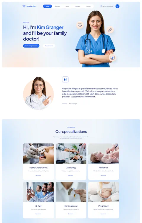
Modern Healthcare Website Design Examples to Inspire You
September 11, 2025
Top Doctor Website Design Examples To Inspire You
September 13, 2025Pet owners Google their next vet before they ever call. Your website is the exam room they see first.
The best veterinarian website design examples balance warmth with professionalism. They convert anxious pet parents into booked appointments within seconds.
Most veterinary clinic websites fail at this. Buried phone numbers, stock puppy photos, clunky mobile experiences. Pet owners bounce to competitors who figured it out.
This guide breaks down what actually works. You'll see real animal hospital websites, vet clinic homepage layouts, and booking systems that drive conversions.
Whether you're building a new site or fixing one that underperforms, these examples show exactly what separates forgettable from fully booked.
What is Veterinary Website Design
Veterinary website design is the process of creating digital platforms for animal clinics, pet hospitals, and vet practices to connect with pet owners online.
These sites handle appointment booking, showcase veterinary services, display staff credentials, and build trust before clients walk through the door.
A well-designed vet clinic website converts visitors into booked appointments. It answers questions pet owners have at 2 AM when their dog won't stop scratching.
The American Veterinary Medical Association reports that pet owners research online before choosing a veterinarian. Your digital presence matters as much as your bedside manner with anxious golden retrievers.
Unlike generic business sites, veterinary websites need specific functionality: emergency contact displays, species-specific service pages, online prescription refills, and client portal access.
Veterinarian Website Design Examples
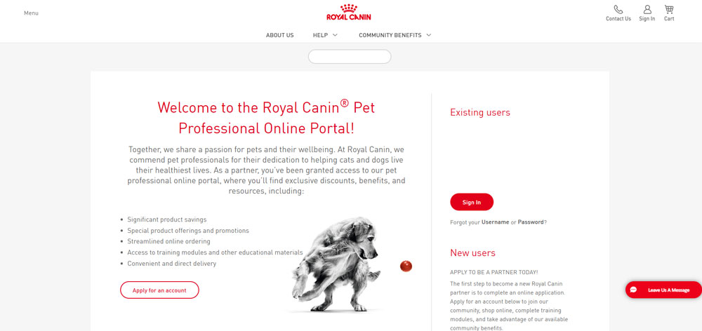
Royal Canin Customer Web Store
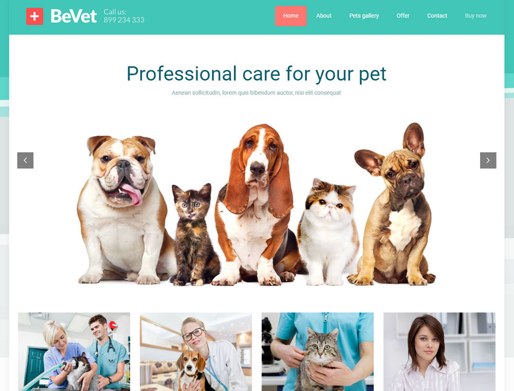
Be Vet
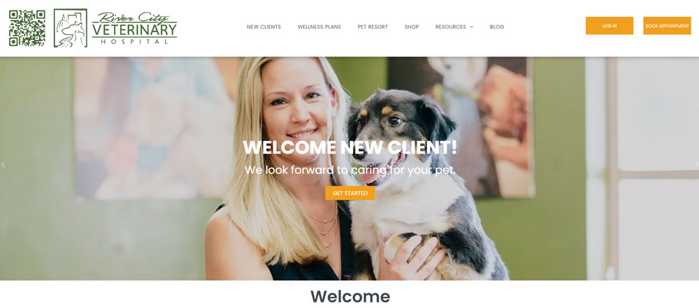
River City Veterinary Hospital
Clinica Dr. Mauro
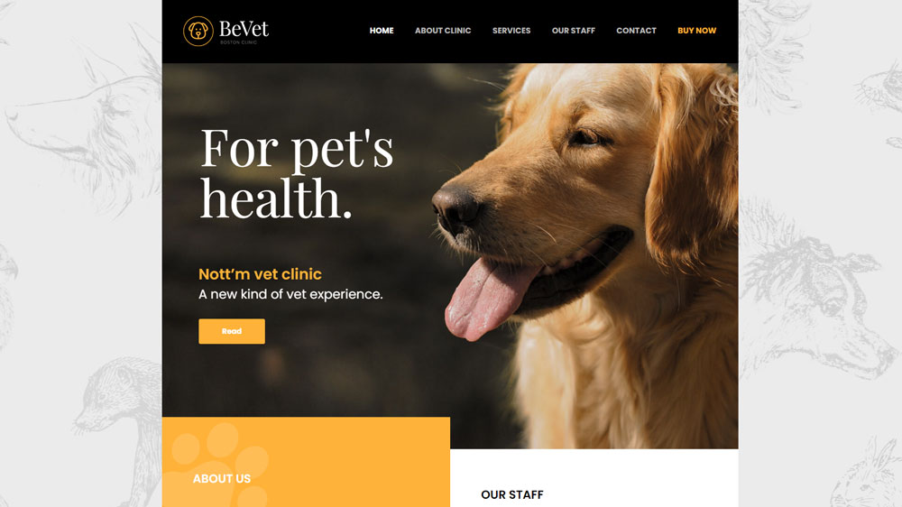
Be Vet 2
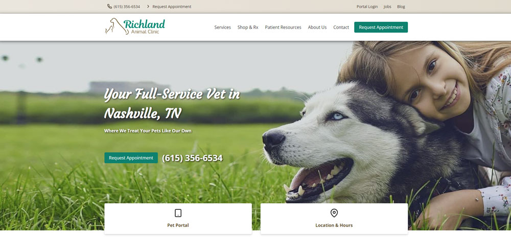
Richland Animal Clinic
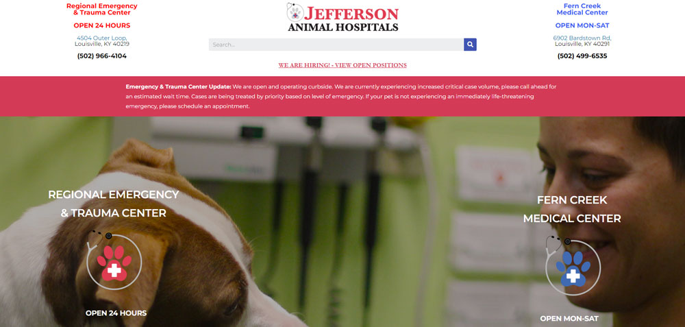
Jefferson Animal Hospitals
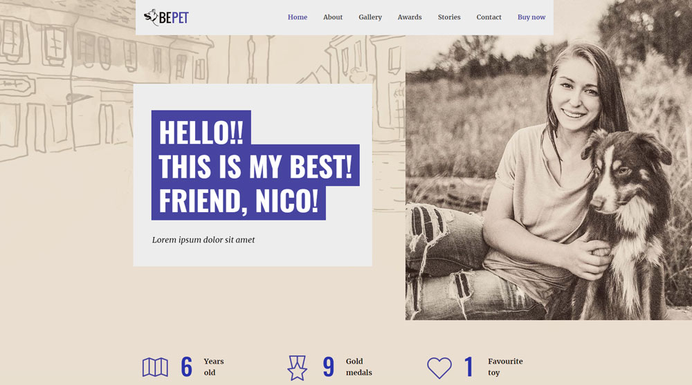
Be Pet
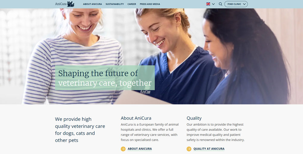
AniCura
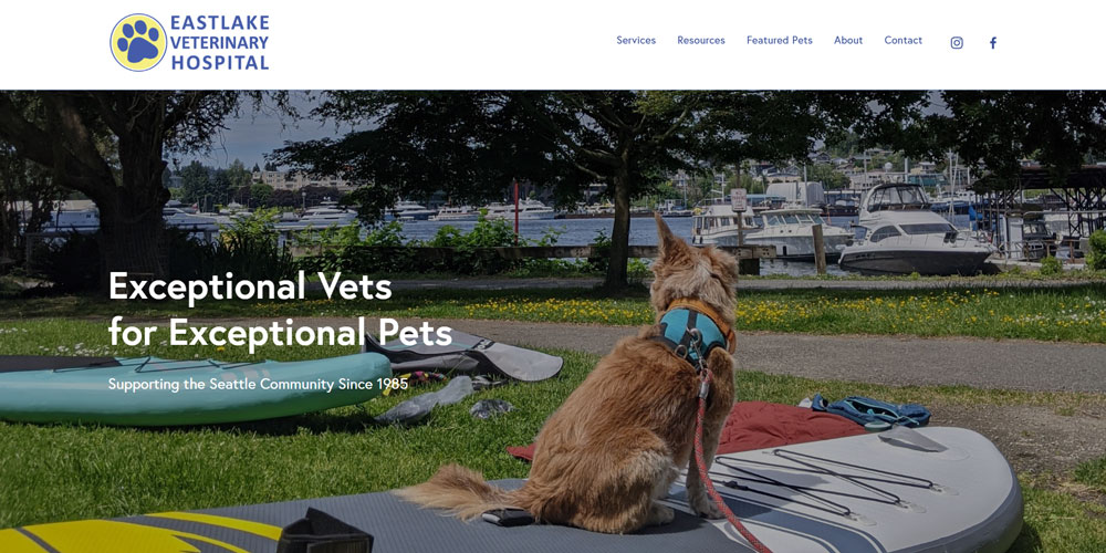
Eastlake Veterinary Hospital
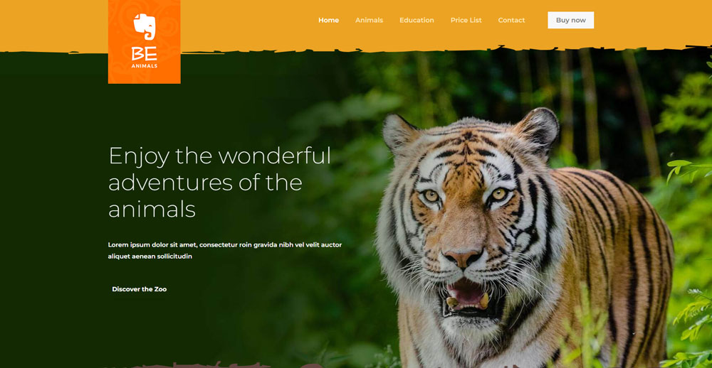
Be Animals
Top Vet
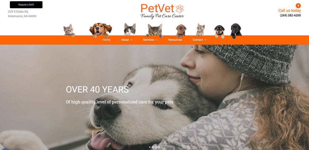
Petvetkalamazoo
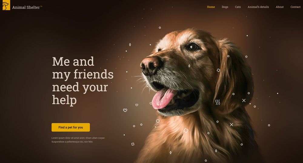
Be Animal Shelter
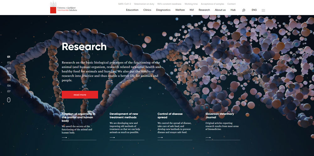
Veterinarska Fakulteta
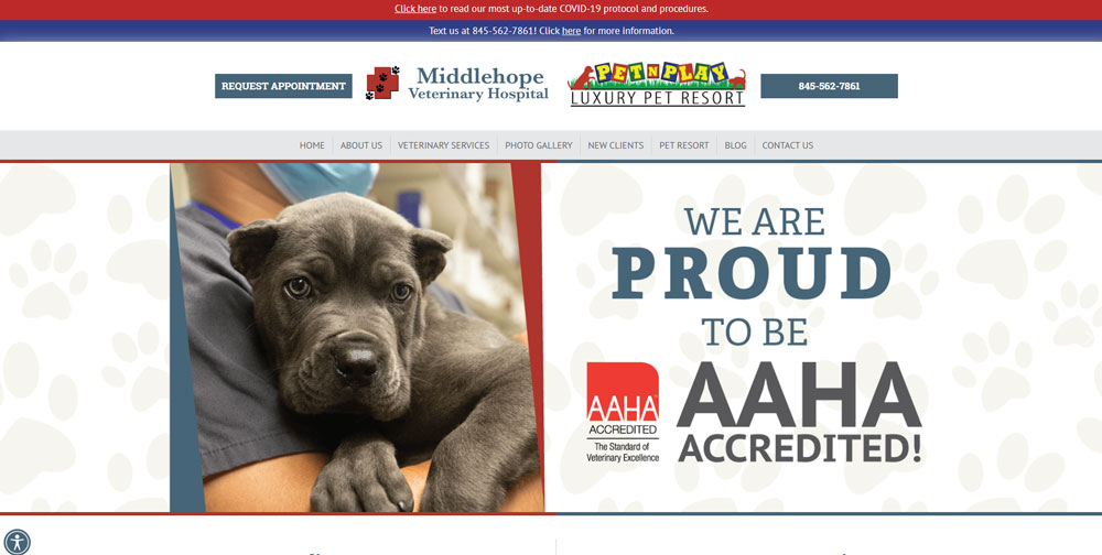
Middlehope Veterinary Hospital
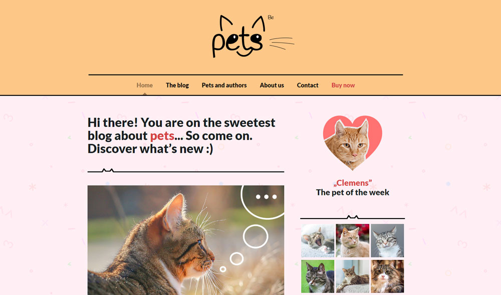
Be Pets
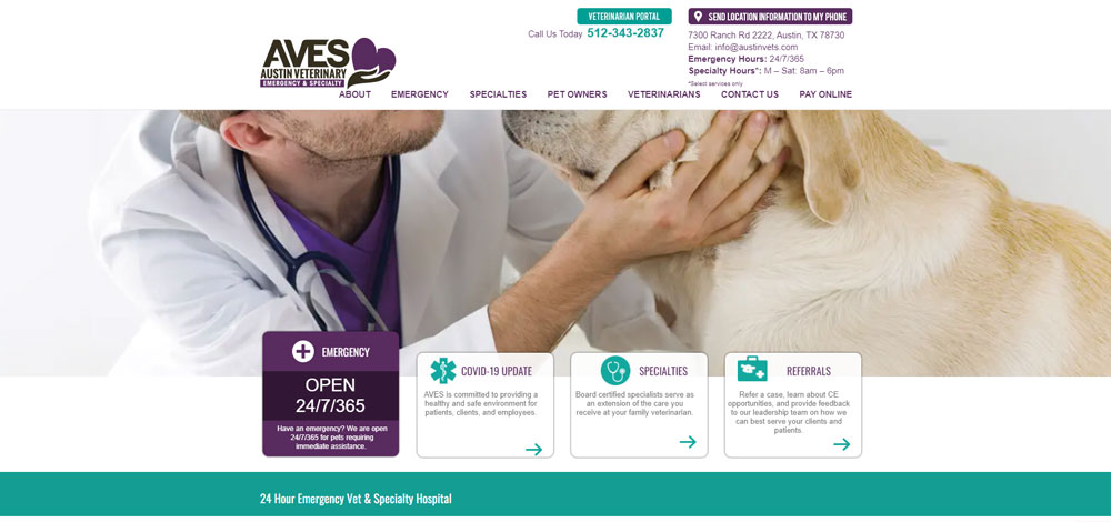
Austin Veterinary Emergency and Specialty Center
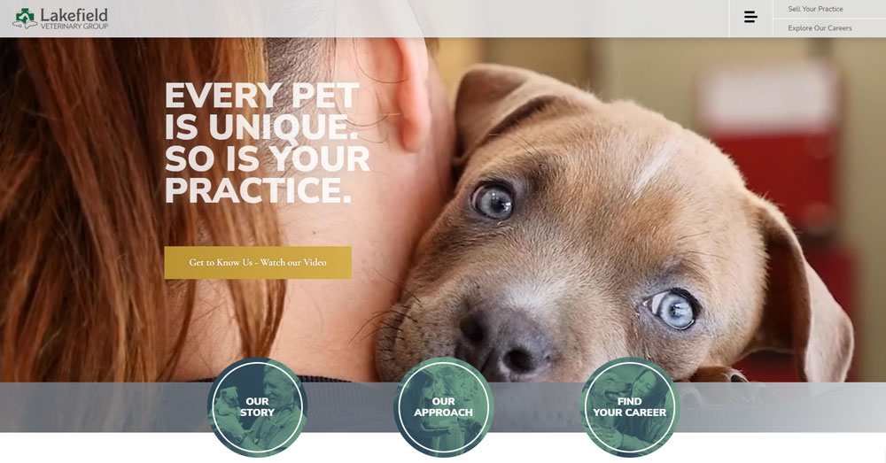
Lakefield Veterinary Group
Be Animals
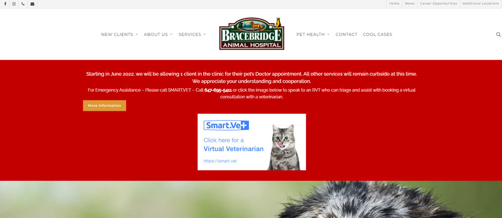
Bracebridge Animal Hospital
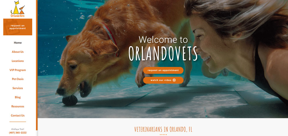
Orlando Vets
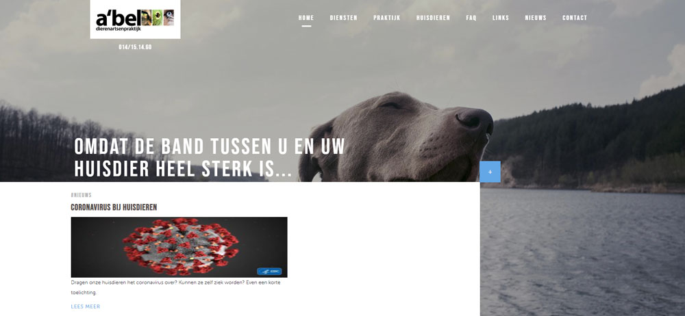
Abel
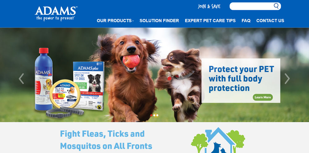
Adams
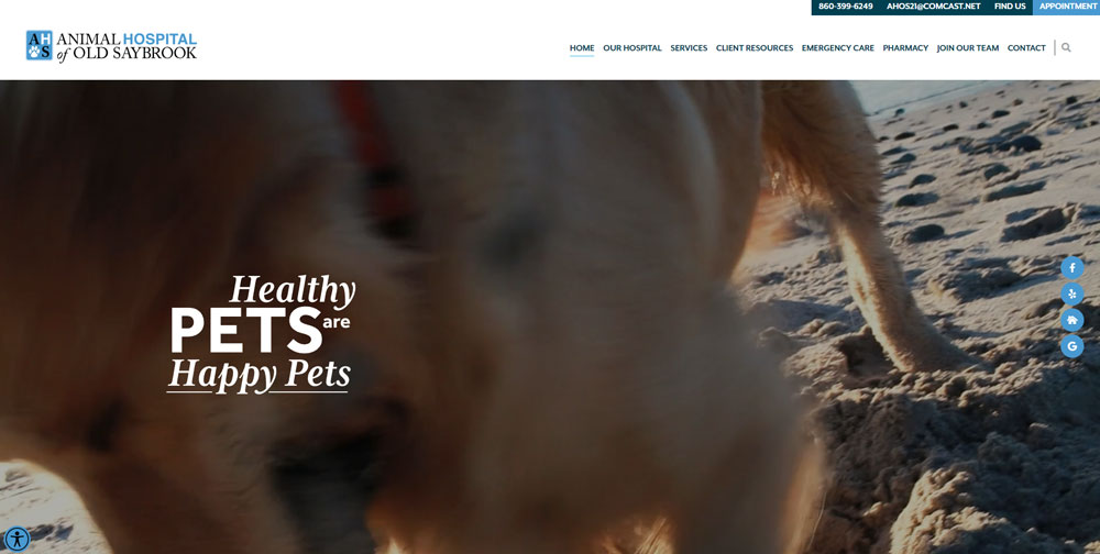
Animal Hospital of Old Saybrook
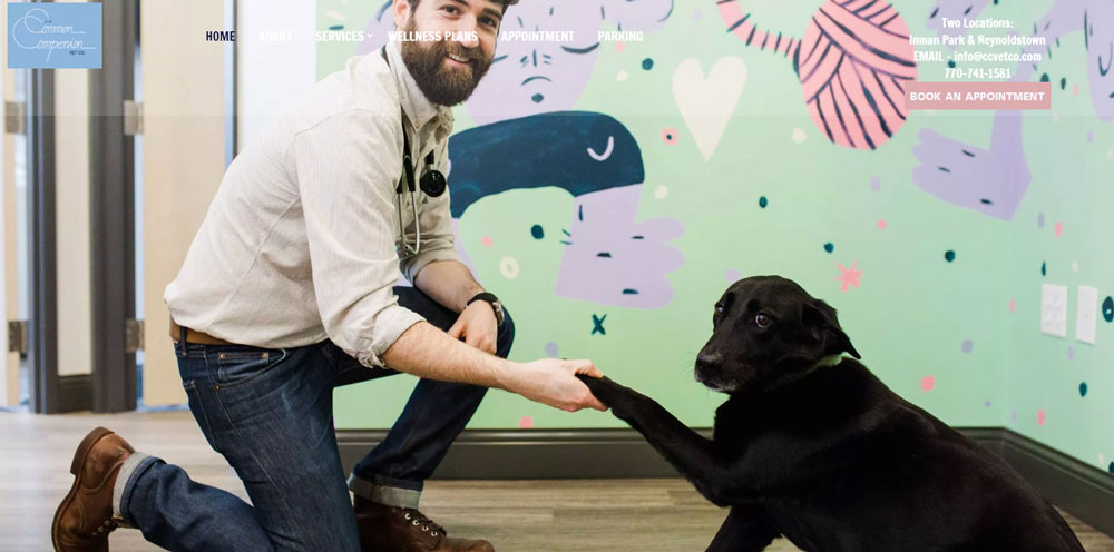
Common Companion Vet Co.
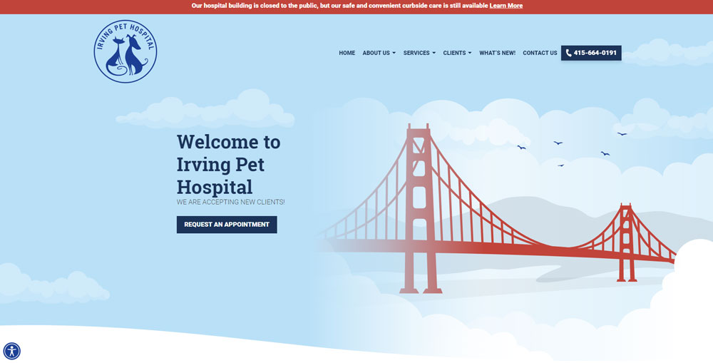
Irving Pet Hospital
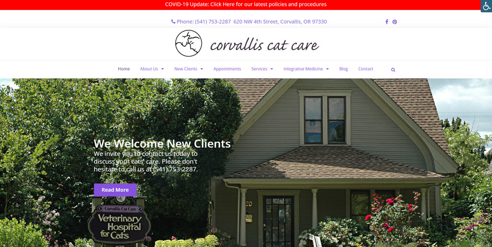
Corvallis Cat Care
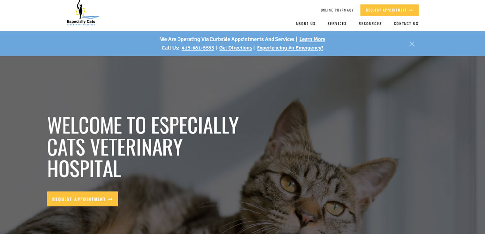
Especially Cats Veterinary Hospital
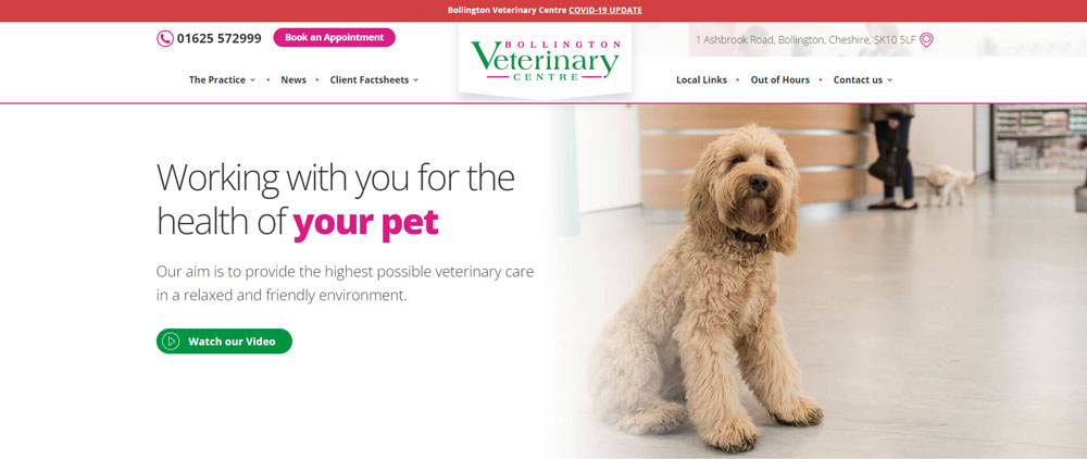
Bollington Veterinary Centre
BluePearl
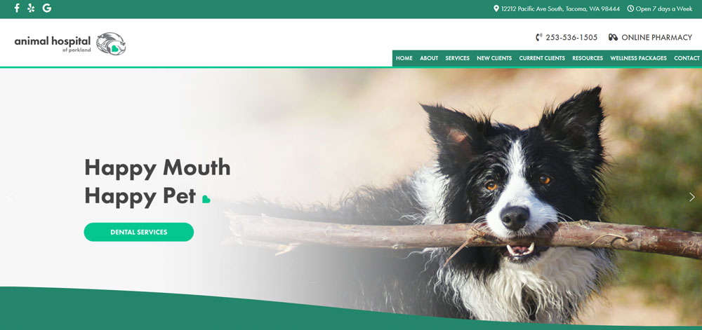
Animal Hospital of Parkland
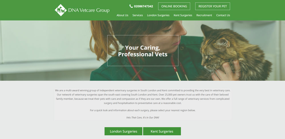
DNA Vetcare
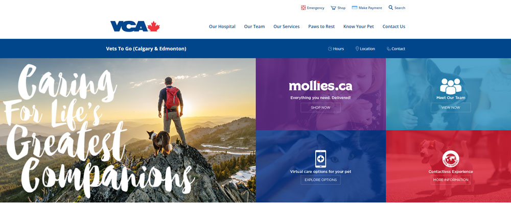
Vets To Go
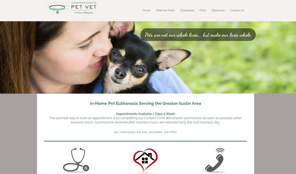
Compassionate Pet Vet
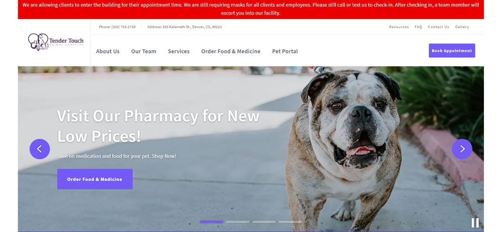
Tender Touch Animal Hospital
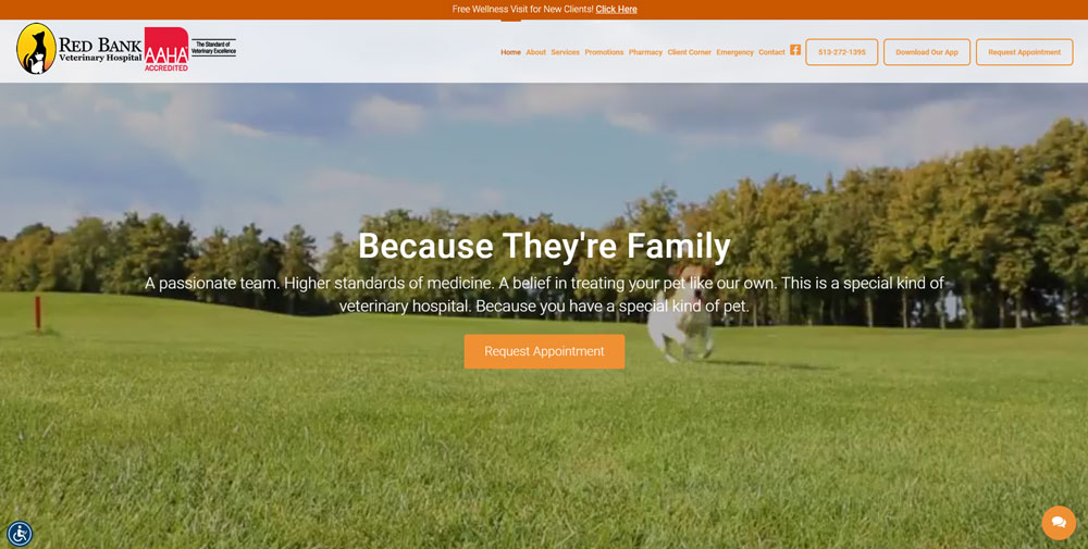
Red Bank Veterinary Hospital
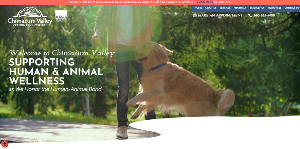
Chimacum Valley Veterinary Hospital
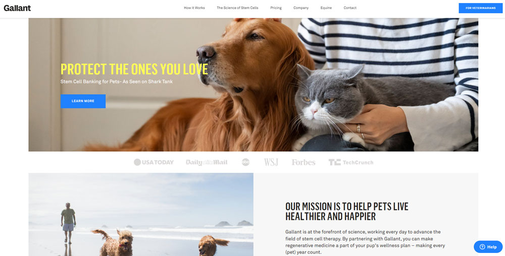
Gallant Vet Hospital
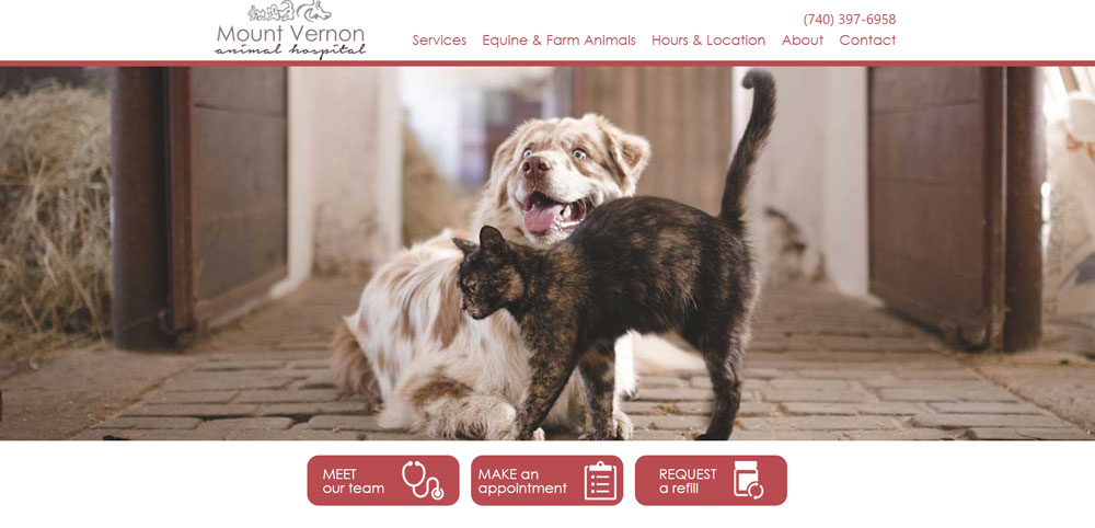
Mount Vernon Animal Hospital
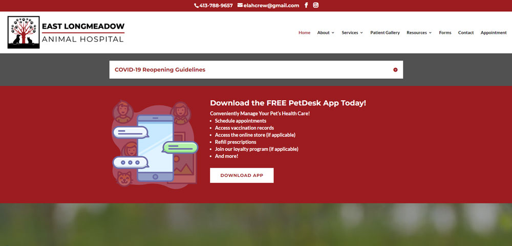
East Longmeadow Animal Hospital
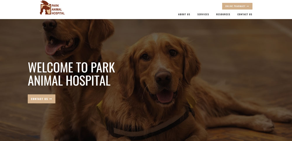
Park Animal Hospital
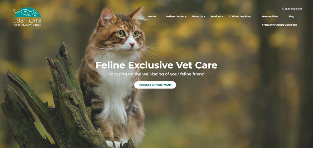
Just Cats Veterinary Clinic
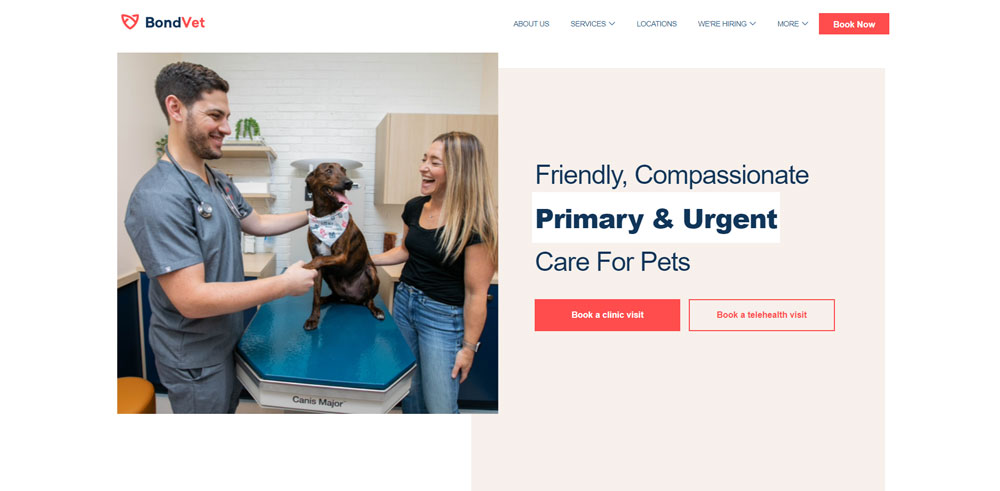
Bond Vet
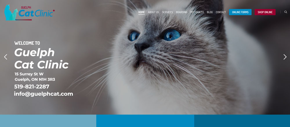
Guelph Cat Clinic
Paz Veterinary
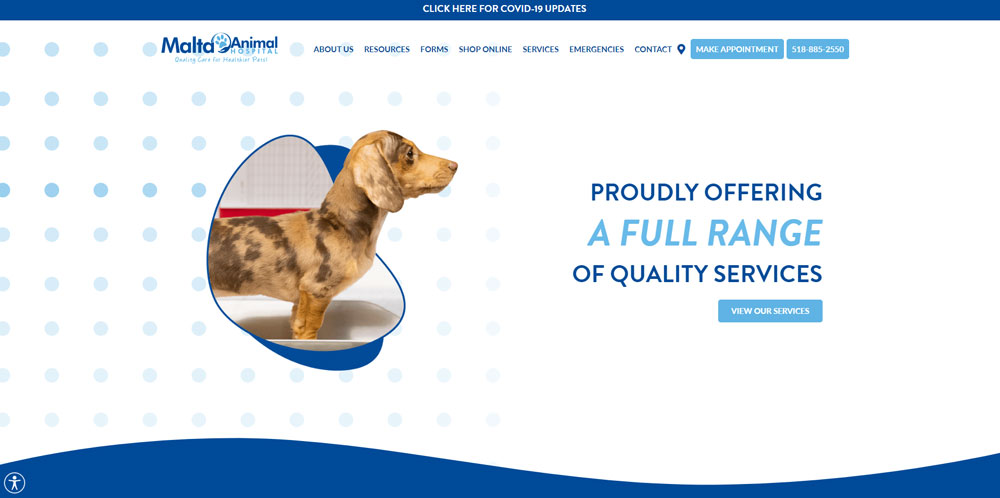
Malta Animal Hospital
Components of Effective Veterinary Website Design
Homepage Layout and First Impressions
The hero section determines whether pet owners stay or bounce. Place your phone number and "Book Appointment" button above the fold.
Sticky menus keep navigation accessible as visitors scroll. Include clear paths to services, emergency info, and contact forms within three clicks maximum.
Color Schemes and Visual Identity
Blues and greens dominate veterinary websites for good reason. These calming color palettes reduce anxiety in stressed pet parents researching emergency symptoms.
Your color scheme should reflect your practice personality. Bright, playful tones work for general practices; sophisticated palettes suit specialty hospitals.
Consistency across all pages reinforces brand recognition. Match your website colors to your physical clinic signage and printed materials.
Photography and Image Selection
Stock photos of generic puppies kill credibility instantly.
Hire a photographer for one afternoon. Capture your actual staff, your actual exam rooms, your actual patients (with permission).
Real images of veterinarians examining animals build trust faster than any testimonial. Pet owners want to see where their anxious cat will be poked and prodded.
Include diverse species if you treat them. Exotic animal hospitals need more than dog and cat photos.
Mobile Responsiveness and Speed
Over 60% of veterinary website traffic comes from mobile devices. Pet emergencies don't wait for desktop computers.
Google's Core Web Vitals directly impact your local search rankings. A responsive website isn't optional anymore.
Page load times under 3 seconds prevent abandonment. Compress images, minimize code, use Cloudflare or similar CDN services.
Test your site on actual phones, not just browser simulators. Button sizes, form fields, and click targets behave differently on touchscreens.
Types of Veterinary Websites
General Practice Veterinary Websites
These sites serve clinics treating dogs, cats, and common household pets. They need comprehensive service listings covering wellness exams, vaccinations, dental care, and basic surgery.
Team introduction pages matter here. Pet owners choose general vets based on personality fit as much as credentials.
Specialty and Emergency Veterinary Websites
24/7 availability indicators must be impossible to miss. Emergency animal hospitals live or die by their contact visibility.
Specialty practices need detailed credential displays. Board certifications, fellowship training, and published research establish authority in oncology, cardiology, or orthopedic surgery.
These sites often benefit from dark themed designs that convey seriousness and sophistication.
Mobile Veterinarian Websites
House-call vets need service area maps front and center. Interactive coverage zones show pet owners whether their address qualifies.
Simplified booking flows work best here. No one wants to navigate complex menus while their elderly cat refuses to enter a carrier.
Simple website designs with minimal navigation outperform feature-heavy alternatives for mobile vet practices.
Animal Hospital Websites
Multi-service facilities face unique challenges. Boarding, grooming, daycare, and medical services compete for homepage attention.
Tab-based navigation helps. Let visitors self-select their service category before diving into details.
Multi-location hospitals need location finders with individual pages for each branch. Local SEO depends on it.
Features Pet Owners Look for on Veterinary Websites
Online Appointment Booking
PetDesk and similar integrations let clients book at midnight without phone calls. Real-time availability prevents double-booking headaches.
Confirmation emails and text reminders reduce no-shows significantly. The form design should capture pet details, visit reason, and preferred times in under two minutes.
Service and Pricing Information
Transparency builds trust. List your exam fees, vaccination packages, and dental cleaning ranges publicly.
Organize services by species or category. Dog owners shouldn't wade through avian services to find heartworm prevention info.
Veterinarian Profiles and Credentials
AAHA accreditation, board certifications, and continuing education matter to informed pet owners. Display them prominently.
Include personal touches: favorite animal species, pets at home, hobbies outside the clinic. People choose vets they like as humans.
Client Testimonials and Reviews
Google review integration shows real feedback from real clients. A dedicated testimonial page provides social proof for hesitant visitors.
Video testimonials from emotional pet owners outperform written reviews for conversion impact.
Pet Health Resources and Blog Content
Educational articles establish expertise and capture organic search traffic. Cover seasonal topics: tick prevention in spring, holiday food dangers in December.
Resource libraries with downloadable guides generate email list signups for ongoing marketing.
How to Choose a Veterinary Website Template
Matching Design to Practice Type
Emergency hospitals need prominent 24/7 indicators and urgent call to action buttons. General practices benefit from warm, approachable layouts with team photos.
Exotic animal clinics require species-diverse imagery. Equine practices need landscape-oriented designs that showcase large animals properly.
Customization Requirements
Your template should accommodate your brand colors without looking forced. Test logo placement, font pairing, and color adjustments before committing.
Some templates lock you into rigid structures. Others offer modular flexibility for adding service categories, location pages, or blog sections later.
Platform Considerations
WordPress powers most veterinary websites due to plugin flexibility and Yoast SEO integration. Themes from ThemeForest range from $30 to $80.
Webflow offers design freedom without coding knowledge. Higher learning curve but cleaner output.
Squarespace and Wix work for simple practices needing quick launches. Limited customization compared to WordPress.
VetMatrix and Beyond Indigo Pets specialize in veterinary-specific solutions with built-in booking integrations.
Veterinary Website Design Mistakes to Avoid
These errors cost practices appointments daily. Recognizing bad design patterns helps you avoid them.
Buried contact information. Phone numbers belong in headers, not footer-only placement. Pet emergencies can't wait for scrolling.
Stock photo overload. Generic pet images signal generic care. Invest in authentic photography of your actual team and facility.
Slow load times. PageSpeed Insights scores below 50 kill mobile conversions. Compress images, enable caching, minimize plugins.
Missing mobile optimization. Unresponsive designs frustrate 60%+ of your traffic. Test on actual devices, not just browser tools.
Cluttered homepages. Every service competing for attention means nothing stands out. Prioritize top 3-4 actions visitors need.
No clear booking path. Appointment buttons should appear within viewport on every page. Don't make pet owners hunt.
Outdated information. Wrong hours, departed staff, discontinued services destroy trust instantly. Audit quarterly at minimum.
Ignoring local SEO. Missing Google Business Profile integration, no LocalBusiness Schema markup, inconsistent NAP data across directories.
Cost of Veterinary Website Design
Budget expectations vary wildly based on approach and practice needs.
DIY template route: $500-$2,000 including template purchase, hosting, domain, and basic customization. Requires significant time investment and technical comfort.
Freelance designer: $2,000-$8,000 for custom design on WordPress or Webflow. Timeline typically 4-8 weeks. Quality varies significantly.
Veterinary-specific agencies: $5,000-$15,000+ for full-service builds from companies like iVET360 or Beyond Indigo Pets. Includes SEO setup, content strategy, and ongoing support options.
Enterprise solutions: $15,000-$50,000+ for multi-location hospital systems with custom integrations, patient portals, and advanced functionality.
Ongoing costs matter too:
- Hosting: $20-$100/month depending on traffic and features
- SSL certificate: Often included with hosting, or $50-$200/year
- Domain renewal: $12-$50/year
- Maintenance and updates: $100-$500/month if outsourced
- Content updates: $50-$150/hour for professional copywriting
The cheapest option rarely delivers best ROI. A $3,000 site converting 5% of visitors outperforms a $500 template converting 1%.
Request portfolios from any agency or freelancer. Check their veterinary-specific experience; healthcare websites require different expertise than retail websites or restaurant sites.
Factor in opportunity cost. Every month without a user friendly website means lost appointments to competitors who invested properly.
Google Search Console data after launch reveals whether your investment performs. Track organic impressions, click-through rates, and conversion paths monthly.
FAQ on Veterinarian Website Design
What makes a veterinary website design effective?
Effective vet clinic websites combine clear navigation, mobile responsiveness, and prominent appointment booking. They feature authentic staff photography, calming color schemes, and trust signals like AAHA accreditation badges.
Fast load times and visible emergency contact information complete the package.
How much does a veterinary website cost?
DIY templates run $500-$2,000. Freelance designers charge $2,000-$8,000. Veterinary-specific agencies like iVET360 or Beyond Indigo Pets range from $5,000-$15,000+.
Multi-location animal hospitals with custom integrations may exceed $50,000.
Which platform is best for veterinary websites?
WordPress dominates due to plugin flexibility and Yoast SEO integration. Webflow offers cleaner design freedom. VetMatrix provides veterinary-specific features.
Squarespace and Wix work for simple practices needing quick launches.
What colors work best for vet clinic websites?
Blues and greens create calming effects for stressed pet owners researching symptoms. These palettes signal professionalism and trustworthiness.
Accent colors should match your physical clinic branding for consistency across touchpoints.
Should veterinary websites use stock photos?
No. Stock pet images kill credibility instantly. Hire a photographer to capture your actual veterinarians, exam rooms, and patients.
Authentic visuals build trust faster than any written testimonial or credential display.
What features do pet owners expect on vet websites?
Online appointment booking tops the list. Pet owners also expect service descriptions, pricing transparency, veterinarian profiles with credentials, client testimonials, and pet health blog content.
Emergency contact visibility is non-negotiable.
How important is mobile optimization for veterinary sites?
Critical. Over 60% of veterinary website traffic comes from mobile devices. Pet emergencies happen away from desktop computers.
Google's Core Web Vitals and mobile-first indexing directly impact local search rankings.
What are common veterinary website design mistakes?
Buried contact information, slow page speeds, stock photo overload, missing mobile optimization, and cluttered homepages. No clear booking path frustrates visitors.
Outdated staff listings and wrong hours destroy trust immediately.
Do veterinary websites need a blog section?
Yes. Pet health articles establish expertise and capture organic search traffic. Cover seasonal topics like tick prevention or holiday food dangers.
Resource libraries also generate email signups for ongoing client communication.
How do I improve my existing veterinary website?
Start with Google Search Console and PageSpeed Insights audits. Fix mobile responsiveness issues first. Add Schema.org LocalBusiness markup for local SEO.
Update photography, streamline navigation, and make booking buttons visible on every page.
Conclusion
These veterinarian website design examples prove that effective vet practice websites share common DNA. Clean navigation, authentic imagery, mobile-first builds, and frictionless booking systems.
Your animal clinic's digital presence directly impacts appointment volume. Pet parents judge your care quality by your homepage before they ever meet your staff.
Start with the basics. Visible contact information, real photos of your veterinary team, and a booking button that follows visitors down every page.
Whether you choose WordPress, Webflow, or a veterinary-specific platform like VetMatrix, execution matters more than technology. A thoughtful $3,000 site outperforms a lazy $15,000 build every time.
Your competitors already figured this out. Time to catch up or pull ahead.


