

How to Remove the Proudly Powered by WordPress Message
March 30, 2025
Top Examples of Fitness Landing Pages
April 18, 2025Your landing page has 5 seconds to make an impression.
Standard templates won't cut it anymore. Creative landing pages aren't just pretty designs. They're conversion machines that speak directly to your visitors' needs while standing out from competitors.
The difference between pages that convert at 2% versus 12%? Strategic creativity that balances visual appeal with clear user pathways.
This guide shows you how to craft creative landing pages that actually work. You'll learn:
- Key design elements that grab attention without hurting conversion rates
- How to structure content for both engagement and action
- Real examples of creative pages that doubled conversion rates
- Tools that help you build standout pages—even without design skills
Let's transform your landing pages from forgettable to impossible to ignore.
Examples of Creative Landing Pages
Codecademy
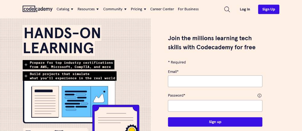
Clean interface with intuitive navigation. The color scheme uses saturated blues against white space, creating strong visual hierarchy. Interactive elements invite engagement while maintaining simplicity. Typography choices balance readability with modern aesthetics. The homepage effectively communicates value proposition through strategic content placement and clear CTAs.
Airbnb
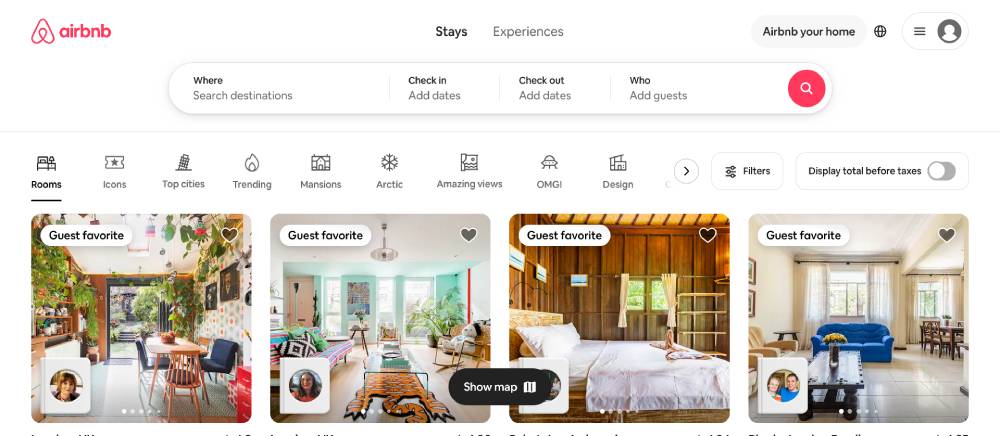
Imagery-focused design with minimal text interference. The search functionality takes center stage through intentional positioning. White space creates breathing room around content blocks. Subtle animations enhance user experience without overwhelming. The responsive layout adapts beautifully across devices while maintaining visual consistency.
Row House
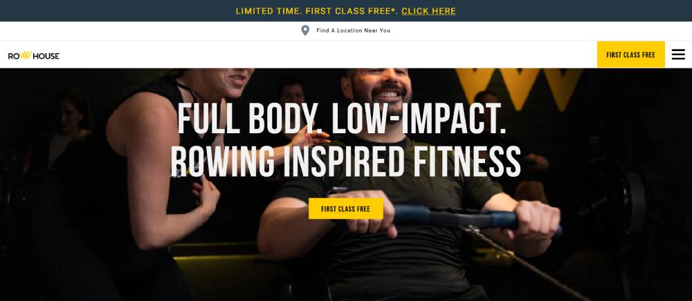
Bold typography creates immediate brand recognition. High-contrast color palette evokes energy and movement. Large format photography shows real people in action, building authenticity. Location finder functionality prioritizes local connections. Mobile-first approach ensures smooth transitions between screen sizes without compromising design elements.
Be Marketing 2
Sunbasket
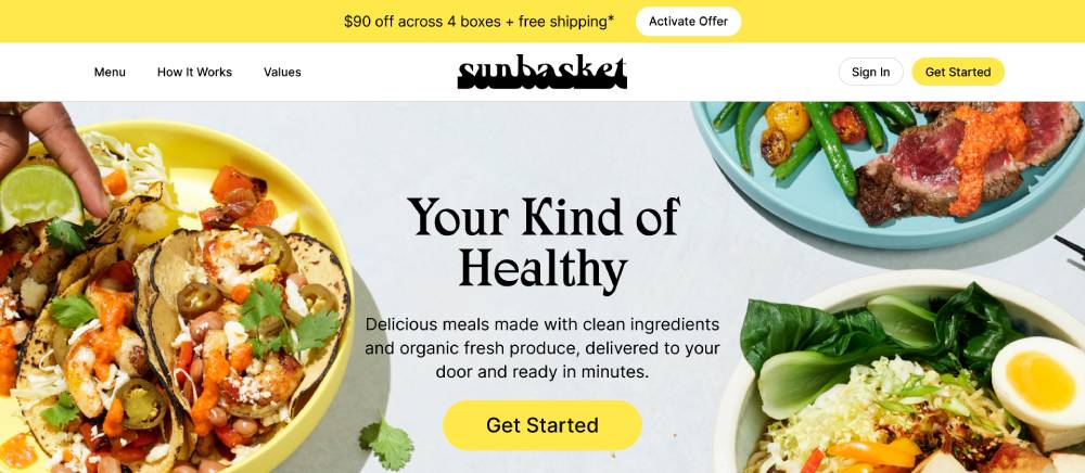
Food imagery dominates with appetite-appealing photography. Green accents reinforce fresh, organic positioning. Card-based layout organizes meal options logically. Typography hierarchy guides users through decision process. Checkout flow reduces friction through simplified form fields and progress indicators.
Breather
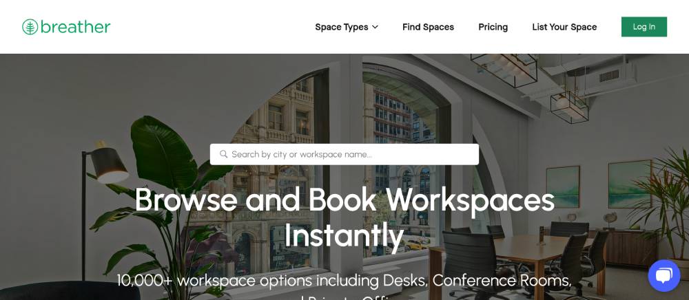
Minimalist aesthetic with ample negative space. Neutral color palette creates calm, professional atmosphere. Location-based search takes priority in navigation structure. Calendar integration demonstrates functionality-focused design. Responsive grid layout maintains visual integrity across breakpoints.
Mailchimp
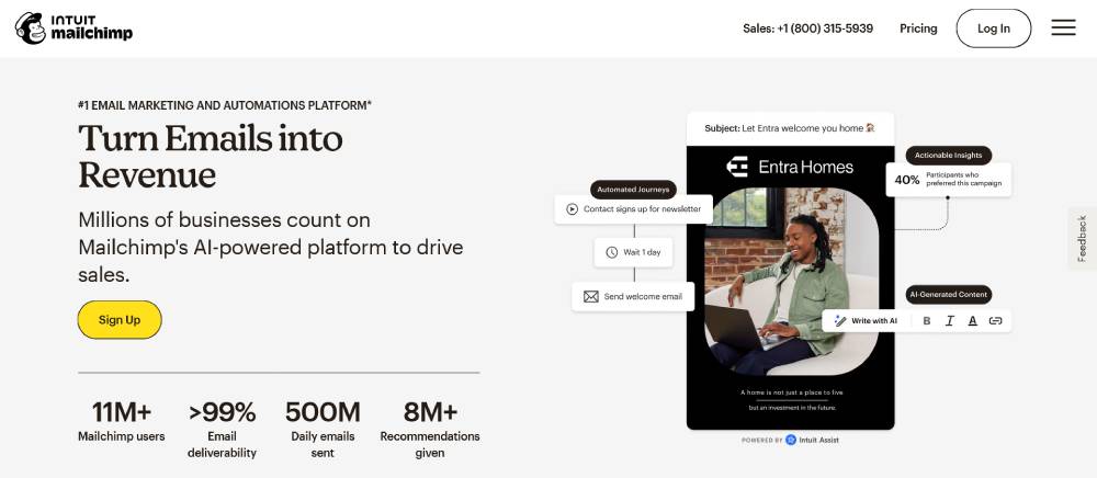
Playful illustrations create brand personality without sacrificing professionalism. Conversion-focused layout directs attention to signup forms. Modular content blocks allow flexible page construction. Consistent header treatments establish clear information hierarchy. Micro-interactions provide subtle feedback throughout user journey.
CarMax
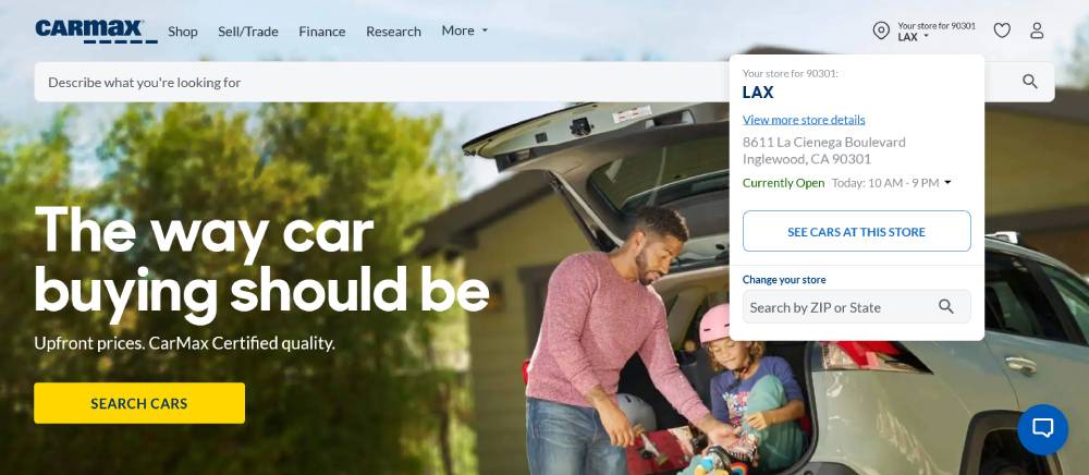
Search functionality dominates above-fold real estate. Vehicle cards use consistent structure for quick comparison. Progress indicators show transparent purchase process. Mobile interface prioritizes essential information first. Form validation provides helpful feedback without frustrating users.
Canva
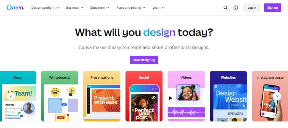
Template showcases highlight possibilities immediately. Drag-drop functionality demonstrated through visual cues. Category navigation simplifies content discovery. Free vs premium features clearly distinguished. Onboarding elements guide new users without overwhelming returning visitors.
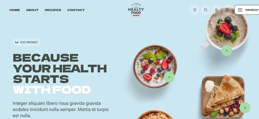
Be Eco Food 3
Mooala
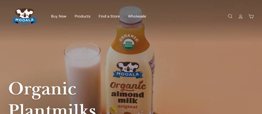
Product photography against clean backgrounds highlights packaging design. Playful brand elements create distinctive personality. Nutritional information presented with visual clarity. Store locator functionality increases practical value. Mobile navigation condenses without losing essential pathways.
Nauto
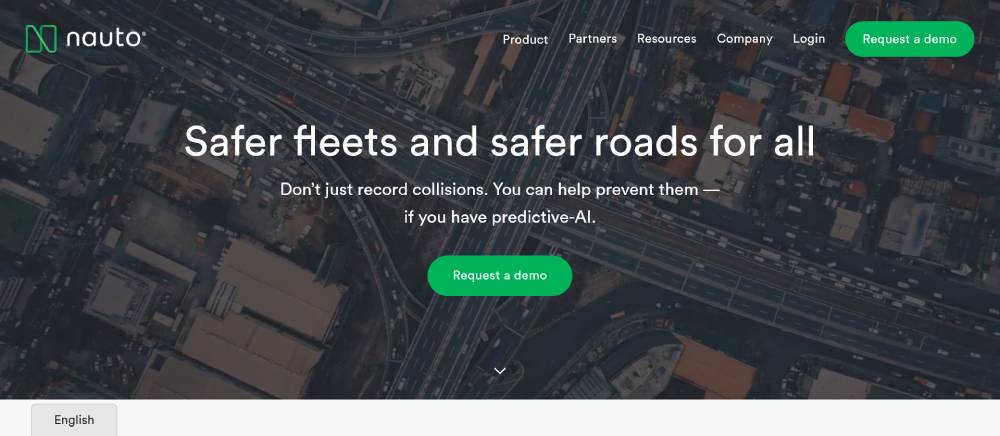
Data visualization communicates complex information clearly. Enterprise-focused design balances professionalism with innovation. Case study sections build credibility through results. Sectioned content creates natural reading rhythm. Contact pathways prominent without being intrusive.
Rover
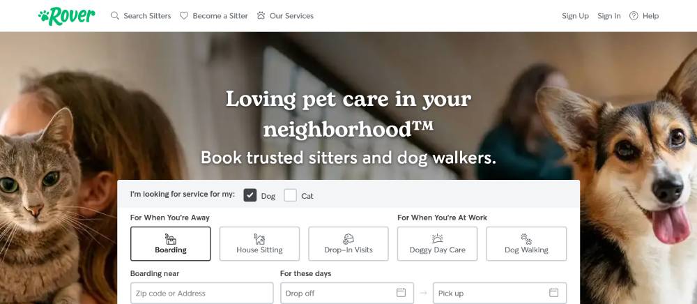
Trust indicators positioned strategically throughout user journey. Location-based matching functionality takes center stage. Profile cards balance information density with visual appeal. Mobile booking process streamlined for on-the-go use. Photography guidelines create consistent visual language across user-generated content.
Gong.io
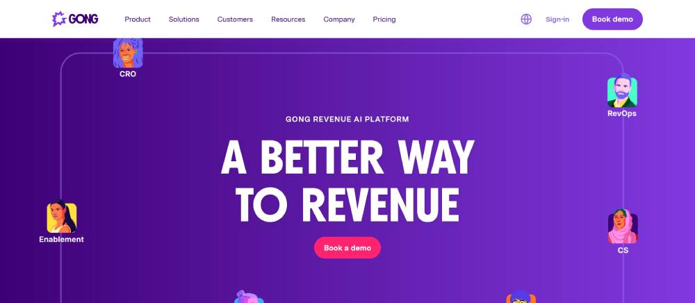
Data-driven design elements visualize product benefits. Animation draws attention to key conversion points. Testimonial integration builds immediate credibility. Feature screenshots show rather than tell functionality. Enterprise-appropriate design maintains professionalism while avoiding corporate staleness.
Gartner
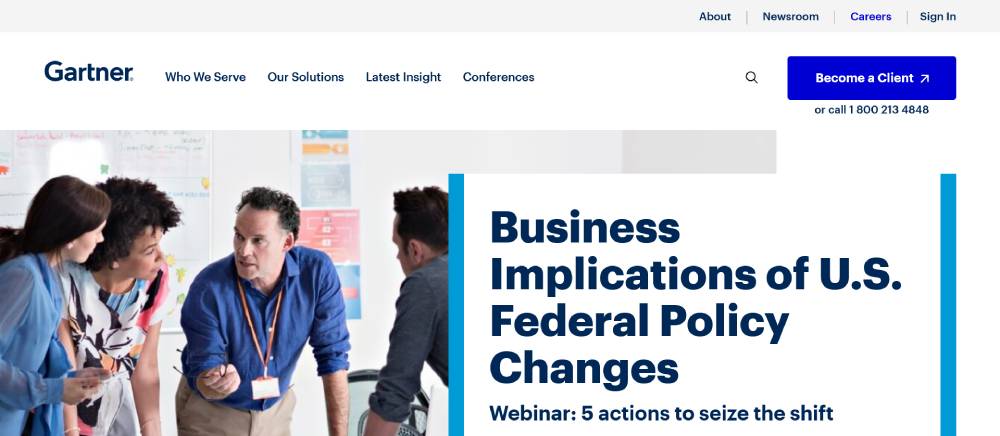
Information architecture handles complex content hierarchy effectively. Research-focused layout prioritizes content discoverability. Subscription models clearly presented with value differentiation. Industry-specific pathways create personalized journeys. Mobile experience condenses dense information without sacrificing access.
Be Jeweler 2
ConvertCart
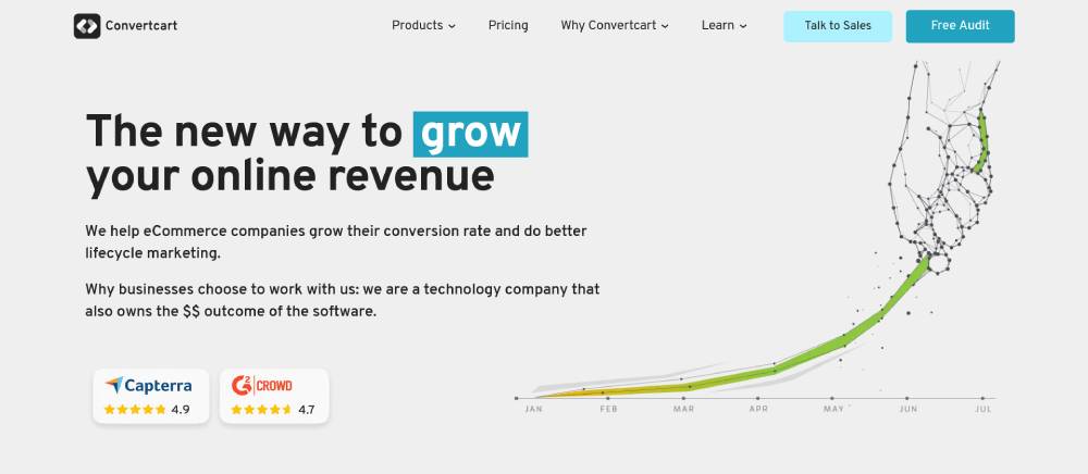
Results-focused messaging paired with supporting visuals. Benefit-driven sections create clear value proposition. Client logos strategically placed for immediate credibility. Process visualization simplifies complex services. Contact points available throughout scroll depth.
Calendly
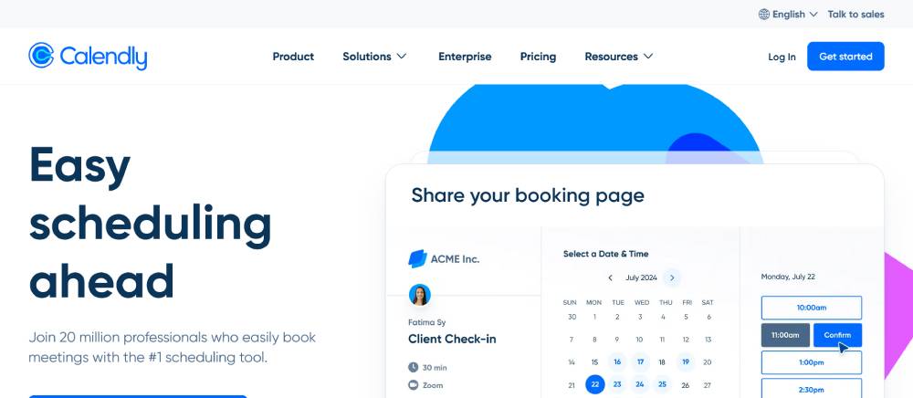
Functionality demonstration embedded directly in homepage. Integration icons build ecosystem credibility. Pricing tiers presented with clear feature differentiation. User interface preview shows rather than tells. Mobile booking experience maintains full functionality with adapted layout.
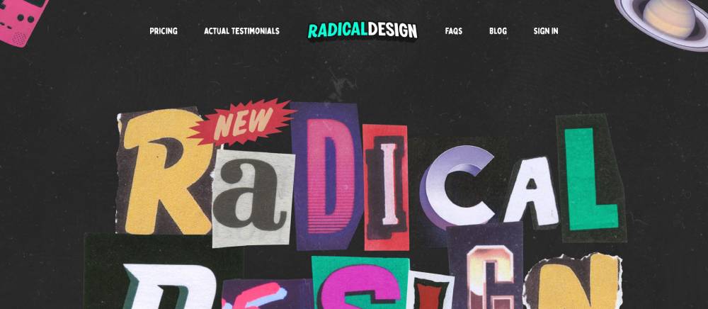
Radical Design Course
Instructor credibility highlighted through strategic positioning. Curriculum preview creates clear expectations. Social proof integrated throughout conversion path. Limited color palette creates focused attention. Registration process minimizes friction points.
Freelancing School
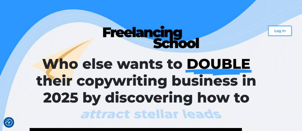
Outcome-focused messaging appeals to target audience needs. Course structure clearly outlined with expected timeframes. Instructor credentials build immediate authority. Payment options reduce financial barriers. Community elements highlight ongoing value beyond course content.
Survicate
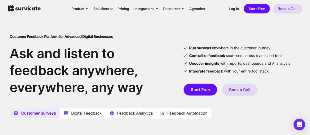
Survey interface previews demonstrate functionality directly. Integration ecosystem builds platform credibility. Use case examples show practical applications. Dashboard previews highlight data visualization capabilities. Trial signup process minimizes friction points.
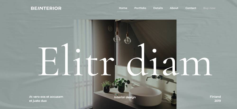
Be Interior 6
Hack The Box

Gamification elements create engaging learning experience. Dark mode interface signals technical sophistication. Challenge progression clearly visualized. Community leaderboards foster healthy competition. Mobile experience maintains core functionality with adapted interface.
Slack
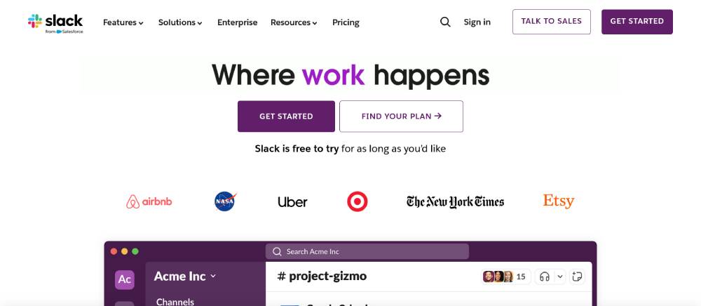
Interface previews show rather than tell functionality. Workspace examples demonstrate practical applications. Integration marketplace highlights ecosystem strength. Enterprise security features clearly communicated. Mobile experience preserves core communication functionality.
Notion
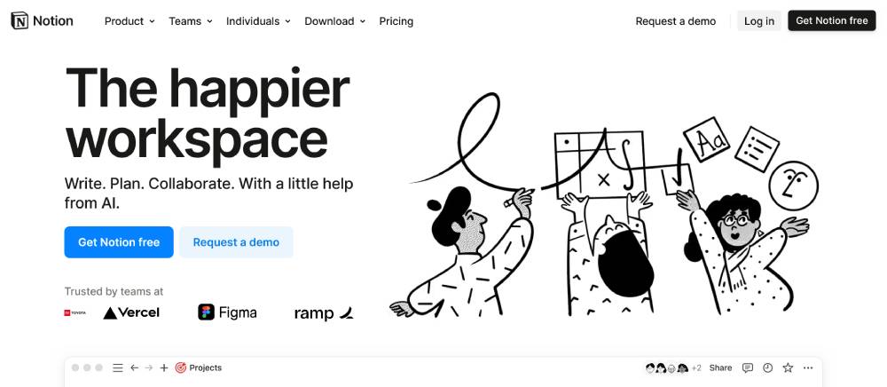
Template gallery showcases versatility immediately. Customization options demonstrated through visual examples. Use case navigation creates personalized journeys. Pricing structure clearly differentiates value tiers. Onboarding process reduces initial complexity through guided setup.
FAQ on Creative Landing Pages
What makes a landing page "creative"?
A creative landing page combines unique design elements with strategic conversion tactics. It's not just about eye-catching visuals—though that's part of it. True creativity means finding fresh ways to present your value proposition through interactive elements, unexpected layouts, and engaging content that resonates with your specific audience. The best pages use visual hierarchy to guide visitors while maintaining brand consistency.
How much does a professional landing page design cost?
Custom landing page creation costs vary widely, from $500 to $5,000+ depending on complexity. Many businesses use templates from platforms like Unbounce or Instapage as affordable starting points ($100-300/month). If you need high-converting page designs with custom features, expect to pay more. Tools like Elementor for WordPress offer middle-ground options where you can build professional pages yourself without extensive coding knowledge.
Do creative landing pages actually convert better?
Yes—when done right. Pages with engaging web design that maintains clear user pathways typically outperform boring alternatives. A Behance study showed conversion-focused design with creative elements improved rates by 30% compared to standard templates. The key is balancing artistic elements with conversion rate optimization principles. Creative doesn't mean cluttered or confusing.
What elements should every high-converting landing page include?
Every effective landing page needs:
- A compelling headline that addresses customer pain points
- Clear, benefit-focused copy with appropriate length optimization
- Strong call-to-action buttons with directional cues
- Trust signals and social proof elements (testimonials)
- Responsive design that works on all devices
- Fast loading speed
- Strategic whitespace
- Form design that minimizes friction
- Above-the-fold content that communicates value instantly
- Consistent typography and color schemes that match your brand
How can I create landing pages without design skills?
You have several options:
- Use landing page templates from Wix, Squarespace, or Shopify
- Try dedicated tools like Leadpages or ClickFunnels with drag-and-drop interfaces
- Explore WordPress page builders like Elementor
- Learn basics through inspiration sites like Dribbble and Awwwards
- Use AI-powered design tools that generate layouts based on your input
Many platforms now offer user-friendly interfaces where you can build pages without touching code. Start with a template, then customize it to match your needs.
How do I test if my landing page design is working?
Implement A/B testing using tools like Google Analytics, Hotjar, or Crazy Egg. Create variations that test one element at a time (headline, imagery, CTA placement). Watch heatmaps to see where users focus and get stuck. Page navigation patterns often reveal design problems. Exit intent popups can capture feedback from leaving visitors. Test with small traffic samples before full implementation, and use tools like GTmetrix to ensure technical performance doesn't interfere with results.
What are the biggest mistakes in landing page design?
Common landing page mistakes include:
- Cluttered layouts without proper information architecture
- Weak or hidden call-to-action buttons
- Slow loading from heavy video backgrounds
- Mismatched messaging between ads and landing content
- Forms that ask for too much information
- Missing mobile-friendly adjustments
- No clear value proposition display
- Generic stock photos instead of authentic imagery
- Too many navigation options leading visitors away
- Not using target audience research to inform design decisions
How long should my landing page be?
It depends on your product and where visitors are in their journey. For simple offers to warm audiences, short pages with minimal content often work best. Complex or expensive products usually need longer pages with more information to build confidence. The key is matching content length to your visitors' information needs. Some successful SaaS landing pages use scrolling sections to progressively reveal information based on user journey mapping. Test different lengths with your specific audience.
What role do animations and interactive elements play?
Strategic microinteractions and scroll-triggered animations can significantly increase engagement on landing pages. They help highlight key information, guide attention, and create memorable experiences. Modern CSS3 and JavaScript techniques make these elements more accessible to implement. However, use them purposefully—not just because they look cool. Each interactive element should serve the page's conversion goal. Heavy animations can hurt page loading speed, so optimize carefully using tools like PageSpeed Insights.
How often should I update my landing page designs?
Update your landing pages quarterly at minimum. Web design trends evolve rapidly—what looked modern last year might appear dated today. More importantly, regular testing provides data to refine your approach. Many successful marketers make small adjustments monthly based on analytics. Major redesigns typically happen annually or when conversion metrics drop significantly. Platforms like HubSpot and Mailchimp allow easy updates without rebuilding from scratch. Keep what works while refreshing elements that underperform.
Conclusion
Creative landing pages transform ordinary web experiences into conversion opportunities. By combining strategic design techniques with user-focused content, you create digital spaces that not only capture attention but drive action. Make them work harder for you.
Building effective pages isn't about following every trend on Dribbble or Awwwards. It's about understanding your audience's journey and crafting experiences that speak directly to their needs. Use responsive templates as starting points, not final solutions. Test different call-to-action placements. Watch heatmaps. Listen to what your analytics tell you.
Remember that even the most visually stunning page fails if it loads slowly on mobile devices. Balance form with function. Typography matters. Whitespace creates focus. Trust signals build confidence.
Start simple, then add complexity where it serves your goals. Your landing pages aren't art projects—they're business tools designed to convert visitors into customers. Make them beautiful, but make them work.
If you enjoyed reading this article on creative landing pages, you should check out this one about accessible websites examples.
We also wrote about a few related subjects like the best looking tourism websites, hotel website design, product landing page, great looking spa websites, cool looking personal trainer websites, top notch musician websites, the most impressive luxury websites and impressive animated websites.


