Event Website Design Examples To Check Out
January 11, 2026
Sleek Car Wash Website Design Examples to Inspire You
January 12, 2026Most gym websites look the same. Dark background, stock photo of someone deadlifting, a "Join Now" button that leads to a broken form. That's not design. That's a template nobody finished.
The difference between a gym site that converts and one that collects dust comes down to specific design decisions: layout structure, booking flow, CTA placement, and how fast the page loads on a phone at 6 AM.
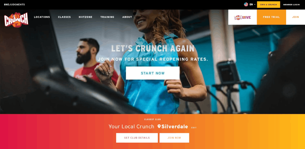
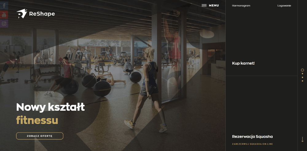
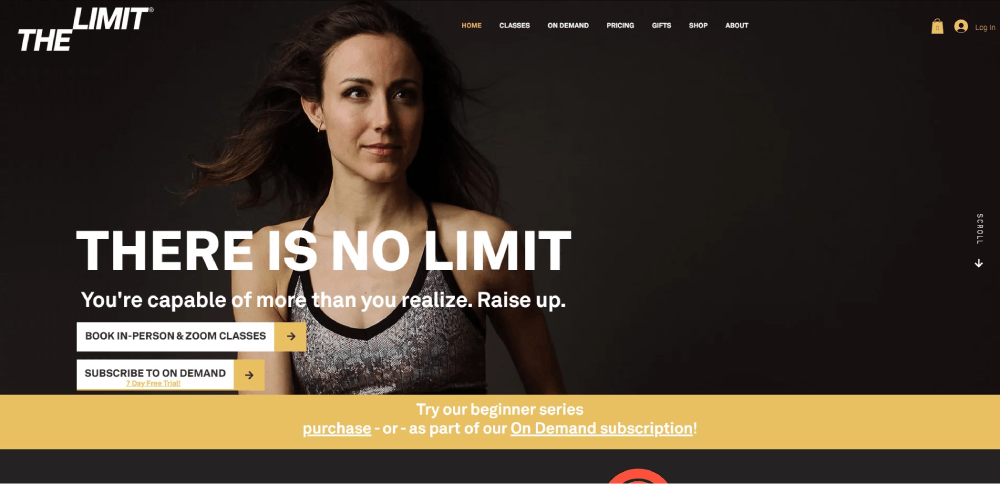
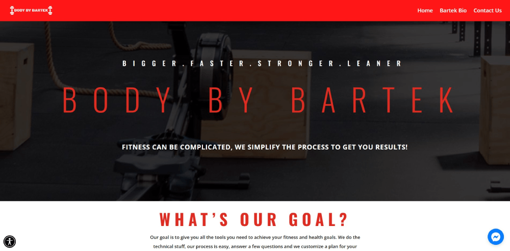
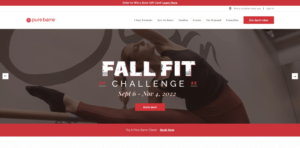
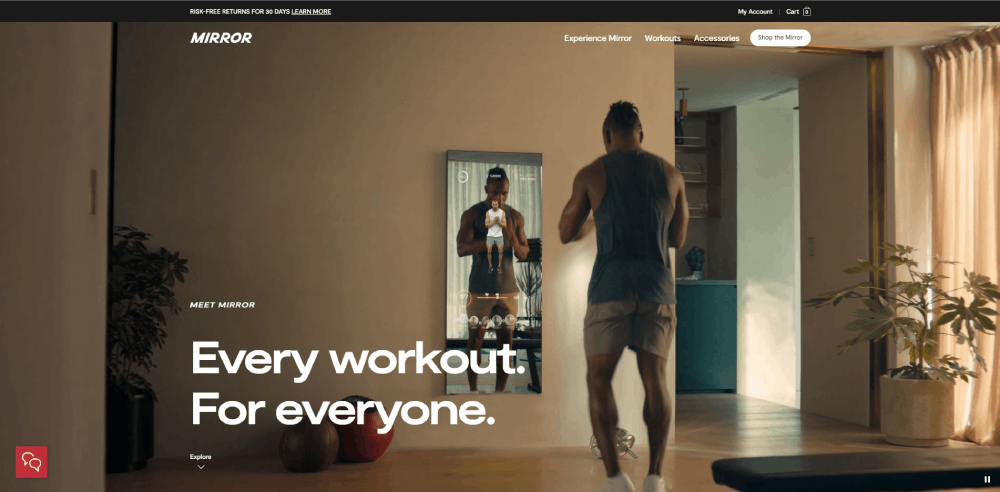
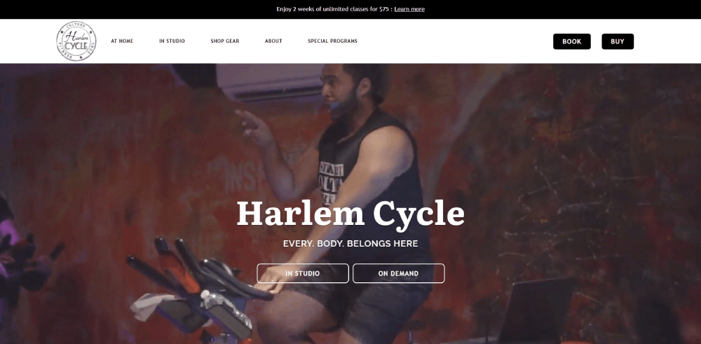
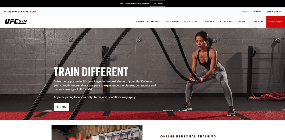
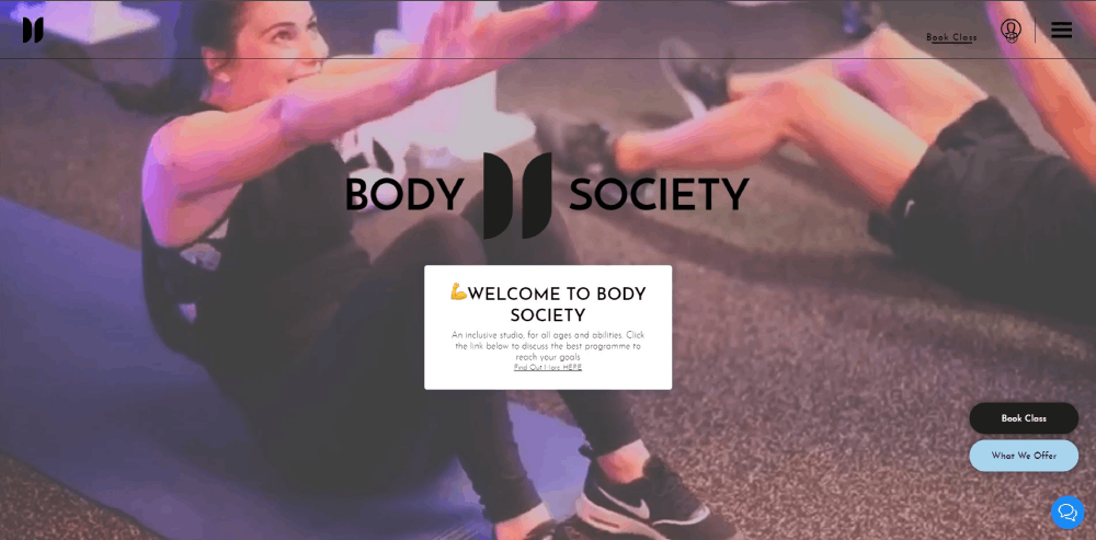
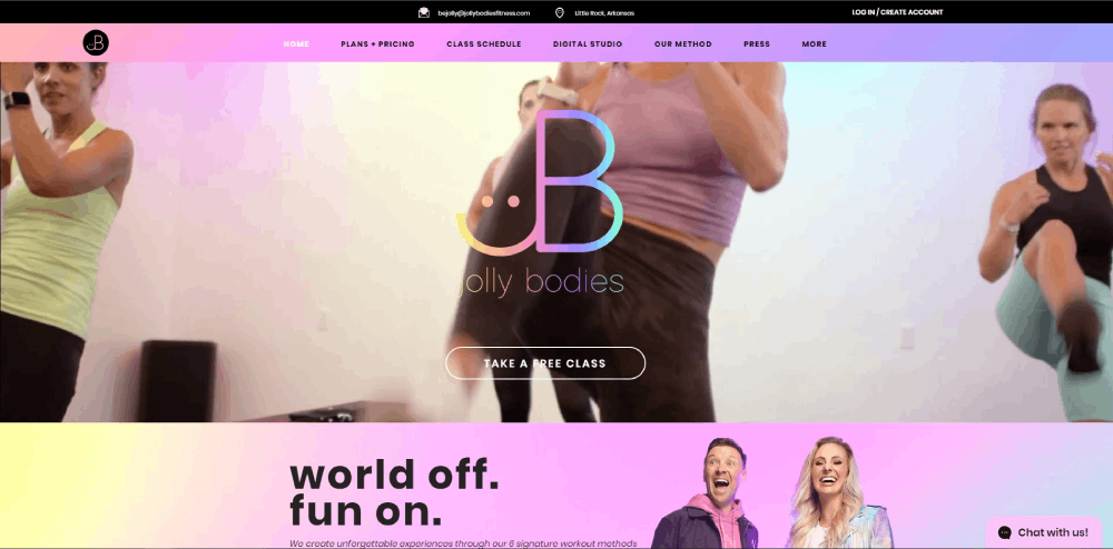
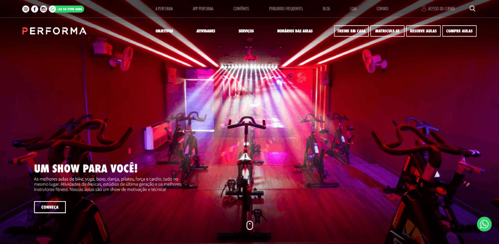
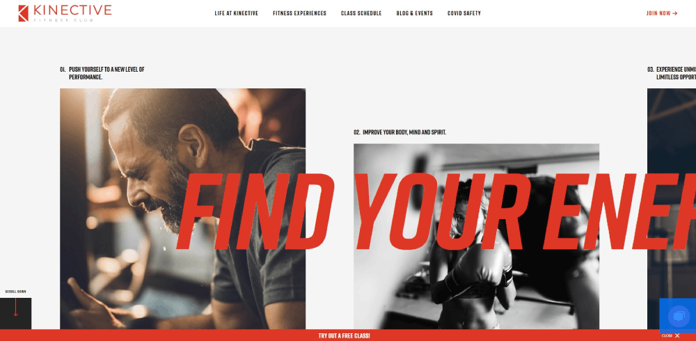
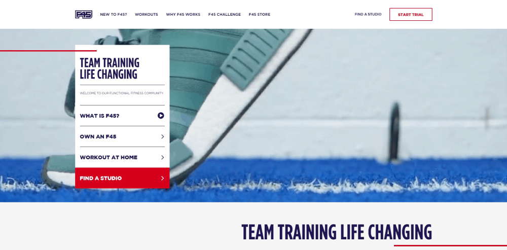
This collection of gym website design examples breaks down what Gold's Gym, Equinox, F45 Training, CrossFit affiliates, and independent studios are doing right (and wrong) with their online presence. You'll see exactly which features, layouts, and design patterns turn visitors into paying members.
What Is Gym Website Design
Gym website design is the process of creating a dedicated online presence for fitness centers, health clubs, and workout studios that converts visitors into paying members.
It covers everything from homepage layout and class schedule display to membership signup flows and online booking integration.
Unlike generic business sites, a gym website has to handle real-time class availability, trainer profiles, pricing tiers, and location-based information all at once.
Think of it this way. A visitor lands on your site at 9 PM after a long day. They want to know three things: what classes you offer, how much it costs, and how to sign up. Your design either answers those questions in under 10 seconds or loses that person to the gym down the street.
Most fitness websites share common structural patterns, but gym-specific design demands tighter integration with booking software like Mindbody, Glofox, or Zen Planner.
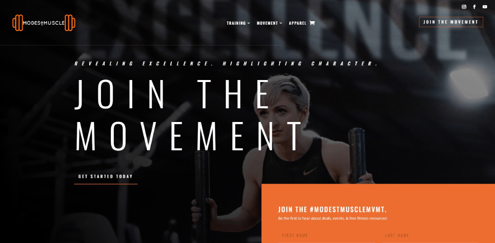
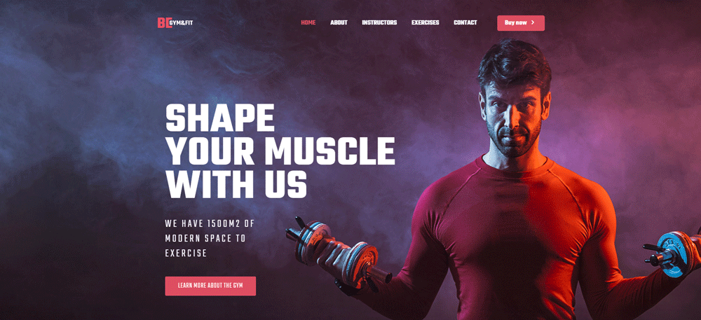
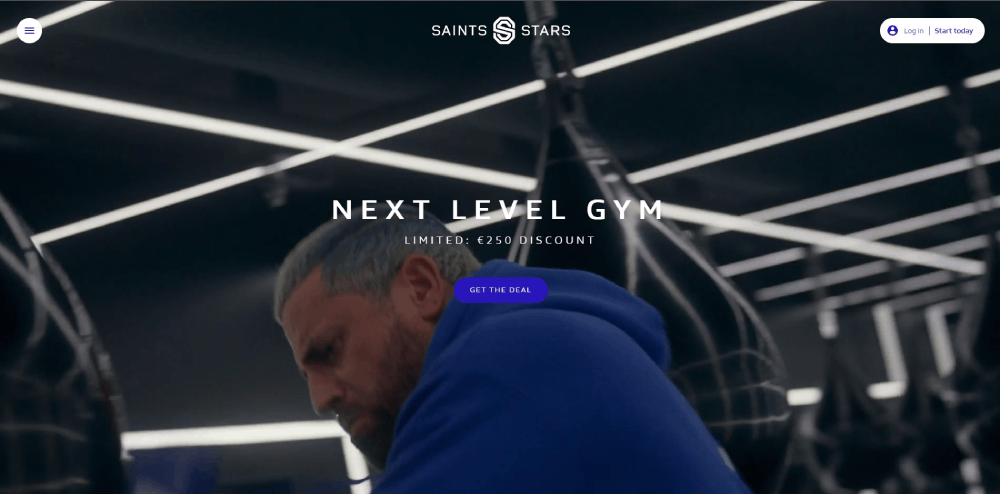
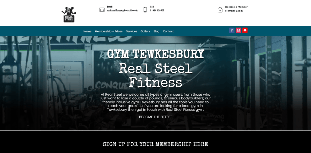
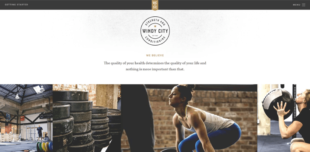
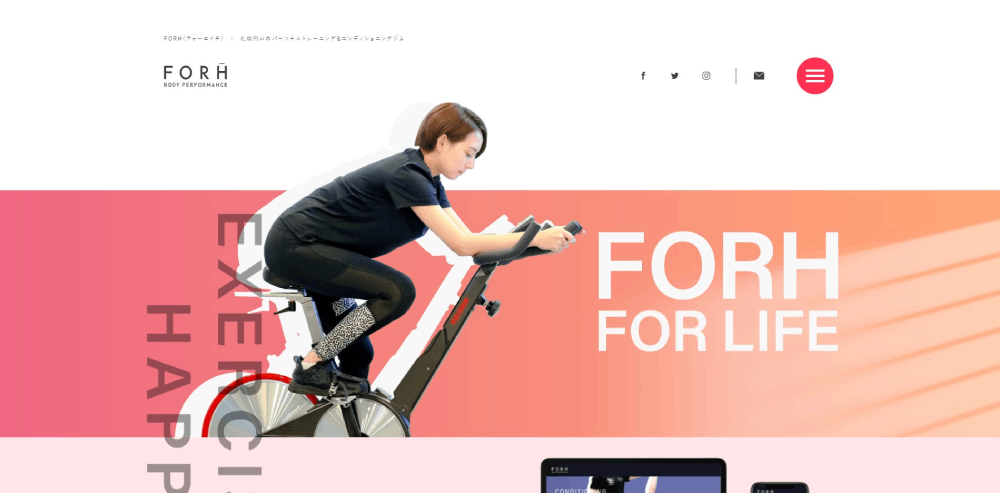
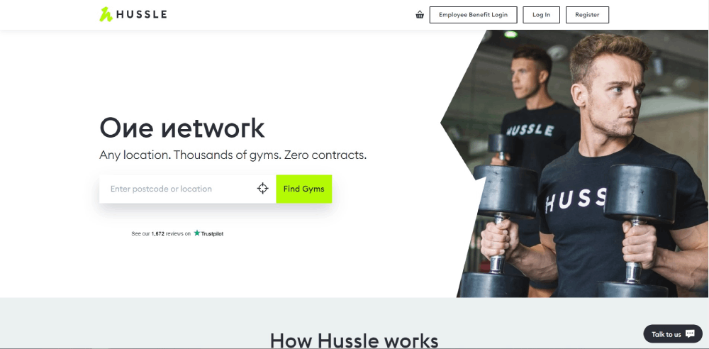
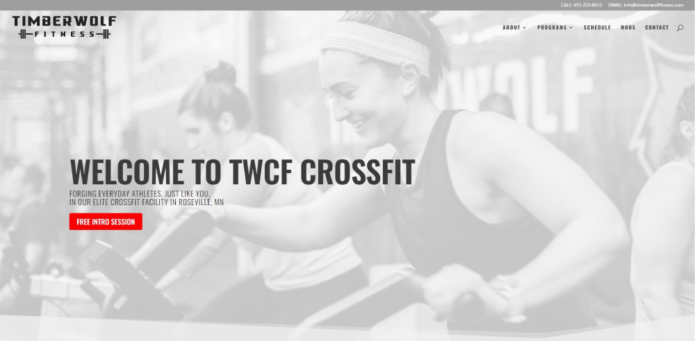
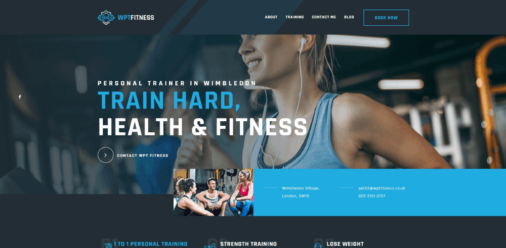
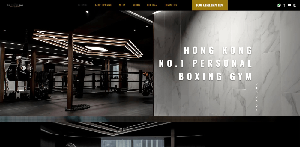
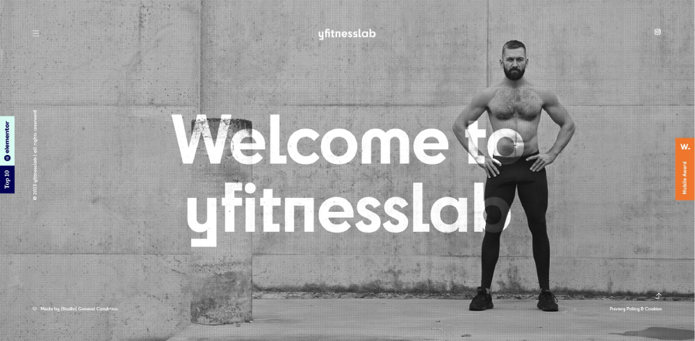
The best gym website designs balance strong visual impact with practical functionality. Heavy imagery, bold typography, and dark color palettes dominate the fitness industry for a reason. They match the energy of the brand.
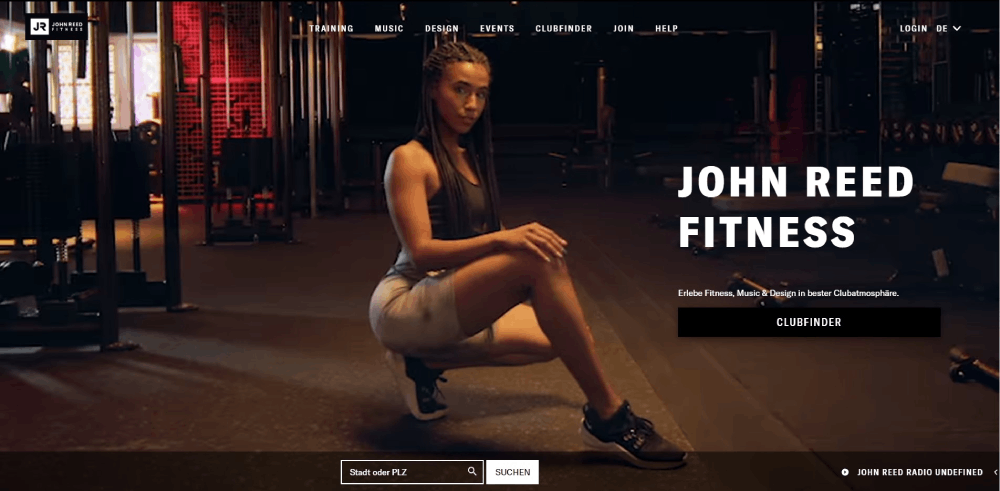
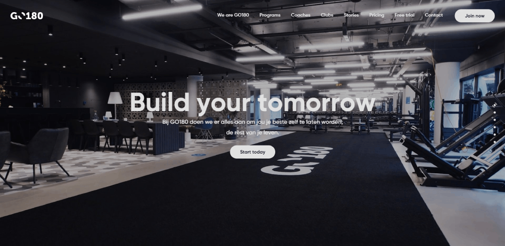
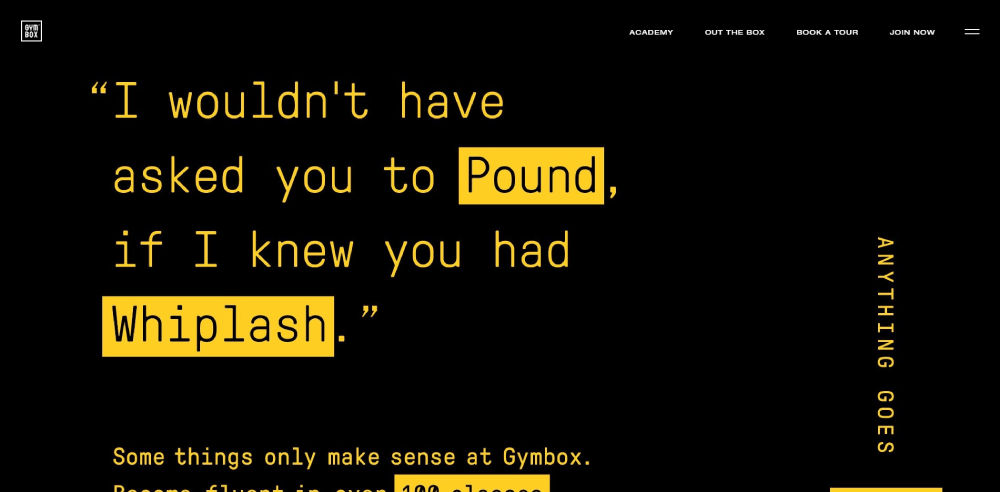
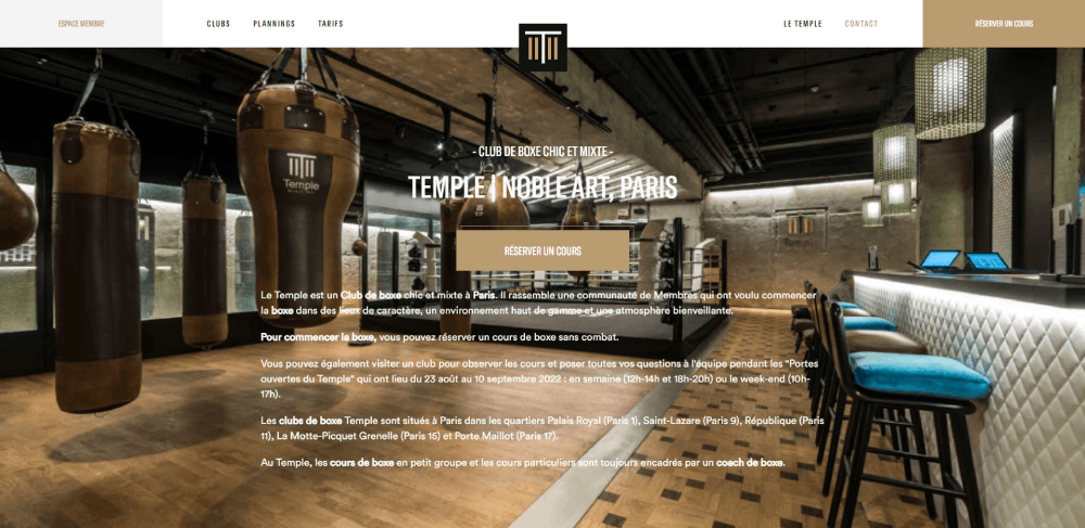
Gym Website Design Examples
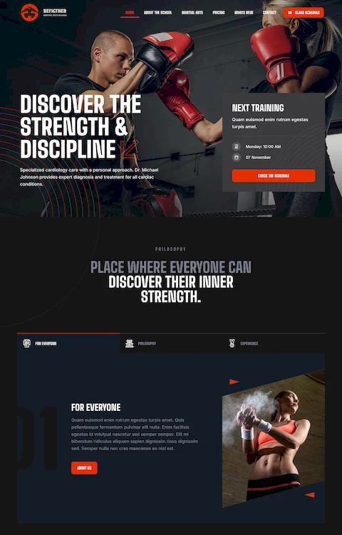
training BOXX
How Does a Gym Website Differ from Other Fitness Websites
A gym website serves a physical location. That single difference changes everything about the design.
Personal trainer websites sell individual expertise. Yoga studio sites lean into calm aesthetics and class philosophies. Gym websites need to do more, faster.
Here's what separates them:
- Multiple class types and schedules running simultaneously
- Tiered membership pricing with different access levels
- Equipment lists, facility photos, virtual tours
- Trainer roster pages with individual bios and certifications
- Location-specific content for multi-branch operations
A CrossFit affiliate site might focus on community and WOD results. An Orangetheory Fitness page pushes heart-rate-zone education and class booking. Planet Fitness leans hard into its judgment-free branding.
Each gym type demands a different design approach, but they all share one goal: get visitors to book a class or buy a membership before they leave the page.
Wellness websites and coaching websites can afford softer conversion paths. Gym sites cannot.
What Makes a Gym Website Design Effective
An effective gym website design loads fast, looks strong, and removes every barrier between a visitor and the signup button.
That sounds simple. Took me years to figure out it actually is that simple. Most gym sites fail because they overcomplicate things.
What Role Does Layout Play in Gym Website Conversions
The website layout determines whether visitors find the signup button or bounce. Place the primary CTA above the fold, keep the navigation to five items max, and put class schedules no more than one click from any page.
Gold's Gym and F45 Training both use single-column layouts on mobile with sticky booking bars at the bottom. It works.
How Does Color Psychology Affect Gym Website Engagement
Dark backgrounds with high-contrast accent colors dominate gym web design, and there's data behind it. Dark themed websites reduce visual fatigue and make photography pop.
Red and orange trigger urgency (good for limited-time offers). Black and charcoal signal premium positioning. Equinox uses near-black with gold accents to match its luxury color palette positioning.
What Typography Works Best for Gym Websites
Sans-serif fonts at large weights. That's the short answer.
Typography in gym design leans heavy and condensed. Fonts like Oswald, Bebas Neue, and Montserrat appear across Barry's Bootcamp, F45, and dozens of CrossFit affiliate sites. Pair a bold display font for headings with a clean body font like Inter or Open Sans from Google Fonts' free library.
What Features Should Every Gym Website Include
Strip away the brand-specific stuff, and every gym website needs the same core set of features. Miss one of these and you're leaving members on the table.
How Should a Gym Website Display Class Schedules
Embed the schedule directly on the page, not behind a PDF link or third-party redirect. Mindbody, Glofox, and Zen Planner all offer embeddable widgets that sync in real time. Filter by class type, trainer, and day of the week at minimum.
What Is the Best Way to Show Membership Pricing on a Gym Website
Show it. Seriously. Hiding pricing behind a "Contact Us" form kills conversions in 2026.
Use a side-by-side comparison layout with two or three tiers. Highlight the most popular option. Include what's in each tier and what's not. Stripe and other payment processors integrate directly with most gym website builders, so there's no reason the signup can't happen on the same page.
How Do Gym Websites Handle Online Booking and Registration
The best gym sites reduce booking to three steps or fewer: select class, pick a time, confirm payment. Every extra form field or page load between "I want to go" and "I'm booked" drops conversion rates.
ClassPass integration is worth considering if your gym targets drop-in visitors alongside regular members. It adds a discovery channel without any design overhead.
Where Should Testimonials and Reviews Appear on a Gym Website
Place member testimonials on the homepage (below the hero, above the pricing section) and on the dedicated testimonial page. Use real names and photos. Video testimonials outperform text by a wide margin, but even a headshot with a two-sentence quote works.
Google Reviews embedded directly onto your site add third-party credibility that self-published quotes can't match.
What Design Mistakes Do Most Gym Websites Make
I've looked at hundreds of gym sites. The same mistakes show up constantly, across franchises and independent studios alike.
Why Do Slow-Loading Gym Websites Lose Potential Members
Gym sites are image-heavy by nature. Uncompressed hero images, autoplay video backgrounds without lazy loading, and unoptimized booking widgets push load times past 4-5 seconds. Google PageSpeed Insights flags most gym homepages in the 30-50 performance range. Visitors leave before the schedule even renders.
How Does Poor Mobile Design Hurt Gym Website Performance
Over 70% of gym website traffic comes from mobile devices. People search "gym near me" on their phone, tap a result, and expect to book a class right there.
Tiny tap targets on booking buttons, horizontal-scrolling schedule tables, and hamburger menus that hide the "Join" link three levels deep. These are the user friendly website failures that cost real money. Mobile first design isn't optional for gyms anymore.
What Happens When a Gym Website Has No Clear Call to Action
The visitor looks around, maybe reads an "About Us" paragraph, then leaves. No booking. No signup. No trial class.
Every page needs one primary CTA visible without scrolling. "Book a Free Class" works better than "Learn More" every single time. Sticky CTAs on mobile (a fixed bar at the bottom of the screen) solve this on pages where the main button scrolls out of view.
Which Website Builders and Platforms Work Best for Gym Websites
The platform choice depends on budget, technical skill, and how much control you want over the booking experience.
How Does WordPress Compare to Squarespace for Gym Website Design
WordPress with Elementor or the BeTheme builder gives full control over layout, booking integrations, and membership plugin options like WooCommerce Memberships. Steeper learning curve. More flexibility.
Squarespace offers cleaner templates out of the box and handles hosting, but its booking integrations are limited to Acuity (built-in) and a handful of third-party embeds. Great for single-location studios that want something live in a weekend.
What Gym-Specific Website Templates Are Available on Wix
Wix has around 15 fitness-specific templates as of early 2026, including layouts built for CrossFit boxes, yoga studios, and personal training businesses. The Wix Bookings feature handles class scheduling natively without third-party plugins.
The tradeoff: Wix sites tend to load slower than WordPress or Webflow builds, and migrating away from Wix later is painful. Good for getting started. Not ideal long-term for gyms scaling past one location.
When Should a Gym Invest in Custom Website Design vs. a Template
If you run a single location with a straightforward class schedule, a sports website template on WordPress or Squarespace handles 90% of what you need.
Custom design makes sense when you're managing multiple locations, need deep Mindbody or Glofox integration, or want a brand experience that doesn't look like every other gym site on the same template. Expect to pay $5,000-$15,000 for a custom gym site from a web design agency.
How Do Gym Website Designs Handle Local Search Visibility
A gym website without local SEO is a gym website nobody finds. 46% of all Google searches have local intent, and "gym near me" is one of the highest-volume local queries in the fitness category.
What Location-Based Design Elements Help Gym Websites Rank Locally
Embed a Google Map on the contact page. Include your full address, phone number, and business hours in the website footer on every page. Create a properly claimed and optimized Google My Business profile that links back to your site.
Add location-specific content: neighborhood name in page titles, local landmark references in the "About" section, and schema markup for local business on every page.
How Should a Multi-Location Gym Structure Its Website
Each location gets its own landing page with a unique URL (yourgym.com/locations/downtown, yourgym.com/locations/westside). Each page includes that location's schedule, trainers, photos, and contact info.
Don't make the mistake of putting all locations on a single page. Search engines treat each URL as a separate document. Separate pages mean separate ranking opportunities for location-specific queries like "gym in [neighborhood]."
How to Evaluate a Gym Website Design Before Launching
Run through this website checklist before going live:
- Load the site on three different phones (not just yours)
- Test the full booking flow from homepage to confirmation, on mobile
- Run Google PageSpeed Insights and fix anything below 70
- Check that the class schedule loads without a separate login
- Verify the membership pricing page is reachable in two clicks or fewer
- Confirm all trainer profile photos are consistent in size and quality
- Test the contact form, the booking widget, and the payment processor
- Review the site on both Chrome and Safari (they render differently)
Use Hotjar or a similar heatmap tool during the first two weeks post-launch. Watch where people click, where they stop scrolling, and where they drop off the booking flow. Real user data beats assumptions every time.
Ask five people who have never seen your site to find the class schedule and sign up for a trial. Time them. If it takes longer than 30 seconds, redesign the flow.
FAQ on Gym Website Design
What makes a gym website design effective?
An effective gym website loads in under 3 seconds, displays class schedules without extra clicks, and places the membership signup CTA above the fold. Strong photography, clear pricing, and mobile-responsive layouts drive conversions more than any visual trend.
Which website builder is best for a gym website?
WordPress with Elementor offers the most flexibility for booking integrations with Mindbody or Glofox. Squarespace works well for single-location studios wanting a quick launch. Wix handles basic scheduling natively but limits scalability for multi-location gyms.
How much does a custom gym website design cost?
A custom gym website costs between $5,000 and $15,000 from a professional agency. Template-based builds on WordPress or Squarespace run $500 to $2,000 including theme, plugins, and basic setup. Ongoing hosting and maintenance add $30 to $100 monthly.
What pages should every gym website include?
Every gym site needs a homepage, class schedule page, membership pricing page, trainer profiles, location and contact page, and a booking or free trial landing page. A blog and testimonials section help with search visibility and trust.
How do gym websites handle online class booking?
Most gym websites embed scheduling widgets from Mindbody, Glofox, or Zen Planner directly into their pages. These tools sync class availability in real time, accept payments through Stripe, and send confirmation emails automatically without redirecting users off-site.
Should a gym website use dark or light color schemes?
Dark backgrounds dominate fitness web design because they make photography stand out and signal energy. Light schemes work better for yoga studios and wellness-focused brands. Match the palette to your brand positioning, not a trend.
How important is mobile design for gym websites?
Over 70% of gym website traffic comes from mobile devices. People search "gym near me" on their phones and expect to book a class immediately. A gym site that isn't fully mobile responsive loses the majority of its potential members.
What are the biggest gym website design mistakes?
Hiding membership pricing behind contact forms, using uncompressed hero images that slow page load, burying the class schedule in submenus, and neglecting mobile optimization. Stock photography with no real gym photos also kills credibility fast.
How do gym websites improve local search rankings?
Embed Google Maps on the contact page, claim and optimize your Google My Business profile, add location-specific content to page titles, and include your full address in the site footer. Separate landing pages for each location boost local visibility.
Can a gym website help increase membership signups?
A well-designed gym website with a clear booking flow, visible pricing, strong testimonials, and a prominent free trial CTA can double conversion rates compared to outdated or poorly structured sites. The site is your 24/7 sales rep.
Conclusion
These gym website design examples prove one thing clearly. The sites that convert members share a handful of patterns: fast load times, visible pricing, frictionless booking, and real photography shot inside actual facilities.
Whether you're building on WordPress with Elementor, launching a Squarespace template for a boutique fitness studio, or commissioning a custom Webflow build for a multi-location operation, the fundamentals stay the same.
Put the class schedule where people can find it. Make the signup flow three steps or fewer. Test everything on mobile before anything else.
Your gym website is the first workout experience a potential member has with your brand. A slow, confusing, or outdated site tells them exactly what to expect inside your facility. Make sure that impression is the right one.

