

Law Firm Website Templates That Build Trust Fast
June 26, 2026The hamburger menu, that little stack of three lines, is one of the most common controls on the web now, which makes it easy to assume it's a solved problem.
It mostly isn't.
A lot of live implementations get at least one detail wrong: a close button that was never added, an animation that drags half a second too long, a panel that slides in under a sticky header and disappears behind it.
The icon itself is rarely the problem; it's everything around it.
What Is a Hamburger Menu?
The pattern is simple enough: a button drawn as three stacked horizontal lines that opens a hidden navigation panel when you click or tap it. The name comes from how the icon looks like a hamburger seen in cross-section.
Norm Cox drew the original back in 1981 for the Xerox Star workstation, where it then sat mostly unused for decades. The smartphone era is what revived it, once designers had to figure out how navigation fits on a small screen.
Every version of it comes down to the same three pieces: the icon, which is the three-line toggle button itself; the trigger, usually a click or tap and very occasionally a hover; and the panel that gets revealed, which might overlay, drawer in, push the page, or drop down.
Mobile devices now make up roughly 60% of global web traffic (StatCounter, 2025), and that shift is what carried the hamburger from a niche idea to something close to a default.
How a Hamburger Menu Works
It only really has two states, closed and open.
Closed, only the icon shows, with the navigation links kept out of the viewport so the content has room. Open, the panel appears, and depending on the pattern it either covers the content, shoves it aside, or drops down out of the header.
The icon often animates as it switches. The usual move is to rotate the top and bottom bars 45 degrees and fade the middle one out, leaving an X that reads as "close."
Hamburger Menu vs. Other Hidden Navigation Patterns
Not every three-line or three-dot icon means the same thing, and a handful of them get mixed up constantly.
| Pattern | Icon | Orientation | Primary Use |
|---|---|---|---|
| Hamburger menu | 3 horizontal lines | Vertical stack | Full site navigation |
| Kebab menu | 3 vertical dots | Vertical column | Item-level actions |
| Meatball menu | 3 horizontal dots | Horizontal row | Overflow options |
| Bento menu | Grid of 6-9 dots | Grid layout | App switchers |
The kebab and meatball menus are action menus rather than navigation ones. Drop a kebab where people expect a hamburger and you've created a reliable little source of confusion in mobile design.
What Are the Most Common Hamburger Menu Design Patterns?
Most hamburger menus fall into one of a few structural patterns: the full-screen overlay, the side drawer, the push menu, and the top-drop panel. Each one moves from hidden to visible navigation in its own way, and each suits a different mix of screen size and content.
Full-Screen Overlay Menu
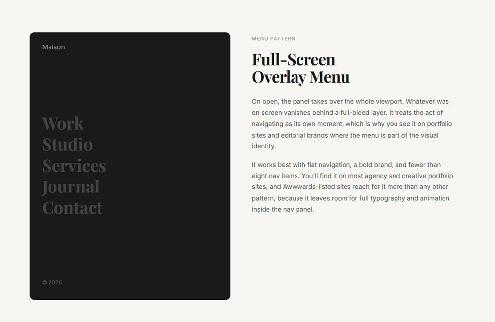
On open, the panel takes over the whole viewport.
Whatever was on screen vanishes behind a full-bleed layer. It treats the act of navigating as its own moment, which is why you see it on portfolio sites and editorial brands where the menu is part of the visual identity.
It works best with flat navigation, a bold brand, and fewer than eight nav items. You'll find it on most agency and creative portfolio sites, and Awwwards-listed sites reach for it more than any other pattern, because it leaves room for full typography and animation inside the nav panel.
Side Drawer Menu
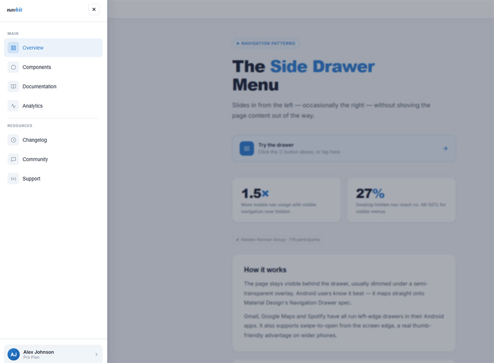
This one slides in from the left, occasionally the right, without shoving the page content out of the way.
The page stays visible behind it, usually dimmed under a semi-transparent overlay. Android users know it best, since it maps straight onto Material Design's Navigation Drawer spec.
Gmail, Google Maps and Spotify have all run left-edge drawers in their Android apps at one point or another. It also supports swipe-to-open from the screen edge, which is a real thumb-friendly advantage on wider phones.
Nielsen Norman Group research with 179 participants found visible navigation got used 1.5x more on mobile than hidden navigation. Even so, the side drawer held up better than desktop hamburgers, where hidden nav was reached in only 27% of cases against 48-50% for visible menus.
Push Menu
Here the panel slides in and pushes the page content aside instead of sitting on top of it.
The visual difference is subtle but it matters in use. Because the content underneath stays partly visible, people keep their sense of where they are. Screen-width limits make it less common on mobile, though it still turns up at desktop breakpoints.
The tradeoff is that the content shift can feel jarring unless the animation is smooth.
Top-Drop Panel Menu
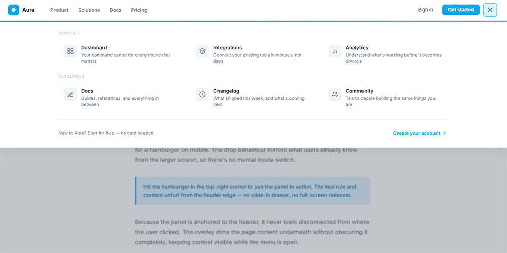
This panel comes down out of the header bar rather than in from a screen edge.
It sits between the hamburger and a traditional dropdown. It fits nicely on sites that swap a full horizontal nav bar on desktop for a hamburger on mobile, because the dropdown behaviour matches what people already saw on the larger screen.
| Pattern | Content Visible Behind | Gesture Support | Best Breakpoint |
|---|---|---|---|
| Full-screen overlay | No | Limited | Mobile + desktop |
| Side drawer | Yes (dimmed) | Swipe-to-open | Mobile |
| Push menu | Yes (shifted) | No | Tablet + desktop |
| Top-drop panel | Yes | No | Mobile (responsive) |
What Are the Best Hamburger Menu Examples on Live Websites?
The good ones tend to do the same few things: the icon is either labelled or clearly set apart from other controls, the animation comes in under 400ms, and it's obvious how to close the thing. A few real implementations are worth looking at, grouped by industry.
E-Commerce Hamburger Menu Examples
E-commerce sites carry more navigation than most. Categories, subcategories, utility links like cart and account and search, plus promotional bits, all fight for the same panel.
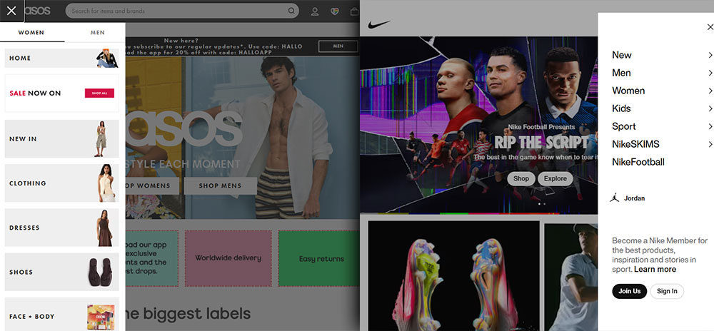
ASOS runs a full-height side drawer with accordions for subcategories. Each parent category opens inline rather than sending you to a new screen, so you stay inside the menu. The icon sits top-left next to the logo, and on wider mobile viewports the word "Menu" shows up beside it.
Nike goes the other way. Its hamburger opens a full-screen overlay that splits items into sections under visible headings, and the sections fade in one after another, roughly 50ms apart per item.
Zara is the most interesting one, in terms of the tension it carries. The menu is minimal, nearly text-only, inside a side drawer, and the icon has no label at all. It gets away with it because Zara's audience is mostly repeat visitors who already know the brand. A first-time visitor would be slower to parse it. That's a deliberate call, not a slip.
Baymard Institute's 2025 mobile UX benchmark found 69% of e-commerce sites land at mediocre or worse on mobile main navigation, with only 31% rated decently or better. You can see that spread playing out across these examples.
Portfolio and Agency Hamburger Menu Examples
Portfolio sites treat the hamburger differently. Navigation comes second to the work, so the menu design often ends up being part of the portfolio itself.
A few things show up again and again in creative agency menus:
- Full-screen overlays with large typography.
- Menu items that animate on hover with colour fills or underlines.
- Custom icon designs: thicker bars, rounded ends, coloured fills.
- Background imagery left visible behind the open menu.
Awwwards-featured sites through 2024-2025 lean toward menus that use CSS clip-path to reveal content in non-rectangular shapes on open, turning the transition itself into a design moment.
The GOV.UK Design System sits at the opposite end. Its mobile navigation is a plain hamburger labelled "Menu," with no animation past a simple show/hide and full keyboard operability. It's probably the most-studied accessible hamburger implementation available as open-source reference code.
SaaS and App Hamburger Menu Examples
SaaS products handle the hamburger differently from content sites. The navigation tends to run deeper, the user is signed in, and the dominant pattern is a sidebar rather than a top drawer.
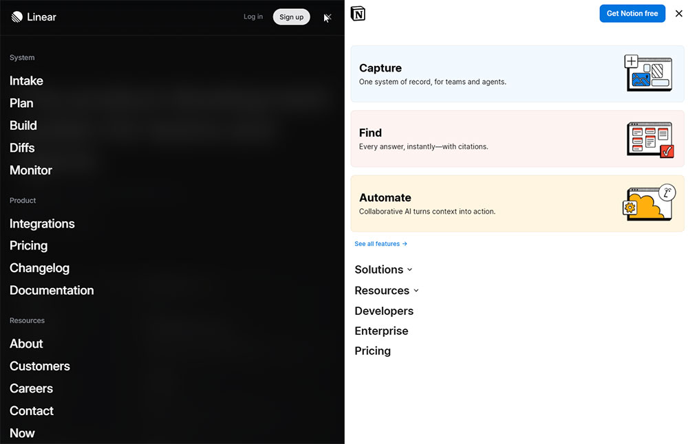
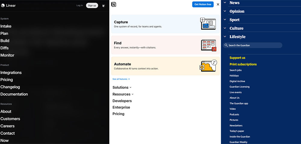
Notion uses a left sidebar toggle that behaves exactly like a hamburger: one click shows or hides the workspace navigation, and on mobile it collapses into the standard pattern. The trigger is a sidebar-collapse icon rather than the classic three-line one, which is worth noting as a variation.
Linear, the project management app, shows how a desktop hamburger can actually work. The left nav collapses to free up horizontal space for the content canvas, with the icon top-left and a simple width transition from full sidebar down to an icon-only rail. There's no overlay and no full-screen panel.
For website navigation examples that go past the hamburger, SaaS products are worth a look, since they stack several navigation layers under one interface.
News and Editorial Hamburger Menu Examples
News sites have a specific problem: hundreds of sections, but a need to keep the most-visited ones in view at all times.
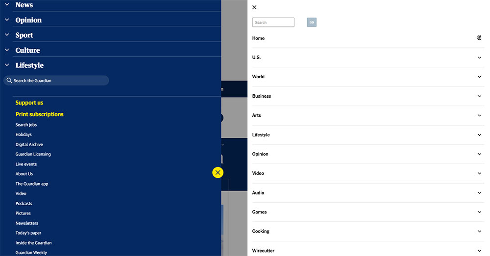
The Guardian's mobile site keeps top-level sections in a horizontal scroll bar above the content and puts the deeper navigation and account links in the hamburger. The hybrid keeps the primary navigation visible and uses the hamburger as an overflow container.
The New York Times labels its hamburger "Sections" rather than the default "Menu," which is a small change that does real work, setting an expectation before the tap. Task completion measurably speeds up when labels match the user's mental model (Nielsen Norman Group).
What Are Good Hamburger Menu Examples in Mobile Apps?
In mobile apps, navigation drawers live under two different design systems, Google's Material Design on Android and Apple's Human Interface Guidelines on iOS. Each sets its own conventions for placement, gestures and visual treatment.
Ignore those conventions and the navigation feels foreign to people, even when it works fine technically.
Android App Hamburger Menu Examples (Material Design)
Material Design 3 calls the pattern the Navigation Drawer, a panel that slides in from the left edge to reach destinations inside an app.
Gmail has run the left-edge drawer since 2014 and is probably the most-studied version of it anywhere. The panel holds folder-level navigation, the Inbox, Starred, Sent and your labels, with the icon top-left next to the search bar. On larger Android tablets the drawer stays open by default and turns into a persistent sidebar.
Worth noting that Gmail quietly moved its primary actions to a bottom navigation bar around 2022-2023, leaving the drawer for the secondary, less-used destinations. The hamburger stayed, but its job got smaller.
Google Maps uses a side drawer for account-level navigation, the profile, saved places and contributions, and keeps the primary map actions out of the hamburger entirely. That's the right way round: in an app the hamburger should hold secondary navigation, not the actions people reach for constantly.
A UX case study on GoSpotCheck's app redesign found people were spending an average of 6 minutes a day just navigating inside the hamburger. Moving to tabbed navigation gave that time back, which shows how drawer-heavy architectures add real friction at scale.
iOS App Hamburger Menu Examples
Apple's Human Interface Guidelines don't recommend the hamburger as a primary navigation pattern for iOS apps.
Apple steers you toward tab bars for primary navigation, with 3-5 items visible along the bottom. A hamburger on iOS feels borrowed from Android and tends to fight the platform's thumb-zone ergonomics.
Plenty of major iOS apps still use one anyway:
- Spotify runs a sidebar-style hamburger on iPad for podcast and library navigation.
- Airbnb has phased the hamburger out of primary mobile navigation in favour of a bottom tab bar, though it still shows up in the web app at smaller breakpoints.
- Facebook switched from a hamburger to a bottom tab bar in 2020, after internal testing showed the tab bar markedly improved navigation engagement.
A study referenced by Medium's daiom publication showed a 25% jump in engagement after switching from a hamburger to bottom navigation on mobile, put down mostly to better thumb-zone reach.
The direction in iOS apps is fairly clear, with the hamburger sliding into secondary or overflow roles rather than anchoring primary navigation.
What Makes a Hamburger Menu Example Worth Studying?
A good implementation and a poor one usually differ on the same set of things: how discoverable it is, the animation timing, accessibility compliance, how it handles navigation depth, and how you close it. Most of the bad ones miss on at least two.
Nielsen Norman Group's study with 179 participants found people rated tasks 15% more difficult when navigation was hidden behind a hamburger, even on tasks they finished successfully. It isn't that the tasks fail, it's that the friction accumulates.
On discoverability, labelled menus beat icon-only ones. A/B tests by Sites for Profit found a hamburger with a thin border and the word "MENU" outperformed the bare icon on both click rate and conversion rate. Icon-only works for returning, brand-familiar users and quietly punishes first-timers.
For animation timing, CSS transitions somewhere between 150ms and 400ms feel deliberate (DEV Community, 2025). Under 150ms reads as instant rather than animated; over 500ms reads as slow, and people tend to tap again thinking the first tap missed, which closes the menu right after it opened.
On navigation depth, a flat list under seven items sits fine in a standard panel. Anything deeper needs either an accordion inside the panel or a multi-screen pattern, where tapping a parent opens a secondary screen. Using both at once in a single menu confuses people.
For closing, a fully working menu gives people several routes out: an X button inside the panel, a click or tap outside it, the Escape key, and the browser back button on mobile. Lean on only one or two and you'll create accessibility failures for keyboard and screen reader users.
And z-index conflicts are the most common technical failure of all. Sticky headers, modals, cookie banners and chat widgets all compete for the top layer, so a panel that slides under a sticky header or hides behind a modal on certain pages is a stacking issue, usually because a parent element uses transform, filter or opacity and creates a new stacking context.
How Do Hamburger Menu Animations Work in Real Examples?
The animations break into two kinds: the icon turning into a close button, and the panel coming in and going out. Both follow one CSS rule of thumb, which is to animate only transform and opacity.
Animating width, height or margin makes the browser recalculate layout on every frame, which is expensive. On lower-powered devices and older Android hardware those properties give you janky, stuttering transitions. transform and opacity run on the compositor thread instead, which gets you 60fps without any layout recalculation (CSS-Zone, 2026).
Hamburger Icon-to-Close Animations

Image source: Austin Remer
Three icon transformations show up as standard.
The rotate-to-X is the most common: the top bar rotates 45 degrees clockwise and shifts down, the bottom bar rotates -45 and shifts up, and the middle bar fades to zero opacity.
The morph has the bars appear to merge before splitting into the X, using a mix of scaleX and rotate; it's more complex but reads as more polished.
The slide-out sends the top and bottom bars off screen in opposite directions while the X fades in, and it mostly shows up on portfolio and agency sites where the animation is part of the brand.
What separates them in practice is how much visual weight the transformation carries. On utility-focused interfaces, the SaaS apps, government sites and e-commerce, rotate-to-X is the right call because it's fast and everyone reads it instantly. On brand-led sites, the morph or slide-out adds a designed feel to something people trigger constantly.
Menu Panel Entrance and Exit Animations
Four panel animations are in active use across the examples here:
| Animation | CSS Properties | Use Case | Feel |
|---|---|---|---|
| Slide from edge | transform: translateX() |
Side drawers | Familiar, directional |
| Fade in | opacity |
Full-screen overlays | Smooth, minimal |
| Scale from corner | transform: scale() |
Creative/portfolio | Distinctive |
| Clip-path reveal | clip-path |
Agency sites | Custom, high effort |
The slide from edge is the safest, most expected behaviour, since Material Design has trained Android users to expect exactly that.
Full-screen overlays on a simple opacity transition work well with a staggered delay on the menu items. GSAP and Framer Motion both make staggered list entrances easy, but you can get the same thing in pure CSS with transition-delay on each <li>, stepping up 50ms per item.
One thing worth flagging: iOS Safari animates clip-path less smoothly than Chrome on Android, especially on older hardware. If a portfolio client needs their animated clip-path menu running on iPhones from 2021-2022, test on those devices specifically before you commit to it.
What Are Hamburger Menu Examples Built With CSS Only?
CSS-only hamburger menus lean on a hidden checkbox as the state toggle, the so-called checkbox hack. A <label> flips the <input type="checkbox">, and the :checked selector decides whether the panel shows.
There are three that actually work: the checkbox toggle, the :focus-within trigger, and the :target pseudo-class.
| Pattern | Trigger | Main Limitation |
|---|---|---|
| Checkbox hack | Hidden <input> + <label> |
No aria-expanded update |
:focus-within |
Focus inside nav | Closes on any focus loss |
:target pseudo-class |
URL hash change | Back button changes URL |
When CSS-Only Is Acceptable
Really just static sites and quick prototypes.
They're fine for CodePen demos, personal portfolios with simple navigation, or single-page landing pages where the navigation is shallow and you're not expecting keyboard or screen reader users.
The core problem is that the checkbox hack can't update aria-expanded dynamically.
That attribute has to flip from false to true when the menu opens and back again on close, and CSS has no way to change ARIA attributes. Without it, screen reader users hear nothing about the panel's state when it opens.
Alvaro Trigo's CSS hamburger documentation (2026) names the tradeoff plainly: the checkbox-and-label approach is CSS-only, but it can't match a real <button> that updates aria-expanded.
When JavaScript Is Required
Anything production-grade needs JavaScript. A few behaviours are simply impossible in pure CSS:
- Closing on an outside click, which needs a click listener on the document.
- Dismissing with Escape, which needs a
keydownhandler to catch the key and send focus back to the trigger button. - Trapping focus, which needs Tab and Shift+Tab intercepted inside the open panel.
The :focus-within pattern half-solves outside-click closing, but it shuts the menu on any focus movement inside the panel, which breaks keyboard navigation completely.
Mark Caron's 2024 off-canvas menu guide puts it plainly: getting solid accessibility is hard without JavaScript's ability to manipulate the DOM.
What Accessibility Standards Apply to Hamburger Menu Examples?
94.8% of websites still have at least one detectable WCAG failure, and navigation components are among the most common places they show up (WebAIM Million, 2025).
A hamburger menu lands on three WCAG 2.1 criteria directly: 2.1.1 (Keyboard), 2.4.3 (Focus Order) and 4.1.2 (Name, Role, Value).
Miss any one of them and you put up barriers for screen reader users, keyboard-only users and people with motor impairments. Web accessibility lawsuits passed 5,000 in 2025, a 27% jump on 2024, with e-commerce making up roughly 70-80% of cases (Seyfarth Shaw, 2025).
Required ARIA Attributes
A fully compliant hamburger button needs a handful of ARIA attributes:
aria-expanded="false"on the trigger, flipping to"true"when it opens.aria-controls="[menu-id]"pointing at the panel's ID.aria-label="Menu"when the button is icon-only with no visible text.role="navigation"on the<nav>container, with anaria-labelto tell it apart from footer navigation.
The A11Y Project and the GOV.UK Design System both use this exact set in their reference implementations.
Focus Management Rules
When the menu opens, focus moves to the first interactive element inside the panel, usually the first nav link.
When it closes, by whatever method, focus returns to the hamburger button. Skip that and keyboard users lose their place on the page entirely.
The WCAG 2.1 Level AA contrast requirement of 4.5:1 applies to the text inside the open panel too. It gets missed a lot on full-screen overlays, where a semi-transparent background drags contrast below the threshold.
WebAIM Million 2025 data has low-contrast text affecting 79.1% of home pages, which makes it the single most common accessibility failure on the web. Panels with white text on a semi-opaque dark overlay often fail this on mid-range background colours.
Accessible Implementation Example
The GOV.UK Design System's hamburger is the most-studied publicly available reference for accessible mobile navigation.
It uses a <button> element rather than a <div> or <a>, updates aria-expanded through JavaScript on every state change, and hands focus back to the trigger on close. There's no fancy animation, just correct behaviour.
What Are Hamburger Menu Examples for Desktop Navigation?
On desktop, the hamburger is almost always a mistake. Nielsen Norman Group puts it bluntly, calling it a necessary evil on small screens and arguing there's no reason to hide a menu when you've got the space to show it.
In their 179-participant study, hidden navigation on desktop got used in only 27% of cases against 48-50% for visible navigation.
There are still a few situations where it earns its place on desktop.
SaaS sidebars are the clearest one. Notion, Linear and Google Analytics all use a sidebar toggle on desktop, where the navigation is secondary to the content canvas and collapsing it buys more horizontal room for the actual work.
Ultra-minimal brand sites are another. Some portfolio and agency sites hide desktop navigation on purpose as a design choice, which works when the audience already knows the brand and the nav holds only four to six items.
And dense dashboards, where the main viewport is a data table, a map or a canvas, benefit from a collapsible sidebar. The hamburger there is a workspace control, not a site-navigation pattern.
Breakpoint Strategy for Responsive Navigation
The obvious question is at what viewport width the hamburger should appear. There's no single right answer, though a few approaches are in common use.
A 768px, tablet-first breakpoint shows the hamburger on mobile and tablet and keeps a persistent nav for desktop only. It's simple and works for most content sites.
A 1024px breakpoint keeps the persistent nav up until tablet-landscape and drops to the hamburger below that, which is what a lot of news and editorial sites do.
The hybrid keeps 3-5 critical items visible at every breakpoint and puts only the overflow in the hamburger. Nielsen Norman Group recommends it for e-commerce and service sites where discoverability matters, and it beats a pure hamburger on mobile because the key navigation never disappears.
For website menu design questions that go past the hamburger, the breakpoint sits inside the wider navigation architecture, not just where you put the icon.
How Do E-Commerce Sites Use Hamburger Menus?
E-commerce mobile navigation carries more structural weight than any other kind of site. Categories, subcategories, utility links for cart, account and search, and promotional content all crowd into one panel.
Baymard Institute's 2025 mobile UX benchmark put 69% of e-commerce sites at mediocre or worse on mobile navigation, naming Mobile Main Navigation the weakest area across everything it measured. Not one benchmarked site scored good or perfect.
Baymard's best-practice mobile patterns for e-commerce in 2026 come down to a handful:
- A hamburger menu for compact navigation on smaller screens.
- A bottom tab bar for 3-5 primary sections.
- A horizontal scroll category bar for flat product taxonomies.
- A full-screen expandable menu for deep category hierarchies.
- A floating action button for persistent search or cart access.
Most sites combine a couple of these rather than betting on one.
Multi-Level Navigation Inside the Panel
E-commerce menus handle category depth two ways: accordion expansion and multi-screen navigation.
Accordion expansion opens subcategories inline inside the panel, each parent getting a disclosure toggle, so the user never leaves the menu. It works two levels deep; at three or more the panel gets hard to scan.
Multi-screen navigation swaps in a new panel state when a parent is tapped, sliding the subcategory list into view, with a back arrow or swipe-right to return to the parent. It mirrors how Android navigation drawers handle depth in native apps.
ASOS uses the multi-screen pattern and H&M uses accordions, both with hierarchies three levels deep. ASOS wins on clarity, because you always get a full-height list at each level instead of a collapsed view buried inside other collapsed items.
Utility Icons Outside the Hamburger
The cart-count badge, the search icon and the account avatar all belong outside the hamburger panel, visible in the header at all times.
These are high-frequency actions people reach for constantly, and burying cart access inside the hamburger adds a tap to every checkout. Zara's mobile site keeps those utility icons permanently in the header next to the hamburger, which holds only category navigation.
Good ecommerce homepage design settles the navigation architecture early rather than as an afterthought. The header pattern and hamburger structure want deciding before the layout, not retrofitting after.
What Are Common Hamburger Menu Mistakes Seen in Real Examples?
A handful of failures turn up again and again in real implementations, and most are easy to miss in development because they only surface under specific conditions.
Nielsen Norman Group's menu design checklist (2024 update) flags hidden desktop navigation as a top mistake, but the ones below hit mobile implementations specifically.
No Visible Close Button
Menus that only close on an outside click fail tablet users in landscape, where the tappable area outside the panel can be very narrow.
The minimum is an X button inside the panel itself, and every implementation should have one. iOS users with full-screen overlays can't swipe to close, since iOS Safari treats swipe gestures differently from Chrome on Android.
Missing or Static ARIA State
aria-expanded has to update dynamically. A static aria-expanded="false" that never changes is worse than no attribute at all, because it actively lies to screen reader users about the panel's state.
It's the most common ARIA failure in these menus. WebAIM Million 2024 data found 96.3% of major websites had detectable WCAG failures, with navigation components a significant share of them, and incorrect ARIA is one of the types automated scanners can catch.
Z-Index Conflicts With Other Components
Z-index stacking is the most-reported bug of the lot. It shows up as the menu sliding under a sticky header, vanishing behind a cookie banner, or getting blocked by a live chat widget.
The cause is nearly always a parent element using transform, filter or opacity, which creates a new stacking context. Any position: fixed or position: absolute element inside that context can't climb past the parent's stacking level, no matter how high you push its z-index.
The fix is simple enough: make the panel a direct child of <body> rather than nesting it inside a transformed parent.
Animation Above 500ms
Transition durations above 500ms get people double-tapping, sure the first tap didn't land.
What happens then is the menu opens and immediately closes, which reads as a bug; they tap again, it opens and stays. That's two extra interactions and a quiet dent in their confidence in the interface.
The practical range for most panel animations is 200ms to 350ms (DEV Community, 2025). The icon-to-X can run a touch faster, around 150ms to 250ms, since it covers less visual area.
Inconsistent Icon Placement Across Pages
The hamburger should sit in the same position on every page, without exception.
Layouts that move it on product pages, article pages or checkout break the user's spatial memory, so people stop glancing for the navigation and start hunting for it. A/B testing at Sites for Profit found labelled, bordered icons beat bare icon-only ones on click rate, and consistent placement compounds that.
Color Contrast Failures Inside the Menu Panel
Full-screen overlays with white text on a semi-transparent dark background routinely fail the WCAG 2.1 minimum contrast ratio of 4.5:1 for normal-size text.
The trouble is the overlay isn't fully opaque, so the page content bleeding through cuts the perceived contrast between background and text. Test the overlay on its own and it passes; test it against a light page underneath and it fails.
Low-contrast text affected 79.1% of home pages in WebAIM's 2025 analysis, at an average of 29.6 instances per page. Navigation panels aren't exempt from the requirement.
FAQ on Hamburger Menus
What is a hamburger menu?
It's the three-line icon button that opens a hidden navigation panel when you click or tap it. Norm Cox designed the original in 1981 for the Xerox Star, and it became a standard mobile navigation pattern once smartphones went mainstream around 2009.
Why is it called a hamburger menu?
The name comes from how the icon looks in cross-section, two outer buns with a patty between them. There's no actual connection to food; the term just stuck because it was descriptive and the design community ran with it.
When should you use a hamburger menu?
Use it on mobile and small-screen viewports where a persistent nav bar would eat too much space. It works best for flat hierarchies under seven items. On desktop, visible navigation almost always beats hidden navigation on discoverability.
What are the main hamburger menu design patterns?
There are four: full-screen overlay, side drawer, push menu and top-drop panel. The side drawer is the one mobile users know best, through Android's Material Design, and full-screen overlays are common on portfolio and agency sites.
Does a hamburger menu hurt SEO?
Not directly. Google can crawl the links inside one. The real risk is usability, since hidden navigation lowers discoverability, which can push up bounce rates and cut the time people spend exploring, both of which feed into organic performance indirectly.
What are the accessibility requirements for a hamburger menu?
The toggle button needs aria-expanded, aria-controls and aria-label. On open, focus moves to the first menu item; on close, it returns to the trigger. Escape has to close the panel. These sit under WCAG 2.1 criteria 2.1.1, 2.4.3 and 4.1.2.
Can you build a hamburger menu with CSS only?
Yes, with the checkbox hack: a hidden <input type="checkbox"> toggled by a <label>. It's fine for simple sites and prototypes. The catch is that CSS can't update aria-expanded dynamically, which rules it out for production interfaces that need full keyboard and screen reader support.
What is the best animation timing for a hamburger menu?
Panel transitions want to land between 200ms and 350ms. Under 150ms reads as instant; over 500ms gets people double-tapping, thinking the first tap missed. Animate only transform and opacity to keep things smooth at 60fps on lower-powered devices.
How do e-commerce sites handle hamburger menu navigation depth?
Two ways. Accordion expansion opens subcategories inline, and multi-screen navigation pushes a new list into view when you tap a parent. Multi-screen works better at three or more levels, because each level stays fully visible.
What are the most common hamburger menu mistakes?
The usual suspects are a missing close button, a static aria-expanded that never updates, z-index conflicts with sticky headers or chat widgets, animation over 500ms, inconsistent icon placement across pages, and contrast failures inside overlay panels on semi-transparent backgrounds.
Conclusion
Across all of these, one thing stays consistent: the icon itself is rarely the problem.
What breaks them is everything around it: missing aria-expanded states, z-index conflicts, animation above 500ms, close behaviours that only work with a mouse.
Mobile navigation accounts for most real user interaction on most sites, and yet Baymard's benchmark still has 69% of e-commerce sites at mediocre or worse on it.
The side drawer, the full-screen overlay and the push menu each solve a different problem. Pick the one that matches your navigation depth and audience, then get the interaction details right.
Good hamburger menu design is mostly about dodging known failures rather than chasing trends.


