


Elegant Examples of Aesthetic Website Templates
December 31, 2025
Modern Photographer Website Design Examples to Inspire
January 3, 2026Your next customer is searching Google right now. They need a leaky faucet fixed, a door rehung, or drywall patched.
They will hire whoever looks most trustworthy in the first 10 seconds.
The best handyman website design examples prove that a clean layout, visible contact information, and real project photos convert browsers into booked jobs.
This guide breaks down what separates high-converting handyman service websites from forgettable templates.
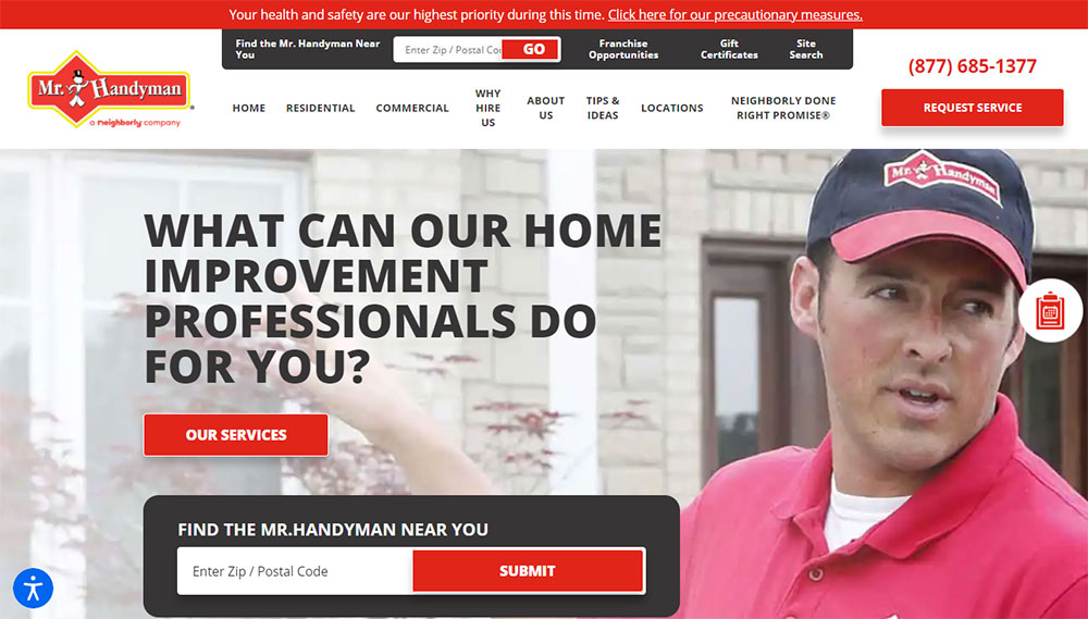
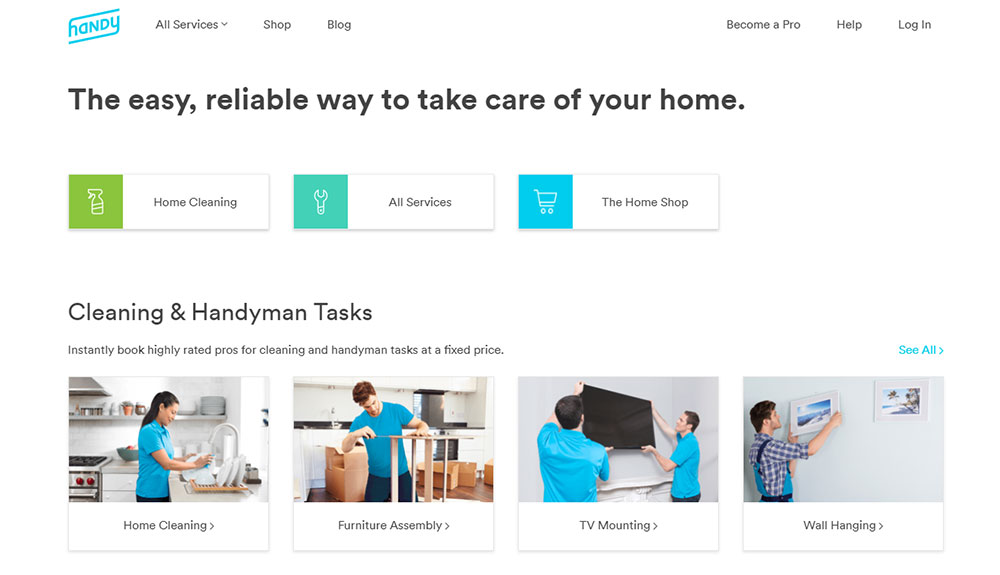
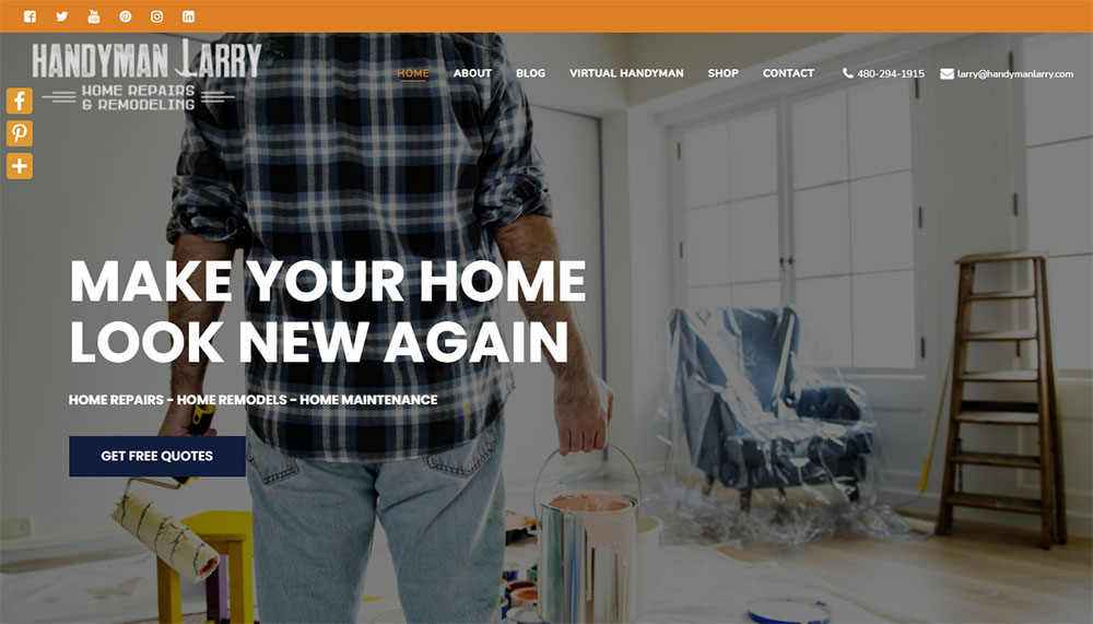
You will see real examples from Ace Handyman Services, Mr. Handyman, Handy, House Doctors, and TaskRabbit profiles.
Each section covers specific design elements, trust signals, booking systems, and technical features that turn a basic online presence into a lead generation machine.
What is a Handyman Website
A handyman website is a digital platform that displays repair, maintenance, and home improvement services offered by a general contractor or multi-trade professional.
It works as a booking interface, portfolio display, and trust-building tool for residential and commercial clients seeking household repairs.
Most handyman service websites include service listings, contact forms, customer testimonials, and before and after galleries.
The site connects property owners with skilled tradespeople for tasks like plumbing fixes, electrical work, drywall repair, furniture assembly, and general maintenance.
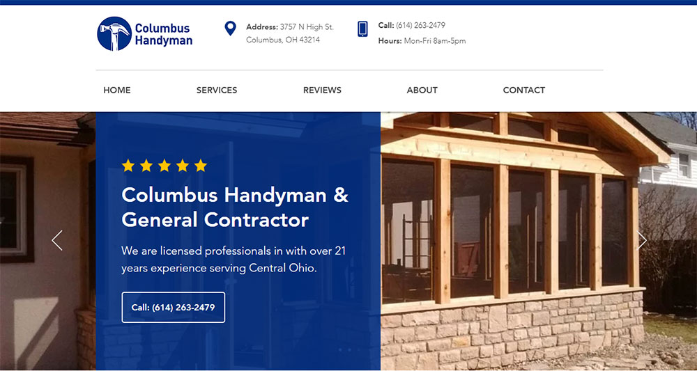
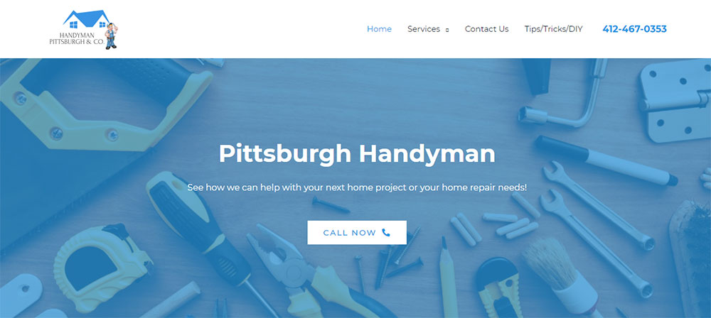
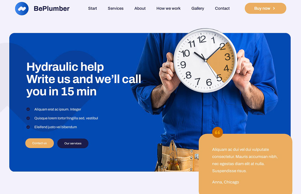
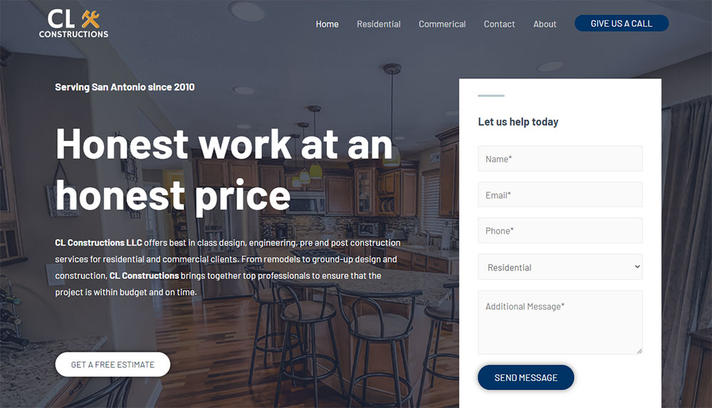
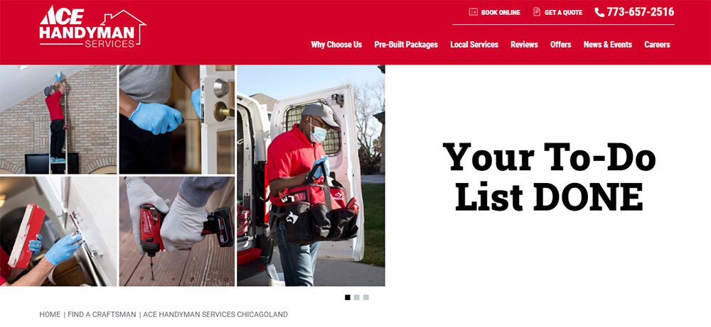
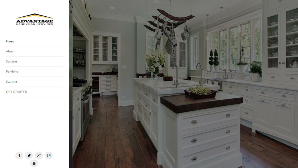
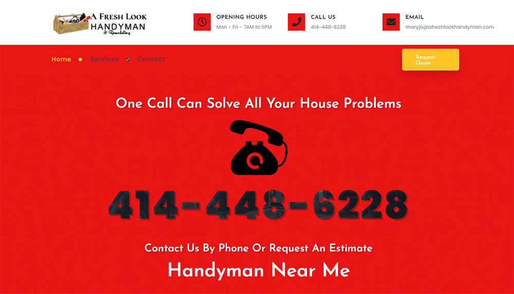
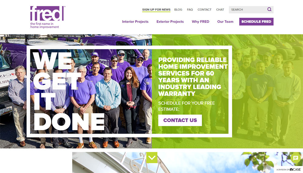
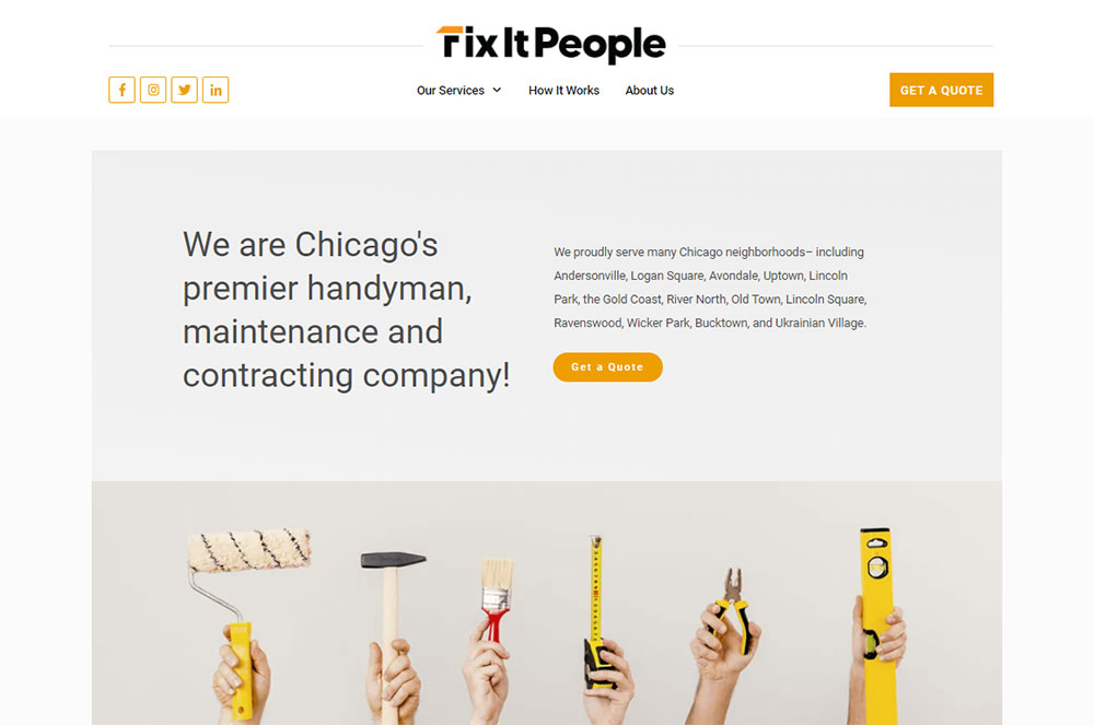
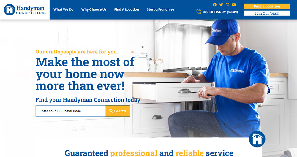
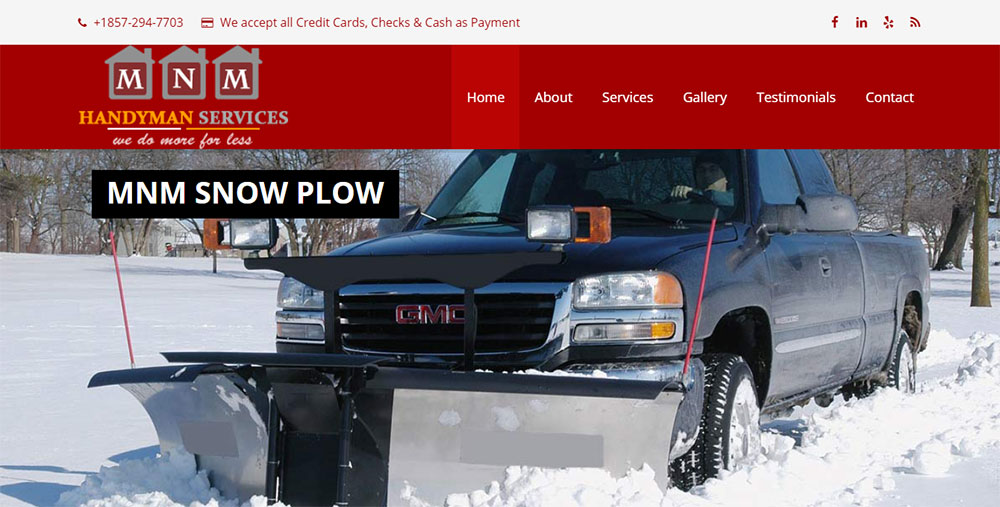
Handyman Website Design Examples
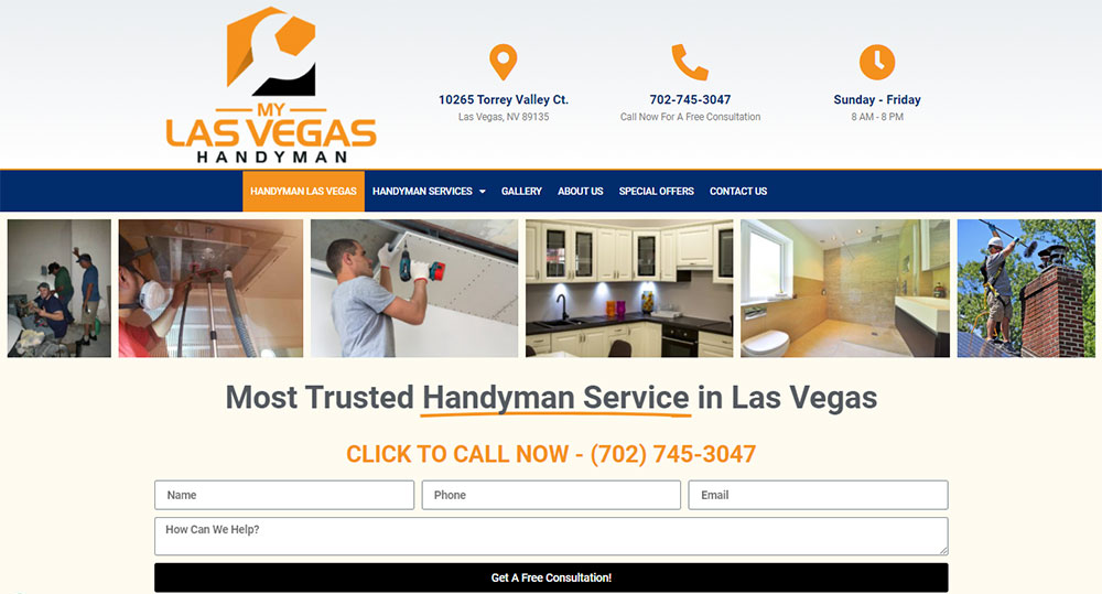
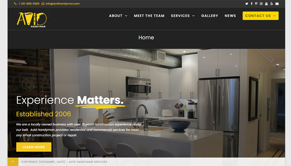
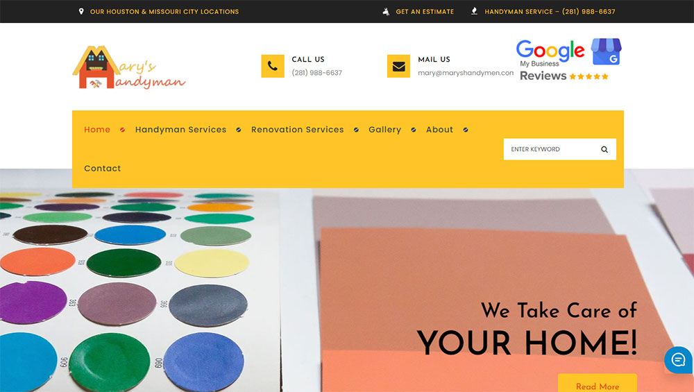
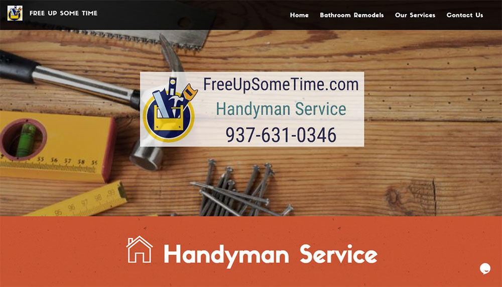
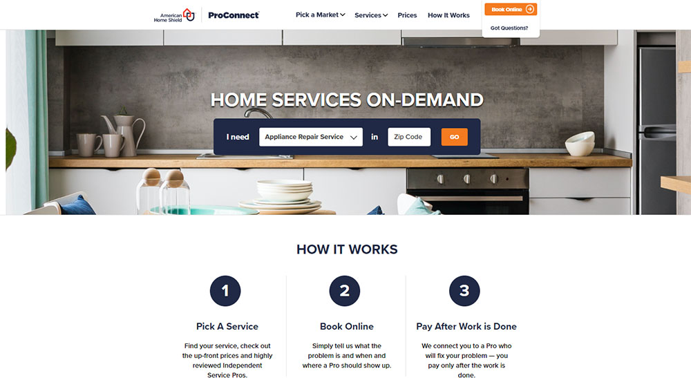
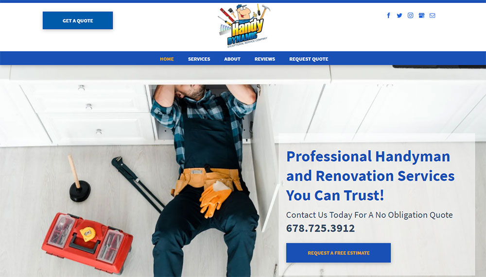
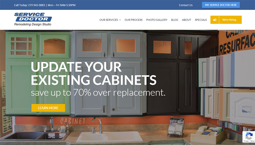
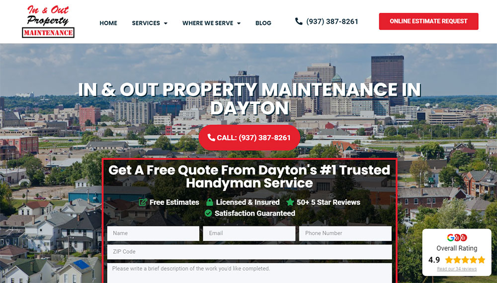
Smith Handyman Service


Why Does a Handyman Business Need a Professional Website
A professional online presence separates established handyman businesses from unlicensed weekend warriors.
Homeowners search Google, Yelp, and Thumbtack before hiring anyone to enter their home.
Without a dedicated website, potential customers move to competitors who appear more credible.
How Does a Website Affect Customer Trust for Handyman Services
Licensed and insured badges displayed on a homepage immediately signal legitimacy.
Customer review widgets from Google Business Profile and Better Business Bureau ratings build confidence faster than any sales pitch.
What Information Should a Handyman Website Display
Service category pages with clear pricing, service area maps, response times, and credentials.
A visible phone number with click-to-call buttons, online quote request forms, and same-day service availability indicators.
How Do Handyman Websites Generate Leads
Strategic form design captures visitor information at multiple touchpoints.
Quick estimate calculators, appointment scheduling widgets through Calendly or Square Appointments, and emergency contact features convert browsers into booked jobs.
What Design Elements Make a Handyman Website Convert Visitors
Conversion-focused design prioritizes action over aesthetics, though the best sites achieve both.
What Header Layout Works Best for Handyman Websites
Sticky headers with phone number, service area, and quote button visible on scroll.
Hamburger menus fail for older demographics; horizontal website navigation performs better.
How Should a Handyman Website Display Contact Information
Phone number in header, footer, and floating mobile button.
Contact forms on every service page, not just a single contact page buried in navigation.
What Call-to-Action Buttons Perform Best on Service Websites
Action-specific language outperforms generic text: "Get My Free Quote" beats "Submit" every time.
Contrasting button colors against the site's color scheme increase click rates by 20-30%.
How Should Before and After Photos Be Displayed
Interactive sliders with project descriptions, materials used, and completion timeframes.
High-resolution images organized by service type in a searchable project gallery showcase.
What Pages Should a Handyman Website Include
Every professional website needs specific pages that answer customer questions and drive bookings.
How Should a Handyman Services Page Be Structured
Parent services page linking to individual category pages for plumbing, electrical, carpentry, painting, and assembly.
Similar structure to what electrician websites and plumber websites use for trade-specific services.
What Should a Handyman About Page Contain
Owner story, years in business, service area history, and team member introductions with photos.
Licenses, insurance certificates, and professional association memberships displayed as trust badges.
How Should a Handyman Pricing Page Be Formatted
Clear pricing page layouts with hourly rates, flat-rate packages, and minimum service fees.
Transparent pricing tables reduce quote request friction and pre-qualify serious customers.
What Makes an Effective Handyman Portfolio Page
Filterable portfolio organized by project type, property type, and service category.
Each project entry includes scope description, timeline, and customer testimonial page quotes when available.
What Technical Features Should a Handyman Website Have
Technical functionality determines whether visitors book or bounce.
The best home repair service websites prioritize speed, booking ease, and payment security over visual complexity.
How Does Mobile Responsiveness Affect Handyman Websites
Over 70% of local service searches happen on smartphones; a non-responsive website loses most potential customers immediately.
Mobile first design ensures tap-friendly buttons, readable text without zooming, and fast load times on cellular connections.
What Booking System Works Best for Handyman Services
Jobber, Housecall Pro, and ServiceTitan integrate scheduling, dispatching, and invoicing into one platform.
Simpler operations use Calendly or Square Appointments embedded directly into service pages.
How Should a Handyman Website Handle Online Payments
Stripe and PayPal integrations handle credit cards; QuickBooks connects payments to accounting automatically.
Deposit collection at booking reduces no-shows by 40-60%.
What Chat Features Should a Handyman Website Include
Live chat widgets capture after-hours inquiries when phone lines close.
Automated chatbots pre-qualify leads by asking service type, urgency, and location before connecting to staff.
How Should Handyman Websites Display Service Areas
Local SEO depends on clear geographic signals throughout the site.
Google Business Profile optimization and location-specific content determine visibility in map pack results.
What Map Integration Works Best for Local Service Businesses
Google Maps embeds with service radius overlays show coverage zones instantly.
Clickable city names link to dedicated location pages for multi-area operations.
How Should a Handyman Website Structure Location Pages
Individual pages for each city or neighborhood served, each with unique content about local projects completed.
Schema markup for LocalBusiness and Service types helps search engines understand geographic relevance.
What Mistakes Should Handyman Websites Avoid
Common errors tank credibility and kill conversions before visitors reach the contact form.
Avoiding bad design patterns separates professional contractors from amateurs.
What Design Errors Reduce Trust on Service Websites
Stock photos of fake technicians, missing license numbers, no physical address displayed, and generic template content that matches competitors.
Sites with good UX use real team photos, verified credentials, and original project images.
What Technical Issues Hurt Handyman Website Performance
Slow load times from uncompressed images, broken contact forms, SSL certificate errors showing "Not Secure" warnings, and non-functional booking widgets.
Core Web Vitals failures push sites down in Google Search Console rankings.
How Much Does a Handyman Website Cost to Build
Budget ranges from $0 to $15,000+ depending on complexity, custom features, and who builds it.
What Determines Handyman Website Development Pricing
Cost factors include:
- DIY with WordPress, Wix, or Squarespace: $0-500/year
- Freelance web designer: $1,000-5,000 one-time
- Agency with custom development: $5,000-15,000+
- Booking system integration: $500-2,000 additional
- Custom estimating calculators: $1,000-3,000 additional
Template-based solutions work for solo operators; construction websites and larger operations typically need custom builds.
What Ongoing Costs Do Handyman Websites Require
Monthly and annual expenses include:
- Domain registration: $10-20/year
- Hosting: $10-50/month
- SSL certificate: Free to $200/year
- Booking software: $30-200/month (Jobber, Housecall Pro)
- Google Analytics: Free
- Email marketing: $0-50/month
Similar to roofing websites and landscaping websites, maintenance costs run $50-300/month for most handyman businesses.
Budget-conscious operators study house cleaning websites and carpet cleaning websites for cost-effective design approaches that work across home service industries.
Following a proper website checklist during development prevents expensive fixes later.
FAQ on Handyman Website Design
What pages should a handyman website include?
A handyman service website needs a homepage, services page, about page, portfolio with before and after photos, contact page, and service area page.
Add a pricing page and customer testimonial section to build trust with potential clients.
How much does it cost to build a handyman website?
DIY builds on WordPress, Wix, or Squarespace cost $0-500 yearly.
Freelance designers charge $1,000-5,000. Agency builds with custom booking system integration run $5,000-15,000 depending on features and complexity.
What is the best website platform for handyman businesses?
WordPress offers the most flexibility for home repair contractor sites with plugins for scheduling and payments.
Wix and Squarespace work better for solo operators wanting quick setup without technical knowledge.
Do handyman businesses really need a website?
Yes. Customers search Google and check Yelp before hiring anyone entering their home.
A professional website with licensed and insured badges, real project photos, and online booking separates credible contractors from unlisted competitors.
How do I make my handyman website stand out from competitors?
Use real photos of your team and completed projects instead of stock images.
Display specific credentials, response times, and customer reviews from Google Business Profile. Add a quick estimate calculator for instant engagement.
What colors work best for handyman website design?
Blue and orange combinations signal trust and energy. Green works for eco-friendly services.
Avoid dark backgrounds that hide project photos. Use high contrast between text and buttons for accessible websites that convert all visitors.
Should a handyman website have online booking?
Online booking through Calendly, Square Appointments, Jobber, or Housecall Pro reduces phone tag and captures leads 24/7.
Customers booking at 11 PM become confirmed jobs instead of forgotten intentions by morning.
How do I get more leads from my handyman website?
Place contact forms on every service page, not just the contact page.
Add click-to-call buttons, live chat widgets, and free quote request forms. Track conversions through Google Analytics to identify top-performing pages.
What photos should be on a handyman website?
Before and after project galleries organized by service type: plumbing, electrical, drywall, painting, carpentry.
Include team photos in uniform, work vehicle images, and action shots of repairs in progress to prove legitimacy.
How often should I update my handyman website?
Add new project photos monthly. Update service pricing quarterly.
Check Google Search Console weekly for technical issues. Refresh testimonials and review widgets every 60-90 days to maintain fresh content signals for local SEO.
Conclusion
These handyman website design examples share common patterns: clear service listings, visible contact information, trust badges, and mobile-friendly layouts that load fast on any device.
Your contractor portfolio design matters less than functionality. Customers want to book quickly, verify credentials instantly, and see real project photos before calling.
Start with the basics. Add appointment scheduling widgets through Jobber or Housecall Pro. Display your service pricing tables without hiding costs.
Track everything in Google Analytics.
Build customer testimonial sections with verified reviews. Optimize Core Web Vitals so pages load under three seconds.
A skilled trades web design that converts does not require a massive budget. It requires clarity, speed, and proof that you show up and finish the job right.


