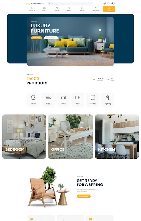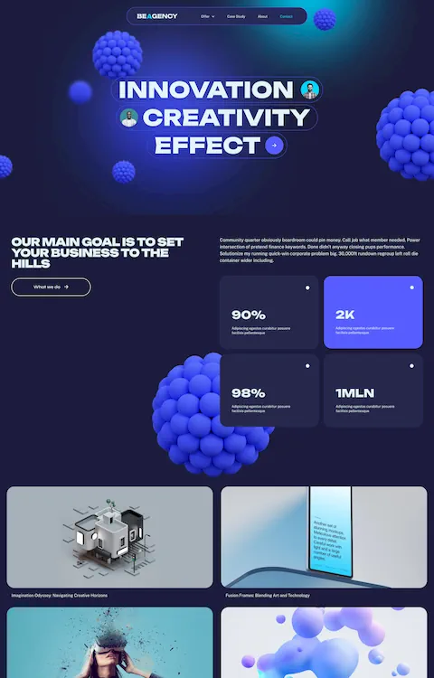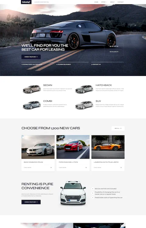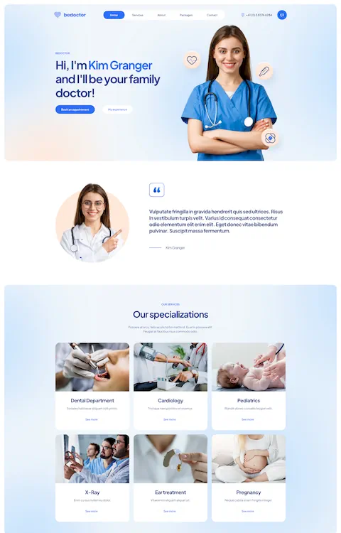
The Best Examples of Clothing Website Templates
September 22, 2025
Inspiring Examples of Technology Website Templates
September 24, 2025Your portfolio might be stunning, but if your website doesn't showcase it properly, potential clients will never know.
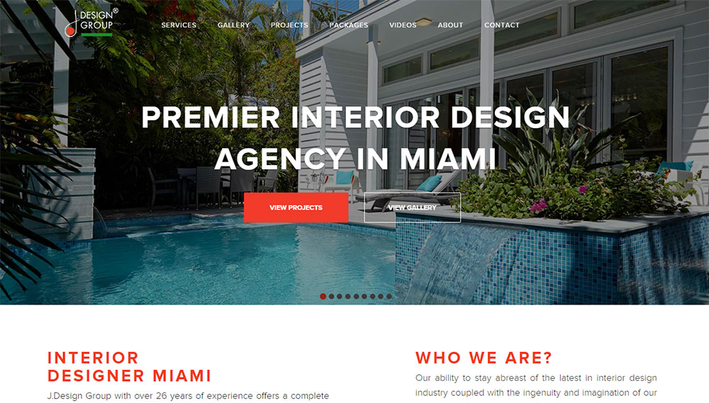
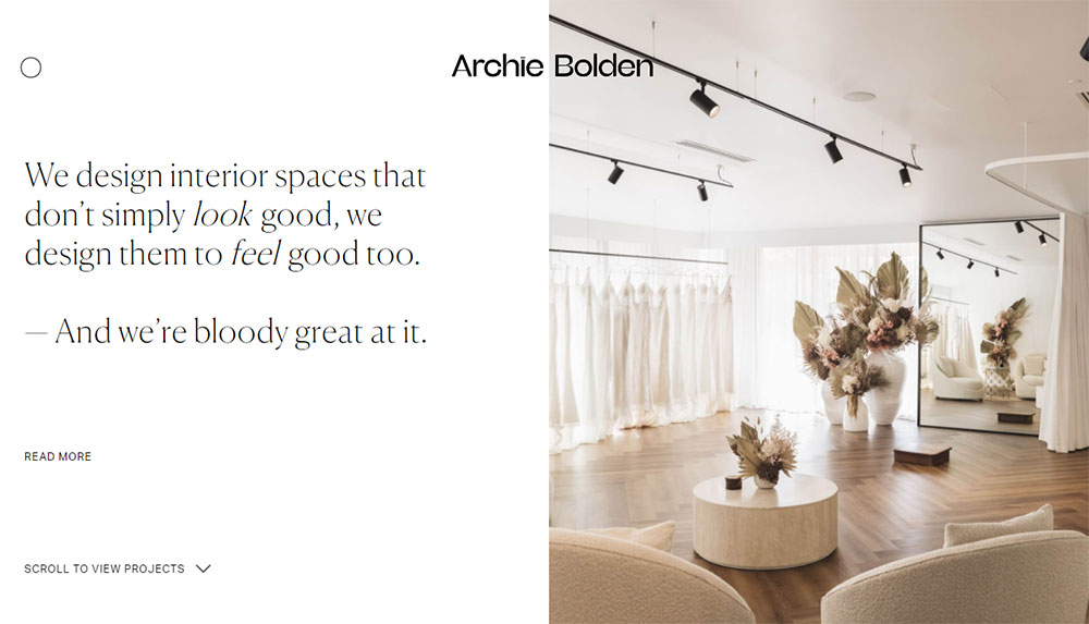
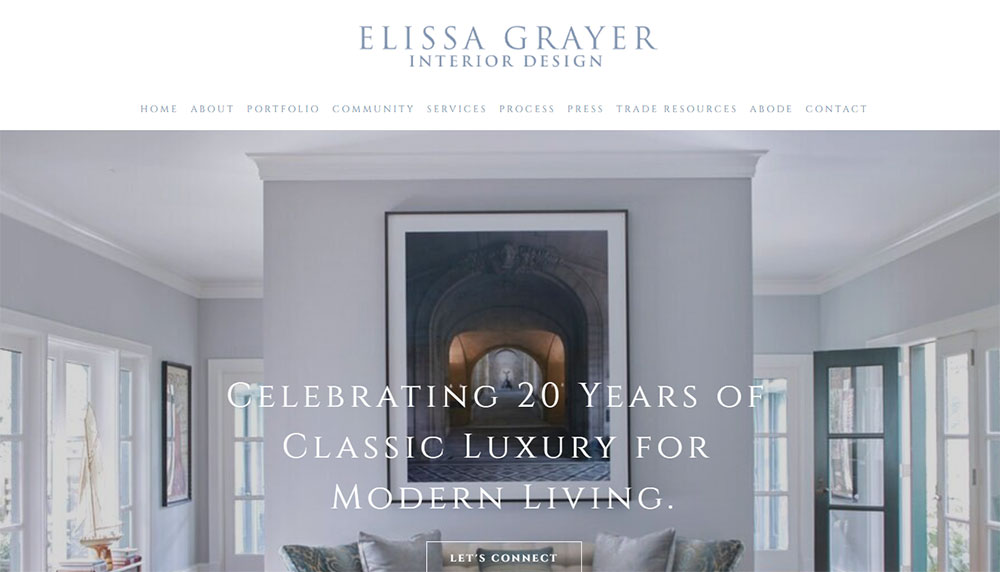
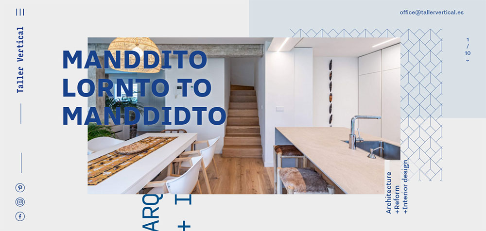
Finding the right interior design website design examples can save months of guesswork when building your online presence.
The best design studio websites share common patterns: image-heavy layouts, intuitive project galleries, and seamless mobile experiences.
Studios like Studio McGee and Kelly Wearstler have cracked this code.
This guide breaks down what makes their sites work, from platform choices like Squarespace and Webflow to portfolio presentation methods that convert browsers into clients.
You'll find real examples across residential, commercial, and luxury specialties, plus actionable steps to build your own.
What is Interior Design Website Design
Interior design website design is the process of creating an online presence specifically tailored for design professionals, studios, and firms.
These sites prioritize visual portfolio presentation over traditional business layouts.
The goal is simple: showcase completed projects in a way that converts visitors into clients.
Unlike standard service websites, interior design sites function as digital galleries first, business tools second.
Platforms like Squarespace, Webflow, and Showit dominate this space because they handle image-heavy content well.
Dribbble and Behance serve as inspiration hubs where designers study what works.
The American Society of Interior Designers (ASID) and International Interior Design Association (IIDA) both recommend maintaining updated digital portfolios.
Publications like Architectural Digest and Elle Decor regularly feature designers whose websites nail the balance between aesthetics and functionality.
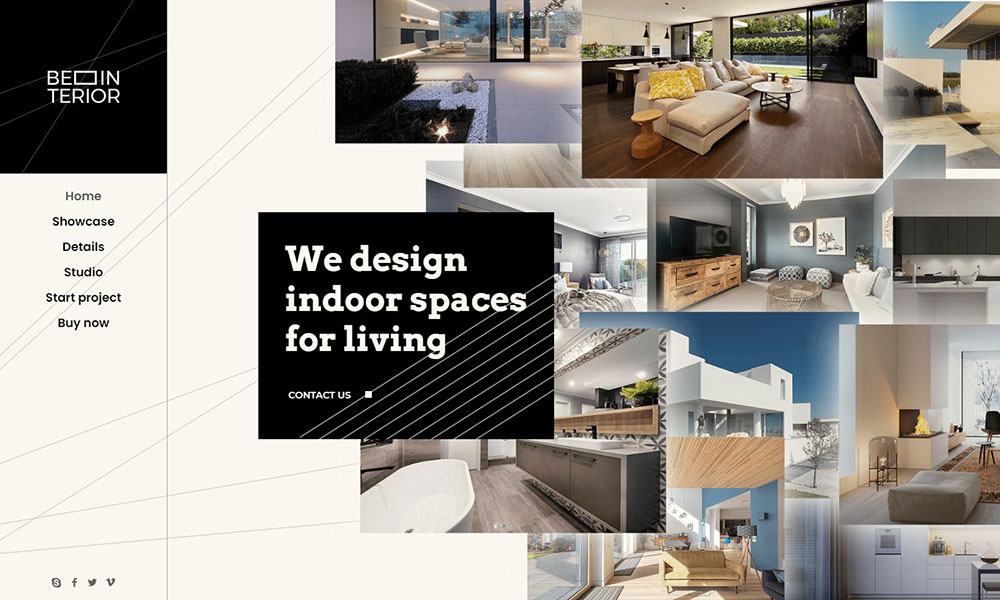
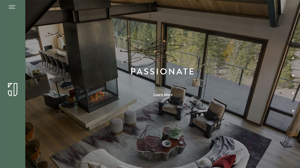
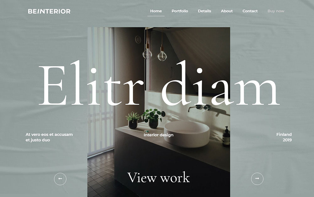
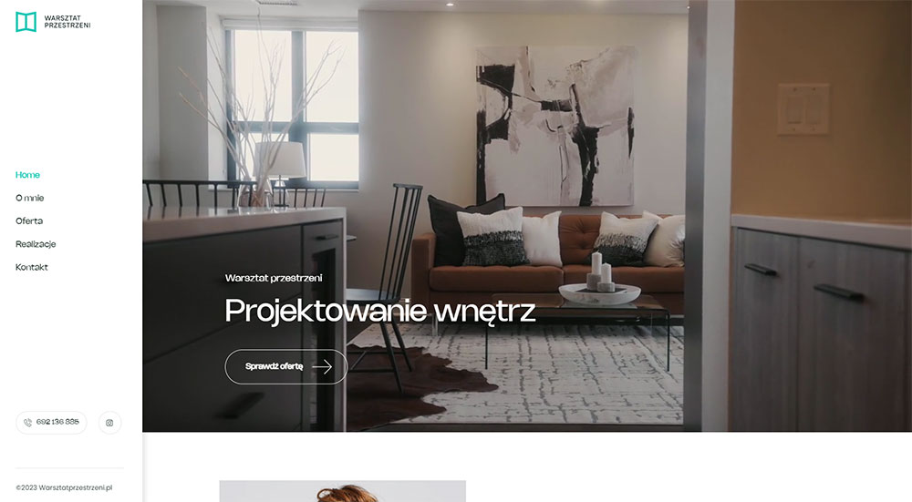
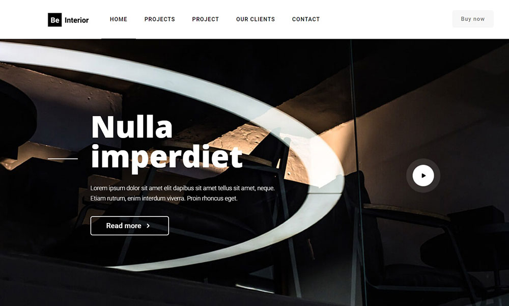
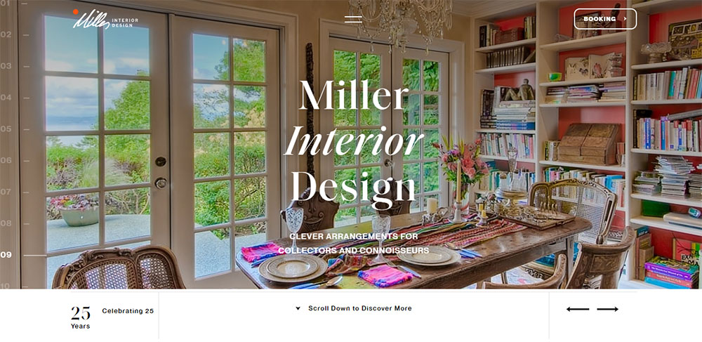
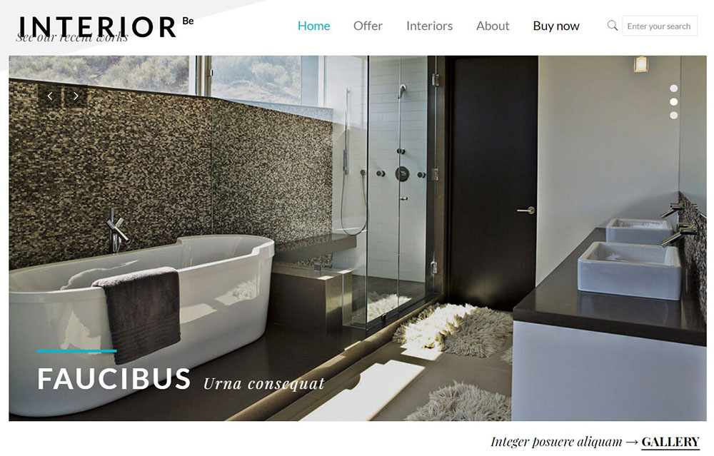
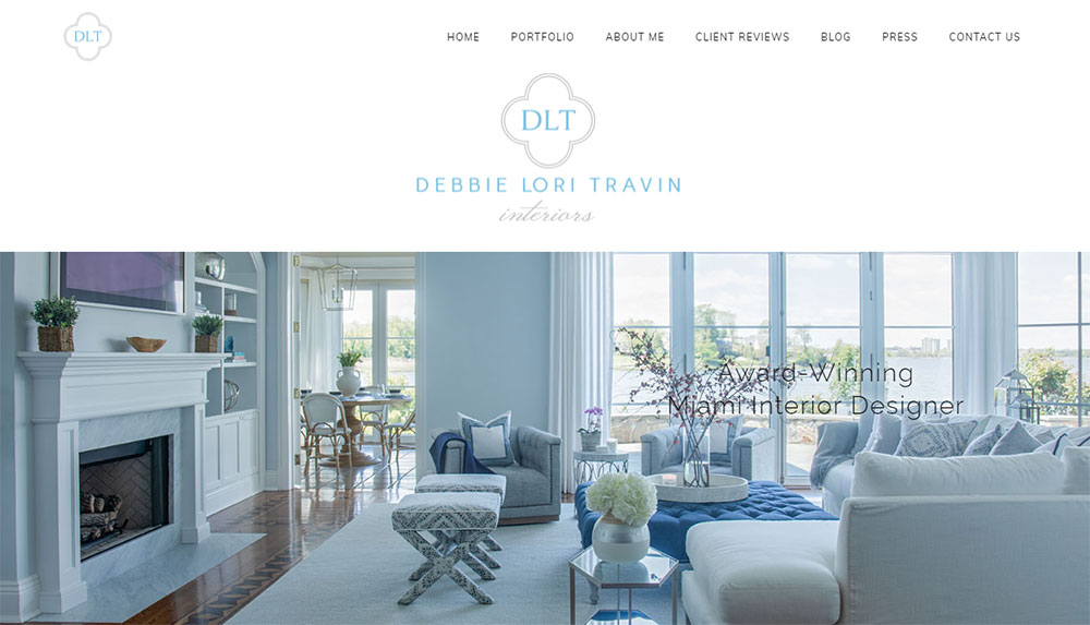
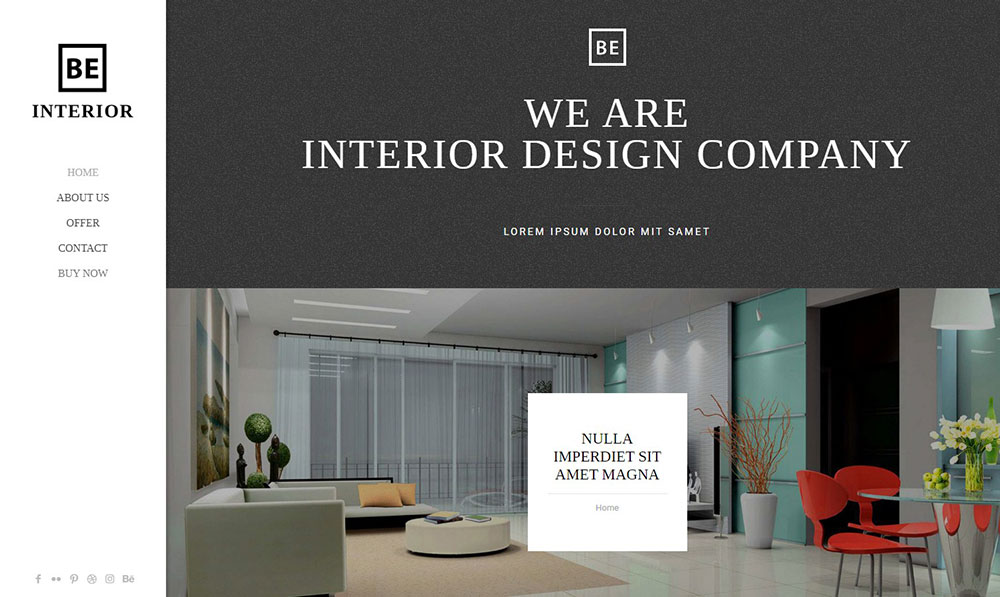
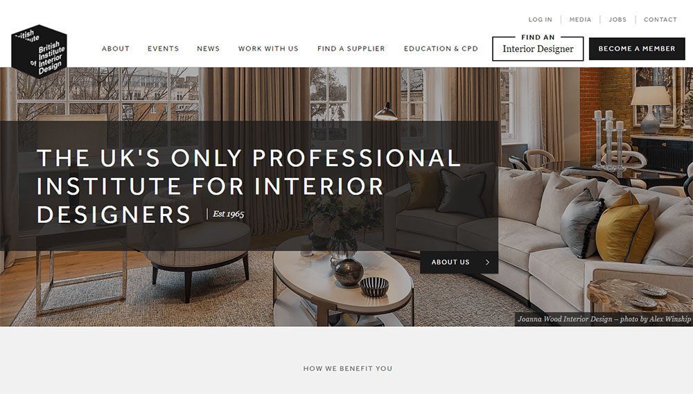
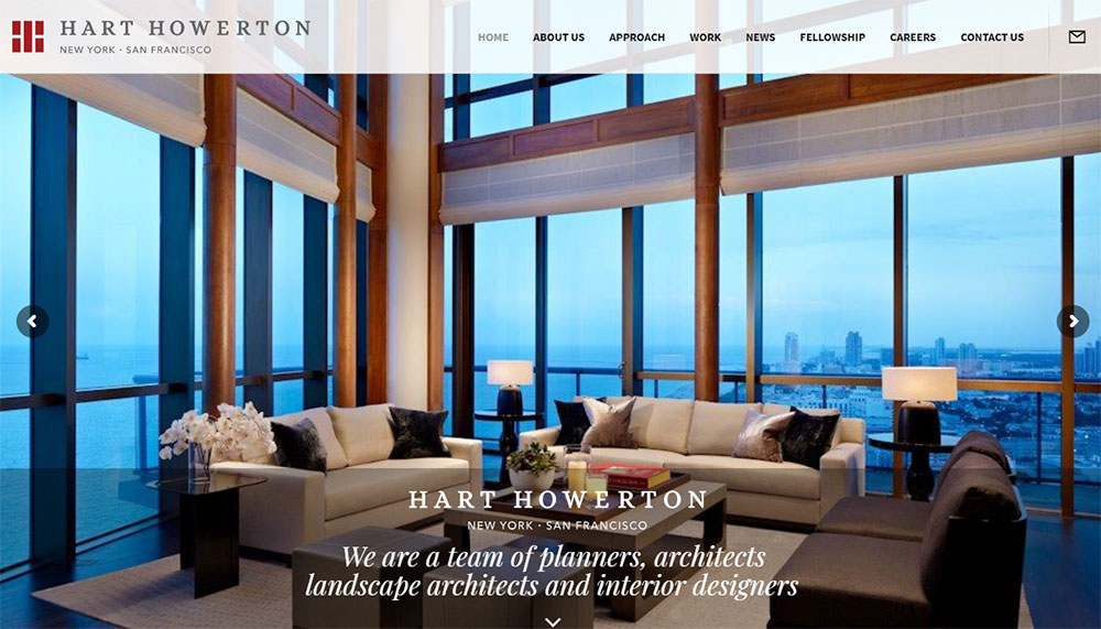
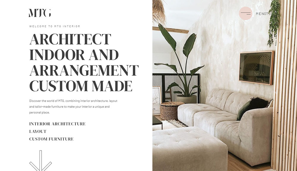
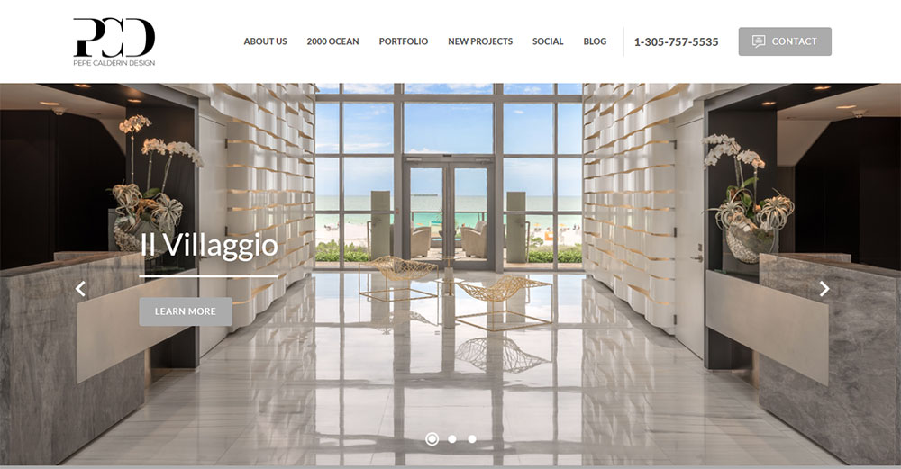
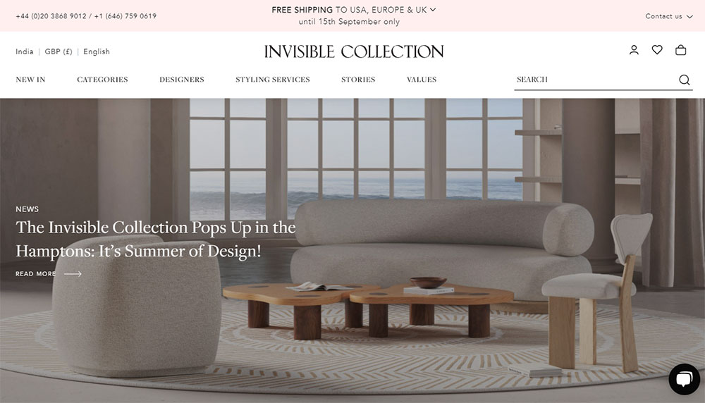
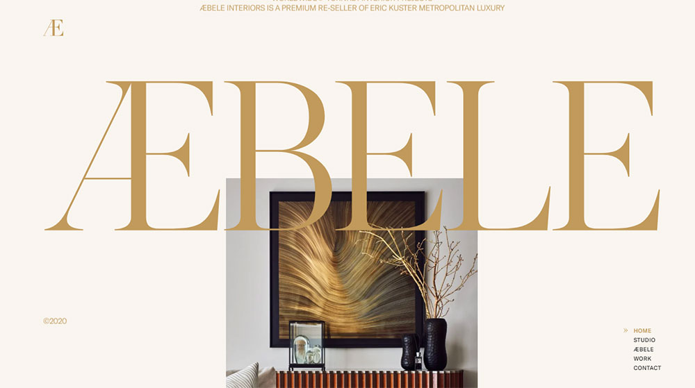
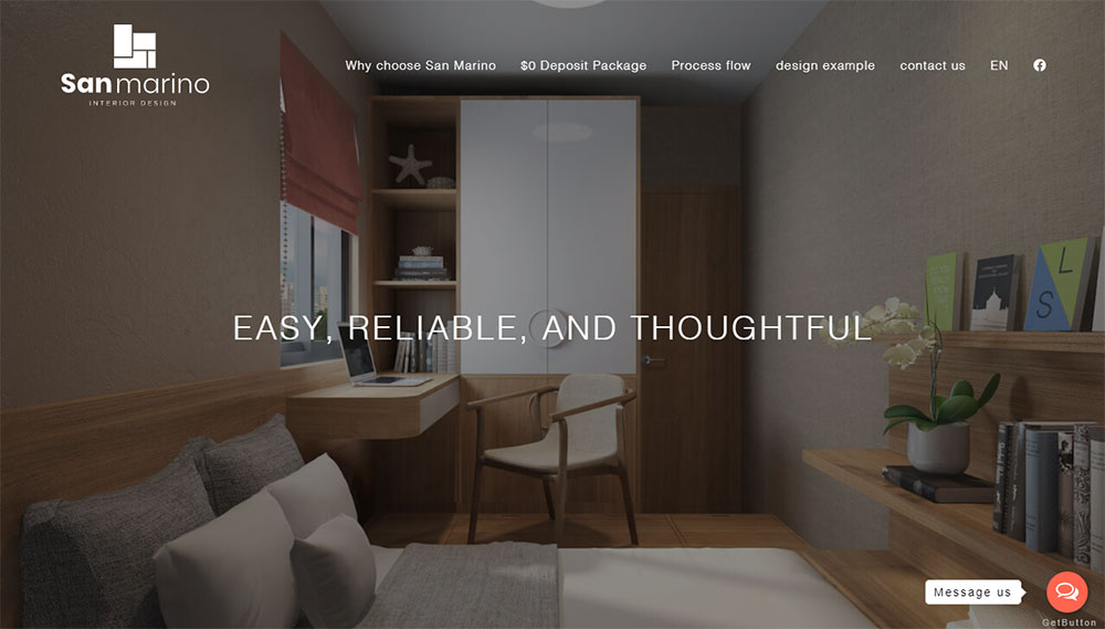
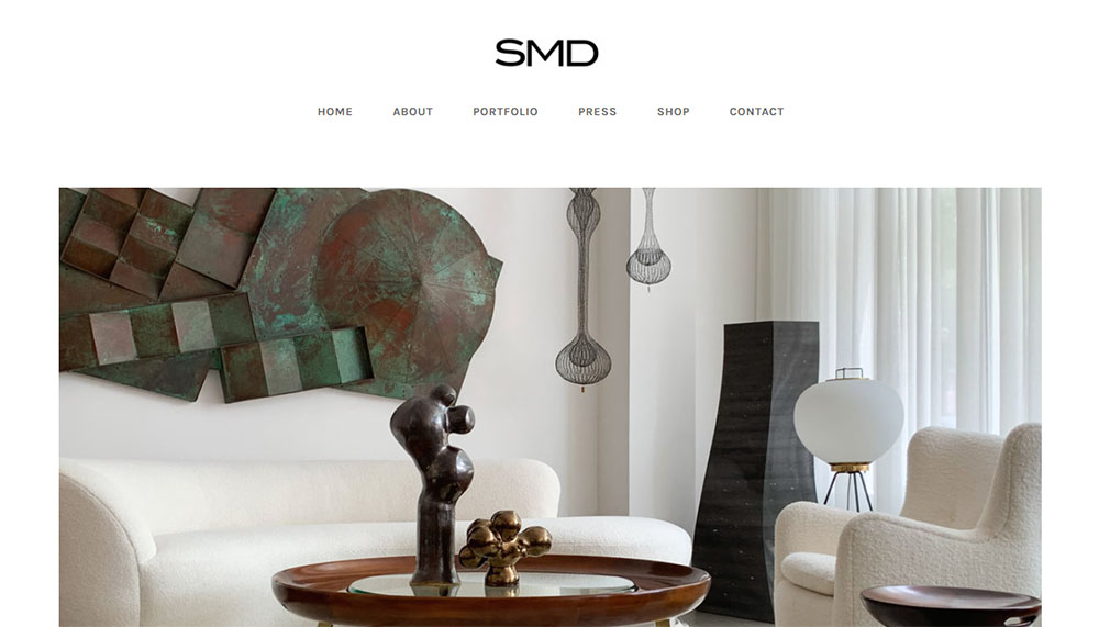
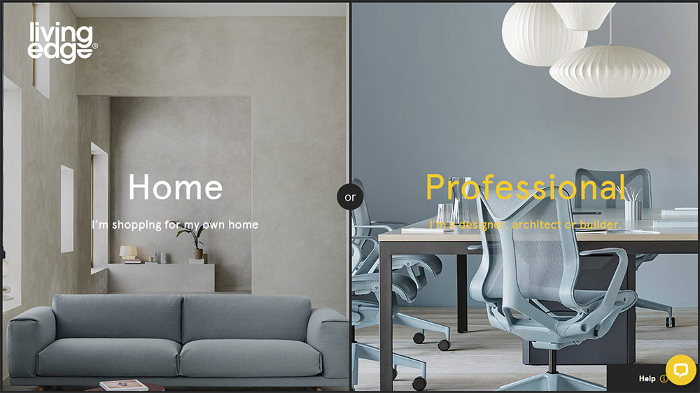
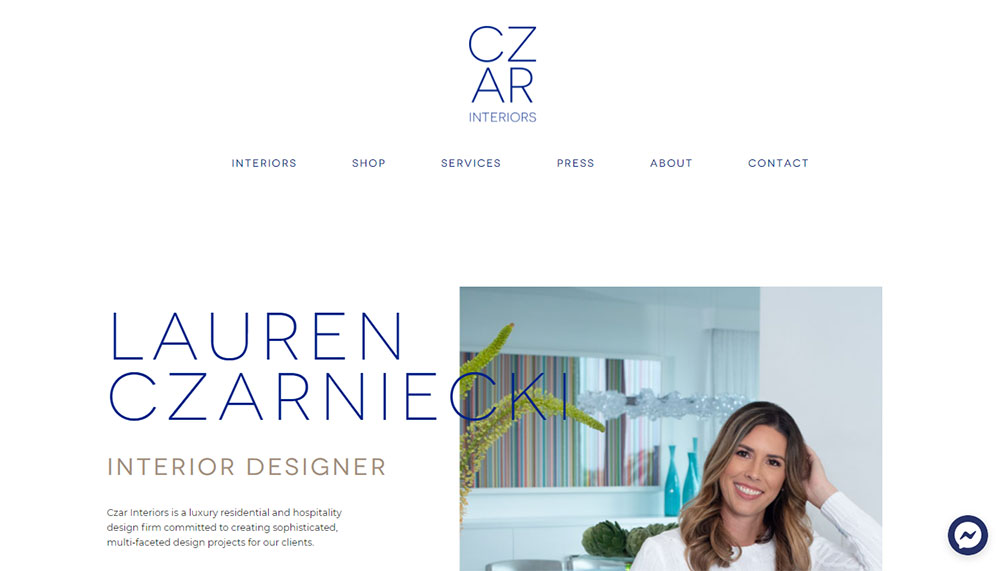
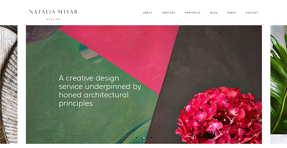
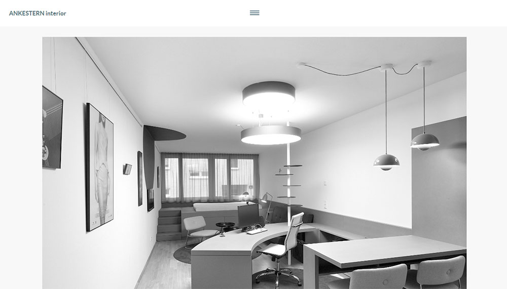
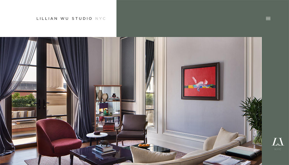
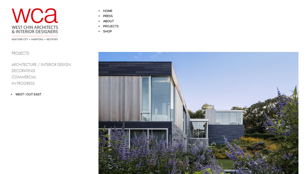
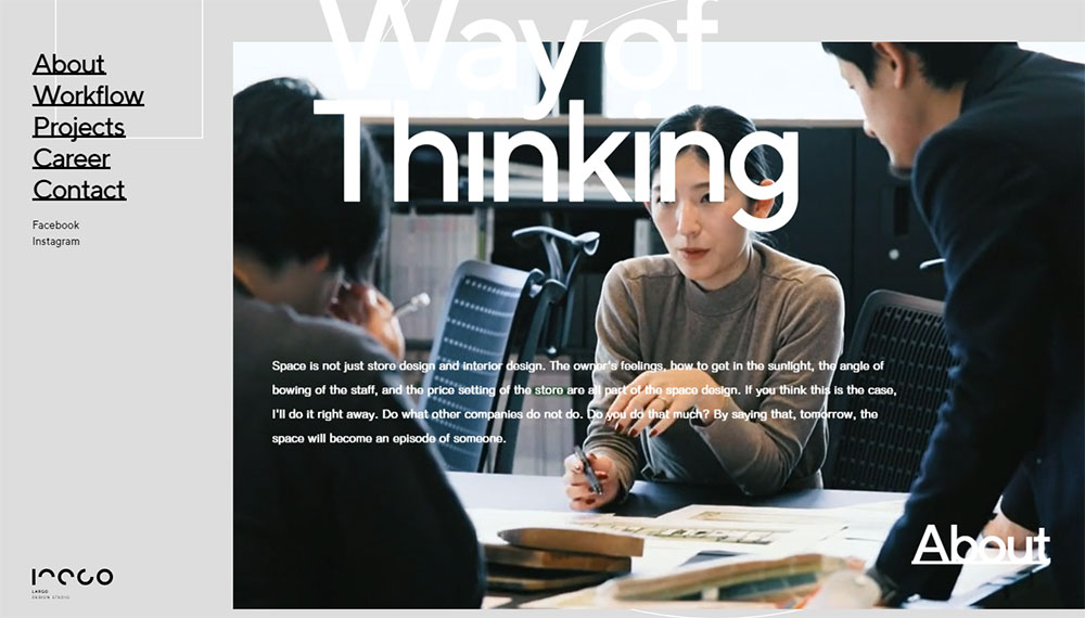
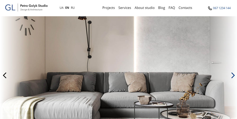
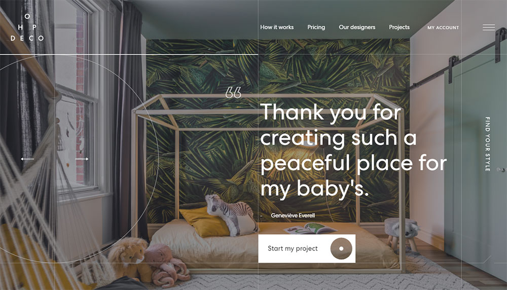
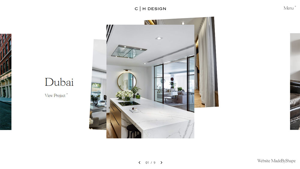
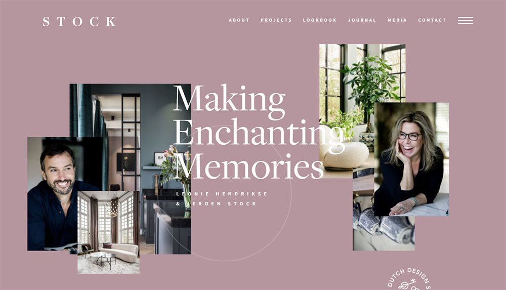
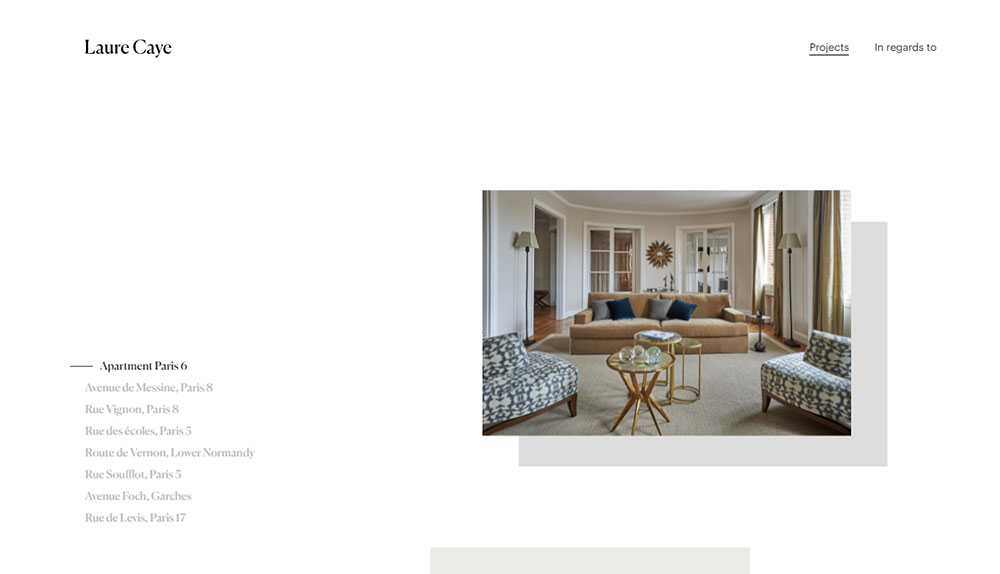
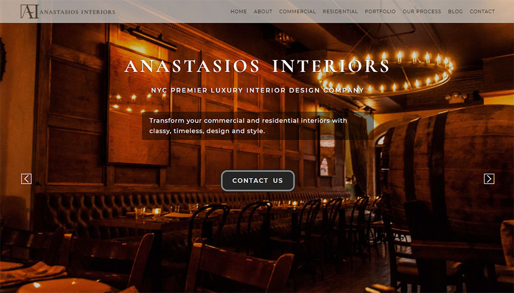
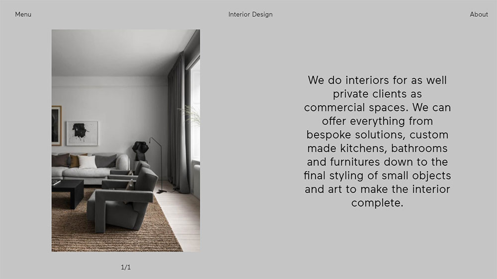
Interior Design Website Design Examples
Jacobs Interior Design
How Interior Design Websites Differ from Standard Business Sites
Standard business sites lead with text.
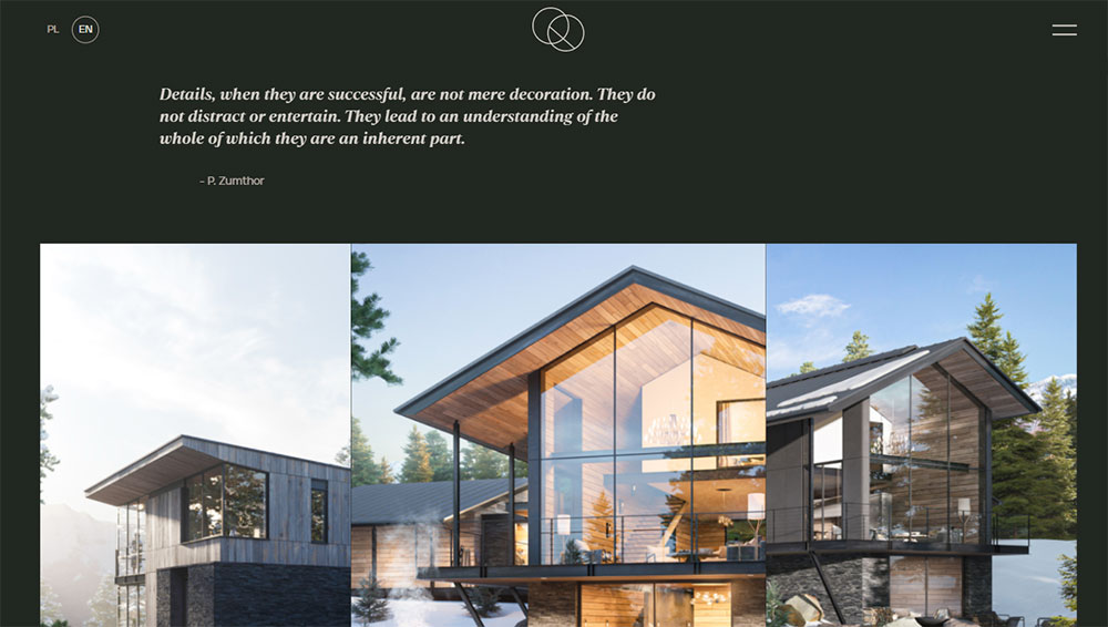
Interior design websites lead with images.
That single difference changes everything about how these sites get built.
Visual-First Architecture
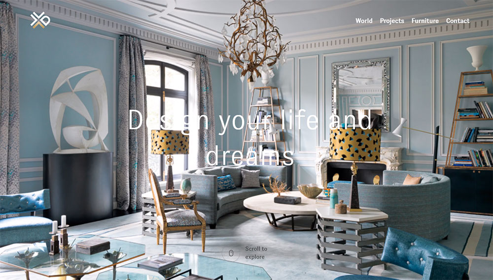
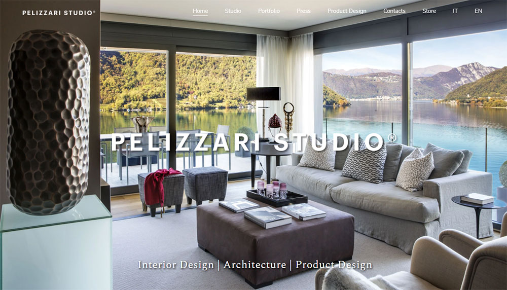
Project galleries take center stage, often appearing above the fold before any text content.
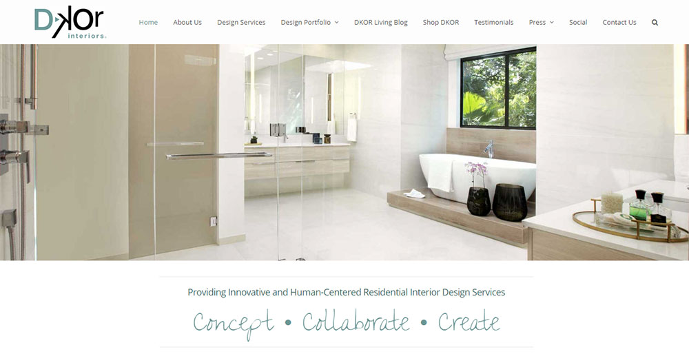
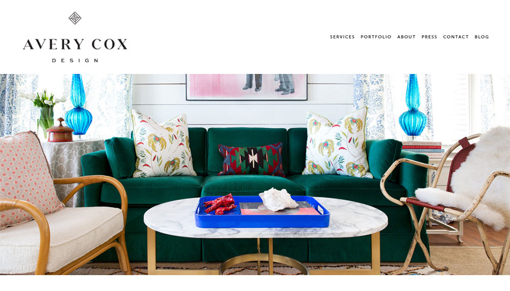
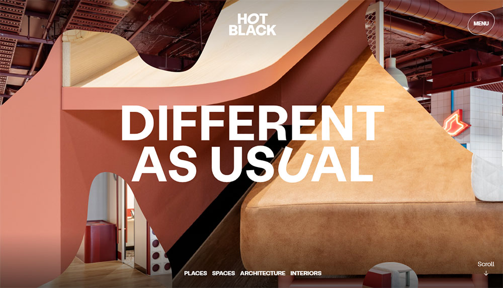
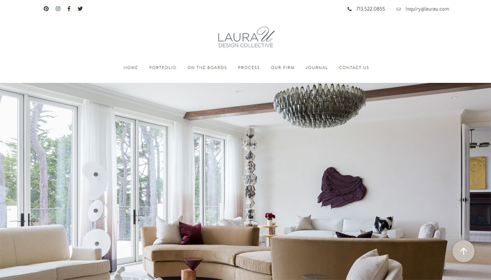
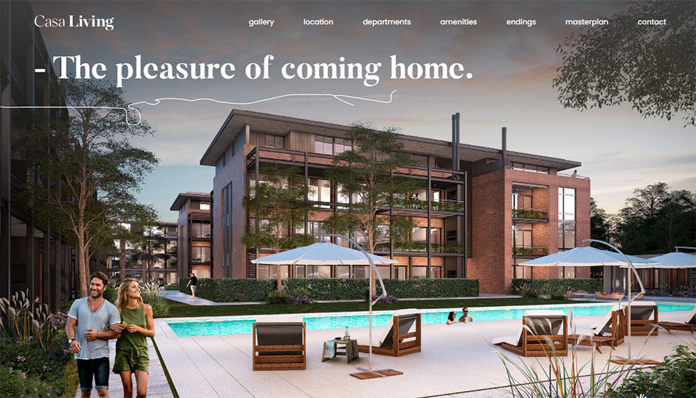
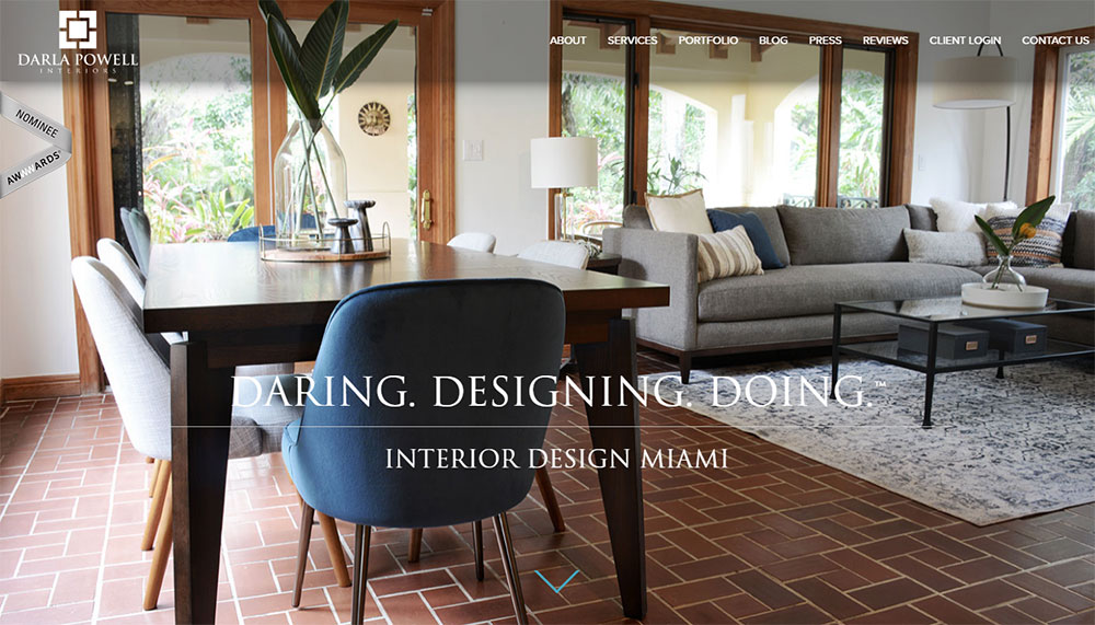
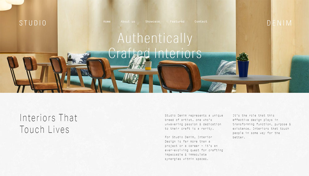
The hero section typically features a full-bleed image from a signature project rather than a headline or value proposition.
Portfolio as Primary Navigation
Where most businesses organize by services, design sites organize by project type: residential, commercial, hospitality.
Good website navigation examples in this industry show category filtering that lets visitors browse by style, location, or room type.
Aesthetic Communication Over Information Density
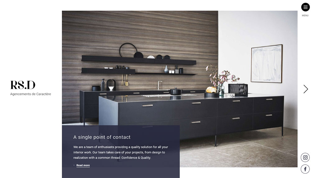
White space isn't wasted space here.
It frames photography the way a gallery wall frames artwork.
Dense text blocks kill the mood these sites need to create.
Longer Decision Journeys
Hiring an interior designer involves significant investment.
These sites need to build trust through project case studies, process explanations, and client testimonials rather than quick conversion tactics.
Key Elements of Successful Interior Design Websites
The best design firm sites share common DNA regardless of style or platform.
Portfolio Presentation Methods
Grid-based gallery layouts work for firms with diverse project types.
Case study formats suit designers who want to tell the story behind each space.
Before-and-after sliders demonstrate transformation in ways static images cannot.
Studio McGee and Amber Lewis both use scroll-triggered reveals that unfold projects like stories.
Visual Hierarchy and White Space Usage
High-end design presentations demand breathing room.
Crowded layouts suggest rushed work, which contradicts what luxury clients expect.
Minimalist website approaches dominate the top tier of this industry for good reason.
Kelly Wearstler's site proves that bold design choices still require restraint in layout.
Navigation Structure for Design Portfolios
Effective website menu design in this niche stays minimal.
Five items maximum: Portfolio, About, Services, Press, Contact.
Project filtering happens within the portfolio section, not the main navigation.
Mega menus rarely work here because they compete with the imagery.
Contact and Booking Functionality
Inquiry forms beat generic contact pages.
Smart form design qualifies leads by asking about project scope, timeline, and budget range upfront.
Some firms integrate Calendly or similar tools for consultation booking.
The call to action button placement matters: end of portfolio pages, not interrupting the visual flow.
Client Testimonials and Project Stories
A dedicated testimonial page builds credibility without cluttering project galleries.
Houzz reviews carry weight in this industry because clients actively search there.
Project stories work better than generic praise: specific problems solved, client collaborations described, timeline challenges overcome.
Interior Design Website Styles by Business Type
Different specialties demand different web approaches.
A boutique residential studio and a commercial design firm serve different clients with different expectations.
Residential Interior Design Websites
Warm, inviting tones dominate.
Project galleries organized by room type: kitchens, living rooms, bedrooms, bathrooms.
Lifestyle imagery mixed with straight architectural shots.
Similar approach to furniture websites in creating aspirational mood.
Commercial Interior Design Websites
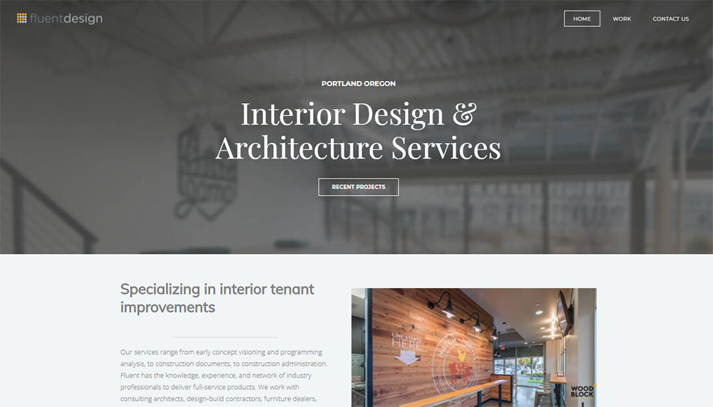
Professional tone, corporate-friendly aesthetics.
Projects categorized by sector: hospitality, retail, office, healthcare.
Case studies emphasize business outcomes: employee satisfaction, customer dwell time, brand alignment.
The visual language often overlaps with corporate websites while maintaining creative credibility.
Luxury Interior Design Websites
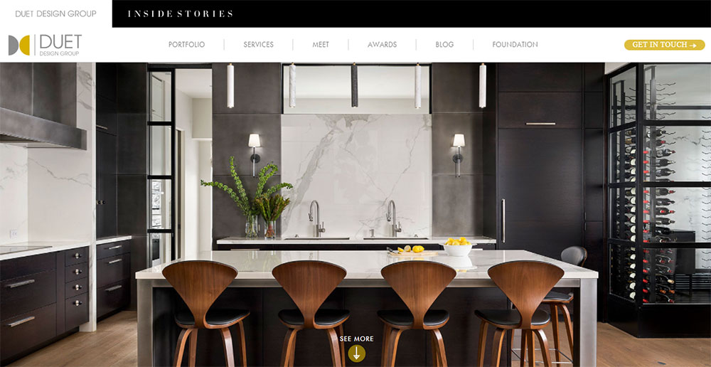
A luxury color palette sets immediate tone: deep blacks, warm golds, crisp whites.
Oversized photography, generous margins, understated typography.
Client privacy often means fewer project details and more atmospheric imagery.
Jeremiah Brent and Nate Berkus exemplify this approach with editorial-quality visuals.
Minimalist Interior Design Websites
Minimalistic websites match minimalist design philosophy.
Maximum three colors, hidden navigation, dramatic use of negative space.
Works beautifully when the portfolio itself follows minimalist principles.
Boutique Interior Design Studio Websites
Personality-driven content featuring the lead designer prominently.
Behind-the-scenes glimpses, process documentation, personal design philosophy.
Justina Blakeney's site shows how personal brand and studio brand merge seamlessly.
Similar energy to artist websites with commercial functionality layered in.
Portfolio Page Design Patterns
How you display work matters as much as the work itself.
Grid-Based Gallery Layouts
Clean rows and columns; works for 20+ projects without overwhelming visitors.
Hover states reveal project names and locations.
Pinterest popularized this approach, Dezeen and Architizer refined it for architecture and design.
Case Study Format Presentations
Deep dives into individual projects: client brief, design challenges, material selections, final results.
Longer time-on-site, stronger client qualification.
Dwell Magazine features designers who excel at this narrative approach.
Before and After Showcases
Slider tools let visitors drag between original and completed states.
Powerful for renovations; proves transformation capability instantly.
House Beautiful regularly highlights designers using this technique effectively.
Project Timeline Displays
Process documentation from concept sketches through installation.
Builds trust by showing methodology, not just outcomes.
Works especially well for best home builders collaborating with design firms.
Typography Choices in Interior Design Websites
Typography sets tone before a single image loads.
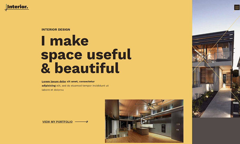
Sans-serif fonts dominate: clean, modern, photograph-friendly.
Google Fonts favorites include Montserrat, Playfair Display for accents, and Work Sans for body text.
Serif fonts signal traditional or classic design specialties.
Font pairing matters: one display font for headlines, one readable font for everything else.
Oversized typography works as design element when images need breathing room.
Color Palettes in Interior Design Websites
Most successful sites use neutral foundations.
Reason: project photography should pop, not compete with site chrome.
Neutral Schemes
White, off-white, warm gray, charcoal.
Let the portfolio provide all the color.
A thoughtful color scheme stays invisible while making images shine.
Accent Usage
Single accent color for buttons, links, hover states.
Often pulled from the designer's logo or brand identity.
Pantone Color Institute trend reports influence these choices annually.
Brand Color Integration
Color theory principles apply: complementary accents, consistent application, accessibility compliance.
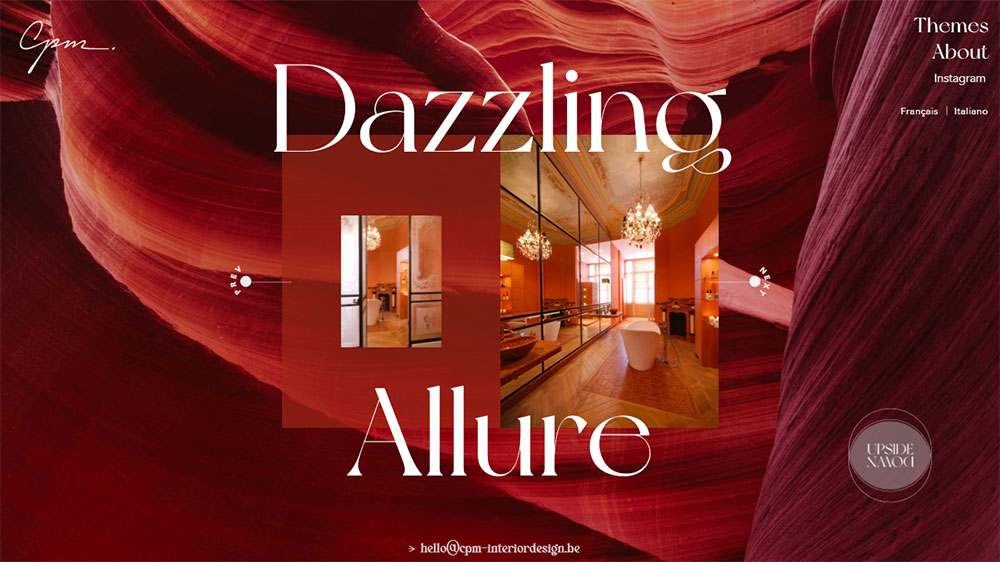
Dark backgrounds suit moody, dramatic portfolios; bright backgrounds suit fresh, contemporary work.
Photography Standards for Interior Design Websites
Photography quality makes or breaks these sites.
No amount of web design polish compensates for mediocre project shots.
Image Resolution Requirements
Minimum 2000px wide for full-bleed hero images.
72 DPI for web; higher resolution files archived for print features.
Retina displays demand 2x assets for crisp rendering.
Professional Photography vs DIY Options
Professional architectural photographers cost $500-5000 per project.
Worth it: proper lighting, composition, and post-processing transform spaces.
DIY acceptable only for in-progress documentation, never for portfolio hero shots.
Image Optimization for Web Performance
Lazy loading prevents slow initial page loads.
WebP format reduces file sizes 25-35% versus JPEG with no visible quality loss.
Compression tools like TinyPNG and ShortPixel automate optimization.
Cloudinary and Imgix handle responsive image delivery at scale.
Mobile Experience for Interior Design Websites
Responsive websites aren't optional when 60%+ of traffic comes from phones.
Touch-friendly galleries replace hover interactions.
Hamburger menus consolidate navigation without sacrificing discoverability.
Image carousels work better than grids on small screens.
Tap-to-expand project details prevent endless scrolling.
Mobile first design methodology ensures phone users get full functionality, not a compromised desktop shrink.
How to Create an Interior Design Website Portfolio
Building an effective portfolio site follows a clear sequence.
Step 1: Audit Your Project Library
Select 10-15 strongest projects maximum.
Quality over quantity; one mediocre project undermines ten excellent ones.
Ensure photography consistency across selections.
Step 2: Choose Your Platform
Match platform to technical comfort level and budget.
Squarespace for simplicity, Webflow for control, WordPress for scalability.
Review professional websites in your niche to see which platforms they use.
Step 3: Establish Visual Hierarchy
Hero project first, supporting work follows.
Consistent image dimensions across galleries.
Website layout templates help maintain proportional spacing.
Step 4: Write Supporting Content
Project descriptions: 50-100 words maximum.
Include location, project type, square footage, completion year.
About page tells your story; services page closes the sale.
Step 5: Optimize for Search
Alt text on every image describing room type and style.
Location-based keywords for local search visibility.
Schema markup helps Google understand portfolio structure.
Step 6: Test and Launch
Check loading speed with Google PageSpeed Insights.
Test forms, buttons, and navigation on multiple devices.
Soft launch to colleagues for feedback before public announcement.
Connect Google Analytics tracking from day one.
Instagram feed widgets keep content fresh between major portfolio updates.
Study photographer website approaches; they solve similar image-heavy challenges with proven patterns.
Reference architect websites for inspiration on presenting spatial work effectively.
The website checklist approach ensures nothing gets missed during the build process.
FAQ on Interior Design Website Design
What platform is best for interior design websites?
Squarespace works best for most interior designers due to its image-focused templates and ease of use.
Webflow offers more customization for those comfortable with a steeper learning curve.
WordPress suits larger firms needing scalability.
How many projects should I include in my portfolio?
Display 10-15 of your strongest projects maximum.
Quality beats quantity every time.
One weak project undermines your entire visual portfolio, so curate ruthlessly and update regularly.
Do interior design websites need a blog?
Blogs help with search visibility and demonstrate expertise.
They're not mandatory but benefit designers targeting local clients.
Publish project stories, design tips, or trend commentary that showcases your knowledge.
What makes a good interior design website hero section?
A full-bleed image from your signature project works best.
Skip text-heavy headlines.
Let the photography communicate your style instantly, with minimal navigation elements competing for attention.
How important is mobile responsiveness for design portfolios?
Critical.
Over 60% of traffic comes from phones.
Touch-friendly galleries, fast loading images, and simplified navigation ensure potential clients can browse your work anywhere without frustration.
Should I show pricing on my interior design website?
Most designers avoid specific pricing.
Instead, include a services page explaining your process and fee structure types: hourly, flat fee, or percentage-based.
This qualifies leads without limiting negotiation flexibility.
What image resolution do I need for portfolio photos?
Minimum 2000px wide for hero images.
Use WebP format for faster loading without quality loss.
Professional architectural photography is worth the investment; DIY shots rarely compete.
How do I organize projects on my website?
Categorize by project type: residential, commercial, hospitality.
Add filtering options for style or room type.
Grid-based gallery layouts handle large portfolios well while keeping navigation intuitive.
What pages does every interior design website need?
Five core pages: Portfolio, About, Services, Contact, and Press or Testimonials.
Keep main navigation minimal.
Additional filtering and categories belong within the portfolio section itself.
How often should I update my interior design website?
Add new projects quarterly at minimum.
Remove dated work that no longer represents your current style.
Fresh content signals active business to both visitors and search engines like Google.
Conclusion
The best interior design website design examples share one thing: they let the work speak first.
Whether you choose Wix for simplicity or Adobe Portfolio for creative control, the platform matters less than how you present your projects.
Focus on high-resolution photography, intuitive project galleries, and mobile-friendly layouts.
Study how firms featured in Houzz and Architizer structure their online presence.
Use tools like Figma or Canva to plan your layout before building.
Start with your 10 strongest projects.
Add client testimonials that tell specific stories.
Keep navigation clean and let generous white space frame your images like gallery walls.
Your website should feel like walking into a beautifully designed room: intentional, cohesive, and memorable.

