


Clean Hairstylist Website Design Examples That Convert
January 13, 2026
Stunning Fashion Website Design Examples to Inspire
January 16, 2026A bad fitness website costs you clients before you even know they existed. They land, they scroll for three seconds, and they leave. That is the reality for most personal trainers running outdated or poorly structured sites.
These personal trainer website design examples show what actually works in 2025. Real sites built on platforms like WordPress, Squarespace, and Webflow, with booking systems, client transformation galleries, and layouts that turn visitors into paying clients.
You will see how top fitness professionals handle homepage structure, form design, service pages, color choices, and mobile responsiveness. Each example breaks down specific design decisions you can apply to your own personal training website today.
What Is Personal Trainer Website Design
Personal trainer website design is the process of building a website that represents a fitness professional's brand, services, and training philosophy online. It covers layout structure, visual identity, booking integration, and content organization specific to fitness businesses.
Unlike generic business sites, a personal trainer website focuses on a single goal: turning visitors into booked clients. That means every page, from the hero section to the contact form, serves that conversion path.
Most personal trainers build their sites on platforms like WordPress, Squarespace, Wix, Showit, or Webflow. Each handles things differently when it comes to template selection, booking plugin support, and speed performance.
The best personal training websites share a few things in common. Clear service descriptions, real client photography, visible certification badges from bodies like NASM or ACE, and a booking system that works without friction.
A good fitness website is not a digital brochure. It is a client acquisition tool that communicates expertise, builds trust through social proof, and removes every possible barrier between "interested visitor" and "scheduled session."
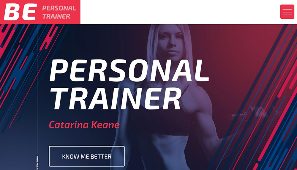
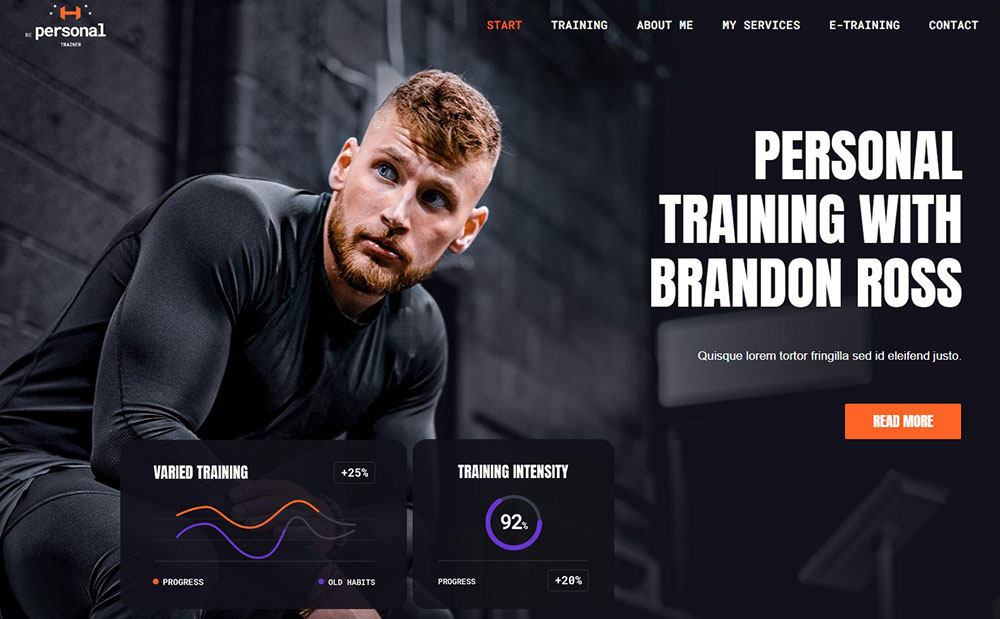
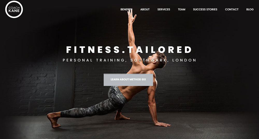
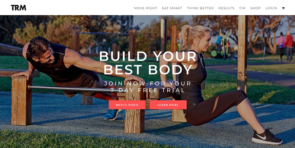
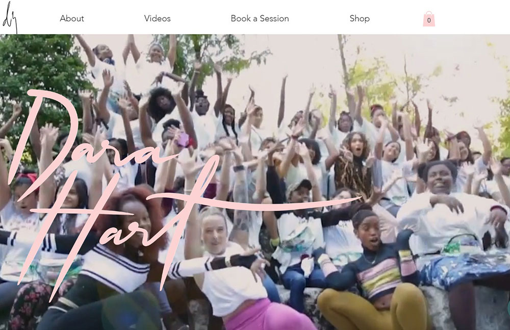
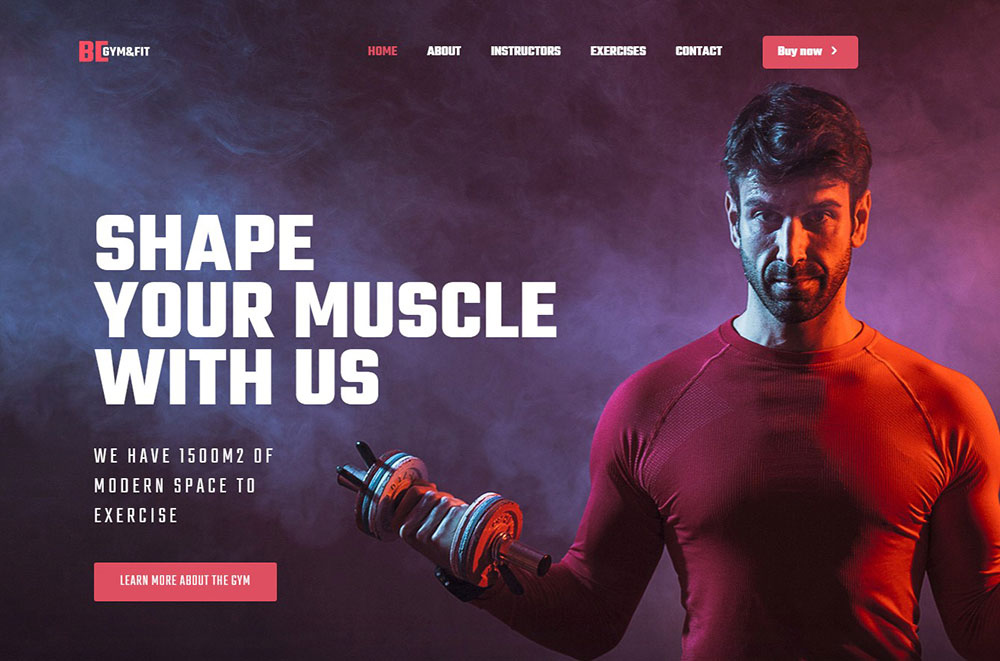
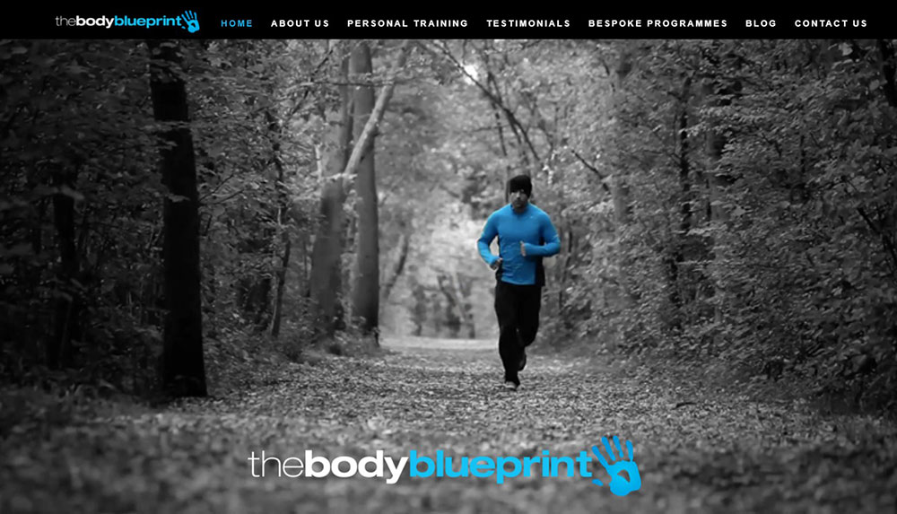
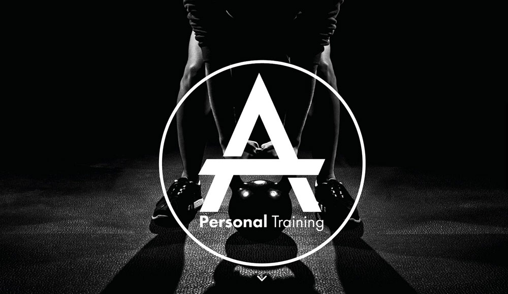
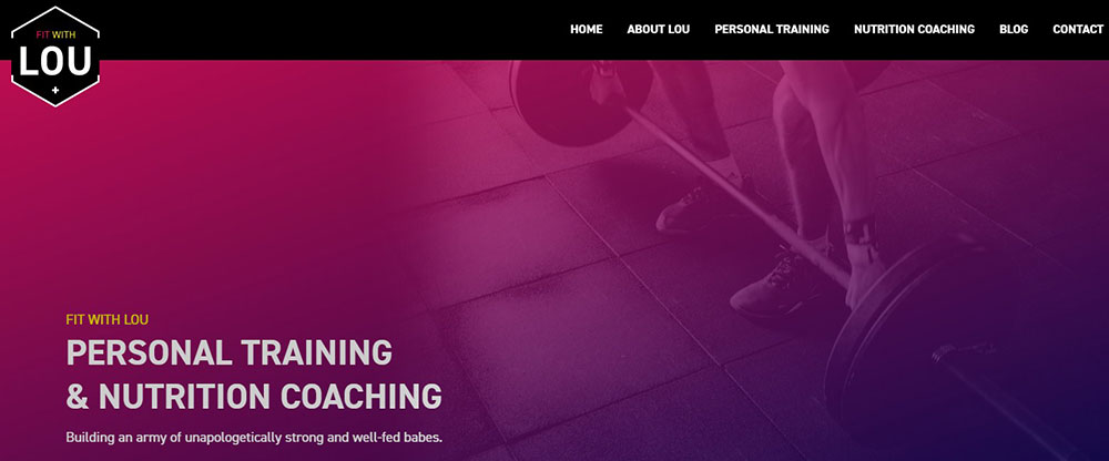
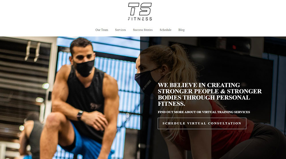
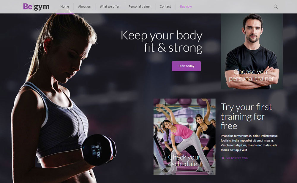
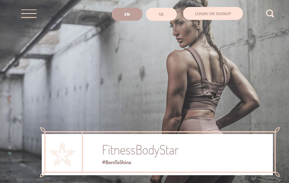
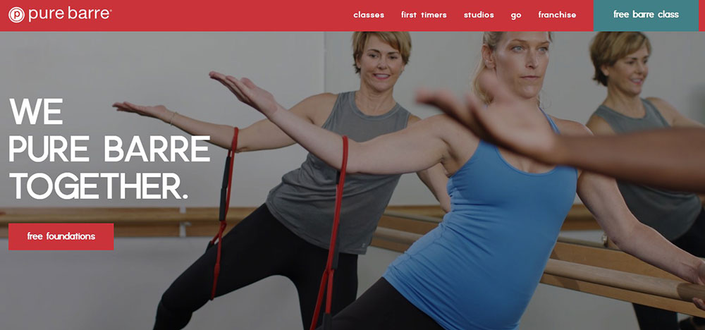
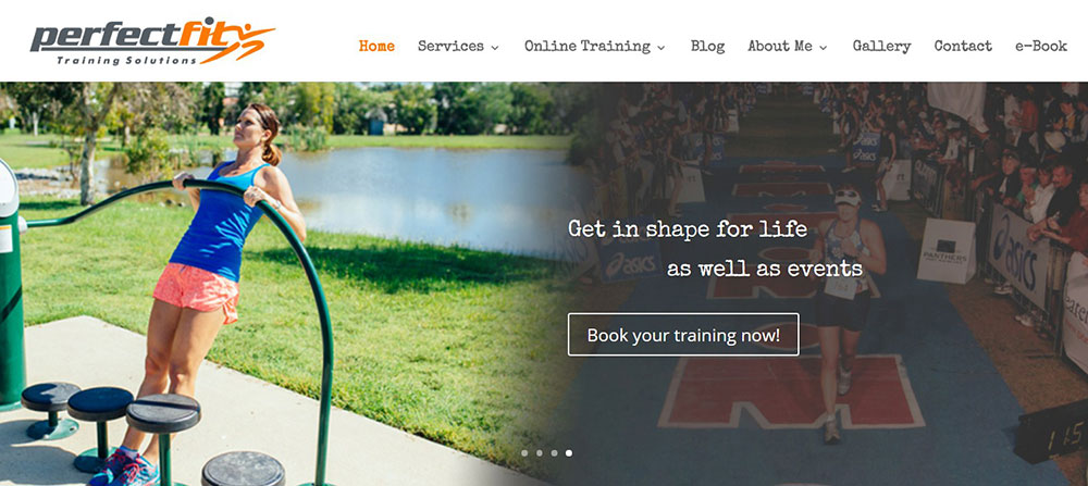
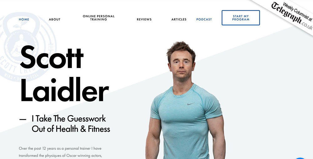
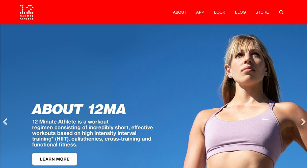
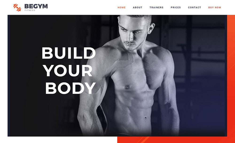
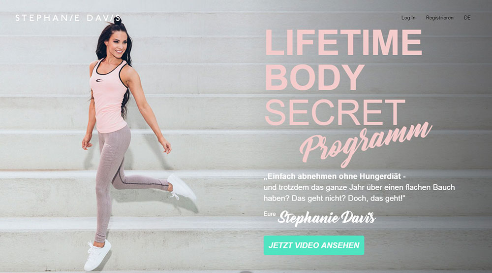
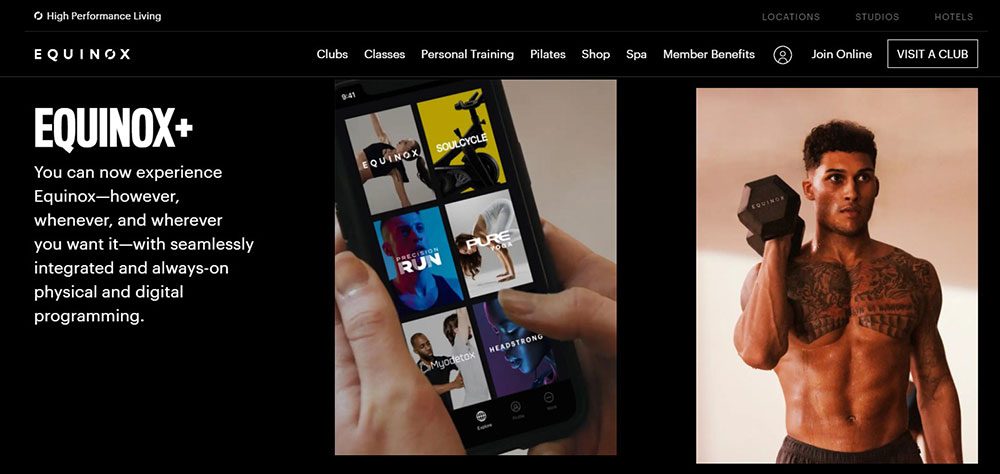
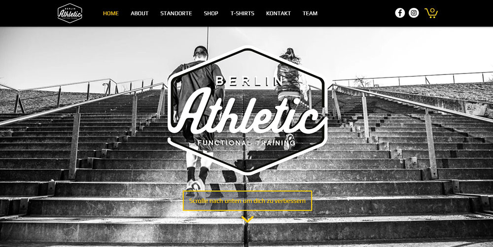
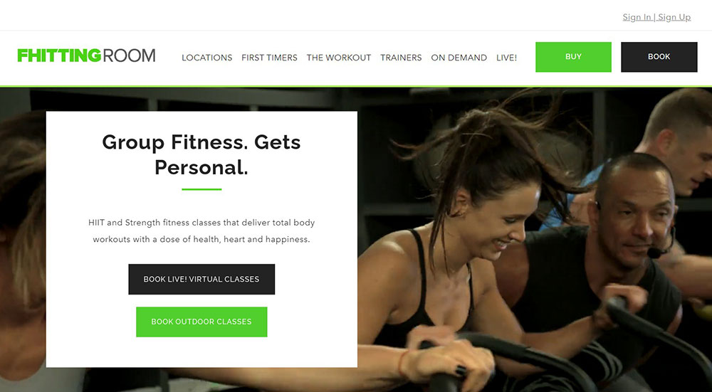
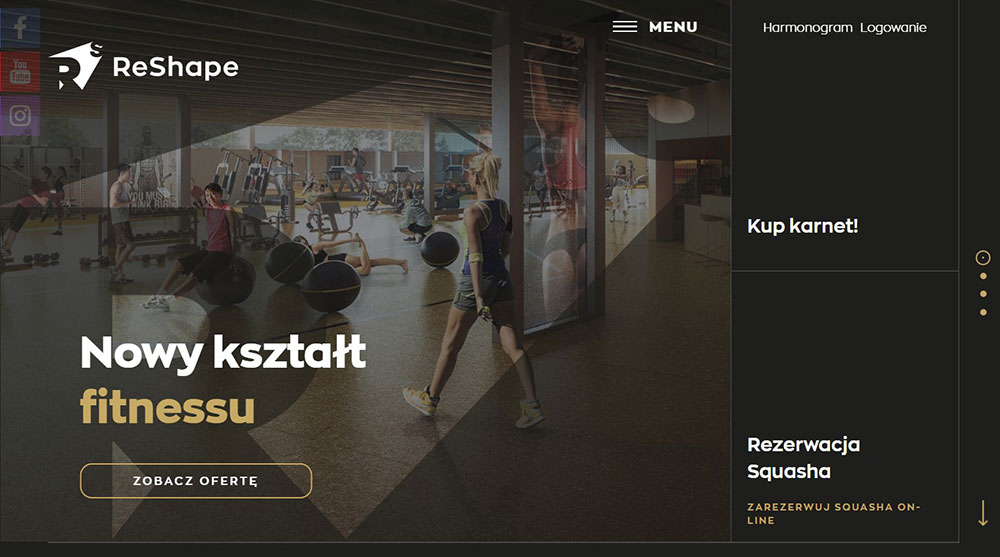
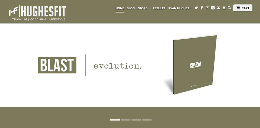
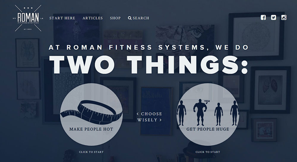
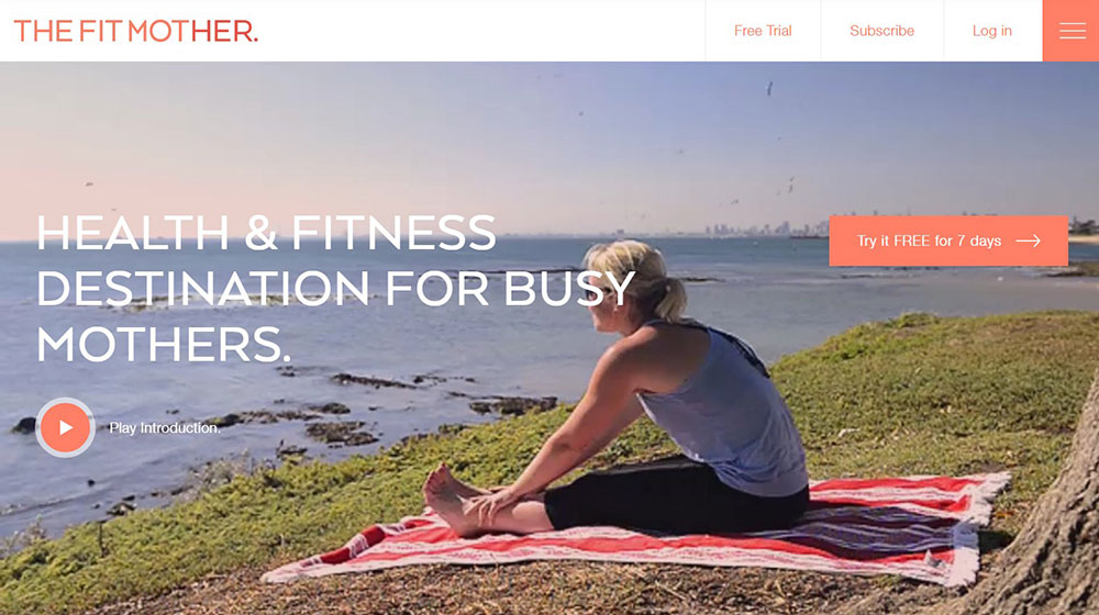
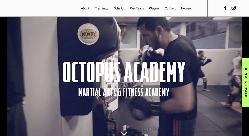
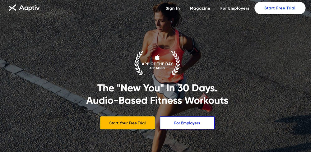
Personal Trainer Websites That Will Inspire You
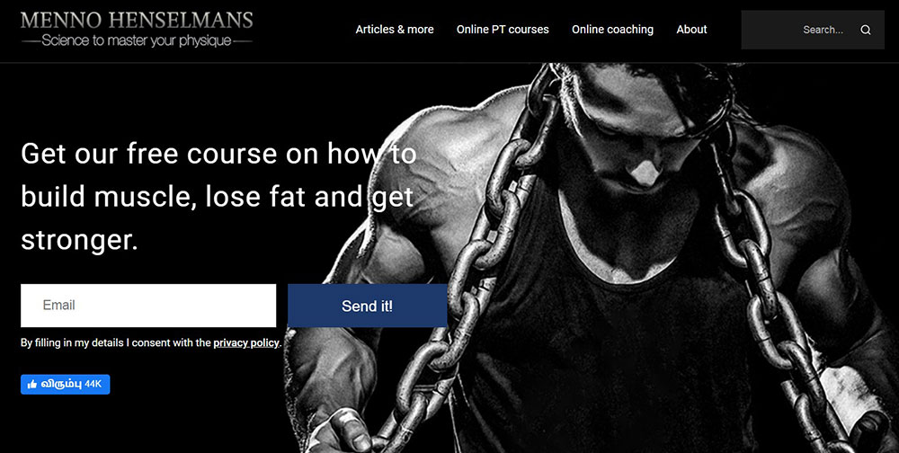
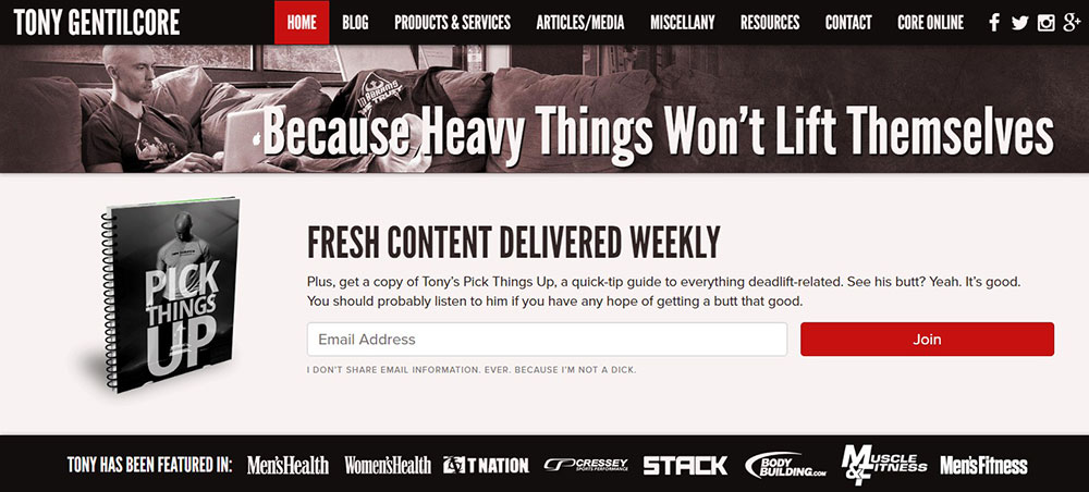
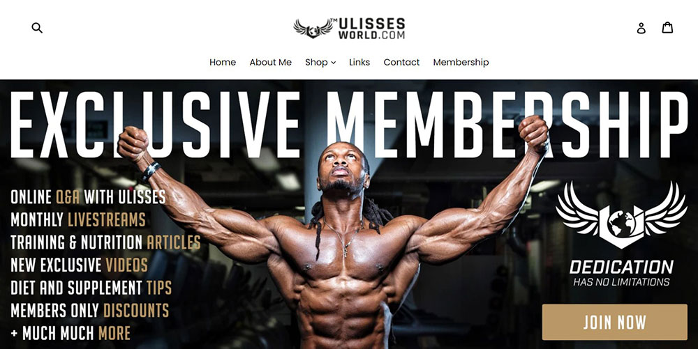
Bayesian Bodybuilding


How Does a Personal Trainer Website Convert Visitors Into Clients
Conversion on a fitness website happens when a visitor takes a specific action. Booking a free consultation, signing up for an email list, downloading a workout PDF, or purchasing a training package directly.
The formula is simple. To calculate your fitness website conversion rate, divide total leads by total visitors, then multiply by 100.
Most personal training sites convert between 2% and 5% of their traffic. Sites with strong call to action buttons and streamlined booking flows tend to sit at the higher end.
What Conversion Elements Matter Most on a Fitness Website
Above-the-fold placement of a primary CTA is the single biggest factor. If someone has to scroll to find out how to book a session, you have already lost a chunk of potential clients.
Here is what actually moves the needle:
- Booking widgets embedded directly on the homepage (Calendly, Acuity Scheduling, or Mindbody)
- Client intake forms with fewer than 5 fields
- Lead magnets like free workout PDFs or nutrition guides placed on landing pages
- Pricing transparency on the services page
- Before-and-after client transformation photos near CTAs
Stripe and PayPal integrations let trainers accept payments at the point of booking. That removes the back-and-forth of invoicing and cuts the gap between decision and payment to seconds.
Trainerize and TrueCoach go a step further. They handle program delivery, progress tracking, and session scheduling inside one platform, which means fewer tools duct-taped together.
Why Do Some Personal Trainer Websites Fail to Convert
Stock photography is the biggest killer. Visitors can tell immediately when the person on the homepage is not the actual trainer.
Other common problems: no CTA above the fold, buried contact information, walls of text with no visual breaks, and slow page load times caused by uncompressed video backgrounds.
Took me forever to figure out why some fitness sites look great but produce zero leads. Almost always, it comes down to the booking path being too complicated or hidden behind too many clicks. If a visitor cannot book within two clicks from the homepage, the site has a structural problem.
What Layout Works Best for a Personal Trainer Homepage
The homepage layout for a personal trainer website follows a predictable but effective pattern. A strong website layout puts the most important information where visitors look first, then guides them toward a single action.
What Should Go Above the Fold
A full-width image or video of the trainer, a headline that communicates the core benefit, and one primary CTA button. That is it. Nothing else competes for attention in this space.
The best fitness homepages use either a static high-quality photo or a short looping video background showing the trainer in action. Autoplay videos with sound are a bad idea on any site, but silent background clips work well when they are compressed properly.
How Should the Homepage Flow Below the Fold
After the hero, the structure usually follows this order:
- Brief "who I am" section with a photo and 2-3 sentences
- Services grid showing training types (one-on-one, group, online coaching)
- Client transformation gallery or testimonial slider
- Certification badges (NASM, ACE, ISSA, ACSM)
- Secondary CTA to book a free consultation or download a lead magnet
- Footer with contact details, social links, and Google Maps embed
Some trainers use a one page website design where everything scrolls vertically on the homepage. Others split content across multiple pages. Both work. The deciding factor is how much content you have and how complex your service offerings are.
On mobile, all of this stacks vertically. If your homepage has more than 8-10 scroll sections on a phone screen, cut something. Mobile first design is not optional for fitness sites, since most potential clients will find you through Instagram or Google on their phones.
What Pages Does a Personal Trainer Website Need
A personal trainer website typically needs five to seven core pages. Adding more is fine if the content is useful. Adding pages just to fill a menu is not.
What Goes on the About Page
Your training philosophy, certifications, years of experience, and a professional photo. Mention specific credentials by name (NASM-CPT, ACE-certified, ISSA Specialist). Include a short personal story if it connects to why you became a trainer. Skip the generic "passion for fitness" copy.
What Should a Services Page Include
Each training service listed with a name, description, session length, and price. Group them logically: one-on-one personal training, small group sessions, online coaching programs, nutrition consultation. A CTA button after each service block that links directly to booking.
Look at how pricing page layouts handle tiered offerings. The same logic applies to personal training packages.
How Should a Personal Trainer Display Pricing
Transparent pricing builds trust faster than "contact us for rates." List your packages with clear names, session counts, per-session cost, and total price. Use a comparison table if you offer multiple tiers (basic, premium, VIP).
If you are not comfortable listing exact prices, at minimum provide a "starting from" figure. Hidden pricing is one of the fastest ways to lose potential clients before they ever reach out.
What Does an Effective Testimonials Page Look Like
Real names, real photos, specific results. "Lost 15 kg in 12 weeks" is stronger than "great trainer, highly recommend." Video testimonials from actual clients perform even better. Include before-and-after transformation images where you have permission.
Place testimonials throughout the site, not just on a dedicated page. Homepage, services page, and booking page should all feature at least one client quote.
How to Structure a Blog for a Fitness Website
A fitness blog supports both search visibility and client trust. Write about topics your target audience actually searches for: home workout routines, meal prep for muscle gain, recovery tips after strength training, how to choose a personal trainer.
Keep articles focused on one topic per post. Use question-based headings that match how people search. Good blog design means readable font sizes, short paragraphs, and images that break up long text blocks.
Link blog posts to your services pages where relevant. A post about "benefits of hiring a personal trainer" should link to your booking page. That is how content turns into clients.
FAQ on Personal Trainer Website Design
What platform works best for building a personal trainer website?
WordPress offers the most flexibility with plugins for booking, payments, and SEO control. Squarespace and Wix are easier to set up but more limited. Webflow gives full design freedom if you know your way around it.
How much does a personal training website cost to build?
A DIY site on Squarespace or Wix runs $16 to $45 per month. A custom WordPress build with professional design and booking integration through tools like Calendly or Acuity Scheduling typically costs $1,500 to $5,000 upfront.
What pages does a personal trainer website need?
Five core pages minimum: homepage, about, services, testimonials, and contact. A fitness blog and a dedicated pricing page strengthen both search visibility and client trust. Add a booking page if your scheduling tool needs one.
How do I add online booking to my fitness website?
Embed a scheduling widget from Calendly, Acuity Scheduling, or Mindbody directly on your homepage and services page. Trainerize and TrueCoach handle both booking and program delivery. Connect Stripe or PayPal for payment processing at checkout.
What colors work best for a personal trainer website?
Dark backgrounds with bright accents like neon green, electric blue, or orange are common in fitness branding. Muted tones work for wellness-focused trainers. Check contrast ratios for readability using tools like Adobe Color or Coolors.
What makes a personal trainer homepage convert visitors into clients?
A strong hero image or video, a clear headline stating the core benefit, and one primary CTA button above the fold. Client transformation photos and testimonials placed near booking links increase conversions significantly.
Which fonts are best for fitness websites?
Bold sans-serif fonts like Montserrat, Oswald, Bebas Neue, and Poppins from Google Fonts are common across top personal training sites. Pair a strong heading font with a clean body font for readability on mobile screens.
How do I display certifications on my personal trainer website?
Place NASM, ACE, ISSA, or ACSM badges on your homepage, about page, and footer. Use the official certification logos at a visible size. Position them near testimonials or booking CTAs where trust signals matter most.
Should a personal trainer website use video backgrounds?
Short, silent, looping clips of training sessions work well as homepage hero backgrounds. Compress files to avoid slow load times. Check performance with Google PageSpeed Insights after adding any video to make sure mobile speed stays acceptable.
How important is mobile responsiveness for a fitness website?
Most potential clients find personal trainers through Instagram or Google search on their phones. A site that breaks on mobile loses those visitors instantly. Test every page on multiple screen sizes before launching, especially booking forms and CTAs.
Conclusion
These personal trainer website design examples prove that good design is not about looking pretty. It is about getting clients booked.
Every site that performs well shares the same foundation. Clear service descriptions, real client photos, visible NASM or ACE certification badges, and a booking system that connects to Stripe or PayPal without friction.
Your gym website layout, font pairing, and homepage structure all affect whether someone clicks "book now" or hits the back button. Small details like white space, readable typography, and fast load times on mobile separate professional websites from forgettable ones.
Pick one example from this list that matches your brand. Study its structure. Then build something better for your own fitness business.


