

The best one-page template designs you can download now
March 7, 2025
How To Fix The WordPress Parse Error Easily
March 13, 2025Great product landing pages drive sales. They showcase features, build trust, and guide visitors toward purchase. Looking for inspiration to create your own high-converting product pages?
This collection of product landing page examples delivers practical insights for e-commerce stores, SaaS companies, and digital marketplaces seeking to improve their conversion rate optimization.
You'll discover:
- Visual merchandising techniques from Apple and Nike
- Mobile-first designs that boost customer acquisition
- Effective call-to-action samples that increase CTR
- Single product websites with compelling value propositions
- User-friendly layouts from Shopify, Squarespace, and Wix
Whether you're using WordPress, Unbounce, or ClickFunnels to build your online sales pages, these purchase journey examples will transform your product showcase designs.
Let's explore these conversion-focused templates to elevate your product storytelling and shopping experience.
Features of a Product Landing Page
The most common landing pages are lead generation and product landing pages. Lead generation landing pages are used to gather information from a visitor to make a future sale. Product landing pages are used to make the immediate sale of a product. A combination of the different styles of landing pages can create a page with a higher conversion rate. The following lists the features that differentiate lead generation from product landing pages.
Lead generation landing pages:
These are landing pages where the main goal is to generate leads. The landing page copy here would be geared towards getting the visitors to provide their contact details. You could incorporate a chatbot or a form to collect this information. To further support user queries, consider including your cloud contact center number, offering users a convenient avenue for quick clarifications and assistance.
Some of the other things to keep in mind are:
- Focus on generating leads to complete a later transaction
- Offer a resource (like an eBook or webinar) in exchange for contact information
- Educate visitors on the benefits of the offer
Product landing pages:
- Sell physical and digital goods
- Focus on having the visitor make an immediate purchase
- Tend to have shorter content
- Include several call-to-action elements (CTA’s)
- Can include multiple offers
- Are more actionable than educational
Design Principles to Make a Product Landing Page Great
A successful product landing page can convert prospects into sales. It is crucial to update yourself with the latest web design trends before planning an innovative landing page. It will also take experimenting to create a successful product landing page. It is common to create two versions of the same product landing page with one version having a slightly different element, this is referred to as A/B testing. Some tips are to:
- Make the page aesthetically appealing. You have mere seconds to catch the attention of a visitor, so make the page simple and short. Headings and bullet points make wise use of limited space. Proper use of whitespace and colors make the page easy to scan and attractive.
- Have clear, bold, and appealing call-to-action buttons.
- Use striking images. Adding visual clues like arrows is also appealing.
- A page that loads too slow will discourage visitors. Use small image files, a fast web host, and an uncluttered page to ensure fast loading times.
- Include answers to frequently asked questions to get rid of any doubts a visitor may have.
- Include commendatory reviews from social media posts.
- Limit exit links. The point of a landing page is to direct visitors down a specific pathway. Avoid adding exit links that would cause visitors to abandon the page.
- Include social media sharing buttons to spread your content further.
- Make the page about the visitor. Do not talk too much about yourself.
- Use dialogue that personalizes the page. Also, words like “imagine” help people visualize what you are offering.
- Use a video when appropriate.
- Make it mobile-friendly to increase conversions.
- Include a thank you follow up page. This creates a happy atmosphere and allows the opportunity to display related material.
The Best Product Landing Page Examples
Shopify
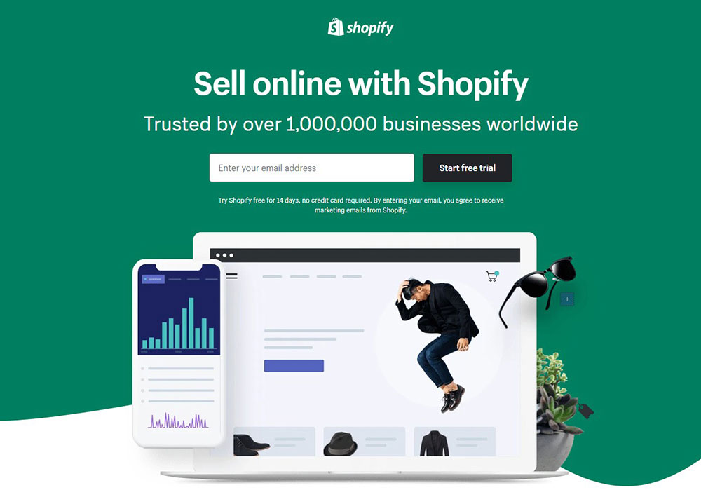
Shopify is a great example of a simple landing page. It has a direct headline that explains the product in a few words. The page is short and includes organized and brief information that is easy to scan. It also contains a review to build trust. The only action that a visitor can make is to enter their email to try a 14-day trial. This landing page fulfills its purpose of directing the visitor to a trail that will lead to a purchase. If you want better manage leads then you can use something like the Phonexa lead distribution software.
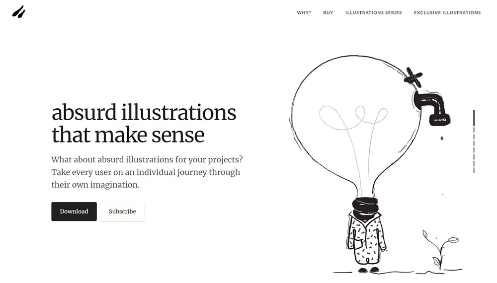
Absurd Design sells unique illustrations for web page designs, presentations, articles, and more. The wise use of whitespace creates a simple layout. This landing page also displays examples of their work and positive reviews. It provides different purchasing options and free illustrations to attract buyers.
Netflix
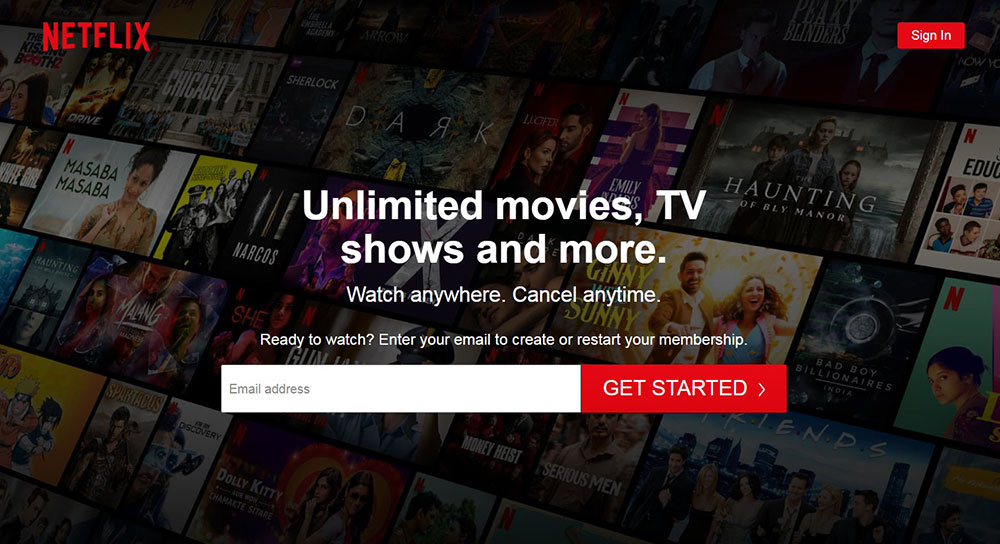
Netflix was the forerunner in changing the way people watch TV shows and movies. This landing page highlights the benefits of using Netflix. It presents the information in a simple format. And it is not difficult to sign up for this service with the first step being to enter an email address. The landing page also includes frequently asked questions to dispel any doubts a visitor might have. It is clear that this strategy works since Netflix has over 200 million subscribers.
Stripe
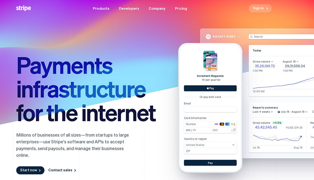
Stripe is one of the biggest financial services in the world. On this landing page, they showcase their talent for user experience and web design. Stripe uses many features, colors, and effects on their landing page. They make sure the CTA’s appear throughout the page. They include pictures of the software and list their biggest clients.
GiftRocket
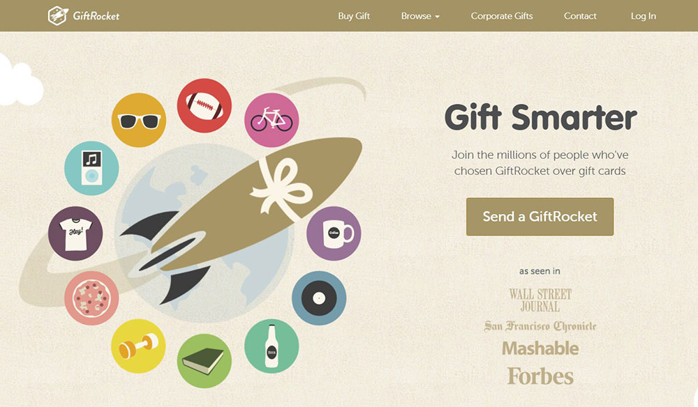
GiftRocket is another example of an appealing landing page. First, it sells a unique product. Second, it explains in a few words what GiftRocket offers. It contains graphics and a color scheme that grabs attention. The layout presents information in a simple and uncluttered way. It has several clear CTA buttons that beckon visitors to click them. It also displays complimentary customer reviews and testimonials.
GoToMeeting
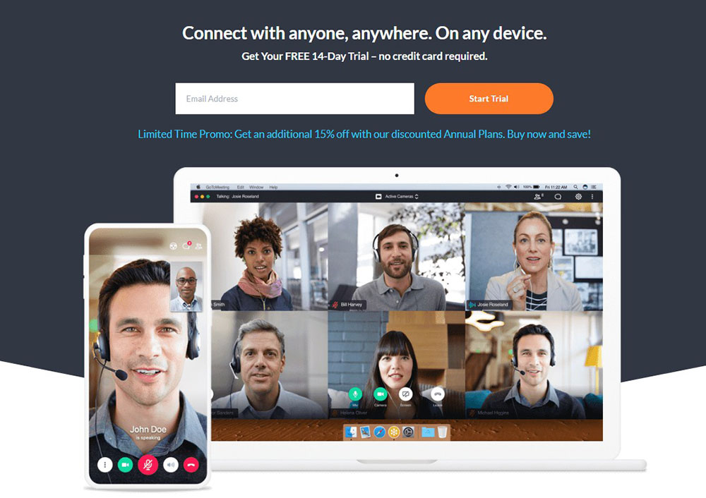
GoToMeeting applies many basic design principles to create an appealing landing page. The page is very short but makes wise use of the limited space. The information is concise and formatted in a way that makes it easy to scan. It includes a picture of the product. This diverse landing page will appeal to everyone. It also highlights the CTA and provides testimonials.
Muck Rack
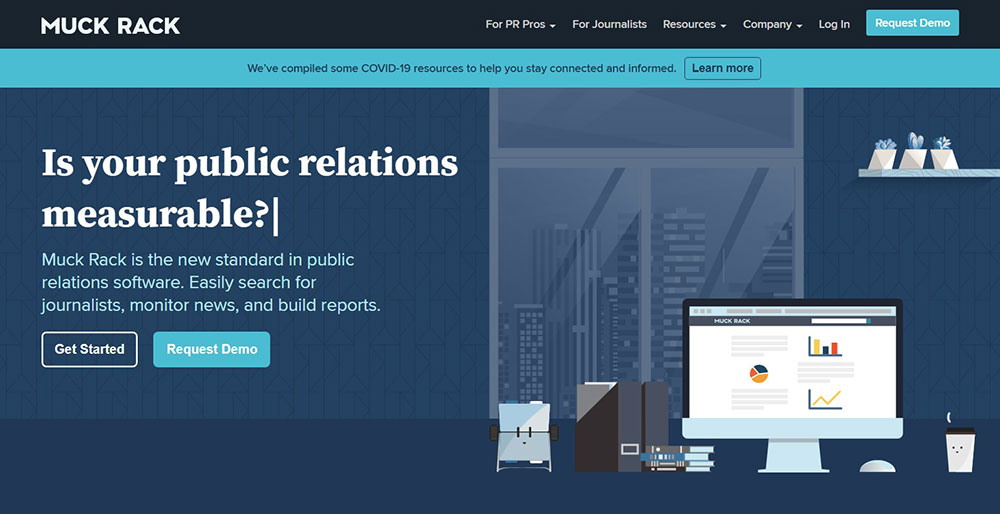
The CTA buttons are the first thing that visitors see when landing on Muck Rack’s landing page. The headings, bullet points, and graphic features of this landing page create a simple layout. It also includes customer testimonials and a list of clients to build the trust of the visitor.
Fitbit
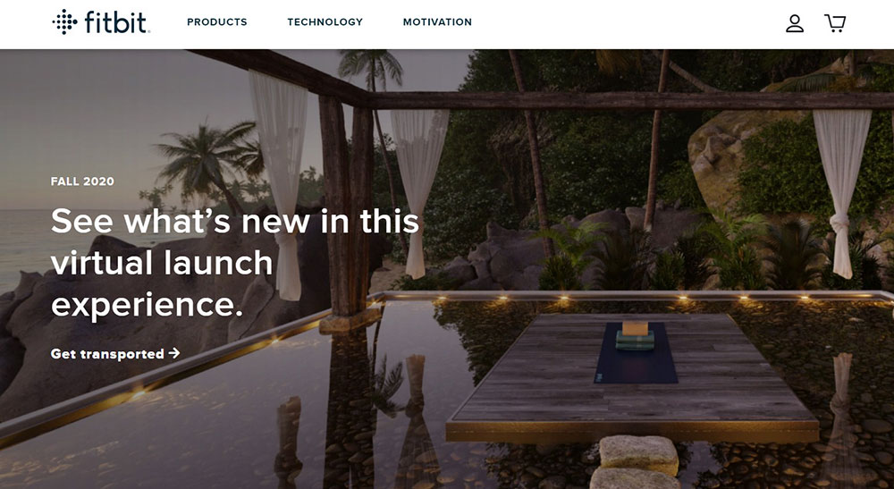
Fitbit defied the general rules of landing pages and created a landing page unlike any other. Instead of including CTA’s that lead visitors to make a purchase, Fitbit includes a “What’s New” button. This button takes the visitor to a virtual experience where they can read about and watch videos on specific Fitbit products. Scrolling down on the landing page displays pictures and brief explanations of Fitbit products.
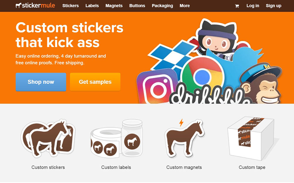
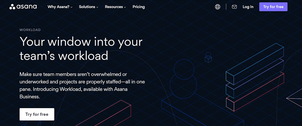
Asana Workload
Sticker Mule designed its product landing page so that the bright CTA is at eye-level to attract attention. This page also includes an entertaining video about the products. The landing page is short, focusing visitors’ attention on the four products. After clicking on a product, the page displays the purchasing options to encourage the visitor to make a fast purchase. This page also includes buyer reviews.
Goby
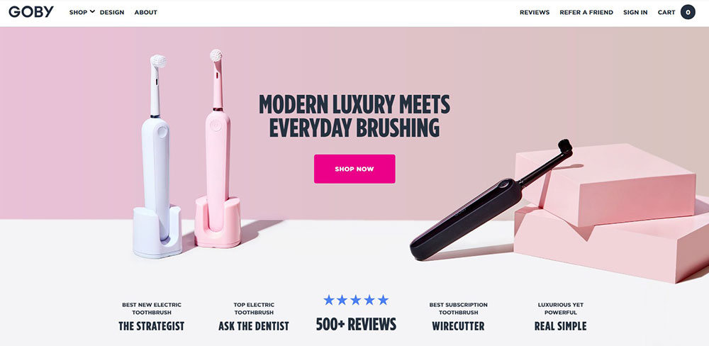
Goby sells electric toothbrushes that make teeth brushing more luxurious. The landing page reflects that luxury with an elegant and uncluttered design. Goby has spread CTA’s throughout the page giving visitors ample opportunity to make a purchase. Reviews from magazines, clients, and dentists build confidence in the brand. A 60-day trial and a lifetime guarantee reinforce the trust of visitors and give’s them a reason to smile.
Sprout Social
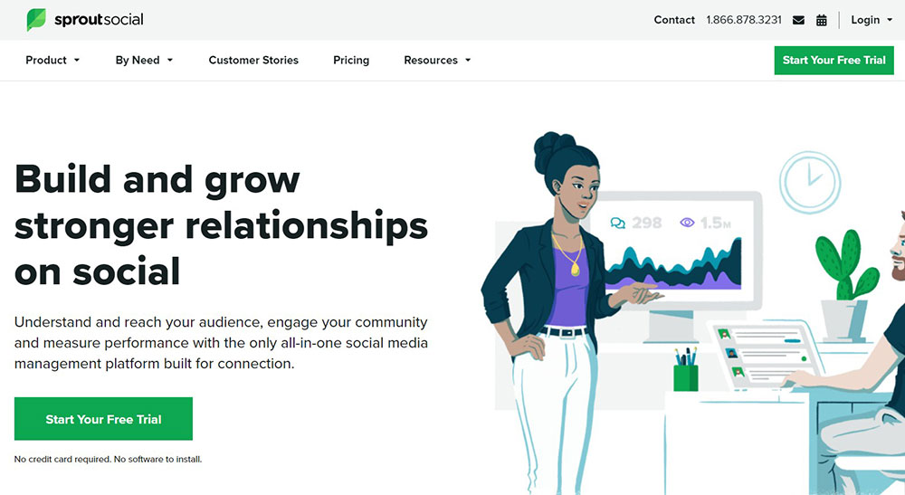
Sprout Social is another landing page example worth imitating. It is visually attractive because of its organized layout. It also has appealing animations and an enticing CTA that stands out. Screenshots present the look of the software. Customer stories build the trust of visitors. There is also a video that includes customer reviews.
Mixpanel
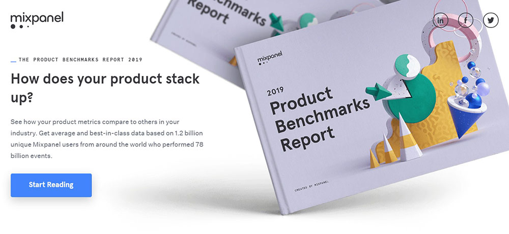
Mixpanel’s landing page encourages people to download their free eBook. Although it is an eBook the landing page displays a graphic of a physical book to help visitors visualize the product. This is an excellent technique to make the offer tangible. The eBook graphic has 3D abstract images to add an entertaining factor to this landing page. Other practical features utilized are a simple layout and clear CTA’s. The page is short but includes a customer review to build trust.
monday.com
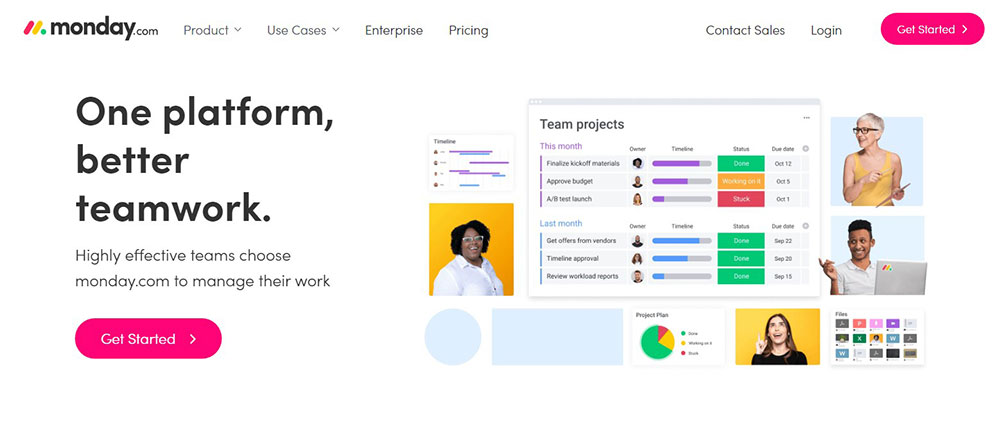
monday.com employs a simple and minimalist landing page design. The page uses whitespace to maintain an organized layout. The text is kept to a minimum to highlight the best aspects of this software. The pictures include an appealing pop of color and the CTA’s are obvious. The header includes a CTA so visitors can get started right away.
Muzzle
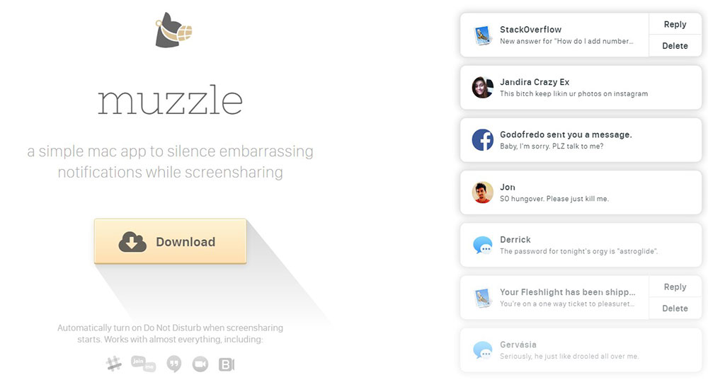
Muzzle is an app for mac that prevents notifications from appearing while screen sharing. This landing page takes a minimalist ‘show don’t tell’ approach. The page displays a brief description of the app as well as a download button. On the right of the screen, embarrassing notifications bombard the visitor. This not only provides entertainment but also conveys the usefulness of this app without a lengthy description.
Pianu
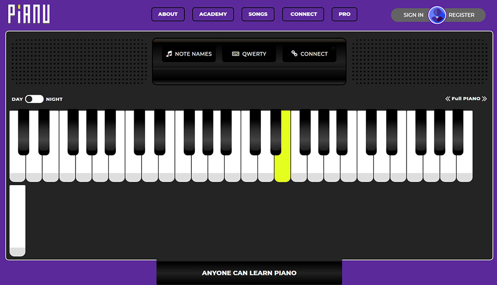
Pianu teaches you to play the piano. Not only is the name appropriate but the landing page is also entertaining. It displays an interactive piano that highlights the keys to press to play a song. This awakens the desire of visitors to learn to play the piano. The landing page includes CTA’s to sign up for classes and suggests other famous songs to play on the digital piano.
Pipedrive
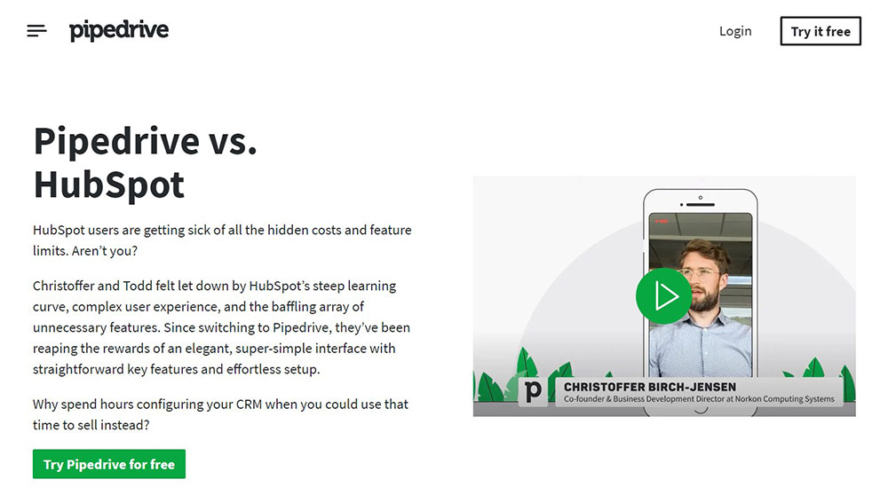
Pipedrive created this landing page to take its competition head-on. Pipedrive calls its competitor out for their hidden fees and feature limits. The page displays a side by side comparison table of what Pipedrive offers vs what the competitor offers. Ample content provides reasons why Pipedrive considers itself the superior product. CTA’s encourage visitors to find out for themselves by trying Pipedrive for free.
Blue Apron
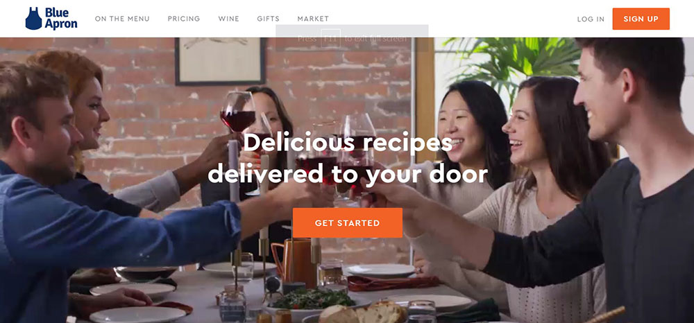
Blue Apron delivers ingredients to subscribers. The page opens to a background video displaying delicious meals. Visitors do not have to scroll further than that because a CTA is right in the middle beckoning a click. If visitors want to scroll down a clean and simple page awaits them. Big headings, bold font, and brief descriptions contribute to the appeal of the page. The bottom half of the page demonstrates the simple process of creating and ordering Blue Apron meals.
Intercom
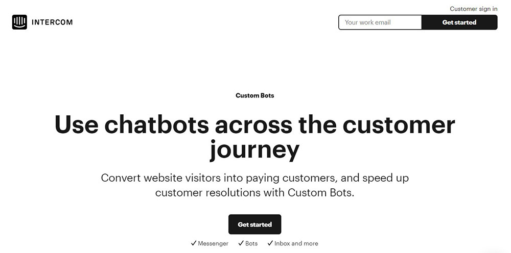
Intercom offers chatbots to convert visitors to paying customers. The chatbot trend has increased through the years and is a good marketing tool. This landing page showcases its offer with a chatbot that explains Intercom. It also displays graphics to show how chatbots work and how they can save customers time.
SEMrush
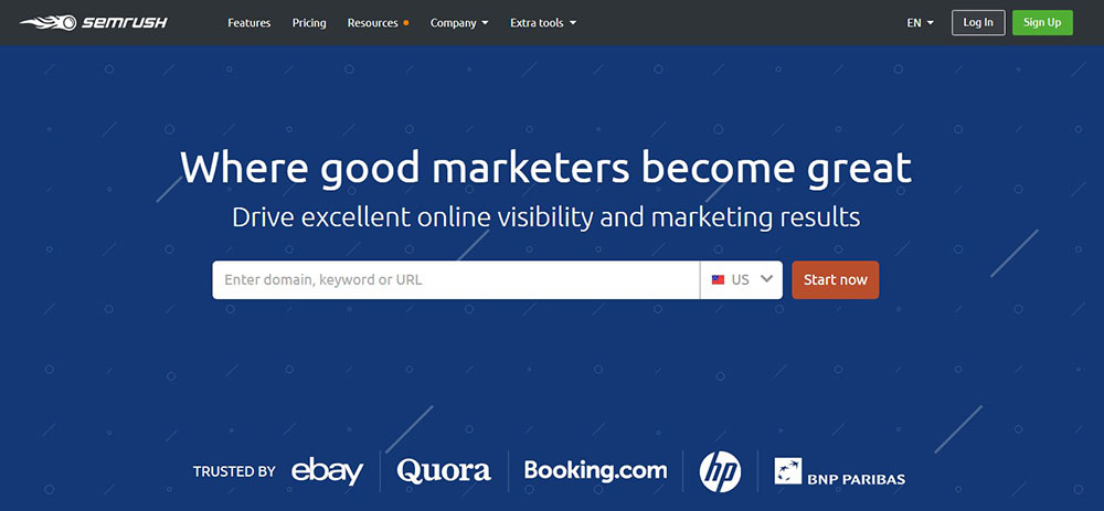
SEMrush is a marketing toolkit for digital professionals. This uncluttered landing page is easy to scan. It displays its information in organized boxes. It lists what the platform offers like PPC, SEO, content marketing, and more. When visitors click on these options a box with a picture and bullet points explains more. SEMrush figures and testimonials build trust in this platform.
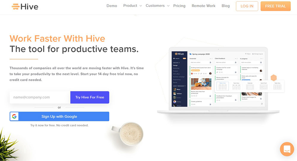
Hive
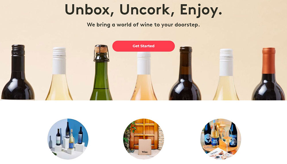
The product landing page for Winc is a good example of a short page. It features a simple design, text, and color scheme that is very appealing. It displays attractive images of its wine products. It describes its proposition with a small amount of text. It contains two CTA’s even though you can reach the bottom of the page with one scroll. It also includes a simple six-word review from Forbes.
Khan Academy
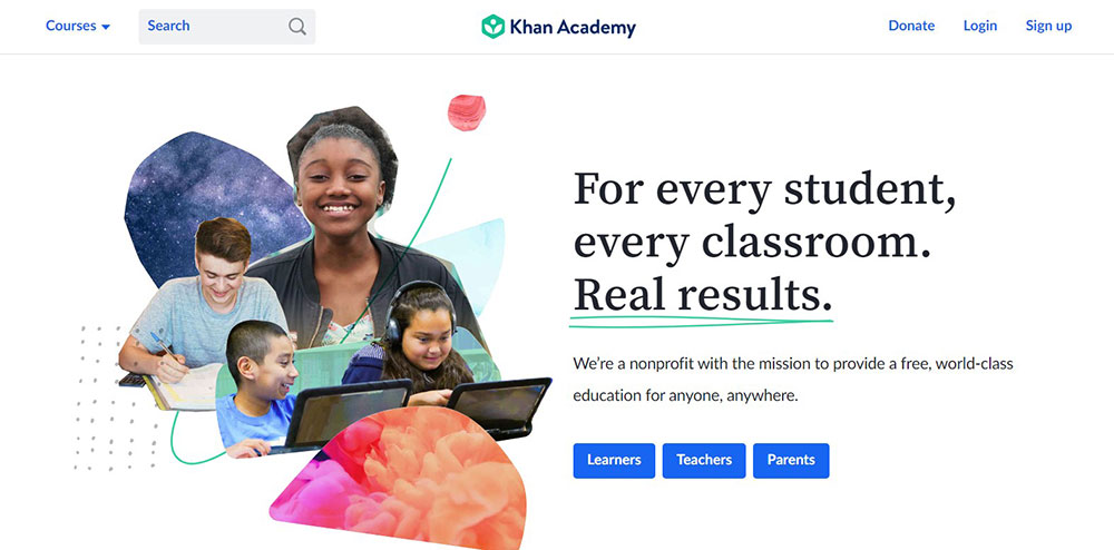
In general, a landing page and a homepage are different but it can be difficult to cater to different audiences on one page. Khan Academy was able to create a landing page that appeals to different audiences. This page was designed for students, teachers, parents, or others interested in donating to Khan Academy. The page is organized, builds trust, and includes testimonials.
TransferWise
TransferWise is a service that transfers money in different currencies. This landing page provides ample information to ensure that they can be trusted. The page does not waste any time because, on the right side of the page, visitors can choose the currencies that they want to transfer without delay.
Home Chef
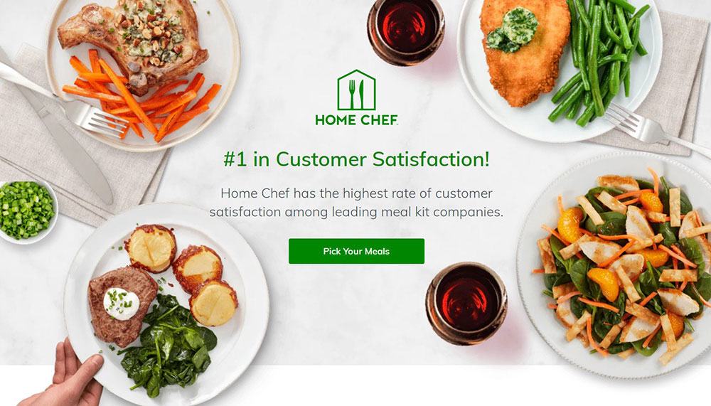
Home Chef employs heavy branding to lead visitors to make a purchase. The logo greets visitors as they enter the page. Along with the logo is a statement that they are number one in customer satisfaction. The logo is accompanied by an image of mouth-watering meals. The page highlights three main propositions. It also includes a video at the bottom of the page.
Astra
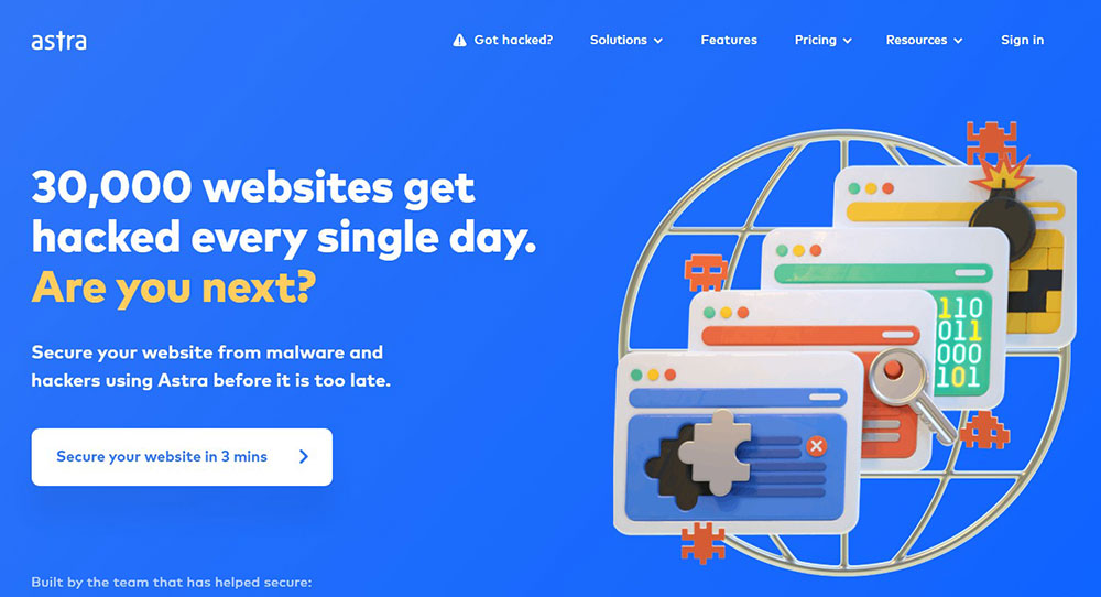
Astra Security protects websites from hackers. The CTA is specific as it mentions that they can secure a website in three minutes. The headings are bold to relay information at a glance. This page also strives to build trust. It contains testimonials, result figures, and detailed descriptions of the security service.
Pack4it
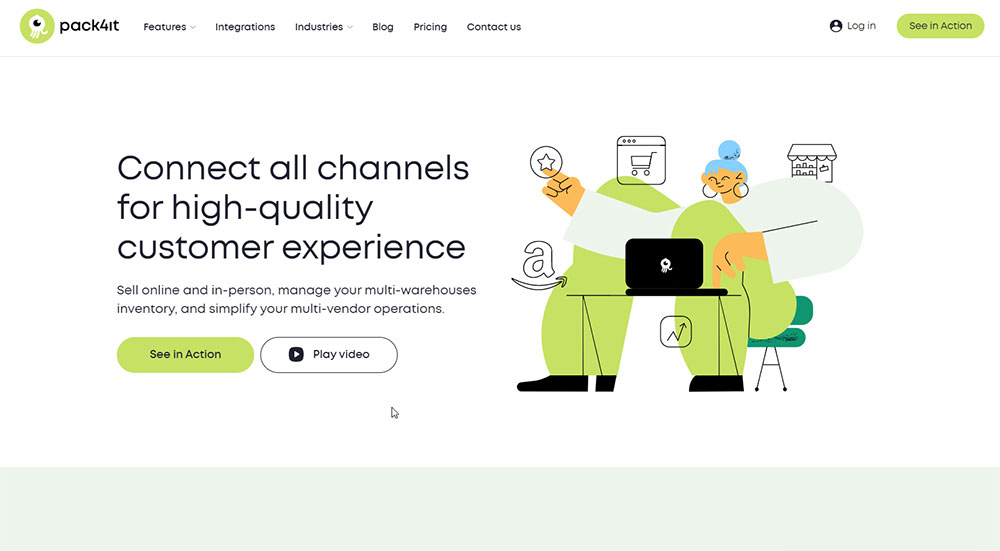
Pack4it provides an omnichannel solution that creates a high-quality customer experience by connecting all of the sales channels together, as well as simplifies all business processes.
Grass Roots
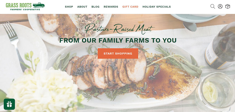
Grass Roots is a small scale family farm that sells grass-fed meat. This landing page takes visitors on a journey. It starts with the mission of the farm and leads to the products they provide. The journey ends with recipes for making delicious meals. Several CTA’s are included as well as testimonials and quality images.
FAQs about product landing pages
What makes a product landing page effective?
Effective product landing pages have clear value propositions, compelling visuals, and strong calls-to-action. They showcase product benefits rather than just features. Shopify and Unbounce templates demonstrate this with user-friendly product layouts that guide visitors through the purchase journey. Mobile optimization and A/B tested landing designs are essential for conversion rate optimization.
How do I create a high-converting product landing page?
Focus on:
- Customer-focused content addressing pain points
- Visual merchandising that highlights benefits
- Single product websites with minimal distractions
- Direct response layouts with clear CTAs
- Above-the-fold design capturing attention immediately
Use platforms like Leadpages or ClickFunnels for conversion-optimized pages.
What elements should I include in my product landing page?
Essential elements include:
- Compelling headline with product value propositions
- High-quality images (product showcase designs)
- Customer testimonials building trust
- Product feature displays highlighting benefits
- Clear pricing information
- Mobile-responsive design (see Wix examples)
- Strategic call-to-action samples that drive sales
Which product landing page examples demonstrate best practices?
Apple product pages master simplicity with stunning visuals. Tesla uses product storytelling pages effectively. SaaS landing examples from HubSpot demonstrate clear value. Nike product launches create urgency. Amazon product listings excel at providing comprehensive information while maintaining strong purchase funnels.
How can I optimize my product landing page for mobile users?
Implement mobile-first design approaches with:
- Simplified navigation
- Touch-friendly buttons
- Faster loading times
- Streamlined content
- Vertical scrolling product presentations
Study mobile product pages from Instapage or Webflow templates for inspiration on shopping experience design that works across devices.
What common mistakes should I avoid on product landing pages?
Avoid:
- Cluttered layouts confusing the customer journey
- Weak or multiple CTAs diluting conversion
- Slow loading speeds affecting bounce rates
- Missing product information
- Poor-quality images
UX design principles from Conversion rate experts suggest focusing on digital storefront examples that prioritize clarity and purpose.
How do I test the effectiveness of my product landing page?
Use Google Analytics conversion tracking to measure performance metrics. Implement A/B testing on headlines, CTAs, and visual hierarchy techniques. Compare results against successful landing pages in your industry. Platforms like Unbounce offer built-in testing tools for e-commerce page layouts.
What role does copywriting play in product landing pages?
Strong copywriting:
- Communicates benefits clearly
- Addresses customer pain points
- Creates emotional connections
- Uses persuasive language techniques
- Maintains consistent messaging
Effective product pages combine compelling copy with visual elements for complete online product presentation.
How do I showcase multiple products on a landing page?
Balance is key. Use product demonstration layouts that group similar items. Implement filtering options for easy navigation. Study e-commerce inspiration from WordPress and WooCommerce templates. Consider features like product carousels, comparison tables, and category-based organization from digital product marketplaces.
What trends are emerging in product landing page design?
Current trends include:
- Interactive product showcases using Figma landing page templates
- Video backgrounds highlighting product benefits
- Minimalist designs focusing on user experience
- AI-powered personalization
- Sustainable messaging in product value propositions
- Bootstrap landing examples with microinteractions
- Improved online marketing pages with storytelling elements
Conclusion
Studying product landing page examples reveals that conversion success relies on thoughtful design choices. Customer-focused landing pages from Squarespace and Elementor templates consistently outperform generic layouts. They work.
The best examples share common traits:
- Clear purchase funnels that guide visitors naturally
- Lead generation product pages with compelling CTAs
- Effective product presentation using visual hierarchy
- Web storefront examples optimized for mobile experiences
- E-commerce inspiration that balances design and function
Dribbble and Behance web design examples demonstrate that sales-oriented web design doesn't mean sacrificing aesthetics. Mailchimp landing pages prove that simplicity often yields the highest customer acquisition rates.
Remember: Your landing page is more than a website product feature—it's your digital sales agent. Adobe Portfolio and Bootstrap landing examples show that by applying these principles, your product marketing pages can transform browsers into buyers.
If you enjoyed reading this article on product landing page, you should check out this one about accessible websites examples.
We also wrote about a few related subjects like hotel website design, the best looking tourism websites, best corporate websites, great looking spa websites, cool looking personal trainer websites, top notch musician websites, the most impressive luxury websites and impressive animated websites.


