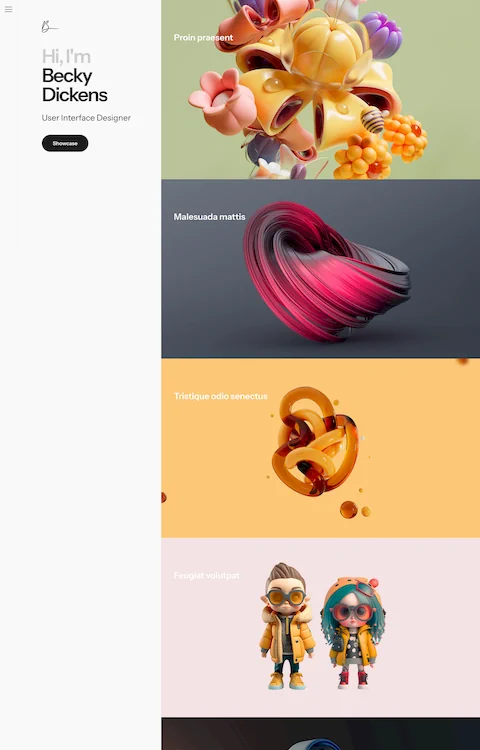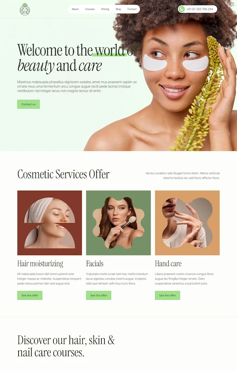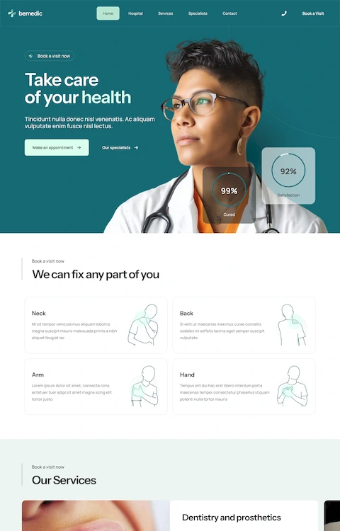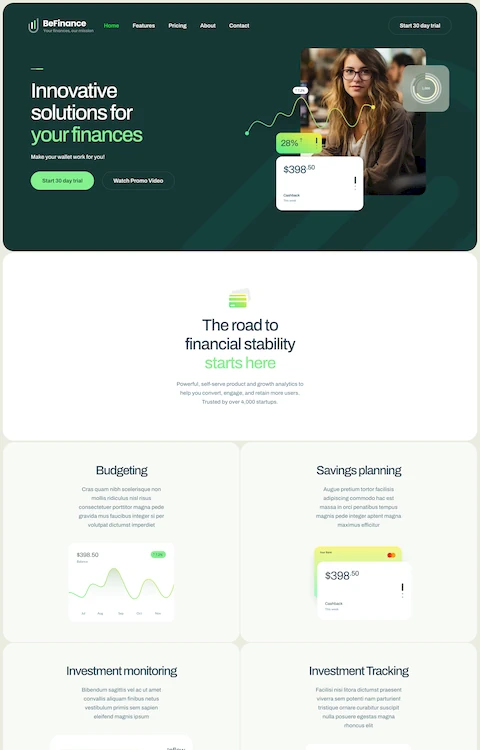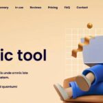
Stunning Examples of Modern Landing Pages
April 21, 2025Inspiring Examples of Startup Landing Pages
April 25, 2025Product landing pages can make or break your conversion rates. A well-designed page is often the difference between gaining a customer or losing a sale.
Looking for high-converting product pages to inspire your next design? You've come to the right place.
This collection showcases exceptional landing page design examples from brands like Apple that master the art of conversion. We'll examine how these pages use call-to-action buttons, hero image placement, and product benefits sections to drive results.
You'll discover:
- Pages with perfect visual hierarchy examples
- How trust badges implementation builds credibility
- Mobile-responsive design techniques that work
- Value proposition display strategies that convince visitors
Whether you're building with WordPress, Unbounce, or Webflow, these product showcase templates will help transform your visitors into customers through strategic user experience optimization.
Examples Of Product Landing Pages
Apple
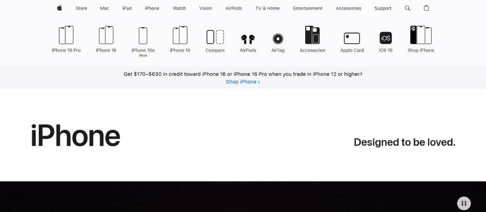
Apple's landing pages feature clean, minimalist design with hero sections that instantly communicate value proposition. Their product imagery dominates the visual hierarchy, with sparse copy focusing on benefits rather than specs.
White space creates breathing room, drawing attention to calls-to-action. User experience flows logically down the page through product demonstrations and feature showcases.
Their above the fold content quickly establishes trust signals through brand authority, while page load speed remains lightning fast despite high-quality visuals.
Slack
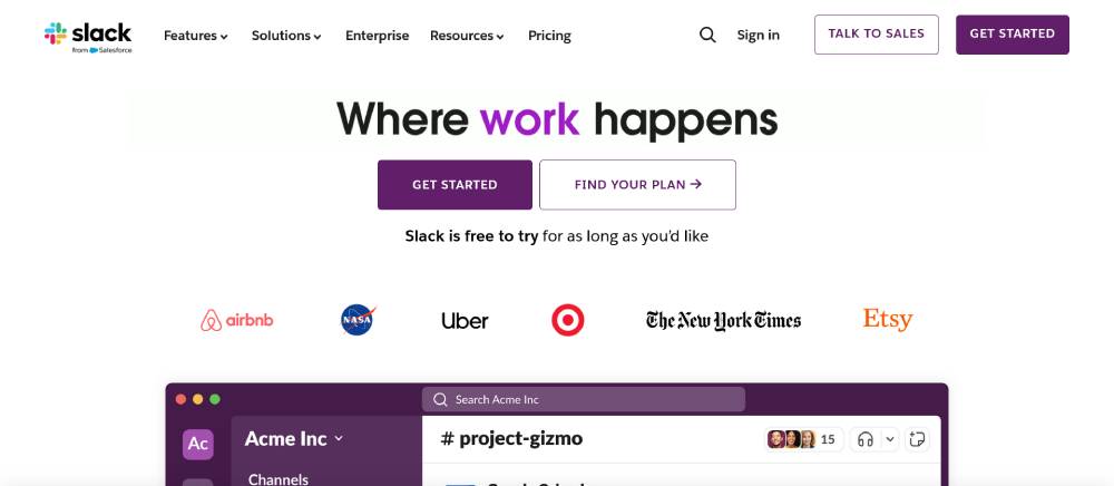
Slack's landing page masters conversion optimization through clear messaging and strategic CTAs. The hero section immediately highlights their unique selling point with concise copywriting.
Their mobile responsive design maintains consistent experience across devices. Customer testimonials and social proof are strategically placed to boost conversion rates.
Form optimization is evident in their simplified sign-up process, reducing friction in the purchase journey. Their marketing pages effectively use visual hierarchy to guide visitors through the digital product card.
Stripe
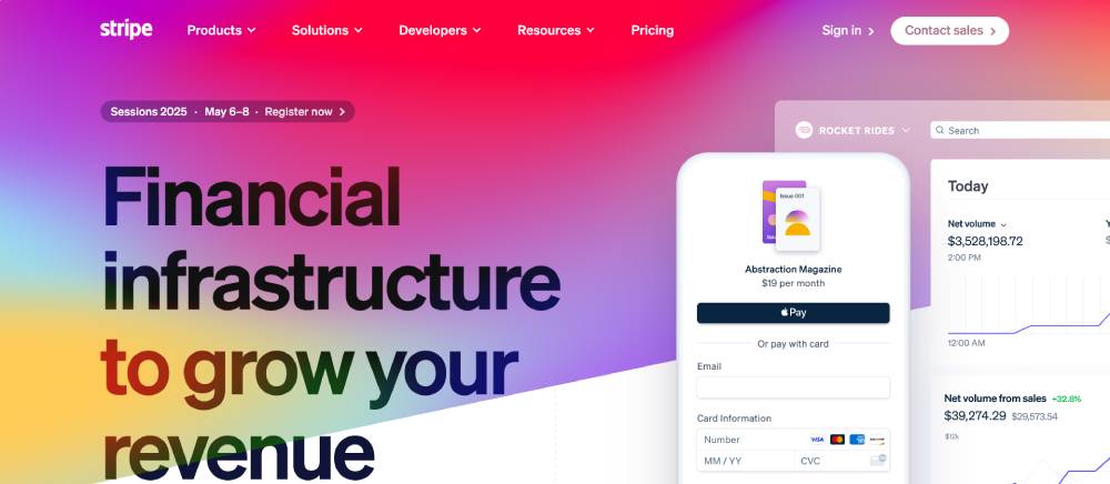
Stripe's landing page demonstrates excellent conversion-focused design with its web product catalog approach. The online selling platform uses subtle animations to showcase product features.
Clean code creates fast page load speeds crucial for conversion rate optimization. Their sales funnel visually guides visitors toward action with strategically placed buttons.
The digital storefront excels at displaying complex information through simplified product descriptions, making the buyer journey tool exceptionally effective for customer acquisition.
Be Smart
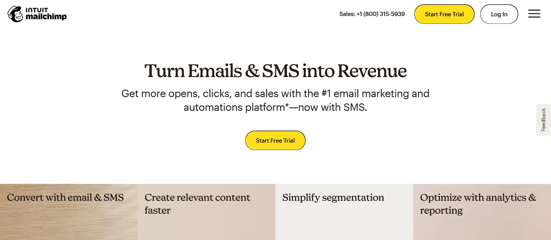
Mailchimp
Mailchimp's product landing page employs vibrant colors and playful illustrations as trust signals. Their A/B testing principles show in the carefully crafted user experience.
The product spotlight section highlights key features through digestible content blocks. Customer decision guidance flows naturally through their digital product promotion strategy.
Their lead generation forms exemplify form optimization principles with minimal fields and clear value exchange, making this online sales tool particularly effective.
Shopify
Shopify's landing page effectively balances product features with customer benefits. Their conversion rate strategy includes powerful social proof sections showing real store examples.
The ecommerce conversion tactics include clear pricing tables with highlighted recommendations. Their product demonstration videos create engagement while simplifying complex concepts.
This web marketing asset uses SEMrush-backed keyword strategy throughout its copy, making each product description page particularly effective for organic discovery.
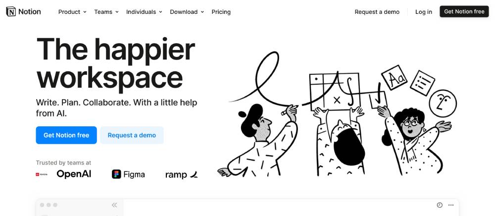
Notion
Notion's landing page breaks convention with its understated design. Their product information structure creates natural visual hierarchy that guides users through features.
The promotional page avoids overwhelming visitors with too many options, instead focusing on core value proposition elements. Their online product display uses subtle animations to demonstrate functionality.
This web sales tool carefully balances whitespace with information density, creating a friction-free customer acquisition path.
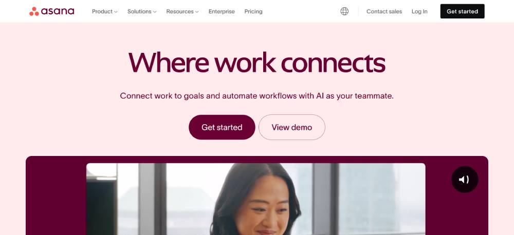
Asana
Asana's landing page illustrates effective A/B testing implementation with clear conversion paths. Their feature showcase uses visual storytelling through carefully selected product imagery.
The online product sheet approach breaks complex workflow tools into digestible benefits. Their direct response page elements create multiple entry points to the sales funnel.
Asana uses Hotjar-informed design choices that optimize the consumer decision page flow, resulting in a highly effective digital storefront experience.
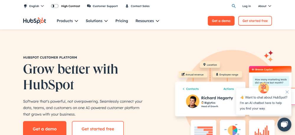
Hubspot
HubSpot's landing page demonstrates strategic conversion optimization through segmented user paths. Their product highlight page approach allows visitors to self-select their journey.
The trust signals include impressive customer testimonials from recognized brands. Their online buying experience feels educational rather than pushy, building confidence through the purchase journey.
This marketing page uses Google Analytics data to continuously refine the customer decision process, making their conversion-focused page particularly effective.
Be Marketing
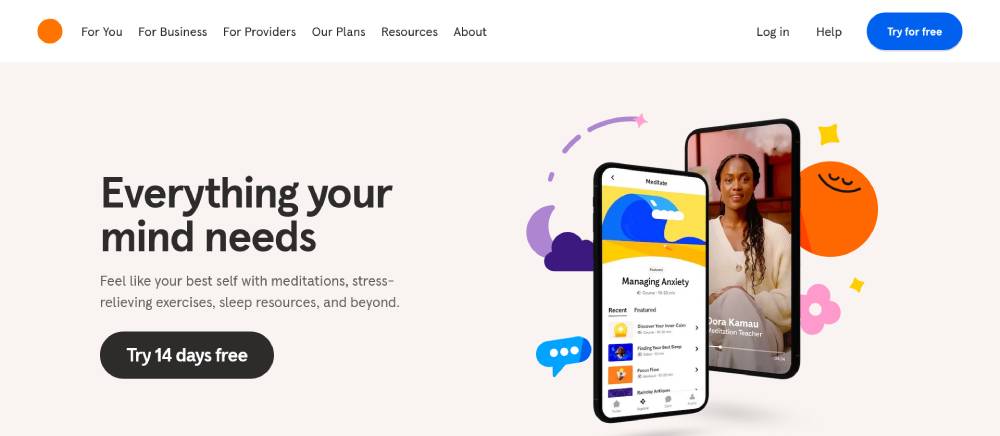
Headspace
Figma's landing page showcases excellent product comparison sections that highlight competitive advantages. Their hero section uses subtle animations to demonstrate core functionality.
The web conversion strategy focuses on free trial signup with minimal friction. Their product features are presented through visual demonstrations rather than lengthy descriptions.
This promotional page implements Ahrefs-backed content strategy throughout, making their online selling platform particularly effective at capturing relevant search traffic.
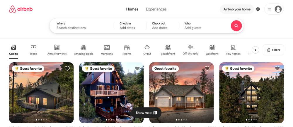
Airbnb
Airbnb's landing page masters conversion through lifestyle-focused product imagery. Their above the fold content immediately communicates value proposition through visual storytelling.
The user experience flows naturally through location-based discovery. Their call-to-action buttons use strategic placement and contrast to improve click-through rates.
This web product catalog implements Drift-style personalization elements, creating a tailored digital storefront for each visitor.
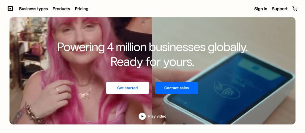
Square
Square's landing page excels at simplifying complex product features through visual demonstration. Their product presentation uses clean modular layouts to avoid overwhelming visitors.
The purchase journey flows logically from problem to solution, with strategically placed trust signals throughout. Their value proposition is immediately clear through concise copywriting.
This online sales tool employs OptinMonster-style lead capture techniques, making their feature showcase particularly effective at conversion optimization.
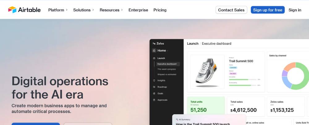
Airtable
Airtable's landing page demonstrates excellent visual hierarchy through color and typography. Their product demonstration uses interactive elements to showcase functionality.
The buyer journey tool guides visitors through complex features with simple use cases. Their social proof includes impressive customer testimonials from diverse industries.
This product highlight page implements Intercom-informed conversation paths, creating multiple entry points to their sales funnel.
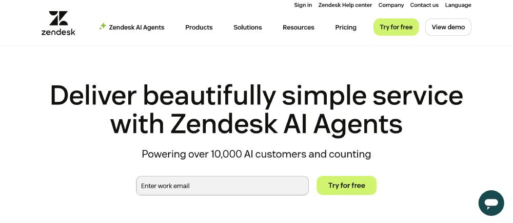
Zendesk
Zendesk's landing page employs clean information architecture to prevent bounce rate issues. Their product information page clearly segments offerings for different user needs.
The trust signals include impressive integration logos and customer success metrics. Their form optimization creates frictionless lead generation while maintaining quality.
This digital product promotion uses Moz-informed keyword strategy throughout its copy, making their online buying experience particularly effective for organic traffic.
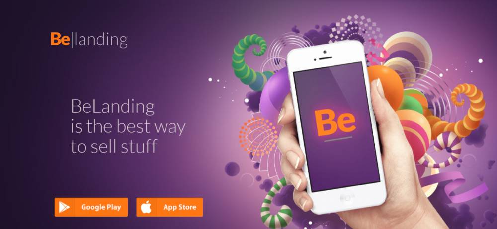
Be Landing
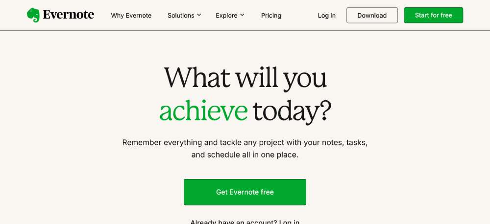
Evernote
Evernote's landing page creates clarity through focused product benefits rather than features. Their conversion rate optimization shows in streamlined sign-up forms.
The user experience guides visitors through key use cases with minimal distractions. Their product demonstration uses real-world examples rather than abstract descriptions.
This marketing page implements Leadpages-style conversion principles, making their customer acquisition pathway particularly effective.
Mint
Mint's landing page showcases effective social proof through security badges and user metrics. Their product description page addresses potential objections directly.
The sales funnel guides visitors logically through benefits to sign-up with minimal friction. Their call-to-action buttons use strategic contrast and placement for improved conversion.
This online product display implements ConversionXL-style optimization techniques, making their web marketing asset particularly effective at driving user registration.
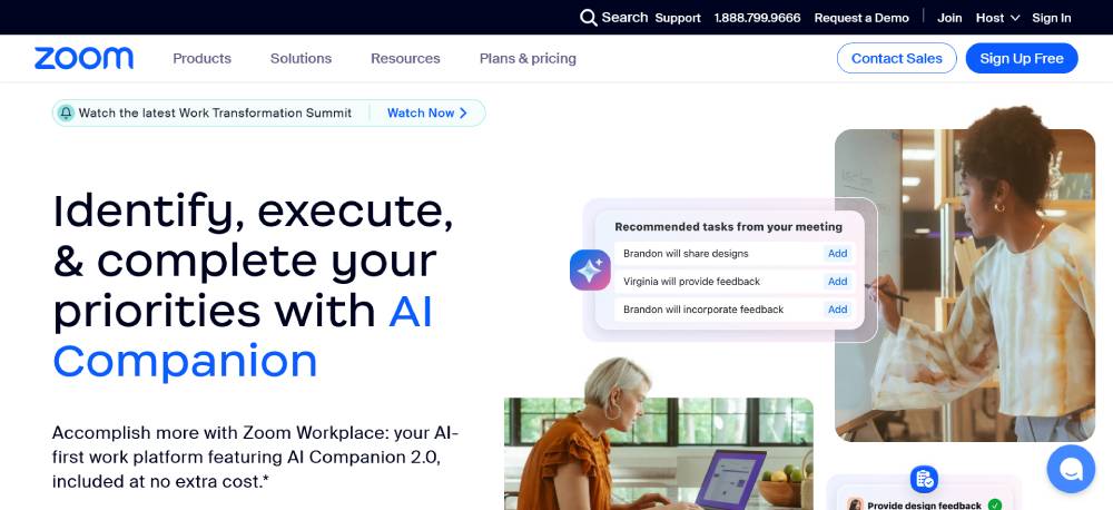
Zoom
Zoom's landing page excels at clear product differentiation through segmented user paths. Their value proposition is immediately clear through concise hero section copy.
The web conversion strategy focuses on free trials with minimal signup friction. Their product showcase uses simple demonstrations rather than complex feature lists.
This digital storefront implements Unbounce-style landing page principles, making their sales pages particularly effective at conversion optimization.
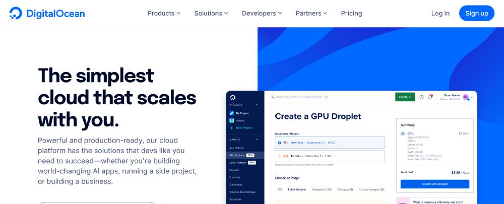
DigitalOcean
DigitalOcean's landing page demonstrates technical expertise while maintaining accessibility. Their product comparison tables provide clear differentiation from competitors.
The user experience guides visitors through complex hosting options with visual simplicity. Their trust signals include impressive performance metrics and security features.
This product information page uses Ahrefs-informed content strategy, making their marketing pages particularly effective for technical audience conversion.
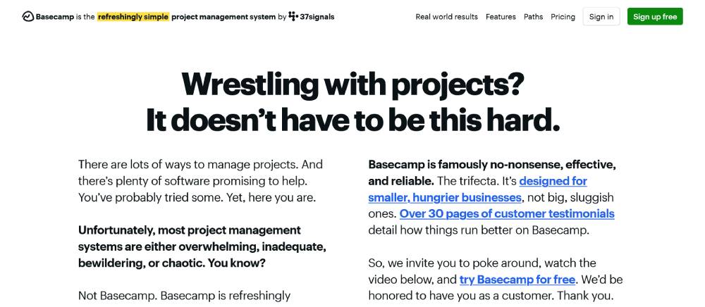
Basecamp
Basecamp's landing page breaks convention with personality-driven copywriting. Their product demonstration uses real screenshots rather than mockups for authenticity.
The conversion-focused page elements create multiple entry points to their signup process. Their value proposition addresses pain points directly through conversational language.
This web sales tool implements Neil Patel-style conversion tactics, making their online selling platform particularly effective at communicating unique benefits.
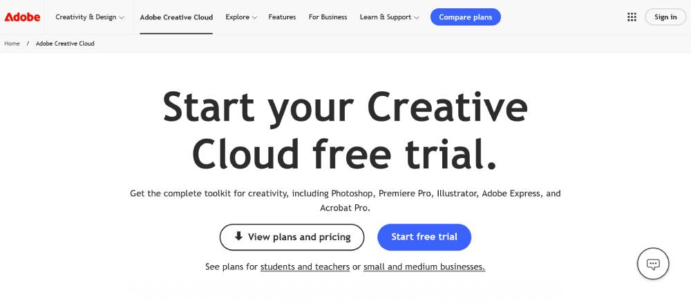
Adobe Creative Cloud
Adobe's landing page showcases premium product imagery that demonstrates software capabilities. Their product spotlight sections highlight key features through visual demonstration.
The purchase journey includes clear pricing tables with various options. Their trust signals leverage Adobe's established brand authority in creative fields.
This online buying experience implements Elementor-style page construction, creating a flexible digital product promotion that adapts to various user interests.
FAQ on Product Landing Pages
What elements should every product landing page include?
Effective pages need call-to-action buttons, compelling hero image placement, clear product benefits sections, and social proof elements. Include trust badges implementation for credibility, concise product specifications, and a mobile-responsive design that works across all devices. Unbounce and Shopify templates often incorporate these essentials automatically.
How do I optimize my landing page for conversions?
Focus on conversion rate optimization through strategic above the fold content and multiple call-to-action buttons. Use A/B testing landing pages to refine your approach. Include customer testimonials and clear value proposition display. Leadpages and ClickFunnels offer tools specifically designed for conversion enhancement. Keep forms simple.
What are examples of effective product landing pages?
Apple product pages demonstrate minimal design with focused messaging. Mailchimp excels at feature comparison section implementation. Stripe showcases excellent product explainer graphics. HubSpot landing pages feature strong headline optimization and sticky navigation. Adobe creates compelling product demo videos that highlight benefits immediately.
How important is page speed for product landing pages?
Critical! Page load speed directly impacts conversions. Studies show visitors abandon pages that take over 3 seconds to load. Use Google Analytics to monitor performance. Optimize images, minimize code, leverage browser caching. Webflow and WordPress with optimization plugins can significantly improve loading times for better user retention.
Should product landing pages be long or short?
It depends on your product complexity. Digital product pages often benefit from long-form sales pages that address all concerns. Simple physical products may use minimal product pages with focused messaging. SaaS product page examples typically include more detailed product explainer pages sections. Test both approaches with your audience.
How do I create an effective mobile landing page?
Prioritize mobile-responsive design with simplified navigation. Use larger buttons for easy tapping. Implement visual hierarchy examples that stack well vertically. Test on multiple devices. Elementor and Divi provide excellent mobile optimization tools. Remember that over 50% of traffic comes from mobile devices today.
What role do visuals play on product landing pages?
Visuals are crucial. Quality product photography, product demo videos, and product explainer graphics communicate value faster than text. Canva and Figma can help create compelling visuals. Dribbble and Behance showcase excellent landing page inspiration gallery examples with strong visual elements that drive conversions.
How do I add social proof to my landing page?
Incorporate customer testimonials, trust badges implementation, and review counters. Display logos of notable clients. Feature case studies showing real results. GetResponse and ConvertKit templates often include designated spaces for social proof. This builds credibility and addresses buyer hesitation through authentic social proof elements.
What's the ideal number of CTAs on a product landing page?
Include 2-3 strategically placed call-to-action buttons. Position your primary CTA "above the fold" and repeat it after presenting benefits. Thrive Themes and OptimizePress offer excellent CTA design options. Avoid multiple competing actions. Each CTA should direct toward the same conversion goal with clear conversion funnel elements.
How do I test my product landing page effectiveness?
Implement A/B testing landing pages comparing different headlines, CTAs, and layouts. Track metrics using Google Analytics or dedicated tools like Instapage. Monitor conversion rate optimization metrics including bounce rate, time on page, and conversion percentage. Make data-driven adjustments based on real user behavior patterns.
Conclusion
Studying examples of product landing pages reveals that success isn't accidental—it's designed. The best high-converting product pages combine strategic elements that guide visitors toward action.
Free trial landing pages from companies like Kartra and Convertri demonstrate how product trial offers can reduce purchase hesitation. Meanwhile, Bootstrap templates show how visual hierarchy examples create natural pathways to conversion.
When building your next page, remember:
- Landing page copywriting should focus on benefits, not features
- Product comparison pages convert better with clear differentiation
- Limited-time offers create urgency that drives action
- Product preview pages with strong page load speed retain visitors longer
Whether you use GoDaddy, Squarespace, or Wix for your platform, success comes from understanding your audience and implementing the right mix of landing page analytics and user experience optimization techniques.
If you enjoyed reading this article on the product landing pages, you should check out this one about best startup websites.
We also wrote about a few related subjects like best restaurant websites, best agency websites, the coolest black websites, the best relaxing websites, the best weird websites, time wasting websites to avoid burnout, best interactive websites, an awesome list of trippy websites and coffee websites.


