


The Best Examples of SaaS Landing Pages for Inspiration
March 15, 2025
Political Campaign Website Design Examples
March 16, 2025The right real estate landing page can turn casual browsers into serious buyers within seconds.
Your online presence often makes first contact with potential clients long before you do. Real estate landing pages serve as focused conversion tools designed specifically to transform website visitors into qualified leads.
Unlike general websites that provide broad information, these targeted pages cut through the noise with a single clear purpose: capturing contact details from interested property hunters.
This guide breaks down:
- What makes real estate landing pages different from standard web pages
- Key elements that drive higher conversion rates
- Templates and examples that actually work in today's market
- Simple setup steps for agents with minimal tech skills
Whether you're an independent agent or managing a brokerage team, mastering the art of high-converting real estate landing pages isn't just nice to have—it's essential for staying competitive when 97% of home buyers start their search online.
Let's build pages that turn clicks into clients.
Examples of Real Estate Landing Pages
Zillow

Zillow's landing page employs a clean, grid-based layout with prominent search functionality centered at the top. The minimalist color scheme—primarily white with blue accents—creates visual hierarchy. Their property cards use consistent spacing with hover effects revealing additional information. Mobile responsiveness is impressive, with elements that reflow naturally across breakpoints. The map integration uses smart clustering for marker density management.
Realtor.com

Realtor.com features a hero section with full-width imagery and search overlay. Typography choices include sans-serif headers with carefully considered line height and letter spacing. The site leverages lazy loading for gallery images, improving initial load performance. Navigation utilizes a sticky header that condenses on scroll. Filter UI components include custom checkboxes and range sliders with interactive feedback.
Redfin
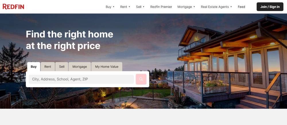
Redfin implements card-based content blocks with subtle drop shadows and rounded corners. Their interface uses consistent padding ratios based on an 8px grid system. Color contrast meets WCAG AA standards throughout. The search experience features typeahead suggestions with geo-matching. Map visualization includes custom-styled pins and heat maps showing price distributions.
Be Estate 4
Trulia
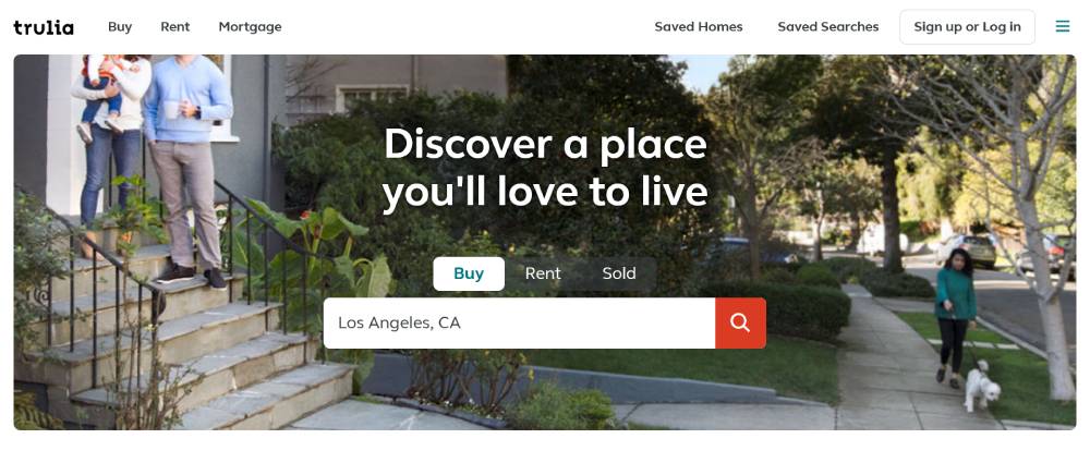
Trulia's design incorporates neighborhood photography with text overlays using semi-transparent gradient backgrounds. The navigation structure uses a tabbed interface with underline indicators. Property listings feature aspect-ratio-preserved images with lazy loading. Their filter system uses chip-style toggles that maintain state across page views. Location-based content uses geolocation API with fallback options.
Homes.com

Homes.com utilizes a modular component library with consistent styling across listing cards. The color palette centers on warm neutrals with strategic accent colors. Form elements feature floating labels that animate on focus. The homepage implements horizontal scrolling carousels with touch-friendly grab indicators. Their property detail pages use sticky sidebars that maintain visibility during content scrolling.
LoopNet
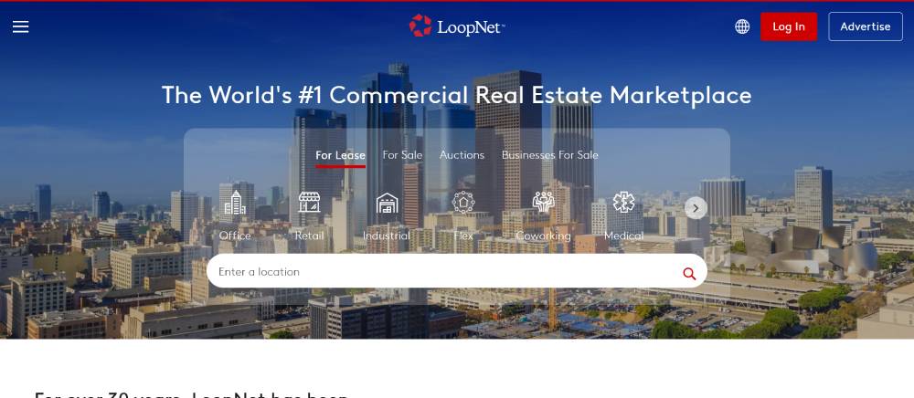
LoopNet's commercial focus is reflected in its data-dense UI with tabular layouts. Typography is pragmatic with clear hierarchies between property details. The filtering system features collapsible accordions to manage vertical space. Their property images implement progressive loading with low-resolution placeholders. Maps feature custom overlays showing zoning information and nearby amenities.
Apartments.com
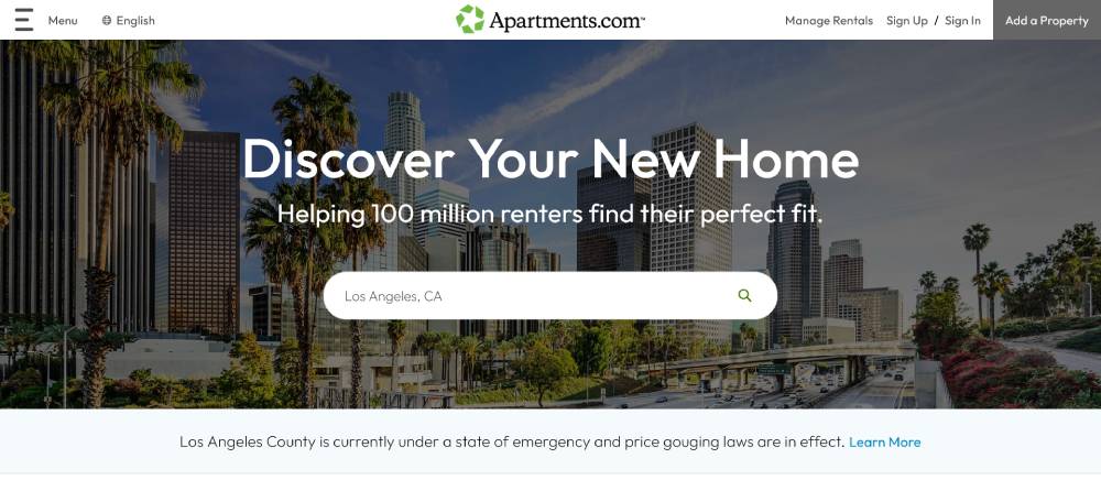
Apartments.com uses lifestyle imagery with high-quality photography showcasing interior spaces. The search interface features prominent CTAs with high-contrast colors. Navigation includes a mega-menu with categorized content. Listing cards implement uniform height with truncated text and expansion options. Their floor plan visualizations use SVG with interactive elements highlighting available units.
Movoto

Movoto employs a clean interface with whitespace used strategically to separate content sections. The design uses subtle background patterns in header areas. Their property galleries feature a filmstrip navigation pattern below main images. Search filters use toggle switches with clear visual feedback states. Property comparison tools use side-by-side layouts with synchronized scrolling.
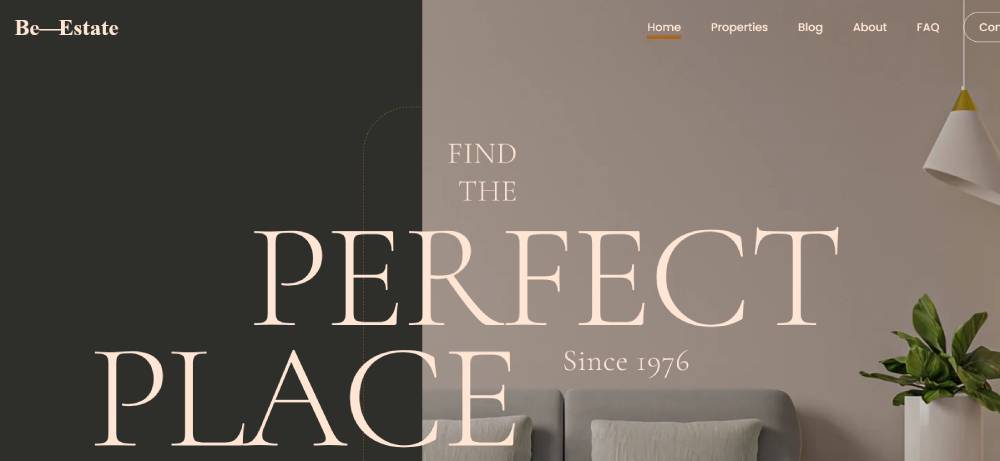
Be Estate

ForSaleByOwner
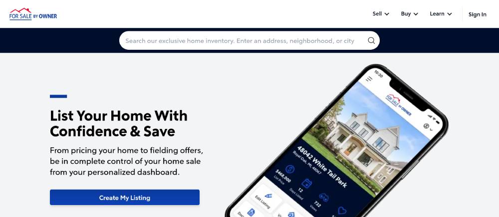
ForSaleByOwner implements a straightforward layout focusing on direct user actions. Typography is highly legible with adequate contrast against varied backgrounds. The site uses breadcrumb navigation for clear user pathways. Form elements feature inline validation with helpful error messaging. Their pricing calculator uses stepped inputs with visual progress indicators.
Compass
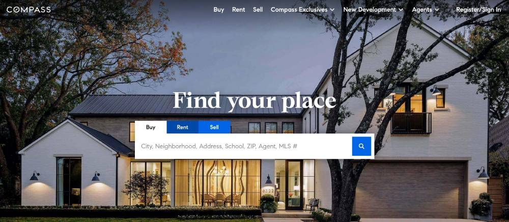
Compass features a premium aesthetic with generous whitespace and high-resolution photography. The grid system adapts fluidly between breakpoints without content jumps. Typography pairs serif headlines with sans-serif body text. Their property listings use masonry layouts accommodating varied image ratios. Agent profiles feature card components with subtle hover states revealing contact options.
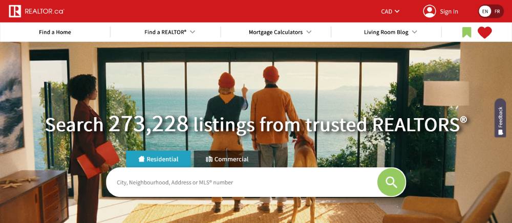
Realtor.ca
Realtor.ca utilizes a responsive grid system with flexible content blocks that adapt to various screen sizes. The interface features a muted color palette with strategic red accents for call-to-action elements. Their property cards implement consistent aspect ratios with overflow protection for varied listing photos. The search functionality includes typeahead predictions with geolocation suggestions. Navigation employs a hamburger menu on mobile that transforms to horizontal tabs on larger screens.
Royal LePage
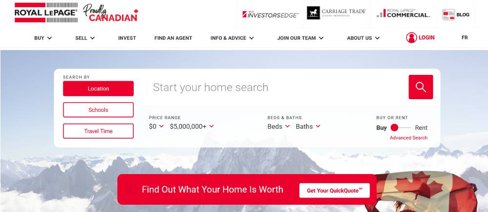
Royal LePage employs a clean layout with hierarchical information architecture. The design uses whitespace effectively to separate content sections. Interactive elements feature subtle hover states with smooth transitions. Their image galleries implement lightbox functionality with keyboard navigation options. The site uses a design system with consistent button styling and form elements across different page templates.
Zolo
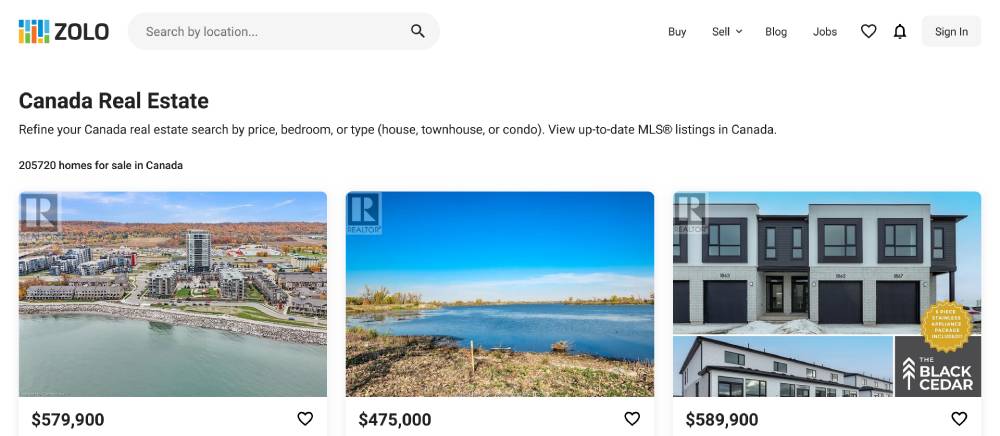
Zolo features a data-focused interface with prominent statistics and market trends. Typography includes clear hierarchies with distinct sizing between headings and body text. Their property listings use uniform card heights with text truncation at consistent character counts. The filtering system employs collapsible panels to manage vertical space. Map integration includes custom neighborhood boundary overlays with interactive hover states.
Be Estate 3
Point2Homes

Point2Homes implements a content-rich layout with clearly defined sections. The navigation structure uses dropdown menus with grouped categories. Property images feature carousel functionality with progress indicators. Their forms employ inline validation with real-time feedback. The site uses skeleton loading states to improve perceived performance during data fetching operations.
Condos.ca
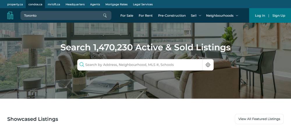
Condos.ca employs a specialized interface focused on vertical living spaces. The design features large imagery showcasing building exteriors and amenities. Typography pairs sans-serif fonts with adequate line height for readability. Their building profiles use tabbed interfaces to organize dense information. The site implements sticky navigation that maintains context during page scrolling.
Rightmove
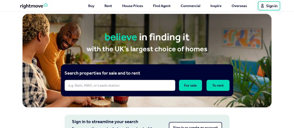
Rightmove uses a structured layout with clearly defined content areas. The color scheme employs purple brand accents against neutral backgrounds. Navigation includes breadcrumbs for clear user pathing. Their property listings feature uniform image containers with consistent aspect ratios. The search interface includes typeahead functionality with recent search history integration.
Zoopla
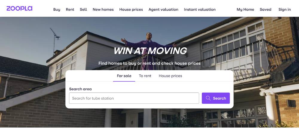
Zoopla implements a modern interface with card-based content blocks throughout. The design uses a consistent 8-point grid system for spacing. Interactive elements feature clear hover and active states. Their property galleries implement swipe gestures on touch devices. The site uses skeleton loading placeholders during content fetching to maintain layout stability.
OnTheMarket

OnTheMarket features a straightforward design with emphasis on property imagery. The layout uses a combination of list and grid views with toggle options. Typography employs adequate contrast ratios meeting accessibility standards. Their filtering system uses accordion panels to manage complex search parameters. The site implements smooth scrolling behavior for an improved user experience.
Be Estate 2
PrimeLocation
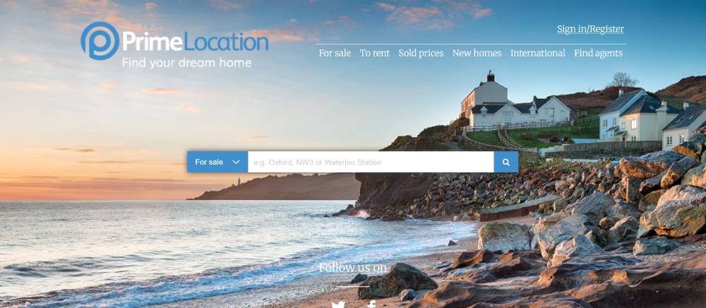
PrimeLocation employs a premium aesthetic with generous whitespace and high-quality photography. The interface uses subtle animations for state changes and transitions. Navigation includes a persistent search bar with quick filters. Their property listings use consistent padding and margin values based on a defined scale. The site implements lazy loading for images to improve initial page load performance.
Nested

Nested features a minimalist design approach with focused user pathways. The color palette uses limited accent colors to highlight primary actions. Typography employs careful hierarchy with distinct size differentials between headings. Their interface components include custom form elements with clear validation states. The site uses progressive disclosure to manage complex information presentation.
Realestate.com.au
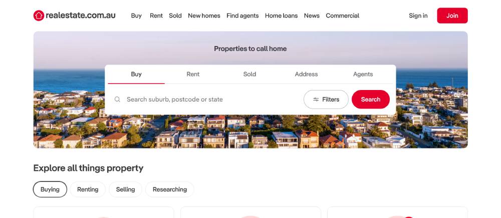
Realestate.com.au features a modular layout with clear section dividers. The site uses a bright color scheme with strategic red accents. Property listings include uniform image containers with hover overlays showing key details. The search interface combines dropdown selectors with typeahead functionality. Their mobile experience includes swipe gestures for gallery navigation with smooth transitions between images.
Domain
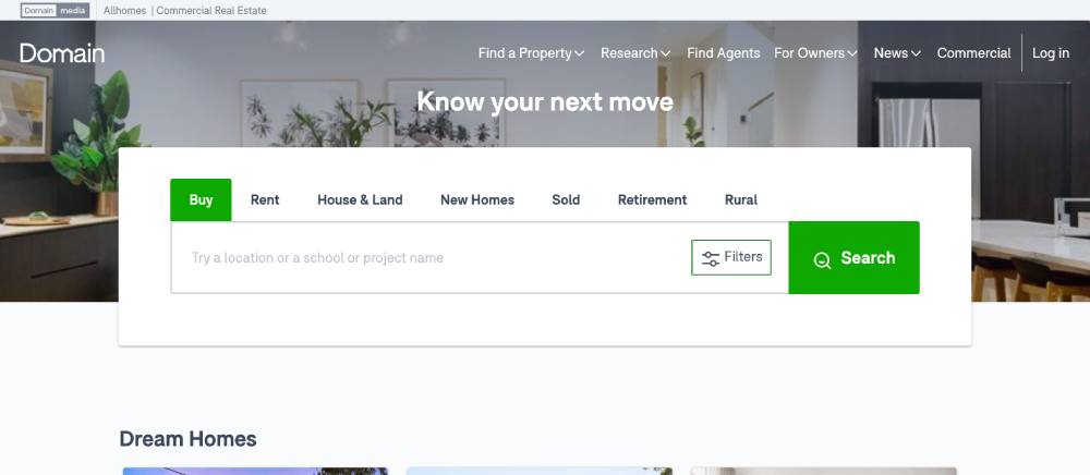
Domain employs a clean interface with ample whitespace between content blocks. Typography pairs sans-serif fonts at varying weights for information hierarchy. Their property cards use consistent height constraints with text truncation. The filtering system includes toggle switches with clear active states. Map integration features custom-styled pins with clustering for dense areas.
Homely
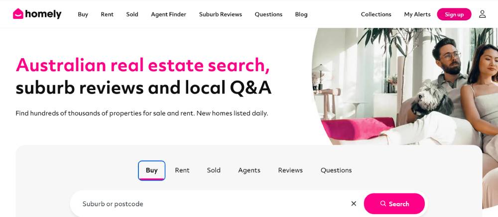
Homely implements a community-focused design with social elements integrated throughout. The layout combines grid and list views with toggle options. Their neighborhood profiles feature tabbed navigation for different content categories. Image galleries use progressive loading techniques. The interface includes custom star ratings with fractional values displayed through CSS.
REA Group

REA Group features a corporate design with structured content blocks. The layout uses a responsive grid system that adapts to various viewports. Typography employs careful line height and letter spacing for optimal readability. Navigation includes a sticky header that transforms on scroll. The site implements subtle parallax effects on hero sections for visual interest.
FAQ on Real Estate Landing Pages
What exactly is a real estate landing page?
A real estate landing page is a standalone web page designed with a single focus: to convert visitors into leads. Unlike your main website with multiple navigation options, landing pages limit distractions and guide users toward one specific action—typically completing a lead generation form. They're purpose-built for marketing campaigns, featuring property listings, virtual tours, or home valuation tools that capture prospect information.
How do real estate landing pages differ from regular website pages?
Landing pages differ fundamentally in their purpose and design. Your main real estate website provides comprehensive information about your services, team, and properties, allowing visitors to navigate freely between sections. A landing page strips away navigation menus, sidebars, and other distractions to focus entirely on conversion. It features a single call-to-action button, targeted messaging for specific buyer personas, and minimal exit points—all optimized for lead capture rather than general browsing.
What elements must a high-converting real estate landing page include?
The most effective real estate landing pages include these critical components:
- A compelling headline addressing a specific pain point or desire
- Professional property photography or virtual tours
- Short, benefit-focused copy highlighting neighborhood information
- A prominent lead generation form (kept intentionally brief)
- Trust signals like testimonials, agent profiles, and social proof
- Mobile responsiveness for on-the-go home searchers
- Clear call-to-action buttons with urgency triggers
- IDX solution integration for real-time MLS listings
- Limited navigation options to prevent distraction
- Contact information and NAP (Name, Address, Phone) details
The strategic combination of these elements creates a conversion-focused experience that transforms visitors into qualified leads.
How many fields should my real estate lead capture form include?
Keep your form fields minimal—3 to 5 fields maximum. While it's tempting to gather extensive information, each additional field reduces conversion rates by approximately 4%. For most real estate landing pages, name, email, and phone number are sufficient for initial contact. If you're offering specialized content like market reports or first-time homebuyer guides, you might add one qualifying question (like "When are you looking to move?") to help with lead scoring. Remember that you can always gather more details during follow-up conversations or through your CRM integration and drip campaigns.
What types of real estate landing pages perform best?
Performance varies by market and audience, but these landing page types consistently deliver results:
- Home valuation tools ("What's My Home Worth?")
- Property search pages with MLS integration
- Neighborhood guides with school district information
- First-time homebuyer resources
- Investment property calculators
- New construction updates
- Recently sold homes in specific areas
- Virtual open house registrations
- Free home selling guides
- Mortgage calculator tools with down payment options
The key isn't just choosing a type—it's matching the landing page to your ideal client's current needs in the buyer's journey.
Should I build different landing pages for buyers and sellers?
Absolutely. Buyers and sellers have distinctly different motivations, questions, and needs. Buyer-focused landing pages might feature property filters, mortgage calculators, and neighborhood information. Seller-focused pages typically highlight comparative market analysis tools, home valuation services, and seller's agent credentials. Each audience responds to different triggers, benefits, and calls to action. Creating separate landing pages allows you to craft messaging that speaks directly to each audience's specific concerns and desires, significantly improving conversion rates.
How do I drive traffic to my real estate landing pages?
Implement a multi-channel approach:
- Run targeted Facebook and Instagram ads to local demographics
- Use Google Ads with location targeting and property-focused keywords
- Share your landing pages in relevant local community groups
- Incorporate them into your email marketing and drip campaigns
- Add QR codes on business cards, print materials, and yard signs
- Optimize for local SEO with structured data and schema markup
- Partner with moving services and other relevant businesses for referral traffic
- Feature links in your Google My Business profile
- Promote through video content on YouTube showcasing properties
Track performance with analytics tools to identify which channels deliver the best ROI and highest-quality leads.
How important is mobile optimization for real estate landing pages?
It's absolutely critical. Over 76% of home buyers search for properties on mobile devices. If your landing page isn't optimized for smartphones and tablets, you're potentially losing three-quarters of your prospects. Mobile optimization isn't just about responsive design—it includes fast page load speed, easily tappable buttons, simplified forms, compressed images, and text that's readable without zooming. A/B testing specifically for mobile users can reveal significant opportunities for improvement in your conversion rate.
How do I measure if my real estate landing page is successful?
Focus on these key metrics:
- Conversion rate (typically 2.5-5% is considered good in real estate)
- Cost per lead acquisition
- Lead quality (tracked through your CRM)
- Time on page
- Bounce rate
- Form abandonment rate
- Return on ad spend for traffic campaigns
Use heatmaps and user behavior tracking to see exactly how visitors interact with your page. Don't just count leads—track them through your sales funnel to determine which landing pages generate actual clients and closings.
How often should I update my real estate landing pages?
Update your landing pages quarterly at minimum, with a complete review of performance data and A/B testing results. However, certain elements require more frequent attention: property listings should reflect current inventory, market reports should contain the latest housing market trends, and seasonal messaging should adapt throughout the year. Additionally, immediately update any changes to your contact information, team structure, or privacy policy. The most successful real estate professionals treat their landing pages as living documents that evolve with market conditions, testing results, and changing buyer behaviors.
Conclusion
Real estate landing pages represent a critical investment for any property professional serious about digital lead generation. They bridge the gap between casual browsers and committed clients through strategic design and focused messaging. Gone are the days when a basic website alone could capture the modern property hunter's attention.
Your success hinges on continuous refinement. Test different CTAs. Monitor conversion rates. Adjust form fields based on completion data. Investment properties might need different landing page templates than first-time homebuyer resources. Most importantly, ensure your pages load quickly on all devices.
Remember that effective real estate landing pages aren't just about technology—they're about psychology. Showcase school district information for family buyers. Highlight comparative market analysis tools for sellers. Integrate mortgage calculators with down payment options for financial planners. Add testimonials as social proof. This personalized approach, combined with proper analytics tracking and SEO optimization, transforms your digital doorways into your brokerage's most valuable lead generation assets.
If you enjoyed reading this article on real estate landing pages, you should check out this one about accessible websites examples.
We also wrote about a few related subjects like the best looking tourism websites, hotel website design, product landing page, great looking spa websites, cool looking personal trainer websites, top notch musician websites, the most impressive luxury websites and impressive animated websites.


