


The Best Medical Website Templates for Modern Clinics
May 18, 2026
Top-Notch Education WordPress Themes for You
May 20, 2026Your label's website is the first thing an A&R contact, a journalist, or a new fan sees before they hear a single track.
These record label website design examples prove that the best label sites do more than look good. They balance artist roster pages, music catalog layouts, embedded streaming players, and press kit access, all without losing the label's visual identity.
Whether you run an indie label or manage a growing roster, this guide covers:
- What separates effective label sites from generic music websites
- Real examples from independent and major labels
- Typography, color systems, navigation, and CMS platform choices
- A step-by-step process for building a label site from scratch
What Is Record Label Website Design?
Record label website design is the practice of building sites that serve 3 distinct audiences simultaneously: artists on the roster, industry contacts (A&R managers, licensing reps, press), and fans. Each audience expects different information, in a different order, delivered through a different entry point.
That three-way split is what separates label site design from a standard business website or a personal artist website template. A label isn't promoting one person. It's managing a brand identity above multiple artists while still giving each artist their own space.
The core functional requirements are consistent across label sizes:
- Artist roster pages with individual profiles
- Release catalog with streaming integration
- Press/EPK section with downloadable assets
- Contact and A&R submission flow
- News or blog page for announcements
Visual identity requirements also differ from standard business sites. Label branding pulls from genre aesthetics, music culture visual language, and the collective personality of the roster rather than from general corporate design trends.
Key distinction: A label site isn't an artist site with more pages, and it isn't a music distributor platform. It sits between those two things, closer to a creative agency site in structure but closer to a music service in content.
| Site Type | Primary Audience | Core Purpose |
|---|---|---|
| Artist personal site | Fans | Promote one artist's work |
| Record label site | Fans, industry, artists | Manage label brand + roster |
| Distributor platform | Artists, rights holders | Distribute and monetize music |
Record Label Website Design Examples
LIGHT MY FIRE RECORDS

Chivi Chivi
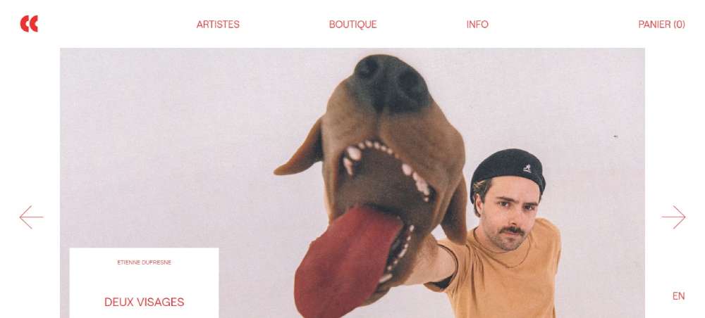
RCA RECORDS

BeParty5

Warner Music Norway

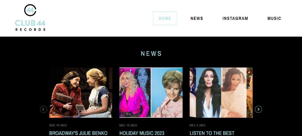
Club 44 Records
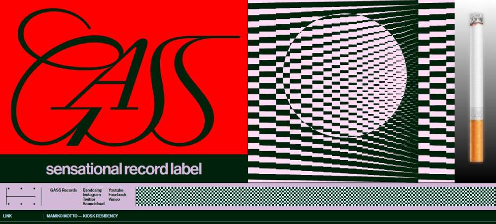
GASS RECORDS
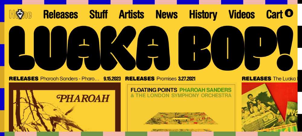
Luaka Bop
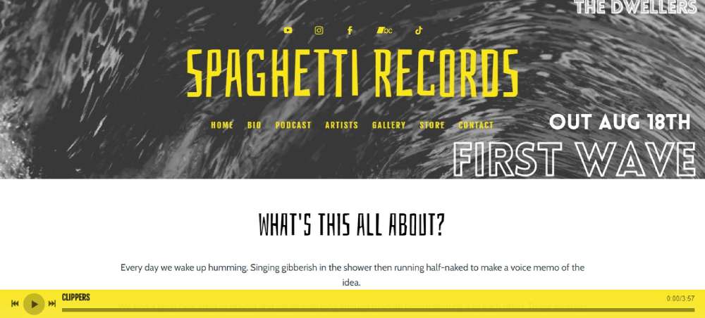
Spaghetti Records
BeParty4

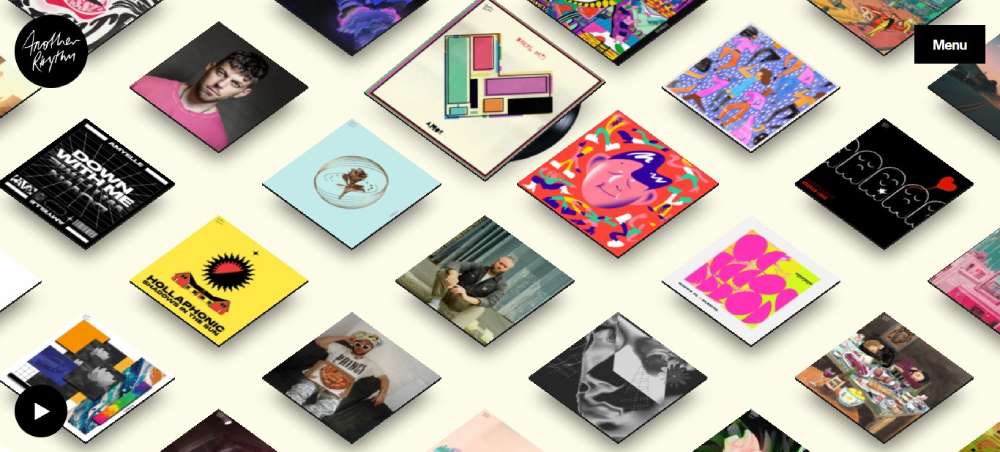
Another Rhythm
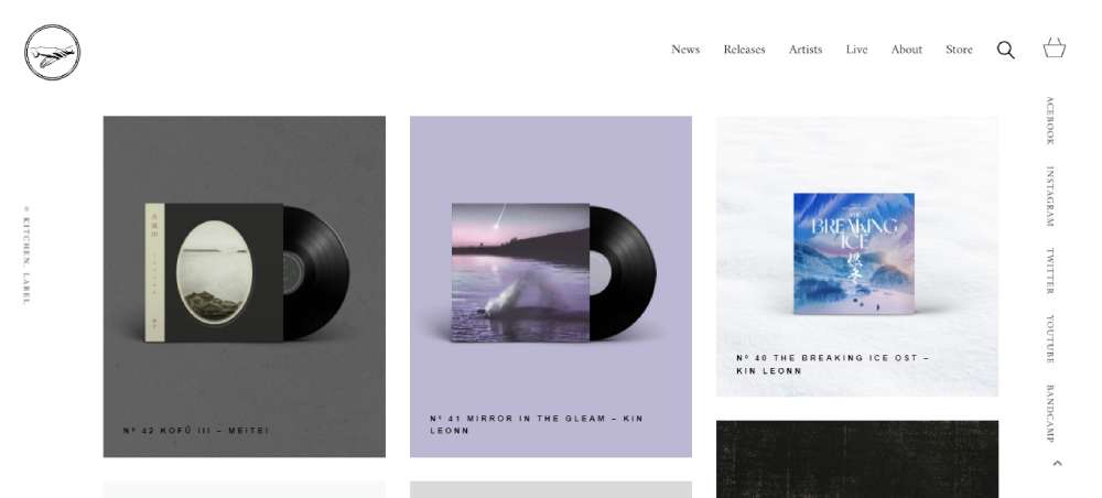
Kitchen Label
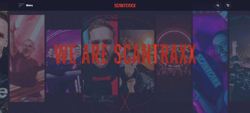
SCANTRAXX RECORDS
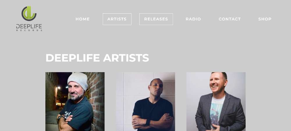
Deep Life Records
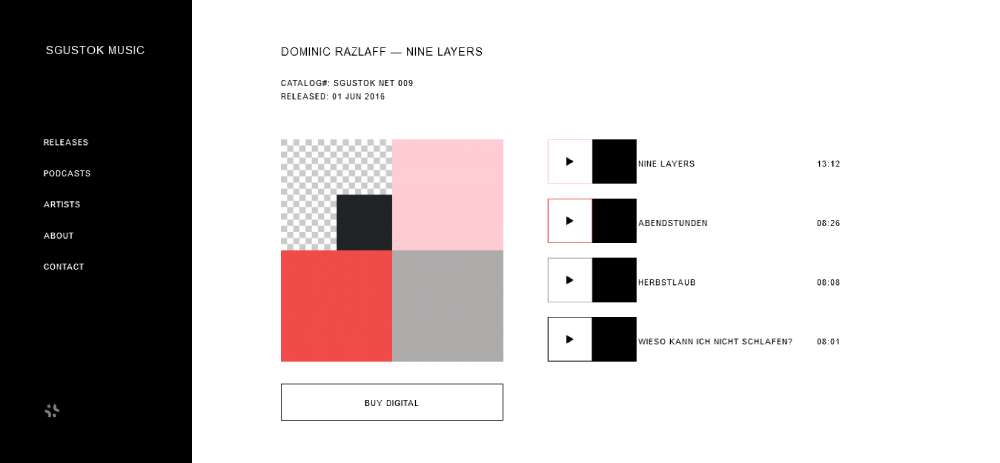
Sgustok Music
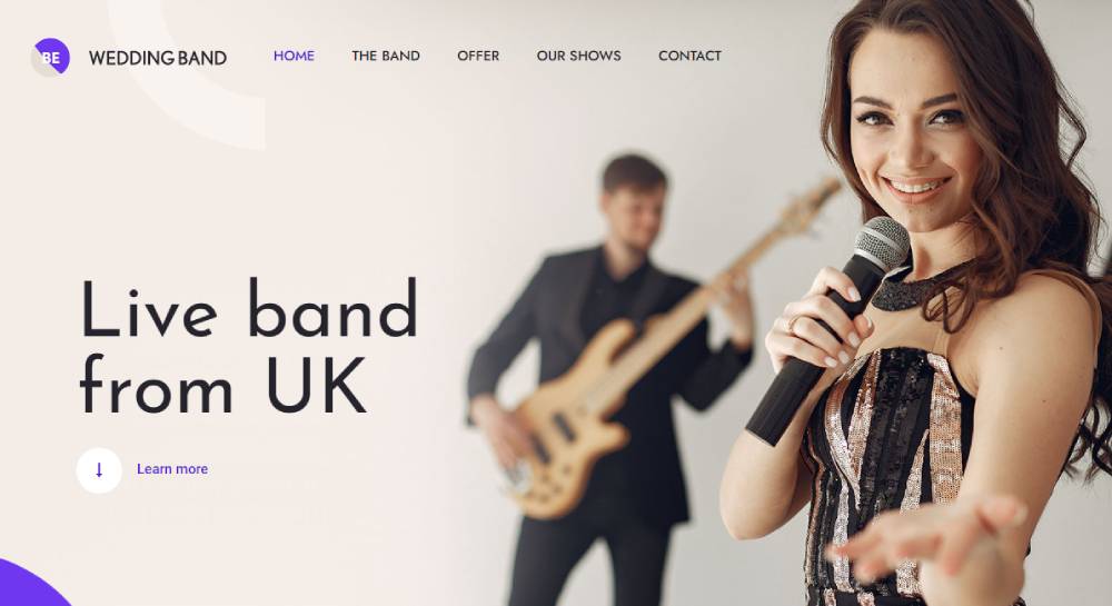
BeWeddingband
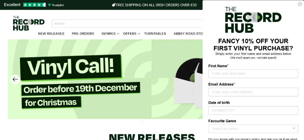
THE RECORD HUB
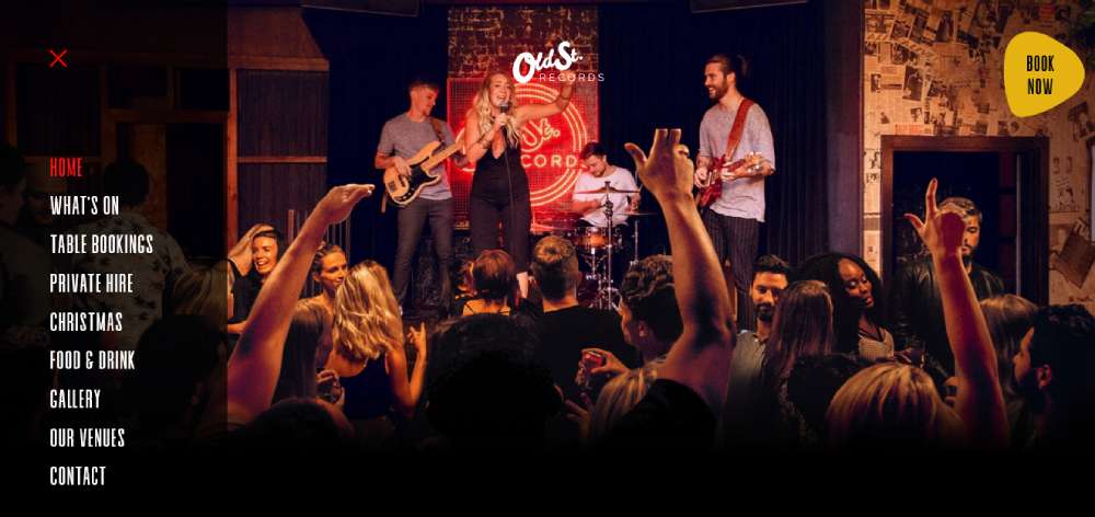
OLD STREET RECORDS BAR
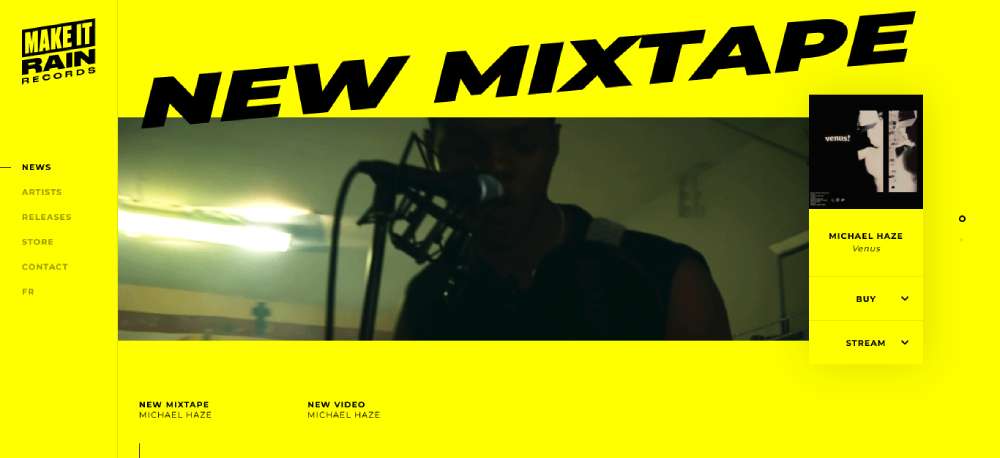
Make it Rain Records
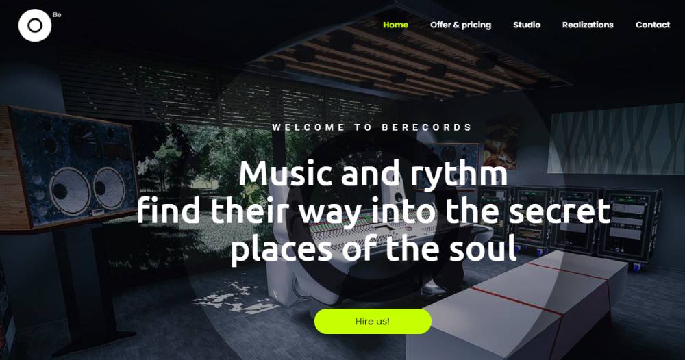
BeRecords2
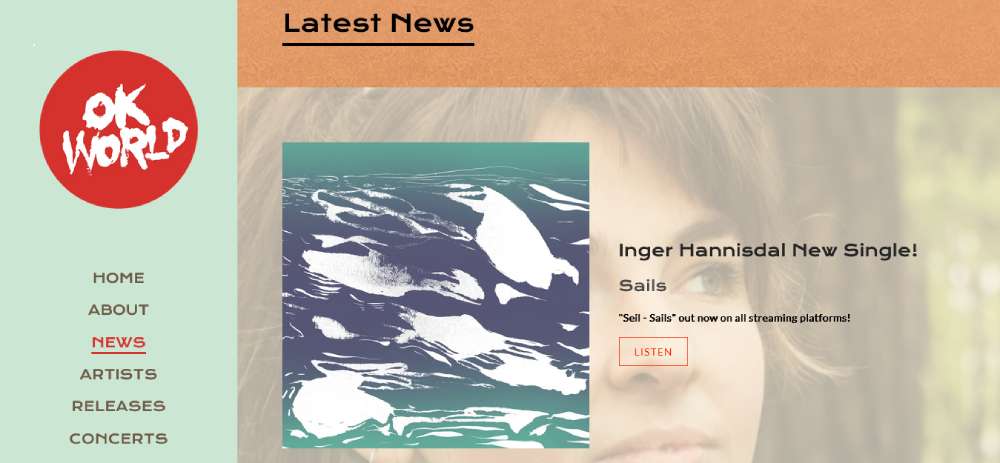
OKWorld
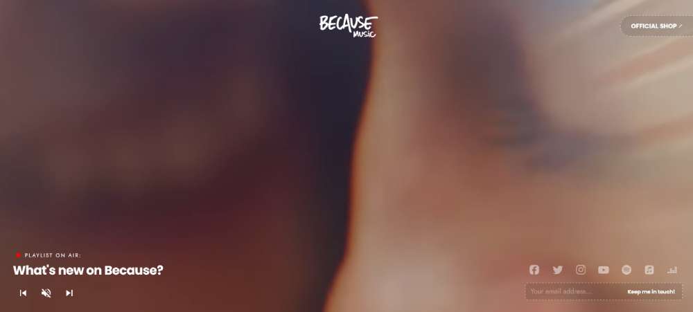
Because Music
Motown Records

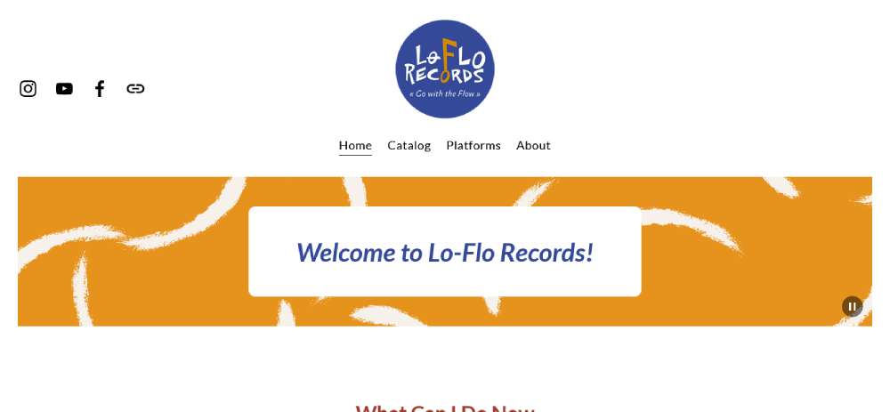
Lo-Flo Records
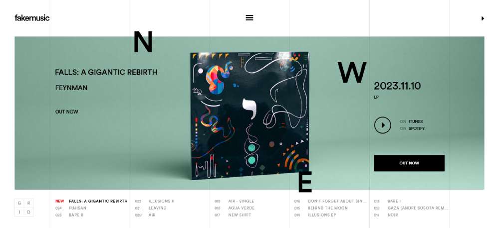
Fake Music
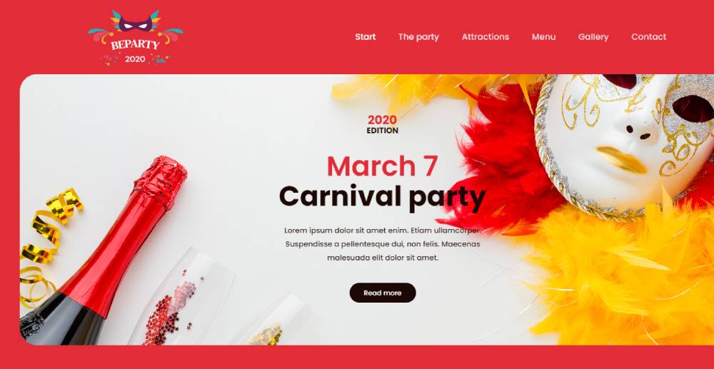
BeParty3
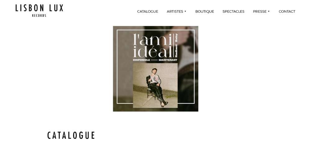
Lisbon Lux
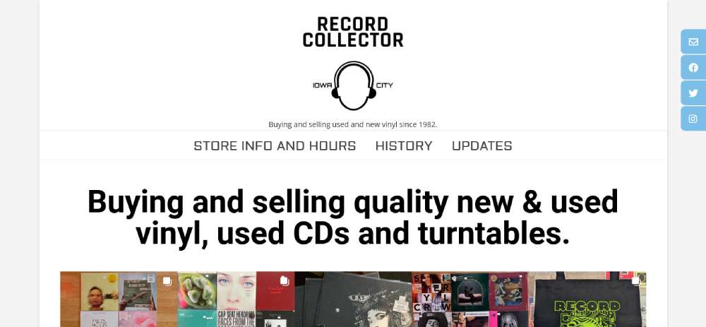
RECORD COLLECTOR
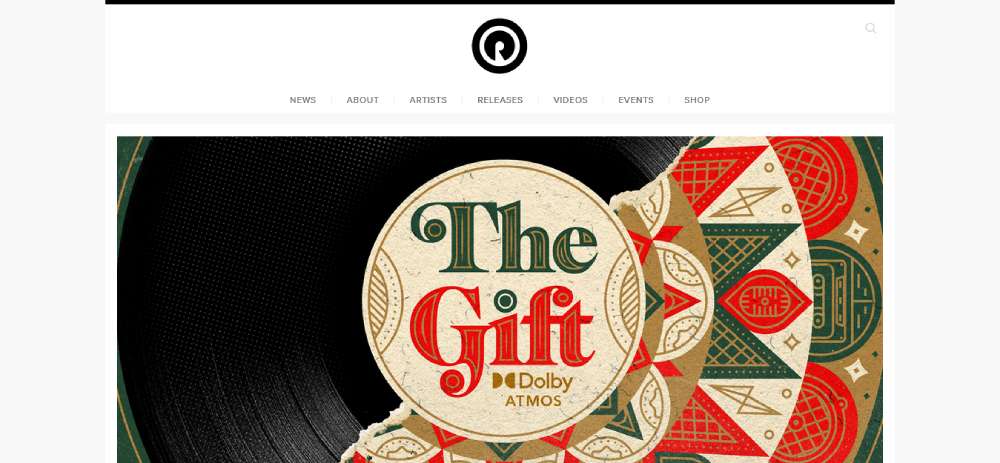
Reach Records
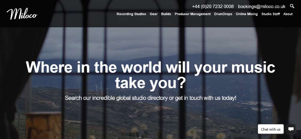
MILOCO RECORDING STUDIOS
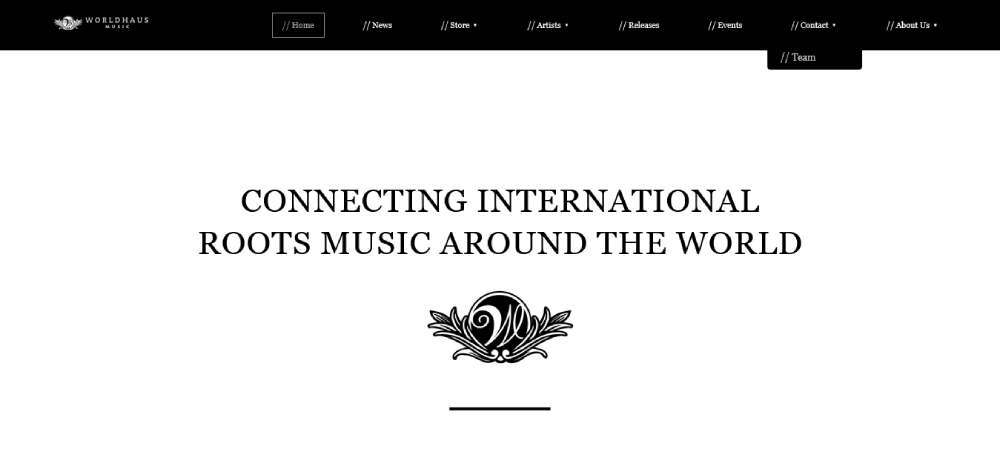
Worldhaus Music
Monday Records
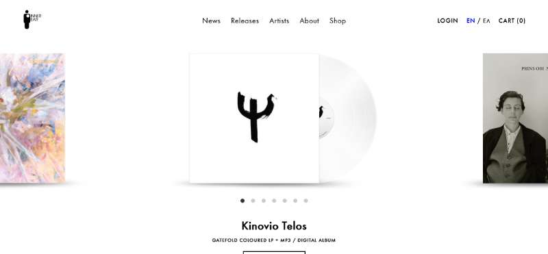
Inner Ear Records
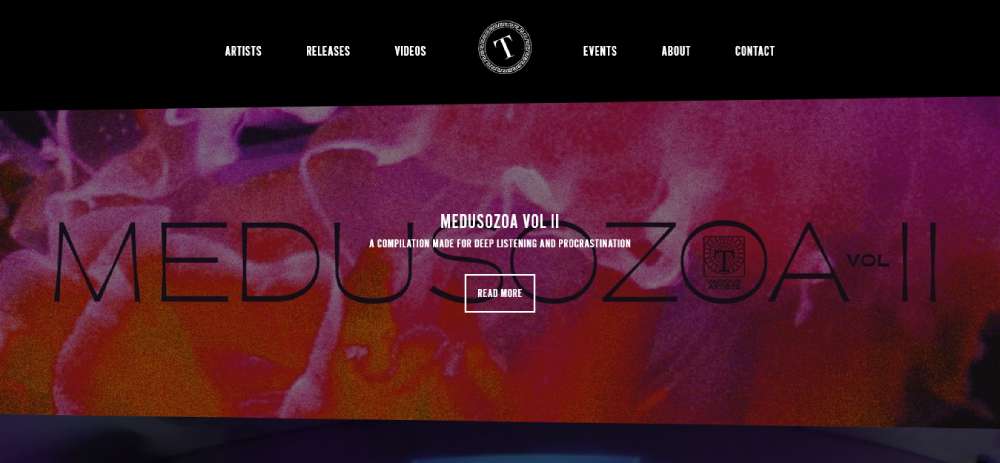
Tartelet Records
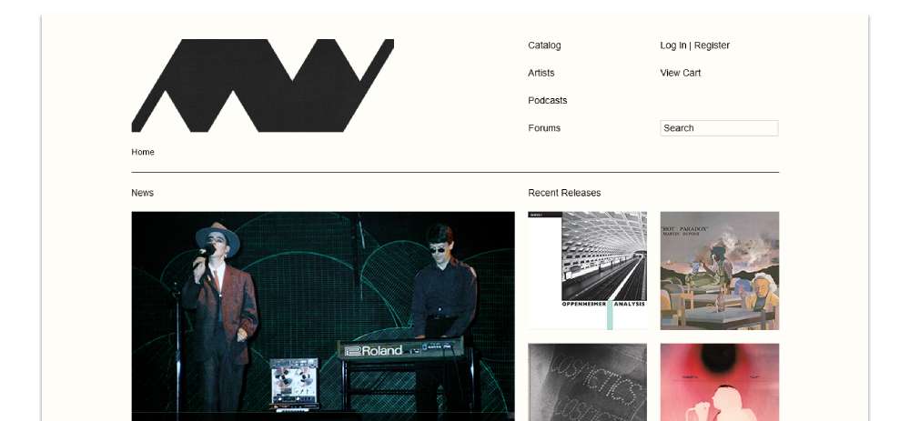
MINIMAL WAVE RECORDS
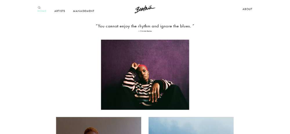
Beatnik
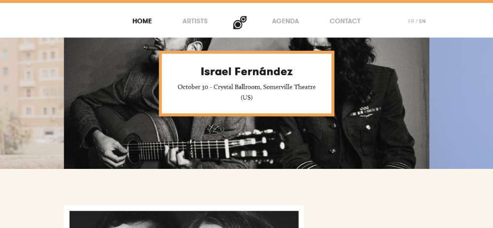
Cinq7

Viavox Production
What Makes a Record Label Website Effective?
An effective label site balances 3 functional pillars: roster discoverability, inline music playback, and clear industry contact access. A site that does 2 of those well but fails the third loses a meaningful segment of its audience.
Streaming accounts for over 80% of total music industry revenues (IFPI, 2024). That means anyone visiting a label site is used to instant, frictionless music access. If they have to leave your site to hear a track, most of them won't come back.
Performance and Speed Expectations
68.2% of website visits now come from mobile devices (Tooltester, 2024). Media-heavy label sites with embedded players, video headers, and large album artwork are particularly vulnerable to mobile performance drops.
Only \\39% of websites pass all three Core Web Vitals on mobile\\ (CrUX data, 2026). For label sites loading multiple player embeds and hi-res cover art, that number is likely lower.
- Lazy load all artwork below the fold
- Replace video backgrounds with static images on mobile
- Use WebP format for all release cover art
Navigation Priorities by Audience
Fan-first navigation and industry-first navigation look completely different. Most label sites try to serve both without separating them, which results in cluttered menus and confused visitors.
Fan navigation: Artists, Music, News, Tour Dates
Industry navigation: Press, Licensing, A&R Submissions, About
The cleanest approach is a primary nav for fans with a secondary footer or utility nav for industry contacts. Sub Pop Records does this consistently, with their press and licensing links sitting in the footer while artist and release content dominates the header.
Music Playback Integration
The embedded player decision shapes the entire layout. A sticky persistent player bar at the bottom of the page (like Bandcamp uses) requires a different structure than inline per-release players. Pick one approach before designing anything else.
Spotify iframes, SoundCloud widgets, and Bandcamp players all behave differently on mobile. Test all three on iOS Safari and Chrome Android before committing. The touch targets for embedded players need to hit at least 44x44px per Apple HIG guidelines, and most default Spotify embeds fall short of that on small screens.
Key Design Pages Every Record Label Website Needs
Five page types appear on every high-performing label site, regardless of size or genre. Getting these right is more important than anything else on the site.
Artist Roster Page Design
The roster page is the structural heart of the label site. Bandzoogle's research on label site behavior shows visitors who reach an artist page from the roster are more likely to follow through to streaming platforms than visitors who arrive via direct artist search.
Card grid vs. list view: Card grids work up to about 30 artists. Past that, list view with filtering becomes necessary. Deep Life Records uses a two-tier approach: a main roster page leads to individual artist pages, each with a bio, social links, and a label-specific mix preview.
- Hover states showing artist name + genre tag
- Filter by genre, roster status (active/alumni), or region
- Artist card links to dedicated profile page, not external streaming
Music Catalog Page Design
The catalog page needs to work for 2 different visitor types: fans browsing for new music, and industry contacts checking the label's release history and current catalog depth.
Chronological sorting works for smaller catalogs. For labels with 100+ releases, filtering by artist, year, and format (LP, EP, single) is necessary. Each release card needs at minimum: cover art, artist name, release title, release date, and at least one streaming link. Press download links belong here too, not buried in a separate press section.
A&R and Contact Page Design
This is the most neglected page on most label sites. A cluttered or unclear contact page tells industry professionals the label isn't serious about inbound relationships.
The page needs to separate 3 distinct contact types clearly:
- Press and media: contact name, email, and downloadable press kit
- Licensing inquiries: separate form or email, with response time expectations set upfront
- A&R and demo submissions: clear submission guidelines, preferred format, and an honest note on whether unsolicited demos are accepted
Leaving a "general contact" email as the only option means press inquiries compete with demo submissions compete with licensing requests in the same inbox. That slows down every professional relationship the label is trying to build.
Music Player and Streaming Integration Patterns in Label Sites
The embedded player decision is irreversible once the site is built around it. Changing from inline per-release players to a sticky persistent player after launch means restructuring page layouts, not just swapping a component.
Streaming contributes 69% of all global recorded music revenues (IFPI, 2024), which is why label sites can't treat player integration as an afterthought. Visitors who hear music on the label site convert to followers on streaming platforms at higher rates than visitors who have to leave the site to find the music first.
Embedded Player Options
4 primary player options exist for label sites, each with different trade-offs:
Spotify iframe embed: Familiar UI for most visitors, zero hosting cost, but limited visual customization and adds a Spotify CTA that takes users off your site.
SoundCloud widget: More visual flexibility than Spotify, good for pre-release or exclusive tracks not yet on streaming platforms. Slower to load than Spotify on mobile.
Bandcamp player: Best option for labels that sell direct. Integrates purchase flow directly into the embed. Strong with indie audiences and labels that prioritize direct artist revenue over streaming plays.
Custom HTML5 player: Full visual control, no third-party branding. Requires hosting audio files directly or via a CDN. Adds maintenance overhead but is the only option for labels with strict brand guidelines.
Sticky Player vs. Inline Player
A sticky persistent player at the bottom of the viewport lets visitors browse the site while music continues playing. This is the right choice for catalog-heavy sites where the goal is extended session time.
Inline per-release players work better for single-release promotional pages or artist pages where you want the visitor focused on one piece of content at a time. The Ninja Tune site uses inline players on release pages rather than a persistent player, which keeps each release page self-contained.
Performance note: Auto-loading audio on page entry increases page weight and fails Core Web Vitals LCP thresholds on mobile. Never auto-play. Always require a user interaction to start playback.
Streaming Link Aggregators
Linking to a single streaming platform on a release page excludes every listener who uses a different service. Link aggregator tools like feature.fm, ToneDen, and Linktree solve this by presenting all platform links on a single page.
The cleanest integration is a single "Listen" button on each release card that opens the aggregator page, rather than displaying 6 individual platform logos in a row. The multi-logo approach worked in 2018. It looks cluttered now, and it's harder to maintain as platforms are added or removed from a label's distribution deals.
Typography and Color Systems Used in Record Label Sites
Typography is where genre identity shows up most clearly in label site design. The typeface choice on a jazz label site and on a techno label site are both "correct" for their audiences, and they look nothing alike.
Over 80% of users prefer dark mode when available (Android Authority, 2024). For electronic, hip-hop, and metal labels, this isn't a concession to user preference, it's the genre default. Dark palettes have been native to those visual cultures since before dark mode was a browser setting.
Serif vs. Sans-Serif by Genre
Genre audiences carry strong typographic expectations shaped by decades of physical media. Record sleeves, tour posters, and editorial music coverage have all built up visual associations that label sites either tap into or fight against.
Genre-to-typeface mapping used in practice:
- Electronic/techno: Grotesque sans-serifs (Helvetica Neue, Aktiv Grotesk, ABC Monument Grotesk). Clean, neutral, utility-forward.
- Jazz/classical: Editorial serifs (Freight Display, Canela, Financier Display). Refined, spacious, liner-note aesthetic.
- Hip-hop: Bold condensed sans or custom wordmarks. Display weight, high contrast, confident.
- Indie rock: Slightly quirky grotesques, slab serifs. Approachable, textured, intentionally imperfect.
Variable fonts are worth considering for label sites with large catalogs. A single variable font file handles weight and width variation across artist cards, release headings, and body copy without the HTTP overhead of loading 4-6 separate font files.
Color Palette Strategy
30% of new web projects now specify dark mode-first design (Colorlib, 2025). Labels in bass-heavy genres already design this way by default. The more interesting question is how to handle color variation across a roster where each artist's release has its own artwork palette.
The most common solution: monochrome or near-monochrome site palette with album artwork providing all the color variation. Warp Records and Hyperdub both use this approach. The site itself stays neutral. The releases bring the color.
Dynamic palette theming is the more advanced version. Interscope and Columbia pull accent colors from the current featured release artwork and apply them to the surrounding UI. It requires more dev work but keeps the homepage feeling fresh without any design changes.
Dark Mode Considerations
82% of smartphone users use dark mode (Earthweb, 2024). For a music label site, supporting both light and dark modes isn't really optional anymore. But full dark mode implementation for a media-heavy site takes more than inverting the color scheme.
On OLED screens, dark mode saves up to 63% on battery life (Night Eye). That's a practical reason for fans browsing on mobile at night to appreciate a label site that handles dark mode correctly.
- Never use pure black (#000000) backgrounds. Dark gray (#121212) reads as more premium and avoids harsh contrast.
- Album artwork often looks washed out on dark backgrounds. Add a subtle shadow or vignette to ground it.
- Test all player embed widgets in dark mode. Third-party embeds rarely adapt automatically.
Navigation and Information Architecture in Record Label Sites
Navigation on a label site has to serve 3 audiences without creating a cluttered menu. Most sites that fail at this have over-engineered their nav for completeness and under-engineered it for the fan, who is the most frequent visitor.
The practical solution that works across label sizes: 2-tier nav. Primary navigation for fans at the top level, secondary navigation for industry contacts in the footer or a utility bar.
Primary Navigation Structure
Fan-facing primary nav should have 4 to 5 items maximum. More than that, and visitors start scanning instead of reading, which means they miss things.
Standard primary nav for most label sizes: Artists, Releases, News, Store, About
The "Store" item is worth its top-level spot. Merchandise sales are a significant revenue line for labels of all sizes, and burying the store in a dropdown reduces conversion. Bandzoogle's research on label sites confirms that labels with store links in primary navigation see higher per-visit merch revenue than those with store links only in footers.
Roster Filtering and Search
For labels with more than 25 active artists, flat roster grids stop working. Visitors can't find who they're looking for by scrolling through 40 artist cards.
Filtering options that add real value:
- Genre or sub-genre (useful when the label spans multiple styles)
- Roster status (active vs. alumni, particularly important for catalog-rich labels)
- Recent activity (most recently released)
Search becomes necessary past roughly 50 artists. Atlantic Records, managing nearly 300, treats search as a primary discovery tool rather than a fallback. That's the right call at that scale. For a label with 12 artists, search adds complexity without value.
Breadcrumbs and Artist Sub-Pages
Artist pages on label sites often reach visitors through direct search, not through the label homepage. Someone searches for an artist name and lands on the label's artist page directly.
That visitor needs context immediately. A breadcrumb structure (Label Name > Artists > Artist Name) tells them where they are and gives them a path back to the label brand. Without it, the visit is isolated, and the label loses the chance to surface other artists.
Artist sub-pages should include at minimum: artist bio, discography with streaming links, press materials, and a related artists or label picks section pointing to 2-3 other roster acts. That last element keeps visitors on the site instead of bouncing directly to Spotify after finding what they came for.
Record Label Website Builders and CMS Platforms
The CMS choice matters more for label sites than for most business sites because of the media management requirements. A label site manages hundreds of release assets, multiple artist profiles, embedded players, and press files, all of which need to be updatable without a developer on call.
WordPress holds a 62.2% CMS market share as of November 2024 (W3Techs). Webflow grew from 0.9% market share in 2022 to 1.2% in 2025 (Enricher.io). Both have real use cases for label sites, but the right choice depends on the label's technical resources and update frequency.
WordPress for Record Labels
WordPress is the most common platform for mid-size indie labels. Sub Pop, Ninja Tune, and most labels in the 10 to 50 artist range run on WordPress with custom themes.
Why it works: The plugin ecosystem covers every label-specific requirement, including music players (MP3-jPlayer, Compact WP Audio Player), event calendars (The Events Calendar), and press kit downloads. The content editor is manageable for non-technical label staff updating news posts and artist pages.
Where it struggles: WordPress's Core Web Vitals pass rate sits at 43 to 45% (Colorlib, 2025), significantly below Webflow (58%) or Squarespace (96% INP pass rate). Media-heavy label sites on WordPress need active performance optimization to stay competitive on page speed.
Webflow for Design-Forward Labels
Webflow's market share has grown steadily, reaching 493,226 active websites by April 2025 (Enricher.io). It's gaining traction among boutique and design-conscious independent labels that want animation control without a dedicated developer.
The trade-off is editor complexity. Webflow's CMS is powerful but less intuitive than WordPress for non-technical staff. Labels considering Webflow should honestly assess whether their team will be able to maintain it after launch.
Best for: Labels with 1-2 dedicated staff who manage the website, and where visual distinctiveness is a top priority.
Platform Comparison
| Platform | Best For | Key Limitation | Core Web Vitals |
|---|---|---|---|
| WordPress | Mid-size indie labels, plugin needs | Performance requires active work | 43-45% pass rate |
| Webflow | Design-first boutique labels | Steeper editor learning curve | ~58% pass rate |
| Squarespace | Startup labels, quick launch | Limited player integration | 96% INP pass rate |
| Next.js / React | Major labels with dev teams | Requires ongoing developer time | Depends on build |
Headless CMS setups using Contentful or Sanity are the right choice for labels managing large release catalogs with API-driven data feeds. The front-end can be built in Next.js or any framework, while the content team uses a clean editorial interface. This approach is overkill for a label with 20 artists but makes sense at 100+.
Mobile Design Considerations for Record Label Sites
Mobile applications account for 58.9% of music streaming usage (Market.us, 2024). The fan visiting a label site is very likely doing so on the same device they stream music from. That context shapes every design decision.
68.2% of all website visits now come from mobile devices (Tooltester, 2024). Yet mobile label sites consistently underperform on exactly the elements that matter most: player embeds, image-heavy roster grids, and video backgrounds.
Player and Media Behavior on Mobile
Every embedded player behaves differently on mobile browsers. This is the thing most label sites get wrong. A Spotify iframe that looks and works well on desktop can be nearly unusable on mobile Safari without explicit sizing adjustments.
Minimum touch target: 44x44px per Apple HIG. Most default Spotify embeds are smaller. Set a min-height on the iframe wrapper and test on a physical device, not just browser DevTools.
Video background headers are the biggest mobile performance drain on label sites. Replace them with static images on mobile using CSS media queries or the HTML picture element. The visual impact is 80% as strong, and the performance difference is significant.
Roster Grid on Mobile
A 4-column artist roster grid on desktop should collapse to a single column on mobile, not a 2-column grid. Artist card photography is the primary visual element on these pages, and at 2 columns on a phone screen, the images are too small to make an emotional impression.
The artist name and genre tag need to be visible without a tap or hover. On mobile, there are no hover states. Any information that only appears on hover on desktop needs a visible alternative on mobile, either always-visible labels or a tap-to-expand approach.
App Store Deep Links
Labels with companion apps or streaming partnerships can increase conversion by adding app store deep-link buttons to artist and release pages. A "Listen on Apple Music" button that deep-links to the app rather than the web player converts better for users who already have the app installed.
Smart link behavior: detect the user's OS and serve the relevant store link (App Store for iOS, Google Play for Android) rather than showing both buttons to everyone. This reduces visual clutter on mobile and removes a decision from the user's path.
How to Design a Record Label Website from Scratch
Start with audience definition, not with a template. The 3 audiences (fans, industry contacts, artists) need to be mapped to specific pages before any design tool is opened. Skipping this step produces sites that try to do everything and communicate nothing clearly.
The most common mistake label sites make is building the homepage first. The homepage is the hardest page to design because it has to represent everything else. Build the artist card component and the release catalog page first. Those are the structural units the homepage is built from.
Step-by-Step Design Process
5 steps, in order. Doing them out of order creates rework.
Step 1: Define audiences and map to pages. Fan pages: Artists, Releases, News, Store. Industry pages: Press, Licensing, A&R, About. Draw the sitemap before touching any visual tools.
Step 2: Choose the music player integration. The player type (sticky vs. inline, Spotify vs. Bandcamp vs. custom) determines page layout structure. This decision cannot be changed easily after the site is built around it.
Step 3: Build the artist card component first. It appears on the homepage, the roster page, search results, and possibly the footer. Design it once, design it well, and reuse it everywhere.
Step 4: Set typography and color from genre identity. Pull from the label's genre visual language, not from general web design trends. A metal label using Inter and a light blue accent is mismatched before a single word is written. Check out typography in web design for a deeper look at pairing display and body typefaces effectively.
Step 5: Build and test the A&R contact and submission flow on mobile before launch. This is the page that failing to test costs real professional relationships. If the submission form doesn't work on a phone, A&R contacts who find the label on mobile will leave without submitting.
Launch Checklist Priorities
Most launch checklists are too long. These are the 4 items that actually cause problems if missed.
- All embedded players tested on iOS Safari and Chrome Android (not just DevTools)
- Press download files accessible without login or gating
- A&R submission form delivers email confirmation to submitter
- Artist pages indexed by Google (check robots.txt and canonical tags)
The website design checklist covers the full pre-launch process in more detail. Worth running through before any label site goes live.
Ongoing Maintenance Reality
A label site is a live document. New releases, tour dates, press features, and artist roster changes happen constantly. Design with that update frequency in mind.
Build the release catalog page so non-technical staff can add new entries without touching code. If adding a new release requires a developer, it will be delayed, and the site will feel stale. A good music website template or CMS setup abstracts content management away from design and code entirely.
Plan for roster changes from the start. Artists leave labels. Alumni pages handle this better than deleting artist profiles, which breaks incoming links and loses catalog history. A simple "past artists" or "alumni" filter on the roster page covers this cleanly.
FAQ on Record Label Website Design
What pages does every record label website need?
Every label site needs 5 core pages: an artist roster, a release catalog, a news section, a press/EPK page, and a contact page with separate A&R and licensing pathways. These cover all 3 primary audiences.
What is the best CMS for a record label website?
WordPress works best for most indie labels due to its plugin ecosystem and music player integrations. Webflow suits design-forward boutique labels. Major labels with developer teams typically use custom Next.js or React builds with a headless CMS like Contentful.
How should a record label display its artist roster?
Use a card grid for rosters under 30 artists. Past that, add genre and status filters. Each card should link to a dedicated artist profile page, not directly to an external streaming platform.
Should a record label website use dark mode?
For electronic, hip-hop, and metal labels, dark backgrounds are the genre default, not a trend. Over 80% of users prefer dark mode when available. Supporting both light and dark modes is the safest approach for any label.
What music player should a record label embed on its site?
Spotify iframes work for most labels. Bandcamp players are better if direct sales matter. Custom HTML5 players give full visual control but require audio hosting. Pick one approach and build the page layout around it before designing anything else.
How do major record labels structure their websites differently from indie labels?
Major labels like Interscope and Columbia use filtered roster grids, site-wide search, and separate sub-label architectures. Indie labels like Warp Records and Ninja Tune favor dense catalog grids and editorial homepages with fewer navigation layers.
What typography works best for music label websites?
Genre drives the choice. Electronic labels use grotesque sans-serifs like Aktiv Grotesk. Jazz and classical labels lean toward editorial serifs. Hip-hop labels favor bold condensed typefaces. Avoid generic system fonts if visual identity matters to the label brand.
How do you handle mobile design on a record label website?
Replace video background headers with static images on mobile. Set embedded player touch targets to at least 44x44px. Collapse roster grids to a single column. Test all Spotify and Bandcamp embeds on iOS Safari and Chrome Android before launch.
What should a record label A&R contact page include?
Separate press, licensing, and demo submission into 3 distinct contact pathways. Include submission guidelines, preferred file formats, and honest response time expectations. A single general contact email forces every inquiry into one inbox, which slows down every professional relationship.
How often should a record label website be updated?
Release pages and artist profiles need updating with every new drop. News sections should reflect current label activity, not posts from 18 months ago. Stale content signals to both visitors and search engines that the label isn't active.
Conclusion
This conclusion is for an article presenting record label website design examples that span indie boutique labels, genre-specific imprints, and major roster-driven platforms.
The through-line across all of them: the best label sites serve fans, industry contacts, and artists without making any of those audiences feel like an afterthought.
Your music catalog page layout, your artist roster structure, your CMS choice, your embedded player strategy, all of these decisions compound.
Get the foundation right and the site scales with the label.
Whether you're building on WordPress with custom themes, launching on Webflow, or commissioning a headless Next.js build, the label's visual identity and genre aesthetics should drive every design decision, not the platform defaults.
Start with your 3 audiences. Map them to pages. Then build.