

The Best Examples of Product Landing Pages
April 23, 2025
Daycare Website Design Examples You Should See
May 20, 2025First impressions matter. A powerful landing page can make the difference between a visitor who converts and one who bounces. Tech startups like Stripe and Dropbox have mastered this digital first impression, creating landing pages that turn curious visitors into loyal customers.
What makes these startup websites so effective? Is it their feature highlight sections, compelling web copy, or their user onboarding experience?
This article showcases exceptional examples of startup landing pages that drive real results. You'll discover:
- High-converting landing pages from SaaS products and B2C startup examples
- Essential elements of effective startup web design
- How Y Combinator startups optimize landing page user flow
- Practical takeaways from mobile-responsive landing pages
Whether you're building a product launch page or refining your startup visual identity, these examples provide actionable inspiration to improve your conversion rate and value proposition display.
Examples of Startup Landing Pages
Retool
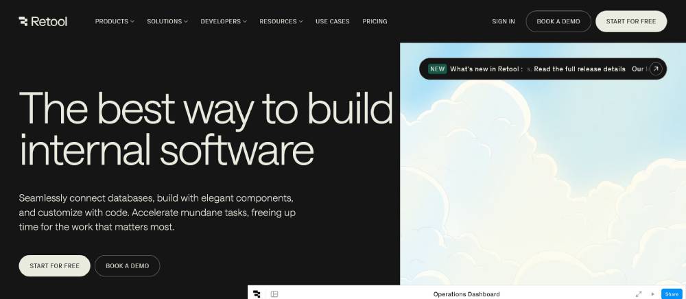
Retool's landing page masters minimal design with a powerful product showcase. The hero section immediately demonstrates value proposition through interactive elements.
Clean user interface balances form with function. Above-the-fold content captures attention while explaining complex functionality through simple visuals.
Their web design mockups show actual product capabilities, not just marketing fluff. Bootstrap framework provides responsive design across devices without sacrificing page load speed.
Vercel
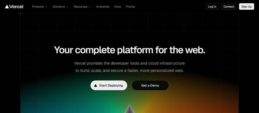
Vercel's homepage design focuses on developer experience with slick animations that don't compromise performance. The headline optimization perfectly targets their audience of developers.
The visual hierarchy guides visitors through a logical customer journey. Their unique selling point comes across immediately through code samples and live previews.
A/B testing has clearly refined their call-to-action buttons placement and color schemes. Google Analytics integration is evident in their thoughtful user flow and conversion optimization.
Replit
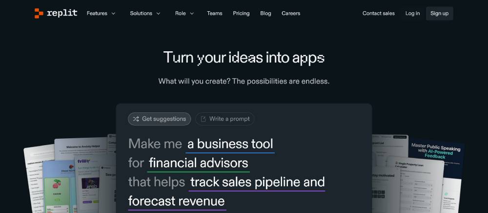
Replit's landing page nails the startup branding with coding examples that serve as both design elements and functional demonstrations.
Their headline speaks directly to the target audience while showcasing product-market fit. The sign-up form is strategically minimal to reduce friction in the onboarding process.
Mobile responsive design ensures the complex coding interface translates well across devices. User testing influence appears in their intuitive navigation and instant value delivery.
Be Business 6
Notion
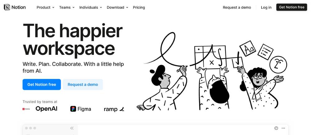
Notion's landing page excels with customer testimonials strategically placed to build trust. The wireframing aesthetic mirrors their actual product experience.
Their web traffic funnels directly into different use cases with tailored messaging for each segment. The brand consistency between marketing site and actual product creates a seamless transition.
Engagement metrics have clearly informed their scrolling behavior design choices. Mixpanel implementation shows in their targeted feature highlights for different user types.
Airtable
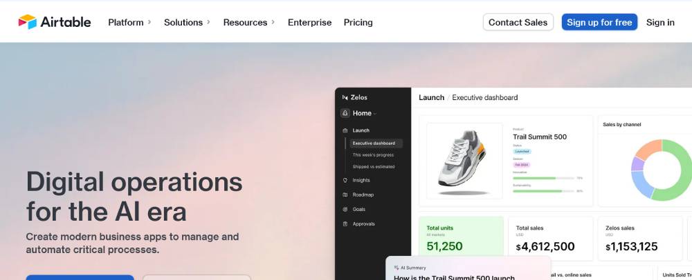
Airtable's SaaS landing page balances complexity with accessibility. The feature highlight sections break down database concepts into visually digestible chunks.
Their homepage captures lead generation through contextual signup opportunities rather than intrusive popups. The MVP launch mentality persists in their direct, benefits-focused copy.
Web analytics influence shows in the progressive disclosure of features based on scroll depth. The conversion rate optimization balances information density with clear calls to action.
Cohere
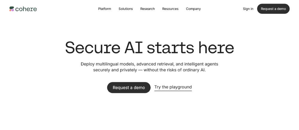
Cohere's tech startup approach focuses on product demonstration through interactive examples. The content strategy emphasizes real-world applications over technical specifications.
Their website conversion path guides visitors from curiosity to technical understanding. The hero section balances visual appeal with substantive information about AI capabilities.
Figma-designed components maintain visual consistency while allowing for distinct section identities. Startup metrics like adoption and use cases take center stage in their messaging.
Rippling
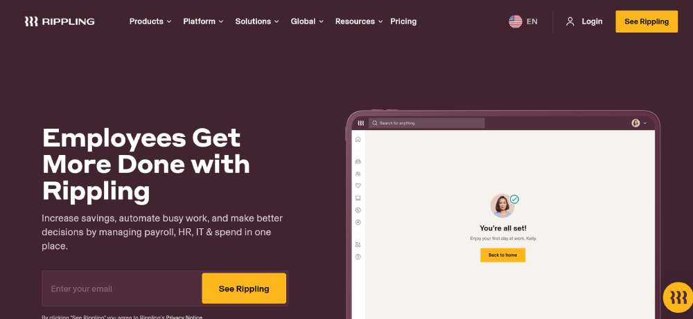
Rippling's digital marketing strategy shines through problem-focused sections addressing specific pain points. The product landing page transitions smoothly between HR and IT solutions.
Their bounce rate minimization tactics include progressive feature reveals that maintain interest. The sales funnel guides different stakeholders to relevant platform capabilities.
Typeform influence appears in their interactive assessment tools embedded directly in the page. Their webpage copy speaks directly to efficiency gains rather than just listing features.
Databricks
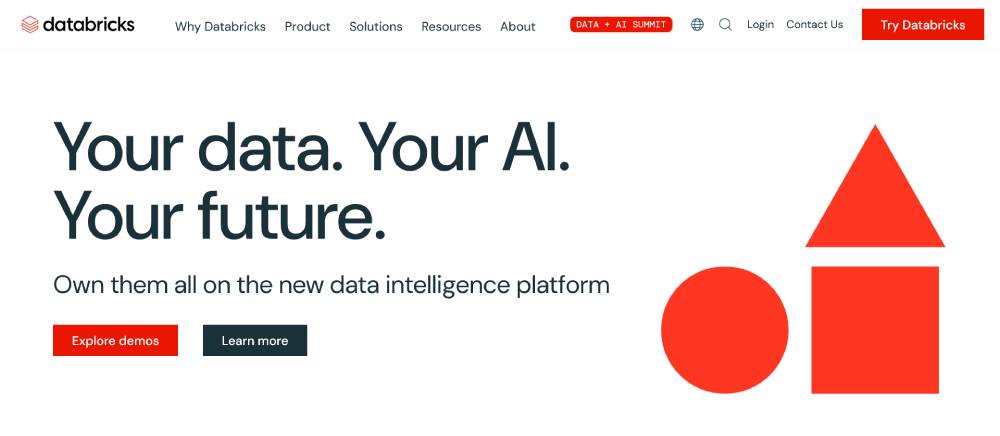
Databricks' landing page targets enterprise with sophisticated data visuals serving both aesthetic and informational purposes. Their beta launch elements highlight newer features without overshadowing core offerings.
The email capture strategy focuses on high-quality leads through targeted content downloads. TechCrunch mentions and industry recognition are subtly integrated into the design.
Adobe XD influence shows in their clean sectioning and whitespace utilization. The investor pitch elements emphasize market position and growth trajectory.
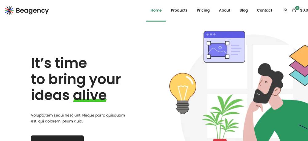
Be Agency
Scale AI
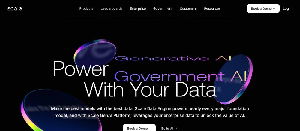
Scale AI's landing page demonstrates startup growth through evolving service offerings. Their web accessibility features ensure complex AI concepts are comprehensible.
The conversion optimization focuses on industry-specific applications rather than generic capabilities. User interface elements mirror actual product experiences.
Hotjar influence appears in their focused content prioritization based on visitor interaction patterns. Their startup market validation comes through client logos and implementation examples.
Anduril

Anduril's defense tech landing page balances serious applications with cutting-edge design. The visual hierarchy leads with mission before diving into specific technologies.
Their customer journey focuses on public sector decision-makers with appropriate content depth. The business model clarity comes through in their problem-solution framing.
Dribbble-inspired visual treatments elevate technical concepts without trivializing applications. Their brand messaging balances innovation with reliability.
Ramp
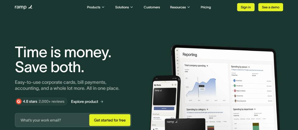
Ramp's financial platform landing page exemplifies conversion rate optimization with clear savings calculations. Their user experience prioritizes immediate understanding of value.
The product showcase highlights dashboard simplicity while suggesting powerful backend capabilities. Their startup funding background subtly informs trustworthiness messaging.
Webflow craftsmanship shows in their smooth transitions and responsive behaviors. Customer acquisition costs appear minimized through self-service trial options.
Brex
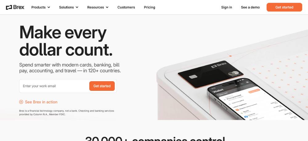
Brex's homepage design focuses on financial decision-makers with clean, trust-building elements. Their value proposition centers on specific pain points rather than generic benefits.
The lead generation focuses on qualification through targeted questions. Venture capitalist backing is subtly integrated as trust indicators throughout the experience.
SEMrush optimization is evident in their targeted content addressing specific financial challenges. Their target audience segmentation provides tailored pathways for different company profiles.
Figma
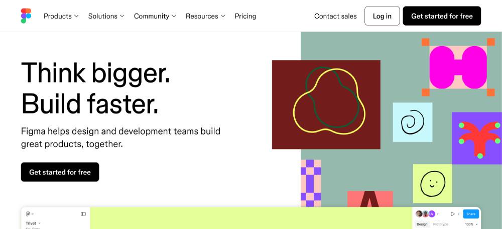
Figma's landing page showcases their own design tool capabilities. The product landing page demonstrates collaboration features through dynamic interface examples.
Their beta launch elements highlight newest capabilities while maintaining focus on core functionality. Above-the-fold content immediately communicates the collaborative advantage.
Web design mockups throughout the site are clearly built with their own platform. The onboarding process preview reduces perceived complexity of adoption.
Be Business 7
Plaid
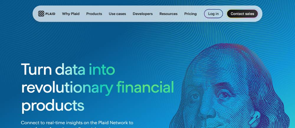
Plaid's financial API landing page balances technical capabilities with business outcomes. Their webpage copy speaks to developers and business stakeholders simultaneously.
The customer testimonials focus on implementation success rather than just praise. The mobile responsive design maintains technical clarity across device sizes.
Ahrefs optimization appears in their structured content addressing specific integration questions. The startup branding balances innovation with reliability for financial sector concerns.
Stripe
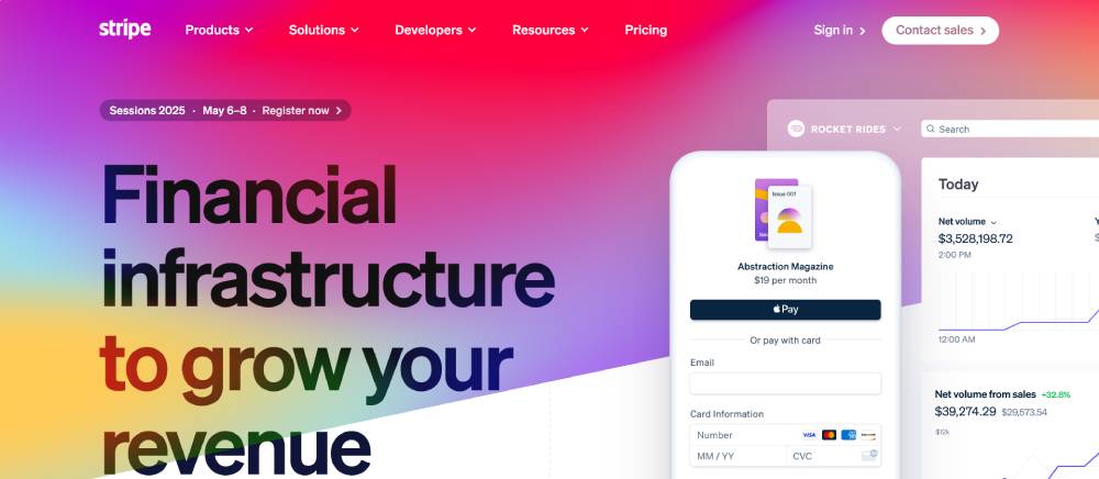
Stripe's landing page exemplifies conversion optimization with developer-focused interactive elements. Their homepage design integrates code samples with business benefits seamlessly.
The sales funnel accommodates both immediate implementation and enterprise consideration paths. Their website builder influences show in modular components that maintain visual consistency.
Zapier integration examples highlight ecosystem connectivity beyond core payment processing. Their bounce rate optimization balances technical depth with accessibility.
Deel
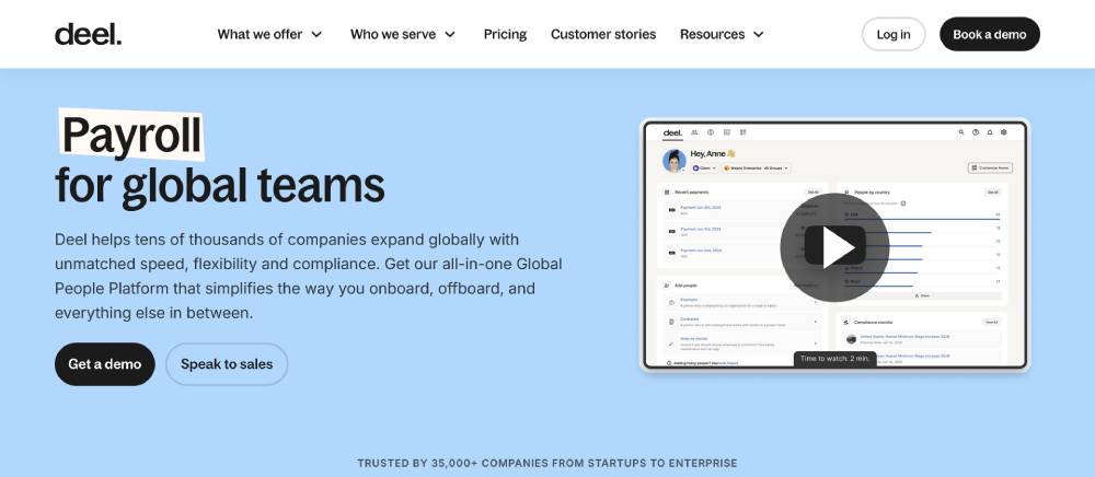
Deel's HR platform landing page focuses on global hiring pain points. Their user testing influence shows in streamlined explanations of complex international employment concepts.
The engagement metrics prioritization appears in their progressive disclosure of features. The brand messaging balances compliance with simplicity.
Unbounce techniques appear in their focused section designs targeting specific use cases. Their customer journey acknowledges different entry points based on company size and needs.
Redwood Research
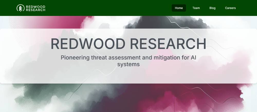
Redwood Research's landing page balances academic credibility with practical applications. Their content strategy prioritizes research transparency while maintaining approachable language.
The visual hierarchy guides visitors from mission to methodologies. Their website conversion focuses on research community engagement rather than traditional sales.
WordPress customization delivers scholarly content in digestible formats. Their unique selling point centers on responsibility in artificial intelligence development.
Flexport
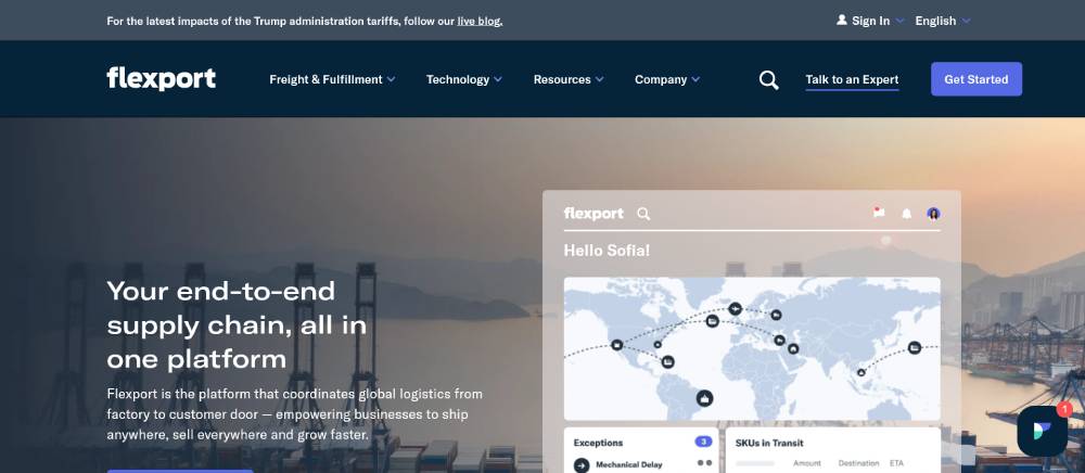
Alchemy's blockchain infrastructure landing page balances technical depth with business applications. Their product showcase demonstrates reliability without overwhelming with complexity.
The headline optimization speaks directly to Web3 developer challenges. Their wireframing approach highlights the simplicity of integration despite complex backend capabilities.
ProductHunt influence shows in their feature presentation and community emphasis. Their startup pitch deck elements translate effectively to web format with clear market positioning.
Clubhouse
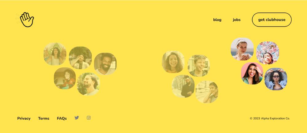
Clubhouse's project management landing page excels in user interface simplicity. Their MVP launch approach focuses on solving core team coordination problems first.
The sign-up forms minimize friction while collecting necessary workspace information. Their call to action buttons reflect project management priorities: clarity and action.
Intercom integration is evident in their contextual support options. Their headline immediately addresses the specific pain points of project coordination.
Lattice
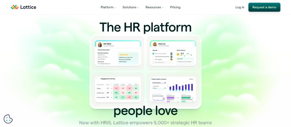
Lattice's HR platform landing page centers on people management challenges. Their above-the-fold content immediately addresses performance management pain points.
The tech startup approach balances employee-centric language with business outcomes. Their lead generation paths differentiate between HR leaders and team managers.
Squarespace influence appears in their clean sectioning and typography choices. Their value proposition targets both analytical and interpersonal aspects of performance management.
Samsara

Samsara's IoT platform landing page transforms complex sensor networks into visual business intelligence. Their conversion optimization connects technical capabilities to business outcomes.
The A/B testing influence shows in their industry-specific pathways that target different use cases. Their startup growth trajectory appears in their expanding solution categories.
FAQ on Startup Landing Pages
What makes a startup landing page effective?
Effective startup landing pages blend compelling web copy with strategic visual hierarchy. They feature clear value propositions above-the-fold, streamlined user flows, and strong calls-to-action. Slack and Stripe excel by addressing customer pain points immediately while maintaining fast landing page load times. Mobile-responsiveness is non-negotiable for today's traffic.
Which startups have the best landing pages?
Airbnb, Dropbox, and Mailchimp consistently showcase exemplary landing pages. Y Combinator startups often feature innovative approaches to digital first impressions. Product Hunt launches reveal cutting-edge landing page design trends, while unicorn company websites demonstrate how conversion-focused landing pages scale with growth.
How do I create a high-converting landing page?
Focus on:
- Clear value proposition display
- Minimal distractions in the user journey
- Compelling trust signals (testimonials)
- Strategic call-to-action placement
- A/B testing landing pages regularly
Study SaaS landing page examples for conversion optimization techniques that tech startup websites use to maximize signup rates.
What elements should a startup landing page include?
Essential elements include:
- Hero section with strong value narrative
- Product benefit display or feature highlights
- Social proof/testimonial showcase
- Simple lead generation forms
- Clear pricing (for subscription service pages)
- Trust signals
- Mobile-responsive design
These components create effective startup web design that converts visitors.
How important is mobile responsiveness for landing pages?
Mobile-responsive landing pages are crucial as over 50% of web traffic comes from mobile devices. Shopify landing pages and other successful e-commerce startup platforms prioritize mobile optimization. Poor mobile experiences dramatically increase bounce rates and decrease conversion potential across all startup website traffic.
What's the ideal length for a startup landing page?
Length varies by product complexity. B2B startup websites often use longer pages to address detailed customer pain points, while Beta signup pages might be shorter. The key is information architecture that guides visitors through a logical conversion funnel rather than arbitrary length constraints.
How do I measure landing page effectiveness?
Track:
- Website bounce rate
- Time on page
- Conversion rate
- Heat mapping
- Form completion rates
- Landing page analytics
Growth hacking landing pages involves continuous improvement based on these metrics. WordPress landing themes often include built-in analytics integration.
Should startup landing pages focus on product or benefits?
Focus on benefits first, product second. Fintech startups and AI startup websites that emphasize customer pain point addressing outperform those showcasing technical features. Your landing page user flow should connect emotional needs to solutions before detailing product functionality, following successful SaaS products examples.
How often should I update my startup landing page?
Update your landing page after significant product changes, when conversion metrics decline, or quarterly at minimum. Tech incubator companies often test variations through A/B testing landing pages. Regular optimization keeps your startup messaging framework fresh while improving web visitor engagement over time.
What common mistakes do startups make with landing pages?
Common mistakes include:
- Unclear value propositions
- Excessive form fields
- Slow page loading
- Poor mobile experience
- Missing trust elements
- Weak calls-to-action
Even Silicon Valley startups sometimes prioritize design over conversion, forgetting landing page best practices that drive actual business results.
Conclusion
Studying examples of startup landing pages reveals clear patterns of success. The most effective landing page conversion rates come from thoughtful design that balances aesthetics with psychology. Wix website templates and Webflow templates offer starting points, but the real magic happens when startups craft their unique web content strategy.
Your landing page should:
- Prioritize first-time visitor experience
- Showcase a compelling digital product showcase
- Implement proper web traffic conversion techniques
- Maintain ideal landing page load time
Freemium model examples from Series A funded companies demonstrate how effective landing pages evolve with business growth. Squarespace designs might look appealing, but without addressing customer acquisition fundamentals, aesthetics mean little.
Remember: great landing pages aren't static. Health tech platforms and mobile app landing pages continuously refine their approach through testing. The perfect landing page isn't created once—it's developed through ongoing optimization of your startup web presence.
If you enjoyed reading this article on startup landing pages, you should check out this one about best startup websites.
We also wrote about a few related subjects like best restaurant websites, best agency websites, the coolest black websites, the best relaxing websites, the best weird websites, time wasting websites to avoid burnout, best interactive websites, an awesome list of trippy websites and coffee websites.


