

Examples of Photographer Website Templates You’ll Love
August 18, 2025
Examples of Charity Website Templates That Inspire
August 20, 2025Yellow stops the scroll.
Brands like McDonald's, IKEA, and Snapchat built billion-dollar identities around this single color. There's a reason for that.
Finding the right website design examples using a yellow color palette can show you exactly how to capture attention without overwhelming visitors.
This guide breaks down over 50 yellow websites across industries, from golden SaaS platforms to bright creative agency sites.
You'll discover which hex codes work best, what color combinations pass accessibility standards, and how brands like Bumble, DHL, and National Geographic use yellow strategically.
Whether you want yellow as a bold background or subtle accent, these examples will guide your next design decision.
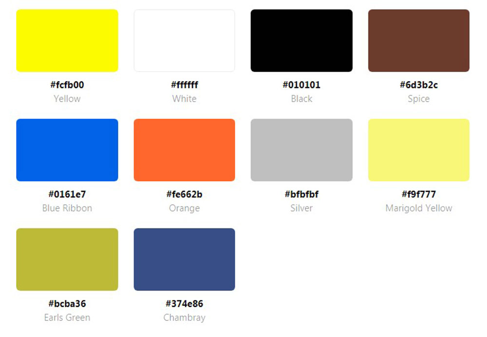
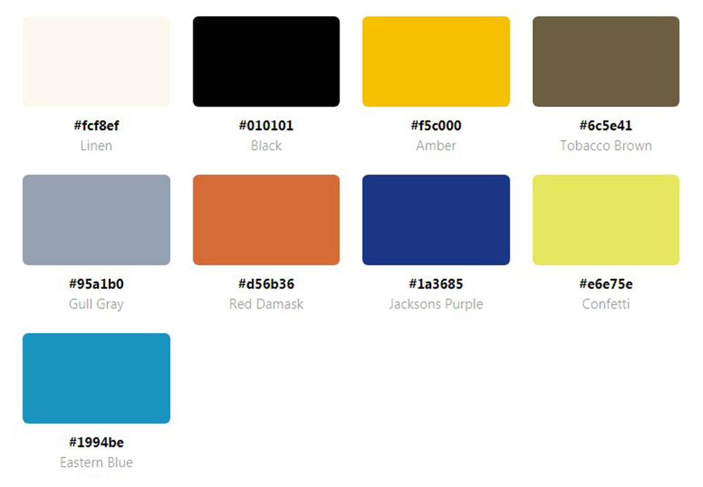
What is a Yellow Color Palette Website
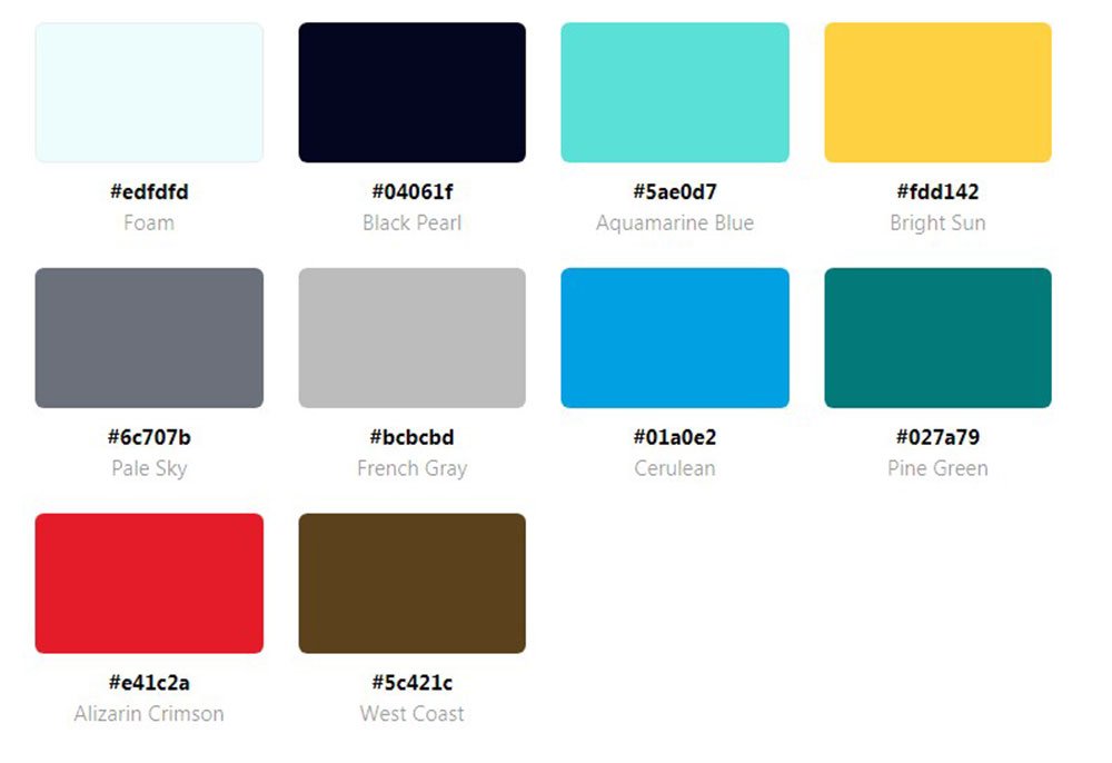
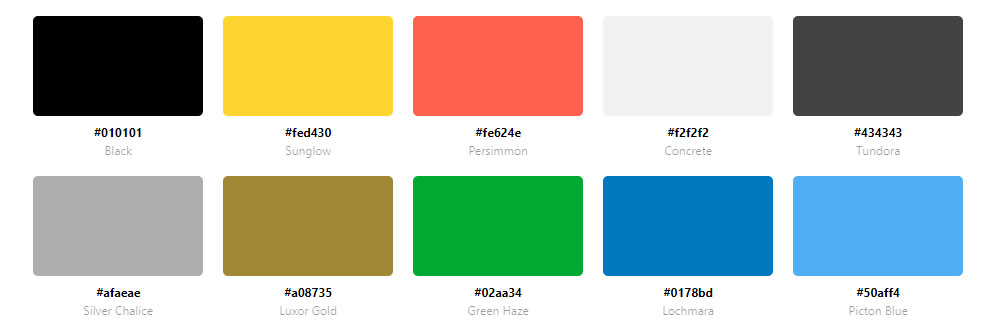
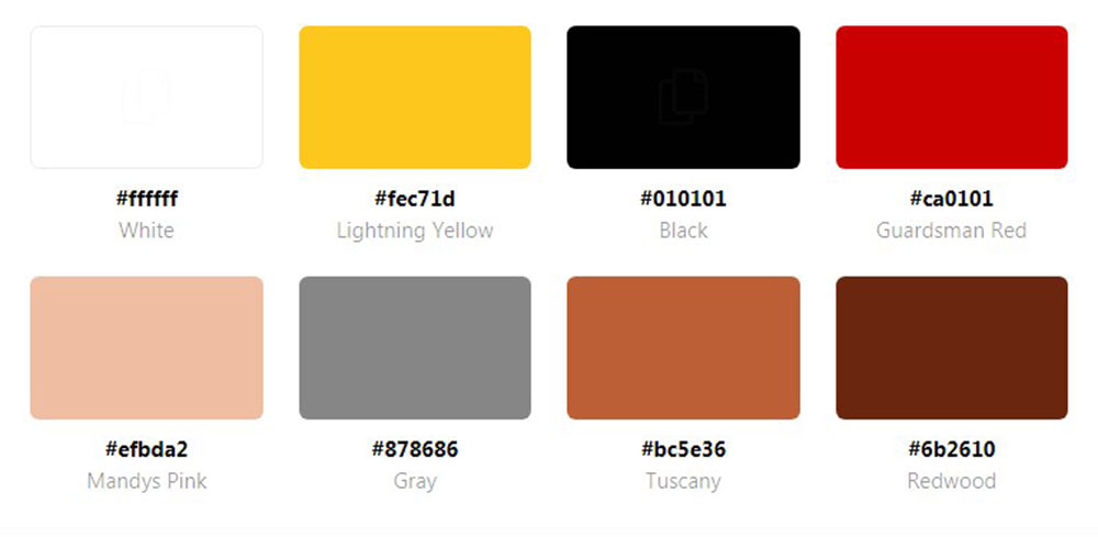
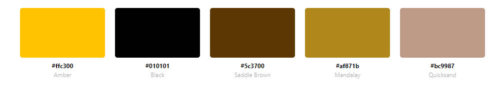
A yellow color palette website uses yellow as its primary or accent color, typically featuring hex codes ranging from #FFFF00 (bright yellow) to #D4A017 (mustard) to #FEED9F (pastel).
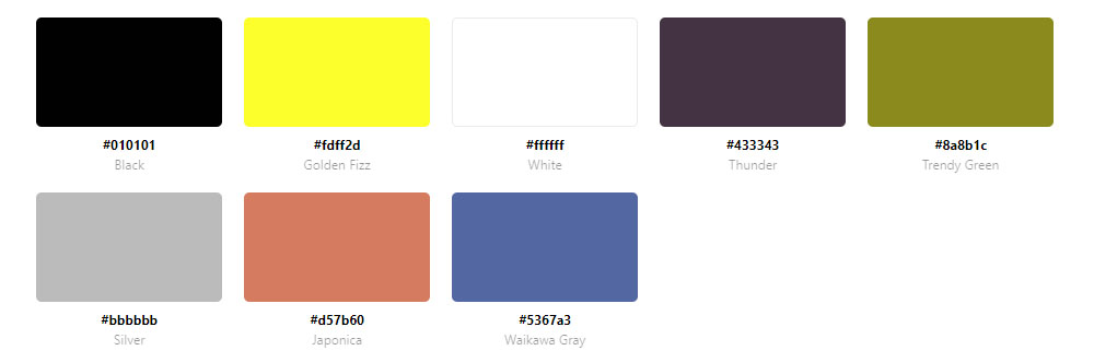
These sites combine golden, lemon, or sunshine tones with complementary colors like black, white, gray, or teal to create visual hierarchy.
Brands like McDonald's, IKEA, Best Buy, and Snapchat have built entire identities around yellow web design.
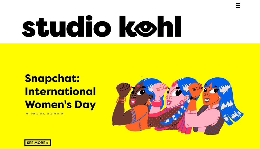
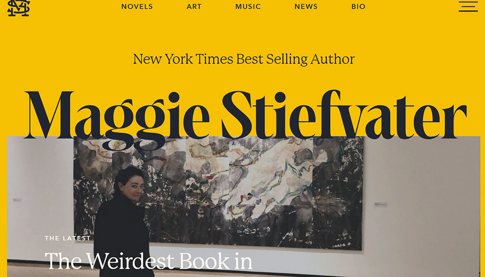
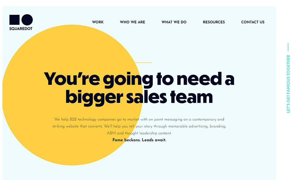
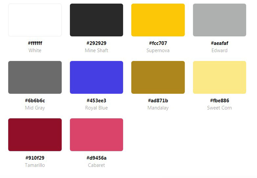
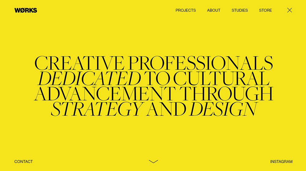
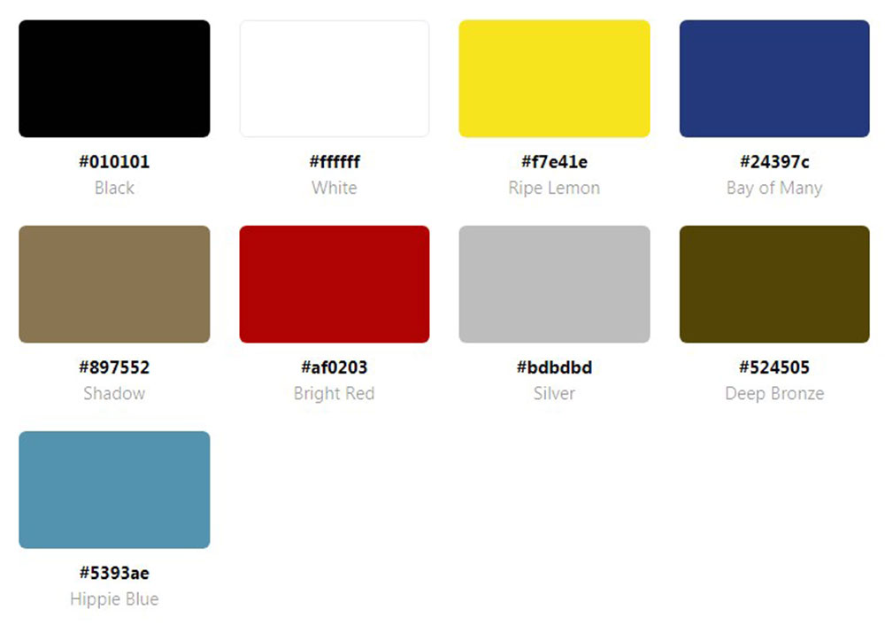
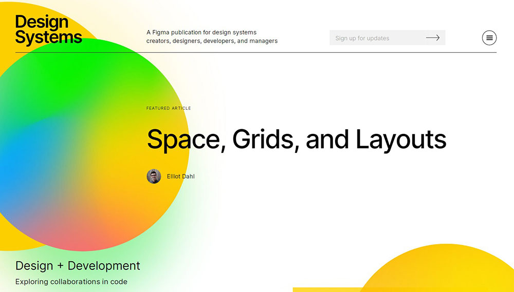
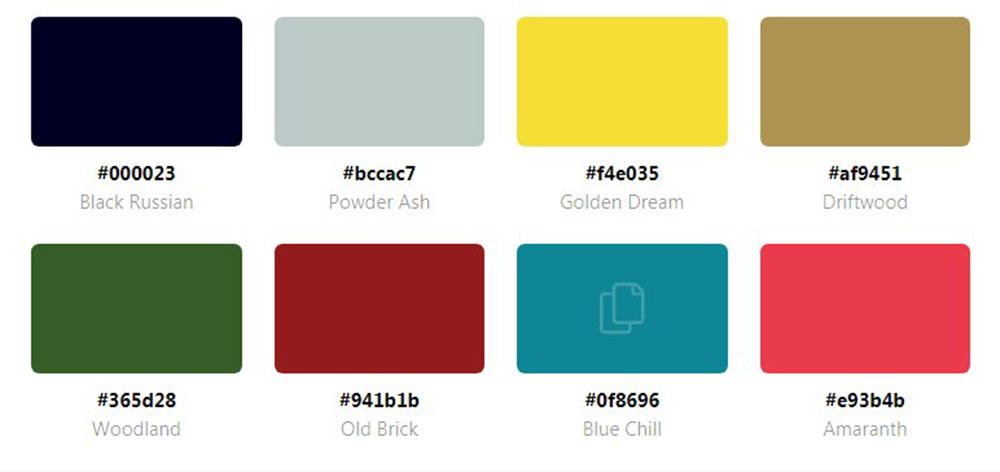
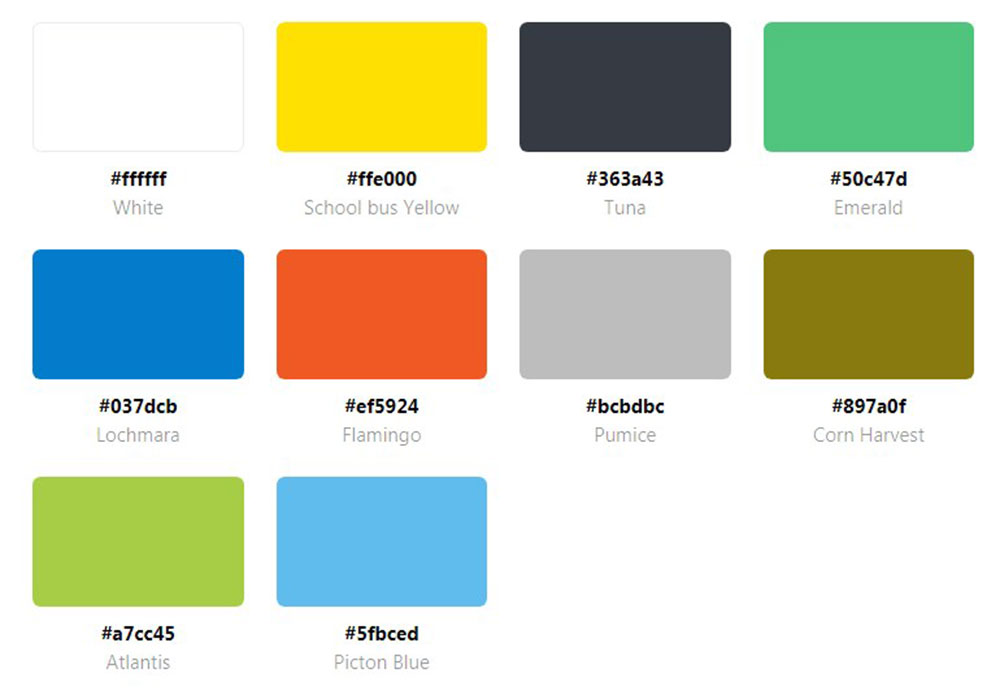
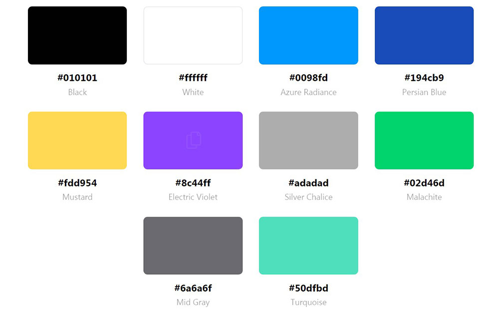
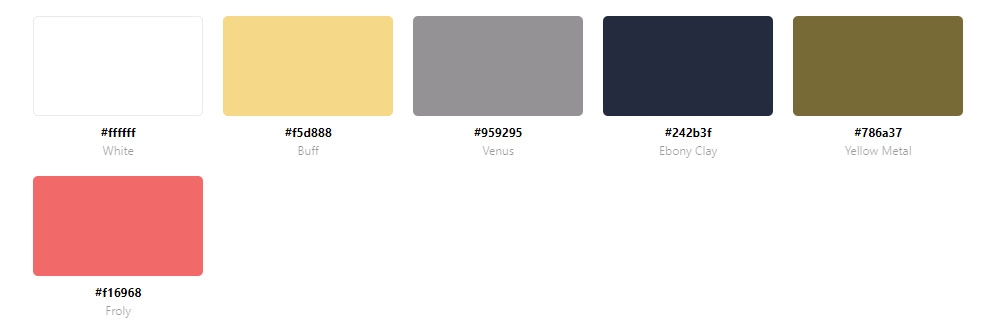
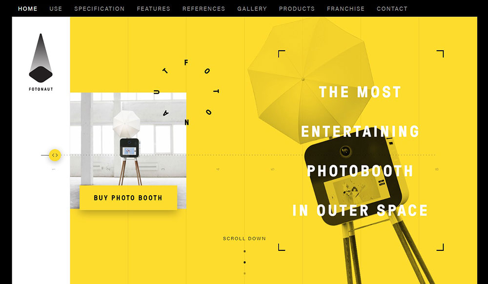
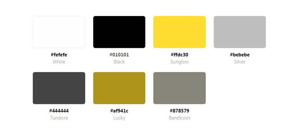
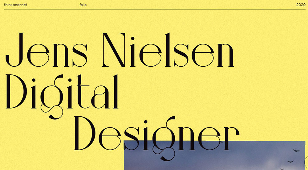
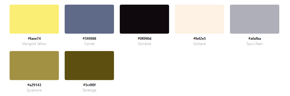
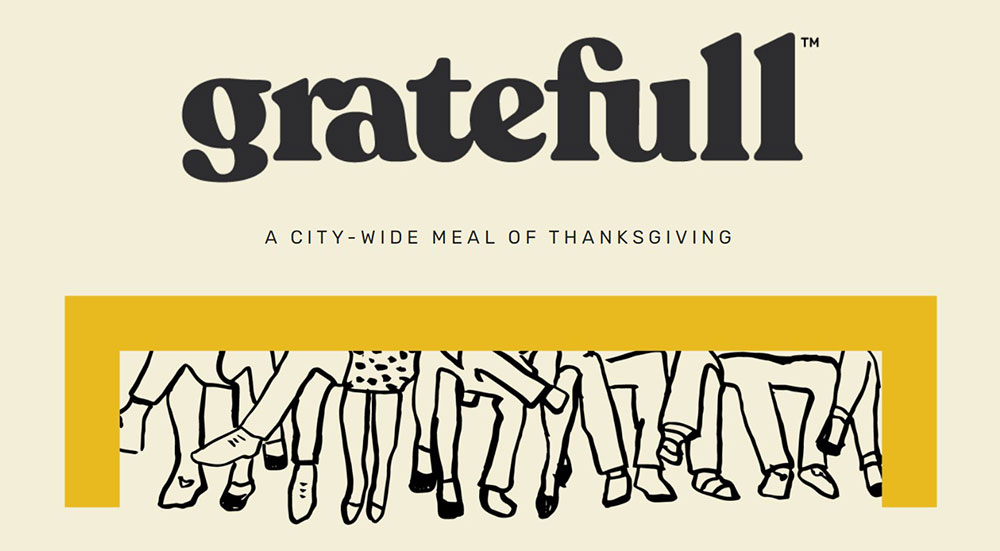
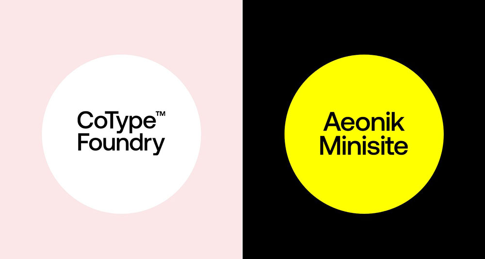
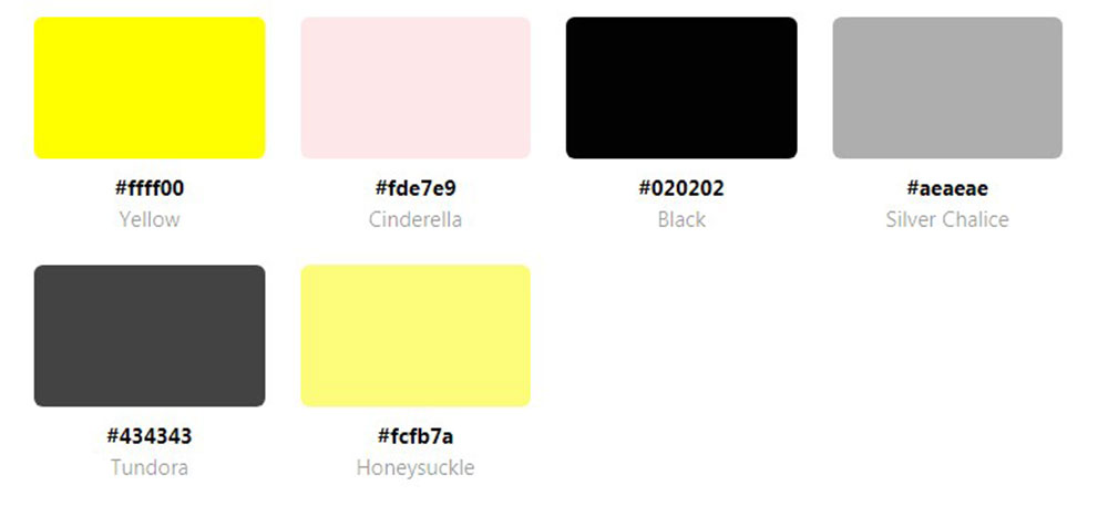
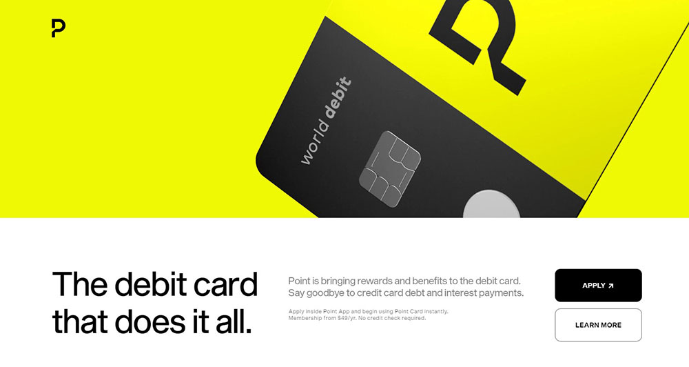
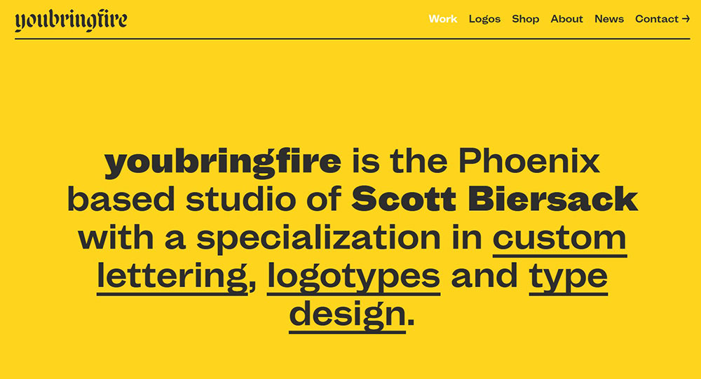
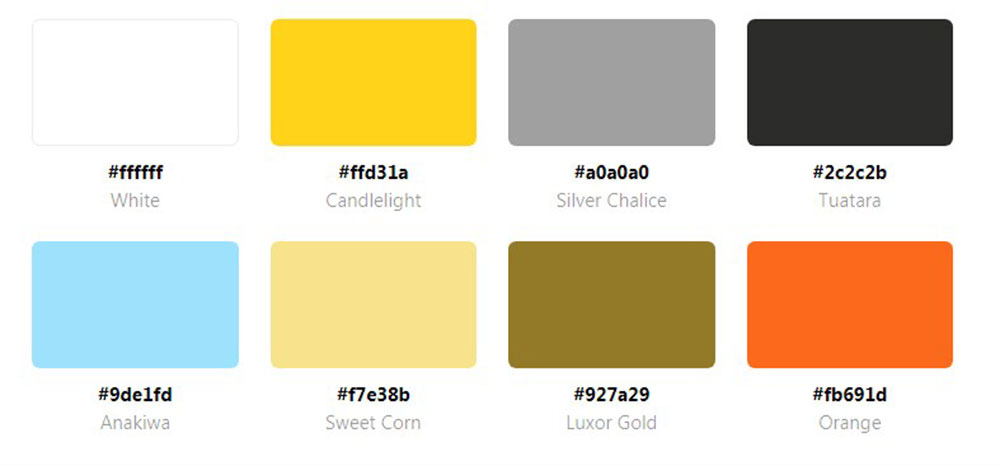
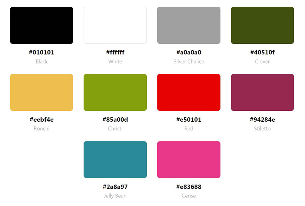
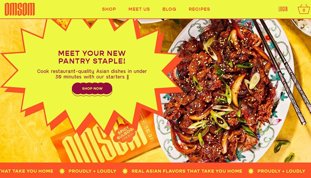
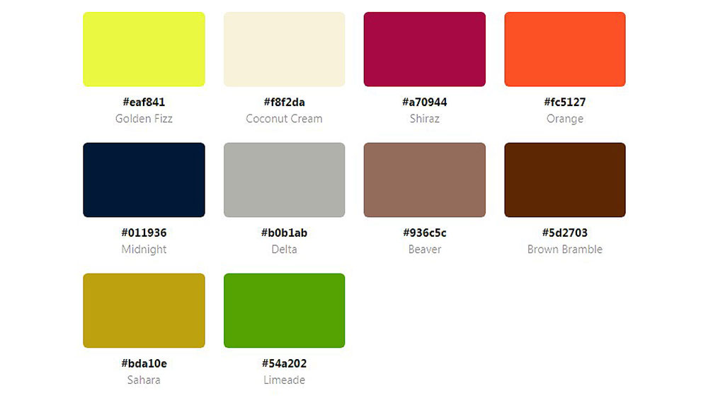
Websites with a Yellow Color Palette
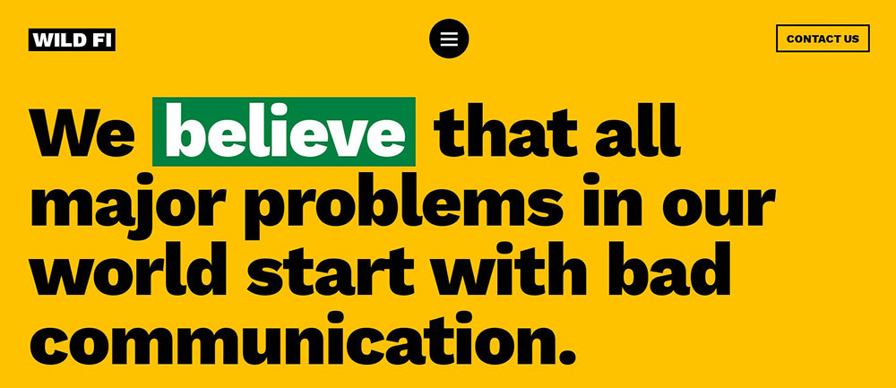
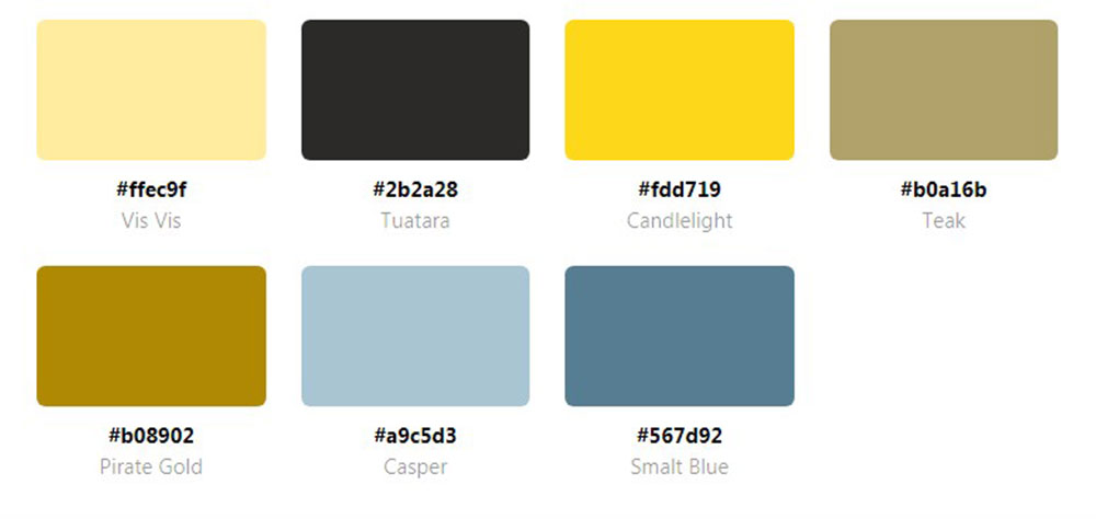
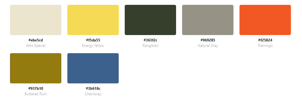
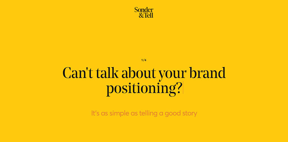
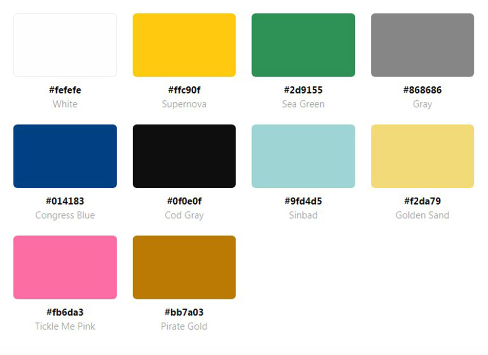
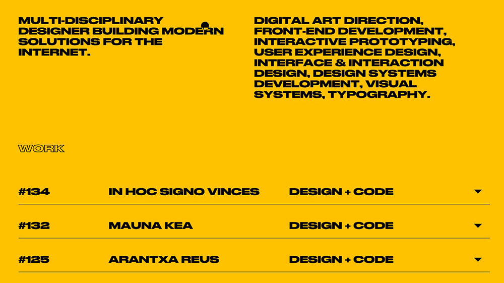
WILD FI
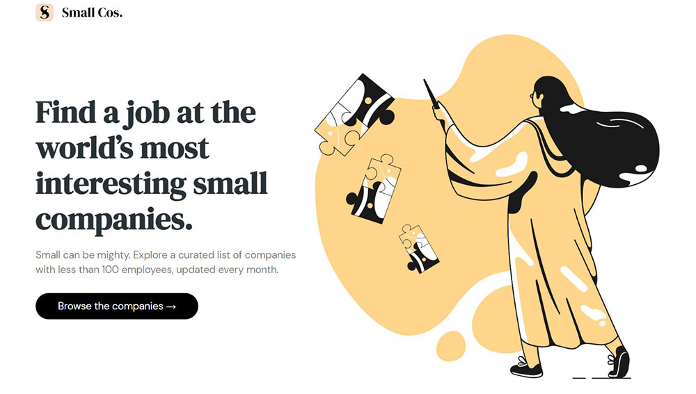
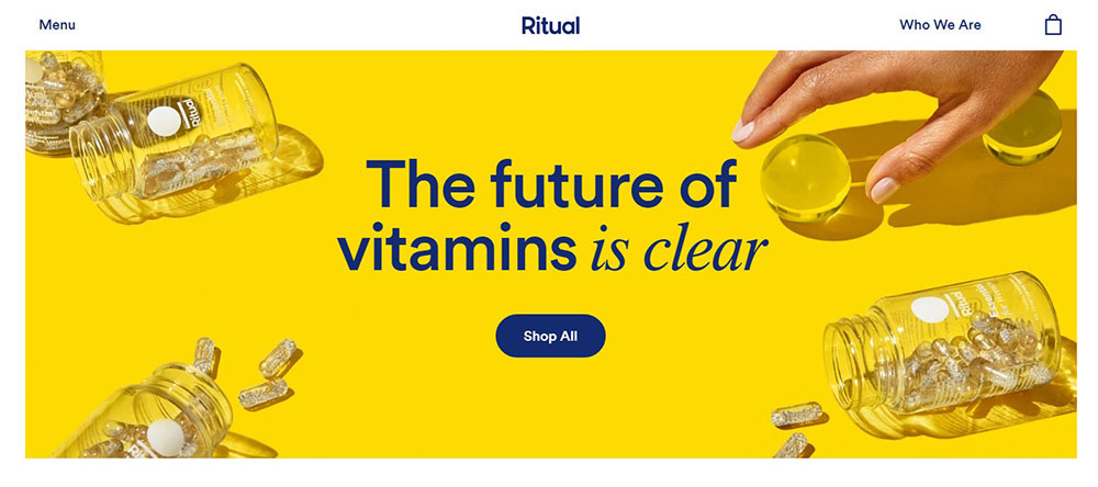

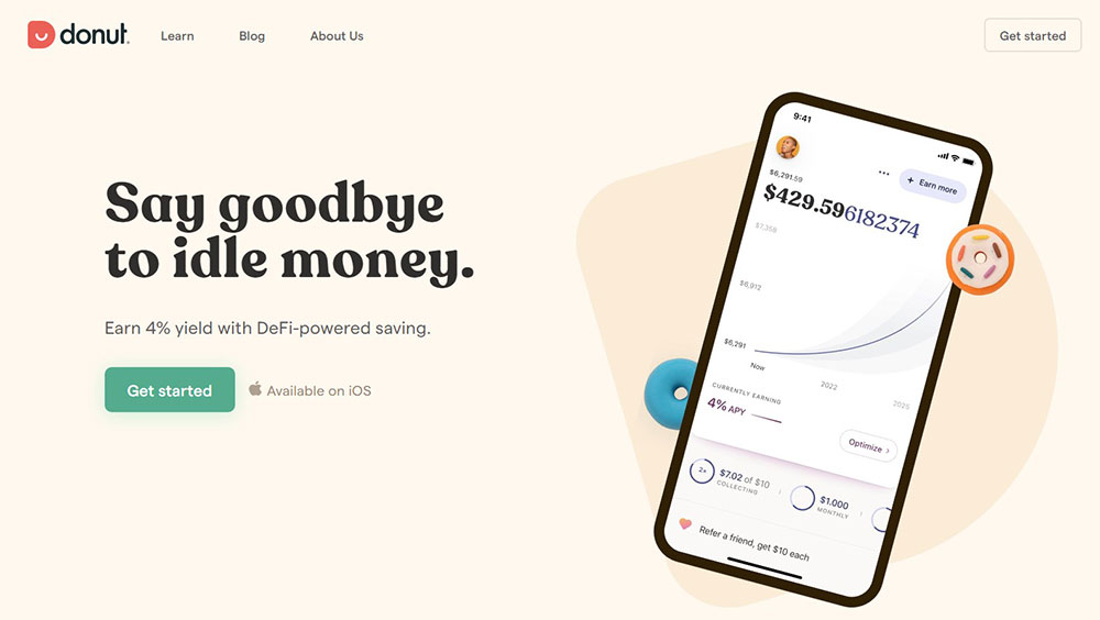
Ritual create their vitamin products with only essential ingredients. Their motto is transparency.
Inspired by nature, the clean look of their website combines yellow with white. You can create a similar color scheme with a color palette generator like the one from Design Your Way.
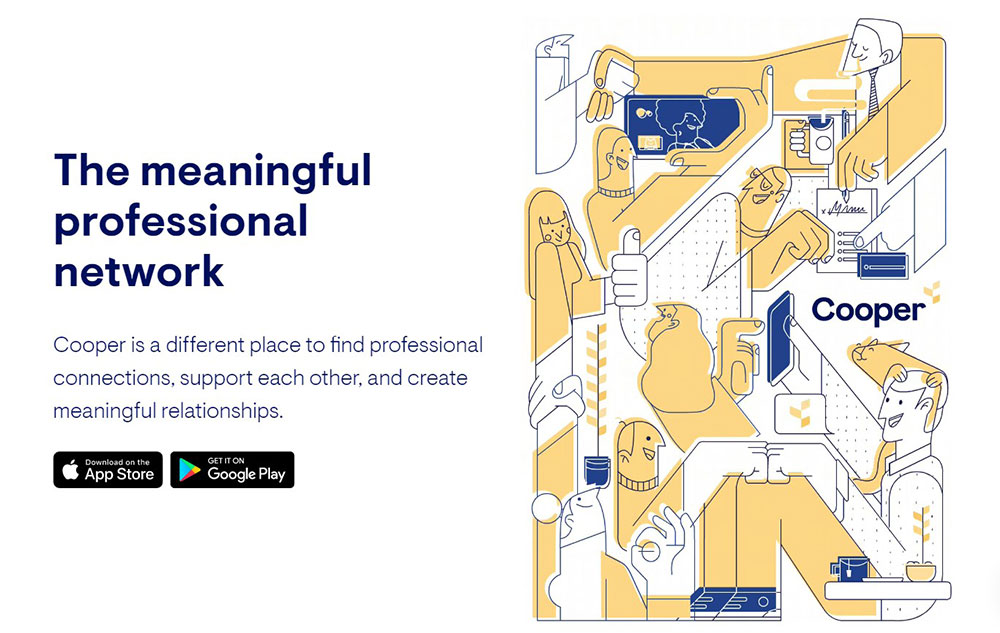
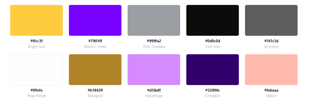
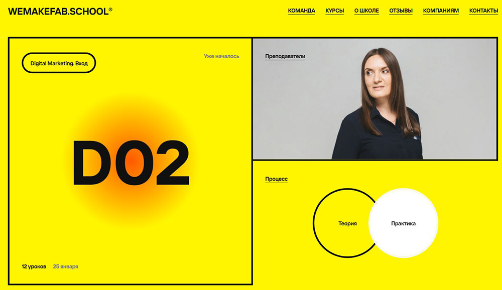
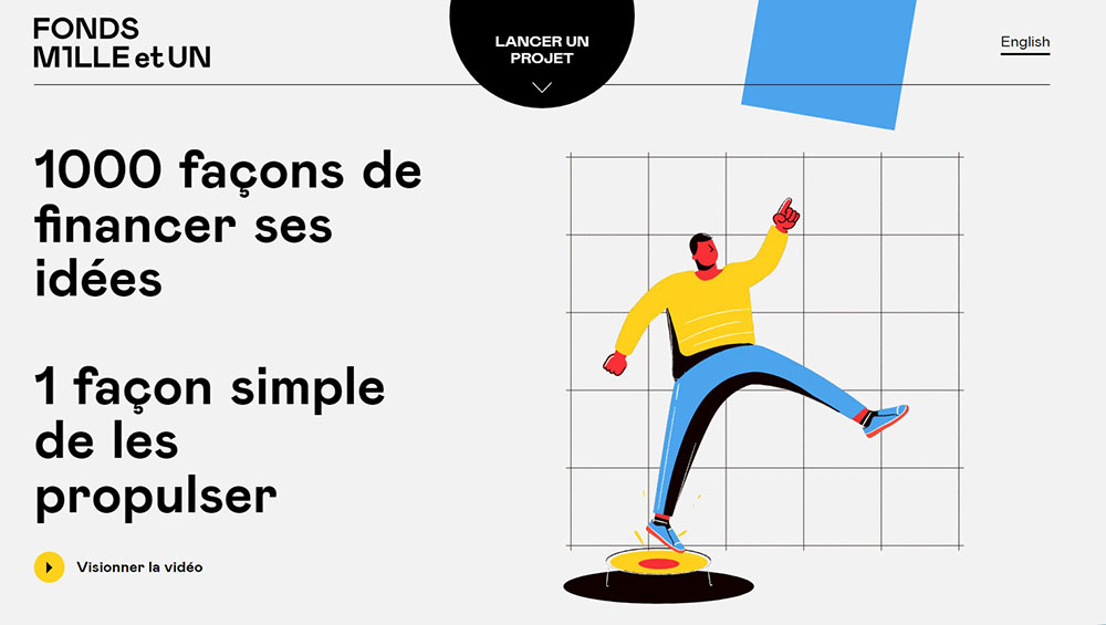
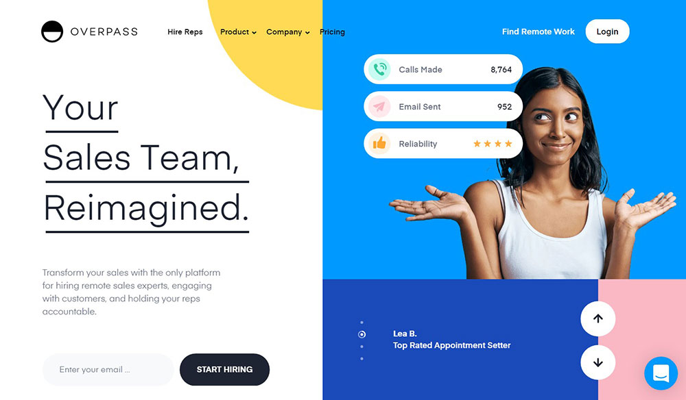
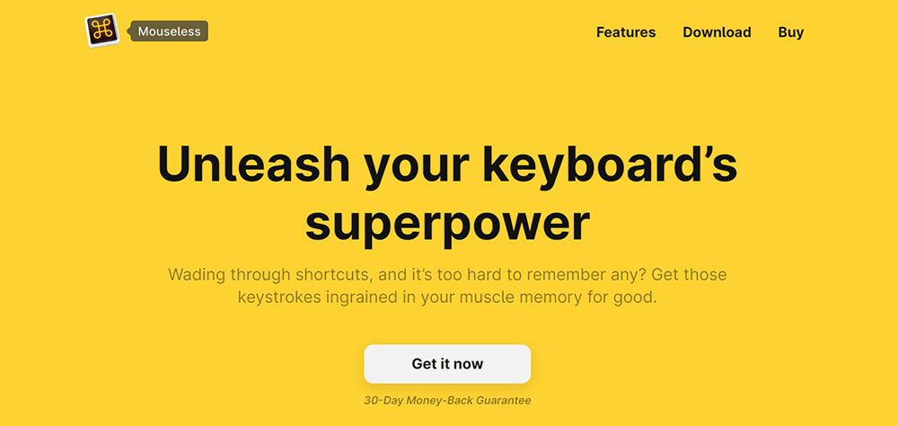
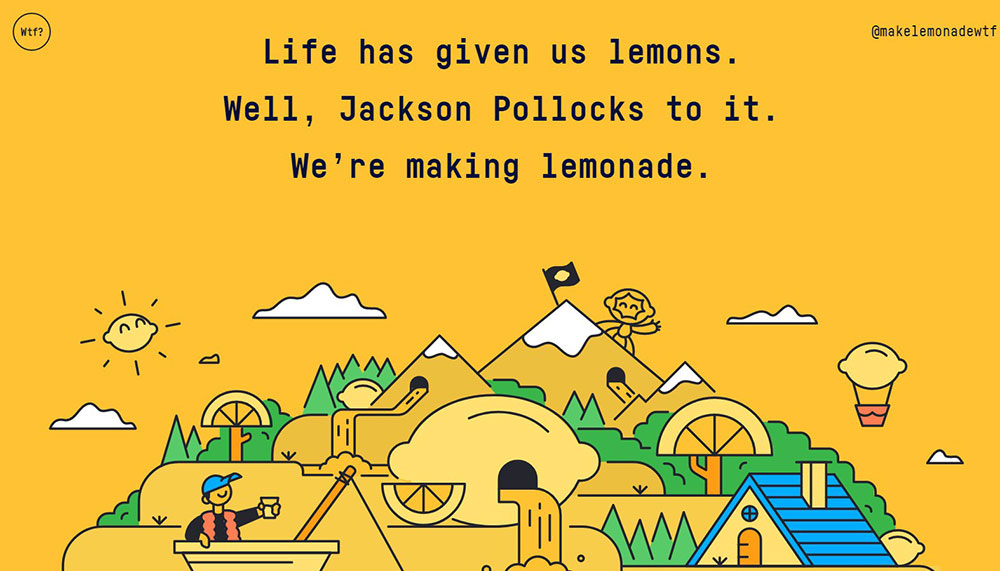
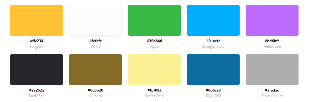
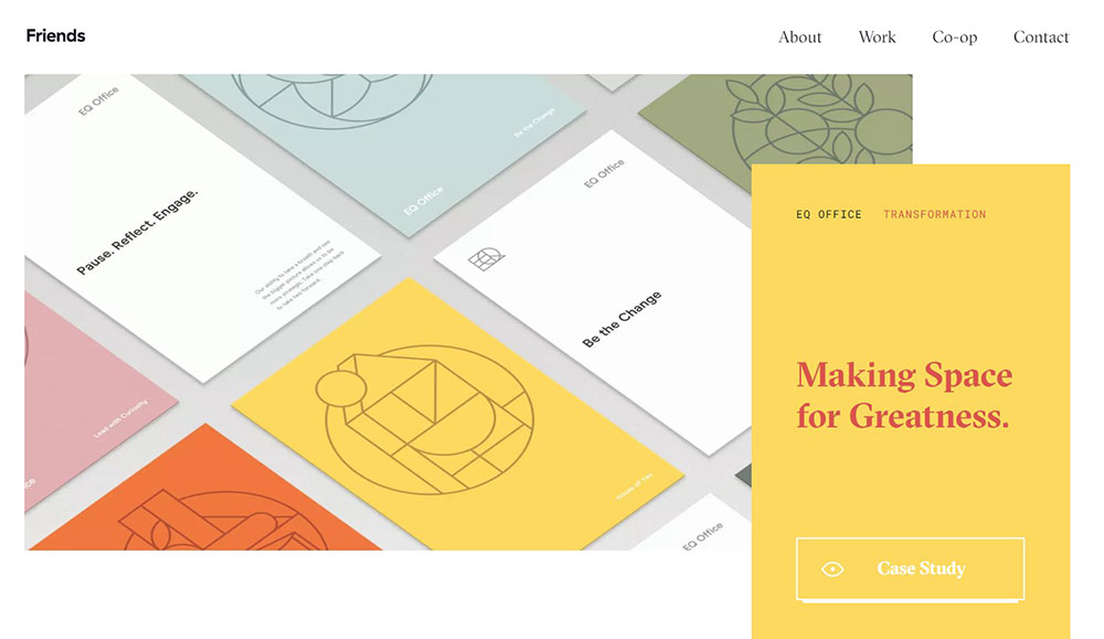
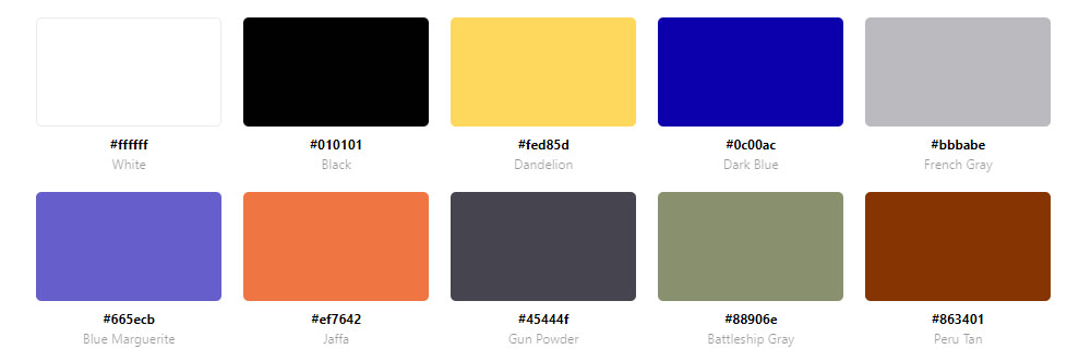
Wisembly Jam


Why Do Brands Choose Yellow for Website Design
Yellow triggers optimism and energy faster than any other color in the spectrum.
Color psychology research shows yellow activates the left side of the brain, stimulating mental activity and generating muscle energy.
This makes it ideal for brands wanting to appear approachable, youthful, or innovative.
Common reasons brands pick yellow:
- Instant visibility and attention-grabbing power
- Association with happiness, warmth, and positivity
- Strong recall value in crowded markets
- Works across cultures as a cheerful, optimistic tone
National Geographic uses that iconic yellow border for immediate recognition.
Bumble built its entire dating app brand around yellow to feel friendly rather than intimidating.
DHL chose yellow for high visibility in logistics.
How Does Yellow Affect User Behavior on Websites
Yellow draws the eye to specific page elements, making it effective for call to action buttons and conversion points.
Studies show yellow buttons can increase click rates when contrasted against darker backgrounds.
But there's a catch.
Too much bright yellow causes eye fatigue and can feel overwhelming.
WCAG accessibility standards require careful attention when using yellow backgrounds, as contrast ratios with white text often fail compliance.
Black text on yellow passes AA standards easily; white text on yellow rarely does.
Key behavioral effects:
- Increases perceived energy and urgency
- Creates feelings of warmth and approachability
- Can trigger anxiety if overused or too saturated
- Best used as accent (10-30% of page) rather than dominant background
What Types of Yellow Shades Work in Web Design
Not all yellows perform the same way on screen.
Tools like Adobe Color, Coolors.co, and the Material Design Color System offer curated yellow palettes tested for digital use.
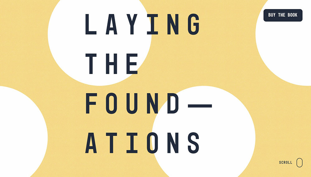
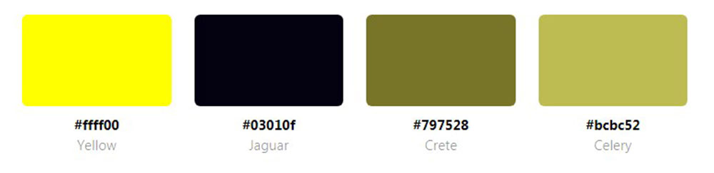
Bright Yellow Websites
Pure yellow (#FFFF00, #FEE32B) commands immediate attention but requires careful handling.
Works best for creative websites and brands targeting younger audiences; pair with black or deep gray for readability.
Golden Yellow Websites
Hex codes like #FAD707 and #D0A823 suggest wealth, quality, and sophistication.
Ritual vitamins and finance websites use golden tones to imply premium value without feeling childish.
Mustard Yellow Websites
Mustard (#E1AD01, #D4A017) reads as mature and earthy.
Popular in fashion websites, interior design, and artisanal brands wanting warmth without brightness.
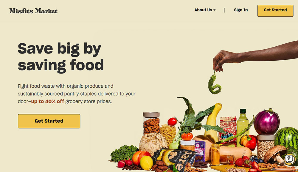
Pastel Yellow Websites
Soft yellows (#FDFC64, #FEED9F, #FFFDEF) create calm, friendly atmospheres.
Common in wellness websites, baby shop websites, and apps focused on mental health or self-care.
What Industries Use Yellow Website Designs
Certain industries have adopted yellow as a signature color based on psychological associations and competitive positioning.
Food and Restaurant Websites
Yellow stimulates appetite and conveys freshness.
Fast food chains, bakery websites, and cafe websites use warm yellows to feel inviting and energetic.
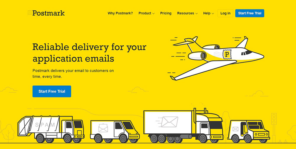
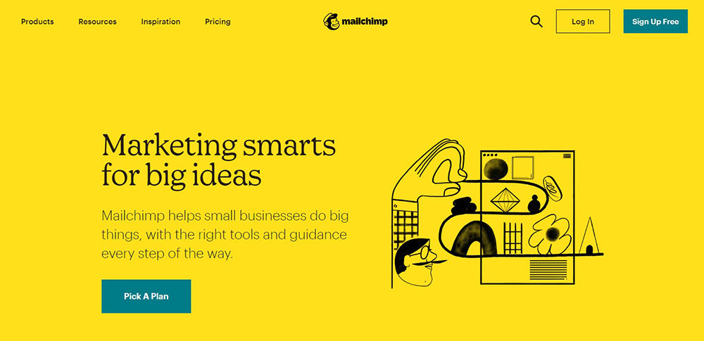
Technology and SaaS Websites
SaaS websites like Butter and Bannerbear use yellow to stand out in a sea of blue tech brands.
The color signals innovation and approachability in an industry often perceived as cold.
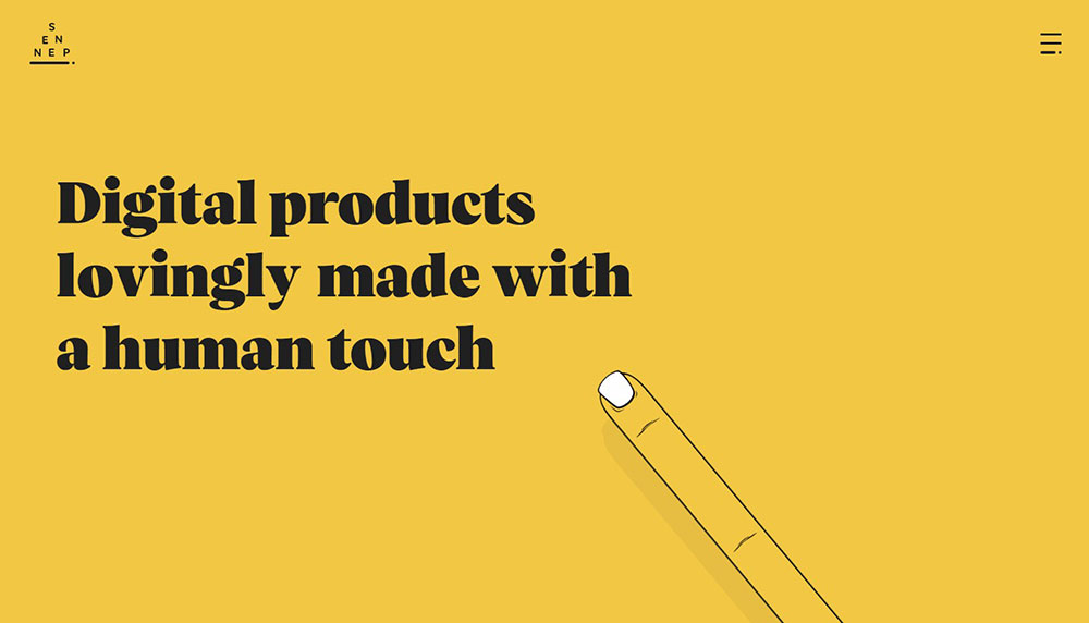
Creative Agency Websites
Agency websites leverage yellow to demonstrate boldness and creative confidence.
Sennep, Dotdotdot, and Wolff Olins all feature striking yellow palettes as brand differentiators.
E-commerce Websites
Yellow accents guide shoppers toward purchase buttons and sale announcements.
Retail websites and clothing websites use yellow strategically for urgency without aggressive red tones.
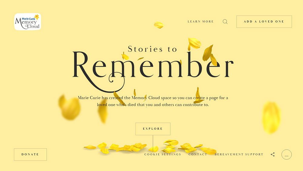
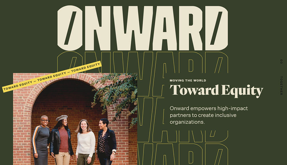
Nonprofit and Community Websites
Non-profit websites choose yellow to feel hopeful and optimistic about their mission.
Organizations like The Fund and Marie Curie Foundation use golden yellows to balance warmth with seriousness.
What Color Combinations Work With Yellow
Yellow rarely works alone.
The best color schemes pair yellow with neutrals or complementary tones to balance its intensity.
Yellow and Black Color Schemes
The highest contrast combination available; instantly readable and bold.
Wolff Olins, CAT equipment, and Stanley tools use this pairing for maximum visual impact and industrial strength associations.
Yellow and White Color Schemes
Creates a clean, airy aesthetic but requires careful execution.
White text on yellow fails accessibility standards, so flip it: yellow accents on white backgrounds with black typography.
Yellow and Blue Color Schemes
Complementary colors that create vibrant energy without clashing.
IKEA and Best Buy prove this combination works across B2C websites from furniture to electronics.
Yellow and Gray Color Schemes
Sophisticated, modern, professional.
Gray tones down yellow's playfulness for corporate websites and B2B websites needing warmth without sacrificing credibility.
How to Create Contrast With Yellow Backgrounds
WCAG 2.1 AA compliance requires a 4.5:1 contrast ratio for normal text.
Pure yellow (#FFFF00) against white achieves only 1.07:1, making it unreadable.
Passing combinations:
- Black (#000000) on yellow: 19.56:1 ratio
- Dark gray (#333333) on yellow: 12.6:1 ratio
- Navy (#000080) on pale yellow: 8.9:1 ratio
Failing combinations:
- White on bright yellow: 1.07:1
- Light gray on yellow: Below 3:1
- Orange on yellow: Below 2:1
Use tools like WebAIM Contrast Checker or Figma plugins to verify compliance before launching.
Building accessible websites with yellow requires testing every text element against your chosen background shade.
What Typography Works on Yellow Backgrounds
Sans-serif fonts perform best on yellow due to clean edges and consistent stroke weights.
Recommended font families:
- Inter, Helvetica, Arial for body text
- Montserrat, Poppins for headings
- Space Grotesk, DM Sans for modern tech aesthetics
Use medium to bold weights (500-700) for body text on bright yellows.
Light weights disappear against saturated backgrounds.
Serif fonts can work on muted or pastel yellows but require larger sizes and heavier weights to maintain readability across responsive websites.
How to Use Yellow as an Accent Color vs Primary Color
The percentage of yellow determines the entire mood of your site.
Yellow as Primary Color (60%+ Coverage)
Bold statement requiring neutral support colors and careful white space management.
Best for creative agencies, children's brands, food companies, and brands wanting instant recognition like Post-it or Cheerios.
Yellow as Accent Color (10-30% Coverage)
Strategic placement on buttons, hero sections, icons, and highlights.
Works across industries from technology websites to lawyer websites without overwhelming professional aesthetics.
Yellow as Background vs Yellow Elements
Full yellow backgrounds demand dark text and minimal competing colors; yellow headers or buttons on white/dark backgrounds offer flexibility.
Test both approaches in Tailwind CSS or your preferred framework before committing to a direction.
FAQ on Website Design Using A Yellow Color Palette
What is the best yellow hex code for websites?
#FFD700 (golden yellow) works across most industries without being too bright.
For softer aesthetics, try #FEED9F or #FFFDEF. Bright brands use #FFFF00 or #FEE32B paired with black for maximum contrast.
Which colors pair best with yellow in web design?
Black creates the strongest contrast. Gray adds sophistication. Navy blue offers complementary balance.
Teal and white work for playful brands. Avoid pairing yellow with orange or red, as they compete visually.
Is yellow accessible for website backgrounds?
Yellow backgrounds require dark text to meet WCAG standards.
Black on yellow achieves a 19.56:1 contrast ratio. White text on yellow fails accessibility at just 1.07:1.
What industries use yellow website designs most?
Food service, creative agencies, SaaS platforms, and e-commerce brands favor yellow.
Fitness websites and construction websites also use yellow to convey energy and visibility.
How much yellow should I use on my website?
Use yellow as an accent (10-30%) for professional sites. Bold brands can push to 60% with neutral support colors.
Too much saturated yellow causes eye fatigue and reduces time on page.
What fonts work best on yellow backgrounds?
Sans-serif fonts like Inter, Helvetica, and Montserrat perform best.
Use medium to bold weights (500-700) in black or dark gray. Light font weights disappear against bright yellow.
Can yellow work for professional or corporate websites?
Yes. Golden and mustard yellows read as mature and trustworthy.
Consulting websites and marketing websites use muted yellows paired with gray for credibility without coldness.
What are examples of famous yellow brand websites?
IKEA, McDonald's, Best Buy, Snapchat, Bumble, National Geographic, DHL, and Hertz all feature yellow prominently.
Each uses different shades matched to their brand personality and target audience.
Should I use yellow for call-to-action buttons?
Yellow buttons work well on dark or neutral backgrounds where they stand out.
Avoid yellow CTAs on yellow backgrounds. Test against blue or green alternatives to find highest conversion rates.
How do I test if my yellow palette is too bright?
Check contrast ratios in Adobe Color or WebAIM Contrast Checker.
View your site in bright sunlight and dim lighting. Ask test users if the yellow causes eye strain after 30 seconds.
Conclusion
These website design examples using a yellow color palette prove that yellow works far beyond children's brands and fast food chains.
From Pantone-approved golden tones to vibrant lemon shades, the right yellow hex code can transform your brand identity.
Remember the basics: black text for readability, 4.5:1 contrast ratios for WCAG compliance, and strategic placement for visual hierarchy.
Tools like Coolors.co and the Material Design Color System make palette selection faster.
Start with mustard or golden yellows if you want sophistication. Go bright if you need attention.
Test your choices on mobile screens and in different lighting conditions.
Yellow demands confidence. Used correctly, it creates beautiful websites that visitors remember long after they leave.


