

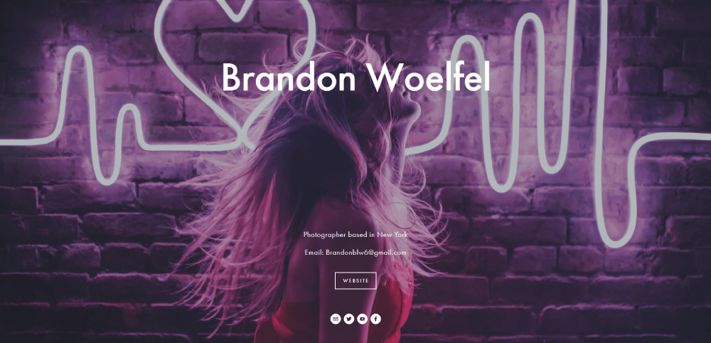
Modern Photographer Website Design Examples to Inspire
January 3, 2026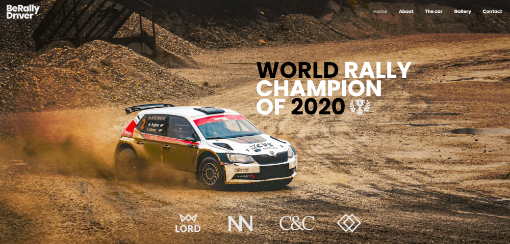
Car Dealer Website Design Examples That Drive Sales
January 3, 2026Your website has 50 milliseconds to make an impression. That's it.
Most design galleries show you pretty screenshots without explaining why they work. This wastes your time.
This article breaks down amazing website design examples that actually convert visitors into customers. You'll see what makes each design effective, from visual hierarchy to technical performance.
We analyze real websites across industries, reveal their design systems, and show you specific techniques you can apply immediately. No vague advice about "being creative."
By the end, you'll understand the difference between designs that look good and designs that perform.
What are Amazing Website Designs
Amazing website designs are digital interfaces combining visual hierarchy, user experience patterns, performance metrics, and conversion architecture to solve business problems while maintaining aesthetic coherence across devices.
These designs balance form and function. They prioritize user needs over designer preferences.
Top-performing websites achieve sub-3-second load times, maintain WCAG AA accessibility standards, and convert visitors at rates 2-5x higher than industry averages. Mobile responsiveness isn't optional.
The difference between good and amazing comes down to execution details: pixel-perfect spacing, intentional color contrast ratios, and thoughtful micro-interactions that guide users through conversion funnels.
Design systems create consistency. Typography scales properly from 320px mobile screens to 2560px desktop monitors.
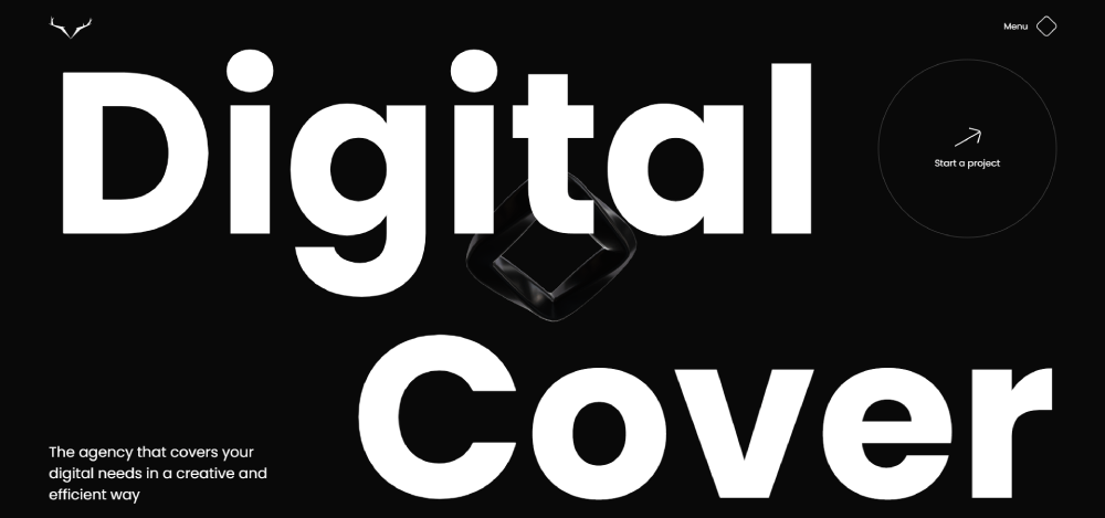
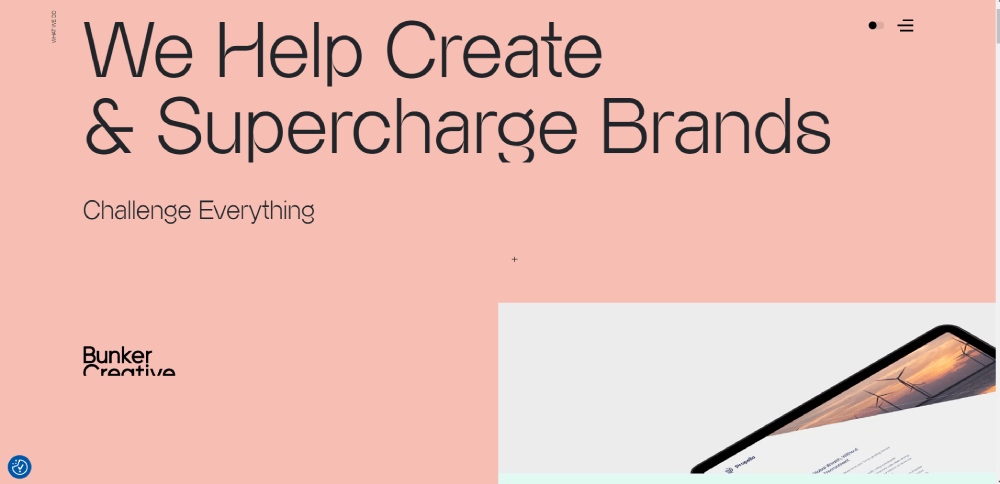
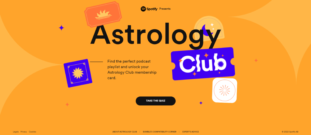
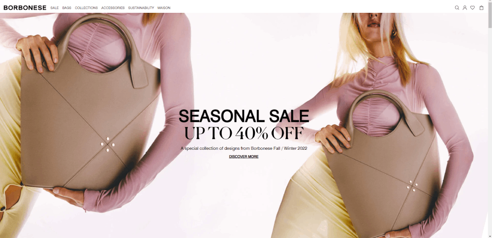
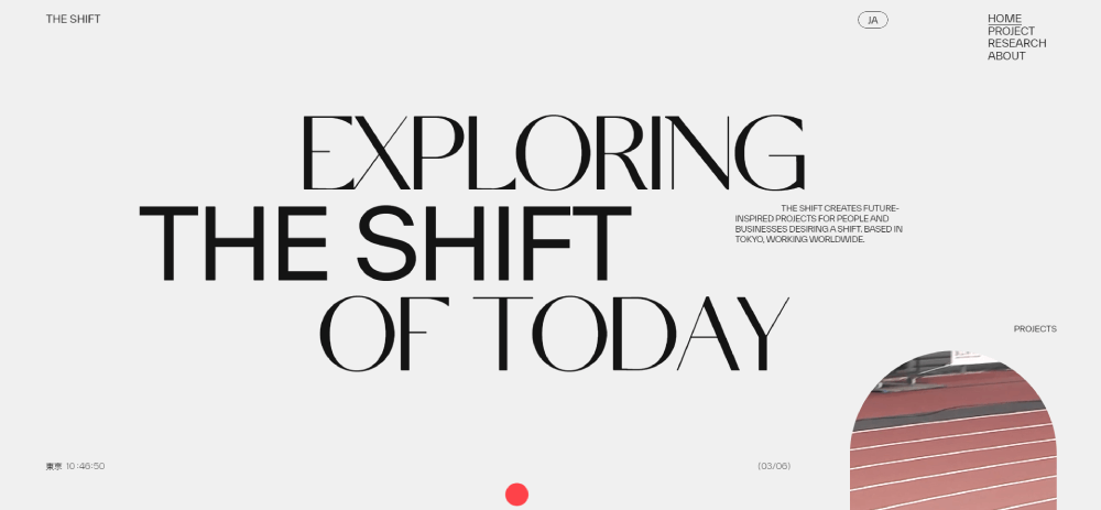
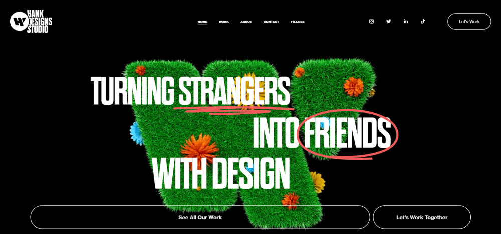
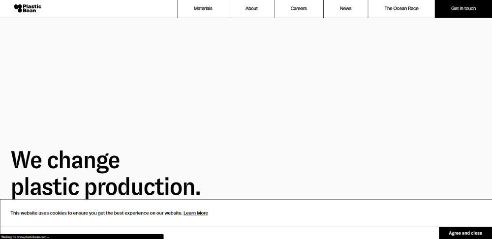
Amazing website design examples
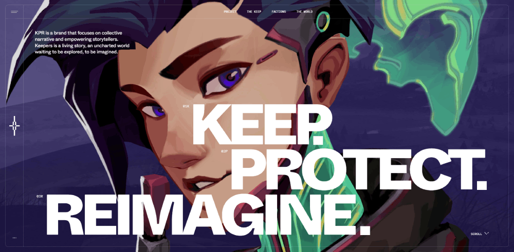
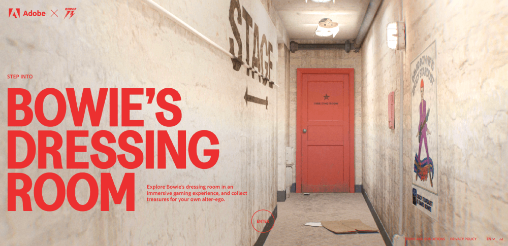
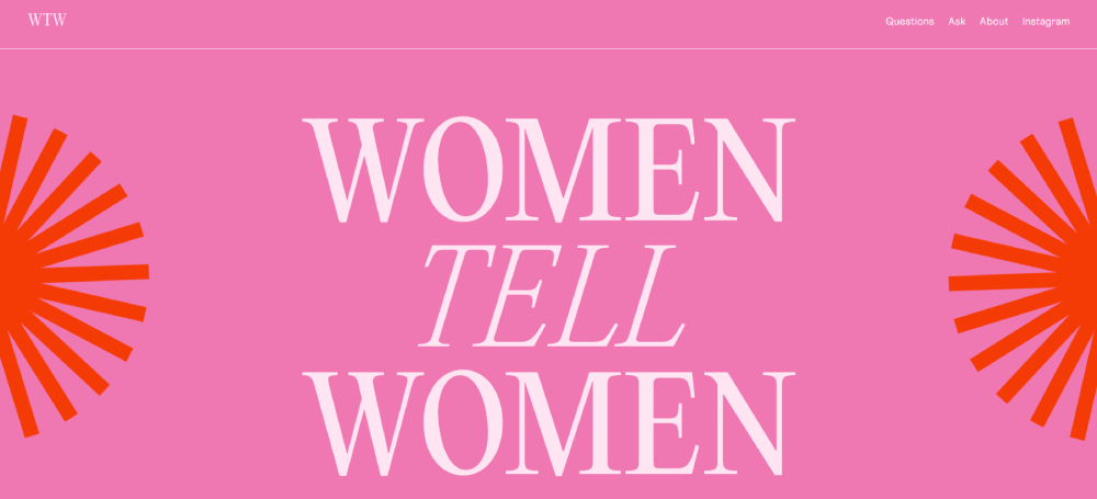
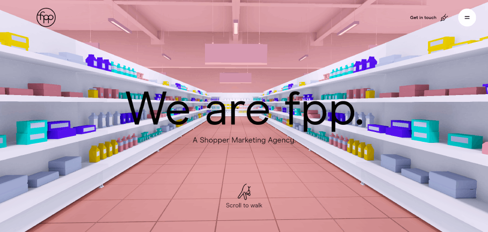
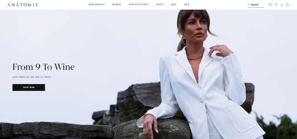
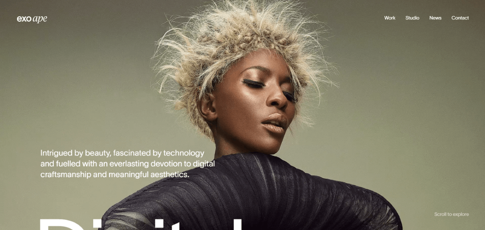
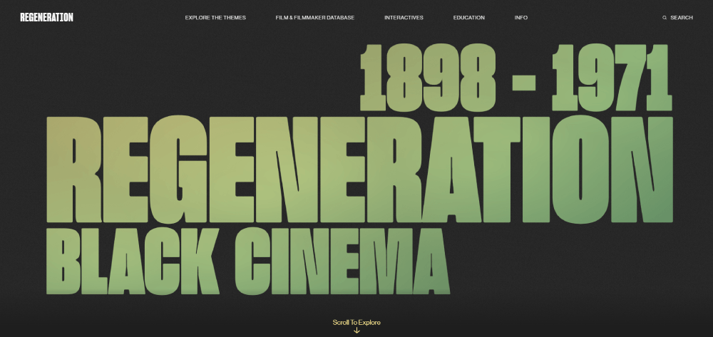
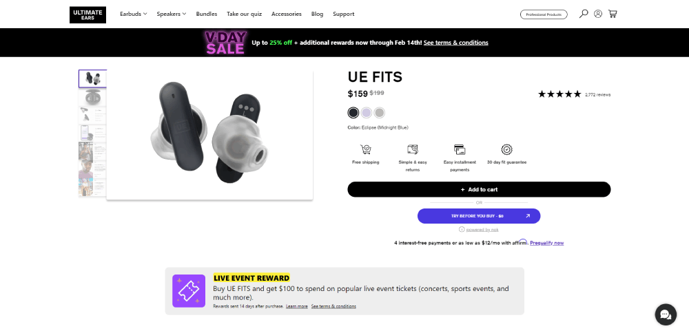
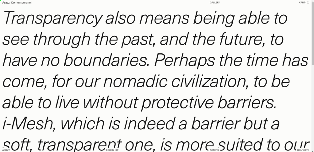
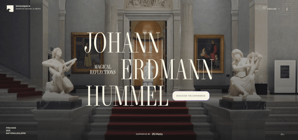
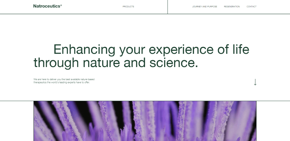
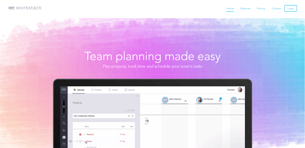
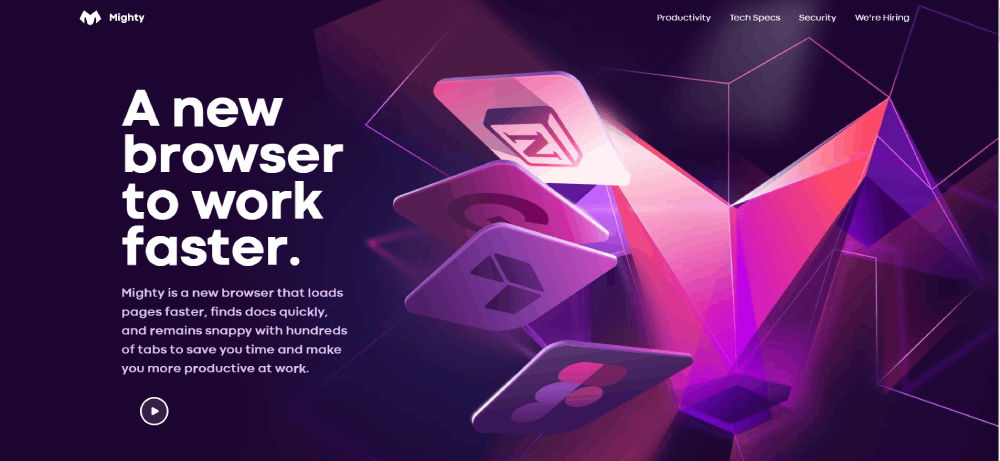
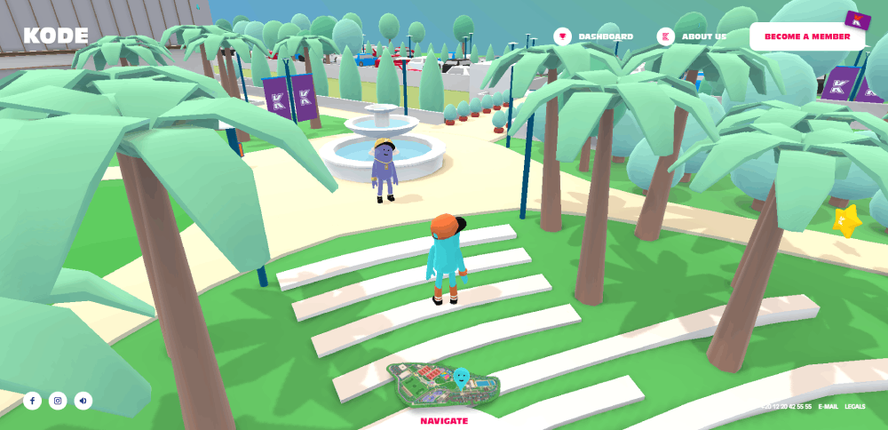
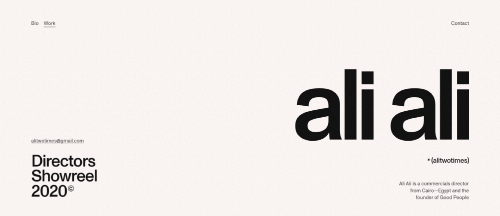
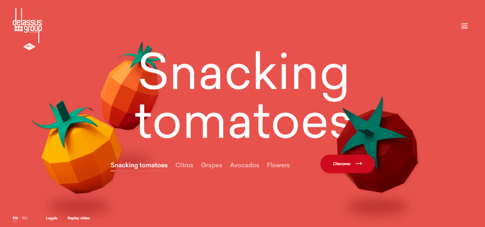
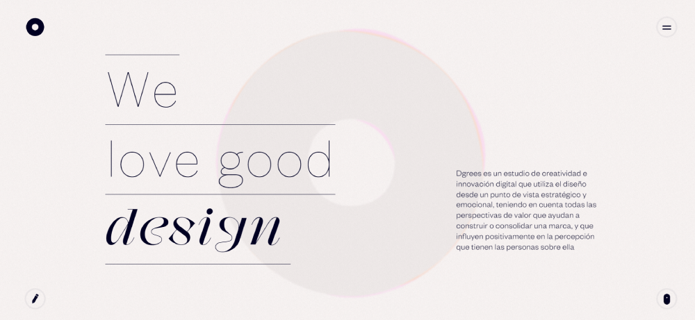
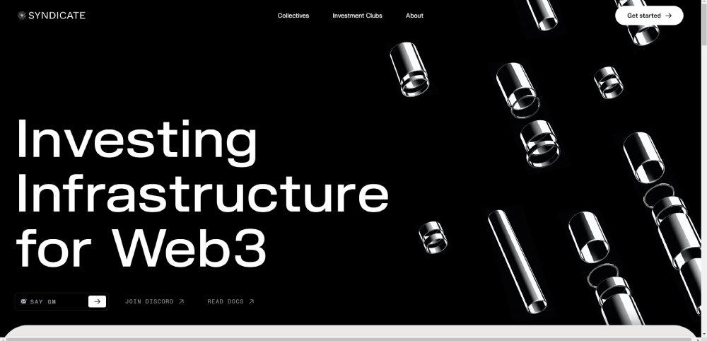
KPR


Core Visual Design Principles in Top-Performing Websites
Top-performing websites implement hierarchy through typography scaling, white space distribution, color theory application, and focal point creation to guide user attention toward conversion paths while maintaining brand consistency.
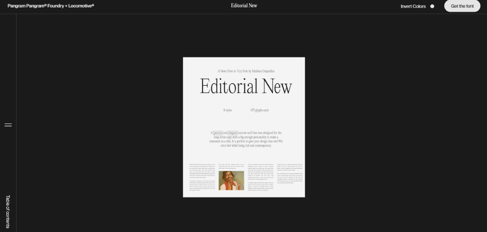
Typography Hierarchy Systems
Type scale ratios determine visual rhythm. The golden ratio (1.618) and major third (1.25) are common multipliers for heading sizes.
H1 elements typically range 48-72px, H2 between 36-48px, H3 at 24-32px, with body text anchored at 16-18px. Line height sits between 1.5-1.75 for optimal readability.
Font pairing follows the two-typeface rule: one for headings, one for body. Mixing serif headers with sans-serif body text creates visual contrast without chaos.
Websites with clear typographic systems reduce cognitive load by 40%. Readers scan faster, comprehend better.
Color Psychology in Conversion Design
Color choices trigger emotional responses and drive action. Blue conveys trust (banks, insurance). Red creates urgency (clearance sales, alerts).
The 60-30-10 rule structures palettes: 60% dominant color, 30% secondary, 10% accent for CTAs. This prevents visual overwhelm.
Contrast ratios matter for accessibility and attention. WCAG requires 4.5:1 for normal text, 3:1 for large text, 7:1 for AAA compliance.
CTA buttons in contrasting colors lift conversions 20-80%. Orange and green outperform blue in A/B tests for action-oriented buttons.
Successful color schemes align with industry expectations while maintaining brand differentiation through strategic accent colors.
White Space Utilization
White space creates breathing room between elements. It's not wasted space.
Macro white space separates major sections, establishes visual rhythm, and guides eye movement down the page. Micro white space improves readability between lines, letters, and UI components.
Luxury brands use 40-60% white space ratios to communicate premium positioning. Budget brands reduce spacing to maximize product density.
Line length affects comprehension. Optimal measure sits at 50-75 characters per line; beyond 90 characters, readers lose their place.
Visual Weight Distribution
Elements compete for attention through size, color, contrast, and position. Larger elements dominate; darker elements feel heavier.
The F-pattern describes how users scan web pages: horizontal movement at top, second horizontal stripe lower, vertical scan down left side. Place critical content along this path.
Z-pattern works for landing pages with minimal text: logo top-left, value proposition top-right, supporting content bottom-left, CTA bottom-right.
Asymmetric layouts create tension and interest. Symmetric designs feel stable, trustworthy.
Technical Architecture Behind High-Performance Website Design
High-performance website design requires Core Web Vitals optimization (LCP under 2.5s, FID below 100ms, CLS under 0.1), mobile-first responsive frameworks, lazy loading implementation, and CDN distribution for asset delivery.
Performance Metrics
Google's Core Web Vitals measure real-world user experience. Largest Contentful Paint (LCP) tracks loading speed - 2.5 seconds or faster marks good performance.
First Input Delay (FID) measures interactivity; users expect responses within 100ms. Cumulative Layout Shift (CLS) quantifies visual stability - scores under 0.1 prevent annoying content jumps.
Time to Interactive (TTI) and Total Blocking Time (TBT) reveal when pages become fully usable. Slow TTI frustrates users even when content appears loaded.
Speed Index measures how quickly content populates during load. Each 100ms delay drops conversions 7%.
Loading Optimization Techniques
Image compression reduces file sizes 60-80% without visible quality loss. WebP format cuts file size 25-35% compared to JPEG while maintaining quality.
Lazy loading defers off-screen images until users scroll near them. This slashes initial page weight by 50-70% on content-heavy pages.
Code minification strips whitespace, comments, and unnecessary characters from CSS and JavaScript. Gzip compression further reduces transfer size 70-90%.
Critical CSS inlining embeds above-fold styles directly in HTML, eliminating render-blocking requests. The rest loads asynchronously.
Browser caching stores static assets locally. Proper cache headers prevent repeat downloads for returning visitors.
Responsive Breakpoints
Mobile-first design starts at 320px, then scales up. Common breakpoints: 320px (small phones), 375px (iPhone), 768px (tablets), 1024px (small laptops), 1440px (desktops), 1920px (large screens).
Fluid grids use percentages instead of fixed pixels. Content reflows naturally across screen sizes.
CSS Grid and Flexbox handle complex layouts without JavaScript. Grid excels at two-dimensional layouts; Flexbox dominates one-dimensional arrangements.
Responsive websites adjust touch targets for mobile - minimum 44x44px ensures easy tapping without fat-finger errors.
Browser Compatibility Requirements
Chrome dominates with 65% market share, Safari holds 18%, Edge takes 5%, Firefox captures 3%. Test across all four.
Progressive enhancement builds core functionality for all browsers, then adds advanced features for modern ones. This beats graceful degradation.
Polyfills add modern features to older browsers. But supporting IE11 (0.5% usage) rarely justifies development cost.
CSS vendor prefixes handle browser-specific implementations: -webkit- for Chrome/Safari, -moz- for Firefox. Autoprefixer tools add these automatically.
Ranking Criteria for Website Design Excellence
Exceptional website design evaluation requires analyzing visual hierarchy effectiveness, conversion funnel performance, technical optimization scores, accessibility compliance, mobile responsiveness, brand consistency, and user task completion rates.
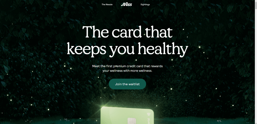
Visual Impact (20%)
First impressions form in 50 milliseconds. Hero sections determine whether visitors stay or bounce.
Brand identity clarity emerges through consistent color application, logo placement, and typography choices. Users should identify the brand within 2 seconds.
Aesthetic coherence means every element follows the design system. Rogue fonts, inconsistent button styles, and mismatched spacing scream amateur.
Professional hero section design balances compelling imagery with clear value propositions and prominent CTAs.
User Experience (25%)
Task completion ease measures friction between user intent and goal achievement. Fewer clicks win.
Navigation intuitiveness matters more than creativity. Users expect logos to link home, hamburger menus on mobile, search icons in top-right corners.
Information architecture organizes content logically. Flat hierarchies (3 clicks to any page) beat deep nesting.
Navigation systems that confuse visitors kill conversions. Clarity beats cleverness every time.
Technical Performance (20%)
Page load speed directly impacts revenue. Amazon loses $1.6 billion annually for every second of delay.
Core Web Vitals passing means LCP under 2.5s, FID under 100ms, CLS under 0.1. Google penalizes sites failing these thresholds.
Cross-browser functionality ensures consistent experiences. A site broken in Safari loses 18% of potential customers.
Mobile performance deserves extra weight - 60% of web traffic comes from phones. Slow mobile sites get abandoned faster than desktop.
Conversion Architecture (20%)
CTA placement follows eye-tracking patterns. Above-fold CTAs increase conversions 20-80% compared to below-fold placement.
Form design optimization reduces fields to bare minimums. Each additional field drops completion rates 5-10%.
Funnel optimization identifies friction points. Checkout abandonment hits 70% industry-wide; great UX cuts this to 35-40%.
Effective call to action buttons use action verbs, contrasting colors, and adequate size (minimum 44x44px for mobile).
Accessibility (15%)
WCAG compliance isn't optional. Level AA accessibility reaches 95% of users; AAA hits 98%.
Screen reader compatibility requires semantic HTML: proper heading hierarchies, alt text for images, ARIA labels for interactive elements.
Keyboard navigation support means every interactive element reaches via Tab key. Visible focus indicators show current position.
Accessible websites expand market reach while reducing legal risk - lawsuits under ADA Title III jumped 250% from 2020-2023.
Industry-Specific Design Patterns in Top Websites
Design patterns vary across industries through specialized navigation structures, content hierarchy adjustments, conversion mechanisms, visual metaphors, trust signal placement, and interaction models tailored to specific user behaviors and expectations.
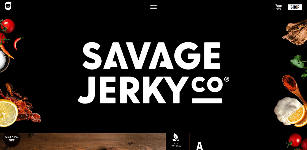
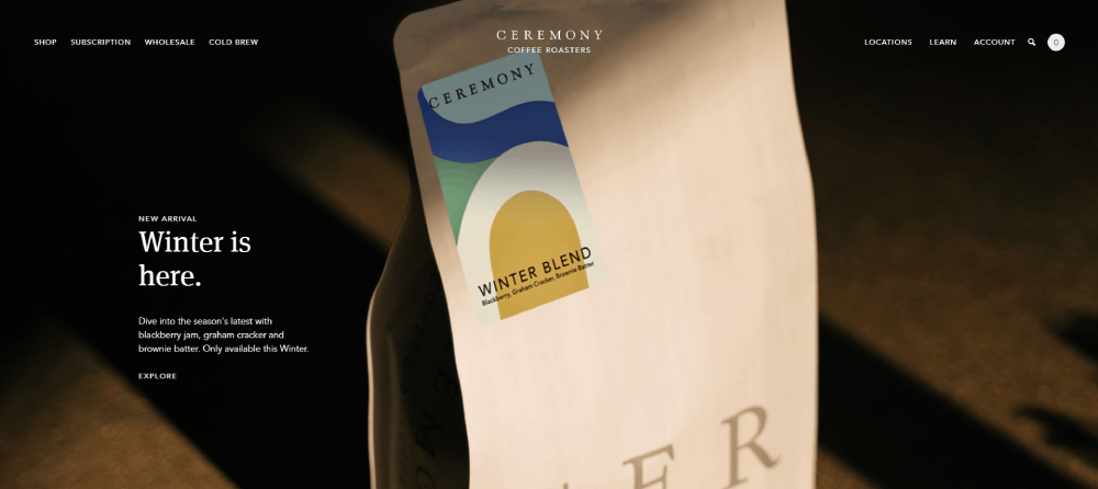
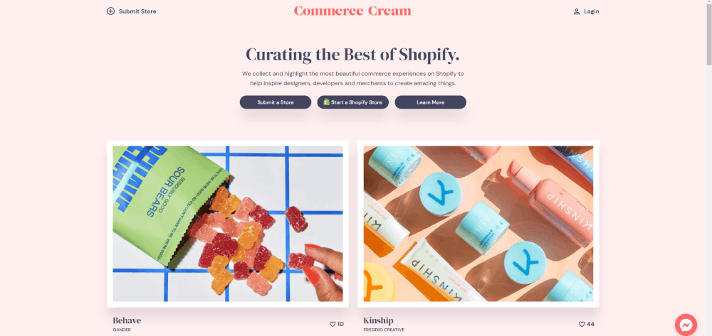
E-commerce Design Patterns
Product grids dominate homepage layouts. 3-4 columns on desktop, 2 on tablet, 1 on mobile maximizes product visibility without overwhelm.
Filtering systems need faceted navigation: price ranges, sizes, colors, brands. Users expect filters on left sidebar (desktop) or top drawer (mobile).
Checkout flows balance simplicity with information gathering. Single-page checkouts convert 10% higher than multi-step, but complex products need step-by-step guidance.
Trust signals cluster near CTAs: security badges, return policies, customer reviews. Reviews boost conversions 18-270% depending on product category.
SaaS Design Patterns
SaaS websites lead with feature benefits over technical specifications. Screenshots and demo videos outperform text descriptions.
Pricing tables compare plans side-by-side. Highlighting "most popular" options lifts conversions 12-17% through anchoring bias.
Free trial CTAs repeat across pages. Top-right header placement, hero section, and sticky bottom bars maximize visibility.
Product tours use progressive disclosure: show core features first, advanced capabilities later. Overwhelmed users abandon during onboarding.
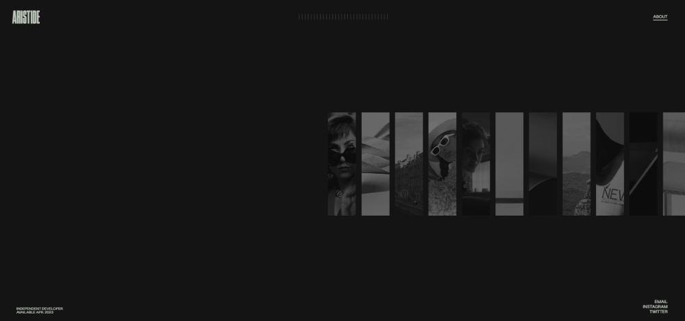
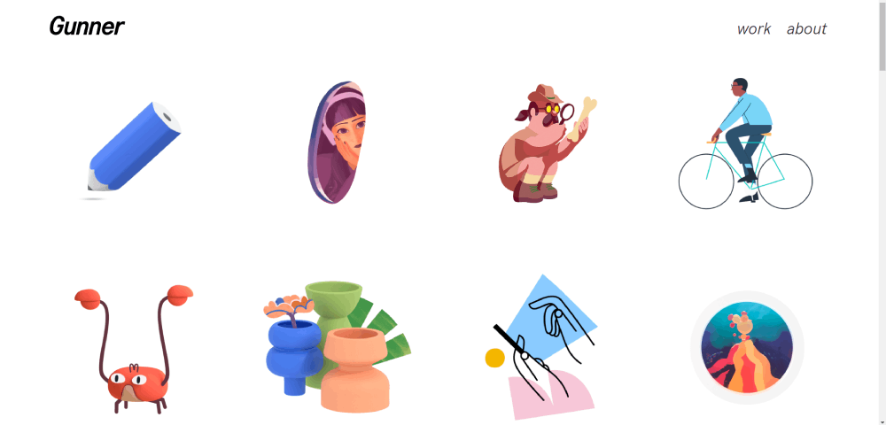
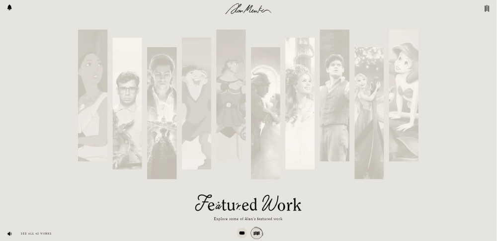
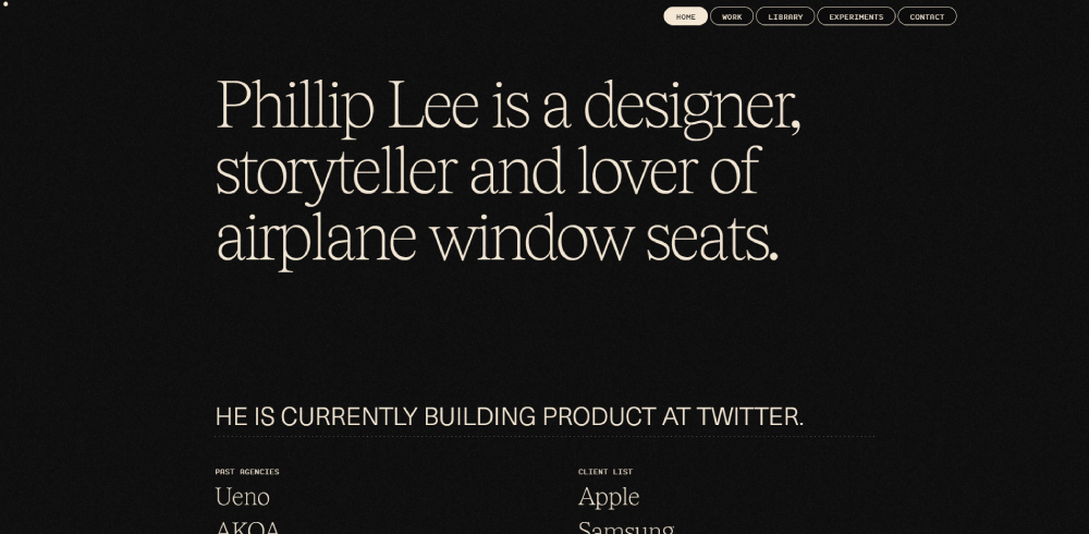
Portfolio Design Patterns
Project galleries prioritize visual impact over text. Grid layouts (masonry or standard) let work speak for itself.
Case study layouts follow story arcs: challenge, solution, results. Metrics prove impact better than adjectives.
Contact forms stay simple: name, email, message. Asking budget and timeline upfront filters tire-kickers but may scare qualified leads.
Strong portfolio designs balance showing range while maintaining cohesive style and demonstrating clear expertise in specific areas.
Media and News Patterns
Content feeds use card-based layouts. Featured stories get hero placement; secondary content fills grids below.
Article layouts balance readability with ad revenue. 650-750px content width, 1.5-1.75 line height, 18-21px font size optimizes reading.
Subscription prompts trigger after 2-3 article views or 30 seconds on page. Immediate popups annoy; delayed prompts convert 3-5x better.
Category navigation requires clear hierarchies. Mega menus organize topics; sticky headers keep navigation accessible during scroll.
Corporate B2B Patterns
B2B websites emphasize credibility over flash. Client logos, case studies, and certifications build trust for high-value purchases.
Service pages need detailed explanations. B2B buyers research extensively before contact - provide comprehensive information upfront.
Lead generation forms balance information gathering with conversion rate. Phone and company name often prove too much friction for top-of-funnel offers.
Resource sections (blogs, whitepapers, webinars) nurture leads through extended sales cycles. B2B purchases take 3-6 months; content maintains engagement.
FAQ on Amazing Website Design
What makes a website design amazing?
Amazing website design combines visual appeal with functionality. It loads under 3 seconds, converts visitors at above-average rates, maintains accessibility standards, and solves specific user problems through intuitive navigation and clear information architecture across all devices.
How do I find inspiration for website design?
Study award-winning sites in your industry, analyze competitor layouts, browse design inspiration galleries, and examine successful conversion funnels. Focus on understanding why designs work rather than copying aesthetics.
What are the key elements of effective web design?
Effective designs require clear visual hierarchy, readable typography systems, strategic color application, purposeful white space, mobile responsiveness, fast loading speeds, accessible navigation, and conversion-focused CTAs placed according to user behavior patterns.
How important is mobile-first design?
Mobile-first design is critical since 60% of web traffic comes from phones. Designs starting at 320px and scaling up ensure usability on small screens while progressively enhancing for larger displays.
What role does color theory play in website design?
Color theory influences emotional response and user action. The 60-30-10 rule structures palettes effectively. Contrast ratios ensure readability. Strategic accent colors on CTAs boost conversions 20-80% in testing.
How can I improve my website's visual hierarchy?
Improve hierarchy through size variation, color contrast, strategic spacing, and positioning. Larger elements attract attention first. F-pattern and Z-pattern layouts guide eye movement toward conversion goals and critical information.
What are common mistakes in website design?
Common mistakes include poor mobile optimization, slow loading speeds, confusing navigation, insufficient contrast, missing CTAs, auto-playing videos, intrusive popups, inconsistent branding, and ignoring accessibility requirements that exclude users.
How does typography affect website design?
Typography impacts readability and brand perception. Type scale ratios create visual rhythm. Font pairing balances contrast and coherence. Optimal line length stays 50-75 characters. Line height between 1.5-1.75 ensures comfortable reading.
What's the difference between good and bad web design?
Good design prioritizes user needs, loads quickly, converts visitors, and maintains consistency. Bad design confuses users, ignores mobile visitors, loads slowly, buries important information, and creates friction between intent and action.
How do I create a user-friendly website?
User-friendly websites minimize clicks to goals, use familiar patterns, provide clear feedback, maintain fast performance, ensure accessibility compliance, and test navigation with real users to identify friction points before launch.
Conclusion
These amazing website design examples prove that effective digital experiences balance aesthetics with performance. Visual hierarchy, typography systems, and color psychology work together to guide users toward conversion goals.
The difference between mediocre and exceptional comes down to execution details. Pixel-perfect spacing, intentional contrast ratios, and optimized loading speeds separate amateurs from professionals.
Every industry requires different design patterns. E-commerce needs product grids and filtering systems. SaaS landing pages prioritize feature benefits and demo CTAs.
Technical architecture matters as much as visual appeal. Core Web Vitals compliance, mobile responsiveness, and interface design quality directly impact revenue.
Study these examples. Understand why they work. Then adapt their principles to your specific audience and business goals.


