

How To Remove the Category From the WordPress URL
April 15, 2026
Cool Websites with a Pink Color Palette (51 Examples)
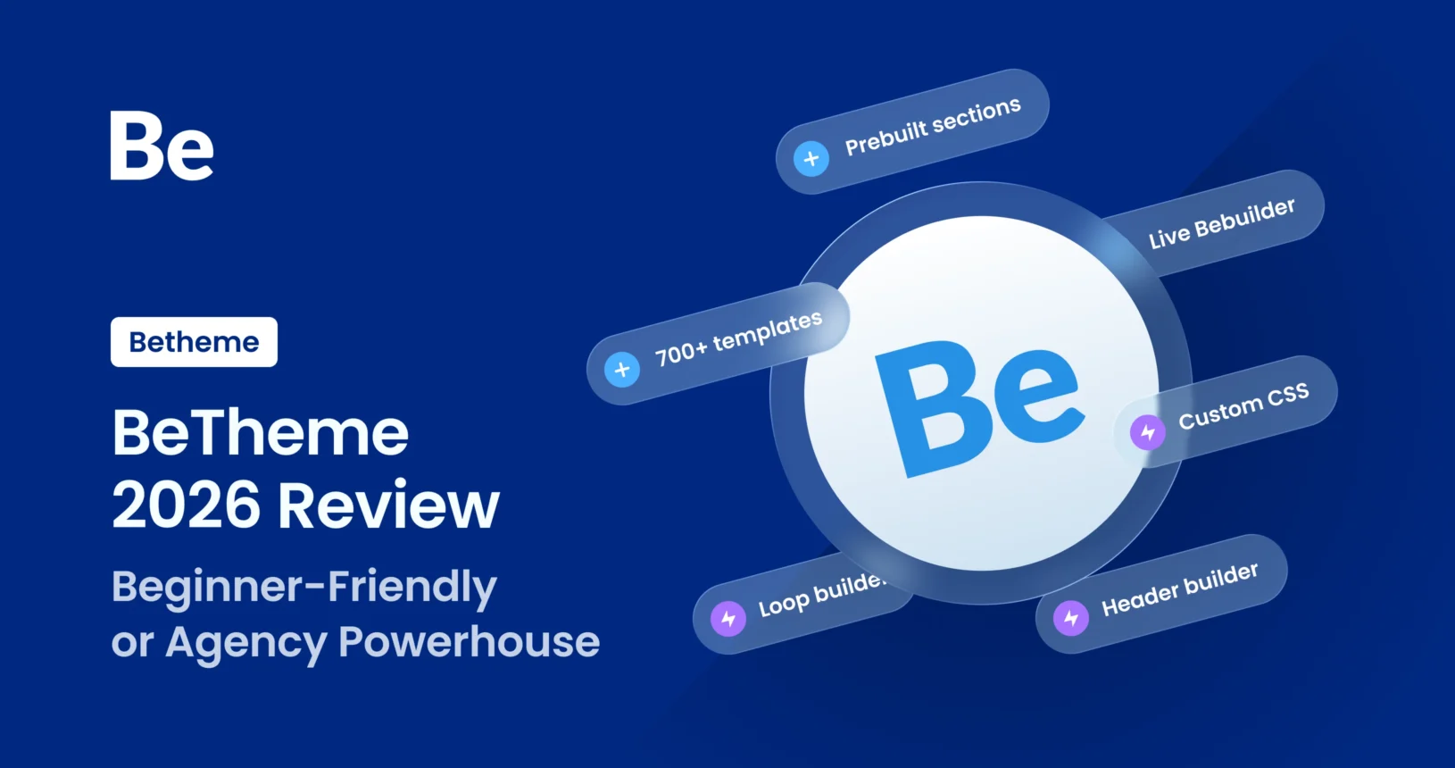
April 20, 2026For years, BeTheme has consistently ranked as a top-tier bestseller on ThemeForest. Boasting over 700 pre-built websites and the formidable BeBuilder tool, it’s a magnet for anyone looking to launch a WordPress site we’ll try to make .
The big question is: Is this just a “beginner’s toy” designed to make life easy, or is it a sophisticated powerhouse that professional web designers and agencies can actually rely on? We’re going to break down both paths to answer that fundamental question.
It’s a fascinating topic because BeTheme has evolved from a simple “library of templates” into a massive ecosystem. With its BeBuilder (previouslu known as Muffin Builder) live visual editor and a suite of specialized builders (header, footer, blog, shop archives and much more), it tries to play both sides of the field. The challenge? These two user groups use the exact same tool in completely different ways.
Before we dive in, let’s talk numbers. As of February 2026, a lifetime license for a single domain sits at $60 (one-time fee). This includes built-in features—like styled blog/shop filters and premium plugins like Slider Revolution—that usually require paid add-ons elsewhere. When you compare that to “SaaS-style” builders that charge several times more every single year without offering more features, BeTheme is incredibly competitive.
Let’s analyze who BeTheme is really for and what it brings to the table for each group.
BeTheme’s Benefits for Different User Types
Every user comes to the table with a unique set of needs, though that’s not to say there isn’t some overlap. A feature that’s a lifesaver for someone building their very first site can be just as valuable to a seasoned pro, and vice versa. That said, I’d like to break down what I believe are the standout features for each specific group within the BeTheme ecosystem.
BeTheme for the Amateur: A Head Start Without the Code
If you’re building your first site with zero dev experience—maybe for a small business, a personal blog, or a portfolio—BeTheme is like LEGOs with an instruction manual.
- 700+ Pre-built Demos: This is the “killer feature.” Pick your niche (e.g., “Dentist,” “Traveler,” “Lawyer”), hit “import,” and in minutes, you have a professional skeleton. Just swap the text and images, and you’re live.
- Intuitive BeBuilder: This modern visual editor uses drag-and-drop logic. You see changes in real-time, which takes the stress out of wondering what’s happening “under the hood.”
- Support & Documentation: As a market giant, BeTheme has a massive knowledge base and tutorials (like the BeTheme Academy). Plus, your license includes six months of tech support to help you over any hurdles.
BeTheme for Designers & Freelancers: Speed and Flexibility
For a professional, time is money. BeTheme allows you to ship high-end projects faster without cutting corners on visual quality. But it’s not just about speed; pros need a robust toolkit to build complex sites and manage reusable content efficiently. This is exactly where BeTheme hits the sweet spot.
- BeBuilder vs. Elementor: BeTheme’s native builder is significantly lighter and faster than Elementor. It cuts “code bloat” to a minimum, which is vital for hitting those Google Core Web Vitals targets.
- Global Styles: Define your brand’s fonts, colors, and layouts globally to skin a client’s site in seconds.
- Complete Control: Pros will love the dedicated Header & Mega Menu Builders, areas that are often frustratingly limited in cheaper themes.
- Variables: Use CSS variables across the site to manage repeating values, making global updates a breeze.
- Import/Export: Easily move entire pages or specific elements between projects to streamline your workflow.
BeTheme for Agencies: Scalability and Standards
Agencies need predictability. BeTheme has provided a stable environment for years, which is essential when managing a large client roster. It’s a true multi-tool: you can build a simple landing page or a massive, customized WooCommerce store using the same framework.
- Versatility: Instead of forcing your team to learn ten different themes, your agency can master BeTheme and handle everything in-house—from simple landing pages to complex WooCommerce stores and high-end enterprise projects.
- Performance: Modern iterations of BeTheme are highly optimized for speed, providing a massive selling point for SEO-conscious clients who demand fast load times.
- White Labeling: The ability to hide BeTheme’s branding from the WordPress admin dashboard allows your agency to deliver a product that feels like a fully custom, proprietary solution.
- Scalable Workflow: With templates for reusable components, global sections, global wraps, and global styles, you can maintain design consistency across the entire site with ease.
The Two Paths to Building
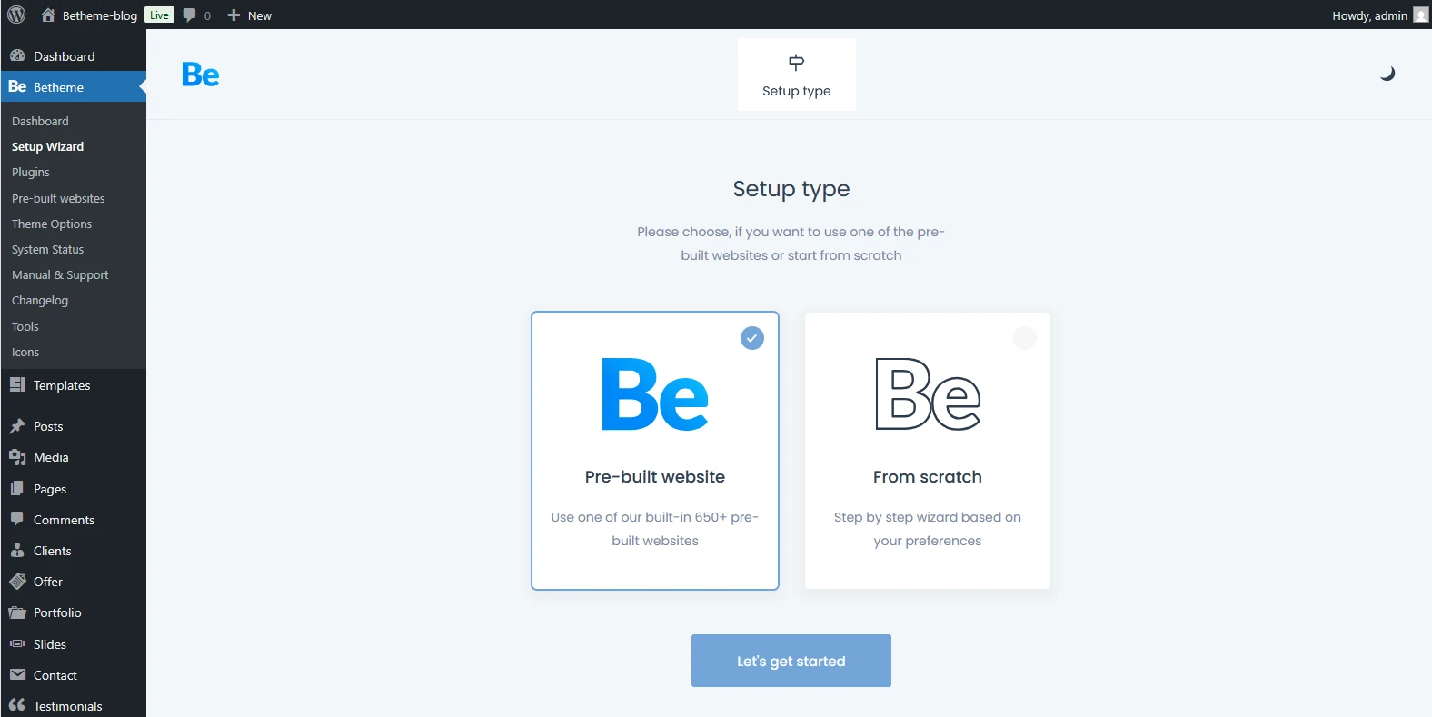
Right after installation—BeTheme gives you a choice: you can either jump start your project with one of their 700+ pre-built templates or roll up your sleeves and build your site entirely from scratch.
Most beginners choose the templates. It’s incredibly fast—some users have launched “One Page” sites in under an hour just by following the demo path. However, if you have a custom design from a tool like Figma, “from scratch” option gives you a blank canvas to build a pixel-perfect site tailored exactly to your client’s needs.
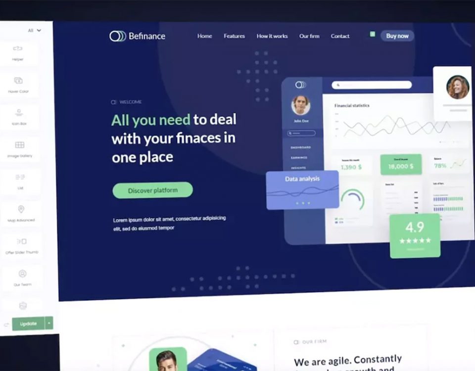
Pre-built Websites: Are They Just for Amateurs?
Most of the pre-built sites in the library come fully loaded with features you won’t even need to tweak. For the most part, your main job is just swapping out the placeholder content—meaning your own copy and images—and you’re good to go.
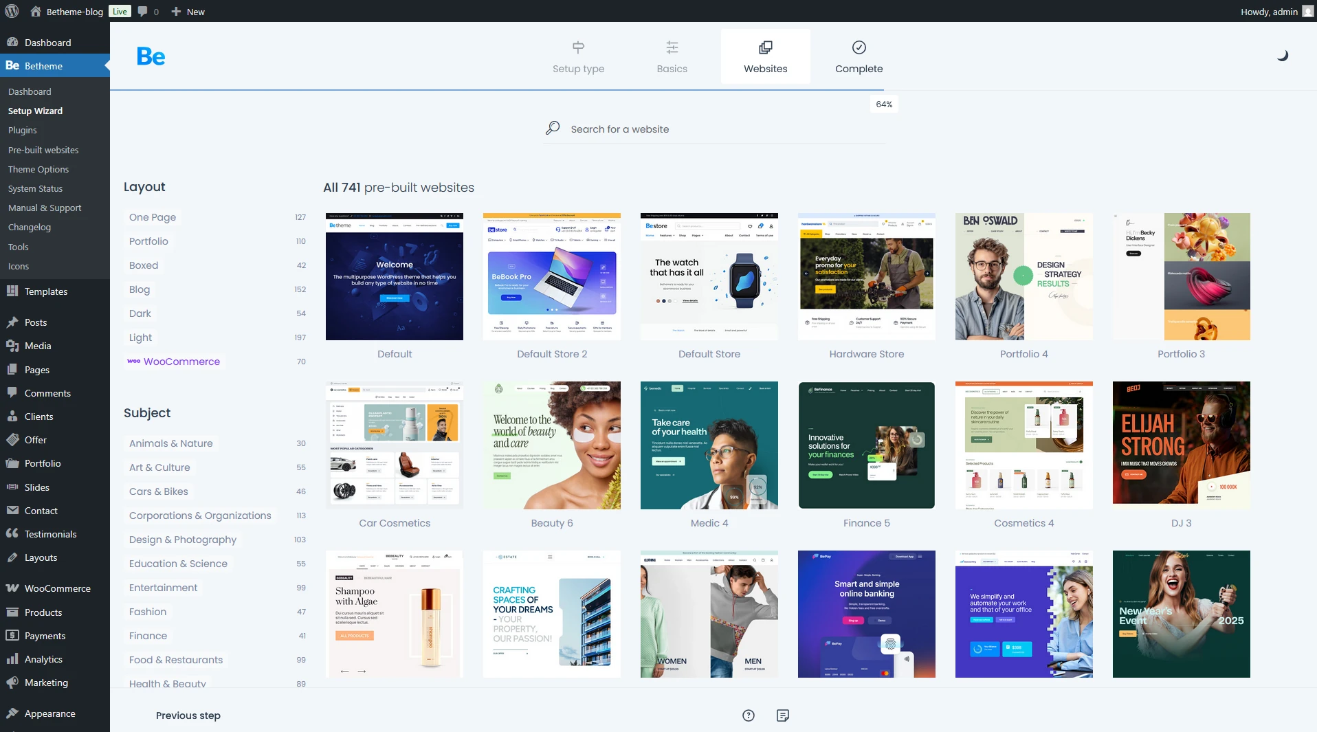
First, pick a look that grabs you. The library of pre-built sites is massive, so it’s bound to satisfy even the most demanding creator or the pickiest client.
As long as you’ve got a vision and the drive, you can completely overhaul any pre-built look to fit your specific needs. In many of these demos, the creators used templates—which act like custom overlays—for specific areas of the site, like the header or footer.
You aren’t locked into using them, though. If you feel like modifying them is a bit too much for you right now, you can easily ditch them. Just delete them from the Templates panel or re-save them while removing the “display conditions.” Once you do that, your site will simply revert to the default options set in Theme Options.
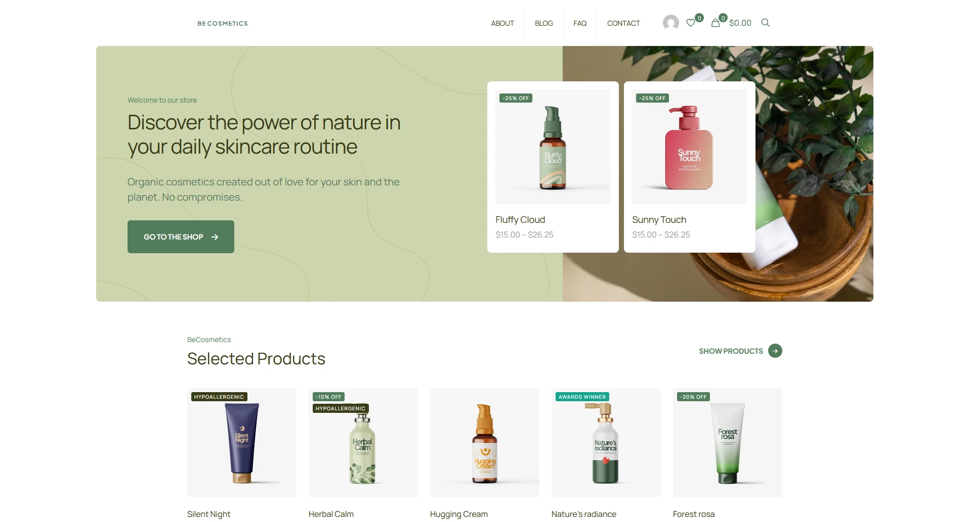
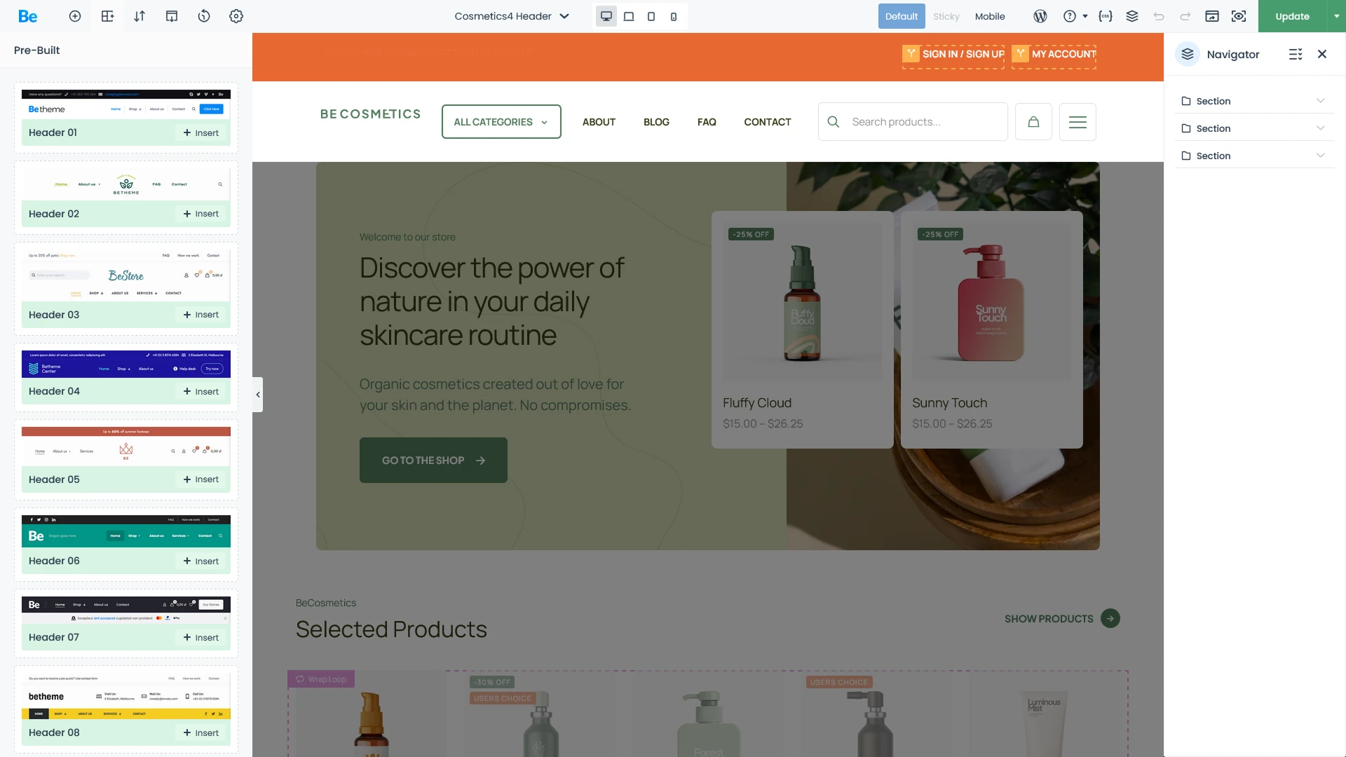
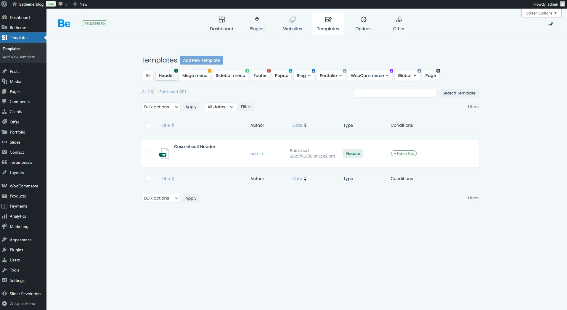
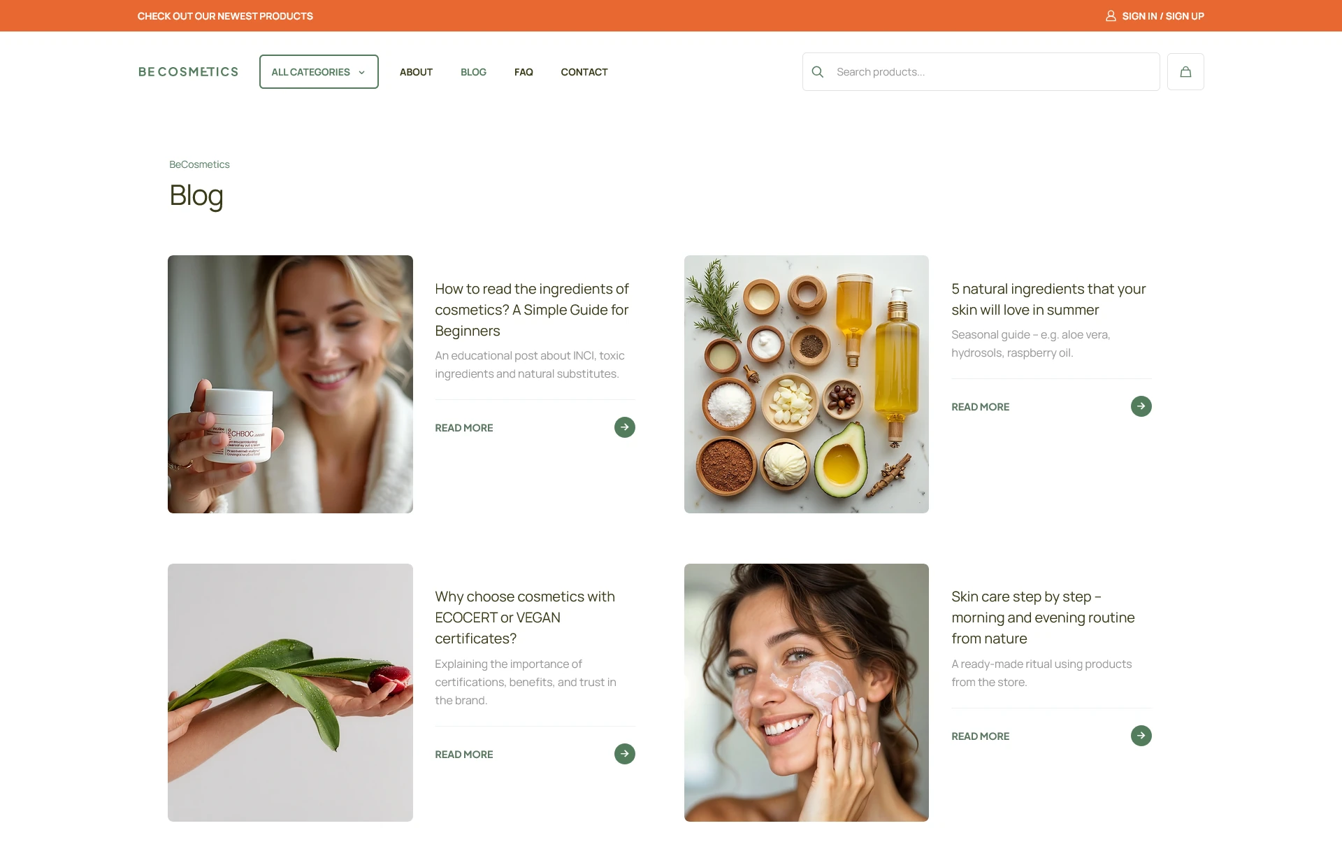
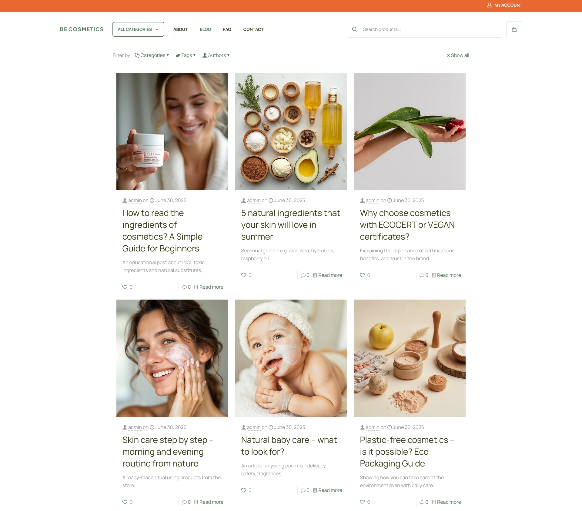
Below, you can see the “Cosmetics 4” pre-built site: first, exactly how it looks fresh after import with the active templates, and second, the view after disabling the header and footer templates to show the default theme layout. You can see how the site looks right out of the box.
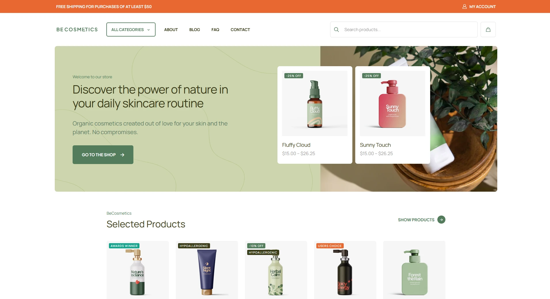
Below you can see the site layout with the header template disabled, reverting to the default header Theme Options.
Headers: The Beginner vs. WebDesigner
Could a beginner handle tweaking an existing header template on their own? Well, there’s no simple “yes” or “no” here. This advanced builder follows the familiar BeBuilder logic, though headers require a slightly different structural approach. If you’ve already got a basic handle on BeBuilder, you can definitely wrap your head around how the header works. But for someone who’s never touched web design before, it might feel a bit overwhelming at first. but with tutorial like the ones provided by the theme authors it’ll be a total breeze.
It all starts in Theme Options. Just head over to the Header tab; that’s where you’ll see if you’re working with a custom template or sticking with the theme’s default header.
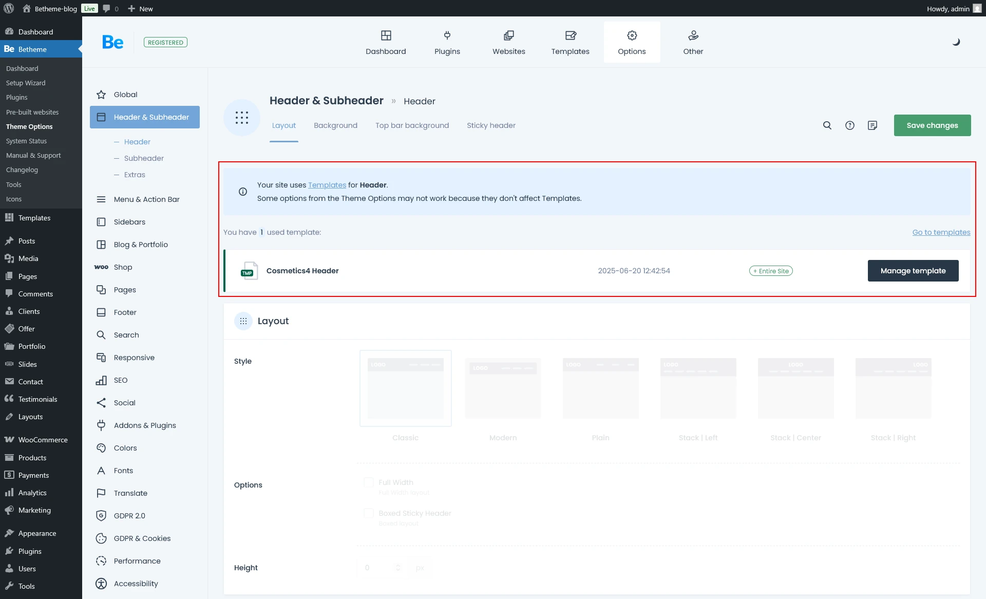
Theme Options indicate that you built the Header using a template. BeBuilder locks the standard header options because you must perform all customizations within the template itself.
No matter which route you choose, BeTheme gives you the flexibility to tailor the header exactly to your needs. High-end templates and solid default options satisfy everyone—from agencies seeking deep customization to beginners wanting a clean, ready-to-go look. The vast library of pre-set layouts gives you variety without the risk of getting lost in advanced settings.
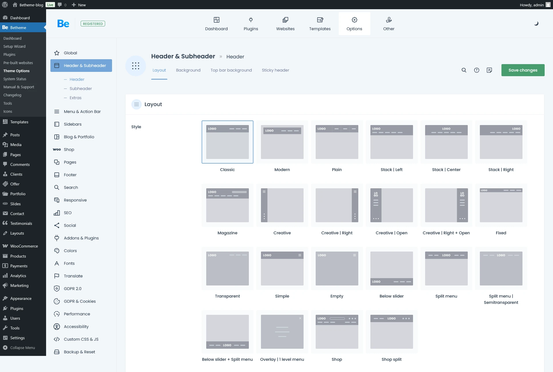
Available header layouts—just click through them to find the one that fits your style best.
Advanced Header Options
If the pre-built site’s header falls short and you dislike the default Theme Options, try our ‘third way’: Pre-built Headers. This option lets you swap in one of dozens of professionally crafted header layouts created by the BeTheme team. For anyone on a tight deadline, this is a total lifesaver—it lets you completely overhaul the top of your site in just a few clicks.
A dozen-plus header layouts at your fingertips—designed to speed up your workflow.
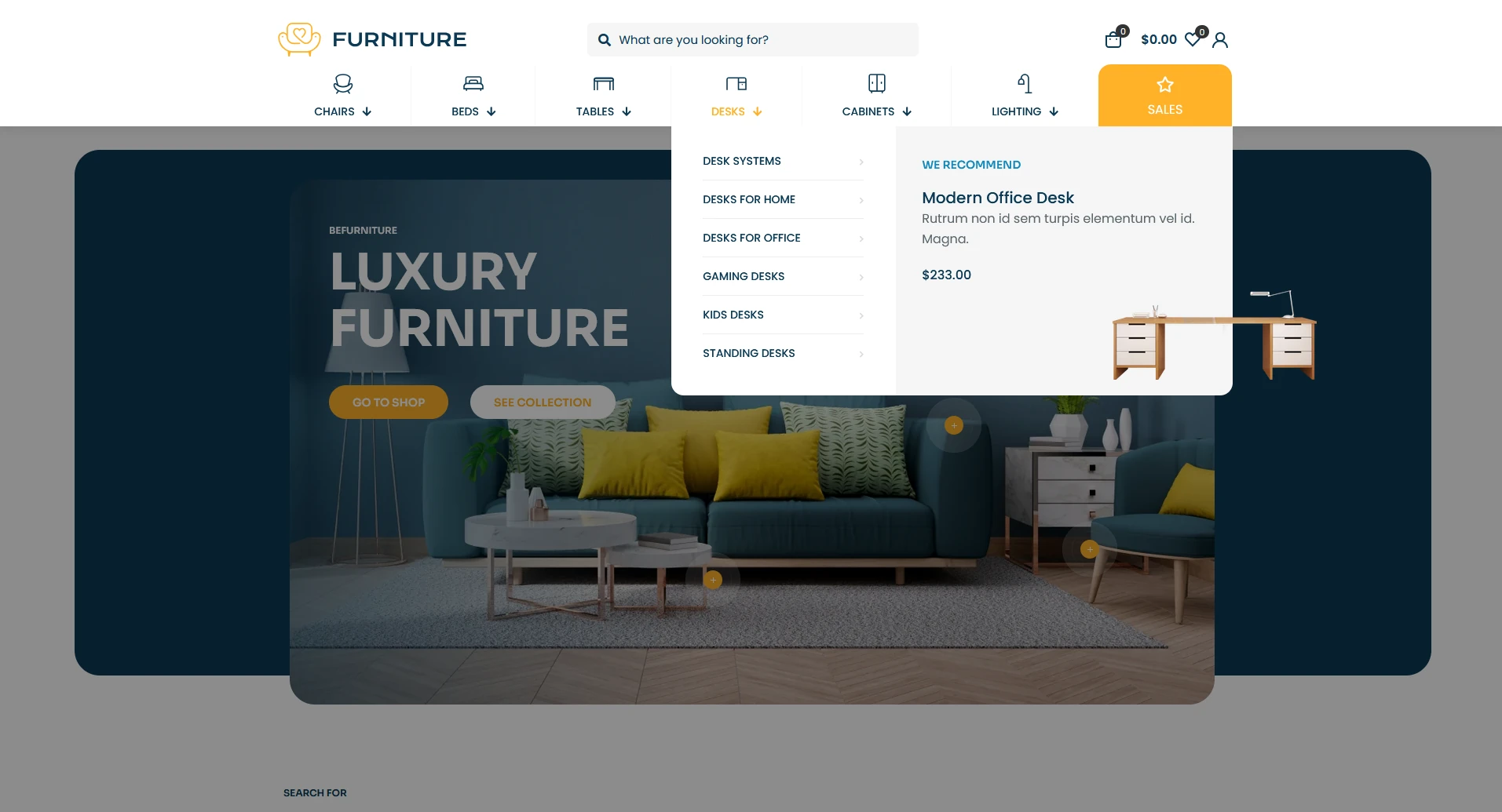
Headers: The Mega Menu
A Mega Menu is a sleek, expanded navigation option for displaying submenu items. If you want your dropdowns to look like the screenshot below, the Mega Menu template has you covered—and then some. Building this kind of setup is a breeze with the Building Mega Menus tutorial. It’s a great way to spice up your header with eye-catching visuals that can actually help boost conversions if you’re running an online store.
BeBuilder
BeBuilder (previously known as Muffin Builder) is a native live visual builder—a powerful WordPress overlay designed for intuitive web design. It streamlines your workflow by putting every option at your fingertips, allowing you to fine-tune page elements with a user experience that just feels right.
The Anatomy of a WebPage made with BeBuilder: The Core Building Blocks
You build every page using three fundamental building blocks:
- Sections
- Wraps
- Elements
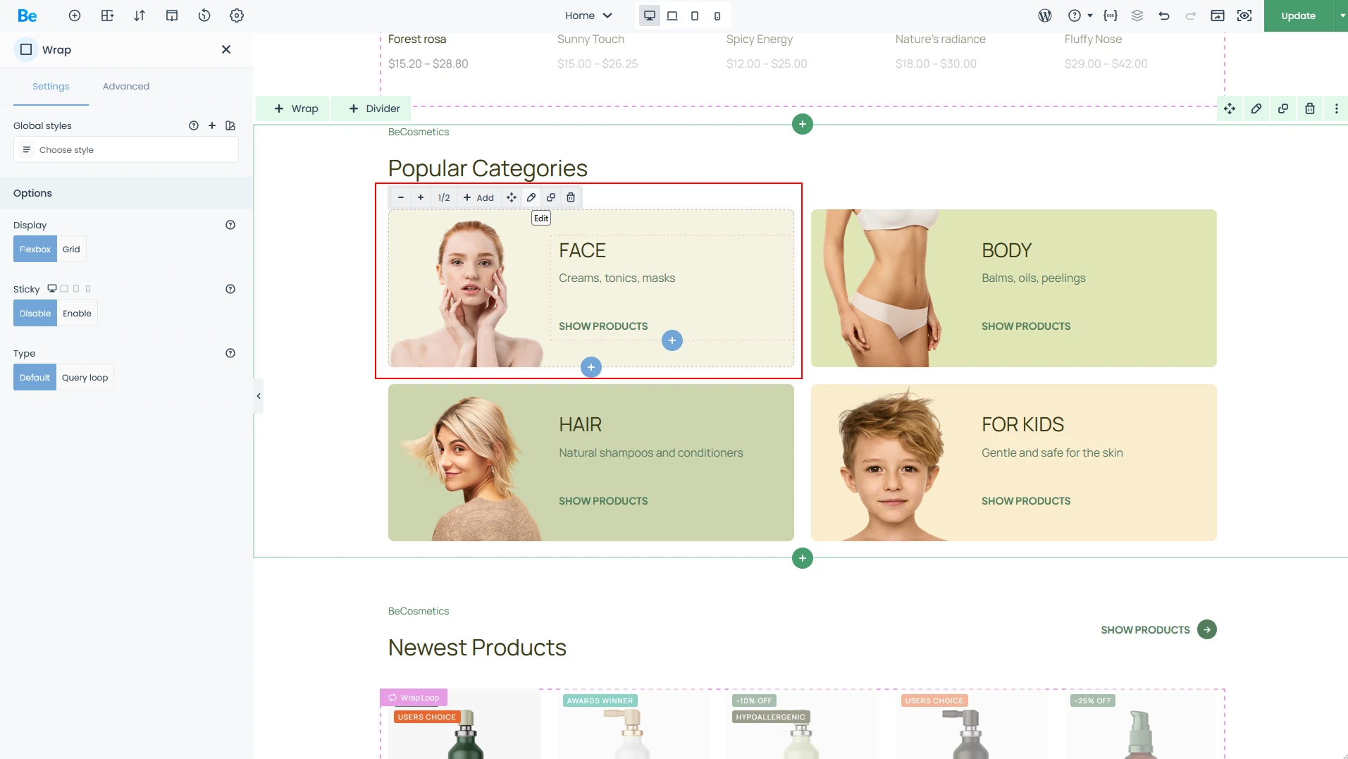
Sections
First up is the Section. Think of this as your primary container—the foundation where all your other content lives. This is where you define the layout’s footprint, determining how much space your elements occupy and setting the backgrounds for different parts of the page.
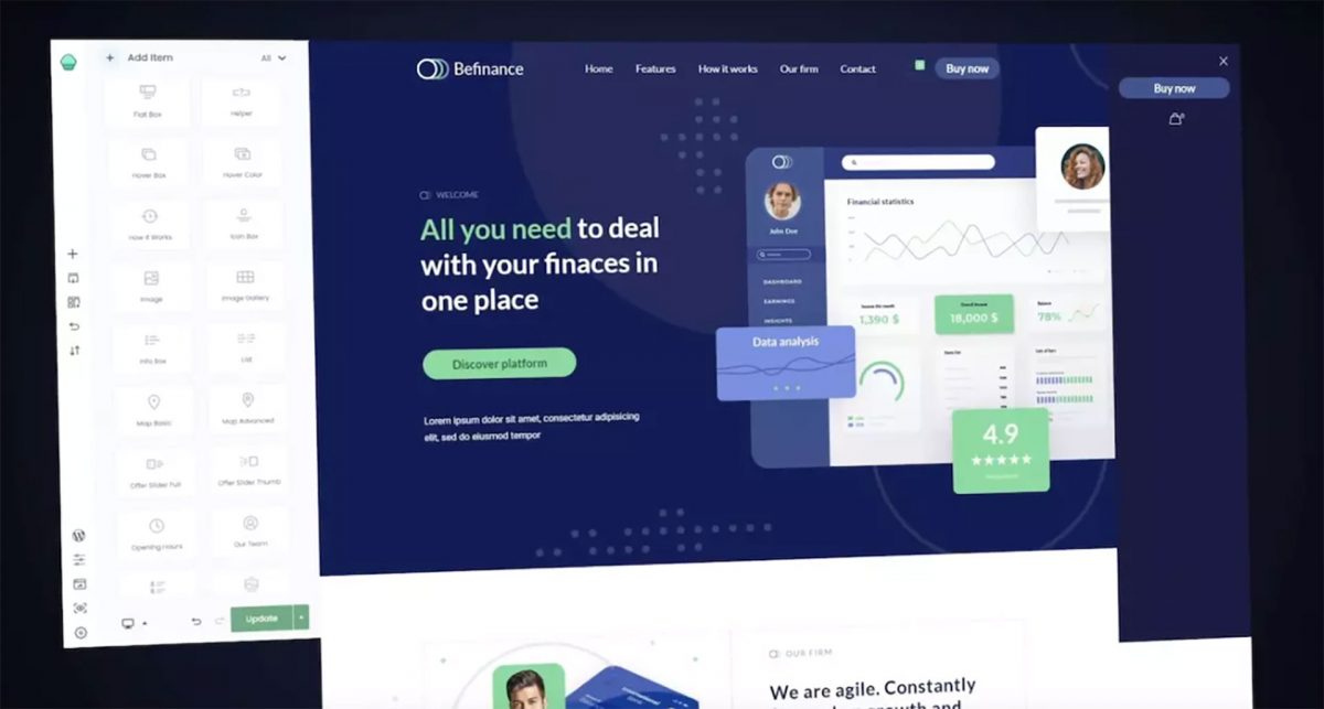
If you need to add a section but aren’t quite sure how to build it from scratch—or if the pre-built site didn’t have the specific layout you’re looking for—you can dive into the Pre-built Sections library. It’s a game-changer for both beginners and agencies alike, significantly speeding up the page-building process by letting you drop in popular, ready-to-use layouts in seconds.
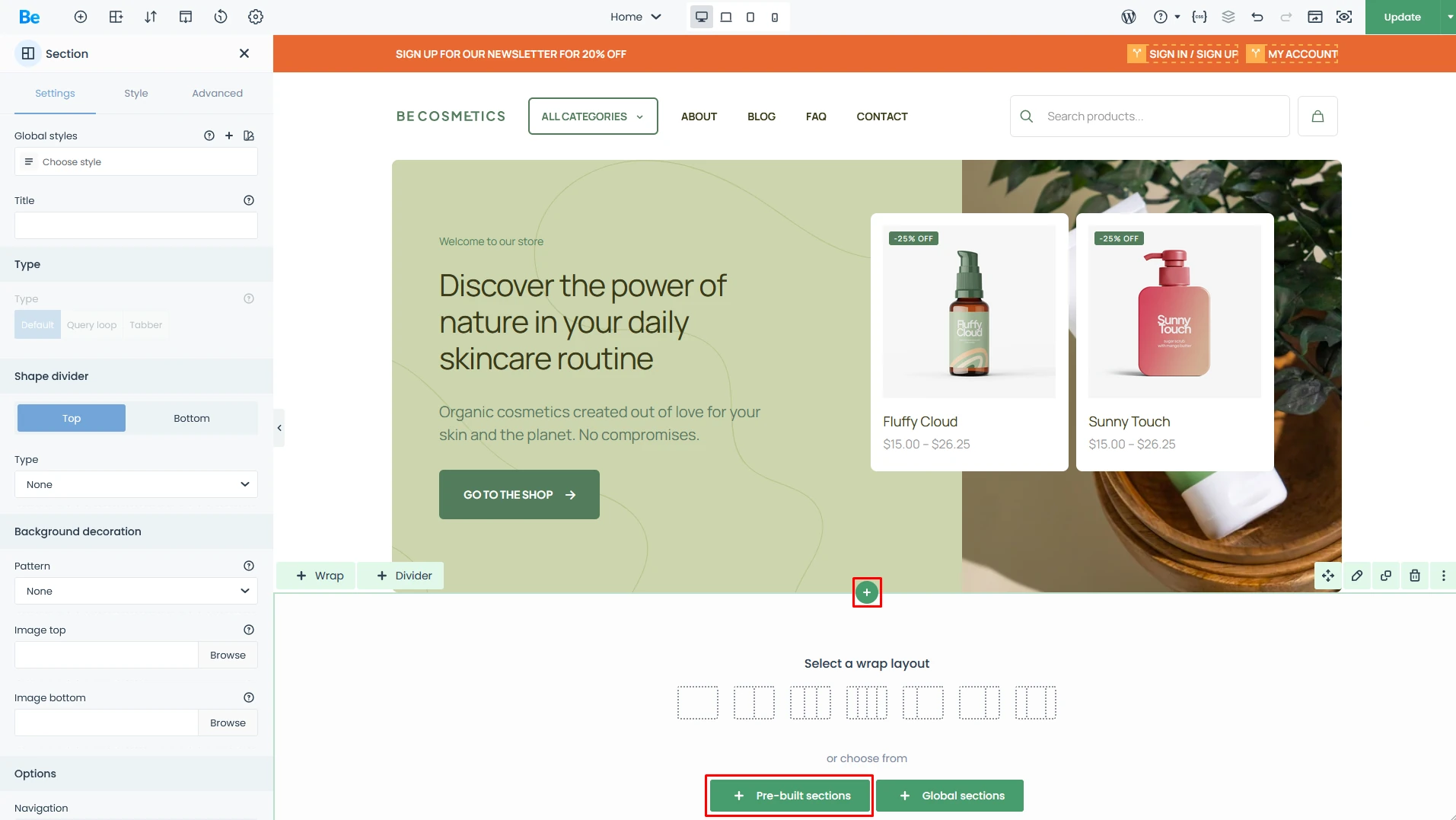
The steps to access the Pre-built Sections panel are highlighted in red.
Once you open the Pre-built Sections panel, you’ll see a visual gallery of ready-to-use layouts. Just hit the “Insert” button on the one you want, and it’ll drop directly into the builder. From there, all that’s left is to swap in your own content, and—just like that—you’ve got professional results in no time.
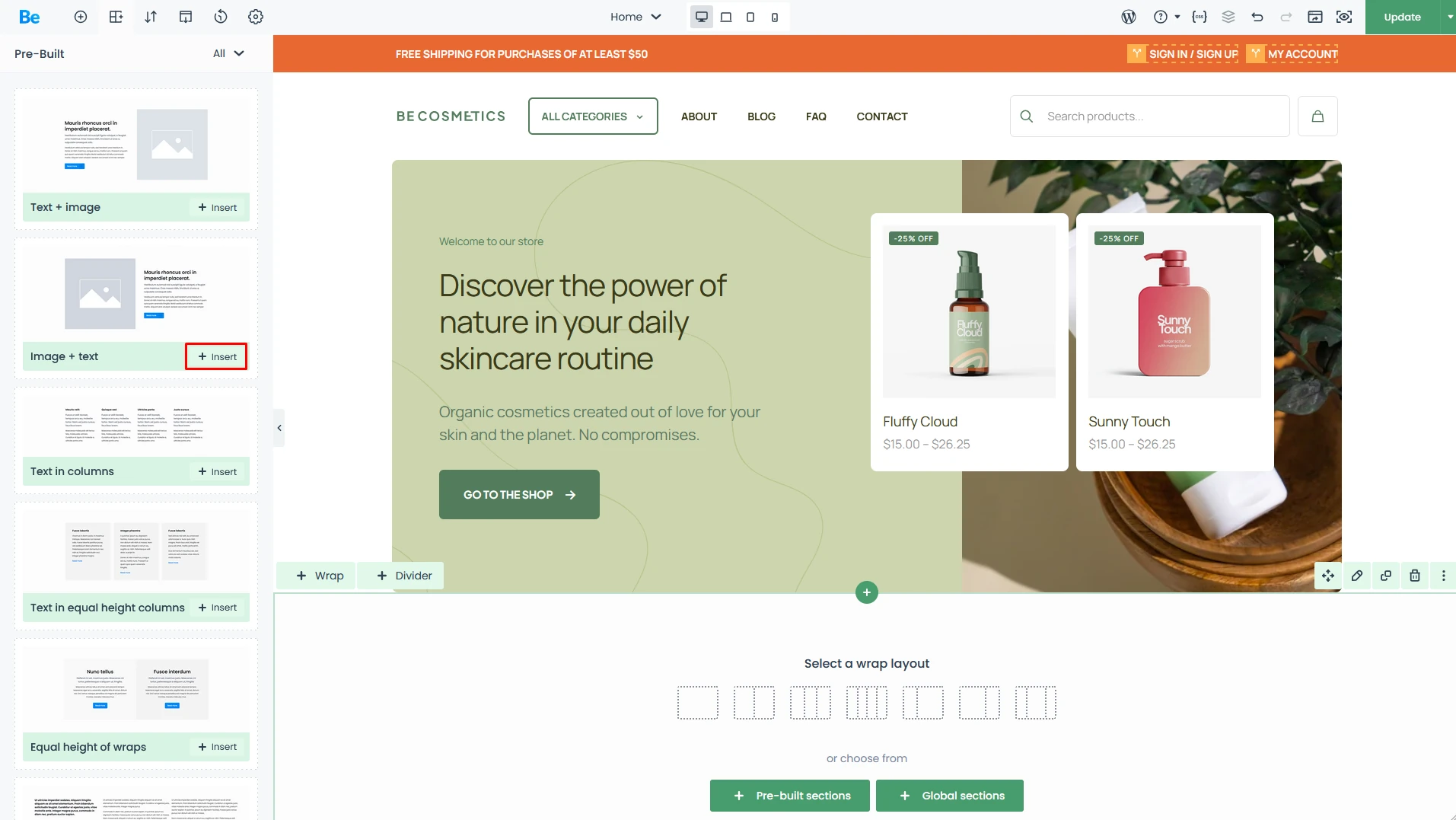
On the left, you’ll find a library of dozens of layouts that you can quickly drop onto your page.
Wraps
A Wrap is the container for your elements. It supports two levels of nesting—meaning inside one wrap, you can stack several other wraps either side-by-side or one on top of another. This flexibility allows you to build even the most sophisticated and complex layouts for your pages.
The Wrap is the box where you place your content, such as images, text columns, and more.
Elements
The extensive Elements library is the true powerhouse of the builder. It ensures you aren’t just limited to basic images and text—each element comes with its own unique set of features and settings, allowing you to craft visually stunning compositions. Using a simple, intuitive drag-and-drop method, you can place any element into a Wrap without ever writing a single line of code.
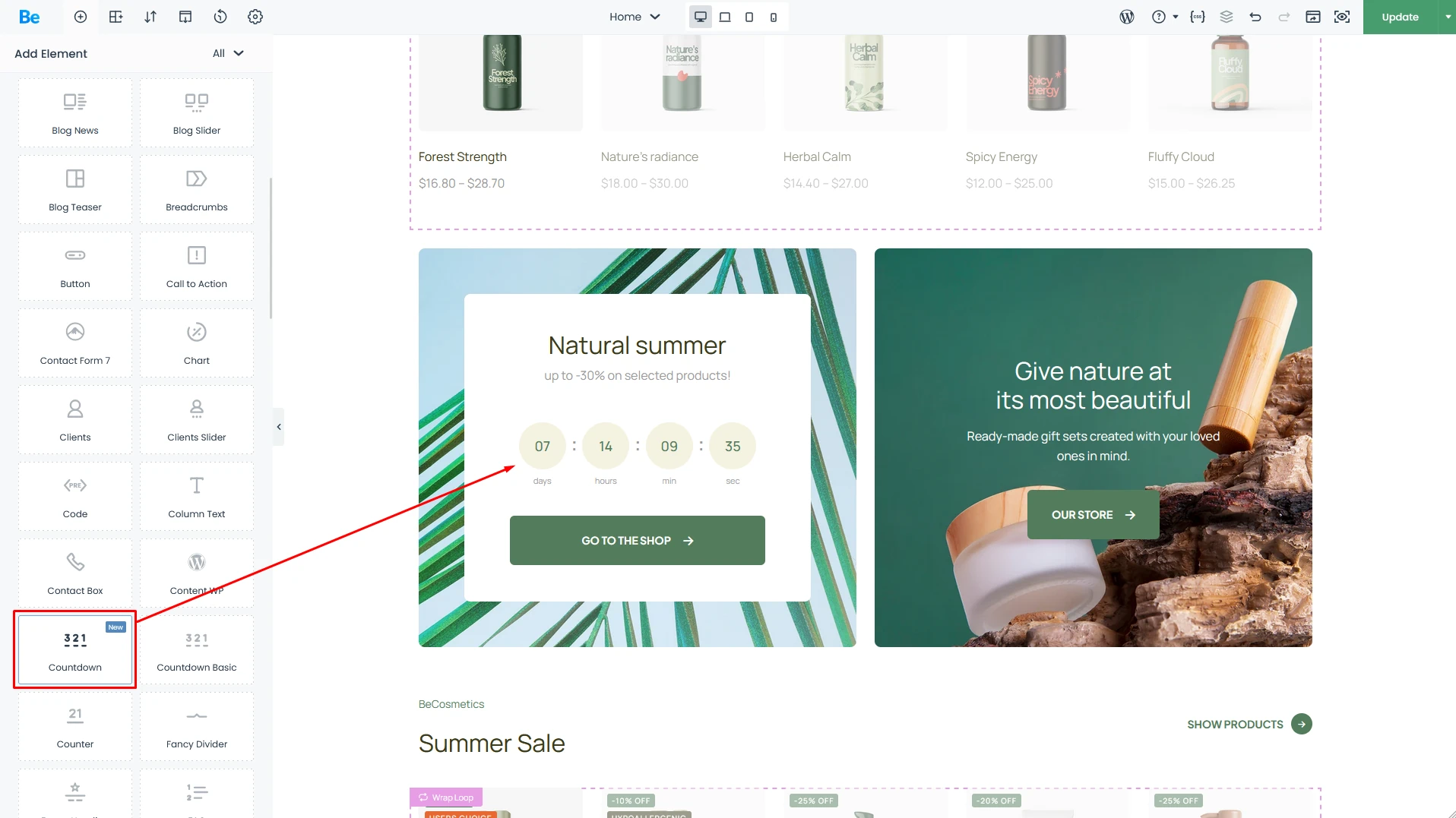
Countdown Element placed in wrap
Resizing Elements: The Beginner-Friendly Way
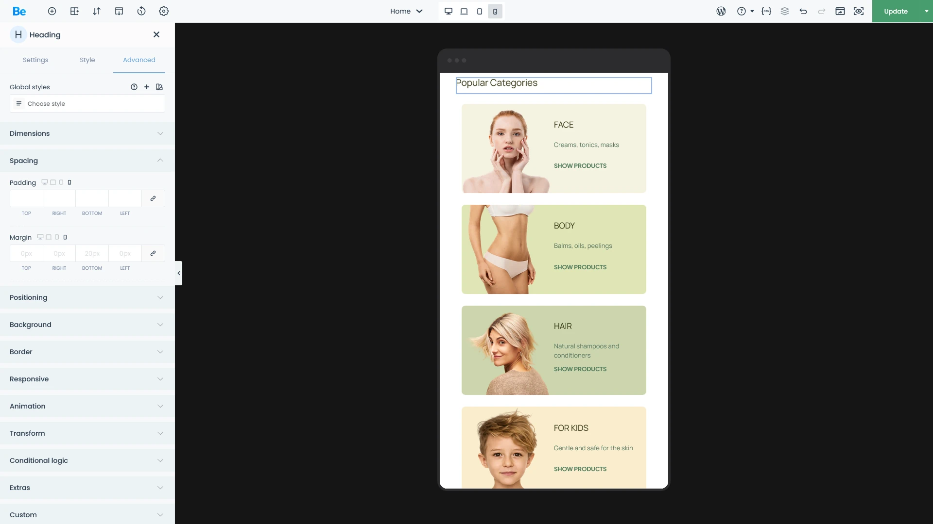
The size of every element and internal container (the Wrap) can be easily adjusted using an intuitive “+” and “-” system.
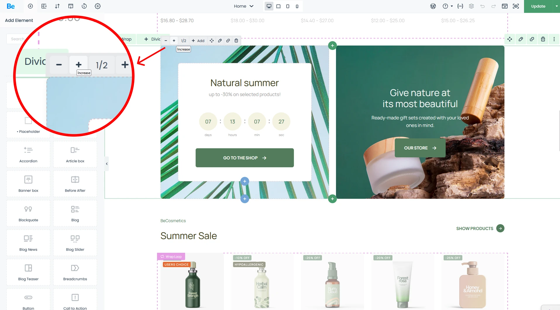
Easily resize elements with intuitive system, featuring presets ranging from 1/6 trough 1/2 all the way to 1/1.
Customizable Element Scaling – WebDesigner/Agency
Bebuilder is designed to bridge the gap between beginners and power users who crave more layout flexibility. While our standard “+/-” system covers most bases, sometimes you need that extra bit of precision to get everything just right. That’s where manual resizing comes in, giving you total creative freedom. Every wrap and element on the page can be fine-tuned using the following units:
- % — Percentage of available space (or Relative to container)
- px — Fixed value in pixels
- vw — Percentage of the viewport width
- vh — Percentage of the viewport height
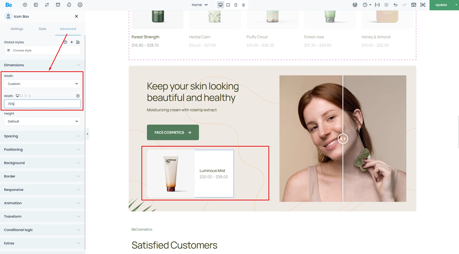
For power users, there’s pro-level options that allow for pixel-perfect precision when fine-tuning element widths across your site.
Mobile-Ready by Default – amateur
Today, the mobile experience is everything. Most people browse the web from their smartphones, which makes responsiveness—the ability for a site to adapt to any screen size—absolutely critical. That’s why we’ve ensured every site built with us is perfectly legible on every device.
The builder comes packed with smart features that automatically optimize font sizes, element widths, and margins for mobile viewing. Plus, all pre-built websites are fully responsive out of the box, making it a breeze for anyone to get started. While the system handles the heavy lifting for you, you’re always in control. You can easily toggle between device previews and fine-tune elements to your heart’s content. Save your changes, and you’ll see the results instantly.
Changes made in this view will be applied once the page is saved.
Mobile-First: The Standard for Modern Web Design – WebDesigner/Agency
“Mobile-First” has been the defining mantra of web design for years. This builder was engineered specifically to give you granular control over every viewport. With four built-in responsive breakpoints, you can optimize your site for virtually any device on the market.
Enjoy total creative freedom—adjust element sizes, typography, padding, and margins independently for each view. You can even swap background positions or display entirely different images for desktop versus mobile users.
Additionally, if you’ve entered data for higher resolutions, those values will carry over to subsequent views and will be highlighted in light blue.
Need even more control? Use Custom Visibility to “Hide under” or “Show under” specific breakpoints, ensuring elements only appear exactly where they should. Beyond that, you can reorder elements within a wrapper to perfect your visual hierarchy. It’s professional-grade responsiveness made simple—no compromises required.
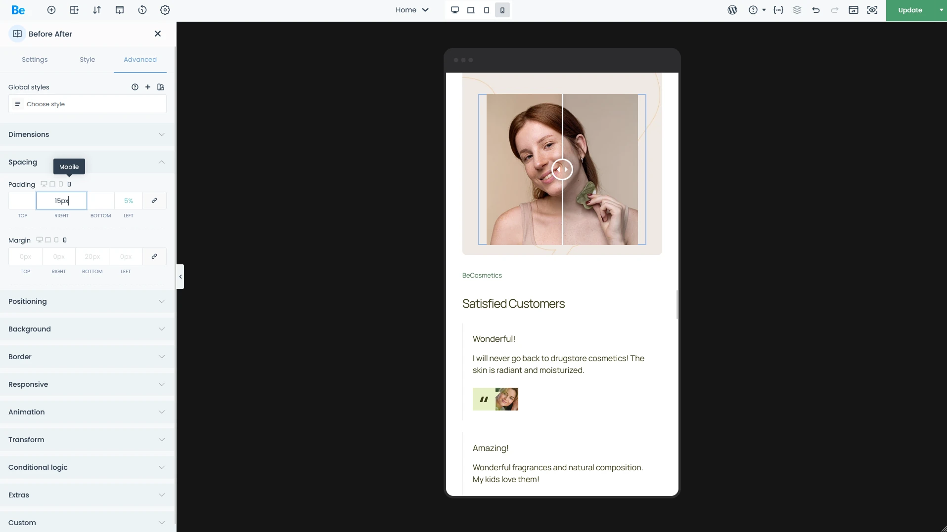
Most properties feature a simple toggle, allowing you to easily override values for different screen sizes.
Advanced Features
BeBuilder is packed with a vast array of tools designed for creating complex, high-performance websites. Below, we’ve highlighted some of the standout features. However, to truly grasp the full potential of BeBuilder, we recommend diving in and exploring the possibilities for yourself.
Templates
Templates are one of BeTheme’s core strengths, allowing you to build out your site using reusable components. While Headers and Footers are the foundation of every page, our template system goes much further. You can also create custom layouts for your Blog and WooCommerce store—including both Archive pages and Single Product views.
Templates are a game-changer. To show you just how much flexibility they offer, let’s look at the same blog page with and without a custom Blog Archive template applied. This setup features a modified post grid and uniquely styled post cards for a tailored user experience.
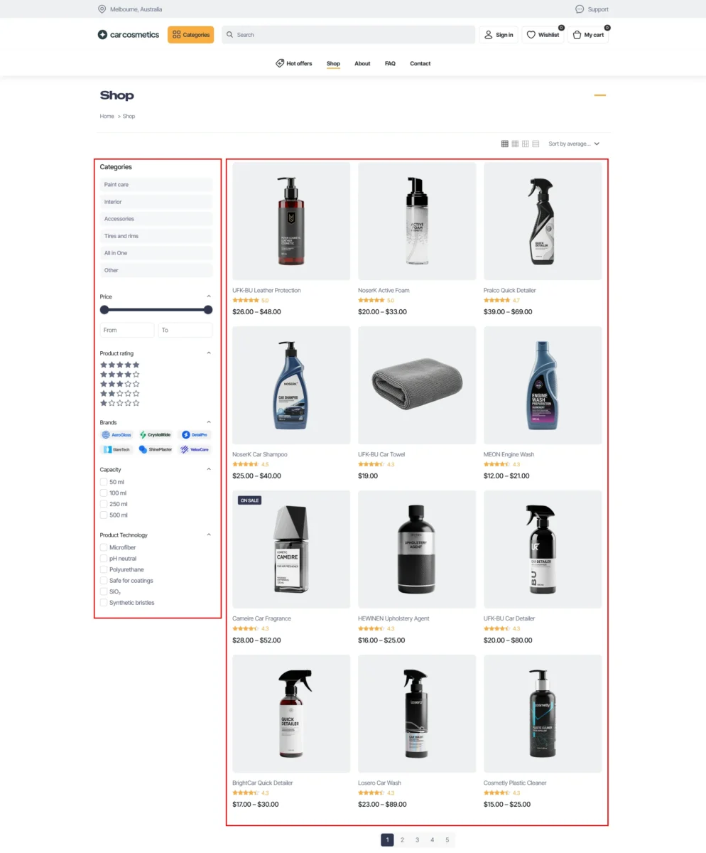
On the next screen you can check standard blog layout. This is the default appearance before any custom template styling and no Theme Options customization.
Global Sections & Wraps: Seamless consistency across your entire site
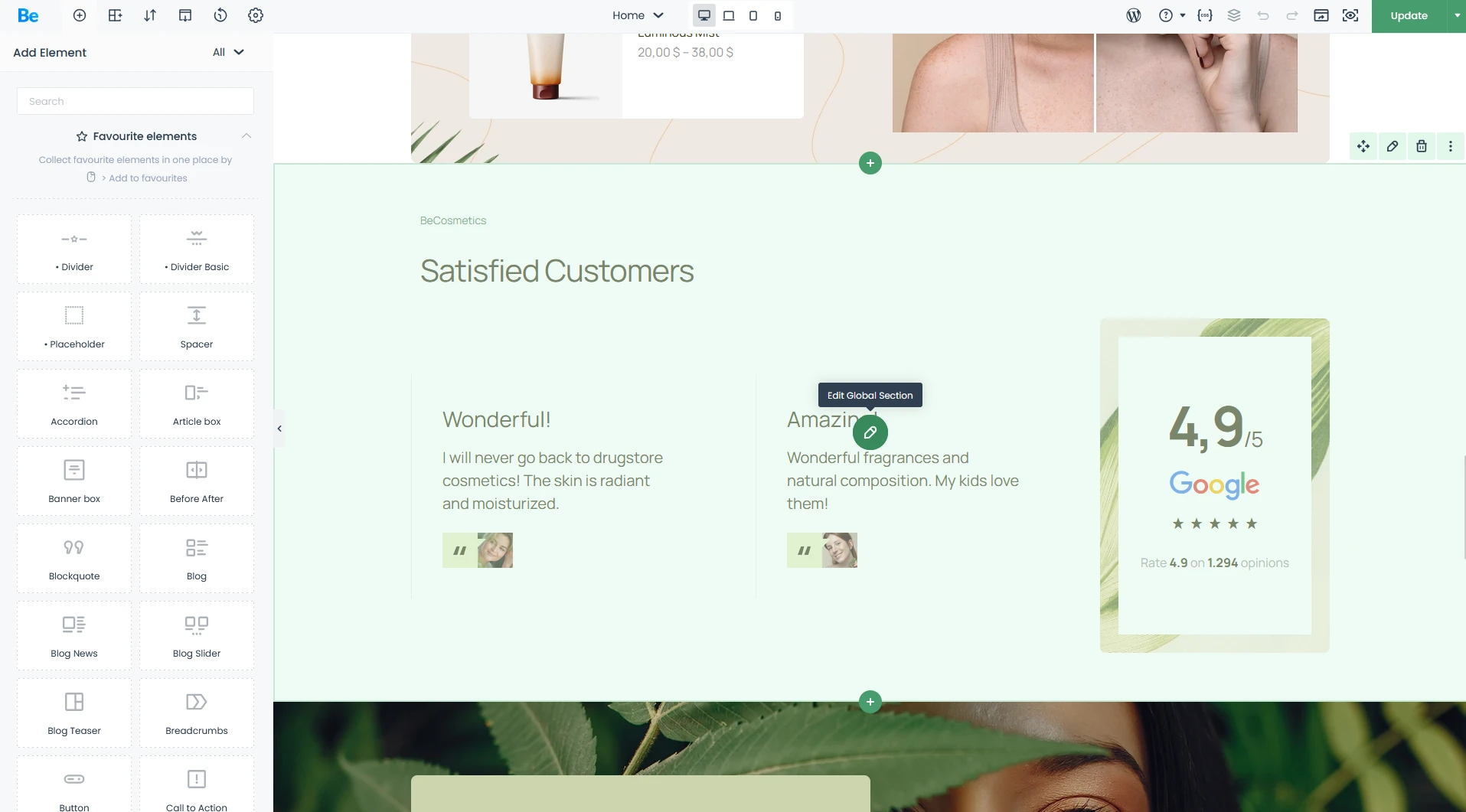
Once you’ve created a Global Section, it’s clearly labeled and easy to manage via its own dedicated editor.
This feature is a total game-changer for your workflow efficiency. Imagine having a client testimonial section or a sign-up form that appears across ten different pages.
- For Beginners: Instead of manually copying and pasting the same element (and risking mistakes), just create it once as a Global Section. If you need to change your phone number or button color a month from now, you only have to do it in one place. The update automatically rolls out across every single page on your site—saving you time and headaches.
- For Designers & Agencies: This is the cornerstone of scalability. Global containers allow you to build repeatable structures that maintain visual consistency, no matter how large the project grows. For sites with dozens of pages, this is a massive workflow optimization—eliminating design debt and ensuring your layout remains perfectly synced at all times.
Tabber: Interactive Content, Reimagined
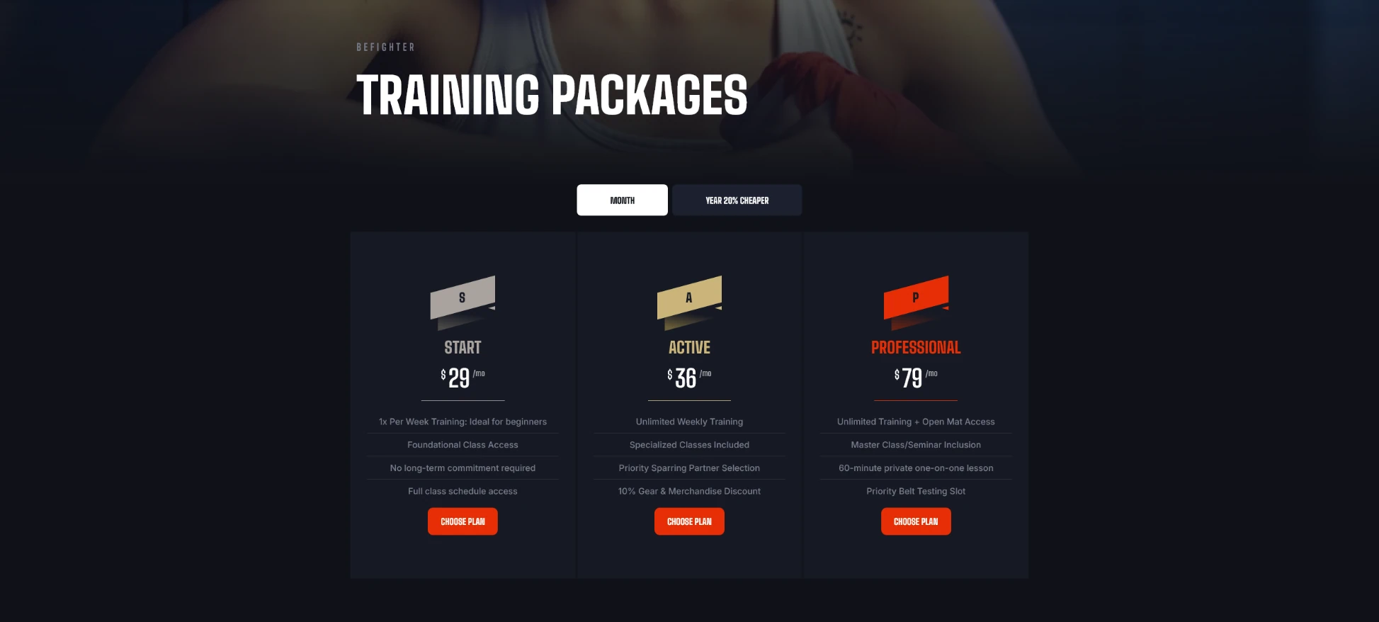
A custom Tabber setup featuring a toggle for Monthly and Yearly subscriptions on Martial Arts pre-built website.
The Tabber element in BeBuilder is far more than just a set of basic tabs—it’s a sophisticated space-management tool. It allows you to condense information into a sleek, interactive format, keeping your visitors engaged exactly where you want them. Instead of forcing users to scroll through endless walls of text, Tabber delivers rich content in a digestible, click-ready layout that keeps your design clean and focused.
- For Beginners: Thanks to intuitive interface, you can build a clean pricing table or an organized FAQ section in minutes. Your visitors can effortlessly toggle between categories without the page ever having to reload—making their experience fast, smooth, and professional.
- For Designers & Agencies: The BeTheme Tabber isn’t limited to simple text; it allows you to embed almost any content type within each tab. This opens up endless possibilities for designing interactive dashboards or complex product specs. Need to build a multi-tier pricing switcher? It’s a breeze. Tabber gives you total creative freedom to build data-rich interfaces without compromising on UI aesthetics.
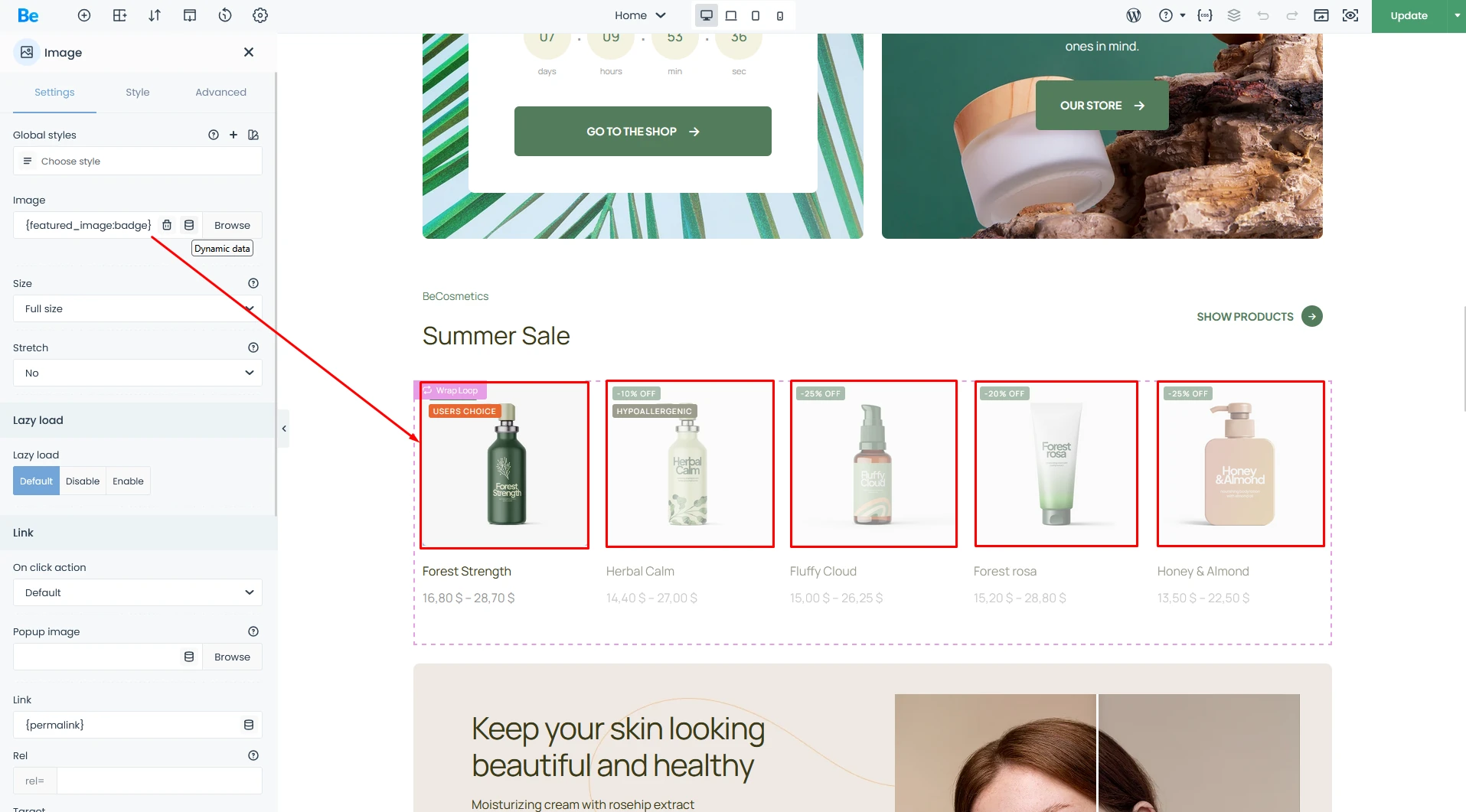
Dynamic Data
Dynamic Data in Action (on the screen below): Using the {featured_image:badge} tag, you can pull a product image that automatically includes a badge overlay. This dynamic feature displays real-time data like discount percentages or custom product labels directly on the image. You can use it in query loops or in single elements with adding .
BeTheme allows you to fetch data directly from the WordPress database or ACF (Advanced Custom Fields). You can pull core WordPress elements—such as Post Titles, Excerpts, Featured Images, dates, and authors—and that’s just the tip of the iceberg. Once BeBuilder pulls the data, you have total creative freedom to style it within ecosystem and display it anywhere on your site.
- For Beginners: You might not use this every day, but it’s a total life-saver. Imagine your header automatically displaying the name of the page you’re on, or your profile picture appearing instantly without you having to upload it manually every time. It’s all about making your site work for you.
- For Designers & Agencies: Dynamic Data is mission-critical for building Templates and Query Loops (which we’ll dive into shortly). Instead of manually crafting 100 separate pages for 100 real estate agents, you build a single template. Dynamic Data then automatically populates the name, headshot, and phone number for each agent directly from the database. If the default “Shop Products” element feels too limiting and you want to design a fully bespoke product archive from scratch—Dynamic Data and Query Loops make it happen.
Query Loops — Building Data-Driven Layouts with Ease
Wraps with Query Loop from the Computer Shop 2 Pre-built Site: This showcase features a “Popular Products” list with a bespoke grid layout that goes far beyond standard out-of-the-box settings.
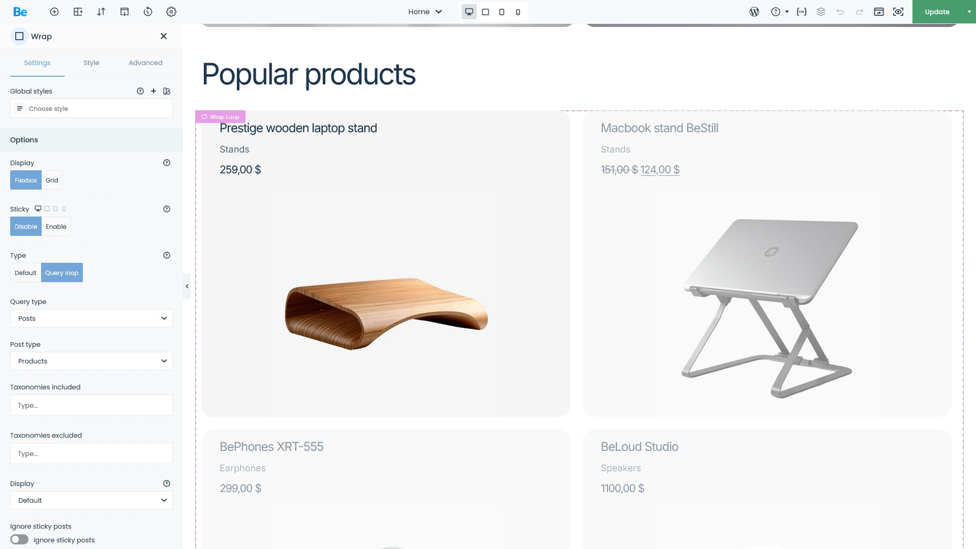
Query Loops are the feature that elevates BeTheme from a visual builder to a powerful Content Management System (CMS). It allows you to design advanced, one-of-a-kind layouts for common content types, such as product archives or blog feeds. By combining the power of ACF (Advanced Custom Fields) with Query Loops, your creative boundaries virtually disappear. Whether you’re building a complex real estate platform or a high-end travel booking site, the possibilities are endless.
- For Beginners: Easily display your latest blog posts or featured products in a sleek, professional grid anywhere on your site. The best part? You can do it all natively within BeBuilder—no extra plugins required. It’s the simplest way to keep your content fresh and beautifully organized.
- For Designers & Agencies: This is a true pro-level toolkit. Query Loops give you granular control over your data, allowing you to filter by categories, tags, or Custom Post Types (CPT) with surgical precision. When paired with custom layouts, you have total authority over how your database content is rendered. It’s the ultimate solution for building scalable, data-driven websites without the usual technical overhead.
Conditional Logic — Smart Content Visibility
Conditional Logic is used at pre-built PainStore to streamline the user journey. A logged-in user will see a “My Account” link, while a guest will see “Sign In / Sign Up”.
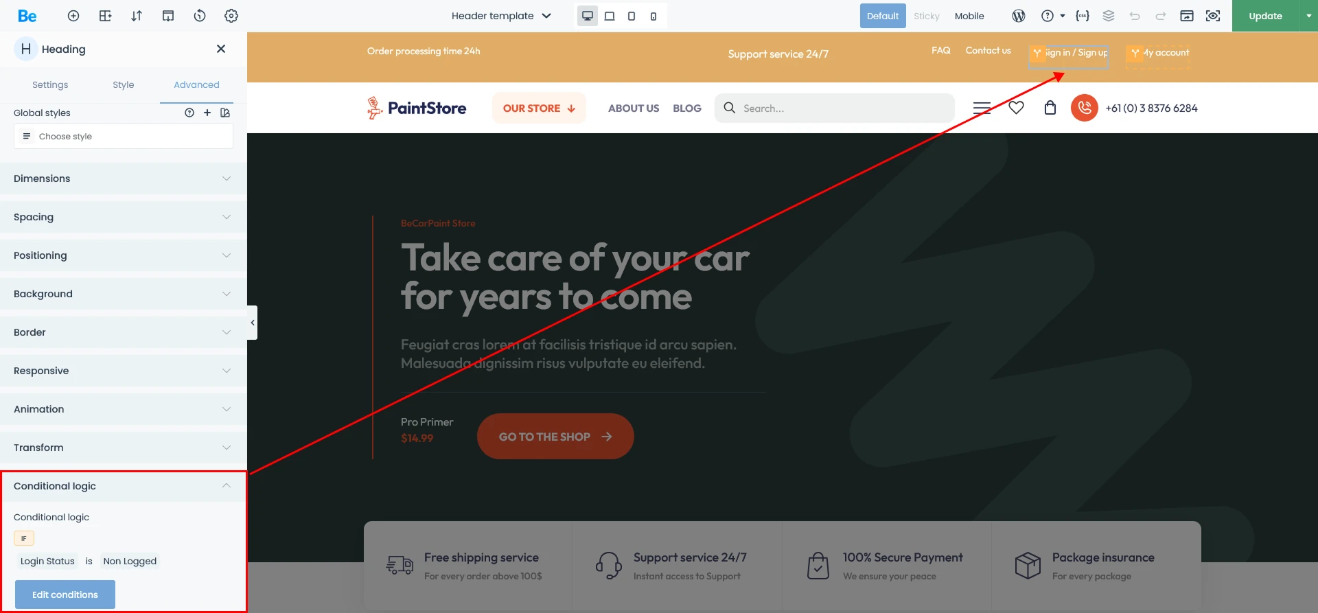
Conditional Logic gives you the power to decide exactly who sees what—and under which circumstances.
- For Beginners: Think of it as an “auto-pilot” for your content. For example, you can set a promotional banner to appear only on your homepage and only on specific days of the week. It’s a simple way to keep your site relevant without having to manually toggle elements on and off every day.
- For Designers & Agencies: This is a powerful tool for UX Personalization. You can serve entirely different navigation menus to logged-in members versus guest visitors. Beyond simple visibility, you can hide pricing sections for specific user roles or trigger complex content displays based on a combination of multiple conditions. It allows you to build a truly dynamic, “app-like” experience for your clients.
Live CSS & CSS Variables — Total Design Authority
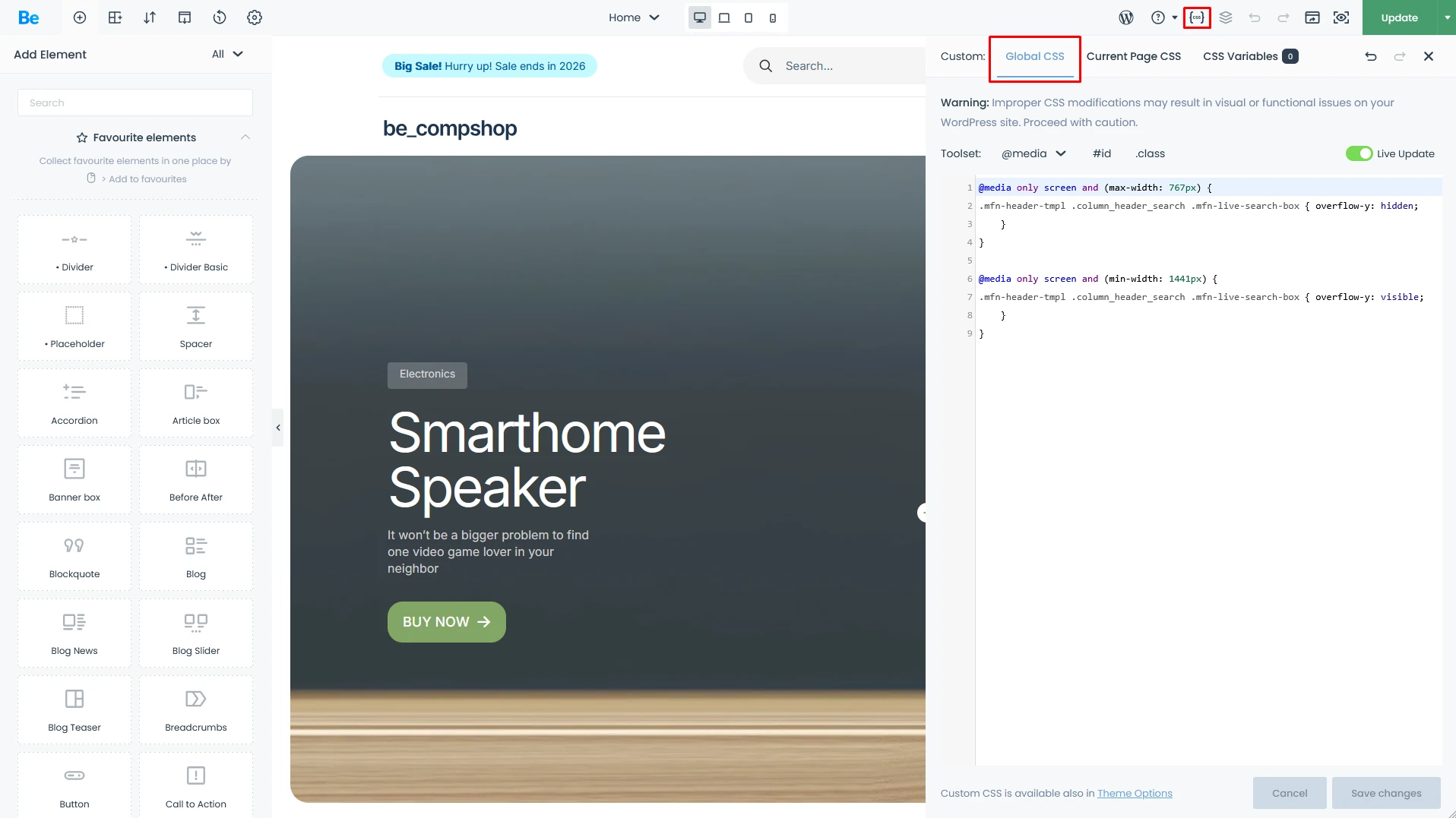
For those who need to go beyond standard UI sliders and built-in styles, BeTheme offers a high-performance Live CSS Editor. Furthermore, it allows you to define Global CSS Variables that are accessible throughout the entire BeBuilder ecosystem. The principle is simple: define a variable once, use it everywhere. When you update the value, the change instantly propagates across every instance on your site.
- For Beginners: You can leverage built-in CSS Variables to change your brand’s primary color across the entire site with just one click. No more hunting through dozens of different settings to find that one specific button shade—change it in one place, and you’re done!
- For Designers & Agencies: The Live CSS editor allows you to write custom code with a real-time feedback loop directly inside BeBuilder. More importantly, CSS Variables empower you to build robust Design Systems. By defining global variables for spacing, border radii, or typography, you ensure your project is future-proof. A full site rebranding that used to take hours can now be completed in minutes, maintaining perfect visual integrity throughout.
Summary
In this deep dive, I’ve explored the strengths of BeTheme and its powerful BeBuilder from the perspectives of both beginners and agency pros. For beginners, BeTheme is a win because of its “point-and-click” simplicity and massive library of pre-built sites that deliver professional results without extra costs. For pros, it’s a high-performance engine for building unique, scalable websites while ditching bloated third-party plugins—all at a fraction of the cost of competing tools. Truly, BeTheme offers a tailored experience for every level of expertise.


