


The Best Modern Examples of Finance Website Templates
October 21, 2025
Inspiring Websites with Video Backgrounds
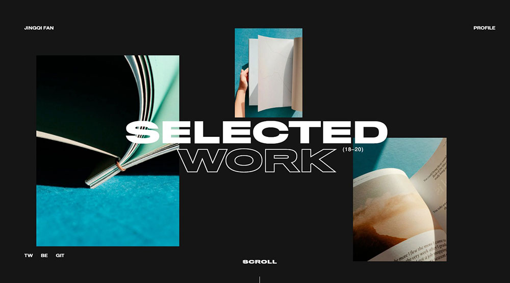
October 23, 2025Black website design is a visual approach that uses black as the dominant background color with contrasting elements layered on top.
White text, vibrant accent colors, and carefully selected imagery create the visual hierarchy.
This dark theme style works across industries. Luxury brands like Chanel and Rolex use it to signal exclusivity. Tech companies like Apple and Netflix rely on it for modern appeal. Photography portfolios leverage black backgrounds to make images pop.
The approach differs from standard dark mode web design in one key way. Black website design commits fully to the aesthetic rather than offering it as an alternative viewing option.
Pure black (#000000) backgrounds create maximum contrast. Dark grays (#121212 or #1a1a1a) feel softer on the eyes while maintaining the noir aesthetic.
Both approaches fall under the black website design umbrella.
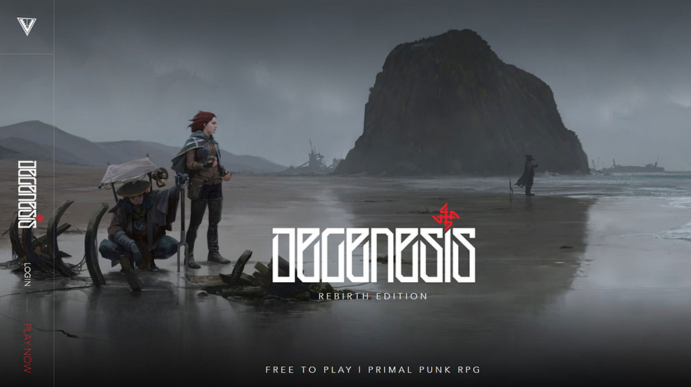
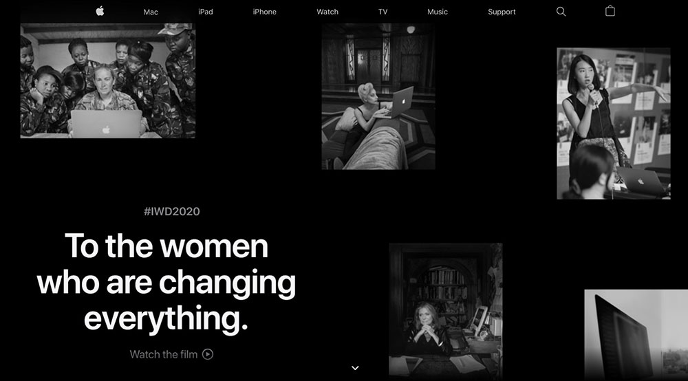
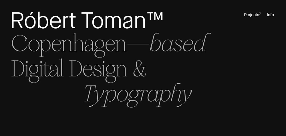
Awesome black websites to check out
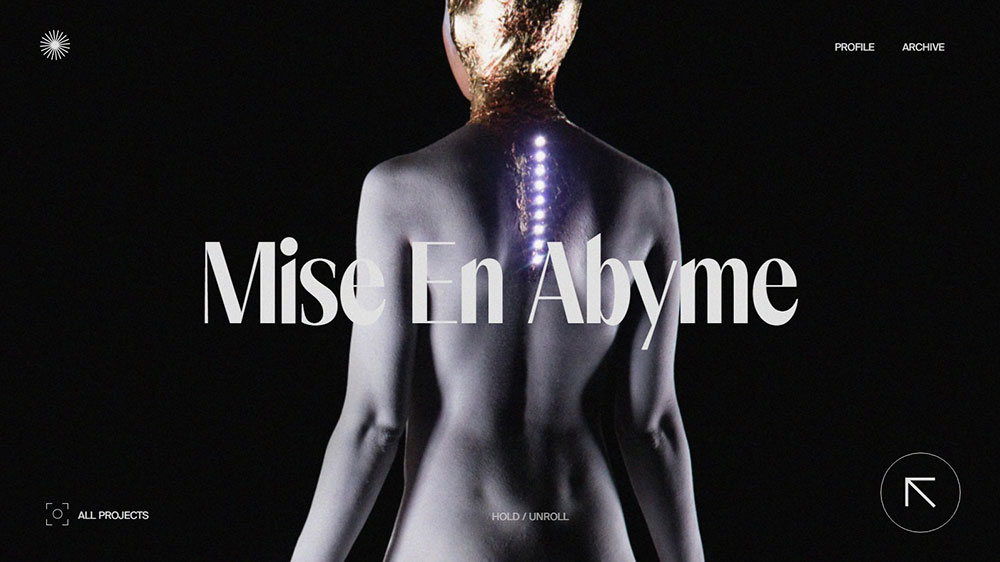
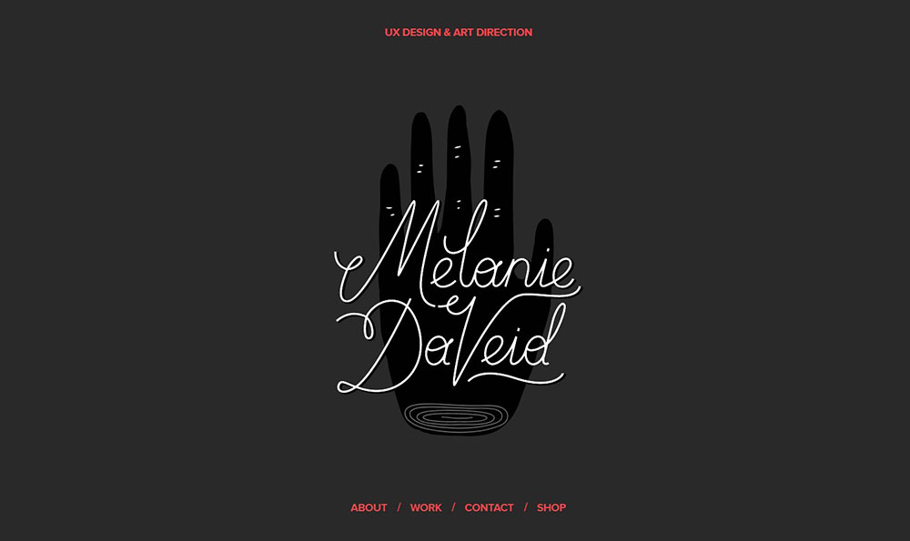
Edoardo Smerilli


Common Color Combinations in Black Website Design
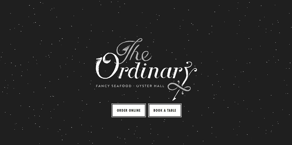
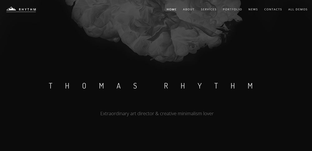
Black and White
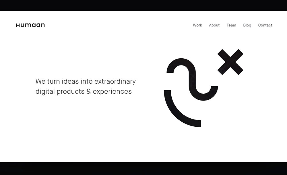
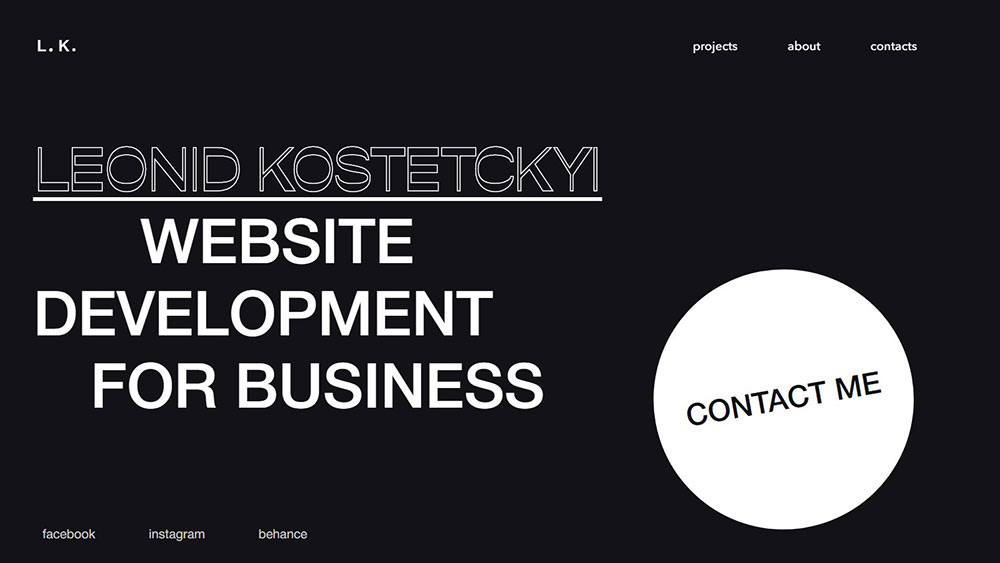
Maximum contrast, zero distraction. The minimalist website approach relies heavily on this pairing.
Works for: graphic designer portfolio websites, architect websites, editorial sites. Clean, timeless, impossible to get wrong.
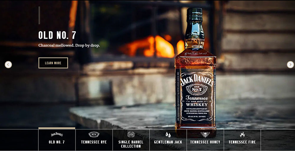
Black and Gold
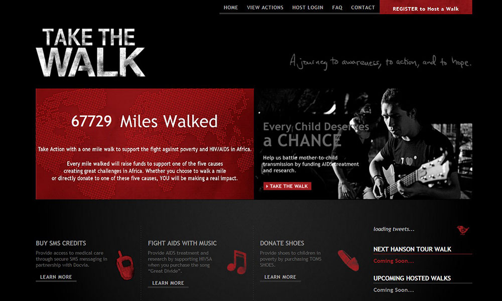
Instant luxury signaling. Finance, jewelry, high-end hospitality gravitate here naturally.
The combination triggers premium associations immediately. Premium website design often defaults to this pairing for good reason.
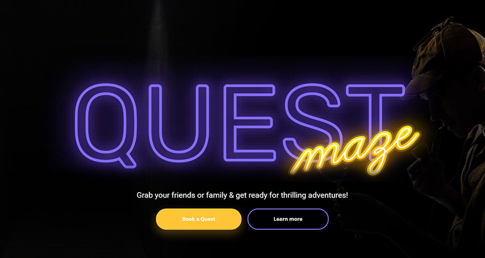
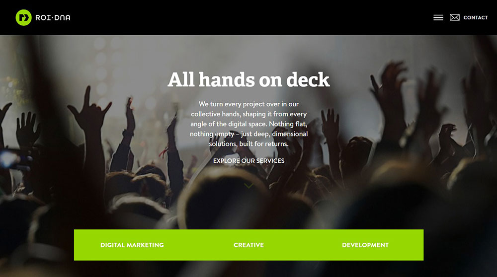
Black and Neon Colors
Electric energy against dark voids. Perfect for esports websites, nightlife brands, and youth-focused products.
Neon pink, electric blue, lime green pop aggressively on black. High risk, high reward approach.
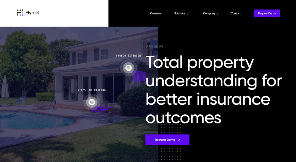
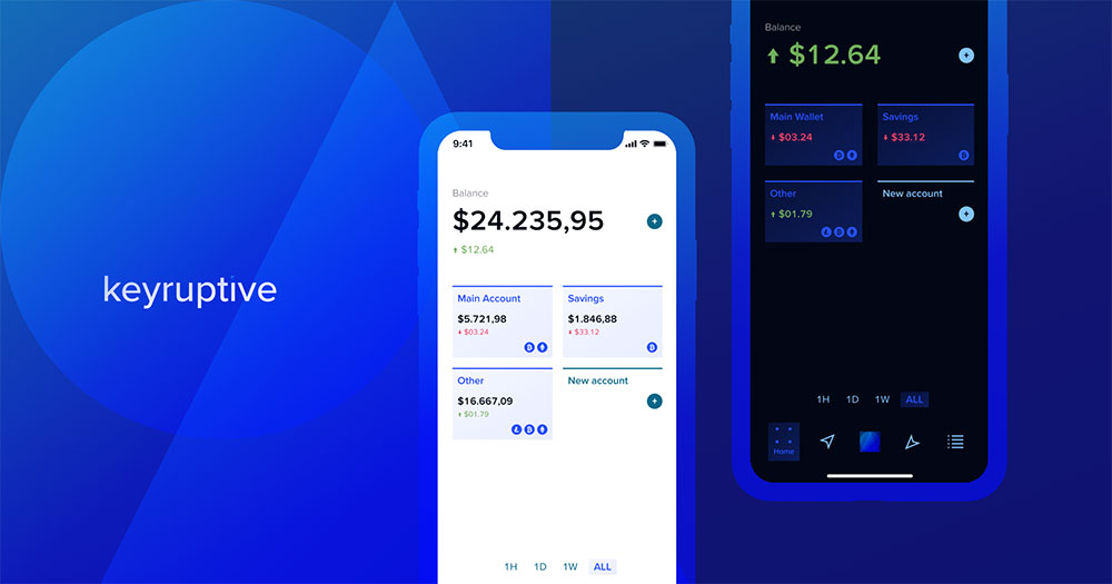
Black and Gradient Accents
Modern tech aesthetic using color transitions. SaaS websites and technology websites favor this combination.
Purple-to-blue and orange-to-pink gradients appear frequently. The effect feels futuristic without dated sci-fi clichés.
Industries That Use Black Website Design Effectively
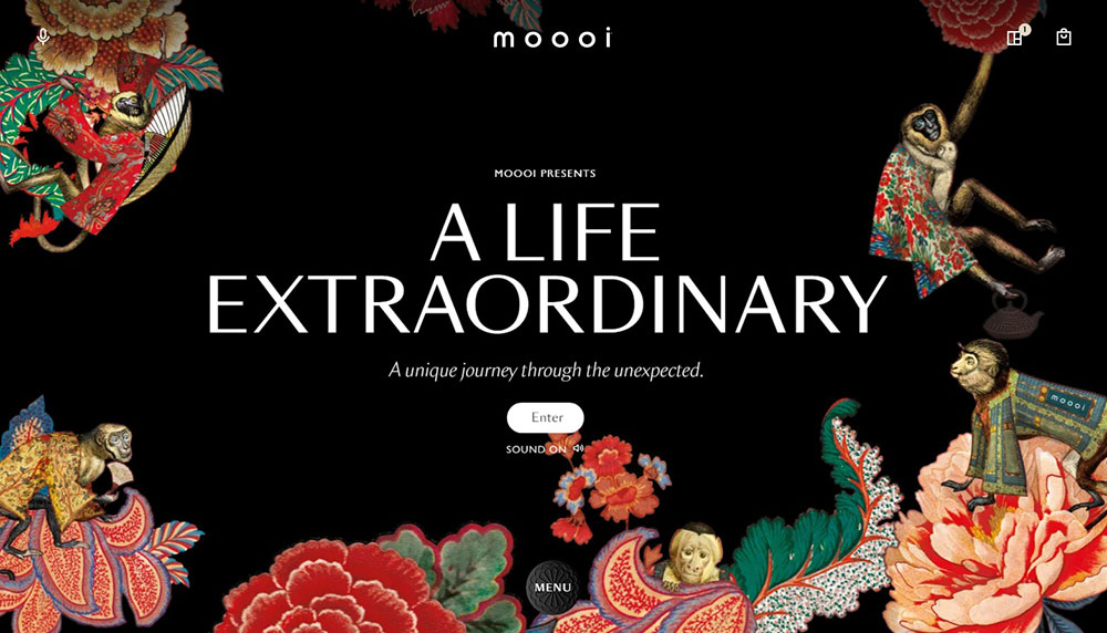
Fashion and Luxury Brands
Black backgrounds became the industry standard for premium positioning. Chanel, Prada, YSL, and Gucci all commit to dark aesthetics.
Products appear more expensive against black. Psychology and sales data confirm this repeatedly.
Photography Portfolios
Images demand attention without background competition. Wedding photographer websites and fine art photographers choose black almost universally.
Color accuracy improves when surrounding pixels stay neutral. The dark frame focuses viewer attention inward.
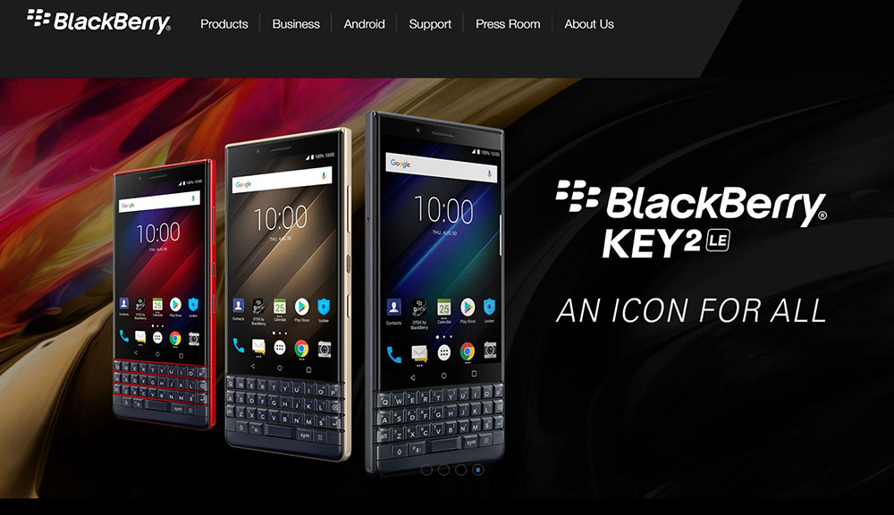
Tech Companies and Startups
Software websites and hardware brands use black to signal innovation. The association between darkness and cutting-edge technology runs deep.
Startup landing pages often adopt dark themes to appear more established than they are.
Music and Entertainment
Musician websites, record label websites, and streaming platforms default to black. The concert hall darkness, the club atmosphere, the studio vibe.
DJ websites and websites for singers leverage black to create performance-ready moods.
Automotive Brands
Car configurators and model showcases gain dramatic impact on black. Dealer websites increasingly adopt dark themes to match manufacturer aesthetics.
Vehicles appear more powerful emerging from darkness.
Typography That Works on Black Backgrounds
Serif Fonts on Dark Backgrounds
Thin serifs can disappear at small sizes on black. Choose fonts with medium stroke weights minimum.
Works best for: luxury brands, editorial sites, fashion. Pair with generous letter-spacing.
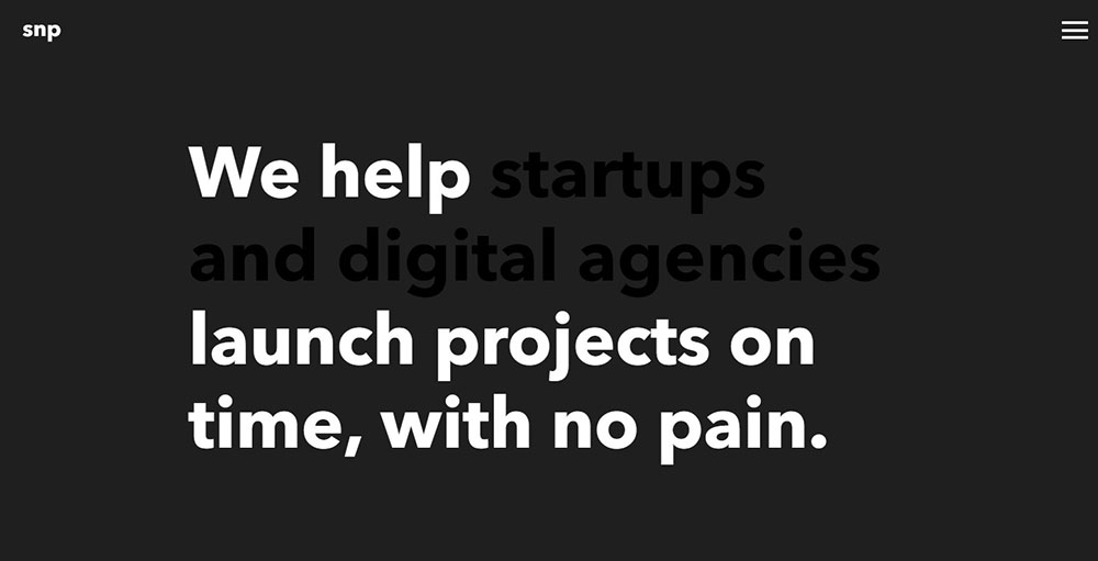
Sans-Serif Fonts for Modern Black Designs
Geometric and grotesque sans-serifs read cleanly against dark backgrounds. Most technology websites stick with this approach.
Inter, Helvetica Neue, and SF Pro work reliably. Avoid ultra-thin weights.
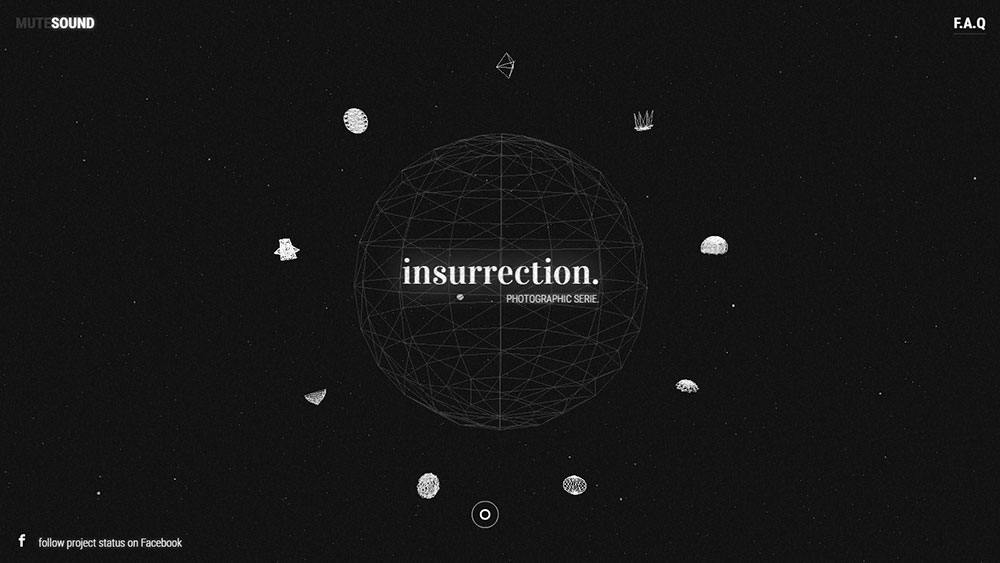
Display Fonts and Statement Headlines
Large type can break conventional rules. Decorative and experimental fonts shine when scaled up on black.
Artsy websites and artist websites push typographic boundaries successfully against dark canvases.
How to Create an Effective Black Website Design
Contrast Ratios and Accessibility
WCAG requires 4.5:1 contrast for normal text, 3:1 for large text. Pure white (#FFFFFF) on pure black (#000000) hits 21:1.
Slight off-whites (#F5F5F5) reduce harshness while maintaining accessible website compliance.
White Space in Dark Layouts
Black space functions as white space in dark designs. Generous margins prevent claustrophobic interfaces.
Let elements breathe. Crowded dark layouts feel oppressive fast.
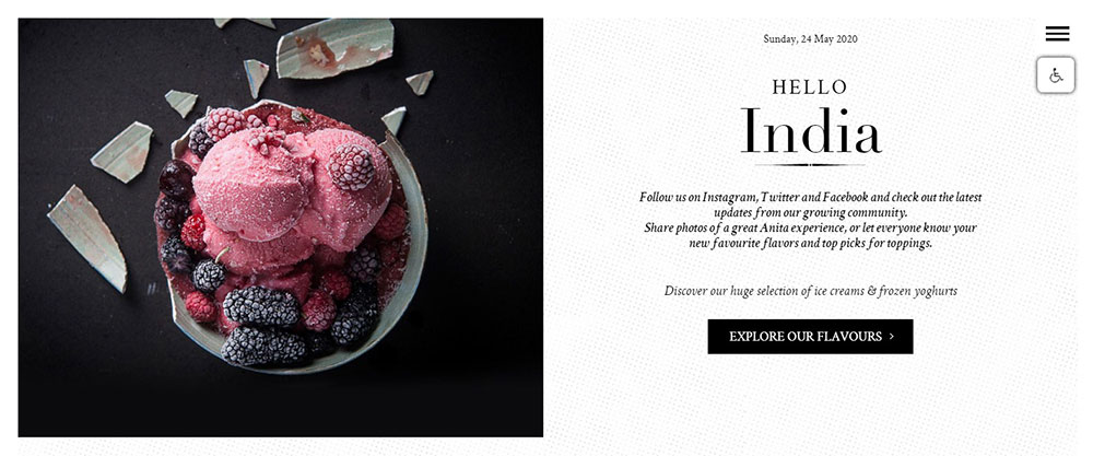
Image Selection for Dark Backgrounds
Photos need edge definition to avoid floating strangely. Subjects with dark edges blend into black backgrounds problematically.
Add subtle borders, vignettes, or place images on slightly lighter gray containers when edges disappear.
Button and CTA Design on Black
Call to action buttons need color contrast and padding adjustment on dark backgrounds. Ghost buttons with white borders work well.
Solid colored buttons pop more dramatically than on white backgrounds. Use this advantage strategically.
Common Mistakes in Black Website Design
Poor Text Contrast
Gray text on black backgrounds fails accessibility standards frequently. Test every text color with contrast checking tools.
Body copy under 16px needs higher contrast than headlines. Don't assume what works large works small.
Overusing Pure Black
100% black (#000000) everywhere creates harsh, flat interfaces. Mix dark grays (#0a0a0a, #121212, #1a1a1a) for subtle depth.
Pure black works for specific elements. Full-page pure black often looks like something failed to load.
Ignoring Mobile Display Differences
OLED screens show pure black differently than LCD. Test on multiple devices before launching.
Ambient light affects dark interface perception dramatically. What works in a dim office fails in bright sunlight.
Why Do Designers Choose Black Backgrounds for Websites
Visual Impact and Brand Positioning
Black backgrounds command attention instantly. They create a sense of sophistication that lighter designs struggle to match.
Brands like Lamborghini, Porsche, and Rolls Royce use dark color palettes because they align with luxury websites conventions. The color psychology is straightforward: black signals premium quality, exclusivity, and confidence.
Technical Benefits for Modern Screens
OLED and AMOLED displays turn off pixels completely when showing pure black. This saves battery on mobile devices.
Users browsing at night experience less eye strain with dark interfaces. The reduced blue light emission helps with screen fatigue during extended sessions.
Content Presentation Advantages
Images and videos gain visual prominence against black. Photographer websites frequently adopt this approach for exactly this reason.
Color accents become more vibrant. A gold accent that looks muted on white backgrounds appears luminous on black.
Text readability improves when typography is handled correctly. High contrast ratios between white text and black backgrounds meet WCAG accessibility guidelines easily.
Differentiation in Crowded Markets
Most websites default to white backgrounds. Going dark immediately sets a brand apart.
This works particularly well for creative websites, gaming websites, and entertainment websites where standing out matters more than blending in.
FAQ on Black Website Design
What industries benefit most from black website design?
Luxury brands, fashion houses, automotive companies, photography portfolios, and tech startups gain the most from dark theme aesthetics. Black backgrounds signal premium quality and create visual impact that lighter designs cannot match.
Is black website design good for accessibility?
Yes, when implemented correctly. Pure white text on black backgrounds exceeds WCAG contrast requirements easily. The key is avoiding gray text and testing all color combinations with accessibility tools before launching.
What colors work best with black backgrounds?
White provides maximum contrast for readability. Gold signals luxury positioning. Neon colors create energy for gaming websites and youth brands. Gradient accents from purple to blue suit fintech websites and tech products.
Does black website design affect page loading speed?
No direct impact on speed. However, dark designs often feature high-resolution imagery and video backgrounds that require optimization. The background color itself adds zero performance overhead to your site.
Should I use pure black or dark gray for backgrounds?
Mix both strategically. Pure black (#000000) works for maximum contrast areas. Dark grays (#121212, #1a1a1a) create depth and prevent flat, harsh interfaces. Most successful dark sites layer multiple dark values together.
How do I make images look good on black backgrounds?
Choose images with defined edges that won't blend into darkness. Add subtle borders or place photos on slightly lighter containers when subjects have dark edges. High-quality photography matters more on black than any other background.
What typography works best on dark backgrounds?
Sans-serif fonts with medium stroke weights read cleanly. Avoid ultra-thin typefaces that disappear at small sizes. Free fonts like Inter and Source Sans Pro work reliably. Increase letter-spacing slightly for better legibility.
Can black website design work for e-commerce?
Absolutely. Brands like Nike, Gucci, and Hugo Boss prove dark e-commerce succeeds. Products photograph well against black. The key is maintaining clear website navigation and readable product information throughout the shopping experience.
How do I add visual interest to all-black layouts?
Use texture overlays like subtle grain or noise. Add parallax scrolling effects for depth. Incorporate micro-animations and hover states. Layer different dark values. Strategic accent colors prevent monotony without breaking the dark aesthetic.
What tools do designers use to create black websites?
Figma and Adobe XD handle interface design. Webflow builds production sites visually. Squarespace and WordPress offer dark templates for faster launches. Sketch remains popular among Mac users for dark UI design projects.
Conclusion
These black website design examples prove that dark aesthetics work across every industry. From Apple's minimalist product showcases to Cartier's jewelry presentations, black backgrounds create visual impact that white simply cannot match.
The key lies in execution. Proper contrast ratios, thoughtful typography choices, and strategic accent colors separate stunning dark interfaces from unreadable ones.
Brands like Tesla, Porsche, and Bang & Olufsen demonstrate how dark color palettes elevate product perception instantly.
Whether you're building a web design portfolio, launching a B2B website, or redesigning an existing business website, black backgrounds offer differentiation in crowded markets.
Start with proven combinations. Test accessibility. Let your content shine against the dark canvas.


