


Cool Looking Personal Trainer Website Design Examples
January 16, 2026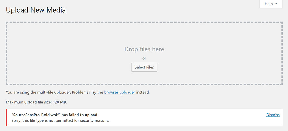
Fixing “sorry, this file type is not permitted for security reasons”
January 19, 2026A fashion website has about three seconds to make someone stay or leave. That is it. Three seconds to communicate brand identity, product quality, and visual credibility through layout, typography, and photography alone.
These fashion website design examples break down what actually works across luxury labels, fast fashion ecommerce, and direct-to-consumer brands. From Chanel's editorial restraint to ASOS's mobile-first product grids.
Each example was selected based on specific criteria: visual hierarchy, page speed, mobile responsiveness, checkout flow, and brand consistency. Not opinions. Measurable design decisions that affect how clothing brands sell online.
Use this as a reference for your next fashion ecommerce project, whether you are building on Shopify, WooCommerce, or a custom frontend.
What is Fashion Website Design
Fashion website design is the process of building an online storefront that sells clothing, accessories, or footwear through a layout built around visual storytelling and brand identity.
It sits at the intersection of ecommerce functionality and editorial presentation. A fashion homepage layout needs to move product while still looking like something worth bookmarking.
Unlike standard retail websites, fashion ecommerce design leans harder on imagery, whitespace, and typographic detail. The product is visual by nature. So the design has to match that energy.
Platforms like Shopify, WooCommerce, and Squarespace offer fashion-specific templates. But the brands that stand out almost always go custom, or at least heavily modify what they start with.
The goal is a site where brand consistency, product photography, and conversion rate optimization all work together without one undermining the other.
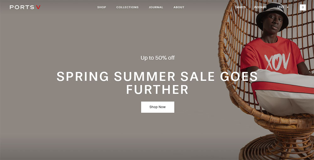
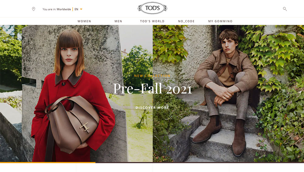
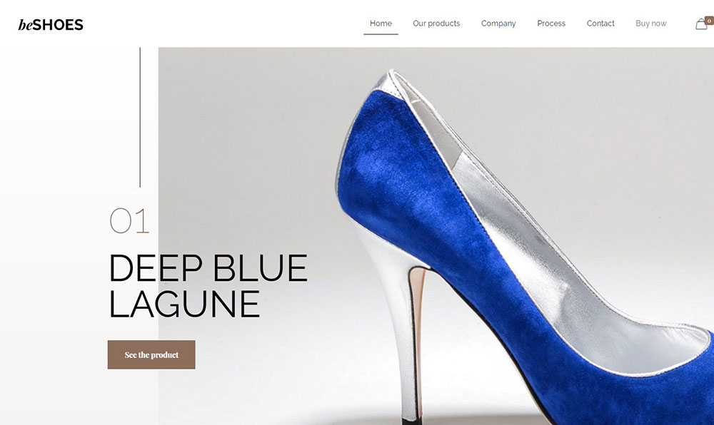
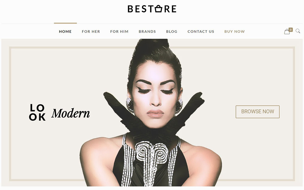
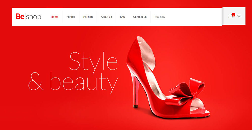
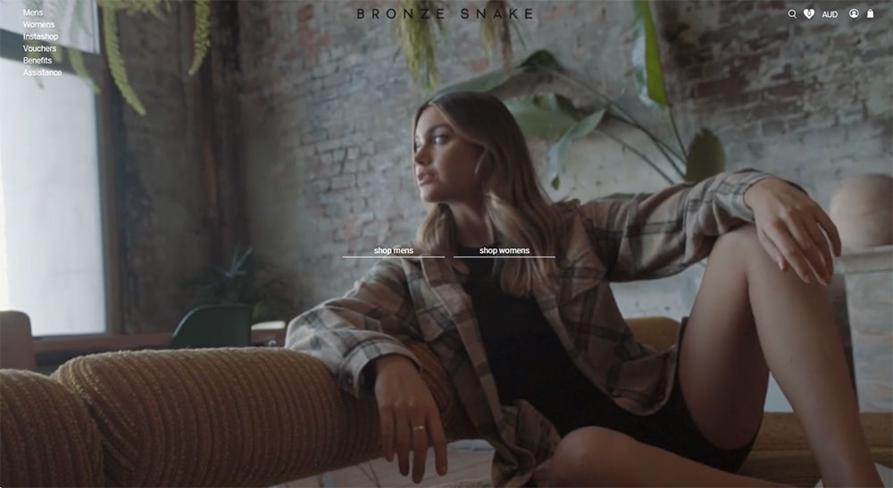
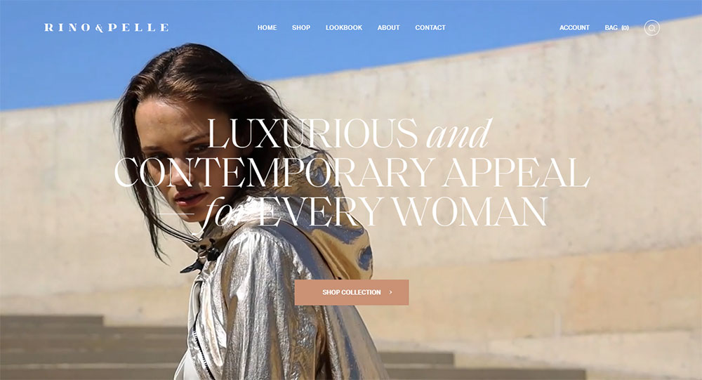
Fashion Website Design Examples
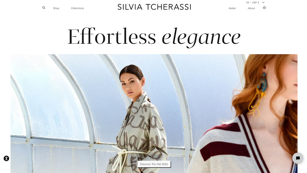
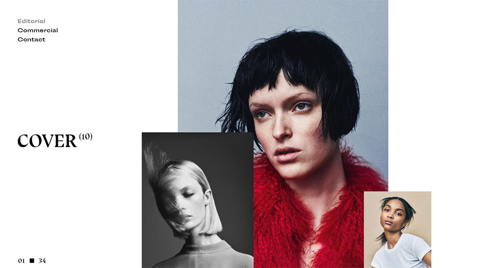
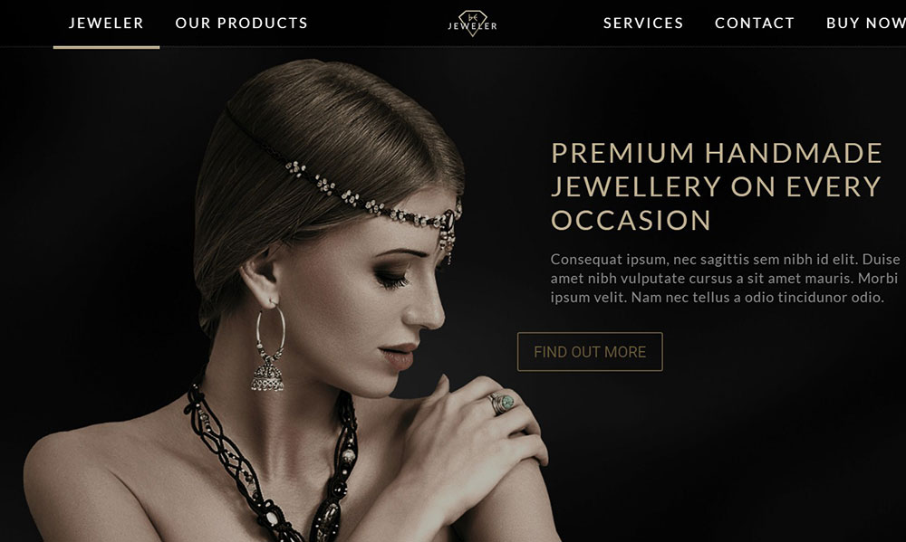
Silvia Tcherassi
How Does Fashion Website Design Differ from Other Ecommerce Design
Most ecommerce sites prioritize function. Fashion sites have to prioritize feeling and function at the same time.
A gadgets website can get away with a plain grid and spec sheets. A fashion brand cannot. Clothing brand website inspiration almost always comes from editorial magazines, not Amazon.
Here is where the differences show up most:
- Product photography carries 80% of the selling weight, not product descriptions
- Lookbook and lifestyle imagery sit alongside transactional pages
- Typography choices communicate brand positioning before a single word is read
- Color palettes shift seasonally, so the design system needs to accommodate that
- Navigation has to handle hundreds of SKUs across gender, category, size, and collection
A B2C website selling software subscriptions measures success by signups. Fashion ecommerce measures it by average order value, time on site, and return rate.
The browsing behavior is different too. Fashion shoppers scroll. They explore. They treat it closer to window shopping than targeted buying. Your category page structure and filtering systems need to support that kind of exploratory intent.
That is why product websites in fashion look and feel nothing like product sites in tech or SaaS.
What Makes a Fashion Website Design Effective
An effective fashion website design converts browsers into buyers without sacrificing the brand experience. That sounds simple. It is not.
Three things have to work together: visual hierarchy, page speed, and mobile responsiveness. Drop any one of those and the whole thing falls apart.
Does Visual Hierarchy Affect Conversion on Fashion Websites
Yes, directly. Where you place hero banners, product grids, and call to action buttons determines what gets clicked. Fashion sites that bury "Add to Cart" below the fold lose sales every single day.
The best hero sections on fashion sites use full-bleed imagery with a single focal point. No clutter, no competing messages. One image, one action.
How Does Page Speed Impact Fashion Ecommerce Performance
Fashion sites are image-heavy by default. That creates a constant tension with Core Web Vitals performance.
Google PageSpeed Insights regularly flags fashion ecommerce sites for large image payloads and render-blocking resources. A one-second delay in load time can drop conversions by 7% according to multiple industry benchmarks.
WebP or AVIF image formats, lazy loading, and a proper CDN are not optional. They are baseline requirements for any fashion product page that carries more than four images per listing.
What Role Does Mobile Responsiveness Play in Fashion Website Design
Over 70% of fashion ecommerce traffic comes from phones. If your site is not built with a mobile first design approach, you are ignoring most of your audience.
Mobile responsive fashion sites need thumb-friendly navigation, swipeable product galleries, and checkout flows that work on a 375px screen without horizontal scrolling.
Brands like ASOS and Zara rebuilt their entire frontend around mobile. Not as an afterthought. As the primary experience.
How Were These Fashion Website Design Examples Selected
Every example in this list was evaluated against specific criteria. Not vibes. Not personal taste. Measurable qualities that affect both user experience and business performance.
Here is what we looked at:
- Layout quality and use of white space across homepage, category, and product pages
- Typography and how it reinforces brand positioning
- Product photography presentation, including zoom, alternate angles, and lifestyle shots
- Mobile experience on both iOS and Android devices
- Checkout and cart flow, from add-to-cart through payment confirmation
- Brand consistency across every page and interaction state
- Loading performance scored through Lighthouse and Google PageSpeed Insights
The list spans luxury fashion brands, fast fashion ecommerce, direct-to-consumer labels, and multi-brand retailers. That range matters because what works for Chanel does not work for H&M, and vice versa.
We specifically chose brands that do something worth studying in their design, not just brands with big marketing budgets.
Best Fashion Website Design Examples
These ten fashion websites represent different segments of the industry, from haute couture to sustainable basics. Each one gets something right that is worth borrowing for your own project.
Chanel
What Design Choices Make Chanel's Website Stand Out
Chanel's site uses a black-and-white foundation with restrained typography that echoes the brand's print advertising. Every page feels like a spread from a fashion editorial.
The navigation is minimal. No mega menu with thirty categories. Just clean top-level links with smooth category transitions.
How Does Chanel Handle Product Photography and Layout
Full-screen product imagery with no visible grid lines. Each piece gets room to breathe. White backgrounds for accessories, styled campaign shots for ready-to-wear.
Product detail pages use a single scrollable column. Nothing fights for attention. The photography does all the selling, supported by spare copywriting and clear size selection.
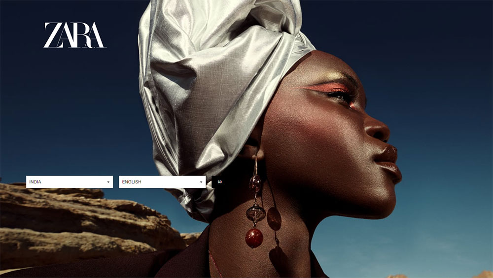
Zara
What Makes Zara's Website Design Minimalist Yet Functional
Zara stripped almost everything away. No sidebar filters on desktop. No promotional banners cluttering the homepage. Just large editorial images linking directly into product categories.
This minimalist website approach works because Zara's audience already knows what they want. The design gets out of the way and lets the clothes do the talking.
How Does Zara Structure Its Product Category Pages
Category pages use a scrollable grid with hover-state alternate images. Roll over a jacket and you see it styled on a model from a different angle. No click required.
Filtering is hidden behind an icon tap on mobile and a small top bar on desktop. Zara trusts its visual merchandising over traditional filter-and-sort patterns.
Nike
How Does Nike Balance Brand Storytelling with Product Sales
Nike's homepage toggles between athlete stories and product launches. You will see a documentary-style hero video next to a "Shop the Look" CTA. Storytelling and commerce sit side by side without conflict.
This works because Nike treats its site like a media property first and a store second. The video background elements and animated transitions between sections make it feel more like a sports broadcast than a shopping cart.
What Interactive Features Does Nike Use on Its Website
Nike By You lets shoppers customize shoes directly in the browser. The 3D product previews, color pickers, and real-time rendering create an interactive website experience that also drives higher average order values.
Personalization extends to the homepage. Logged-in users see recommendations based on their sport, browsing history, and local weather conditions.
ASOS
How Does ASOS Design for a Young, Mobile-First Audience
ASOS built its entire UI around Gen Z shopping behavior. Quick-add buttons, infinite scroll on category pages, and a persistent bottom navigation bar on mobile. The experience is fast, visual, and built for thumb-first browsing.
Product pages include catwalk video clips. A 15-second loop showing the garment in motion. That alone separates ASOS from competitors still relying on static photography.
What Filtering and Navigation Systems Does ASOS Use
ASOS has one of the most detailed filtering systems in fashion ecommerce. Users can sort by brand, price, color, pattern, neckline, sleeve length, and body fit. The navigation handles over 85,000 products without feeling overwhelming.
Saved searches and "style match" image search add extra layers of product discovery beyond standard browse-and-filter.
Gucci
How Does Gucci Translate Its Luxury Brand Identity into Web Design
Gucci's site feels like walking into their flagship store. The layout is editorial, almost gallery-like. Full-width campaign imagery dominates every landing page.
They use a dark-toned palette for certain collections and bright, maximalist colors for others. The design system is flexible enough to shift mood by season while maintaining a recognizable luxury color palette.
What Typography and Color Choices Define Gucci's Website
Gucci uses a custom serif typeface across headlines. It reads as traditional luxury with an edge. Body text stays clean and sans-serif for readability.
The color scheme changes with each campaign launch. This makes the site feel alive, not static. It also gives returning visitors a reason to explore again.
Everlane
How Does Everlane Use Transparency as a Design Element
Everlane shows cost breakdowns on every product page. Materials, labor, transport, and markup. This transparency-first approach is baked into the layout itself, not buried in an "About" section.
The design is intentionally plain. White backgrounds, simple grids, minimal decoration. The brand's visual identity says "we have nothing to hide," and the clean website design reinforces that message without a single extra pixel.
What Layout Patterns Does Everlane Use for Product Pages
Two-column layout. Image gallery on the left, product details on the right. Sticky "Add to Bag" button on mobile. Factory story and material breakdown sit just below the fold.
Nothing fancy. But everything loads fast and scans easily, which matters more than visual tricks when you are selling basics and essentials.
Reformation
How Does Reformation Combine Sustainability Messaging with Product Display
Reformation places environmental impact data next to the "Add to Cart" button. Pounds of CO2 saved, gallons of water conserved. It is right there in the purchase flow, not on a separate sustainability page.
The visual design is warm and slightly playful. Softer fonts, earthy tones mixed with clean whites. It feels approachable without being cheap.
What Checkout and Cart Design Does Reformation Use
Single-page checkout. No account creation required. Express payment options (Apple Pay, Shop Pay) appear above the standard form design.
The cart drawer slides in from the right without a full page reload. Cross-sell suggestions ap
What is Fashion Website Design
Fashion website design is the process of building an online storefront that sells clothing, accessories, or footwear through a layout built around visual storytelling and brand identity.
It sits at the intersection of ecommerce functionality and editorial presentation. A fashion homepage layout needs to move product while still looking like something worth bookmarking.
Unlike standard retail websites, fashion ecommerce design leans harder on imagery, whitespace, and typographic detail. The product is visual by nature. So the design has to match that energy.
Platforms like Shopify, WooCommerce, and Squarespace offer fashion-specific templates. But the brands that stand out almost always go custom, or at least heavily modify what they start with.
The goal is a site where brand consistency, product photography, and conversion rate optimization all work together without one undermining the other.
How Does Fashion Website Design Differ from Other Ecommerce Design
Most ecommerce sites prioritize function. Fashion sites have to prioritize feeling and function at the same time.
A gadgets website can get away with a plain grid and spec sheets. A fashion brand cannot. Clothing brand website inspiration almost always comes from editorial magazines, not Amazon.
Here is where the differences show up most:
- Product photography carries 80% of the selling weight, not product descriptions
- Lookbook and lifestyle imagery sit alongside transactional pages
- Typography choices communicate brand positioning before a single word is read
- Color palettes shift seasonally, so the design system needs to accommodate that
- Navigation has to handle hundreds of SKUs across gender, category, size, and collection
A B2C website selling software subscriptions measures success by signups. Fashion ecommerce measures it by average order value, time on site, and return rate.
The browsing behavior is different too. Fashion shoppers scroll. They explore. They treat it closer to window shopping than targeted buying. Your category page structure and filtering systems need to support that kind of exploratory intent.
That is why product websites in fashion look and feel nothing like product sites in tech or SaaS.
What Makes a Fashion Website Design Effective
An effective fashion website design converts browsers into buyers without sacrificing the brand experience. That sounds simple. It is not.
Three things have to work together: visual hierarchy, page speed, and mobile responsiveness. Drop any one of those and the whole thing falls apart.
Does Visual Hierarchy Affect Conversion on Fashion Websites
Yes, directly. Where you place hero banners, product grids, and call to action buttons determines what gets clicked. Fashion sites that bury "Add to Cart" below the fold lose sales every single day.
The best hero sections on fashion sites use full-bleed imagery with a single focal point. No clutter, no competing messages. One image, one action.
How Does Page Speed Impact Fashion Ecommerce Performance
Fashion sites are image-heavy by default. That creates a constant tension with Core Web Vitals performance.
Google PageSpeed Insights regularly flags fashion ecommerce sites for large image payloads and render-blocking resources. A one-second delay in load time can drop conversions by 7% according to multiple industry benchmarks.
WebP or AVIF image formats, lazy loading, and a proper CDN are not optional. They are baseline requirements for any fashion product page that carries more than four images per listing.
What Role Does Mobile Responsiveness Play in Fashion Website Design
Over 70% of fashion ecommerce traffic comes from phones. If your site is not built with a mobile first design approach, you are ignoring most of your audience.
Mobile responsive fashion sites need thumb-friendly navigation, swipeable product galleries, and checkout flows that work on a 375px screen without horizontal scrolling.
Brands like ASOS and Zara rebuilt their entire frontend around mobile. Not as an afterthought. As the primary experience.
How Were These Fashion Website Design Examples Selected
Every example in this list was evaluated against specific criteria. Not vibes. Not personal taste. Measurable qualities that affect both user experience and business performance.
Here is what we looked at:
- Layout quality and use of white space across homepage, category, and product pages
- Typography and how it reinforces brand positioning
- Product photography presentation, including zoom, alternate angles, and lifestyle shots
- Mobile experience on both iOS and Android devices
- Checkout and cart flow, from add-to-cart through payment confirmation
- Brand consistency across every page and interaction state
- Loading performance scored through Lighthouse and Google PageSpeed Insights
The list spans luxury fashion brands, fast fashion ecommerce, direct-to-consumer labels, and multi-brand retailers. That range matters because what works for Chanel does not work for H&M, and vice versa.
We specifically chose brands that do something worth studying in their design, not just brands with big marketing budgets.
FAQ on Fashion Website Design
What makes a good fashion website design?
A good fashion website design combines strong visual hierarchy, fast load times, high-quality product photography, and mobile responsiveness. Brand consistency across every page matters. The layout should sell the clothing without getting in the way of the shopping experience.
Which platform works best for fashion ecommerce websites?
Shopify is the most popular choice for fashion brands due to its template flexibility and app ecosystem. WooCommerce works well for WordPress users. Squarespace suits smaller boutiques. Magento handles enterprise-level catalogs with thousands of SKUs.
How important is mobile responsiveness for fashion websites?
Over 70% of fashion ecommerce traffic comes from mobile devices. A mobile-first design approach is not optional. Swipeable galleries, thumb-friendly navigation, and single-page checkout flows are baseline requirements for any clothing brand website.
What typography should fashion websites use?
Luxury brands lean toward custom serif typefaces for headlines. Fast fashion sites typically use clean sans-serif fonts for readability. The key is consistency. Your typography choices should match your brand positioning across every page, from homepage to checkout.
How do fashion websites handle product photography?
Most fashion sites use a mix of studio shots on white backgrounds and lifestyle imagery. Alternate angles, zoom functionality, and catwalk video clips improve conversion. Product photography carries more selling weight than product descriptions in fashion ecommerce.
What color palettes work for fashion website design?
It depends on positioning. Luxury brands favor monochrome, black, and gold tones. Sustainable fashion leans into earthy palettes. Fast fashion uses bolder, seasonal colors. The best color palette shifts with campaigns while keeping core brand colors intact.
How should fashion websites structure navigation?
Fashion sites need category structures organized by gender, product type, collection, and occasion. Filtering by size, color, price, and brand is standard. Breadcrumb navigation helps users track where they are inside deep product category pages.
What page speed score should a fashion website aim for?
A Lighthouse score above 80 on mobile is a solid target. Most fashion sites struggle here because of heavy imagery. WebP formats, lazy loading, and CDN delivery help. Core Web Vitals performance directly affects both rankings and conversion rates.
Do fashion websites need a blog or editorial section?
Yes, if done right. Net-a-Porter integrates editorial content directly into the shopping experience. A fashion blog with lookbook pages, styling guides, and trend coverage builds topical authority and creates internal linking paths to product pages.
What checkout design works best for fashion ecommerce?
Single-page checkout with express payment options like Apple Pay and Shop Pay. No forced account creation. A slide-in cart drawer that shows cross-sell suggestions performs better than a full checkout page redirect for most fashion brands.
Conclusion
These fashion website design examples prove one thing clearly. The brands that sell the most online are the ones that treat their website like a flagship store, not an afterthought.
Every site on this list gets the fundamentals right. Strong product page design, intentional color palettes, readable font choices through Google Fonts or custom typefaces, and a checkout flow that does not lose people at the last step.
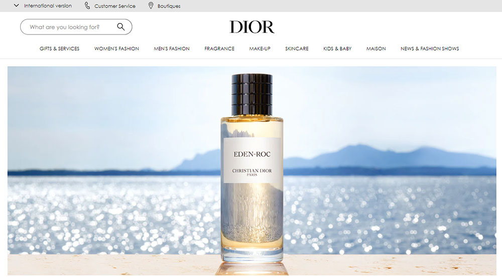
What separates a forgettable online boutique from a site like Dior or Reformation comes down to detail. How images load. How categories are structured. How the design holds up on a 6-inch screen.
Use these examples as a benchmark. Study what fits your brand segment, whether that is luxury, sustainable fashion, or high-volume fast fashion ecommerce. Then build something that your audience actually wants to browse.
Good fashion ecommerce design is not about trends. It is about making the user experience feel effortless while the business metrics quietly climb.


