Stunning Examples of Creative Landing Pages
April 15, 2025
Stunning Examples of Modern Landing Pages
April 21, 2025Converting website visitors into loyal gym members isn't magic—it's design. Looking for inspiration to create a fitness website that actually works? The best gym website templates combine visual appeal with strategic functionality.
Top brands like Peloton, Orange Theory Fitness, and CrossFit have mastered their online presence through thoughtfully crafted landing pages that showcase their unique value propositions.
A well-designed fitness landing page does more than look pretty—it:
- Captures attention with compelling hero sections
- Drives action through effective fitness CTAs
- Builds trust with authentic testimonial displays
- Streamlines the class booking systems process
- Optimizes for both desktop and mobile-friendly fitness websites
This collection of examples of fitness landing pages will help you understand what works, why it works, and how to apply these principles to your own fitness website design.
Let's explore these high-converting workout page designs that turn browsers into buyers.
Examples Of Fitness Landing Pages
Peloton
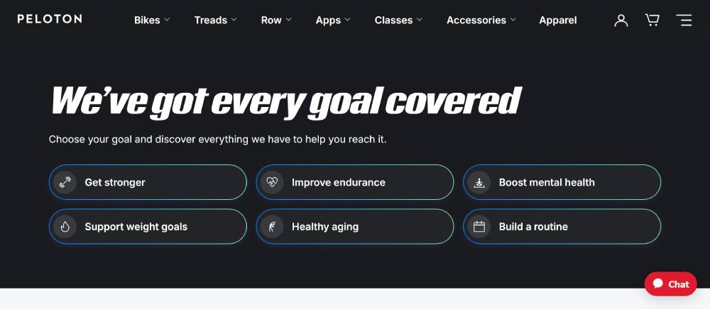
Peloton's website showcases minimalist design with high-contrast elements. The black background makes workout content pop while maintaining brand consistency.
Their site architecture prioritizes video integration and equipment showcases. The membership area design features clear pricing structures and subscription options.
Mobile responsiveness allows seamless transitions between devices, crucial for users tracking workouts on different screens. The fitness content management system handles media-heavy pages without sacrificing load times.
Orange Theory Fitness
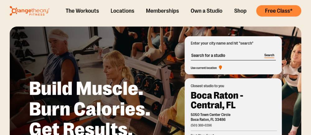
Orange Theory's site leverages vibrant orange accents against clean whites for immediate brand recognition. Their class schedule interfaces provide intuitive booking tools integrated directly with payment gateways.
The mobile-first gym website approach ensures the booking experience works flawlessly on phones. Their before/after galleries highlight real results while maintaining respectful presentation of client transformations.
Member testimonials appear strategically throughout the user journey rather than isolated on a dedicated page.
CrossFit
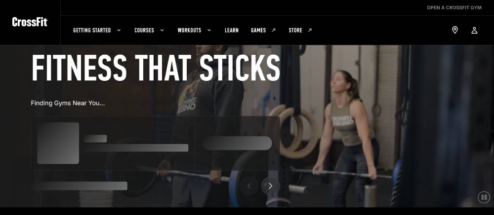
CrossFit's website balances community content with commercial elements. The CrossFit site development includes robust location finders for affiliated gyms.
Their workout library architecture categorizes movements by skill level with detailed form guides. The online fitness community features keep members engaged through comment sections and shared workout logs.
Typography choices reflect the brand's strength-focused ethos with bold, impactful headings balanced by readable body text for workout instructions.
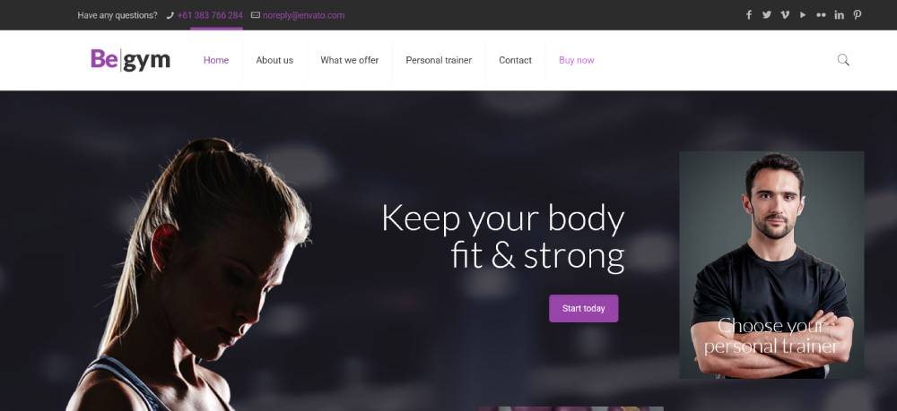
Be Gym
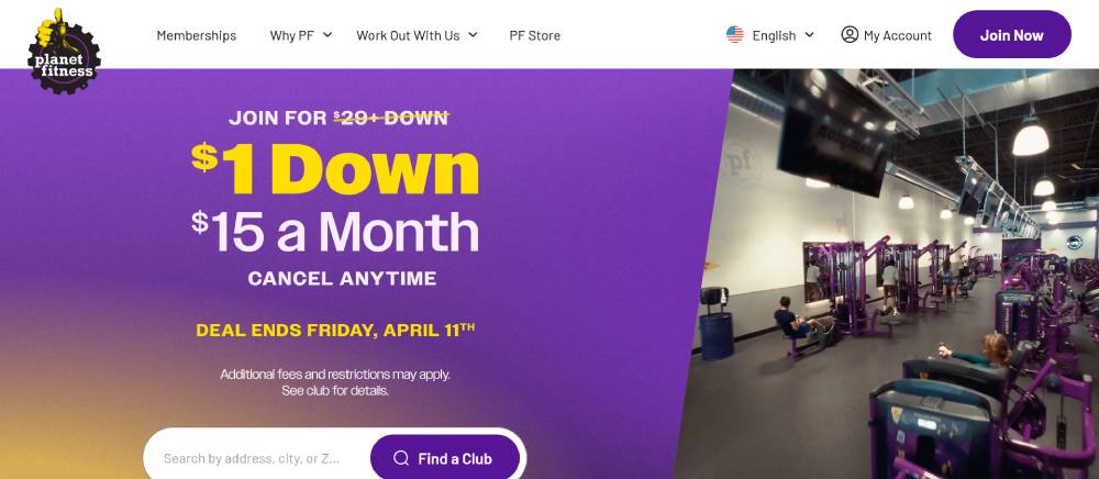
Planet Fitness
Planet Fitness employs accessibility-focused design with clear navigation and readable text. Their gym homepage layout emphasizes affordability and inclusivity through thoughtful imagery selection.
Location finders include detailed amenity lists for each facility. The responsive fitness website adapts beautifully to all devices while maintaining brand consistency.
Their conversion rate optimization appears in simplified signup flows with minimal form fields, reducing abandonment during the membership process.
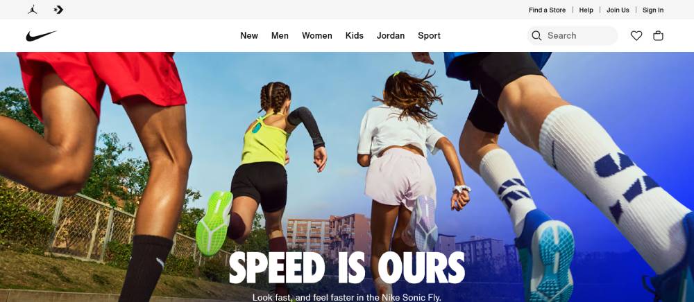
Nike Training Club
Nike's training portal demonstrates masterful fitness website branding through cohesive visual language. The exercise program website integrates with wearable device connectivity for comprehensive tracking.
Their UX for gym websites prioritizes fluid navigation between workout categories. The fitness landing pages showcase trainers with professional photography against minimal backgrounds.
Custom fitness illustrations explain movements clearly without relying solely on photographs or video.
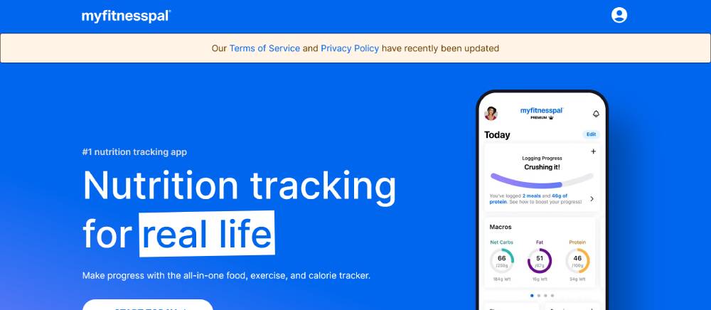
MyFitnessPal
MyFitnessPal exemplifies health tracking dashboards with data visualization that balances complexity with clarity. Their nutrition page layout organizes dense information without overwhelming users.
Progress tracking tools provide encouraging feedback through thoughtful micro-interactions. The exercise site SEO focuses on long-tail nutrition and workout tracking terms.
Mobile optimization prioritizes core tracking features with secondary features accessible through intuitive navigation patterns.
Equinox
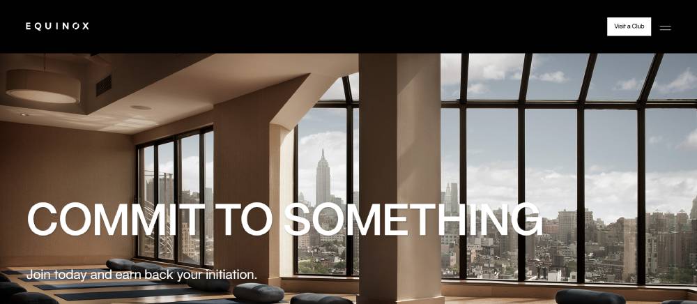
Equinox's website embodies luxury through refined spacing and typographic choices. Their fitness UI elements feature subtle animations that guide users without distracting from content.
Class descriptions use concise copywriting that conveys intensity levels and expectations. The wellness site architecture separates digital content from membership information while maintaining cohesive branding.
Video backgrounds load selectively based on connection speed, ensuring performance across various devices.
LA Fitness
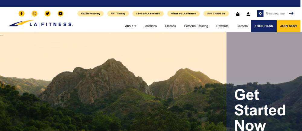
LA Fitness demonstrates practical gym management system integration with membership tracking and facility information. Their site prioritizes location-based content delivery for relevant local promotions.
The fitness website functionality focuses on converting visitors to leads through strategically placed call-to-action buttons. Their booking system integration handles high-volume class registrations efficiently.
Color schemes remain consistent with physical locations, reinforcing brand recognition across digital and physical touchpoints.
Be Sportsman
Gold's Gym
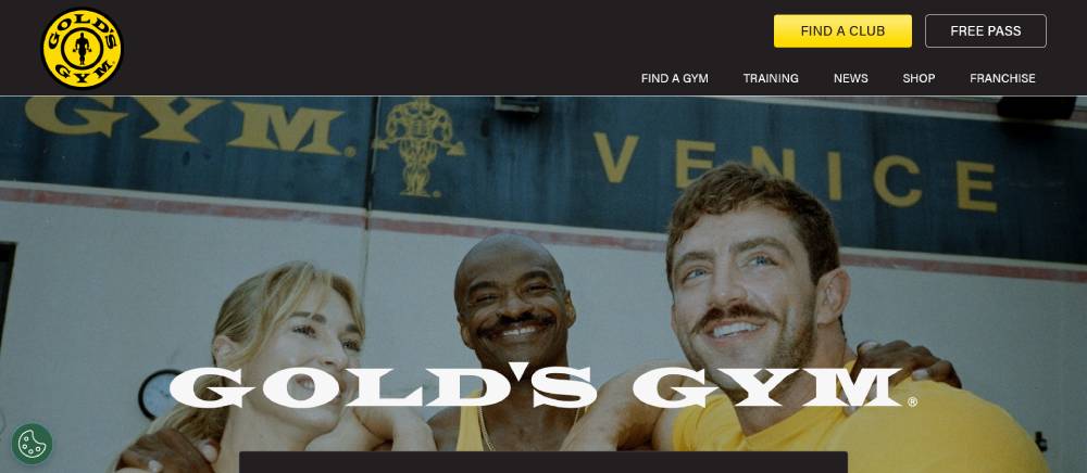
Gold's Gym balances heritage with contemporary design through thoughtful fitness website maintenance. Their trainer profile templates showcase staff credentials prominently.
The workout tracking interfaces allow progress sharing within the platform community. Their athletic website templates adapt to different franchise locations while maintaining brand standards.
Location pages include virtual tours that highlight equipment variety, supporting decision-making for prospective members.
Strava
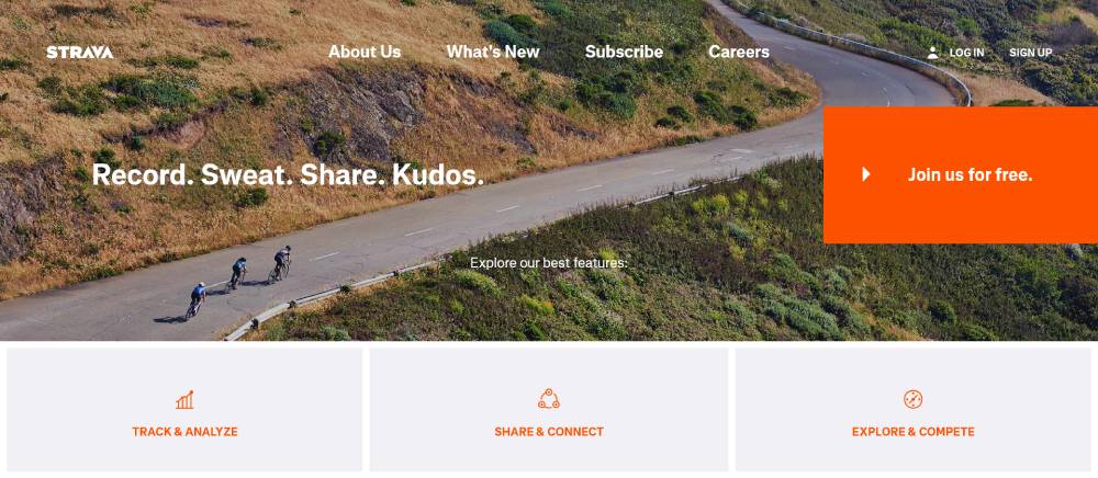
Strava's platform demonstrates exceptional user experience research in how athletes interact with performance data. Their fitness site navigation uses progressive disclosure to prevent overwhelming new users.
Community features center on achievement sharing and route mapping. The sports website creation emphasizes mobile performance since most users track activities on smartphones.
Data visualization presents complex metrics in accessible formats through thoughtful information hierarchy.
Fitbit
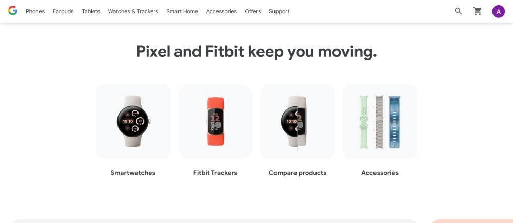
Fitbit's website balances product showcases with health content through clear information architecture. Their wellness portal development connects hardware features with software benefits seamlessly.
Product pages use comparison tools that highlight differences without overwhelming technical details. The fitness ecommerce design streamlines the purchase process with minimal steps.
Dashboard previews demonstrate the value of their tracking ecosystem before purchase, supporting conversion goals.
ClassPass
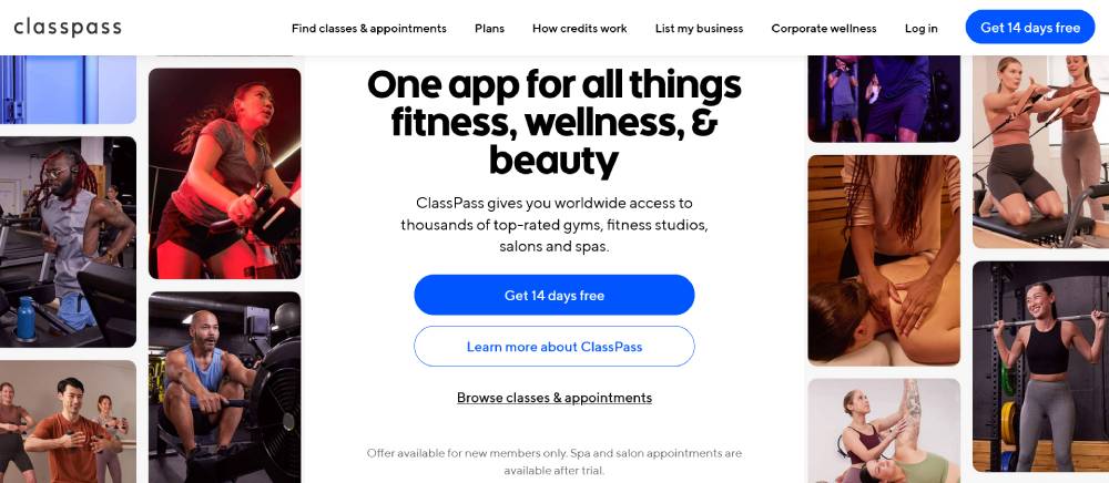
ClassPass exemplifies fitness membership portals with flexible booking interfaces. Their online fitness marketplace connects users with varied workout options through intuitive search filters.
The location-aware design surfaces nearby options first, reducing friction in the discovery process. Their gym website responsiveness ensures convenient booking from any device.
Photography guidelines ensure consistent quality across partner studios, maintaining visual cohesion despite diverse content sources.
Bodybuilding.com
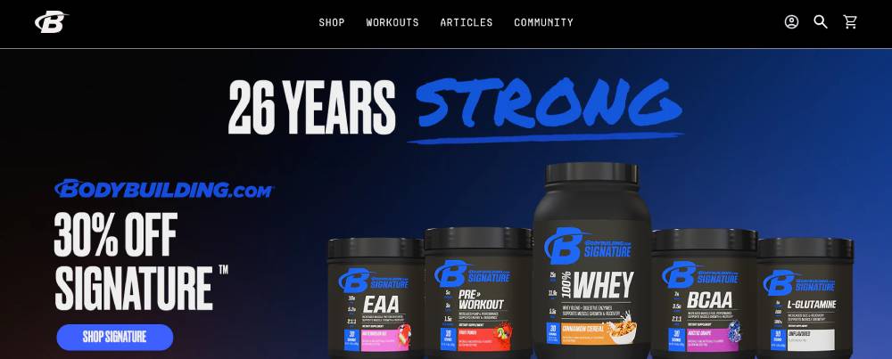
Bodybuilding.com demonstrates content-rich fitness blog design with clear categorization. Their exercise subscription sites provide tiered access to specialized workout programs.
The online workout interface connects exercise demonstrations with nutrition guidance. Their fitness website analytics drive personalized content recommendations based on browsing patterns.
Community forum design encourages knowledge sharing while maintaining navigable thread structures despite high volume.
Be Sports Club 2
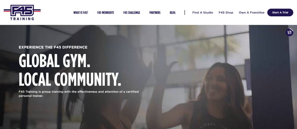
F45 Training
F45 Training uses dynamic content to showcase their high-intensity workout approach. Their training program websites emphasize the scientific backing behind their methods.
Location finders include trainer spotlights to build personal connections before visits. Their online coaching platforms integrate in-person and digital experiences cohesively.
Animation is used strategically to demonstrate exercise forms without requiring video playback on slower connections.
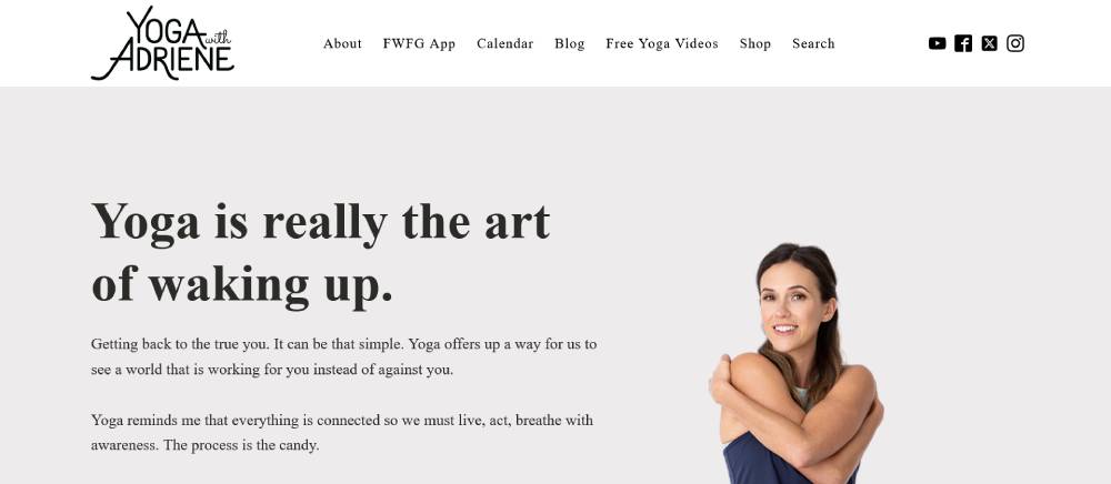
Yoga With Adriene
Yoga With Adriene presents a personal brand through thoughtful yoga studio website design choices. Their video content integration provides seamless playback without platform redirects.
The serene color palette reflects the brand's mindful approach to fitness. Their exercise website templates maintain simplicity to keep focus on instructional content.
Navigation prioritizes skill levels and practice duration, helping users quickly find appropriate sessions.
Crunch Fitness
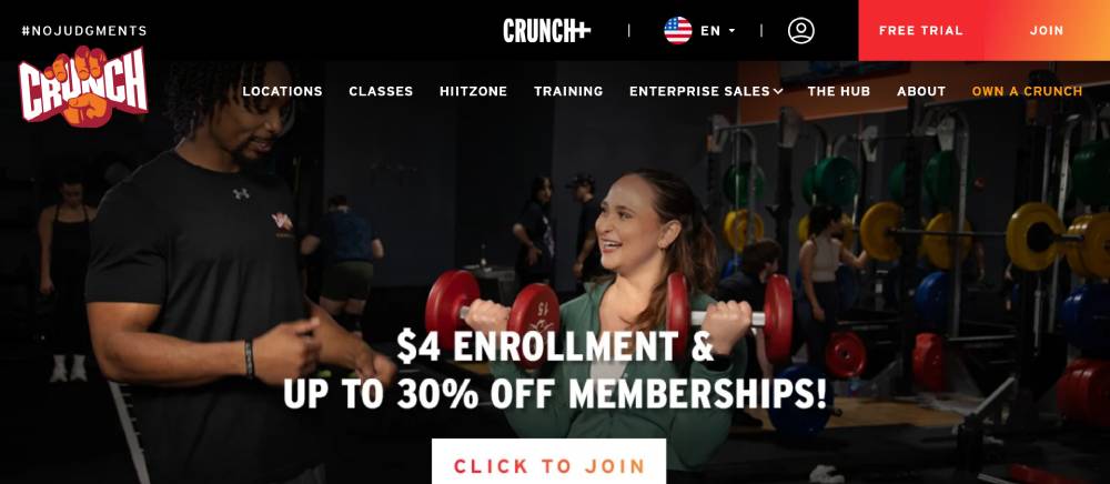
Crunch Fitness employs playful design elements that reflect their brand personality without sacrificing usability. Their gym site builders create cohesion across franchise locations.
Class descriptions use engaging copywriting that matches in-person instructor energy. Their fitness site loading speed prioritizes performance through optimized image delivery.
Member areas include social features that extend community beyond physical locations.
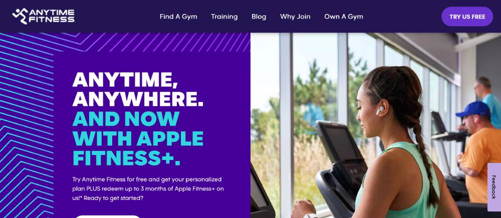
Anytime Fitness
Anytime Fitness demonstrates clear information hierarchy through structured page layouts. Their health portal construction focuses on accessibility across all hours, reflecting their 24/7 value proposition.
Location finders include detailed amenity filters to match member preferences. Their gym website security features protect member data without creating friction during signup.
Mobile functionality prioritizes features needed on-the-go, like location access and digital key cards.
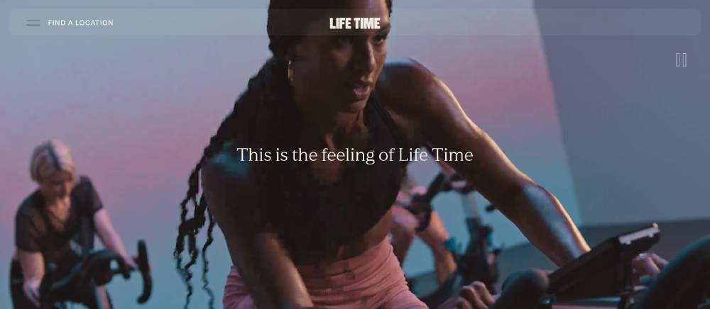
Life Time Fitness
Life Time's website employs premium visual language through photography selection and spacing. Their health site color schemes use warm tones to create inviting digital environments.
The wellness site architecture segments content for different user goals from fitness to relaxation. Their online payment processing integrates smoothly with membership management.
Family-focused features highlight multi-generational offerings, distinguishing them from individual-focused competitors.
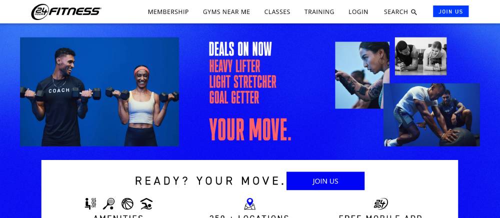
24 Hour Fitness
24 Hour Fitness uses practical navigation patterns optimized for different user journeys. Their gym class scheduling systems adapt to varying location hours automatically.
Membership comparison tools clarify differences between tiers with visual cues. Their fitness website maintenance ensures consistent performance despite regular promotional updates.
Mobile features focus on in-gym utility like digital check-ins and workout tracking.
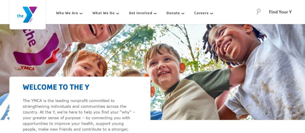
YMCA
YMCA's website balances community programs with fitness offerings through thoughtful information architecture. Their personal trainer websites within the ecosystem highlight staff credentials and specialties.
Program finders use clear filtering options for age groups and interests. Their health website wireframes clearly separate non-profit initiatives from membership information.
Accessibility features exceed standards, reflecting their inclusive community mission.
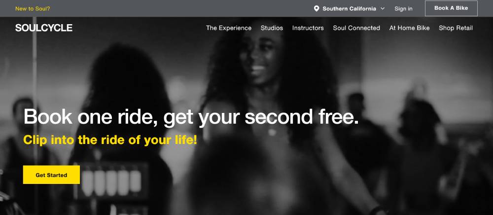
SoulCycle
SoulCycle's website exemplifies focused fitness brand websites with immersive imagery. Their instructor showcase creates celebrity status through professional photography and compelling bios.
Booking flows minimize steps between intention and reservation. Their workout website typography reflects their energetic brand through dynamic font pairings.
Location pages create distinct personalities for studios while maintaining consistent booking experiences.
Beachbody
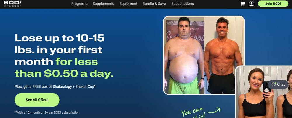
Beachbody demonstrates effective fitness landing pages with clear program differentiation. Their nutrition plan displays connect workout programs with supporting meal guidance.
Trainer personalities feature prominently in program marketing materials. Their fitness website copywriting balances aspiration with achievable results.
The online fitness community features create accountability through shared progress and challenges across their digital ecosystem.
FAQ on Fitness Landing Pages
What makes a good fitness landing page?
A good fitness landing page combines eye-catching design with strategic functionality. It should feature clear fitness CTAs, compelling before and after transformations, mobile responsiveness, and fast loading speed. Like Planet Fitness and Orange Theory Fitness, effective pages highlight unique selling points while making it easy for visitors to take action.
How do I optimize my fitness landing page for conversions?
Focus on converting fitness website visitors through:
- Prominent call-to-action buttons
- Social proof (testimonial displays)
- Limited form fields
- Clear value proposition
- Fitness pricing page examples that are transparent
- A/B testing different elements
Top gym marketing pages from brands like ClassPass and F45 Training consistently test and refine their approach.
What content performs best on fitness landing pages?
High-converting content includes:
- Transformation stories
- Workout plan download pages
- Short, engaging videos
- Instructor bios that build credibility
- Fitness FAQ sections addressing common concerns
- Clear class booking systems
Beachbody and Nike Training Club excel at creating content that motivates action while addressing visitor questions upfront.
How important is mobile optimization for fitness landing pages?
Extremely. Over 70% of fitness searches happen on mobile devices. Mobile-friendly fitness websites with responsive fitness web design perform significantly better. Fitness website user experience must be seamless across all devices. Leading brands like Peloton and Strava prioritize mobile-first design for their workout page designs.
What colors work best for fitness landing pages?
Colors should align with your fitness brand identity online. Energetic brands like Crunch Fitness often use red or orange, while wellness-focused businesses like CorePower Yoga prefer calming blues and greens. Fitness website color schemes should create contrast for CTAs while maintaining accessibility standards.
How do I showcase fitness programs effectively?
Create dedicated sections highlighting each program with:
- Clear benefits
- Sample workout schedule displays
- Instructor credentials
- Progress tracking features
- Success stories
- Pricing options
Orange Theory Fitness and Barry's Bootcamp excel at presenting their unique fitness program websites with compelling visuals and clear differentiation.
What types of images work best on fitness landing pages?
Use authentic images showing:
- Real members (not just models)
- Your actual facility
- Instructors in action
- Before and after transformations
- Equipment in use
- Community events
Equinox and SoulCycle effectively use aspirational yet realistic imagery throughout their fitness website layouts.
How should I structure my fitness landing page?
Follow this proven structure:
- Attention-grabbing hero sections
- Problem acknowledgment
- Solution presentation
- Social proof
- Offer details
- Risk reversal (guarantees)
- Strong CTA
Gold's Gym and Anytime Fitness use this structure effectively in their gym promotion pages.
What calls-to-action convert best on fitness landing pages?
High-converting CTAs include:
- "Start Your Free Trial"
- "Book Your First Class"
- "Get Your Custom Plan"
- "Join Now" with limited-time offers
Effective gym trial offer pages from LA Fitness and 24 Hour Fitness make the next step crystal clear with minimal friction.
How can I use testimonials effectively on my fitness landing page?
Feature diverse testimonials showing:
- Different demographics
- Various fitness goals achieved
- Specific results with numbers
- Before/after photos
- Video testimonials when possible
Noom and WW masterfully integrate authentic testimonials throughout their fitness challenge landing pages.
Conclusion
Exploring examples of fitness landing pages reveals that successful websites blend strategic design with clear purpose. Gym website bounce rates drop dramatically when pages address visitor needs directly. Fitness blogs landing pages from brands like Pure Barre and TRX Training demonstrate this perfectly.
Creating effective fitness websites requires:
- Understanding your audience's fitness journey
- Implementing responsive fitness web design
- Showcasing real transformation displays
- Optimizing fitness website analytics
- Including fitness community forums
The best exercise landing page examples from companies like FitBit and Lululemon prioritize user experience while guiding visitors toward a specific action. Your athletic website design should follow suit.
Remember that wellness website templates are just starting points. The real magic happens when you customize them to reflect your brand while incorporating fitness email signup forms and virtual consultation pages that convert.
Study these examples, apply what works, and test relentlessly.
If you enjoyed reading this article on the fitness landing page, you should check out this one about best startup websites.
We also wrote about a few related subjects like best restaurant websites, best agency websites, the coolest black websites, the best relaxing websites, the best weird websites, time wasting websites to avoid burnout, best interactive websites, an awesome list of trippy websites and coffee websites.

