


Top Examples of Fitness Landing Pages
April 18, 2025The Best Examples of Product Landing Pages
April 23, 2025Landing pages make or break your online success. The difference between a visitor and a customer often comes down to your landing page design.
Website conversion strategies have evolved dramatically, with high-converting landing page designs now featuring responsive layouts and mobile-friendly implementations. Companies like WordPress and MuffinGroup provide powerful platforms to create pages that convert visitors into leads.
Modern landing pages utilize:
- Strategic call-to-action examples
- Conversion-focused design principles
- User experience design techniques
- Visual hierarchy examples that guide visitors
This article showcases exceptional modern landing page examples across industries—from Shopify product pages to SaaS landing page examples. You'll discover how Webflow designs and WordPress landing page themes implement conversion rate optimization techniques through effective page visitor engagement.
By examining these examples, you'll learn practical web design trends you can apply immediately to boost your conversion rates.
Modern Landing Pages
Stripe
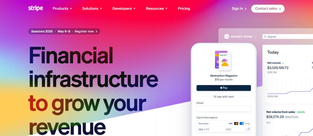
Stripe's landing page showcases exceptional conversion optimization through minimalist design principles. The page features a clean visual hierarchy with strategic white space usage that guides visitors through the content.
Their responsive layout adapts perfectly across devices while maintaining fast page load speed—a critical factor for reducing bounce rates. Interactive elements appear as you scroll, creating subtle microinteractions that enhance user experience without feeling overwhelming.
The value proposition sits prominently above the fold with trust indicators strategically placed to build immediate credibility.
Figma
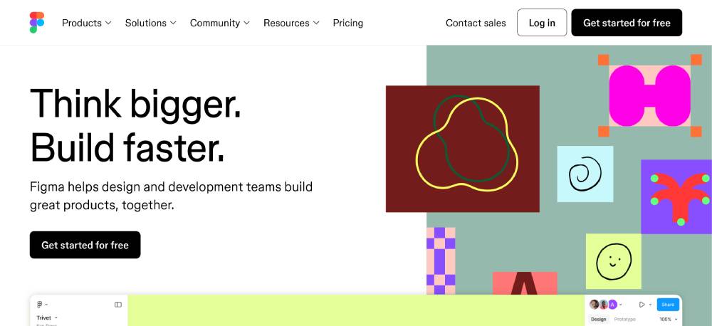
Figma's homepage excels in user-friendly interface design with a focus on customer journey mapping. Their hero section immediately demonstrates the product through animated page sections that respond to visitor engagement.
The conversion-focused design uses custom illustrations to showcase the collaborative aspects of the platform. Form validation appears seamlessly in their lead capture elements, reducing friction in the marketing funnel.
Typography choices and color psychology work together to create a cohesive, professional feel that appeals to their target audience of designers and teams.
Notion
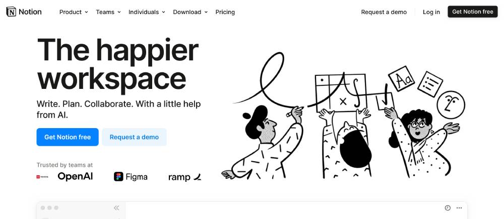
Notion employs exceptional lead generation techniques through their landing page. The single-page website structure creates a natural flow that guides visitors through different product benefits.
Their minimal web design approach combines with strategic calls to action that appear at key decision points. Page analytics likely show strong conversion metrics from this thoughtful arrangement.
The scroll-triggered animations reveal features progressively, keeping users engaged throughout the sales funnel. Social proof sections featuring prominent customers build credibility through authentic testimonials.
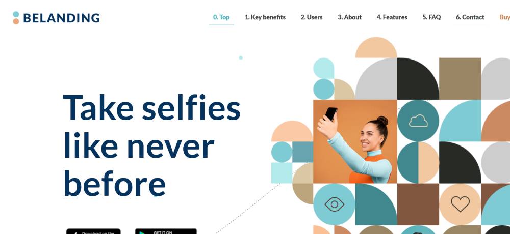
Be Landing 3
Airbnb
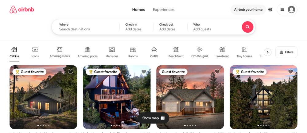
Airbnb's landing page demonstrates mastery of persuasive copywriting and visual storytelling. Their web design focuses on user behavior patterns to create intuitive navigation flows.
The mobile-first design ensures a seamless experience across all devices. Split testing has clearly refined their conversion rate over time, as evidenced by the clear pathways and minimal distractions.
High-converting pages like theirs succeed by balancing aesthetics with functionality—notice how their search function dominates the hero section while maintaining visual appeal.
Slack
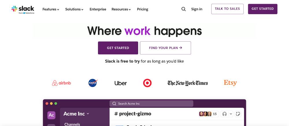
Slack's landing page shows expert implementation of growth hacking principles through its clear content hierarchy. Their A/B testing history is evident in the refined user flow that guides visitors toward conversion.
The sticky navigation maintains context while scrolling through feature explanations. Lead magnets appear strategically throughout, offering valuable resources in exchange for contact information.
Dark mode options and accessibility features demonstrate their commitment to inclusive web traffic from all potential users.
Linear
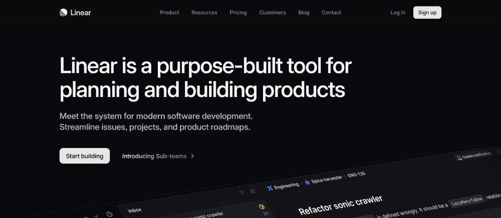
Linear's homepage exemplifies high-converting page design with its focused approach. The visitor engagement strategy uses subtle animations that highlight product capabilities without distracting from core messaging.
Their form optimization keeps lead capture simple yet effective. The strategic use of white space creates breathing room around key elements, drawing attention to conversion metrics that matter.
The thank you page experience continues the brand story, maintaining momentum through the marketing funnel.
Vercel
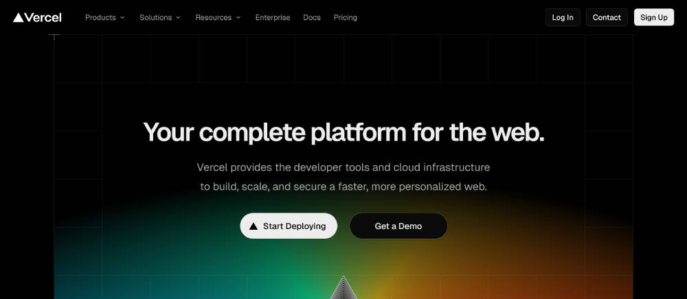
Vercel's landing page showcases modern web design with exceptional page elements placement. Their above the fold content immediately communicates value while hinting at deeper content below.
Scrolling behavior was clearly considered—notice how each section builds on the previous one, creating a cohesive story about their deployment platform. Heatmap tracking has likely informed their button placement and sizing.
Exit-intent popups are tastefully implemented to recover potentially leaving visitors without disrupting the user experience.
Framer
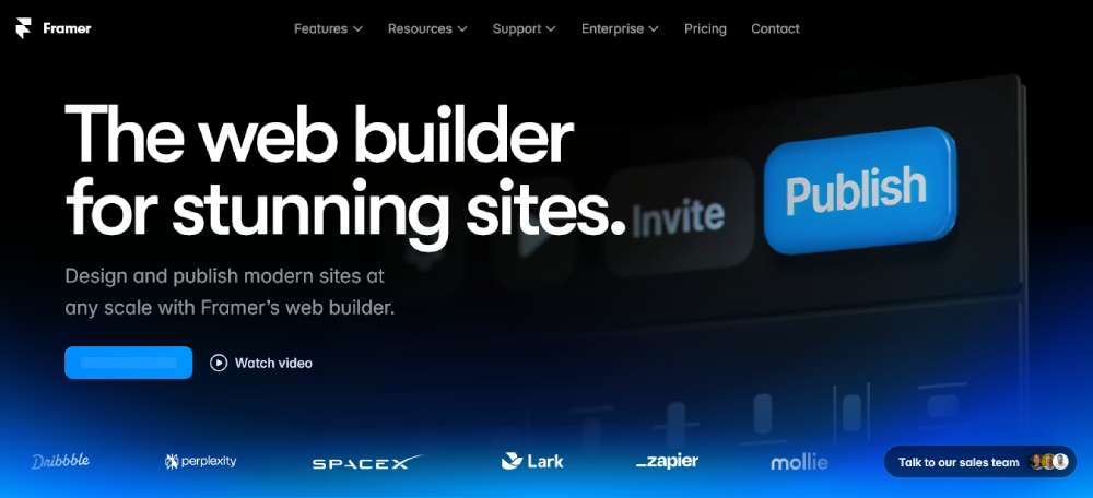
Framer's homepage demonstrates advanced conversion optimization through interactive elements that showcase the product's capabilities. Their user flow guides visitors from awareness to consideration seamlessly.
The responsive layout maintains design integrity across devices while highlighting key features through animated page sections. Video backgrounds create dynamic visual interest without slowing page load speed.
Their call to action buttons stand out through careful color psychology and positioning based on visitor engagement patterns.
Be Landing 4
Calendly
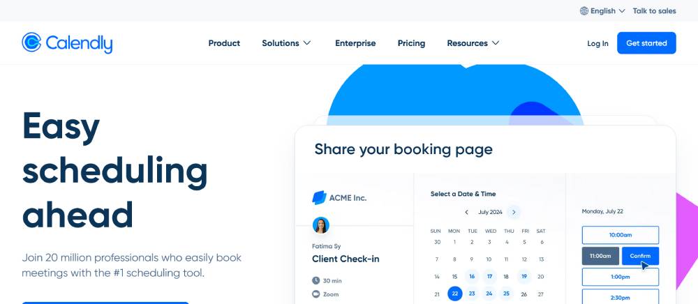
Calendly's landing page excels in lead generation with its clean, purposeful design. The single-page website approach keeps the message focused while social proof sections build immediate trust.
Their mobile-friendly interface prioritizes the most important actions. Customer journey mapping is evident in how they've simplified scheduling into a compelling visual story.
The bounce rate is likely reduced by clear value propositions and trust indicators positioned strategically throughout the page.
Pitch
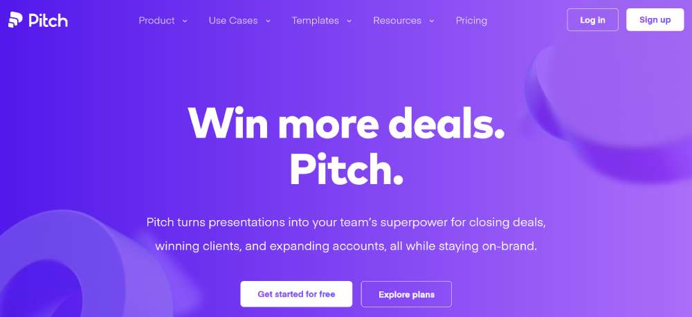
Pitch displays exceptional web design fundamentals with a focus on conversion metrics. Their use of microinteractions creates moments of delight that keep visitors engaged with the content.
The form optimization reduces friction in signup processes. Strategic placement of trust indicators builds credibility throughout the marketing funnel.
Their responsive layout adapts beautifully across devices while maintaining visual hierarchy in all contexts.
Airtable
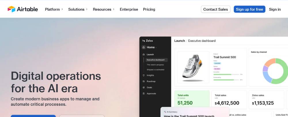
Airtable's landing page demonstrates sophisticated lead capture strategies through carefully designed page elements. The visual hierarchy guides visitors through complex product offerings without overwhelming them.
Their split testing history shows in the refined messaging and layout. Custom illustrations help visualize abstract concepts, making the value proposition immediately clear.
The page load speed remains impressive despite rich interactive elements—a testament to their technical optimization.
Loom
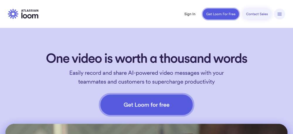
Loom's homepage showcases effective conversion-focused design with its clear, direct approach. The above the fold content immediately demonstrates the product's value through video integration.
The user experience feels intuitive through thoughtful placement of interactive elements. Their A/B testing has refined call to action placement for maximum conversion rate impact.
Social proof sections featuring real users create authenticity that builds trust throughout the sales funnel.
Shopify
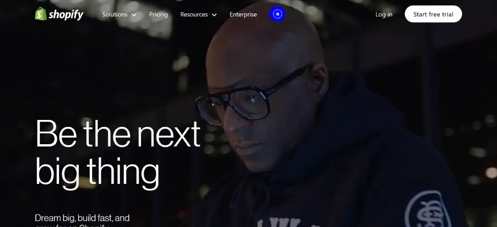
Shopify's landing page exemplifies lead generation mastery with its strategic content hierarchy. The conversion metrics they target are evident in how they guide different visitor segments through tailored pathways.
Their responsive layout maintains consistency across devices while highlighting key benefits through clean typography and spacing. User behavior analysis clearly informs their design decisions.
Trust indicators appear throughout the page, building confidence as visitors move through the marketing funnel.
Be Landing 2
Coda
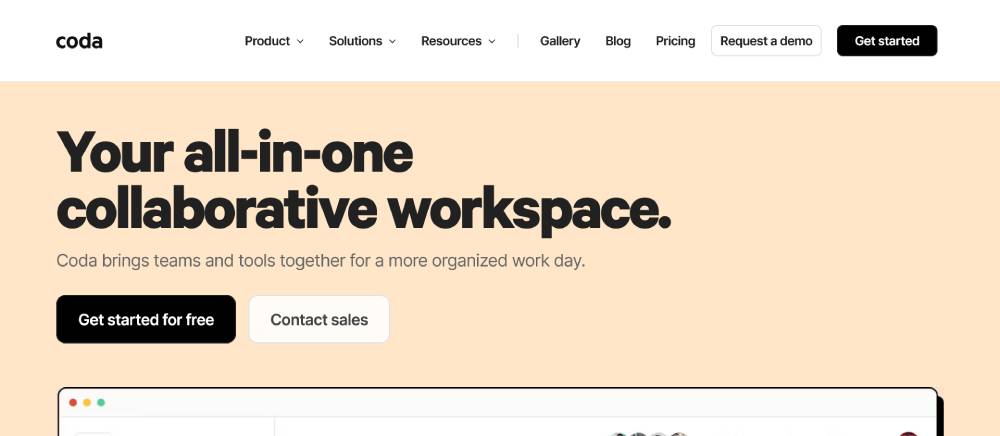
Coda's homepage demonstrates sophisticated user flow design with progressive disclosure of features. Their minimal web design approach keeps focus on key benefits while reducing visual noise.
The animated page sections reveal functionality in context, helping visitors understand complex features. Form validation in their signup process reduces friction points in the conversion funnel.
Their call to action buttons stand out through strategic color psychology and positioning based on scrolling behavior analysis.
Miro
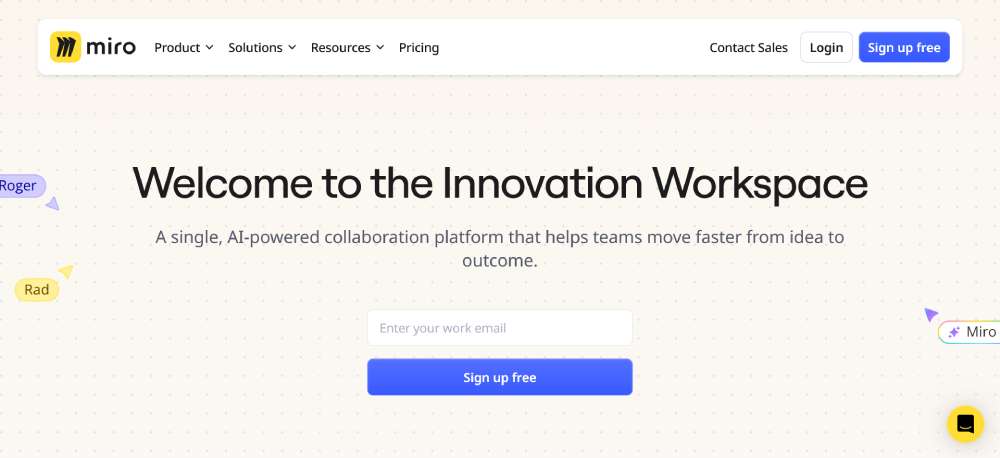
Miro's landing page shows excellence in conversion optimization through its visual storytelling approach. Their interactive elements demonstrate the collaborative nature of the product directly.
The page employs white space strategically to create breathing room around key messages. Mobile-first design principles ensure consistent experiences across all devices.
Lead magnets offer valuable resources that attract their specific target audience, creating natural entry points to their marketing funnel.
Asana
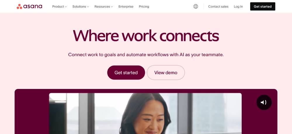
Asana's homepage exemplifies high-converting page design through clear visual hierarchy and purposeful layouts. Their user experience prioritizes different visitor segments with tailored messaging.
The responsive layout maintains design integrity while showcasing product benefits through strategic content placement. Split testing has refined their approach to conversion rate optimization.
Social proof sections feature recognizable brands, building immediate trust and credibility with new visitors.
Raycast
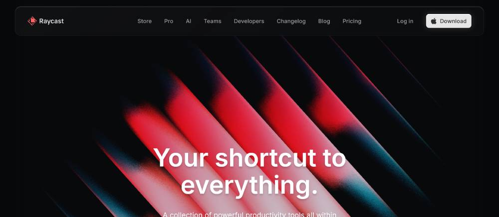
Raycast's landing page demonstrates modern web design principles with its focus on performance and clarity. The conversion-focused approach keeps messaging direct and benefits clear.
Their above the fold content immediately communicates the product's purpose. Scrolling behavior reveals additional features through carefully timed animations that maintain page load speed.
The lead capture form is streamlined for minimum friction, optimizing the path to conversion throughout the sales funnel.
Arc Browser
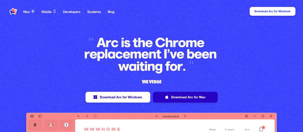
Arc's homepage showcases innovative conversion optimization through unique interactive elements. Their design breaks conventional patterns while maintaining usability through strong visual cues.
The single-page website guides visitors through a compelling narrative about browsing differently. Microinteractions create moments of discovery that mirror the product experience itself.
Their call to action placement shows careful consideration of the customer journey and key decision points.
Ramp
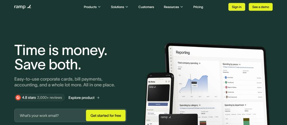
Ramp's landing page excels in lead generation for financial services with its clean, trustworthy design. The user experience prioritizes clarity and security through thoughtful visual hierarchy.
Their form optimization reduces friction in the application process. Trust indicators appear prominently throughout, addressing common concerns in the financial sector.
The mobile-friendly design ensures consistent experience across devices while maintaining the professional feel essential to their brand positioning.
FAQ on Modern Landing Pages
What makes a landing page "modern"?
Modern landing pages feature minimal design, responsive layouts, and conversion-focused design. They prioritize mobile-friendly implementations with fast page load speed. Today's designs use white space effectively, incorporate micro-interactions, and focus on visual hierarchy examples that guide users through the conversion process. Webflow designs and custom WordPress landing page themes exemplify these modern approaches.
How do landing pages differ from homepages?
Landing pages focus on a single conversion goal, while homepages serve multiple purposes. Landing pages eliminate navigation, use focused call-to-action examples, and simplify choices to increase conversion rate optimization. They're specifically designed as homepage alternatives for campaigns. Tools like Unbounce platform and Elementor page builder help create these conversion-specific pages separate from main website architecture.
What elements should a high-converting landing page include?
A high-converting landing page design includes:
- Compelling headline
- Clear value proposition display
- Strategic call-to-action examples
- Relevant imagery
- Social proof elements
- Minimal form fields
- Mobile-friendly implementation
- Fast page load speed
- User experience design that guides visitors
HubSpot landing pages often showcase these elements effectively.
Which industries benefit most from specialized landing pages?
All industries benefit, but e-commerce landing pages, SaaS landing page examples, and lead generation pages show highest ROI. Shopify product pages convert well in retail. Web page optimization for finance, healthcare, education, and B2B services also shows strong results. Webinar registration pages and specialized service offerings across sectors leverage landing page analytics for conversion improvements.
What are current trends in landing page design?
Current web design trends include:
- Dark mode landing pages
- Interactive landing pages with micro-interactions
- Single page websites with scroll-triggered animations
- Minimal design landing pages
- Personalized web experiences
- AI-powered content recommendations
- Tailwind CSS components for clean interfaces
- Video backgrounds
- Conversational UI patterns
- Accessible design features
How can I measure landing page effectiveness?
Measure success using Google Analytics conversion tracking, Hotjar heatmaps, and website heatmap analysis. Track conversion rates, bounce rates, time on page, and form completions. A/B testing landing pages helps optimize performance. ClickFunnels templates often include built-in analytics. Focus on visitor tracking methods that reveal how users interact with page elements.
What tools do professionals use to create modern landing pages?
Professionals use:
- Unbounce platform
- HubSpot landing pages
- Webflow designs
- WordPress landing page themes
- Elementor page builder
- Instapage platform
- Leadpages examples
- Wix landing page templates
- Figma prototypes for planning
- Adobe XD wireframes for initial concepts
Should landing pages be simple or feature-rich?
Landing pages need balance. Some products require interactive landing pages with detailed feature explanations and scroll-triggered animations. Others convert better with minimal design landing pages focused on a single action. User experience design principles should guide this decision. Test different landing page layouts to find your optimal approach.
How do mobile and desktop landing pages differ?
Mobile landing pages require simplification of above the fold content, larger tap targets, and condensed form design. Desktop versions can use more complex landing page layouts and interactive elements. Bootstrap framework and Material Design examples help create responsive landing pages that adapt intelligently to different screens while maintaining conversion-focused design principles.
How much do professional landing pages cost?
Costs vary widely. DIY options with Wix landing page templates or WordPress landing page themes range from $0-100/month. Mid-range solutions using Unbounce platform or Leadpages examples cost $50-300/month. Custom designs from agencies using Figma prototypes and Adobe XD wireframes start at $1,500 and can exceed $10,000 for complex projects with conversion rate optimization.
Conclusion
Exploring examples of modern landing pages reveals how web design trends have transformed digital marketing. From interactive landing pages to conversion-focused design, modern approaches prioritize both aesthetics and results. Webinar registration pages and e-commerce landing pages showcase how strategic page visitor engagement drives conversion.
The best landing pages share these qualities:
- Minimal design landing pages that eliminate distractions
- Effective use of white space and visual hierarchy
- Split testing results guiding continuous improvement
- Integration with customer journey mapping
- Website accessibility features that welcome all users
As platforms like GatsbyJS landing pages and Notion landing page designs demonstrate, the evolution continues. Whether using Framer website prototypes or ConvertKit forms, success comes from balancing creativity with conversion principles. Start implementing these proven techniques and watch your website conversion strategies transform visitors into loyal customers.
If you enjoyed reading this article on the modern landing pages , you should check out this one about best startup websites.
We also wrote about a few related subjects like best restaurant websites, best agency websites, the coolest black websites, the best relaxing websites, the best weird websites, time wasting websites to avoid burnout, best interactive websites, an awesome list of trippy websites and coffee websites.


