

Fixing the Failed to Load Resource Error in WordPress
February 23, 2025
WordPress Can’t Upload Images? Here’s How to Fix It
February 28, 2025Pricing page design examples are more significant than you think. They show how a mix of user experience (UX) and user interface (UI) design can attract and keep customers.
Finding the best design isn't just about looks; it's crucial for a good conversion rate. The pricing page is where many potential buyers decide whether to subscribe or buy.
By the end of this article, you'll know critical elements in pricing page structures, like call to action (CTA) areas, dynamic subscription tier displays, and clear pricing grids that increase customer trust.
Each example shows design psychology, the value of an effective visual hierarchy, and how unique templates can fit different markets like SaaS companies and e-commerce websites.
Pricing Page Design Examples
Routable
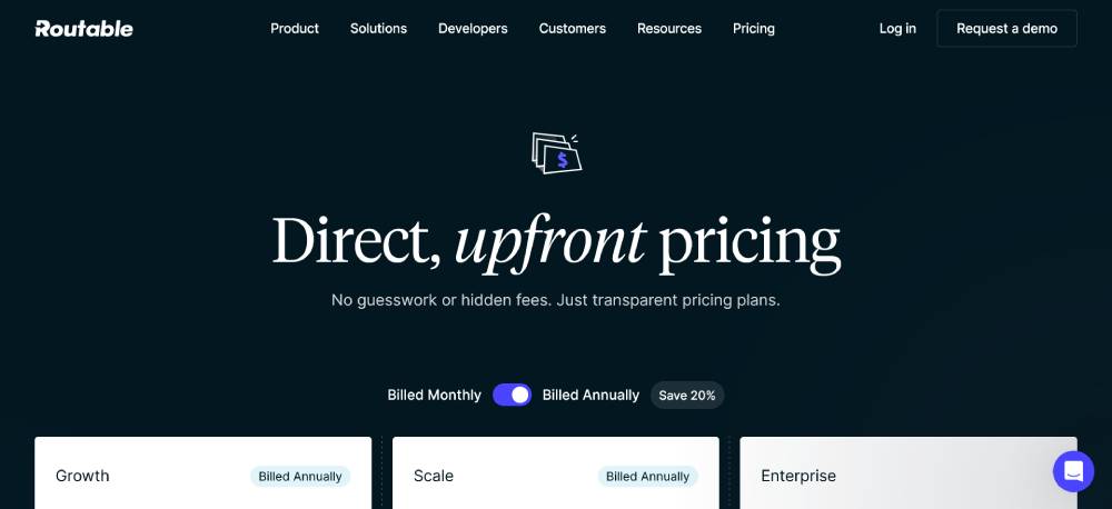
A structured, minimalistic layout with a clean white background. Pricing tiers are clearly defined with distinct sections, making it easy to scan. Typography is bold for key features, while icons add visual balance. The call-to-action buttons stand out with a strong contrast. The page includes well-placed white space, ensuring readability. Interactive elements, such as expandable sections, improve user engagement. The overall design focuses on clarity and transparency.
Lattice
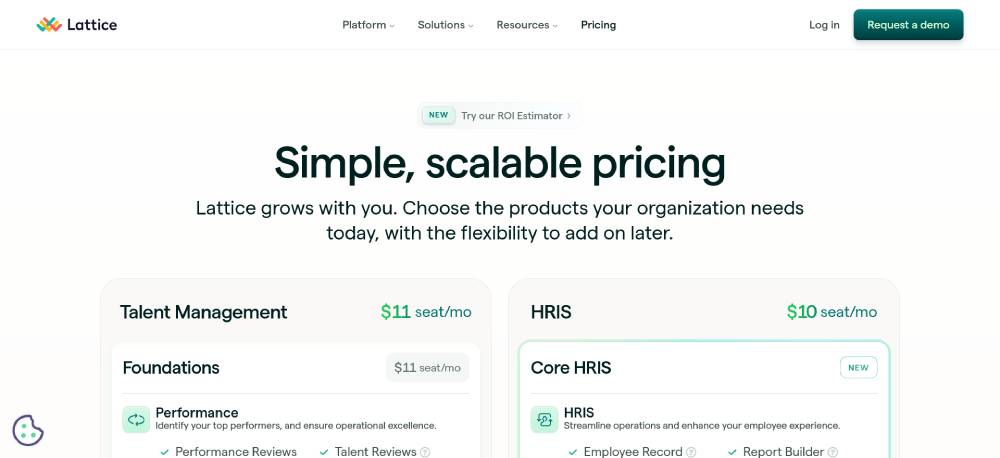
A modern, grid-based design with ample spacing between sections. The pricing page maintains a consistent hierarchy, using headings and subheadings effectively. Different plans are color-coded, helping users distinguish between options at a glance. Icons accompany feature lists, reinforcing comprehension. Call-to-action buttons are prominent but not overwhelming. The page maintains a balance between visual appeal and functionality, ensuring a smooth browsing experience.
Critter
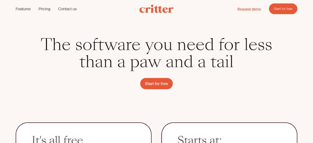
A straightforward design with a focus on simplicity. The free plan is emphasized, making it immediately clear what users get at no cost. The color scheme is soft, avoiding distraction. Typography is clean, with generous spacing that enhances readability. Key features are listed in a collapsible format to reduce clutter. The page encourages engagement with clear steps on how to get started. Visual consistency makes navigation effortless.
Be Cosmetics 3
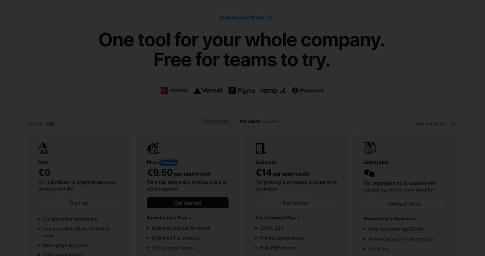
Notion
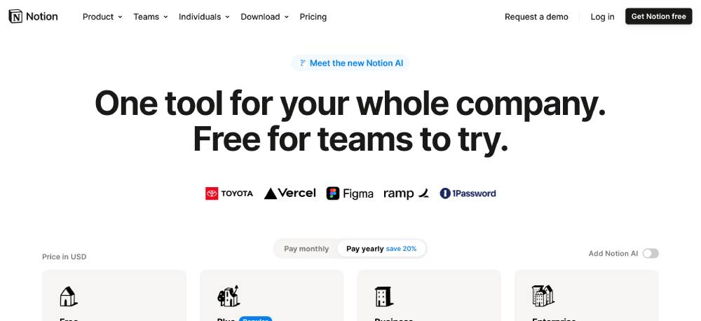
A well-structured layout with clear sections and a minimalist aesthetic. Each plan is presented in a card-style format, making comparisons easy. Hover effects subtly highlight interactive elements. The typography is refined, using weight and size variations to guide attention. Feature comparisons are aligned neatly in a table format, ensuring quick scanning. The overall design stays true to Notion’s branding, reinforcing familiarity for users.
Index
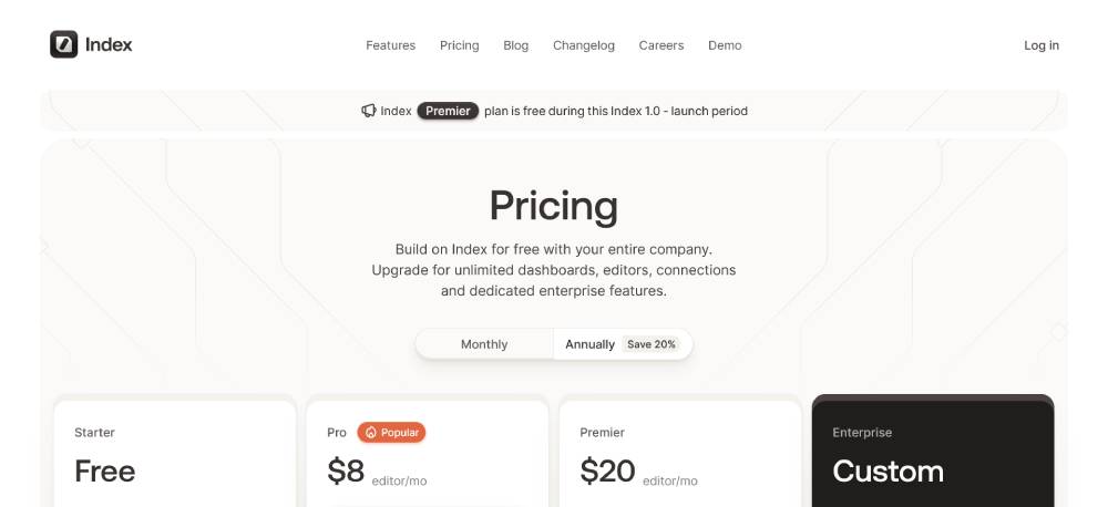
A dark-themed, sleek design with a bold yet minimalist layout. The pricing structure is presented with a progressive reveal, guiding users through different tiers naturally. Well-spaced typography enhances readability. Icons and subtle animations add an interactive touch without overwhelming the user. Call-to-action buttons are clear, maintaining visual hierarchy. The use of white space ensures an uncluttered browsing experience, keeping attention on essential details.
Clerk
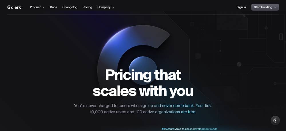
A structured, content-rich design that prioritizes clarity. The pricing page follows a modular layout, breaking down each plan into digestible sections. Icons and subtle color variations differentiate feature categories. The design remains consistent with Clerk’s overall aesthetic, using well-defined typography and a responsive grid system. Interactive elements, such as expandable details, keep the page informative without making it feel overwhelming.
SaveDay
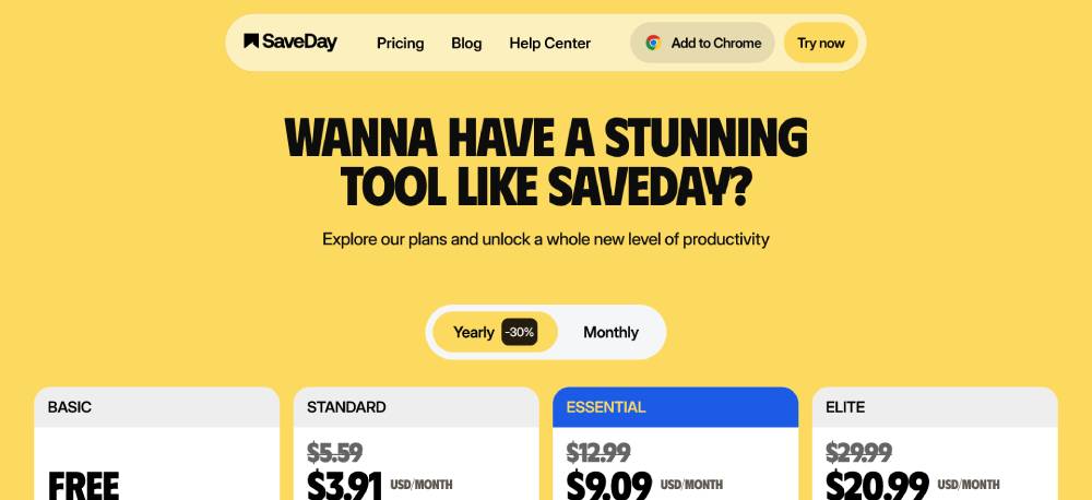
A modern, engaging layout with a focus on functionality. The page uses a toggle switch for monthly and yearly pricing, allowing users to see cost variations instantly. A well-organized feature comparison table makes distinctions between plans clear. The typography is crisp, ensuring readability. Thoughtful use of color guides the eye naturally across sections. The call-to-action buttons are strategically placed, maximizing conversion potential.
Rainforest Pay
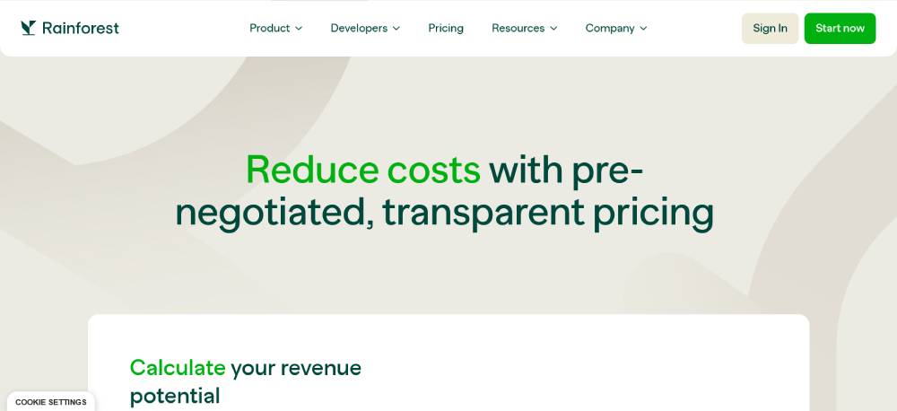
A highly structured design with a professional, data-driven approach. The page includes a revenue calculator, making it interactive and useful for potential customers. A balance of text and graphical elements ensures information remains digestible. The typography is clear and professional, reflecting the business-oriented nature of the platform. Ample white space prevents the page from feeling overwhelming despite its detailed content.
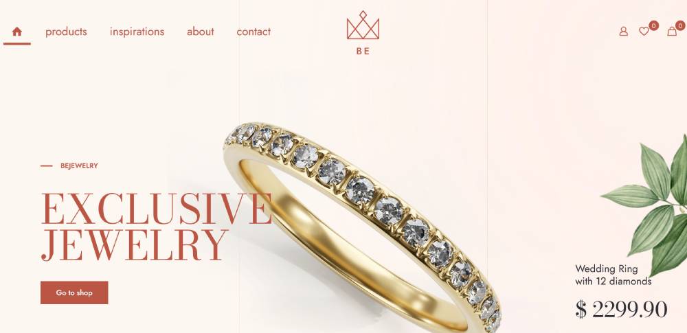
Be Jeweler 2
Fathom
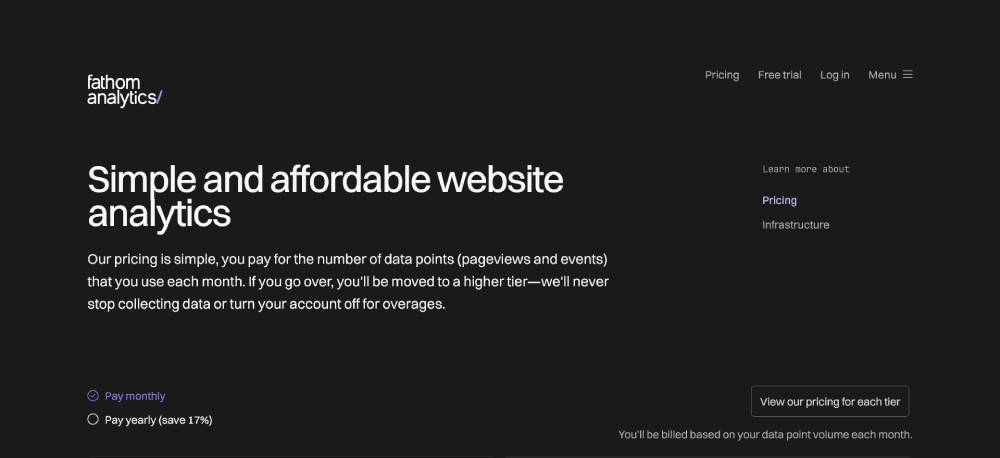
A clean and functional design with a strong focus on usability. The pricing page follows a linear structure, making navigation straightforward. The use of tiered pricing cards ensures a quick comparison between plans. White space and well-defined typography improve readability. Subtle micro-interactions enhance user engagement without distraction. The page effectively balances content and design, maintaining clarity while presenting all necessary details.
Wiza
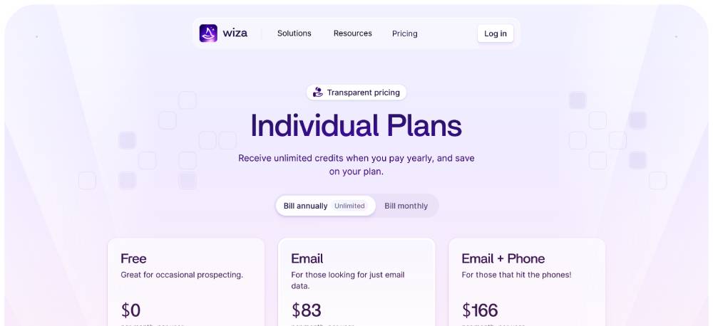
A modern, high-contrast layout with a focus on simplicity. The page uses distinct sections to separate pricing tiers, making comparisons seamless. The typography is large and easy to read, with a well-balanced color scheme that ensures clarity. Icons and checkmarks effectively highlight included features. Call-to-action buttons are positioned strategically, guiding users toward sign-ups naturally. The design is both functional and visually appealing.
Better Stack
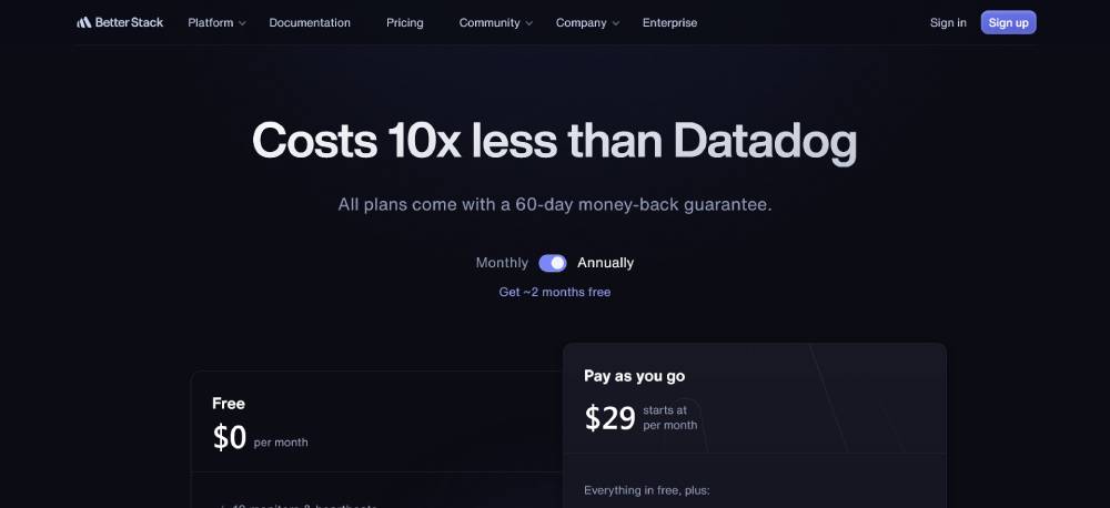
A clean, structured page with a strong focus on functionality. The design uses a card-based layout to separate different pricing tiers. Feature comparisons are well-organized, using alternating backgrounds to guide the eye. Icons and typography contribute to a professional, enterprise-grade aesthetic. A responsive design ensures readability across devices. Interactive elements, like dropdowns for detailed pricing, keep the page dynamic without overwhelming the user.
Spline
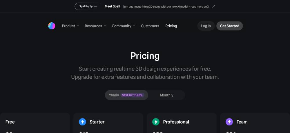
A visually engaging page with a modern, minimalistic layout. The design stays true to Spline’s 3D-focused branding, incorporating subtle animations and smooth transitions. Pricing tiers are presented in a card-based format, with clear distinctions between plans. Hover effects and interactive elements enhance user engagement. White space and typography are well-balanced, ensuring clarity while maintaining an artistic feel.
Harvest
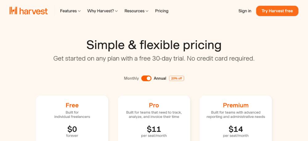
A structured, no-frills design with a clear pricing breakdown. The page uses a grid layout to compare features across plans, making it easy to scan. The typography is clean and well-spaced, improving readability. The call-to-action buttons are prominent but not intrusive. Interactive elements, such as a feature comparison table, enhance usability. The design maintains a professional tone while ensuring accessibility.
Be Whiskey 2
Evervault
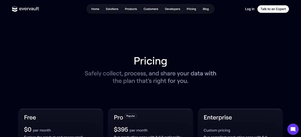
A sleek, minimalistic layout with a data-driven aesthetic. The pricing page uses a grid structure to separate different plans, ensuring clarity. The typography is bold yet refined, guiding the user’s attention naturally. Icons and subtle hover effects add an interactive touch. The page maintains a strong visual hierarchy, making it easy to compare plans at a glance. The design stays aligned with Evervault’s cybersecurity focus.
Glide
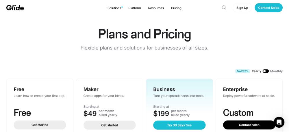
A well-organized, modern layout that emphasizes usability. The page uses a toggle switch for monthly and yearly pricing, improving user experience. Feature breakdowns are displayed in a structured table format, ensuring quick comparisons. The typography is clean and legible, with a balanced use of color to highlight key details. Subtle animations enhance interactivity without being distracting. The overall design prioritizes clarity and ease of navigation.
FAQ on Pricing Page Design
What elements make a good pricing page design?
A good pricing page mixes clarity with compelling visuals. Calls to Action (CTAs) should pop and guide. Pricing grids need to present information clearly.
Add feature comparison tables to help customers see differences. Understand the user journey and keep the layout straightforward, yet visually appealing.
How can I improve my pricing page design for better conversion rates?
Focus on the user experience (UX) and visual hierarchy. Ensuring pricing plans are easy to compare can increase conversions.
Incorporate A/B testing to gather data on what works. Highlight your value proposition prominently and use trust signals like testimonials or guarantees effectively.
Which pricing page layouts work best for SaaS companies?
In SaaS, simplicity is key. Use standard-tiered pricing layouts with clear subscription tiers and well-defined CTAs.
Ensure each plan showcases the feature differences. Keep the design responsive for different devices, and highlight benefits in each pricing card.
How important is mobile-friendliness for pricing pages?
Being mobile-friendly is critical. Many users check pricing on their phones. Responsive design ensures your page looks and works well on any device.
A seamless experience supports conversion rate optimization and keeps potential customers engaged from browsing to purchase.
What role does visual hierarchy play in pricing pages?
Visual hierarchy guides users through the content in order of importance. Use size, color, and spacing to draw attention to critical elements like your CTAs.
An effective hierarchy helps users quickly find what they need, contributing to a smooth user interface (UI) design.
How do I use feature comparisons effectively on my pricing page?
Feature comparisons help customers understand what they gain at each tier. Comparison tables should be easy to scan, highlighting differences with graphics or text.
This helps users make informed decisions based on features that match their needs and budget, driving higher engagement.
Why is it necessary to include trust signals on a pricing page?
Trust signals reassure users about product credibility. These include testimonials, client logos, ratings, and guarantees.
They're important in highlighting reliability and can play a crucial part in the customer's decision-making process, ultimately influencing conversion.
How vital is A/B testing for pricing pages?
Testing is critical. A/B testing different elements like pricing page navigation, CTAs, or layouts can provide insights into user preferences and behaviors.
These insights help refine the design and drive better conversion rates by making data-driven adjustments.
Can visual elements impact pricing perception?
Yes, how you present pricing can affect perception. Use visuals to convey value. Highlight savings or best deals with colors or badges.
Ensure the design aligns with branding so customers trust what they see, making them more likely to convert.
What common mistakes should I avoid in pricing page design?
Avoid clutter and confusing layouts. Don't hide key information. Ensure that pricing structures are clear, and the CTAs are obvious and well-placed.
Don’t neglect user feedback, as it can point out overlooked issues. Always aim for clarity and simplicity.
Conclusion
Pricing page design examples can offer a practical look at what works. They’re a mixture of clear pricing structures, effective CTA placements, and engaging visuals. A well-designed page does more than list costs. It improves trust, aids in decision-making, and secures higher conversions.
Takeaways from these examples highlight the critical role of feature comparisons, the need for mobile-friendly layouts, and the importance of simple pricing tables. The overall design sets the user experience apart by addressing consumer needs head-on and removing ambiguity.
Top considerations:
- Display clarity
- Strong value propositions
- Easy navigation
Review, adjust, and test your designs. Every tweak is a step toward improved user satisfaction and business goals. Stay informed as market trends shift, requiring continual adaptation in this important area. These examples offer a roadmap, encouraging creativity and purpose in pricing strategies. Adapt them, and watch engagement grow.
If you enjoyed reading this article on Pricing page design examples, you should check out this one about accessible websites examples.
We also wrote about a few related subjects like the best looking tourism websites, hotel website design, product landing page, great looking spa websites, cool looking personal trainer websites, top notch musician websites, the most impressive luxury websites and impressive animated websites.


