Examples of Charity Website Templates That Inspire
August 20, 2025
Websites with a Green Color Palette That Look Amazing
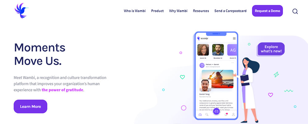
August 29, 2025Purple sits at the intersection of calm and energy. Brands like Twitch, Cadbury, and Heroku built recognition through this single color choice.
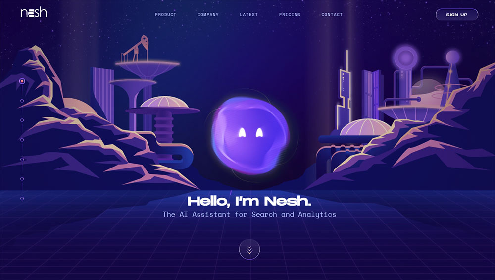
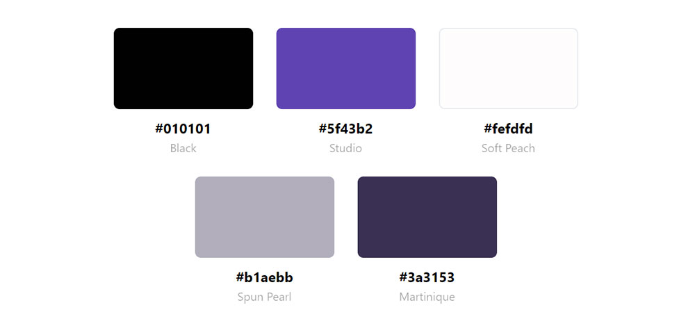
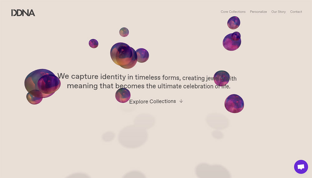
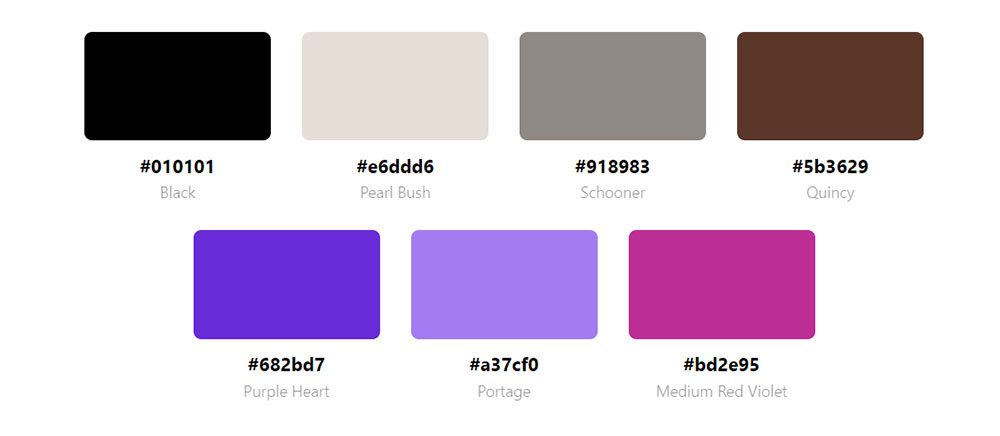
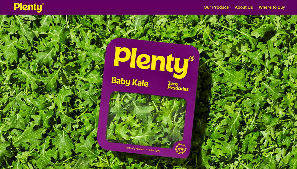
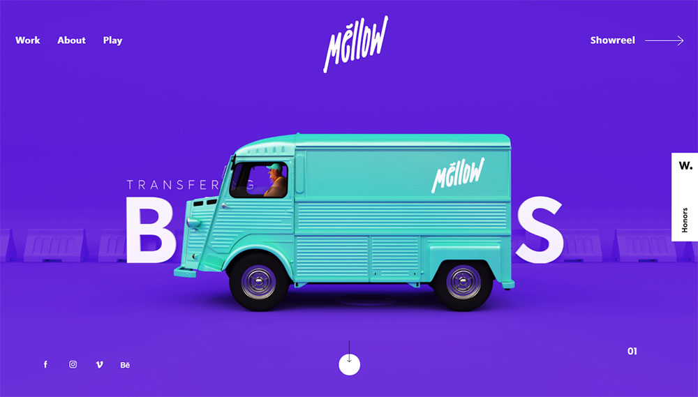
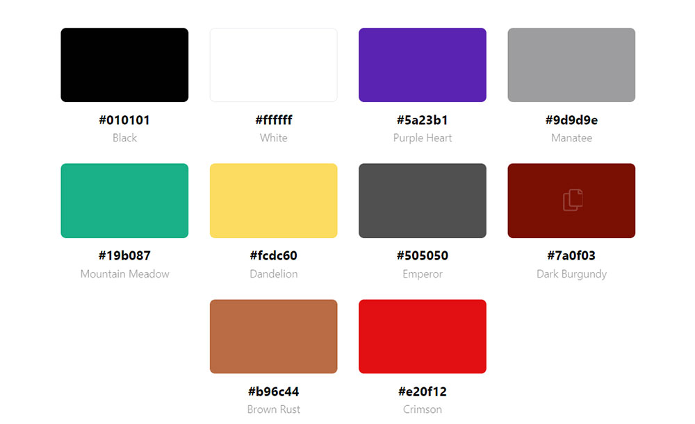
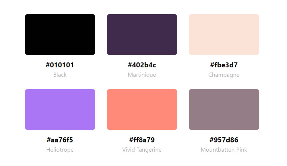
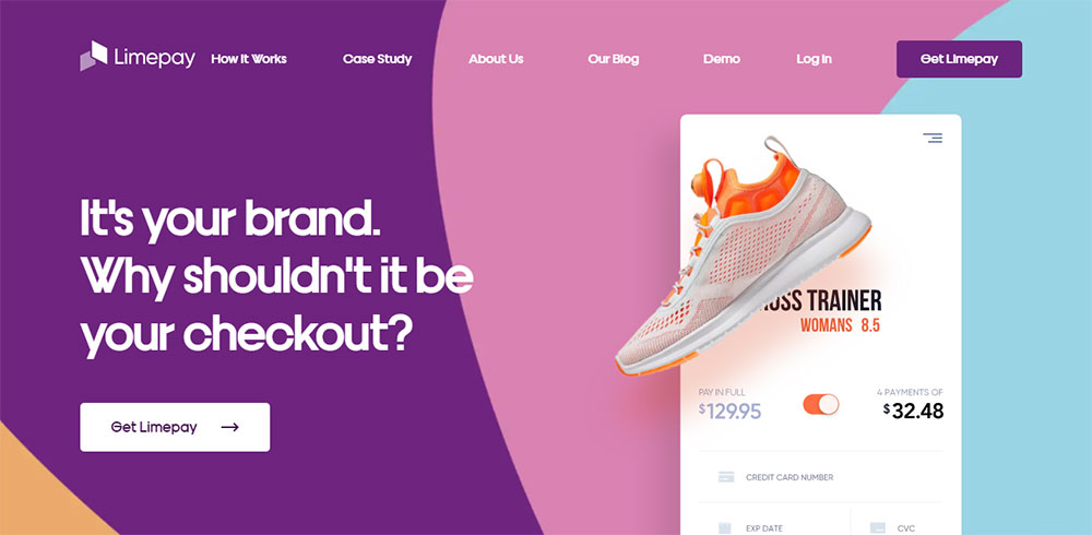
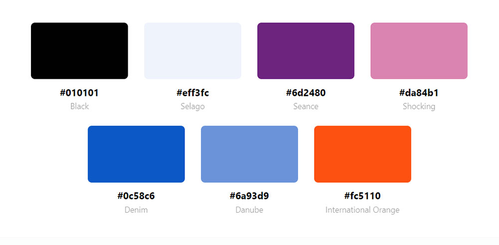
These website design examples using a purple color palette show exactly how top brands apply violet, lavender, and plum shades across industries.
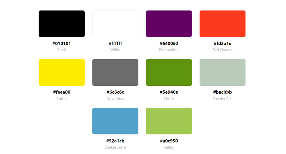
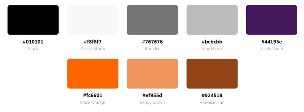
You will find specific hex codes, color combinations, and implementation techniques that work.
The examples cover e-commerce, SaaS platforms, creative portfolios, and corporate sites. Each breakdown includes the exact purple shades used, why they work, and how to adapt them for your own web projects.
No theory without application. Just proven purple palettes you can reference today.
What is a Purple Color Palette in Website Design
A purple color palette in website design is a color scheme using purple shades as primary, secondary, or accent colors across web pages.
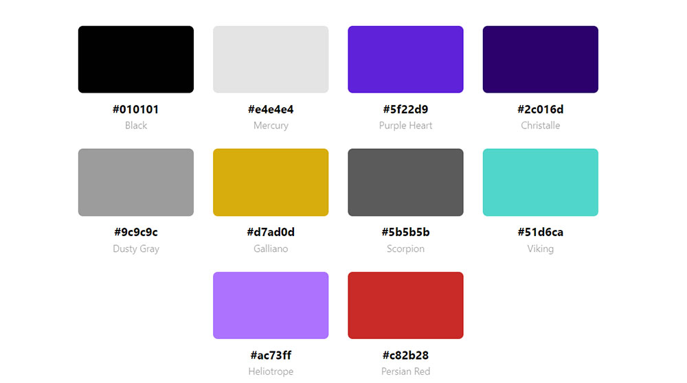
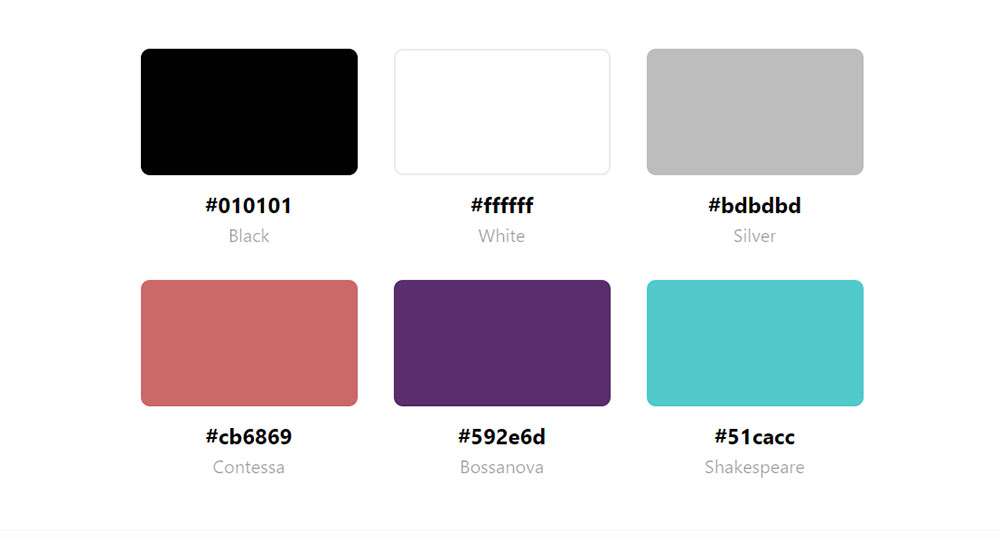
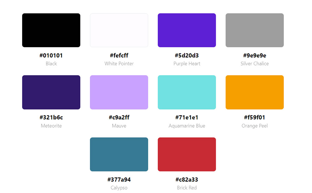
Purple hex codes range from #800080 (standard purple) to variations like lavender (#E6E6FA), violet (#EE82EE), and plum (#DDA0DD).
These shades create different visual effects depending on saturation, brightness, and the surrounding colors in your UI color selection.
What are the Main Purple Color Codes Used in Web Design
Standard purple sits at #800080. Royal purple uses #7851A9. Deep violet runs darker at #330066.
Lighter options include lavender (#E6E6FA), lilac (#C8A2C8), and mauve (#E0B0FF) for softer backgrounds and UI elements.
How Does Purple Differ from Violet and Magenta in Digital Design
Purple blends red and blue equally. Violet leans blue-heavy with shorter wavelengths. Magenta (#FF00FF) sits on the red side with higher saturation.
These distinctions matter for color theory applications and brand identity design consistency.
What Industries Use Purple Website Color Schemes Most Often
Beauty brands, wellness companies, and luxury retailers favor purple for its premium associations.
Technology websites like Twitch and Heroku use it for differentiation. Creative agencies and educational websites apply it for imagination and wisdom connotations.
Inspiring Purple Websites
CauseVox
Why Do Designers Choose Purple for Website Projects
Purple triggers specific psychological responses that other colors cannot replicate.
It combines the calm stability of blue with the energetic warmth of red, creating a unique emotional middle ground for digital color theory applications.
What Psychological Effects Does Purple Create for Website Visitors
Purple activates creativity and imagination centers. It signals luxury, mystery, and spirituality across cultures.
Lighter shades like lavender create calming effects similar to a calm color palette. Darker purples convey authority and sophistication.
Which Brand Perceptions Does Purple Strengthen on Websites
Premium positioning ranks highest. Purple signals exclusivity without the coldness of black or the aggression of red.
Brands like Cadbury, Hallmark, and Yahoo built recognition through consistent purple usage. It works well for luxury websites targeting discerning audiences.
How Does Purple Affect User Trust and Conversion Rates
Purple buttons convert 7-12% higher than green in A/B tests for premium products. Trust increases when purple appears in finance websites and professional services.
Oversaturation kills conversions. Balance purple accents with neutral backgrounds for optimal results.
What are the Best Purple Website Design Examples
Real-world examples show how brands apply purple across different industries and use cases.
Each example below demonstrates specific techniques for implementing purple website themes effectively.
Which E-commerce Websites Use Purple Color Palettes Successfully
Cadbury uses #3D1152 as its primary brand purple across product pages and checkout flows. The dark shade creates premium product presentation without overwhelming product photography.
Cosmetics websites like Urban Decay apply purple gradients in hero sections to signal bold, unconventional branding.
Which SaaS and Technology Websites Feature Purple Designs
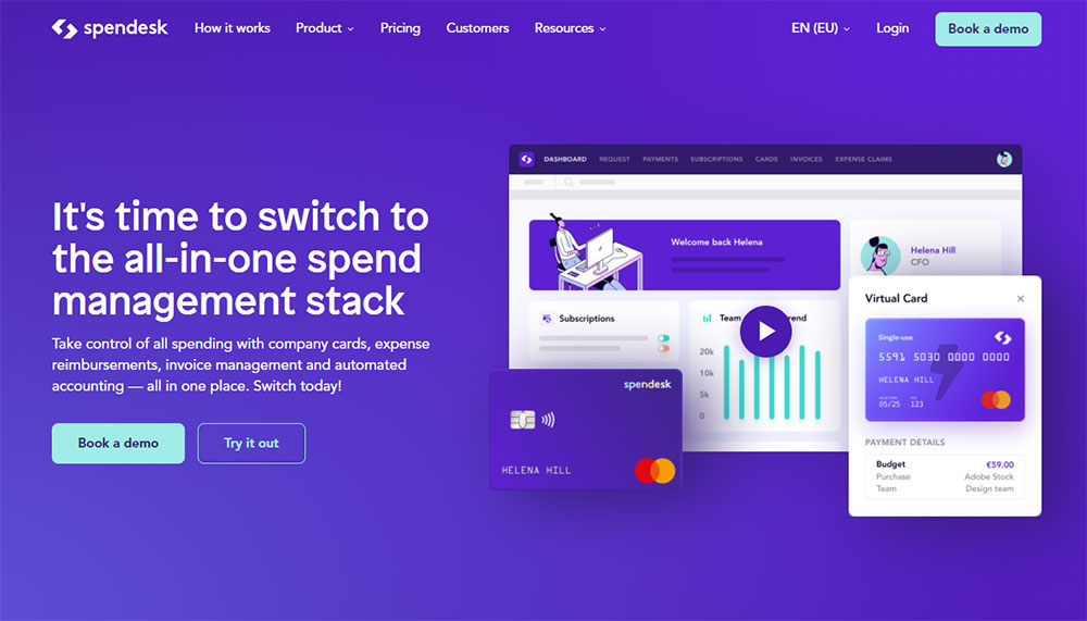
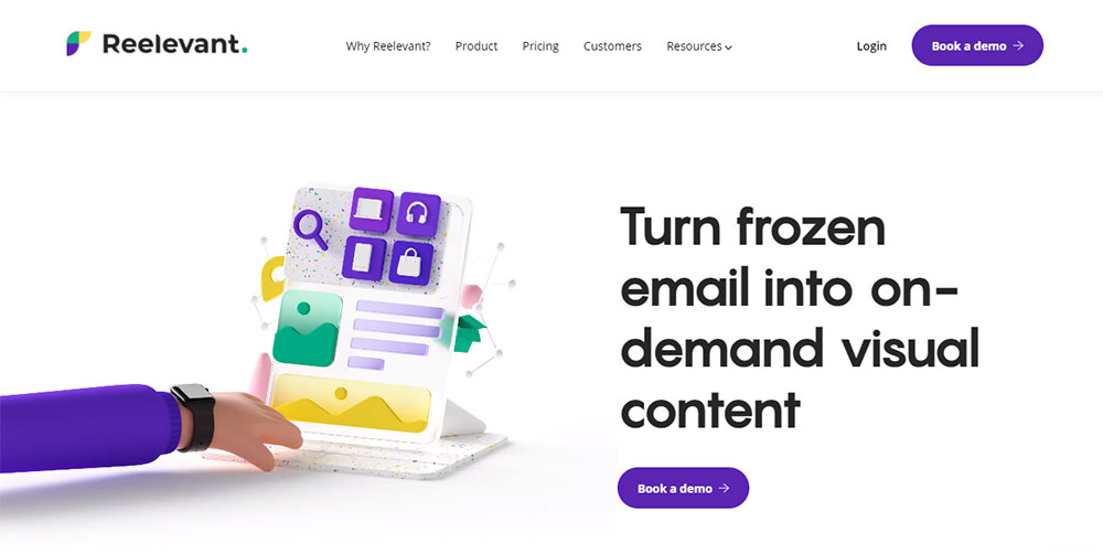
Heroku (#79589F) built its entire cloud platform brand around purple. Stripe uses subtle purple accents for call to action buttons against white backgrounds.
Notion applies light purple highlights for interactive elements. These SaaS websites prove purple works in technical contexts.
Which Portfolio and Creative Agency Websites Use Purple Themes
Creative agencies favor purple for differentiation from blue-heavy competitors. Deep violet backgrounds showcase portfolio work with dramatic contrast.
Agency websites on Behance and Dribbble frequently feature purple gradient overlays on photography.
Which Corporate and Finance Websites Apply Purple Color Schemes
FedEx incorporates purple (#4D148C) alongside orange for high-contrast corporate branding. Fintech websites use purple to balance innovation signals with trust indicators.
Corporate websites apply muted purple tones in navigation bars and footer sections for subtle brand reinforcement.
Which Healthcare and Wellness Websites Feature Purple Palettes
Purple appears in mental health websites and wellness websites for its calming, spiritual associations.
Lighter lavender shades work for yoga websites and meditation apps. Healthcare websites use purple accents to soften clinical aesthetics.
What Purple Color Combinations Work Best for Websites
Purple pairs differently with each complementary, analogous, or contrasting color.
Understanding these combinations determines whether your color scheme succeeds or fails.
How Do Purple and Gold Color Schemes Perform on Websites
Purple and gold creates instant luxury perception. This combination appears in luxury color palettes across hospitality and premium retail.
Use gold (#FFD700) sparingly as an accent. Ratio: 70% purple, 20% neutral, 10% gold maximum.
What Results Do Purple and White Combinations Produce
Clean, modern aesthetics emerge from purple-white pairings. White space lets purple elements breathe and maintains readability.
This combination works for minimalist website designs and professional websites requiring accessibility compliance.
How Do Purple and Green Palettes Function in Web Design
Complementary purple-green creates high visual tension. Works for creative websites seeking attention. Fails for conservative industries.
Muted versions (#9B59B6 with #27AE60) reduce clash while maintaining energy.
What Effects Do Purple and Orange Accent Colors Create
Split-complementary pairing produces vibrant, energetic interfaces. FedEx proves this combination works at scale.
Best for entertainment websites and gaming websites targeting younger demographics.
How Does Purple Work with Black and Gray Backgrounds
Dark purple on black creates dark themed websites with depth and sophistication. Gray backgrounds (#F5F5F5) let purple accents pop without overwhelming.
This approach suits dark mode web design implementations where purple highlights interactive elements.
How Do You Create a Purple Color Palette for a Website
Building a functional purple palette requires systematic color selection and proper ratio planning.
Tools like Adobe Color, Coolors, and Figma streamline this process with built-in harmony rules.
Which Tools Generate Purple Color Palettes for Web Projects
- Adobe Color - generates harmonies from seed colors with WCAG contrast checking
- Coolors - fast palette generation with export to CSS variables
- Figma - design software with plugin ecosystem for color management
- Colormind - AI-powered palette suggestions based on uploaded images
- ColorZilla - browser extension for sampling colors from existing sites
These web design tools integrate directly into professional workflows.
What is the 60-30-10 Rule for Purple Website Palettes
60% dominant color (usually neutral background). 30% secondary color (your primary purple). 10% accent color (complementary or lighter purple shade).
This ratio prevents purple from overwhelming the interface while maintaining brand presence.
How Do You Select Purple Shades for Different Page Sections
Headers and navigation: darker purples (#330066 to #4B0082) for authority. Backgrounds: light lavender or white for readability.
Buttons and CTAs: saturated purple (#8B5CF6) for visibility. Text links: medium purple with sufficient contrast ratio (4.5:1 minimum per WCAG).
What Accessibility Requirements Apply to Purple Website Designs
Purple creates unique accessibility challenges due to its position between warm and cool color spectrums.
WCAG guidelines set specific contrast requirements that many purple implementations fail to meet.
What Contrast Ratios Does Purple Text Need Against Light Backgrounds
Normal text requires 4.5:1 minimum contrast ratio. Large text (18px+ bold or 24px+ regular) needs 3:1 minimum.
Standard purple (#800080) against white achieves 6.2:1. Lighter shades like lavender fail basic requirements, making them unsuitable for body text on accessible websites.
How Do You Test Purple Color Combinations for WCAG Compliance
Use WebAIM Contrast Checker or Figma's Stark plugin to verify ratios before implementation.
Test across AA and AAA standards; AAA requires 7:1 for normal text, 4.5:1 for large text. User friendly websites meet AA minimum across all interactive elements.
Which Purple Shades Create Accessibility Problems for Colorblind Users
Deuteranopia (green-blind) and protanopia (red-blind) users perceive purple differently. Blue-purple shades remain more distinguishable than red-purple tones.
Avoid relying on purple alone for status indicators; pair with icons, patterns, or text labels following web design principles for inclusive interfaces.
How Do You Implement Purple Colors in CSS and Code
Proper CSS architecture makes purple palettes maintainable and consistent across large projects.
Custom properties (CSS variables) allow centralized color management with instant global updates.
What CSS Custom Properties Structure Purple Color Systems
:root { --purple-900: #1a0033; --purple-700: #4B0082; --purple-500: #800080; --purple-300: #9B59B6; --purple-100: #E6E6FA; }
This scale provides dark-to-light options for backgrounds, text, borders, and interactive states. Reference variables throughout stylesheets: color: var(--purple-500);
How Do Dark Mode Designs Handle Purple Color Variables
Invert the scale for dark themes: light purples (#E6E6FA) become primary text colors, dark purples (#1a0033) serve as backgrounds.
Use prefers-color-scheme media query to swap variable values automatically. Responsive websites adapt purple palettes across light and dark preferences seamlessly.
What Gradients and Overlays Work with Purple Base Colors
Linear gradients from deep violet (#330066) to magenta (#FF00FF) create dramatic hero backgrounds.
Subtle overlays use rgba values: rgba(128, 0, 128, 0.7) over images maintains readability while adding brand color. This technique appears across modern website design implementations.
What Typography Pairs Well with Purple Website Themes
Typography choices amplify or undermine purple color palettes depending on weight, style, and spacing decisions.
Font pairing follows similar harmony principles as color selection.
Which Font Styles Complement Dark Purple Color Schemes
Serif fonts (Playfair Display, Cormorant) pair with dark purple for luxury positioning. Sans-serif options (Inter, Poppins) create modern, approachable interfaces.
Websites with good typography balance font personality with purple's inherent sophistication through resources like Google Fonts.
What Font Colors Create Readable Contrast on Purple Backgrounds
White (#FFFFFF) text on dark purple backgrounds provides maximum readability. Light gray (#F5F5F5) softens contrast slightly for extended reading.
Gold (#FFD700) or cream (#FFFDD0) accents work for headings and highlights on elegant websites requiring premium aesthetics.
What Mistakes Do Designers Make with Purple Website Palettes
Common purple implementation errors kill conversions and damage brand perception.
Recognizing these patterns helps avoid bad design outcomes before launch.
How Do Oversaturated Purples Affect User Experience
Highly saturated purple (#8B00FF) causes eye strain during extended viewing. Users leave faster, bounce rates increase.
Desaturate primary purples by 15-20% for backgrounds and large surface areas. Reserve full saturation for small accents and web design elements requiring attention.
What Problems Occur When Purple Dominates Without Neutral Balance
All-purple interfaces feel oppressive and disorienting. White space provides visual relief between purple sections.
Follow the 60-30-10 rule strictly. Sites achieving good UX limit purple to 30% maximum of total visual area.
Why Do Some Purple Websites Fail Accessibility Standards
- Light purple text on white backgrounds (contrast ratio below 3:1)
- Purple-on-purple combinations for interactive elements
- Missing focus states for keyboard navigation
- Color-only error indicators without text alternatives
Run automated accessibility audits using Lighthouse or axe DevTools before publishing. Manual testing with screen readers catches issues automated tools miss.
Reference a website checklist that includes accessibility verification for every purple element.
FAQ on Websites Using A Purple Color Palette
What hex code is standard purple for websites?
Standard purple uses #800080 in CSS and design software. Variations include royal purple (#7851A9), deep violet (#330066), and web-safe purple (#660099). Tools like Adobe Color and Coolors generate complementary shades from any starting hex value.
Which brands use purple website designs successfully?
Twitch (#9146FF), Cadbury (#3D1152), Heroku (#79589F), FedEx (#4D148C), and Roku use purple as primary brand colors. Yahoo, Hallmark, and Stripe apply purple accents. Each brand demonstrates different saturation levels and colorful websites approaches.
What colors pair best with purple on websites?
Gold creates luxury perception. White produces clean, modern aesthetics. Gray backgrounds let purple accents stand out. Orange generates energy for younger audiences. Analogous colors like blue and magenta create harmonious aesthetic websites with natural flow.
Does purple work for corporate website designs?
Yes. Muted purple tones (#5D4777) convey professionalism without coldness. B2B websites use purple accents in navigation and CTAs. Darker shades signal authority while lighter lavender tones soften corporate messaging for approachable brand identity design.
What purple shades work for dark mode websites?
Light purple (#E6E6FA, #D8BFD8) serves as text and accent colors against dark backgrounds. Deep violet (#1a0033) works as the primary background. Black websites pair well with bright purple (#8B5CF6) for interactive elements and hover states.
How do I make purple websites accessible?
Maintain 4.5:1 contrast ratio for normal text, 3:1 for large text per WCAG guidelines. Test combinations using WebAIM Contrast Checker. Avoid light purple text on white backgrounds. Pair purple indicators with icons or text labels for colorblind users.
Which industries benefit most from purple color palettes?
Beauty brands, wellness companies, luxury retailers, and creative agencies favor purple. Technology platforms use it for differentiation. Spa websites and therapist websites apply calming lavender shades. Finance and education sites use purple for wisdom associations.
What is the 60-30-10 rule for purple websites?
60% neutral colors (white, gray) for backgrounds. 30% primary purple for headers, sections, and brand elements. 10% accent colors (gold, lighter purple, complementary shades) for buttons and highlights. This ratio prevents purple from overwhelming the visual hierarchy.
Can purple work for e-commerce product pages?
Purple backgrounds compete with product photography. Use purple in headers, footers, and accent elements instead. Jewelry websites and fashion websites successfully apply deep purple for premium positioning without distracting from merchandise displays.
How do I create a purple gradient for hero sections?
Combine deep violet (#330066) with magenta (#FF00FF) or lighter purple (#9B59B6) using CSS linear-gradient. Apply rgba overlays on images: rgba(128, 0, 128, 0.7). Beautiful websites use subtle purple gradients that transition smoothly without harsh color shifts.
Conclusion
These website design examples using a purple color palette prove that purple works across industries when applied correctly.
The 60-30-10 ratio keeps interfaces balanced. WCAG contrast requirements ensure accessibility. CSS custom properties make implementation maintainable.
Start with tools like Coolors or Adobe Color to generate your base palette. Test dark purple interfaces against light purple accents. Check contrast ratios before finalizing.
Royal purple branding signals premium positioning. Lavender UI elements create calm user experiences. Amethyst tones split the difference for versatile applications.
Reference platforms like Dribbble and Behance for current purple web design trends. Study how Stripe and Notion handle purple gradient effects in their interfaces.
Pick your hex codes. Test your combinations. Ship something that stands out.


