Great Looking Salon and Spa Websites You Must Check Out
parallax background

Great Looking Salon and Spa Websites You Must Check Out

Cool Looking Personal Trainer Websites To Inspire You
September 16, 2020
The Best Corporate Websites and WP Themes to Build Your Own
September 21, 2020
Cool Looking Personal Trainer Websites To Inspire You
September 16, 2020
The Best Corporate Websites and WP Themes to Build Your Own
September 21, 2020
 

If you run a salon or spa, your website may be the first interaction with new clients. If your website doesn’t entice visitors within the first few minutes, you could miss out on business opportunities.

When building a website, make sure that the design is straightforward, readable, mobile-friendly, comprehensive, and accessible. Your design should be innovative and attractive and should stand out from the crowd without being too ostentatious.

This article provides a summary of the best salon and spa websites available. They will be useful inspirations for your personal design journey.

30+ Spa Website Designs To Inspire You

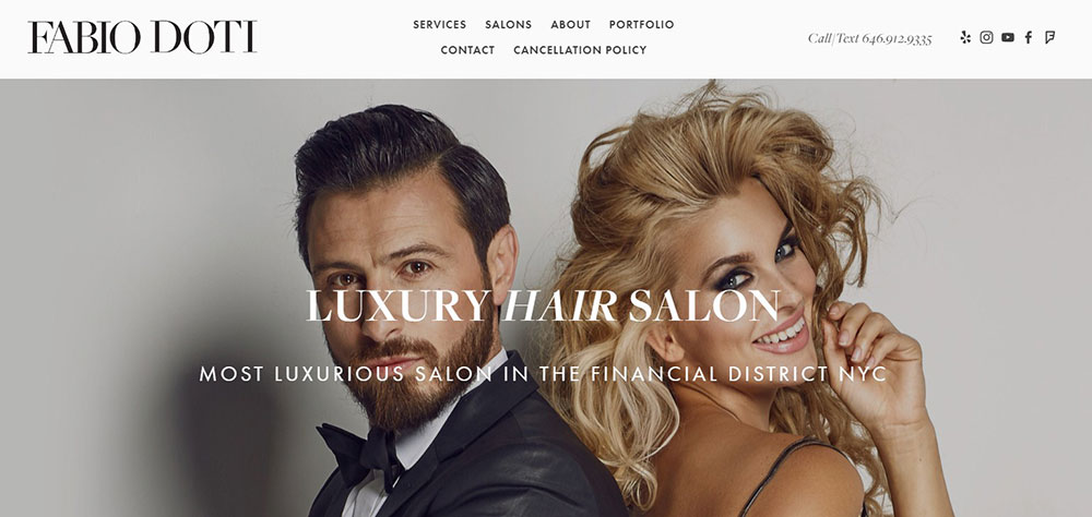
Fabio Doti Hair Salon


The Fabio Doti website showcases the services of a premium, upscale New York salon in a personal and inviting way, setting it apart from other luxury service sites.

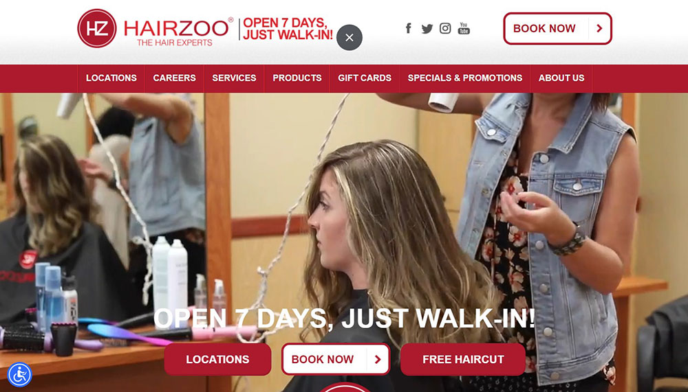
Hairzoo


Headquartered in Santa Monica, California, Hairzoo’s website is simple yet highly responsive to a variety of platforms including laptops, phones, and tablets.

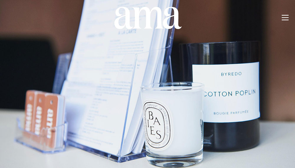
Ama the Salon


Ama’s website is a great execution of the brand, both off and online. A visit to the website is like walking into the salon itself. The website uses high-quality photos of the salon location and artistic images used on the salon walls.

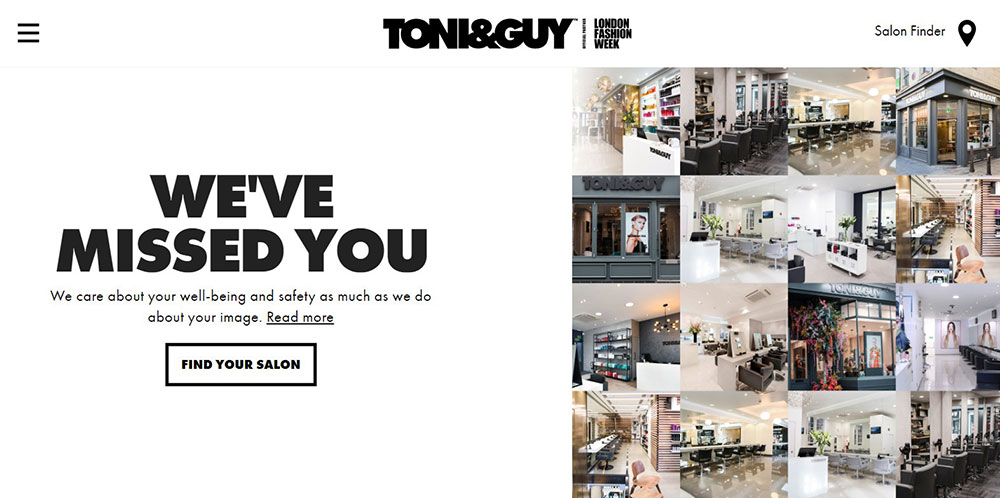
TONI&GUY


Good websites in the beauty industry are often based around the presence of excellent photography, and this website conforms very well to this norm.

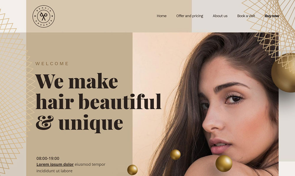
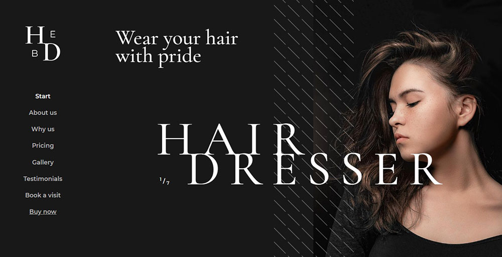
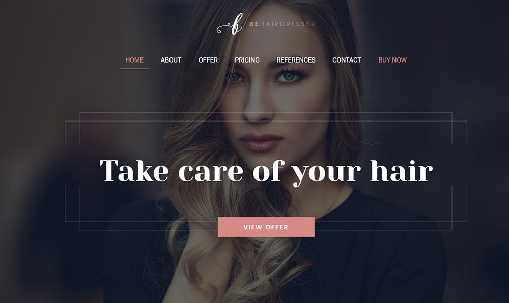
BeHairdresser


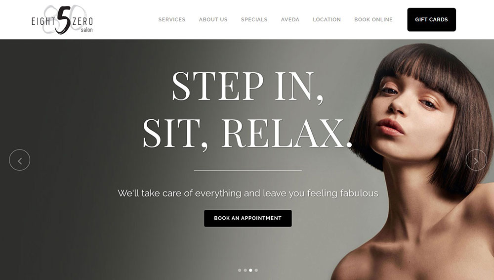
A combination of professional beauticians and quality beauty products is key to expanding your beauty salon business from the ground up, and a good website will also help. Eight Five Zero Salon’s website uses a minimal yet elegant spa template.

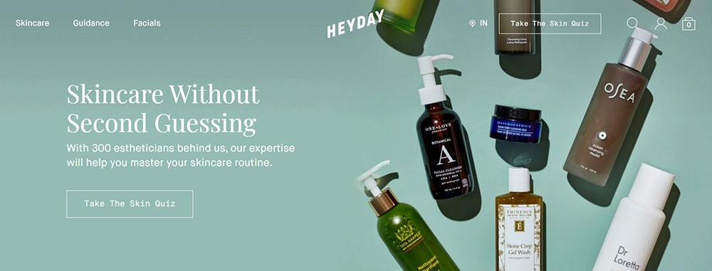
Heyday


Heyday is an excellent website for skincare enthusiasts, using a minimalist design that is created through the use of a website builder and spa template. It features a basic background and a prominent call to action that stands out but isn’t brash. It’s a great example of how simple ideas can enhance your website when they are well executed.

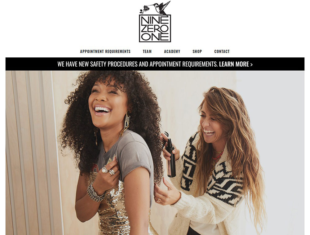
Nine Zero One Salon


The website design of this trendy salon combines images and quotes in an attempt to capture the atmosphere of the spa. The quotes showcased on the homepage are impressive and distinctive.

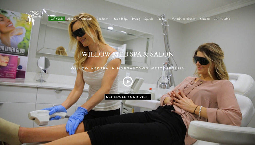
Willow Med Spa & Salon


Willow Med Spa integrates video content into the overall workflow of their site. This luxury spa business uses a custom video at the top of their page to keep things simple and attractive.

Salon True


Located in Pennsylvania, Salon True’s website has a professional feel and a careful arrangement of buttons, making it responsive to mobile devices and small screens.

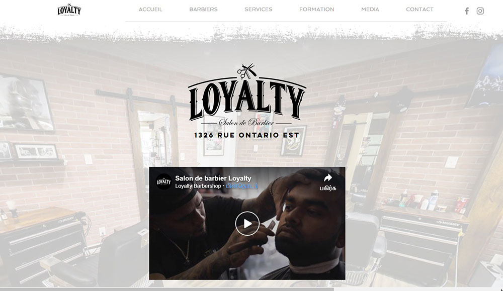
BeHairdresser


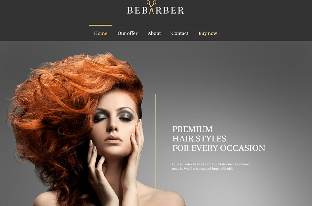
If you like barbershop websites, you'll surely like this one. The clever button at the top of this website is noteworthy. If you navigate through the website, you’ll notice that the phone number is hyperlinked, so when you click the button, your preferred call management tool will come up.

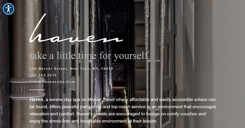
Haven Spa NYC


This salon’s unique website has a navigation bar on the left-hand side of the screen which allows the background image to be displayed in full-screen view. Users can find additional service details and contact information as they scroll over the navigation bar.

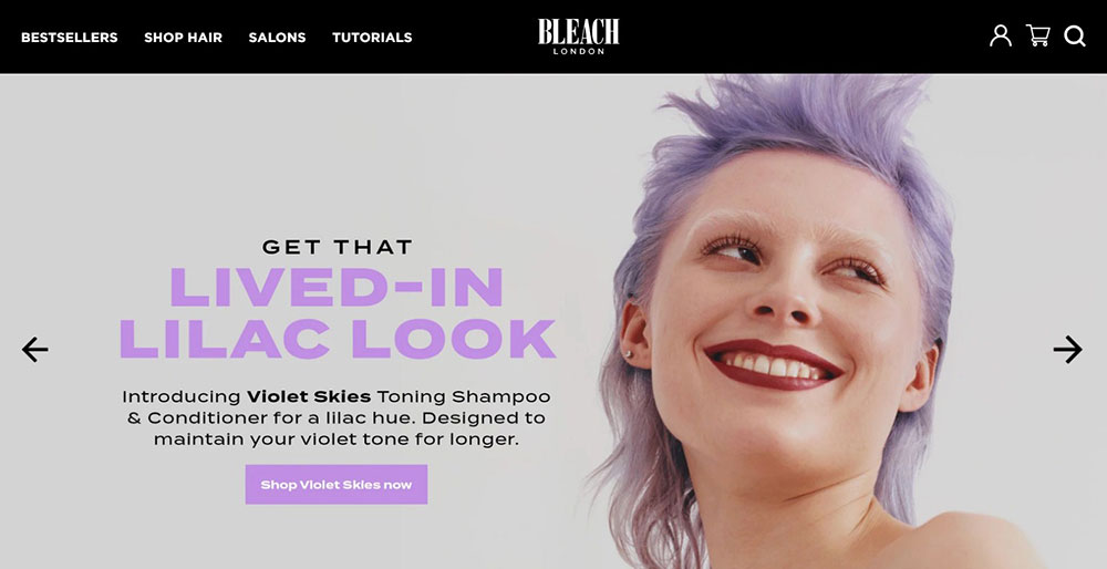
Bleach London


Bleach London uses a unique tactic to draw visitors to their site by using vibrant colors and bold graphics. This conveys the goal of their beauticians, which is to create stylish hairstyles that defy the normal standards. This site can be used as an inspirational starting point for the colors you use to represent your salon.

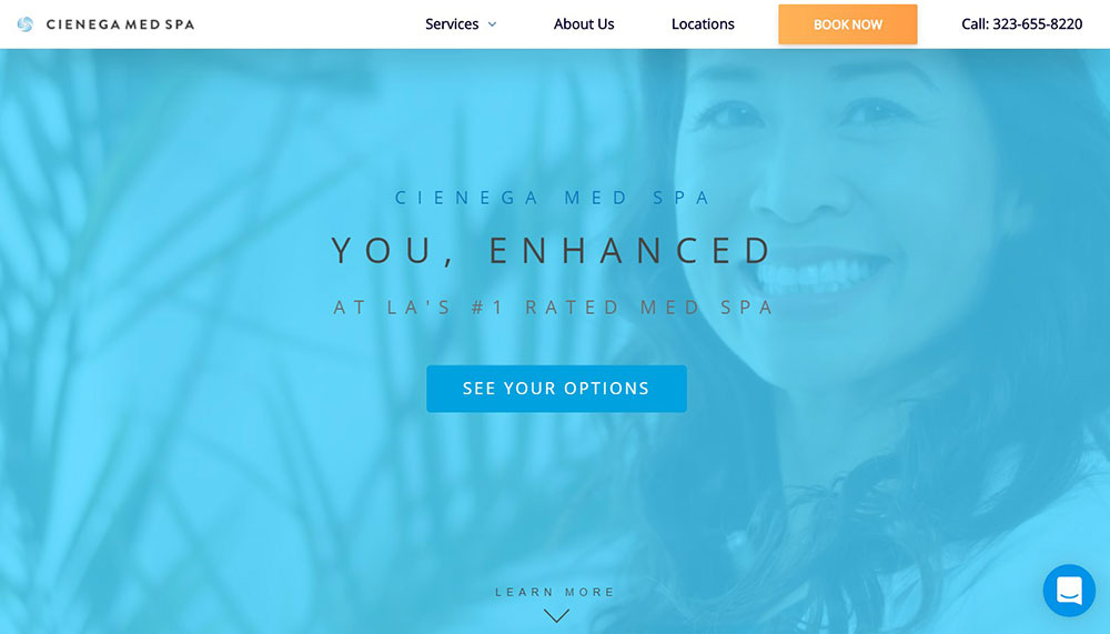
Cienega Med Spa


Cienega Med Spa uses a delightful color scheme on their salon website, which you can imitate.

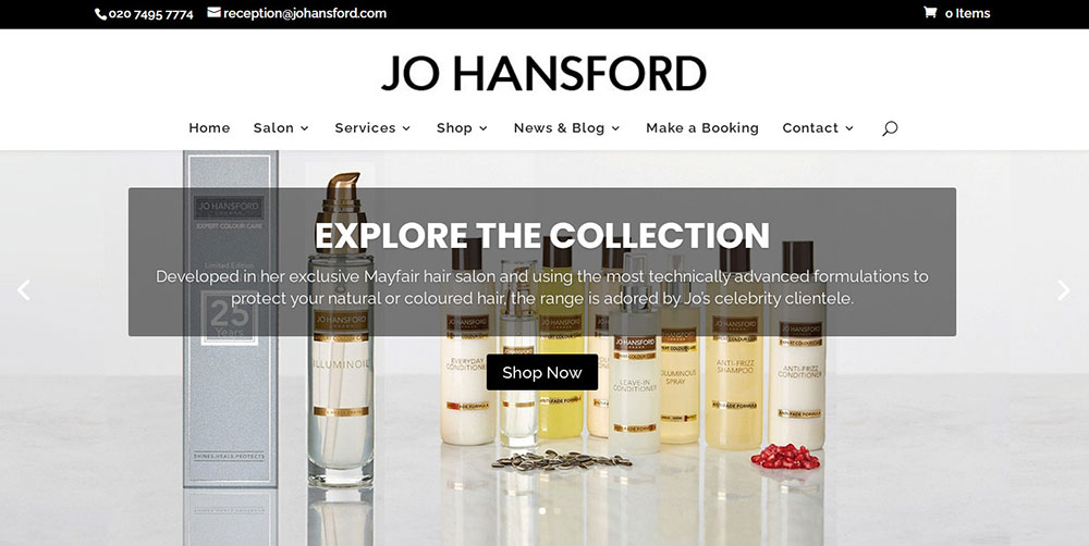
Jo Hansford


The Jo Hansford website uses a minimalist design with cool tones. The content is positioned in the middle of the page and the menu utilizes off-canvas, with access to the website’s most essential pages.

BeHairdresser


This beautiful spa website accomplishes two important goals for a salon owner, giving viewers plenty of guidance, allowing them to find the information they want in record time, as well as booking appointments.

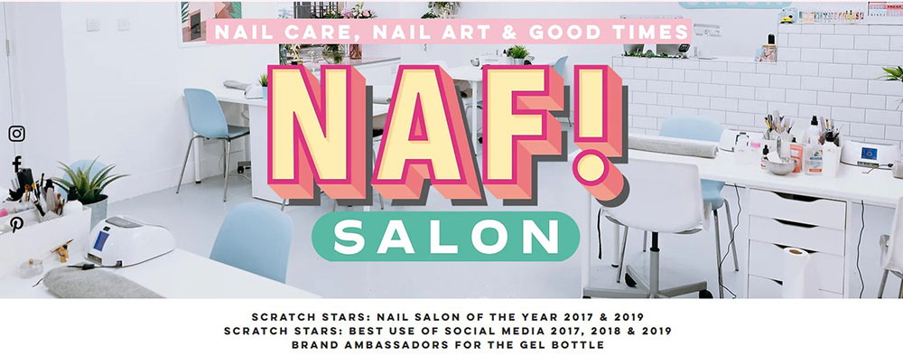
NAF! Salon


As one of Vogue’s top-voted best UK beauty salons, NAF! Salon’s website uses pastel colors and bold typography ingeniously.

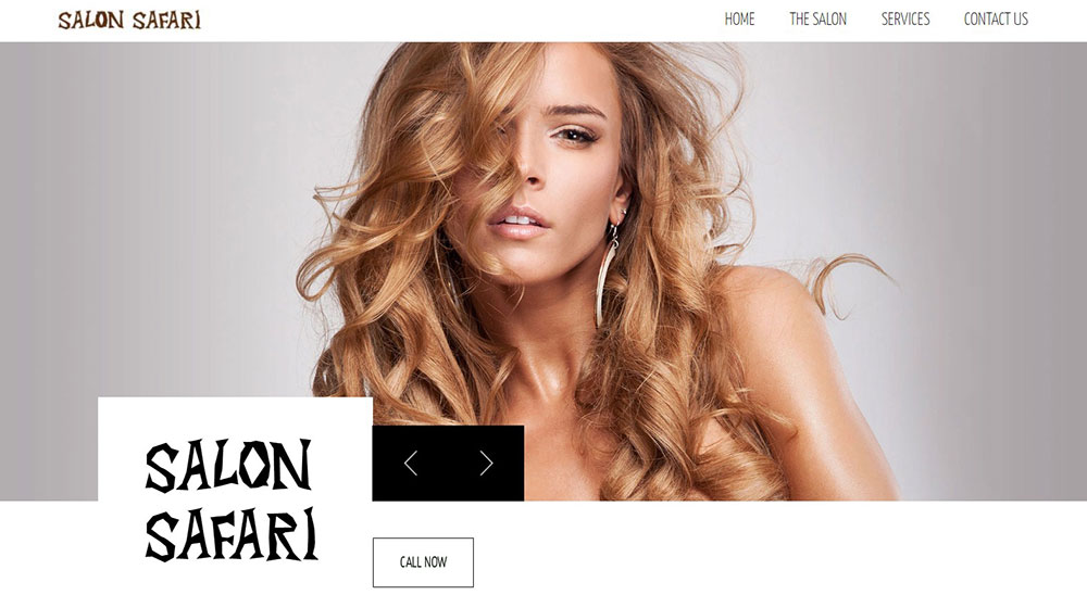
Salon Safari


Salon Safari’s modern beauty salon website focuses on functionality and content. It includes quality images, stylish typography, and a structured design hierarchy. These attributes when paired with content, convey Salon Safari’s premium services.

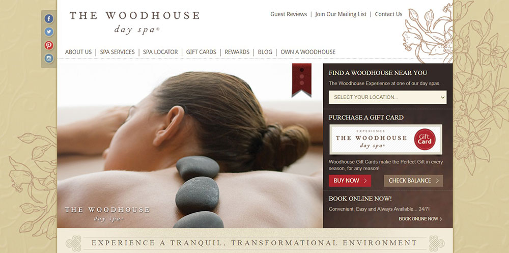
Woodhouse Day Spas


This site has an abundance of information. Woodhouse Spas uses a slideshow of photos to showcase their achievements. It has a double navigation feature that separates general spa details and contact information.

fringe salon ny


The Fringe salon’s website is exceptional. By clicking the top link, you’ll see the magazines that advertize their salon, which promotes confidence and earns the trust of potential clients.

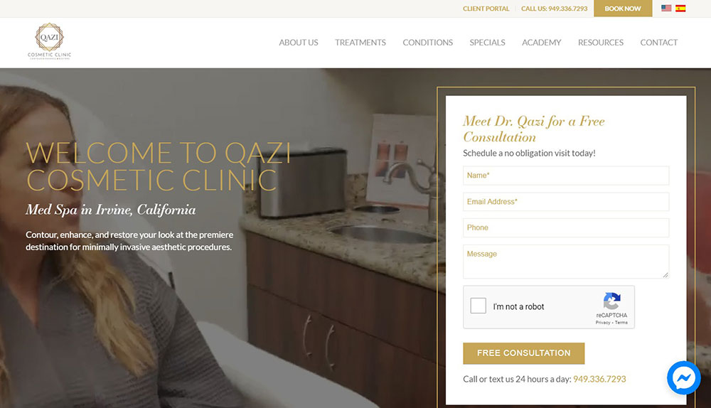
Qazi Cosmetic Clinic


Qazi Cosmetic Clinic’s site has a very functional platform. Visitors can browse the various areas of the site with their uncomplicated navigation system.

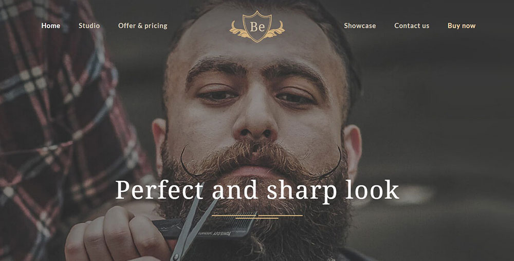
Be Barber Master


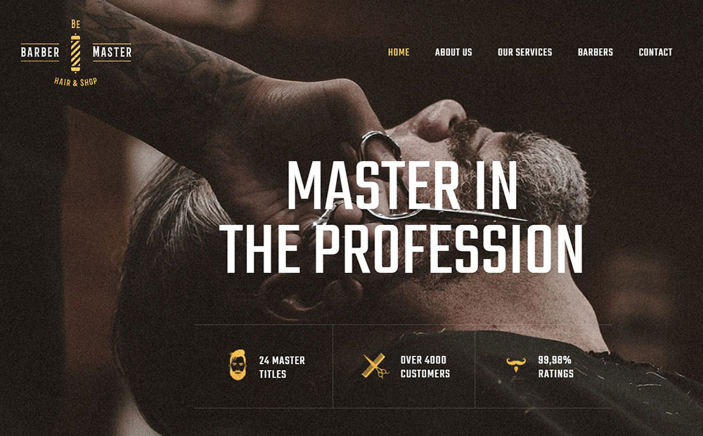
This studio showcases the importance of their clients in a style that makes the site seem realistic and personal.

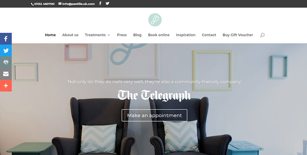
Pastille


You can advertise your beauty services by linking Instagram directly to the salon layout design, thereby easily sharing images across platforms. The talented stylists at Pastille use this strategy to their advantage.

Terry's Mane Sreet Salon


Terry’s Mane Street Salon uses parallax elements to customize their spa template. As a result, they have a website that boasts a modern appearance and welcoming atmosphere, featuring a blue background and warm-toned images.

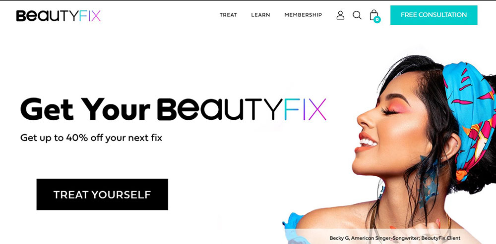
BeautyFix MedSpa


BeautyFix MedSpa makes use of quality content in an attractive website design.

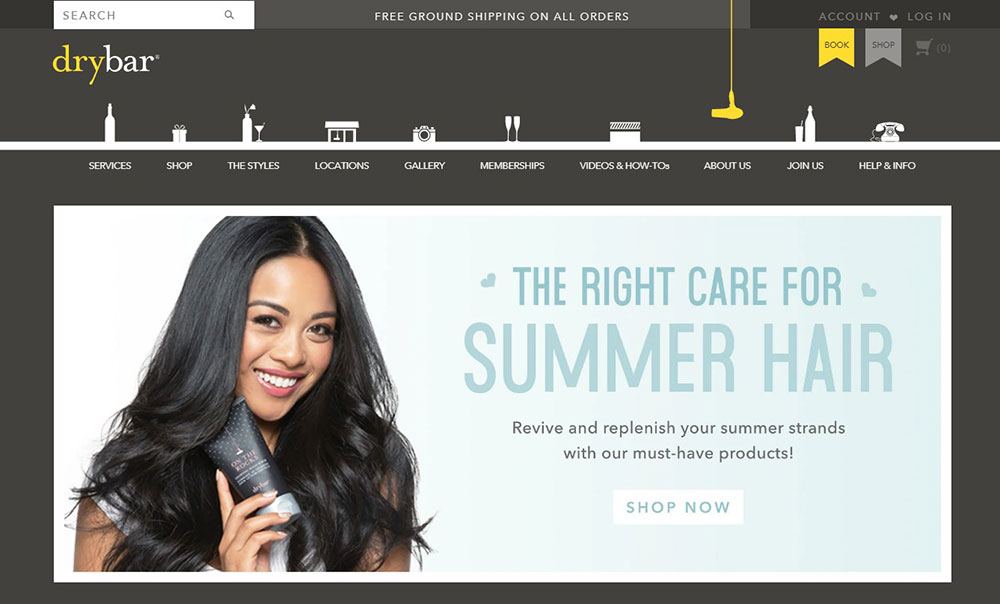
Drybar


Drybar’s website reflects the brand’s personality by using its signature colors in various locations, such as on the background, text, buttons, and images.

Be Barber


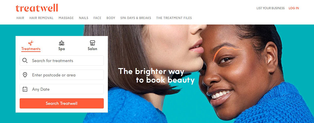
Treatwell’s website has a clear design, with an uncluttered content. Each section has a drop-down menu that allows clients to connect with their local salons without information from other establishments.

Spavia Day Spa


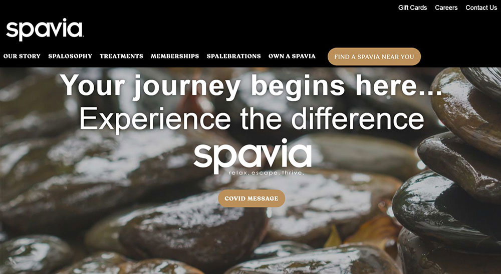
Providing various luxurious services, Spavia has a smooth background consisting of calming images of stones and water, perfectly conveying the luxury of their brand. They have showcased short run-downs of each of their services and use an unusual font for their navigation bar.

Muse Salon and Spa


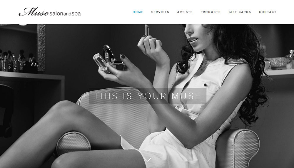
This luxury beauty clinic welcomes viewers with an attractive grayscale image of a model. It also has a gallery that displays photos of the establishment’s facilities, as well as CTAs and brief service descriptions.

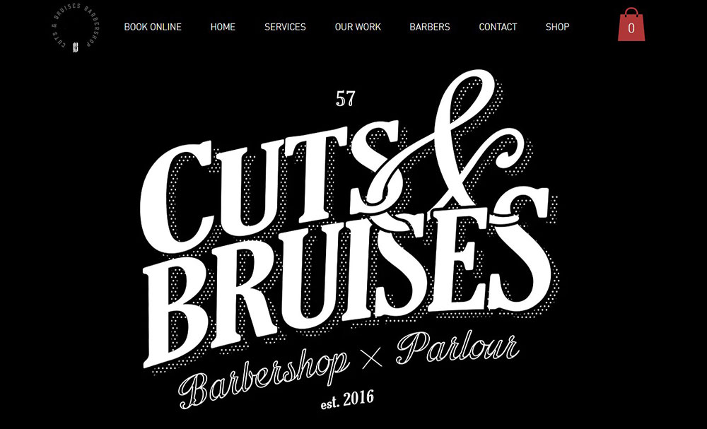
Cuts & Bruises Barbershop


Cuts & Bruises Barbershop integrates plenty of interactive video content to attract potential customers.

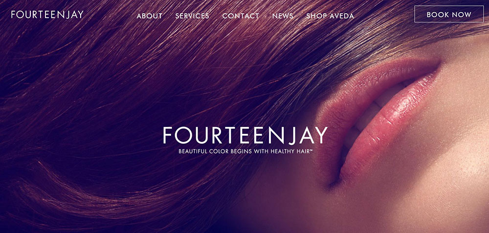
Fourteenjay


The homepage of Fourteenjay is sweet, simple, uncluttered, and clean.

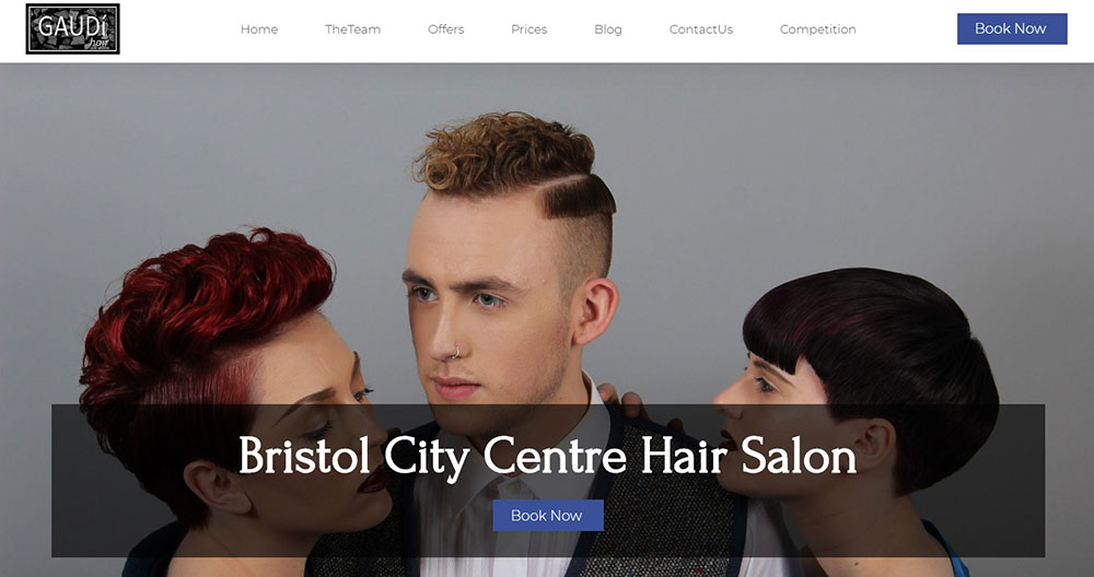
BeBarber


Gaudi Hair has a basic navigation bar at the bottom of the main page and a variety of neatly arranged buttons and content. It’s easy to find the desired information on this site.

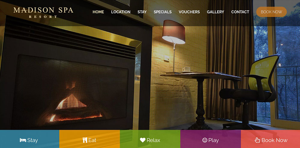
Madison Spa Resort


Madison Spa Resort uses a double navigation system and a structured content layout. The home page includes a slideshow of original photos that demonstrate their clean and professional spa.

Now It’s Your Turn to Make Your Spa Website Awesome!

If you are building a new website for a hair salon, spa, or small barbershop, the design process does not have to be complicated. First, you need to find a website builder that offers ready-made themes.

Betheme is one of the most popular WordPress themes for the specific purpose of building spa websites and hair salon layouts. It has more than 580 pre-built templates and has all the premium WordPress features you’d expect from a paid theme.

It offers features such as:

  • A shortcode generator
  • Video and parallax backgrounds
  • WPML support
  • Mega Menu
  • RTL support
  • Customizable header styles
  • Visual icon selectors

If you enjoyed reading this article on great looking spa websites, you should check out this one about accessible websites examples.

We also wrote about a few related subjects like best corporate websites, the best looking tourism websites, hotel website design, product landing page, cool looking personal trainer websites, top notch musician websites, the most impressive luxury websites and impressive animated websites.

Albert Ślusarczyk
Albert Ślusarczyk
As the co-creator of Be Theme, I am a strong believer in designing with care and patience. I pour my energy, time & knowledge into perfecting the theme for our 260,000+ customers.
Siteground Hosting