


Great Looking Websites With A Calm Color Palette
February 17, 2025
Cool Websites with a Pink Color Palette (51 Examples)
February 20, 2025Crafting a testimonial page that sings praises loud and clear isn't just nice to have—it's a must for building trust. In a changing digital area, displaying customer feedback with creative design examples can make your site more engaging and reliable.
As visitors land on your page, a well-designed testimonial section serves as a trust signal, boosting not only your brand's credibility but also aiding in conversion optimization.
You'll discover useful page inspiration, ideas on using trust badges, and how to present customer experience showcases effectively.
Using a diverse approach, with elements of UX design and visual content, can make your testimonials stand out and improve user interaction.
By the end of this guide, you'll be equipped with insights to design pages that truly highlight client love, ultimately growing your brand's online reputation. Dive in, and transform your testimonials from ordinary to extraordinary.
Testimonial Page Design Examples
Neon Tech
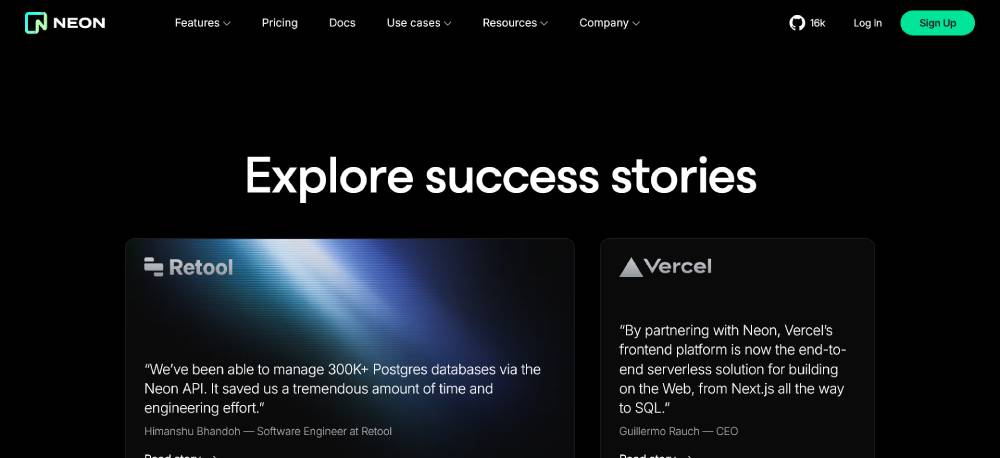
This case study page keeps the layout simple and content-focused. The design places user stories in a structured format, making each one easy to scan. The typography is modern, with a clear contrast between headlines and body text. The use of whitespace ensures readability without distractions. The layout adapts well to different screen sizes, ensuring a consistent experience across devices.
Buy Me a Coffee
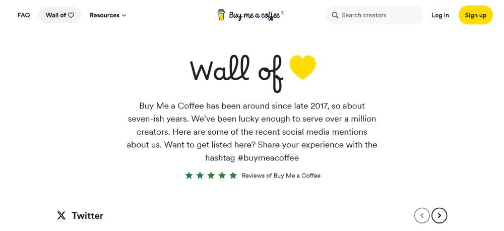
The testimonial section is user-driven, featuring real feedback in a conversational format. Each review is short, direct, and visually separated for clarity. The design avoids unnecessary embellishments, keeping the focus on the credibility of user experiences. The inclusion of profile images adds authenticity. The page structure ensures quick access to multiple reviews without excessive scrolling.
Nova Benefits
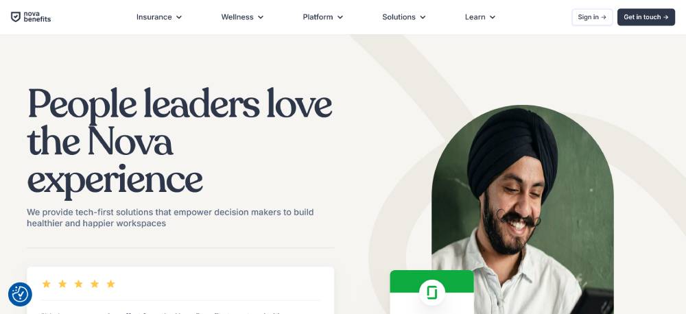
This page presents testimonials with a strong emphasis on trust. It combines short text reviews with company logos to reinforce credibility. The design integrates branding elements subtly, ensuring consistency with the overall website. The structured layout prevents visual clutter, and clear typography enhances readability. A CTA is strategically placed to encourage user engagement.
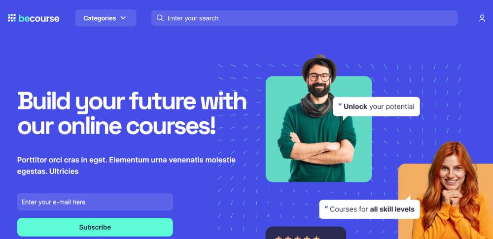
Be Course 3
StackerHQ
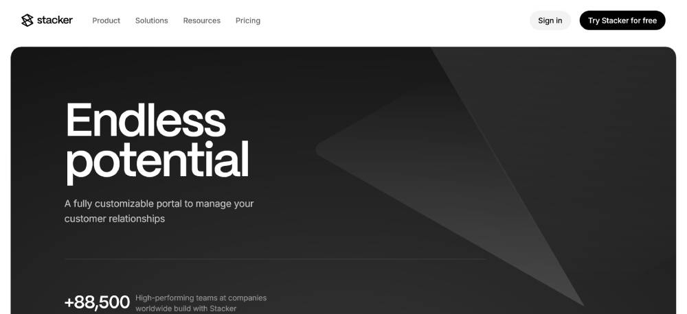
The design prioritizes functionality, grouping case studies by industry. The testimonial section blends text with supporting data, making success stories more compelling. Each story is concise yet informative, with clear navigation to explore more details. The use of icons and structured grids improves visual organization. The mobile-friendly design ensures seamless interaction on smaller screens.
Tailscale
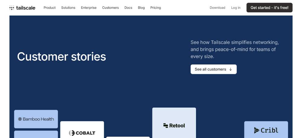
This page uses a clean, professional layout to highlight customer stories. Each testimonial is formatted with a structured heading, making it easy to identify key takeaways. The use of company names and job titles adds authenticity. A minimalist design approach keeps the focus on content rather than visual distractions. The page ensures a smooth reading experience with optimized typography.
Relume
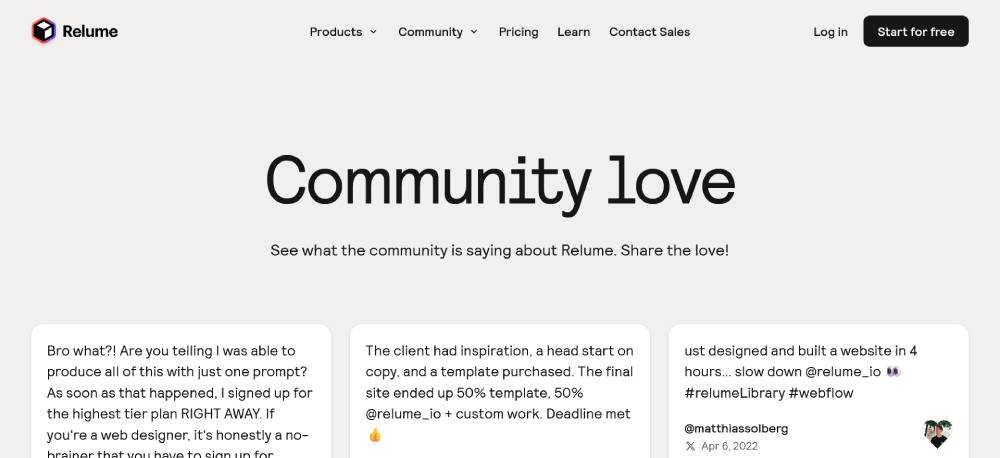
The testimonial page is community-driven, featuring direct quotes from designers and developers. The design is highly interactive, integrating social proof from real users. Short, impactful messages are displayed dynamically, maintaining engagement. The layout effectively balances text with visual elements. The page design aligns well with Relume’s focus on modern web solutions.
Dribbble
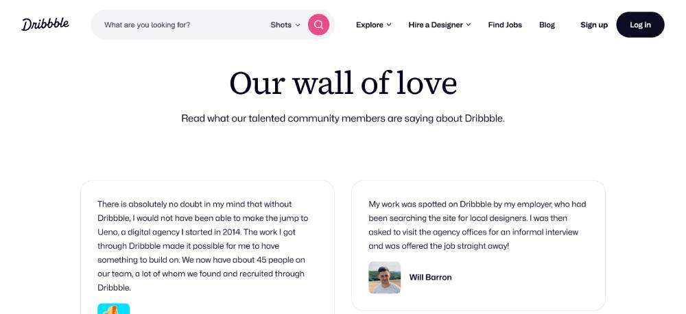
The layout follows a structured format, allowing users to scan testimonials quickly. Each review is presented with a mix of personal experiences and professional success stories. The design keeps distractions minimal while ensuring the content remains engaging. Clear call-to-action elements encourage new users to join. The use of whitespace makes the page easy to navigate.
Carta
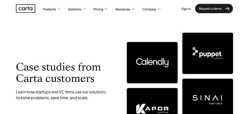
This case study section organizes testimonials into categories, making it easier to find relevant content. The design integrates supporting visuals where necessary, improving engagement. The structured format presents key statistics alongside success stories. The use of a uniform color scheme enhances readability. Navigation is seamless, allowing users to explore more details effortlessly.
Be Consultant 3

Stripe
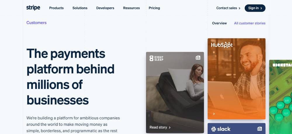
The page balances detailed case studies with quick testimonial snippets. The layout ensures that essential insights are highlighted first, followed by in-depth customer stories. The design uses a combination of text, images, and statistics for credibility. Responsive formatting ensures consistency across different devices. The strategic placement of CTAs encourages user interaction.
Frame.io
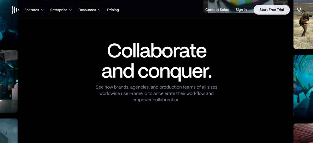
This testimonial section blends text with real-world use cases, making the stories more relatable. The design emphasizes clarity, using structured grids to separate different testimonials. The content is concise, ensuring users can quickly extract key insights. The use of branded visuals maintains consistency with the company's identity. The overall layout supports easy navigation without overwhelming users.
Supabase
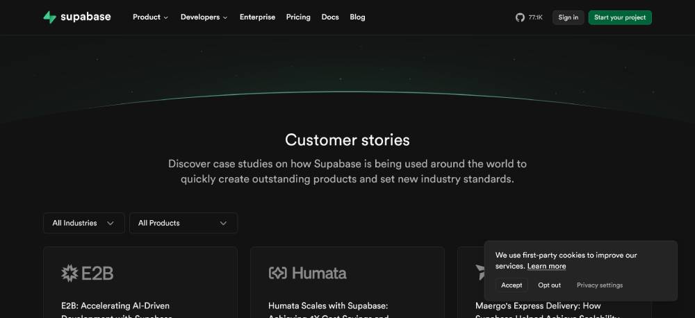
The page presents case studies in a structured layout, making it easy to explore different industries. Each customer story is short, focused, and accompanied by a "Learn More" button. The design emphasizes readability with clear typography and balanced spacing. The use of concise headlines ensures users can quickly find relevant case studies. A mobile-friendly structure ensures accessibility across devices.
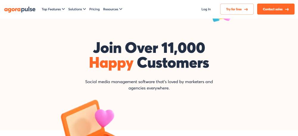
Agorapulse
This testimonial page keeps the focus on real user experiences. Quotes are formatted clearly, with names and roles displayed for credibility. The layout is clean, ensuring each testimonial stands out. The use of bold key phrases highlights the most impactful parts of each review. A logical content hierarchy ensures users can navigate through testimonials without distractions.
Homerun
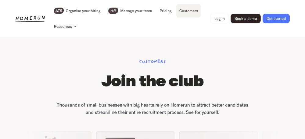
Homerun organizes testimonials by industry, making it easy to find relevant customer stories. The design includes structured sections with industry-based testimonials and feature highlights. A mix of text and call-to-action elements ensures engagement. The page layout is balanced, avoiding clutter while keeping the information accessible. The use of brand-aligned colors and typography enhances consistency.
Be Business 7
Appraisd
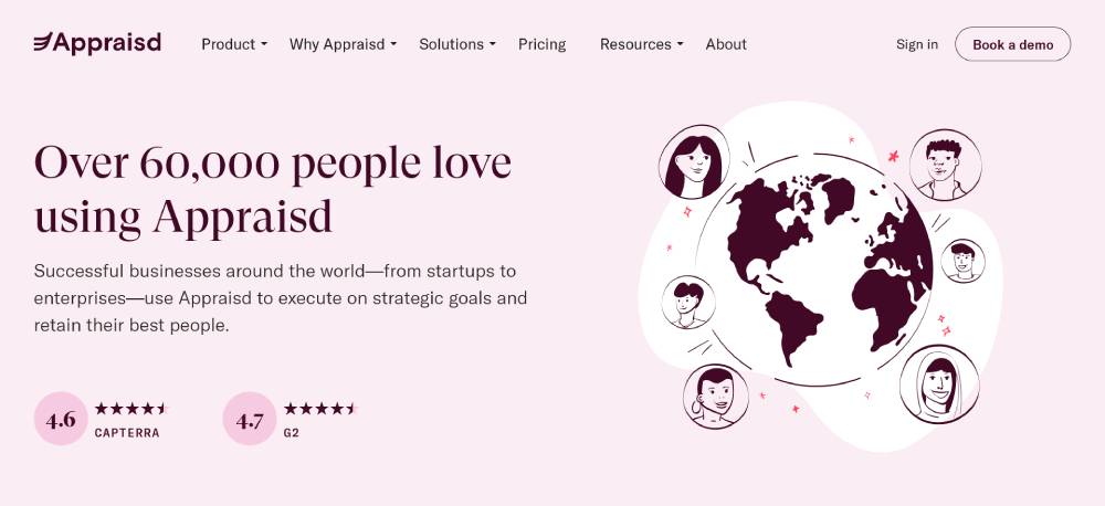
This page combines testimonials with statistics to add credibility. The design uses a structured format, separating different industries and success stories. The typography is professional, ensuring easy readability. The content highlights measurable outcomes, reinforcing the platform’s impact. A well-placed CTA encourages deeper engagement with the testimonials.
Hello Bonsai
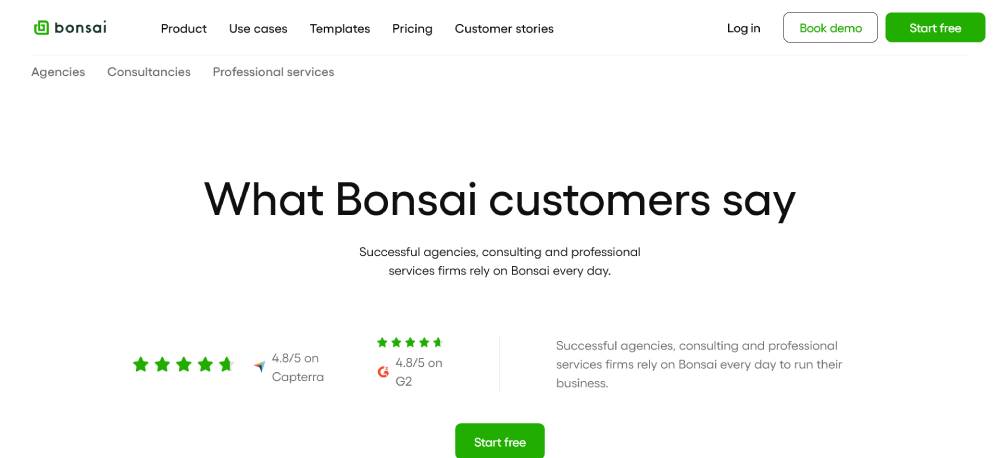
This testimonial section is structured for credibility, featuring client names, company affiliations, and concise feedback. The page maintains a professional and clean layout, focusing on ease of reading. The use of white space ensures testimonials remain the focal point. The CTA is strategically positioned, guiding users to explore more about the product. The overall experience is smooth and accessible.
Programmai
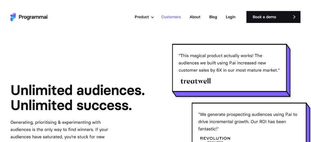
The design focuses on structured case studies, using key statistics to highlight success stories. The layout is simple but effective, ensuring each customer story is easy to scan. Each section includes relevant data points, reinforcing the platform’s effectiveness. The use of industry-based segmentation ensures quick navigation. The mobile-friendly design ensures a seamless experience across devices.
FAQ on Testimonial Page Design
Why are testimonial pages important?
Testimonial pages build trust and credibility. With client reviews, prospects see genuine feedback. Positive experiences serve as powerful trust signals.
When prospects notice that others vouch for your services, it encourages them to engage, improving user interaction. It’s like providing a window into customer satisfaction and loyalty.
What makes a testimonial page effective?
An effective testimonial page combines clean design and authentic feedback. A balanced layout, engaging visual content, and real client quotes boost trustworthiness. Interactive elements like sliders and carousels engage users more.
Call-to-action strategically placed can guide visitors’ next steps. Make it easy-to-read and visually pleasing, focusing on user experience.
How should testimonials be displayed?
Use attractive layouts and various formats. A testimonial carousel works well for space-saving. Quotes for short insights and video testimonials for engaging visuals.
Include client photos and logos for authenticity. Highlight impactful stories, focusing on diverse aspects like customer support or quality provided through case study examples.
What are common mistakes to avoid?
Avoid overcrowded designs and fake reviews. Testimonial overload makes pages look cluttered. Authenticity is key, so don’t use generic or manufactured feedback.
Too much text can deter readers. Ensure mobile compatibility for a responsive design. Without a user-friendly look, even genuine testimonials may get ignored.
How often should testimonials be updated?
Regular updates keep testimonials fresh and relevant. Aim for bi-annual reviews of content. New feedback shows ongoing client satisfaction.
Remove outdated quotes to maintain credibility. Stay current with trends, so testimonials resonate with visitors today. Featuring recent testimonials reflects your ongoing customer engagement and reliability.
Should you include negative testimonials?
Yes, include some constructive criticism to appear genuine. Showing how you addressed issues can boost customer trust. Visitors appreciate transparency and knowing you’re receptive to feedback.
Address any concerns professionally. Balance it with more positive stories to maintain trust without compromising brand reputation.
How to encourage clients to give testimonials?
Make it easy. Use email requests or personalized asks after a successful project. Offer incentives like discounts for feedback, but prioritize authenticity over compensation.
Provide guidelines to help clients express themselves clearly. Highlight valued contributions, showing how their feedback positively impacts the brand.
What should be included in a testimonial?
Include client names, positions, and photographs to build authenticity. Adding the company name or logo enhances credibility. Testimonials should feature specific experiences, highlighting what stood out.
Emphasize results or benefits that resonate with potential clients. Emotional appeal works well, showing genuine clients’ stories and feelings.
How can testimonial pages impact SEO?
Testimonial pages enhance search visibility by adding unique content and relevant keywords. Rich in genuine feedback, they provide fresh material for search engines.
Use structured data markup to help search engines recognize and index this content better. This affects rankings and can drive organic traffic growth.
Can video testimonials be more effective?
Yes, video testimonials offer dynamic visuals and genuine expressions, engaging viewers on a deeper level. Through facial cues, viewers connect more with authentic stories.
Videos grab attention quickly and keep it. Ensure good production quality for a professional look, focusing on clear audio and sharp visuals.
Conclusion
Wrapping up our look at testimonial page design examples, it's clear these elements are more than just nice details. They’re a key part of building relationships with potential clients. When done right, these pages are powerful tools for engagement and conversion.
Learn to show sincere customer stories using a mix of text, visuals, and user experience principles. Incorporate trust badges and ensure easy navigation. Collect genuine feedback that speaks directly to the heart of potential clients.
Every detail counts, from layout to visual hierarchy, because these testimonials can make or break the first impressions. They should demonstrate user trust and reflect the brand identity consistently.
By carefully designing this space, you encourage action, strengthen connections, and grow your digital presence effectively. Each step you take in refining this area adds value, leaving visitors with a lasting impression of your authenticity and commitment to excellence.
If you enjoyed reading this article on testimonial page design, you should check out this one about accessible websites examples.
We also wrote about a few related subjects like the best looking tourism websites, hotel website design, product landing page, great looking spa websites, cool looking personal trainer websites, top notch musician websites, the most impressive luxury websites and impressive animated websites.


