10 Quick Tricks to Boost WooCommerce Sales with Betheme
February 13, 2026
How to Fix the “Parse Error: Syntax Error Unexpected” In WordPress
February 18, 2026Your portfolio is doing more talking than you are. Clients and hiring managers form opinions about your design skills in seconds, and the web design portfolio examples you study will shape how you present your own work.
A strong portfolio site doesn't just display projects. It proves you can think through layout, user experience, and visual storytelling while building something that actually works on every device.
This guide breaks down real portfolio examples across different styles, from minimal Webflow builds to experimental Three.js showcases. You'll see what platforms designers use, how to structure case studies that get reviewed (not skipped), and the mistakes that quietly kill otherwise solid portfolios.
What Is a Web Design Portfolio?
A web design portfolio is a curated collection of completed projects that shows what you can actually do. Not what your resume claims. Not what your LinkedIn headline says. The work itself, presented on a site you built or customized yourself.
It functions as both proof of skill and a filter for fit. Clients browsing your portfolio are checking whether your style matches their vision. Hiring managers are looking for evidence that you understand layout, user flow, and visual hierarchy.
And here's the thing most people overlook. Your portfolio is a design project. If the site hosting your work looks sloppy, loads slowly, or falls apart on mobile, that tells a reviewer everything they need to know before they even click a single case study.
A Hover survey found that 71% of employers agree or strongly agree that a portfolio's quality directly influences their hiring decision. That number probably surprises no one who's ever sat on the other side of a hiring table.
There's a meaningful difference between a portfolio site and a basic resume or LinkedIn profile. A resume lists roles and dates. LinkedIn gives a summary with endorsements. But a portfolio shows the actual output, the design decisions, the process, and (ideally) the results.
According to Medium.com, roughly 90% of web designers are considered "unhirable" for two reasons: their portfolios look identical because they rely on out-of-the-box templates, and their case studies lack human-centered insights or measurable results. Harsh? Sure. But it tells you exactly where the bar sits.
If you're a freelancer, agency designer, or someone switching careers into UX, the portfolio does more work than any cover letter ever could. It's the first thing people check and, in many cases, the last thing they need to see before making a decision.
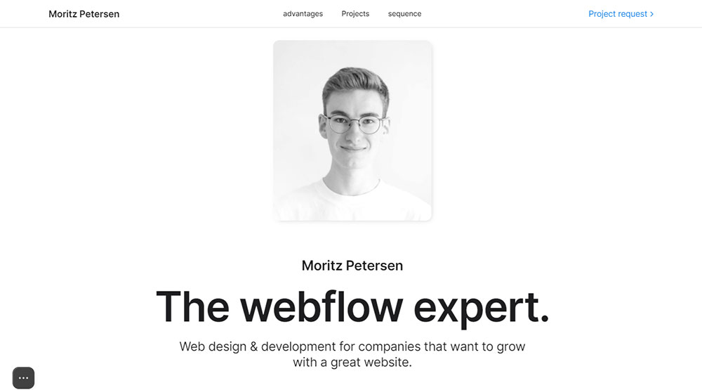
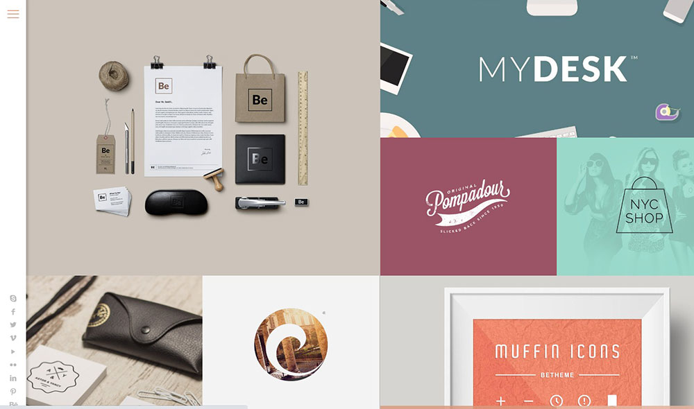
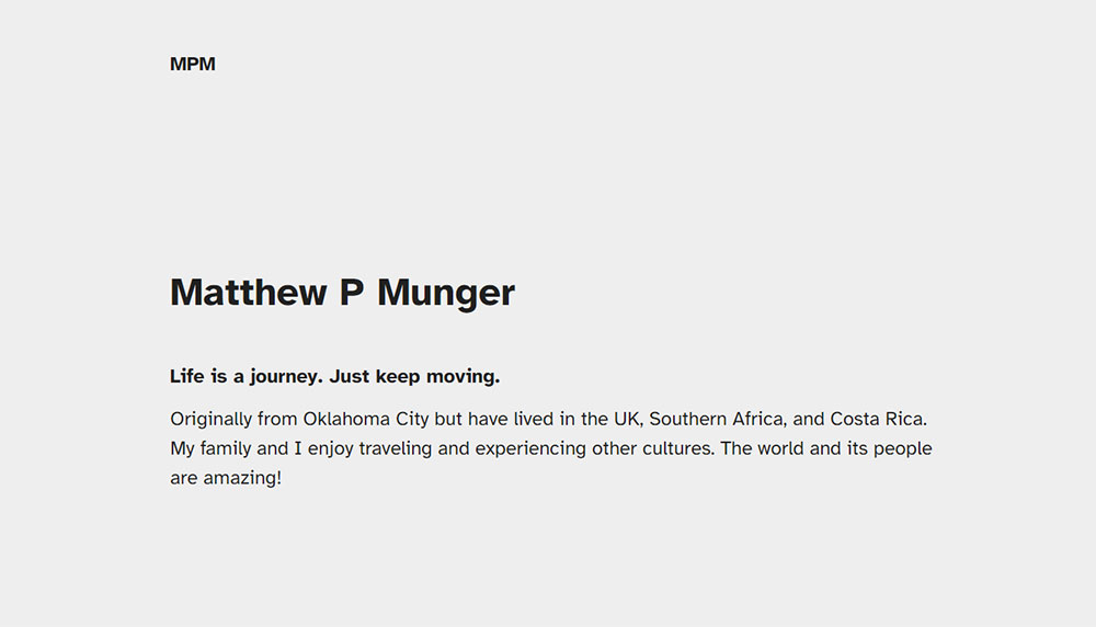
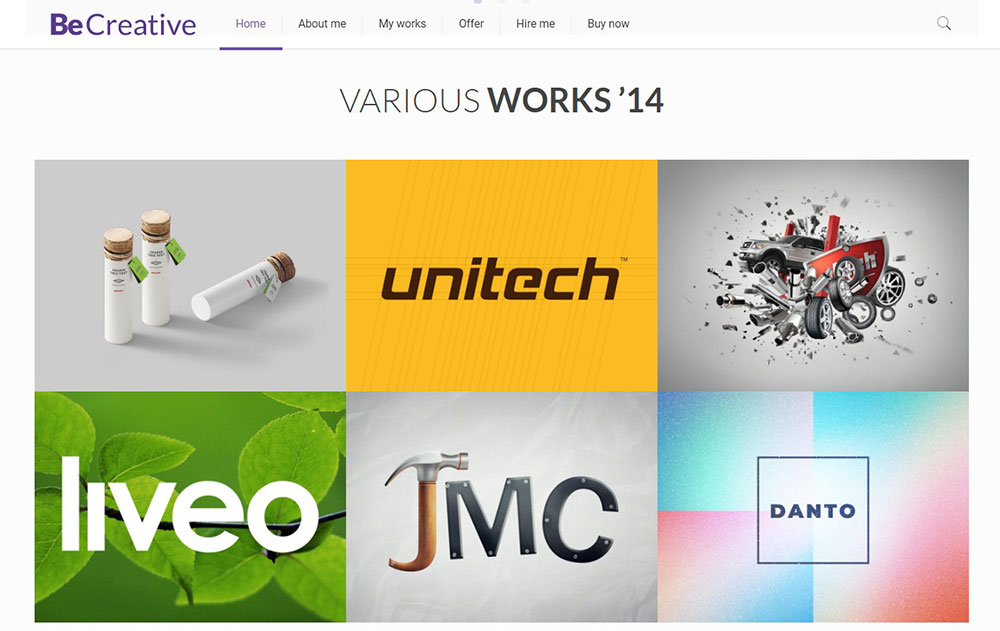
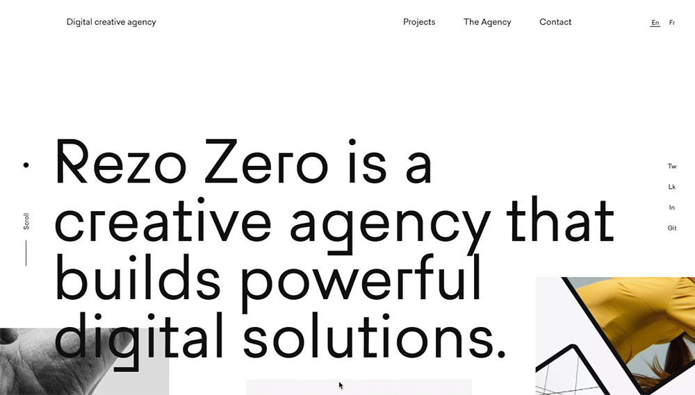
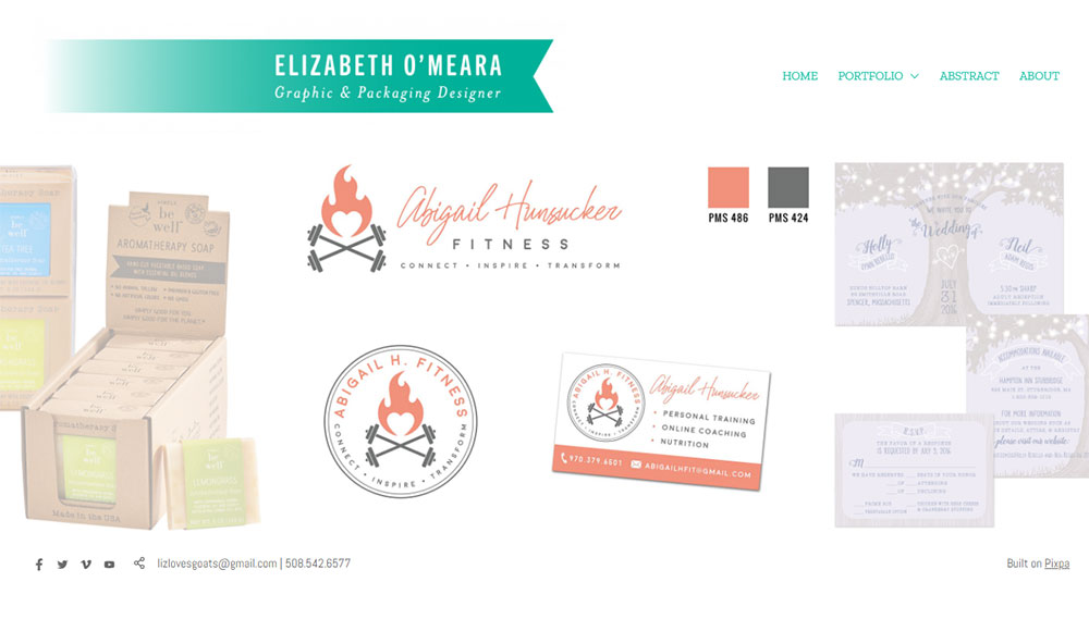
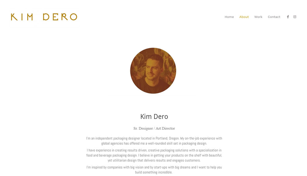
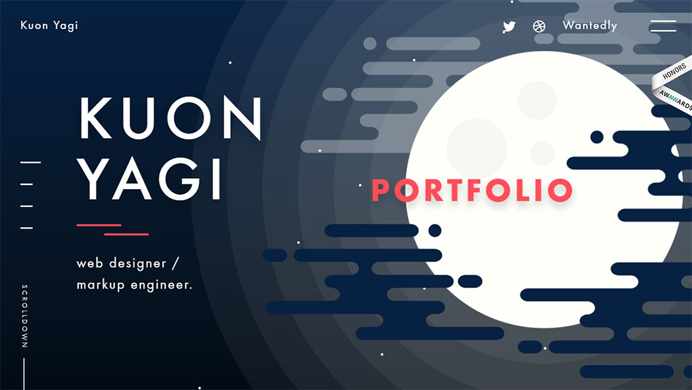
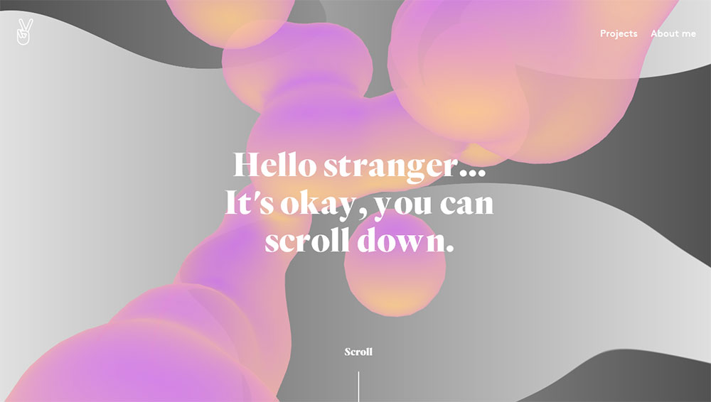
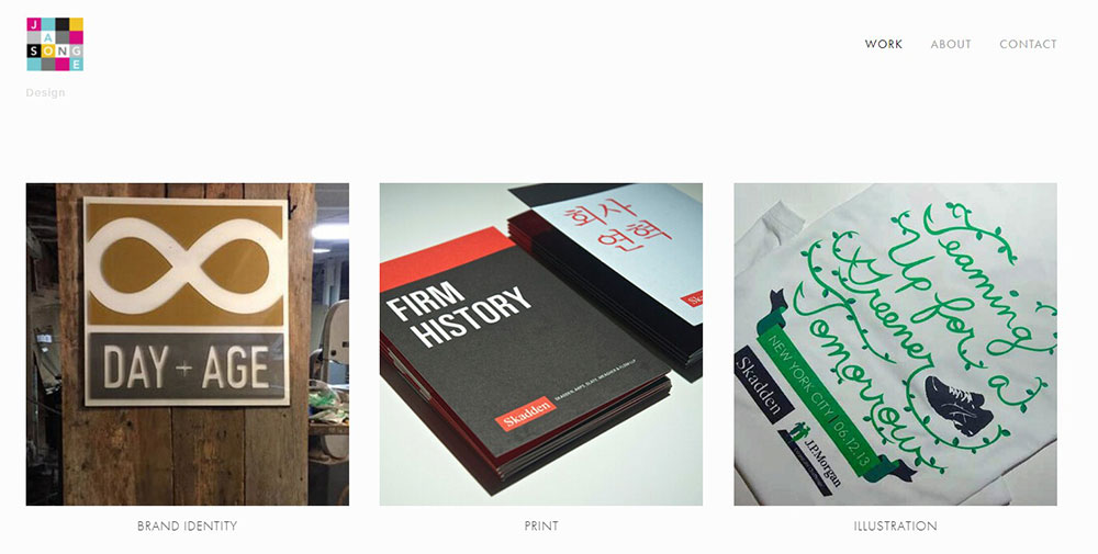
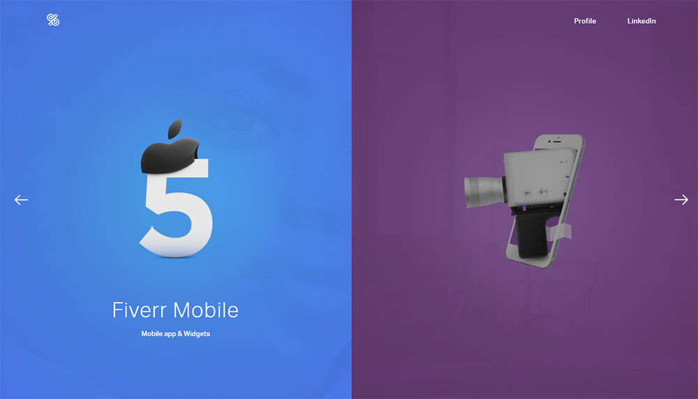
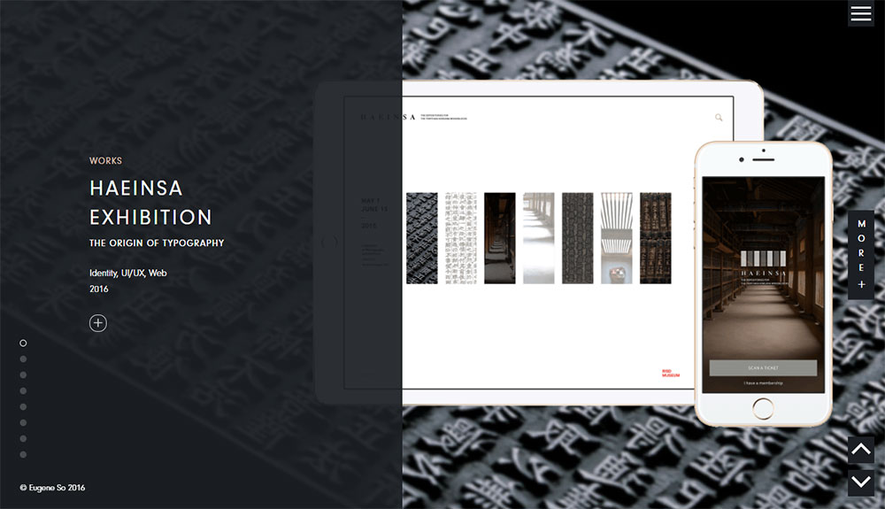
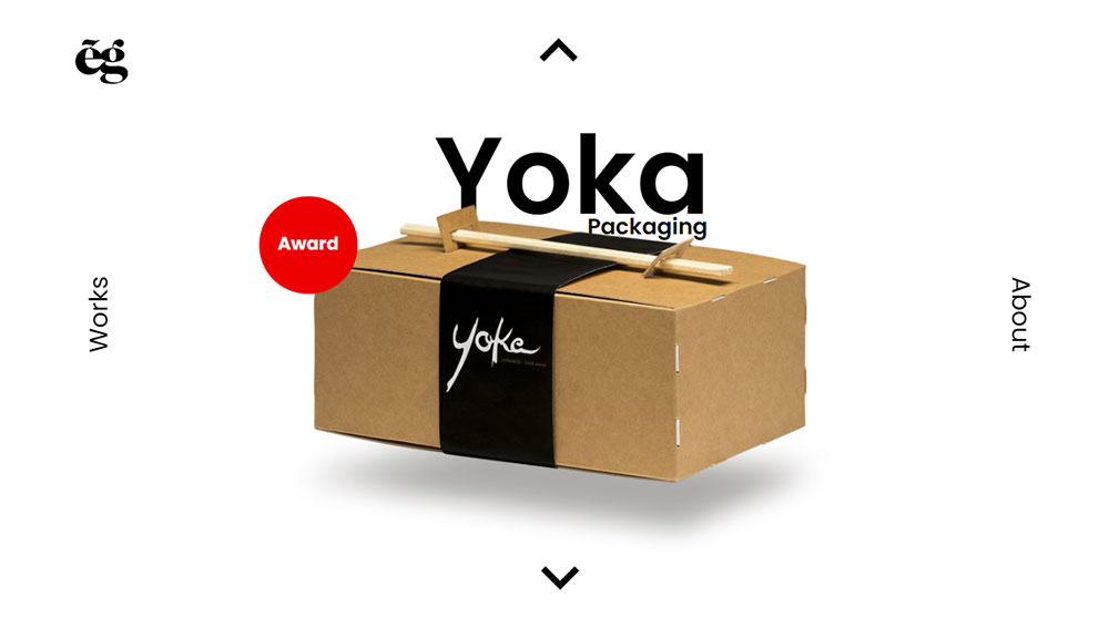
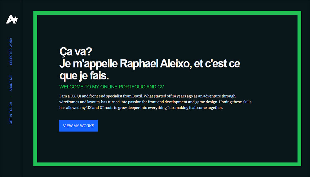
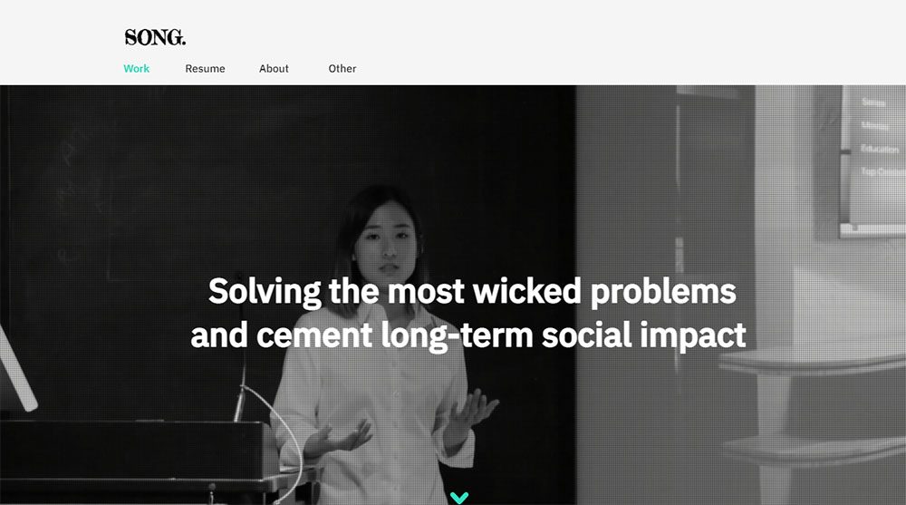
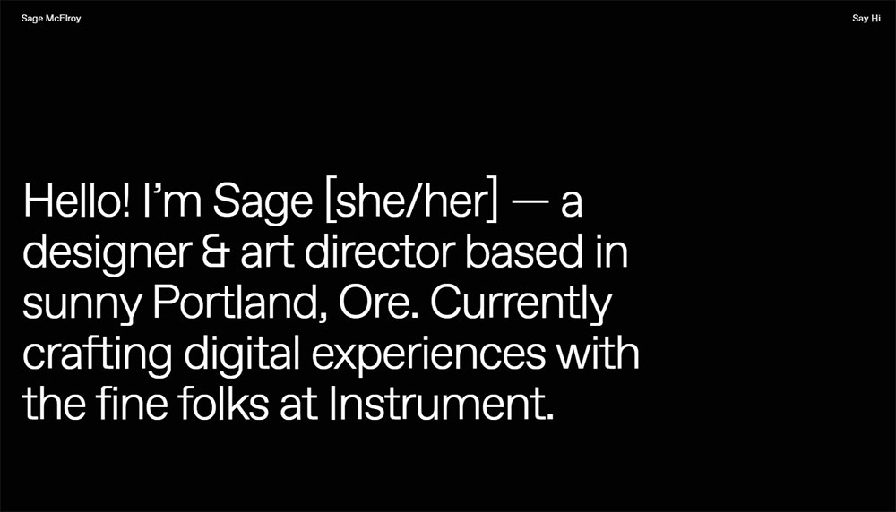
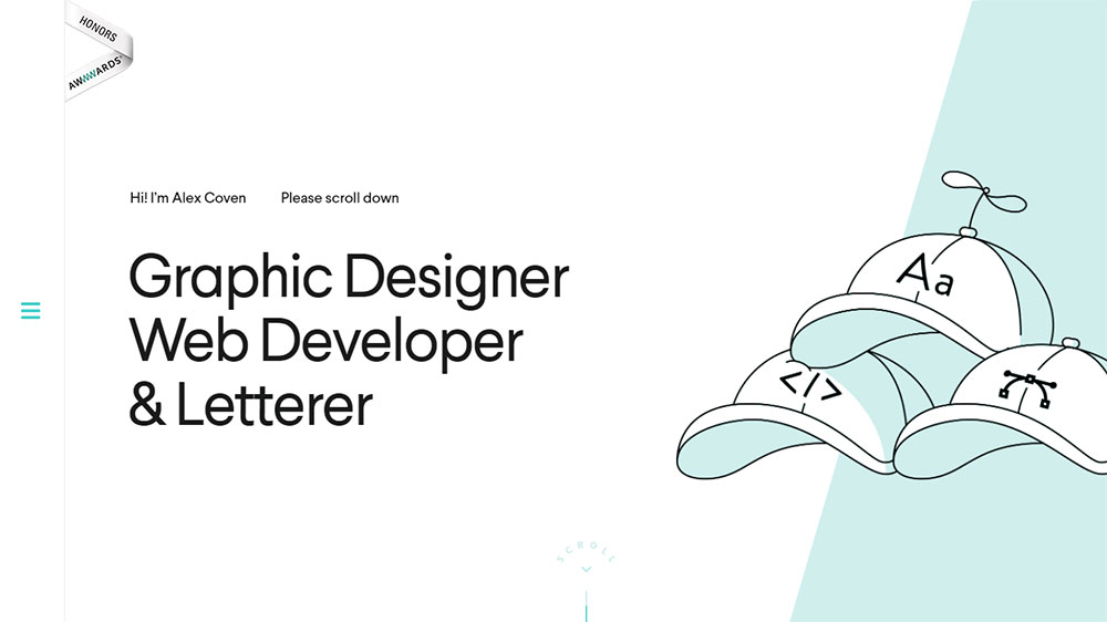
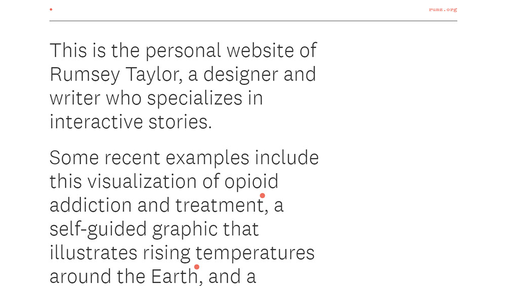
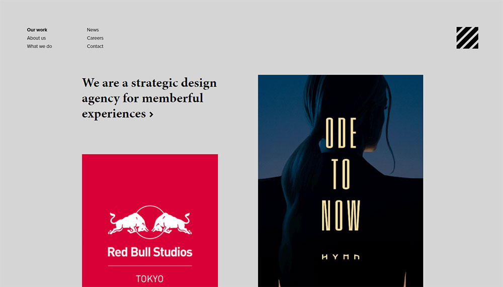
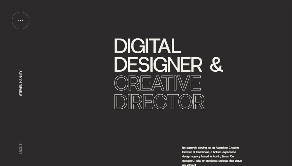
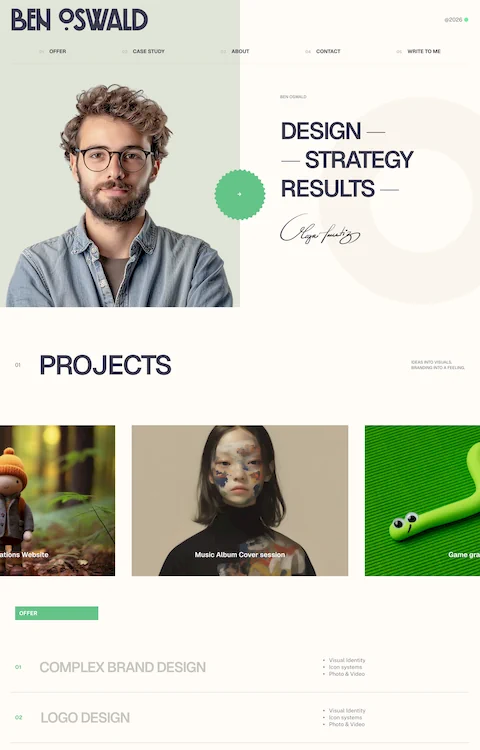
The Best Web Design Portfolio Examples
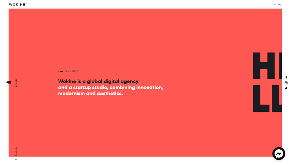
Wokine
What Makes a Web Design Portfolio Stand Out?
Most portfolios blend together. Grid of thumbnails, vague project titles, maybe a sentence or two underneath. That approach worked in 2015. It doesn't anymore.
What separates a good portfolio from a forgettable one comes down to a few specific things. And none of them are about flashy animations or trendy fonts (though those can help if done well).
Visual Hierarchy and Navigation
A Stanford Web Credibility Research study found that 75% of users judge a company's credibility based on website design alone. That applies to portfolio sites just as much as corporate ones.
Clear website navigation examples show that visitors should never have to guess where to click. Your homepage layout, project pages, about section, and contact information need to follow a logical structure that a first-time visitor can parse in seconds.
Google research confirms that users form an opinion about a site in roughly 0.05 seconds. That's not enough time to read a single word. It's purely visual. Your hero section and top-of-page design carry most of the weight here.
Case Studies with Context
Screenshots without explanation are almost worthless. Hiring managers at companies like Google and Meta have made this clear repeatedly: they want to see process, not just polish.
The Interaction Design Foundation notes that hiring managers may allocate only five minutes to review your entire portfolio. If your case studies don't lead with a problem statement and results, you've already lost them.
Strong case studies walk through the full design process. Problem, research, wireframes, iterations, final design, and measurable outcomes. Before-and-after comparisons, when available, are particularly effective.
Loading Speed and Responsiveness
Hostinger reports that 90% of all websites now use responsive design, covering about 1.2 billion sites worldwide. If your portfolio doesn't look right on a phone in 2026, you're telling potential clients that you don't prioritize mobile first design.
Loopex Digital data shows that when mobile pages take over four seconds to load, 63% of users leave. Your portfolio shouldn't be the one testing people's patience.
Personality Over Templates
This is where it gets tricky. A minimalist website approach works if that's genuinely your style. So does something bold and experimental. The problem is when the template does all the talking and there's zero personality underneath.
Took me a while to figure this out personally, but the portfolios that stick in people's heads are the ones where you can tell a real human made choices. A specific color scheme that matches the designer's brand. Good typography choices that reflect intention, not just defaults. Custom micro-interactions that show front-end understanding.
| Portfolio Trait | Why It Matters | Common Mistake |
| Clear Navigation | Visitors decide in under 1 second. | Buried project links or no clear "Back to Top" CTA. |
| Case Study Depth | Hiring managers prioritize process over finals. | "Gallery style" layouts with no text context. |
| Mobile Responsiveness | 60%+ of recruiter "pre-screens" are on mobile. | Desktop-only testing (cutoff text or broken grids). |
| Load Speed | 63% bounce rate after 4 seconds on mobile. | Uncompressed PNGs and non-deferred scripts. |
| Personal Branding | Shows intentional design thinking. | Over-reliance on generic, unmodified templates. |
Portfolio Platforms and Tools Designers Actually Use
The platform choice matters less than most people think. But it matters more than zero. Every platform has trade-offs, and the best portfolios are built by designers who picked the right tool for their specific needs.
Here's an honest comparison based on what designers actually use in 2025/2026.
| Platform | Best For | Limitation |
| Webflow | Scalable, high-traffic agency sites. | Deep CSS logic required; pricing scales quickly with traffic. |
| Cargo | Art directors & experimental visuals. | Proprietary "Cargo Script" can be rigid for non-visual features. |
| Squarespace | Effortless, polished "vibe" sites. | Lower customization ceiling; limited 3rd-party integrations. |
| Framer | High-fidelity motion & "Figma-to-Site." | Not built for massive databases or complex e-commerce. |
| WordPress + Elementor | Complex, long-term ownership. | High maintenance; security and plugin "update hell." |
| Custom-coded (Vercel) | Performance purists & developers. | High time investment; requires "vibe coding" (AI assist) to stay fast. |
HubSpot research shows that 93% of web designers now use AI tools in some part of their workflow. Figma's AI features, Adobe Creative Suite integrations, and even GitHub Copilot for custom-coded portfolio sites are becoming standard parts of the web design tools stack.
For hosting, Netlify and Vercel dominate among developers who custom-code their portfolios. GitHub Pages is another free option, though it's better suited for simple static sites than complex portfolio layouts.
Wix and Pixpa show up in beginner portfolios frequently. They're fine for getting something online quickly. But at a certain point, the template constraints become visible to anyone who's reviewed more than a dozen portfolios.
One thing that's changed recently: Framer has grown fast among designers who want something between Squarespace simplicity and Webflow power. It originated as a prototyping tool, so the transition to live sites feels natural for product designers already working in it. Google Fonts integration and responsive breakpoint controls are built in.
How to Structure a Web Design Portfolio Site
Structure is where a lot of portfolios quietly fail. The design might look great, the projects might be impressive, but if a visitor can't figure out what they're looking at or where to go next, none of that matters.
GoodFirms found that 84.6% of designers consider cluttered layouts a top mistake small businesses make with their websites. Portfolio sites are no different.
Homepage Layout Patterns That Work
Project grid: The classic approach. Thumbnail images in a grid, each linking to a project page. Works best when you have 6 or more strong projects and the images carry visual weight on their own.
Featured project hero: One large project takes center stage at the top, with smaller projects below. Good if you have a standout piece that's clearly your best work.
Single-scroll narrative: Your entire portfolio lives on one page, with sections for intro, projects, about, and contact. This works well for designers with fewer than five projects who want a focused experience.
ColorWhistle data shows that 66% of people prefer beautifully designed websites when given 15 minutes to consume content. Your homepage is where that first impression either lands or doesn't.
What Goes on an About Page
Skip the third-person bio. Write in first person. Say who you are, what you focus on, and what kind of projects you're looking for. If you have web designer skills in a specific area, like accessibility, animation, or e-commerce, this is the place to say it.
A photo helps. Not a professional headshot (necessarily), but something that shows you're a real person. Mention your tools. Figma, Adobe XD, Sketch, whatever you actually use daily.
How Many Projects to Include
Six to twelve is the range most hiring managers and creative directors expect. PathUnbound recommends featuring 3-5 of your strongest case studies to avoid overwhelming the viewer.
Quality over quantity applies here more than almost anywhere else. If your weakest project drags down the overall impression, cut it. Nobody will miss the tenth thumbnail.
For projects under NDA, you have options. Show the process without revealing the client. Use anonymized screenshots. Or simply describe the challenge and outcome in text. Some designers on platforms like UXfolio even password-protect specific case studies and share access during the interview process.
Common Mistakes in Web Design Portfolios
Let's be blunt about what kills portfolios. These aren't edge cases. They're patterns that show up repeatedly, across hundreds of applicants, at every level from junior to senior.
No Context Around Projects
This is the single most common problem. A grid of pretty screenshots with project titles like "E-commerce Redesign" or "Mobile App." No explanation of what the project was, who it was for, what problem it solved, or what the designer actually did.
The UX Collective reports that design managers will reject a portfolio in as little as 30 seconds when they can't quickly identify the designer's role and thinking process. Screenshots alone won't clear that bar.
Slow Loading and Broken Responsive Layouts
WebFX data shows the web design services market hit $61.23 billion in 2025. The industry is massive and competitive. If your own portfolio has rendering issues on an iPhone or takes five seconds to load, you're signaling that you ship work without testing it.
Retailers lose $2.6 billion annually from slow websites, according to industry research. Your portfolio probably isn't an e-commerce store, but the same user behavior applies. Slow pages mean bounced visitors.
Template Design Without Customization
Using a Squarespace or Wix template is perfectly fine. Using one without changing anything beyond the text? That's a problem.
Hiring managers see hundreds of portfolio sites. They can spot a default Squarespace layout from the first scroll. At minimum, customize the typography, color theory choices, and website layout to reflect your personal brand.
Burying Contact Information
If someone wants to hire you, they need to find your email or contact form in under five seconds. A footer link is the bare minimum. A dedicated contact page or a sticky call to action button in the header is better.
SmallBizGenius found that 70% of small business websites lack a clear call-to-action on their homepage. Portfolio sites are guilty of the same thing. Don't make people hunt for the "hire me" button.
Outdated Work
If your most recent project is from 2022, that raises questions. Design trends change. The web design elements that looked current three years ago might read as dated today.
Refresh your portfolio at least once a year. Swap out older projects for newer ones. Update the copy. And if the site itself starts feeling stale, consider a full website redesign.
How to Present Client Work in a Portfolio
Showing client work sounds straightforward until you actually try it. NDAs, unclear permissions, team projects where your role blurs with everyone else's. These are real problems that every working designer deals with.
The Interaction Design Foundation is direct about this: hiring managers need to see that you respect NDAs, and clearly labeling which projects have confidentiality restrictions actually builds trust rather than hurting you.
Getting Permission and Handling NDAs
Most clients and employers will let you show work if you ask properly. UX Playbook's 2025 portfolio guide recommends a simple process:
- Read the NDA terms carefully (check if it's time-limited or perpetual)
- Email the project lead with a specific list of what you want to show
- Get written approval, not verbal
If the NDA is non-negotiable, you still have options. Password-protect the case study on platforms like UXfolio and share access during the interview process only.
Freelancermap notes that some NDAs expire after a set period. Keep a document tracking all your NDAs so you know when specific projects become available to display publicly.
Clarifying Your Role on Team Projects
This trips up a lot of designers. You worked on a big project with a team of eight, but your portfolio makes it look like you did everything alone. Or worse, it doesn't specify what you did at all.
Indeed Design's UX hiring managers are clear: they want to see problem statement, process, team makeup, and the candidate's specific role. Susan Le, UX Director, specifically looks for this breakdown in every case study she reviews.
| Presentation Approach | When to Use It | Watch Out For |
| Full Case Study | Client gave written permission. | Don't over-share proprietary metrics or internal Slack logs. |
| Anonymized Case Study | NDA restricts naming the client. | Use generic names (e.g., "A Major FinTech App") but keep the data real. |
| Process-Only | Strict NDA; no visuals allowed. | Focus on your logic: wireframes, sketches, and user interview insights. |
| Password-Protected | Sensitive work shared selectively. | Mention the password in your application; don't make them "request" it. |
Screenshot Quality and Mockups
The UX Collective warns that pixelated images are sometimes enough to reject a portfolio on their own. If a design manager has 98 other applicants, a blurry screenshot gives them an easy reason to move on.
Use device mockups (laptop frames, phone bezels) to present work in context. Tools like Figma, Sketch, and even Canva offer free mockup templates. Video walkthroughs of interactive projects perform better than static screenshots, especially for work involving animation or complex user flows.
How Web Design Portfolios Get Reviewed by Employers and Clients
Understanding how the other side evaluates your portfolio changes how you build it. The review process is faster, more ruthless, and more pattern-driven than most designers realize.
How Much Time Reviewers Actually Spend
Lauren Ranke, director of creative recruiting at Wieden+Kennedy, told MediaSilo: "I spend about five to twenty seconds deciding whether to look more closely at a portfolio."
That's the initial filter. If those seconds go well, she might spend fifteen to twenty minutes with your work. If they don't, you're done.
The UX Collective's research on design manager behavior found a similar pattern. The rejection decision can happen in roughly 30 seconds. And the most common reasons? Quality issues like pixelated images, cluttered layouts, and missing context around projects.
What Creative Directors Look for First
Catch In Talent's agency research found that within the first 10 seconds, creative directors are asking one question: "Can this person actually think?"
Visual polish catches attention. Problem-solving keeps it.
Jim Bell, creative director at Forge, says the strongest portfolios get to the point fast. If your featured project needs two minutes of scrolling before the interesting part, you've already lost most reviewers.
UXfolio's 2026 portfolio guide adds that for senior roles, reviewers shift from evaluating execution to evaluating direction. They want to see how you shaped strategy across projects, not just how you pushed pixels on individual screens.
How Clients Evaluate Portfolios Differently Than Employers
Employers look for: design process, team collaboration signals, alignment with their product or brand, and growth potential.
Clients look for: relevant industry experience, visual style match, turnaround capability, and clear pricing signals.
A freelance designer pitching to a SaaS company should lead with SaaS project examples. Someone targeting food brands should put restaurant and food product websites front and center.
Catch In Talent's agency research puts it plainly: if you don't understand their sector, you're probably not getting hired. Fintech agencies want evidence you understand regulatory constraints. Healthcare clients need someone who grasps patient privacy concerns. Tailor the portfolio to the audience.
The Role of the Portfolio in the Broader Hiring Process
Askcruit's 2025 UX hiring data shows that 90% of hiring managers consider the portfolio a key part of the application. Most design portfolio review sessions run 30 to 45 minutes total, with one case study presented in depth.
The portfolio isn't the only thing that matters. But it's often the gateway. A strong resume gets you past the ATS. A strong portfolio gets you the interview. And the interview presentation (usually a portfolio walkthrough) is where the final decision happens.
Annie Jarvis, Senior UX Director at Indeed, sums it up: "The portfolio is king." Work experience matters, and a degree can help. But the portfolio is how hiring managers learn about what you've actually accomplished and how you think through design problems.
One last thing worth mentioning. Some designers now use analytics tools like Hotjar or Microsoft Clarity on their portfolio sites to track where visitors click and where they drop off. If five companies all leave at the same case study midway through, that's a clear signal to fix that page. Treating your portfolio like a product, with real user data, is something that separates professional websites from ones that just exist.
FAQ on Web Design Portfolio Examples
How many projects should a web design portfolio include?
Most hiring managers expect between 6 and 12 projects. Quality matters more than quantity. If a weaker project drags down the overall impression, cut it. Nobody scrolls past your eighth thumbnail anyway.
What platform is best for building a portfolio website?
Webflow, Squarespace, Cargo, and Framer are the most popular choices. Custom-coded sites on Netlify or Vercel work well for developers. Pick the platform that matches your technical comfort level and customization needs.
Do I need case studies in my portfolio?
Yes, especially for UX and product design roles. Hiring managers want to see your design process, not just polished screenshots. A case study showing problem, research, iterations, and results outperforms a gallery of final mockups every time.
Can I include personal projects in a web design portfolio?
Absolutely. Redesign concepts, volunteer work, and self-initiated projects all count. Present them honestly. Label spec work as spec work. Hiring managers respect transparency more than a padded project list.
How do I show client work that's under NDA?
Ask for written permission first. If that fails, anonymize the case study by removing client names and sensitive data. Password-protected pages on platforms like UXfolio let you share selectively during interviews.
Should my portfolio be responsive?
Non-negotiable. Over 60% of web traffic comes from mobile devices. If your portfolio breaks on a phone, you're telling reviewers you don't test your own work. Use responsive templates or build with CSS Grid and Flexbox.
How often should I update my portfolio?
At least once a year. Swap older projects for recent ones. Refresh the copy and check that all links still work. If the site itself feels dated, consider a full redesign to match current design trends.
What do hiring managers look at first in a portfolio?
Visual impression hits first, within 0.05 seconds. Then they check navigation clarity, your strongest featured project, and whether case studies include context. Creative directors at agencies like Wieden+Kennedy decide in under 20 seconds.
Is a PDF portfolio still useful alongside a website?
Some hiring managers prefer a PDF for deeper review after screening your site. Keep it concise, around 10 to 15 pages. Use it as a supplement, not a replacement for your live portfolio website.
What's the biggest mistake in web design portfolios?
Showing work without context. A grid of screenshots tells reviewers nothing about your thinking. Every project needs a problem statement, your specific role, and measurable results. Process matters as much as the final design.
Conclusion
The best web design portfolio examples share one thing in common. They treat the portfolio itself as a design project, with the same attention to responsive layouts, clear navigation structure, and intentional branding that goes into any client deliverable.
Whether you're building your first portfolio on Framer or refining a custom-coded site hosted on Vercel, the fundamentals stay the same. Lead with strong case studies. Show your process, not just your finals. And make sure the site loads fast on mobile.
Hiring managers spend seconds on the initial scan. Those seconds decide everything. A clear homepage layout, honest project documentation, and visible contact information will do more for your career than any scroll animation ever could.
Keep your portfolio website updated, cut the weak projects, and build for the people reviewing it. That's the entire strategy.

